Unleash Harmony: The Ultimate Guide to Cohesive Color Palettes in Abstract Art
Transform chaos into captivating harmony! Zen Dageraad Visser's ultimate guide explores personal strategies, essential color theory, historical insights, and practical techniques to craft cohesive color palettes that make your abstract art truly sing.
Unleash Harmony: The Ultimate Guide to Cohesive Color Palettes in Abstract Art
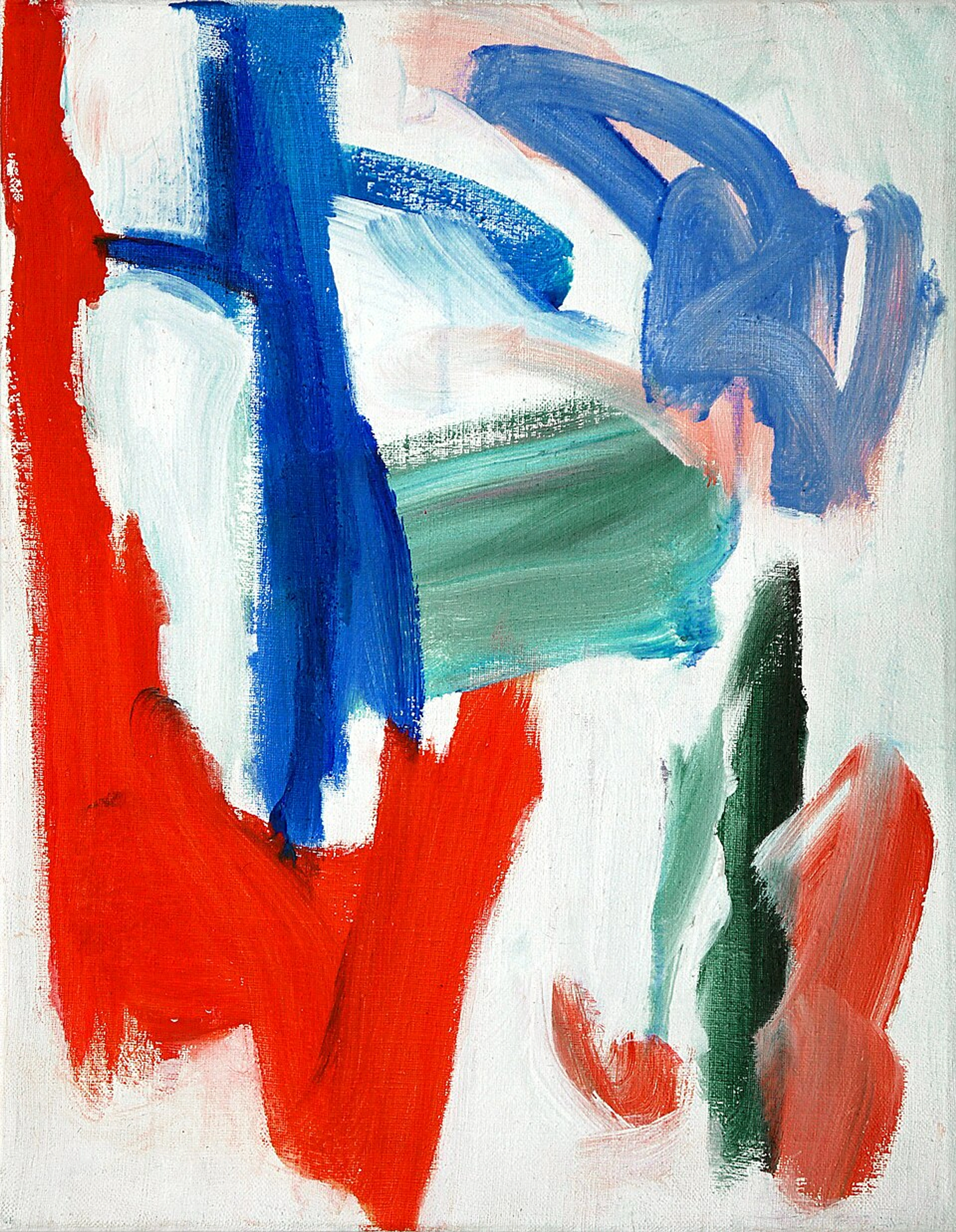
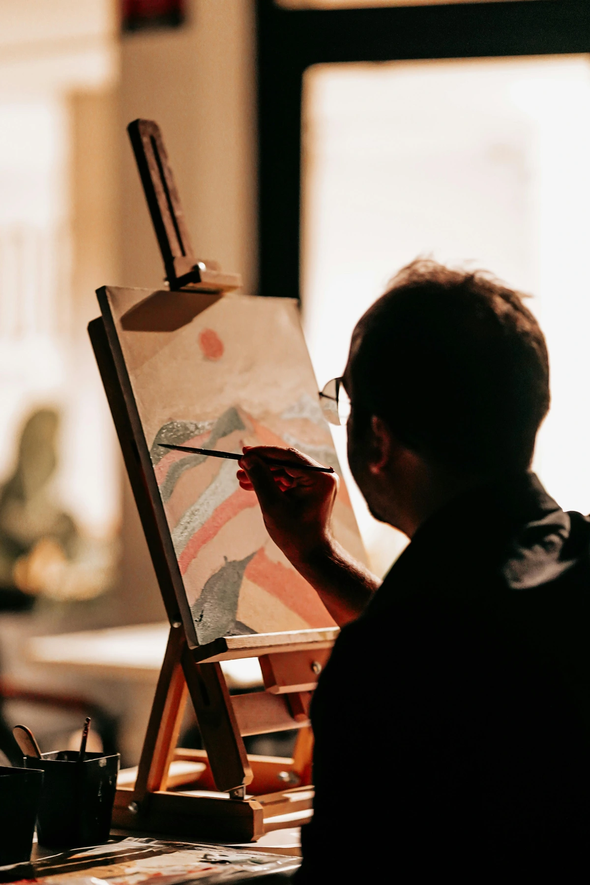
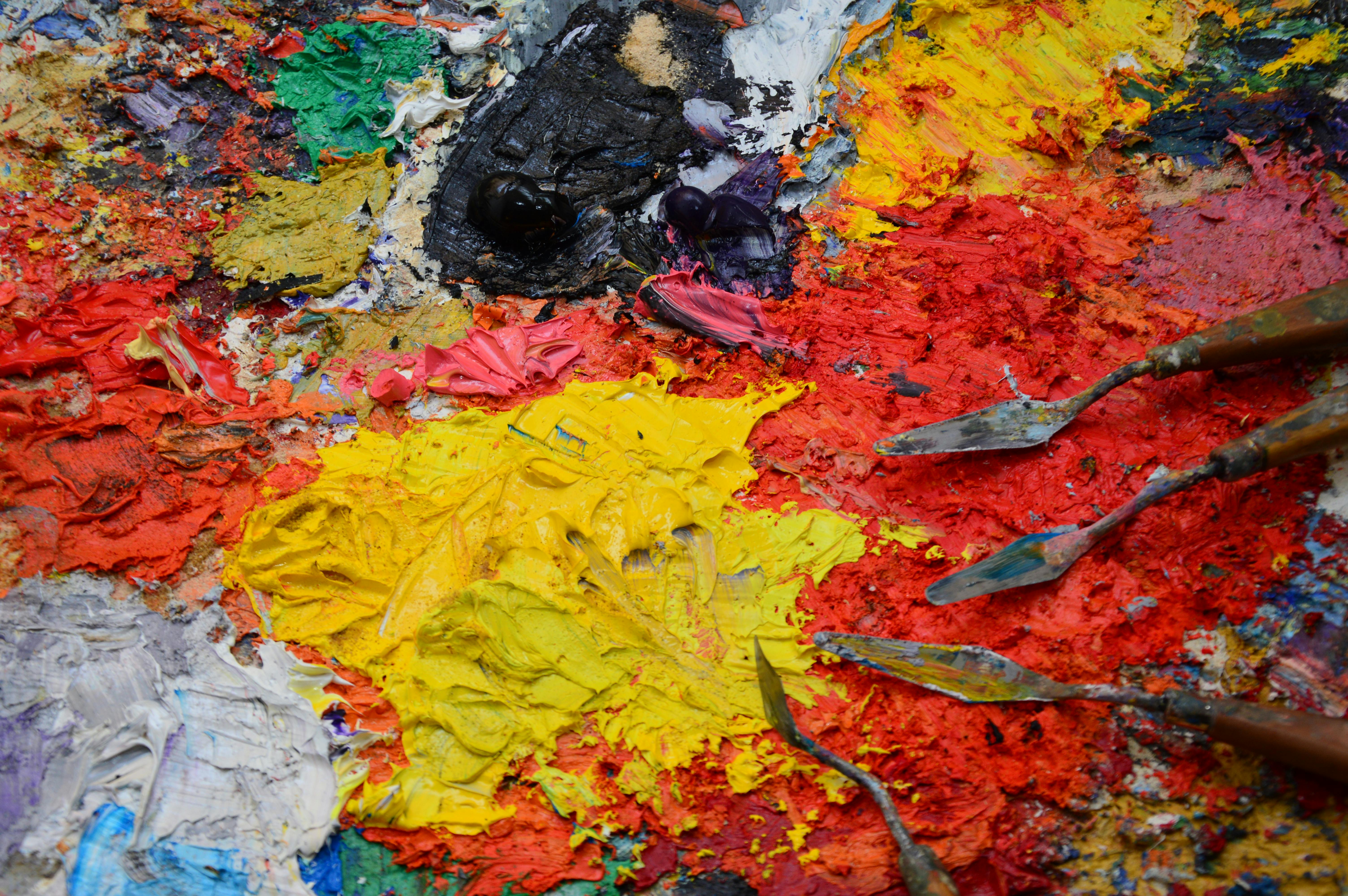
Ever felt like your abstract paintings are a riot of color but lack a unifying 'voice'? Like a band playing every instrument at once, completely out of tune? I certainly have. I remember the familiar tension of a blank canvas, my easel waiting, surrounded by a riot of paint tubes and puddles. Sometimes, a chaotic whisper would urge me, "Just throw it all on there!" And bless its wild heart, sometimes I'd listen. The result? Well, not every experiment found its way into a gallery. Some pieces vibrated with life, yes, but others... they just felt off. It was a visual cacophony, a discordant shout, instead of a resonant hum. That's when I realized the magic wasn't in using all the colors, but in choosing the right colors, and making them dance together beautifully. This isn't just about aesthetics; it's about giving your abstract art a soul, a voice, a feeling that truly connects. This guide is my journey, my struggles, and my hard-won lessons on crafting a color palette that doesn't just coexist, but actively sings. Are your abstract paintings feeling a bit 'off'? Trust me, I've been there. By the end of this guide, you'll have the tools and understanding to create abstract art where your colors don't just occupy space, they converse, they embrace, they tell a story.
The Unspoken Language: Why Color Cohesion is the Soul of Abstract Art
Ever wondered why some abstract paintings feel like a comforting embrace while others assault the senses, a jarring visual racket? We often associate abstract art with wild, unbridled expression, and it absolutely can be! But even in the wildest storm, there's an underlying current, a rhythm. For me, that rhythm in painting often comes from a cohesive color palette. It's the silent language that whispers to the viewer, creating an emotional landscape without a single recognizable form. Imagine a gradient of muted blues and grays, transitioning seamlessly, evoking a sense of vast, lonely introspection, even without depicting a sky or an ocean. This deep connection comes from understanding the emotional language of color in abstract art and how it truly speaks directly to our core.
When your colors harmonize, they effortlessly guide the eye, creating a visual flow that pulls someone deeper into your world. Imagine a gentle, flowing river of hues that carries the viewer along without resistance. Without a sense of cohesion, a painting can feel disjointed, restless, or simply overwhelming, like trying to have a meaningful conversation in a room where everyone is shouting over each other. Unbalanced palettes can evoke anxiety, confusion, or a sense of unease, unwittingly detracting from the intended mood. A clash of unthoughtful reds and greens, for instance, can create a nervous, agitated energy, while a muddy array of browns might unintentionally cast a somber, even depressing, shadow.
But when your palette sings in unison, it creates a sense of calm, excitement, tension, or joy – whatever emotion you're aiming for – in a way that feels intentional and deeply resonant. It gives your work that magnetic quality that makes people pause, drawing them into a conversation with the canvas. If you've ever felt a deep, inexplicable connection to an abstract piece, chances are its thoughtful color choices played a huge role. Colors don't just exist; they speak directly to our emotions and perceptions. It’s a bit like diving into the psychology of color in abstract art beyond basic hues – understanding their subtle power is a game-changer.
The Nuances: Unpacking Color Psychology for Cohesion
While we often associate basic hues with simple emotions (red for passion, blue for calm), the truth is far more complex, especially in abstract art where forms don't dictate meaning. A cohesive palette leverages these deeper psychological nuances. For instance, an analogous palette of deep blues and greens can evoke profound serenity, but with a subtle introduction of a desaturated purple, it can shift into a mood of contemplative mystery. Conversely, a complementary pairing of vibrant orange and blue, carefully balanced, can create an exhilarating tension without feeling jarring. It’s about orchestrating emotions, not just colors. By understanding how tints, shades, and tones of specific hues modify their psychological impact, you gain precise control over the emotional narrative of your abstract works, ensuring that your cohesive palette consistently delivers the intended feeling. For example, a desaturated purple, bordering on lavender, often evokes contemplation and introspection, while a deep, rich violet can suggest luxury and mystery. Similarly, a pale sky blue offers serenity, but a deep navy can convey power and authority.
A Brief History of Color in Abstraction: Learning from the Masters
While my personal journey into cohesive palettes is relatively recent, the intentional use of color in abstract art has a rich, profound history. This deep understanding of color's emotional resonance isn't new; it's a thread woven through the very fabric of abstract art. When I'm wrestling with a palette, I often think, "What would Rothko do to make this feel monumental?" or "How would Kandinsky orchestrate these hues for a specific feeling?" This historical context isn't just academic; it's a wellspring of inspiration, a masterclass in chromatic intention.
Pioneers like Wassily Kandinsky, often credited with painting one of the first purely abstract works, meticulously explored how colors and forms could evoke spiritual and emotional responses without representing concrete reality. His groundbreaking treatise, Concerning the Spiritual in Art, profoundly influenced how artists thought about color's intrinsic meaning and its ability to resonate deeply. He orchestrated vibrant compositions where each hue played a distinct role in a larger, non-objective symphony, demonstrating early principles of chromatic cohesion.
Artists like Kazimir Malevich with his Suprematist compositions or Mark Rothko's expansive color fields continued this exploration, proving that color alone could carry profound meaning and depth. Rothko, for instance, aimed for the sublime, using vast, luminous fields of color, carefully balanced in saturation and value, to invite contemplation and evoke deep emotional states. His seemingly simple palettes achieved immense emotional weight through meticulous attention to how large blocks of color interacted, creating a singular, immersive experience. Later, color field painters like Helen Frankenthaler and Barnett Newman further pushed the boundaries, exploring the expressive power of color through monumental scale and innovative staining techniques, allowing color to be the sole subject and form, often achieving cohesion through subtle shifts within a limited range.
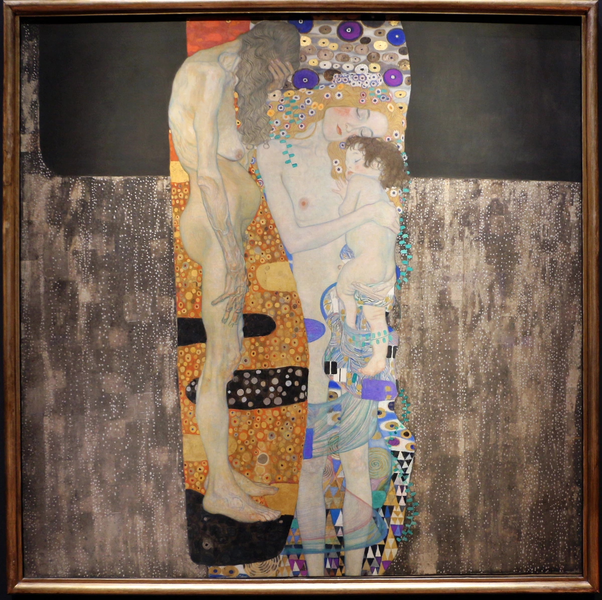
But the journey didn't start there. Even earlier, Impressionists, like Claude Monet, broke down color into its constituent parts, exploring how light created vibrant, fleeting color experiences, often using broken color and juxtaposed hues to create luminosity. Fauvists, such as Henri Matisse, then liberated color entirely from its descriptive function, using bold, non-naturalistic hues for their emotional and decorative impact, often relying on internal consistency for their powerful effects. And later, Abstract Expressionists, from Jackson Pollock's rhythmic drips of color to Willem de Kooning's aggressive, vibrant palettes, each found new ways for color to express raw emotion and inner states, frequently finding a spontaneous cohesion within their gestural marks. Consider also the impactful color use of Georgia O'Keeffe, who, even in her semi-abstract floral and landscape compositions, demonstrated a profound understanding of how color could convey form, emotion, and deep spiritual connection, often using a limited, deliberate palette to achieve monumental scale and impact, where every hue felt essential to the overall harmony. Figures like Paul Klee explored color as both form and feeling in playful, musical compositions, while Hilma af Klint's early spiritual abstract works harnessed color for profound mystical expression. Josef Albers, with his groundbreaking Interaction of Color series, meticulously documented how colors influence each other, a foundational insight for understanding color relativity. And Robert and Sonia Delaunay, through their Orphism movement, showcased how pure color and form alone could evoke sensation and dynamic rhythm.
Understanding their approaches to color – whether for emotional impact, spiritual resonance, or pure formal exploration – offers invaluable lessons. It reminds me that even in abstract art, there's a lineage of thoughtful, deliberate choice behind the apparent chaos.

My Journey from Chaos to Harmony: Embracing Guiding Principles
Once I truly grasped the fundamental importance of a cohesive palette, my focus shifted to developing a systematic yet intuitive process for creating one. Honestly, when I first started, my palettes were often a free-for-all. Every tube of paint felt like a potential friend, and I wanted them all to play together. The result? A lot of muddy grays and pieces that looked, well, let's just say a kindergarten art project usually has more intentionality! I remember one particularly frustrating session where I'd used every bright color I owned, and the canvas screamed rather than whispered, a visual clash of primary school exuberance gone wrong. My early palettes often resembled a toddler's enthusiastic, if not entirely harmonious, finger-painting session.
I learned pretty quickly that while variety is the spice of life, too much spice can make a dish inedible. The temptation to use every beautiful hue you own is real, especially when you're exploring how to abstract art and feel like there are no rules. But here's a surprising truth: embracing certain guiding principles doesn't limit your creativity – it actually unleashes it. It's like learning the notes before you compose a symphony; suddenly, a world of intentional harmony opens up.

My first breakthrough was understanding that restraint isn't a limitation; it's a superpower. By consciously limiting my color choices, I forced myself to explore the nuances of each hue, how they interact, and how they could be layered to create depth and interest without adding another entirely new color to the mix. This focused approach naturally leads to cohesion because all your colors are inherently related, making it a powerful tool for mastering limited palette abstract art. This is also where the concept of a focal point within your palette comes in: strategically placing a higher saturation, higher contrast, or lighter value color can draw the viewer's eye without disrupting the overall harmony. It's about a spotlight, not a scattered strobe light.
My Color Theory Compass: The Essential Notes
Once I embraced restraint and the power of a limited palette, I realized I needed a solid understanding of the building blocks – the foundational notes – of color. This led me to revisit and internalize the core principles of color theory, not as rigid rules, but as a vital vocabulary for my artistic journey. Even as an abstract artist, a little dip into color theory never hurts. It's about having a vocabulary to understand why certain combinations just click. Think of these as my handy color compass, not a rigid rulebook – knowing the notes before you compose a symphony. For a deeper dive into the technical side, check out the definitive guide to color theory in art: from pigments to psychology.

Here’s a look at the core components and their general impact for me:
- Hue: This is simply the pure color itself (e.g., red, blue, yellow) – the base note of any color's identity. It's the inherent quality that distinguishes red from green, the very soul of the pigment. This is the 'what' of a color.
- Tint: When you add white to a hue, making it lighter (e.g., pink is a tint of red). Tints often feel airy, delicate, or gentle, like a whisper of the original color. They reduce intensity and increase lightness.
- Shade: When you add black to a hue, making it darker (e.g., maroon is a shade of red). Shades tend to be more dramatic, somber, or intense, adding a sense of weight or mystery. They reduce lightness and can increase perceived depth.
- Tone: When you add gray to a hue, reducing its intensity (saturation) and subtly shifting its temperature (e.g., dusty rose is a tone of red). Tones are often sophisticated, muted, and subtle, like a color seen through a soft veil. This reduction in saturation is key for a truly cohesive palette.
- Primary Colors: Red, Blue, Yellow. The foundational three, from which all others spring. They're like the elemental forces of my canvas, direct and powerful. For me, red often brings passion or energy, blue evokes calm or depth, and yellow radiates joy or light.
- Secondary Colors: Orange, Green, Purple. Born from mixing primaries. These are the first delightful surprises. Orange often feels warm and enthusiastic, green is connected to nature and growth, and purple can be mysterious or royal.
- Tertiary Colors: These are nuanced blends of a primary and a secondary color (e.g., red-orange, blue-green). Think of red-orange, which is the subtle warmth you get when you blend a passionate red with a sunny yellow, evoking a fiery energy. Or a blue-green, which can be calmly expansive like the ocean, yet with a hint of earthy complexity. This is where things start to get really interesting, adding subtle richness, helping you go beyond the primary: how i use secondary and tertiary colors to create complex abstract worlds. For example, a deep olive green (a toned yellow-green) can feel grounded and wise, very different from a zesty chartreuse (a vibrant yellow-green) that radiates youthful energy. Understanding these nuances makes your palette truly sing.
This isn't about rigid adherence, but about understanding the tools at your disposal. It's about knowing why a certain combination feels right or wrong. It's a bit like learning how artists use color in a deeper, more intentional way, allowing you to control the emotional narrative of your abstract work.
The Silent Architects: Value, Saturation, and Temperature
While hue (the pure color itself) is what most people notice first, value (lightness or darkness) and saturation (intensity or purity) are equally critical for a cohesive palette. These are the unsung heroes that prevent your painting from falling flat. You can have the most beautiful hues, but if their values are all similar, the painting will look like a single, dull plane. Imagine a landscape seen on a foggy, overcast day – everything merges into a similar middle-gray value, losing definition and depth. Conversely, a painting with a strong range of values, from bright highlights to deep shadows, feels dimensional and dynamic, even with limited hues. This is why understanding balance in art composition is so vital. A monochromatic abstract piece, for instance, can achieve profound depth and interest solely through skillful variations in value, from the lightest tints to the darkest shades, creating a journey for the eye without any change in color. By consciously manipulating value, you can create a sense of light, form, and space that guides the viewer through your abstract world.
The Vibrancy Factor: Saturation
Similarly, a palette where all colors scream at full saturation can be overwhelming and lack nuance – imagine a room where everyone is shouting at the top of their lungs! By varying saturation, you create moments of quiet and intense focus. Highly saturated colors jump forward, acting as focal points or bursts of energy, while desaturated (more muted or grayish) colors recede, creating breathing room and a sense of atmosphere. A limited palette with strong value contrast and varied saturation can be far more impactful than a wide palette with similar values or saturation levels. For example, a high-contrast palette of muted blues and bright yellows can create a sense of dynamic calm, while a low-contrast palette of highly saturated reds and oranges can be jarring. This conscious control over saturation allows you to control the visual weight and prominence of each color within your composition.

The Temperature Tango: Warm and Cool Tones
While mastering value and saturation is crucial, the interplay of temperatures adds another dynamic layer to our palette's narrative. The dance between warm and cool colors is another powerful tool in my palette-building arsenal. Warm colors (reds, oranges, yellows) tend to advance in a painting, evoking energy, closeness, and excitement – they practically jump off the canvas! Cool colors (blues, greens, purples) tend to recede, creating a sense of distance, calmness, and introspection. Strategically balancing these temperatures within a cohesive palette can create incredible depth, mood, and visual interest, a beautiful push and pull across the canvas. When I'm working with warm and cool tones, I often think about the psychology of yellow in my art: joy, optimism, and light versus the psychology of blue in abstract art: calm, depth, and emotion to guide my choices.
For instance, I might use a dominant cool blue to establish a serene, expansive background, then introduce small, intense bursts of warm orange or red to create tension or a focal point, making the blues feel even more profound by contrast. Or, conversely, a primarily warm palette can be cooled down and given depth with strategic hints of deep greens or purples. It's all about intentionality and understanding the subtle dialogue between these thermal opposites.
Color Relativity: The Shifting Sands of Perception
This might be one of the trickiest, yet most vital, concepts for a truly cohesive palette: color relativity. It's the phenomenon where colors appear different when placed next to each other, influencing each other's perceived hue, value, and saturation. Imagine a pure crimson red. Next to a vibrant emerald green, it might appear to lean slightly orange. Next to a deep sapphire blue, it might seem more intense. This is why simply picking beautiful colors in isolation isn't enough; you must consider their relationships. A cool gray, for example, can appear warm when placed against a very cool blue, but turn distinctly cool when next to a fiery red. Understanding and anticipating these interactions is crucial. It’s a dance of perception, and by orchestrating these relationships (as exemplified by Josef Albers' groundbreaking work), you ensure your colors truly 'sing' in unison, rather than just existing side-by-side.
The Subtle Influence of Texture and Sheen
Often overlooked, the texture and sheen of your paint can profoundly impact how your palette is perceived and its overall cohesion. A matte finish absorbs light, creating a softer, more subdued feel, while a gloss finish reflects light, making colors appear more vibrant and intense. Think of a deep, velvety matte black against a high-gloss, almost wet-looking cadmium red – the contrast in sheen alone adds a powerful dynamic. Similarly, textural variations like thick impasto strokes can make colors physically interact, casting tiny shadows and adding a tactile dimension, while smooth, thin washes create seamless, atmospheric blends. Mixing these textures within a cohesive palette, for example, a smooth wash of deep blue with a textured highlight of bright yellow, creates a rich visual experience that goes beyond mere color. This plays a huge role in exploring texture: my favorite techniques for adding depth to abstract paintings.
Playing with Light and Shadow in Abstract Color
While abstract art doesn't represent reality, it can certainly evoke the feeling of light and shadow through color. I think of it not as literal depiction, but as creating luminosity and depth. For instance, a brightly saturated yellow juxtaposed with a deep, desaturated violet doesn't just create contrast; it can visually imply a strong light source illuminating an area, while the violet suggests a receding, shadowed space. A bright, high-value yellow next to a deep, low-value blue doesn't just create contrast; it can suggest a burst of light against a receding darkness. Conversely, a dark, cool color mixed with a warm, slightly desaturated hue can evoke the mysterious quality of a shadowed space. Using color temperature, value, and saturation in concert allows you to sculpt forms and spaces that don't exist in the tangible world but feel utterly real to the eye and emotion, guiding the viewer's gaze and creating a sense of movement across the canvas.
The Musicality of Hues: My Approach to Color Harmonies
To translate these theoretical relationships into practical application on my canvas, I often consider these fundamental color harmonies. For a deeper dive, check out the definitive guide to understanding color harmonies in abstract art.
Harmony Type | Description | My Abstract Takeaway & Application | Typical Feeling/Emotional Impact | When I Use It (Practical Application) | Potential Pitfalls |
|---|---|---|---|---|---|
| Analogous | Colors next to each other on the color wheel (e.g., blue, blue-green, green). | Great for creating a calm, harmonious, and flowing feel. I often use this to build a dominant 'mood' in a piece, wrapping the viewer in a pervasive emotion. For a serene, oceanic feel, I might use a deep Prussian blue as my base, a cerulean for mid-tones, and a hint of viridian green for subtle accents. Subtlety and depth are born here, allowing the viewer's eye to glide through the piece effortlessly. Nature often favors analogous schemes – think of the greens of a forest, or the blues and purples of a twilight sky. | Peaceful, Serene, Calm, Organic, Harmonious, Flowing | To establish a pervasive mood (calm, contemplative, natural) where subtlety and smooth transitions are desired, allowing the viewer's eye to glide through the piece effortlessly. | Can lack excitement or focal points if not varied in value/saturation. |
| Complementary | Colors opposite each other on the color wheel (e.g., red and green, blue and orange). | High contrast, high energy! I use this sparingly for maximum impact, a burst of tension or excitement. A little goes a long way to make a statement, acting like a visual exclamation point. To create a focal point of intense energy, I might use a dominant warm orange with small, sharp accents of deep indigo blue. Conversely, a muted complementary pair can create subtle vibration without overwhelming the eye. | Vibrant, Energetic, Tense, Dynamic, Bold, Eye-catching | To create a strong focal point, evoke a sense of drama or tension, or add a dynamic "pop" that makes the painting feel alive. Best used in smaller doses for impact, or in muted forms for subtle vibration. | Risk of jarring clash or 'mud' if not carefully balanced or used in correct proportions. |
| Triadic | Three colors equally spaced on the color wheel (e.g., red, yellow, blue). | Bold and vibrant, but can be tricky to balance. I often pick one dominant color and use the other two as accents or in smaller areas to keep it from feeling overwhelming. To keep a vibrant triadic palette from becoming chaotic, I might let yellow dominate, using red as a strong secondary, and blue only in small, considered bursts. Consider applying one color as a large background wash, the second for significant forms, and reserving the third for small, sharp accents. | Lively, Playful, Bold, Stimulating, Balanced (with care) | When aiming for a very vibrant, playful, or stimulating piece. It requires careful balance, often by letting one color dominate and using the others as supporting accents to prevent visual chaos. | Can become chaotic or overwhelming if all three colors are used with equal intensity. |
| Monochromatic | Different shades, tints, and tones of a single color. | Pure elegance and sophisticated simplicity. It forces me to explore value and texture deeply, creating richness through subtle shifts rather than dramatic color changes. The soul of indigo: my personal connection to blue in abstract art is a perfect example of how powerful this can be! For a deep, contemplative piece, I'd explore variations from a light, airy sky blue to a rich, almost black navy. This scheme forces intense focus on value and texture rather than relying on hue contrast. | Elegant, Sophisticated, Calm, Contemplative, Subtly Rich, Unified | To achieve profound depth, subtle shifts in mood, and a highly unified, sophisticated look. It forces intense focus on value and texture rather than relying on color contrast. | Can appear flat or dull if value and texture variations are neglected. |
My Secret Weapon: The "Mother Color" Concept
This is a technique I developed for myself, and it's been a game-changer for achieving true cohesion. I pick one dominant color – my "mother color" – that will be present in varying degrees throughout the entire painting. Think of it as the lead singer or anchor holding the musical composition of the painting together. It's not necessarily the most prominent color, but a subtle undertone or a binding agent that influences every other color on the canvas. It's the invisible thread weaving everything together.
For example, if my mother color is a deep Phthalo Teal, I might mix a tiny, almost imperceptible bit of it into my Cadmium Yellows to slightly desaturate them, creating a muted, earthy gold. Or I might add a hint to my Ultramarine Blues to deepen their hue, or even just use a very thin glaze of it over other colors. This means the teal isn't just a separate color; it's subtly influencing the other colors, creating a unifying undertone that ties everything together, creating an undeniable, yet often subconscious, sense of unity. I've also used a warm Burnt Sienna as a mother color, weaving its earthy warmth through cooler blues and greens to prevent them from feeling too stark. Another time, a vibrant Cadmium Yellow acted as my mother color, infusing every other hue with a sense of radiant energy, even my darkest blues. Or a deep, velvety Black, subtly mixed into other colors, could ground the entire piece with a powerful, dramatic undertone. Imagine a vibrant Cadmium Red as my mother color; I might add a tiny, almost imperceptible touch to a cool Cobalt Blue to give it a slightly warmer, more complex undertone, or mix it into a Lemon Yellow to create a deeper, more fiery orange. This ensures a subtle, cohesive 'hum' throughout the entire composition.
Crafting Your Symphony: My Process for Building a Palette That Sings
When I stand before a blank canvas, my palette isn't just a collection of colors; it's the nascent whisper of a story waiting to unfold. Crafting a cohesive color palette is my way of giving that story its voice, its soul. For me, it's less about finding the 'perfect' combination and more about telling a story. Each painting has a narrative, even if it's just a feeling. My process usually starts long before I even touch a brush – it's an ongoing conversation with my inspiration.
Inspiration is Everywhere (If You Look!)
I truly believe inspiration isn't something you wait for; it's something you actively seek. And for color, it's literally everywhere. I've found palettes in the most unexpected places, which often inform the emotional palette: how i choose colors for my abstract art and even the colors of my life: how personal experiences shape my abstract palettes:
- Nature's Palette: Obvious, right? But go beyond the postcard-perfect sunset. Look at the subtle greens of moss on a stone, the muted tones of a winter sky, or the vibrant chaos of a wildflower field. One time, I was walking along the coast, and the way the muted blues of the distant sea met the sandy beige and sparse green dunes – that became an entire series for me. Another time, the unexpected combination of deep purples in twilight clouds against a sliver of orange sunset sparked an entire abstract landscape. Nature is an endless masterclass in analogous and complementary harmonies.
- Urban Landscapes: The rust on an old metal gate against faded brick, the neon glow of a sign reflecting on wet pavement, even the specific colors of a street mural. There's a raw, often accidental beauty in city colors. This vibrant São Paulo graffiti mural could spark countless ideas, showing how even gritty urban environments hold sophisticated palettes.
- Fabrics & Interiors: A vintage textile, a modern rug, the carefully curated palette of a magazine spread. I find myself constantly observing how designers combine colors to evoke a mood. For instance, I once saw a Scandinavian living room with soft grays, warm wood tones, and an accent cushion in a deep mustard yellow – a perfectly balanced palette that felt both cozy and sophisticated. Those lessons translate directly to my canvas.
- Art History: Looking at masters, not just for form, but purely for their color choices. How did Rothko create such emotional depth with just a few expansive hues? Or Kandinsky's explosive orchestrations of color and form? What can we learn from Gerhard Richter's abstract paintings and his unique color blending? They each hold a masterclass in chromatic intention.
The Power of Limited Palettes: Less is Often More
This is where my art really started to evolve. Instead of grabbing every color, I challenged myself to pick just 3-5 key colors, plus black and white. It sounds restrictive, doesn't it? But it forces you to be incredibly creative with mixing and layering. You discover new shades and tones within your chosen few that you might never have found otherwise. This focused approach naturally leads to cohesion because all your colors are inherently related. It's a wonderful exercise in the art of intuitive painting: embracing spontaneity in abstract creation, allowing the limited choices to guide your instinct. I often challenge myself with a "4-color challenge," picking only four tubes and seeing what an entire series can be born from them. This also naturally lends itself to the Rule of Thirds in color distribution, where you might use a dominant color for roughly 60% of the piece, a secondary color for 30%, and an accent for 10%. This creates a visually pleasing and balanced composition, even with a limited palette.
Approaches to Palette Building: Finding Your Starting Point
To help you find your starting point, I often categorize my palette-building methods into these approaches:
- Inspiration-Led: This is where I draw colors directly from a specific image, mood, or experience. For example, the muted tones of a misty morning landscape could inform a serene analogous palette, or the vibrant chaos of a street market might spark a dynamic complementary scheme. It's a great way to ground the abstract in a tangible feeling. This approach naturally fosters harmony from its source and often evokes a very specific mood. It's about translating the emotional resonance of a scene directly onto the canvas.
- Harmony-Led: Here, I start with a specific color harmony, like analogous or complementary, and build around those relationships. If I want a calm, contemplative piece, I'll start with an analogous palette. If I'm aiming for high energy, a complementary scheme is my go-to. This ensures inherent visual balance and a predictable emotional impact from the outset.
- Emotion-Led: When the emotional narrative is paramount, I let my intuition guide me directly to the hues that best express the inner landscape. Deep blues for contemplation, fiery reds for passion – these choices are often guided by my creative flow. This approach creates a direct connection to the emotional impact, making the art more resonant and authentic.
- Process-Led: Sometimes, I just start with a few random colors that catch my eye, then slowly build the palette by seeing how they interact and adding colors that feel 'missing' or 'needed'. This aligns perfectly with the art of intuitive painting: embracing spontaneity in abstract creation and allows for organic discovery, fostering unexpected harmonies.
- Constraint-Led: This is about deliberately limiting choices based on arbitrary rules – perhaps only colors found in a single leaf, or only 3 primary colors plus black. I use this when I want to push my creativity, force new discoveries, and break habitual color choices. It fosters intense exploration of subtle variations, naturally leading to tight cohesion.
Step-by-Step: My Quick Guide to Building a Cohesive Palette
For those ready to dive in, here’s a simplified version of my process:

- Define Your Desired Mood/Emotion: Before picking any colors, ask yourself: What feeling do I want this abstract piece to evoke? Serenity, excitement, mystery, joy? This clarity will guide all your subsequent choices.
- Gather Visual Inspiration: Look at nature, urban scenes, textiles, or even other art for colors that resonate with your chosen mood. Capture them with photos or mental notes.
- Select Your Core Hues (3-5 max): Based on your inspiration and desired mood, choose a limited number of main colors. Consider starting with a basic color harmony (analogous, complementary, triadic) as a framework.
- Consider Value and Saturation Range: Ensure your selected hues offer a good mix of light, mid-tone, and dark values, and a balance of highly saturated (vibrant) and desaturated (muted) colors. This adds depth and visual interest.
- Identify Your "Mother Color" (Optional but Powerful): Choose one of your core hues to be your subtle unifying force. Plan how you'll integrate tiny touches of it into other colors, or use it as a thin glaze.
- Swatch and Test: On a small canvas scrap or test panel, mix your chosen colors. Observe how they interact, layer them, and apply glazes. This is crucial for understanding color relativity and preventing accidental mud.
- Refine and Adjust: Step back, squint, and evaluate. Are the colors singing? Do they convey your intended emotion? Adjust values, saturations, or introduce subtle tints/shades/tones within your existing palette until you achieve the harmony you seek.
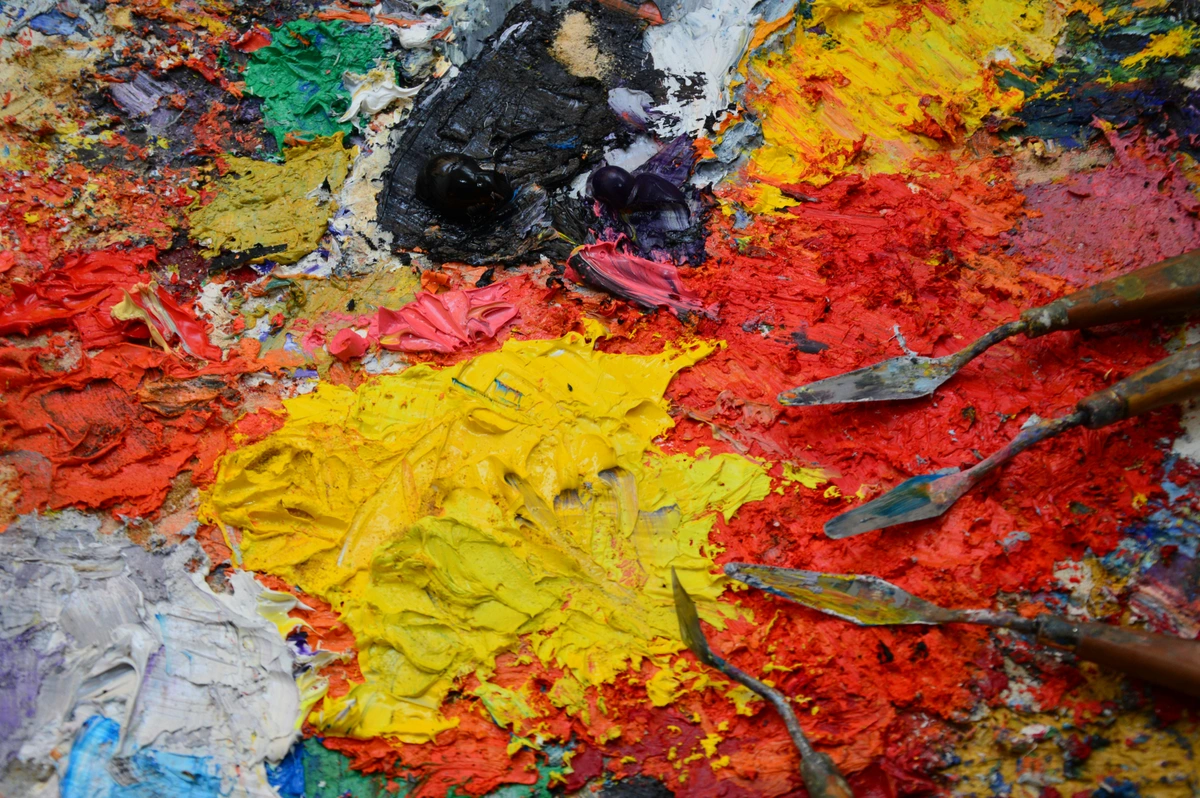
Tools and Techniques I Swear By
While inspiration fuels the palette, tangible tools and techniques are essential for bringing those ideas to life on the canvas. Beyond my trusty best acrylic paint brushes for artists and what is a palette knife and how to use it, I've got a few go-to methods for solidifying a palette:

- Digital Mood Boards & Color Generators: Pinterest, Procreate, or even just a simple image editor can be fantastic for collecting images that share a similar color vibe. I extract the colors, test them next to each other, and see what feels right. Digital tools like Adobe Color, Coolors.co, or Paletton can even help you generate harmonies from a single image or explore color temperatures and accessibility, though I always take these as starting points, not final solutions. It's low-stakes experimentation, allowing you to iterate quickly before committing to paint. I particularly love using the eyedropper tool in Procreate to pull subtle hues from a photograph and then building a palette directly from those unexpected gems. Digital generators help you quickly visualize potential color relationships and identify harmonious combinations that might not be immediately obvious on the physical color wheel. They offer a low-stakes sandbox for testing ideas before you even mix a drop of paint, saving you time and valuable pigment.
- Physical Swatching & Test Panels: Before committing to a large canvas, I'll take a small piece of paper, a canvas scrap, or even a dedicated test panel and mix my chosen colors. I try out different ratios, observe how they look wet vs. dry, and how they interact when layered. This is non-negotiable for me, especially to understand color relativity – how colors appear different when placed next to each other and influence each other's perceived hue, value, and saturation – and to test warm/cool interactions. This step is crucial for ensuring the colors truly 'sing' when together, rather than just existing in isolation. I might create small squares for direct comparison, larger rectangles for observing layering effects, or strips for value scales. It's also crucial for identifying potential "accidental mud" before it ruins a painting.
- The 'Squint Test': Stand back from your test panel (or even an evolving painting) and squint your eyes. This blurs the details and allows you to see the overall value and color relationships more clearly, revealing if the core composition of light and dark, and the major color masses, are harmonious. If it feels harmonious when squinted, you're on the right track.
Mastering Color Transitions and Blending
How you apply and blend your chosen colors is just as crucial as the selection itself. Techniques like glazes, scumbling, washes, and impasto can dramatically enhance cohesion. A thin glaze of your mother color over other hues can subtly unify them, creating an almost iridescent glow. Scumbling, a dry-brush technique, allows colors to peek through, creating soft, atmospheric transitions and optical mixing where the viewer's eye blends the colors. Thin washes of transparent color can also build subtle layers and unify disparate elements, much like a filter over an image. Remember, these layers are not just about adding color, but about creating depth and interaction that strengthens the palette's unity.
And impasto, with its thick, textured paint, can make colors interact on a physical level, adding dynamic depth. The choice of brush or tool also plays a role: a soft mop brush can create seamless blends, while a stiff bristle brush or a textured palette knife can create exciting broken color effects and rich texture, contributing to exploring texture: my favorite techniques for adding depth to abstract paintings. Mastering soft edges for seamless blends or hard edges for dramatic contrasts within your palette are also key ways to control the visual flow and emotional impact. Remember, how colors blend (or don't blend) can vary dramatically between mediums; oils allow for long, smooth transitions, while acrylics, with their faster drying time, demand quicker decisions and often more deliberate layering. Finally, consider the paint's sheen or finish – matte colors absorb light and can appear duller, while gloss finishes reflect light, making colors seem more vibrant and sometimes unifying a palette through a consistent reflective quality.

Navigating the Pitfalls: How I Stay on Track (Mostly!)
We've all been there – staring at a canvas, wondering where things went wrong. Oh, believe me, I've fallen into every trap imaginable. Here are a few that still try to trip me up, and how I (mostly) avoid them:
Too Many Colors in the Kitchen: The Chaos Trap
The biggest one. It’s so easy to add 'just one more' color, and then another, until your palette becomes a chaotic mess, like trying to cook a gourmet meal by throwing in every spice you own. My rule now: if a new color isn't absolutely essential to the emotional impact or visual story, it doesn't make the cut. Simplicity often breeds strength. Different paint mediums also influence this; while oils allow for endless blending, acrylics dry faster, making quick decisions and a limited palette even more crucial. While my experience is primarily with acrylics, the principle applies across all mediums. Just remember, your painting is not a competition to see how many tubes you can empty!

The Commitment Conundrum: Trusting Your Choices
Sometimes I'll choose a palette, start painting, and then halfway through, panic and want to introduce a whole new set of colors. That fear of commitment can leave me staring at a canvas, paralyzed by indecision, which is never a good place for creativity to bloom. This usually leads to disaster. Now, I try to really commit to a palette for at least the initial layers. If I absolutely hate it, I can always paint over it (hello, the power of imperfection: embracing accidents and evolution in my abstract art!). But giving it a fair chance – letting the colors interact and build – is crucial. Trust your initial instinct, or at least give it a fighting chance! It's like dating a new set of colors; you have to give them a chance to show their true selves before swiping left.
Ignoring the Depth: The Value Void
Value (lightness or darkness) is just as important as hue. You can have a beautiful set of colors, but if they all have similar values, the painting will look flat and uninteresting. It’s like listening to music played all at the same volume – no dynamics! I constantly remind myself to include a good range of lights, middles, and darks in my chosen palette to create depth and contrast. Strong value contrast creates visual interest and hierarchy, even in a monochromatic piece. Without it, your painting might just... float aimlessly.

Ignoring Undertones and Overtones: The Sneaky Mud Maker
This is a subtle one that often trips up beginners (and me, on an off day!). Every color has subtle undertones – a seemingly cool blue might have a tiny hint of green, or a warm red might lean slightly orange. When you mix colors without considering these underlying biases, you can inadvertently create muddy, dull results, even with hues that should be compatible. It's like mixing two beautiful, but slightly off-key, musical notes. Let's say I have a cool, Phthalo Blue and a warm Cadmium Yellow. If I mix them directly without considering the yellow's inherent warmth and the blue's slight green bias, I might end up with a somewhat dull, greenish-gray mud instead of a vibrant viridian. Understanding that Phthalo Blue can lean very green-blue, and Cadmium Yellow is distinctly warm, helps me anticipate that the resulting green will likely be lively and bright. My solution? Really observe your colors, especially in swatching. What happens when you put a warm blue next to a cool yellow? The interaction is everything, and understanding these nuances is a deep dive into my approach to color mixing: creating vibrant palettes in abstract painting.
The Accidental Mud: Keeping Colors Clear
Ah, the dreaded accidental mud! This happens when colors mix unintentionally on your palette or canvas, especially with too much over-blending or using dirty brushes, resulting in dull, lifeless hues that often have a strangely unpleasant, brownish-gray quality. This brownish-gray is often the result of mixing complementary colors unintentionally, or over-mixing too many hues that neutralize each other. This often happens when you're mixing multiple colors on your palette, using a brush that hasn't been fully cleaned, or overworking areas where colors meet, especially with mediums like acrylics that dry quickly and can trap muddiness. To avoid this, I always keep my palette knives and brushes clean when switching colors, and I try to avoid mixing more than three colors at once. Sometimes less truly is more, especially when trying to maintain vibrant, clear colors. If mud does occur, try to neutralize it with a tiny touch of its complementary color, or, if extensive, allow it to dry and then glaze over it with a transparent, vibrant hue. A little planning in your mixing areas can save you a lot of headache (and wasted paint!).
My Signature Palettes: A Glimpse into My Artistic Soul
To illustrate these principles in practice, here are a few of my most cherished and frequently revisited color combinations. These aren't rigid recipes, but starting points that often inspire new series, each designed to evoke a specific feeling or tell a particular story.

- Deep Teal, Muted Gold, and a Touch of Warm Gray: This combination feels luxurious, contemplative, and slightly mysterious. The deep teal provides a sense of profound calm and introspection (the psychology of blue in abstract art: calm, depth, and emotion is at play here), the muted gold adds warmth and a hint of glamour (often with subtle orange or yellow undertones), while the warm gray grounds it, preventing it from becoming too opulent. This palette often leans towards an analogous harmony with a complementary accent from the gold, evoking a sense of deep thought and quiet power, like an ancient, forgotten treasure. To achieve the muted gold, I might mix a Cadmium Yellow with a touch of Burnt Sienna and then desaturate it with a minuscule amount of my deep Indigo (effectively adding a touch of gray/complementary color), creating an earthy, rich tone. Imagine a large canvas where deep teal washes create an expansive, serene background, and delicate brushstrokes of muted gold catch the light, reminiscent of hidden veins in rock, all unified by a whisper of warm gray in the shadows. This is a journey into quiet opulence.
- Burnt Orange, Deep Indigo, and Creamy White: This is an energetic, yet balanced, palette. The burnt orange provides warmth and vibrancy, almost a fiery passion (the fiery heart: how red ignites passion and energy in my abstract compositions is close here), the deep indigo adds a cool, sophisticated contrast and stability, and the creamy white offers breathing room and freshness. This is a strong complementary harmony, reminding me of vibrant sunsets over a calm, evening sea. I often use the indigo as a grounding force, allowing the burnt orange to dance and expand, with the creamy white softening the edges and inviting the eye to rest. For the burnt orange, I might start with a Cadmium Orange, add a touch of Quinacridone Red for depth, and then mute it slightly with a hint of Burnt Umber to give it that earthy, deep quality.
- Soft Rose, Earthy Green, and a Hint of Mauve: This palette is much softer, reminiscent of a spring garden at dawn. It's gentle, organic, and evokes a sense of renewal and subtle beauty. The soft rose suggests tenderness and innocence, the earthy green brings a connection to nature and growth, and the mauve adds a touch of wistful sophistication. This leans towards an analogous harmony with gentle shifts in tone, perfect for when I want to create a more introspective or soothing piece, often seen in my nature-inspired works like this one:
- Charcoal Black, Stark White, and a Single Punch of Cadmium Red: This minimalist palette focuses entirely on value, texture, and the raw power of a single accent color. The stark contrast between the neutrals and the vibrant red creates dramatic impact and intense emotional focus, proving that the expressive power of charcoal in abstract art isn't limited to monochrome. This is essentially a monochromatic palette with a singular, high-impact complementary (or near-complementary) accent, a shout in the silence, a sudden, undeniable burst of energy and passion within a field of quiet contemplation. Imagine large, sweeping gestures of black and white creating a dynamic, almost calligraphic landscape, suddenly interrupted and energized by a single, sharp line or intense shape of Cadmium Red. This palette is about stark drama and undeniable presence.

- Deep Moss Green, Rich Umber, and a Whisper of Pale Lavender: This is my "Forest Floor & Misty Dawn" palette. It evokes the quiet, damp serenity of an ancient forest after rain, with hints of unexpected floral delicacy. The moss green provides the dominant, grounding hue, the umber adds earthy depth and shadow, and the pale lavender offers a surprising, almost ethereal highlight – a fleeting moment of light catching dew. It's a predominantly analogous palette, but the lavender (a cool red-purple) acts as a subtle, unexpected contrast, making the greens feel even richer. For the moss green, I'd typically mix a deep Phthalo Green with some Raw Umber and a touch of Yellow Ochre, then desaturate it a bit with a tiny amount of complementary red. I use this when I want to create a sense of grounded tranquility with a touch of otherworldly magic.
- Electric Turquoise, Deep Navy, and Flecks of Magenta: My "Cosmic Glow" palette. This combination is all about vibrant, expansive energy and a sense of infinite possibility. The deep navy provides the vastness of space, the electric turquoise adds a charged, luminous energy, like distant nebulae, and the magenta acts as tiny, explosive bursts of starlight or cosmic dust. It leans towards a split-complementary harmony, creating intense visual vibration without feeling chaotic. I find this palette incredibly invigorating, perfect for capturing the awe and mystery of the universe, with dynamic compositions that feel both fluid and electric.
Evaluating Your Palette: Beyond the Brush
So you've chosen your colors, you've started painting... but how do you know if your palette is working? And what if it's not? This is where objective evaluation comes in, even for something as subjective as abstract art. Besides the 'squint test' I mentioned earlier, I employ a few other strategies to course-correct and ensure my colors are truly singing.
- Step Back, Way Back: I literally walk away from the canvas for a few minutes, or even a few hours. When I return, I look at the painting from across the room. Distance helps to reveal the overall impact and balance of the colors, rather than getting lost in details. Do the colors hold together as a single entity, or do they fragment?
- Flip It Upside Down: Another old trick, but a good one! Turning your painting upside down removes the subconscious recognition of forms or compositions, allowing you to see the color relationships and value distribution purely on their own terms. Does the color balance still feel right?
- Photograph in Black and White: Take a quick photo of your painting and convert it to black and white. This instantly highlights your value structure. If the painting looks muddy or lacks definition in monochrome, you know your value range needs adjustment, even if your hues are beautiful. This is a non-negotiable step for me, as strong value contrast is the backbone of any compelling composition.
- Ask "What If?": If a color feels off, instead of instantly adding another color, ask yourself: What if I lighten this color? What if I darken it? What if I desaturate it a little? Or what if I use a thin glaze of my "mother color" over it? Often, the solution lies within your existing palette, not outside it. It’s about refining, not restarting.
- Look Under Different Lighting: How your colors appear can change dramatically under different lighting conditions – natural daylight, warm incandescent, or cool LED. Observe your painting in various lights to ensure it maintains its intended mood and cohesion. This is especially important if you're aiming for a specific emotional impact, as light profoundly influences how we perceive color temperature and value.
- Embrace Accidental Harmony: Sometimes, a seemingly random color choice or an unexpected mix can yield a delightful, cohesive result. Don't immediately dismiss happy accidents! Learn to recognize these unplanned harmonies and integrate them deliberately into future work. It’s a bit like finding a new melody by chance – sometimes the best discoveries are serendipitous.
These checks, combined with a willingness to adjust, are vital for transforming a good idea into a truly cohesive work.
Frequently Asked Questions About Abstract Color Palettes
Q1: How many colors should I use in an abstract painting?
A: There's no hard and fast rule, but I usually aim for a limited palette of 3-5 main colors, plus black and white. This encourages cohesion and forces you to explore mixing and layering rather than just adding more tubes. It's about quality, not quantity. Think of my "4-color challenge"! This approach helps prevent your colors from becoming chaotic and supports a strong, unified statement. For more on mixing, see my approach to color mixing: creating vibrant palettes in abstract painting.
Q2: How do I find inspiration for new abstract color palettes?
A: Look everywhere! Nature (the subtle hues of a forest floor, the vibrant chaos of a wildflower meadow), architecture (rust against brick, neon reflections), textiles, photography, even other artists' work (not to copy, but to analyze their color choices). Digital mood boards and physical swatching are fantastic tools for capturing and testing ideas. Pay attention to colors that evoke a strong emotional response in you. Don't be afraid to try a "Constraint-Led" approach, limiting yourself to unexpected sources like colors from a favorite book cover, a piece of old pottery, a specific gemstone, or even colors within a precise CMYK range. You might find some surprising ideas in the ultimate guide to abstract art movements.
Q3: What's the difference between tint, shade, and tone?
A: Good question! It's all about what you add to a pure hue:
- Tint: Adding white to a hue, making it lighter and less intense (e.g., pink is a tint of red).
- Shade: Adding black to a hue, making it darker and often more dramatic (e.g., maroon is a shade of red).
- Tone: Adding gray to a hue, which reduces its saturation (intensity) and can subtly shift its temperature, creating a more muted, sophisticated version of the color (e.g., dusty rose is a tone of red).
Understanding these distinctions is key to building depth and nuance in your cohesive palette.
Q4: How do I use a color wheel effectively for abstract art?
A: Think of the color wheel as your visual compass, not a rigid rulebook. For abstract art, it's fantastic for quickly identifying harmonious relationships: analogous (next to each other for calm), complementary (opposite for high contrast), and triadic (evenly spaced for vibrant balance). Use it to plan your initial palette, then let intuition take over. It’s a tool for understanding potential interactions and emotional impacts before you even touch paint.

Q5: What if I don't like my chosen palette halfway through a painting?
A: This happens to everyone! First, try the 'squint test' and 'step back' methods to see if it's just the details throwing you off. If it still feels wrong, don't be afraid to adjust. Sometimes just introducing a different value or saturation of one of your existing colors, or adding a thin glaze of your 'mother color' can transform it. If all else fails, take a break, or even paint over it. It's part of the power of imperfection: embracing accidents and evolution in my abstract art – sometimes a "mistake" leads to a breakthrough. Remember, the canvas is forgiving.
Q6: Should I always use warm or cool colors in abstract art?
A: Not at all! The most compelling palettes often have a mix of warm and cool elements to create contrast and visual interest. Warm colors (reds, yellows, oranges) tend to advance, while cool colors (blues, greens, purples) tend to recede. Using both can create incredible depth and dynamic interplay, creating a beautiful push and pull across the canvas. The key is balance and intentionality within your chosen palette. Think of it as a dialogue, not a monologue.
Q7: How do different paint mediums affect my color palette choice?
A: Absolutely! Each medium has unique properties that impact how colors mix, behave, and appear. With acrylics, which dry quickly, I often work with a more limited palette and focus on layering and glazes rather than extensive wet-on-wet blending. This demands quicker decisions and often more deliberate layering to build depth. Oils, with their longer drying time, allow for more subtle blending, nuanced transitions, and the creation of soft, atmospheric effects. Watercolors rely heavily on transparency and luminosity, so I focus on washes and building layers of dilute color to achieve depth and cohesion, using the white of the paper as a vital component of the palette. Gouache, being opaque, offers rich, flat color applications, similar to acrylics but with a softer, matte finish. Always consider your medium's inherent characteristics when building your palette and planning your application.
Q8: How do I choose colors for a commission if the client has specific preferences?
A: This is a fantastic challenge! I start by having a very clear conversation with the client about the mood, dominant colors, and overall feeling they envision. I'll then create a few small test swatches or digital mock-ups based on their input, showing how their preferences can be integrated into a cohesive, artistic palette that still aligns with my style. It's a balance of respecting their vision while guiding them towards a harmonious outcome. Often, I'll identify a 'mother color' that bridges their preference and my artistic intent, ensuring their input feels honored and the final piece remains a strong example of my work.
Your Palette, Your Voice: A Final Invitation
Ultimately, creating a cohesive color palette for your abstract painting isn't about following a rigid formula. It's about finding your unique voice, your way of speaking through color. It's a journey of experimentation, a dance between intuition and informed choice. Don't be afraid to make mistakes, to try wild combinations, and to discover what truly resonates with you. Your art is an extension of yourself, and your palette is one of the most powerful ways to express that. So go forth, explore, and let your colors sing their own beautiful song! Now, take this knowledge and experiment. Grab a small canvas, select your three 'mother' colors, and let your intuition guide you. And remember, these principles apply beyond the canvas too – you can even learn how to create a cohesive color palette for your home around abstract art.
If you're curious about my own work and how these principles come to life on my canvases, feel free to browse my available artworks or explore my timeline to see the evolution of my artistic journey. So, what are you waiting for? Grab your paints and try building a palette based on one of the approaches discussed. Experiment with your 'mother color' concept on a small scale today! Your masterpiece awaits!


