
Color Theory in Art: Ultimate Guide to Principles, Psychology & Mastery
Master color theory in art: explore scientific principles, psychological impact, harmonies, and practical application across mediums. Learn how artists use color for emotional depth & creative innovation.
The Ultimate Guide to Color Theory in Art: Principles, Psychology, and Creative Mastery
Honestly, color. It’s more than just a visual treat; it’s a direct line to the soul, a language without words that hits us with the force of a whisper, a shout, or a whole symphony. For me, stepping into a world bathed in particular hues feels like stepping into a different emotional landscape altogether. There’s a particular quiet thrill in how a deep, shadowy blue can make me feel instantly contemplative, or how a splash of pure, audacious orange can ignite a sudden, unbidden burst of joy. It’s more than just what pigment goes where; it’s about connecting, deeply and instantly, with an artwork. Whether I'm the one wrestling with a tube of cadmium red or just standing, captivated, in front of a canvas, color speaks. And understanding how it speaks, the sophisticated system behind those vibrant whispers – that's what truly liberates an artist. It transforms what could be a lucky accident into intentional, powerful communication. I remember this one time, trying to mix the perfect cerulean for a sky, and ended up with a muddy grey-blue that looked like a storm cloud had, well, vombled on my canvas. It was frustrating, to say the least, but it hammered home that there’s a science, a method, to this glorious madness. This guide – well, it’s my attempt to pull back the curtain on this amazing language, exploring its scientific backbone, its mysterious psychological power, how we actually use it (and sometimes, delightfully, break its rules!), its evolution through history, and its application across different mediums and design fields. From the simple elegance of the color wheel to the wonderfully complex dance of advanced harmonies, I want to show you how artists – and yes, me too – wield this vibrant language to create works that, hopefully, stick with you.
The Expressive Power of Color in Art: Perception and Psychology
You know that feeling, right? That immediate, gut-level response to a color? A bright, sunny yellow sparks joy; a deep, brooding blue pulls you into introspection. Color does that. It hits us hard, often before our conscious mind even registers it. This isn't some happy accident; it’s a beautifully complex interaction of light, pigment, and the wonderfully intricate way our eyes and brains work – all meticulously, sometimes obsessively, explored within color theory. It’s the very foundation of how this visual language translates into an emotional dialogue. I remember learning about our cones, those specialized cells in the retina that pick up red, green, and blue light. It’s such a fundamental biological mechanism, yet it underpins almost everything we experience emotionally through color. For me, grasping these principles felt like being handed a secret decoder ring. It transforms those intuitive "this feels right" color choices into a much more articulate, refined visual language. Even when I'm just letting rip in a spontaneous burst of creativity, having that underlying knowledge of how colors behave, how they push and pull, allows me to subtly nudge the mood, highlight a focal point, or just get the compositional balance just right.
Think about it historically: the Impressionists, bless their light-chasing hearts, practically dissolved forms into pure chromatic patches, using broken color to capture those fleeting moments of light and atmosphere. Their goal was to depict how light felt on objects, using color rather than sharp lines. I always marvel at how they used color to create luminosity, almost as if the canvas itself was glowing. Then the Post-Impressionists came along, and they were like, "Hold my beer," using color subjectively, often to just dump their emotional states onto the canvas, reality be damned. Think Van Gogh's swirling, intense blues and yellows, expressing his inner world. And then, wow, Fauvism and Expressionism took it to another level, explicitly making color the star of the emotional show. Fauvist artists, pioneers of Fauvism, used bold, non-naturalistic colors, not to describe reality but to express raw emotion and sensation, often directly from the tube. Similarly, Expressionists employed vivid, often distorted colors to convey intense psychological states and societal critiques. It's like they knew, deep down, that color has this unmediated, powerful impact, and they just went for it. It still gives me shivers sometimes.
The Fundamental Properties of Color and the Color Wheel: Core Principles
To truly get cozy with color, to really make it sing, you need to understand its basic building blocks. For me, these weren't just fancy terms; they felt like unlocking the secret code to truly mastering any color I encountered. They're the triumvirate of artistic decision-making, in my opinion. I remember trying to paint a sunset once, and all my reds looked flat. It wasn't until I realized I needed to boost their value – make them lighter and brighter in certain areas – that they really began to glow. That little revelation changed everything for me, turning frustration into a quiet triumph.
Hue, Saturation, and Value: The Triumvirate
- Hue: This is the most straightforward, right? It's simply the name of the pure color – red, blue, yellow – before any alterations to its lightness or intensity. It’s the "what color is it?" question that starts every conversation.
- Saturation (or Chroma): Ah, saturation. This is the intensity, the purity, the oomph of a color. A highly saturated color practically leaps off the canvas, demanding your attention. Desaturate it, and it softens, becomes more muted, often creating a sense of calm or something more subtle, more introspective. It's how you control how 'loud' or 'quiet' a color is, affecting its visual weight and presence.
- Value (or Lightness/Darkness): If I had to pick one, value might be the unsung hero. This is how light or dark a color is, from dazzling white to abyssal black. And honestly, it’s often more critical than hue itself for creating impact, contrast, depth, and form. Without strong value shifts, even the most vibrant hues can fall flat. It’s what gives a painting its bones, its structural integrity.
The Color Wheel: Your Navigational Compass
And where do we start organizing all these delightful hues? With the trusty color wheel, of course. It’s such a simple, elegant tool, a foundational piece of knowledge that just keeps giving. At its heart, you've got your primary colors: red, yellow, and blue. These are the OG colors, the ones you can't mix from anything else, the pure essence. This is where the magic of color mixing truly begins.
Then, mix two primaries, and boom, you get your secondary colors: orange, green, and violet. They're like the cool kids who got together. Take a primary and an adjacent secondary, and you're into tertiary colors territory (think red-orange, yellow-green, blue-violet). This systematic layout isn’t just for identifying colors; it’s a roadmap for navigating the vast, beautiful spectrum and understanding how to create an endless array of hues from a limited palette.
Color Temperature: Warmth, Coolness, and Spatial Illusion
Beyond the basic recipe, the color wheel also spills secrets about color temperature. I broadly categorize them into warm colors (reds, oranges, yellows) and cool colors (blues, greens, violets). My personal experience is that warm colors almost physically advance in a composition, bringing energy, passion, sometimes even aggression. Cool colors, on the other hand, tend to recede, inviting calm, suggesting distance, or evoking a sense of tranquil coolness. It's a powerful trick for playing with spatial illusion and emotional pull, an integral part of the larger elements and principles of art that I’m always pondering.
Now, for those of us who dabble in both traditional and digital realms (and who doesn't these days?), understanding color models is a must. RGB (Red, Green, Blue) is an additive model; think light-emitting devices like your phone screen or TV. All three at full blast? White. Conversely, CMYK (Cyan, Magenta, Yellow, Key/Black) is a subtractive model, for printing. These pigments absorb light, and ideally, all together they would give you pure black, though in practice, pigment impurities often result in a deep, muddy brown or a rather disappointing grey. I’ve had my fair share of "printer-ate-my-colors" moments – the screen promised vibrancy, the printer delivered dullness – so reconciling these models is crucial to making sure what you see on screen is what you get on paper. It's a never-ending quest for color accuracy, let me tell you.
And then there's color constancy. Our clever brains, bless them, perceive colors as consistent even when the lighting shifts. It’s super helpful for not freaking out that your blue shirt suddenly looks purplish under fluorescent lights, or that a red apple still looks red whether in bright sunlight or soft indoor light. But for an artist? It’s a little devil. That color on your palette might look utterly different once it’s on the canvas and the light changes. It forces careful observation, really seeing, not just assuming. Plus, don't even get me started on surface texture. A rough surface scatters light, making colors appear less saturated, lighter. A smooth, reflective one? It makes them sing, deepens their saturation. It’s all part of the glorious, maddening dance of color. Understanding these fundamental properties and how they interact is the first step towards orchestrating truly compelling visual narratives.
Beyond these standard properties, a truly versatile understanding of color acknowledges that sometimes, the most compelling compositions emerge not from perfect harmony, but from intentional discord. Just as a perfectly balanced chord can be beautiful, a dissonant one can create powerful tension and meaning, a concept we’ll explore further when we talk about breaking the rules.
The Historical Evolution of Pigments and Neurological Perception
It's easy to take our vibrant palettes for granted today, but the availability of pigments has profoundly shaped artistic possibilities throughout history. For centuries, artists were limited by what nature (and often their patrons’ wallets) could provide. Think of the precious lapis lazuli for ultramarine blue, or the reliance on earth tones like ochres and umbers. Imagine medieval manuscript illuminators painstakingly grinding minerals for their vibrant, yet limited, palette. This limited range often necessitated inventive techniques, like glazing or tempera, to achieve desired effects and greater luminosity. The Renaissance, for example, saw artists mastering complex layering to achieve depth and luminosity with a relatively small range of expensive, natural pigments like vermilion (mercuric sulfide), malachite (copper carbonate), and lead white.
Then, the 19th and early 20th centuries brought a color revolution with the advent of new synthetic pigments. Suddenly, artists had access to a dazzling array of stable, affordable, and incredibly vibrant hues like Cadmium Yellow, Cadmium Red, and Alizarin Crimson. This technological leap completely unleashed artists, allowing for the audacious choices that defined movements like Fauvism and Expressionism. The very understanding and application of color theory were profoundly reshaped, moving from the subtle blending of natural tones to bold, direct, and often non-naturalistic use of color. It's a vivid reminder that art and science are always in conversation.
Beyond the physical properties and historical evolution of pigments, it’s worth a quick thought about the neurological basis of color perception. Our eyes, with their rods and cones, send signals to the brain, which then constructs our subjective experience of color. It’s not just about sensing light; it's about interpreting it. Different areas of the brain process hue, saturation, and value, allowing us to perceive not just a raw input, but a coherent, emotionally charged visual. For me, understanding this intricate dance between light, biology, and consciousness makes the act of choosing a color feel even more profound – like I’m tapping directly into the viewer's neural pathways, trying to conjure a specific internal world.
Color Harmonies: Principles of Pleasing and Purposeful Combinations
Once you've got a handle on individual color properties, the real symphony begins: understanding how colors talk to each other. How do they form a cohesive arrangement, or sometimes, a glorious cacophony? That’s where color harmonies (or color schemes) come in. These aren't just arbitrary rules; they're established frameworks, tried and true guidelines for combining colors to achieve specific aesthetic and emotional effects. For me, they're like different conversation starters, each one leading to a unique visual dialogue that guides the viewer's eye, creates specific emotional responses, or establishes visual hierarchy within your work. While these schemes provide a fantastic foundation, remember that artistic mastery often involves knowing when and how to intentionally bend or break these rules for heightened effect. If you want to dive even deeper into this fascinating interplay, I've previously explored The Definitive Guide to Understanding Color Harmonies in Abstract Art.
To master the art of color interaction, these foundational schemes are your best friends, each serving a unique purpose:
Harmony | Description | Visual on Color Wheel | Typical Effect |
|---|---|---|---|
| Monochromatic | Derived from a single hue, utilizing variations in saturation and value (tints, tones, shades). | A single slice of the wheel, extending from the center to the edge. | Sophisticated, unified, cohesive, strong singular mood. |
| Analogous | Comprises colors situated next to each other on the color wheel (e.g., blue, blue-green, green). These colors share a common hue. | Three or more adjacent slices on the wheel. | Harmonious, comfortable, naturally integrated. |
| Complementary | Consists of two colors directly opposite each other on the color wheel (e.g., red and green, blue and orange). These pairs create maximum contrast and vibrancy. | Two colors directly across from each other on the wheel. | Dynamic, energetic, high contrast. |
| Split-Complementary | A variation of the complementary scheme, using a base color and the two colors adjacent to its complement (e.g., red with yellow-green and blue-green). | One base color and the two colors on either side of its complement, forming a narrow 'Y' shape. | High contrast with more nuance and less tension than direct complementary. |
| Triadic | Involves three colors evenly spaced around the color wheel (e.g., red, yellow, blue). | Three colors forming an equilateral triangle on the wheel. | Inherently balanced, bold, vibrant, commanding attention. |
| Tetradic (Rectangular) | Utilizes four colors arranged into two complementary pairs, forming a rectangle on the color wheel. | Four colors forming a rectangle on the wheel (two complementary pairs). | Rich, diverse, complex; requires careful management of dominance and balance. |
| Square | Similar to the tetradic, but with four colors evenly spaced around the color wheel, forming a square. | Four colors forming a square on the wheel. | Vibrant, balanced, often with uniform tension. |
Beyond these core schemes, artists often explore "advanced harmonies" which involve variations within these structures or more complex combinations, often guided by intuition and a deep understanding of how subtle shifts can dramatically alter a composition's feel.
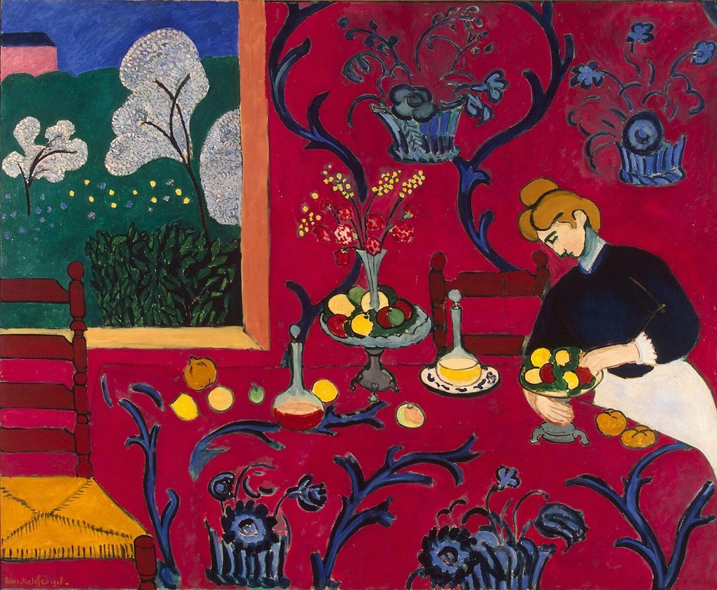
And artists, bless their hearts, have been playing with these harmonies for ages. In the Renaissance, they were obsessed with chiaroscuro, those dramatic light-and-dark contrasts that made everything pop with three-dimensionality. It’s a reliance on value, really, and it subtly shapes the color harmonies by manipulating light. Take Henri Matisse, for instance, a pioneer of Fauvism. He practically threw naturalistic color out the window in favor of bold, expressive hues, often using complementary and analogous schemes with such striking intensity. His work "The Red Room (Harmony in Red)" is a fantastic example. It’s this dominant, almost enveloping red, harmonized so beautifully with subtle blue-green accents. This red and blue-green combination works so well precisely because blue-green is roughly complementary to red, creating that vibrant tension, while slight variations within the blue-green family offer a soothing, analogous counterpoint. It just works, creating such a profound sense of unity and vibrancy that, honestly, it blows me away every time.

For me, the split-complementary scheme is a personal favorite. It offers the dynamic energy of a complementary pair but with a softer edge, allowing for more subtle storytelling. I once created an abstract piece with a dominant orange, using blue-green and blue-violet accents. The orange screamed, but the cooler colors provided just enough complexity and calm to make it feel vibrant without being overwhelming. It was an unexpected triumph.
But here’s the thing: while harmonious combinations are often what we seek, sometimes, artists (and I've been guilty of this myself, in the best way possible) intentionally employ discordant color schemes. These are the colors that clash, that create a visual tension, a subtle sense of unease. It’s not a mistake; it’s a deliberate, powerful choice to convey a specific narrative, a psychological state, or just some dramatic emphasis. It’s art’s way of saying, "Hey, pay attention, something's not quite right here," without needing a single word. Many Expressionist artists, for example, were masters of using jarring, clashing colors to depict emotional turmoil or comment on society. They deliberately made things unsettling to provoke a strong reaction, and sometimes, that’s exactly what art needs to do.
Sometimes, I find myself drawn to those "imperfect" harmonies, the ones that perhaps don't perfectly align on the color wheel but create an unexpected, intriguing conversation. It’s like a slightly off-key note in a song that just makes the melody more interesting. The goal isn't always outright beauty; sometimes, it's about making you feel something, even if that feeling is a little bit squiggly. These harmonies, whether pleasing or purposefully dissonant, are the bridge from simply seeing color to truly experiencing it.
The Psychology of Color: Emotional and Cultural Resonance
So, we've explored how colors work together, but the influence of color, for me, isn't just about what hits the eye; it's what hits the gut, the heart, the deepest parts of our being. Colors have this uncanny ability to stir feelings, yank memories, and even get our bodies to respond. A quickened pulse, a sense of calm, a sudden surge of energy – all from a blob of paint, amazing, isn't it? While some associations are pretty universal, I’ve learned the hard way that the psychological impact of color is hugely shaped by cultural context, personal experience, and individual interpretation. So, while we can talk about general principles, how you actually receive a color can be incredibly subjective – what’s serene for one might be sorrowful for another.
Take white, for example. In many Western cultures, it’s all purity, innocence, and new beginnings – think wedding dresses or christenings. But travel to some Eastern traditions, like in India or China, and it’s a color of mourning or death, worn at funerals. Yellow, often my go-to for happiness, can signify cowardice or sickness elsewhere. As an artist, I constantly have to ask myself: who am I talking to? What baggage might this yellow carry for that person? It’s a delicate dance, ensuring my message lands effectively. This is why you see brands obsessing over color palettes; they’re trying to tap into very specific emotions and build recognition, a precise emotional fingerprint.
Even within the realm of art history, color symbolism shifts. In the Renaissance, for instance, colors often carried explicit religious or allegorical meanings: blue (derived from costly ultramarine) symbolized divinity and truth, frequently used for the Virgin Mary's robes, while red often represented Christ's passion or earthly love. During the Baroque era, artists used deep, rich, often dramatic color palettes, employing strong contrasts of light and shadow (chiaroscuro) and vibrant hues to evoke intense emotion and grandiosity, reflecting the period's theatricality. These aren't just aesthetic choices; they're embedded with layers of meaning, sometimes subtle, sometimes overtly declarative.
Beyond direct associations, the phenomenon of simultaneous contrast is something that still fascinates me, and frankly, sometimes trips me up. It’s when two colors next to each other subtly (or not so subtly) mess with each other’s appearance. Imagine a quiet gray square. Place it on a sunny yellow background, and suddenly, that gray might pick up a ghost of purplishness, almost vibrating with an unsettling hum. Move it to a deep blue, and it might just glow with a reddish tint. It's a visual trick, really, but one that artists must consider meticulously. The perceived quality of a color can dramatically shift based on its chromatic neighbors. It's a visual dialogue where each color subtly alters how we perceive its neighbor. For a deeper dive, I’ve also pondered The Psychology of Color in Abstract Art: Beyond Basic Hues.
On a personal level, I find that my own interpretation of colors is deeply intertwined with my memories and experiences. The deep greens I gravitate towards aren't just "nature" to me; they're the quiet of a forest walk, the feeling of grounded calm, sometimes even a touch of melancholy from a forgotten rainy day. That bright orange might be the audacious spirit of my abstract pieces, but it’s also the warmth of a Dutch summer sunset. My palette choices are never just intellectual; they're an outpouring of my inner landscape, filtering through my personal lens. I remember once, trying to capture the feeling of a particularly intense thunderstorm – a mix of awe and fear. I instinctively reached for a palette of deep indigos, bruised purples, and electric, almost sickly, greens. It wasn't 'realistic' storm colors, but they perfectly conveyed the emotion of it for me, the sense of primal power and underlying tension.
Common psychological associations of various hues include (though always remember, your mileage may vary!):
- Red: Passion, energy, anger, danger, and, of course, love. It's a primal, highly stimulating color that always demands attention, like a sudden shout in a quiet room.
- Blue: Calm, serenity, stability, trust. But also, sometimes, a deep sadness or melancholy. It evokes the vastness of skies and oceans, a quiet, expansive feeling, like a sigh of relief.
- Yellow: Happiness, optimism, intellect. But tread carefully, it can also hint at caution or sickness. It's the spark of an idea, or the uneasy glow of fever.
- Green: Nature, growth, harmony, renewal. Or, if I’m honest, sometimes a touch of envy. It’s incredibly versatile, from a lush forest to a creeping sense of unease.
- Orange: Warmth, enthusiasm, creativity, excitement. It's often friendly, inviting, like a good conversation or a vibrant sunset that fills you with wonder.
- Purple: Royalty, mystery, spirituality, and luxury. It sits uniquely between red's passion and blue's calm, often feeling a bit magical or deeply introspective.
- Black: Power, elegance, sophistication. But also death, evil, or mourning. It’s the ultimate absence, or, paradoxically, the potent presence of all colors, depending on how you wield it – a void or a statement.
- White: Purity, innocence, cleanliness, and simplicity. For me, it’s a blank slate, a fresh start, the presence of all light, a whisper of potential.
I consciously employ these associations to guide your emotional journey through my work. If I want you to feel a serene reflection, I’ll lean heavily on blues and greens. If I want to ignite excitement, it’s reds and oranges all the way. It’s like being a conductor, and color is my orchestra.
And on a more practical note, I always try to be mindful of color vision deficiency (color blindness). It’s easy to forget that not everyone sees the world in the same way. So, I often consider using strong value contrasts in addition to just hue differences. It’s about ensuring the message, the feeling, gets across to everyone. A little trick I use is converting my digital work to grayscale to check value contrast. If it still works in black and white, I know I'm on the right track for inclusivity. There are also fantastic online tools and software plugins that can simulate various types of color blindness, allowing artists to preview their work through different visual filters and make more informed, accessible choices. Creating palettes that work even if specific hues aren't perfectly distinguishable – by focusing on value and texture – that’s a challenge I embrace, striving for art that speaks to every eye.
Practical Application: Bringing Theory into Practice
So, we've talked theory, now let's get our hands dirty. Turning those abstract color principles into something tangible, something you can hang on a wall or gaze at on a screen, that’s the real work, isn’t it? It’s a continuous cycle of experimenting, failing, learning, and finally, hopefully, creating something impactful.
A fundamental distinction, one I grappled with early on, is between additive (light) and subtractive (pigment) color mixing. Most of us artists are playing in the subtractive sandbox, where pigments absorb wavelengths and reflect only what’s left. This is why mixing all your primary pigments usually results in a murky brown or black – quite the opposite of light, where combining all primary lights gives you white. The reason for this muddy outcome in subtractive mixing is that each pigment absorbs different wavelengths; the more pigments you mix, the more light is absorbed, leaving less to reflect back to your eye. I’ve definitely learned that lesson the hard way, ending up with mud where I wanted a vibrant violet! I remember vividly trying to mix a deep, rich purple for a night sky in a painting. I kept adding more blue and red, expecting a glorious jewel tone, but because I wasn't careful about the specific pigments' undertones and purity (a subtractive color nightmare!), I just ended up with a dull, bruised grey. It was a disheartening day, a true "palette of shame" moment, but it taught me invaluable lessons about the importance of understanding the chemistry of my paints, not just the theory. Achieving precise hues, especially those elusive secondary colors, often means a careful selection of initial pigments. Impurities, as I've found, are the enemy of vibrant mixtures. Different pigments also have varying degrees of opacity and transparency, a crucial factor when layering. For example, some cadmiums are incredibly opaque and vibrant, while a phthalocyanine blue is transparent and staining. Understanding these nuances can be the difference between a dull mix and a luminous jewel tone.
My go-to methods often involve glazing techniques, where I build up depth and luminosity with thin, translucent layers of paint over a dried underpainting. It's a patient process, but the way the light interacts with those layers, creating a kind of inner glow, is just magical. Then there’s impasto, which is just so satisfying – slathering paint on thickly to create texture, giving color a physical presence and casting subtle shadows that deepen its perceived value and vibrancy. Or scumbling, where I lightly drag an opaque layer over a dry one, creating this hazy, ethereal effect that totally changes the perceived color underneath. And speaking of changing over time, the real practical concern is color permanence and lightfastness. No one wants their vibrant masterpiece to fade into a ghostly whisper after a few years, right? It's a constant consideration when choosing materials, almost like planning for the artwork's long-term health.
Color Across Artistic Mediums and Digital Realms
Ensuring consistent color across different mediums – oil, acrylic, watercolor, pastel – and then trying to translate that to a digital display or print? Oh, boy, that’s a whole different beast. Each medium has its own personality, its quirks, often dictated by the very binder that holds the pigment, the physical properties of the pigment itself (like particle size or crystalline structure), and even the substrate (the surface you're painting on) plays a critical role with its inherent color and texture. For example, larger pigment particles might scatter more light, appearing less intense, while finely ground pigments in a smooth binder can create intense, saturated effects.
Oil Paints
Oil paints are my old friends; suspended in oil (like linseed or poppy), they offer incredible saturation, blendability, and those wonderfully slow drying times that let you work and rework, building subtle gradations and glazes for days. The oil binder itself often imparts a rich, deep luminosity. The texture of the canvas or wood panel underneath can subtly affect how the oil paint sits and reflects light.
Acrylics
Acrylics are the energetic, quick-drying newcomers; their acrylic polymer emulsion binder makes them versatile and vibrant, perfect for immediate, bold pieces. They dry fast, which can be a blessing or a curse! I've lost count of the times I've wished for just a few more minutes to blend an acrylic wash, only to have it set like concrete! Smooth surfaces like gessoed panels allow acrylics to pop, while textured papers can give them a more matte, integrated look.
Watercolors
Watercolors are all about luminosity through transparency, relying on the white of the paper to make them sing. Their gum arabic binder allows for delicate washes and layers, but precision is key. It’s a delicate balance, a quiet dance. The tooth of the watercolor paper directly influences how the pigment settles and how intense or soft the color appears.
Pastels
Pastels offer direct, intense color – almost like drawing with pure pigment with minimal binder – but they’re delicate, requiring a gentle touch for fixation, often layered for their subtle, soft effects. It’s like touching pure light with your fingers. The texture of the paper is paramount here, as it holds the pigment particles.
It’s a symphony of factors: pigment composition, the binder holding it all together, the surface itself, ambient light, your screen calibration, the printer you use. All these things dynamically influence how a color is seen. I’ve spent countless hours with color swatches, digital color profiles (the mysterious ICC profiles), and proofing methods, trying to tame these variations. I once spent a whole week trying to match a specific vibrant orange from a painting to a digital print – the screen said one thing, the printer another. It was a battle of wills, but ultimately, understanding the nuances of ICC profiles saved my sanity (and my orange!), reminding me that technology is only as good as our understanding of its limitations.
In the digital world, we have such precise tools. But even with all the sliders and filters, you still need to understand the underlying color theory. It’s like having a top-of-the-line camera; it won't magically make you a great photographer if you don't understand composition and light. The camera offers the tools, but your understanding of visual language crafts the image. Color grading in digital art and animation, for instance, is all about adjusting colors to conjure specific moods or styles, making a scene feel warm and inviting, or cold and stark. And Look-Up Tables (LUTs)? Think of them as pre-set color filters, quickly remapping color values to ensure consistency across different displays or for achieving specific cinematic looks. In photography, color theory is just as crucial for composition, mood, and making your subject pop.
For ensuring color consistency across applications, especially for archival purposes or when preparing my work for prints or exhibitions, systems like the Munsell Color System or the CIELAB color space are incredibly helpful. Don't worry, my brain still does a little flip when I think about them too hard, but it's good to know these scientific, standardized approaches exist because they provide objective tools for precise color communication, matching, and ensuring my vision translates accurately across the board, from paint to pixel.
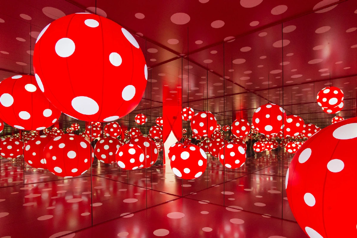
Color in Sculpture and Installation Art
The principles of color theory aren't confined to flat surfaces. In sculpture and installation art, color interacts dynamically with three-dimensional forms and the environment itself. I recall experiencing Yayoi Kusama’s "Dots Obsession" – the way the light and shadows played on those polka-dotted spheres in a mirrored room was mind-bending. The inherent color of the materials, the environmental lighting, and your movement around the piece all create such dynamic chromatic experiences. It’s a full sensory immersion, where the color isn't just painted on, but is part of the physical presence and interaction.
Beyond basic mixing, strategic color application allows me to:
- Create Depth and Space: This is one of my favorite tricks. Warm colors advance, cool colors recede. It's like a built-in illusionist! I can use it to create three-dimensionality on a flat canvas, guiding your eye through foreground and background.
- Direct the Eye: If I want you to look here, I’ll use high contrast, maybe some complementary colors or a dramatic value shift. It’s my visual spotlight, pointing you towards the heart of the composition.
- Establish Mood and Atmosphere: This is where the psychology comes in. A palette of muted, earthy tones tells a completely different story than one bursting with vibrant, high-saturation hues. It’s all about setting the emotional stage.
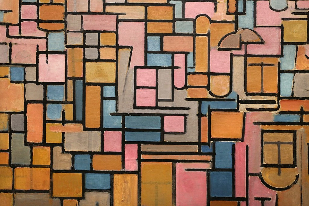
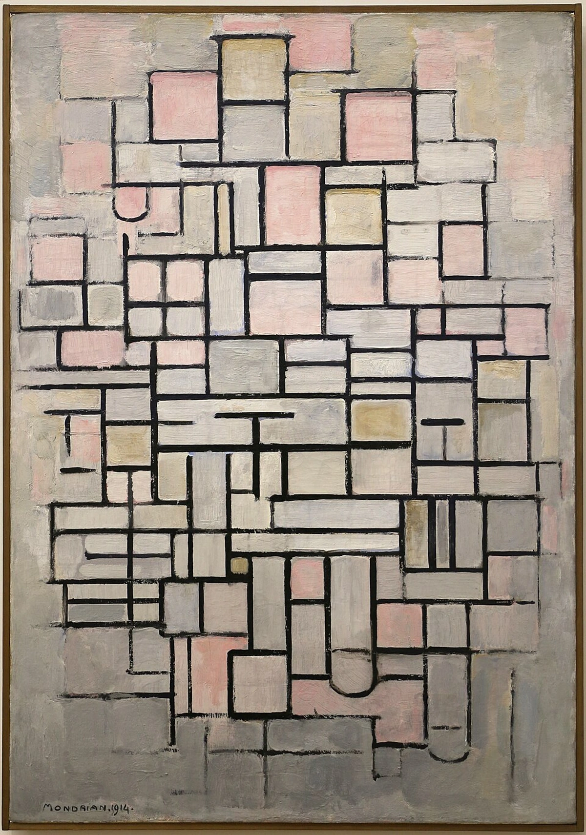
- Achieve Balance and Harmony: Even in my abstract work, balance is everything. Look at Piet Mondrian’s "Tableau III: Composition in Oval". It's not just about shapes; it’s the weight, intensity, and distribution of those colors that create such a compelling balance. It's a key element in understanding what is design in art.
credit, licence
For more insights into how artists weave color into their narratives, How Artists Use Color offers further illumination. Artists like Mark Rothko, with his massive color field paintings, showed how color alone, without any obvious subject, can be profoundly moving, almost spiritual. And Helen Frankenthaler, with her poured and stained canvases, really stripped color down to its raw, expansive power. The tactile nature of paint also plays a huge role; impasto creates shadows and highlights that literally shift the perceived hue and value. Gerhard Richter, with his rich, scraped surfaces, exemplifies how texture adds another layer of dynamic complexity to colors, inviting you to engage more deeply. It's like the colors are breathing.

Color in Illustration and Animation
Color theory isn't just for canvas and gallery walls; it's the lifeblood of illustration and animation. In these dynamic fields, color is used not only for aesthetics but also for storytelling, character development, and conveying complex emotional arcs. From the limited but impactful palettes of classic Disney animation to the vibrant, expressive worlds of modern digital illustration, every hue choice is deliberate. Artists use color to establish time of day, differentiate characters, highlight action, or even symbolize inner turmoil. Consider the way a character’s emotions might be reflected in a sudden shift of their surroundings’ color palette, or how a warm, inviting scene can become cold and alienating with a simple color grade. It's a powerful tool for visual narrative, often working subtly beneath the surface to manipulate our emotional response.
Color Theory in Other Design Fields
While this guide primarily focuses on fine art, it’s worth noting that color theory’s influence extends far beyond the canvas. In graphic design, for instance, carefully chosen palettes evoke brand identity and guide user experience, from the calming blues and greens of health apps to the vibrant reds and yellows of fast-food logos designed to stimulate appetite and urgency. Interior design uses color to manipulate perceptions of space, create mood, and enhance functionality – think a serene bedroom in cool, light tones to promote rest, versus a dynamic living room in warm, contrasting hues for energy and conversation. Even fashion design relies on color to convey trends, social statements, and emotional expressions, shaping how we perceive garments and the wearers themselves – a bold red dress for confidence, earthy tones for a connection to nature. It's a testament to the universal power of color that its principles are indispensable across such diverse creative fields.
Beyond the Rules: Intentional Deviation and Innovation
Here’s where it gets really fun, at least for me. While color theory gives us this beautiful, robust framework, true artistic mastery often involves knowing when – and how – to intentionally break those "rules." It’s not about rejecting theory; it’s about understanding it so deeply that you know exactly what effect a deliberate transgression will produce. It’s like knowing the grammar of a language so well that you can invent new poetic forms. This is the stage where practice meets intuition, creating something truly unique and, dare I say, a little rebellious.
I vividly remember a painting where I intentionally used a discordant combination of electric blue and muddy olive green. By all conventional measures, it should have been awful, but I was trying to convey a very specific sense of unease and a slightly unsettling beauty. And it worked. The tension created was exactly what the piece needed. Another time, I deliberately painted a figure with bright, almost neon yellow skin in a scene that was otherwise realistically rendered. The intent wasn't to portray illness, but to evoke a sense of otherworldly glow, a subtle spiritual presence that defied naturalistic representation. It was a risky move, pushing past what felt 'safe,' but the impact was exactly what I’d envisioned – unsettling, yet captivating, almost like a secret whispered directly to the viewer's subconscious.
Sometimes, I’ll also use non-local color – colors that simply aren't "real" for the subject – to heighten emotion or symbolic meaning. You see this everywhere in Fauvism and Expressionism, and it's a move I deeply admire. Fauvist painters like André Derain and Maurice de Vlaminck just slapped pure, unmixed color straight from the tube onto the canvas, using audacious, "arbitrary" hues to express raw emotion. They weren't describing reality; they were feeling it, and channeling that raw emotion directly through color. Similarly, German Expressionists such as Ernst Ludwig Kirchner or Franz Marc used vibrant, often unsettling colors to mirror inner turmoil or spiritual yearning, divorcing color from its descriptive job to serve purely expressive ends. It's a bold, liberating act that still resonates today.
This spirit of intentional deviation also extends into conceptual art, where the idea behind the color choice might be far more important than its aesthetic application. Here, color isn't just about what looks good; it's a medium for conveying a message, challenging perceptions, or provoking thought. The choice of a specific hue might be tied to a historical event, a political statement, or a philosophical concept, making the viewer engage with the work on an intellectual as well as an emotional level.
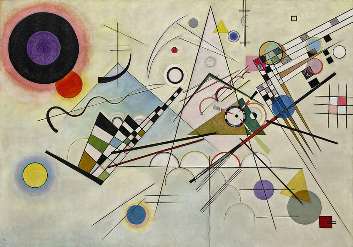
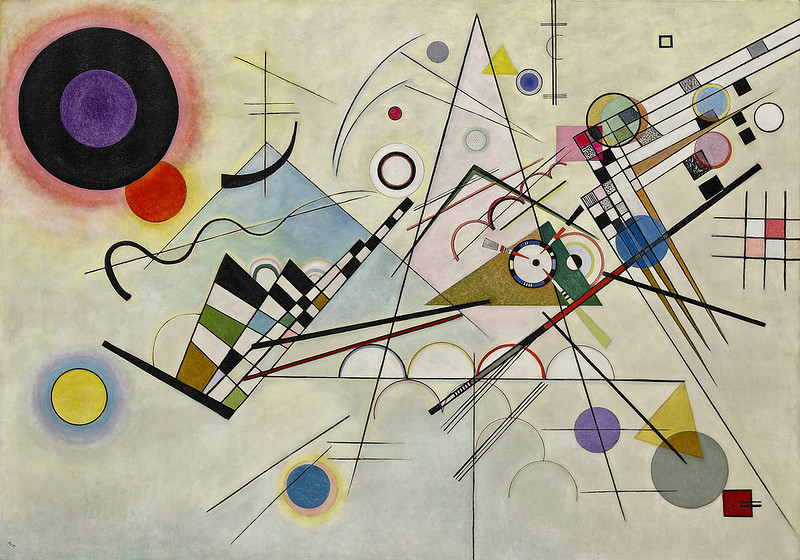
Wassily Kandinsky, for me, is the ultimate example of this liberation. A pioneer of abstract art, he used color independently of form or subject, relying purely on its intrinsic emotional and spiritual resonance. His "Composition VIII" isn't about what it depicts; it's a symphony of hues and shapes where color is the protagonist, and it resonates deeply within you, sometimes without you even knowing why.
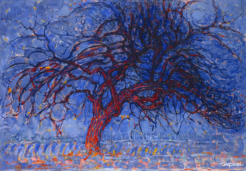
Even Piet Mondrian, whose later work is so stark, showed his deep understanding in earlier, less abstract pieces like "Evening; Red Tree". The intense contrast between that vibrant red and the cooler blues and greens beautifully defines the structure and evokes emotion, even as he was moving towards abstraction. Later, in "Composition No. IV", he proves that impactful color isn't solely about vibrancy. With a restrained palette of muted pinks, grays, and whites, punctuated by strong black lines, he achieves immense impact through thoughtful placement and proportion. It’s a masterclass in quiet power, showing that even minimal color can speak volumes.
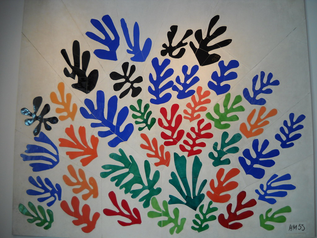
In contemporary art, artists continue to push these boundaries. Take for example, the work of Henri Matisse in his later years, particularly his cut-outs like "La Gerbe (The Sheaf)". Here, he uses flat, highly saturated planes of color, often in unexpected combinations, to create a sense of vibrant movement and joyous expression, proving that even simple forms can achieve profound emotional depth through audacious color choices. This experimental approach is absolutely vital for growth, for finding your own unique artistic voice that's informed by both deep theoretical knowledge and exhilarating creative freedom. It's constantly pushing the boundaries of what color theory means, inviting us all to new, wonderful perceptual and emotional experiences.

Even artists like Christopher Wool, known for his stark, often monochromatic word paintings and abstract patterns, demonstrate a profound, albeit restrained, understanding of color. His choices of black and white, or muted grays and browns, are not an absence of color theory but a deliberate, powerful application of it – focusing on value, contrast, and texture to create immense impact. It's about making every chromatic decision count, even when working with a limited palette.
credit, licence
Frequently Asked Questions About Color Theory
It's natural to have questions as you navigate the vibrant world of color theory. Here are some of the most common ones I hear, and my thoughts on them – often learned through my own trials and delightful errors:
What are the most important color theory aspects for art beginners?
If you're just starting out, my absolute go-to advice is to get really comfortable with the color wheel and the concepts of warm and cool colors. Those are your absolute bedrock, making it so much easier to choose, mix, and apply colors. But if I could give you one piece of advice that truly changed my game, it’s this: obsess over value and saturation. Seriously. Value underpins contrast and form even more directly than hue, dictating the sense of depth in your work – it's the secret sauce. And saturation? That's how loud or quiet your colors speak. I remember struggling to make my early paintings feel dynamic, and it wasn't until I truly grasped how to manipulate light and dark values and control saturation that my compositions started to sing. Also, start paying attention to how colors interact with each other through simultaneous contrast – it’s a game-changer for understanding perceived color.
How do abstract artists utilize color theory?
Oh, abstract artists live by color theory! When you strip away representational forms, color becomes the primary storyteller. It's how we convey emotion, build depth, establish rhythm, and create a cohesive composition. For me, it functions as a pure visual language, intrinsically linked to the broader elements and principles of art and what is design in art. Often, color isn't just a part of the subject; it is the subject, explored for its intrinsic qualities and raw emotional power. We might use a progression of hues to suggest movement, or rhythmic blocks of color to create a visual beat across the canvas, constructing entire worlds from chromatic relationships alone.
Can impactful art be created without formal color theory knowledge?
Absolutely, yes! I've seen countless folk artists and self-taught creators make breathtaking work, using color in ways that are deeply intuitive and powerful. They often arrive at successful compositions not by consciously following rules but by an innate sensibility, a natural 'eye' for what works. However, and this is where formal study became so valuable for me, explicit knowledge of color theory gives you control. It expands your expressive range, lets you make precise choices, and, crucially, empowers you to intentionally break the rules to achieve something even more profound. It gives you a bigger, sharper, and more versatile toolkit, allowing you to move beyond happy accidents to deliberate mastery.
What is the impact of color vision deficiency on art?
Color blindness, or color vision deficiency, is super important to acknowledge. It affects how individuals distinguish certain colors, and as artists, we want our work to communicate with everyone. While a colorblind artist can certainly create compelling art, I try to be mindful of accessibility in art. That means, beyond just hue differences, I often focus on strong value contrasts to ensure my message is conveyed to all viewers. I use color simulations in my software, or even just convert to grayscale, to see if the work still holds up. Creating palettes that work even if specific hues aren't perfectly distinguishable – by focusing on value and texture – that’s a challenge I embrace for greater inclusivity. Many digital art programs now include built-in color blindness simulators, which are invaluable for testing your palette's effectiveness, giving you a chance to see your work through different eyes.
How can artists develop a truly unique color palette?
Ah, the quest for a unique voice! It’s a wonderful journey, and one that never truly ends. For me, it involves a blend of study, relentless experimentation, and deep personal introspection. I look at artists I admire, pick apart their palettes, and then try to understand why those colors resonate with me. I experiment with different harmonies, but I also draw heavily from my own life – the colors of my city, the emotions of a particular memory, the way light hits a certain object that sparks an unexpected feeling. Keep a color journal, make tons of small color studies (even just swatches), and let your unique sensibility guide you. It’s less about finding a palette out there and more about discovering it within yourself, through continuous dialogue between your inner world and the external visual stimuli.
What are common color application mistakes for emerging artists?
Oh, I’ve made them all! Over-mixing colors, turning them into a sad, muddy mess – definitely been there, done that, and probably still doing it sometimes! Neglecting value contrast, leading to compositions that feel flat and lifeless – yep, that too. Or using color purely decoratively, without thinking about its emotional punch. Another big one is inconsistency in color temperature within a composition, which can really disrupt the visual unity and make the piece feel disjointed. Overcoming these isn’t about instant perfection; it’s about practice, conscious application of color theory, and being kind to yourself when you inevitably make a mess. Every "muddy mess" is a lesson learned, a step closer to understanding, and sometimes, those messes even spark a new, unexpected direction. Embrace the glorious, colorful chaos!
Conclusion: The Enduring Significance of Color Theory
For me, color theory has always felt less like a rigid set of rules and more like a wonderfully expansive playground, a dynamic framework for understanding color's profound impact and boundless potential. It offers us artists a refined lens through which to perceive, analyze, and intentionally wield the expressive power of hues. By truly engaging with these principles – sometimes even playfully defying them – we can transform our intuitive color choices into deliberate, powerful artistic statements, deepening our ability to communicate complex ideas and emotions with unparalleled clarity and resonance.
This journey with color theory, I’ve found, is an ongoing adventure of discovery, a conversation that never truly ends. It continually enriches my own practice, pushes my creative boundaries, and deepens my connection to the visual world, allowing me to craft pieces that, I hope, resonate deeply with you, sparking emotions and thoughts you might not have anticipated. As art itself continues to evolve, embracing new technologies and diverse cultural perspectives, so too will our interpretations and applications of color theory, constantly inviting new explorations and innovations in how we understand and experience the world through color. It's a magnificent, never-ending dance between logic and intuition, and I wouldn't have it any other way. So go on, I urge you, experiment, make some glorious messes, and let your unique artistic voice emerge, vibrant and audacious, through the extraordinary language of color!
If you’re interested in exploring original works that embody this thoughtful yet free-spirited application of color – perhaps something vibrant, something abstract, something that speaks directly to your own emotional landscape – I invite you to explore the art for sale on my website. Or, if you happen to be in the Netherlands, why not visit my museum in 's-Hertogenbosch? I’d love to share this journey, and these vibrant worlds, with you.


