My Life's Colors: How Personal Stories & Intuition Shape My Abstract Art
Explore an artist's personal journey, from raw emotions to abstract canvases. Discover intuitive color mixing, practical tips, and how your life shapes your art experience.
My Life's Unfolding Canvas: How Personal Stories Guide My Abstract Palettes
A particular shade of burnt sienna isn't just a color; it’s the lingering echo of a summer evening, a hushed conversation under a sky ablaze with possibility, or the sudden, startling jolt of a revelation. There are moments in life that hit you with such intensity, they almost demand to be painted. Not literally, of course, but their raw feeling, their very essence, seems to cry out for a canvas. Just as a forgotten melody or a familiar scent can transport you back in time, hitting you with a wave of nostalgia or a sudden flash of a forgotten moment, for me, colors possess that same potent, almost magical power. They’re not just pigments on a canvas; they're echoes of laughter, whispers of quiet introspection, and the fiery bursts of passion or frustration that have peppered my journey.
Every splash, every hue in my abstract palettes, is intertwined with my own beautifully messy life. It’s a bit like trying to read my diary, but instead of words, you get a vibrant riot of color – and, frankly, it’s a lot less embarrassing than my actual diary (which, for the record, contains far too many notes about forgetting where I put my keys). This personal connection to color goes far beyond the scientific understanding of hues; it's a profound, intuitive dialogue with my innermost self, expressed on canvas, and continually evolving as I experience the world. It’s an ongoing process of emotional cartography, charting the landscape of my life through chroma.
More Than Just Pigment: Decoding My Emotional Palettes
So, how do these internal landscapes translate onto a two-dimensional surface? While many artists study the psychology of color in abstract art, for me, it's far more visceral. It’s less a conscious decision and more a gravitational pull, an intuitive magnetism towards certain hues. Why abstract? Because it offers an unfiltered channel to convey these deep-seated emotions, free from the constraints of literal representation. Imagine trying to paint the feeling of profound loss with a literal depiction; it might show a sad face or a dark scene, but it struggles to capture the swirling, formless ache. Abstraction, however, can use disorienting lines, heavy textures, and dissonant colors to express that raw, ineffable essence directly. It allows me to express the essence of an experience, rather than its mere depiction. This, in essence, is my personal philosophy and artistic vision: to translate the intangible into the visually resonant, to give form to the formless through the unique abstract language I’ve developed.
This intuitive approach extends beyond mere color choice; it’s about how colors interact, how a sharp, jagged line of crimson can convey a sudden decision, or a gentle gradient of cerulean might whisper of slow, unfolding understanding. In my studio, a thick impasto texture (paint applied thickly, often with visible brushstrokes) might embody the weight of a memory, while translucent washes (thin, see-through layers) speak to fleeting thoughts. The very physical properties of paint – its opacity, how quickly it dries, or its viscosity – also become part of this emotional vocabulary, allowing me to build layers of feeling and meaning. This is how artists use color and texture to tell their stories, not with words, but with feeling and form.
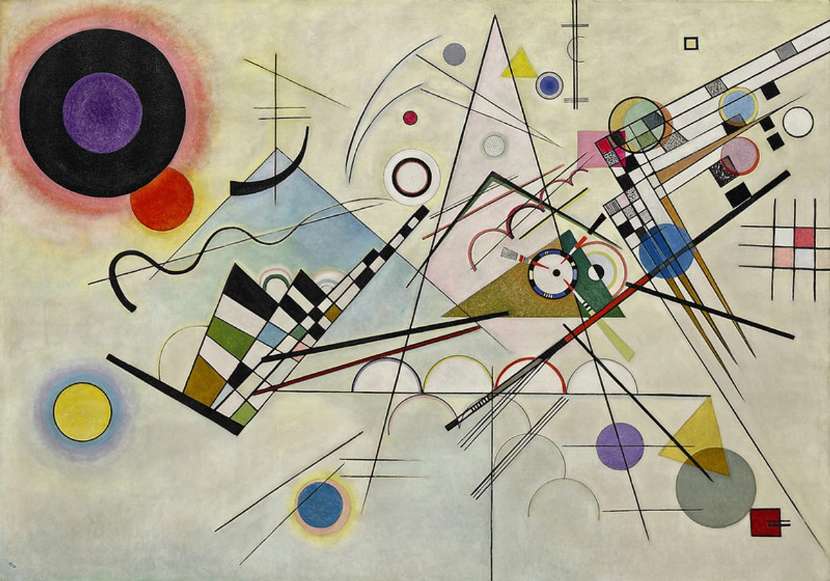
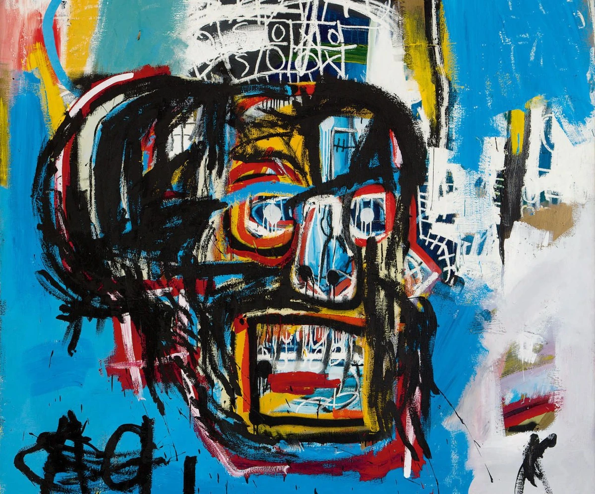
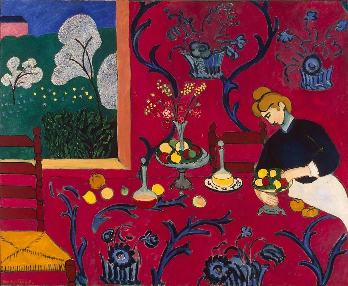
This intuitive connection to color isn't unique to my journey; many artists throughout history have explored this profound relationship, transforming their inner worlds into visual experiences. Consider the dynamic compositions of Wassily Kandinsky, who believed colors and shapes could directly speak to the soul, or the vibrant, raw energy of a Basquiat piece. Kandinsky, with his synesthesia, experienced sounds as colors, a direct parallel to my own internal dialogue with hues, though my experiences are less about auditory stimuli and more about the visceral imprint of life events. Mark Rothko, too, with his large fields of color, sought to evoke deep spiritual and emotional responses, stripping away all but the raw power of chroma. While their methods might differ, the core principle remains: color as a conduit for pure, unadulterated emotion, enabling a profound emotional language of color in abstract art. Even contemporary artists continue to explore personal narratives through abstract forms, proving that the canvas remains a powerful space for introspection and connection.
Anecdotes in Hues: My Journey Through Color
My life isn't a neat, organized paint-by-numbers kit (I tried one once; it was a disaster, much like my attempts at baking a soufflé). It's a spontaneous, sometimes chaotic, and always evolving canvas. And so are my color choices. Each hue, a chapter. Each stroke, a whispered memory. Let’s dive into some of the specific hues that form my emotional palette in action.
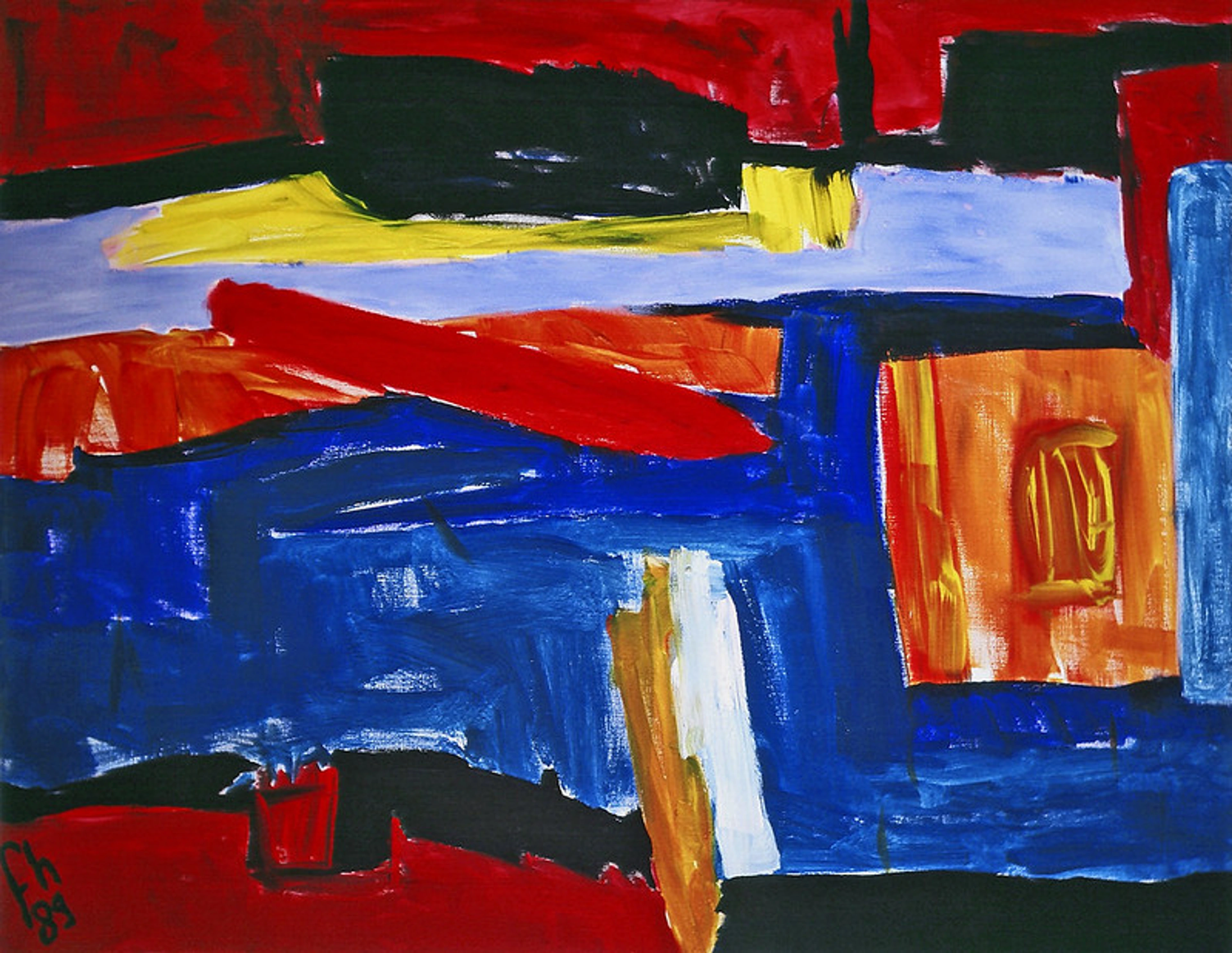
Fiery Reds and the Pulse of Passion (or Frustration!)
Red – now there’s a tricky one. It's often associated with anger, and yes, sometimes I certainly paint with a healthy dose of that (especially when a new tube of paint explodes, leaving a crimson crime scene on my perfectly clean floor – that’s a real passion killer, or perhaps a passion igniter, depending on how you look at it). But more profoundly, red is passion, energy, and the sheer vibrancy of being alive. It’s the electric current of a new idea taking hold, the fierce determination to push through a creative block, or the warmth of human connection. The challenge, of course, is to capture the nuance of that fiery emotion, to distinguish between a furious outburst and the quiet, burning ember of resilience.
There was one particularly stubborn painting that just refused to cooperate; every brushstroke felt wrong. I threw everything at it – literally, at one point – and finally, in a fit of pure frustration, I grabbed the brightest red I had and just slashed it across the canvas. And wouldn't you know it? That raw, unbridled energy was exactly what the piece needed. It reminds me that even when life throws its worst, there's always a fiery core of resilience within. What vibrant, untamed emotion does red ignite in your own life?
The Joy of Yellow and Unexpected Sunshine
Yellow, oh yellow! It’s the color of the sun, obviously, but for me, it’s also the specific, comforting warmth of my grandmother's kitchen, the unexpected burst of laughter during a tough day, or that blissful feeling of finally solving a creative puzzle – the kind that makes you want to do a little victory dance around the studio, even if no one's watching. Yellow is my visual sigh of relief. There was a time when I was struggling with a particular series, feeling a bit lost in the greys, and then I stumbled upon an old photograph of a summer picnic – all golden light and happy faces. Suddenly, my canvas was flooded with a brilliant cadmium yellow, and the entire piece just clicked. It truly became about joy, optimism, and light. Where do you find your moments of unexpected sunshine?
credit, licence
The Nuance of Green: Growth, Nature, and a Little Envy
Green is the color of growth, of new beginnings, of the lush landscapes around my home, or the slightly unruly plant I’m constantly trying to keep alive in my studio (it’s a work in progress, much like my art). Green, for me, embodies quiet perseverance. But if I’m honest (and I always try to be, even if it’s just with myself), sometimes green also holds a whisper of that universal human experience – a gentle nudge of 'what if?' when I see another artist’s effortlessly perfect stroke, or the serene painting I imagine someone else just created while I was wrestling with my exploding paint tube. It's a reminder that colors, like emotions, are rarely one-dimensional. They're complex, layered, and always evolving, just like me, reflecting the very fabric of nature and our place within it. The vibrant greens and rich history of the nearby 's-Hertogenbosch countryside, particularly the intricate details within the Hieronymus Bosch collection at the museum, often find their way into my subconscious, influencing my palette choices without me even realizing it until the piece is almost complete. What complex emotions does green evoke for you?

The Serenity of Blue, or a Moment of Calm
Blue is my go-to when my brain feels a bit like a tangled ball of yarn, or when my to-do list seems to be staging a hostile takeover. It’s the color of a vast, open sky, the deep, calming ocean, or that rare moment of quiet in my studio when I'm not frantically searching for a lost brush (which, let's be honest, is most of the time). Blue, for me, is the color of a much-needed mental reset. Sometimes, I just need to pour out the blues – not sad blues, but the kind that reminds me to breathe, to pause, to simply exist. It’s an attempt to find serenity amidst the beautiful chaos of life, even if that serenity is fleeting, like trying to meditate with a cat on your lap. It rarely works, but the intention is always there, creating a moment of peace, even if I have to paint it into existence myself. What shade of blue brings you that sense of unexpected calm?
From Memory to Masterpiece: My Intuitive Color Mixing
So, how do these chaotic, beautiful experiences actually translate onto the canvas? Honestly, it's less a scientific formula and more a dance with intuition, a constant conversation between my inner world and the evolving surface before me. My approach to color mixing is often a spontaneous one; I don't always plan my palettes precisely. Often, the colors emerge as I work, guided by an internal compass that points towards a feeling or a memory. There's a delicate balance between intent and letting the materials surprise me.
Sometimes, I’ll be reaching for a specific cerulean blue, but my hand, almost on its own accord, will instead grab a touch of raw umber. Suddenly, that blue transforms into the muted, earthy tone of a twilight sky I remember from a childhood trip, unexpected and perfect. It's an embrace of intuitive painting, letting the materials lead the way. It’s a dynamic, evolving process where each stroke informs the next, building layers of memory and emotion. This kind of experimentation is vital to my creative flow.
When representing complex emotions or transitions, it's rarely a single color but a dynamic interplay. A flash of vibrant yellow might bleed into a calming blue, capturing the shift from excitement to introspection in a single breath. I've found that specific mediums, like fluid acrylics, allow for beautiful, unpredictable blending that mimics the fluidity of emotion, while heavy body paints can convey the weight and permanence of a deep memory. Beyond color, the texture and form I employ further deepen the narrative. A rough, scraped texture might speak of past struggles, while delicate, flowing lines suggest hopeful possibilities. These elements don't just exist alongside color; they interact, creating a multi-sensory experience. Even the thoughtful use of negative space – the area around and between the subjects of an image – can contribute significantly to the emotional narrative, allowing the viewer's eye to rest or creating a sense of openness or confinement. My studio environment, with its particular quality of natural light and the subtle influence of the surrounding landscape, also plays a quiet role, often unconsciously guiding my selections.

It’s all part of embracing the unexpected, and allowing the paint to lead the way. There’s a beautiful freedom in knowing that mistakes aren't really mistakes, just delightful detours to a more interesting destination. I remember one piece where I accidentally smeared a swath of deep magenta across a delicate blue. My first thought was 'Disaster!' My second, after a deep breath and a moment of staring, was 'Actually, that’s the raw, unpredictable chaos of that memory, perfectly imperfect.' This journey, chronicled in my artistic timeline, has allowed me to discover my unique artistic style and the stories I want to tell through my work. In my early days, exploring the collections at the museum in 's-Hertogenbosch was particularly influential, observing how masters used color not just to depict, but to evoke – an early lesson in abstraction, long before I even picked up my first serious brush. The very act of navigating the challenges of translating something as ephemeral as a feeling into a tangible artwork is, for me, a crucial part of the creative process and the ongoing development of my unique voice.
Quick Tips for Intuitive Mixing
For those of you who want to explore your own intuitive connection to color, here are a few thoughts from my messy studio:
- Evoking Complex Memories: If you're trying to evoke a complex, perhaps bittersweet memory, don't be afraid to mute a vibrant color. Try adding a tiny touch of its complementary color – a speck of green to a bold red, for instance – to create a richer, more nuanced tone that speaks volumes beyond a simple primary hue. It's like finding the perfect word for a complex feeling; sometimes it's a blend.
- Creating Depth & Vibrancy: For added depth and unexpected vibrancy, try layering transparent washes over opaque colors, or applying small dabs of a highly contrasting color (like a bright orange on a deep blue) sparingly. It creates a 'shimmer' or 'pulse' that can mimic the fleeting, layered nature of emotion.
- Embracing the Unexpected: Don't be afraid to let a 'mistake' guide your next step. Sometimes a drip, an accidental smear, or an unexpected blend is exactly what the piece needed to truly express that raw, unrefined emotion. It’s a happy accident, a beautiful imperfection that adds authenticity.
- Starting Points Beyond the Brush: Sometimes I'll start with a color that simply feels right, a gut reaction, even before I know what I'm painting. Other times, it's a specific memory, a scent, or even a piece of music that dictates the initial palette. Let your senses, and not just your eyes, guide you into the work.
- When Stuck: Have a Dialogue with One Color: If you're feeling creatively blocked, try focusing on a single hue and exploring its full range – from deep, opaque shades to translucent washes, or mixing it with unexpected complementary colors to see what new emotional territory emerges. It's like having a deep conversation with just one color, uncovering all its hidden personalities. Remember, even my creative sanctuary can sometimes feel creatively stagnant, and these exercises help me reconnect.
Unlocking the Canvas: Your Role as the Viewer
When you engage with abstract art, especially pieces born from personal experience, you become an integral part of the narrative. My work isn't just a window into my world; it's a mirror for yours. The true magic happens when my colors and forms spark a memory, an emotion, or a connection within you, transforming the canvas into a shared landscape of human experience. It's less about understanding my exact intention and more about discovering your own. This idea of the viewer completing the artwork, finding your reflection within it, is central to my artistic philosophy.
Your Questions, My Colorful Answers
I often get asked about my process, my choices, and the mysteries behind the canvases. Here are some of the most common curiosities, answered through my colorful lens.
Do you always start with a specific emotion in mind when choosing colors?
Not always, and rarely with a single, neatly packaged emotion. Often, an emotion or a memory might be a subconscious starting point, a whisper rather than a shout. As I begin to paint, the colors I intuitively reach for start to build a narrative, and the emotion crystallizes as the piece develops. It’s more of an emergent process, a revelation, rather than a predefined one, much like life itself. The beauty is that the canvas itself becomes a mirror, reflecting back what I perhaps hadn't consciously acknowledged.
How do you choose colors that tell a story without being literal?
It's a delicate balance! I rely heavily on my personal associations with colors – for instance, the yellow of that picnic, or the specific blue of a quiet evening. But it's also about contrast, harmony, and composition. The way colors interact on the canvas creates its own language, inviting the viewer to bring their own experiences to the decoding of abstract art. It's less about painting a story and more about evoking a feeling that might resonate with many stories. Understanding color theory in abstract art certainly plays a role, but it's always filtered through the deeply personal, like translating a silent scream into a vibrant, expressive burst of color.
Can my personal experiences influence how I see your art?
Absolutely, and that's the greatest beauty of abstract art! When you look at one of my pieces, your own life experiences, memories, and current mood will undoubtedly influence how you perceive and connect with the colors. For example, a deep crimson that evokes a passionate memory for me might stir a sense of bold defiance in you, or perhaps even a quiet comfort. Your interpretation is just as valid and enriching as my own initial intention. It becomes a dialogue between my world and yours, a shared moment of colorful human connection. It's like finding a secret message in a painting that only your heart can read, and that's a truly beautiful thing.

The Unending Canvas of Life
Ultimately, my art is a testament to the belief that life itself is the greatest inspiration. Every joy, every struggle, every quiet moment of reflection, and every silly, self-deprecating thought finds its way into my abstract palettes. The colors of my life are a never-ending source of creativity, a rich tapestry that continues to unfold with each passing day and each new brushstroke. They are a constant reminder that art isn't just about what you see, but what you feel, what you remember, and what you dream.
If you're looking to connect with color on a deeper level, I encourage you to try keeping a 'color journal' where you jot down colors you see and the feelings or memories they evoke. Don't just write 'blue = sad'; instead, try to sketch the color, note the specific context (e.g., 'deep cerulean in twilight sky'), and write down the associated memory or nuanced emotion (e.g., 'weary peace after a draining day'). I still do this sometimes, especially when I'm feeling creatively stuck – it's amazing how a simple observation of a vibrant sunset or a muted rain cloud can unlock a flood of inspiration. It’s a fascinating journey into your own inner world, a way to map the emotional geography of your days.
So, if any of these colors resonate with your own journey, perhaps one of my pieces will find a home with you. You can explore my available art and see if our palettes align. It’s a wonderful thing when art finds its reflection in someone else’s life, transforming a wall into a window to a shared, colorful human experience. And who knows, perhaps the colors painting the soundtrack of your life right now might one day inspire a new series of my own, forming an even deeper connection through art.


