What Is Pointillism? A Dot-by-Dot Guide to This Mind-Bending Art Technique
A personal, in-depth guide to the art of Pointillism. Discover how tiny dots create vibrant masterpieces, learn about Georges Seurat, and get practical tips to try it yourself.

Pointillism: A Deep Dive into the Science and Art of Dots
The Pixel Before Pixels: A Revolution in Perception
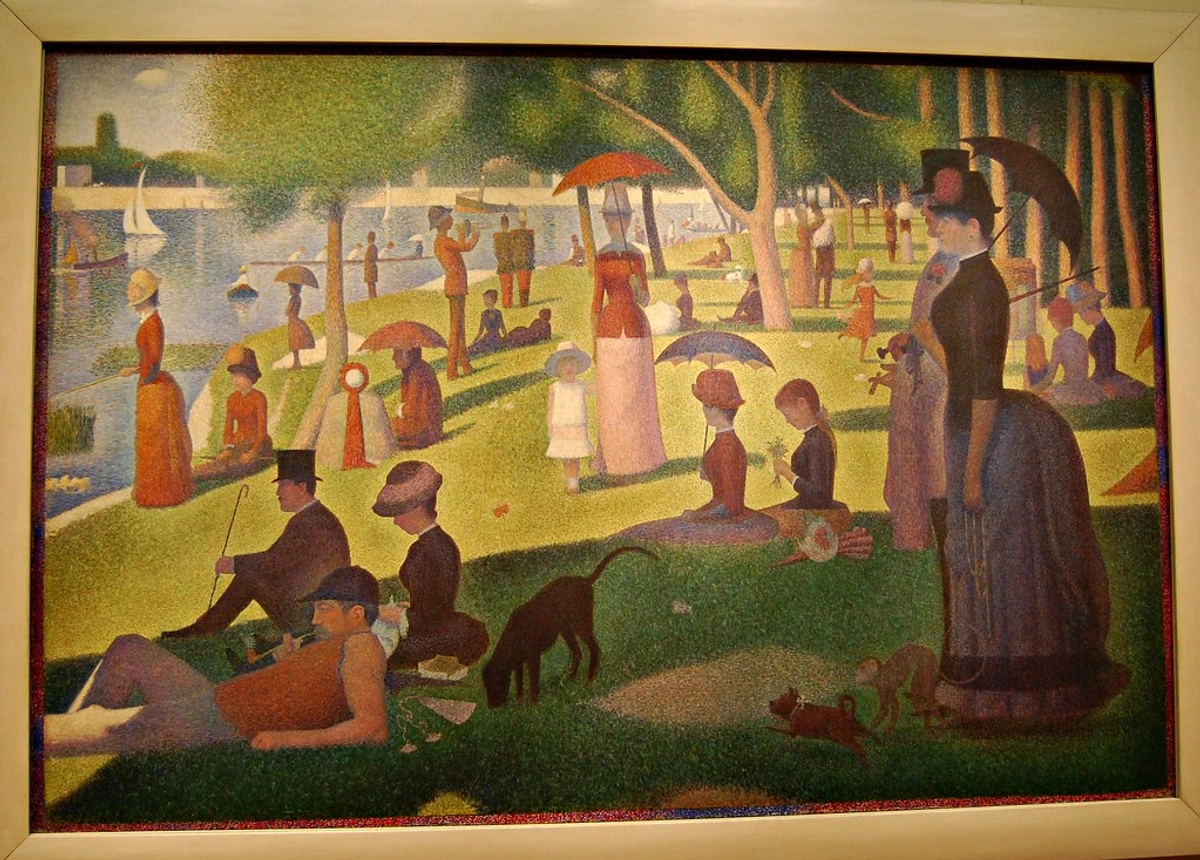
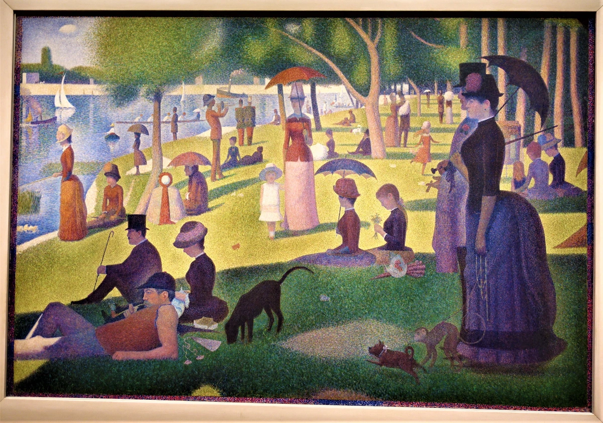
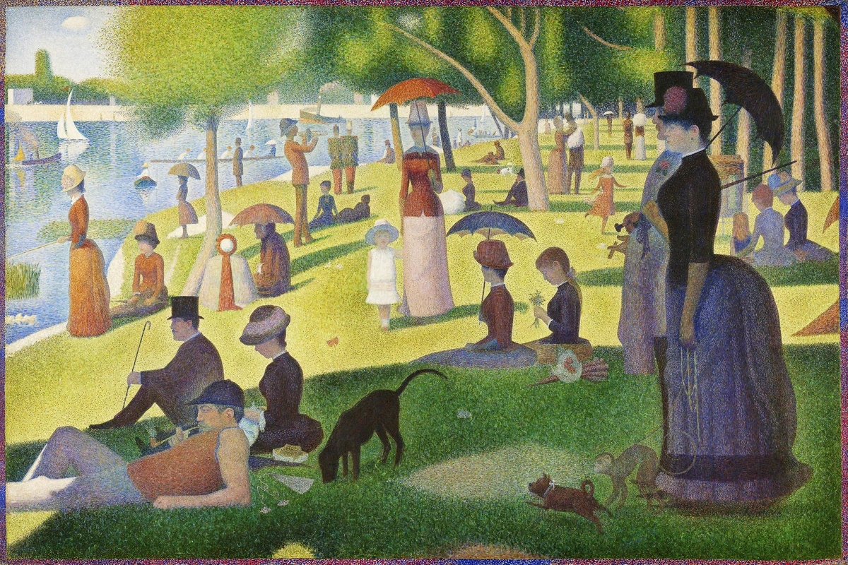
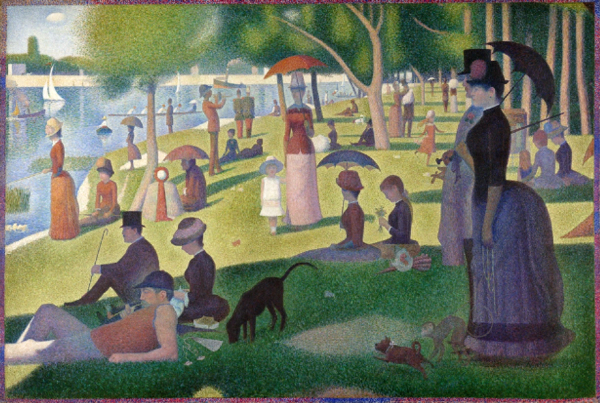
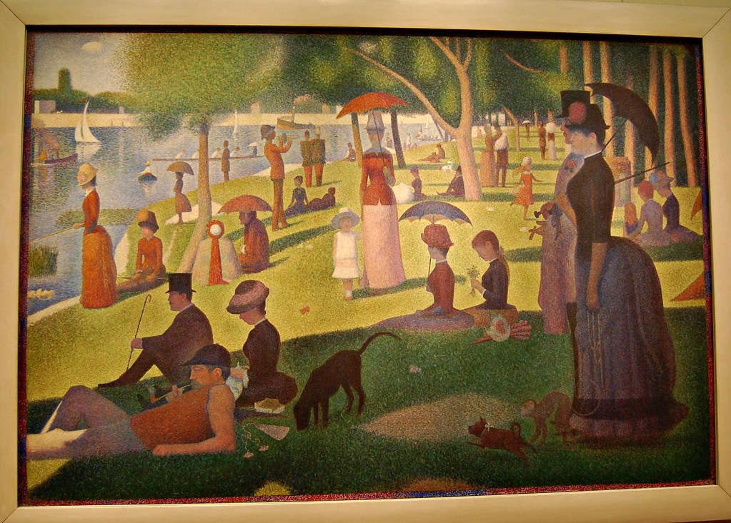
Have you ever looked at a painting and felt like your eyes were playing tricks on you? That’s exactly how I felt the first time I encountered Georges Seurat’s monumental A Sunday on La Grande Jatte in a book. As a kid, accustomed to art with clear, bold lines, my initial thought was, "Okay, this is a bit... fuzzy?" It felt like trying to focus on a TV screen with bad reception, a colorful, static mess of confetti-like dots. I squinted, held the book further away, but it stubbornly remained a blurry tableau of people in a park.
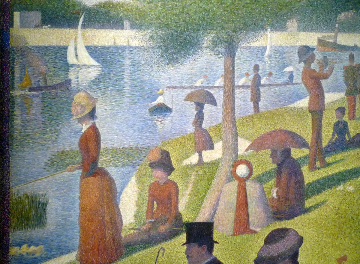
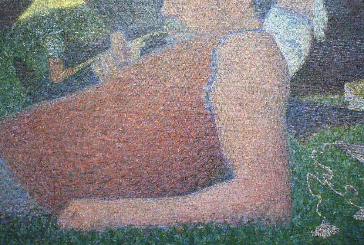
Then, years later, I saw it in person at the Art Institute of Chicago, and let me tell you, standing in front of that enormous canvas is a completely different experience. Up close, it's a bewildering chaos—a frantic storm of individual, unmixed dots of color that simply don't make sense. Your eye instinctively screams for definition. But then, you take a few steps back, and your vision softens, your brain takes over... and the magic happens. The discrete dots disappear, fusing together in your eye to create luminous, shimmering colors that no physically mixed paint on a palette could ever achieve. My perception did a complete flip-flop. It wasn't fuzzy at all; it was brilliant. It was a masterpiece of controlled chaos, a profound testament to how rigorous scientific precision can meet and elevate artistic vision. That, my friend, is the trick, the absolute genius of Pointillism. It’s an art technique that doesn't just present a picture; it actively plays with your perception, transforming your own visual cortex into the artist's ultimate palette. It’s less about simply painting a scene and more about meticulously building a visual symphony of light and color, one tiny, calculated dot at a time. This article will take a comprehensive journey through its scientific foundations, key figures, practical applications, and its astonishingly enduring legacy in art and modern technology.

The Genesis of the Dot: Scientific Roots and 19th-Century Innovation
Before we dive into how your brain pulls off this visual trick, it’s worth a quick detour into the brilliant minds that meticulously laid the groundwork. Pointillism wasn't born from a sudden, intuitive burst of creativity; it was deeply rooted in the rigorous scientific explorations of color and light that were intellectually buzzing through Europe in the mid-19th century. This era, shaped by the Industrial Revolution, the rise of positivism, and the advent of photography, fostered a scientific worldview that permeated even artistic circles. Artists like Georges Seurat weren't content to simply wield a brush; they were avid, almost obsessive, students of optics, physics, and human perception, often poring over dense scientific texts in addition to traditional art manuals. This profound intellectual curiosity truly set them apart from earlier artistic approaches, marking a significant paradigm shift. The very essence of Pointillism, in my opinion, lies precisely in this fusion of rigorous scientific inquiry with profound creative expression. It was a conscious effort to bring scientific rigor to the canvas, making art a form of visual science.
Let's consider the key scientific figures who fueled this revolution:
- Michel Eugène Chevreul (French Chemist): Working at a tapestry factory (stay with me here – it’s more relevant than it sounds!), Chevreul observed that the perceived color of a thread wasn't solely its inherent dye, but was dramatically influenced by the colors surrounding it. His seminal 1839 book, The Principles of Harmony and Contrast of Colors, became a veritable bible for many artists. It meticulously explained phenomena like simultaneous contrast – how placing two complementary colors directly next to each other makes both appear far more vibrant and intense. Chevreul’s innovative work also introduced the concept of the color wheel as a systematic tool for understanding color relationships, a concept that would become foundational for artists. Chevreul's work powerfully demonstrated that color perception is anything but a simple, static experience; it’s incredibly dynamic, context-dependent, and surprisingly subjective.
- Ogden Rood (American Physicist): Rood's 1879 opus, Modern Chromatics, with Applications to Art and Industry, further meticulously broke down how light and color interact and mix. He vividly distinguished between additive mixing (mixing light, as seen on a stage or a digital screen, where combining red, green, and blue light creates white) and subtractive mixing (mixing pigments, like on an artist's palette, where combining colors generally results in darker, duller hues, eventually black). The Pointillists, with a stroke of genius, found a way to essentially apply additive mixing principles directly to pigment on a canvas, ingeniously letting the viewer's eye and brain perform the final, vibrant blend. Rood's practical experiments with rotating color discs, which blended colors optically to create new hues, directly inspired the Neo-Impressionists. This was a radical, almost subversive idea that completely upended centuries of traditional painting methods, where colors were almost always physically mixed on the palette. This wasn't just about creating pretty pictures; it was a profound reflection of a broader 19th-century fascination with science, industrial progress, and the systematic understanding of the world. Artists, much like the scientists of their era, were relentlessly searching for underlying principles to explain the visual phenomena they observed, making Pointillism a truly modern movement in its audacious intellectual ambition. It was less about capturing a subjective, fleeting impression and far more about constructing an objective, intensely luminous reality. This dedication to a scientific approach was nothing short of revolutionary, powerfully demonstrating how deeply the art world was engaging with, and being transformed by, contemporary intellectual currents.
Key Scientific Influences on Pointillism
Scientist  | Field | Key Contribution to Color Theory | Impact on Pointillism |
|---|---|---|---|
| Michel Eugène Chevreul | Chemistry | Documented simultaneous contrast and how adjacent colors affect perception | Provided theoretical basis for placing complementary colors next to each other to enhance vibrancy. |
| Ogden Rood | Physics | Distinguished between additive (light) and subtractive (pigment) color mixing | Informed Pointillists' method of using pure pigments side-by-side to achieve additive optical blending. |
| Hermann von Helmholtz | Physiology | Advanced understanding of how the eye perceives color and light | While not directly cited by Pointillists as often, his work on the physiology of vision and color perception provided a robust scientific framework that validated the optical blending effects they observed and utilized. |
| Charles Blanc | Art Theorist | Advocated for systematic color application based on scientific principles | His influential Grammar of the Arts of Drawing (1867) translated complex scientific theories into practical advice for artists, encouraging a rational and systematic approach to color and composition. |
The Big Idea: Your Brain Does the Mixing – Optical Illusion or Scientific Fact?
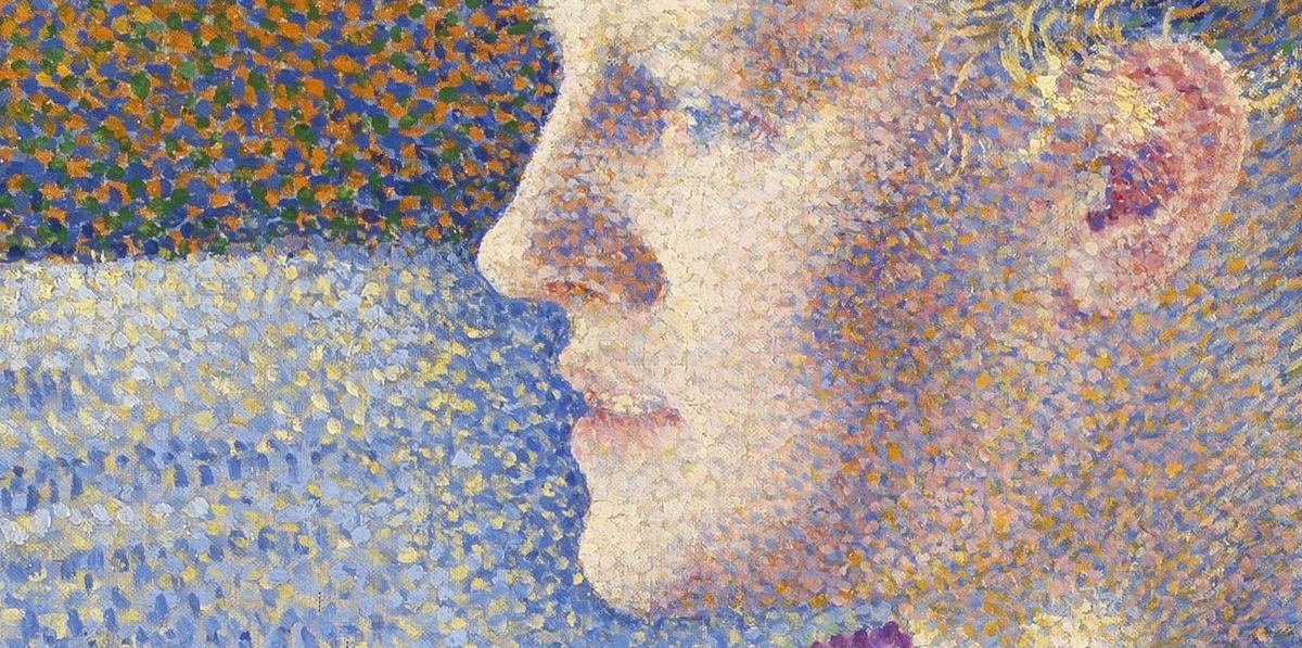
So, what's really going on here? The core concept behind Pointillism is optical mixing. It’s a beautifully simple, yet revolutionary idea that almost makes your eyes feel like they're playing a trick on you. But it's no trick; it's pure science. Instead of mixing, say, blue and yellow paint on a palette to make green, a Pointillist painter would place a tiny dot of blue right next to a tiny dot of yellow.
From a distance, your brain can't distinguish the two separate dots anymore. It gets a little lazy, smushes them together, and voilà—you perceive it as green. But it’s not the flat, predictable green from a tube. It's a vibrant, living green that seems to vibrate with energy. This is because the pure, unmixed colors retain their own luminosity. The light reflects off the pure pigment before it hits your eye, untouched by the dulling effect of physical blending. This phenomenon, often called simultaneous contrast (thanks, Chevreul!), means that a color's perceived intensity is heightened by the colors placed directly next to it. A tiny red dot next to a green one won't just blend into a muddy brown; from a distance, they'll vibrate, making each other appear more intense and brilliant. It's a magic trick performed by physics and your own visual cortex.
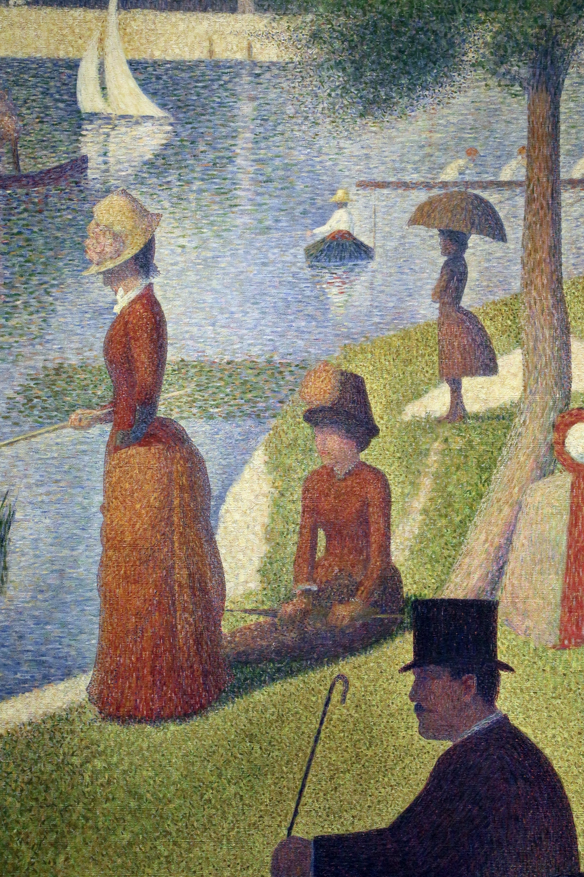
Think of it, quite literally, like the pixels on your phone screen or computer monitor. Each pixel is a microscopic dot of red, green, or blue light. Your screen isn't generating every single color in the universe individually; it's simply combining these three primary light colors in varying intensities, and then your brain performs the incredibly complex heavy lifting to synthesize a full-color, seamless image. Georges Seurat, the pioneering mastermind behind this technique, was, in essence, inventing an analog version of digital pixels in the 1880s—a full century before digital screens became commonplace! He was undoubtedly a bit of a science nerd, deeply immersed in the cutting-edge color theory research of his day. Pointillism was his grand, meticulously planned experiment, a radical act of translating profound scientific principles into a stunning, vibrant, and entirely new visual language. It makes you wonder how he'd react to seeing his ideas manifest in every device we interact with today.
Neo-Impressionism: The Broader Canvas
Neo-Impressionism: The Broader Canvas of Scientific Art
It’s tempting to get completely caught up in the mesmerizing dots, but Pointillism is actually a very specific, albeit iconic, painting technique embedded within a much larger and more ambitious artistic movement: Neo-Impressionism. This broader movement was spearheaded by Georges Seurat and his close collaborator, Paul Signac, who vehemently preferred their approach to be known as Divisionism or Chromo-luminarism. "Divisionism" directly refers to the systematic separation of color into its constituent hues and tones, while "Chromo-luminarism" emphasizes the rigorous scientific study of light and color relationships. "Pointillism," somewhat ironically and initially disparagingly, was a term coined by critics to describe the technique. Yet, as so often happens in art history, it’s the popular, simpler name that ultimately stuck. This tension between the public's perception and the artists' profound scientific aspirations speaks volumes about the movement's intellectual rigor and its desire for precise nomenclature.
Neo-Impressionism represented a deliberate, intellectualized step away from the spontaneity and subjective impressions characteristic of its predecessor, Impressionism. While the Impressionists aimed to capture fleeting moments and atmospheric light with visible, often thick, and sometimes almost blurry brushstrokes, the Neo-Impressionists sought to inject a profound sense of order, scientific precision, and a more enduring, monumental quality into their depictions of light and color. They rigorously adhered to a methodical application of paint based on the latest scientific color theory, resulting in compositions that often felt more static and classical, yet paradoxically, incredibly vibrant and alive. It was less about the fleeting "impression" of a moment and far more about the deliberate "construction" of a luminous, objective reality—a meticulously considered optical experience rather than a transient sensory one. This methodical approach wasn't just aesthetic; it aimed to capture a more universal and timeless representation of reality, contrasting sharply with the ephemeral, personal impressions favored by their Impressionist predecessors. Neo-Impressionism was, at its heart, a movement driven by intellect as much as by aesthetics, striving for permanence and scientific truth in art.
Impressionism vs. Neo-Impressionism: A Comparative Table
Characteristic | Neo-Impressionism (Pointillism/Divisionism) | |
|---|---|---|
| Primary Focus | Fleeting impression, subjective experience, light and atmosphere | Scientific precision, objective reality, optical mixing, luminosity |
| Brushwork | Visible, spontaneous, often broken strokes | Meticulous, small, distinct dots or dashes of pure color |
| Color Theory | Intuitive application of color, emphasis on perception | Systematic application based on scientific theories (Chevreul, Rood) |
| Composition | Often asymmetrical, spontaneous, capturing a moment | Highly structured, classical balance, geometric rigor |
| Emotional Content | Evokes mood, personal feeling | Detached, analytical, aims for universal visual harmony |
| Key Figures | Monet, Renoir, Degas, Pissarro (early) | Seurat, Signac, Cross, Pissarro (briefly), Luce |
Georges Seurat: The Mastermind and His Masterpiece
You simply can't talk about Pointillism without camping out on the subject of Georges Seurat for a while. He was the absolute driving force, the quiet visionary behind this whole dot-based revolution. He and his fellow artist Paul Signac co-developed this style, which they preferred to call Divisionism or Chromo-luminarism (as we’ve discussed, they were going for scientific precision, not just pretty points!). "Pointillism" was actually a term used by critics to make fun of it, but, well, the irony is that it’s the name that stuck.
Born in Paris in 1859, Georges Seurat's formal artistic training began, somewhat traditionally, at the École des Beaux-Arts. There, he immersed himself in the academic rigor of classical sculpture and drawing, mastering the fundamentals of form and line. This classical foundation in draftsmanship and composition, rather than being abandoned, was ingeniously integrated into his revolutionary approach, providing a backbone of order and structure beneath the shimmering dots. However, it was his intense, almost obsessive, independent study of scientific texts on color theory and optics—particularly the groundbreaking works by Chevreul and Rood—that truly illuminated and forged his unique artistic path. He didn't just paint; he meticulously researched, experimented, and theorized, viewing every canvas as a vibrant laboratory for the precise interplay of light and color. This profound intellectual curiosity, combined with his almost superhuman patience and methodical disposition, meticulously forged the very foundation of his revolutionary technique.
Seurat's A Sunday on La Grande Jatte is undeniably the movement's defining work, a monumental achievement in its sheer scale and meticulous execution. It offers a timeless snapshot of Parisian leisure, yet it feels eternal, almost architecturally monumental. But it wasn’t his only foray into this revolutionary style. Indeed, he dedicated his relatively short career to a consistent exploration of these principles across a range of subjects.
The Meticulous Process: Seurat's Studio as a Laboratory
Seurat's artistic process was famously painstaking, a testament to his scientific rigor and incredible patience. He rarely painted directly from life, preferring to work in his studio, meticulously assembling his compositions from numerous preliminary studies. He would create dozens of tiny oil sketches (croquetons) and detailed conté crayon drawings to work out the lighting, figures, and overall composition. These studies allowed him to experiment with color relationships and tonal values before committing to the large canvas. He often gridded his canvases, carefully plotting out the placement of each element to ensure perfect balance and harmony, a classical approach adapted to his modern technique. This wasn't spontaneous art; it was art constructed with the precision of an engineer and the vision of a poet.
Bathers at Asnières: An Early Masterpiece
Before A Sunday on La Grande Jatte, Georges Seurat painted Bathers at Asnières (1884), an equally striking, though perhaps less known, work that unequivocally demonstrated his early, ambitious exploration of Divisionist principles. This monumental canvas depicts working-class men leisurely bathing by the Seine, a poignant and deliberate contrast to the bourgeois leisure he would later immortalize in La Grande Jatte. Bathers served as his large-scale laboratory, allowing him to experiment with the optical mixing of colors and the monumentalization of figures on a grand scale, meticulously setting the foundation for his more [famous work](/finder/page/famous abstract art). These weren't quick studies, mind you; La Grande Jatte itself, for instance, famously took him two full years to complete, requiring countless preliminary sketches, oil studies, and precise color analyses. Can you even begin to imagine that level of dedication? The sheer, mind-numbing, almost meditative patience required to apply millions of tiny dots to a canvas that is seven by ten feet—it's an extraordinary act of faith in both art and science. Every single dot was a calculated decision, a testament to his unwavering belief in the scientific harmony of color and light.
What I love about this painting is how it feels both timeless and strangely frozen. The figures are stiff, almost like mannequins, a far cry from the blurry, fleeting moments the Impressionists tried to capture. Seurat wasn't interested in capturing a mere moment; he was interested in creating a perfectly balanced, harmonious, and enduring image, meticulously constructed using his scientific principles of composition in art. He meticulously planned his compositions, often employing classical principles like the Golden Ratio and strict geometric grids, all to achieve a profound sense of calm monumentality and universal order. This wasn't accidental or arbitrary; it was a deliberate, intellectual choice, powerfully reflecting the Neo-Impressionist desire for permanence and scientific truth over ephemerality. It's a testament to his incredible discipline and vision, a true intellectual masterpiece.

The Channel of Gravelines, Petit Fort Philippe (1890)
The Channel of Gravelines, Petit Fort Philippe (1890): Capturing Light and Atmosphere
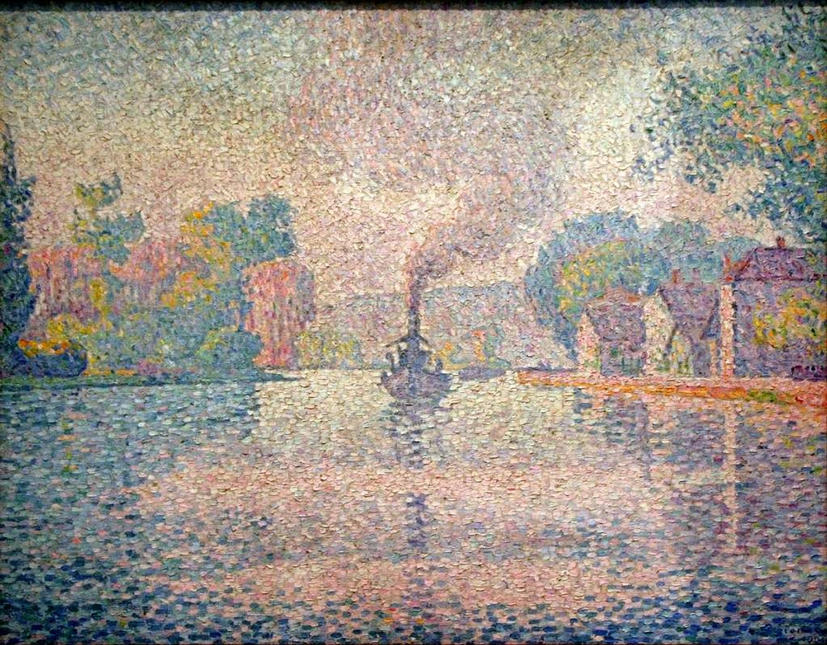
Beyond his figure compositions, Seurat also applied his Divisionist technique to stunning seascapes. The Channel of Gravelines, Petit Fort Philippe is a serene and luminous example, one of several coastal scenes he painted towards the end of his life. These works showcase his intense fascination with light and atmosphere, meticulously rendered through an almost vibrating mosaic of tiny, distinct dots. In these seascapes, the systematic application of color allows for an almost ethereal quality of light, capturing the nuanced shifts in the sky and water with breathtaking precision and luminosity. It demonstrates the versatility of his method, extending beyond complex figural arrangements to capture the subtle grandeur of nature itself. These late seascapes, often devoid of human figures, allowed Seurat to focus purely on the optical effects of light on natural elements, achieving a profound sense of tranquility and space.
Other Key Works by Georges Seurat
While A Sunday on La Grande Jatte is undeniably his magnum opus, Seurat's other works powerfully demonstrate his evolving mastery and the versatile application of the Pointillist technique.
- The Circus (1891): This vibrant, unfinished masterpiece showcases Seurat's profound fascination with dynamic movement, theatricality, and the artificial light of the circus arena. Rendered with the same meticulous dot application, it captures the energetic spectacle with an almost scientific precision of color and form, emphasizing the contrast between the static audience and the lively performers.
- Circus Sideshow (Parade de Cirque, 1887–88): This fascinating, almost haunting depiction of a nocturnal street performance offers a stark contrast to his sunlit park scenes. Here, Seurat brilliantly explores the effects of artificial gaslight and shadow in a distinctly Divisionist manner, creating a sense of quiet anticipation and melancholy. It’s a powerful example of how his scientific approach could evoke deep emotional resonance.
- Models (Les Poseuses, 1886-88): In this work, Seurat depicts three female models in his studio, with a segment of La Grande Jatte visible in the background. It's a fascinating "painting within a painting," serving as both a classical study of the nude and a subtle demonstration of his artistic method, contrasting the traditional subject with his revolutionary technique.
These works collectively illustrate that his artistic ambition extended far beyond serene park scenes. He was relentless in exploring complex human interactions, diverse social environments, and vastly different lighting conditions, all with the same unwavering scientific rigor. He was truly a man obsessed with light, color, and form, and his tragically short career was packed with groundbreaking, experimental achievements.
So, You Want to Try It? A Practical Guide
Alright, so after all this talk about science, dots, and monumental patience, perhaps you're feeling a spark? You want to give Pointillism a shot yourself. My absolute first piece of advice? Start small. Seriously. Unless you have a multi-year sabbatical planned and the patience of a saint, do not, I repeat, do not try to replicate La Grande Jatte on your first go. Let's ease into it, shall we?
Your Toolkit: Then and Now
Historically, the Neo-Impressionists predominantly created their groundbreaking works using oil paints. The inherently slow drying time of oils was crucial, as it allowed for incredibly careful, deliberate placement and subtle layering of individual dots without the paint drying too quickly. Imagine it as a slow-motion, high-stakes chess game with colors, demanding absolute precision with every move. The rich, deep pigmentation of traditional oils also profoundly contributed to the intense luminosity and vibrancy that these artists tirelessly sought to achieve. But here's the genuinely good news for us modern-day experimenters: you absolutely don't have to commit to going full 19th-century master to play with the technique. Today’s diverse array of modern tools offers fantastic and often far more accessible ways to experiment with optical mixing, and many are significantly less intimidating than tackling a giant canvas armed with a palette full of oils. For example, my own art often plays with similar ideas of color and perception, albeit through a different lens, but the fundamental lessons from Pointillism are always there, humming in the background of my creative process.
- Markers: Alcohol-based markers, specifically fine-liner or brush-tip varieties, are fantastic for this. They create clean, crisp dots without much fuss, and their translucent nature allows for interesting layering effects, building up color intensity. Just be mindful of paper bleed-through, especially on thinner papers!
- Colored Pencils: Sharpen them well! You can layer dots of different colors to achieve incredibly subtle blends and rich textures, especially on paper with a bit of tooth. Varying the pressure you apply will also dramatically affect the density, vibrancy, and perceived value of your dots. Think about using both soft, wax-based pencils for smooth application and harder, oil-based pencils for sharper detail.
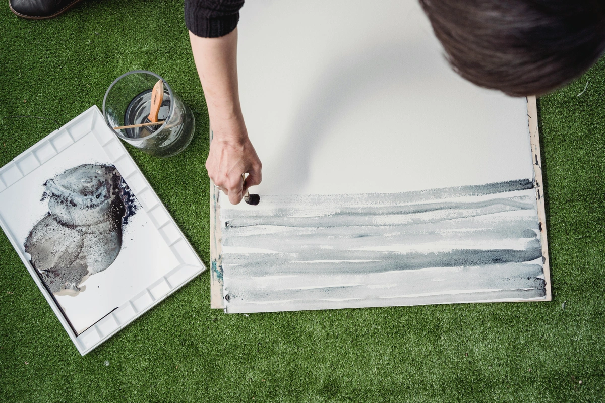
- Acrylic Paint: Use a fine-tipped brush, a round brush with a good point, or even the blunt end of a pencil or a dotting tool for perfectly uniform circles. Acrylics dry faster than oil, so you have to work a bit more quickly and plan your layers carefully. It’s a great way to practice speed, precision, and layering without the long drying times of oils. Consider using a fluid acrylic for easier dot application.
- Digital Tools: Of course, in the digital age, this is easy to replicate across various software from Photoshop to Procreate. Just select a hard-edged brush (or even a custom dot brush) and start dotting away on your tablet or computer. Experiment with opacity settings to build up color depth. It's a fantastic, mess-free way to understand the concept of optical mixing without wasting precious paint. Plus, infinite undo, which is a blessing when you're meticulously placing thousands of digital dots!
The evolution of tools for Pointillism, from Seurat’s meticulous oils to today’s digital tablets, reflects a broader shift in art-making. Yet, the core principle remains: the deliberate placement of individual color components. The medium changes, but the magic of optical mixing persists.
A Comparative Look: Tools for Pointillism
Tool Type | Pros | Cons | Ideal For |
|---|---|---|---|
| Oil Paints | Slow drying (more working time), rich color, traditional feel, superior luminosity | Long drying time, messier, requires solvents, can be costly | Large-scale, museum-quality works, subtle blends, truly luminous effects |
| Acrylic Paints | Faster drying, water-soluble, versatile, vibrant, good for layering | Faster drying (less working time), can appear flat if over-layered, less luminosity than oil | Experiments, quick studies, textured works, bold colors, classroom use |
| Markers | Clean, crisp dots, portable, immediate results, good for fine detail | Can bleed, limited blending compared to paints, often not lightfast | Graphic, illustrative styles, precise patterns, small-scale studies, sketching |
| Colored Pencils | Layering for subtle blends, portability, precise control, no mess, good for texture | Can be slow, limited vibrancy compared to paint, hand fatigue, requires good paper | Detailed illustrations, subtle shading, small works, quiet meditative practice, controlled gradients |
| Digital Tools | Infinite undo, mess-free, easy experimentation, quick iteration, vast color palette | Lacks tactile feel, can look too "perfect," screen dependency, digital fatigue | Beginners, learning color theory, complex patterns, conceptual drafts, quick mock-ups, graphic design |
credit, licence
Choosing Your Surface
Just as crucial as your choice of tools is the surface you choose to meticulously dot on. For the purists and traditionalists, a finely primed canvas or a rigid wooden board is absolutely excellent, providing a stable, consistently non-absorbent base that allows oil paints to sit proudly on the surface, maximizing their luminosity. If you're opting for markers or colored pencils, a smooth, heavy paper like Bristol board, vellum, or a hot-press watercolor paper will be your best friend. These surfaces effectively prevent feathering or bleeding, ensuring crisp, clean dot application. For acrylics, a gesso-primed canvas, wood panels, or even sturdy, heavy-weight paper can work beautifully, but always consider how quickly the surface absorbs moisture. The less absorbent the surface, the more your dots will retain their distinctness and sit on top, preserving their vibrant intensity. And here's a professional tip I've picked up: working on a lightly toned ground—a canvas or paper already painted with a thin, neutral color like a soft grey, beige, or even a pale blue—can dramatically help you judge your colors more accurately from the very beginning, preventing the stark white of a blank surface from overwhelmingly dominating your initial dot placements. It's like giving your colors a gentle, supportive stage to perform on.

Color Palette Selection for Pointillism: Orchestrating Optical Harmony
Choosing your colors for a Pointillist piece is not merely an artistic whim; it’s both a precise science and a profound art, inextricably tied to the optical mixing principles we’ve meticulously discussed. It's fundamentally not about randomly picking pretty hues; it’s about a deep, intuitive understanding of how those hues will dynamically interact on the canvas and, crucially, within the viewer's own eye.
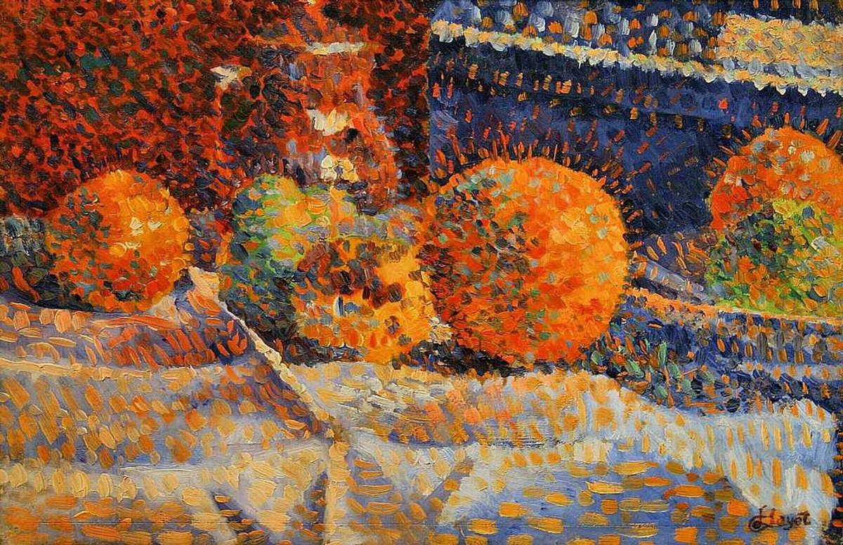
- Primary Colors are Your Best Friends: Always begin with the pure, unadulterated primaries: red, yellow, and blue. By placing tiny, distinct dots of these pure, unmixed colors adjacent to each other, your eye will, almost miraculously, naturally mix them from a distance to create secondary (like orange from red and yellow) and tertiary colors. This is precisely how you achieve that vibrant, intensely shimmering, almost vibrating quality so utterly unique to Pointillism. Think about how a Seurat sky shimmers with subtle purples and oranges, all from tiny dots of primary colors.
- Embrace Complementary Pairs for Maximum Pop: This is where the true visual magic truly erupts for unparalleled vibrancy. Placing small, precise dots of a complementary color (e.g., a tiny red dot next to a tiny green one, blue next to orange, or yellow next to purple) will not blend into a muddy mess from a distance—provided the dots are small enough. Instead, they will create an electrifying visual tension, making each other pop and heightening the perceived intensity and brilliance of both colors. This is the phenomenon of simultaneous contrast in its most potent, dazzling action. I’ve found that even a few strategically placed complementary dots can completely transform a seemingly flat area.
- Warm and Cool Colors for Illusory Depth: Harness the inherent properties of warm colors (reds, oranges, yellows) to visually bring elements forward in your composition, making them feel closer or more prominent. Conversely, deploy cool colors (blues, greens, violets) to make elements recede, creating a profound sense of depth and atmospheric perspective. This simple yet powerful trick, applied meticulously with dots, can conjure incredible spatial depth and atmosphere in your work, far beyond what traditional shading might achieve.
- Avoid Mixing on the Palette: Optical is the Goal! The entire point, quite literally, of Pointillism is optical mixing! It’s a hard habit to break for many, but you must, absolutely must, resist the urge to pre-mix your paints on the palette. Keep your dots as pure, unadulterated, and vibrant as possible to maximize luminosity and chromatic intensity. Let the viewer’s eye do the work!
- Experiment with Tones and Shades: Don't just think "blue" as a monolithic color. Think cerulean, ultramarine, Prussian blue, indigo, light blue, dark blue, sky blue, turquoise. The subtle variations in tone and saturation within your dot clusters will add astonishing richness, complexity, and a nuanced vibration to your optically mixed colors. It’s about building a gradient with individual light sources, not a blended smear.
By approaching your palette selection with these meticulous considerations, you're not just merely painting a picture; you're actively orchestrating a complex visual symphony of light, perception, and chromatic brilliance.
Exploring Different Pointillist Color Schemes
Beyond the core principles, artists can experiment with various color schemes to evoke different moods and optical effects in Pointillism:
Color Scheme | Description | Example Pointillist Application |
|---|---|---|
| Complementary | Colors opposite on the color wheel (e.g., Red/Green, Blue/Orange, Yellow/Purple). | Placing tiny dots of complementary pairs side-by-side to achieve maximum vibrancy and visual "pop," making each color appear more intense without physical mixing. |
| Analogous | Colors that are next to each other on the color wheel (e.g., Blue, Blue-Green, Green). | Using a cluster of analogous dots to create subtle, harmonious optical blends and gradients, useful for serene landscapes or soft transitions in skies, lending a calmer, more unified feel than complementary schemes. |
| Monochromatic | Variations of a single hue (e.g., light blue, medium blue, dark blue). | Building depth and form using only different values and saturations of one color, achieved by varying dot density and the subtle introduction of a very limited range of near-hues (e.g., a touch of blue-green within a blue scheme) to add richness. |
| Triadic | Three colors equally spaced on the color wheel (e.g., Red, Yellow, Blue). | Employing these fundamental primaries to create a wide spectrum of optically mixed secondary and tertiary colors, ensuring maximum chromatic range and a vibrant, balanced composition. |
| Tetradic (Rectangular/Square) | Four colors arranged in a rectangle or square on the color wheel (e.g., Red, Green, Blue-Violet, Yellow-Orange). | Utilizing a richer, more complex palette to achieve highly nuanced optical blends and sophisticated color harmonies, offering a greater challenge but rewarding with profound depth and visual interest. |
Understanding and intentionally applying these schemes elevates your Pointillist work from mere dot-placement to a sophisticated exploration of color theory.
A Simple Process to Get Started: Your First Pointillist Journey
Okay, so you’ve got your tools, you’ve picked your surface, and you've got a handle on color. Now what? Here’s a super simple, step-by-step process I’d recommend for anyone brave enough to dip their toe (or their brush!) into the world of Pointillism. Remember, patience is your co-pilot here.
Step | What to Do | My Two Cents |
|---|---|---|
| 1. Sketch Lightly | Start with a very light pencil sketch of your subject. Just the basic shapes and outlines, focusing on the main compositional elements. | Don't get bogged down in detail. Seriously, this isn't about perfectly defined lines, as you're going to cover it all with dots. It’s just your visual roadmap, your underlying structure. |
| 2. Color Block... with Dots | Begin by filling in the largest areas of color. For a blue sky, for instance, start with dots of different blues (think light blue, dark blue, cerulean, even a touch of navy), perhaps interspersing a few violets or even subtle hints of warm orange in distant areas. Apply dots with a consistent size initially. | Seriously, don't just use one shade of a color! Variation in hue, value, and saturation is absolutely key to making the final image feel vibrant, alive, and optically rich. Resist the urge to create neat, rigid rows; instead, scatter them with a deliberate, almost organic randomness – embrace the 'controlled chaos' to maximize optical mixing. This is where your understanding of color theory really comes into play! |
| 3. Introduce Contrasting Colors | To make a color pop, add tiny, sparse dots of its complementary color nearby. For a vibrant blue sky, add tiny touches of orange. For green grass, a few dots of red. This is also where you can begin to introduce subtle shifts in dot size to create texture. | This is where the real magic happens, where the optical mixing truly comes alive! It sounds counter-intuitive, but it will make your main colors sing and shimmer. Trust the color theory, it's science! The key is sparse application – just enough to create that vibration, not to physically blend. |
| 4. Build Up Density | To create shadows, darker areas, or a profound sense of depth and form, resist the instinct to simply reach for black or grey paint. Instead, achieve darker values by placing your dots much closer together, increasing their density. Alternatively, introduce darker shades or complementary colors within your existing color scheme (e.g., adding deep blues and purples to a green shadow). | This step is entirely about density and strategic color choices, not about adding "mud" to your palette. More dots, placed in a concentrated area, will optically blend to create a darker, richer value. Conversely, fewer, more spaced-out dots (allowing the white of the paper or canvas to subtly show through) will naturally create lighter values and shimmering highlights. It's a dance between presence and absence, a true optical illusion of light and shadow, and where the sense of three-dimensionality really takes hold. |
| 5. Refine Details & Edges | Once the main areas are built, go back and carefully add finer, more precise dots to define edges, subtle textures, and smaller elements. This is where the painstaking precision really comes into play. | This is where your subject truly emerges from the optical blend. Remember, even with dots, you can create the illusion of crisp lines and intricate forms through careful placement and density changes. Take your time with these final touches. |
| 6. Step Back. Often. | Every few minutes, get up, walk away from your work, and look at it from a distance. | This is, hands down, the most important step! What looks like an absolute mess up close will magically make sense from afar. Your brain needs that distance to do its job of optical mixing. It’s your only true way to gauge progress, and often, you’ll be amazed at what emerges. |
| 7. Embrace Patience | Pointillism is not a race; it’s a marathon. Work in short bursts, allowing your eyes to rest and your brain to process. It’s a meditative practice, a form of active mindfulness. | This is where the "meditative" aspect truly comes in. Don't rush it; the beauty, the brilliance, and the unique luminosity are all in the meticulous, patient accumulation of those tiny specks of color. Embrace the journey, not just the destination. |
Compositional Strategies
Compositional Strategies: Guiding the Eye Through the Dots
Beyond just the meticulous application of individual dots and the thoughtful selection of colors, a truly strong composition is absolutely paramount to creating a compelling and engaging Pointillist work. Since the technique, by its very nature of individual, static dots, can sometimes lead to a somewhat static or rigid feel, artists must be incredibly deliberate and strategic about guiding the viewer's eye and constantly creating visual interest within the piece.
Here are some key compositional strategies to consider:
- Balance and Harmony: Pointillists, most notably Georges Seurat, often meticulously aimed for a classical sense of balance in their compositions. This extends far beyond mere symmetry; it's about how elements—colors, shapes, densities of dots—are visually weighted and distributed across the canvas to create an overall sense of equilibrium and serenity, even if the arrangement itself is asymmetrical. Think about consciously distributing visual 'weight' evenly to achieve a harmonious and stable overall feeling, preventing any one area from overwhelming another.
- Leading Lines: Even with a composition built from discrete dots, you can powerfully create implied lines that subtly (or not so subtly) draw the viewer's eye through the painting. Consider the inherent directionality of your dot placement—how they naturally flow, converge, or diverge. This deliberate arrangement can create a sense of movement and rhythm, effectively guiding the viewer's gaze from one captivating element to another, leading them on a carefully choreographed visual journey.
- Focal Points: Decide with absolute precision where you want the viewer's eye to primarily rest and then intentionally emphasize that particular area. You can achieve this through several dot-based techniques: by making dots significantly denser, by utilizing brighter or more intensely contrasting complementary colors, or even by varying the size of the dots in that specific area to create visual texture and emphasis. Remember, the human eye will naturally be drawn to areas of highest contrast, greatest activity, or most intense color, so expertly use this to your advantage to direct attention.
- Rhythm and Repetition: While the individual dots are inherently repetitive units, the way they are applied and grouped can powerfully create a visual rhythm throughout the artwork. Consider how the deliberate spacing, size, and color sequence of your dots can establish a visual beat or pulse, adding a subtle yet compelling dynamism and flow to your otherwise static composition. It’s like a visual musical score.
- Negative Space: This is a concept often overlooked, but critically important: do not, for a second, forget the areas between your dots and your main shapes. Negative space—the unoccupied areas—is just as dynamically important as positive space. Thoughtfully incorporating and shaping negative space can dramatically enhance readability, provide visual breathing room, and prevent your painting from appearing too cluttered, heavy, or overwhelming. It frames and defines your primary subjects.
Common Hurdles and How to Leap Them
No art technique is without its challenges, and Pointillism is no exception. Trust me, I’ve hit every single one of these walls. But don't despair! Here are some common hurdles you might encounter and how I’ve learned to leap over them (or at least gently nudge them aside):
- The "Muddy Color" Trap: This is a common and disheartening hurdle: instead of achieving vibrant optical mixing, your colors can sometimes appear dull, murky, or muddy from a distance. This typically happens if your dots are too large, placed too close together, or if you’re using too many subtly different colors in one small area without sufficient distinction. Solution: The absolute key here is purity and ample space. Keep your individual dots small, crisp, and pure in color, allowing the pristine white of the canvas or paper to subtly peek through between them. This breathing room is crucial; it gives the colors space to resonate and allows your eye to perform its magical optical blending. And remember those complementary colors are for vibrancy enhancement, not for physically blending them into oblivion directly on the canvas!
- Lack of Form/Definition: It can be incredibly tricky to create clear, defined shapes and forms when you’re building an image purely from dots. Everything can begin to look a bit, well, formless, like a vibrant, colorful fog. Solution: Rely heavily on your initial, very light pencil sketch – it’s your unwavering anchor and guide. Use varying dot densities to precisely define edges and planes (denser dots for shadows and contours, sparser dots for highlights and receding areas). Strategic, subtle shifts in color temperature (warm vs. cool hues) can also powerfully help to give objects dimension and volume. And trust me on this: frequently squinting at your work from a distance truly helps you perceive the overall shape and form emerging from the chaos.
- Impatience: The Silent Destroyer: This is, hands down, the biggest killer of many a Pointillist dream. It’s so easy to become utterly frustrated with the incredibly slow, meticulous pace and feel an overwhelming urge to rush it, to just "fill it in!" Solution: You must, absolutely must, break your work into smaller, manageable sessions. Put on some calming music, listen to a fascinating podcast, or simply immerse yourself in the quiet, rhythmic repetition of dotting. Actively treat it like a meditation, not a race against time. The process itself, when approached with mindfulness, can be profoundly calming, a true form of artistic zen.
- Overworking: The Dimming Effect: Sometimes, in an effort to make it "better," "more vibrant," or "more something," you keep adding more dots, only to find it actually starts to detract from the piece, losing that precious luminous quality. Solution: This circles back to a golden rule: Step Back. Often. Your eyes desperately need that distance to reset and truly perceive the overall optical effect. Also, sometimes, genuinely, less is more. Knowing precisely when to stop is an art in itself! A strategic hint of white (the unpainted surface) showing through can often add far more light and life than an extra, dulling layer of dots.
- Inconsistent Dot Size/Shape: If your individual dots are wildly inconsistent in size, shape, or spacing, the optical mixing can become haphazard and uneven, leading to a patchy, unrefined appearance. Solution: Practice, practice, practice makes perfect. Aim for a consistent pressure and a smooth, uniform movement with your chosen tool. For paints, a consistent amount of paint loaded onto the brush tip is crucial. For digital work, stick to a fixed brush size and opacity. Uniformity in your individual units of color is the bedrock for creating a more cohesive, harmonious, and optically convincing overall effect. Consider doing drills to improve consistency before tackling a major piece.
- Choosing the Right Distance: A common mistake is not knowing the optimal viewing distance for your piece, which can lead to colors either not blending or looking overly muddy. Solution: This is where Step Back. Often. becomes even more critical. During the process, experiment with different viewing distances. A general rule of thumb is to step back about three times the diagonal measurement of your canvas. The goal is to find that sweet spot where the individual dots recede, and the vibrant, blended colors magically emerge. This is an interactive process; your painting needs the viewer's eye to complete it.
Beyond Seurat: The Pointillism Squad – Other Key Figures
Paul Signac: The Theorist and Traveler
While Georges Seurat is undoubtedly the towering figure and intellectual architect of Pointillism, he was by no means alone in this meticulous journey. It was a movement, after all, and movements demand more than one brilliant mind to flourish! Paul Signac (1863–1935) was not only Seurat's closest collaborator and confidant but also a brilliant artist in his own right who actively co-developed the style. Crucially, after Seurat's tragically early death in 1891, Signac stepped up to become the movement's most ardent theorist, articulate advocate, and tireless chronicler.
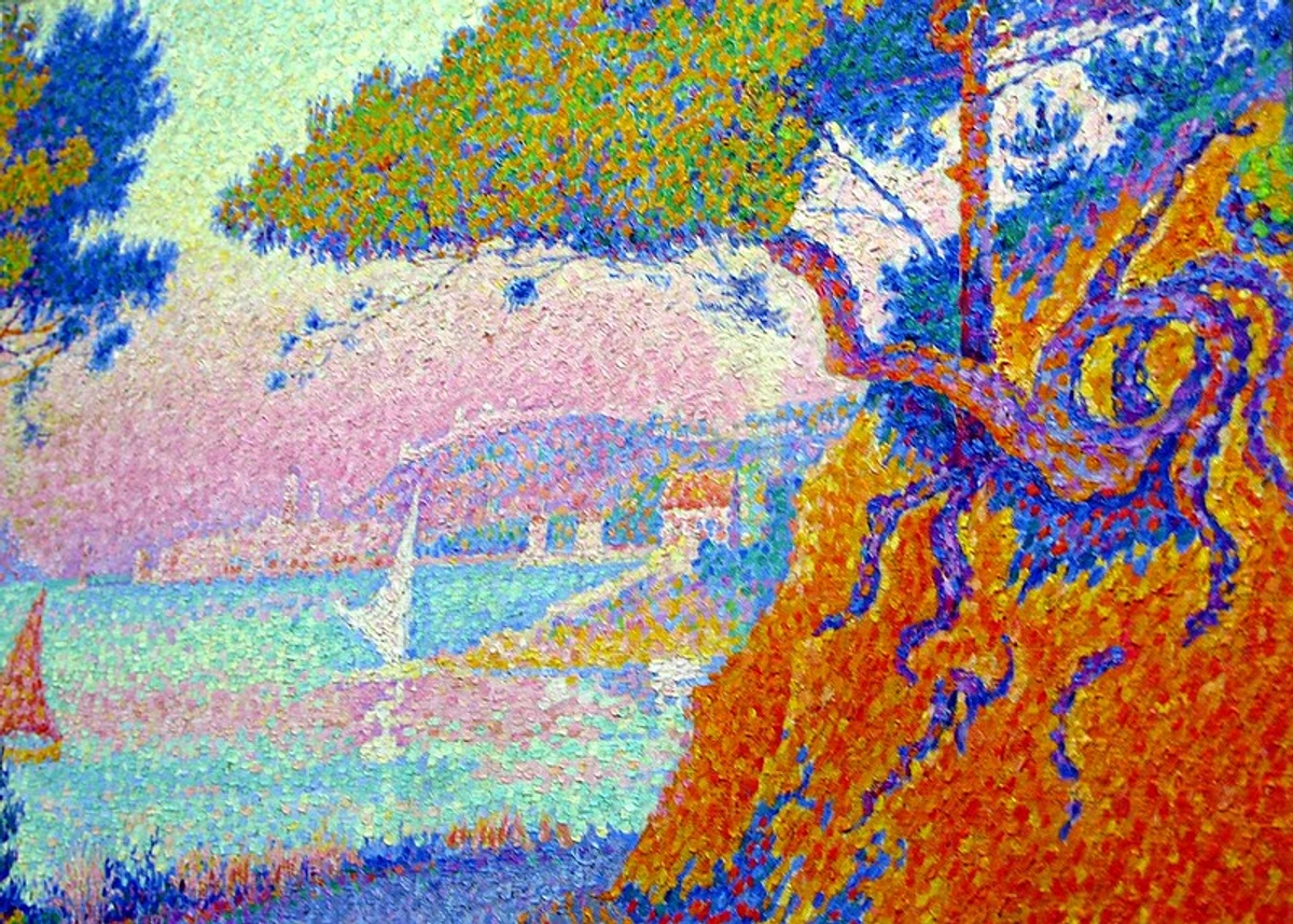
Signac's artistic approach, while rooted in Divisionism, often feels a touch looser and more expressive than Seurat's. His canvases frequently feature larger, sometimes more rectangular, dabs or "tesserae" of color, imbuing his works with a vibrant, mosaic-like quality that seems to shimmer with light. He was also a passionate sailor and traveler, extensively bringing the Divisionist technique to breathtaking coastal landscapes, bustling port scenes, and vibrant cityscapes throughout France and the Mediterranean, often infusing his palettes with a brighter, more optimistic range of hues. His seminal theoretical work, D’Eugène Delacroix au Néo-Impressionnisme (1899), became an absolutely crucial text, meticulously outlining the movement's scientific and aesthetic principles and profoundly influencing subsequent generations of avant-garde artists. It was Signac who, with immense dedication, truly carried the torch for Neo-Impressionism after Seurat's untimely passing, ensuring its legacy was preserved and disseminated.
But the Neo-Impressionist 'squad' extended far beyond the two pioneers, encompassing a fascinating array of artists who adapted the core principles to their individual visions:
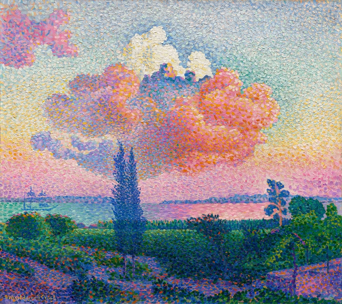
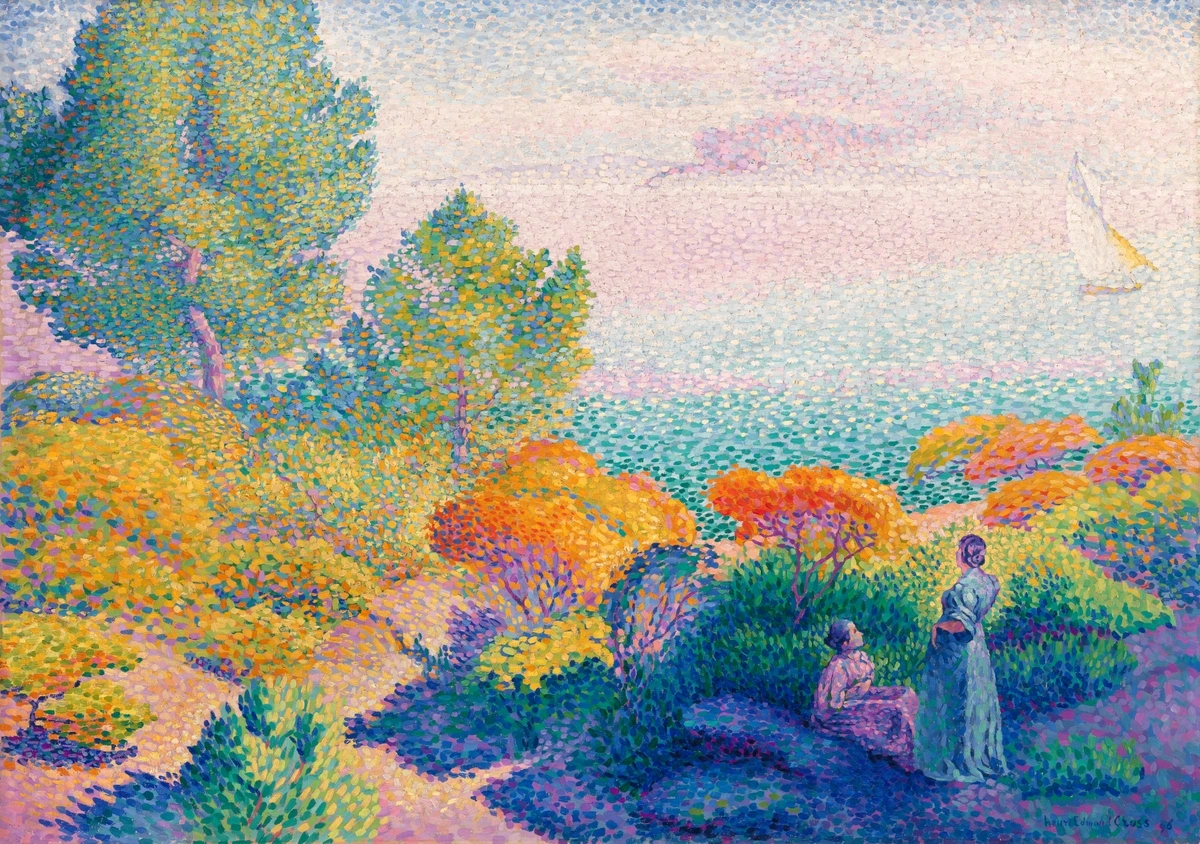
- Henri-Edmond Cross (1856–1910): Cross's serene, sun-drenched landscapes and nudes often employed larger, more distinct divisions of color, sometimes even moving towards square-ish brushstrokes, a style that elegantly blurred the lines between rigorous Neo-Impressionism and the burgeoning, emotionally charged early Fauvism. His works, like The Hair (1892) or The Joy of Life (1896), exemplify a more decorative, expansive, and harmoniously composed approach to the technique, infused with a vibrant Mediterranean light.
- Camille Pissarro (1830–1903): It’s truly remarkable that even a master like Pissarro, a foundational figure of Impressionism, briefly but wholeheartedly embraced the Neo-Impressionist technique in the mid-1880s. He produced several Divisionist paintings during this period, finding its methodical approach appealing for rendering light and atmosphere. While he eventually returned to a more Impressionistic approach, his brief flirtation is a powerful testament to the technique's captivating, albeit challenging, intellectual and visual allure, demonstrating how even established artistic giants were drawn to its scientific promises.
- Maximilien Luce (1859–1941): Luce was known for his powerful, often grittier industrial scenes and vibrant Parisian cityscapes, bringing the shimmering, divided color to portray the harsh realities and dynamic energy of modern urban and working-class life. His works, such as The Steelworks (1895), offer a unique social commentary within the Neo-Impressionist framework.
- Théo van Rysselberghe (1862–1926): A prominent Belgian artist, Van Rysselberghe's portraits and maritime scenes brought the shimmering, luminous quality of Divisionism to new subjects, often with a highly refined and elegant touch. His work demonstrates how the technique could be adapted to create psychologically insightful portraits and atmospheric seascapes.
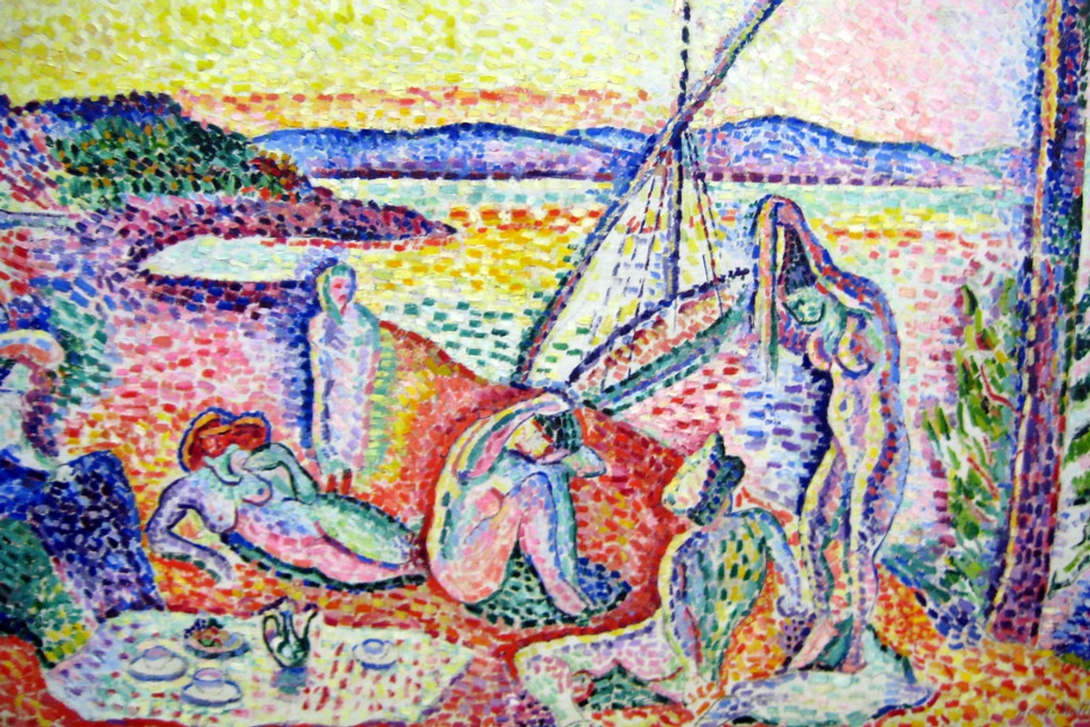
You can also see the undeniable, profound influence of Divisionist color principles echoing in the early, foundational works of pioneering Fauvist painters like Henri Matisse and André Derain. They took the liberating idea of pure, unmixed color and ran with it in a completely new, explosive direction, albeit with a different, more visceral focus on raw emotional expression rather than precise scientific calibration. Each of these artists brought their own unique sensibility to the humble dot, proving that a rigorous technique didn't necessarily stifle individual expression, but rather channeled it into a focused, brilliant pursuit of luminous, emotionally resonant color. The legacy of these artists is not just in their individual masterpieces, but in how they collectively pushed the boundaries of artistic expression and scientific inquiry, leaving an indelible mark on the trajectory of modern art.
Conservation Challenges of Pointillist Works: A Delicate Dance
Given the profoundly unique application method of Pointillism, these invaluable artworks present a distinct and highly particular set of challenges for conservation specialists. The pure, unmixed pigments, applied in myriad distinct dots, are inherently susceptible to irreparable damage if conventional, aggressive cleaning or restoration methods are employed. The delicate, almost tactile surface texture, along with the precise optical integrity of the individual dots, must be preserved at all costs.
Restorers involved with Pointillist masterpieces must operate with an almost surgical precision, using microscopic tools and advanced imaging techniques to meticulously analyze and treat the works. The paramount concern is to avoid disturbing the individual paint layers or, heaven forbid, inadvertently 'mixing' the colors directly on the canvas, which would fundamentally destroy the artist's original, carefully calculated intent for optical blending. This makes the conservation of works by Georges Seurat, Paul Signac, and their contemporaries an extraordinarily specialized, delicate, and time-consuming process. It's a powerful reminder that the physical, microscopic structure of these paintings is every bit as integral to their breathtaking optical effect as the colors themselves. Factors like light exposure, humidity fluctuations, and even minute vibrations can pose significant threats to these fragile surfaces, demanding constant environmental control and vigilance from museum conservators.
The Waning and Waxing of Dots: Legacy and Evolution
While Pointillism as a pure, dominant art movement had a relatively short lifespan (roughly 1886 to 1906), its principles didn't simply vanish. In fact, its very rigor and scientific basis made it a crucial stepping stone for subsequent avant-garde movements. The meticulous application and theoretical underpinnings proved to be both its strength and, arguably, its limitation. I mean, how many artists have the patience of Seurat, right?
The intense discipline required by the technique meant that few artists could sustain the pure Pointillist method for long. Its static, almost monumental compositions also contrasted with the growing desire for more emotional and expressive art that characterized movements like Expressionism and Fauvism. However, these movements benefited immensely from Pointillism's daring use of pure, unmixed color, albeit applied with far greater freedom and intensity. For example, the Fauves, like Henri Matisse and André Derain, directly adopted the Neo-Impressionist liberation of color from its descriptive role, though they used broad, expressive brushstrokes rather than dots. Futurists and Orphists, for instance, took the idea of breaking down light and color into components, but instead used it to depict movement and dynamism, rather than static harmony. It taught a vital lesson: that color could be liberated from its descriptive role and become a powerful, independent force, capable of conveying emotion and energy on its own.
So, is Pointillism just a fascinating, perhaps slightly eccentric, blip in the grand, sweeping narrative of art history? I vehemently don't think so. Its legacy is, in fact, absolutely monumental, powerfully reverberating through art right up to our contemporary moment. It stood as one of the very first art movements to be so profoundly and explicitly rooted in rigorous scientific theory, thereby boldly paving the way for countless future movements that would relentlessly challenge the very definition of what a painting could be, and how it could be created and perceived. It triumphantly demonstrated that art could be simultaneously deeply analytical and breathtakingly beautiful, a true and profound synthesis of the intellectual head and the emotional heart.
And when you really stop to consider it, Pointillism's fundamental principle—the revolutionary idea of building a complete, cohesive image from countless pure, tiny, discrete components—is literally everywhere you look in our modern world, whether you consciously realize it or not. From the pixels that form every image on your digital screen to the halftone dots in every printed photograph, its influence is pervasive. It's truly a testament to the enduring, transformative power of a foundational idea, a concept so potent that artistic styles and technological innovations continue to take it in wildly different, yet undeniably connected, directions.
Pointillism in Pop Culture and Modern Applications: The Enduring Pixelated Legacy
From the hallowed halls of the fine art gallery to the vibrant pages of a comic book, and from your smartphone screen to giant billboards, the pervasive influence of Pointillism's core concept—the audacious idea of building a complete image from countless discrete dots—is truly astonishing. It’s a concept that continually reinvents itself across media and technology.
- Digital Screens and Pixels: As we touched upon earlier, this is perhaps the most ubiquitous and direct, albeit technological, descendant of the Pointillist vision. Every single digital screen you interact with daily—your smartphone, computer monitor, television, LED billboard—operates on the very same principle of optical mixing. Tiny pixels (short for 'picture elements') of red, green, and blue light are illuminated in varying intensities. Your eye and brain then perform the "optical mixing," blending these discrete light sources to create a seamless, full-color image. It’s genuinely wild to think that Georges Seurat was, in essence, inventing analog pixels in the 1880s, laying the conceptual groundwork for our digital visual world.
- Printing Technology (Halftone Dots): Long before digital printing, the process of reproducing photographs and images in newspapers, magazines, and books relied heavily on what's known as halftone printing. This technique breaks down continuous-tone images (like photographs) into a series of tiny, varying-sized dots. From a distance, these dots optically blend to create the illusion of different shades and tones. It’s essentially industrial-scale Pointillism, allowing mass media to reproduce complex imagery. The CMYK (Cyan, Magenta, Yellow, Black) printing process, used for nearly all color printing, also relies on layering these four primary ink colors as tiny dots to create a full spectrum of hues.
- Comic Books (Ben-Day Dots): Fans of classic comic books, particularly Pop Art masterpieces by artists like Roy Lichtenstein, will immediately recognize Ben-Day dots. These are small, colored dots (or lines, or squares) arranged in specific patterns to create shading and secondary colors, famously mimicking the printing processes of comics. Lichtenstein, in particular, elevated Ben-Day dots into a high art form, making the mechanical reproduction visible and integral to the aesthetic. It's a playful, yet direct, homage to the optical mixing principles pioneered by the Neo-Impressionists.
- Digital Art and Pixel Art: In the realm of contemporary digital art, pixel art has seen a resurgence. Artists intentionally create images using discrete, visible pixels, often evoking a nostalgic 8-bit or 16-bit video game aesthetic. While the medium is digital, the deliberate creation of imagery from individual, discernible color units is a clear conceptual echo of Pointillist principles. Even highly sophisticated digital painting software often incorporates brushes that can mimic a Pointillist or Divisionist effect.
- Textile Design and Fashion: The idea of creating patterns and perceived colors through woven threads of different hues, which optically blend from a distance, predates Pointillism but shares its core principle. Tapestries, tweeds, and various textile designs utilize this optical blending, creating rich, complex textures and colors that can’t be achieved with a single, block color. The subtle shimmer of a finely woven fabric often relies on this principle of optical fusion.
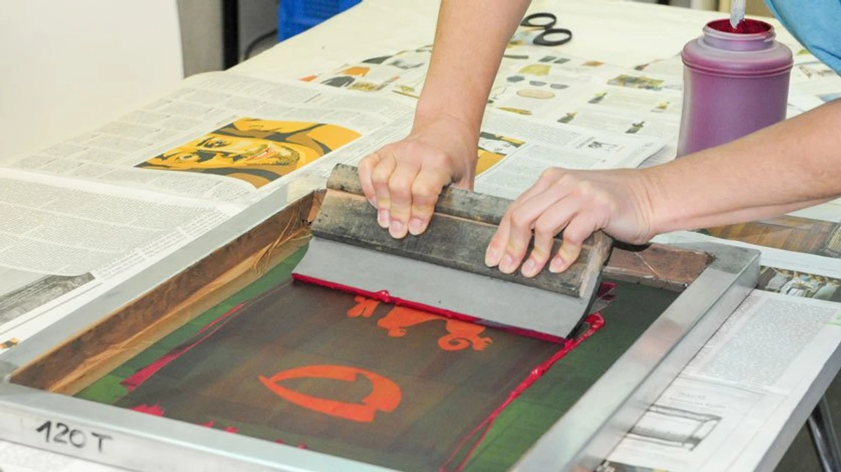
- Street Art and Mosaics: While not always strictly "dots," many forms of street art and mosaic art embrace the idea of building larger images from smaller, distinct components. Whether it's a stencil artist using a pattern of sprayed dashes or a mosaicist painstakingly arranging tiny tiles (tesserae), the viewer's eye is often asked to optically complete the image, much like with a Pointillist painting.
- Lenticular Printing and 3D Effects: This fascinating technology, which creates illusions of depth or animation, relies on arranging interleaved images. While not strictly dots, the individual strips of imagery are optically blended by the viewer's position, creating a dynamic visual experience that echoes the perceptual manipulation at the heart of Pointillism.
Modern Applications of Pointillist Principles
Application | Description | Connection to Pointillism |
|---|---|---|
| Digital Screens | Smartphones, TVs, monitors display images using tiny red, green, and blue light-emitting pixels that blend in the viewer's eye. | Directly employs the principle of additive optical mixing; discrete color elements are perceived as continuous tones. |
| Halftone Printing | Used in newspapers and magazines, images are broken into varying-sized dots of primary inks (CMYK) to create the illusion of continuous tone. | Industrial-scale subtractive optical mixing; the viewer's eye blends the printed dots to form a full spectrum of colors and shades. |
| Ben-Day Dots | Comic book printing technique using small, colored dots to create shading and secondary colors, famously utilized in Pop Art. | A deliberate artistic and printing method relying on optical blending of primary colors to achieve a wider chromatic range and visual texture, a direct homage to Neo-Impressionist techniques. |
| Pixel Art | Contemporary digital art style where images are intentionally created with visible, discrete pixels, often evoking retro video game aesthetics. | Emphasizes the creation of cohesive imagery from individual color units, mirroring the Pointillist focus on the fundamental components of an image, even if the medium is digital rather than paint. |
| Textile Design | Woven fabrics where different colored threads are interlaced, creating perceived colors and textures that blend from a distance (e.g., tweeds, tapestries). | Shares the core principle of optical mixing where separate color components (threads) are visually blended by the eye to create new, composite colors and textural effects in the fabric. |
| Mosaics / Street Art | Larger images built from small, distinct components (tiles, sprayed dashes, stenciled elements) where the viewer's eye completes the overall image. | Relies on the viewer's brain to synthesize a complete image from individual, discrete units, similar to how Pointillist dots are optically blended. |
| Lenticular Prints | Specialized prints that create illusions of depth or animation by interleaving multiple images, which are then optically resolved by the viewer's perspective. | Manipulates viewer perception by presenting discrete visual information that the eye and brain merge into a dynamic or three-dimensional image, echoing the perceptual manipulation central to Pointillism, albeit through a different technological means. |
It's wild to think that Georges Seurat was, in essence, inventing the visual language of our digital age over a century ago. The way we perceive images on screens and in print owes an enormous debt to the scientific curiosity and artistic innovation of the Pointillists.
FAQ: Your Pointillism Questions Answered
Q: Is Pointillism a form of Impressionism?
A: This is a really common and understandable question! While Pointillism (or more accurately, Neo-Impressionism) evolved directly out of Impressionism and shares an interest in light and color, it's not simply a form of Impressionism. Think of it more as Impressionism's highly intellectual, scientifically-minded, and much more systematic younger sibling. The Neo-Impressionists admired the Impressionists' liberation of color, but they found their spontaneity and lack of structure too fleeting. They sought to bring scientific rigor and permanence to the depiction of light, which led to their methodical dot-based technique. So, inspired by, but distinct from!
Q: What is the difference between Pointillism and Impressionism?
A: It's a great question because they're related! Impressionism was about capturing the fleeting feeling and light of a moment with visible, often spontaneous brushstrokes. Pointillism (or Neo-Impressionism) grew out of that but was much more scientific and methodical. Instead of spontaneous strokes, it used calculated dots based on color theory to create a more stable and luminous image. Think of it as Impressionism's more organized, scientifically-minded cousin.
Q: What kind of subjects did Pointillist artists paint?
A: While Georges Seurat's most famous work, A Sunday on La Grande Jatte, depicts a serene park scene, Pointillist artists explored a wide range of subjects. You'll find landscapes (especially coastal scenes, a favorite of Paul Signac), cityscapes, portraits, nudes, and even industrial scenes (Maximilien Luce). They weren't limited by subject matter; rather, they applied their scientific technique to whatever caught their eye, often with a particular interest in scenes of modern life and leisure.
Q: Why did Pointillism artists use dots?
A: They believed that optical mixing—letting the viewer's eye blend the dots of pure color from a distance—created more vibrant and brilliant colors than mixing paints on a palette ever could. They were chasing luminosity and a more intense, 'alive' color effect that traditional blending simply couldn't achieve.
Q: How is Pointillism related to color theory?
A: It's fundamentally intertwined! Pointillism is essentially an artistic application of 19th-century scientific color theory. Artists like Seurat meticulously studied the works of color theorists like Chevreul and Rood, particularly their ideas on simultaneous contrast and additive/subtractive mixing. They used these scientific principles to inform their choice and placement of pure, unmixed colors, believing it would create more luminous and vibrant optical effects than traditional palette mixing. It's art driven by intellectual understanding of light and perception.
Q: What is "Divisionism" or "Chromo-luminarism"?
A: These are the terms that Georges Seurat and Paul Signac preferred for their technique. "Divisionism" refers to the systematic separation of color into individual dots or distinct touches, while "Chromo-luminarism" emphasizes the scientific study of light and color and their interactions to achieve maximum luminosity. "Pointillism" was actually a term coined by critics, initially with a somewhat mocking tone, but, as often happens, it's the name that stuck in popular usage!

Q: Are there any modern artists using Pointillism today?
A: Absolutely! While pure academic Pointillism from the late 19th century is a historical movement, its underlying principles—creating images from distinct color units and relying on optical mixing—are very much alive. You'll find contemporary artists, especially in digital art (pixel art!), graphic design, and even street art, who draw inspiration from or directly employ dot-based techniques. It's a testament to the enduring power of the core idea, adapted and reinterpreted for new media and contexts.
Q: Is Pointillism hard to learn?
A: The underlying concept is beautifully simple, but the actual execution requires an enormous amount of patience and meticulousness. It's not necessarily "hard" in the way, say, realistic portraiture or complex anatomy might be technically difficult, but it is an incredibly slow, deliberate, and demanding process that requires immense discipline. The main challenge, I've found, is often more mental than physical—it's about trusting the process, believing in the optical magic, and consistently stepping back to see the whole image emerge.
Q: Who are the most famous Pointillist artists?
A: The big two, the undisputed pioneers, are Georges Seurat and Paul Signac. Others associated with the movement include Henri-Edmond Cross, Charles Angrand, and for a brief period, even the Impressionist master Camille Pissarro dabbled in the technique. It’s a fascinating roster of artists who pushed the boundaries of color and light.
Q: Can I buy art that uses these techniques?
A: Absolutely. While the original masterpieces are in museums, many contemporary artists use dot-based techniques in their work, often blending it with other styles. You can find modern interpretations and pieces inspired by this methodical approach in galleries and online, including some of my own works available to buy.
Conclusion: The Enduring Dot and Its Infinite Canvas
So there you have it – a comprehensive journey into the seemingly simple, yet profoundly complex and endlessly fascinating world of Pointillism. From my own initial "fuzzy" encounter with Georges Seurat's La Grande Jatte to a much deeper appreciation of its scientific underpinning and artistic genius, this remarkable movement continues to utterly fascinate me. It stands as a powerful testament to the human capacity for meticulous observation, extraordinary patience, and the incredible, often underestimated, capabilities of our own visual perception and cognitive processing.
Pointillism, at its core, gently reminds us that sometimes, the most revolutionary, transformative ideas are ingeniously hidden in plain sight—or, in this case, in plain, unmixed dots. It masterfully bridges the often-perceived chasm between rigorous science and breathtaking art, powerfully proving that analytical rigor, when paired with artistic vision, can indeed lead to unparalleled beauty, vibrant luminosity, and profound optical effects. For any aspiring artist, it offers a timeless and powerful lesson: trust the process, deeply understand your materials and how they interact with light, and most importantly, generously allow the viewer's eye and brain to complete the magic, actively participating in the creation of the image.





Why not give it a try yourself? It’s a wonderfully meditative, almost therapeutic practice that can genuinely transform how you perceive and interact with color and light in the world around you, one tiny, deliberate dot at a time. And if your curiosity is now piqued about where Pointillism so elegantly fits into the grander, intricate narrative of art history, I enthusiastically recommend exploring our interactive art history timeline.
Q: What was the influence of Pointillism on later art movements?
A: Pointillism, and Neo-Impressionism as a whole, profoundly influenced subsequent avant-garde movements. Its liberation of color from its descriptive role paved the way for Fauvism and Expressionism, while its systematic approach to breaking down images into components influenced Cubism and Futurism. It truly shifted how artists thought about color, light, and form, providing a scientific blueprint for future artistic revolutions. Its legacy is etched into the very fabric of modern visual culture, from gallery walls to the screens in your pocket.