Georges Seurat, Pointillism & Divisionism: The Ultimate Guide to Optical Art and the Science of Seeing
Unravel the science of seeing with Georges Seurat! This ultimate guide explores Divisionism, the optical theory behind Pointillism, analyzes masterpieces, and offers practical tips for the vibrant dot technique. Discover its profound legacy and try it yourself!
Georges Seurat, Pointillism & Divisionism: The Ultimate Guide to Optical Art and the Science of Seeing
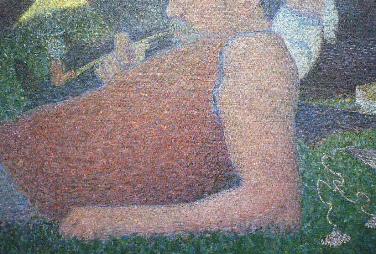
I remember the first time 'A Sunday on La Grande Jatte' truly clicked for me. Not just seeing it, but perceiving it. I was in front of a high-resolution digital image, zooming in until the serene park scene dissolved into a dizzying mosaic of individual, unblended dots. Red next to blue, yellow beside green. Up close, it was chaos; step back, and suddenly, a vibrant, luminous world emerged. It felt like a visual magic trick, both broken and exquisitely perfect, simultaneously. Broken because the individual dots made no sense; perfect because my brain instinctively took over, stitching it all together into something impossibly alive. That's when I realized: Seurat wasn't just painting a park, he was painting the very act of seeing itself. It's a technique that demands your active participation, a profound trust in the science of perception. And honestly, that’s what makes it so utterly brilliant and why we’re diving deep into it today. This article aims to be your most comprehensive and engaging source for understanding Georges Seurat, Pointillism, and the groundbreaking theory of Divisionism. We'll unravel the scientific brilliance of Seurat, distinguish Pointillism from Divisionism, explore his iconic works and their deeper meanings, understand the subtle psychological effects of color and line, and even offer you a practical guide to try this mesmerizing technique yourself. Prepare to see art—and the act of seeing—in a whole new light. Perhaps even learn a bit about yourself in the process.

Unpacking the Language: Pointillism, Divisionism & Chromo-Luminism
Let's get one thing straight from the start, because this is where many people get it (pun absolutely intended) wrong. Calling Pointillism 'dot art' is like calling a classic novel 'word art.' It's technically true, sure, but it misses the entire, profound point. Think of it this way: Pointillism is the how, the specific technique of applying paint in small, distinct dots or dashes. It's the artistic brushstroke, but instead of a stroke, it's a dot. It requires a steady hand and endless patience – something I know I struggle with on a Monday morning before my coffee has fully kicked in.
Divisionism (or Chromo-Luminism) is the overarching color theory or artistic principle behind Pointillism. It's the why. This is the critical distinction. It emphasizes the separation (division) of colors into their pure components on the canvas, allowing the viewer's eye to optically mix them from a distance. Chromo-luminism (literally 'color-light-ism') was the term preferred by Seurat and his circle, and it perfectly highlights their scientific focus on light and color. It's truly a fascinating concept, almost like a visual alchemy, where your brain performs the final blend.
So, what exactly was he dividing? Seurat was meticulously dividing colors into their pure, component parts, trusting your eye to do the mixing from a distance. Instead of mixing green on his palette, for instance, he'd place a dot of pure blue right next to a dot of pure yellow. When you step back, your eye does the hard work, blending those dots to create a green that feels more vibrant, shimmering, and alive than anything you could mix by hand. He firmly believed this optical mixing would result in colors far more luminous and brilliant than the 'muddy' results of traditional physical mixing.
Why do physical mixtures tend to be muddy? Because pigments work by subtractive mixing: they absorb certain wavelengths of light and reflect others. The more pigments you mix, the more light is absorbed, resulting in a duller, darker color. I know from personal experience, if I get carried away mixing too many colors on my palette, especially with oils, the result quickly turns into an uninspiring brown or gray mess. Seurat, in essence, was leveraging your eyeballs to perform additive mixing – allowing them to mix light, not just pigment, creating a brilliance akin to how light itself behaves. Think of your TV screen, where tiny red, green, and blue pixels blend to create a full spectrum of colors from a distance – that's optical mixing in action, combining light to create a brighter perceived color. This entire concept is explained further in this deep dive into what is Pointillism in art.
Here’s a simple breakdown of the core difference, because this really is the key to understanding Divisionism:
Feature | Physical Mixing (On the Palette) | Optical Mixing (On the Canvas) |
|---|---|---|
| Method | Pigments are blended together before application, creating a new color. | Pure, unmixed dots of color are placed next to each other. |
| Application | A single, continuous stroke or area of paint. | Individual dots applied directly to the canvas, leaving tiny gaps. |
| Result | A single, flat area of the mixed color. | The viewer's eye blends the dots from a distance to perceive a mixed, shimmering color. |
| Luminosity | Tends to be lower; combined pigments absorb more light, leading to potentially 'muddy' or duller tones. | Higher; individual dots reflect more light, creating a shimmering, vibrant, almost translucent effect. |
| Viewer Participation | Passive; the artist has done all the mixing. | Active; the viewer's brain and eyes perform the final act of color synthesis. |
| Example | Mixing blue and yellow paint directly to get green. | Placing pure blue and pure yellow dots side-by-side to perceive green. |
Seurat: The Methodical Mind Behind the Dots
Before we dive headfirst into the millions of dots, let's talk about the methodical mind behind them. Georges Seurat wasn't your stereotypical bohemian artist, starving away in a dusty Parisian garret. Born into a well-off family in Paris in 1859, he was, by all accounts, a meticulous, almost scientific soul. I can almost picture his studio resembling a laboratory, meticulously organized, filled with color charts, optical diagrams, and perhaps even notes from scientific journals. He honed his skills at the prestigious École des Beaux-Arts, where he received a traditional academic training. But unlike many of his peers, his true fascination quickly shifted from old traditions to the emerging science of color and light.
He was utterly obsessed with theories about how colors interact, how our eyes perceive them, and, crucially, how he could meticulously control that process on the canvas. This wasn't a happy accident of a new style; it was a calculated, revolutionary system built on deep study and experimentation. He truly believed art could be as precise and predictable as a chemical reaction. If you're curious about the man himself, you can find a deeper look into his life and influences by reading more about who is Georges Seurat.
Beyond pure theory, Seurat's method also had a practical, economic dimension. Pure, high-quality pigments were often very expensive for 19th-century artists. By applying them in discrete, unmixed dots, Seurat could achieve maximum brilliance and optical mixing with less pigment overall, avoiding the need for large quantities of physically mixed colors that might dull or become muddy. It was a clever way to maximize the impact of costly materials.
Neo-Impressionism: A Scientific Evolution from Spontaneity
Seurat's groundbreaking work didn't emerge in a vacuum; it grew directly out of Impressionism, but it was also a deliberate, highly systematic reaction against its spontaneity. The artistic climate of the late 19th century was dynamic, shifting from the grand narratives of Romanticism and the factual representations of Realism. Impressionism, as I see it, aimed to capture the fleeting moment, the impression of light and atmosphere, often with quick, visible, broken brushstrokes and a sense of immediate, alla prima (at first attempt) observation. It was about capturing a subjective experience, a moment of personal perception. Think of Monet’s rapid, expressive strokes capturing the changing light on Rouen Cathedral – it's all about that immediate, felt experience.
Seurat and his followers, who became known as the Neo-Impressionists, took that interest in light and systematized it, almost industrializing the brushstroke into a precise, calculated dot. This wasn't merely a stylistic choice; it reflected a broader late-19th-century intellectual current favoring scientific objectivity and rational order over subjective experience. It was a clear pivot from spontaneous observation to highly calculated construction, a move from emotional intuition to scientific rigor. While many Impressionists reveled in capturing nature's momentary moods, Seurat sought to impose order, structure, and a sense of permanence on his subjects. He was building masterpieces, dot by painstaking dot. This systematic approach also connected to a fascination with the modern urban environment, seeking to depict its ordered, often detached, social realities.
If you look at an Impressionist painting like Renoir's 'La Loge' (above), you can almost feel the energy and speed of the moment, the soft focus and fluid blend of colors. It's immediate, intimate. Seurat’s work, in stark contrast, feels still, monumental, and meticulously planned. He traded that spontaneity for precision, carving out a whole new branch of art that eventually paved the way for other movements and is often categorized under Post-Impressionism. To truly appreciate the contrast, you can also explore other famous Impressionist artists and see the incredible range of styles they encompassed. For a deeper understanding of the differences, let's break it down:
Feature | Impressionism | Neo-Impressionism (Divisionism) |
|---|---|---|
| Goal | Capture fleeting impression of light/atmosphere; subjective experience. | Systematize light/color; objective, scientific approach to perception. |
| Brushwork | Quick, visible, broken strokes; spontaneous, alla prima application. | Meticulous, small, distinct dots (Pointillism); calculated and controlled. |
| Color Mixing | Often physical mixing on the palette; emphasis on perceived color in nature. | Optical mixing in the viewer's eye; separation of pure pigments on canvas. |
| Subject Matter | Everyday life, landscapes, light effects; focus on subjective perception of the moment. | Similar subjects, but with an emphasis on order, structure, and psychological impact. |
| Emotional Tone | Often immediate, spontaneous, emotional, capturing movement and fluidity. | Generally more static, monumental, controlled; intellectual and analytical. |
| Science Influence | Intuitive understanding of light; less explicit scientific theory. | Deeply rooted in contemporary color science (Chevreul, Rood, Helmholtz). |
The Scientific Lens: How Seurat Painted Light and Perception
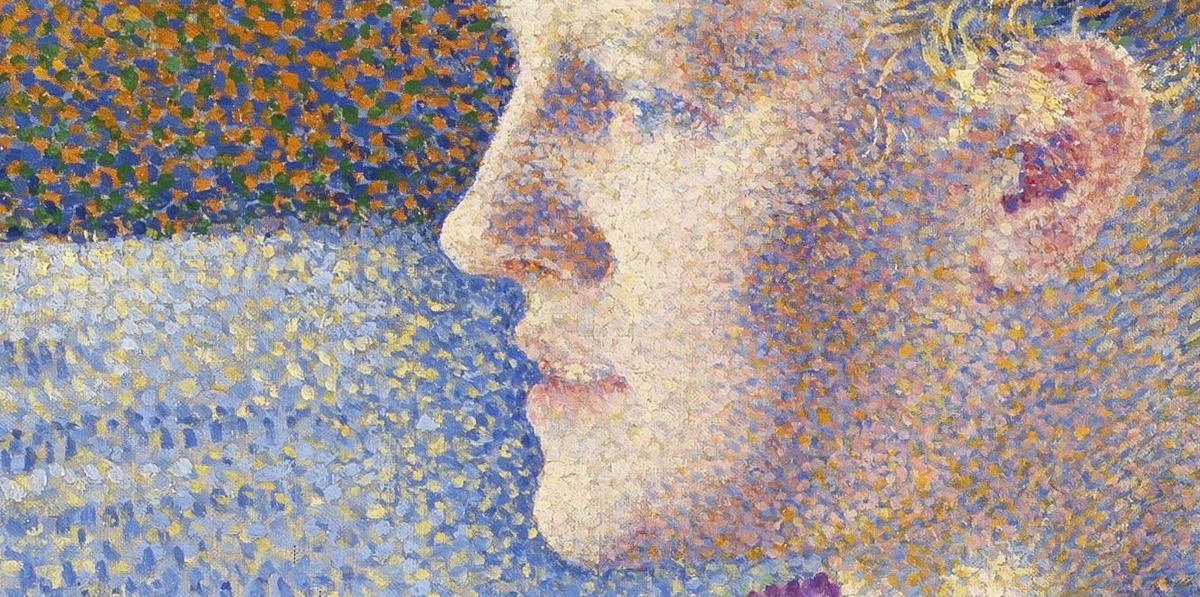
Seurat wasn't just an artist; he was, to me, a scientist of sight. The very foundation of his work was rooted in the cutting-edge color science of his day, particularly the ideas put forth by chemist Michel Eugène Chevreul and physicist Ogden Rood. It sounds dense, I know, but trust me, it's fascinating! Seurat also likely consulted the writings of Hermann von Helmholtz, a German physician and physicist whose seminal work on human vision, color perception, and physiological optics was highly influential in the late 19th century. Helmholtz explored how the human eye perceives and interprets light, including the existence of three types of cone cells in the retina sensitive to red, green, and blue light – a foundational concept for understanding how our brains ultimately perform additive color mixing. This is how your brain synthesizes all those tiny dots into a cohesive image – quite remarkable, isn't it?
Chevreul, known for his work with Gobelins Manufactory tapestries, observed that the appearance of a color is drastically affected by the colors placed immediately next to it. This became his law of simultaneous contrast. Imagine placing a bright red square next to a plain gray one; the gray will subtly appear greener. Conversely, if you place a yellow square next to a gray one, the gray might take on a faint purple tint. Seurat and his Neo-Impressionist followers took this concept and ran with it, believing that by placing pure, unmixed colors side-by-side, each color would appear more intense and vibrant, especially when our eyes blended them from a distance. It was about enhancing the inherent power of each hue, making colors practically glow.

Rood's theories further informed their approach, especially regarding how light mixes (additive mixing) versus how pigments mix (subtractive mixing). Imagine shining colored spotlights onto a stage (additive) – red, green, and blue light (the primary colors of light, often abbreviated as RGB) mix to create white light. This happens because light waves are adding together, reflecting more light back to your eye. But when you mix red, yellow, and blue paint (the traditional primary colors of pigment, used in subtractive mixing), you typically get a dark, 'muddy' brown or black. This 'muddy' effect happens because pigments work by absorbing certain wavelengths of light and reflecting others; the more pigments you mix, the more wavelengths are absorbed, leading to a darker, duller color. Think of how a printer uses CMYK (cyan, magenta, yellow, black) dots to create images – each pigment subtracts light, and combining them extensively results in black. Seurat, understanding that pure, high-quality pigments were also costly (a significant economic factor for 19th-century artists), sought to mimic the brilliance of additive light mixing on canvas, using subtractive pigments in a revolutionary way.
He understood that each individual dot of pure color would reflect its maximum light, and when combined optically by the viewer's eye, this would create a greater luminosity than physically mixing pigments, which absorb more light when combined. It was a revolutionary way to literally paint with light, transforming the canvas into a vibrant mosaic of pure, reflected light. It was as if he was finding a clever workaround to the limitations of paint, allowing your eyes to do the final, brilliant blend. This ingenious approach is a cornerstone for understanding how artists use color, definitive guide to color theory in art and even the psychology of color in abstract art.

credit, licence
This meticulous, scientific approach is a cornerstone of so many art forms, even those that seem more intuitive. You can further explore the fundamentals of how artists use color, delve into the psychology of color in abstract art, or learn about definitive guide to understanding light in art.
Seurat's Masterpieces: Beyond Just One Sunday
While 'A Sunday on La Grande Jatte' is undeniably the icon, Seurat's unwavering dedication to Divisionism manifested in several other monumental works. Each piece pushed the boundaries of his technique and composition, exploring different subjects and emotional ranges. His dedication to each canvas was legendary, a testament to his methodical nature and artistic vision. He really was constructing worlds, dot by deliberate dot, and thinking about every single element, from the largest figure to the tiniest shadow. This makes his work a masterclass in the art of composition: guiding viewer's eye.
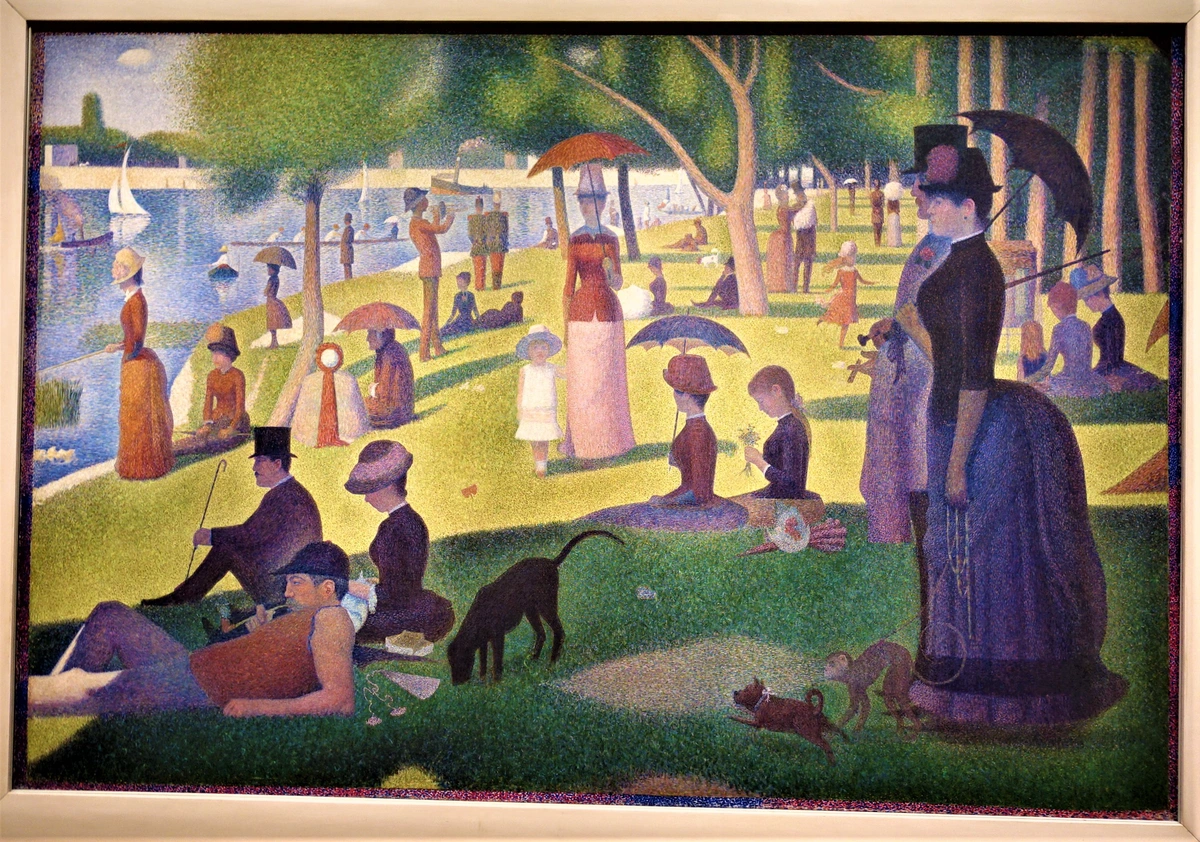
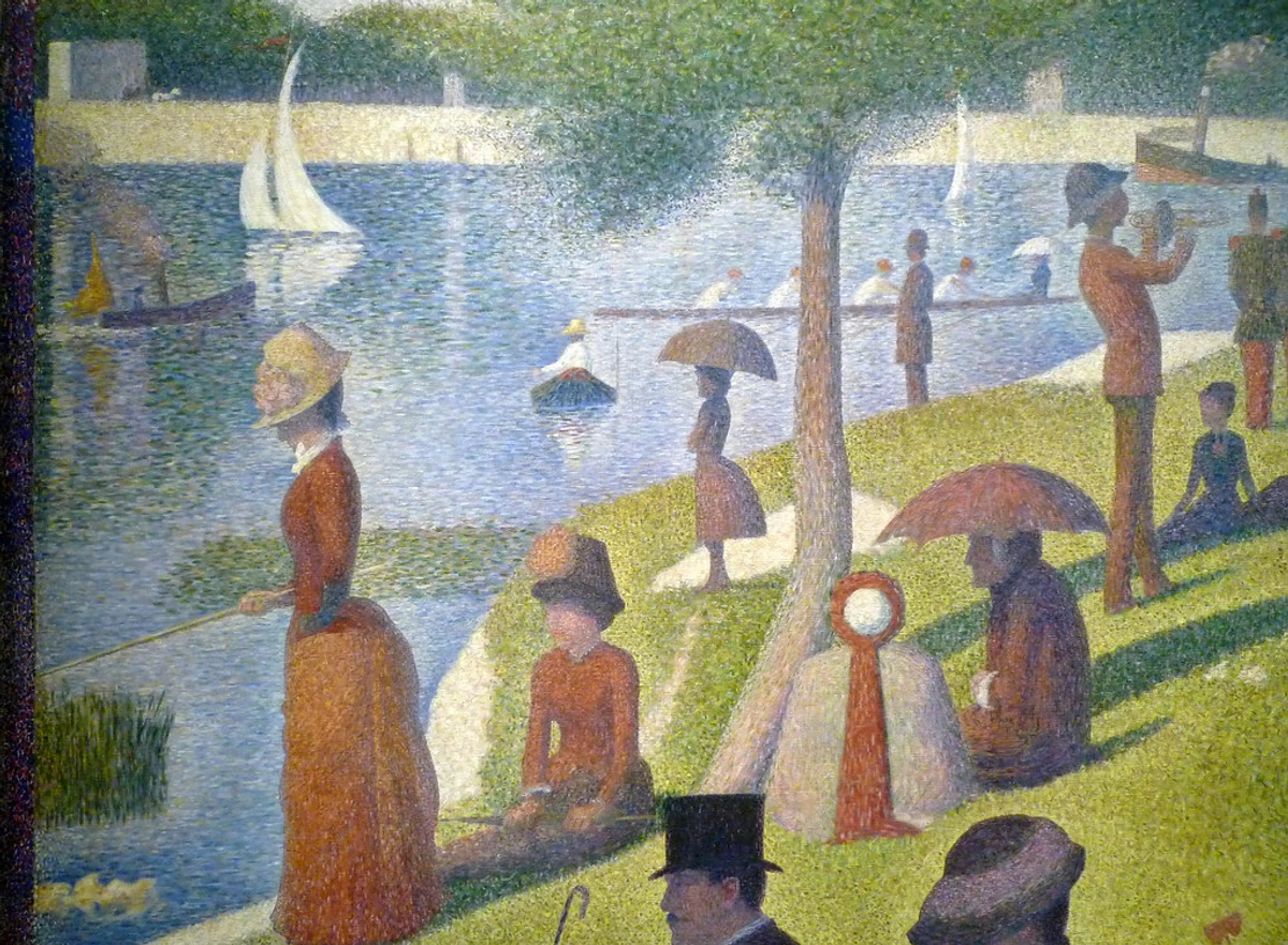
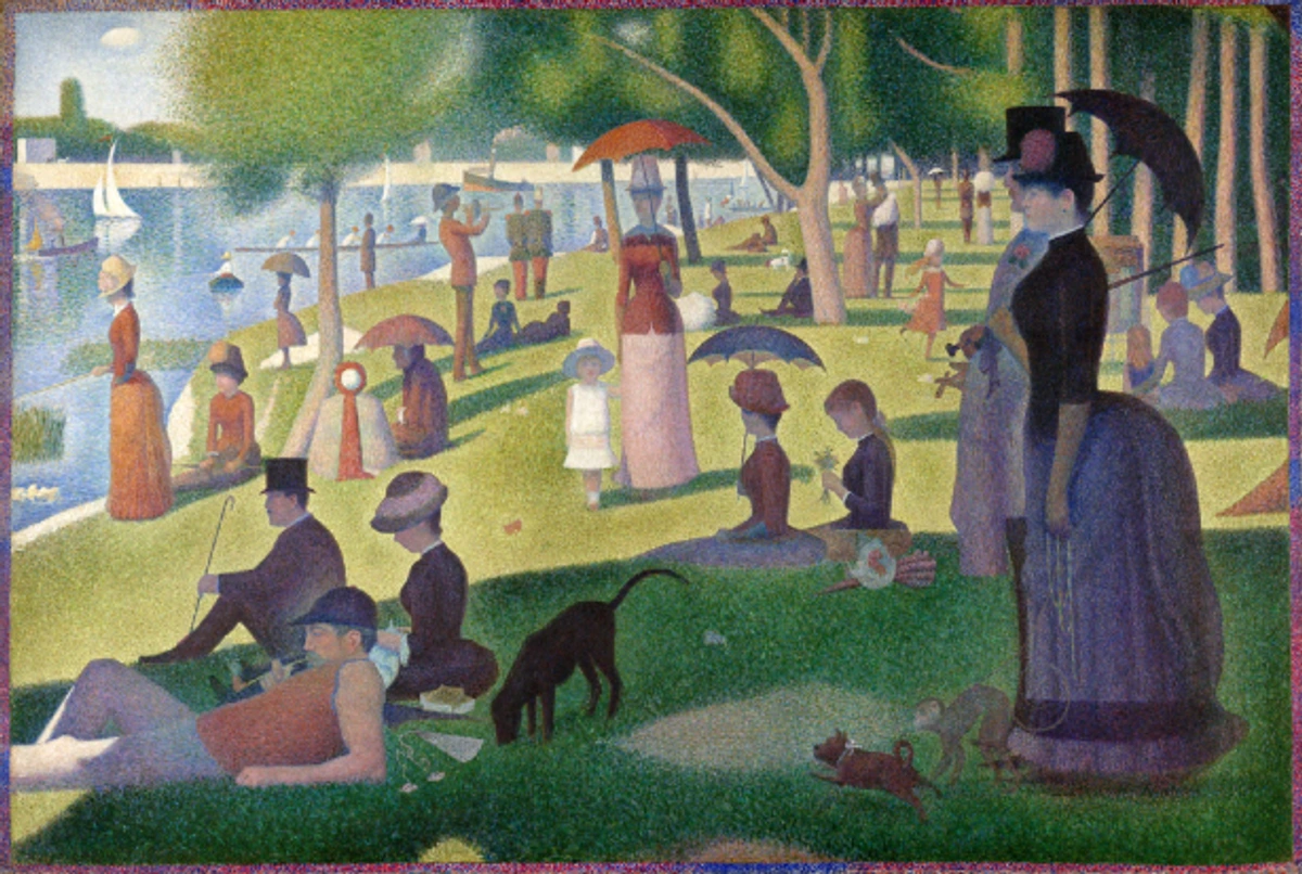
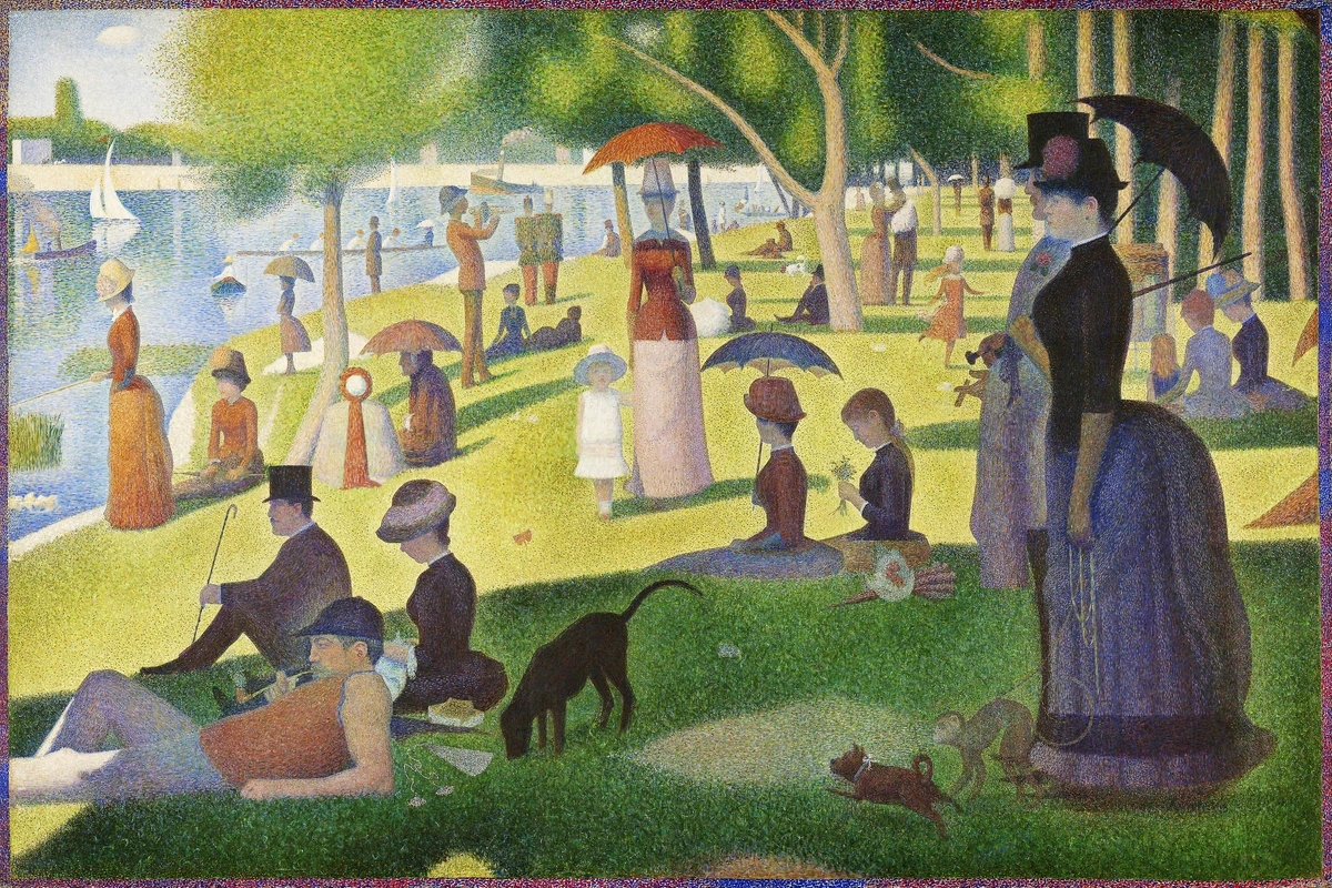
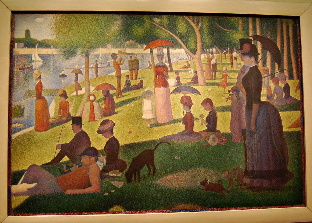
'A Sunday on La Grande Jatte' (1884-1886)
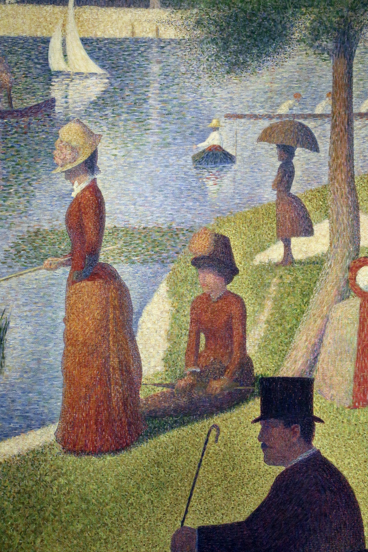
This is, without a doubt, the big one. It's the piece that captivated me, and I imagine many others. It consumed Seurat for two years of intense, painstaking work, involving dozens of preliminary sketches and smaller painted studies. The final canvas is enormous, roughly 7 by 10 feet (2 x 3 meters), depicting Parisians from various social classes enjoying a leisurely day off on an island in the Seine. Yet, despite the festive setting, it feels strangely silent and still. The figures are rigid, almost hieroglyphic, lending the scene an uncanny, timeless quality – perhaps a subtle critique of the alienation within modern Parisian leisure, or simply an exploration of human interaction in public spaces. The careful arrangement of figures and use of light also makes it a masterclass in composition in art explained.
Every single part of it, from a dog's playful shadow to a woman's elaborate bustle, is constructed from countless tiny dots of pure pigment. Seurat famously used lead chromates (yellows and oranges), cobalt blue, and emerald green, alongside more traditional vermilion and earth tones, for their intense, pure hues. The work is a testament to his incredible control, his profound understanding of composition, and his mastery of color theory. When it was first exhibited, people were baffled, even outraged. Some critics famously mocked it, calling it 'confetti' or 'cross-stitch'. Yet, a cohort of younger, avant-garde artists immediately recognized it as a new path forward, a way to bring structure, intellect, and scientific rigor back into painting, moving decisively beyond the fleeting moments of Impressionism. It was a powerful statement that art could be both exquisitely beautiful and rigorously scientific, though it certainly wasn't an easy pill for the art world to swallow at first.
Other Key Works:
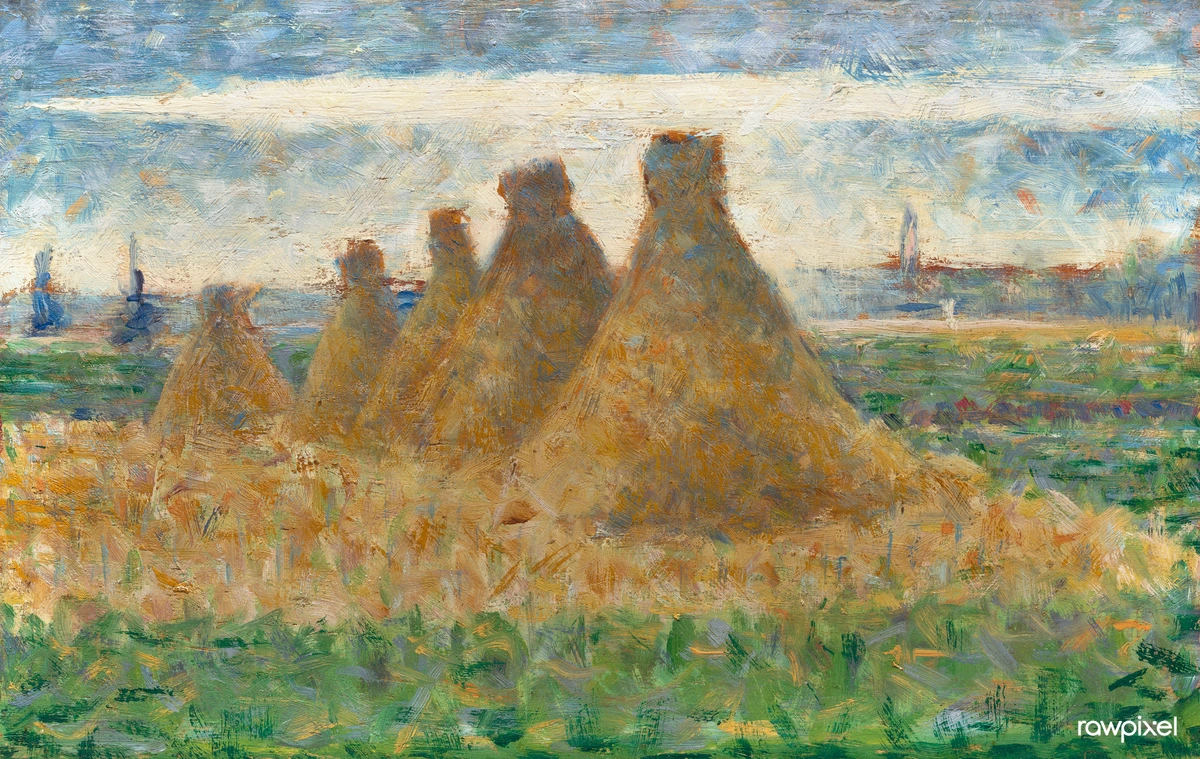
- 'Bathers at Asnières' (1884): Often considered a kind of companion piece to 'La Grande Jatte', this earlier large-scale work depicts working-class men relaxing by the Seine. It shares the monumental scale and sense of stillness, but with a slightly more melancholic or detached mood. While employing methodical brushwork, it shows a less rigid application of pure dots compared to his later work, revealing the evolution of his technique. You can observe areas where he used more conventional brushstrokes or slightly blended dots alongside nascent Divisionist applications, particularly in the water and sky, where the dots are larger and less uniform, a clear precursor to his perfected system. The stillness here feels less about critique and more about a quiet observation of labor and leisure, perhaps an almost classical portrayal of the working class. Notice the use of slightly larger, less uniform dots in the water to create a sense of shimmering light, or the subtle interspersion of complementary blues and oranges in the figures' skin to achieve a vibrant, lifelike glow without physical mixing. It's a prime example of his developing vision.
- 'The Circus' (1890-91): One of Seurat's last major works before his untimely death, this painting bursts with the vibrant, dynamic energy of a circus performance, all rendered through his controlled, dot-filled lens. Here, he really delved into experimenting with dynamic lines and the psychological effects of color. The bright, artificial lights and warm hues (yellows, reds, oranges) create a sense of thrilling excitement, which he then cleverly amplified with a contrasting blue border, optically enhancing the warmth within the canvas. The density and interspersion of these pure, warm dots, especially in the performers' costumes and the stage lighting, create an almost shimmering, pulsating energy that perfectly captures the artificiality and spectacle of the circus. Notice how closely packed the yellow and red dots are in the spotlights, creating an intense, almost vibrating glow. He uses specific combinations, for example, tiny pure orange dots among yellows and reds to represent the warmth of the artificial stage lights, while strategically placing small violet dots in the shadows to prevent them from feeling 'dead' and instead make them shimmer with subtle depth.
- 'Chahut' (1889-90): This painting, capturing a can-can performance, is another fantastic example of Seurat's theories of line and color at play. The high-kicking, upward-angled legs of the dancers literally illustrate those upward-sloping lines, creating an effect of artificial gaiety and almost frantic energy. The bright, artificial stage lighting is meticulously rendered with his Divisionist technique, making the scene shimmer with a thrilling exuberance. Again, the careful placement and density of dots, particularly in the vibrant skirts and background, build this sense of artificial light and movement. He might use small, deliberate dashes of complementary colors within a dominant hue to heighten its intensity, for example, tiny green-blue dots interspersed within a vibrant red skirt to make the red 'pop' even more. Observe the calculated placement of short, angled blue and green dashes within the dancers' warm-toned skirts; this optical interplay creates a heightened sense of movement and visual 'fizz,' enhancing the perceived reds and oranges without blending them into dullness.
How Seurat Used Color & Line for Psychological Impact
Beyond simply mixing colors optically, Seurat was deeply interested in how specific arrangements of lines and hues could evoke particular psychological and emotional responses in the viewer. He approached this almost like a scientific formula, believing that art could manipulate emotion with the precision of a chemist. This isn't just about pretty colors; it's about a deliberate, intellectual strategy to communicate feeling. He was, in essence, trying to codify emotion through visual grammar, a testament to his belief in art's rational power. This connects deeply with understanding elements of art: line.
Seurat meticulously categorised emotional responses:
- Joy and Happiness: To convey exuberance and vivacity, Seurat employed upward-sloping lines (think diagonals moving from left-to-right and up, or high-kicking legs as in 'Chahut' and 'The Circus') paired with warm, bright colors like vibrant reds, yellows, and oranges. The optical mixing of these pure warm hues amplified their perceived vibrancy, further enhancing the feeling of exhilaration. He might subtly intersperse tiny dots of a complementary cool color (like blue or green) within a warm area to make the warm color 'pop' even more through simultaneous contrast, without making the overall effect feel muddy. It’s a delicate balance, ensuring vitality without overwhelming the viewer. This speaks to the broader concept of understanding balance in art composition.
- Calm and Tranquility: For a sense of peace and stillness, his compositions featured predominantly horizontal lines and a careful, balanced arrangement of both warm and cool tones, creating a harmonious equilibrium. These works often feel stable and restful, inviting a contemplative gaze. Consider the serene landscape elements in 'La Grande Jatte', where the horizontal lines of the river and the gentle slopes of the ground provide a sense of grounded calm. This careful use of horizontal lines creates a visual anchor, much like the stable horizons in 'Bathers at Asnières'.
- Sadness or Melancholy: Expressing pathos or a subdued mood involved downward-sloping lines (diagonals moving from left-to-right and down) and predominantly cool, darker colors such as deep blues, greens, and purples. The subdued nature of these colors, combined with the downward visual movement, effectively conveyed a sense of gravity or introspection. Think of a figure with slumped shoulders or a path receding into a shadowed distance, subtly guiding your eye downwards and evoking a more somber mood, as seen in the muted tones and drooping forms in some of his preparatory studies for 'La Grande Jatte' focusing on shadows or isolated figures.
He rigorously applied these theories to ensure his compositions were not only visually appealing but also psychologically resonant, a true testament to his scientific approach to art. It's a reminder that every mark, every color, every line was chosen with an almost obsessive intention, transforming painting into a precise language of emotion and perception.
How To Think in Dots: A Practical Guide for You
So, you're thinking of trying it? I'm not going to lie, it demands the patience of a saint. And a steady hand, which on some days, I simply do not possess! But you know what? It's also incredibly meditative. You stop thinking about painting a 'tree' and start thinking about placing a dot of dark green next to a dot of light yellow. It's a fantastic exercise in observation and, crucially, trust in the optical process. I remember trying to paint a simple apple this way once, and the sheer frustration of realizing how many distinct shades of red, yellow, and even blue dots I needed just to represent the light hitting its curves. But the eventual shimmer, that incredible vibrancy from a distance? Totally worth it. It’s like building an illusion, one tiny piece at a time. The challenge, I found, was maintaining a consistent dot size and density; it takes a steady hand and practice, perhaps even some warm-up exercises just for your hand, before diving into a complex piece.
Item | Why You Need It | Tips for Success |
|---|---|---|
| Paints | Acrylics or gouache are fantastic for beginners. They dry relatively fast and have strong, opaque colors, perfect for distinct dots. | Start with a limited palette of pure primary and secondary colors. Avoid pre-mixed colors to truly practice optical blending. For deeper insights, check our definitive guide to paint types for artists. |
| Brushes / Dotting Tools | Small, round brushes (sizes 0 to 4) are your best friends for consistent dots. Alternatively, use the back of a paintbrush handle, toothpicks, or specialized dotting tools. | Experiment with slightly larger sizes for broader areas and smaller ones for fine details. A good quality brush that holds its point is crucial. Consistent pressure is key for uniform dots. |
| Surface | A smooth canvas board or thick, rigid paper (at least 200gsm) works best. Significant texture makes crisp, consistent dots difficult, as the paint tends to sink into crevices and blur. | Priming your surface with gesso creates an even, non-absorbent base, making your colors appear more vibrant and dots more distinct. |
| Patience & Music | Seriously. This isn't a sprint; it's a marathon. Put on some music, a podcast, or an audiobook. Embrace the process, not just the outcome. You're building an illusion, and that takes time. | Remember, Seurat spent two years on 'La Grande Jatte'! Allow yourself to make mistakes and learn. Step away and come back with fresh eyes. Try experimenting with different color juxtapositions to see how your eye blends them! |
Simple Steps to Start:
- Sketch Lightly: Begin with a very simple, faint outline of your subject in pencil. Don't worry about details yet; this is just a guide for your composition, a subtle nod to definitive guide to composition in art. Keep it minimal; the dots will define the form.
- Think in Pure Color Blocks: Forget about mixing on your palette. Instead, visualize where the pure light green dots will go, or the dark blue ones. Map out the basic color areas in your mind, or even with tiny, faint pencil notations. Consider the interplay of how artists use color in terms of complements and primaries.
- Start Dotting – The First Layer: Pick one pure color (say, a primary red) and start applying dots in its designated area. The trick? Don't let them touch! That tiny bit of canvas or paper showing through between the dots actually helps create the shimmering, vibrant effect when viewed from a distance. For instance, to create a brilliant orange, you might place dots of pure red right next to dots of pure yellow. Experiment with varying the density of your dots – closer dots for darker, richer areas; sparser dots for lighter, more ethereal effects. For historical context, remember that acquiring pure, high-quality pigments was once costly, a factor in meticulous application.
- Build Up Colors (Optically!) – The Second Layer and Beyond: Now, add your second pure color next to the first, letting your eye do the mixing. To make an area appear darker or richer, you might add denser dots of darker shades, or strategically intersperse dots of its complementary color. For example, a few tiny green dots placed sparingly within an area of red will actually deepen and enrich the perceived red, making it glow more intensely, rather than making it appear brown or muddy. This works because the green amplifies the red through simultaneous contrast. For a luminous skin tone, try layering subtle hints of pure red, yellow, and even tiny blue and green dots (especially in shadow areas) to achieve a remarkably lifelike and glowing effect. This layering of pure color creates a unique depth and vibrancy that traditional mixing can't replicate. It's truly painting with light, as we discussed earlier in the context of definitive guide to understanding light in art.
- Step Back Often: This is the most crucial step. What looks like a chaotic mess of individual dots up close will magically, almost unbelievably, come together from a few feet away. This is where the trust comes in. Trust your eyes, trust the process, and embrace the unexpected magic of optical blending. It's an invitation to rediscover how you see the world, and to marvel at the human brain's ability to synthesize a coherent image from disparate elements.

The Legacy and Limitations: Where Did the Dots Go?
The intense, methodical, and incredibly time-consuming nature of Pointillism meant it was never destined to be a widespread, long-lasting movement. Seurat himself died tragically young at just 31, and with his passing, much of the strict theoretical underpinning of Divisionism lost its primary champion. Artists, understandably, often found the technique restrictive, feeling it stifled the emotional expression and spontaneity that were becoming increasingly central themes in art at the turn of the 20th century. You couldn't easily achieve the thick impasto of a Van Gogh or the fluid, expressive brushwork of a Monet with Seurat's meticulous dots. It demanded a scientific rigor and detachment, coupled with the high cost of acquiring and precisely applying pure, unmixed pigments, that simply didn't appeal to everyone.
For many artists and viewers, the intellectual, almost cold, detachment of the style felt at odds with the expressive possibilities of paint, leading to criticisms of its perceived lack of 'soul' or warmth. Not every artist, I think, is a meticulous researcher like Seurat. The sheer temperament required to apply thousands upon thousands of precise dots also significantly limited its widespread adoption; it's not a technique for the impatient or the free-spirited.
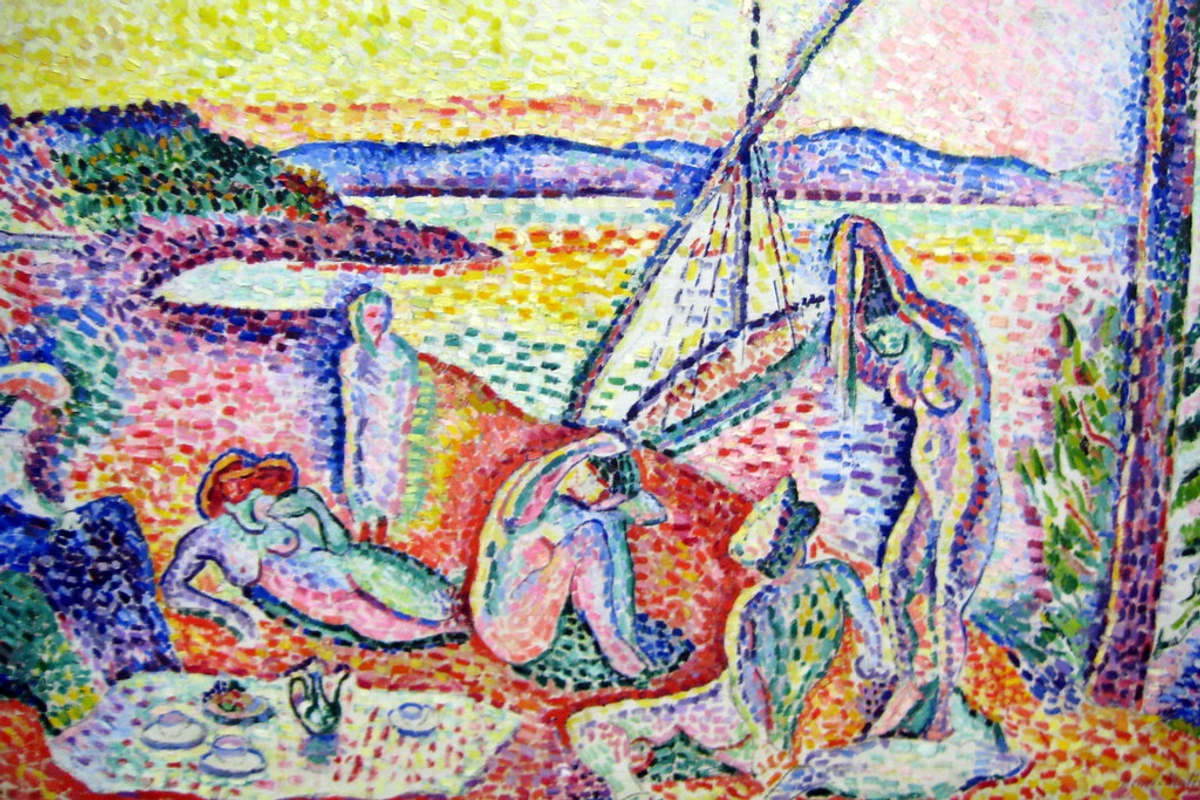
However, its influence was undeniable and remarkably far-reaching. The idea of breaking color down into pure components directly inspired the bold, expressive colors of the Fauvists, like Henri Matisse. While the Fauvists took Seurat's pure colors and applied them more arbitrarily and emotionally, rather than for strict optical mixing—think of Matisse placing pure reds and greens side-by-side not for optical blending, but for their sheer emotional intensity and juxtaposition, as seen in works like his 'Open Window, Collioure'—the liberation of color itself was a direct descendant of Divisionist thought, emphasizing color's independent expressive power. You can explore this vibrant movement further in our ultimate guide to Fauvism.
Similarly, the structured, analytical approach to composition, and the scientific inquiry into perception, had a significant impact on the Cubists, who similarly deconstructed form. Seurat's methodical deconstruction of an image into individual dots and color planes certainly prefigured Cubism's later deconstruction of objects into geometric facets, creating a direct lineage for movements like Fauvism and Cubism. Consider Pablo Picasso's early Cubist works, where forms are broken into geometric shards, a conceptual parallel to Seurat's breaking down of color into discrete dots.
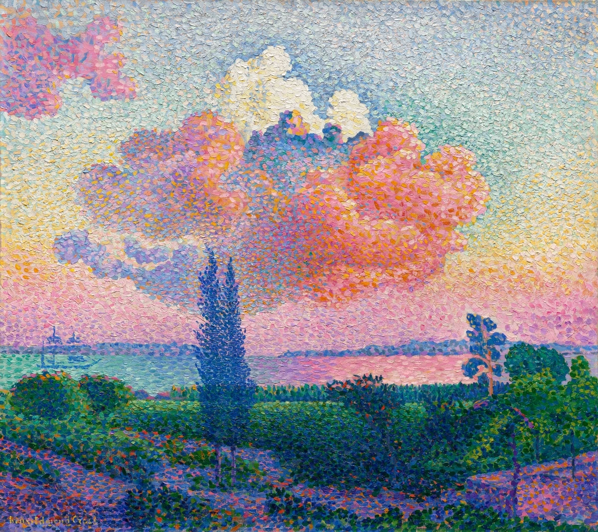
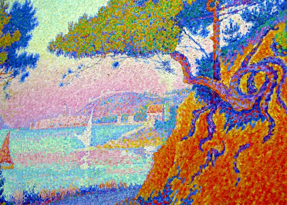
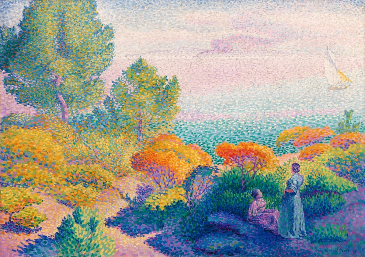
Other Neo-Impressionists, like Paul Signac (who became the movement's intellectual successor and chronicler, continuing to develop the theories after Seurat's early death) and Henri-Edmond Cross (known for his more fluid, mosaic-like application of larger, square-ish strokes), continued to develop the style, influencing artists such as Piet Mondrian and Robert Delaunay, who adapted the scientific rigor to their own abstract explorations. Even later abstract expressionists, though seemingly chaotic, often rely on an intuitive understanding of how colors interact and how the eye perceives layered marks, a distant echo of Divisionist principles, as seen in the work of Jackson Pollock.
Today, you can trace its ghost not just in art history, but in the very fabric of our modern visual world. Think about the pixels on your digital screens or the CMYK (cyan, magenta, yellow, black) dots of modern printing. Every time you look at your phone, you're seeing a form of optical mixing in action, where tiny red, green, and blue light sources (RGB sub-pixels) are combined to create the full spectrum of perceived colors – a distant, digital echo of Seurat's revolutionary vision. He truly laid some foundational groundwork for how we understand and reproduce color. And when you look at a printed magazine or billboard up close, you'll see how CMYK dots are used in subtractive mixing to create a vast array of colors; while technically also using dots, the principle is reversed from Seurat’s additive goal – more dots lead to darker colors, eventually black.
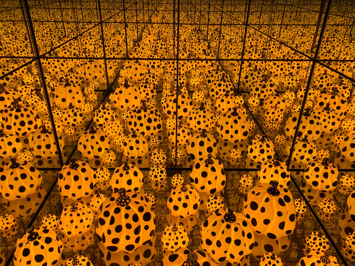
Even in contemporary abstract art, the idea of using simple, repeated marks to build a complex whole remains a powerful and enduring concept. We see echoes in artists who employ repetitive elements to create texture, pattern, or an overall visual vibration that resonates with Seurat's principles of building from the ground up. Beyond painted canvases, consider the structured yet vibrant surfaces of pixel art, digital mosaics, or even certain intricate textile designs – all owe a debt to the principle of discrete elements combining to form a larger, coherent image. Oh, and yes, even the digital representation of NFTs on a screen, with their individual pixels, subtly leverages these same principles, though I admit, the philosophical implications are quite different from Seurat's scientific pursuit and frankly, the claims of immutable provenance and true ownership associated with blockchain technology often feel overblown and lack the same tangible, enduring artistic value I seek in art. To see the broader journey of art, explore the evolution of abstract art: key movements and their collectible value.
To bridge the gap even further, look at contemporary abstract painters like Zeng Fanzhi. While his 'Mask Series' or 'Hospital Series' might seem far removed, his later landscape works, especially those with intricate, almost web-like lines, build complex visual fields from countless individual, precise marks. It’s a different kind of dot or stroke, but the underlying principle of a structured aggregation of elements creating a larger, cohesive, and often emotionally charged image, is strikingly similar to Seurat's methodical approach.
Frequently Asked Questions About Pointillism & Divisionism
Who were the main Pointillist/Neo-Impressionist artists?
Georges Seurat was the undisputed pioneer and theoretical leader. His closest follower and a major artist in his own right was Paul Signac, who further developed the theories after Seurat's early death and became the movement's chronicler and intellectual successor. Other significant artists who experimented with or adopted the style include Camille Pissarro (for a brief but important period of a few years), Henri-Edmond Cross (known for his more fluid, mosaic-like application of larger, square-ish strokes), Maximilien Luce, and Théo van Rysselberghe. They all explored Seurat's meticulous approach to color and light in their unique ways, often adapting it to their own thematic interests, though always staying true to the core principles of optical mixing.

Why didn't more artists use this technique?
It's incredibly slow, labor-intensive, and highly restrictive. Many artists felt it stifled emotional expression and spontaneity, which were becoming increasingly important artistic values around the turn of the 20th century. For instance, the technique didn't easily allow for the thick, expressive impasto of an artist like Van Gogh, or the fluid, atmospheric brushwork of Monet. It demanded a scientific rigor and detachment, coupled with the high cost of acquiring and precisely applying pure, unmixed pigments, that simply didn't appeal to everyone, leading to its relatively short lifespan as a dominant movement. For many, the resulting visual effect, while brilliant, could also feel static or 'cold' compared to the immediate warmth of more traditional or expressive painting styles. Not every artist, I think, is a meticulous researcher like Seurat, and certainly not everyone has the temperament for such painstaking detail!
Can I use oil paints for Pointillism?
Yes, absolutely! While acrylics and gouache are often recommended for beginners due to their faster drying times and opacity, traditional oil paints can also be used for Pointillism. The key difference is that oil paints dry much slower, which means you'll need to be even more patient and allow layers to dry between applications if you're trying to achieve precise, unblended dots. However, the luminosity and rich color saturation achievable with oils can be truly stunning when applied in a Divisionist manner, offering a unique depth that water-based paints might not. Some Neo-Impressionists did indeed use oils, accepting the longer working times for the desired effects – it's all about what you're willing to commit to, isn't it?

What are common mistakes beginners make in Pointillism?
I’ve made most of these myself! The most common mistakes include:
- Over-blending: Letting the dots touch or using too much paint, causing them to merge physically rather than optically. Remember, the tiny gaps are crucial for that shimmering effect!
- Inconsistent dot size/pressure: This can lead to an uneven texture and disrupt the optical mixing effect. Aim for uniformity within areas, varying size deliberately for effect, not accidentally. It takes practice, like learning to draw a perfect circle every time.
- Impatience: Rushing the process, trying to finish quickly, or not stepping back often enough to assess the optical effect. It's a slow burn, not a sprint. Put on a long podcast, I tell you.
- Mixing on the palette: Defaulting to traditional mixing habits instead of thinking in pure, unblended dots. This defeats the purpose of Divisionism. You're trying to make your eye do the work, remember?
- Lack of color theory understanding: Not consciously choosing complementary or analogous colors to create specific optical blends. A little theory goes a long way here; it's the science, after all!
Is Pointillism the same as Stippling?
No, while both involve creating an image using dots, their primary goals and underlying theories are distinct. Stippling is a technique, often used in drawing (pen and ink) or engraving, to create tone, shading, and texture by varying the density of dots. Its main purpose is typically to render form or value, like adding shadows to a drawing. Pointillism, on the other hand, is a specific painting technique rooted in the scientific color theory of Divisionism. Its primary goal is to achieve optical mixing and enhanced luminosity through the juxtaposition of pure colors, relying on the viewer's eye to blend the colors, not just to create texture or shading. So, while both use dots, their intent is fundamentally different.
How long did it take to paint 'La Grande Jatte'?
It took Seurat approximately two years of continuous, painstaking work (1884-1886) to complete 'A Sunday on La Grande Jatte'. This included dozens of preliminary sketches, compositional studies, and smaller painted studies before he even began work on the monumental final canvas. He was known to revisit and make minor revisions even after its initial exhibition, reflecting his obsessive dedication to perfection. It was an epic undertaking for a single painting, showcasing a level of commitment that is rare even among the most dedicated artists. Imagine spending two years on one piece! I often revisit my own art, but certainly not for that long.
What was the initial critical reception of Seurat's work, and how did it evolve?
Initially, his work, particularly 'La Grande Jatte', was met with a mixture of bewilderment, ridicule, and sometimes outright outrage. Critics famously dismissed it as 'confetti', 'cross-stitch', or 'tapestry-like', often criticizing its methodical approach as cold, mechanical, and lacking emotional depth or spontaneous feeling. It challenged the prevailing artistic norms so radically that many simply didn't know what to make of it. The influential critic Félix Fénéon, however, was one of the first to articulate its scientific basis and champion its revolutionary potential, even coining the term Neo-Impressionism. Among a small but influential circle of younger, more avant-garde artists, theorists, and critics, it quickly gained recognition as a groundbreaking, scientifically informed approach to painting. This group saw it as a new, intellectual path for art, profoundly influencing subsequent generations and movements like Fauvism and Cubism, ultimately securing its place in art history as a pivotal, if sometimes challenging, milestone.
My Final Thought: It's All About Trust and the Act of Seeing
To me, Pointillism and Divisionism are profound exercises in trust and a deep celebration of our own incredible visual processing. Seurat had to trust the burgeoning science of light and color. He had to trust his painstaking, almost obsessive process, believing in the illusion he was building dot by minuscule dot. And most importantly, he had to trust us—the viewers—to stand at just the right distance and let our eyes and brains do their magic, completing the picture and bringing his seemingly disparate dots to vibrant life. He provides the pure components, but we provide the synthesis. In our fast-paced, instant-gratification world, there's something incredibly beautiful and deeply satisfying about an art form that asks you to slow down, step back, and just see what happens. It's a powerful reminder that sometimes, the most complex and vibrant realities are built from the simplest, purest components, perceived and processed by our own amazing minds. So, next time you encounter a seemingly chaotic collection of elements, whether in art or in life, or even just look at the pixels on your screen, remember Seurat's lesson: step back, trust your perception, and let the magic of optical blending reveal the bigger, more vibrant picture. Perhaps all of life is just a grand, intricate Divisionist painting, waiting for us to engage, to slow down, and to truly take it all in. And for an artist like myself, it's a constant reminder that even in contemporary abstract expression, the deliberate placement of color and form, however intuitive, still engages with these fundamental principles of sight. It's truly an enduring legacy. If you're inspired to delve deeper into the art world or even start your own creative journey, feel free to explore more guides on zenmuseum.com/finder/page/ or discover original artworks for sale at zenmuseum.com/buy.