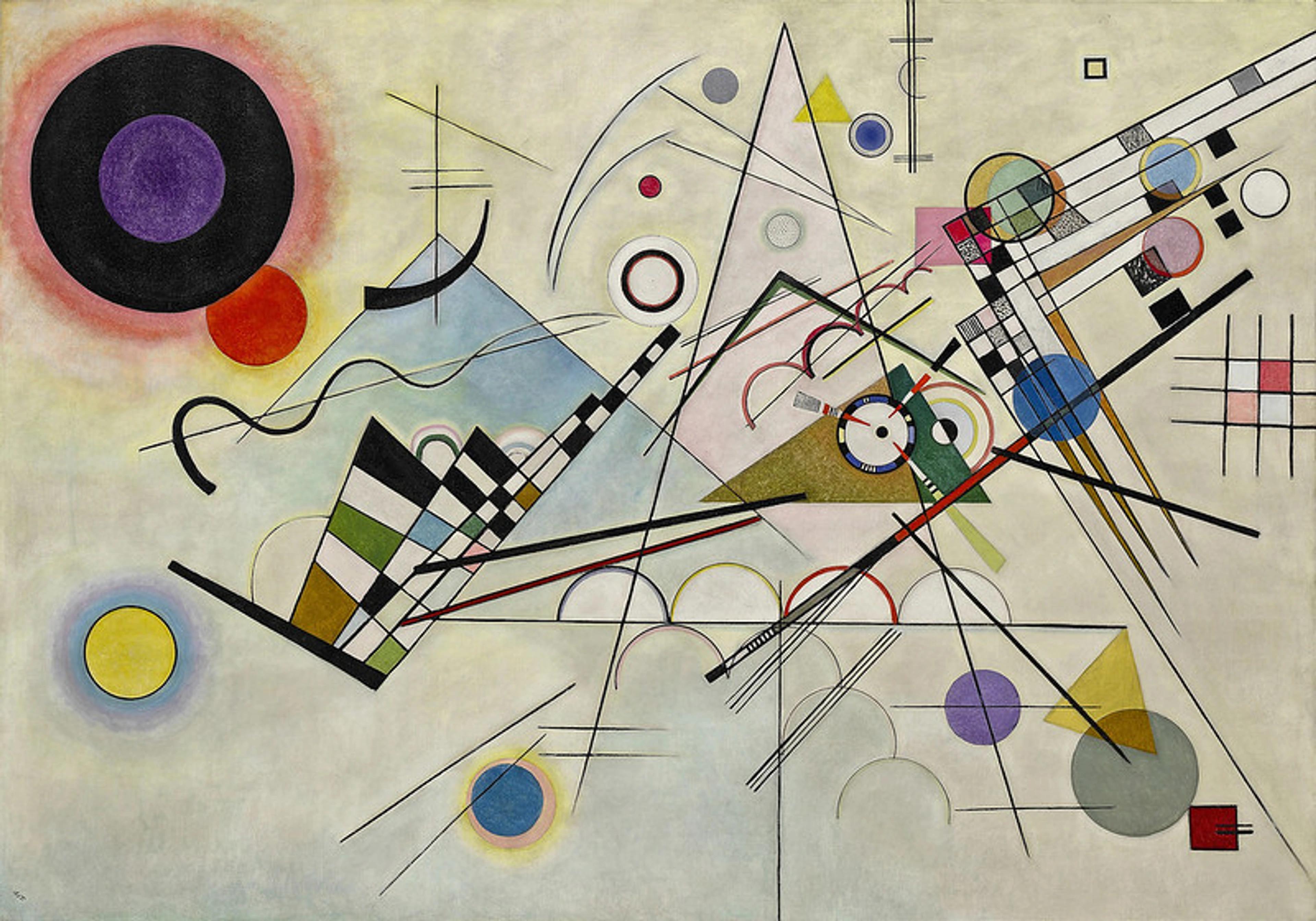
What Is Art, Really? A Painter's Guide to the Core Principles of Art Theory
Art theory can feel like a dense academic swamp. I wanted to write something that felt more like a friendly conversation, explaining why a splash of red makes you feel something and how artists use these tricks on you.

What Is Art, Really? A Painter's Guide to the Core Principles of Art Theory
Have you ever stared at a painting and felt it was staring right back? Not just the eyes of a portrait, but the whole canvas, humming with a kind of energy that bypasses words and goes straight to your gut. I remember standing in front of a small, forgotten canvas tucked in the corner of a gallery years ago. It wasn't the biggest or the brightest, but something about the way the light pooled in one corner, the tension between a single hard line and a wash of soft color, a simple but powerful use of contrast and asymmetry... it pulled me in. It was a feeling, a story, a memory—all at once. That's the power of art in action, and it's not random. It's a system, a language. And just like a musician needs to understand scales to improvise jazz, or a writer needs to know about plot and character to build a world that feels real, an artist plays with a set of fundamental principles to make you feel all of that. It’s not about constraining creativity; it’s about giving it a structure to push against, a language to speak through. It’s the difference between random noise and music, between a shopping list and a poem.
This isn't just an article; it's a conversation. We're going to peek behind the curtain to see the strings and pulleys. We'll unravel the choices artists make, from the bold abstracts of a Rothko to the tense, beautiful scenes in a Vermeer, and even the jarring genius of a Duchamp. Think of this as a friendly chat about the tools in the artist's toolbox—the things that transform simple lines and colors into something that can stop you in your tracks and make you forget about your phone for a few minutes.
And let me tell you, whether you've been painting in a studio for decades or you're just starting to think seriously about that creative itch—the kind where you look at a blank page and feel a strange mix of terror and excitement—these principles aren't dusty textbooks. They're the very things that make a simple brushstroke feel like a whispered secret or a shouting match. They're what separates an awkward doodle from a powerful statement. For those ready to move beyond the basics and think like a master, understanding these principles is like learning a secret handshake with every great artist who ever lived.
Before we dive into the principles, let’s step back and ask a more fundamental question.
Why Do We Even Have Principles? A Journey from Chaos to Canvas
It’s a fair question. If the goal is to break boundaries and free-flowing expression, why shackle ourselves to a set of rules? The truth is, the principles of art aren’t a cage; they’re the bones that give a piece its structure. Without bones, an animal is just a puddle of jelly—unable to move, fight, or run. Without principles, a painting is just a collection of random marks, unable to communicate, emote, or persuade.
I think of it like this: a musician can learn to play jazz by ear, getting a feel for what works. But if they first learn the formal rules of music theory—the scales, the chord progressions, the modes—suddenly they aren’t just playing; they’re composing with intention. They understand the universe of sound at a structural level. The same is true for an artist. Learning these principles lets you switch from being a passive observer of your own impulses to an active commander of the visual forces on your canvas. You’re not just throwing paint; you’re directing an orchestra of perception.

This shift is what separates a hobbyist from a master. A master knows why a composition feels tense, not just that it does. They know how to build that tension deliberately using Contrast and unresolved Balance. They know how Movement can guide a viewer’s eye to a hidden story and how Unity without Variety leads to a visual tomb. These principles are a product of millennia of human observation about what our brains find satisfying, moving, or disturbing. They are the hard-won insights into the very mechanics of seeing and feeling.
The Bedrock of Art: The Seven Core Principles
The art world loves a good argument, but most creators and critics agree on a foundational set of seven principles. You can think of them as the grammar of the visual language. You use this grammar every day without thinking about it when you arrange objects on a shelf or take a photo. Artists just do it with more intention. They have these principles in their bones, a second-nature instinct for composing a visually compelling experience. It’s this intuitive understanding, built on a foundation of knowledge, that separates a casual sketch from a truly arresting composition. It’s about knowing the rules in order to make them sing for you.
Let’s break them down, not as cold, academic terms, but as living ideas, starting with the one that literally shapes our world.
1. Balance: The Art of Visual Weight
Balance is about composing a feeling of resolution. We instinctively seek equilibrium in everything we see. It’s a primal urge, a need for our brains to feel that the world isn’t about to tip over. Balance is the deliberate satisfaction of this urge, creating either a serene, classical peace or, when cleverly manipulated, a profound and unsettling tension. It's the art of distributing visual weight. If everything is crammed into one corner, your eye goes there and feels stuck, nervous. It's like a conversation where one person dominates the entire time—you just want to walk away. A balanced composition, on the other hand, feels right. It's resolved. It doesn't mean everything has to be perfectly equal. This is the first trap many new artists fall into: the assumption that a centered object is a 'safe' or 'correct' choice. In reality, perfect symmetry is a powerful statement, not a default. Misusing it can lead to compositions that are static and lifeless, like a corporate stock photo where everything is so perfectly arranged it feels devoid of genuine life. True balance creates a sense of inevitability, where every element, even the "empty" spaces, feels essential to the whole.
- Symmetrical Balance: Imagine folding an image in half, and both sides mirror each other. It's stable, formal, and powerful, like a classical temple or a Rorschach inkblot. It feels monumental, authoritative, and can be a little rigid. It has a stillness that speaks of permanence and certainty. You see this in works by artists like Leonardo da Vinci, whose preparatory drawings for compositions often explored perfect symmetry to instill a sense of divine order. However, over-reliance on it can be a crutch, leading to a feeling of sterility that drains the dynamism from an image.
- Asymmetrical Balance: This is where things get dynamic. The weight isn't equal, but it's distributed in a way that feels stable. A large, simple object on one side can be balanced by several small, complex objects on the other. Think of a heavy anchor and a flock of birds. Light objects can 'weigh' as much as heavy ones if placed at the right distance. It's the difference between a seesaw with two identical people and one with a parent and a child who has to move closer to the center to achieve a balance. The painting The Son of Man by René Magritte places a single, powerful figure against a vast, empty sky, creating an asymmetrical balance of intimacy and void that feels both calm and deeply unsettling. It's a visual metaphor for the individual's place in a vast, unknowable universe.

- Radial Balance: Elements radiate out from or spiral around a central point, like the spokes of a wheel, the petals of a daisy, or a nautilus shell. You find this everywhere in nature—a clear indication that our brains are wired to find it harmonious. In human art, it dominates religious and decorative art (think mandalas, rose windows, or a classic round dinner plate). It pulls your eye inward to the center, creating a powerful sense of focus and concentric harmony.
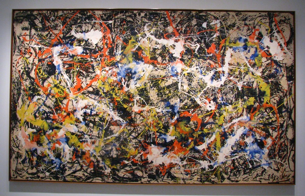
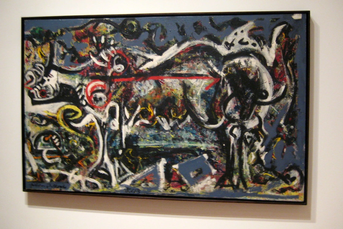
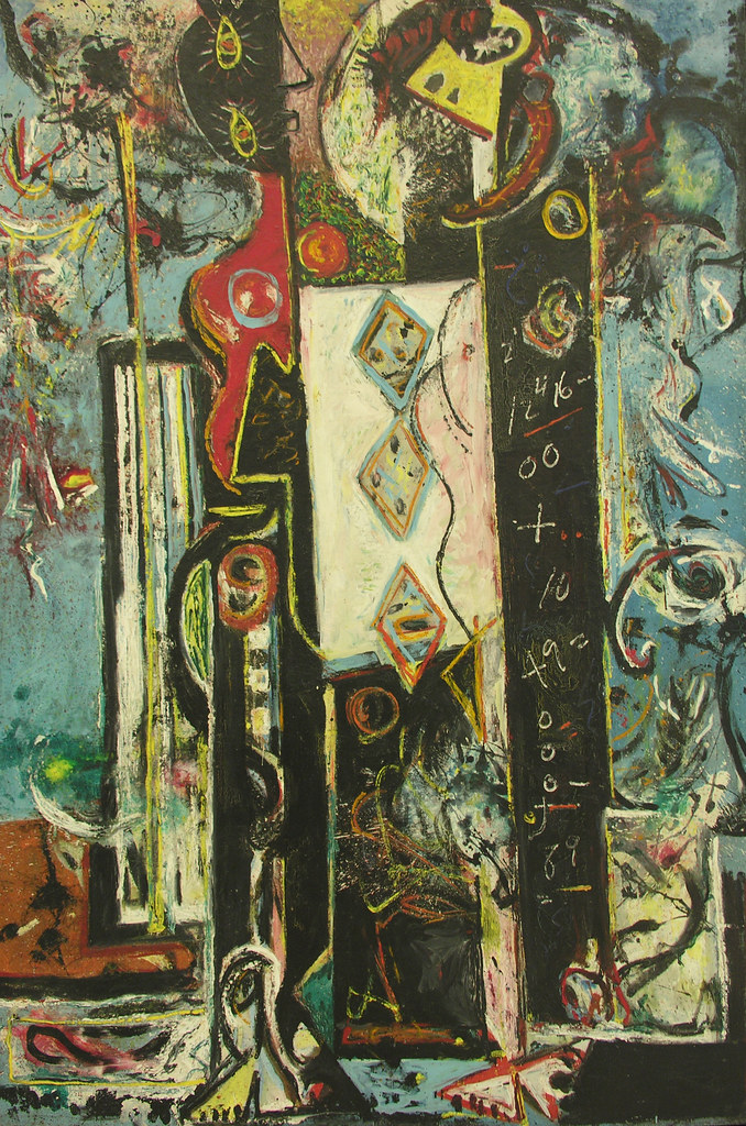
There's another kind, too, a sort of hidden balance. Crystallographic Balance, where there's no single focal point, but the entire surface is filled with an equal emphasis, creating a kind of "all-over" pattern. Think of a Jackson Pollock drip painting or a dense pattern on fabric. There's no single star, just a field of energy. It’s a democratic composition where every inch of the canvas demands an equal amount of attention, creating a hum rather than a shout. In music, it’s the difference between a melodic song with a clear chorus you can sing along to and a dense piece of ambient soundscape where every note has equal weight. Abstract artists like Jackson Pollock and Yayoi Kusama used this to immerse the viewer in an all-encompassing environment, almost dissolving the boundary between the artwork and the space around it.
2. Movement: A Path for Your Eyes to Dance
3. Pattern & Repetition: The Visual Beat
As mentioned, while rhythm is the flow, repetition and pattern provide the foundational beat. Let's give it its own spotlight.
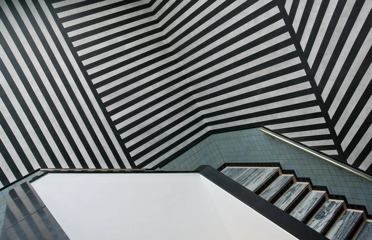
If Movement is the melody, then Pattern and Repetition are the drumbeat. They provide the underlying structure, the pulse that can make a composition feel stable, energetic, or hypnotic. Repetition is the simple act of using the same element more than once, which creates a sense of cohesion and familiarity. When that repetition becomes organized and predictable—like the beats in a measure of music—it becomes a pattern. Our brains are hardwired to seek out patterns; they represent order and predictability in the world around us. In art, they can be comforting, decorative, or even lulling, pulling the viewer into a trance-like state before the artist introduces a surprising break. An artist's job is to control your gaze, to guide it on a journey through their work. It's not just about where you look first; it's about where you look next. Movement (often called Rhythm) is the principle that creates this path. It’s the visual beat, the choreography of your perception. But movement isn’t just about guiding the eye; it’s about implying time on a static canvas, making the viewer feel the seconds ticking by within a single, frozen moment. It’s the principle that transforms a still image into a story, a narrative that unfolds spatially rather than chronologically. Think of it as the compositional equivalent of page-turners in a book; once you start the journey, you’re compelled to keep going.
Lines are the most obvious tool. A strong diagonal line, like the mast of a ship in a storm, pulls your eye across the canvas with energy and drama. A series of repeated shapes can establish a rhythm, like a drumbeat, leading your gaze from one point to the next. But it’s deeper than that. Implied lines—the invisible connections between elements—are often more powerful than literal ones. A figure looking off the canvas points your gaze there. A string of objects of diminishing size creates movement through a sense of depth. This play on perspective is crucial; it gives the illusion that some elements are closer or farther away, thereby introducing a temporal rhythm into the spatial composition. An artist like Wayne Thiebaud uses the implied lines of a steeply angled street to pull your eye into the scene, creating a feeling of vertigo and anticipation, almost forcing you to "enter" the world of the painting.
Look at any painting by Vincent van Gogh—his brushstrokes aren't just describing objects; they're currents of energy that pull you into a swirling, emotional landscape. His paint seems to be in motion as you look at it. Or consider how the lines in a Futurist painting by Umberto Boccioni don't just show a figure; they show the passage of time and speed itself. They trace the path of a single gesture across multiple moments, compressing a narrative into one explosive image. It’s movement that tells a story of itself. We can break down movement into a few different rhythms, each with a distinct emotional flavor:
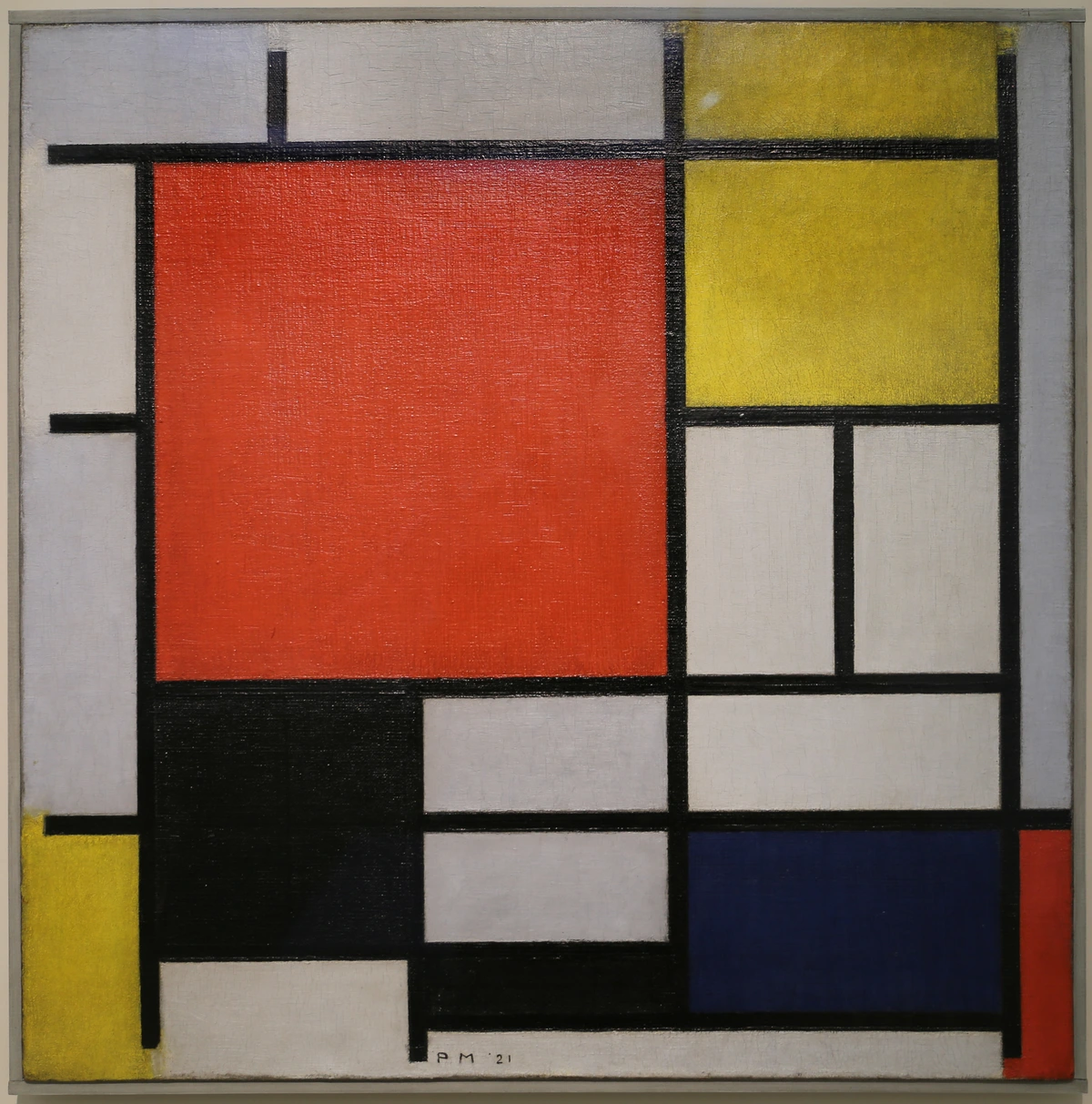
- Regular Rhythm: A predictable, steady beat, like stripes on a shirt or a row of columns. It creates a sense of order and reliability, but it risks monotony if not contrasted with something else. Think of the ticking of a clock: steady, dependable, and slightly lulling.
- Flowing Rhythm: Curved, organic repetitions that make your eye travel in a smooth, graceful way, like rolling hills or the implied line of a dancer's arms. It feels natural and calm, like a slow, unhurried dance or a river winding its way to the sea.
- Progressive Rhythm: A gradual, often accelerating change. Imagine a series of circles that get progressively smaller, leading your eye to a vanishing point. It builds a sense of increasing tension, drama, or focus, like a musical crescendo that pulls you inexorably towards a climax.
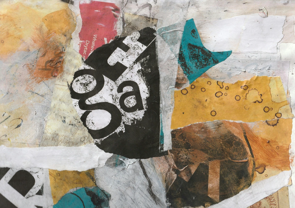
4. Emphasis & Focal Point: The Art of the Anchor
Have you ever walked into a room and your eyes just go, instantly, to one thing? That's emphasis. Emphasis is about creating a star, a visual anchor—the thing you notice first. The focal point is where the artist wants to tell the most important part of their story. It’s the answer to the question, "What is this piece about?" Interestingly, the human brain can only truly focus on one thing at a time in high detail. The artist’s skill is in exploiting this biological fact, forcing your focus onto their chosen subject and away from the supporting cast. Without it, a work can feel aimless, leaving the viewer's eye wandering in a visual soup.
Artists are masters of visual manipulation, and they create emphasis in many ways. Understanding these techniques is like learning how a magician performs a trick:
- Contrast: This is perhaps the most powerful tool. Placing a bright, warm color (like a cadmium red) against a sea of muted, cool tones will immediately draw the eye. It’s like a single spotlight on a dark stage, or a person shouting in a quiet library. It's impossible to ignore. But contrast isn't just color; it's about value (a single white spot in a dark room), size (a single large shape among small ones), or texture (a rough patch in a smooth field).
- Placement: The center of a canvas is actually a very static place. Putting the most important element off-center, according to the Rule of Thirds (imagining a tic-tac-toe grid over your canvas and placing points of interest where the lines cross), is far more dynamic and interesting. Your eye naturally gravitates to these power points. We can thank the compositional geniuses of the Renaissance for figuring this out.
- Isolation: A single, lonely figure in a vast landscape automatically becomes the focal point. By separating it from a crowd, or placing it in a sea of negative space (the powerful, often-forgotten area around the subject), the artist creates a powerful sense of narrative, emotion, or vulnerability. Think of Caspar David Friedrich's Wanderer above the Sea of Fog—the figure's isolation against the immense, foggy expanse is what makes the painting so powerful and Romantic.
- Convergence: This is a more subtle one. The artist creates implied lines that all lead to the same place. In a Leonardo da Vinci painting, the gazes of the figures, the angles of their bodies, and the perspective of the architecture all lead your eye to the focal point of the narrative. It’s an invisible web of forces pulling your attention, and when done skillfully, you don’t even realize you’re being guided.
5. Contrast: The Engine of Drama
If balance is harmony, then contrast is conflict. It's the clash of opposing elements. Think light vs. dark, large vs. small, rough vs. smooth, warm vs. cool. Contrast creates excitement, drama, and visual interest. Without it, everything blends into a dull, monotonous mush. It's the difference between a story with a clear antagonist and one that's just a description of a field. It’s the 'something happening' that pulls us into a narrative, whether it’s told with words or with paint.
Contrast is the reason a composition doesn't just lie there flatly. In my own work, I often explore how a vibrant, energetic splash of color can sit against a calmer, more structured background. It’s that tension between chaos and order that creates a spark. The Italian Baroque painter Caravaggio was a master of this, using dramatic chiaroscuro (extreme contrasts of light and dark) to create paintings of intense, almost theatrical violence and passion. His light doesn't just illuminate; it slices through the darkness to carve out moments of high emotional and physical drama. He transforms a biblical scene from a static tableau into a brutally immediate event happening just outside the frame. Even centuries later, standing in front of one of his paintings, you can feel the tension, the suddenness of the moment captured. It's a technique that has influenced filmmakers and photographers to this day, proving that these principles are timeless and deeply ingrained in our psychology. There are many forms of contrast:
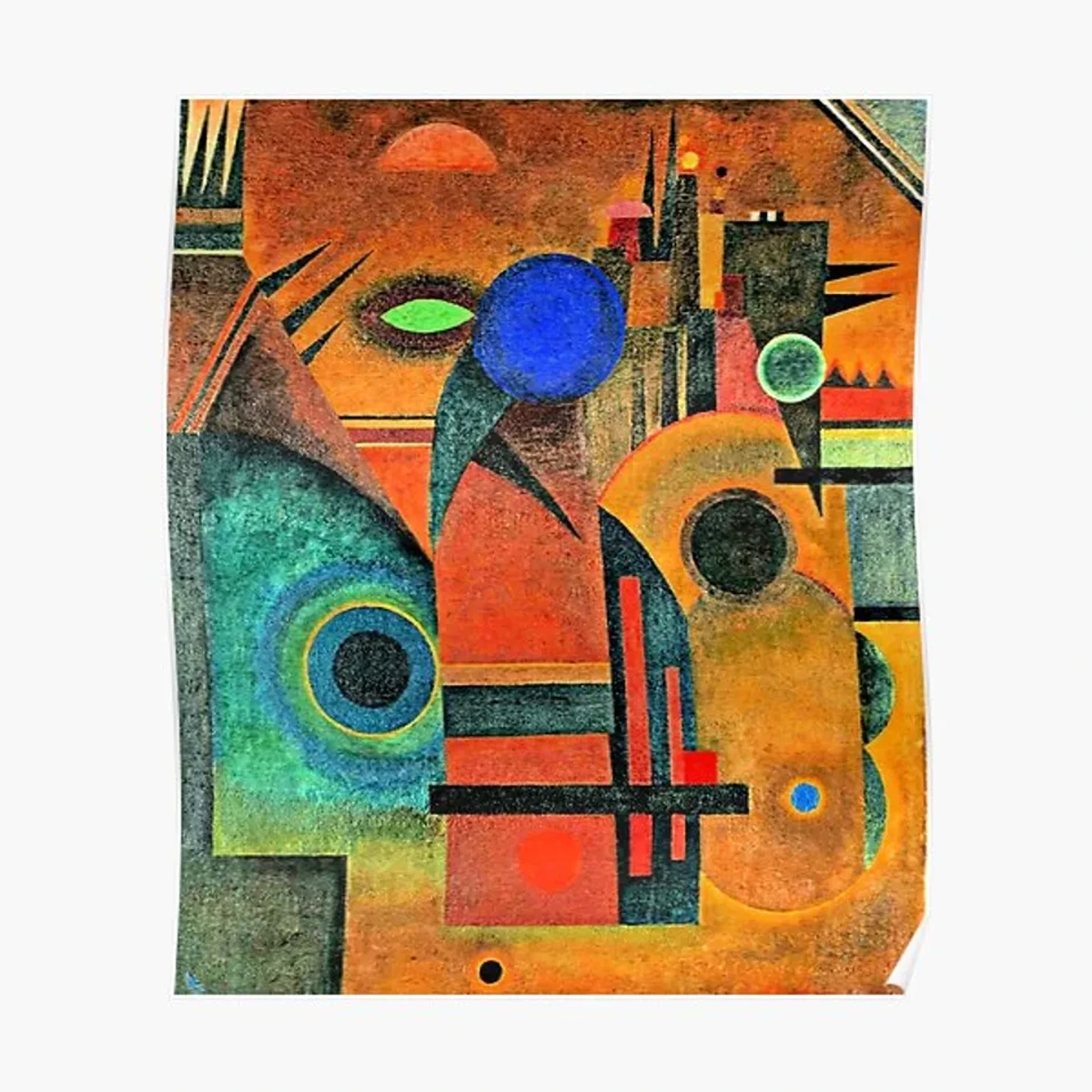
- Value Contrast: This is the most fundamental, the difference between light and dark. A high-contrast image feels dynamic and bold, while a low-contrast image can feel soft, gentle, or somber. It is the very skeleton that defines form and depth in a drawing or painting.
- Color Contrast: This goes beyond just light/dark. It's about hues. The most potent color contrast is between complementary colors (opposites on the color wheel, like red and green, or orange and blue). Placing them next to each other makes both appear more vibrant and intense. Then there's warm vs. cool, which evokes temperature and psychological distance—compare a cozy, warm orange room to a cold, distant blue landscape. You can also play with contrast of saturation (a brilliant red against a muted gray), or even contrast of extension—how much of one color versus another is used.
- Textural Contrast: The interplay of rough and smooth, soft and hard. A single, jagged rock in a calm, glassy lake. A stroke of thick, buttery impasto paint next to a thinly washed, translucent area. This contrast can be purely visual or, in some medium like sculpture, an invitation to touch.
- Conceptual Contrast: This is a more advanced but powerful idea. It's the contrast of ideas. Think of René Magritte's painting of a pipe with the words "This is not a pipe." It's a contrast between image and language, between what you see and what you're told.
6. Unity & Harmony: The Glue That Holds It All Together
Have you ever walked into a room where nothing quite matches? It feels jarring, restless, like everyone is shouting at once. An artwork needs the opposite feeling; it needs Unity. It's the sense that all the individual elements belong together and work as a team. It's the difference between a garage band warming up and a symphony orchestra playing a finished piece. Harmony is the result of that unity—a feeling of visual completeness, rightness, and wholeness.
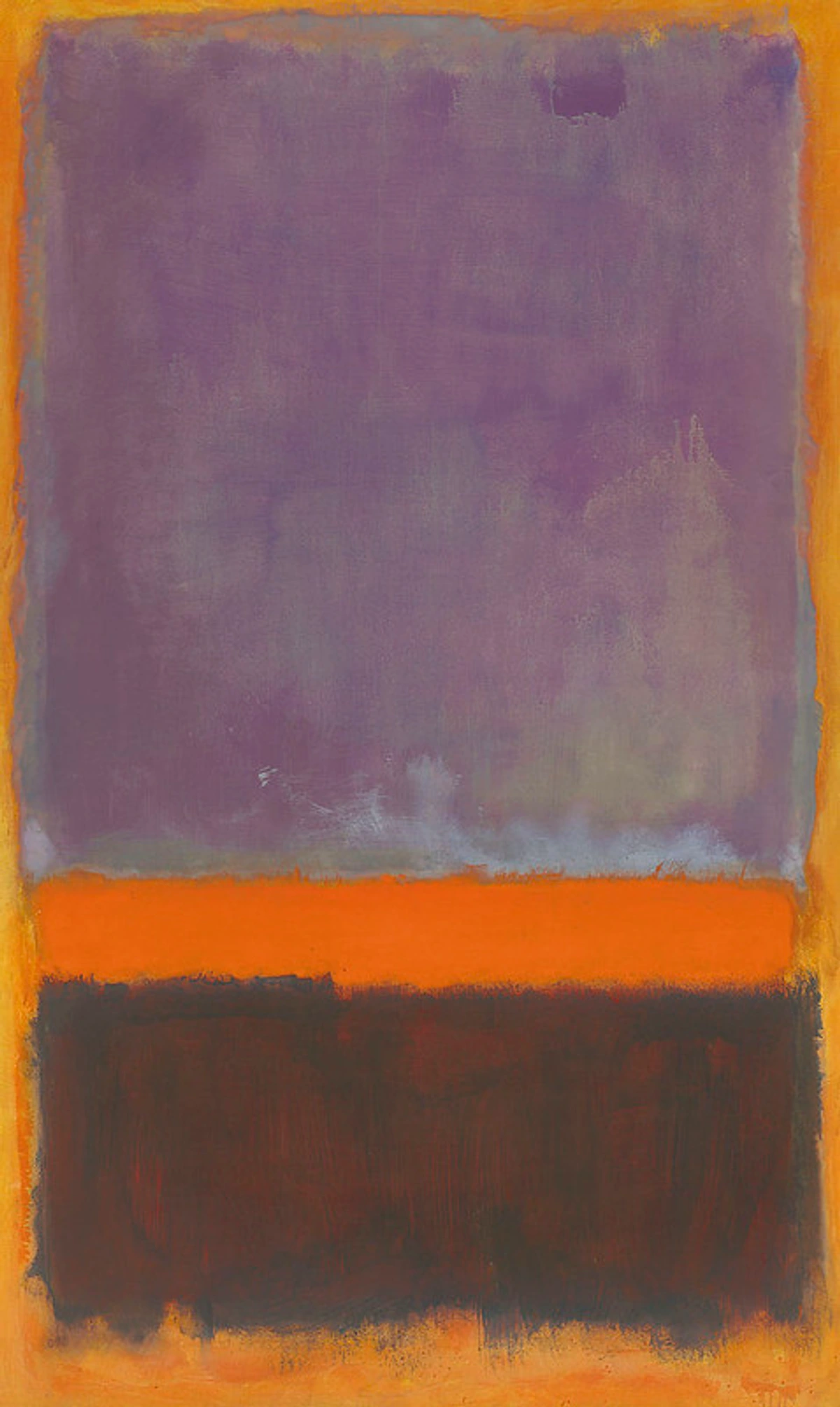
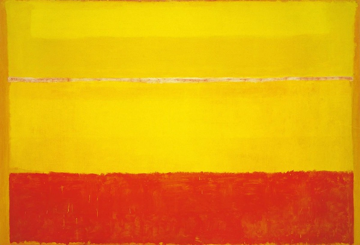
The easiest way to create harmony is through repetition, like using a limited color palette. When the same few colors appear throughout a piece, they tie everything together into a cohesive whole. It’s a visual echo that tells the viewer, “Yes, all these pieces are part of the same story.” It’s a visual contract between the artist and the viewer, promising a unified experience. Just think of the calm, unified feeling of a Mark Rothko painting, where the mood is created by immense fields of closely related colors, or the harmonious effect of a Japanese woodblock print with its carefully selected, resonant color scheme. These artists didn’t use every color in the box; they chose a few and made them sing. Think of the calm, unified feeling of a Mark Rothko painting, where the mood is created by immense fields of closely related colors. But it's more than just color. It's about commitment to a concept. A unified artwork feels intentional, as if every mark was destined to be there. A consistent style of brushwork (think van Gogh), repeated textures, or related shapes all contribute to a sense of oneness. This consistency ensures the artwork feels like a single, resolved statement rather than a collection of unrelated ideas. It’s the feeling that the artist had a clear vision and followed through on it. When you look at a painting by an Old Master, you can see this commitment in the way every fold of fabric, every highlight in a piece of fruit, serves the overall composition and lighting scheme. There are no loose ends, no random details thrown in for the sake of it. Everything belongs. Unity provides the strength and coherence that allows the more dynamic principles, like Contrast and Movement, to have their full effect without tearing the piece apart.
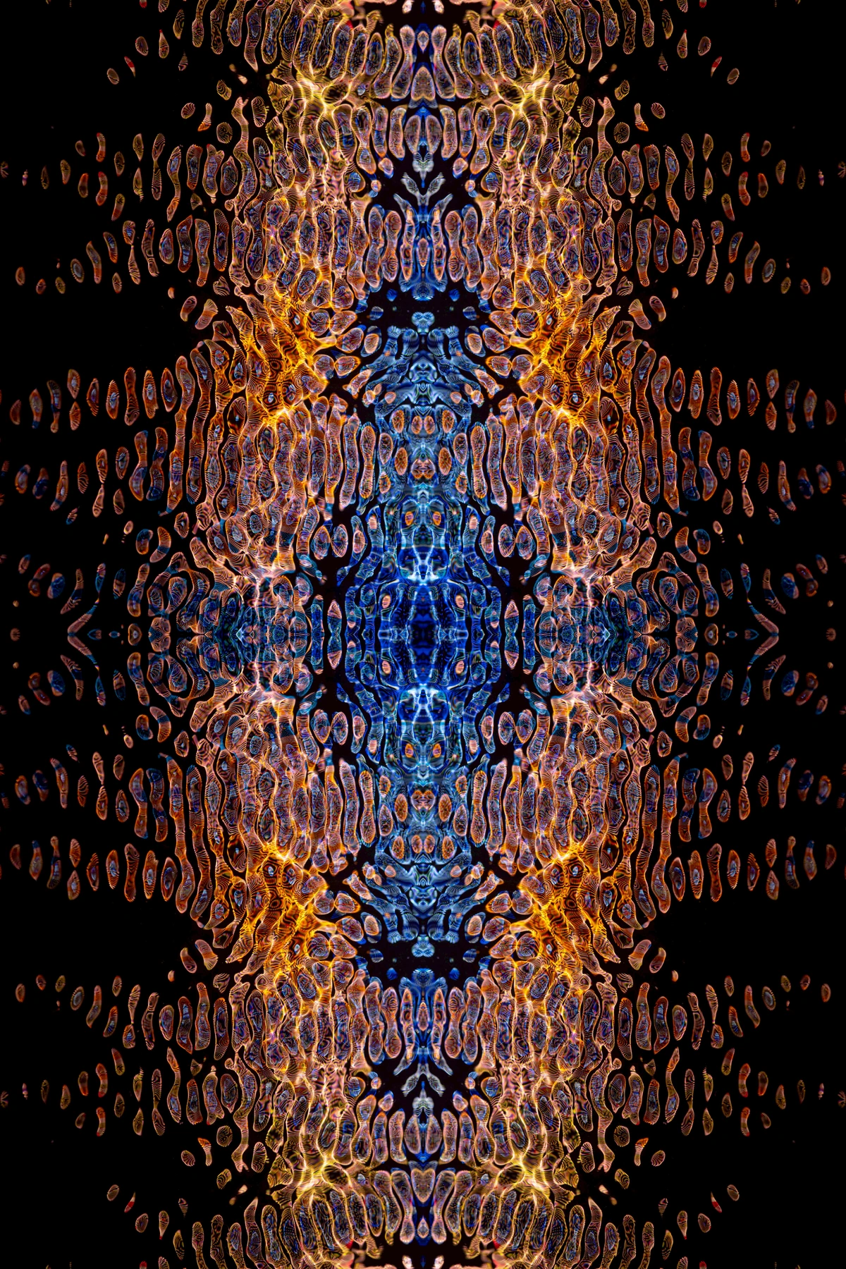
7. Variety: The Spice of (Visual) Life
If unity is the glue, variety is the glitter and the confetti. Variety is the counterpoint to harmony, the vital ingredient that prevents boredom and delights the eye. It's the artist adding spice. It's the element of surprise that keeps the viewer engaged. It’s what rewards a viewer for lingering. Without variety, even the most harmonious composition can feel flat and lifeless, like a song that is perfectly in tune but consists of only one note held forever.
Variety is the unexpected. It's a splash of a complementary color that zings. It's the introduction of a new texture that begs you to touch it, or a surprising change in scale. It can be a small object that tells a story contrasting with a larger, more abstract field. It's the bit of weathered grunge texture on an otherwise polished and sleek digital design. I like to think of it in music: a symphony with only one note would be unbearable. You need a rich range of notes, tones, and instruments to create something moving. The genius of an artwork often lies in finding that perfect balance between unity and variety—creating a composition that is cohesive, but not monotonous; varied, but not chaotic. It keeps the viewer engaged and rewards them for looking closely. This eternal push-and-pull is one of the most fundamental tensions an artist will ever negotiate. It’s like a conversation: Unity ensures everyone is speaking the same language; Variety ensures the conversation isn't boring. Striking that balance is what separates a good composition from a breathtaking one.
The Artist’s Toolkit: How Principles and Elements Dance
These principles don't live in a vacuum. They are activated through the artistic elements—the physical stuff we put on the canvas. It's the interplay of these tools and principles that creates the final magic. Think of the elements (line, color, etc.) as the ingredients and the principles as the recipe. You can have great ingredients, but without a good recipe, the meal falls flat. A great chef understands not just the flavor of each ingredient, but how they clash and harmonize. But there's another layer to this. The elements are also the tools you hold in your hand—the type of paint, the texture of the canvas, the hardness of the pencil. The principles are the choices you make with those tools. It's the voice in your head that says, "This needs more weight over here," or "I need a splash of something unexpected over there." This section is about connecting that inner voice to the physical reality of making a mark.
Element  | What It Is | How It Works with the Principles | A Tiny Thought Experiment |
|---|---|---|---|
| Line | A mark with greater length than width. It can be straight, curvy, thick, thin, implied. It's the skeleton of a composition. | A horizontal line can create a feeling of calm and stability (Balance). A jagged line creates tension and energy (Movement). Diagonal lines are dynamic, suggesting action. The quality of a line (fat, thin, hesitant, calligraphic) can also carry immense emotional weight. | Imagine a calm horizon (a long, thin line) versus a sharp, jagged lightning bolt. Same element, completely different emotional feel based on its use. A thick, charcoal line feels heavy and certain, while a wispy, thin line made with a delicate brush can feel light and full of life. |
| Shape | An enclosed two-dimensional area. Can be geometric (squares, circles) or organic (blobs, leaves). | Repeating a shape creates a pattern. Using a large shape against small shapes creates contrast. Organic shapes feel natural and fluid, while geometric ones feel man-made, stable, and ordered. | Think of looking at a parade of identical ballerinas vs. a single dancer in a spotlight. The singularity and difference create both contrast and emphasis. |
| Color | The element of light, with three properties: Hue (the color family), Saturation (intensity/purity), and Value (lightness/darkness). | Color creates emotional impact (Emphasis), harmony (using analogous colors), drama (Contrast), and a sense of space (warm colors advance, cool colors recede). Understanding color temperature is key. | Its psychology is powerful: a room painted in a low-saturation blue feels calm, while a room with a single, high-saturation red chair in the corner feels dynamic and focused. |
| Value | How light or dark something is, independent of its color. This is the skeleton of a painting, creating its fundamental structure. | This is crucial for creating form (3D illusion), depth, and focal points. High-contrast value creates drama (think Caravaggio!). Low-contrast can create mood and subtlety. | If you take a color photo and make it black and white, the underlying compositional structure that remains—the areas of light and shadow—is pure value. |
| Form | A three-dimensional object (height, width, depth) or the illusion of one on a two-dimensional surface. | Artists use value (shading) to make a circle look like a sphere, turning a flat shape into a volumetric form. It tricks your brain into seeing volume and mass. | It's the difference between drawing a flat circle (a shape) and drawing a shaded, round ball (a form). The form has weight. |
| Texture | The perceived surface quality of an object—rough, smooth, bumpy, sticky. Can be actual (tactile) or implied (visual). | It creates visual richness and contrast. An artist can use thick paint (impasto) to create actual texture. Implied texture creates realism and detail. Using varied textures adds Variety. | Compare the actual texture of a smooth, polished marble statue to the implied, painted texture of a satin dress in a Vermeer painting. One you can feel, the other you only see. The choice between real and implied texture can drastically change how a viewer relates to the work, inviting touch in one case and demanding careful observation in the other. |
| Space | The area around, between, and within subjects. Can be positive (the object) or negative (the emptiness/background). | The arrangement of objects in space creates balance. Using perspective creates an illusion of depth. Manipulating the empty space is a powerful compositional tool for creating emphasis. | The vast, negative space around a small figure can make them look lonely, powerful, or contemplative. The space between objects can be as important as the objects themselves. |
Deeper Waters: Linking Principles to Art Movements
You don't just see these principles in one painting at a time; you see them define entire artistic philosophies.
When the Impressionists decided to capture a fleeting moment, a feeling of light, they broke free from the rigid studio paintings of their time. Their goal was to paint the sensation of seeing, not just the thing being seen. They used loose, visible brushwork (Movement) to create a sense of the artist's hand at work, of time passing right there on the canvas. They applied broken color (Variety)—placing separate dabs of pure color next to each other—knowing the viewer's eye would mix them, creating a more vibrant and truthful depiction of light than a smoothly blended paint ever could. It was a radical idea at the time: that the painting itself could be a record of a specific moment in time, not just a permanent historical or mythological scene. They took everyday subject matter—a boating party, a field of poppies, dancers at a cabaret—and suffused it with this vibrant, breathing life.
Then came the Post-Impressionists like Cézanne, Seurat, and Van Gogh. They took the Impressionist's ideas and ran with them. Cézanne was less interested in the fleeting feeling of light and more interested in the underlying, eternal structure of reality. He broke the world down into basic geometric shapes (Shape, Balance), trying to paint the scene not as his eye saw it, but as his mind understood it. He would deliberately flatten a table or tilt a bottle to better serve the composition's structure, laying the intellectual groundwork for Cubism. Meanwhile, Georges-Pierre Seurat developed Pointillism, a method of applying small, distinct dots of pure color that would blend in the viewer's eye. This scientific approach used Pattern to achieve incredible luminosity and demonstrated how the principles could be systematized to achieve heightened optical effects. Van Gogh, in contrast, cranked up the Emphasis and Movement to express his raw, inner emotional state. His paintings aren't just pictures; they are records of feeling, with every brushstroke vibrating with energy and psychological intensity. He showed that the principles could be tools for pure emotional expression, not just objective observation. Georges Seurat took a radically different path, using Pattern and minuscule dots of color (Pointillism) to build his images scientifically, relying on the viewer's eye to blend them. Van Gogh, on the other hand, cranked up the Emphasis and Movement to express his raw, inner emotional state. His paintings aren't just pictures; they are records of feeling.
The torch was then passed to movements that redefined reality from the ground up. Cubism, pioneered by Picasso and Braque, shattered traditional perspective. They broke objects into geometric planes, showing multiple viewpoints at once—the top, the side, the inside—all on the same canvas. This was a radical re-imagining of Form and Space, showing us that an object isn't just what it looks like from one fixed spot; it's the sum of all its possible views, all its remembered fragments, held in your mind at once. Surrealism, with artists like Salvador Dalí, René Magritte, and Max Ernst, used bizarre, dreamlike imagery and illogical scenes to tap into the unconscious mind. They created jarring Contrast not by how they painted, but by what they painted, juxtaposing realistic rendering with impossible subject matter to bypass logic and access a deeper, more poetic reality.
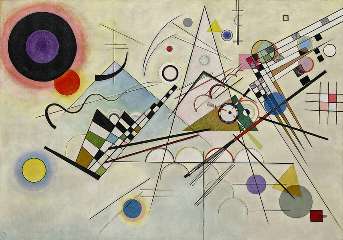
Finally, Abstract Expressionists like Mark Rothko or Jackson Pollock took these principles and turned them completely inward. Their subject wasn't a landscape or a person; it was the emotion itself. A Rothko painting uses large fields of color and hazy edges to envelop the viewer, creating a feeling of awe, serenity, or sorrow (Color, Emphasis). A Pollock drip painting is a pure, physical record of Movement and crystallographic Balance, with the artist's body as part of the machine. They prove that these principles are powerful enough to communicate profound ideas without ever showing you a single "thing."
But the story didn't stop there. Movements like Minimalism took these ideas even further, paring art down to its essential forms. Pop Art, on the other hand, injected the principles back into the language of mass media, using repetition, pattern, and bold color contrasts to critique and celebrate consumer culture. In our own time, Conceptual Art has pushed the boundaries, sometimes prioritizing the idea over the physical object itself, asking where the principles of art reside if not in a beautiful, well-composed object. Each of these movements shows us that these principles are not static rules, but a living language, capable of endless reinvention and redefinition, constantly pushing us to answer the fundamental question: what is art, really?
These weren't just stylistic choices; they were philosophical ones. Each movement chose which principles to prioritize, and in doing so, redefined what art could be.
The Unspoken Question: Why Does Any of This Matter to You?
I know what you might be thinking: that all sounds wonderfully academic. But here's the truth, the messy, practical, beautiful truth: understanding these principles is like learning a new language, and it does a funny thing to your brain. It rewires your entire way of seeing. It doesn't just change your experience of a museum; it changes your experience of the world. Suddenly, you can't unsee it. The principles are everywhere once you know their names. You’ll find yourself analyzing the composition of a movie frame, or noticing how the graphic designer of your favorite coffee bag used color to create emphasis. It’s a lifelong gift, turning every daily encounter with the man-made world into a potential source of insight and delight.
You start to see composition in the way buildings frame the sky. You notice color harmonies in a sunset or the deliberate psychological manipulation of a fashion magazine spread. You understand, on a gut level, why one room feels "right" and another feels chaotic—it’s probably the balance, the contrast, the lack of a focal point. It makes you a more active, critical perceiver of the world, turning every street scene into a potential painting. More importantly, when you look at a piece of artwork—whether it's in a grand museum or hanging on a wall in a coffee shop—you can have a richer, more meaningful conversation with it. You go from "I like it" to understanding why you like it, what the artist is trying to tell you, and how they're using this ancient, shared language to do it. It turns passive viewing into an active, engaging dialogue. Suddenly, the abstract splashes of color in a gallery aren't just random gestures; they're a carefully orchestrated symphony of rhythm, balance, and emotion. You begin to appreciate the thought and intention behind every mark that an artist makes, seeing the work not as a static object, but as a physical record of human intention.
Your Burning Questions, Answered
What are the 7 principles of art?
They're less like rigid rules and more like guiding principles—the grammar of a visual language. They are Balance, Movement, Pattern & Repetition, Emphasis & Focal Point, Contrast, Unity & Harmony, and Variety. An easy way to remember them is to think of them as the foundational choices an artist makes to organize the elements of art.
How do I apply these principles to my own creative work?
This is the leap from theory to practice. The bridge between knowing and doing. Here’s a simple, practical exercise you can try right now, even if you’ve never picked up a paintbrush:
- Find Your Anchor (Emphasis): Get a piece of paper and a pen. Draw a single, small shape. A circle, a star, whatever. That’s your focal point. Your entire composition will now serve this one shape. This simple act forces you to make a decision and stick to it, which is at the heart of good composition.
- Create a Stage (Contrast): Draw five more of the same shape, but make them much bigger and lighter (or a different color if you have one). You’ve just used contrast of size and value to make your original shape stand out. This is the first, most fundamental lesson in visual drama.
- Add a Rhythm (Movement): Draw a series of simple lines (or dots, or small marks) that lead from the edge of the paper toward your focal point. It could be a curve coming in from the corner. You’ve just created an implied line, guiding the viewer’s eye on a journey. You are now choreographing the viewer's experience in time and space.
- Tie It Together (Unity): Look at your composition. Is there a feeling you want to convey? Calmness? Energy? To create unity, repeat some element. If you want calm, make all your lines gently curved and horizontal. If you want energy, make them sharp and diagonal. Use only two or three tones—you’ve just created a unified color palette. This is where your personal voice starts to emerge from the mechanics.
- Throw in a Surprise (Variety): When you feel the composition is getting too predictable, add one unexpected mark. A single, different-colored dot in a far corner. A sudden, jagged edge on one of your shapes. This is the spice. This is what makes it yours. This final step is about breaking your own rules just enough to create interest without sacrificing the unity you just built.
Doing this for just ten minutes will teach you more about composition than a week of reading. It’s the difference between looking at a map and walking the terrain. These principles are a starting point, a solid ground from which to leap into the unknown. So go on, take the leap.
Which principle of art is most important?
That's like asking which ingredient is most important in a soup. You can't have a good soup without any of them. They work as an interconnected system. However, if I had to pick one, I'd argue that Contrast is the most fundamental. Without it, nothing has a stage to perform on. It’s the engine that makes everything else visible and interesting. It's the conflict that makes the story worth telling. How can you create a focal point without contrast? How can you suggest movement without contrasting a static element against a dynamic one? How can you achieve balance without contrasting weights? It is the principle that gives all the others the ability to function.
But a composition with only contrast and no unity would just be chaos. So, the most 'important' principle in any given artwork is arguably the one the artist chose to make the loudest statement with, or the one they deliberately broke to achieve a specific, jarring effect. The real answer is that they're a family. They need each other to survive.
What is the difference between the elements and principles of art?
This is a fantastic question because it gets to the heart of how art is built. Think of it like this: The Elements (Line, Shape, Color, Value, Form, Texture, and Space) are your raw materials—your paint, your words, your musical notes. They answer the question, 'What am I using?'. The Principles (Balance, Movement, Pattern, Emphasis, Contrast, Unity, and Variety) are the structure you build with them—the plot, the grammar, the musical score. They answer the question, 'How do I arrange what I'm using?'.
One is tangible (the elements), the other is relational and structural (the principles). You can't have a principle without an element to enact it upon. The principle of Rhythm answers the question how to arrange elements, and the element of Line is the what that you are arranging. Understanding this distinction is a mental shift that moves you from seeing a painting as a collection of things (a blue line here, a red circle there) to understanding it as a dynamic system of relationships. It’s the difference between looking at a pile of bricks and seeing a cathedral.
How do artists use color to create emphasis?
They use contrast. A warm color (like red or orange) will advance toward your eye, while a cool color (like blue or green) will recede. A high-saturation color will command attention away from a low-saturation one. If you place a warm, saturated orange circle on a large, muted blue background, that orange circle becomes the star of the show. It's an undeniable focal point.
But it goes deeper than that. The artist is literally using the physics of perception and deep cultural associations to control where you look. In many cultures, for instance, red is a color of urgency and passion, which can be used for powerful emphasis beyond just its optical properties. It's the color of stop signs, warning lights, and emergency exits for a reason—our brains are conditioned to pay attention to it. An artist might use a splash of red not just because it's a complementary color, but because they want to create a sense of immediate, almost alarming importance.
On the flip side, an artist can use a very low-contrast, muted color palette to create a soft, subtle emphasis that rewards close looking. It whispers rather than shouts. Consider the nearly monochromatic paintings of Mark Rothko, where the "emphasis" isn't a sharp dot, but a gentle, luminous shift in hue that draws you into a state of quiet contemplation. In these cases, the emphasis is not on an object, but on an atmosphere or an emotion, with color acting as the primary vehicle for that journey.
Why do artists break the rules?
Because the rules are a starting point, not a prison. The rules are there to create expectations. And breaking an expectation is the most powerful way to create meaning. Think of them as the rules of jazz. You have to know the chord progression before you can improvise on top of it. Breaking a rule is a deliberate choice. An artist might create a wilfully unbalanced composition to make the viewer feel anxious and unsettled. Another might completely avoid a focal point to create a sense of democratic visual noise, turning the entire canvas into a single, all-over texture. Artists like the Cubists broke the rules of perspective to show us a new way of seeing. Marcel Duchamp broke the rules of what even constitutes art. To break a rule effectively, you first have to know it intimately.
What is the Rule of Thirds?
The Rule of Thirds is one of the most well-known compositional guidelines. Imagine dividing your canvas into nine equal squares with two equally-spaced horizontal lines and two equally-spaced vertical lines. The theory states that if you place the most important elements of your composition along these lines, or at the points where they intersect, you'll achieve a more balanced, dynamic, and interesting composition than if you just plonk the subject in the center. It's a simple way to achieve a powerful form of Asymmetrical Balance. It’s a simplification of the more complex Golden Ratio, but for most everyday compositions, it’s an incredibly effective tool. You see it used instinctively by master painters, from the serene landscapes of the Dutch masters to the dynamic scenes of the Romantics. It’s pervasive in photography, graphic design, and filmmaking because it just plain works to create a more engaging and less static image.
Bringing It All Home: The Subtle Alchemy of Scale and Proportion
The principles we've discussed don't exist in a vacuum; their impact is magnified or diminished by two silent but powerful forces: Scale and Proportion. While often confused, they are different.
Scale refers to the size of an object in relation to something else—usually ourselves or a standard of measurement. Think of the difference between a life-sized sculpture of a horse and a miniature one. Both could be perfectly executed, but the sheer scale of the larger one has a physical, almost intimidating presence. Artists like Claes Oldenburg and Coosje van Bruggen made their careers playing with scale, creating gigantic clothespins and shuttlecocks that transform familiar objects into something monumental and surreal. Working on a large scale, you feel like you're stepping into the painting, becoming a part of its world. Working on a small scale creates an intimate experience, pulling the viewer in close for a private discovery.
Proportion, on the other hand, is about the relationship of size between the different parts of a whole. It's the harmonious, or deliberately unharmonious, relationship between a head and a body, a window and a wall, a brushstroke and the canvas. The ancient Greeks were obsessed with ideal proportions, believing they reflected a divine cosmic order. This led to concepts like the Golden Ratio, a mathematical proportion found in nature and classical architecture that was thought to be inherently pleasing to the eye. Artists like Leonardo da Vinci explored this in works like Vitruvian Man.
But proportion is also a powerful tool for expression. Artists like El Greco or Amedeo Modigliani intentionally distorted the proportions of the human figure, creating unnaturally elongated forms to express spirituality, grace, or psychological tension. In these cases, "wrong" proportions are the "right" choice. Understanding this allows you to move beyond simply depicting what you see to interpreting what you feel. It's about deciding which parts of your composition are most important and giving them the space—both literally and figuratively—to express that importance.
What's the difference between Pattern and Repetition?
This is a subtle but important distinction. Repetition is the broader concept of repeating any element—a color, a shape, a sound—to create a sense of cohesion. Pattern is more specific; it's a regular, predictable repetition. For example, drawing a series of random circles on a page uses repetition. Drawing a perfect grid of circles uses pattern. All patterns use repetition, but not all repetition creates a pattern. In art, repetition can be used to create texture or rhythm, while pattern is often used to create a decorative surface or a sense of structured order.
It can get even more interesting. Think of the difference between a simple checkered shirt (a rigid, predictable pattern) and the shimmering, ever-shifting scales of a fish (repetition with organic variation). Artists often play with this boundary, disrupting a perfect pattern with a single irregularity to create surprise and juxtaposing rigid order with organic chaos to explore deep ideas about the natural and the man-made, as seen in the stark grid works of Agnes Martin contrasted against the gestural organic forms of Henri Matisse.
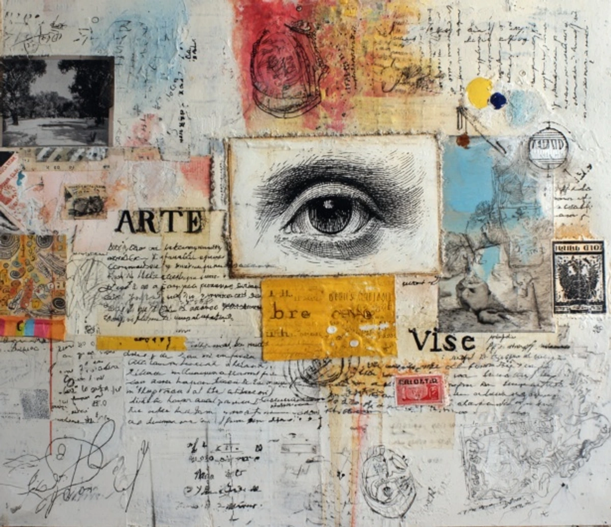
I hope this has pulled back the curtain a little. These principles aren't just academic jargon; they are the secret handshake, the tools and tricks that artists have used for centuries to turn pigment and canvas into something that feels like a part of your own soul. They are the language of visual poetry.
The next time a piece of art stops you in your tracks, take a moment. Look for the balance, feel the movement, and ask yourself: What is the artist really trying to tell me? And then, if you feel that creative urge, pick up a pencil or a brush. Don't be afraid of the blank page. See it not as an emptiness to be feared, but as a space of infinite potential waiting for you to make your first mark. Use these principles as your allies, your tools, your starting points. Let them guide you, challenge you, and liberate you. Because in the end, art isn't about following rules. It's about learning the language so well that you can finally tell your own story.
Key Takeaways: Your Mental Palette
Let's step back from the details and look at the big picture. If you take one thing away from our chat, let it be this:
- The principles are not laws to be memorized; they are a lens through which to see the world, a vocabulary for your perception, and a toolkit for your own creativity.
- No principle works in isolation. The magic always happens in the interplay. A painting is a conversation between all seven, a delicate negotiation between competing forces to create a coherent whole.
- The elements (line, color) are the what. The principles are the how. An artist's skill lies in using the how to bring the what to life with intention and meaning.
- Contrast is the engine that makes everything else visible. It creates the stage where all the other principles perform, and is the foundational tool for emphasis and drama.
- The ultimate goal is to manage the eternal push-and-pull between Unity (making everything feel like it belongs) and Variety (providing the spice of life). Mastering that balance is the secret to masterful composition.
Armed with this mental palette, you are equipped to see art—and the world—in a more profound way. So go out there and look. And then look again.








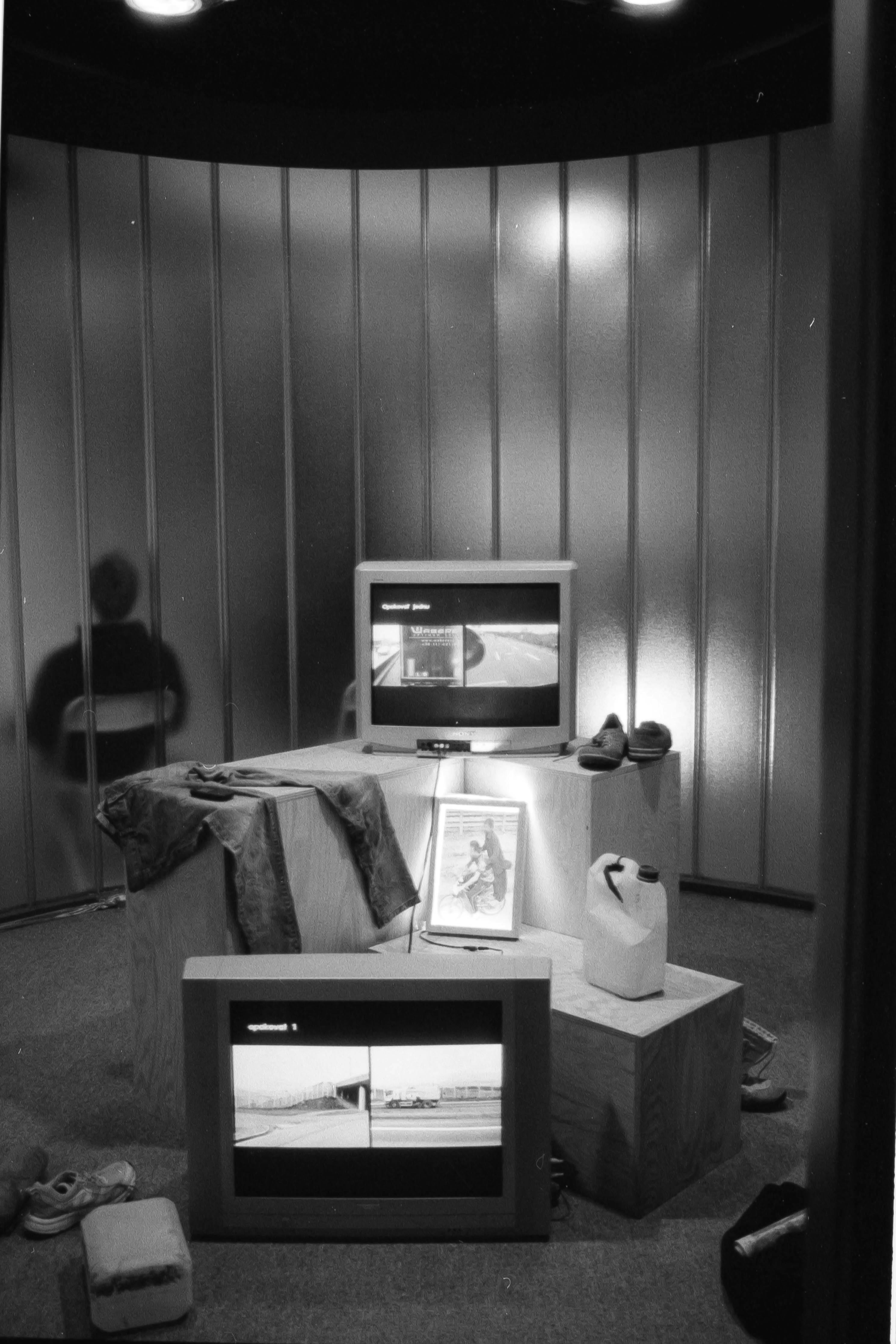
Understanding these fundamentals is about more than just appreciating art; it's about becoming more conscious of the visual world you navigate every day. It's about realizing that beauty, order, and meaning aren't accidental—they're the result of a set of choices, a conversation between the maker and the viewer, spoken in a language we can all learn to understand. It's a form of literacy, empowering you to not only see but also to create. It’s the skill of looking past the obvious and understanding the bones, the structure, the very DNA of what makes a visual experience resonate. And once you can see that language, you can start to speak it yourself.