The Golden Rule in Art: A Guide to the Ratio That Defines Beauty
A deep dive into the Golden Rule in art composition, exploring its history from ancient Greece to modern abstract art. Learn why this principle persists and how to use it to create dynamic, enduring compositions.

# The Golden Rule in Art Composition Isn't a Rule at All (And That's What Makes It Golden)
Out of sheer desperation, I started sketching out a simple spiral, more doodle than design. I remember the specific frustration of that night—a large canvas mocking me with its perfect flatness. It was a chaotic mess of good intentions, a landscape that felt as claustrophobic as a crowded elevator. When I laid my painting's main focal point at the curve's origin, something happened. The chaos didn't just settle; it resolved, like a chord moving from dissonance to consonance. The entire piece suddenly had a focal point, a [visual rhythm](/finder/page/what-is-rhythm-in-art) that guided your eye without shouting for attention. It wasn't a magic trick, but it felt like learning a secret language. It turns out, the [Golden Rule](/finder/page/golden-rule-art-ethics-best-practices) in [art composition](/finder/page/understanding-balance-in-art-composition) isn't a rigid formula for beauty; it's a powerful principle for creating rhythm and resonance. It's not about chaining your creativity to a calculator; it's about understanding the deep grammar of visual appeal.

[credit](https://commons.wikimedia.org/wiki/File:Piet_mondrian,_composizione_n._IV-composizione_n._6,_1914,_01.jpg),
[licence](https://creativecommons.org/licenses/by/3.0)
## What Is the Golden Ratio?
Let's get the math out of the way first, because it's deceptively simple. The [Golden Ratio](/finder/page/understanding-the-golden-ratio-in-art-and-design-a-guide-to-harmonious-composition) is a specific number, approximately **1.618**, often denoted by the [Greek](/finder/page/famous-greek-sculptures) letter **Phi ($\phi$)**. It’s derived from the Fibonacci sequence, where each number is the sum of the two preceding ones (0, 1, 1, 2, 3, 5, 8, 13...). As the sequence progresses, the ratio between consecutive numbers gets closer and closer to Phi. It's an irrational number, meaning its decimal representation goes on forever without ever repeating, a hint of the infinite complexity hidden within this simple ratio.
To understand why this is special, imagine dividing a line into two parts. A boring, equal division gives you a ratio of 1:1. The [Golden Ratio](/finder/page/understanding-the-golden-ratio-in-art-and-design-a-guide-to-harmonious-composition) division is different: the ratio of the whole line to the longer segment is the exact same as the ratio of the longer segment to the shorter one. This unique, self-referential property is what gives Phi its profound sense of balance. It's not arbitrary; it's a relationship that contains itself, a mathematical echo.
[credit](https://upload.wikimedia.org/wikipedia/commons/7/78/Gustav_klimt%2C_le_tre_et%C3%A0%2C_1905%2C_01.jpg),
[licence](https://creativecommons.org/licenses/by-sa/4.0)
In visual terms, this ratio describes a relationship where the ratio of a line segment's total length to its longer segment is the same as the ratio of the longer segment to the shorter one. I know, it sounds about as exciting as watching paint dry. But when you turn that relationship into a shape—like a rectangle—you get what we call the **[Golden Rectangle](/finder/page/understanding-the-golden-ratio-in-art-and-design-a-guide-to-harmonious-composition)**. This unique rectangle possesses an almost magical property of self-similarity, a kind of visual recursion that's incredibly pleasing to the eye.
[credit](https://upload.wikimedia.org/wikipedia/commons/5/53/Ciao_Adele_Vienna-03-2006.jpg),
[licence](http://creativecommons.org/licenses/by-sa/3.0/)
Consider how this rectangle's elegant proportions are timeless.
```
[Imagine a rectangle]
```
If you take a [Golden Rectangle](/finder/page/understanding-the-golden-ratio-in-art-and-design-a-guide-to-harmonious-composition) and draw a square inside it, you're left with another, smaller [Golden Rectangle](/finder/page/understanding-the-golden-ratio-in-art-and-design-a-guide-to-harmonious-composition). You can do this over and over, creating a cascade of perfectly proportioned squares and rectangles. This process of infinite subdivision reveals a core principle of the ratio: it's a pattern that exists within itself, a nesting doll of visual harmony. Now, draw an arc, or a spiral, connecting the opposing corners of those nested squares.
That elegant, ever-expanding curve is the **[Golden Spiral](/finder/page/understanding-the-golden-ratio-in-art-and-design-a-guide-to-harmonious-composition)**. This is where the math leaves the textbook and enters the world we see around us—from the unfurling of a fern to the swirling arm of a galaxy. It's a pattern of growth, of organized, organic expansion. I keep a nautilus shell in my studio for this very reason. On days when a painting feels dead, I'll pick it up and trace its curve. It's a tangible reminder that this isn't just a human invention; it's a deep, embedded logic in the world around us. This pattern resonates because we've been seeing it our whole lives, long before we knew its name. It represents a blueprint for growth that is both efficient and beautiful, a universal algorithm for creating form.
[credit](https://upload.wikimedia.org/wikipedia/commons/b/bc/Klimt_Adele_Bloch_Bauer.jpg),
[licence](https://creativecommons.org/licenses/by/3.0)
### From Numbers to Nature: The Fibonacci Connection
The link between the Fibonacci sequence and the natural world is where the [Golden Ratio](/finder/page/understanding-the-golden-ratio-in-art-and-design-a-guide-to-harmonious-composition) stops feeling like a classroom exercise and starts to feel a bit like magic. The Fibonacci numbers (1, 1, 2, 3, 5, 8, 13, 21...) show up in the most unexpected places. This isn't a mere coincidence; it reflects a fundamental efficiency in nature's patterning, a way to pack the most seeds into a seed head or arrange leaves for optimal sunlight with a mathematical elegance that is simply breathtaking. Think of the head of a sunflower, with its spiraling florets moving both clockwise and counter-clockwise. Count those spirals and you'll find they are almost always adjacent Fibonacci numbers. It’s nature’s way of achieving maximum packing efficiency without a conscious plan, a result of simple iterative growth creating profound complexity.
But what does "efficiency" really mean in this context? Let's break it down. Imagine a plant stem. For each new leaf to avoid shading the one below it, it needs to grow at a specific angle. That optimal angle of rotation often corresponds to $\frac{360^\circ}{\phi^2}$, which is about 137.5 degrees. The result is an exquisite spiral pattern of leaves (a phyllotactic spiral), where no leaf is directly above another, maximizing exposure to light and air. This isn't an accident; it is the result of billions of years of evolutionary optimization, converging on a mathematical constant. Nature isn't "thinking" about math; it is simply finding the path of least resistance and greatest efficiency, and that path is often defined by Phi.
Take the humble sunflower. Its seed head isn't just a jumble; it consists of two sets of spirals, one clockwise and one counter-clockwise. If you count these spirals, you will consistently find that the numbers are consecutive Fibonacci numbers, like 34 and 55, or 55 and 89. Why? Because this arrangement allows for the tightest possible packing of seeds, ensuring the maximum number can fit in the available space. It's nature's own ingenious solution to a complex packing problem, written in the language of mathematics.
[credit](https://itoldya420.getarchive.net/amp/media/post-impressionist-post-impressionism-fine-art-nature-landscapes-874bfc),
[licence](https://creativecommons.org/publicdomain/zero/1.0/)
## A Glimpse into History: The "Divine" Obsession
My initial skepticism wasn't unfounded. The Golden Ratio has been hyped for centuries, often with a mystical reverence that can feel alienating. It's like the disco ball of art history—everyone projects their own light onto it. The ancient [Greek](/finder/page/famous-greek-sculptures) sculptor Phidias was said to have used it in the design of the Parthenon, believing it represented a divine, perfect harmony. Whether he actually did or not is a subject of great debate among scholars, but the mere association shows how long this number has captivated our imagination. This enduring debate highlights the human tendency to seek order and perfection in the greatest works of the past. It's a beautiful example of how we want to believe that great beauty comes from a secret, a formula, something we can put in a box and replicate.
### Ancient Greece: The Formal Birth of Phi
The story of Phi, at least in the Western world, truly begins with Euclid of Alexandria. Around 300 BCE, in his foundational mathematical text "Elements," he provided the first written definition of what he called "the extreme and mean ratio." He wasn't looking at art; he was solving a geometric problem. The beauty of it, however, was immediately apparent to the Greeks, who sought mathematical perfection in all things.
The Parthenon's facade is often the poster child for Phi, an image plastered on countless websites and textbooks. But let's be real: modern measurements show its proportions are close to, but not a *perfect*, golden ratio. So, what's going on? It's a classic case of a beautiful story overtaking a more complicated reality. The Greeks likely used a simpler, more practical system of proportions, perhaps based on the ratio of whole numbers, as seen in musical harmonies (think octaves, fifths, and fourths). Many ancient structures we admire follow a principle of **root rectangles**—a system of creating rectangles based on the square roots of 2, 3, and 5. The $\sqrt{5}$ rectangle, for instance, is remarkably close to the Golden Rectangle, and some historians argue this is the more likely source of the Parthenon's elegant proportions. This isn't a disappointment; it means that multiple paths in the pursuit of beauty can lead to similar destinations.
But here's the catch, and it's a big one. This entire idea of the Greeks "using" the Golden Ratio might be a historical projection. The term "Golden Ratio" itself didn't exist until the 19th century, coined by mathematician Martin Ohm. While Euclid defined the number geometrically, the idea of it as a divine, universal key to beauty is a later invention. This doesn't mean the Parthenon isn't beautifully proportioned—it is. It just means they might have been guided by a different kind of harmony, one based on whole-number ratios. The Greeks were deeply invested in rationality and whole numbers, and their system of proportions was likely based on these more "human" scales. This makes the story more interesting, not less. It shows that humans have always been on a quest for a system of beauty, and we keep rediscovering and reinterpreting the same mathematical truths.
[credit](https://images.pexels.com/photos/18132988/pexels-photo-18132988/free-photo-of-close-up-of-abstract-colorful-paintings.jpeg),
[licence](https://creativecommons.org/public-domain/)
### The Renaissance: Where Art and Science Collide
## A Glimpse into History: The "Divine" Obsession
It was during the Renaissance that proportion truly flowered as an [artistic principle](/finder/page/what-is-artistic-merit-and-how-is-it-judged). This was the era of the "Renaissance Man," the polymath, and art was not seen as separate from science, but as its ultimate expression. Artists began to codify their methods, moving from craft secrets passed down in workshops to theoretical knowledge based on mathematics and philosophy.
[credit](https://upload.wikimedia.org/wikipedia/commons/2/29/Piet_mondrian%2C_composizione_con_grande_piano_rosso%2C_giallo%2C_nero%2C_grigio_e_blu%2C_1921.jpg),
[licence](https://creativecommons.org/licenses/by/3.0)
### The Leonardo da Vinci Connection
Leonardo da [Vinci](/finder/page/why-is-leonardo-da-vinci-famous), who saw art and science as two sides of the same coin, was utterly fascinated by proportion. He famously illustrated Luca Pacioli's book "De Divina Proportione" ("On the Divine Proportion"), a text that synthesized mathematical knowledge with artistic application. This act did more than just explain a concept; it brought the Golden Ratio into the studios of the era's greatest minds as a subject of serious academic inquiry.
Did da Vinci apply it with the rigid precision of a modern-day CAD program? Almost certainly not. But his preparatory sketches for masterpieces like **"The [Last Supper](/finder/page/what-is-the-last-supper-painting)"** reveal an underlying geometric structure that aligns remarkably well with harmonic proportions. For these thinkers, proportion wasn't a secret ingredient; it was a way to connect their art to the fundamental, mathematical underpinnings of the cosmos. They were searching for a universal syntax for beauty, a code they believed was written into the very fabric of reality.
The **"Vitruvian Man"** is the ultimate expression of this quest. [Da Vinci](/finder/page/ultimate-guide-to-leonardo-da-vinci) wasn't just drawing a man in a circle and a square; he was illustrating the Roman architect Vitruvius's belief that the ideal human proportions could form the basis for all architectural and artistic perfection. It's a map of the human body as a microcosm of the universe's geometry. And while the ratios in the drawing aren't a perfect 1:1.618, the philosophical principle—that man's form holds the secrets to harmony—is the golden thread connecting art, science, and nature.
[credit](https://commons.wikimedia.org/wiki/File:Piet_mondrian,_tableau_III,_composizione_in_ovale,_1914_%28stedelijk_museum_amsterdam%29_02.jpg),
[licence](https://creativecommons.org/licenses/by/3.0)
### The Silent Language of the Masters: From Botticelli to Raphael
Even artists who didn't write treatises were deeply engaged with these ideas. Another master, Sandro Botticelli, is believed to have used similar proportional systems to structure his compositions. In **"The Birth of Venus,"** the placement of the central figure, the curve of the shell, and the overall layout of the canvas create a rhythmic flow that strongly suggests an underlying harmonic armature. It became a [silent language](/finder/page/the-language-of-line:-how-gestural-marks-define-emotion-in-my-abstract-art) of balance that the great masters shared, a way to make a scene feel both monumental and effortlessly natural.
This wasn't about slavishly following a ruler. It was about internalizing a system of relationships so deeply that it became an instinct. Think of it like a musician learning scales: eventually, you stop thinking about the individual notes and just *feel* the melody. For artists like Raphael, this internalized geometry allowed them to arrange complex groups of figures—as in **"The School of Athens"**—in a way that feels dynamic and alive, yet perfectly ordered and balanced. The result is a composition that you *feel* long before you analyze it.
[credit](https://www.rawpixel.com/image/3894575/illustration-image-art-vintage),
[licence](https://creativecommons.org/publicdomain/zero/1.0/)
User: Luc Viatour, [CC BY-SA 3.0](https://creativecommons.org/licenses/by-sa/3.0)
This appeal to natural order is why principles of the Golden Ratio transcend cultures. In Japan, the concept of "Ma" (間), or dynamic [negative space](/finder/page/role-of-negative-space-abstract-art), often aligns with this sense of harmonious asymmetry. A Zen garden, with its precisely raked gravel and carefully placed rocks, isn't designed with a golden spiral overlay, but it achieves a similar goal: a composition that feels perfectly balanced, dynamic, and alive. The famous Horyu-ji temple near Nara is a masterpiece of Japanese Buddhist architecture, and while its design predates formal golden ratio analysis, its proportions are remarkably close to these harmonic principles. The same goes for Buddhist stupas and mandalas. Their construction is based on complex geometric diagrams called yantras, which serve as blueprints for a sacred space and are often filled with proportional relationships that echo the nature-inspired growth patterns we see in Phi. What connects these vastly different traditions is a shared pursuit of a profound visual logic that resonates with the deepest patterns of the natural world.
These aren't coincidences. They point to a universal human tendency to find visual order in the same kinds of patterns that appear in the natural world. It seems that across vastly different cultures, when humans set out to create something of immense beauty or spiritual significance, we often arrive at the same fundamental principles of balance and growth.
## Demystifying the Jargon: Golden Ratio vs. Rule of Thirds
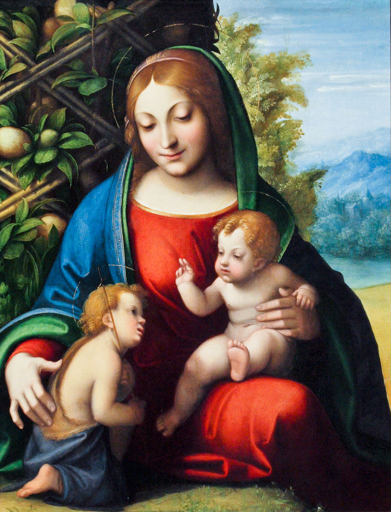
This is where most people get tripped up. Before we go any further, let's clear the air. The Golden Spiral and Phi-based grids are often confused with the more common **Rule of Thirds**.
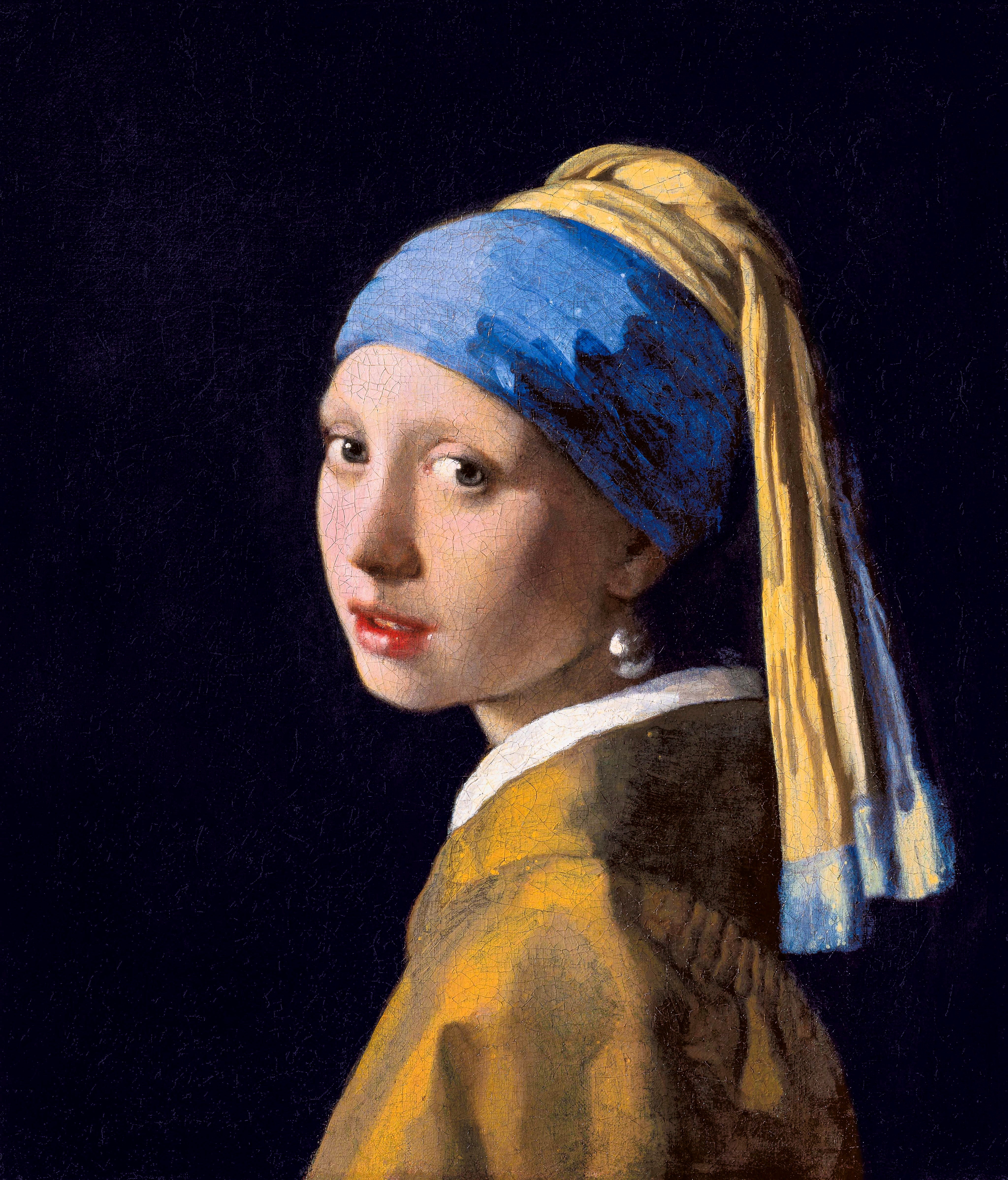
Here's the core difference: The **Rule of Thirds** is a simplification. You divide your canvas into a 3x3 grid (a tic-tac-toe board) and place your key elements along the lines or at the intersections. It's a fantastic compositional starting point—a rule of thumb that helps you break away from a static, centered composition. Even the great Dutch master Johannes Vermeer, in works like **"Girl with a [Pearl Earring](/finder/page/what-is-the-girl-with-a-pearl-earring),"** intuitively placed his subject's focal eye near a "power point" that aligns with the Rule of Thirds, giving the painting an immediate, subtle liveliness. It works because the intersections are close to the eye's natural resting points when scanning an image, creating an instant sense of dynamic balance that feels both stable and energetic.
| Technique | Philosophy | Best For |
| :----------------- | :--------------------------------------------- | :---------------------------------------- |
| **Rule of Thirds** | A quick, simple, and effective approximation. | Beginners, a fast shot, balanced scenes. |
| **Golden Ratio** | A dynamic, precise, and organic spiral leading the eye. | Deliberate composition, creating a focal point with flow. |
| **Dynamic Symmetry** | A more complex grid system also based on the Golden Ratio, using diagonals and reciprocals. | Advanced composition, creating strong dynamic tension and counter-movements. |
[credit](https://live.staticflickr.com/5285/5284269263_402145f326_b.jpg),
[licence](https://creativecommons.org/licenses/by-nc-nd/2.0/)
Think of it this way: if the Rule of Thirds is a solid, reliable pickup truck—practical, easy to use, and great for everyday jobs—the Golden Ratio is a luxury sports car. Both will get you where you need to go, but one is a tool for balance and the other is an engine for rhythm. The Rule of Thirds *approximates* the power points of the Golden Ratio, but it lacks the subtle, curving guide of the spiral that can pull a viewer on a specific path through your painting. It's the difference between placing a signpost and building a winding garden path. One gives you a destination, the other invites you on a journey.
[credit](https://upload.wikimedia.org/wikipedia/commons/6/65/VDM_speurpuzzel_met_thema_De_Stijl_FP_2018-3.jpg),
[licence](https://creativecommons.org/licenses/by-sa/4.0)
### Dynamic Symmetry: The Advanced Blueprint
But the journey doesn't end with two choices. For those wanting to go deeper, there's also **Dynamic Symmetry**, a system developed by artist and theorist Jay Hambidge in the early 20th century. This framework takes the Golden Rectangle and subdivides it further with both diagonals and lines creating "reciprocals." This creates multiple focal points and lines of action, giving you a more flexible toolkit for creating complex, dynamic compositions with tension and counter-movement.
If the Golden Ratio is a sports car, Dynamic Symmetry might be the blueprint for the entire racetrack. It's a powerful next step if you ever feel the simpler grids are becoming too limiting. Artists like [Georges Seurat](/finder/page/who-is-georges-seurat) and the Post-Impressionists often used similar underlying geometric armatures to structure their paintings, building an invisible scaffolding of lines and intersections that gave their work a profound, almost architectural stability beneath its painterly surface.
[credit](https://www.flickr.com/photos/42803050@N00/31171785864),
[licence](https://creativecommons.org/licenses/by-nd/2.0/)
## How to Use the Golden Ratio in Your Art (The Practical Part)
Okay, so it's not just a myth. How do you actually use it?
Honestly, I rarely sit down and painstakingly construct a perfect Golden Spiral on my canvas before I paint. That's a quick way to kill any [creative spark](/finder/page/finding-abstraction-in-the-everyday:-how-mundane-moments-fuel-my-creative-vision). It can feel rigid and artificial, turning the canvas into a spreadsheet. Instead, I keep it in mind as a principle for fine-tuning. The goal is to **internalize the *feeling* of this proportion** so it becomes an instinct. You learn the rules so you can break them with purpose, not out of ignorance. Think of it as a scale for a jazz musician: you practice it endlessly so that when you improvise, the notes you choose, even the 'wrong' ones, are informed by a deep sense of harmonic structure. The music feels free, but it's freedom built on a foundation of discipline.
### Quick and Practical Methods for Applying the Ratio
Before diving into specific applications, let's talk about tools. You don't need to be a math genius or wield a compass. There are surprisingly simple ways to invite Phi into your process.
* **The Overlay Method:** This is my go-to for troubleshooting. Pull up a transparent Golden Spiral or Phi Grid (you can find images of these online in seconds) on your phone or tablet and simply place it over a photo of your work-in-progress. It's a brutally honest way to see if your composition has a natural flow or if it needs a nudge. This is less about proving the ratio's presence and more about diagnosing weak spots in your painting's visual rhythm.
* **The Sketch Method:** When you're planning a piece, try a few five-minute compositional sketches with a light pencil spiral. The goal isn't to be precise, but to find a balance that *feels* right. Once you start painting, you can ignore the sketch entirely, trusting your hand to remember the flow. This internalization is the key to moving from rigid application to intuitive use.
* **The Research Method:** Before you even sketch, spend ten minutes gathering reference photos. Look for the natural flow in a mountain range, the curve of a coastline, or the way branches reach away from a tree trunk. You'll be surprised how often these natural lines echo the golden spiral. Try sketching *that* flow, not the object itself, training your eye to see the underlying dynamics of composition in the world around you.
* **The Digital Method:** If you're working digitally (in Photoshop, Procreate, etc.), most applications allow you to create custom guides. Import a Golden Spiral or a Phi grid, lower its opacity, and lock the layer. It becomes your compositional safety net, something to glance at when you're feeling stuck, without ever becoming a rigid constraint that stifles your brushstrokes.
* **Negative Space Drawing:** Instead of drawing your subject, try drawing the empty spaces *around* it. This forces you to stop thinking about "thing" and start thinking about "shape." By focusing on the negative shapes, you can often find a more interesting and dynamic overall composition. These "found" compositions have a tendency to align with natural proportional systems because nature itself often grows according to these principles.
[credit](https://www.publicdomainpictures.net/pictures/740000/nahled/mixed-media-abstract-collage-17608140105LM.jpg),
[licence](https://creativecommons.org/publicdomain/zero/1.0/)
### 1. Creating an Unbeatable Focal Point
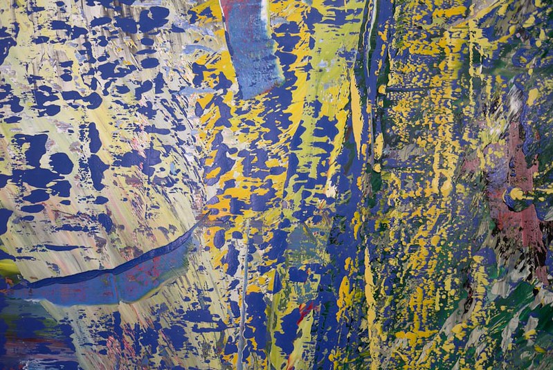
This is its greatest strength. The eye is naturally drawn to the center of the spiral's "navel," the point where it is smallest and tightest. Placing your painting's main subject there—a face in a portrait, a key object in a [still life](/finder/page/what-is-a-still-life), the sun in a landscape—gives it undeniable priority.

[credit](https://images.pexels.com/photos/29230061/pexels-photo-29230061.jpeg?cs=srgb&dl=pexels-esra-afsar-123882149-29230061.jpg&fm=jpg),
[licence](https://creativecommons.org/public-domain/)
But here's the magic: instead of just plopping the subject in the middle, you're placing it off-center. This creates immediate visual interest and tension, but it does so with a sense of organic logic that other off-center placements lack. The spiral's path guides the viewer's eye into the focal point, rather than just pointing at it. Vermeer's "Girl with a [Pearl Earring](/finder/page/what-is-the-girl-with-a-pearl-earring)" is a masterclass in this. Her enigmatic gaze isn't at the center of the canvas, but its placement creates a powerful, magnetic pull that the simple off-centeredness can't fully explain. The arrangement feels inevitable, like gravity. It's the difference between telling someone to look at something and creating a path that makes them *want* to travel to it.
[credit](https://live.staticflickr.com/7275/7548168124_243d637c75_c.jpg),
[licence](https://creativecommons.org/licenses/by-nc-nd/2.0/)
### 2. Generating a Dynamic Flow
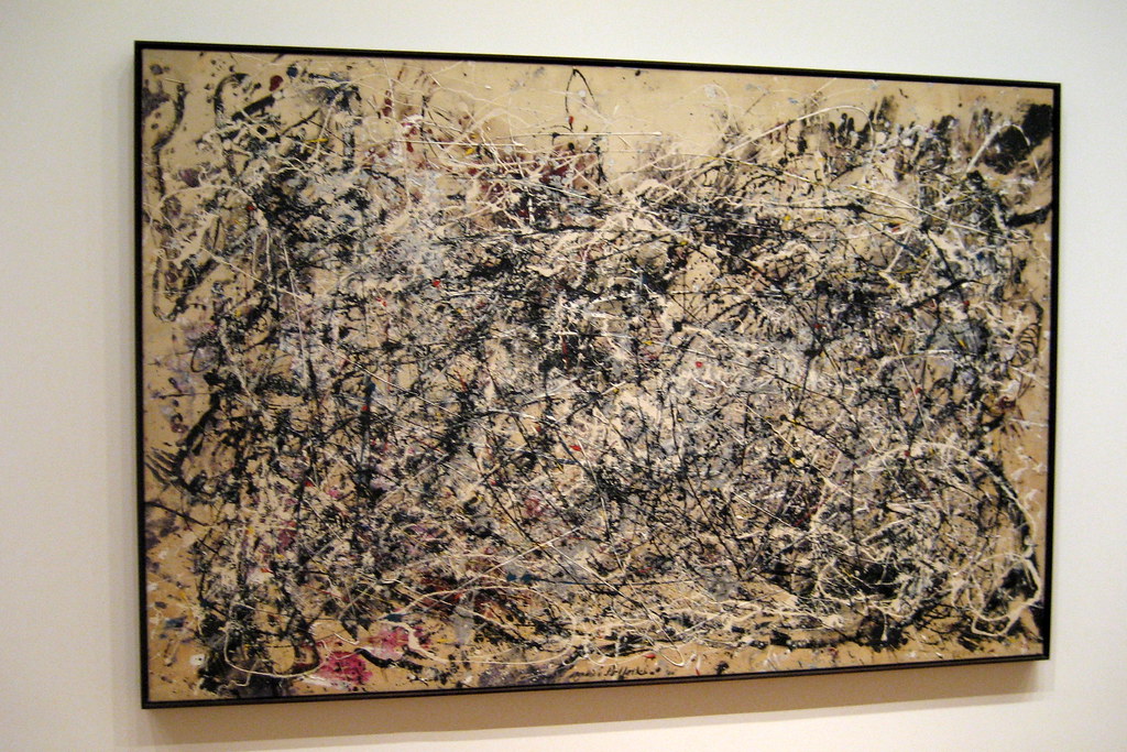
Once your eye lands on that focal point, the spiral acts as a path, leading it outward. Think of it as designing a scenic route through your artwork. You can use secondary elements—the curve of a branch, the sweep of a hill, the line of a shadow—to loosely follow this invisible roadmap.
Imagine a seascape with a boat as the focal point at the spiral's center. The gentle curve of a wave breaking in the foreground could echo the spiral's arc, subtly pulling the viewer's gaze from the boat outwards towards the open sea or the setting sun. The composition becomes a journey, a visual story with a beginning, a middle, and an implied end. It's the art of visual seduction—guiding the viewer's experience without them even realizing it.
[credit](https://live.staticflickr.com/1037/564039636_0416c6a112_b.jpg),
[licence](https://creativecommons.org/licenses/by-nc-nd/2.0/)
[credit](Printerval.com),
[licence](https://creativecommons.org/licenses/by-nc/4.0/)
### 4. The Golden Ratio in Abstract Art
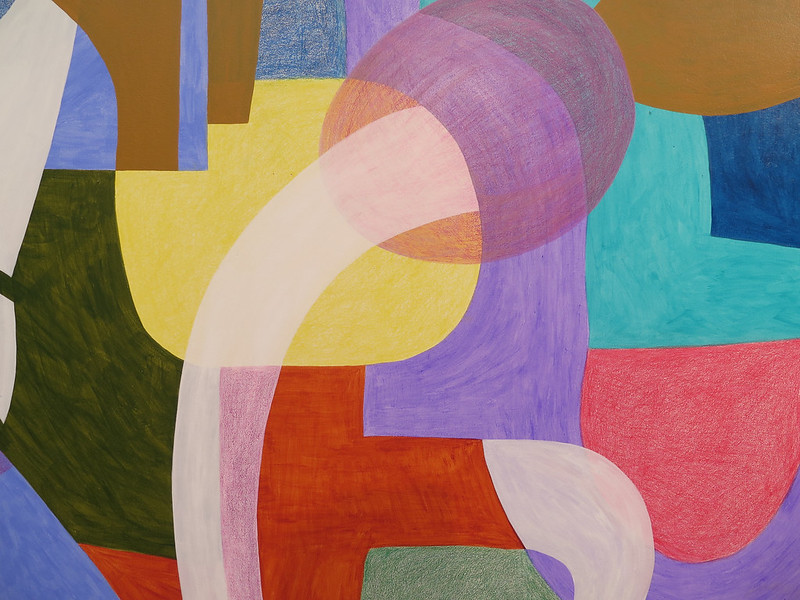
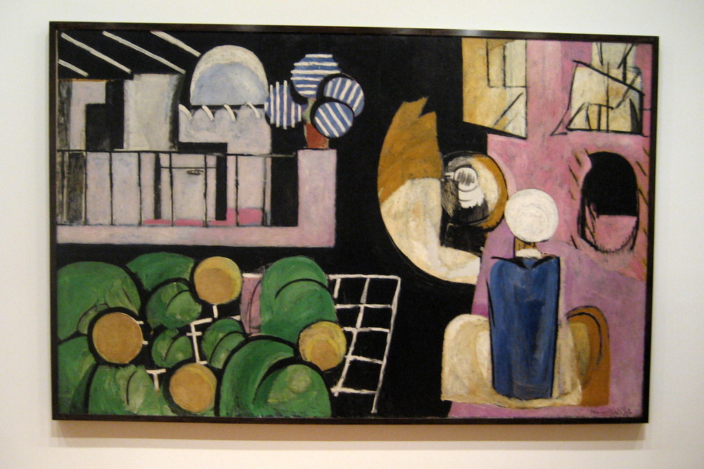
You might think [abstract art](/finder/page/how-to-abstract-art), with its focus on color, line, and form, would have no use for such a mathematical concept. I used to think that, too. But the ratio isn't about *what* you paint; it's about *how* you organize what you paint. Even in a non-representational piece, you are still dealing with visual weight, balance, and focal points.
[credit](https://live.staticflickr.com/1353/562537994_b3dc0dc5c4_b.jpg),
[licence](https://creativecommons.org/licenses/by-nc-nd/2.0/)
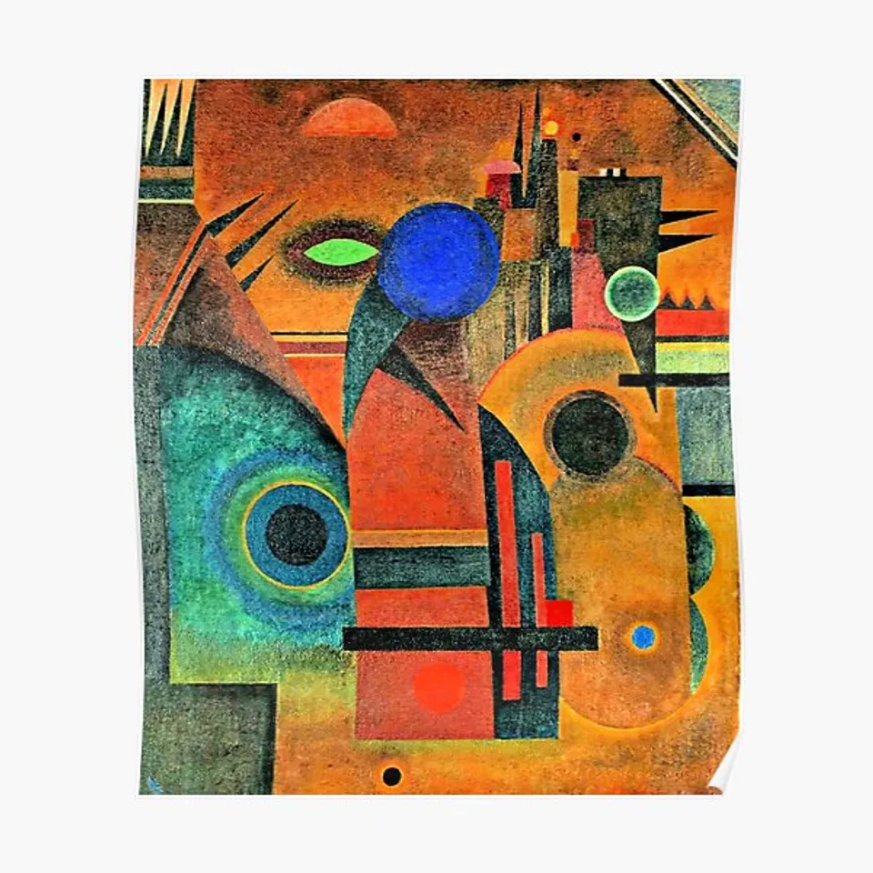
Pioneers of abstraction like Kandinsky believed in a spiritual dimension of art. He used color and form to express inner feelings, and the placement of these elements was crucial. The balance and rhythm in his work show a deep understanding of composition, even when the subject was purely emotional.
I've used it to decide where to place a streak of intense cadmium red in a field of cool blues, or how to orient the dominant stroke in a gestural painting. It brings order to the chaos of [pure form](/finder/page/ultimate-guide-to-kazimir-malevich-suprematism-and-the-purity-of-abstract-form). It's the underlying structure that allows the emotional, spontaneous marks on the surface to feel powerful and intentional, rather than just random. In my own work, I might create a vibrant, textured abstract piece and then use a spiral overlay to find the exact point where a final, decisive mark will anchor the entire composition, turning energetic chaos into a resolved and powerful statement.
[credit](https://www.flickr.com/photos/24786512@N04/2547373209/),
[licence](https://creativecommons.org/licenses/by-nc-nd/2.0/)
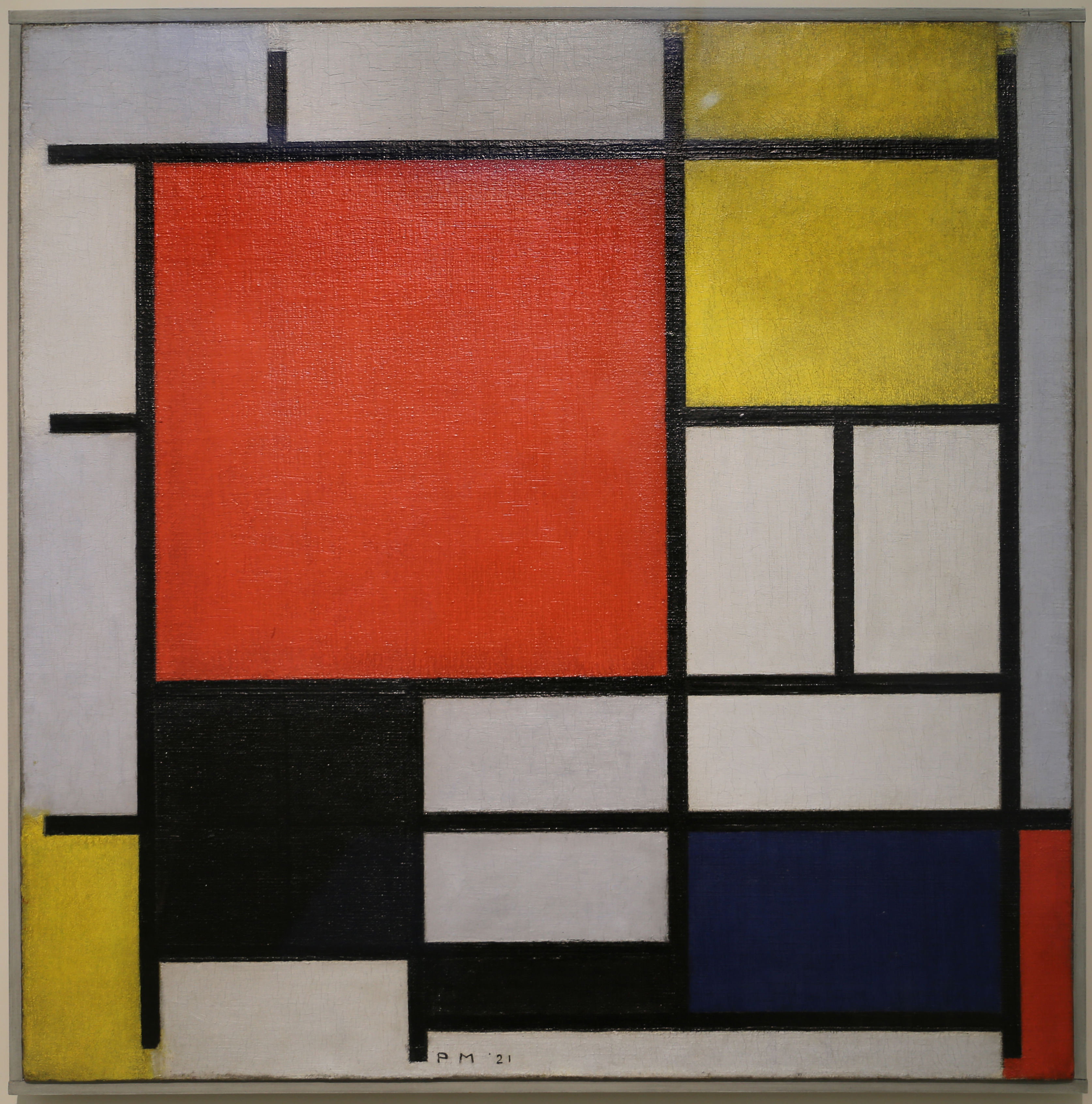
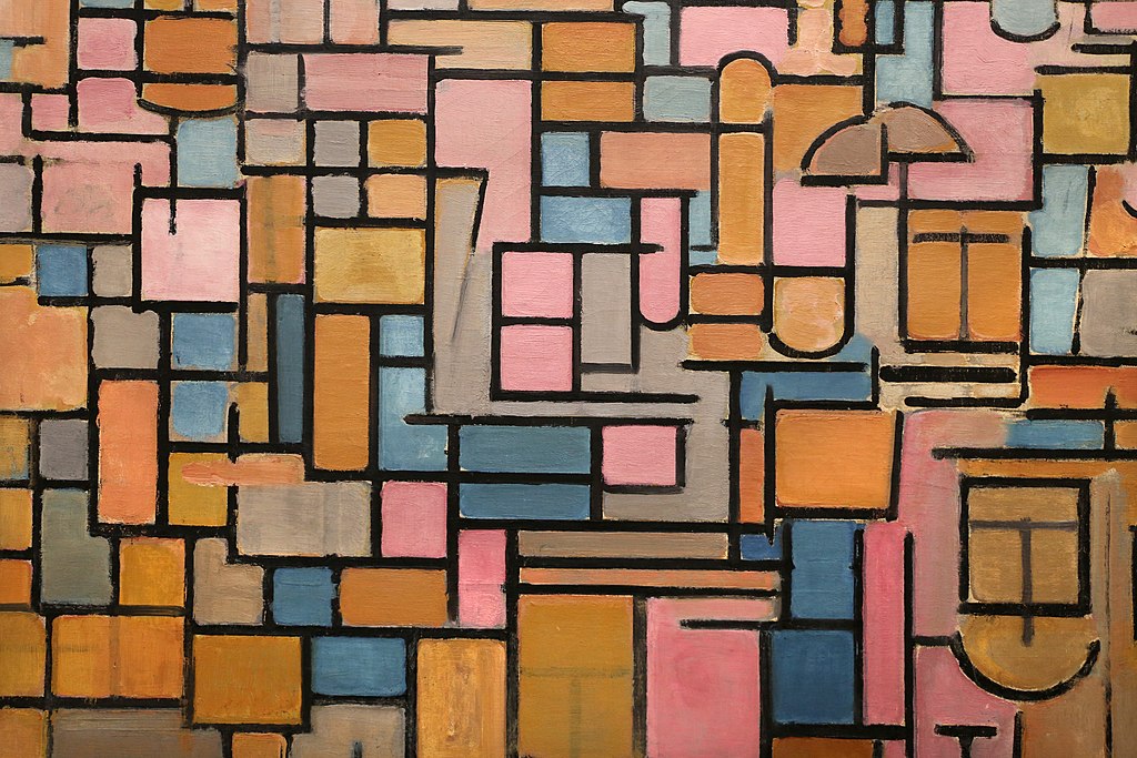
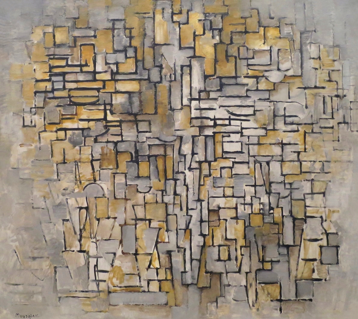
Pioneers of geometric abstraction like [Piet Mondrian](/finder/page/ultimate-guide-to-piet-mondrian) sought to find a universal visual language. By reducing his compositions to vertical and horizontal lines, he explored the fundamental power of proportion and [negative space](/finder/page/role-of-negative-space-abstract-art) to create a feeling of dynamic equilibrium.
[credit](https://upload.wikimedia.org/wikipedia/commons/0/07/Johannes_Vermeer_-_Girl_with_pearl_earring.jpg),
[licence](https://creativecommons.org/licenses/by-sa/4.0)
## Criticisms and Considerations: A Dose of Reality
Let's not get carried away. There's a valid criticism that we, as humans, have a tendency to find patterns where none exist—a phenomenon called apophenia. Some art historians argue that we've retroactively applied the Golden Ratio to famous works, seeing the spiral we *want* to see rather than the one the artist intentionally created. And they have a point. Many of the so-called "examples" of the Golden Ratio in famous paintings involve a lot of creative interpretation with the spiral overlay. The debate over the Parthenon is the perfect case study. Most serious historians will tell you the evidence for its intentional use is extremely thin. We project our modern fascination onto the past. It's a kind of beautiful historical pareidolia, where we see a face in the clouds and declare it intentional.
Furthermore, slavishly following *any* rule is the enemy of art. If a composition only works because it obeys a mathematical rule, it probably isn't a very strong composition; it's an illustration of a formula. The Golden Ratio should be a starting point, a tool for analysis, or a [secret weapon](/finder/page/what-is-your-secret-weapon-in-art) for fixing a problem area. It should never become a cage.
The great architect Frank Lloyd Wright, who was certainly no stranger to geometric principles, put it perfectly: "The physician can bury his mistakes, but the architect can only advise his clients to plant vines." The same is true for artists. Learning to transcend the rules is to learn how to create a building that is beautiful even without the vines. The rule is the training wheels; the art is the freedom you feel when you finally take them off.
[credit](https://images.pexels.com/photos/1787242/pexels-photo-1787242.jpeg),
[licence](https://creativecommons.org/public-domain/)
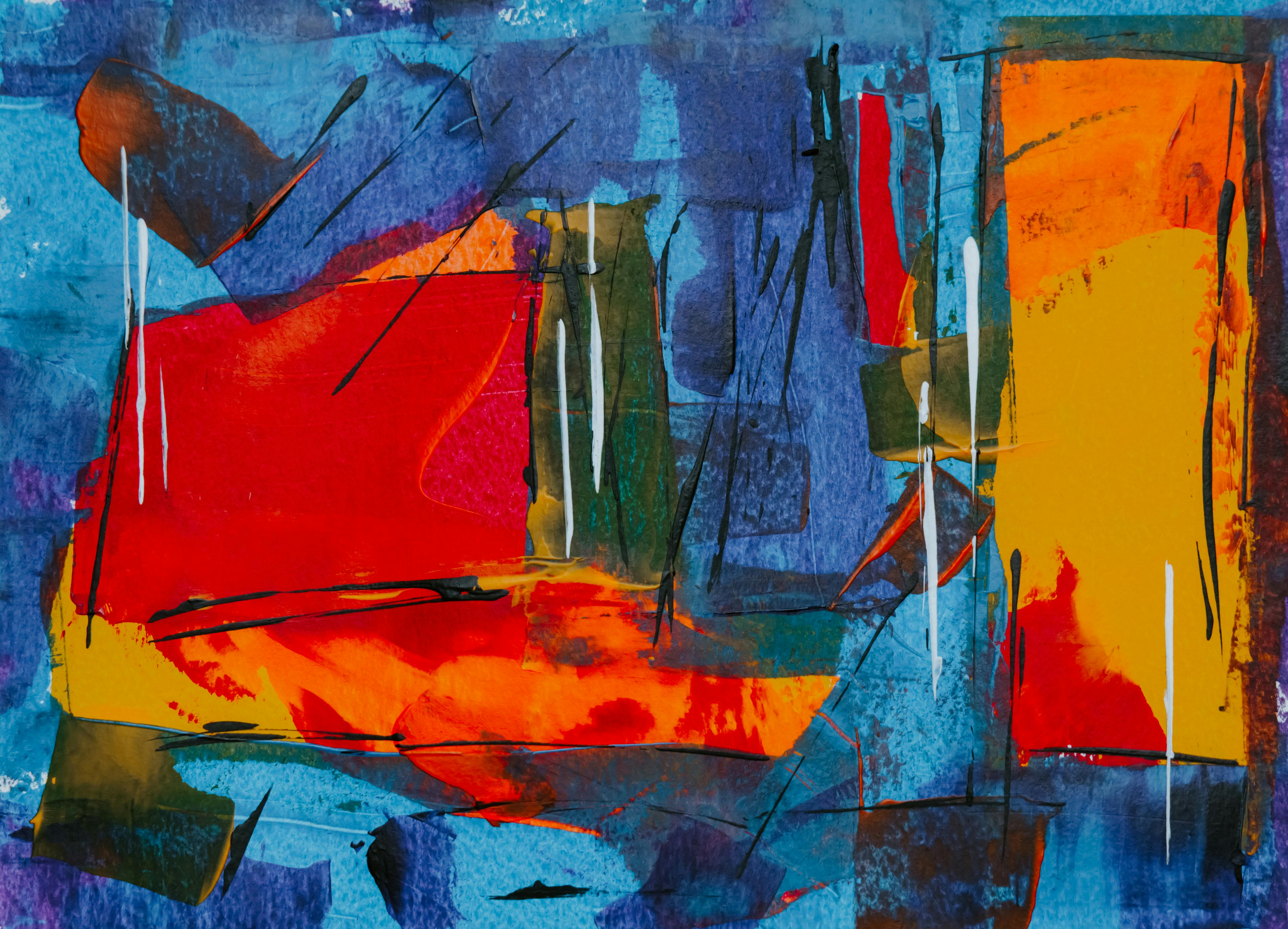
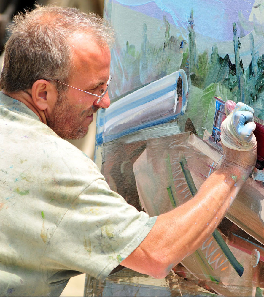
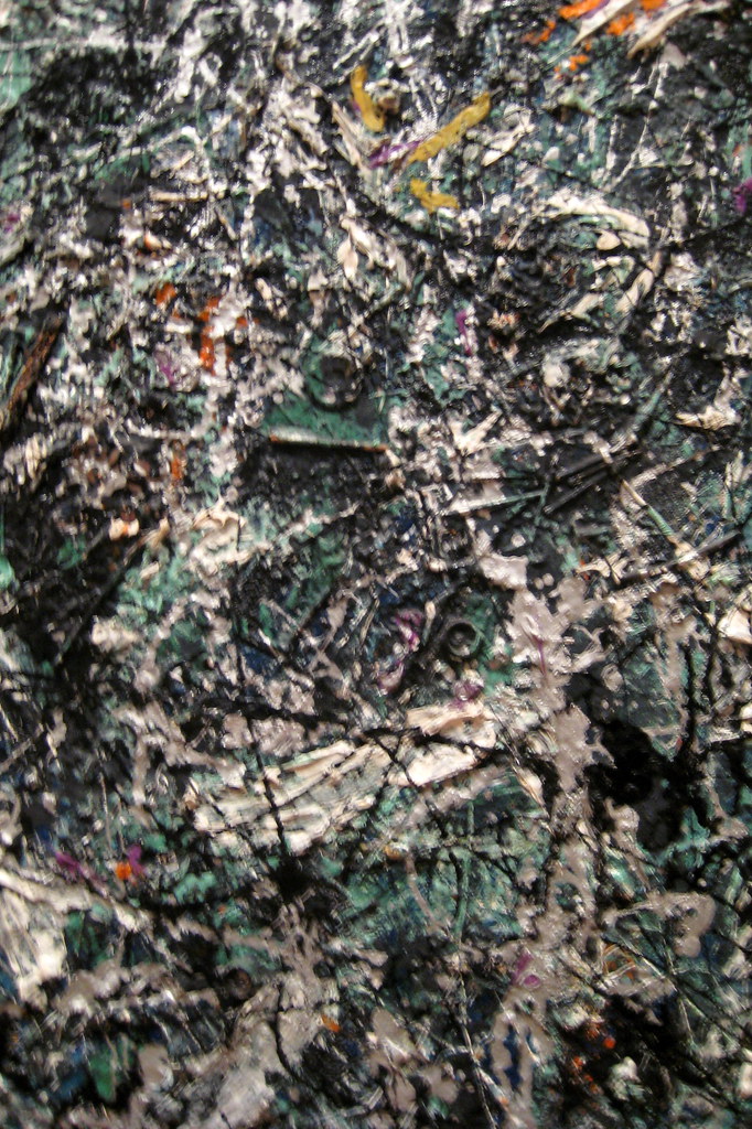
This is especially true for the Abstract Expressionists. Artists like [Jackson Pollock](/finder/page/ultimate-guide-to-jackson-pollock) or [Willem de Kooning](/finder/page/ultimate-guide-to-willem-de-kooning-the-master-of-abstract-expressionism) operated on pure intuition and gestural energy. To impose a Golden Spiral overlay on one of their drip paintings would be to completely misunderstand their intent. Their flow came from the body, not from a fixed geometric path. Yet, even in their chaos, you can sometimes find accidental moments of harmonic balance that we, as viewers, can't help but associate with Phi. This suggests that even when an artist actively rejects formal structure, they are often guided by an innate sense of rhythm and balance that echoes natural growth patterns.
[credit](https://commons.wikimedia.org/wiki/File:Painter_David_Brewster_creating_work_for_the_Art_of_Action_project.jpg),
[licence](https://creativecommons.org/licenses/by/1.0)
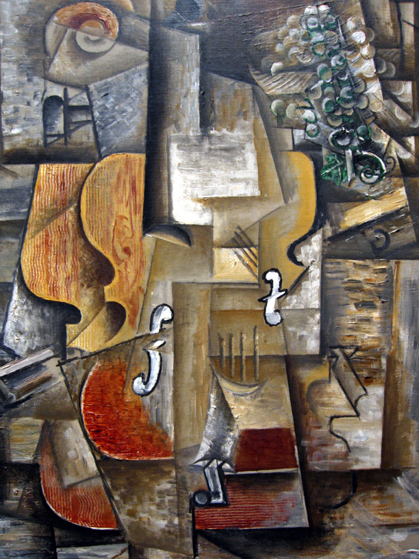
Or take Picasso. He famously said, "Learn the rules like a pro, so you can break them like an artist." His work is a testament to this. He had classical training and understood proportion deeply, which is precisely what gave him the freedom to shatter it in movements like Cubism. The resulting compositions feel revolutionary, but their power comes from the tension between the learned rules and the radical departure. The "broken" forms only work because we have an innate sense of what they are breaking away from. It’s a deliberate, intelligent disruption of harmony that only an artist who truly understands harmony can successfully pull off.
[credit](https://commons.wikimedia.org/wiki/File:The_Creation_Of_The_Mountains.jpg),
[licence](https://creativecommons.org/licenses/by-sa/4.0/deed.en)
For me, using the Golden Ratio is like learning a scale on a musical instrument. The scale itself isn't the music. Musicians who only play scales are just warming up. But knowing the scale gives you the foundation, the muscle memory, and the understanding of intervals needed to compose a beautiful, improvisational solo that feels both spontaneous and absolutely right. Let it inform your intuition, don't let it replace it. It should live in your bones, not on your ruler. The best compliment an artist can get is not "You followed the rules perfectly," but "How on earth did you come up with *that*?" The ratio is simply one of the many paths to that "how."
## Frequently Asked Questions
### When was the Golden Ratio discovered?
The Golden Ratio has been known for millennia, though not always by that name. The ancient Greeks formally documented its mathematical properties around 300 BCE in Euclid's "Elements," where he described it as "the extreme and mean ratio." However, it's likely that builders and artisans intuitively understood its pleasing proportions long before that.
Some researchers argue that the **Great Pyramid of Giza** (built around 2560 BCE) incorporates dimensions that approximate the Golden Ratio, although this is a hotly debated topic. Similarly, certain Babylonian and Sumerian artifacts suggest a practical understanding of these proportions thousands of years before Euclid. It seems to be one of those fundamental truths about proportion that humans have discovered, forgotten, and rediscovered throughout history. Each culture seems to arrive at a similar conclusion not by copying, but by observing the same patterns in nature and the human form.
[credit](https://live.staticflickr.com/65535/49810080901_2837d157fd_b.jpg),
[licence](https://creativecommons.org/licenses/by-nc/2.0/)
### Why does the human eye like this ratio?
There's no single definitive answer, which is part of what makes it so fascinating. The leading theory is rooted in evolution: we have evolved to find it aesthetically pleasing because it's a pattern of growth and efficiency. Since our brains are constantly processing information from the natural world—seeing this ratio in flower petals, pinecones, and nautilus shells—we may process it as familiar, orderly, and inherently harmonious. It feels organic and right because, in a very real sense, it is.
Some neuroscientists believe that our brains are wired to process information most efficiently when it's structured by the Golden Ratio. This "biological comfort" with the ratio might explain why a room furnished with golden proportions feels inherently more serene and balanced than one that isn't. It's less about a magical number and more about a deeply ingrained recognition of a pattern that signifies health, order, and vitality in nature.
[credit](https://images.pexels.com/photos/9176028/pexels-photo-9176028.jpeg),
[licence](https://creativecommons.org/public-domain/)
### Do all artists need to use the Golden Ratio?
Absolutely not. It's a tool, not a law, and it's not for everyone. Many artists, especially those in more intuitive or expressive traditions, work entirely from feeling and never give it a second thought. And their work can be magnificent.
However, understanding compositional principles like this one can give you a powerful toolkit for diagnosing why a painting might not be working and how to fix it. It's about adding another layer of understanding to your [creative process](/finder/page/my-creative-process-sketchbook-to-canvas), not replacing the ones you already have. I often find myself using it unconsciously now, the way a jazz musician doesn't think about every single note in a scale, yet their improvisation is structured by a deep, internalized understanding of its logic. The goal is to learn the "rules" so well that when you break them, you're doing it with intention, not ignorance. This internalization of principle over prescription is what separates the technician from the true artist.
[credit](https://upload.wikimedia.org/wikipedia/commons/8/8a/Gustav_Klimt%2C_The_Bride%2C_1917-18%3B_Leopold_Museum%2C_Vienna_%282%29.jpg),
[licence](https://creativecommons.org/licenses/by/2.0)
### What modern artists and designers are known for using it?
While many are influenced by it, some have intentionally made it a core part of their philosophy.
[credit](http://www.digitale-bibliothek.de/),
[licence](https://creativecommons.org/publicdomain/mark/1.0/)
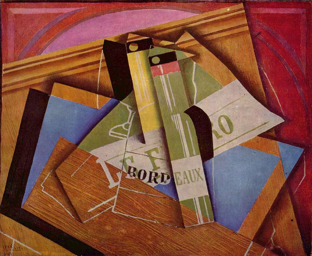
* **Le Corbusier (Architecture):** The Swiss-French architect created the **"Modulor,"** a revolutionary system of proportions based on the human body and the Golden Ratio. He used it to design buildings and entire cities that felt harmoniously connected to their inhabitants, translating a timeless ideal of human-centric design into the very blueprints of our living spaces.
* **Salvador Dalí (Painting):** The Surrealist was famously obsessed with mathematics, mysticism, and nuclear physics. He deliberately used the Golden Ratio to structure complex, dreamlike paintings like **"The Sacrament of the [Last Supper](/finder/page/what-is-the-last-supper-painting),"** believing it was the key to creating subconsciously resonant art.
* **Piet Mondrian & De Stijl (Abstract Art):** Artists associated with [De Stijl](/finder/page/my-dialogue-with-de-stijl:-finding-order-and-balance-in-abstract-composition), like [Piet Mondrian](/finder/page/ultimate-guide-to-piet-mondrian), used underlying geometric principles to achieve their unique sense of dynamic balance. They were stripping art down to its fundamental components—line, color, plane—and in doing so, revealed the profound power of proportional relationships.
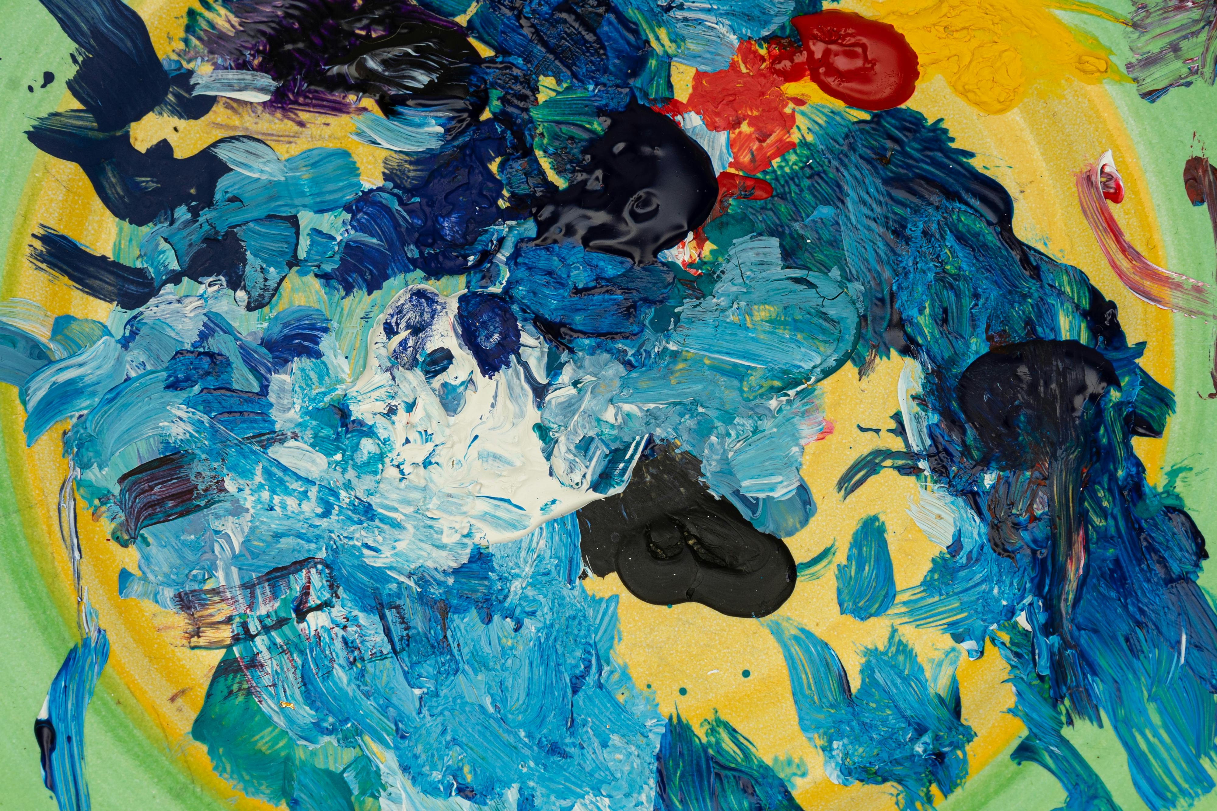
* **[Graphic Design](/finder/page/how-famous-artist-influenced-graphic-design):** It's not just in galleries. The Golden Ratio is a staple in logo design (Apple, Twitter, Pepsi have all been analyzed for their use of it), layout design, and typography. It offers a ready-made formula for creating layouts that feel timeless, balanced, and immediately appealing to the human eye.
[credit](https://images.pexels.com/photos/5703778/pexels-photo-5703778.jpeg),
[licence](https://creativecommons.org/public-domain/)
### What is the Golden Spiral?
The Golden Spiral is the most famous visual representation of the Golden Ratio. It's a logarithmic spiral that grows outward by a factor of $\phi$ (approximately 1.618) for every quarter turn it makes.
In simpler terms, it's the elegant curve you get when you connect the corners of the squares that are created within a Golden Rectangle. It is the visual, dynamic manifestation of the Golden Ratio and is a [powerful tool](/finder/page/art-as-a-tool-for-social-commentary) for guiding the viewer's eye through a composition. Think of it as a map for a journey you want the viewer's eye to take—starting at the tightest point and gradually moving outward to explore the rest of the image. Unlike a simple archimedean spiral, its growth rate is constant, making it feel endlessly expansive.
### What is the Golden Triangle?
Beyond the rectangle and spiral, there are other compositional tools derived from Phi. The **Golden Triangle** is an elegant one. It's an isosceles triangle where the ratio of the length of its legs to its base is the Golden Ratio.
It's excellent for creating dynamic, diagonal compositions. Imagine slicing your canvas with a strong diagonal line, then drawing a perpendicular line from one of the other corners to meet it. The resulting triangles and intersections provide powerful guides for placing key elements. It's a fantastic alternative to the spiral for creating a sense of movement and tension, especially in landscapes with strong diagonal elements like mountain ridges or sloping rooftops.

[credit](https://www.flickr.com/photos/gandalfsgallery/27744325407),
[licence](https://creativecommons.org/licenses/by-nc-sa/2.0/)
## Golden Ratio in the Digital Age: Logos, Design, and Photography
It would be a mistake to think of the Golden Ratio as a dusty artifact confined to painting. Its influence is everywhere in the modern world, often so seamlessly integrated that we don't even notice it.
### In Logo and Graphic Design
The goal of a logo is to be simple, memorable, and feel "right." The Golden Ratio is a powerful shortcut to achieving that feeling. The **Apple logo**, **Twitter bird**, and the **Pepsi globe** have all been meticulously analyzed and found to contain proportions eerily close to the Golden Ratio. Why go to the trouble? Because it creates a sense of balance, efficiency, and visual appeal that feels 'right.' It's no surprise, then, that it's a staple tool for graphic designers aiming to create timeless, balanced, and aesthetically pleasing layouts and interfaces. In a world saturated with visual noise, a logo or design based on these proportions has a higher chance of being perceived as elegant, trustworthy, and balanced. It's a non-verbal cue that this brand has been carefully considered.
[credit](https://live.staticflickr.com/2062/2386777346_5bf51496cb_b.jpg),
[licence](https://creativecommons.org/licenses/by-nc-nd/2.0/)
### In Photography
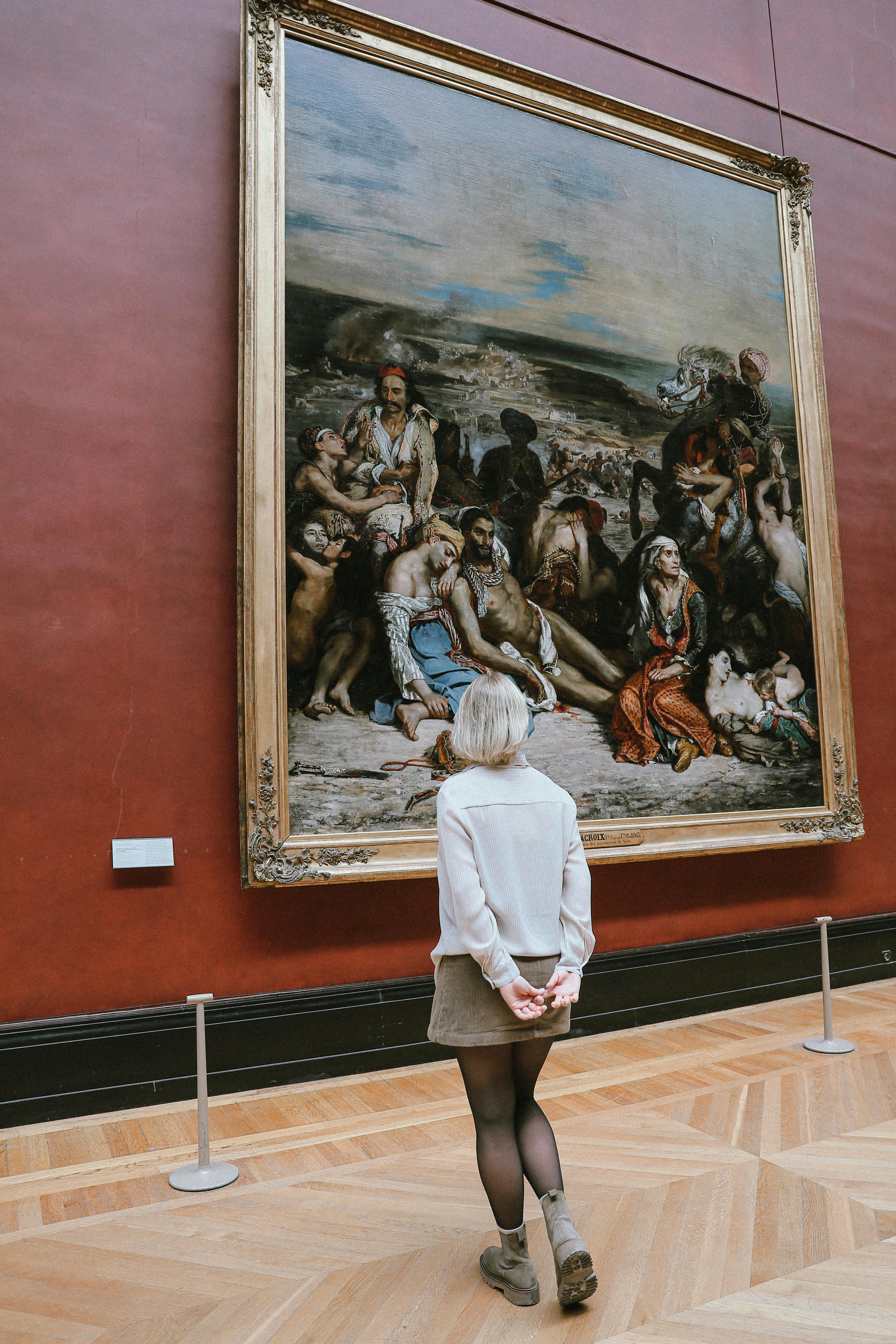
While the Rule of Thirds is the de facto standard for most photographers, many professionals turn to the Golden Ratio for a more nuanced and [dynamic composition](/finder/page/my-process-for-creating-dynamic-abstract-compositions). Overlaying a Golden Spiral on a photograph can be a revelation, showing how the natural flow of a landscape, the curve of a model's shoulder, or the lines of an architectural detail can lead the eye on a more compelling journey. It's the difference between a technically correct photo and a captivating one. It invites the viewer to linger, to explore the image's details, creating a more immersive and memorable experience that feels less like a snapshot and more like a deliberate story.
[credit](https://images.pexels.com/photos/16960922/pexels-photo-16960922/free-photo-of-woman-in-a-museum-looking-at-paintings.jpeg),
[licence](https://creativecommons.org/public-domain/)
### The Psychology of Perception
Why does this ratio endure, from ancient temples to modern logos? At its core, it speaks to a deeper psychological need for order amid chaos. Our brains are pattern-matching machines, and the Golden Ratio represents a pattern that is complex enough to be interesting, yet simple enough to be understood on an almost subconscious level. It offers a sense of inevitable, natural order—a moment of visual calm that can be profoundly satisfying.
In a world of endless visual stimulation and information overload, a composition guided by this ancient principle can feel like a sanctuary. It is a visual anchor in a turbulent world, a pre-verbal promise that there is an underlying harmony to be found, if only we know how to look for it.

[credit](http://www.digitale-bibliothek.de/),
[licence](https://creativecommons.org/publicdomain/mark/1.0/)
## Conclusion: The Pulse Beneath the Painting
The [Golden Rule](/finder/page/golden-rule-art-ethics-best-practices) in [art composition](/finder/page/understanding-balance-in-art-composition) is less of a rigid law and more a profound principle. It's the echo of a natural pattern—a rhythm of growth, balance, and harmony—that we can choose to weave into our work. Don't use it as a straightjacket. Instead, let it be a quiet, steady heartbeat under the skin of your painting, giving it a pulse that viewers can feel, even if they can't quite explain why they can't look away. It is the unseen structure that gives freedom its power, the grammar that makes the poetry sing.
Experiment with it. Sketch out a spiral on a piece of tracing paper and lay it over a painting you admire, or one of your own that feels unbalanced. See where the curves align. Question it, play with it, and ultimately, make it your own. That's the true soul of any rule in art: not blind obedience, but understanding it so deeply that you know exactly when to break it. It is a dialogue between your conscious mind, your trained hand, and the raw, intuitive feeling that made you want to create in the first place.
As you move forward, keep the ratio in your mental toolkit. Let it be a reference, a question you ask your composition, and a secret helper when things just feel 'off.' In doing so, you connect your own creative act to an ancient, universal language of form that has captivated artists, architects, and mathematicians for thousands of years—a conversation about beauty that started long before us and will continue long after. It's a reminder that true creativity isn't about rejecting the past, but about joining a timeless conversation and adding your own unique, authentic voice to the chorus. The goal is not to be ruled by it, but to be in dialogue with it.