The Ultimate Guide to Proportion in Art: Harmony, Distortion & Your Creative Practice
Unravel the profound impact of proportion in art. This comprehensive guide explores historical canons, the power of intentional distortion, visual harmony, and practical applications for abstract and digital artists alike. Discover how to use or break proportional rules to make your art truly sing.
The Ultimate Guide to Proportion in Art: Finding Harmony, Breaking Rules, and Elevating Your Artistic Journey
I'll admit it: for a long time, the word “proportion” in art used to make my eyes glaze over a little. It sounded like math, like rigid rules, like something academic that would stifle the vibrant, spontaneous energy I crave in my studio. And let's be honest, who wants to feel like they're doing geometry when they're trying to unleash their inner creative genius? Not me, that’s for sure. I initially resented the idea, seeing it as a constraint on true freedom, a buzzkill for true artistic intuition.
But here’s the thing I slowly, almost begrudgingly, came to understand: proportion isn’t just about strict measurements; it’s about visual harmony, about the relationships between things. It’s the silent force that makes a piece of art sing, even if you can’t quite put your finger on why. It’s what makes a composition feel balanced, dynamic, or even purposefully unsettling. And once you start seeing it, you can’t unsee it. It’s like discovering a secret language the universe speaks, and suddenly, everything makes a little more sense. The chaos of creation, it turns out, often hides a deeper, proportional order, influencing how our eyes perceive and interpret everything from the ancient to the utterly abstract. This isn't just theory; it's a foundational pulse in all visual communication. It's the 'why' behind why some things just feel right.
So, if you’re like me and prefer your art lessons with a side of introspection and maybe a dash of self-deprecating humor, stick around. We’re going to dive into the definitive guide to proportion in art, exploring its history, its core principles, how even us abstract-loving, rule-bending artists use it every single day, and most importantly, how to use it to make your art truly sing. Forget the textbooks for a moment; let's talk about how it feels, how it influences everything from ancient sculptures to the most avant-garde abstract canvas. We'll cover everything from historical canons (those strict, established rules of ideal proportion) to modern digital manipulations, and even how to apply these ideas in your own practice. This is the ultimate guide to understanding how all the parts of a visual story fit together, or delightfully don't.

What Even Is Proportion, Anyway? (Beyond the Measuring Tape and the Family Photo)
At its core, proportion refers to the relative size of parts within a whole, and how these parts relate to each other and to the overall composition in art explained. Think of it like a family photo: how big is Uncle Barry compared to your tiny niece? How much space does the sprawling oak tree take up behind them? It’s all about how things fit together, visually speaking.
Proportion in Everyday Life: A Subtle Art
But let’s broaden that analogy. Consider everyday objects: a well-designed chair has a back, seat, and legs that are proportionally balanced for both comfort and aesthetics. A car’s wheels, body, and windshield are carefully scaled to create a sense of speed, luxury, or utility. Even in fashion, the length of a sleeve relative to a jacket's hem, or the width of a lapel, dramatically changes the garment's overall look and feel. If it’s too small or too large, the entire object, and perhaps its function, feels off-balance. We perceive these proportional relationships instinctively, without ever pulling out a ruler.
Proportion in Art: The Building Blocks of Visual Harmony
In art, this means considering:
- The size of one element compared to another (e.g., a hand compared to an arm – this is often called anatomical proportion, crucial in figurative art and learning how to draw figures with correct proportions).
- The size of an element compared to the whole artwork (e.g., a figure compared to the canvas – this is compositional proportion, influencing the overall understanding balance in art composition).
- The spacing and relationships between shapes, colors, and lines, and even the often-overlooked negative space around them. Here, we also talk about visual weight, where certain elements command more attention due to their inherent characteristics. It's not just size or darkness; think about how a vibrant red square next to a pale blue one will feel heavier, pulling your eye first due to higher color saturation. Similarly, a highly textured area might feel denser than a smooth one, or a shape with sharp, defined edges might feel more impactful than one with blurry, soft edges. Even the intricacy of a detail, the illusion of perceived depth, or strong contrasts can contribute to visual weight, guiding the viewer's eye and establishing a visual rhythm across the composition.
It’s also important to distinguish proportion from scale. While proportion deals with the relative sizes of elements within a single work (e.g., a person's head to their body), scale refers to the size of an artwork or element in relation to its environment or the viewer. A monumental sculpture might have perfect internal proportions, but its scale (compared to a human or building) evokes awe. Conversely, a tiny, intricately detailed drawing might have a small scale but still command attention through its internal proportional harmony. Understanding scale is vital, especially when considering art above the sofa: a guide to perfect placement and scale.
Another concept is optical proportion, which refers to how proportions are perceived by the eye. This can sometimes differ from actual measurements due to optical illusions or surrounding elements. Artists often exploit optical proportion to create specific effects or feelings, making things feel right even if they aren't strictly accurate by the ruler. Think about how a line can appear longer when placed next to a shorter one, or how certain colors seem to advance while others recede – these are visual tricks that play with our perception of size and relationship.

It’s not just about accuracy, though that’s where it often starts. While accuracy provides a foundation, proportion is a versatile tool for expression, not just a rigid rule. Sometimes, a slight exaggeration or distortion of proportion can create intense emotion, a sense of unease, or a comical effect. It’s about creating a visual rhythm, a pleasing or impactful relationship that guides the viewer's eye and evokes a certain feeling. You can even explore this through the elements of design in art and how they influence our perception of forms and spaces.
A Whisper from the Past: Proportion's Enduring Footprint Across Civilizations
The idea of perfect proportions isn't some dusty academic concept invented last week; it's practically as old as art itself. From the moment humans started making images, there was an innate drive to arrange things in a way that felt harmonious, balanced, or spiritually significant. This isn't just a Western concept; it's a global artistic impulse that speaks to our fundamental need for order and beauty, a desire to represent the world, or an ideal, in a coherent way.
Ancient Egypt: Canon of Ideals and Eternal Order
In ancient Egypt, proportion was deeply tied to spiritual beliefs and the desire for eternal order. Artists followed strict canons of proportion using grid systems to ensure consistency in the depiction of figures, particularly pharaohs and gods. A standing figure, for example, might be precisely 18 squares high from the soles of the feet to the hairline. This wasn't about realism but about idealization and maintaining a timeless, unchanging visual language. It conveyed stability and divine authority, a powerful artistic statement that transcended individual artistic whim, and its influence on modernism is undeniable.
Ancient Greece: The Golden Ratio and Human Perfection
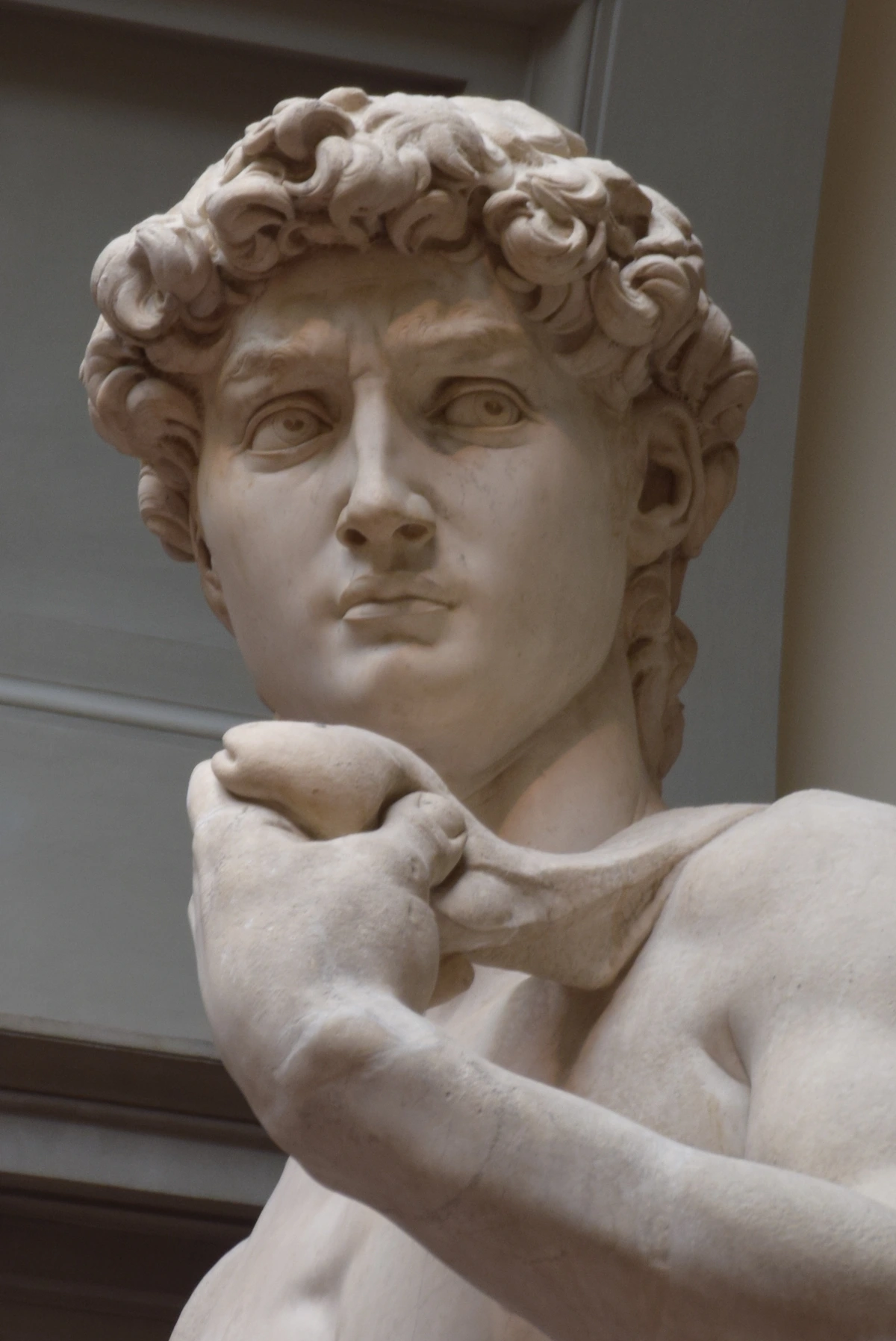
The ancient Greeks, with their fervent pursuit of ideal beauty and mathematical perfection, arguably gave us some of the most enduring concepts of proportion. They were fascinated by the Golden Ratio (often denoted by the Greek letter Phi, approximately 1.618), a mathematical relationship found throughout nature and later applied extensively in art and architecture. It's often considered inherently harmonious because its ubiquity in natural patterns (like seashells, leaf arrangements, and even human anatomy) makes it feel 'right' to our eyes. Sculptors like Polykleitos developed canons of human proportion based on mathematical ratios, creating works like the Doryphoros (Spear Bearer) that embodied physical perfection and balance. The Parthenon, a marvel of ancient architecture, also famously incorporates the Golden Ratio and other subtle proportional adjustments to create an illusion of perfect symmetry and grandeur, even when viewed from afar. They really took their math seriously, those Greeks, and made it beautiful.

The Renaissance: Realism, Idealism, and Da Vinci's Obsession
The Renaissance saw a renewed interest in classical ideals combined with a burgeoning scientific inquiry. Artists like Leonardo da Vinci, Albrecht Dürer, and Michelangelo meticulously studied human anatomy, often dissecting bodies to understand the underlying skeletal and muscular structures. This wasn't just for academic curiosity; it was to achieve unprecedented realism and a heightened sense of anatomical proportion in their paintings and sculptures. Da Vinci's Vitruvian Man is perhaps the most iconic example of this synthesis – a perfect human figure inscribed within a circle and a square, symbolizing the harmonious relationship between man and the cosmos, governed by ideal proportions. It’s also during this period that techniques like sfumato emerged, where artists softened outlines and transitions between colors, subtly playing with perceived form and depth, which in turn influences how we perceive proportion – it’s less about sharp lines and more about suggestion, creating a softer, more integrated visual proportional system.
Beyond the Western Canon: Global Perspectives
It's important to remember that proportional systems are not solely a Western invention. Traditional Japanese art, for example, often employs modular systems like the ken (a unit of measurement), and while not always strictly mathematical in the Greek sense, they establish harmonious relationships within architectural and artistic compositions. Many African sculptures utilize elongated forms or exaggerated features for symbolic or spiritual purposes, creating a distinct proportional language that communicates meaning beyond mere imitation. Consider the powerful elongation of figures in African art and its influence on modernism. Similarly, traditional Chinese landscape painting often uses varying scales and a masterful deployment of negative space to convey philosophical concepts of man's place in nature, rather than strict anatomical accuracy. Islamic geometric art, with its intricate patterns, relies on precise mathematical proportions and repetition to create complex, harmonious designs that reflect spiritual unity and order. These diverse approaches remind me that while the drive for visual order is universal, the rules are culturally constructed and endlessly fascinating.
Here’s a quick overview of how proportion has shaped art through the ages:
Era/Movement | Key Focus | Notable Examples/Concepts | Artists/Styles |
|---|---|---|---|
| Ancient Egypt | Stability, divine order, idealization | Grid systems, fixed canons of human figures | Pharaonic portraiture, hieroglyphs |
| Ancient Greece | Ideal beauty, mathematical harmony | Golden Ratio, Polykleitos's Canon, Parthenon | Polykleitos, Iktinos, Phidias |
| Renaissance | Realism, idealism, scientific accuracy | Da Vinci's Vitruvian Man, anatomical studies | Da Vinci, Michelangelo, Dürer, sfumato |
| Mannerism | Emotional expression, elegant distortion | Elongated figures (El Greco), dramatic poses | El Greco, Parmigianino |
| Baroque/Rococo | Dynamic movement, dramatic contrast | Exaggerated gestures, opulent settings | Caravaggio, Rubens, Fragonard |
| Neoclassicism | Return to classical ideals, clarity | Balanced compositions, idealized forms | Jacques-Louis David, Canova |
| Romanticism | Emotion over reason, individual experience | Dramatic scale shifts, intense color contrasts | Delacroix, Turner |
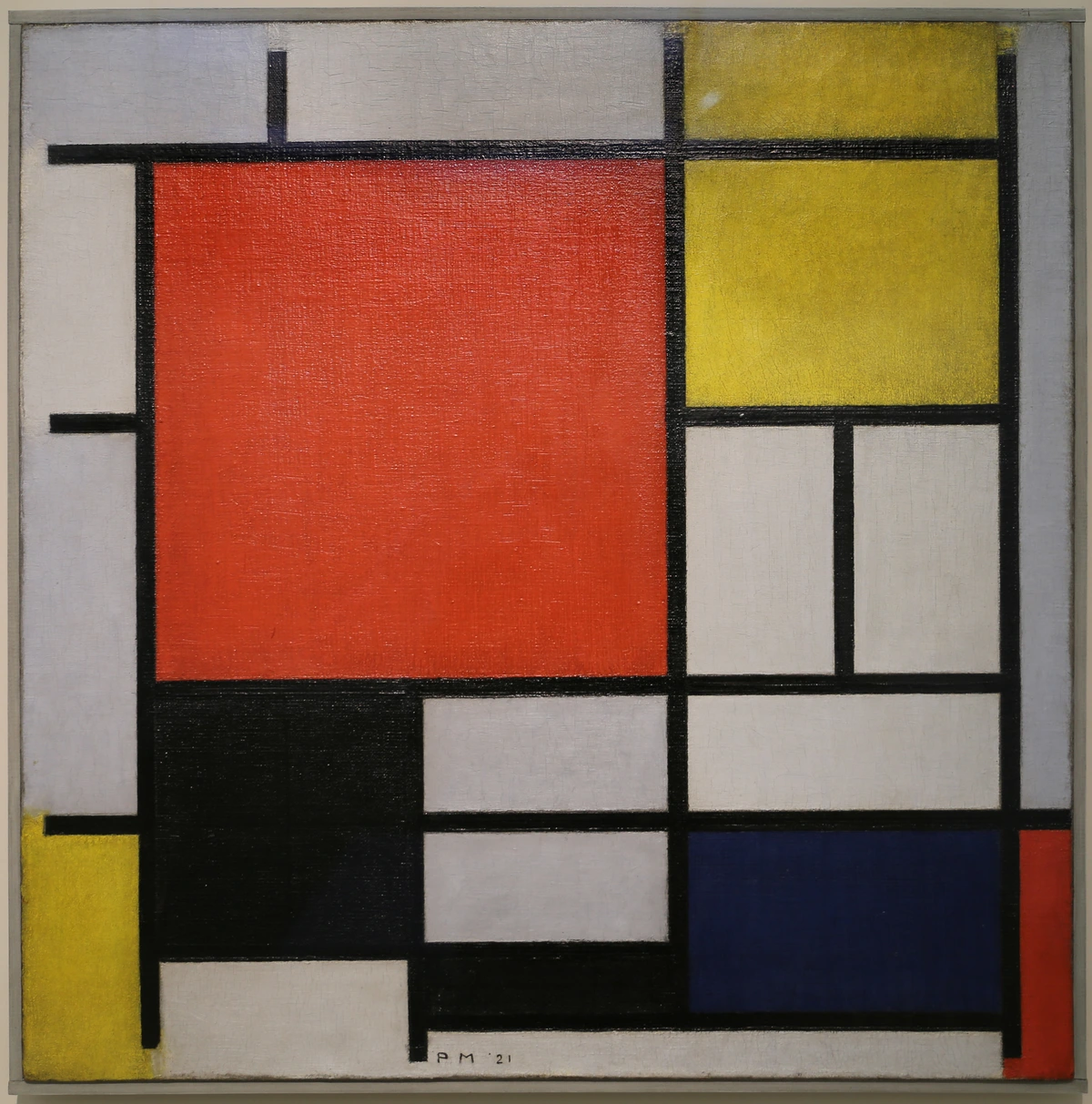
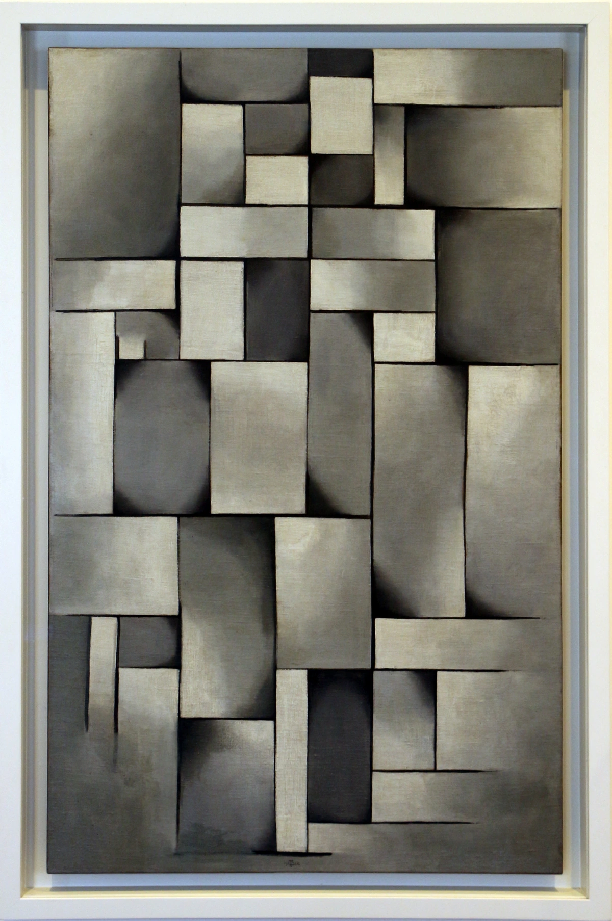
| Modernism/Abstract | Visual tension, emotional impact, new aesthetics | Fractured forms (Picasso's Cubism), color fields (Rothko's color fields), non-representational relationships | Picasso, Rothko, Kandinsky |
| Digital Art | Manipulation, experimentation, new realities | Scaling, distortion filters, layering, 3D modeling, virtual environments | Contemporary digital artists, AI art |
Breaking the Rules: When Distortion Becomes Expression
Now, here’s where things get really interesting for me, especially as an abstract artist who often rebels against strict formulas. The most compelling art often isn't about perfect replication, but about profound expression. And sometimes, to express something truly deeply, you have to break the perceived rules. My initial aversion to proportion came from seeing it as a straitjacket, but I quickly realized that understanding the 'rules' is actually the first step to knowing how to break them effectively, with intention, to achieve a specific emotional or narrative impact. It's like a jazz musician understanding classical harmony before improvising wildly.
Artists throughout history have deliberately distorted proportions for powerful effects:
- Mannerism: Following the Renaissance, artists like El Greco elongated figures, giving them an ethereal, spiritual quality that moved beyond mere realism. This wasn't a mistake; it was a stylistic choice to evoke heightened emotion and drama.
- Expressionism: Think of artists like Ernst Ludwig Kirchner or Egon Schiele. Their figures are often gaunt, angular, and disproportional, reflecting inner turmoil and psychological states rather than external reality. The distortion amplifies the raw emotion.
- Surrealism: In the dreamlike worlds of Salvador Dalí or Remedios Varo, proportions are often warped and juxtaposed in unexpected ways, creating a sense of the uncanny and challenging our perception of reality. Remedios Varo's surrealist worlds are prime examples of this deliberate manipulation.
- Contemporary Art: Many modern artists continue this tradition. Consider the unsettling, powerful figures in Francis Bacon's work, often contorted within architectural frameworks to convey isolation and existential angst. Or the powerful, sometimes grotesque, silhouettes of Kara Walker, where exaggerated features and scale shifts are used to critique historical narratives and racial stereotypes.
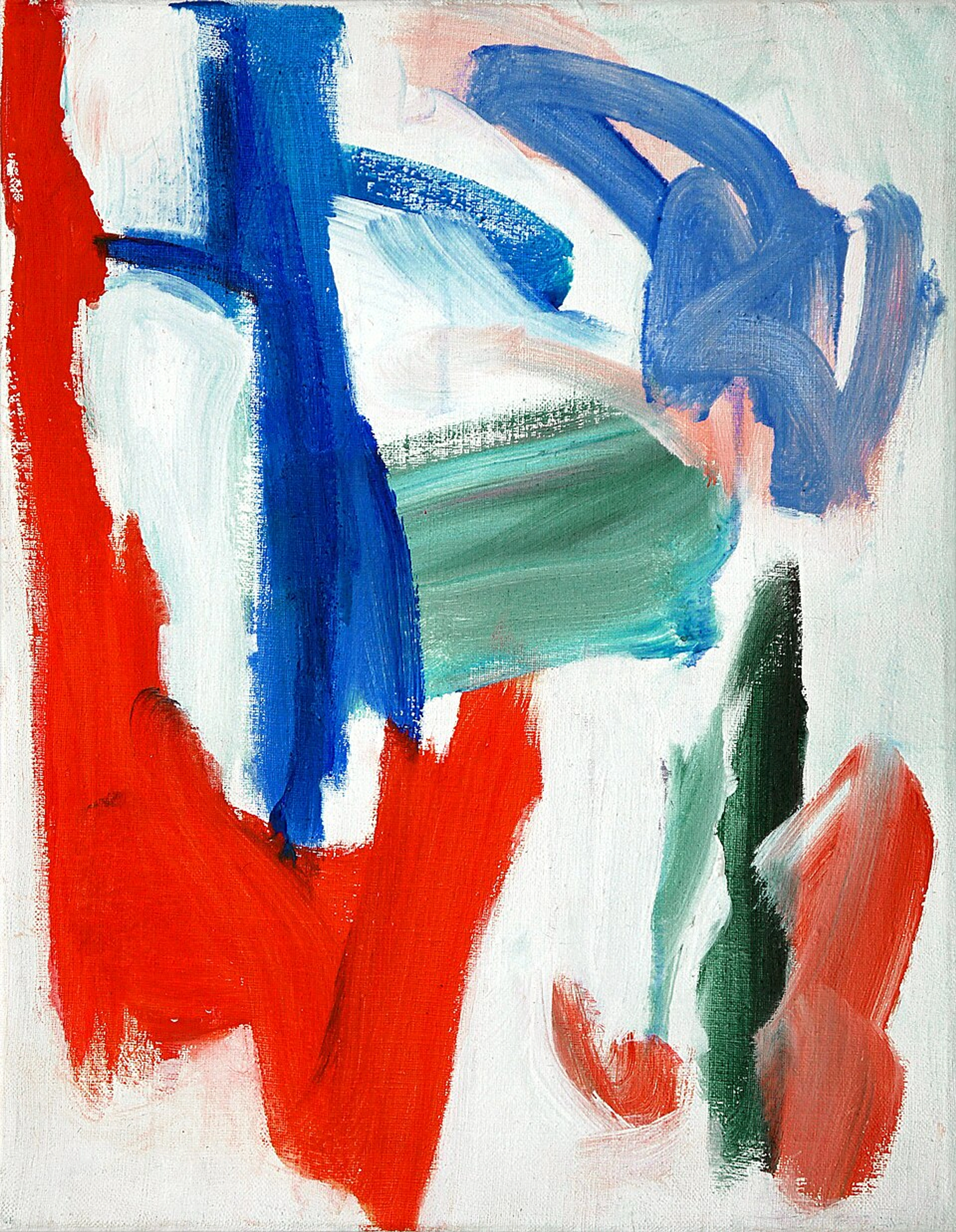
The key here is intentionality. Distortion is not a lack of skill; it's a deliberate choice. It's about knowing why you're bending the rules, understanding the effect it will have, and using it as a potent tool for communication. It’s about creating a visual story that resonates on a deeper, often uncomfortable, level. It's about letting the narrative dictate the visual harmony, rather than the other way around. My own abstract pieces, for example, often play with disproportionate shapes and colors to evoke a sense of dynamic imbalance, which I find far more interesting than a perfectly symmetrical composition.
Proportion in Your Practice: From Realistic Figures to Abstract Explorations
So, how do we, as artists, actually use proportion in our daily work? Whether you’re drawing a portrait or composing an abstract painting, proportional thinking is always at play.
1. Observational and Figurative Art
For artists focused on realism, understanding anatomical proportion is non-negotiable. It allows you to represent the human figure (or any subject) convincingly. Tools and techniques include:
- Measuring and Sighting: Using your brush handle or a ruler to measure relative sizes and angles from your subject. This trains your eye to see proportions accurately.
- Grid Systems: Drawing a grid over your reference image and then replicating that grid on your canvas to transfer proportions precisely. This is a time-honored technique for achieving accuracy.
- Canons of Proportion: Studying established artistic canons (like the head-to-body ratios) as a starting point, even if you later choose to deviate for expressive purposes.
- Foreshortening and Perspective: Proportion is critical in definitive guide to perspective in art. As objects recede in space, their perceived proportions change. Accurately depicting this change is what creates the illusion of depth and three-dimensionality.
2. Compositional Proportion in Any Medium
Beyond individual elements, overall compositional proportion influences how your entire piece feels. This is where you think about the relative sizes of different forms, areas of color, and negative space within your frame. Key considerations:
- Rule of Thirds/Golden Ratio: While not strict rules, these compositional guidelines can help you place focal points and divide your canvas into proportionally pleasing sections. The Golden Ratio is particularly potent for creating innate harmony.
- Visual Balance: Distributing visual weight proportionally across the canvas. A large, dark shape on one side might need a cluster of smaller, brighter shapes on the other to balance it out. This isn't just about symmetry; it's about perceived equilibrium.
- Negative Space: The empty spaces around your subjects are just as important as the subjects themselves. The proportional relationship between positive and negative space can create tension, movement, or a sense of calm. Think of how traditional Japanese art masterfully uses negative space to imply vastness.
- Developing a Visual Rhythm: Consciously varying the sizes and intervals of elements creates a visual flow, guiding the viewer's eye through the artwork. This rhythmic arrangement relies heavily on proportional relationships.
3. Abstract and Conceptual Art
Even in abstract art, where overt representation is absent, proportion is a foundational concern. It shifts from anatomical accuracy to the relationships between non-representational elements:
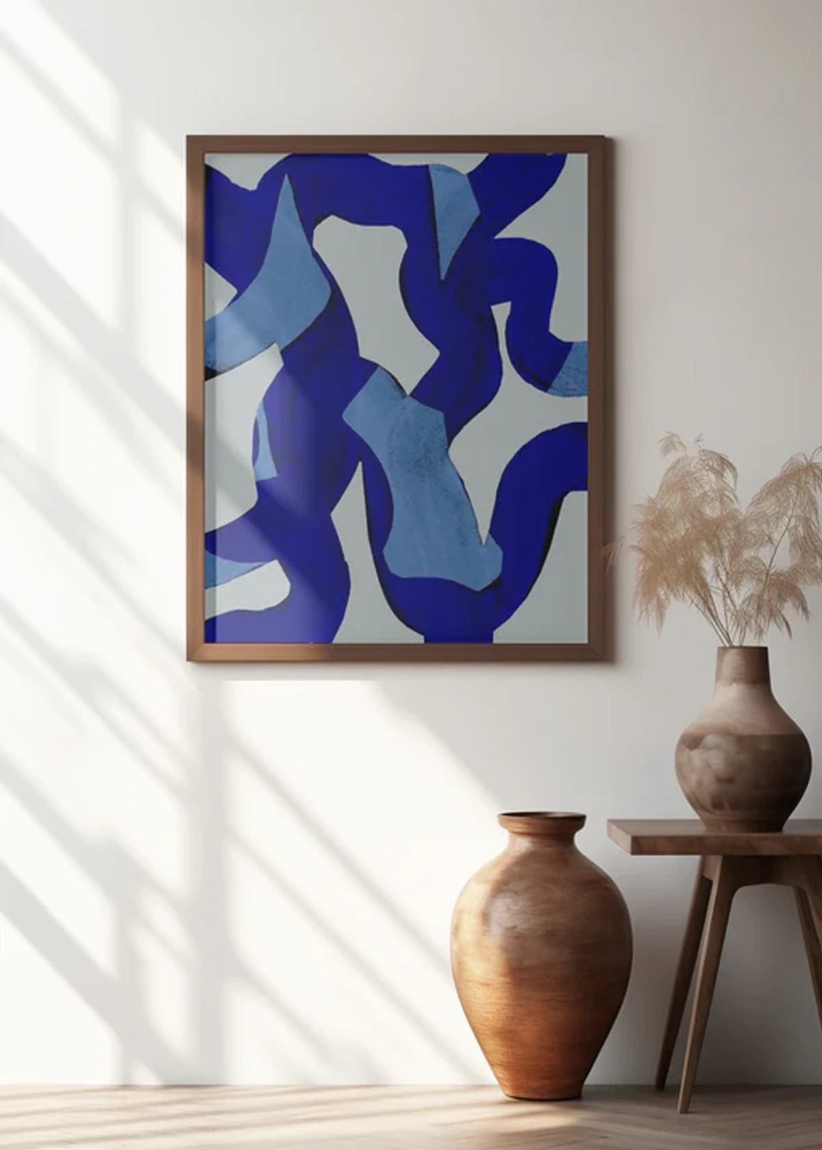
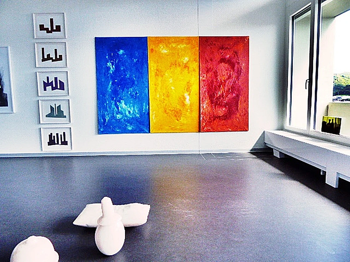
- Relationships of Form and Color: How big is one color field compared to another? Does a small, intensely saturated color area feel proportionally 'right' next to a large, muted one? Think of Rothko's color fields – their impactful scale and the proportions of his color blocks are what give them their contemplative power.
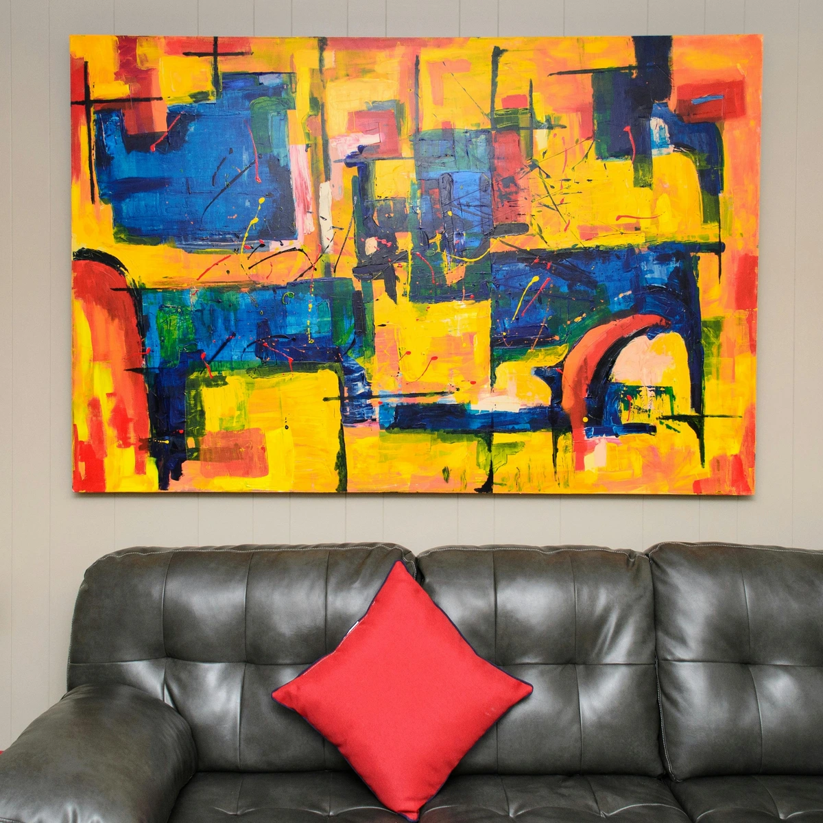
- Scale and Impact: While internal proportion is about relationships within the work, the scale of an abstract piece in relation to its environment or the viewer can dramatically alter its impact. A monumental abstract canvas in a gallery feels very different from a small one on a home wall. This is a critical consideration in collecting emerging abstract art.
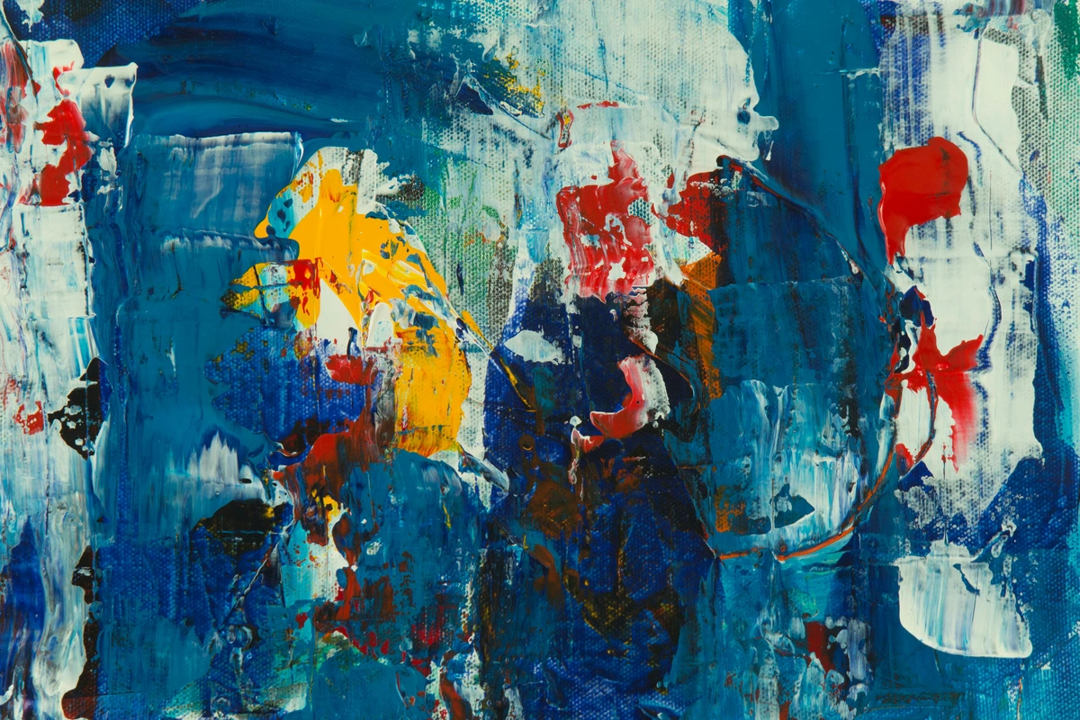
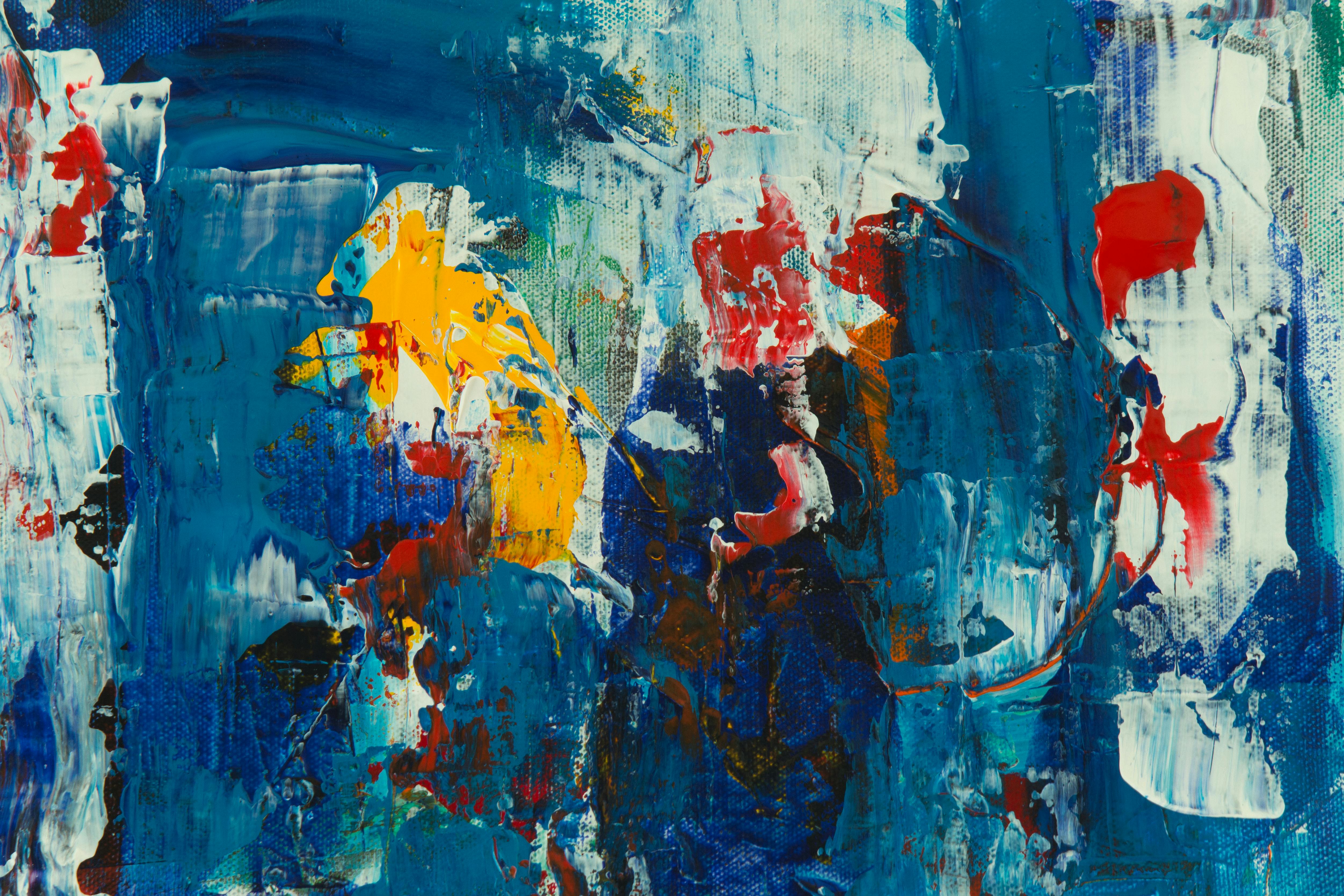
- Emotional Resonance through Disproportion: I often deliberately use disproportionate shapes, lines, or color blocks in my own work to create a sense of dynamic tension or unease, to challenge the viewer, or to evoke a particular emotional landscape. It's about intuitive proportion, where the 'right' relationships are dictated by feeling rather than measurement. This is a core part of my artistic process, where embracing accidents and evolution leads to surprising proportional discoveries.
4. Digital Art and Graphic Design
Digital tools provide unprecedented control over proportion, making it both easier to adhere to and easier to manipulate. From graphic design principles to photography composition, proportion is key.
- Grids and Guides: Software like Photoshop, Illustrator, and other design programs come with powerful grid and guide tools that allow precise proportional arrangements, whether you're designing a website layout or a poster.
- Scaling and Transformation: Digital art allows for effortless scaling and transformation of elements, making experimentation with different proportional relationships incredibly quick and iterative. You can stretch, compress, and resize components to test their visual impact without permanence.
- 3D Modeling: In 3D art, proportion is fundamental to creating convincing models, whether architectural renders or character designs. Even slight proportional errors can make a 3D object look unnatural or 'off'.
- Virtual and Augmented Reality: As art moves into immersive digital spaces, the proportional relationships between virtual objects, and between the viewer and those objects, become critical for a believable and engaging experience. This impacts how holography art is perceived.

Frequently Asked Questions About Proportion in Art
When delving into proportion, I find many artists grapple with similar questions. Let's tackle a few of them head-on.
Q: How do I know if my proportions are "right"?
A: This is the million-dollar question! For representational art,