What is Watercolor Paint? A Beginner's Guide to Water's Magic
What is watercolor paint? Dive into its unique transparency, luminosity, and versatile magic. This guide covers properties, differences from other paints, and why artists love it. Embrace the flow!
The Luminous World of Watercolor: A Comprehensive Beginner's Guide to Artistry and Expression
Welcome, fellow traveler on the artistic path! If you've ever been captivated by the sheer brilliance of a watercolor painting, or perhaps a little intimidated by its ethereal glow, then you've absolutely landed in the right spot. I remember the first time I truly understood watercolor, not as a paint, but as a living, breathing entity on the paper. It wasn't in a stuffy art history class, nor was it from reading a technical manual. It was a Saturday morning, sun streaming through my window, and I was just messing around with a cheap pan set and some thick paper. I laid down a wash, and instead of opaque coverage, the light seemed to dance through the pigment, reflecting off the white paper beneath. It was a revelation! That's the magic of watercolor, isn't it? It's not about hiding; it's about revealing. It’s a medium that truly breathes with light and movement, a conversation between you, the pigment, and the water – a constant dance of surrender and control.
This delicate interplay of water and pigment is what makes watercolor so captivating, but also, let's be honest, sometimes a little intimidating for beginners. The very transparency that gives it its glow can feel elusive, and the fluid nature of water, well, it has a mind of its own! But don't let that deter you! It's an incredibly approachable medium that profoundly rewards curiosity, a willingness to experiment, and an openness to embrace its unique, often unpredictable, qualities. For those embarking on their artistic journey, understanding the subtle science, the rich history, and the boundless creative potential of watercolor paint is absolutely key. It's a journey into fluidity and light, a medium that truly sets itself apart from all others, offering a unique avenue for both delicate realism and bold abstract expression. This guide aims to be your definitive resource, answering all your burning questions and inspiring you to fearlessly explore the luminous world of watercolor. Consider this your ultimate companion for exploring essential supplies, mastering basic techniques, troubleshooting common challenges, delving into its rich history, and even venturing into advanced mixed media applications, all designed to empower you to create with confidence and joy. By the end, you'll not only understand watercolor, but hopefully, feel a little of its magic for yourself – and maybe even learn to coax it into creating exactly what you envision, or perhaps, even more wonderfully, something entirely unexpected!
Key Characteristics: Understanding Your Paint's Personality
Before we dive into the fundamental components, let's quickly touch on a few key characteristics that define how watercolor pigments behave. Knowing these will give you a head start in anticipating your paint's personality and making informed choices for your artwork. Think of it as getting to know a new friend – each pigment has its quirks, strengths, and subtleties, and understanding them is like learning their love language. This intimate knowledge empowers you to choose the perfect paint for the mood, texture, and intensity you envision in your artwork.
Tinting Strength: How Much Punch Per Drop
Tinting strength refers to a pigment's power to impart its color to a mixture. Think of it as the pigment's inherent 'loudness.' A pigment with high tinting strength, like Phthalo Blue, means a tiny amount will intensely color a large amount of another pigment or water. It's like a concentrated essence – a little goes a very, very long way. Low tinting strength pigments, on the other hand, require more paint to achieve a similar intensity, behaving more like a gentle whisper in a mix. Knowing your pigments' tinting strengths is crucial for efficient color mixing, preventing accidental over-saturation, and saving paint. It allows you to anticipate how a color will behave in a mix, enabling you to build up color gradually for subtle effects or achieve bold statements with minimal effort. I've certainly learned the hard way that a tiny dab of Phthalo Blue goes a very long way, often overpowering other colors if you're not careful!
Granulation: The Textured Whisper
Granulation is a captivating characteristic where pigment particles visibly settle and separate on the paper's surface as the watercolor dries, creating a beautiful, subtle, and often organic texture. Think of it as tiny specks of color clustering together, leaving behind a slightly mottled or sandy appearance, rather than a smooth, uniform wash. This happens because some pigments have larger or heavier particles that don't stay suspended evenly in the water. Ultramarine Blue is a classic granulator, creating a wonderful, almost dusty texture. Other pigments, like Phthalo Blue, are finely milled and disperse smoothly, resulting in flat, even washes. Understanding granulation allows you to harness it for stunning effects – imagine creating the rough texture of ancient stone, the subtle shimmer of sand, or the dappled light on distant foliage, all with the inherent properties of your paint! It's one of those delightful quirks of watercolor that can transform a simple wash into a visually rich and engaging surface, adding character and depth that's hard to replicate otherwise.
Viscosity and Flow: The Paint's Natural Movement
Related to tinting strength is a paint's viscosity—how thick or fluid it is when mixed with water. This impacts its flow across the paper. Imagine honey versus water; that's the range of viscosity we're talking about with pigments. Different pigments inherently have different viscosities, even when mixed with the same water ratio. A thicker, more viscous paint might offer more control for detail work, allowing you to create sharp lines or build textured layers, while a very fluid paint is excellent for broad, even washes, covering large areas with seamless color. Understanding this will help you choose the right pigment for the right technique. For instance, I might grab a more viscous earth tone for textured rocks, allowing it to hold its form and create interesting granular effects, but a free-flowing Viridian for a calm, expansive sky, letting it spread and blend effortlessly. This subtle yet profound difference in flow is a key factor in choosing the right paint for the right artistic intention, from crisp botanical details to expansive, atmospheric landscapes.
The Essence of Watercolor: Pigment, Binder, and a Dash of Magic
At its heart, watercolor paint is incredibly simple, yet capable of profound complexity. Like all paints, it's essentially made of two primary components: pigment and a binder. The magic, as always, is in the details, and with watercolor, it's largely about the binder and how it interacts with water to suspend and release the pigment, transforming it from a dry, inert substance into a vibrant, flowing medium. It's this delicate balance that allows for both precise control and spontaneous, fluid effects, making each brushstroke a potential revelation.
Water is also undeniably a core component of the paint itself, not just a diluent. It's the essential vehicle that brings the pigment and binder to life, enabling the unique flow, transparency, and luminosity that defines watercolor. Without water, it's just colored dust. With water, it becomes a living, breathing entity on your paper, ready to dance.

Pigments: The Soul of Color
Just like in oil paint or acrylic paint, the pigment in watercolor is what gives it its color. These are the finely ground, often microscopic, particles of natural or synthetic materials that absorb certain wavelengths of light and reflect others, giving us the glorious hues we see. Think of vibrant blues from lapis lazuli (or a modern synthetic equivalent) or earthy siennas from iron oxides, each with its own unique origin story and chemical makeup. Pigments can be broadly categorized as organic (derived from carbon compounds, often synthetic, offering high tinting strength and vibrancy, like a brilliant Phthalo Green) or inorganic (derived from minerals or metal oxides, often more subdued, earthy, and famously granulating, such as Ultramarine Blue or a warm Burnt Sienna). Historically, natural pigments were painstakingly ground from minerals, plants, and even insects, a tradition that continues to influence some modern paints, often commanding higher prices for their rarity and unique character. Today, however, synthetic pigments often offer remarkable consistency, a vast spectrum of colors, and frequently boast superior lightfastness, ensuring your artwork endures for generations. The origin of a pigment can tell you a lot about its historical use and its specific properties, from its geological beginnings to its journey through alchemical labs or modern chemical synthesis. For instance, the deep reds and browns of iron oxides have been used since prehistoric cave paintings, while brilliant synthetic pigments like the Phthalos are a marvel of 20th-century chemistry, offering unparalleled saturation and lightfastness. This blend of ancient and modern gives us an incredibly rich palette to work with, each color carrying its own story.
The pigment load—the sheer amount of pigment packed into the binder—is a huge factor in a paint's intensity and vibrancy. It directly impacts how much punch your color has and how far it can spread, dictating how much watercolor magic you get from a single squeeze of a tube or dab of a pan. The quality of the pigment itself—its fineness (how smoothly it disperses), its lightfastness (how well it resists fading over time when exposed to light, a crucial factor for artists selling their work, as we'll discuss later), its intensity, and its particle size—all contribute profoundly to the quality and behavior of the paint. Some pigments are naturally more staining, others lift easily, and some, delightfully, granulate, creating beautiful textures as they dry. Think of a high pigment load as having more concentrated color available to you, meaning you need less paint to achieve vivid results. This high concentration is a key differentiator in artist-grade paints, offering a richness and depth that student-grade alternatives often lack, ultimately providing more value and longevity, making that initial investment truly worthwhile.
You'll often hear about single-pigment paints versus convenience mixes. Single pigments, as their name suggests, contain just one type of pigment. They offer pure, vibrant color and predictable mixing, allowing you to create a vast spectrum of harmonious hues from a small, carefully chosen palette. Convenience mixes, on the other hand, are pre-blended hues, sometimes containing two, three, or even more pigments to achieve a specific shade. While they can be convenient for specific shades when you're in a hurry, for beginners, a mix can initially seem easy, but as you grow in your practice, single pigments quickly become your best friend for clean color mixing and truly understanding color theory. This foundational knowledge empowers you to create any hue you desire without unwanted muddiness. Learning to mix your own colors from a limited palette of single pigments is one of the most rewarding aspects of watercolor, giving you unparalleled control and understanding of your hues. It’s like learning to cook from scratch instead of relying on pre-made sauces – it truly deepens your understanding and allows for endless customization and nuanced expressions.
Pigment Ponderings: Organic vs. Inorganic
Characteristic | Organic Pigments | Inorganic Pigments |
|---|---|---|
| Origin | Carbon compounds (often synthetic, from dyes/coal tar) | Minerals, metal oxides, clays (natural or synthetic) |
| Vibrancy | Often very bright, intense, high tinting strength | Tends to be more subdued, earthy, but can be vibrant |
| Transparency | Can be highly transparent or semi-opaque | Often semi-opaque to opaque (e.g., Cadmiums, Cobalts) |
| Granulation | Less prone to granulating, tend to be smooth | Many are famously granulating (e.g., Ultramarines, Cobalts) |
| Staining | Many are strong stainers (e.g., Phthalos, Quinacridones) | Can be staining or non-staining (e.g., Iron Oxides vs. Cadmiums) |
| Lightfastness | Varies, many modern synthetics are excellent | Generally very good, some historical inorganic pigments can be poor |
| Examples | Phthalo Blue, Quinacridone Rose, Hues | Ultramarine Blue, Burnt Sienna, Cadmium Yellow, Cobalt Blue |
This table gives you a quick reference, but remember that individual pigments within each category can still vary wildly in their specific characteristics. For example, not all organic pigments are staining, and some inorganic pigments, like the Cobalts, can be incredibly vibrant. The nuances of each pigment are part of the lifelong learning and discovery in watercolor. Knowing these general tendencies, however, empowers you to predict how a color will behave in a wash or a mix, leading to more intentional and less frustrating creative sessions. It’s about building an intimate relationship with your colors, understanding their personalities so you can truly bring out their best in your artwork.
The Binder: Making it Stick (and Flow)
This is where watercolor really sets itself apart, giving it its unique re-wettability and luminous flow. The primary binder is typically gum arabic, a natural resin derived from acacia trees. Gum arabic is water-soluble, which is absolutely crucial for watercolor's distinctive properties. It acts like a temporary glue, holding the pigment particles together in a dry state (in a pan) or a paste (in a tube). But as soon as you add water, it happily releases them, allowing them to flow freely across your paper with your brush. It's this remarkable property that allows watercolor to be re-wetted so easily, even after drying for years – a practical joy for artists, offering unparalleled flexibility. The quality of the gum arabic itself is also a crucial factor; higher-grade gum arabic, free from impurities, contributes to a smoother flow, better pigment dispersion, and ultimately, more luminous and vibrant washes. Inferior binders can lead to cracking, poor re-wetting, or a dull, chalky finish, diminishing the inherent beauty of the pigments. Other ingredients might be added to fine-tune the paint's behavior, influencing everything from its drying time to its spread and shine:
- Glycerin: Often included in watercolor formulations to keep the paint moist, prevent cracking in pans or tubes (especially in drier climates), and significantly improve re-wetting properties. It acts as a humectant, meaning it attracts and retains moisture from the air, and can subtly extend drying time, which can be a distinct advantage for techniques requiring a longer 'open window' for blending. For pan paints, glycerin is especially vital as it allows the dried paint to readily re-absorb water, making them instantly pliable and responsive with a single brushstroke, transforming a solid block of color into liquid brilliance. Think of it as the paint's personal moisturizer, keeping it supple and ready for action. Beyond just flexibility, glycerin also influences the open time of the paint, meaning how long it stays workable on the palette and on the paper before drying. A slightly longer open time can be invaluable for wet-in-wet techniques or for blending large washes, giving you that precious extra moment to finesse your strokes before the paint sets.
- Ox Gall (or Synthetic Dispersants): A traditional additive (now often synthetic, and animal-free) that acts as a wetting agent. Think of it as a tiny helper that smooths things over. It reduces the surface tension of water, allowing the paint to spread more smoothly and evenly across the paper's surface, preventing frustrating beading, blotchiness, or splotches. It's often essential for achieving those beautiful, unblemished, even washes and can also enhance the luminosity and flow of certain pigments, making the colors appear more vibrant, cohesive, and less likely to shy away from the paper's fibers. Without it, your paint might just sit there, stubbornly refusing to spread, like a shy dancer at a party. The right amount of wetting agent also enhances the color's luminosity, allowing the light to interact more freely with the pigment and paper, intensifying that characteristic watercolor glow. It's truly a subtle but powerful player in achieving professional-looking washes.
- Preservatives: Small amounts are often added to prevent mold growth, especially in tube paints, which contain more moisture and are more susceptible to microbial activity. This ensures the longevity and hygiene of your precious paints, protecting your investment and keeping your studio safe and pleasant. After all, nobody wants fuzzy watercolors! It's the silent guardian against unwelcome biological invaders. While natural alternatives exist, modern preservatives ensure consistent quality and safety, protecting your paints from degradation and allowing you to focus purely on your creative process without worry.
- Fillers/Extenders: In student-grade paints, inexpensive fillers like chalk, dextrin, or even corn syrup may be added to increase volume and lower costs, often at the expense of pigment intensity, vibrancy, and lightfastness. Artist-grade paints, on the other hand, minimize or completely avoid these fillers, ensuring a higher pigment load and pure, concentrated color. This is why a tube of artist-grade paint often costs more but delivers far more concentrated pigment, ultimately providing more value and superior artistic results. It's this intricate balance of binder and additives that makes each brand and even each pigment within a brand unique. Some manufacturers guard their binder recipes closely, leading to subtle but discernible variations in how paints re-wet, flow, and interact with the paper across different brands. Experimenting with various brands can reveal subtle but delightful differences in handling and final appearance, and it's a journey many artists undertake to find their perfect match, much like a chef seeking the perfect ingredient. This delicate interplay of binder, pigment, and additives is what creates the unique 'feel' of a particular watercolor, making the choice of brand a very personal and artistic decision.
The Silent Partner: The Crucial Role of Water
I can't emphasize this enough: water is not just a mixer in watercolor; it's an active participant, a co-creator. It's the solvent that activates the pigment, the vehicle that carries it across the paper, and the force that dictates flow, blending, and texture. Mastering watercolor is less about mastering paint and more about understanding and harnessing the unique properties of water itself. It's truly a dance, where the water leads as often as you do. The ratio of water to pigment is everything, determining the intensity (value) and transparency of your color. Too little water, and your colors will be dense and sticky; too much, and they'll be faint and lack vibrancy. Finding that sweet spot, that perfect milky consistency, is a lifelong pursuit, and part of the joy.
Even the type of water you use can subtly impact your results – and this is where some artists get quite particular! While tap water is generally fine for everyday practice, some artists prefer distilled water to avoid minerals, chlorine, or other impurities that might affect sensitive pigments, especially when working with very delicate colors or in areas with exceptionally hard water. Impurities in tap water can sometimes alter the subtle nuances of certain pigments (causing a slight shift in hue or dullness) or even affect the paper's archival qualities over very long periods. The temperature of your water can also subtly influence flow and re-wetting; slightly warmer water can help re-wet dried pan paints more easily, making them more pliable and releasing pigment more readily, as the warmer water molecules are more active and can break down the dried binder more efficiently. Conversely, colder water might slow down the drying process slightly, giving you more working time for complex blends, or even creating interesting textural effects as it interacts with the paper. Experimenting with these subtle variables can truly unlock new expressive possibilities – sometimes a minor tweak makes all the difference, revealing a new dimension to your artistic voice! I often find that the temperature of my water can subtly shift the mood of a wash, with warmer water encouraging a more expansive, flowing quality, and cooler water allowing for a slightly more controlled, slower diffusion. It's these minute details, this constant dialogue with the elements, that elevates watercolor from a mere painting technique to a profound artistic conversation.
Beyond the Basics: Understanding Watercolor Paint Characteristics
Before we dive into the truly unique properties that define watercolor, it's worth taking a moment to understand some other characteristics that impact how the paint behaves on your paper. This isn't just technical jargon; these qualities will profoundly influence your artistic choices and the final look of your piece. Think of it as knowing your instruments intimately before you compose a symphony. You can learn even more about paint types in our definitive guide to paint types for artists.
Working Time: The Art of the Open Window
Related to a paint's viscosity and the paper's absorbency is its working time – essentially, how long you have to manipulate the paint on the paper before it dries and sets. Some pigments, combined with specific paper types (like slower-drying cotton rag paper) and environmental conditions (high humidity or cooler temperatures), offer a longer 'open window' where you can blend, soften edges, or perform delicate lifting. Others, however, dry almost instantly, demanding swift and confident strokes, almost like a race against time. Understanding and anticipating a pigment's working time is crucial for choosing the right technique; you wouldn't try a complex wet-on-wet blend with a fast-drying pigment on highly absorbent paper unless you're aiming for a very specific, quick, textural effect. For me, it's about knowing when to linger, enjoying the slow dance of colors, and when to make a decisive, confident move before the paint sets forever. Environmental factors, like the humidity in your studio or even the ambient temperature, play a huge role here. In a dry climate, paints dry incredibly fast, demanding speed and efficiency. In humid conditions, you might have a much longer working window, allowing for more expansive wet-on-wet exploration. I’ve certainly learned to adjust my pace when painting on a humid summer day versus a dry winter afternoon – it’s a constant dance with nature’s whims!
Staining vs. Non-Staining (Lifting Properties)
This is a big one that relates directly to the lifting technique we'll discuss later, and it's a characteristic that dramatically impacts your ability to make corrections or create specific effects. Staining pigments (like Phthalo Blue, Alizarin Crimson, or Quinacridone Rose) essentially dye the paper fibers themselves. Once they're down and dry, they're difficult or impossible to completely remove without damaging the paper. They become an intrinsic part of the paper, creating intense, vibrant colors that are hard to disturb, offering incredible permanence and luminosity. On the other hand, non-staining pigments (like Ultramarine Blue, Cadmium Yellow, or Cobalt Blue) sit more on the surface of the paper, making them much easier to lift or remove, even after drying. They're often the ones that granulate beautifully, creating interesting textures, and offer more flexibility for softening edges or pulling out highlights. Knowing this distinction is like having an invisible 'undo' button for some colors, but not others! For instance, if I’m painting a delicate sky and want the option to gently lift clouds or soften a horizon, I’ll often reach for a non-staining pigment like Cobalt Blue. But for a rich, vibrant botanical illustration where I want bold, permanent color, a staining Quinacridone Rose might be my choice. This knowledge becomes a powerful strategic tool in your artistic arsenal, guiding your color choices based on both hue and desired working properties.
Transparency vs. Opacity
While watercolor is famous for its transparency, which is truly its defining characteristic, not all pigments are created equal in this regard. Some pigments are naturally more transparent, allowing light to pass directly through them, bounce off the pristine white paper surface, and reflect back to your eye – this is what creates that signature luminosity and glow. Others are more opaque (like Cadmium colors, Naples Yellow, or certain earth tones), meaning they block more light and create a more solid, covering layer. A slightly opaque pigment can be surprisingly useful for subtle corrections, adding a sense of density, or creating a more solid focal point or highlight that wouldn't typically be achieved with pure transparent washes. However, generally, true transparency is the hallmark and most celebrated quality of watercolor. Understanding this spectrum is crucial. A transparent pigment like Hansa Yellow can create brilliant glazes, allowing previous layers to shine through, while a semi-opaque pigment like Cadmium Yellow (often used for its strong tinting power and vibrancy) will create a more solid, covering layer. Even within transparency, some pigments are more 'dye-like' (strong stainers), while others are more 'particulate' (prone to granulation), offering endless nuanced possibilities.
Permanence and Lightfastness: The Unsung Hero of Archival Art
We touched on lightfastness earlier when discussing pigment quality, but it’s absolutely worth reiterating here, because it's a silent destroyer of artwork if ignored. A paint's permanence refers to its overall ability to resist change over time, encompassing not just fading (which is what lightfastness addresses specifically) but also resistance to humidity, atmospheric pollutants, and chemical reactions with other materials. Always, always choose artist-grade paints with good lightfastness ratings (often indicated by ASTM ratings like I, II, or III, or stars on the paint tube/pan) if you want your artwork to endure for decades, or even centuries. I've heard too many stories of beautiful works fading into ghosts, slowly diminishing into pale echoes of their former selves, and it's always a heartbreak. Imagine pouring your heart into a painting, only for its vibrant hues to gradually disappear – that's the tragedy of non-lightfast pigments. Prioritizing lightfastness is an act of preserving your artistic legacy, ensuring your creations can be enjoyed by future generations. Trust me, few things are more heartbreaking than seeing a cherished piece of art fade into a pale ghost of its former self. Always, always check those ASTM ratings – it's a small step that makes a monumental difference in the life of your art. (You'll find a more detailed table on lightfastness ratings and archival best practices in the 'Care & Preservation' section of this guide, so you can make truly informed and conscientious choices for your masterpieces.)
Dispersion, Flocculation, and Sedimentation
This is a bit more technical, but absolutely fascinating and crucial for understanding how pigments settle on your paper! Dispersion refers to how evenly the pigment particles spread out in the water. Some pigments disperse very smoothly, creating uniform washes, perfect for calm, unblemished skies. Others, however, tend to clump together or flocculate (form tiny aggregates of pigment), especially as they dry, contributing to a more textured, slightly uneven wash. This isn't necessarily a bad thing; in fact, it's often a beautiful characteristic that adds visual interest, particularly with granulating pigments. Think of the subtle, organic textures you see in an old, weathered wall or a misty, distant landscape; flocculation can beautifully replicate these natural surfaces. Closely related is sedimentation, which is when heavier pigment particles literally settle out of the water and collect at the bottom of a wash as it dries, also contributing significantly to granulation and textured effects. Understanding dispersion, flocculation, and sedimentation can help you anticipate precisely how a pigment will behave in a wash and prevent unexpected results – or, more excitingly, harness them for intentional artistic effects! For example, a controlled flocculation can create the varied textures in a distant forest, the dappled light on foliage, or the natural unevenness of an old stone wall, adding immediate character and depth to your scene. Learning to observe how different pigments flocculate and settle can open up a whole new world of textural possibilities, transforming what might seem like a 'defect' into a deliberate and sophisticated artistic choice.
Blooms or Cauliflowers: Embracing or Avoiding Water Marks
Also known as water marks or backruns, these are irregular, often feathery-edged dark patches that appear in a wash when new water or wetter paint is introduced into a drying, but still damp, wash. They happen because the fresh, wetter solution pushes the pigment at the edge of the damp area, causing it to concentrate and bloom outwards. While often seen as a beginner's mistake – and trust me, I've had my share of unintentional cauliflowers that left me pulling my hair out! – experienced artists frequently embrace blooms intentionally for textural effects, like the soft, ethereal edges of clouds, the organic feel of distant foliage, or the rugged texture of rocky landscapes. Learning to control or prevent them, however, is key for achieving smooth, even washes when desired, but don't be afraid to lean into them for intentional texture! I've had more than one happy accident turn into a beautiful cloud formation or a uniquely rugged mountain texture that I could never have planned. Sometimes, the 'mistake' is the invitation to discover a new technique.
If you're asking me, the distinct personality of watercolor stems from a few key properties. These aren't just technical specifications; they're the very characteristics that define the experience of painting with it. Let's delve into what truly makes watercolor, watercolor.
Re-wettability: The Gift of Infinite Workability
One of the most uniquely practical and forgiving characteristics of watercolor, and one that sets it apart from acrylics or oils, is its remarkable re-wettability. This simply means that even after the paint has dried, sometimes for years, you can reactivate it with water. This is thanks to the gum arabic binder, which never becomes truly insoluble. For artists, this is an immense gift. It means you can easily go back to a dried palette and reactivate your colors, minimizing waste. On paper, it allows for various lifting techniques (which we'll explore in the techniques section) and offers a degree of flexibility for adjustments that other mediums simply don't. I've often returned to a dried painting a day later, and with a clean, damp brush, been able to gently soften a hard edge or lift a subtle highlight, almost like magic. This endless capacity for re-activation makes watercolor incredibly forgiving and efficient, allowing for a freedom of practice that is truly liberating. It’s a testament to the medium’s inherent pliability and responsiveness, always ready to dance again with water.
Transparency and Luminosity: Light Through Color
This is the big one, the defining characteristic, the very soul of the medium. Unlike opaque mediums, watercolor is inherently transparent. When you apply a wash, the light passes through the layer of pigment, bounces off the pristine white surface of your paper, and reflects back to your eye, picking up the color on its way out. This unique interplay of pigment, water, and paper is what gives watercolor its incredible luminosity and glowing quality – it’s truly like painting with captured light itself, a truly ethereal experience. It’s why watercolorists often talk about preserving the white of the paper – that untouched white is your ultimate light source, your purest highlight, and once it's gone, it's gone. Think of it like a beautiful stained-glass window: the light shines through it, not just on it, creating a vibrancy and depth that's difficult to replicate with other paints. This transparency also means that underlying pencil lines or even previous layers of paint will subtly show through, adding to the depth and complexity of your work, creating a rich visual history within your painting. Indeed, the adage "preserve your whites" is almost a mantra among watercolorists, a constant reminder that the paper itself is your most brilliant light source, and its untouched purity is irreplaceable once covered. This careful planning around light, rather than painting it on, is a foundational difference and a beautiful challenge that watercolor presents.
Mastering this takes practice, but the luminous, glowing results are truly worth the effort.
The Art of the 'Happy Accident' (Water's Unpredictable Nature)
This is a phrase you'll hear often in watercolor circles: "happy accidents." And truly, they often are! The very nature of watercolor, with its fluid, unpredictable water component, means that sometimes the most beautiful, organic, and captivating effects happen when you surrender a little control and let the medium do its thing. Learning to let go and work with the water, rather than rigidly against it, is perhaps the most profound lesson watercolor teaches. I’ve certainly had moments where a planned wash went wonderfully rogue, only to morph into a stunning cloud formation, a uniquely textured foreground element, or a serendipitous blend of colors that I could never have intentionally engineered. Embrace the way colors bloom and mingle, the unexpected soft edges, or the surprising textures that emerge from the interaction of water and pigment. Sometimes, the 'mistake' is actually the most interesting part, leading you to discover new artistic paths and expanding your creative vocabulary! It’s this joyful surrender to the medium that truly differentiates watercolor from more controlled forms of painting, inviting a fresh sense of discovery with every piece.
Essential Watercolor Supplies: Your Starting Toolkit for the Luminous Journey
Alright, you're hooked, you're ready to dive in! But what do you actually need to get started on this luminous journey? The beauty of watercolor is that you don't necessarily need a huge initial investment, but a few quality basics, thoughtfully chosen, can truly make all the difference in your enjoyment and results. I've been there, staring at a wall of tantalizing supplies, wondering where to even begin and what was truly essential versus merely tempting. Let me guide you through the essentials, helping you build a toolkit that sets you up for success.
Paper: The Foundation of Your Luminous Work
This is, arguably, the most important element after the paint itself – yes, even more so than fancy brushes! Watercolor paper isn't just any paper; it's a specially engineered surface designed to withstand significant amounts of water without buckling, bleeding, or losing its structural integrity. Choosing the right paper will dramatically impact your results, your enjoyment of the process, and your overall sanity. Trust me, cheap, poorly-sized paper is a recipe for immense frustration, warped paintings, and a premature end to your artistic enthusiasm!
- Weight: Measured in pounds (lb) or grams per square meter (gsm). This refers to the thickness and density of the paper. Aim for at least 140 lb (300 gsm) paper for most projects. Lighter papers buckle easily – I remember early on trying to save a buck with lighter paper, only to end up with a wavy, unworkable surface after my first wash, which completely derailed my efforts! For extremely wet techniques or very large washes, 300 lb (640 gsm) paper is an absolute dream, as it rarely buckles at all, even without stretching. It's a more significant investment, but can be incredibly liberating for ambitious pieces. Using watercolor blocks, where the paper is glued on all four sides, also brilliantly prevents buckling, as the paper is held taut while drying. Once your painting is dry, you simply use a palette knife or thin blade to separate the top sheet from the block. The heavier the paper, the less likely it is to warp, providing a smoother, more predictable, and ultimately more enjoyable surface for your delicate washes.
- Composition: The fibers that make up your paper dramatically impact its performance and longevity.
- Cotton (Rag) Paper: The gold standard, often labeled as '100% cotton' or 'rag' paper. This is the top tier. 100% cotton paper is incredibly absorbent, allows for beautiful lifting, retains its strength even when saturated, and is far less prone to buckling. It's an investment, but absolutely worth it for its superior performance, beautiful texture, and archival qualities. The long, strong cotton fibers are what give it this exceptional durability, allowing the paper to handle repeated wetting, lifting, and scrubbing without disintegrating or pilling.
- Wood Pulp Paper (Cellulose): More affordable and readily available, but generally less forgiving. Often labeled as 'student grade' or 'cellulose paper,' it can be quite prone to buckling and may not allow for the same level of subtle lifting or layering that cotton paper offers. While it's great for initial sketches or experiments, its shorter and less robust fibers make it less durable when wet. Wood pulp paper is more prone to pilling or tearing if overworked, and it may absorb paint too quickly, leading to duller colors.
- Blends: Some papers are a blend of cotton and wood pulp, offering a compromise between performance and cost. These can be a good stepping stone between student and artist grade papers, providing a slightly better experience than pure wood pulp without the full investment of 100% cotton.
- Sizing: This refers to chemicals (often gelatin, starch, or synthetic agents) added during manufacturing (internal sizing, mixed into the pulp) or applied to the surface (external sizing). Sizing is critical because it controls the paper's absorbency. Without adequate sizing, watercolor paper would absorb paint like a sponge, leading to dull, flat colors and a complete lack of control, almost like painting on blotting paper. Good sizing allows the paint to sit on the surface for a brief period, maintaining vibrancy and allowing you to manipulate the paint before it soaks in. Too much sizing can make the paper repel water, causing it to bead up and resist your brushstrokes, creating frustratingly uneven results. Conversely, too little sizing, and the paper drinks the paint too quickly, leading to dull colors and a complete loss of control over your washes and blending. It's truly a Goldilocks situation – too much and paint beads frustratingly, too little and it's absorbed too fast – just right is absolutely key for that sweet spot of control and luminosity! Without proper sizing, your beautiful transparent washes would simply disappear into the paper, leaving behind dull, lifeless pigment. It’s the invisible shield that holds the magic on the surface, allowing the water and pigment to dance and mingle before finally settling into their final, luminous embrace.
- Surface pH (Acid-Free): Always, always look for paper labeled acid-free or archival quality. This means the paper has a neutral pH (typically 7 or higher), preventing it from yellowing, becoming brittle, or degrading over time due to acid content. This is absolutely vital if you want your artwork to last for decades, or even centuries, without self-destructing. Using non-acid-free paper is a silent killer of artwork, causing it to slowly deteriorate and lose its vibrancy, often a heartbreaking realization years down the line. It's a non-negotiable for any artwork you want to endure.
- Cotton (Rag) Paper: The gold standard, often labeled as '100% cotton' or 'rag' paper. This is the top tier. 100% cotton paper is incredibly absorbent, allows for beautiful lifting, retains its strength even when saturated, and is far less prone to buckling. It's an investment, but absolutely worth it for its superior performance, beautiful texture, and archival qualities. The long, strong cotton fibers are what give it this exceptional durability, allowing the paper to handle repeated wetting, lifting, and scrubbing without disintegrating or pilling. The natural cellulose in cotton also interacts uniquely with watercolor, promoting luminous washes and vibrant color retention.
- Wood Pulp Paper (Cellulose): More affordable and readily available, but generally less forgiving. Often labeled as 'student grade' or 'cellulose paper,' it can be quite prone to buckling and may not allow for the same level of subtle lifting or layering that cotton paper offers. While it's great for initial sketches or experiments, its shorter and less robust fibers make it less durable when wet. Wood pulp paper is more prone to pilling or tearing if overworked, and it may absorb paint too quickly, leading to duller colors and less predictable blending. The lack of robust sizing in many student-grade wood pulp papers means they can often 'drink' the paint, resulting in less vibrant and less controllable washes.
- Blends: Some papers are a blend of cotton and wood pulp, offering a compromise between performance and cost. These can be a good stepping stone between student and artist grade papers, providing a slightly better experience than pure wood pulp without the full investment of 100% cotton. They aim to balance the archival qualities and workability of cotton with the affordability of wood pulp, often a good choice for serious students or for larger practice pieces where cost is a factor.
- Texture: The surface texture, or 'tooth,' of watercolor paper is another crucial choice, dramatically affecting how your paint behaves and the final look of your piece. Each texture offers unique advantages:
- Hot Press: This paper has a smooth surface, with very little or no 'tooth,' created by pressing it between hot rollers. This makes it fantastic for detailed work, fine lines, precise washes, and smooth gradations. Colors appear very vibrant and intense on hot press paper because there's less texture to diffuse the light. It's perfect for botanical illustration, realistic portraits, crisp graphic styles, ink and wash techniques, or even calligraphy, where sharp lines are desired. For me, hot press is where clarity and crispness reign, allowing for those intricate details that make a piece truly sing. It's also excellent for techniques like dry brush when you want minimal texture and a more 'broken' line, or for adding layers of precise glazes without disturbing underlying textures. However, its smooth surface can sometimes make large, even washes more challenging for beginners, as there’s less tooth for the water to 'grab' onto, potentially leading to streaks if not applied swiftly and confidently.
- Cold Press: This is the most popular and versatile choice for watercolor artists, offering a medium texture. It's created by pressing the paper between cold rollers. It provides a good balance of detail and washes, with enough 'tooth' to allow for some beautiful granulation and absorption, while still offering a relatively smooth surface for brushstrokes. This is my personal go-to for most general painting, offering incredible versatility and forgiving qualities, making it ideal for beginners and experienced artists alike. It's the dependable friend in your artistic toolkit. The texture of cold press paper provides just enough grip for the pigment to settle beautifully, allowing for wonderful granulation and varied wash effects. It's also more forgiving for lifting and corrections compared to hot press, making it a favorite for many artists exploring a range of subjects and styles.
- Rough: As the name implies, this paper has a heavily textured, pronounced tooth. It creates strong granulating effects, allowing pigments to settle beautifully into the valleys of the paper, and highlights the tooth of the paper wonderfully with dry brush techniques. This surface is fantastic for capturing rough textures in landscapes, like craggy rocks, turbulent water, or stormy skies, and for bold, expressive washes where texture is a key element. The deep valleys of the paper often remain white, creating a brilliant, sparkling effect with dry brush techniques, adding an immediate sense of character and depth. When I want that raw, untamed texture, rough paper is my first choice. It demands a confident hand, as delicate details can be lost in its valleys, but for expressive, textural work, it’s simply unmatched. I particularly love how dry brush on rough paper creates a scintillating effect, almost like light sparkling on a textured surface, adding incredible depth and character to a landscape or abstract piece.
Paper Grain: Direction and Impact
Beyond texture, watercolor paper also has a grain, referring to the direction in which the paper fibers are aligned during manufacturing. This isn't usually a critical factor for smaller pieces, but for larger works or when tearing/folding paper, it can be important. Paper tears more cleanly along the grain, and folds are sharper. While not as overtly impactful as texture, understanding grain is part of a holistic appreciation for your paper's properties. Sometimes, the grain can subtly influence how a wash spreads or how the paper reacts to wetness, especially in larger sheets. It's another layer of subtle interaction between you, your materials, and the final artwork, often only noticed by the most seasoned artists, but worth a quiet nod in our comprehensive guide.
Paper Texture | Characteristics | Best For |
|---|---|---|
| Hot Press | Smooth, very low tooth, colors appear vibrant, sharp lines | Detailed botanical work, portraits, ink & wash, calligraphy |
| Cold Press | Medium texture, versatile, balanced absorption, good for granulation | General painting, balanced washes, details, beginners, landscapes |
| Rough | Heavy texture, pronounced tooth, encourages granulation, highlights dry brush | Expressive landscapes, rocks, stormy skies, abstract textures |

I always tell beginners, and I can't emphasize this enough: "Don't skimp on paper!" Even student-grade paints look dramatically better and are more enjoyable to work with on good paper. You can find more in-depth advice in our guide to best watercolor paper for artists. Selecting the right paper is truly about empowering your brushstrokes and ensuring your efforts are beautifully preserved. It's the silent partner that absorbs, or resists, your creative intentions, setting the stage for all your watercolor adventures.
Brushes: Extensions of Your Artistic Intent
You don't need dozens of brushes, don't get me wrong, but a few quality ones make an exponential world of difference. A good round brush (size 8 or 10) and a flat wash brush (1/2 inch or 1 inch) will get you surprisingly far, allowing you to explore a vast array of techniques with confidence. I always recommend investing in the best brushes you can reasonably afford, as they are truly an extension of your hand, providing better control, superior water retention, and impressive durability. Taking good care of your brushes, which we'll cover in detail right now, will ensure they last a lifetime and remain trusted companions on your artistic journey.
Brush Care: Making Your Tools Last
Proper brush care is often overlooked, and I know it can feel like a chore sometimes, but it's absolutely crucial for the longevity and optimal performance of your brushes. Think of them as delicate instruments that need a little love! Immediately after painting, rinse your brushes thoroughly in clean water until absolutely no pigment comes off. You can gently swirl them in your 'dirty' water container and then run them under a tap. Crucially, avoid scrubbing them harshly against the bottom of your container or leaving them sitting bristles-down in water, which can permanently bend the hairs and loosen the ferrule (the metal part that connects the bristles to the handle). Once rinsed, gently reshape the bristles with your fingers to their original point or chisel edge – this helps maintain their intended shape. Then, let them dry flat or brush-side down (using a brush holder, if you have one, or just propped carefully) – never resting on their ferrules, which can cause water to seep into the handle and loosen the glue, shortening their lifespan. Crucially, never, ever let paint dry in the bristles, as this can permanently damage them and make them stiff, splayed, and ultimately unusable. A well-cared-for brush can truly last you for years, becoming a trusted and responsive companion in your artistic journey. For more detailed tips, you might enjoy our guide on cleaning and caring for your paint brushes. I've seen countless artists lose their favorite brushes prematurely due to improper cleaning; it's a small investment of time that pays huge dividends in the longevity and performance of your tools. Remember, your brushes are an extension of your creative intention, treat them with the respect they deserve, and they will faithfully serve your artistic vision.
- Natural Hair: Often sable (like Kolinsky sable, considered the gold standard for its exceptional snap, point, and capacity) or squirrel (known for holding truly enormous amounts of water, perfect for large, flowing washes). These brushes typically hold an incredible amount of water and pigment and release it smoothly and evenly. They are generally more expensive but offer a true joy to use for their responsiveness and capacity, especially for traditional watercolor techniques. Kolinsky sable, in particular, is prized for its exceptional snap and ability to hold a fine point, making it ideal for both broad, juicy washes and intricate details. Other natural hairs like squirrel offer incredible water retention, perfect for large, flowing washes with minimal re-loading, while goat hair can provide a unique softness for blending and atmospheric effects. Each natural hair type brings its own subtle magic to the brushstroke, inviting a deeply tactile and responsive painting experience.
- Synthetic Hair: Excellent modern alternatives, often more affordable, durable, and cruelty-free. Advances in synthetic fiber technology mean they mimic natural hair properties remarkably well, offering good spring, control, and pigment release. Many artists, myself included, find synthetics to be incredibly versatile and reliable workhorses, sometimes even preferring them for their consistency and resilience. They're a fantastic choice for any artist, from beginner to professional. Many modern synthetics are specifically engineered to replicate the properties of natural hairs, offering excellent spring, good water capacity, and impressive durability. They are also often more resilient to harsh pigments and repeated scrubbing, making them ideal workhorses for daily practice and robust techniques. I often mix natural and synthetic brushes in my own toolkit, leveraging the strengths of each for different aspects of a painting.
- Blends: A mix of natural and synthetic fibers, designed to combine the best properties of both – often a good compromise between performance, water retention, and cost. They can be fantastic all-rounders, offering some of the benefits of natural hair with the durability and affordability of synthetics. These hybrid brushes often strike a wonderful balance, providing good snap and water retention without the premium price tag or delicate care requirements of pure natural hair, making them a superb option for a versatile and reliable brush collection.
Beyond hair type, brush shape is also key, each designed for specific marks and purposes – choosing the right shape can make a huge difference in achieving your desired effect:
- Round Brush: The most versatile and often a beginner's first brush. Thanks to its pointed tip and broad belly, it's great for everything from fine lines (with the tip) to broader washes (with the belly) and details, all depending on the size and pressure you apply. A good size 8 or 10 round is indispensable for everything from subtle shading to crisp outlines. The sheer versatility of a well-made round brush means it can perform the duties of several other brush shapes, making it a foundational tool for any watercolor artist. I often find myself reaching for my trusted round brush for almost every step of a painting, from initial washes to final delicate details.
- Flat Wash Brush: As the name suggests, this brush is ideal for laying down even washes over large areas, creating crisp, straight edges, or for more geometric shapes. Comes in various widths, like 1/2 inch or 1 inch, perfect for covering ground quickly or for creating strong, angular forms in architectural sketches or bold abstracts. Their sharp, straight edge is also invaluable for lifting color or creating distinct, geometric shapes, offering a different kind of control than a round brush. For expansive skies or calm bodies of water, a large flat wash brush can lay down a seamless, even wash with remarkable efficiency.
- Mop Brush: A large, soft, absorbent brush (often squirrel hair or a high-quality synthetic equivalent) perfect for soaking up excess water, laying down very soft, even washes, or creating soft-edged blooms. They hold a tremendous amount of liquid, making them excellent for large, fluid applications, especially when you want a smooth, ethereal effect. Their incredibly soft bristles are gentle on the paper, making them ideal for delicate blending and avoiding harsh brushstrokes. I often use a mop brush for initial large washes or for absorbing excess water from a wet area, almost like a thirsty cloud, bringing a unique softness to the work.
- Liner/Rigger Brush: These are long, thin brushes with a very fine point, originally designed for painting the rigging on ships (hence 'rigger'). They are perfect for very fine lines, delicate details, signatures, and long, flowing calligraphic strokes (think delicate tree branches, long blades of grass, or intricate patterns). They excel at continuous, unbroken lines. Their long, slender bristles allow for a remarkable amount of paint to be held, enabling you to draw extended, consistent lines without reloading the brush, which is crucial for those intricate details that demand precision and flow. Think of painting the delicate tendrils of a vine or the intricate patterns on a butterfly's wing; a rigger is your perfect companion.
- Fan Brush: This brush has splayed bristles resembling a fan. It can be used for soft blending, creating organic textures like grass, distant foliage, hair, or fur, or for controlled spattering effects. It's a specialist brush, but wonderfully expressive for organic, feathery marks, adding a touch of natural spontaneity. I’ve found it invaluable for creating the texture of distant foliage, soft grass, or even the gentle ripples on water, offering a unique mark-making capability that’s hard to replicate with other brushes. It’s a tool that encourages a looser, more impressionistic approach, inviting you to play with texture and suggestion.
For more on choosing the right tools, check out our essential watercolor supplies for beginners article. And don't forget, the quality of your paper, brushes, and paints all work in concert to influence your final outcome – they're a team, and the weakest link can sometimes affect the whole. Choose wisely, care for them well, and they'll serve your artistic vision beautifully.
Palettes: Your Color Mixing Sanctuary
Anything non-porous and white (or a very neutral light gray) works as a palette! Seriously, I've used everything from a fancy ceramic palette to the lid of a takeout container in a pinch (don't judge, inspiration strikes, right?). Ceramic or porcelain palettes are often preferred for their satisfying weight, smooth non-staining surface, and how beautifully colors appear true to their hue and are easy to re-wet. Plastic palettes are lightweight and portable, though some can stain over time and may cause water to bead up slightly. Metal palettes (often found in pan sets) are also common and can be very durable, but check for rust resistance to avoid unwanted discoloration. The key is that the surface is non-absorbent, allowing your pigments to remain vibrant and easily accessible for dilution and mixing without them soaking in or altering their appearance. A white background helps you accurately see the true hue and value of your mixed colors, which is vital for precise color choices. Cleaning your palette regularly is also key to preventing muddy mixes, and covering your palette when not in use can prevent dust or pet hair from settling into your precious paints, keeping your colors fresh and vibrant. For me, a clean palette is a clear mind, and it ensures the purity of my abstract color mixes, preventing any unintended dullness. Different palette materials, from smooth porcelain to practical plastic, offer varied experiences. Porcelain provides a beautifully non-staining surface that makes colors appear true to hue, while plastic palettes are lightweight and durable for travel. Regardless of material, the key is a non-porous surface, allowing your pigments to remain vibrant and easily accessible for dilution and mixing without them soaking in or altering their appearance. Regular cleaning isn't just about aesthetics; it's about preserving the integrity of your colors and preventing unwanted muddying in your next masterpiece. And a little trick I've learned: covering your palette when not in use can prevent dust or pet hair from settling into your precious paints, keeping your colors fresh and vibrant for your next session!
Water Containers: Two is Better Than One
This simple tip is a complete game-changer, and it's one of the first things I share with anyone starting out! Always, always keep two containers of water: one for rinsing off most of the paint from your brush (your designated 'dirty' water), and one for clean water to dilute your colors or create fresh washes (your designated 'clean' water). This crucial distinction prevents your pristine mixes from inadvertently turning muddy and ensures your colors remain vibrant and true. You'd be amazed how quickly that single clean water container becomes a murky soup if you don't maintain this separation, and muddy colors are, as we'll discuss, the arch nemesis of any watercolorist! Any jar or cup will do, but I often opt for wider containers that allow for easy rinsing without banging the brush against the sides, and a heavier base can prevent accidental tipping. It’s a small habit, but it reaps huge rewards in clarity and color purity. Trust me, I've learned this the hard way more times than I care to admit, ending up with unintended muted tones when I was aiming for brilliance! The distinction between your 'dirty' rinse water and your 'clean' diluting water is a small habit that yields monumental results in the clarity and vibrancy of your colors. A wide-mouthed container also makes rinsing much easier, preventing you from banging your brush bristles against the sides and preserving their delicate shape. It's a simple organizational tweak that will dramatically elevate your painting experience and the purity of your hues.

Other Essential Watercolor Supplies: The Supporting Cast
Artist Tape / Gummed Paper Tape: The Buckle Buster
While we've discussed stretching paper to prevent buckling, artist tape or gummed paper tape is the unsung hero that facilitates this process. Artist tape (sometimes called painter's tape, but ensure it's low-tack and specifically designed for art) is excellent for temporarily securing paper to a board for smaller works or for creating crisp, clean borders around your painting. Gummed paper tape, however, is the traditional and most effective method for stretching paper. It's water-activated, incredibly strong, and creates a drum-tight surface once dry, completely eliminating buckling, even with heavy washes. I always keep a roll of good quality gummed tape in my studio; it's an indispensable tool for ensuring a perfectly flat working surface, especially when I'm tackling larger pieces or intense wet-on-wet techniques. It's the silent engineer behind many a perfectly flat watercolor. Remember to choose archival quality tapes to ensure they won't damage your paper over time.
While paint, paper, brushes, and water are the undeniable stars of the show, and rightly so, a few other items can significantly enhance your watercolor experience, make your life easier, and expand your creative possibilities. Think of them as the unsung heroes and loyal supporting cast members of your studio – they might not always be in the spotlight, but they're indispensable!
Masking Fluid (Liquid Frisket): The White Preserver
This is a brilliant liquid latex-based product that you apply to areas you want to keep pristine white (or any underlying color) and completely free of paint. Once it's dry, you paint over it with your watercolor washes, and after your paint is completely dry, you gently rub or peel off the masking fluid to reveal the untouched area beneath. It’s invaluable for preserving delicate highlights, creating sharp edges for complex shapes, or protecting intricate areas you simply don't want paint to touch. I always keep a dedicated, old brush or a silicone shapers just for masking fluid, because it can be tough on bristles and dries incredibly quickly! You can also use a fine-tipped applicator, a ruling pen, or even a toothpick for very precise lines. A rubber cement pickup or even a clean finger can be used to gently remove dried masking fluid without damaging the paper. Remember to remove masking fluid only when the paint is completely dry to avoid tearing the paper or lifting unintended areas of pigment – patience is key here, too! For me, masking fluid is an absolute game-changer for preserving those crisp, intentional moments of white in my abstract compositions, allowing the surrounding colors to truly sing. It's a tool that requires a bit of practice to master its application and removal, but the results — sharp, untainted whites amidst flowing color — are truly worth the effort. Always remember to use an old brush or a silicone tool, as it can be incredibly tough on delicate bristles, and clean your applicator immediately after use to prevent drying and damage. This small precaution will save you many brushes in the long run!
Sponges: Organic Textures and Soft Edges
Natural sea sponges or synthetic sponges can be surprisingly fantastic for creating organic textures (like dappled foliage, rough stone, or misty effects), softening edges, or even lifting large areas of paint for clouds, highlights, or corrections. Experiment with different levels of dampness and pressure to see the incredible variety of marks you can make – they're surprisingly versatile! A small, damp natural sponge can be a revelation for creating natural cloud forms, misty atmospheric effects, or even the texture of distant trees. Each sponge has a unique porosity and texture, so it's absolutely worth experimenting to find your favorites and discover their unique mark-making capabilities. I've found them indispensable for adding an organic, almost accidental texture that mimics natural forms. A natural sea sponge, with its irregular pores, can create beautifully random textures, perfect for dappled light through trees or the rough surface of rocks. Synthetic sponges, on the other hand, can offer more uniform patterns or be cut into specific shapes for unique marks. Experimenting with dry, damp, and wet sponges, and varying the pressure, will unlock a surprisingly vast array of textural possibilities, transforming what might seem like a simple tool into a versatile texturizing agent.
Paper Towels/Rags: Your Silent Assistants
Absolutely, unequivocally essential! Never underestimate the power of a clean, absorbent paper towel or a dedicated cotton rag – they are your unsung best friends for control, blotting excess water from your brush, cleaning up drips, correcting small mistakes by lifting, or even creating soft, subtle textures. I literally always have a roll nearby, as they're indispensable for maintaining clean work, precise control over your water, and immediate troubleshooting. Beyond blotting excess water from your brush or lifting stray drops, a gently twisted corner of a paper towel can be used to lift small highlights from a damp wash, creating delicate cloud forms or sparkling reflections. It’s an incredibly versatile and often underappreciated tool that offers both control and correctional power. They're like the ever-present, ready-to-help assistant in my studio, always there to prevent a disaster or refine a delicate wash.
Pencils and Erasers: The Light Touch of Planning
For light preliminary sketches that will guide your painting without dominating it. Use a hard lead pencil (like a 2H or H, or even a mechanical pencil with a light lead) so the lines are faint and won't show through your transparent washes. You want lines that suggest, not dominate your delicate watercolors. A kneaded eraser (that pliable, putty-like eraser) is perfect for gently lifting pencil marks without damaging the paper's surface, as it "lifts" graphite rather than rubbing and potentially abrading. A firmer rubber eraser can be used carefully on dry paint for stronger lifts, but always test it first on a scrap piece to avoid abrading the paper. An eraser shield can also be handy for protecting surrounding areas while erasing, ensuring you only remove what you intend to. The fainter and lighter your initial sketch, the more seamlessly it will integrate into your luminous watercolor, disappearing into the finished piece. My own process often begins with the lightest whisper of a pencil line, just enough to guide the flow. For me, the sketch is a silent conversation with the paper, a preliminary dance before the pigment arrives. I prefer a very light touch, almost invisible, ensuring the transparency of the watercolor isn't compromised by dark graphite lines. A kneaded eraser is a watercolorist's best friend for gently lifting excess pencil marks without disturbing the paper's surface, preserving its integrity for the washes to come.
Drawing Board/Support: The Stable Foundation
While not explicitly a 'supply' for the paint itself, a rigid drawing board (like Masonite, Gatorboard, or even a thick piece of plywood) is absolutely invaluable for several reasons. You can tape your paper to it to prevent buckling (especially lighter papers), or simply have a stable, portable surface to work on, whether at your desk or en plein air. Many boards also come with clips or can be propped up. Having a slight incline on your board (even just propping up one end with a block or book) can significantly aid in smooth wash application, letting gravity gently pull the wash downwards and preventing unwanted puddles or hard edges. It's a simple trick that can make a huge difference, especially for those challenging graded washes! Drawing boards can be made of various materials, including wood, Masonite, Gatorboard, or even acrylic, each offering different levels of portability and durability to suit your needs. I rarely paint without a slight incline, it feels like I'm collaborating with gravity itself! The stable surface of a drawing board is also crucial for preventing warping if you're not stretching your paper, or for simply providing a firm foundation for your artistic gestures. Whether you're working at a desk or en plein air, a reliable support makes all the difference in the comfort and control of your painting experience.
Spray Bottle: The Moisture Controller
A small, fine-mist spray bottle is incredibly useful for a surprising number of tasks. It's fantastic for re-wetting dried paints on your palette, preventing them from completely drying out during a painting session. You can also gently mist your paper to keep washes damp for longer periods, which can be invaluable for large, complex wet-on-wet techniques, giving you more working time. It's also great for creating interesting wet-on-wet effects directly on your paper, or for subtly softening hard edges after a wash has dried, giving you more flexibility and control over your washes and blends. Just make sure it's a fine mist, not a jet! I've used a spray bottle to create a dreamy, misty atmosphere in a landscape, almost like painting with fog. Beyond re-wetting paints and extending working time, a fine mist can also be used to pre-dampen paper for smoother washes, or even to create subtle textural effects by encouraging pigment movement on a partially dry wash. It’s a deceptively simple tool that offers a surprising amount of control over moisture and atmospheric effects.
Fixative: The Finishing Shield
While not always necessary if your work will be framed under glass (which provides its own protection), a light spray of archival fixative can be a useful extra layer of protection. It shields finished watercolors from dust and minor smudges, especially if they won't be framed immediately or if you're layering other dry media (like pastel or colored pencil) on top. Ensure it's a specialized watercolor or pastel fixative (often called a 'workable fixative') that is designed to be clear and won't react with the delicate paint layers or alter their transparency. Always test on a scrap piece first to check for any unwanted changes to color or sheen! There are also different finishes, from matte to satin, so choose one that complements your artwork without dulling its inherent luminosity. For pieces that might be handled before framing, a light fixative offers invaluable peace of mind. While not a substitute for proper archival framing under glass, a good quality fixative can provide an interim layer of protection against minor abrasions, dust, and smudging, especially if you're transporting or exhibiting your work unframed. Always ensure it's a 'workable' fixative if you plan to layer other dry media on top, as this allows for further modifications without reacting with the watercolor.
- Masking Fluid (Liquid Frisket): This is a brilliant liquid latex-based product that you apply to areas you want to keep pristine white (or any underlying color) and completely free of paint. Once it's dry, you paint over it with your watercolor washes, and after your paint is completely dry, you gently rub or peel off the masking fluid to reveal the untouched area beneath. It’s invaluable for preserving delicate highlights, creating sharp edges for complex shapes, or protecting intricate areas you simply don't want paint to touch. I always keep a dedicated, old brush or a silicone shapers just for masking fluid, because it can be tough on bristles and dries incredibly quickly! You can also use a fine-tipped applicator, a ruling pen, or even a toothpick for very precise lines. A rubber cement pickup or even a clean finger can be used to gently remove dried masking fluid without damaging the paper. Remember to remove masking fluid only when the paint is completely dry to avoid tearing the paper or lifting unintended areas of pigment – patience is key here, too!
- Sponges: Natural sea sponges or synthetic sponges can be surprisingly fantastic for creating organic textures (like dappled foliage, rough stone, or misty effects), softening edges, or even lifting large areas of paint for clouds, highlights, or corrections. Experiment with different levels of dampness and pressure to see the incredible variety of marks you can make – they're surprisingly versatile! A small, damp natural sponge can be a revelation for creating natural cloud forms, misty atmospheric effects, or even the texture of distant trees. Each sponge has a unique porosity and texture, so it's absolutely worth experimenting to find your favorites and discover their unique mark-making capabilities.
- Paper Towels/Rags: Absolutely, unequivocally essential! Never underestimate the power of a clean, absorbent paper towel or a dedicated cotton rag – they are your unsung best friends for control, blotting excess water from your brush, cleaning up drips, correcting small mistakes by lifting, or even creating soft, subtle textures. I literally always have a roll nearby, as they're indispensable for maintaining clean work, precise control over your water, and immediate troubleshooting.
- Pencils and Erasers: For light preliminary sketches that will guide your painting without dominating it. Use a hard lead pencil (like a 2H or H, or even a mechanical pencil with a light lead) so the lines are faint and won't show through your transparent washes. You want lines that suggest, not dominate your delicate watercolors. A kneaded eraser (that pliable, putty-like eraser) is perfect for gently lifting pencil marks without damaging the paper's surface, as it "lifts" graphite rather than rubbing and potentially abrading. A firmer rubber eraser can be used carefully on dry paint for stronger lifts, but always test it first on a scrap piece to avoid abrading the paper. An eraser shield can also be handy for protecting surrounding areas while erasing, ensuring you only remove what you intend to. The fainter and lighter your initial sketch, the more seamlessly it will integrate into your luminous watercolor, disappearing into the finished piece.
- Drawing Board/Support: While not explicitly a 'supply' for the paint itself, a rigid drawing board (like Masonite, Gatorboard, or even a thick piece of plywood) is absolutely invaluable for several reasons. You can tape your paper to it to prevent buckling (especially lighter papers), or simply have a stable, portable surface to work on, whether at your desk or en plein air. Many boards also come with clips or can be propped up. Having a slight incline on your board (even just propping up one end with a block or book) can significantly aid in smooth wash application, letting gravity gently pull the wash downwards and preventing unwanted puddles or hard edges. It's a simple trick that can make a huge difference, especially for those challenging graded washes! Drawing boards can be made of various materials, including wood, Masonite, Gatorboard, or even acrylic, each offering different levels of portability and durability to suit your needs.
- Spray Bottle: A small, fine-mist spray bottle is incredibly useful for a surprising number of tasks. It's fantastic for re-wetting dried paints on your palette, preventing them from completely drying out during a painting session. You can also gently mist your paper to keep washes damp for longer periods, which can be invaluable for large, complex wet-on-wet techniques, giving you more working time. It's also great for creating interesting wet-on-wet effects directly on your paper, or for subtly softening hard edges after a wash has dried, giving you more flexibility and control over your washes and blends. Just make sure it's a fine mist, not a jet!
- Fixative: While not always necessary if your work will be framed under glass (which provides its own protection), a light spray of archival fixative can be a useful extra layer of protection. It shields finished watercolors from dust and minor smudges, especially if they won't be framed immediately or if you're layering other dry media (like pastel or colored pencil) on top. Ensure it's a specialized watercolor or pastel fixative (often called a 'workable fixative') that is designed to be clear and won't react with the delicate paint layers or alter their transparency. Always test on a scrap piece first to check for any unwanted changes to color or sheen! There are also different finishes, from matte to satin, so choose one that complements your artwork without dulling its inherent luminosity.
Basic Watercolor Techniques: Your Artistic Building Blocks
Once you have your essential supplies gathered, it's truly time to play! These fundamental techniques are your artistic building blocks, the vocabulary of watercolor. Mastering them will unlock a world of possibilities and allow you to translate your vision onto paper. And honestly, the best way to learn is just to do – grab your brush, get some water, and start experimenting!
Loading Your Brush: The First Stroke of Control
Before we dive into techniques, let's talk about loading your brush – a seemingly simple step that is absolutely fundamental to successful watercolor painting. It's the art of picking up just the right amount of water and pigment from your palette. Too little, and your brush will be dry and streaky; too much, and your wash will be weak and uncontrollable. The goal is to achieve a juicy, consistent mixture that your brush can hold generously, ready to release its luminous color onto the paper. Practice swirling your brush in your paint mixture until the bristles are fully saturated and come to a beautiful point (for a round brush) or a clean chisel edge (for a flat brush). The ideal consistency often resembles warm tea or milk for lighter washes, and rich cream for more concentrated color. This initial act of loading your brush with intention and precision sets the stage for every stroke that follows, directly influencing the vibrancy, flow, and success of your washes. I often spend a moment just observing the loaded brush, feeling the weight of the water and pigment, anticipating its release – it’s a moment of quiet preparation that makes all the difference.
Washes: The Heartbeat of Watercolor
A wash is a layer of diluted color applied evenly over an area. Mastering washes is absolutely fundamental to watercolor, as they form the backbone of many paintings, establishing atmosphere, setting the mood, and laying down large fields of color. It’s all about controlling the water-to-pigment ratio and cleverly working with gravity and the wetness of your paper. Think of washes as the very canvas of your watercolor painting, setting the mood and initial tones before you even begin to add details – they are the atmosphere, the light, the very foundation upon which everything else is built.
- Flat Wash: An even, consistent layer of color, like a clear, unbroken sky or a serene, uniform background. To achieve this, you typically work quickly and decisively, charging your brush (loading it generously with a consistent mixture of paint and water), and applying overlapping strokes that maintain a 'wet edge' until the entire area is covered. Gravity is absolutely your friend here; a slight, consistent tilt to your painting board helps the wash flow downwards, preventing unwanted hard edges and streaks. The goal is a uniform appearance without visible brushstrokes. A common trick is to use a large, soft brush that holds a lot of water, which helps in laying down a continuous, smooth application, ensuring the 'wet edge' never dries before the next stroke connects to it. This takes practice but is a foundational skill for smooth, clean backgrounds and atmospheric effects. Achieving a truly flawless flat wash is a mark of growing mastery, requiring consistent brush loading, a steady hand, and an understanding of the paper's wetness. It's the silent, steady backdrop against which more dramatic elements can play, establishing a unified atmosphere or a calm, expansive sky.
- Graded Wash: A beautiful, smooth transition from dark to light, or from one color to another. This is perfect for dramatic sunsets, subtle atmospheric effects, or creating a sense of depth and form. You start with a more concentrated mixture of pigment at the top, then, with each successive stroke, gradually add more water (or switch to a lighter, related color) to your brush, blending seamlessly as you work your way down the paper. The key is to keep the leading edge of the wash wet and allow the pigments to soften into each other naturally, letting gravity do some of the work. This technique takes practice to get smooth, flawless transitions, but the luminous results – think of a sky fading into the horizon – are incredibly rewarding. Consistent moisture on your brush and managing the paper's wetness are vital to prevent harsh lines. I love how a well-executed graded wash can create a profound sense of depth and atmosphere, whether it's the gentle fading of a sunset sky or the subtle curves of a distant mountain range. It's a technique that truly showcases the luminous transparency of watercolor, allowing colors to flow into each other with breathtaking subtlety.
- Variegated Wash: This is where you introduce two or more different colors into a single wash, allowing them to blend and mingle organically directly on the paper. It's fantastic for vibrant, dynamic backgrounds, skies with multiple, shifting hues, or creating abstract effects where colors flow and interact with each other in unpredictable but often beautiful ways. The magic truly happens as the colors interact spontaneously, often creating unexpected but stunning transitions and soft blends. This technique is fantastic for conveying the impression of complex skies, dappled light in a forest, or rich, layered abstract backgrounds. It allows for a playful and spontaneous approach, often letting the colors and water dictate some of the direction themselves, leading to wonderful discoveries. This technique is particularly expressive in abstract work, where the spontaneous mingling of hues creates unexpected harmonies and visual poetry. For me, a variegated wash is a joyful surrender to the medium, allowing the colors to converse directly on the paper in a dance orchestrated by water and chance.
Wet-on-Wet: Embracing the Chaos
This technique involves applying wet paint onto a wet surface (paper already dampened with clean water or into a fresh, wet wash that's still glistening). This creates incredibly soft, diffused, and often unpredictable blends, as the wet pigment travels freely and organically into the wet paper or existing wet wash. This is truly where those "happy accidents" often shine, giving you beautiful blossoms, soft, lost edges, and organic transitions that are wonderfully difficult to achieve with dry brushwork. The key is understanding the delicate degree of wetness – too wet, and the color will dissipate too much, becoming pale and washed out; just right, and it will bloom and mingle beautifully, creating a luminous glow and captivating effects. It's a technique that demands a bit of trust and surrender to the medium, letting the water do a significant part of the work, and for me, it's one of the most meditative and exciting parts of watercolor. To manage the effects of wet-on-wet, you need to be mindful of the moisture level of both your paper and your brush. Too much water, and your colors might spread excessively and become faint; too little, and you might get unexpected hard edges within your soft wash. It’s a constant experiment in balancing moisture, and that's where the joy lies! Learning to control this moisture level is akin to a delicate dance, allowing you to intentionally coax effects like soft, ethereal skies, misty atmospheric layers, or dynamic abstract blends. It's a continuous balancing act between the wetness of your brush, the paint, and the paper – a true conversation with the medium.
Wet-on-Dry: Precision and Control
In contrast, wet-on-dry means applying wet paint onto a dry surface (dry paper or a completely dried layer of paint). This results in sharp, defined edges and intense, concentrated color. This technique is excellent for rendering crisp details, creating precise lines, and for controlled layering, where you want each new layer to be distinct and not bleed into the previous one. It offers a much higher degree of control, making it perfect for intricate subjects or adding clear focal points. This is also the technique you'll use when applying masking fluid or when you're carefully lifting color from a dry wash to create highlights or soften forms, providing maximum control over your edges and layers. It's the go-to for crisp foreground elements, sharp architectural details, or for building up layers of transparent glazes, where each successive layer adds depth and richness without disturbing the previous one. Mastery of wet-on-dry provides the precision and control needed to render intricate subjects with clarity and intention.
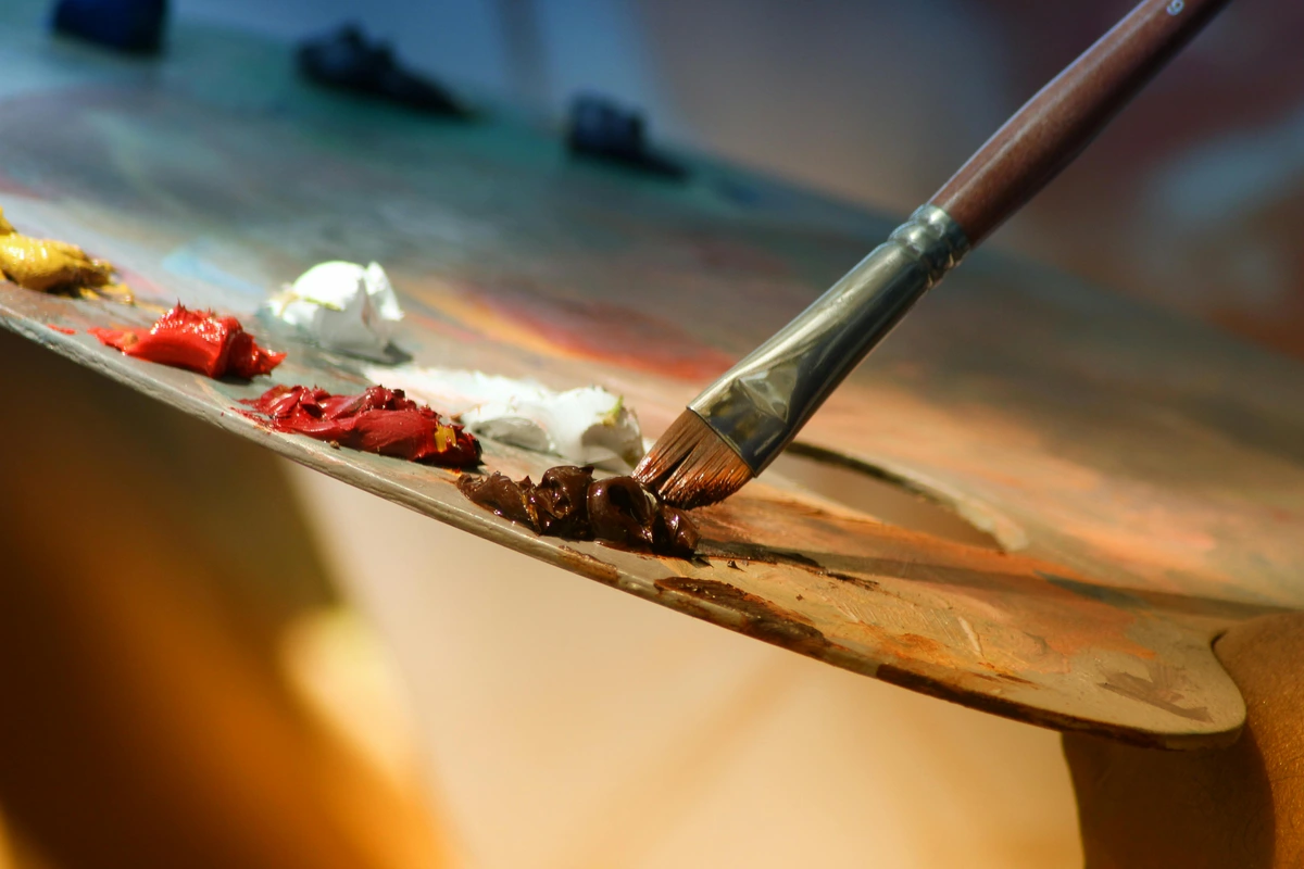
Dry Brush: Texture and Sparkle
Dry brush involves using a brush with very little water and a good amount of concentrated pigment, then dragging it lightly across the textured surface of your paper (this works especially well on cold press or rough paper). The paint catches only on the raised parts of the paper's 'tooth,' leaving the depressions untouched and creating a beautifully broken, textured effect. This technique is wonderful for evoking rough textures like weathered wood, ancient stone, distant foliage, windswept sand, or even the sparkle of light on water. It's a fantastic way to add immediate visual interest and tactile quality to your work without heavy layering. Experiment with different brush types – a stiff, flat brush can create sharp, linear textures, while a round brush can give you more irregular, organic marks. I often use dry brush for the sparkle on water or the delicate texture of distant foliage, adding an immediate sense of life and vibrant detail that truly pops. A stiff flat brush or even an older, splayed round brush can be surprisingly effective for dry brush, allowing you to drag the bristles across the paper’s tooth, creating those wonderfully broken, textured lines. It's a fantastic technique for adding immediate character and visual interest, especially when you want to suggest texture rather than render it precisely.
Table of Core Watercolor Techniques
Technique | Description | Best For | Key Characteristic |
|---|---|---|---|
| Flat Wash | Even layer of diluted color, uniform appearance without visible brushstrokes | Skies, backgrounds, large uniform areas, foundational layers | Smooth, consistent tone |
| Graded Wash | Smooth transition from dark to light or one color to another | Sunsets, atmospheric effects, gradual shading, building form | Gradual color/tone change |
| Variegated Wash | Two or more different colors into a single wash, blending organically | Vibrant backgrounds, multi-hued skies, abstract effects, organic blends | Interacting, flowing colors |
| Wet-on-Wet | Wet paint onto wet paper or a fresh, wet wash | Soft edges, blending, creating organic shapes, "happy accidents", luminous glows | Diffused, unpredictable flow |
| Wet-on-Dry | Wet paint onto dry paper or a completely dried layer of paint | Sharp edges, details, crisp lines, controlled layering (glazing), highlights | Defined, controlled lines |
| Dry Brush | Brush with minimal water, dragged lightly across textured paper | Rough textures (wood, stone), sparkling effects, broken lines, highlighting paper tooth | Textured, broken lines |
| Lifting | Re-wetting and gently removing dried paint (more effective with non-staining pigments) | Correcting mistakes, creating highlights, softening edges, subtle textures | Subtractive, subtle erasure |
| Masking | Applying masking fluid to protect areas from paint | Preserving precise whites, sharp edges for complex shapes, intricate details | Protective barrier |
| Salt Technique | Sprinkling coarse salt onto a wet wash | Creating star-like patterns, organic textures, frost effects, atmospheric texture | Textured, crystalline |
| Wax Resist | Drawing with a wax crayon or candle before painting | Preserving white areas, creating crackled textures, subtle patterns, resist effects | Repelling, defined outlines |
This expanded table offers a more comprehensive overview of foundational techniques, including essential additions like Variegated Wash and Masking, which are crucial for beginners to understand.
Lifting: The Art of Subtraction
Lifting in watercolor is the process of removing wet or dried paint from the paper to create lighter areas, highlights, or to correct mistakes. It's a subtractive technique, a wonderful contrast to the additive nature of painting. For wet paint, a clean, damp brush, sponge, or paper towel can gently blot away pigment. For dried paint, you'll need to re-wet the area with clean water and then gently dab or blot with an absorbent material. This technique is most effective with non-staining pigments, which sit more on the surface of the paper. Lifting can create soft, ethereal clouds, sparkling highlights on water, or even subtle textural effects in a landscape. It's the closest thing watercolor offers to an "undo" button, and mastering it provides an incredible amount of control and flexibility for corrections and creative effects. I often use lifting to soften the edges of a cloud or to pull out a delicate highlight on a wet leaf, allowing the white of the paper to shine through.
Layering (Glazing): Building Depth with Transparency
Layering, often referred to as glazing in its more refined application, involves applying multiple, thin, transparent washes of color, allowing each layer to dry completely before applying the next. This isn't just stacking colors; it's about building luminosity and depth. The magic happens as light passes through each transparent layer, picking up color, bouncing off the white paper, and reflecting back to your eye. This optical mixing creates rich, vibrant, and incredibly nuanced colors that cannot be achieved by mixing colors directly on the palette. Each subsequent glaze modifies the underlying color, creating complex hues and a wonderful sense of dimension. The key is extreme patience and very dilute washes; rushing will only lead to muddiness or lifting of previous layers. Glazing is fundamental for achieving that signature watercolor glow, allowing for subtle shifts in tone and color, and adding a profound sense of dimension to your work. I find the process of glazing to be deeply meditative, watching each transparent veil transform the painting with new richness and light.
You can learn even more about these foundational skills in our basic watercolor techniques for beginners guide.
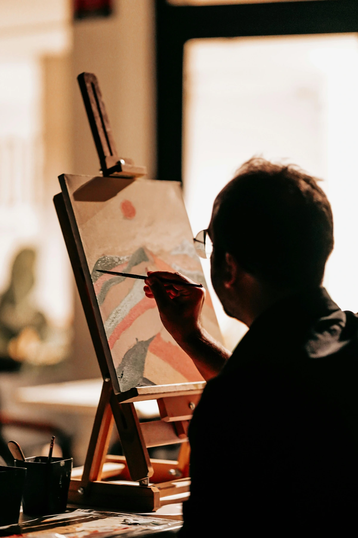
Choosing Your Colors: Palettes and Color Theory Basics
Ah, the glorious, sometimes overwhelming, world of color! It can feel like a vast ocean, but understanding a few basic principles of color theory will absolutely empower your watercolor journey. It’s not about memorizing rigid rules, but about understanding how colors interact, how they mix, and most importantly, how they make you feel. My own abstract work, for instance, often starts with an emotional resonance I want to convey, which then dictates my palette choices. You can explore this further in our guide on how artists use color, but let's dive into the fundamentals here.
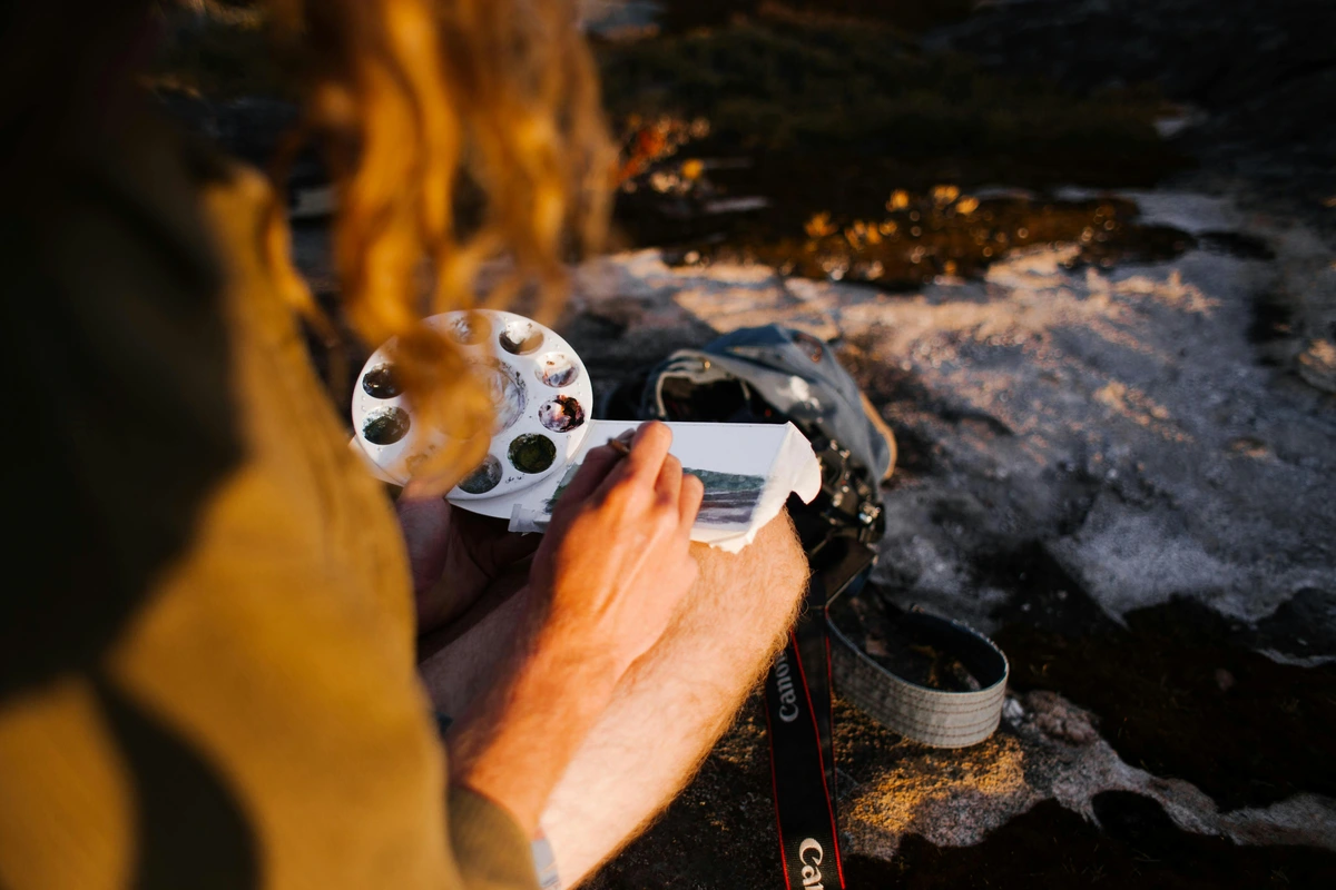
Hue, Saturation, and Value: The Three Dimensions of Color
Before diving into the fascinating world of color relationships, let's quickly define the three fundamental properties that describe any color – think of them as the DNA of a hue:
- Hue: This is what we typically mean by "color" – red, blue, yellow, green, etc. It's the pure, unadulterated spectrum color, like a primary red straight from the tube.
- Saturation (or Chroma): This refers to the intensity or purity of a color. A highly saturated color is vibrant, vivid, and bright, bursting with pigment. A desaturated color, on the other hand, is duller, more muted, and closer to gray. Think of a brilliant ruby red versus a muted, dusty rose – same hue, different saturation.
- Value (or Brightness): This is the lightness or darkness of a color, independent of its hue. A light sky blue has a high value, while a deep indigo has a low value. As we'll discuss, value is often the most critical element for creating compelling artwork, defining forms and creating contrast. Understanding these three dimensions gives you a precise vocabulary to describe and control your colors, much like a musician understands pitch, timbre, and volume in a symphony. For me, mastering these elements is like learning the secret language of light, allowing me to speak eloquently through my art, whether I'm aiming for the bold statement of pure hue or the subtle whisper of a desaturated tone.
The Color Wheel: Your Navigator in a Sea of Hues
You remember the color wheel from art class in school, right? That vibrant, circular diagram is an indispensable tool for understanding how colors relate and interact with each other. It's truly your navigator in the sometimes-choppy seas of hues! Primary colors (red, blue, yellow) are the foundational hues, the building blocks that can't be mixed from other colors. Secondary colors (orange, green, purple) are made by mixing two primaries. Tertiary colors are a mix of a primary and a secondary (e.g., red-orange, blue-green). Beyond these basic relationships, the color wheel helps us understand various harmonies and contrasts, guiding our choices for emotional impact and visual appeal:
Color Relationship | Description | Emotional Impact / Use |
|---|---|---|
| Warm Colors | Reds, oranges, yellows. These colors appear to "advance" in a painting. | Evoke energy, passion, warmth, intimacy, and often a sense of closeness. Use them to bring elements forward. They can create a sense of urgency, comfort, or even aggression. |
| Cool Colors | Blues, greens, purples. These colors appear to "recede" in a painting. | Suggest calm, distance, coolness, serenity, and can be used to push elements into the background. They often evoke feelings of peace, introspection, or melancholy. | | Cool Colors | Blues, greens, purples. These colors appear to "recede" in a painting. | Suggest calm, distance, coolness, serenity, and can be used to push elements into the background. | | Analogous Colors| Colors next to each other on the color wheel (e.g., blue, blue-green, green).| Harmonious, pleasing palettes with minimal contrast, sense of unity. I often turn to analogous palettes when I want to create a harmonious, serene mood in my abstract landscapes, allowing the colors to flow seamlessly into one another, much like the gentle transition of a sunset sky. | | Monochromatic | Different shades, tints, and tones of a single color. | Unified, sophisticated feel, subtle depth, focus on form and value. Painting monochromatically can be a fantastic exercise for understanding value, forcing you to rely solely on lightness and darkness to define forms and create interest, independent of hue. It's a sophisticated choice that speaks volumes with a restrained voice. | | Complementary Colors| Opposite each other on the color wheel (e.g., red and green, blue and orange).| High contrast, vibrant, can create striking focal points or rich neutrals when mixed. The dynamic tension between complementary colors can make a painting incredibly vibrant and energetic, drawing the eye to specific areas. I often use a tiny touch of a complementary color to make a dominant hue truly sing, creating a visual 'pop' that energizes the entire composition. | | Split Complementary| A base color and the two colors adjacent to its complement. | Offers a slightly softer contrast than direct complements, still vibrant. This scheme provides a rich color combination without the aggressive tension of direct complements, creating a more sophisticated and balanced vibrancy. It's a wonderful way to introduce variety and visual interest while maintaining a strong sense of harmony. | | Triadic Colors | Three colors evenly spaced on the color wheel (e.g., red, blue, yellow). | Vibrant, balanced palettes with strong contrast, dynamic, energetic. Think of the primary triad – red, yellow, blue – used in bold, expressive works. A triadic palette offers a lively, balanced energy that can be incredibly captivating, especially in abstract compositions where a sense of dynamic interplay is desired. It’s a powerful tool for creating impactful and memorable artwork. | | Tetradic Colors| Four colors forming a rectangle on the color wheel (e.g., blue, orange, red, green).| Rich, complex, varied, but can be challenging to balance, offers diverse moods. This complex scheme offers the widest range of color possibilities and can create incredibly rich, engaging, and multifaceted compositions. While it demands careful balancing to avoid chaos, a well-executed tetradic palette can convey a profound sense of depth and narrative, weaving together disparate hues into a cohesive visual tapestry. It's a true test of a colorist's skill and intuition. |

For more on how artists use color, check out our guide on how artists use color. Understanding these relationships is like learning the grammar of color, allowing you to speak eloquently through your art.
Complementary Colors: The Art of Dynamic Contrast
Complementary colors are those hues that are directly opposite each other on the color wheel (e.g., red and green, blue and orange, yellow and purple). This relationship is all about dynamic contrast and visual excitement! When placed next to each other, they create maximum contrast and vibrancy, making both colors appear more intense and lively – a tiny touch of a complementary color can make another color truly sing and pop off the page! However, the magic doesn't stop there. Mix them together, and they tend to neutralize each other, often leading to beautiful, muted grays, rich earthy browns, or deep, nuanced blacks – fantastic for believable shadows and subtle, complex tones. Understanding this dual nature can prevent accidental muddiness, or, conversely, empower you to create sophisticated shadow work and rich neutrals intentionally. You might also hear of split complementary schemes, where you use a base color and the two colors adjacent to its direct complement, offering a slightly softer yet still vibrant contrast.
Limited Palettes: Less is Often More
Especially for beginners, working with a limited palette (say, 3-6 colors) can be incredibly liberating and surprisingly educational. It forces you to explore the nuances of mixing, truly understand color relationships, and often leads to more harmonious and sophisticated paintings. My first "serious" watercolor efforts were with just a primary triad – perhaps a warm red (like Pyrrol Red), a cool blue (like Phthalo Blue Green Shade), and a mid-yellow (like Hansa Yellow Medium) – and I learned so much more about color mixing, saturation, and temperature than if I'd had 50 colors staring back at me. This approach encourages you to truly get to know your core pigments, pushing the boundaries of each and discovering a vast array of subtle variations you might otherwise overlook. It also dramatically simplifies decision-making, allowing you to focus more intently on form, value, and composition rather than getting lost in a sea of choices. For a classic primary triad, I often recommend a warm red (like Pyrrol Red or Cadmium Red Light), a cool blue (like Phthalo Blue Green Shade or French Ultramarine), and a mid-yellow (like Hansa Yellow Medium or Cadmium Yellow). Adding an earth tone (like Burnt Sienna) and a cool green (like Viridian) can expand your range even further without overwhelming you. This approach empowers you to truly get to know your core pigments, pushing the boundaries of each and discovering a vast array of subtle variations you might otherwise overlook, ultimately leading to more sophisticated and harmonious color mixes. For a deeper dive into how different hues affect a piece, explore the psychology of yellow in my art: joy, optimism, and light, the fiery heart: how red ignites passion and energy in my abstract compositions, or the soul of indigo: my personal connection to blue in abstract art.

The Power of Value: The Unsung Hero of Visual Impact
Beyond just color, understanding value is perhaps the single most critical element for creating compelling artwork – seriously, it's that important. Value refers to the lightness or darkness of a color, independent of its hue. Imagine taking a black and white photo of your painting; the different shades of gray you see represent the values. A strong range of values, from deep, resonant darks to sparkling, pristine whites, creates contrast, dimension, and a powerful sense of realism or drama. It's how you define forms, create a focal point, and lead the viewer's eye. My art teacher always said, "Value does the work, color gets the credit." And it's profoundly true! Focusing on value studies (painting in monochromes or creating quick thumbnail sketches to map out light and dark areas) can dramatically improve your watercolor skills, making your colorful pieces far more impactful and ensuring a strong underlying structure. You can explore more about this fundamental element in our definitive guide to understanding light in art. I often tell my students, "Value does the work, color gets the credit." And it's profoundly true! A strong value structure provides the underlying backbone, the architecture of your piece, ensuring visual impact even before the colors ignite. It's the silent force that commands attention, guides the eye, and builds the illusion of three-dimensional form on a two-dimensional surface.
Common Challenges & Troubleshooting for Watercolor Beginners: Navigating the Waters
Look, it's easy to get discouraged when you're starting out with watercolor. I certainly did, often ending up with a frustrated sigh and a crumpled piece of paper! Paper buckling, colors turning muddy, losing those pristine whites... it's all part of the learning curve, a rite of passage for every watercolorist. But here's the good news: with a few tips and a bit of understanding, you absolutely can overcome these common hurdles. Remember, every artist, no matter how experienced, has faced these initial struggles. It's through navigating them that you truly grow, develop your unique artistic voice, and forge a deeper connection with this captivating medium!

Muddy Colors: The Arch Nemesis
This is probably the most common complaint for watercolor beginners, and it's certainly one I wrestled with! Muddy colors usually happen when:

- Overworking: Too many brushstrokes, especially when the paint is still wet, can churn pigments together into an indistinct mess. Watercolor thrives on fresh, clean applications. Learn to lay down a wash and leave it alone until it's dry. Patience is your secret weapon here. Resist the urge to poke and prod a drying wash! Once a wash starts to lose its sheen, stepping away is often the best choice; trying to 'fix' it while it's semi-dry almost guarantees a muddy mess or an unwanted bloom.
- Dirty Water: Using the same water to rinse your brush and mix new colors. Remember my "two water containers" tip? It's a lifesaver. Always have one for the initial rinse, and one for clean water to dilute and mix. Your colors will thank you, and your paintings will sing!
- Mixing Too Many Pigments: Sticking to a limited palette and understanding complementary colors helps immensely. Mixing more than 3-4 pigments often leads to dullness, especially if those pigments are complex convenience mixes themselves. Remember, each pigment brings its own unique qualities, and combining too many can quickly become a recipe for visual chaos. Keep it simple, let the water do the blending, and avoid over-stirring your palette. Sometimes, less is truly more when it comes to vivid color and clarity. Understanding how pigments interact on the color wheel, particularly complementary colors, is key to avoiding accidental muddiness and creating rich, nuanced grays and browns intentionally. I often keep a separate, small "mud palette" for those intentional, complex neutrals, ensuring they don't inadvertently contaminate my vibrant main mixes. It's a simple organizational trick that saves a lot of frustration!
Buckling Paper: The Wavy Wonder
Ah, the dreaded paper buckle! When lighter weight paper (typically under 140 lb/300 gsm) gets wet, it absorbs water unevenly and its cellulose fibers swell, causing it to wrinkle, warp, or buckle, creating frustrating ridges and valleys. If these fibers aren't uniformly constrained, they expand and contract unevenly – a bit like a damp piece of cloth that curls as it dries. It's a common headache for beginners, often making the paper feel unworkable, but thankfully, there are reliable solutions. Don't let a wavy surface get you down!
Paper Pilling: When Your Paper Starts to Fray
Have you ever found tiny, fuzzy bits of paper rolling up under your brush, almost like lint? That’s paper pilling, and it’s an incredibly frustrating experience that signifies the paper fibers are breaking down. This usually happens for a few reasons:
- Overworking the Surface: Too much scrubbing, lifting, or aggressive brushwork on a single area, especially when the paper is damp or re-wetted, can abrade the surface and cause the fibers to lift. Watercolor paper is designed to be delicate and transparent; it's not meant for heavy scrubbing.
- Poor Quality Paper: Student-grade or wood pulp papers, with their shorter, weaker fibers, are far more prone to pilling than high-quality 100% cotton rag paper. The robust, long fibers of cotton paper can withstand much more manipulation.
- Insufficient Sizing: Paper with too little sizing (the internal and external treatment that controls absorbency) will be weaker and more susceptible to pilling when wet.
Solution: The best prevention is to use high-quality, 100% cotton paper with good sizing and to approach your painting with a light touch. Avoid excessive scrubbing or re-wetting an area repeatedly, especially if it’s already started to dry. If pilling does occur, try to gently remove the loose fibers once the paper is completely dry, but be careful not to damage the surface further. Sometimes, you just have to accept it as part of the learning process and move on to a fresh sheet of paper, taking the lesson with you. For me, pilling is usually a strong indicator that I'm either using the wrong paper for the technique or being too aggressive with my brush – a valuable signal to adjust my approach.
- Solution 1: Use Heavier Paper. The simplest and often most effective solution is to consistently use heavier paper (140 lb/300 gsm or even 300 lb/640 gsm). These heavier papers have more body, contain more and often longer fibers, and are designed to handle significant amounts of water without warping. The investment is absolutely worth it for the peace of mind, as it greatly reduces the distraction of an uneven surface and allows you to focus purely on your painting.
- Solution 2: Stretch Your Paper. This involves thoroughly wetting the paper, taping (using gummed paper tape or painter's tape) or stapling it to a rigid, non-absorbent surface (like a drawing board, Masonite, or Gatorboard), and letting it dry taut. It's a bit of extra work upfront, but it prevents buckling entirely and provides a perfectly flat surface to work on, especially for large, wet washes. Once dry, your paper will be drum-tight and ready for anything you throw at it (or rather, paint on it!). Alternatively, consider using watercolor blocks, where the paper is already glued on all four sides, holding it taut as it dries. You just paint directly on the top sheet, and once dry, you use a palette knife or thin blade to separate it from the block. For traditional stretching, you fully immerse your paper in water (or wet it thoroughly with a sponge), lay it flat on a rigid board, blot off excess water, and then secure all four edges with archival gummed paper tape. As it dries, the paper shrinks and pulls taut, creating a drum-like surface that will remain flat during painting. This process, while seemingly tedious, offers unparalleled control and a smooth, unblemished surface that allows your washes to truly sing. It's a foundational skill for serious watercolorists, eliminating one of the most common frustrations and freeing you to focus purely on your art.
Losing Your Whites: The Irretrievable Light
Once you paint over a white area in watercolor, especially with staining pigments, it's incredibly difficult to get that pure, luminous white back. This is why watercolorists often talk about "preserving the white of the paper" as a core principle. It means consciously deciding which areas will remain unpainted to serve as highlights or the primary light source. This is one of the biggest mental shifts from opaque painting, where you can simply paint white over dark; in watercolor, the white of the paper is your light source, and once it's covered, that brilliant luminosity is challenging to recover.
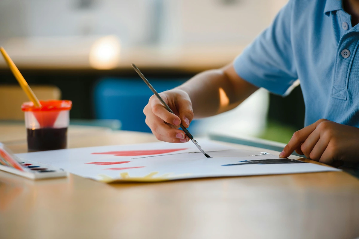
- Solution: Plan ahead, my friend! Before you even touch paint to paper, identify and mentally (or lightly sketch) the areas you want to keep white. This forethought and planning is a cornerstone of successful watercolor painting. Embrace negative space!
- Solution: Use masking fluid (a liquid frisket) to temporarily protect areas you want to remain white. Apply it precisely, let it dry completely, paint over it with your washes, and then gently remove it once your watercolor is dry. It's a fantastic tool for crisp highlights, intricate details, or protecting complex shapes.
- Solution: Practice lifting (as we discussed in the techniques section) for small adjustments and subtle highlights. While it won't restore pure white from a heavily painted area, it can effectively lighten values and create subtle highlights where needed. For those truly sparkling, pinpoint highlights that got lost in the painting process, sometimes a tiny touch of opaque white gouache or a white gel pen can be a last-resort 'cheat,' but use it sparingly and intentionally to maintain the watercolor feel! I've found that pre-planning my whites meticulously, almost like carving out the light, is one of the biggest mental shifts in watercolor. It forces a more considered, thoughtful approach to composition and light, making the final luminosity even more rewarding.
Uneven Washes: The Streaky Surprise
If your washes are patchy or streaky, preventing that smooth, even coverage, it's usually due to:
- Not enough water/pigment: Your brush might be too dry, or the mix on your palette isn't consistent enough. Make sure your brush is fully loaded with a juicy, consistent mixture of paint and water – you want it to feel generous, not parched! A brush that's too dry will leave frustrating streaky marks and uneven pigment distribution, completely disrupting the smooth flow of your wash. I've certainly had my share of washes that looked like they were applied by a very tired person with a tiny brush and no water!
- Uneven surface wetness: The paper might not be uniformly damp (if you're pre-wetting), or you're working on an uneven incline, causing the paint to pool in some areas and dry too quickly in others. A slight, consistent tilt to your painting surface can actually help gravity pull the wash evenly, preventing those pesky hard edges. Also, always consider the ambient humidity; in very dry environments, washes dry incredibly fast, making smooth transitions challenging. In contrast, very humid conditions can extend drying times dramatically, giving you more working time but also potentially leading to excessive bleeding if not managed carefully.
- Working too slowly: For large washes, you need to work fairly quickly and consistently, overlapping strokes while the previous stroke is still wet, to maintain a continuous "wet edge." Once an edge dries, trying to blend into it will almost always leave a harsh line. Practice makes perfect with this one! Developing a confident, swift, and continuous stroke is key to achieving seamless washes. It's a bit like learning to ice a cake – you need a consistent hand and good coverage from the start. I often practice washes on scrap paper before committing to my main piece, getting a feel for the day's humidity and how quickly the water is moving. Remember, a little tilt to your board, a generously loaded brush, and swift, confident strokes are your allies in the quest for smooth, luminous washes.
Washed-Out Colors: When Vibrancy Fades
Sometimes, your colors might look beautiful on the palette, but once on paper, they appear pale and lack vibrancy. This can be incredibly disheartening, especially when you're aiming for those rich, glowing watercolors. I've often felt a pang of disappointment when my brilliant mixtures dry to a shadow of their former selves – it's a common hurdle, but one with solutions.
- Solution: Pigment to Water Ratio. The most common culprit is simply too much water for the amount of pigment. Remember, watercolor's transparency means light passes through; if there's not enough pigment, the color will appear diluted and weak. Try using a more concentrated mix of paint, especially for initial layers or focal points. Gradually add water as needed to achieve the desired consistency, rather than starting with a very watery mix. Your goal is often a rich, milky consistency, not watery tea!
- Solution: Build in Layers. Instead of trying to achieve full intensity in one go, build up your colors with multiple thin, transparent glazes. Each dry layer will add depth and vibrancy without losing the luminosity of the medium. Patience is truly a virtue here; allow each layer to dry completely before applying the next. Be mindful of your environment too; very dry air can cause washes to dry too quickly, sometimes resulting in a less vibrant, 'chalky' appearance, while high humidity can make drying frustratingly slow, demanding even more patience.
- Solution: Quality of Paint and Paper. As we discussed earlier, student-grade paints often have lower pigment loads and can appear less vibrant. Similarly, highly absorbent, poorly sized paper can literally drink up the pigment, leaving a dull, lifeless finish. Investing in artist-grade paints and good quality, properly sized watercolor paper will significantly enhance the vibrancy of your colors and make your efforts shine. Don't underestimate the power of good materials! I've seen countless beginners blame themselves for 'dull' colors when the culprit was actually student-grade paint or poorly sized paper. Investing in artist-grade supplies can truly unlock the full, vibrant potential of watercolor, making your artistic efforts shine with the luminosity they deserve.
Unwanted Blooms or Cauliflowers: Those Feathery Edges
We touched on these earlier, but they're such a common frustration for beginners that they deserve a dedicated troubleshooting spot. Blooms (also called backruns or cauliflowers) occur when fresh, wetter paint or clean water is introduced into a wash that is partially dry but still damp. The new moisture pushes the pigment at the edge, causing it to concentrate and form that characteristic feathery outline. This can be jarring if you're aiming for a smooth sky, but a gift if you're trying to create organic textures. I've certainly battled these unintended blossoms, only to later embrace their unexpected beauty in a happy accident!
- Solution 1: Ensure Full Wetness or Full Dryness. The most reliable way to prevent unwanted blooms is to ensure a wash is either completely wet (for wet-on-wet techniques where you want intentional mingling and softness) or completely dry (for wet-on-dry layering and crisp edges) before adding more paint or water. Let each layer dry thoroughly! You can use a hairdryer on a cool, low-speed setting to speed this up, but be cautious not to dry too quickly or too close, which can sometimes create harsh edges or push pigments.
- Solution 2: Control Your Water. Don't overload your brush with water when adding it to a damp area. Blot excess water from your brush on a paper towel before re-entering a wash. The less excess water introduced into a semi-dry area, the less likely a bloom will occur. Think of your brush as a controlled dispenser, not a free-flowing faucet.
- Solution 3: Embrace Them! If a bloom happens, sometimes the most artistic solution is to integrate it into your painting as a textural element. Turn that 'mistake' into a happy accident! I've certainly had many unintended blooms that transformed into beautiful clouds, tree foliage, or abstract patterns. Learning to work with them is part of the watercolor journey. You can even intentionally create small blooms by touching a clean, damp brush or a droplet of water to a drying wash, yielding beautiful, organic patterns for clouds, foliage, or abstract textures. It’s about turning a perceived 'mistake' into an artistic opportunity and letting the medium surprise you! I've had many unintentional blooms that I've managed to integrate into the landscape, transforming a 'flaw' into an interesting textural element. Learning to either control them or incorporate them gracefully is a subtle art that speaks volumes about your growing understanding of the medium.
Don't let these challenges deter you. Every artist, no matter how experienced, has faced them. It's through overcoming them that you truly grow and refine your approach! Think of each challenge as an opportunity to deepen your understanding of this captivating medium.
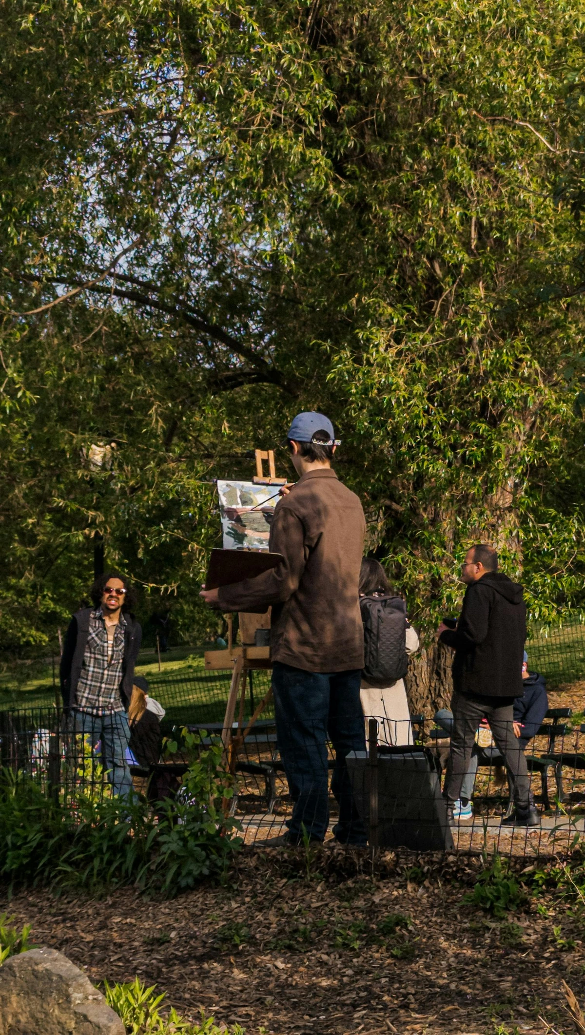
Advanced Watercolor Techniques: Expanding Your Creative Horizon
Once you've got a handle on the basics, and you're feeling more confident with the fluid nature of watercolor, the medium truly opens up into a playground for experimentation. These advanced techniques aren't just for seasoned pros; they can add incredible depth, texture, and unexpected beauty to your work, pushing your creative boundaries. While this is just a quick peek into a vast world, remember the joy is always in the exploration! Don't be afraid to combine them, break the 'rules,' and discover your own unique applications and artistic voice. Experimentation, after all, is truly the mother of innovation in art.
Glazing: The Art of Building Luminous Depth
We touched on layering earlier, but glazing as an advanced technique takes that concept to a whole new level of intentionality and sophistication. It involves applying multiple, very thin, transparent washes of color, allowing each layer to dry completely before applying the next. The magic of glazing lies in the optical mixing that occurs; the light passes through each transparent layer, reflecting off the white paper beneath, creating a luminous depth and rich, vibrant colors that cannot be achieved by mixing colors directly on the palette. It's a slow, meditative process that builds incredible intensity and subtle color shifts, perfect for rendering complex shadows, luminous skin tones, or the ethereal quality of distant landscapes. The key is extreme patience and very dilute washes; rushing will only lead to muddiness. Think of it like building up layers of colored glass, each adding to the overall brilliance and complexity of the stained-glass window. This technique is fundamental for achieving that signature watercolor glow and a profound sense of dimension.### Negative Painting: Defining by What's Not There
This is a truly magical technique that can feel counter-intuitive at first, but yields stunning results. Instead of painting the subject directly, you paint around it, defining its shape by painting the background or surrounding elements. It’s like carving out your subject with color and light, revealing its form through the absence of paint, creating incredibly luminous and layered effects. This is especially beautiful for dense foliage, intricate flowers, or complex patterns where you want multiple layers of detail to subtly show through. It forces you to see shapes in a new, indirect way, which can be a wonderful exercise for your artistic eye and spatial reasoning. This layered approach creates a wonderful illusion of depth and can be incredibly impactful for creating intricate natural forms and a sense of atmosphere.
Spattering: Adding Dynamic Texture
Remember those childhood days flicking paint? Watercolor spattering is a more controlled, artistic version of that joyful abandon! Load a brush with diluted paint, then tap the brush against another finger or object, flick it, or use a finger to run across the bristles, sending tiny droplets of color onto your paper. This creates a lively, textured effect, perfect for stars in a night sky, subtle rain, falling snow, or adding an organic, unpredictable texture to a landscape or abstract piece. Experiment with different brush types (a stiff toothbrush works wonders!) and levels of dilution for varied results. You can control the size of the spatters by adjusting the wetness of your brush and the distance from the paper. For fine, misty spatters, use a very wet brush held further away; for larger, more defined drops, use a less wet brush held closer or flick it more vigorously. You can also mask off areas with paper or masking fluid to control precisely where the spatters land, creating dynamic and focused textures.
Dropping in Color: Harnessing the Wet Flow
This technique involves carefully dropping concentrated, wet pigment into an already wet wash or onto damp paper. The magic here is that instead of mixing colors thoroughly on the palette, the hues bloom and blend directly on the paper, creating beautiful, soft transitions, ethereal effects, and organic shapes. It's fantastic for vibrant, atmospheric skies, dynamic landscapes, or abstract backgrounds where you want colors to flow into each other naturally and unpredictably. The key is understanding the precise wetness of both the paper and your brush – too dry, and you'll get unwanted hard edges; too wet, and the color will dissipate too much, becoming pale. It's a delicate balance that allows the colors to mingle freely without either dissolving completely or creating hard, unblended edges. It's a wonderful way to achieve a spontaneous, fresh, and truly watercolor-specific look. I often use this to create the soft, shifting clouds in my landscapes, letting the colors gently ebb and flow.
Scratching (Sgraffito): Adding Fine Detail and Highlights
Sgraffito (Italian for 'to scratch') in watercolor involves scratching into damp or dry paint to reveal the white of the paper underneath or previous layers of color. You can use the back of a brush handle, the edge of a palette knife, a fingernail, or even a dedicated scratching tool. This technique is fantastic for creating incredibly fine lines like individual strands of hair, whiskers, delicate grass blades, the sparkling texture of water, or subtle textures in stone or weathered wood. It's a powerful subtractive method that adds brilliant highlights and intricate details that are often difficult to achieve with a brush alone. Be mindful of the paper, though; too much scratching can damage the surface, especially with lighter-weight or poorly sized papers, leading to pilling. It's a technique best used with a delicate hand and on sturdy, cotton-rag watercolor paper, which can withstand the slight abrasion much better. Tools like a palette knife edge, the blunt end of a paintbrush, or specialized sgraffito tools can be used to achieve varied effects. For me, sgraffito is a secret weapon for adding that final sparkle to water or the delicate texture of a bird's nest.
Monoprinting / Transferring: Accidental Beauty
This fascinating technique involves creating a one-of-a-kind print using watercolor. You can paint a design onto a non-absorbent surface (like a glass plate, plastic sheet, or even glossy paper) with watercolor. While the paint is still wet, gently press a piece of watercolor paper onto the painted surface, and then carefully peel it away. The result is a unique, often soft and diffused, print or transfer of your original design. The magic lies in the unpredictable nature of the transfer, often creating beautiful textures, broken lines, and accidental blends that are impossible to achieve with direct brushwork. It's a fantastic way to generate interesting backgrounds, abstract patterns, or unique textures for mixed media work. I love how monoprinting forces me to relinquish some control, leading to wonderful surprises and a more intuitive approach to texture and form. Each print is truly a unique discovery, impossible to replicate exactly.
You've poured your heart into a watercolor painting, and you want it to last! Unlike oils or acrylics, watercolor can be a bit more delicate, so understanding how to care for it is crucial. These steps ensure your beautiful work endures for years to come, allowing future generations to appreciate your luminous creations.
Lightfastness: The Silent Fader
We mentioned lightfastness earlier when discussing pigment quality and characteristics, but it bears repeating – and reinforcing – because it's that vital for the longevity of your artwork. Pigments that aren't lightfast will fade over time, sometimes dramatically, especially with prolonged exposure to sunlight or even ambient room light. Imagine pouring your heart and soul into a painting, only to see its vibrancy slowly disappear, fading into a ghost of its former self! Always choose artist-grade paints with good lightfastness ratings, typically indicated by the ASTM (American Society for Testing and Materials). ASTM ratings are usually I (Excellent), II (Very Good), III (Fair), or IV (Poor). Many manufacturers also use a star system (*** Excellent, ** Very Good, * Fair). For any artwork you intend to keep, exhibit, or sell, always aim for ASTM I or II (or three-star/two-star ratings) to ensure its longevity. I simply cannot stress enough how important this is. Don't compromise on lightfastness if you want your art to be truly archival. It’s a silent destroyer of art, slowly diminishing the vibrant colors you painstakingly applied, often without you even noticing until it's too late.
ASTM Lightfastness Rating | Description | Expected Longevity (Museum Conditions) |
|---|---|---|
| I (Excellent) | Retains original color for 100+ years | Highest archival quality |
| II (Very Good) | Retains original color for 50-100 years | High archival quality |
| III (Fair) | May show noticeable fading in 20-50 years | Not recommended for permanent artwork |
| IV (Poor) | May show noticeable fading in under 20 years | Avoid for any serious artwork |
Framing: Protection from the Elements
Once your watercolor painting is complete, and you're thrilled with the result, proper framing is absolutely crucial for its long-term preservation. Watercolor paintings should always be framed under glass to protect them from dust, humidity, and atmospheric pollutants that can cause deterioration. Even better, opt for UV-protective glass or acrylic to filter out harmful ultraviolet rays, further safeguarding your artwork from fading over time. Always use acid-free mats and backing boards to prevent discoloration of your paper over time (acidic materials can cause unsightly yellowing or browning), and ensure they are spaced away from the glass with a mat or spacers to prevent moisture buildup or the artwork sticking to the glass itself. And, as mentioned with lightfastness, direct sunlight is the enemy – hang your beautiful pieces where they won't be constantly bathed in harsh UV rays from a window. Proper, archival framing is the final, essential step in ensuring your watercolor masterpiece stands the test of time, a legacy for years to come. If you're unsure about archival framing practices, consulting with a professional framer is always a wise investment to protect your treasured artwork. I consider archival framing to be the final, crucial step in completing a watercolor piece; it's the protective embrace that safeguards your delicate work from the ravages of time and environment. Proper framing doesn't just display your art; it preserves it.
Storage: Keep it Flat and Dry
For unframed watercolors, proper storage is just as important as proper framing, protecting your efforts until they find their permanent home. They should always be stored flat in an acid-free portfolio or archival box, ideally separated by acid-free tissue paper or glassine sheets to prevent them from sticking to each other or pigments transferring. Avoid rolling them, as this can crack the paint or paper, especially if the layers are thick. Most importantly, keep them in a stable, dry environment away from direct sunlight, extreme temperature fluctuations, and high humidity, which can encourage insidious mold growth or cause the paper to warp. Think of them as precious paper artifacts – because that's exactly what they are! Your future self, and anyone who enjoys your art, will thank you for taking these simple but crucial precautions. High humidity can lead to mold and mildew, while extreme temperature fluctuations can cause the paper to expand and contract, potentially damaging the delicate paint layers. I always advise storing unframed pieces in flat, acid-free archival boxes, interleafed with acid-free tissue. This seemingly simple act is a profound investment in the longevity of your artwork, protecting it from physical damage and environmental degradation until it finds its permanent home or is presented to the world.
A Brief History of Watercolor: Tracing its Luminous Path from Ancient Times to Modern Masterpieces
While my own journey with watercolor began relatively recently with a simple pan set, the history of this luminous medium stretches back centuries, evolving from a functional tool to a revered art form, influencing cultures across the globe.
Watercolor has deep roots in ancient Egypt, where pigments were mixed with a binder (like egg yolk or animal glue) and applied to papyrus for murals and texts, often for religious or ceremonial purposes. Ancient Chinese painting, dating back thousands of years, also utilized water-based pigments, developing incredibly sophisticated techniques with ink and color on silk and paper. These traditions, particularly in China and Japan, often emphasized a spiritual and philosophical connection to nature, and a mastery of expressive brushstrokes to achieve breathtaking landscapes, intricate botanical studies, and flowing calligraphy. In medieval Europe, it was extensively used for illuminating manuscripts, scientific illustrations, and cartography, valued for its precision, subtle color, and portability for traveling scholars, playing a crucial role in documenting the world.
But the true rise of watercolor as an expressive, standalone medium in the Western world often begins in the Renaissance. Artists like Albrecht Dürer used it for detailed botanical and wildlife studies, demonstrating its capacity for intricate rendering and observations of the natural world, often capturing the ephemeral beauty of flora and fauna with unprecedented accuracy. Later, the 18th and 19th centuries saw its golden age, particularly in England, where it was championed by the Royal Watercolour Society, evolving from a preparatory sketch tool to a respected art form. Artists like J.M.W. Turner pushed the boundaries of the medium to astonishing effect, creating dramatic, atmospheric landscapes that challenged the dominance of oil painting, showcasing its emotive power and ability to capture light and weather with incredible immediacy. Other significant figures include Thomas Girtin, known for his grand topographical landscapes, and later John Singer Sargent, whose fluid and masterful brushwork in watercolor is still revered for its immediacy, brilliance, and bold compositions, making it seem effortless. It became an increasingly popular choice for capturing fleeting moments, travel sketches, and detailed natural history illustrations. Its practicality, portability, and quick drying time made it perfect for artists working en plein air (outdoors), capturing landscapes directly from nature, a concept you can read more about in our article on what is plein air painting.
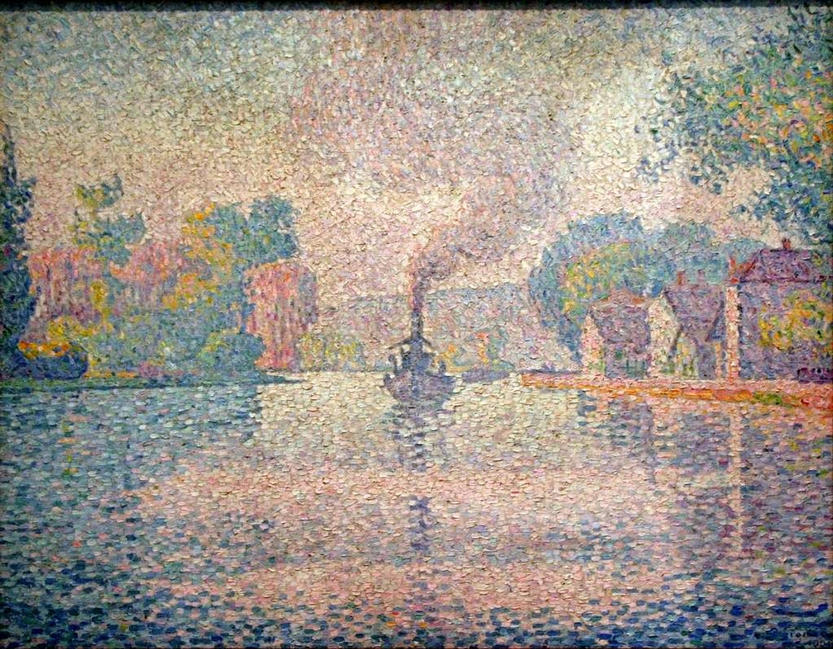
Today, watercolor continues to be a vibrant and versatile medium, embraced by artists around the globe, from traditional landscapes and realistic portraits to bold, abstract expressions, and cutting-edge contemporary mixed media works. It's truly a testament to its enduring appeal that a medium so seemingly simple can hold such profound artistic depth, constantly inviting new interpretations and pushing the boundaries of what's possible.
Salt and Alcohol Effects: Unpredictable Textures
This is where true experimentation comes into play! By introducing common household items to wet watercolor washes, you can create utterly unique and unpredictable textures.
- Salt Technique: Sprinkle coarse table salt or sea salt onto a wet, glistening wash (the timing is crucial – too wet, and it will dissolve; too dry, and it won't react). As the salt crystals absorb the water, they push the pigment away, creating beautiful, star-like patterns, delicate frosty textures, or organic bursts of lighter color. Once the wash is completely dry, simply brush off the salt crystals to reveal the fascinating texture beneath. It's fantastic for snow, distant foliage, abstract backgrounds, or even the texture of ancient stone.
- Alcohol Effects: Dropping isopropyl rubbing alcohol (or even clear spirits) into a wet wash can create striking, organic 'resist' patterns. The alcohol repels the water and pigment, pushing it away to create fascinating cellular textures, bubbles, or abstract rings. Different concentrations of alcohol will yield different effects, from subtle blooms to dramatic reticulated patterns. Both salt and alcohol techniques require a bit of experimentation to master the timing and desired effect, but they offer truly exciting ways to add unexpected texture and visual interest to your work, embracing the unpredictable nature of watercolor. I often use salt to create the sparkle of snow on a winter landscape, and alcohol to add a sense of otherworldly texture to abstract compositions. From delicate, atmospheric washes to vibrant, expressive strokes, watercolor remains an incredibly powerful tool for artistic communication. You can even see how historical art movements, like those explored in this pointillist painting by Paul Signac, hint at the precise yet luminous qualities that watercolor artists strive for. Although not watercolor itself, Signac's work shares that pursuit of light and color that resonates deeply with watercolor's core identity, demonstrating that the pursuit of light and color transcends specific mediums and eras. Its adaptability continues to inspire contemporary artists to explore new frontiers, proving that this ancient medium is anything but static.
Watercolor vs. Other Mediums: A Comparative Glance at Creative Tools
You might be wondering how watercolor stacks up against its more opaque cousins, like oil paint and acrylic paint. And that's a perfectly natural question! Each medium offers a unique experience, a distinct set of characteristics, and understanding their differences can profoundly help you choose the right tool for your artistic vision. It's not about one being 'better' than another, but rather about aligning the medium's inherent properties with your creative goals and preferred working style. I see them all as different languages, each capable of telling incredible, diverse stories, and each with its own beautiful nuances.### Table: Watercolor vs. Oil vs. Acrylic
Feature | Watercolor | Oil Paint | Acrylic Paint |
|---|---|---|---|
| Transparency | Highly transparent (luminosity from paper), built in layers | Opaque to translucent (can be layered opaquely or thinly for glazes) | Opaque to translucent (can be thinned significantly for washes or used thickly) |
| Drying Time | Fast (minutes), can be sped up with hair dryer | Very Slow (days to weeks), requires good ventilation, can be extended | Fast (minutes), can be extended with mediums/retarders, permanent once dry |
| Solvent/Clean-up | Water (easy cleanup, generally non-toxic) | Turpentine, mineral spirits (fumes, chemical cleanup, often toxic) | Water (easy cleanup when wet), permanent once dry, generally non-toxic |
| Supplies Needed | Paper, brushes, water, paints (minimal setup) | Canvas, brushes, solvents, oils, paints, palettes (more extensive setup) | Canvas/various surfaces, brushes, water, paints, mediums (versatile setup) |
| Portability | Excellent (especially pan sets), minimal equipment, ideal for travel | Moderate (can be messy with solvents, more equipment to transport) | Good, many portable options available, less messy than oils |
| Blending | Excellent (wet-on-wet for soft, unpredictable blends; layering for depth) | Excellent (long open time allows for seamless blending, wet-into-wet) | Good (fast drying can make blending challenging without retarders); layered blending possible |
| Corrections | Limited (some lifting possible, transparency makes covering difficult) | Easy to overpaint or scrape off, very forgiving and flexible | Easy to overpaint or remove when wet, permanent once dry, less forgiving than oils |
| Archival Qualities | Excellent with artist-grade, lightfast paints, acid-free paper, proper framing | Excellent with artist-grade paints and proper care, historically proven | Excellent with artist-grade paints and proper care, modern and durable |
| Characteristic | Luminous, delicate, fluid, unpredictable, light-driven, ethereal | Rich, vibrant, textural, deep, blendable, classic, traditional | Versatile, bold, dries permanently, can mimic oils or watercolors, flexible, durable |
| Primary Support | Watercolor paper | Canvas, wood panels | Canvas, wood, paper, fabric, various primed surfaces |
| Cost (Beginner) | Low to Moderate | Moderate to High | Low to Moderate |
| Learning Curve | Moderate to High (requires understanding of water control) | Moderate (can be slow due to drying time) | Low to Moderate (fast drying can be a challenge) |
| Safety | Generally Non-Toxic | Can involve toxic solvents, proper ventilation needed | Generally Non-Toxic, some pigments may be hazardous |
You can dive deeper into the world of different paint types with our definitive guide to paint types for artists. Each medium has its own unique personality, its own strengths, and its own challenges. The choice often comes down to the effect you want to achieve and the working process you enjoy most. Knowing these distinctions can save you a lot of frustration and open up new avenues for artistic expression, allowing you to choose the perfect tool for your creative vision. One significant difference often overlooked by beginners is the safety and environmental impact of these mediums. Watercolor, with its primary solvent being water, is generally the most non-toxic and environmentally friendly, a factor increasingly important to many artists. Oil paints often require solvents like turpentine or mineral spirits, which produce fumes and necessitate special disposal. Acrylics, while water-soluble when wet, are plastic-based and can have environmental considerations regarding microplastic waste. This environmental consciousness often influences an artist's long-term material choices, myself included, aligning creative practice with broader ethical considerations.
Watercolor in Mixed Media: A Versatile Collaborator
One of the most delightful and exciting aspects of watercolor is its incredible versatility and willingness to play exceptionally well with other mediums. Far from being a solitary pursuit, watercolor is a fantastic foundation or a brilliant complement for mixed media artwork, allowing artists to layer different textures, opacities, and effects to create truly unique and complex pieces. This is where your creativity can truly run wild, combining the best of different worlds!
Pairing with Pen and Ink
This is a classic, timeless combination that I personally adore. Many artists use waterproof ink (often with fine-liner pens, dip pens, or even brush pens) to lay down crisp line work, defining shapes, contours, and intricate details. Then, transparent watercolor washes are delicately applied over or around the ink lines, adding vibrant color and soft atmosphere without obscuring the intricate drawing. This creates a wonderful blend of precision and fluidity, commonly seen in urban sketching, scientific and botanical illustrations, graphic novels, and expressive figure drawing. The crispness of the ink provides structure and anchor points, while the washes bring life, light, and atmosphere, creating a dynamic interplay. Traditional Indian ink is a popular choice for its deep black and permanence, but modern waterproof colored inks also open up a vibrant world of possibilities.
Combining with Colored Pencils
Colored pencils are another fantastic partner, offering a surprising amount of versatility when combined with watercolor. They can be used effectively both before or after watercolor washes. Applied lightly before washes, they can add subtle texture that shows through the transparent paint, creating a lovely undertone or a delicate resist effect. Used after the watercolor has dried, they're perfect for adding fine details, sharpening edges that might have softened, building up deeper shadows and richer values, or adding intricate patterns and textures that would be difficult to achieve with a brush alone. It's an excellent way to regain some control and add precision to softer watercolor effects, allowing for a layered depth that is both painterly and illustrative. I often reach for them to add delicate textures or intensify a shadow after my washes are complete, building up multiple layers of color for subtle shifts in hue and value and a rich, nuanced finish.
Integrating with Gouache: Opaque Power
Gouache is often wonderfully called "opaque watercolor" because it shares the same binder (gum arabic) but has a higher pigment load and often includes an opacifying agent (like chalk or titanium white). This makes it beautifully matte and opaque, crucially allowing you to paint light over dark – something usually impossible with traditional transparent watercolor. It's a fantastic companion for adding crisp highlights, bold lettering, or solid, matte details on top of your transparent washes, effectively bridging the gap between watercolor and acrylics in terms of opacity. You can think of it as your secret weapon for those precise, bright accents or strong, flat color areas that pure transparent watercolor struggles to achieve. Its matte, velvety finish also contrasts beautifully with the luminosity of transparent watercolor, adding another textural and visual dimension to your work. For more, check out our reviewing the best gouache sets for beginners. I often use it to pop a highlight or create a strong, flat shape over a soft watercolor background, really making elements sing. It's like having a spotlight you can turn on exactly where you need it.
White Gel Pens and Opaque Inks: The Final, Luminous Touches
For those truly sparkling, pinpoint highlights that are hard to preserve with masking fluid or achieve with lifting alone, a white gel pen or opaque white ink can be an absolute godsend. Applied after your watercolor is completely dry, these tools allow for bright, crisp details like the glint in an eye, fine reflections on water, or tiny stars in a night sky. They offer a level of precision and brilliance that can truly make elements pop, acting as that final, magical punctuation mark on your artwork. I find them indispensable for adding the tiniest glint in an eye, the sparkle of morning dew, or the distant twinkle of city lights – those micro-details that would be nearly impossible to preserve or create with transparent washes alone. They are the finishing touches that can transform a good painting into something truly captivating, adding a touch of unexpected brilliance.
Mixed Media Magic: Pairing Watercolors
Medium Partner | How it Pairs with Watercolor | Ideal For |
|---|---|---|
| Pen & Ink | Line work (waterproof ink) laid down before or after washes. | Urban sketching, botanical illustration, graphic novels, creating strong outlines, details. |
| Colored Pencils | Adding detail, texture, sharpening edges, building shadows (before or after). | Fine details, realistic textures, intensifying colors, delicate gradients, subtle patterns. |
| Gouache | Adding opaque highlights, solid matte areas, light over dark. | Crisp details, lettering, bold focal points, achieving specific flat color areas, opaque corrections. |
| White Gel Pens/Ink | Creating brilliant, pinpoint highlights and fine details. | Sparkles, glints, stars, reflections, fine linear details that need to pop, corrective accents. |
| Pastels | Adding soft, velvety textures, atmospheric effects (usually after watercolor). | Dreamy landscapes, subtle color shifts, hazy backgrounds, adding a tactile, matte finish. |
| Charcoal/Graphite | For initial loose sketches, adding deep, muted tones and expressive lines. | Underpaintings, moody portraits, expressive mixed media, creating foundational structures, values. |
| Acrylic Inks | Can be used similarly to transparent watercolors for vibrant washes, or for opaque details. | Dynamic drips, concentrated color, mixed media layering for diverse effects. Their permanence once dry makes them ideal for layering under or over watercolor without reactivating. |
Integrating with Pastels and Charcoal
Pastels (soft or oil) can be used over dried watercolor to add soft, velvety textures, atmospheric effects, or build up opaque areas with a distinct tactile quality. They are fantastic for creating hazy backgrounds or subtle color shifts in a landscape. Soft pastels, in particular, offer a velvety, buildable texture, while oil pastels provide a richer, more waxy opacity. I've used pastels to add a dreamy, atmospheric haze to a watercolor sky, blurring the edges and softening the entire scene.
Charcoal can be used for initial loose sketches under transparent watercolor washes, or applied over dried watercolor to add deep, muted tones, expressive lines, or create a moody, atmospheric effect. It's a powerful tool for adding gravitas and depth to your mixed media pieces. This world of mixed media is truly where your creativity can run wild, allowing you to combine the best aspects of different materials to achieve truly unique artistic visions.
Collage/Assemblage: Layering Narratives
Watercolor can form a beautiful backdrop or a textural element within collage and assemblage. You can paint on various papers before tearing or cutting them for collage, creating unique patterns and textures. Or, you can apply watercolor washes directly over glued elements, integrating them into the painting. This technique allows for the incorporation of found objects, text, or other papers, adding narrative depth and tactile interest to your work. The transparency of watercolor is particularly effective here, allowing underlying elements to subtly show through, creating layered visual histories. I often use collage to introduce unexpected forms or textures into my abstract pieces, using watercolor to unify the disparate elements into a cohesive whole, weaving a rich visual tapestry. For a deeper dive, check out the definitive guide to mixed media in abstract art. My own journey with mixed media has certainly led to some unexpected and delightful discoveries, creating layered narratives that transparent watercolor alone couldn't achieve. You can also learn more about my personal approach in my journey with mixed media: blending materials for abstract expression.
Acrylic Inks: Dynamic Drips and Concentrated Color
Acrylic inks are another fantastic addition to the mixed media artist's toolkit. They are highly fluid, intensely pigmented, and, once dry, completely waterproof and permanent. This makes them incredibly versatile. You can use them similarly to transparent watercolors for vibrant washes, creating dynamic drips and concentrated bursts of color that won't reactivate with subsequent watercolor layers. Or, for more opaque details, their high pigment load allows for strong, defined lines and shapes. Their permanence means you can layer watercolor over them without fear of muddiness or lifting the acrylic ink layer, opening up a world of layering possibilities for unique textures and visual effects. I've found them perfect for adding bold, energetic lines or a rich, concentrated pop of color that stands out against the softer watercolor washes.
So, with all these options, why embrace watercolor? For me, it's about the unique relationship it fosters between artist, water, and pigment. It's a medium that teaches patience, observation, and a certain surrender to its natural flow, making it a truly meditative and rewarding practice.
Versatility and Adaptability: A Medium for Every Vision
Beyond its inherent beauty, watercolor's sheer versatility and adaptability are profound draws. From highly detailed botanical illustrations to expansive, atmospheric landscapes, from crisp urban sketches to bold, abstract explorations, watercolor can adapt to almost any artistic vision. Its ability to create delicate glazes or vibrant, opaque layers (when used with minimal water) makes it an incredibly flexible medium. It can be precise or spontaneous, subtle or bold, quiet or expressive. This adaptability means that as your artistic style evolves, watercolor can evolve with you, always offering new avenues for expression and discovery. I often marvel at the breadth of styles and subjects that watercolor artists tackle, each revealing a new facet of the medium's boundless potential. It's truly a chameleon of the art world, capable of mirroring the diverse imaginations of its practitioners. Beyond the technical aspects, it's the sheer joy of watching colors bloom and spread, the delicate luminosity it imparts, that keeps me coming back to it.
The Beauty of Transparency and the Dance of Light
That inherent luminosity is truly unparalleled in the art world. Watercolor allows your subject to breathe with light, capturing ephemeral moments and creating an airy, almost ethereal quality that's incredibly difficult to achieve with other mediums. It's truly like painting with light itself, with the pristine white of the paper acting as an internal light source, giving your colors a unique glow and depth that draws the viewer in, almost inviting them to step into the scene. I find myself constantly captivated by how light interacts with the transparent layers, making the colors sing and shimmer. This delicate dance of light and pigment is the very soul of the medium, making it a favorite for artists who want to capture the ephemeral and the luminous. The optical mixing that occurs as light passes through successive transparent glazes creates a depth and vibrancy that's truly difficult to replicate with opaque paints – it's a magic all its own. For me, it's about finding that sweet spot where the pigment dances with the light, creating an experience rather than just an image.
Portability and Unrivaled Simplicity
A small pan set, a brush, a sketchbook, and a bottle of water – that's often literally all you need to create art anywhere. Its compact nature, minimal mess, and incredibly easy cleanup make it appealing for artists on the go. Its portability makes it perfect for plein air painting, travel journaling, or just capturing a quick thought in a bustling coffee shop or a serene park. The ability to quickly capture fleeting light and atmosphere directly from observation is a unique and powerful advantage. I've personally painted with it on mountaintops, in bustling city streets, and on quiet forest trails, sketching faces and capturing fleeting landscapes, and it never ceases to amaze me how little I I need to get started. This freedom to create, wherever and whenever inspiration strikes, is undoubtedly one of its greatest joys and a huge reason I keep coming back to it again and again. It's the ultimate 'grab and go' art medium, allowing me to capture inspiration the moment it strikes.
Expressive Freedom, Unpredictability, and the 'Happy Accident'
While it certainly demands a degree of planning and an understanding of its unique flow, watercolor also profoundly rewards spontaneity and a willingness to experiment. The way colors bloom and mingle on wet paper can lead to unexpected, beautiful results, often surpassing anything you could have consciously planned. It challenges you to adapt, to see possibilities in what might initially seem like a mistake, and to find beauty in the uncontrolled. This dance with the unpredictable, this constant conversation with the medium – anticipating, reacting, and sometimes just observing – is, for many, its greatest charm and a deeply meditative experience. It pushes you to be present and to trust the process, letting go of rigid expectations and allowing the medium to guide you, fostering a deep connection between your inner artistic voice and the flowing paint. This ongoing dialogue with the medium is, I believe, key to developing a truly unique and expressive artistic style, one that is truly your own. It's a reminder that sometimes, the most beautiful art emerges from surrendering to the unexpected.
Environmental Friendliness
Compared to oil paints with their often-toxic solvents and cleanup materials, watercolor is generally a much more environmentally friendly medium – a factor that's increasingly important to many artists, myself included. It primarily requires only water for clean-up, and many artist-grade paints are made with high-quality, non-toxic pigments, minimizing your chemical footprint. This ease of disposal and reduced chemical footprint is a small but significant factor for many artists, allowing for a more guilt-free creative process. Always look for non-toxic labels and ethical sourcing information from your paint manufacturers to ensure you're making the most environmentally conscious choices. Many brands are now committed to sustainable practices, from pigment sourcing to packaging, allowing artists to create beautiful work with a clearer conscience and contribute to a healthier planet. This aspect is particularly important to me, as I strive to ensure my artistic practice aligns with my environmental values. The simplicity of water cleanup, coupled with a growing selection of ethically sourced, non-toxic pigments, makes watercolor a truly conscious choice for the modern artist.
If you're looking for a medium that encourages discovery, celebrates light, and offers a refreshing challenge, then watercolor might just be your perfect artistic companion. It certainly is for me!
Frequently Asked Questions (FAQ) About Watercolor Paint: Demystifying the Medium
I've heard countless questions about watercolor over the years, so I thought I'd tackle some of the most common ones here. This section aims to quickly address those lingering queries and solidify your understanding of this incredible medium. Consider this your go-to quick reference for those nagging questions that pop up during your creative process.
Q: Is watercolor difficult for beginners?
A: It certainly has a reputation for being challenging, and I won't lie, it has its quirks! But I'd say it's more about different than difficult. It requires a fundamental shift in mindset from opaque mediums like acrylics or oils, primarily focusing on transparency, planning, and embracing the fluid, sometimes unpredictable, nature of water. Once you begin to understand these core principles, and with the right paper and a few basic techniques under your belt, beginners can absolutely create beautiful and satisfying results quickly. My advice? Don't be afraid to experiment, make mistakes (they're often 'happy accidents'!), and learn to love the journey of discovery! It's through these explorations that you'll truly discover your own unique artistic voice and a deep connection with the medium. While there's definitely a learning curve, the rapid drying time and immediate visual feedback make it a fantastic medium for quick studies and continuous, joyful learning. I always encourage beginners to embrace the journey, to play with the water and pigment, and to let go of the pressure for perfection. The true joy of watercolor often lies in the unexpected discoveries and the unique connection it fosters between the artist and the fluid medium.
Q: What's the difference between student-grade and artist-grade watercolor paint?
A: The core difference lies fundamentally in quality and pigment concentration. Artist-grade paints use higher concentrations of pure, finely ground pigments, offering superior vibrancy, exceptional lightfastness (meaning they won't fade over time), incredibly easy re-wetting (even after drying for months or years), and a wider, richer range of colors. They handle beautifully on paper, allowing for smooth, luminous washes and rich saturation. Student-grade paints, on the other hand, often use more fillers, less expensive pigments, and have a lower pigment concentration, making them more affordable but typically less luminous, vibrant, and sometimes prone to looking dull or chalky. For beginners, student-grade is perfectly fine for practice and getting a feel for the medium without breaking the bank. However, I always, always recommend upgrading to artist-grade when you can – the difference in experience, vibrancy, longevity, and sheer joy of painting is truly noticeable and incredibly inspiring. You can check out our reviews for professional watercolor sets to find some great options. Remember, while student grades are good for practice, professional paints truly unlock the full potential of watercolor's luminosity, handling, and expressive range. I always say, you can learn to drive in a basic car, but a high-performance vehicle truly reveals the thrill of the road. It's the same with paint; artist-grade materials enhance your experience and elevate your results, making that initial investment truly worthwhile in the long run.
Q: Can I mix watercolor with other paints?
A: Yes, absolutely! Watercolor is incredibly versatile and plays exceptionally well with others – it's a favorite medium for mixed media artists. You can use it with gouache (an opaque watercolor that's fantastic for highlights or solid, matte areas), waterproof ink for crisp line work and detailed drawings, or even colored pencils for adding fine details, textures, and intensifying shadows after your washes have dried. Many artists also combine it with pastels, charcoal, or even acrylic inks. The possibilities for creative expression are truly endless when you start exploring mixed media, building up layers of different materials and effects! I find that watercolor provides a beautiful, transparent foundation, a subtle stage upon which other mediums like opaque gouache, crisp ink lines, or textured colored pencils can perform, creating rich visual dialogues and unexpected harmonies. It's a wonderful way to expand your creative vocabulary and push the boundaries of what's possible in your artwork. Think of watercolor as a gentle, transparent foundation that allows other mediums like pen, colored pencil, or even gouache to layer on top, adding precision and opacity where desired, creating unique visual dialogues.
Q: How do I prevent my watercolor paintings from fading?
A: Preventing fading is absolutely crucial for preserving your artwork for years, even centuries, to come. The key is a multi-pronged approach: firstly, always use lightfast artist-grade paints with high ASTM ratings (I or II). Secondly, always frame your finished work behind UV-protective glass or acrylic to filter out harmful ultraviolet rays, further safeguarding your artwork. Lastly, and perhaps most importantly, avoid hanging your artwork in direct sunlight or in brightly lit areas that receive prolonged exposure to UV light. These simple but diligent steps, when combined, will significantly prolong the life and vibrancy of your watercolor artwork. In optimal museum conditions, with controlled climate and lighting, truly lightfast watercolors can indeed endure for centuries, preserving your artistic legacy. This dedication to archival practices is an act of respect for your own artistic labor and for the generations who will appreciate your work. It's about ensuring your luminous creations stand the test of time, sharing their beauty and narrative for years to come. I cannot stress enough the importance of choosing quality pigments with high lightfastness ratings. It's a foundational decision that protects your artistic investment and ensures your message endures, rather than slowly fading into oblivion.
Q: Why is my paper buckling?
A: This typically happens with lighter-weight paper (under 140 lb/300 gsm) because it simply can't handle the amount of water applied. The paper fibers (especially cellulose fibers) absorb moisture unevenly, causing them to expand and contract, which then leads to frustrating warping or buckling. This is because the cellulose fibers in paper expand when wet; heavier papers have more fibers and are typically sized better, allowing them to resist this expansion and contraction more effectively. The best solutions include using heavier paper (140 lb/300 gsm or 300 lb/640 gsm), or stretching your paper before painting by thoroughly wetting it and taping it to a rigid board. We touched on this in more detail in the "Common Challenges & Troubleshooting" section! Good paper truly makes a world of difference, trust me on this one. I've seen too many aspiring watercolorists get frustrated by buckling paper, thinking it's their fault, when it's simply a material mismatch. Invest in quality paper, or learn to stretch it, and one of the biggest initial hurdles will simply disappear, allowing you to focus on the joy of painting.
Q: How do I store my watercolor paints?
A: Proper storage is key to extending the life and usability of your precious paints! For pan paints, simply let them air dry completely after use and then close the lid of your palette. They'll re-wet beautifully next time you're ready to paint! For tube paints, ensure the caps are tightly sealed immediately after use to prevent them from drying out – an air-tight seal is crucial to prevent them from hardening into unusable bricks. If you've squeezed tube paint into a palette to dry for convenience, it can be left exposed in your studio or covered to keep dust off. Store all paints in a cool, dry place away from direct sunlight and extreme temperature changes to maintain their integrity and optimal re-wetting capabilities. Proper storage ensures your paints last for years, preserving their vibrancy and usability, and protecting your investment.
Q: How long do watercolor paints last?
A: High-quality, artist-grade watercolor paints can last for a remarkably long time, often decades, if stored properly. Pan paints, being dry, are incredibly durable and can be re-wetted even after many years. Tube paints, if sealed tightly to prevent drying out, can also last for many years. The primary factors affecting longevity are proper storage (cool, dry, sealed for tubes) and lightfastness for the pigments themselves. While the binder (gum arabic) is quite stable, extreme temperature fluctuations or exposure to contaminants can eventually degrade paints. I've certainly unearthed tubes from the back of my studio that were years old but sprang back to life with a little care. It's truly a testament to the enduring quality of these materials.
Q: What's the best way to clean watercolor brushes?
A: Proper brush care is absolutely essential for their longevity and optimal performance – think of them as an extension of your hand! Immediately after painting, rinse your brushes thoroughly in clean water until no pigment comes off. You can gently swirl them in your 'dirty' water container and then run them under a tap. Avoid scrubbing them harshly against the bottom of your container or leaving them bristles-down in water, which can permanently bend the hairs and loosen the ferrule (the metal part). Once rinsed, gently reshape the bristles with your fingers to their original point or chisel edge. Then, let them dry flat or brush-side down (never resting on their ferrules, which can cause water to seep into the handle and loosen the glue). Crucially, never, ever let paint dry in the bristles, as this can permanently damage them and make them stiff and unusable. A well-cared-for brush can last you for years, becoming a trusted companion! I cannot emphasize enough how important this is; a damaged brush can fundamentally alter your painting experience, making smooth washes difficult and fine details impossible. Treat your brushes like delicate instruments, and they will serve your artistic vision faithfully for a lifetime.
Q: What surfaces can I paint on besides paper?
A: While watercolor paper is undeniably the traditional and most recommended surface, you can absolutely experiment with other supports once you're comfortable with the basics! You can paint on specially prepared watercolor canvas (which has a gesso-like coating designed for water absorption), wood panels prepared with a watercolor ground, or even some types of fabric. The key is to have a surface that can adequately absorb and hold water without immediately buckling, pilling, or completely repelling the paint. Each alternative surface will offer a unique textural quality and challenge, often creating very different effects, so don't be afraid to try new things! Just be sure to prepare your surface properly with a watercolor ground if it's not specifically designed for it, to ensure adhesion and proper absorption. It's a great way to expand your creative horizons! I've experimented with watercolor on raw wood, and the natural grain creates a beautiful, earthy texture that is impossible to replicate on paper.
Q: Can I use different types of paper for practice?
A: Absolutely! While professional, artist-grade watercolor paper is crucial for final artwork, you can certainly use less expensive paper for practice and experimentation. Sketch paper, mixed media paper, or even heavier drawing paper (like 90 lb/190 gsm or above) can be used to get a feel for brushstrokes, color mixing, and water control without the pressure of 'wasting' expensive paper. Just be aware that these papers will buckle more easily, may not allow for lifting as effectively, and colors might not appear as vibrant or luminous as they would on proper watercolor paper. It's about finding a balance between cost and a satisfying practice experience. Ultimately, the best practice paper is the one you feel comfortable using freely, without fear of preciousness or perceived 'waste.' Experiment with what you have! The trade-off is often in the archival quality and handling properties, but for learning, inexpensive options are invaluable. Don't let the cost of materials intimidate you; the important thing is to simply start creating!
Q: Can I use watercolor on fabric?
A: Traditional watercolor paints are generally not permanent on fabric and will wash out. However, there are specialized fabric paints or textile mediums that can be mixed with watercolors to make them permanent on fabric. These mediums essentially transform your watercolors into fabric-friendly paints. Alternatively, you can find specific fabric watercolors designed for this purpose. If you're looking to create permanent designs on textiles, it's crucial to use these specialized products or mediums and to follow their instructions carefully, which usually involves heat-setting the design. I've experimented with fabric paints for some of my abstract designs on clothing, and the results can be wonderfully vibrant and surprisingly durable, opening up a whole new realm of creative expression beyond paper!
Beyond the Basics: Your Continuous Watercolor Journey
There you have it – a deep dive into the enchanting, sometimes challenging, but always profoundly rewarding world of watercolor paint. From its humble components to its luminous magic, its rich history, and its versatile applications, I truly hope this comprehensive guide has demystified this incredible medium for you and ignited a powerful spark of creative curiosity. It's a medium that, for me, embodies both precision and wild abandon, a constant source of learning, joy, and unexpected discoveries.
Remember, art is a journey, not a destination, and watercolor is a particularly beautiful and engaging path to explore. Don't be afraid to experiment, make "happy accidents" (and learn from them!), and most importantly, embrace the process of discovery and continuous learning. Pick up a brush, dip it in some color, and let the water do its magic – you might be delightfully surprised by the beautiful, luminous worlds you create. The paper, with its waiting tooth and eager absorbency, truly awaits your unique touch and vision! I hope this guide has equipped you with the knowledge and inspiration to dive deeper into this incredible art form.
I encourage you to visit our other related articles, such as essential watercolor supplies for beginners and basic watercolor techniques for beginners, to continue building your skills. And if you're curious about more of my own art, my artistic philosophy, or the story behind Zenmuseum, feel free to explore my work or learn more about the museum. You can also discover my artistic journey through my timeline. Happy painting, and may your washes always be luminous! And if you ever find yourself needing a little more inspiration, remember the journey of light and color is endless and endlessly rewarding. It's a journey I continue to travel every day, finding new joys and challenges with each brushstroke. So grab your supplies, embrace the fluidity, and let your creative spirit soar in the luminous world of watercolor. Your canvas of possibilities is as boundless as your imagination!


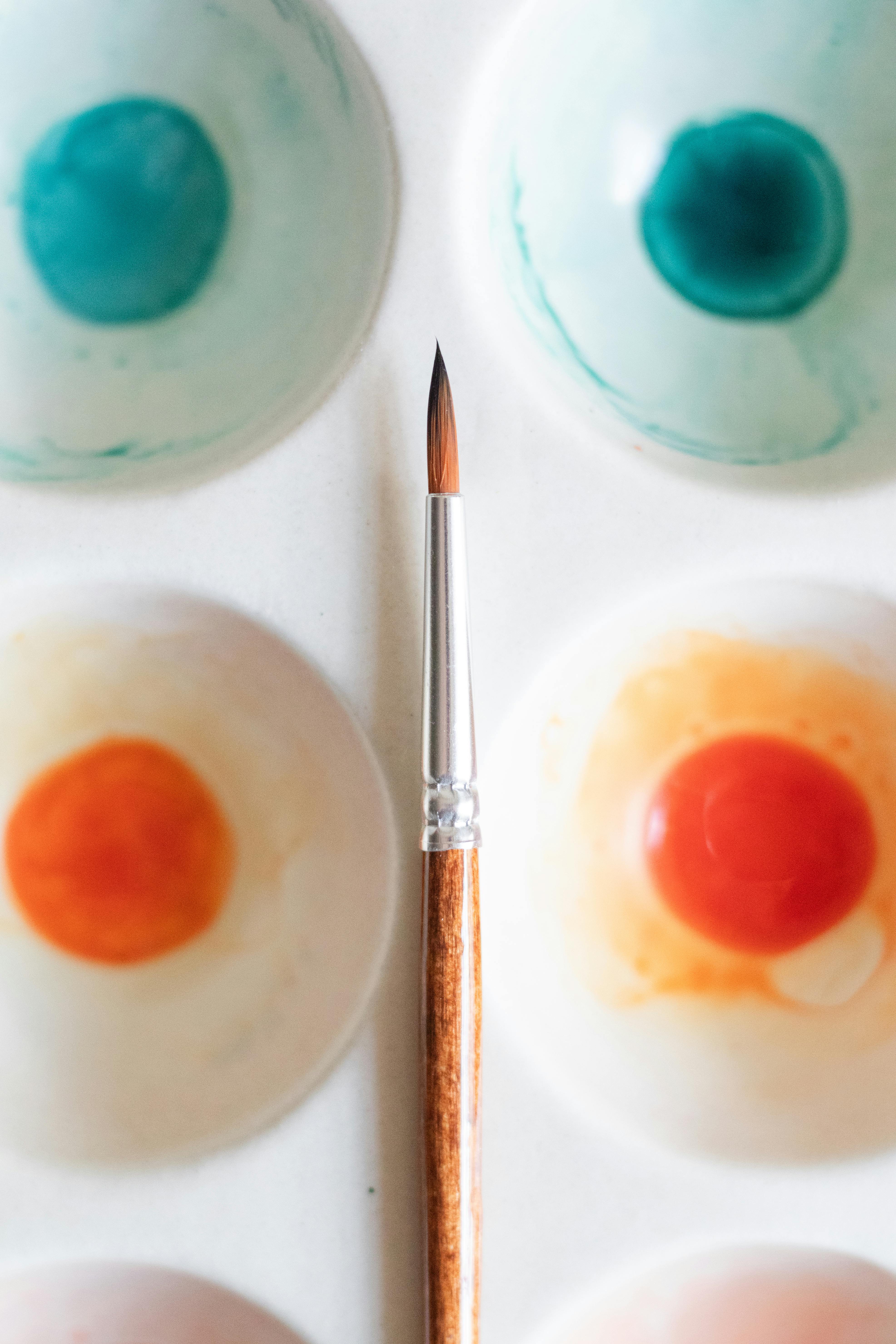