Gouache Painting: Your Artist's Guide to Mastering Opaque Watercolors
Unravel the mystery of gouache with this artist's guide. Explore its opaque qualities, velvety matte finish, history, and essential techniques. Master color shift, compare to other mediums, and unlock its graphic potential for vibrant art. Perfect for illustrators and digital artists.
Gouache Painting: Your Artist's Guide to Mastering Opaque Watercolors
Do you ever find yourself going down an internet rabbit hole, deep-diving into obscure art supplies at an ungodly hour? I vividly remember my first encounter with gouache (pronounced gwahsh) in just such a late-night session. Scrolling through endless options, and then: "Opaque watercolor?" I scoffed. "Isn't that just... paint? What's the big deal?" Honestly, I was skeptical. My artistic brain, comfortably wired for the luminous transparency of traditional watercolors or the bold permanence of acrylics, just couldn't quite grasp this delightful paradox. It felt like art's eccentric cousin—familiar, yet utterly unique in its handling, and frankly, a bit baffling. I'd even made a glorious mess of my first few attempts, convinced it was just a clunky watercolor.
But here's the kicker: it’s not just another paint. This is a medium that behaves like watercolor but covers like acrylic – a truly delightful paradox. Gouache offers incredible graphic qualities, surprising forgiveness, and a distinctive velvety matte finish that's a game-changer, especially for digital reproduction. This article isn't just some dry guide; it’s my personal deep dive into why this quirky medium—which, by the way, eventually won me over (curiosity always does with art supplies, doesn't it?)—deserves a prime spot in your studio. Over time, gouache has carved out a special, slightly quirky place in my artistic heart. It feels both ancient and incredibly modern, capable of surprising you with its versatility, and perfect for when you want bold, flat colors or the ability to build up layers with confident strokes, especially if you're like me and sometimes struggle to get true opacity with other water-based paints. So, ready to unravel this delightful opaque mystery with me? We'll journey from its ancient origins to its modern applications, explore its unique characteristics, and I'll share my hard-won wisdom on how to make friends with it. You can even follow some of my own artistic journey with this medium on my artistic timeline.
Unpacking the Gouache Mystery: What Even IS It?
So, let's get to it: gouache is often called "opaque watercolor." And that's really the core of it. Its lineage stretches back to ancient Egypt, where artists needed bold, flat colors for tomb paintings, laying the groundwork for opaque water-based mediums. Imagine your regular watercolors, but with a secret ingredient that makes them, well, not transparent. This opacity comes from a higher ratio of pigment to binder (usually gum arabic, just like watercolor), and often, the addition of white pigment or finely ground chalk as a filler. These fillers aren't just there to bulk up the paint; they're inert substances, like chalk or barium sulfate, with unique light-scattering properties that effectively 'block' the paper beneath and contribute significantly to that characteristic opacity. Think of it like a dense, creamy milkshake versus a clear fruit juice. The binder, gum arabic, is what holds the pigment particles together and allows them to adhere to the surface, but its higher concentration in gouache, combined with the fillers, creates a thicker, more covering paint film. Don't worry if that sounds like a chemistry lesson; the important thing is how it makes the paint behave! Think of this way: with watercolor, light passes through the pigment, reflecting off the white paper underneath to give that glow. With gouache, its higher pigment load and fillers work like tiny mirrors, reflecting light between the pigment particles, making the paint itself appear solid and luminous – the secret to that beautiful, velvety matte finish we all adore.
Historically, the balance of these components has evolved, with early forms relying more heavily on coarser pigments and natural binders, leading to a sometimes chalkier finish, while modern artist-grade gouache boasts finer pigments and more refined binders for enhanced vibrancy and durability. It’s a key distinction; artist-grade gouache generally offers purer pigments and less filler, translating to better lightfastness and less color shift, a topic we’ll dive into shortly. What is lightfastness, you ask? It's simply the resistance of a pigment to fading when exposed to light over time. Artist-grade paints often come with ASTM (American Society for Testing and Materials) ratings, which indicate how resistant a paint is to fading. A rating of I (Excellent) or II (Very Good) is what you're looking for if you want your artwork to last for generations, especially important if you plan to sell your pieces. But for now, let's see how this enigmatic medium measures up against its artistic cousins.
Gouache vs. the Gang: Acrylic, Tempera, Casein, and Even Oil Pastels
What sets it apart from acrylic painting, then? Well, acrylics dry quickly and become a permanent, waterproof, plastic-like film. This means once dry, they cannot be reactivated with water, creating an unyielding, durable surface with excellent archival qualities and UV resistance. Gouache? Not so much. It's re-wettable, even when dry. This means you can come back to a painting days later, add a bit of water, and reactivate the paint. It's both a blessing and a curse, depending on what you're trying to achieve (and how clumsy you are with your coffee cup). We'll get into that.
While gouache shares some characteristics with tempera (which often uses egg yolk as a binder) or casein (a milk-protein binder), gouache’s gum arabic binder makes it distinctly re-wettable, setting it apart in its handling and finish. Tempera and casein, once dry, are generally permanent and cannot be easily reactivated or reworked with water. This offers a different kind of precision and archival quality, as they create a robust, inflexible film that is more resistant to environmental damage than gouache's delicate surface. However, this permanence sacrifices the flexibility that gouache offers to soften edges or correct errors over time. Moreover, tempera and casein often dry to a more brittle or inflexible film, affecting the feel and application; gouache's gum arabic binder provides a smoother, more flexible film even when dry, which contributes to its unique blendability and capacity for layered corrections. Tempera, particularly egg tempera, is often favored for its incredibly fine detail and luminosity in traditional iconography, used extensively in medieval manuscripts and Byzantine art, while casein is sometimes chosen for its robust, durable matte finish in commercial art applications like murals or sign painting where permanence is paramount. It really does feel like it's coating the paper, rather than staining it, especially when applied thicker, which is a major difference from watercolor's fluid touch.
Moving from these water-based cousins, we encounter a distinctly different opaque medium: oil pastels. Now there's another opaque friend, but a very different one. While gouache is water-based and re-wettable, offering a smooth, velvety finish, oil pastels are, as the name suggests, oil-based with a waxy binder. They create a rich, dense, and permanent mark that isn't reactivated by water. You can layer and blend them, but the result is a distinct, textured, often painterly stroke that can't be thinned or softened with water like gouache. Their waxiness also means they don't dry in the traditional sense, but rather cure slowly, contributing to their unique, almost crayon-like feel and permanent adhesion, with excellent lightfastness. Think of gouache as a refined, creamy paint you apply with a brush, and oil pastels as a more direct, expressive crayon-like tool that melts onto the surface. Both offer incredible opacity, but their handling and finish are worlds apart, each with its own charm and limitations. So, you see, while many opaque mediums exist, gouache carves out its own special niche with its re-wettability and smooth, velvety matte finish, a unique blend that artists have cherished for centuries. Now that we’ve navigated the family tree, let's explore what truly makes gouache tick.
The Magic and the Maddening: Characteristics of Gouache
Now that we've unpacked the core differences, it's time to explore the true personality of gouache – the traits that make it both a magical ally and, occasionally, a maddening opponent. Every medium has its quirks, right? Gouache is no exception. Here are the things I've come to know, love, and sometimes curse about it:
Its Superpower: Opacity
This is its superpower, and frankly, a huge confidence booster. You can paint light over dark, correct mistakes, and create solid, flat areas of color that truly pop. If you've ever struggled with watercolor's inability to cover a dark line or wished you could paint a bright yellow sun over a deep blue forest canopy without ending up with a muddy mess, gouache will feel like a warm, forgiving hug. You can simply apply a layer of deep blue, let it dry, and then confidently paint that bright yellow sun right on top, achieving crisp separation and vibrant color without any underlying color peeking through or becoming dull. That's the dream, right? What a relief!
The Allure: Velvety Matte Finish
Oh, how I adore this. When dry, gouache paintings have a beautiful, almost velvety matte finish that absorbs light rather than reflecting it. For me, this is pure magic; it minimizes glare, making the artwork a dream to photograph without reflections, and reproduces exceptionally well in print. This crisp reproduction, holding sharp edges and flat, consistent color areas, is highly desirable in commercial illustration and graphic design, ensuring consistent color representation. Its ability to mimic the clean, editable nature of vector graphics makes it a favorite for artists who need their physical work to translate seamlessly to digital platforms for print or online media.
Beyond its practical benefits, this matte surface gives a unique depth and softness to the artwork that subtly influences how a viewer perceives texture and form. For instance, in a landscape, a matte finish can make painted clouds feel more ethereal or a distant mountain appear more integrated into the atmosphere, lending a calming, sophisticated presence. Now, a small confession: this matte finish, for all its beauty, can sometimes play tricks on you when you're mixing colors. Values can appear slightly different wet vs. dry, and the lack of reflective sheen means you have to rely more on your eye for pure color and tonal relationships rather than how light plays off it. While a touch of gloss medium can be experimented with, it often defeats the purpose of gouache's unique matte appeal, so I rarely bother. Just be mindful that this lovely soft surface can be prone to smudging or scuffing if handled carelessly, so a light touch is key, and ultimately, framing under glass is its best friend to protect it from the world (and clumsy hands!).

The Double-Edged Sword: Re-wettable Nature
This is the double-edged sword I mentioned. On one hand, it allows for beautiful, seamless blending, especially if you work quickly or keep your palette moist. You can soften edges long after the paint has dried, or create smooth gradients by working wet-into-wet. This re-wettability also lends itself to some truly unique textural effects. By allowing layers to dry partially, then gently reactivating with a damp brush, you can create soft, blurred edges reminiscent of mist, or even delicate feathering effects that hint at distant foliage.
One of my favorite techniques is a "wet-on-dry with a soft edge," where I apply a dry brush stroke over a fully dried layer, then quickly and lightly go over the edge with a clean, damp, soft synthetic brush to create a gentle, controlled bleed, softening the line without reactivating the entire underpainting. It’s even great for lifting color, gently dabbing a wet brush or sponge to create subtle highlights like sunlight catching water, or atmospheric effects such as hazy distant mountains – a lovely trick once you get the hang of it. The quality of the gum arabic binder plays a crucial role here; a purer, well-balanced binder allows for consistent re-wettability without becoming gummy or overly sticky. It's a subtle art, allowing the paint to guide you, which truly sets gouache apart from its transparent watercolor cousin or the stubborn permanence of acrylics. Thinking about understanding elements of art like edge and form really helps here.
On the other hand, if you're not careful, layers beneath can lift and muddy, especially if you scrub at a dried area with a wet brush. My hard-won wisdom here? Work with a lighter touch and allow layers to dry completely if you want crisp separations. It's a delicate dance, really, between precise control and surrendering to the medium's inherent fluidity. (And yes, that 'clumsy with your coffee cup' comment? Totally based on personal, tear-stained experience, or that time a curious cat decided to inspect my nearly finished landscape with damp paws.) So, which aspect of its re-wettability do you think is more challenging to master?
The Speedy Friend: Quick Drying Time
For an impatient artist like myself, this is a huge win. Gouache dries relatively quickly, allowing for rapid layering and reducing the waiting game. It's not as fast as acrylics in every application (especially very thin washes), but definitely quicker than oils, making it excellent for studies or fast-paced illustrations.
The Sneaky One: Color Shift
This is perhaps the trickiest characteristic. Gouache tends to lighten when it dries if it's applied thinly, and darken if it's applied thickly. It's like the paint is playing a game of hide-and-seek with your intended color! This counter-intuitive behavior takes some serious getting used to. I once spent an hour mixing the perfect sky blue for a distant mountain, applied a thin wash, and watched it dry several shades lighter, completely throwing off my composition. I still remember the subtle groan I let out – a rookie mistake, even after all this time!
This often occurs because as water evaporates, the gum arabic binder contracts, and the chalky fillers and pigment particles interact with light in a way that alters the perceived color. It's like the medium holds a little secret until it's fully dry.
Thin Layers: The Whisper Effect
In thinner applications, as the water evaporates, the chalky fillers become more prominent, scattering light more effectively across the dried surface. This makes the paint appear lighter, almost chalkier, and less saturated. It's like the paint is trying to be a whisper when you wanted a clear note, frustratingly altering the visual impact you were aiming for.
Thick Layers: The Shout Effect
With thicker layers, the pigment density remains high even after water evaporation. The binders and fillers still play a role, but the sheer volume of pigment ensures the color dries darker and more saturated, closer to its wet appearance. Here, the paint wants to be a shout! The gum arabic, as it dries, also forms a denser film, which can slightly deepen the perceived color in thick applications. The absorbency of your paper can also subtly influence this; a more absorbent surface like cold press might make thin washes appear lighter as the binder is absorbed faster into the fibers, leaving more concentrated filler on the surface, while a less absorbent hot press can lead to a more predictable shift.
My advice? Get to know your specific pigments and brands. While modern artist-grade gouache uses highly stable pigments, some historical pigments or even certain hues today (like specific Cadmium Yellows or Ultramarine Blues) can still surprise you with their shifts. I've learned to do a lot of swatching beforehand, creating small gradient tests from thick to thin, especially when aiming for precise color matching, and often test colors on a scrap piece of the actual paper I'm using to anticipate the shift. Sometimes, I’ll even mix a slightly darker shade than I want for thin applications, just to trick the universe. Oh, and just when you think you've got it, remember that humidity and temperature fluctuations can also subtly affect the long-term appearance of dried gouache, sometimes altering its perceived lightness or saturation over time. Understanding these quirks is key to mastering gouache, and consistent swatching is your best defense against color shift surprises. If you're interested in the nuances of how colors behave, you might want to dive deeper into articles like my definitive guide to color theory in art or how artists use color. So, have you ever had a color shift completely ruin a piece? Let me know!
A Walk Through Time with Gouache: From Ancient Manuscripts to Modern Masterpieces
But gouache isn't just about its quirks; its enduring appeal is rooted in a surprisingly long and rich history. It’s got a seriously impressive resume, spanning millennia and diverse cultures. Knowing this history, and connecting it to how the enduring influence of ancient Egyptian art on modernism still shapes art today, adds a layer of appreciation for this versatile paint. It's a reminder that sometimes the most 'modern' techniques have roots older than we can imagine, or that seemingly simple mediums like gouache have a complex story to tell.
Ancient Roots and Medieval Manuscripts
Its roots stretch way back, believed to have been used in ancient Egyptian tomb paintings, where artists needed bold, flat colors for their symbolic imagery. Fast forward to the European Middle Ages, and opaque water-based mediums, often similar to early forms of tempera or gouache, were central to illuminating manuscripts—those gorgeous, intricate books crafted by monks. I'm constantly amazed by the patience those monks had, using these opaque paints to create stunning, solid blocks of color and delicate details – truly mind-boggling! You can explore more about that period in the ultimate guide to Renaissance art.
The Renaissance to 19th-Century Naturalism
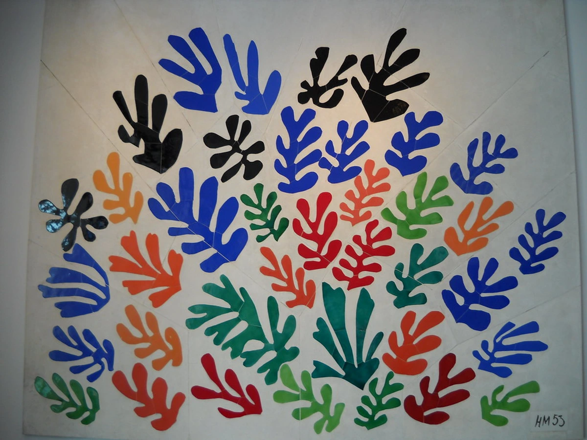
Then came the Renaissance, where artists continued to experiment, and later, the 18th and 19th centuries saw gouache embraced for its quick application and opaque qualities in preparatory sketches and detailed illustrations, especially for natural history. Think of those incredible botanical plates by artists like Pierre-Joseph Redouté, whose work showcased fine botanical detail and vibrant, true-to-life colors, or the precise bird illustrations by John James Audubon, where crisp definition was paramount. Gouache was particularly suited for these subjects due to its ability to capture fine, intricate details and render vibrant, true-to-life colors with crisp definition and clean lines—qualities essential for scientific accuracy. While not their primary medium, artists like J.M.W. Turner occasionally employed gouache for rapid studies and sketches to capture fleeting light or atmospheric composition ideas with a speed that oil paint couldn't match. Henri Matisse, a true innovator, notably used it extensively for his renowned paper cut-outs, demonstrating its powerful graphic potential for creating large, flat planes of vibrant color with clean, precise edges, almost like painting with scissors.
Gouache's Golden Age: 20th-Century Commercial Art and Animation
By the 20th century, gouache truly hit its stride in commercial illustration, poster art, and comic books. Its matte finish reproduced beautifully in print, capturing accurate color without glare, which was invaluable for consistent color representation in mass production. Its ability to create clean, sharp edges and flat color areas made it ideal for graphic design, solidifying its graphic qualities—think vector-like precision but in paint! Iconic designers and illustrators from the Art Nouveau era, such as Alphonse Mucha for his bold, flat color fields and flowing lines in posters, or later mid-century artists like Paul Rand and Charley Harper for their striking, graphic styles, found gouache indispensable. Its versatility made it a favorite for book illustrators, graphic designers, and advertising artists who needed consistent, reproducible color. As I mentioned, Henri Matisse utilized gouache extensively for his famous paper cut-outs, where he painted sheets of paper with gouache and then cut them, demonstrating its power for creating vibrant, flat planes of color with precise, almost sculptural edges, a quality that makes it so appealing for graphic work. It was even a staple for early animation cels, notably during Disney's Golden Age (think of the vibrant, flat colors of classic films like Snow White or Cinderella), where artists required consistent, flat, and vivid colors that photographed well without glare or reflections. Its opacity allowed for clean layering of colors, and its re-wettability provided a crucial advantage for animators, enabling quick corrections or adjustments during the meticulous cel painting process without having to restart. It's amazing to think that the same kind of paint used for ancient texts could also be the backbone of a vibrant comic book page or a striking art print, influencing movements from Art Nouveau illustration to mid-century graphic design and even the early stages of digital art emulation, where artists sought to mimic its clean, graphic appearance digitally. For instance, the graphic qualities of Art Nouveau often lent themselves well to gouache, as explored in articles like the ultimate guide to Art Nouveau jewelry (though focusing on jewelry, the aesthetic principles apply). More recently, contemporary artists like James Gurney (known for his Dinotopia series) and Nathan Fowkes have championed gouache for its versatility in concept art and plein air sketching, demonstrating its continued relevance in a digital age. What a journey for a little paint, right?
My Gouache Playbook: Getting Started and Making Friends with the Medium
If my rambling has convinced you to give gouache a go, welcome to the club! Now that we've wrestled with its quirks and celebrated its strengths, let's get our hands dirty and actually use this stuff. Here's my no-nonsense guide to getting started, gleaned from my own trials and errors. Think of it as a friendly nudge into a delightful (and occasionally frustrating) journey.
What You Need (the basics):
- Gouache Paints: Start with a small set of artist-quality tubes or pans. Don't go for the cheapest student grade if you can help it; the pigment load and quality of binder really make a difference. Artist-grade gouache uses higher concentrations of pure pigments and a balanced binder ratio, resulting in more intense, lightfast, and vibrant colors with better opacity and consistent re-wettability. What does this mean in practice? You'll notice artist-grade gouache offers smoother, more opaque coverage with fewer strokes, colors won't turn chalky when diluted, and it re-wets beautifully without becoming gummy or forming a film. Student-grade versions often contain more inert fillers (like chalk) and less pigment, leading to chalkier, less brilliant results that might fade over time. These extra fillers can also make the paint film more brittle and prone to cracking when applied thickly, and affect its overall texture and re-wettability in unpredictable ways. Lightfastness, or the resistance of a pigment to fading when exposed to light over time, is particularly crucial for gouache, especially given its common use in illustration and reproduction where the longevity and true color of the artwork are paramount. The binder, typically gum arabic, is what holds the pigment particles together and allows them to adhere to the surface. Its quality and ratio profoundly influence the paint's consistency, flow, and re-wettability.A quick note on brands: While I love Winsor & Newton for its vibrancy, I also frequently reach for Holbein's gouache when I need a truly creamy, butter-like consistency for smooth, flat areas. Schmincke Horadam also makes a fantastic, finely milled gouache. It's like finding your favorite coffee roast; everyone has a preference, and a bit of experimentation goes a long way. Don't be afraid to try a few tubes from different manufacturers to see what clicks with your style!Tubes vs. Pans: Tubes offer a fresh, creamy consistency every time you squeeze them, ideal for larger applications and maintaining pure color. Pans (dry cakes of paint in a palette) are super portable and convenient for sketching, as you just add water to reactivate. I find tubes better for studio work, while pans are my go-to for outdoor sketching or when I'm on the move.
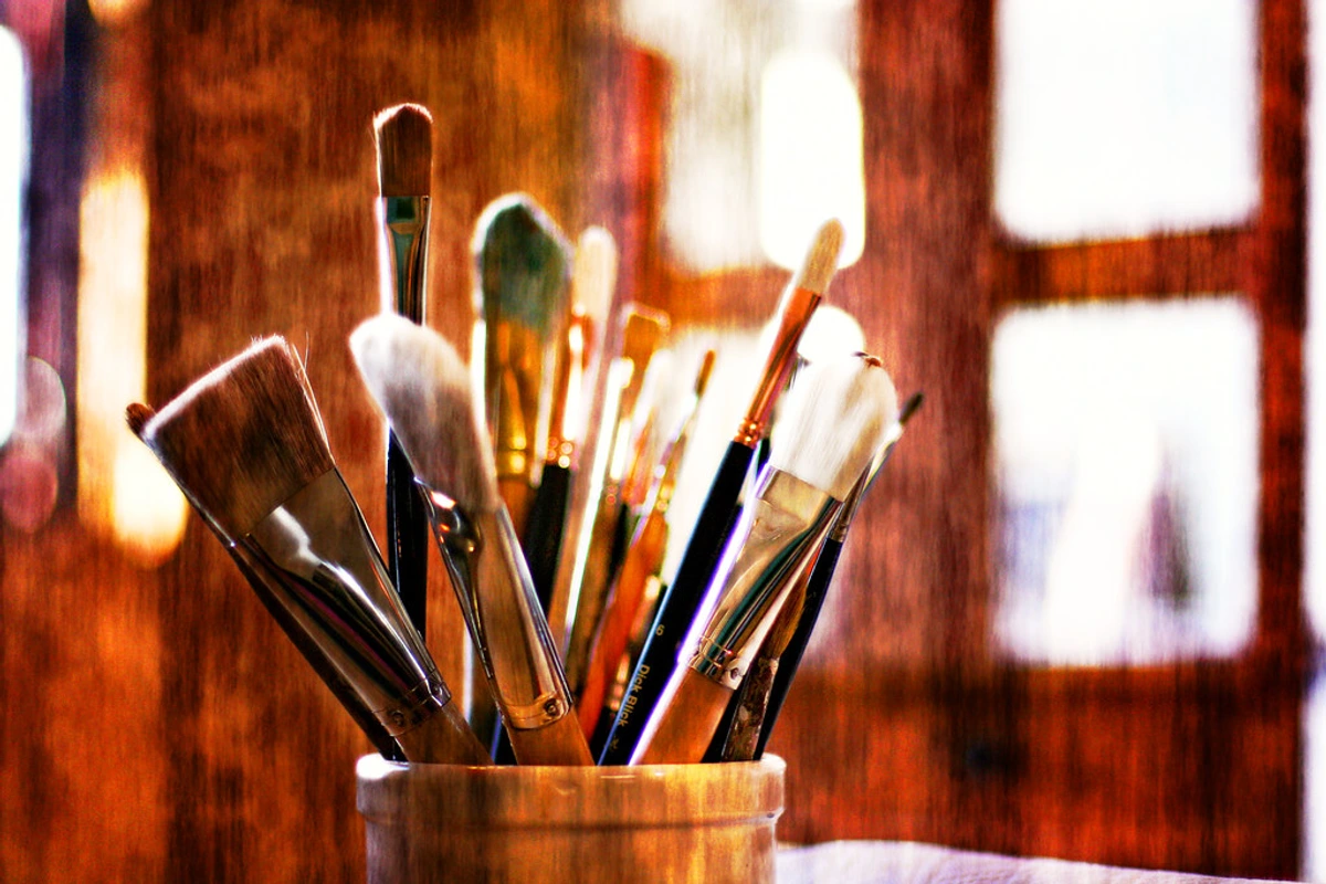
- Brushes: Soft synthetic brushes work wonderfully. You'll want a range of sizes for broad washes and fine details. Natural hair brushes (like sable) also work well for delicate control, but can be pricier.
- Paper: Think thick! Watercolor paper (140lb/300gsm or heavier) is ideal. It needs to withstand water without buckling too much. My favorites are cold press for a bit of tooth (great for trapping pigment for texture, facilitating lifting techniques, and creating subtle atmospheric effects by giving the paint something to grab onto) or hot press for super smooth results (perfect for fine details, crisp lines, and smooth, seamless gradients). Remember, heavier paper helps manage the water content inherent in gouache and prevents buckling, ensuring a stable surface for your work.
- Palette: Ceramic plates, plastic palettes, or even an old dinner plate work great. Something non-absorbent. I personally love ceramic palettes because they keep the paint moist longer and are easy to clean.

- Water Containers: Two is always better: one for rinsing dirty brushes, one for clean water to mix with your paints. This prevents muddy colors and keeps your work fresh.
- Paper Towels: Essential for blotting brushes and controlling moisture, especially with a re-wettable medium like gouache.
Tips for Beginners (My Hard-Won Wisdom):
Once you have your supplies ready, and before you dive headfirst into what might seem like a chaotic adventure (trust me, I've been there), here are the golden nuggets of wisdom I've collected (often the hard way) that will help you make friends with gouache quickly.
- Don't Be Afraid of Layers: Unlike traditional watercolor, you can layer opaque colors on top of each other. Start thin, let it dry, and then build up. This is where the magic happens! Just be mindful that excessively thick, impasto-like layers can crack if dried too quickly or on a flexible surface, especially if you're using student-grade gouache which often has a higher filler-to-binder ratio, making it less flexible and more brittle when dry. Artist-grade gouache tends to be more resilient to thicker applications due to its purer binder content.
- Embrace the Re-wetting (or Control It!): If you want soft blends, keep your areas moist. If you want crisp edges, let layers dry completely before painting adjacent to them. It's a push and pull. I've found it helpful to think about the understanding elements of art like edge and form when applying this principle.
- Experiment with Water Ratios: Gouache is incredibly versatile. Use it thick for full opacity, almost like acrylics, or dilute it a bit for smoother, yet still opaque, washes. The amount of water totally changes the effect. While you can thin gouache with water for lighter, less saturated opaque layers, it won't achieve the pure luminosity and transparency of true watercolor. Think of it as a creamy, thick soup (thick gouache), a flavorful, thin soup (diluted opaque gouache), versus a pure, clear broth (true watercolor) – all delicious, but serving different purposes!
- Swatch, Swatch, Swatch: Seriously, make a color chart of your paints and note how they look wet vs. dry. Create small gradient tests, going from thick application to a thinned wash, for each color. It will save you so much frustration with that pesky color shift. Trust me on this one. Pay attention to how different brands or even different pigments within the same brand react – some colors are just more temperamental!
Beyond the Basics: Advanced Gouache Techniques I've Explored (and Botched!)
Ready to push the boundaries? Once you've found your footing, gouache opens up a world of exciting possibilities for more nuanced and expressive work. These techniques build upon the foundational understanding of gouache's unique properties, allowing for greater control and creative expression. Here are a few advanced techniques I've enjoyed exploring, sometimes with great success, other times ending in a delightful mess.
- Layering and Opaque Glazing: This involves building thin, diluted layers of color to create depth, much like oils or acrylics, but always with that unique matte finish. It's crucial to understand this will still behave as a diluted opaque pigment rather than a truly transparent watercolor glaze. An opaque gouache glaze builds up color density and coverage, influencing but ultimately covering the layer beneath, whereas a transparent watercolor glaze or an oil/acrylic glaze allows underlying colors to show through and blend optically with the top layer. Think of it as adding a sheer, colored film over another color, rather than staining it, giving you subtle control over hue and value shifts. This is particularly useful for achieving rich, layered colors without making your work look heavy. If you're looking to play with these techniques, specialized mediums can help. A flow improver can help you achieve thinner, more even washes without compromising the paint's opacity as much as plain water might. It essentially thins the paint while maintaining pigment dispersion. A retarder, on the other hand, slows down the drying time, giving you more open time for blending and working wet-into-wet, which can be invaluable for creating smooth gradients or softening edges. I've found them particularly useful when I want to extend that 'open' window just a little longer on a hot day!
- Dry Brushing: Using a nearly dry brush with a tiny bit of thick gouache to create textured, broken strokes. Great for adding rough texture (like the bark of a tree or weathered stone) or subtle highlights, it's a fantastic way to introduce exploring texture: my favorite techniques for adding depth to abstract paintings into your work, adding a tactile quality that contrasts beautifully with flat areas.
- Sgraffito: This is a fun one! While the paint is still wet (or even softly dry), use the end of your brush handle or a fine tool to scratch back into the layer, revealing the color underneath. For instance, scratching delicate lines into a wet dark layer can beautifully depict individual blades of grass or strands of hair. Sometimes I get a little too enthusiastic and scratch a bit too deep, revealing more than I intended – oops! It's a wonderful way to add fine lines or expressive marks and infuse your work with dynamic energy. For more on this technique, check out what is sgraffito in art.
- Masking: Because of its opaque nature, gouache works incredibly well for masking. You can use masking fluid to preserve white areas, or just use its covering power to paint precise shapes. It's like having a digital selection tool, but for paint! I often use it to create crisp geometric shapes for my abstract studies, achieving edges that are difficult with less opaque mediums.
- Mixed Media: Gouache plays surprisingly well with others. I've used it over ink, with colored pencils, and even alongside traditional watercolors. Its opaque nature makes it perfect for adding highlights or strong focal points to transparent mediums, creating striking contrasts. I've even heard of artists using it for underpainting in oil or acrylic to quickly block out colors, or even for digital painting emulation, given its clean graphic qualities. The flat, vibrant colors and sharp edges of gouache are often mimicked in digital art to create a similar graphic, print-ready aesthetic, making it a great bridge between traditional and digital workflows. It really is a team player! You can dive deeper into this fascinating blend of materials in my guide to mixed media.
Advantages and the Occasional Headache: My Pros and Cons List
So, we've explored gouache from its humble beginnings to its more advanced applications. But like any good friend, it comes with its own set of strengths and weaknesses. No medium is perfect, and gouache, for all its charm, certainly has its moments. Here's my candid summary of where it shines and where it sometimes drives me nuts:
Characteristic | Watercolor | Gouache | Acrylic |
|---|---|---|---|
| Opacity | Transparent, luminous | Opaque, matte | Opaque, vibrant |
| Drying Time | Medium to slow | Fast | Fast |
| Re-wettable | Yes (for blending/reactivation) | Yes (for blending/reactivation) | No (permanent once dry) |
| Finish | Luminous, transparent | Velvety matte | Matte to glossy (depending on medium) |
| Waterproof Dry | No | No | Yes |
| Ease of Correction | Difficult (requires careful lifting) | Easy (can layer over mistakes) | Moderate (can paint over, but permanent) |
| Layering Capability | Challenging (relies on transparency) | Excellent (builds opaque layers) | Excellent (builds opaque layers) |
| Cost & Value | Moderate initial cost; good value for artist-grade materials. | Moderate initial cost; artist-grade offers excellent value due to high pigment load and versatility, making it a cost-effective choice for illustrators and designers who prioritize consistent reproduction and graphic quality. | Moderate to High initial cost; excellent long-term value due to permanence and versatility across applications. |
| Learning Curve | Moderate to High | Moderate | Low to Moderate |
| Lightfastness | Varies, generally good (check ASTM ratings) | Varies, generally good (check ASTM ratings) | Varies, generally excellent (check ASTM ratings) |
| Archival / UV Resistance | Good, if protected (framing under UV-protective glass is crucial due to delicate surface and re-wettability) | Good, if protected (framing under UV-protective glass is crucial due to its delicate surface and re-wettability) | Excellent (inherently more robust, less prone to environmental damage) |
Pros of Gouache (from my perspective):
- Versatility: You can use it thick or thin, opaque or slightly translucent, for fine details or broad washes. It's like having multiple mediums in one tube, ready for whatever your creative whim dictates.
- Opacity: The ability to paint light over dark and correct mistakes is a huge confidence booster. My inner perfectionist breathes a sigh of relief when I can simply paint over a misplaced line instead of starting fresh.
- Vibrancy: The colors are often incredibly rich and intense, especially when applied thickly. They really pop off the page, giving your artwork an immediate visual impact.
- Portability: Like watercolor, it's easy to pack up and take to your local coffee shop or out into nature. Perfect for sketching on the go, making it a favorite for urban sketchers and journal artists.
- Quick Drying: Allows for faster layering and less waiting around. I can actually finish a piece in one sitting without the dreaded waiting game of oils.
Cons of Gouache (where it sometimes drives me nuts):
- Re-activation: Ah, the bane of my existence! While a pro for blending, it means your finished work isn't waterproof and needs protection (framing under glass is key). Also, be aware of humidity; a very humid environment can reactivate layers over time, leading to subtle shifts. Extreme temperature fluctuations can also affect its stability. Don't spill your tea on a finished gouache piece! Or, speaking from personal experience, don't let a curious cat walk across your masterpiece with damp paws, unless you're aiming for collaborative art.
- Color Shift: That whole drying lighter/darker thing can be a real head-scratcher until you get the hang of it. It takes practice and patience, and still sometimes catches me off guard. It's like a tiny, pigment-based magic trick that occasionally backfires.
- Fragility: Cracking usually happens when gouache is applied too thickly, especially if it dries too quickly, or if there's insufficient binder (gum arabic) relative to the pigment and fillers. The binder provides flexibility and adhesion, so a lack of it can make the dried paint brittle. Student-grade gouache often contains more inert fillers (like chalk) and less pigment, leading to a less flexible and more brittle paint film because the binding agent is simply spread too thin. It's definitely not as durable or flexible as acrylics or oils, so think of it as a delicate, precious medium. (I've definitely learned this the hard way after a piece mysteriously developed tiny hairline fractures after I left it near a drafty window – a truly humbling experience!) For true archival longevity, protecting it from dust, humidity, and UV light (through framing with UV-protective glass) is absolutely crucial. Without proper care, its beautiful matte surface can be easily marred.
- Not Waterproof When Dry: Again, needs protection. This isn't a medium for outdoor murals unless you're sealing it with something else. It's a studio companion, a cherished indoor friend.
FAQs from My Art Buddies (and My Own Brain)
Got questions? I've certainly asked a ton, and these are some of the most common ones that come up when discussing gouache. Consider this my rapid-fire Q&A session, addressing those nagging uncertainties you might have.
Can you mix gouache with watercolor?
Absolutely! They are both water-based and share the same binder (gum arabic). Mixing them can create interesting effects – you can make your watercolors slightly opaque, or your gouache more translucent. Just be mindful that adding too much watercolor can dilute gouache’s opacity more than intended, and might slightly extend its drying time, but it’s a wonderful playground for experimentation! Don't be afraid to see what happens when these two cousins mingle.
Is gouache good for beginners?
Yes, definitely! Its opaque nature makes it more forgiving than traditional watercolor (easier to correct mistakes). Plus, it dries quickly and the materials aren't too expensive to start with. Just be patient with the color shift and re-wettability. Start with a good student-grade set if cost is a concern, but consider upgrading to artist-grade as you gain confidence to experience the full vibrancy and performance of the medium. Think of it as a friendly, patient teacher.
Does gouache need to be varnished?
Generally, no. Varnishing gouache can often alter its beautiful matte finish, making it more shiny, and can even reactivate the paint. This happens because the solvents or moisture in some varnishes can interact with the gum arabic binder, causing the dried paint to soften or lift. Beyond reactivating the paint, some varnishes can yellow over time, altering the color of your artwork, which is another compelling reason to avoid them. While some artists might cautiously use a very light application of a spray varnish designed for pastels or watercolors (applied from a distance in thin, even coats), be aware that even these carry a risk of reactivating the delicate gum arabic binder. The safest and most recommended protection is framing it under glass, just like you would with pastels or watercolors. The glass provides physical protection and a barrier against humidity and dust, preserving that lovely matte finish without compromise. Seriously, when in doubt, just frame it.
How do you keep gouache from cracking?
Cracking in gouache most commonly occurs due to applying the paint excessively thick, allowing it to dry too quickly, or an insufficient binder (gum arabic) content in relation to pigments and fillers. To prevent this, aim for layers that aren't overly thick, similar to how you'd avoid heavy impasto-like layers unless you're confident in your paint's flexibility. Ensure the paint dries naturally, away from direct heat sources like heat guns, which can cause rapid shrinkage. Using good quality artist-grade gouache with a well-balanced binder ratio is also crucial, as cheaper student-grade versions often have more inert fillers (like chalk) and less pigment, leading to a less flexible and more brittle paint film because the binding agent is simply spread too thin. This is different from the flexibility of acrylics or the robust film of oils, where cracking is often due to improper layering or fat-over-lean principles. Working on thick, stable surfaces like heavy watercolor paper or art board also helps. If a minor crack does appear, sometimes you can gently re-wet the area with a fine brush and a tiny bit of distilled water, then carefully smooth it down, or apply a very thin wash of the original color over it to minimize its appearance.
How can I avoid muddy colors or streaky application with gouache?
Avoiding muddy colors with gouache primarily comes down to managing its re-wettability and using a two-water system. Always have one container for rinsing dirty brushes and another for clean water to mix with your paints. This prevents transferring dirty pigments back into your palette or clean areas of your painting. When layering, ensure the underlying layer is completely dry if you want crisp, clean separations. If you try to paint a wet layer over a still-damp one, the colors will inevitably blend and often turn muddy. For streaky application, it’s usually a matter of paint consistency – too little water will make it drag and streak, too much will thin it out excessively. Experiment with water ratios to find that perfect creamy, opaque consistency that glides smoothly but covers evenly. Crucially, ensure your brushes are adequately loaded with paint and water for a smooth, consistent release of color. Using soft, good-quality synthetic brushes (or natural hair, if preferred) can also make a big difference, as they hold water and release paint more consistently and smoothly. It's a bit like finding the perfect consistency for pancake batter – too thick, it's lumpy; too thin, it runs everywhere.
How should I store gouache paints?
For tubes, keep the caps tightly sealed to prevent drying. If a tube dries out a bit, you can often rehydrate it by adding a tiny drop of distilled water and kneading the tube, though consistency might change slightly. Using distilled water is preferable to tap water as minerals and impurities in tap water can sometimes affect paint consistency, vibrancy, or longevity. For pans (like those found in a palette), simply let them dry completely after use. When you want to paint again, just add a drop of water to reactivate the color. Some artists prefer a sealed container for pans to keep them moist longer, but it's not strictly necessary, especially if you enjoy the convenience of re-wetting dry cakes. For finished artwork, the best storage is flat, unframed, in archival sleeves or between acid-free boards, away from direct light, humidity, and extreme temperatures. If framed, ensure it's under UV-protective glass.
How do I clean gouache brushes properly?
Since gouache is water-soluble, cleaning brushes is quite straightforward. Rinse your brushes thoroughly in two water containers (one for initial cleaning, one for a final rinse) until all color is gone. Gently squeeze out excess water, reshape the brush head, and let them air dry flat or brush-side up. Using distilled water for rinsing can also help prevent mineral deposits from tap water from affecting your brush fibers over time. Avoid letting paint dry in the bristles, especially near the ferrule (the metal part), as this can cause the bristles to splay and permanently damage the brush over time. For a more thorough cleaning, especially with natural hair brushes, consider using a brush soap specifically designed for artist brushes. It helps to remove stubborn pigment without stripping natural oils, preserving the brush's longevity. Treat your brushes well, and they'll treat your gouache well in return!
Can gouache be used for underpainting?
Absolutely! Many artists use gouache for underpainting, especially in oil or acrylic works. Its quick drying time and opaque nature make it excellent for rapidly blocking in initial color values and compositions. You can lay down a thin layer of gouache to establish your drawing or the general color scheme, let it dry, and then paint over it with oils or acrylics. The gum arabic binder creates a non-reactive film that won't reactivate with subsequent dried oil or acrylic layers, providing a stable, matte base that accepts other mediums beautifully. This technique is fantastic for studies or for speeding up your workflow, and I've found it invaluable for quickly testing out bold color harmonies before committing to a more permanent medium.
Can gouache be used for outdoor sketching?
While gouache is wonderfully portable and dries quickly, making it seem ideal for plein air work, its re-wettability means you need to be cautious outdoors. If you're working in a humid environment or it starts to rain (even a light drizzle!), your layers can reactivate and lift. Its delicate, non-waterproof finish also means finished pieces need to be protected from moisture and physical abrasion; a bump or scuff can easily damage the surface. I also recommend using distilled water for mixing your paints when sketching outdoors, as minerals and impurities in tap water can sometimes interact unexpectedly with pigments, especially in fluctuating temperatures. So, for a quick sketch in a dry, sheltered spot, it's great! But for anything exposed to the elements or needing long-term durability without protection, I'd generally lean towards more permanent mediums or ensure your gouache sketches are quickly brought inside and framed under glass. It's a fair-weather friend, but a very charming one!
What's the difference between gouache and poster paint?
Ah, a common point of confusion! While both gouache and poster paint are opaque, water-soluble, and often used for bold, flat colors, there's a significant difference in quality. Gouache, especially artist-grade, is made with finer pigments, higher quality gum arabic binder, and often less inert filler. This results in more vibrant, lightfast colors, a smoother application, better re-wettability, and a finer, more velvety matte finish. Poster paint, on the other hand, is typically a student-grade or craft paint. It uses cheaper pigments, more chalk or filler, and a less refined binder. This makes it less lightfast (prone to fading), often chalkier, and can be less consistent in application and re-wettability. While great for temporary projects and kids' crafts due to its low cost and ease of use, it's not suitable for archival artwork where longevity and professional finish are important. Think of gouache as the refined artist, and poster paint as its playful, less serious cousin.
Can gouache inspire or translate to digital art?
Absolutely! Many digital artists intentionally mimic gouache's distinctive qualities—its opaque, flat colors, crisp edges, and matte finish. The clean, graphic aesthetic of gouache is highly desirable for digital illustration, animation, and even concept art, as it provides a solid foundation for digital rendering. Some traditional artists even use gouache for initial color blocking and compositional studies, then translate those ideas into digital paintings, leveraging gouache's quick-drying nature and ease of color mixing to rapidly iterate concepts. It’s a fantastic bridge between tactile and digital creative processes.

Wrapping Up My Gouache Rant
Look, I know this has been a bit of a journey through my scattered thoughts on gouache. But that's kind of the point, isn't it? Art isn't always about mastering one thing perfectly; it's about exploring, experimenting, and finding what resonates with you. Gouache, with its rich history, unique blend of watercolor accessibility and acrylic opacity, and forgiving (yet challenging) nature, has certainly resonated with me. It’s perfect for those moments when I want vibrant, flat colors, or when I need to work quickly and still retain control, much like the bold, graphic styles you might recognize in modern illustration or even my own latest collection of prints, many of which I conceptualize using gouache sketches. So, if you're looking to expand your artistic toolkit, or just curious about a medium that offers a beautiful blend of watercolor's accessibility and acrylic's opacity, give gouache a shot. Don't be afraid to make a mess, embrace the learning curve, and who knows, maybe you'll find your own unexpected love story with this delightful paint. The journey of an artist is always evolving, and gouache has certainly been a fun detour on my own artistic timeline. If you ever happen to be near 's-Hertogenbosch, you might even spot some of my own gouache experiments on display at my museum, where its distinct matte quality shines in contrast to more transparent works. So, grab a small set, find some paper, and start playing. I can't wait to see what you create, and I'd love to hear about your own gouache adventures in the comments below!


