
Choosing a Canvas for Painting: A No-Nonsense Guide
My personal, no-nonsense guide to every type of canvas for painting. I break down cotton vs. linen, priming, and what's best for acrylics or oils. Stop guessing and start painting.
Choosing Your Battlefield: A Real-Talk Guide to Canvas for Painting - The Ultimate Guide
Ever stood in an art supply store, completely overwhelmed by the sheer number of canvases? Trust me, I've been there, staring blankly at a wall of options – cotton duck, Belgian linen, stretched, rolled, panels, primed, unprimed, 8 oz, 12 oz. It can feel like you need a secret decoder ring just to buy a white rectangle, right? Well, let me tell you, it's simpler than it looks, but making an informed choice is absolutely critical. As an artist who has spent countless hours experimenting, I've learned that understanding your canvas is just as crucial as understanding your paint. It's the silent partner in your creative dance, profoundly influencing everything from the fluidity of your brushstrokes to the ultimate archival destiny of your masterpiece. This isn't just a basic overview; this is the definitive guide, delving into every nuance of canvas selection, from its raw fibers to its archival destiny. Seriously, by the time you're done here, you'll be able to walk into any art store and confidently choose the perfect battlefield for your next artistic triumph.
At its core, a canvas is a durable fabric surface, most often cotton or linen, meticulously stretched over a wooden frame or expertly adhered to a rigid panel. This surface is then typically prepared with a primer like gesso, transforming it into a stable, receptive ground for your artistic vision. Historically, artists experimented with various supports before canvas became dominant, a journey that itself speaks volumes about its practicality and enduring appeal. But the nuances, my friend, are where the magic – and sometimes the frustration – happens.
This guide is designed to cut through all that noise. Think of it as a real-talk, hands-on journey through the world of canvas, ensuring your precious creative energy is spent on painting, not worrying about your surface. For too long, the humble canvas has been seen as a mere backdrop, an afterthought, when in reality, it's a foundational decision that impacts every single stroke you make. I want to shift that perception, to empower you with the knowledge that transforms your canvas from a simple surface into a truly intentional choice, a dynamic part of your creative expression. We'll explore everything from the raw fibers to the final finish, making sure you feel empowered, not overwhelmed, to choose the perfect canvas for your unique artistic vision.
This article aims to be your most comprehensive and engaging resource, addressing key questions like: What are the fundamental differences between cotton and linen? How do factors like weave, weight, and priming truly affect your art? Which canvas is best for your chosen medium, be it oils, acrylics, watercolors, or even pastels? And how can you ensure your art stands the test of time? Let's unravel these mysteries together, ensuring you're not just buying a canvas, but making a deliberate, informed choice that empowers your creative journey.
Choosing your canvas isn't just about picking a surface; it's about setting the stage for your artistic expression, whether you're capturing a vibrant landscape or delving into abstract forms, or even exploring the expressive power of charcoal in abstract art on a unique ground. It’s about anticipating how your chosen medium – whether it's the thick impasto of oils, the fluid washes of acrylics, or even the delicate whispers of pastel – will interact with the canvas’s inherent properties. This symbiotic relationship is where the true alchemy of painting happens.
Let’s cut through the jargon together. Think of me as your friend who has already made all the mistakes so you don’t have to. We'll demystify the choices, from fabric to form factor and priming, so you can confidently select the right foundation for your art and get back to the fun part: slinging paint. Throughout this guide, I'll share my own insights and experiences, giving you the real talk you need to navigate this sometimes-overwhelming world with confidence.
Why Your Canvas Choice Matters More Than You Think: Beyond Just a Surface
I often hear artists, especially beginners, say, "Oh, a canvas is just a canvas, right?" And I always gently push back on that. It's a common misconception that can honestly limit your artistic potential and, in some cases, even compromise the longevity of your work. Your canvas is anything but a passive backdrop; it's an active participant, a collaborator, if you will, that profoundly influences how your paint behaves, how colors vibrantly (or subtly) appear, and even the very texture and ultimate archival destiny of your finished piece. It’s about more than just holding paint; it’s about providing the optimal stage for your vision. I've personally seen canvases with a rougher weave beautifully grab and hold thick impasto oil paint, creating dramatic textures you simply can't achieve on a smooth surface. Conversely, a smoother, finer canvas might be the dream for delicate portraiture, intricate details, or luminous acrylic glazes. Understanding these subtle yet critical nuances can truly elevate your work from merely 'good' to genuinely exceptional, saving you countless hours of frustration and wasted materials in the long run. It’s about forging a deeper harmony between your artistic vision and your chosen medium, understanding the intricate dance between canvas and paint, and ultimately, how that interaction contributes to the overarching narrative of your finished piece. Sometimes, the 'wrong' canvas can serendipitously lead to unexpected breakthroughs, but knowing the rules empowers you to break them intentionally and effectively. For instance, imagine spending hours on a detailed portrait only to realize the canvas texture is fighting your delicate brushwork. Or conversely, trying to achieve bold, textural strokes on a canvas that’s too smooth, leaving your paint feeling flat. These are the frustrations I want you to avoid. Remember, the canvas isn't just a surface to hold your paint; it's an extension of your artistic voice, capable of enhancing or hindering your expressive intent.
But how do you navigate this sea of choices? Let's dive in.
Key Factors in Canvas Selection: Your Artistic Toolkit
Before we dive headfirst into the fascinating world of fabric types, it’s incredibly helpful to grasp the core elements that truly define a canvas. Think of these as the fundamental variables you’ll be juggling, each playing a crucial role in your painting experience and the final outcome of your art. Ignoring these can lead to unexpected challenges, but mastering them transforms your canvas from a mystery into a powerful tool.
- Fiber Material: This is the big one—primarily cotton or linen, each boasting distinct characteristics that influence everything from flexibility to longevity. We'll dive deep into this debate shortly in The Great Fabric Debate: Cotton vs. Linen. My own preference has shifted over the years, and understanding the nuances here can be a game-changer.
- Weave & Texture: Often referred to as the 'tooth' of the canvas, this describes how tightly the fibers are woven together. A tighter weave creates a smoother surface, while a looser weave results in a more pronounced texture, directly impacting how your paint adheres and how your brushstrokes manifest. We'll explore this further in The Canvas Weave: Texture and Tooth, because honestly, it’s a tactile joy to find the right one.
- Weight: Measured in ounces per square yard (oz) or grams per square meter (gsm), the density of the fabric directly impacts its durability, stability, and ability to handle heavy paint applications without buckling or sagging over time. We'll explore this more in Canvas Weight (It's Like Denim), and trust me, it’s a more relevant comparison than you think.
- Sizing: This is the often-overlooked but absolutely crucial protective barrier applied to the raw fabric. It prevents paint from directly interacting with the canvas fibers, especially important for oil paints, which can degrade natural fibers over time. Dive deeper into this in Sizing: The Essential Barrier, because without it, your art might not last.
- Priming: The ground, almost universally gesso, is applied after sizing (or combined with it in pre-primed canvases). It creates a stable, consistent, and slightly absorbent surface that allows your paint to adhere properly, prevents excessive sinking, and ensures color vibrancy. Learn more about it in All About That Prime(r), a section I wish I’d read earlier in my career.
- Form Factor: This refers to the physical presentation of your canvas—whether it’s already stretched over a frame, available in a roll for custom stretching, or a rigid panel. Each offers unique benefits for portability, storage, and painting style. This is detailed in Form Factor: Stretched, Rolled, or Paneled?, where we'll unpack what truly suits your creative workflow.
- Archival Quality: While not a physical component, this overarching factor speaks to the materials' ability to resist degradation, yellowing, and deterioration over extended periods (think 100+ years). It’s a synthesis of all the above factors, ensuring your work endures for future generations. This is a topic woven throughout our discussion, especially when we talk about linen and proper preparation, and it’s a commitment every serious artist makes.
Each of these factors plays a significant, interconnected role, creating a complex yet utterly fascinating world of choices. Understanding them empowers you to move beyond guessing and truly select a surface that complements your artistic intentions. It’s the difference between merely applying paint and truly collaborating with your materials. It’s about becoming a master of your chosen craft, not just a dabbler.
The Great Fabric Debate: Cotton vs. Linen
At its heart, a canvas is just a piece of fabric. And 99% of the time, that fabric is either cotton or linen. This isn't just a matter of preference; it's a foundational decision that impacts cost, durability, and how your paint behaves. This is the biggest choice you'll make, so let's break it down into a bare-knuckle, real-talk comparison.
Cotton Duck: The Friendly Workhorse
Cotton duck canvas is what most of us start with, and for good reason. It's made from cotton plant fibers, and the 'duck' part has nothing to do with birds—it comes from the Dutch word doek, meaning cloth. It's affordable, versatile, and readily available, making it an undeniable staple in almost every artist's studio. I think of cotton as the reliable, everyday workhorse of the art world—the solid, dependable friend who's always there, ready for action. It’s perfect when you're learning, experimenting, or working on a larger scale without wanting to take out a second mortgage. Its naturally uniform weave provides a wonderfully consistent and predictable surface that many artists, myself included, find incredibly forgiving and satisfying. This is particularly true for broad strokes, vibrant acrylic color fields, or bold abstract compositions where you want the paint to be the star, not an overly dominant canvas texture. You’ll find it takes beautifully to a wide variety of applications, from thin, transparent washes to more substantial, textured layers. That consistent texture is often a true blessing when your focus is squarely on color and form, free from the potential distraction of a highly irregular surface. It also boasts a subtle, springy give, which can be incredibly satisfying to paint on, especially with the quick-drying and flexible nature of acrylics. It truly allows the paint to sing without fighting the surface. It's like a good, solid pair of jeans – always dependable, always comfortable, and always gets the job done without fuss.
When exploring cotton, you'll encounter various grades, from student-grade (typically lighter weight with a looser, more open weave) to artist-grade (heavier, with a much tighter, more robust weave). These grades directly impact durability and how much abuse the canvas can withstand. A heavier, artist-grade cotton canvas, for example, will generally offer a superior painting surface that's less prone to sagging and better equipped to handle multiple layers of paint or aggressive techniques. You might also hear terms like "single fill" or "double fill" duck canvas. This refers to how many weft (crosswise) yarns are woven through each warp (lengthwise) yarn. Single fill is more common and affordable, while double fill creates a much denser, stronger, and more uniform weave, making it highly resistant to stretching and tearing. Additionally, pay attention to the tone: unbleached cotton naturally offers a warmer, slightly off-white or even creamy tone. Some artists absolutely adore this for its earthy undertones, finding it particularly complementary for landscapes, portraits, or any palette where a stark, cool white might feel too jarring. Most pre-primed canvases, however, are made from bleached cotton, providing that universally bright white surface many artists prefer for maximum color pop. This initial color choice can subtly influence your entire palette, so it's worth considering! Below is a quick table to help you navigate these options:
Cotton Type/Grade | Characteristics | Best For |
|---|---|---|
| Student-Grade Cotton | Lighter weight, looser weave, economical | Practice, quick studies, budget-conscious |
| Artist-Grade Cotton | Heavier weight, tighter weave, robust | Durable work, heavier paint application, better longevity |
| Single Fill Duck | More common, affordable, good all-around | General use, light to medium paint layers |
| Double Fill Duck | Denser, stronger, more uniform weave | Resists stretching/tearing, large works, heavy impasto |
| Unbleached Cotton | Warm, creamy natural tone, earthy undertones | Landscapes, portraits, muted palettes, natural aesthetic |
| Bleached Cotton | Bright white surface, maximizes color pop | Vibrant colors, high contrast, universal appeal |
The main downside? Cotton fibers are inherently shorter and generally less robust than their linen counterparts. This means that over time, and especially when subjected to fluctuations in humidity and temperature, a large cotton canvas can begin to sag. I’ve definitely had a few pieces that looked like sad hammocks after a particularly humid summer! This isn't the end of the world, and it's certainly a skill worth mastering—re-tensioning with those little canvas keys or, in more extreme cases, even re-stretching the canvas. For a deeper dive into mastering this empowering skill, be sure to check out my comprehensive guide on how to stretch a canvas for painting.
From an environmental perspective, conventional cotton cultivation can be quite water-intensive and often relies on pesticides. If sustainability is a key concern for you, look for options like organic cotton or canvases made from recycled cotton when possible. It's a small but impactful choice in your artistic practice, a quiet way to align your values with your creative output. I've personally started prioritizing these options where available, as every little bit helps, right?
Beyond pure cotton, you might also encounter cotton-poly blends. These ingenious hybrids aim to strike a perfect balance, offering much of cotton's beloved affordability while leveraging the increased strength and remarkable resistance to sagging provided by polyester fibers. These blends can be a fantastic middle-ground, providing enhanced durability and stability for an accessible price point, making them particularly popular for larger works or pieces destined for less climate-controlled environments where maintaining consistent tension is a challenge. I've used them myself for large-scale commissions where budget and stability were both crucial, and they performed admirably. They often present a smoother, more uniform surface than pure cotton, which some artists adore for detailed work or crisp lines.
Linen: The Old Master's Secret
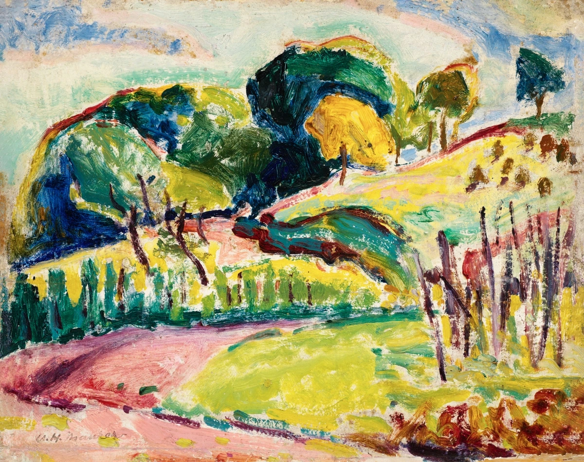
Linen is the premium, top-shelf option. It's made from the fibers of the flax plant, which are much longer and stronger than cotton. This is the stuff the Old Masters used, and it's revered for its durability and beautiful, natural weave. When you visit a museum, like the Noordbrabants Museum in Den Bosch, you're almost certainly looking at paintings on linen that have survived for centuries – a testament to its enduring quality. It’s the choice for those who demand the absolute best in archival integrity and a truly sublime painting experience.
Painting on a high-quality linen canvas for the first time is, quite frankly, a real treat. The surface has a unique, often irregular, and almost alive texture that just feels... professional. The natural slubs and subtle variations in the flax fibers can impart a truly subtle character to your brushwork, a nuanced depth that cotton simply can't quite replicate, creating an undeniable sense of history and gravitas in your piece. It's also significantly less absorbent than cotton, which means your paint tends to sit on top in a wonderfully luminous way, allowing for far greater control over delicate glazes and subtle color shifts—a game-changer, especially with oils where transparency and nuanced layering are key. I remember the first time I painted on a really fine linen; it felt like the brush just glided, and the colors sang in a way I hadn't experienced before. It was a moment where the material truly elevated the act of creation, and it shifted my perception of what a painting surface could be.
When we talk about linen, the conversation often centers around two main types: Belgian linen and Irish linen. Belgian linen is frequently heralded as the gold standard, renowned globally for its consistent quality, exceptional strength, and truly beautiful, often very fine, weave. Irish linen is equally highly regarded, known for its fine texture, impressive durability, and often a slightly more rustic charm. Within these broader categories, you'll discover a fascinating array of grades based on fiber length and weave tightness—from exquisitely fine, smooth portrait linen (perfect for meticulous detail) to coarser, more textured landscape linen (ideal for robust brushwork and expressive strokes). Your choice here often boils down to your preferred surface texture and the specific demands of your painting style and subject matter. It's like choosing between a finely tailored suit and a rugged, handcrafted outdoor coat – both are premium, but serve different, intentional purposes. And here's a quick reference table to make sense of the different types:
Linen Type/Grade | Characteristics | Best For |
|---|---|---|
| Belgian Linen | Consistent quality, exceptional strength, fine weave | High-end professional work, detailed paintings, archival |
| Irish Linen | Fine texture, impressive durability, slightly rustic | Versatile professional work, a balance of tradition and resilience |
| Fine Portrait Linen | Exquisitely smooth, minimal texture, tight weave | Meticulous detail, delicate glazes, hyperrealism |
| Coarse Landscape Linen | Pronounced texture, open weave, robust | Expressive brushwork, impasto, textural effects, abstract work |
Beyond its aesthetic qualities, linen is incredibly strong, remarkably stable, and far less prone to sagging or warping compared to cotton. This makes it the absolute top choice for archival, professional work, especially with oil paints. When you choose linen, you're investing in a foundation that ensures your masterpieces can endure for centuries, much like the timeless works you admire in the great museums of the world. For a deeper dive into this premium material, you can find more details on its unique benefits in my article about the best canvas for oil painting. And if you're curious about a deeper comparison, I've got a whole other piece dedicated to the Canvas Showdown: Linen vs. Cotton for Artists. It's an investment in posterity, truly.
Environmentally speaking, linen (flax) is often lauded as a more sustainable crop than conventional cotton. It requires significantly less water and fewer pesticides to grow, and nearly every part of the flax plant can be utilized, minimizing waste. So, if you're aiming for an eco-conscious art practice, linen offers a compelling choice beyond its superior artistic qualities. It's a way to align your creative work with your values, a quiet statement of responsibility.
A Brief History of Canvas: From Ship Sails to Masterpieces
It’s easy to forget that canvas wasn’t always the go-to support. Before its widespread adoption in the 15th and 16th centuries, particularly in Venice, artists largely painted on wood panels. But as commissions grew larger and artists sought lighter, more portable surfaces that could handle grander scales, the sturdy fabric used for ship sails and tents became an unlikely, yet revolutionary, contender. Italian Renaissance masters like Titian and Tintoretto were among the early adopters, appreciating its flexibility and the expansive scale it allowed for their dramatic compositions. Later, Dutch masters embraced it for its ability to capture intricate details and light. Over the centuries, techniques for preparing canvas evolved, with sizing and priming becoming standardized to protect the fibers and provide an optimal painting ground. This historical progression, in my opinion, highlights art’s constant adaptation to new materials. So, every time you paint on canvas, you're actually connecting with a long, rich lineage of artistic innovation! It’s quite a thought, isn’t it? For more on how materials shape art, you might find my article on the history of oil painting from ancient pigments to modern masterpieces particularly illuminating. It reminds me that art is never static; it’s always in conversation with the tools and materials available, pushing boundaries and finding new expressions. It’s a living, breathing tradition you become a part of.
The catch with linen, you ask? It's expensive. Sometimes, dramatically so. You certainly don't need to start with linen, especially if you're just finding your artistic feet. But it's absolutely something to aspire to as you gain confidence and your work demands the highest archival standards. It’s an investment in the future of your art, a choice that speaks to the enduring value of your creative output.
Feature | Cotton Duck Canvas | Linen Canvas |
|---|---|---|
| Material | Cotton plant fibers | Flax plant fibers |
| Cost | $ - $$ | $$$ - $$$$ |
| Durability | Good, but can sag over time | Excellent, very strong, archival |
| Texture | Uniform, slightly soft weave | Irregular, natural, and crisp weave |
| Best For | Students, large works, acrylics | Professional artists, oils, archival work |
| Stretch | More elastic, can loosen | Less elastic, holds tension well |
| Weave Type | Uniform, tighter, less pronounced | Natural, irregular, pronounced texture |
It's Not Just the Fabric: Weight, Weave, and Priming
Beyond the fiber material itself, a canvas comes with a set of characteristics that deeply affect its performance and your painting experience. Understanding terms like weave, sizing, weight, and priming is like knowing the different brush types in your arsenal – each serves a distinct purpose. Think of it as truly understanding your artistic toolkit, moving beyond mere surface knowledge.
Okay, so you've picked a side in the cotton vs. linen debate. But there are a few more details on the label that matter, details that can profoundly impact the final outcome of your masterpiece. Let's peel back the layers and see what else makes a canvas truly tick, because the devil, and often the magic, is in the details.
The Canvas Weave: Texture and Tooth
Before we dive into what goes on the canvas, let's talk about the weave itself. This refers to how tightly and uniformly the threads of the fabric are woven together, and it's a critical, yet often overlooked, factor in your canvas choice. The weave dictates the 'tooth' of your canvas – that subtle surface texture that your paint loves to grab onto. It’s the textural whisper beneath your brush, profoundly influencing how light interacts with your paint, creating nuanced depths and highlights. Ignoring the weave is like choosing a paintbrush blindfolded; you miss out on a fundamental aspect of control and expression, and honestly, a lot of fun experimentation.
- Fine Weave (Smooth): Imagine a tightly woven, almost silky fabric. This delicate weave is perfect for detailed work, intricate portraiture, or smooth blends where you absolutely don't want the canvas texture to interfere with the precision of your brushstrokes. It offers a delicate, almost imperceptible tooth that’s excellent for thin oil glazes, luminous acrylic washes, and achieving a high level of realism or photographic detail. It's the surface I'd choose if I were painting a meticulous still life or a classical portrait. When you need that seamless transition and microscopic detail, a fine weave is your best friend, allowing your brush to glide with minimal resistance.
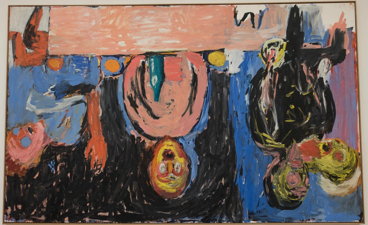
- Medium Weave: This is arguably your most versatile, all-purpose weave, and it's what you’ll typically find on standard cotton canvases. It presents a noticeable, yet not overly dominant, texture. This makes it incredibly adaptable and suitable for the vast majority of painting styles, providing just enough tooth for excellent paint adhesion without becoming a visual distraction. Many abstract artists, myself included, find this weave ideal for its harmonious balance of texture and smoothness, allowing for both subtle transitions and bolder applications. It’s like the perfect middle-ground, offering both control and a hint of character, a true workhorse for everyday painting.
- Coarse Weave (Rough): Stepping into the realm of the dramatic, coarse weaves boast a more open, pronounced texture. These are fantastic for impasto (what is impasto painting? A technique where paint is laid on thickly!), heavy paint application, and truly expressive brushwork. The inherent peaks and valleys of the weave can create dynamic broken color effects and add an undeniable tactile quality to your finished piece. If you're using a palette knife or really building up substantial layers, a coarse weave can be an absolute game-changer, allowing for incredible textural effects and a strong sense of physicality in your work. It's particularly fantastic for applying thick oil paints or heavy body acrylics, where you want the paint to stand proud from the surface. I often find myself reaching for a coarse weave when I'm exploring palette knife painting techniques to create those bold, expressive textures you often see in my abstracts. Just a friendly warning: more texture means your brushes will wear down a bit faster, but oh, the results can be worth it! This is where you truly let the canvas join the expressive dance, creating a conversation between the material and your mark-making.
Weave Type | Texture/Tooth | Best For | Typical Materials |
|---|---|---|---|
| Fine | Smooth, delicate, minimal tooth | Detail, portraiture, glazes, realism | Fine linen, highly gessoed cotton |
| Medium | Noticeable, balanced tooth | Versatile, general painting, abstracts | Standard cotton, medium-weave linen |
| Coarse | Pronounced, rough, strong tooth | Impasto, heavy paint, expressive work | Coarse linen, heavy cotton duck |
Sizing: The Essential Barrier
Before we even talk about primer, there's another crucial, often overlooked, step, especially for oil painters: sizing. Think of sizing as a foundational shield. Raw canvas, whether it's cotton or linen, naturally contains oils and acids. If oil paint comes into direct contact with these fibers over many, many decades, it can actually degrade them in a process affectionately (or rather, unaffectionately) known as "oil rot"—which, let's be honest, sounds nasty! Sizing creates an essential protective barrier, preventing the paint from coming into direct, damaging contact with the canvas fibers. Critically, sizing also reduces the canvas's absorbency, preventing your paint from sinking in and losing its vibrancy, which can often result in a dull, matte finish. Instead, the paint will sit beautifully on the surface, allowing its true color and sheen to shine through. It’s like putting a really good, invisible force field around your fibers, safeguarding your artistic legacy.
Traditional sizing agents include rabbit skin glue (RSG), a classic, historically authentic, but admittedly odorous option that requires careful preparation and is hydroscopic, meaning it reacts significantly to changes in humidity. For those who want the true Old Master experience, pungent aroma and all, RSG is the choice. On the more modern and practical side, we have alternatives like PVA glue (polyvinyl acetate), which is artist-grade, archival, remarkably easy to apply, and crucially, non-hydroscopic. Another excellent modern option is acrylic polymer emulsion, essentially a thin, clear gesso, which also acts as a superb barrier and is non-hydroscopic. I personally gravitate towards the modern, less-smelly options for practical reasons, but I respect the traditionalists! Each offers unique benefits, as summarized below:
Sizing Agent | Pros | Cons | Best For |
|---|---|---|---|
| Rabbit Skin Glue | Traditional, good tooth, excellent for oils | Odorous, hydroscopic, requires preparation, not vegan | Traditional oil painting, purists who value historical authenticity |
| PVA Glue (Artist-grade) | Archival, non-hydroscopic, easy to apply, affordable | Less traditional feel than RSG | All mediums, especially oils and acrylics, for a modern, stable barrier |
| Acrylic Polymer Emulsion | Easy to apply, non-hydroscopic, fast-drying, clear | Can be less rigid than traditional sizing for oils | All mediums, especially acrylics, offers minimal alteration to canvas appearance |
For oil paints, this sizing step is, in my opinion, absolutely non-negotiable if you want your work to last for centuries. Raw oil paint directly on fabric will eventually cause 'oil rot' as the linseed oil degrades those natural fibers. Sizing acts as your primary defense, preventing this direct contact. For acrylics, while sizing isn't strictly necessary (acrylic paint itself forms a stable film and is chemically inert), many artists still prefer it for that added layer of protection, to reduce canvas absorbency (giving you more control over your washes), and to create a smoother, more uniform surface. Personally, I tend to size even for my acrylic work when I’m preparing my own canvas; it’s that extra peace of mind and an investment in the longevity and vibrancy of my colors. For a comprehensive, step-by-step guide to this essential preparation, check out my article on how to prepare a canvas for acrylic painting (which covers sizing as well). And for oil painters, my guide on how to prepare a canvas for oil painting goes even deeper into this critical first step.
Sizing Agent | Pros | Cons | Best For |
|---|---|---|---|
| Rabbit Skin Glue | Traditional, good tooth, excellent for oils | Odorous, hydroscopic, requires preparation, not vegan | Traditional oil painting, purists |
| PVA Glue (Artist-grade) | Archival, non-hydroscopic, easy to apply, affordable | Less traditional feel than RSG | All mediums, especially oils and acrylics |
| Acrylic Polymer Emulsion | Easy to apply, non-hydroscopic, fast-drying | Can be less rigid than traditional sizing for oils | All mediums, especially acrylics |
Proper sizing is like building a strong, invisible shield for your canvas, protecting it from the ravages of time and paint.
Canvas Weight (It's Like Denim)
You’ll often see numbers like '8 oz' or '12 oz' (referring to ounces per square yard) or '280 gsm' or '450 gsm' (grams per square meter). This crucial measurement indicates the weight of the raw fabric before any sizing or priming is applied. Don't gloss over this detail, as it significantly impacts the canvas's performance and longevity. It's truly a foundational characteristic, and one I've learned to pay close attention to over the years. Think of it in terms of denim: a lightweight pair of jeans is fantastic for summer and easy movement but might not last forever. In contrast, a heavy-duty pair feels stiff initially but offers incredible durability and resistance to wear and tear. The same principle applies to canvas:

- 7-10 oz (around 200-300 gsm): This is a lighter weight canvas. It’s excellent for quick studies, smaller paintings, and practice pieces where cost-effectiveness is a priority. While more affordable, it might not offer the same structural integrity for very large works or heavy paint application. I typically avoid these for anything I intend to keep or sell, as they can sag easily.
- 10-15 oz (around 300-500 gsm): This falls into the professional-grade category. A canvas in this weight range is a sturdy, reliable, and truly all-purpose option. It can confidently handle substantial paint application, like bold impasto (those glorious thick layers of paint!), without buckling or losing tension. This is where you really start to feel the quality, offering a fantastic balance of durability and price. It's my go-to for most medium to large-scale works.
- 15 oz+ (around 500 gsm+): These are heavy-duty canvases, often found in high-quality linen or extra-heavy cotton. They are built for monumental works, extremely aggressive painting techniques (think vigorous scraping or thick textural pastes), and maximum archival longevity. They are an investment, but one that pays off in unwavering stability, providing a rock-solid foundation for your most ambitious projects.
A heavier canvas just feels more substantial, doesn't it? It’s significantly less likely to warp, tear, or succumb to the stresses of vigorous painting. It offers a robust foundation that can truly withstand aggressive techniques and hold up beautifully over decades, even centuries. This isn't just a subtle upgrade; it's a significant leap in permanence for your work. Heavier weights also inherently stretch more tightly and maintain their tension far better, fiercely resisting the sag that can plague lighter fabrics, especially on larger pieces or in fluctuating, humid environments.
I find that experimenting with different canvas weights can genuinely open up new possibilities in your painting. A heavier canvas provides an unwavering foundation, particularly when you’re exploring textural applications, mixed media, or grand abstract compositions. It gives you the freedom to push the boundaries of your materials. For instance, if I’m planning a large abstract with lots of heavy gel medium and collage, I absolutely reach for a 15oz+ canvas to avoid any potential warping or sagging down the line. It's an investment that pays off in stability and peace of mind. One final thought on weight: heavier canvases, while more robust, can also be a bit more challenging to stretch evenly if you're preparing your own canvas, requiring a bit more muscle and attention to detail. But again, the results are well worth the effort! It's another example of how taking control of your materials can truly elevate your art, allowing you to achieve effects that simply aren't possible on lighter weights.
All About That Prime(r): The Essential Foundation
Raw canvas is, frankly, super absorbent. If you were to paint directly on it, your expensive paint would simply sink in, appearing dull and lifeless, losing both its vibrancy and its archival integrity. This is precisely where primer—most commonly gesso—comes in. It acts as a foundational coating, meticulously designed to create a stable, ideally non-absorbent, and subtly textured surface for your paint to adhere to. This protective layer ensures your colors stay bright and your artwork lasts. Think of it as laying down the perfect asphalt before painting the lines on a road; without it, everything would just bleed into the ground, and who wants that mess?
I truly believe the painstaking process of stretching and priming your own canvas gives you unparalleled control over the surface, influencing every brushstroke that follows. It's a foundational ritual, a moment of quiet preparation before the creative storm. When I'm working on a piece destined for my timeline, I often spend as much time on the prep as I do on the initial layers of paint. That's how important it is for achieving the desired effects and longevity.
Gesso, in its simplest form, is a mix of a binder (usually acrylic polymer or animal glue), chalk (like calcium carbonate), and pigment (typically titanium dioxide for white). This blend creates that ideal non-absorbent, slightly textured surface for your paint to grab onto. To really get into the weeds on this foundational topic, I've written comprehensive guides on what gesso is in painting and also compared gesso vs. primer: what's the difference for artists, exploring their nuanced differences and helping you choose the best gesso for canvas preparation. I've also found that understanding how different gessoes interact with various mediums is a key to unlocking new possibilities in my own work.
Most pre-primed canvases you buy are perfectly fine to use right out of the wrapper. However, many artists (myself included, when I'm not feeling particularly lazy!) like to add another layer or two of gesso. Why? To achieve an even smoother, more uniform surface, or to adjust the 'tooth' precisely to their liking. This extra step provides an incredible level of control over the final texture and absorbency, ensuring the canvas is exactly what you envision before the first stroke. For a step-by-step process on how to achieve this perfect surface, see my guide on how to apply gesso to canvas. It’s an extra five minutes that can make all the difference, especially when you’re about to pour hours of creative energy onto the surface. Think of it as customizing your instrument before a big performance.
Types of Gesso: Acrylic vs. Oil Primers
Not all gessos are created equal, and understanding their differences is vital. While acrylic gesso is by far the most common and versatile option on the market today, suitable for both acrylic and oil paints, it's essentially an acrylic polymer-based primer. It's flexible, quick-drying, and creates a durable, slightly absorbent surface that many artists find ideal for a broad range of styles and mediums. This flexibility is a huge advantage, as it accommodates the movement of the canvas without cracking. This is often referred to as "universal gesso" because of its compatibility. You'll also find clear gesso, which offers the same priming benefits without obscuring the raw canvas, perfect if you want the natural fabric color or texture to show through beneath transparent layers of paint. And beyond just white, tinted gessoes are available in a spectrum of pre-mixed colors, offering an immediate colored ground. The choices can feel overwhelming, but they truly offer a world of possibilities for customizing your surface – a secret weapon, if you ask me!
On the other hand, oil gesso—which traditionally contained lead white, linseed oil, and a binder (though modern, safer versions use titanium dioxide)—creates a significantly less absorbent, often remarkably smoother, and more luminous surface. It is specifically designed for oil painting and is prized by traditional oil painters for its historical authenticity and the exquisite way it allows oil paint to glide, blend, and build in layers. A crucial distinction: you cannot paint acrylics over oil gesso (the acrylic won't adhere properly), but you can paint oils over acrylic gesso (provided the acrylic gesso is fully cured and of good quality). This choice dictates the very foundation of your painting's character. It's a bit like choosing between a high-performance sports car and a versatile SUV – both have their strengths, but you wouldn't take the sports car off-roading, would you? The choice of gesso is not just a technical one; it’s a philosophical one about the very nature of your art.
Gesso Type | Base | Characteristics | Compatibility | Best For |
|---|---|---|---|---|
| Acrylic Gesso (Universal) | Acrylic polymer | Flexible, quick-drying, slightly absorbent | Acrylics, Oils | Most versatile, general use, beginners |
| Oil Gesso | Oil-based (linseed, titanium dioxide) | Rigid, slow-drying, very smooth, less absorbent, luminous | Oils ONLY | Traditional oil painting, fine detail, rich glazes |
| Clear Gesso | Acrylic polymer | Transparent, retains canvas texture | Acrylics, Oils | When natural canvas or pre-collage elements need to show through |
| Tinted Gesso | Acrylic polymer | Colored ground, influences palette | Acrylics, Oils | Setting mood, undertones, overcoming white canvas intimidation |
The choice of gesso, whether you opt for the standard traditional white or venture into a vibrant hue, truly lays the groundwork for the emotional resonance, technical success, and overall vibrancy of your painting. It’s a foundational decision that impacts every subsequent brushstroke.

Playing with Colored Gesso: Beyond the White Canvas
And who, I ask, says gesso has to be white? While white gesso is undoubtedly the standard for achieving maximum vibrancy with your colors, please don't shy away from the exciting possibilities of colored gesso. Toning your canvas with a warm light gray, an earthy burnt sienna, a calming soft blue, or even a rich black, can dramatically alter the mood, atmosphere, and optical mixing of your subsequent paint layers. It allows you to build luminosity, or conversely, depth, from a colored ground, often leading to a more cohesive, sophisticated, and unexpectedly harmonious color palette. It’s also an incredible way to solve the daunting "blank white canvas" syndrome. Plus, let's be honest, it's just plain fun to experiment with and see how a different base transforms your entire creative approach! I often use a warm grey gesso for portraits, finding it makes skin tones glow, or a deep black for abstract works to really make vibrant colors pop.
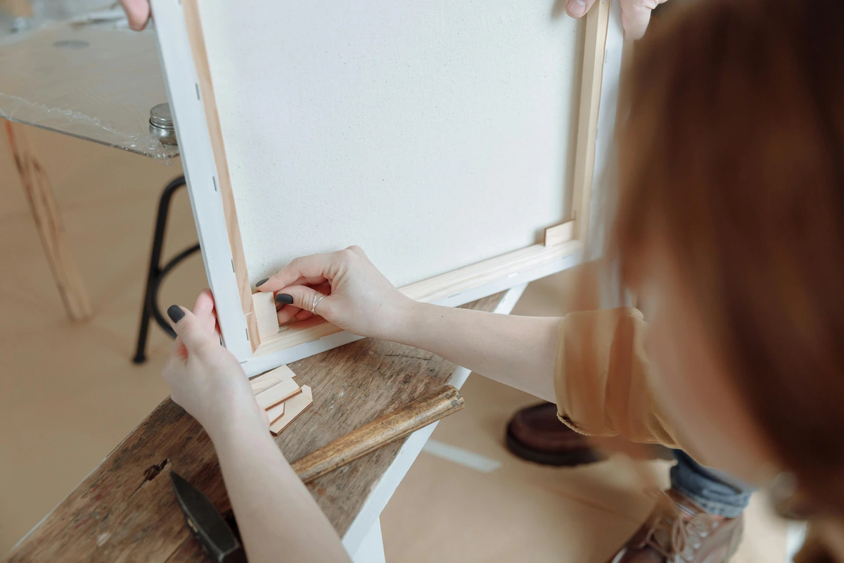
The Anatomy of Stretcher Bars: The Unsung Heroes of Your Artwork
When we talk about stretched canvas, we're actually talking about the unsung heroes of the art world: stretcher bars. These precisely milled wooden frames are what give a canvas its fundamental structure and drum-tight tension, and their quality matters immensely for the longevity and enduring stability of your artwork. Please, never underestimate them; a poorly constructed or inferior stretcher bar can be a recipe for disaster, leading to warping, unsightly sagging, and even irreversible damage to your painting over time. I've learned this the hard way with a few early pieces that succumbed to the dreaded 'canvas hammock effect' – a frustrating sight for any artist!
- Material: Always, always look for kiln-dried wood, typically premium pine or fir. Kiln-drying is a vital process that meticulously removes moisture from the wood, preventing it from twisting, warping, or bowing as it ages and reacts to environmental changes. Un-dried or poorly dried wood is, quite simply, a recipe for future heartbreak. Beyond just drying, the quality of the wood matters immensely: look for straight-grained, knot-free lumber, as knots can be weak points and cause unpredictable warping. It’s an investment in stability.
- Construction: High-quality stretcher bars are usually expertly finger-jointed at the corners, creating an incredibly strong, stable, and remarkably precise bond. They should fit together snugly, almost seamlessly, allowing for easy assembly and disassembly if needed for transport or re-stretching. This precision prevents unwanted movement and instability. Different joint types, like mitered corners (a simple diagonal cut) or more complex tongue-and-groove joints, each contribute to the frame's integrity, with the latter generally offering a superior, more robust connection that resists separation and twisting.
- Profile (Depth): As mentioned briefly, the depth (or profile) of the stretcher bar—think 3/4 inch (standard) versus 1.5 inches (gallery wrap) and beyond—significantly affects both the aesthetic presentation and your framing options. A deeper profile creates a more contemporary, robust 'gallery wrap' look, allowing the artwork to stand proud from the wall, while standard profiles are typically designed to fit neatly into traditional frames.
Profile Type | Depth (Approx.) | Aesthetic/Framing | Notes |
|---|---|---|---|
| Standard | 3/4 inch (1.9 cm) | Best for traditional framing, economical | Staples often visible on sides, designed to be covered by frame. |
| Medium | 7/8 inch - 1 inch (2.2 - 2.5 cm) | Offers slightly more presence, can be framed or sometimes unframed | A good mid-range option, balances cost and depth. |
| Gallery Wrap | 1.5 inches (3.8 cm) + | Designed for unframed display, contemporary look | Staples on back, paintable edges, creates a strong visual statement. |
- Bracing & Crossbars: For any canvas of a substantial size (and I’d argue anything generally over 20x24 inches), cross-bracing—those vital horizontal or vertical supports—is absolutely essential. These reinforcements prevent the stretcher bars themselves from bowing inwards or outwards under the immense tension of the canvas, thus maintaining the structural integrity of your entire piece. Without them, large canvases can become concave or convex over time, which, trust me, you don’t want. It’s like the skeleton of your artwork, providing crucial support.
- Keys (or Wedges): Those small, often overlooked wooden wedges you sometimes find tucked into the corners of a pre-stretched canvas? They’re your best friends! They allow you to gently tap outwards to re-tension a sagging canvas. Over time, due to humidity changes, temperature shifts, or simply the natural elasticity of the fabric, canvas can naturally slacken. Keys give you the power to restore that satisfying, drum-tight surface, breathing new life into your work. To use them effectively, tap them in evenly and gently into the slots at the corner joints, just enough to remove the slack without over-tensioning, which could damage the frame. Think of it as fine-tuning your drum before the big performance! I've saved many a canvas with these little wonders.
Choosing a canvas with robust, well-constructed stretcher bars is more than just a purchase; it’s an intelligent investment in your art's future, diligently ensuring it hangs flat, true, and pristine for generations to come. Trust me, you'll thank yourself years down the line when your painting still looks as crisp and taut as the day you finished it.
Form Factor: Stretched, Rolled, or Paneled?
Finally, how do you want your canvas delivered? The physical presentation of your canvas impacts portability, storage, and even the way you approach your artwork. This isn't just about convenience; it's about finding the format that best suits your creative process, your working space, and your budget. Let's explore the distinct advantages and considerations of each.
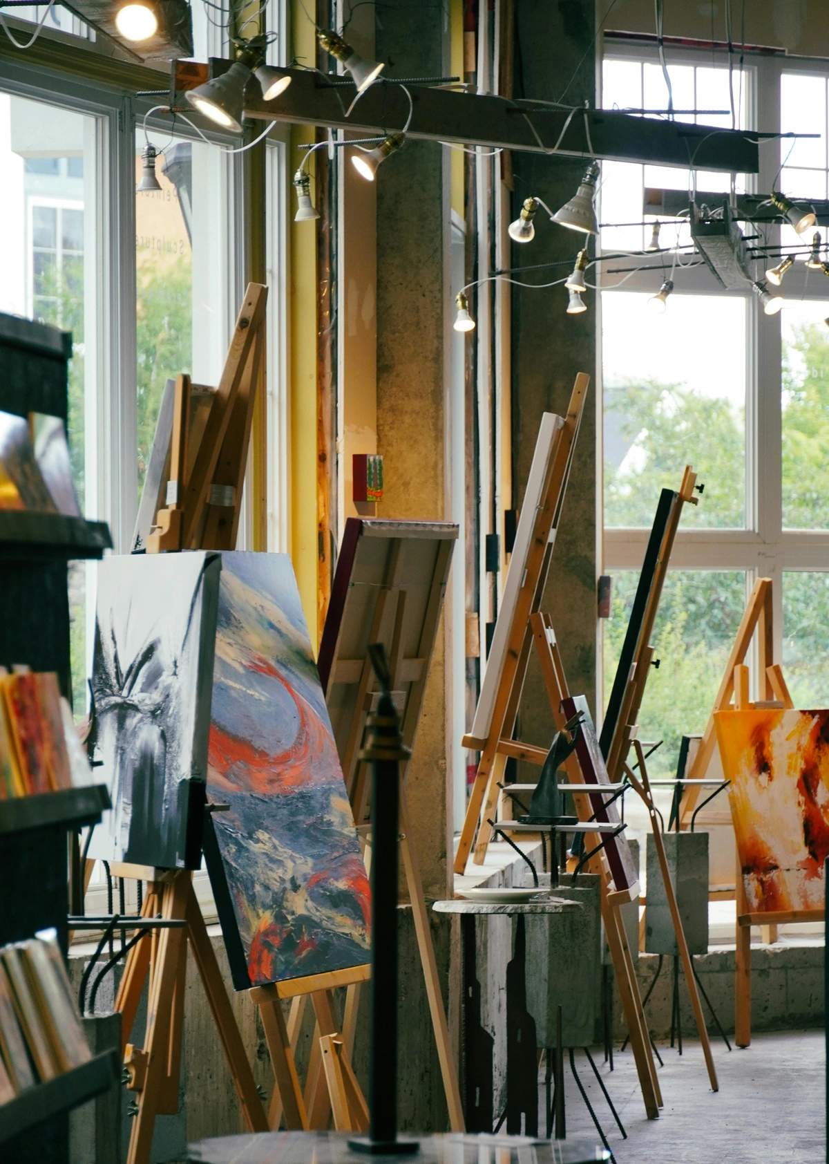
Pre-Stretched Canvas
This is, without a doubt, the format most artists start with, and for excellent reason—it’s the absolute epitome of convenience. The canvas arrives already perfectly tensioned over a sturdy wooden frame, those essential stretcher bars we just discussed, and is pre-primed, often with gesso, making it truly ready to go straight out of the wrapper. The quality of these stretcher bars is paramount: always look for kiln-dried wood to prevent the dreaded warping and twisting over time that can utterly ruin a painting. For any canvas of a decent size (generally anything over 20x24 inches), always, always check for cross-bracing (horizontal or vertical supports) in the back. These are vital for maintaining structural integrity and preventing the canvas from bowing in the center under its own tension. You might also discover those small but mighty wooden wedges, affectionately called "keys," tucked into the corners; these allow you to gently tap outwards to re-tension the canvas if it ever slackens due to humidity or age, restoring that satisfying drum-tight surface. Pay close attention to the profile (or depth) of the stretcher bars: a deeper profile (e.g., 1.5 inches or more) creates a more substantial, gallery-ready look, allowing you to hang it unframed for a contemporary aesthetic, while a standard profile (e.g., 3/4 inch) is more economical and often intended for framing. My personal preference, especially for my abstracts, almost always leans towards a deeper profile for that contemporary, frameless presentation. When I'm checking pre-stretched canvases in a store, I always run my hand across the surface to check for even tension and look for any bowing in the frame. A good quality pre-stretched canvas should feel drum-tight and flat. The main downsides? They undeniably take up a lot more space for storage and transport, and for their size, they can be a more expensive option per square foot compared to buying canvas by the roll. But for sheer ease of use, you can’t beat them, especially when you're just starting out and want to focus purely on the painting itself.

Stretcher Bar Profiles for Pre-Stretched Canvas
Profile Type | Depth (Approx.) | Best For | Aesthetic |
|---|---|---|---|
| Standard Wrap | 3/4 inch (1.9 cm) | Framing, economical | Traditional, hidden staples, classic presentation. |
| Medium Profile | 7/8 inch - 1 inch (2.2 - 2.5 cm) | Offers slightly more presence, can be framed or sometimes unframed | A good mid-range option, balances cost and depth. Versatile for various display choices. |
| Gallery Wrap | 1.5 inches (3.8 cm) + | Designed for unframed display, contemporary look | Modern, paintable edges, visible presence, creates a strong visual statement. |

Choosing a Stretcher Bar Profile: Beyond Just Depth
The depth you choose for your stretcher bars isn't just a technical specification; it's a significant aesthetic decision that impacts how your artwork sits in a space and how it's perceived. A thinner profile might recede more, ideal for a traditional frame or a subtle presence. A deep gallery wrap, however, adds a contemporary, almost sculptural quality, making the artwork feel substantial and allowing it to "float" off the wall. Consider your desired presentation and the overall feel of your art when making this choice—it can truly elevate the final piece. I've seen a stunning difference a deep profile can make in transforming a painting from 'just a picture on the wall' to a commanding presence. It's an often-underestimated aspect of curating your finished work.
Gallery Wrap vs. Standard Wrap: The Finishing Touch
When buying pre-stretched, you'll often see "gallery wrap" or "standard wrap." A gallery-wrap canvas has the fabric wrapped around the stretcher bars and stapled neatly on the back. This creates clean, paintable edges, meaning the image can continue around the sides, making it perfect for hanging unframed for a contemporary look. A standard wrap canvas has the staples on the sides of the stretcher bars, meaning the staples are visible, and it's typically intended to be framed to conceal them. This small detail profoundly impacts how your finished piece is presented, so choose wisely based on your artistic vision and framing intentions.
Canvas Rolls
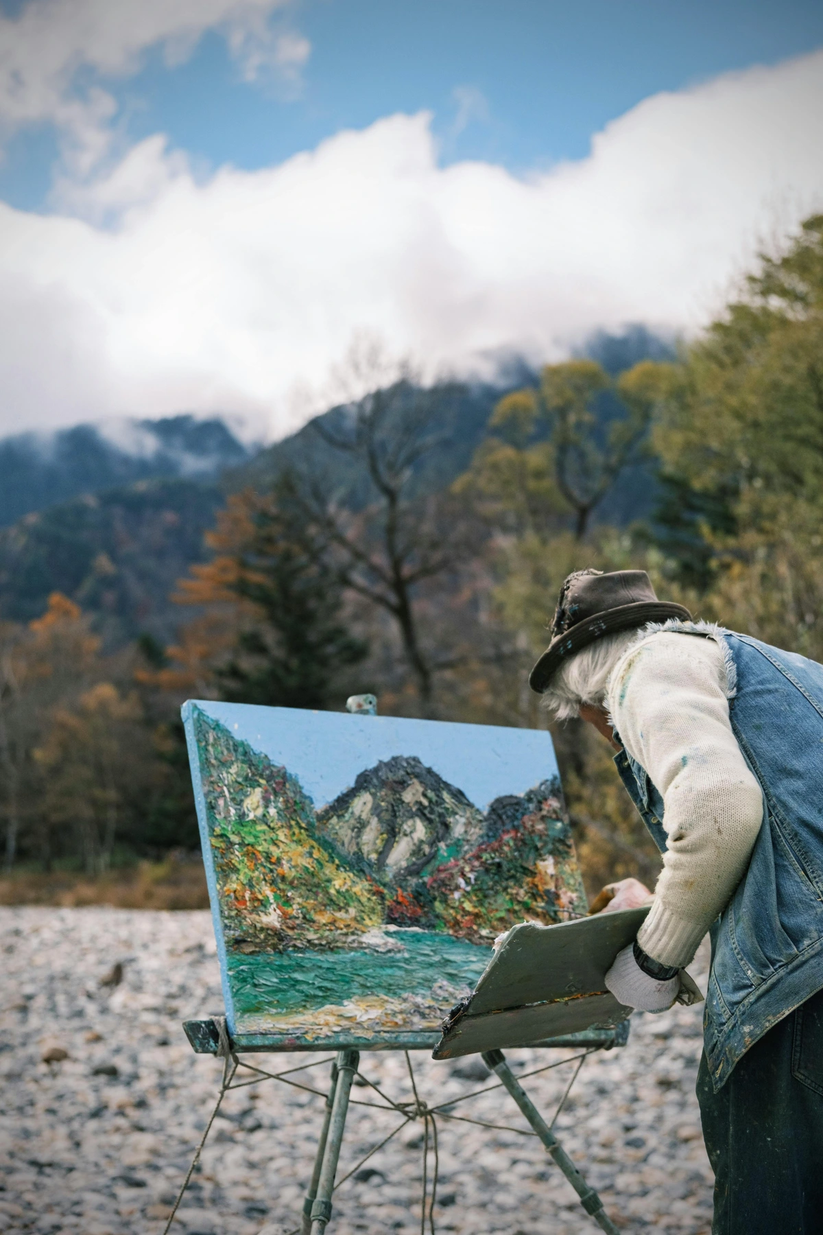
Buying canvas by the roll is, hands-down, the most economical way to acquire fabric, especially if you’re working on a grand scale or need very specific custom sizes. These rolls are available either pre-primed or completely unprimed, offering maximum flexibility. This is particularly advantageous if you need truly unique dimensions, are planning a series of works like diptychs or triptychs, or simply want to try a different kind of priming. The primary trade-off? You’ll have to stretch it yourself. While the idea might sound a bit daunting at first, I promise you, stretching your own canvas is a genuinely empowering skill to master. It grants you complete and utter control over the tension and surface quality—a level of customization you simply can’t get with off-the-shelf options. You'll need a few basic tools: stretcher bars, a staple gun, canvas pliers, and a sharp utility knife. This also liberates you to choose your exact canvas material, weave, and weight, giving you a truly bespoke surface that aligns perfectly with your vision. It’s also a fantastic way to cut down on waste and storage space for unpainted canvases, making it an incredibly economical choice for prolific artists or those embarking on ambitious, large-scale projects. Sometimes, I even work on large sections of rolled canvas unstretched for murals or installations, then mount them later. Personally, I find the process meditative, a quiet ritual performed before the joyful chaos of creation, a foundational step that connects me more deeply to the very materials I use. If you're ready to dive into this rewarding process, my comprehensive guide on how to stretch a canvas for painting walks you through every single step, dispelling any fear and building your confidence. And for those interested in the sheer mechanics, my guide on how to stretch a canvas delves even deeper into the practical side. This method might take a bit more time initially, but the artistic freedom it offers is, in my opinion, priceless.
Canvas Panels and Boards
These are fantastic, rigid alternatives where a primed canvas fabric is meticulously adhered to a sturdy, flat backing. Common backing materials include robust cardboard, durable hardboard (MDF), or even premium Baltic birch plywood. They are typically thin, wonderfully rigid, and significantly more affordable than their stretched canvas counterparts. I absolutely adore them for quick studies, spontaneous experiments, or dedicated plein air painting sessions because they're incredibly easy to transport, store, and, crucially, they don't flex under aggressive brushstrokes. This rigidity offers an exceptionally stable surface that’s particularly amenable to detailed work, intricate lines, or even robust mixed media applications. When choosing, always consider the backing material: simple cardboard is excellent for practice and quick studies, but for anything you intend to be archival and long-lasting, always reach for acid-free hardboard (MDF) or Baltic birch plywood. These materials offer superior durability, remarkable resistance to warping, and a neutral pH that will not degrade your precious artwork over time. I almost exclusively opt for the latter when I'm creating a piece I want to truly last, as the unwavering stability of the support contributes immensely to the longevity and integrity of the paint layers. For an even more customizable approach, you can even purchase unprimed paper or thin canvas sheets and mount them yourself onto rigid panels using archival adhesive sheets or glues. This gives you absolute control over both the support and the surface. They are an unsung hero of the portable studio, and I always have a stack on hand for whenever inspiration strikes!
Cradled Wood Panels
These are a significant step up from basic canvas panels, representing a premium rigid support. Cradled wood panels feature a high-quality wood panel (often birch or MDF) with a small, integrated wooden frame (or "cradle") expertly constructed around the back edges. This cradle is a game-changer: it not only adds superior stability, preventing warping, but also allows for incredibly easy hanging without the need for additional, often expensive, framing. They offer a wonderfully rigid, unyielding surface, highly valued by artists who enjoy building up significant texture and working with mixed media, as the solid backing provides unwavering support for heavy applications of paint, found objects, collage elements, or even light sculptural additions. The integrated cradle also elegantly elevates the artwork off the wall, creating a subtle, sophisticated shadow line that enhances its presence and gives it a gallery-ready finish. If you want a panel that screams 'finished artwork' right off the bat, this is your choice.
Paper for Painting: The Versatile Alternative
While not technically "canvas," specialized heavy-weight art papers offer a fantastic, affordable, and incredibly portable surface for studies, experiments, and even finished work, particularly with acrylics and gouache. These are truly versatile and deserve a place in every artist's toolkit. I’ve probably done hundreds of sketches and studies on various papers before committing to a larger canvas – it’s an invaluable step in my process, saving me both time and expensive materials.
Acrylic Paper
This paper is specifically designed with a built-in coating to prevent buckling, bleed-through, and excessive absorption, often featuring a subtle texture that mimics a fine canvas. It's a great choice for acrylic studies or finished pieces where you want the archival benefits of paper with a canvas-like feel and the convenience of a pad. I find it holds up surprisingly well to layering.
Watercolor Paper
Heavy-weight (300 gsm or more) watercolor paper can absolutely be used with other water-based mediums like acrylic washes or gouache, though its inherent absorbency differs greatly from a gessoed canvas. The way paint interacts with it is wonderfully unique, allowing for beautiful granular effects and lifting techniques that are hard to replicate elsewhere.
Oil Paper
This is a specially treated paper, typically primed or coated to be resistant to oil penetration. This crucial barrier allows oil paints to be used directly on the surface without the need for prior sizing, offering a convenient and portable option for oil studies or quick sketches. It's a fantastic, low-commitment way to experiment with oils without the full canvas preparation.
Mixed Media Paper
A true workhorse, versatile paper is designed with a robust surface to handle a wide variety of wet and dry mediums, from inks and markers to light washes and collage elements. It's my go-to for brainstorming and combining different artistic approaches.
Pastel Paper
While often textured or sanded, specialized pastel papers (or even papers with a pumice ground applied) provide the essential grip for pastel pigments, preventing them from simply falling off. It’s a different, but equally rewarding, textural experience, allowing for vibrant, layered pastel work. I love how the paper's texture can become an integral part of the artwork.
These specialized papers often have a built-in tooth or surface treatment that mimics canvas to varying degrees, allowing for vibrant color application without excessive absorption or buckling. For me, they are an invaluable way to explore ideas, experiment with techniques, and work out compositions without the financial commitment or spatial demands of a large canvas. For soft pastels especially, a sanded or heavily textured paper provides the necessary grip for the delicate pigment to adhere, offering a distinct and highly tactile experience. I often think of it as giving the pigment something to hold onto, allowing for rich, layered effects. For more on this, check out my article on exploring oil sticks for expressive mark-making which shares some similar textural considerations. I constantly use these papers for my initial compositional sketches, color studies, and quick explorations, finding them indispensable before committing to a larger canvas. They’re a true playground for artistic discovery, allowing for freedom without the pressure of a 'final piece' from the get-go. And here's a quick table for your reference:
Paper Type | Key Characteristics | Best For | Notes |
|---|---|---|---|
| Acrylic Paper | Built-in coating, prevents buckling, subtle canvas texture | Acrylic studies, light acrylic paintings, mixed media | Designed to handle wet mediums without warping. |
| Watercolor Paper | Highly absorbent, various textures (cold press, hot press) | Watercolors, gouache washes, ink, delicate glazes | Requires stretching for very wet applications to prevent buckling. |
| Oil Paper | Specially treated to resist oil penetration | Oil sketches, studies, convenient for oil painting on the go | No prior sizing needed, offers a smooth or textured surface. |
| Mixed Media Paper | Robust surface, handles wet and dry mediums | Sketching, journaling, light washes, collage, inks | A versatile all-rounder for various experiments. |
| Pastel Paper | Textured or sanded surface for pigment grip | Soft pastels, oil pastels, charcoal, sanguine | Essential for preventing pastel pigments from falling off. |
So, What Canvas for YOUR Paint?
This is the final, pivotal piece of the puzzle. The specific medium you choose has a direct, undeniable impact on the canvas you should select for optimal results and longevity. It’s like pairing the perfect wine with a meal – the right combination elevates the entire experience, while the wrong one can fall flat.
For Acrylic Painters: The Versatile All-Rounder
Acrylics are, without a doubt, the champions of flexibility in the painting world. Seriously, you can pretty much use them on any properly primed surface, which is precisely why they’re so universally beloved by artists of all levels. A standard, good quality, pre-primed cotton duck canvas is your absolute best friend here. It’s wonderfully affordable, the texture is generally fantastic for acrylics, and it handles everything you can throw at it—from thin, delicate washes and luminous glazes to incredibly thick, glorious applications. Whether you’re pouring, splattering, glazing, or building intense impasto (those sculptural layers of paint!), cotton can absolutely take it. Acrylics dry quickly, which is a massive advantage, allowing for rapid layering and fearless exploration of transparency or opacity without endless waiting. For those looking to create a specific surface, you can easily add extra layers of gesso to achieve a super smooth, almost glass-like finish, or, conversely, incorporate texture mediums directly into your gesso before you even touch paint to canvas, creating a unique ground for your work. Using a coarse weave can be fantastic for expressive, heavy applications and pronounced texture, while a finer weave is ideal for delicate glazes, intricate details, and achieving a smooth transition from one acrylic color field to the next. Techniques like dry brush work beautifully on canvas to create soft, feathery textures, while glazing with transparent layers builds incredible depth. While the fascinating question of canvas vs paper for acrylics is a whole other topic to explore, for finished, lasting work, canvas truly remains king. And don't forget, you can dive even deeper by exploring various acrylic mediums to further enhance your painting on canvas, adding sheen, body, or transparency, transforming the surface into anything from a glossy, enamel-like finish to a rich, matte texture. The possibilities are, quite literally, endless! And if you're venturing into the realm of acrylic gouache, a uniquely opaque form of acrylic paint, a standard gesso-primed canvas provides a beautifully robust and non-absorbent ground that allows for its signature flat, matte finish and crisp edges. For a deeper dive into the world of acrylics, check out my definitive guide to paint types for artists, specifically the acrylic section! I also love experimenting with how to mix acrylic paint directly on the canvas to create unique color interactions.
Acrylics, with their incredible versatility, thrive on a well-prepared canvas, allowing for everything from bold, expressive strokes to subtle, nuanced washes. They truly are the chameleon of paints.
For Oil Painters
Oils, my friends, are a bit more demanding, a true diva of the art world. The inherent oils in the paint can, over many decades, degrade natural fibers. This is precisely why a proper prime and/or sizing is not just recommended, but absolutely crucial. Traditionally, this involved multiple layers of animal glue sizing followed by several coats of lead white oil primer, a meticulous process that created an incredibly stable, non-absorbent, and luminous surface. Modern alternatives like oil-primed linen (or high-quality oil-primed cotton) are widely considered the gold standard for oils. The robust, stable fibers of linen hold up beautifully to the weight and chemical properties of oil paint, ensuring your work can literally last for centuries. Of course, you can absolutely use oils on a high-quality, acrylic-gesso-primed cotton canvas, but for work you want to endure for generations, linen offers that extra layer of confidence and archival integrity. Remember the crucial "fat over lean" principle, especially on an oil-primed surface, to ensure your paint layers dry consistently and prevent cracking over time. This means applying paint with more oil (fat) over layers with less oil (lean). Failure to follow this can lead to serious issues down the line, compromising the archival integrity of your masterpiece. There's a lot of nuance here, which I cover in my post on how to choose the right canvas for acrylic vs. oil. For those just starting, don't miss my guide on best oil paints for beginners and my top recommendations for best oil painting brushes for artists. For the truly dedicated, delving into mastering glazing techniques in oil painting can unlock incredible luminosity and depth on a well-prepared linen surface. It’s all about respecting the medium and giving it the support it deserves to truly shine.
For Watercolor Painters: A Surprising Canvas Choice
This might truly surprise some, but yes, you can absolutely paint with watercolors on canvas! While traditional watercolor paper offers a unique absorbency and texture that is ideal for specific techniques, specialized watercolor canvases are indeed available. These canvases are typically pre-primed with a uniquely absorbent ground (often a gesso specifically designed to mimic paper's absorbency and textural properties) that allows watercolors to flow, lift, and blend. The experience, I must admit, is distinctly different from paper. They can be less forgiving than paper, as colors often dry more quickly and re-wetting can be a bit trickier, making delicate washes and subtle blends a different beast to master. However, for those seeking a durable, frameless presentation, a bolder aesthetic, or simply a more experimental approach, canvas offers an incredibly interesting and robust alternative. It allows for heavier application, glazing, and even scraping techniques that simply aren't possible on delicate paper. The absorbent ground essentially acts like a thick, highly durable paper surface, but with the inherent strength and permanence of canvas. For purest, traditional watercolor effects, a high-quality, heavy-weight watercolor paper is usually preferred, but please, don't let that stop you from exploring the exciting possibilities of watercolor on canvas for a truly unique and often more abstract aesthetic. It’s a surface that encourages a bolder, perhaps more expressive approach to the medium, transforming subtle washes into commanding statements. I’ve found it pushes me to think about watercolor in entirely new ways, which is always a good thing! And if you're curious about different types, check out my reviews of the best watercolor sets for beginners and review of Schmincke Horadam watercolors for more options.
The choice of canvas profoundly influences the expressive potential of your medium, from the thick impasto of oils to the delicate washes of watercolor.
For Gouache Painters: The Opaque Powerhouse
Gouache, often affectionately called opaque watercolor, cleverly shares characteristics with both acrylics and watercolors, making it a truly versatile medium. It absolutely thrives on a surface with a bit of tooth, making a standard gesso-primed canvas a natural and fantastic fit. A good quality, gesso-primed cotton canvas or even rigid canvas panels work wonderfully for gouache, much like they do for acrylics. The inherent opacity of gouache means it covers the canvas beautifully, creating rich, matte color fields, and the slight absorbency of cotton can actually help it adhere beautifully without excessive cracking, making it a surprisingly robust choice. I often find myself reaching for it when I want to achieve those crisp, graphic effects in my abstracts. You have immense control, able to layer gouache opaquely for bold, flat areas of color or thin it down for more delicate, watercolor-like washes, and the canvas surface holds up exceptionally well to its unique properties, particularly its fast drying time and, interestingly, its ability to be re-wet even after drying. This allows for both crisp lines and soft blends, offering a truly wide range of expressive possibilities. For those exploring this vibrant medium, I highly recommend checking out my article on essential gouache painting techniques for beginners and, of course, a review of the best gouache sets for beginners. It's a medium I've recently fallen in love with for its vibrant, matte finish, and it performs beautifully on a prepared canvas. It’s a medium I’ve recently fallen in love with for its vibrant, matte finish, and it performs beautifully on a prepared canvas. I often find myself reaching for it when I want to achieve those crisp, graphic effects in my abstracts.
An artist's connection to their canvas, whether in a studio or en plein air, is a fundamental aspect of the creative process, often evolving with experience and medium choice. It’s a dynamic relationship, a silent dialogue between creator and material.
For Pastel Artists (Oil and Soft): Embracing Texture
While pastels are most typically associated with paper, certain canvases—or rather, canvases specially prepared—can offer an incredibly exciting and unique textural surface. For oil pastels, which are a waxy, dense medium, a finely primed canvas or a sanded paper meticulously adhered to a rigid board can provide the necessary grip for the pigment to adhere. This allows for wonderfully rich, vibrant layers and captivating broken color effects as the canvas texture subtly shows through the pastel. The inherent rigidity of a panel is often greatly preferred here to prevent any flexing that could potentially crack the applied pastel.
For soft pastels, which are delicate and powdery, a surface with significant tooth—far more than typical gesso provides—is absolutely crucial to effectively hold the pigment. While less common than paper, some adventurous artists meticulously prepare canvases with a pumice-based ground or apply specialized pastel grounds (which are essentially a gesso infused with fine grit) to create a genuinely pastel-friendly surface that wonderfully mimics sanded paper. This innovative approach allows for the unique blendability and layering capabilities of soft pastels on a more rigid, durable support, offering a truly intriguing alternative to traditional paper. My guide on a beginner's guide to using oil pastels has more on this, and exploring these uniquely textured grounds can truly open up new expressive avenues. For soft pastels specifically, a deeper understanding of what soft pastels are and how to use them will further inform your optimal surface choices. It’s all about creating a surface that truly grabs and holds that delicate pigment.

The tactile qualities of a painting surface are evident in historical works and can be deeply explored in contemporary art through diverse mediums. It’s a conversation that has been happening for centuries and continues to evolve with every artist.
For Mixed Media and Experimentation: The Fearless Canvas
If you're anything like me and delight in throwing everything but the kitchen sink at your canvas, then a sturdy, exceptionally well-primed heavyweight cotton or linen canvas is, without a doubt, your absolute best bet. These robust surfaces are specifically designed to confidently handle complex layers of wildly different mediums—think collage elements, vibrant inks, fluid acrylics, rich oils, delicate pastels, and so much more—all without buckling, cracking, or degrading over time. The fundamental key here is building an incredibly strong, stable foundation with a reliable, artist-grade primer that acts as both a protective barrier and provides adequate tooth for all those diverse layers to adhere to. Don't, for a second, be afraid to experiment! Try adding texture directly to your gessoed canvas before you even start painting, using anything from a simple palette knife to specialized textural gels to create dynamic, truly three-dimensional surfaces. I always recommend starting with a heavier weight canvas here, as it can withstand more abuse and layering without compromise. My own artistic journey, which frequently involves a blend of disparate mediums, absolutely thrives on canvases that offer both unwavering resilience and a wonderfully receptive surface, allowing for intricate, complex narratives to unfold and evolve directly on the surface. For a deeper dive into my approach, check out my articles on the unseen layers: my process of building depth and narrative in abstract mixed media and exploring texture: my favorite techniques for adding depth to abstract paintings. The mixed media canvas is truly your playground, so make it a strong one! It's where the most exciting discoveries often happen, allowing for unparalleled creative freedom. I always recommend starting with a heavier weight canvas here, as it can withstand more abuse and layering without compromise.
Paint Type vs. Canvas Characteristics: A Quick Reference
To help you quickly navigate your choices, here’s a summary of which canvas characteristics generally pair best with different paint mediums. Remember, these are guidelines, not rigid rules—the most exciting discoveries often happen when you thoughtfully break them!
Paint Medium | Ideal Canvas Material | Preferred Weave/Texture | Sizing/Priming | Form Factor Recommendations |
|---|---|---|---|---|
| Acrylics | Cotton, Linen | Medium to Coarse | Universal Gesso | Stretched Canvas, Panels, Acrylic Paper, Canvas Rolls |
| Oils | Linen (preferred), Cotton | Fine to Medium | Oil Primer, Sizing | Stretched Canvas, Oil Paper, Cradled Wood Panels |
| Watercolors | Specialized Canvas | Fine, Absorbent | Watercolor Gesso | Watercolor Canvas Panels, Heavyweight Watercolor Paper |
| Gouache | Cotton, Panels | Fine to Medium | Universal Gesso | Stretched Canvas, Panels, Mixed Media Paper |
| Oil Pastels | Panels, Heavy Paper | Medium to Coarse, Textured | Universal Gesso | Rigid Panels (adhered), Heavyweight Paper |
| Soft Pastels | Panels, Heavy Paper | Very Coarse, Sanded | Pumice Ground | Rigid Panels (adhered), Specialized Pastel Paper |
| Mixed Media | Heavyweight Cotton, Linen | Coarse, Textured | Universal Gesso | Robust Stretched Canvas, Cradled Wood Panels, Mixed Media Paper |
FAQ: Your Canvas Questions Answered
I get a lot of questions about canvases, and frankly, some of them are pretty insightful. So, I've gathered some of the most common ones here, along with my honest, real-world answers. Hopefully, these clear up any lingering doubts and help you confidently choose your next artistic battlefield. Because let's be honest, sometimes you just need a straightforward answer without all the jargon, right?
What are some common canvas brands and how do they compare?
Navigating the world of canvas brands can be as complex as choosing your paint! While personal preference plays a huge role, some brands are consistently lauded for their quality, consistency, and archival standards. For student-grade and practice, brands like Fredrix, Artist's Loft, or Grumbacher offer accessible options, usually in cotton duck. Moving up to artist-grade, you'll find brands like Winsor & Newton, Claessens, and Artfix which provide superior linen and heavier cottons, often with meticulous priming and sturdy stretcher bars. When you're ready to invest, exploring these higher-end options can genuinely elevate your painting experience. I always recommend touching and feeling a few different brands in person if you can, as the subtle differences in weave, tension, and primer can be quite significant. It’s a sensory experience, after all, and the right feel can truly inspire. Just like with paints, where you might compare Golden vs. Liquitex acrylics, canvases also have their loyal followings and distinct characteristics.
How do different canvas finishes (smooth, textured, absorbent) impact my painting process?
The finish of your canvas is truly like a silent, yet incredibly influential, collaborator in your creative process. A smooth finish—often painstakingly achieved with finer weaves and multiple layers of gesso, meticulously sanded between coats—is an absolute dream for delicate detail, crisp, precise lines, and effortless, seamless blending. This makes it utterly ideal for portraiture, hyperrealism, or the subtle beauty of thin glazes. On the other hand, a textured finish—derived from coarser weaves, minimal gesso, or gesso with intentionally added grit—provides that essential 'tooth' for the paint to grab onto. This is fantastic for robust impasto, expressive brushwork, and creating a profound sense of raw, tangible physicality in your work, almost like a sculptural element in itself.
Now, regarding absorbency, this is where things get really interesting. A highly absorbent surface will cause your precious paint to sink in rapidly, often resulting in a duller, less vibrant appearance, requiring more paint or multiple layers to truly achieve luminosity. Conversely, a less absorbent surface (which is common with traditionally oil-primed canvases or those heavily gessoed with acrylic gesso) allows paint to luxuriantly sit on top. This maintains its inherent luminosity and makes blending a dream. Your choice here should unequivocally align with your medium and your desired artistic outcome—personally, I often gravitate towards a highly textured, less absorbent surface for my abstract work, as it gloriously maximizes the tactile quality and visual impact of the paint itself. It's a key decision that informs the entire conversation between your paint and the surface. Remember, there's no 'right' answer, only the answer that's right for your vision and medium.
Canvas Depth: Does it Really Matter?
Yes, absolutely it does! The depth or profile of your canvas stretcher bars (for instance, a slim 3/4 inch versus a substantial 1.5 inches or more) makes a remarkably significant difference in both the finished aesthetic of your artwork and how you ultimately choose to present it. A standard 3/4 inch depth often looks its absolute best when framed, as it’s designed to fit perfectly into most common frame sizes, creating a classic, refined presentation. However, a deeper, 'gallery wrap' profile (1.5 inches or more) is fantastic for hanging unframed, creating a clean, contemporary, and almost sculptural presence on the wall. The substantial edge allows the artwork to truly command attention. For my own abstract works, I almost always choose deeper profiles, as I find it genuinely adds to their commanding presence and allows the viewer to focus purely on the art, without the distraction of a frame. It’s a subtle architectural element that frames your art on the wall, even without a traditional frame.
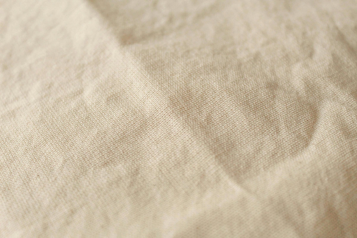
The depth of your canvas can dramatically shift how a viewer perceives and interacts with your artwork, even before framing is considered. It’s about creating a presence, a weight to your statement, literally and figuratively.
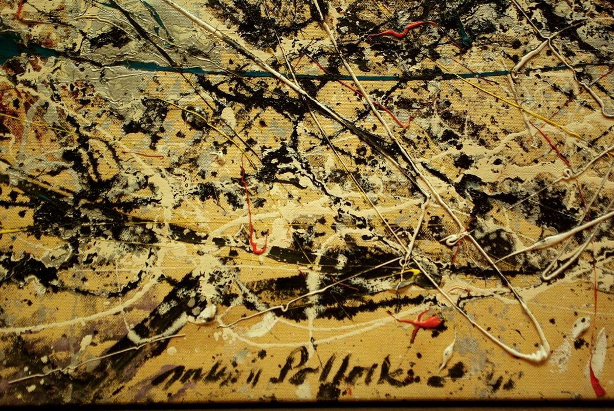
How do I choose the right canvas size and aspect ratio for my art?
Choosing the right canvas size and aspect ratio is a surprisingly critical, yet often underestimated, step that profoundly impacts your composition, the narrative you wish to convey, and even how your work is ultimately received by viewers. It's not just about making it fit on a wall; it's fundamentally about its visual impact and the dialogue it creates. I've seen incredible concepts fall flat simply because the artist chose an ill-fitting canvas size.
- Standard Sizes: You’ll find common aspect ratios like 1:1 (square), 3:4, 2:3, and 16:9 (widescreen) are widely available. Starting with these can definitely simplify framing logistics later on, as off-the-shelf frames are readily available. I often use these for commissions where framing is a known factor.
- Emotional Impact: The chosen format itself carries an emotional weight. A tall, narrow canvas, for example, can powerfully evoke a sense of grandeur, solemnity, or even confinement, drawing the eye upwards. Conversely, a wide, panoramic one can suggest expansive, breathtaking landscapes or a more intimate, close-up view, inviting the viewer to linger across its breadth. Square formats, I find, often feel inherently balanced, stable, and deeply contemplative, perfect for a strong focal point.
- Subject Matter: Always consider what you're painting. A classic portrait might genuinely thrive on a traditional 3:4 ratio, emphasizing the figure. An abstract landscape, however, could truly sing on a wide, expansive format, mirroring the horizons of nature. For my own abstract work, I often intentionally lean into unusual or non-standard ratios to disrupt expectation, create tension, and encourage a more active, dynamic viewing experience. It's all part of the artistic statement.
- Space & Display: This is a practical but vital consideration. Where will the finished piece ultimately hang? A monumental, large-scale work demands a correspondingly large wall, needing room to breathe and command. A small study, on the other hand, can perfectly grace more intimate spaces, inviting closer inspection. Always think about how the canvas will interact with its intended environment, and if it will compete or complement.
My advice? Don't be afraid to sketch out your composition on different paper sizes or even cut out paper mock-ups first. This quick, low-stakes exercise can give you an invaluable feel for how your imagery translates across various dimensions and aspect ratios before committing to a more expensive canvas. It’s a small step that can save big headaches, and I do it all the time!
Can I reuse a canvas?
Oh, absolutely! As an artist, I've had many canvases that didn't quite work out (we all have those moments, right?). Instead of tossing them, I often gesso right over the old painting. A fresh layer or two of gesso can completely cover the previous image, giving you a brand new, perfectly usable surface. It's economical, environmentally friendly, and sometimes the ghost of the old painting can even subtly inspire the new one. Just make sure the previous paint layers are dry and stable, and that you apply enough gesso to create an opaque, uniform ground. It’s a fantastic way to embrace sustainability in your studio and let go of perfectionism. I’ve found some of my most unexpected breakthroughs have happened on a 'recycled' canvas.
What's the best canvas for a total beginner?
Honestly, don't overthink it. Grab a pack of medium-sized, pre-stretched, gesso-primed cotton canvases or a handful of canvas panels. They are incredibly affordable, ready to paint on straight out of the wrapper, and perfect for learning without that nagging fear of 'wasting' an expensive surface. Just dive in and enjoy the process! The most important thing is to just start, not get bogged down in endless choices. My advice? Don't let perfection be the enemy of progress; just get some paint on that surface!
Can I use oil paints on a cheap, acrylic-primed cotton canvas?
This is a common question, and the short answer is: yes, generally. Modern acrylic gesso primers are formulated to create a sufficient, stable barrier between the oil paint and the cotton fibers, preventing the damaging "oil rot" we discussed earlier. While a traditional oil-primed linen canvas is still considered the gold standard for museum-bound masterpieces you want to last 500 years, for learning, practice, and even many professional pieces, an acrylic-primed canvas is perfectly adequate. The crucial bit is simply ensuring the canvas is indeed primed with a quality gesso that provides that protective layer. Just be aware that the surface absorbency and feel might differ slightly from a traditionally oil-primed surface. For everyday painting and practice, it's a perfectly viable option, but for your magnum opus, you might want to save up for that linen! It's a pragmatic choice for many artists, myself included, when budget or accessibility is a factor.
How do I clean an unpainted or painted canvas?
For unpainted canvases, a light dusting with a soft, dry brush is usually enough to remove surface dust. If it's a pre-primed canvas and gets a minor scuff, a slightly damp (not wet!) cloth can gently wipe it clean, but avoid saturating the canvas. For painted canvases, especially finished works, cleaning can be a delicate operation. For light dust, a very soft, dry brush (like a large makeup brush) can work. For anything more substantial, or if you're dealing with grime, it's best to consult a professional art conservator. Harsh chemicals or excessive moisture can easily damage paint layers and varnishes, so when in doubt, less is more. Your finished artwork is a delicate treasure, so treat it with the respect it deserves! I've seen too many good intentions ruin a painting, so proceed with extreme caution.
What does "archival quality" really mean?
When you see "archival quality," it means the materials are designed to be chemically stable and resistant to degradation, yellowing, or falling apart over an extended period—we're talking 100+ years here. For canvas, this typically translates to using high-grade linen, acid-free primers and sizing, and sturdy, kiln-dried stretcher bars that resist warping, and using lightfast pigments in your paints. It's about ensuring your work endures for future generations, allowing your artistic voice to speak through time. It's the ultimate vote of confidence in your own work, a statement that you believe in its lasting power. For me, it's about creating something that will resonate long after I'm gone.
Why is linen so much more expensive than cotton?
The flax plant, from which linen is made, is significantly more difficult and labor-intensive to grow, harvest, and process than cotton. Unlike cotton, which can be machine-harvested, flax often requires more careful handling to preserve its long fibers. The entire journey from plant to woven fabric requires more specialized machinery and skill, from retting (a process of rotting the stalk to separate fibers) to spinning the strong, long threads. This complex, high-quality production chain, coupled with linen's superior strength and durability, naturally makes the final linen product considerably more costly. It’s an investment, but one that pays dividends in longevity and artistic quality. It's the difference between mass-produced and artisanal, if you will. I often think of it as paying for the craftsmanship and enduring legacy.
What is the environmental impact of canvas choices?
This is a question I'm thinking about more and more. Both cotton and linen are natural fibers, which is a good start. However, conventional cotton farming can be water-intensive and often uses significant pesticides. Organic cotton or recycled cotton options are better if you can find them. Linen (flax) is generally considered more sustainable; it requires less water and fewer pesticides to grow, and almost every part of the plant can be used. When considering the environmental impact, also think about the longevity of your materials—an archival painting that lasts centuries is inherently more sustainable than one that degrades quickly. And always consider local sourcing if possible to reduce transportation footprint. It's a complex issue, but making conscious choices, even small ones, adds up. Every little bit helps, right? As artists, we have a responsibility to consider our impact.
Do I need to add more gesso to a pre-primed canvas?
Need to? No, not usually. Want to? Maybe! It's entirely a matter of personal preference and the specific surface you desire. If you crave a very smooth, less absorbent surface for highly detailed or delicate work, adding a couple more layers of gesso (and sanding lightly in between coats) can make a huge difference. For abstract, textural work, you might even build up gesso or leave it a bit rough. It's your canvas, your rules, and sometimes, a little extra preparation makes all the difference in your creative flow. It’s about taking control and making the surface truly your own. I often find this extra step can transform a generic surface into something uniquely mine.
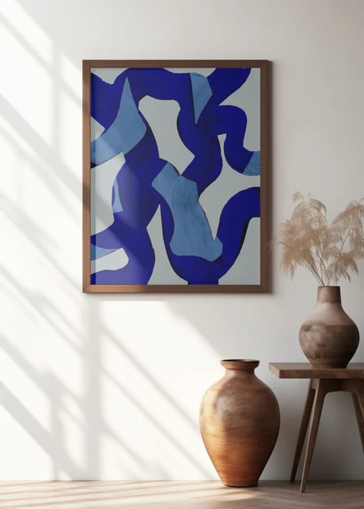
Artists like Christopher Wool explore surface and texture, demonstrating that sometimes, less is more when it comes to visual impact, even in preparation.

What is the best way to store unpainted canvases?
Store unpainted canvases vertically, preferably in a dry, temperature-consistent environment away from direct sunlight. Avoid stacking them flat on top of each other, as this can create pressure points and indentations. Keeping them wrapped in plastic or paper can protect them from dust and minor scuffs until you're ready to paint. Treat them like precious future masterpieces, even before they have a drop of paint on them! Proper storage is a simple yet crucial step in ensuring your materials are ready when inspiration strikes.
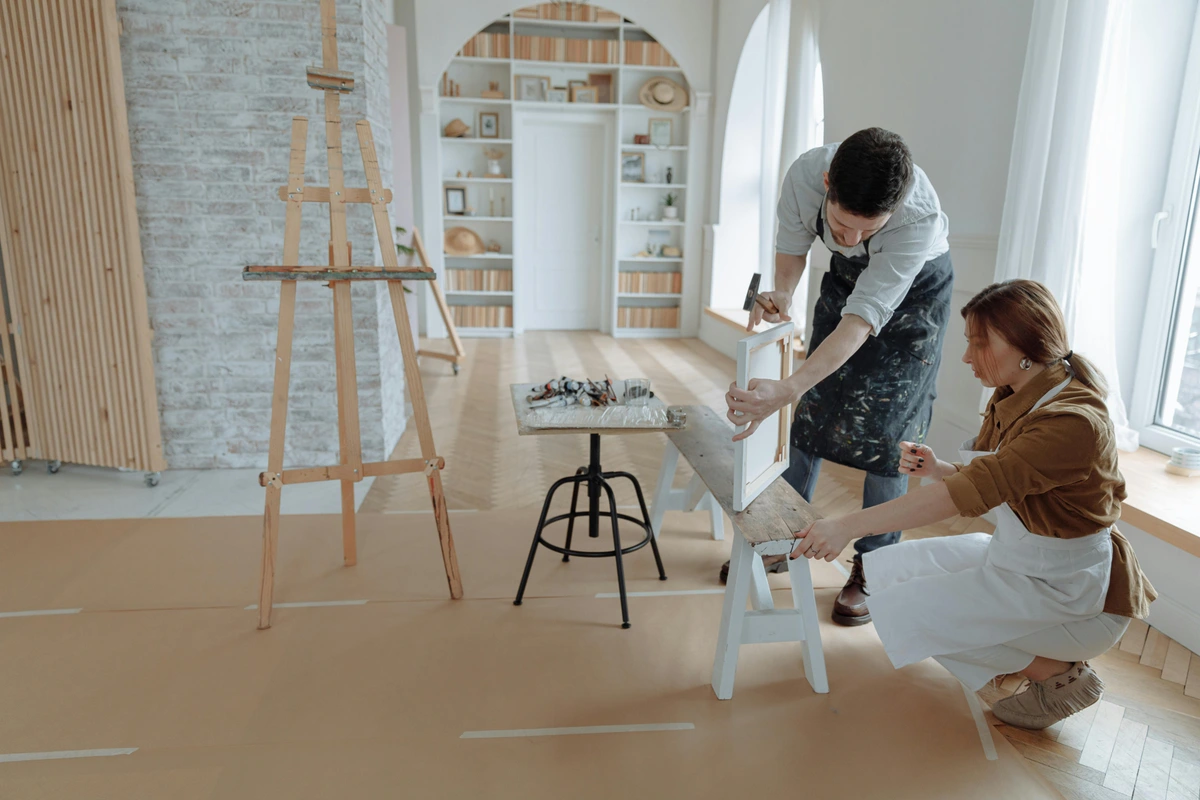
How does humidity affect my canvas?
Humidity and extreme temperature fluctuations are the arch-nemeses of canvas! Changes can cause the canvas fabric to expand and contract, leading to sagging, stretching, and even cracking in your paint layers over time – especially problematic for oil paintings, which can become brittle with age. This is why linen's inherent stability is so valued, and why maintaining a relatively stable, climate-controlled environment for your artwork is crucial for its longevity. Think of it as creating a happy home for your art where it won't be stressed by its surroundings! I've learned this lesson the hard way, with a few pieces succumbing to the elements before I understood the critical role of environment. Even a slight fluctuation can make a difference, so consistency is key.
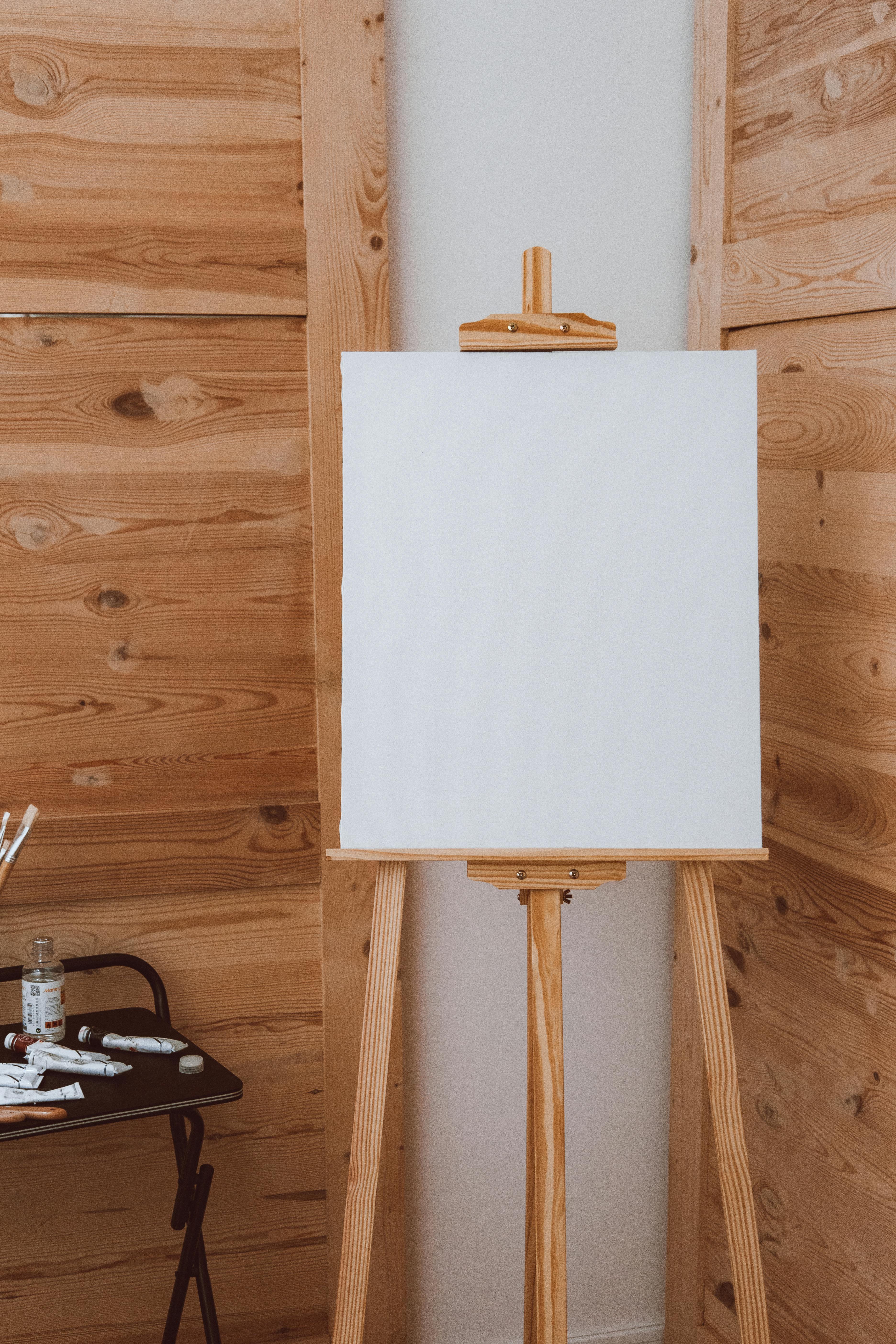
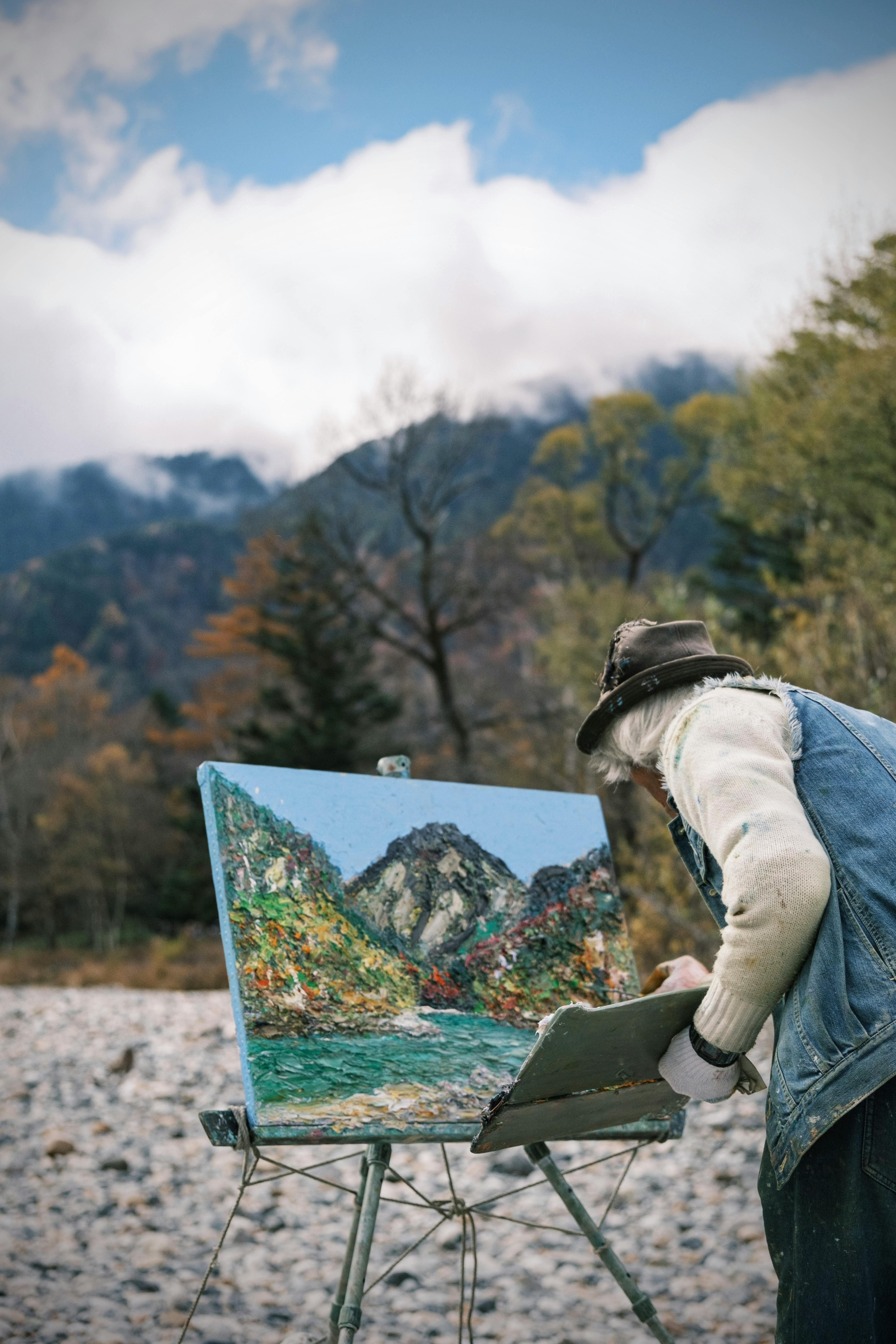
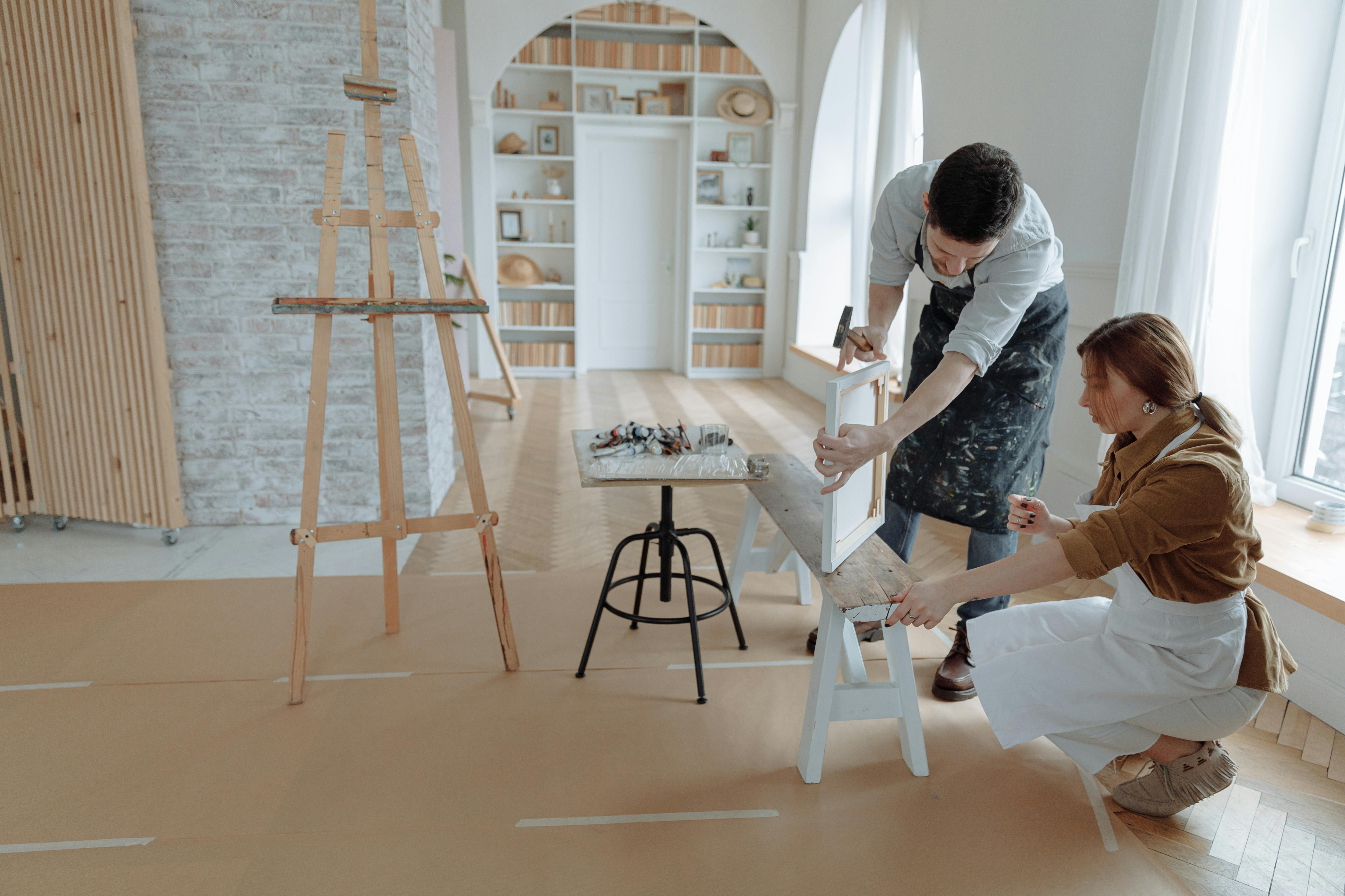
The studio environment, with its interplay of light and shadow, can subtly influence how an artist approaches their canvas, even down to how the material responds to environmental changes.
Should I sign my canvas before or after varnishing?
Generally, it's best to sign your canvas before varnishing. Your signature is an integral part of the artwork, a final, deliberate mark. Applying varnish over it protects it along with the rest of the painting. If you sign after varnishing, the signature won't have the same protective layer, and the sheen might be inconsistent. You want your mark of authorship to be as protected and enduring as the art itself. It's a small detail, but one that truly speaks to the archival intent of your work.
Can I make my own gesso or canvas?
Yes, absolutely! Many artists find immense satisfaction and gain incredible control by preparing their own materials. Making your own gesso allows you to customize its consistency, absorbency, and even color. While traditional recipes often involve rabbit skin glue, modern alternatives use acrylic polymer emulsions with marble dust or titanium white pigment. It's a bit of a process, but truly rewarding! As for canvas, buying it by the roll and stretching it yourself is a fantastic way to achieve custom sizes and the exact tension you prefer. I've covered this extensively in my guide on how to stretch a canvas for painting and also touched on making your own gesso in how to make your own gesso: a diy guide for artists. It's a wonderful way to connect more deeply with your materials and your artistic practice. It’s like being a chef who bakes their own bread – a whole new level of mastery, and deeply satisfying, I might add.
What are alternatives to canvas for painting?
While canvas is a powerhouse, it's certainly not the only option! Artists have always experimented with different supports. Wood panels (cradled or uncradled), metal (like aluminum or copper, especially for historical oil painting techniques), and even synthetic surfaces are all viable alternatives, each with unique properties. Wood panels offer a rigid, unyielding surface, fantastic for detailed work or building heavy texture. Metal provides an incredibly smooth, non-absorbent ground, allowing for luminous glazes. And, of course, a wide variety of art papers, from watercolor paper to specially coated oil paper, are excellent for studies, sketches, and even finished works, particularly for their portability and cost-effectiveness. The "best" alternative truly depends on your medium, style, and desired outcome. It’s a wonderful rabbit hole to explore! Don't be afraid to step outside the traditional box; sometimes a new surface is all it takes to spark a fresh creative direction.
What's the difference between a staple-back and a gallery-wrap canvas?
As we touched on earlier in the Form Factor section, this distinction is all about how the canvas is attached to the stretcher bars. A gallery-wrap canvas has the fabric wrapped around the stretcher bars and stapled neatly on the back. This creates clean, paintable edges, meaning the image can continue around the sides, making it perfect for hanging unframed for a modern aesthetic. A staple-back (or standard wrap) canvas has the staples on the sides of the stretcher bars, meaning the staples are visible, and it's typically intended to be framed to conceal them. It's a small detail, but it profoundly impacts how your finished piece is presented. Choose wisely, as it sets the tone for your artwork's presentation! I almost always opt for gallery-wrap for my own work for that unframed, contemporary look.
How do I deal with a warped canvas?
Ah, the dreaded warped canvas! It's a common, frustrating issue, often caused by changes in humidity or improperly constructed stretcher bars. For minor warping on a stretched canvas, you can sometimes gently re-tension it using the small wooden "keys" found in the corners. For more stubborn cases, some artists have had success with carefully re-humidifying the back of the canvas (using a damp cloth, never soaking!) and then placing it under pressure with weights. For canvas panels, gentle, controlled pressure over time can sometimes help, but severe warping is often irreversible. The best defense is a good offense: invest in quality, kiln-dried stretcher bars with proper cross-bracing, and store your canvases in a stable environment. An ounce of prevention, my friend, is worth a pound of cure! It's an issue that reminds us that even our materials need a little TLC, just like our finished artworks.
What is 'oil prime' vs 'acrylic prime' canvas?
This is a really important distinction! An acrylic-primed canvas (often called "universal gessoed") is prepared with an acrylic polymer emulsion. It's flexible, quick-drying, and suitable for both acrylics and oils, as it creates a sufficient barrier. This is what you'll find on most commercially available pre-primed canvases. An oil-primed canvas, on the other hand, uses an oil-based primer, often involving linseed oil and titanium dioxide (in modern versions). This creates a less absorbent, very smooth, and luminous surface that is highly prized by oil painters for its historical authenticity and how it allows oil paint to glide and blend beautifully. The key difference is that while you can paint oils over acrylic primer, you cannot paint acrylics over oil primer. Think of it as a one-way street! And choosing the wrong direction can lead to some serious painting headaches. Always double-check your primer if you're switching mediums or trying a new canvas.
Can I paint directly onto raw canvas?
For acrylics, you technically can paint on raw canvas if you specifically desire the look of the paint soaking in and staining the fabric, creating a unique, muted effect. However, for true color vibrancy, optimal paint adhesion, and, crucially, for the longevity of your artwork, priming is almost always recommended. For oil paints, painting directly on raw, unsized, and unprimed canvas is a definite no-go. As we've discussed, this will lead to "oil rot" where the linseed oil degrades the natural fibers over time, eventually destroying your painting. Always size and prime for oils to create a stable, archival barrier between your paint and the canvas fibers! It’s one of those cardinal rules that you break at your own peril if you value the longevity of your work. I learned this the hard way early on, so please, protect your precious work!
The Final Word: Just Start Painting!
Look, after all this deep dive into fibers, weaves, weights, sizes, and primes, here’s the absolute, unvarnished truth: the perfect canvas is ultimately the one that genuinely gets you excited to pick up a brush and make something. Don't, for a second, let the sheer abundance of options paralyze your creative flow. Start simple, perhaps with a trusty medium-weight cotton canvas or a handful of versatile canvas panels. See how it feels, how it responds to your touch, and then, only then, maybe branch out to a luxurious linen panel or a cradled wood board on your next art supply run. The most profound learning, I've found, comes from doing, from the actual act of painting, not from endless theoretical deliberation. I always tell my students, the best canvas is the one you actually paint on!
The most important thing, always, are the authentic marks you make on the surface, the unique story you tell, and the pure joy you find in the process—not the surface itself. While the technicalities do matter for longevity and achieving specific artistic effects, they should never, ever overshadow the pure, unadulterated act of creation. After all, a Stradivarius violin is just wood and strings without the musician. My own journey as an artist is a testament to this ever-evolving relationship with materials; you can witness the full evolution in my work, from early experiments to my current bold abstracts, on my timeline. There, you'll see firsthand how my understanding of canvas has intimately shaped my artistic path. Many of those pieces, from experimental abstracts to commanding color statements, are available as prints if you’d like to own a part of that journey, just check out what’s for sale and bring a piece of that creative energy into your own space. After all, the canvas is merely the stage; your art is the performance.
Now, truly, go make something wonderful. Don't let the technicalities paralyze you; instead, let this newfound knowledge empower your choices, making them intentional and confident. The canvas is ready for your story, your unique vision, and your distinctive touch. Grab that brush, embrace the surface, and start painting. Remember, every master once started with a blank canvas and a willingness to explore. The world is eager to see what you create, and a well-chosen canvas is the first, exhilarating bold step on that incredible journey of bringing your unique artistic voice to life. What are you waiting for? Your masterpiece awaits!