Master Still Life Drawing: Your Definitive Guide to Everyday Magic
Discover how to draw still life, from choosing subjects to mastering light, shadow, texture, and color. This step-by-step guide helps you transform ordinary objects into extraordinary art.
Mastering Still Life Drawing: The Definitive Guide to Finding Magic in the Mundane
I know, I know. "Still life." For some, it conjures images of dusty old fruit bowls or rigid academic exercises. But for me? It's a whispered secret, a quiet conversation with everyday objects, an invitation to slow down and truly see the world around me. And honestly, it's one of the most profoundly rewarding ways to draw, whether you're just starting out or you've been sketching for years, patiently coaxing depth and story from the commonplace.
I still remember my early days, grabbing whatever was nearest – a coffee cup, my keys, maybe a random book. My compositions were… well, let's just say they were enthusiastic, if a little chaotic. But over time, I discovered that drawing a still life isn't just about rendering objects; it's about telling a story, however small, and finding the inherent beauty, even the quiet magic, in the mundane. And trust me, the journey from haphazard sketch to a piece that truly sings is incredibly satisfying.
In this definitive guide, I'm going to share everything I've learned, from choosing compelling subjects and mastering light, to building form with subtle shading and even infusing vibrant color. We'll dive into the essential tools, demystify composition, and walk through my step-by-step process to help you create still life drawings that truly resonate. Consider this your ultimate resource for cultivating keen observation skills and transforming ordinary scenes into extraordinary art. Let's make some magic, shall we?
The Enduring Allure: What is a Still Life, Really?
Before we dive into the nitty-gritty of pencils and paper, let's talk about what a still life actually is. It's far more than just a collection of inanimate objects. Think of it as a captured moment, a silent drama playing out on your tabletop, waiting for you to uncover its depth. At its core, a still life (from the Dutch stilleven) is an artistic work depicting mostly inanimate subject matter, typically commonplace objects which are either natural (food, flowers, game, rocks, shells) or man-made (drinking glasses, books, vases, jewelry, pipes, coins).
Artists throughout history have embraced this genre. The ancient Egyptians, for instance, depicted offerings for the afterlife, while Roman frescos showcased everyday items with a surprising realism, providing glimpses into daily life long before the term "still life" existed. During the Renaissance, still life elements often appeared symbolically within larger narratives, like fruit representing fertility or decay. It's a microcosm of the visual world, contained and contemplative.
The genre truly blossomed with the Dutch Masters during the Baroque era, giving us the very term stilleven. This was a period of burgeoning trade and a rising merchant class in the Netherlands. These artworks often served multiple purposes: they told stories of everyday life, conveyed philosophical ideas (like the fleeting nature of life in vanitas paintings), or simply celebrated the beauty of common objects and the prosperity of the age. For example, artists like Jan Brueghel the Elder crafted intricate floral still lifes that celebrated nature's bounty, while Willem Claesz. Heda masterfully depicted banquet pieces with subtle reflections, showcasing wealth. Rachel Ruysch captivated viewers with her elaborate floral arrangements, often incorporating insects and reptiles, highlighting both life and decay. Later, Jean-Baptiste-Siméon Chardin elevated everyday kitchen items into profound meditations on domestic life through his subtle handling of light and texture. In stark contrast, Francisco de Zurbarán created austere, almost spiritual still lifes with stark contrasts and simple arrangements. The rich history of still life art reveals its incredible versatility and enduring appeal.
Let's talk about vanitas for a moment, because they are truly fascinating. These weren't just pretty pictures; they were visual sermons, profoundly popular in the 16th and 17th centuries, particularly in the Netherlands, a time when wealth was growing but religious strictures remained strong. They used specific objects — a skull for mortality, an hourglass or a clock for the passage of time, wilting flowers for decay, an extinguished candle for life's brevity, books for earthly knowledge (which perishes) — to remind viewers of the transience of life, the futility of worldly pleasures, and the inevitability of death. Beyond a simple reminder, they encouraged contemplation on spiritual salvation and a moralistic critique of excessive materialism. It's a powerful form of still life symbolism, turning mundane objects into profound philosophical statements, a quiet contemplation on our own fleeting existence. I find it incredibly powerful, don't you?

The boundaries of still life have always been fluid, morphing with each artistic movement. Think about how Impressionists like Monet captured 'still moments' in landscapes, focusing on the transient effects of light, effectively treating nature itself as a still life subject. Or how Cubists like Picasso and Braque deconstructed objects in their still lifes, exploring multiple perspectives simultaneously on a two-dimensional plane, challenging traditional single-point representation. Later, Surrealists like Magritte used commonplace objects in dreamlike, unsettling ways to explore the subconscious. Even in Pop Art, Warhol's iconic soup cans are, at their heart, still lifes – elevating the everyday consumer object to art and commenting on mass culture. For me, it shows how the boundaries of a still life can stretch and morph, inviting us to find the 'stillness' and profound meaning even in a vibrant, sunlit scene or a stack of ordinary groceries.
What I love most about still life is its sheer accessibility. You don't need a model, you don't need to brave the elements for a landscape, and you definitely don't need to worry about your subject wiggling. Your studio can be your kitchen table, and your subjects can be anything from a wilting flower to your favorite mug. It's a truly wonderful way to hone your observational skills without pressure, allowing for deliberate practice of form, light, and composition without the external demands of capturing fleeting moments or complex human anatomy. It’s a true masterclass in the foundational elements of art.
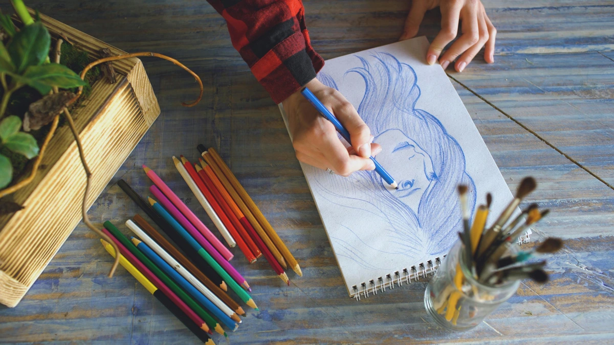
My Toolkit for Taming the Canvas (or Paper!): Essential Supplies for Still Life Drawing
Now, about the tools. You don't need a fancy art store haul to get started. I'm a big believer in beginning with the basics and expanding as you discover what you enjoy. For still life drawing, here's what I generally reach for – think of it as assembling your cast of characters for the blank stage of your paper. For a deeper dive into tools, I highly recommend exploring my guide on best sketching pencils for artists.
Item | Why I Use It |
|---|---|
| Graphite Pencils | - For sketching, shading, and capturing a full range of values. - Start with HB for initial light outlines (good for erasing, less smudging). - Move to 2B for mid-tones and defining forms. - Use 4B and 6B for richer shadows and deeper blacks (can smudge easily but build deep tones). - Each grade gives nuanced control over intensity, allowing for subtle transitions and dramatic contrasts. |
| Erasers | - A kneaded eraser is your best friend for gently lifting graphite and creating subtle highlights without damaging the paper (reusable and moldable). - A vinyl eraser (or plastic eraser) is great for sharper corrections and cleaning up edges, giving crispness where needed (can be abrasive if used too hard). |
| Drawing Paper | - Something with a bit of tooth (that's the subtle texture of the paper surface) to hold graphite, but not too rough for fine details. - A medium tooth paper, like Strathmore Bristol Vellum (excellent for blending) or Canson Mi-Teintes (smooth side for control), works wonders. - Paper weight is crucial: aim for at least 90lb (180gsm) or heavier. This prevents buckling and tearing, and stands up to multiple layers of graphite and erasing. A standard sketchpad is a perfect starting point. |
| Blending Stumps/Tortillons | - These tightly rolled paper tools create smooth transitions and even blends for shadows. - Especially useful for areas where you want a soft, seamless gradient. - Just be careful with oils from your skin if you're tempted to use a finger instead – it can leave smudges that are hard to remove, and frankly, these tools do a better, cleaner job. |
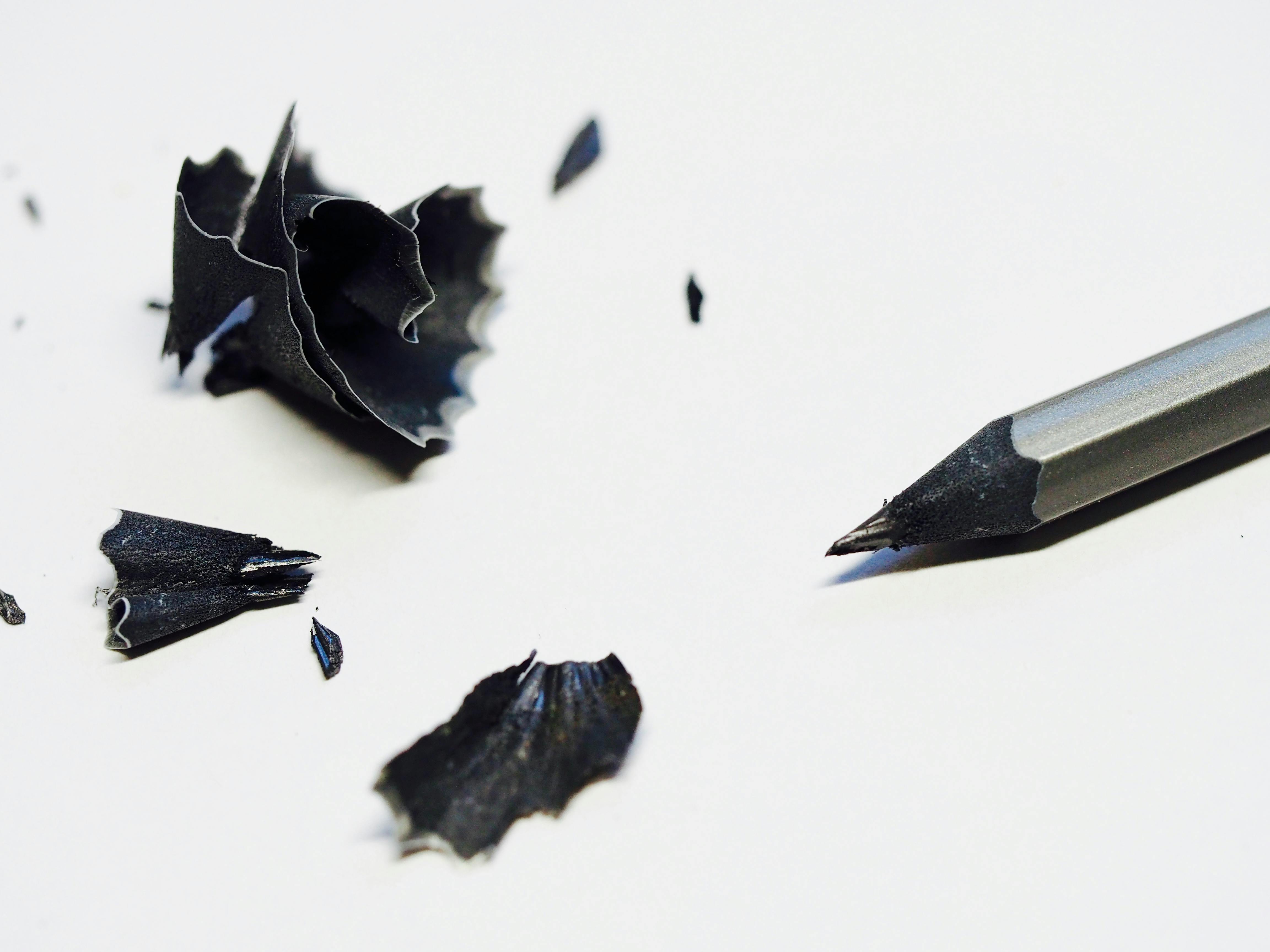
| Sharpener | - Keep those points sharp for detail! - A good old hand sharpener is fine, but a craft knife can also give you a longer lead exposure for broad strokes and varied marks. - Different point types serve different purposes, from fine details to wide coverage, offering expressive versatility. |
| Drawing Board/Surface | - Something firm to clip your paper to, especially if you're not at a desk. - Provides a stable base, preventing indentations and allowing for consistent pressure. - It's a small detail that makes a big difference to your drawing comfort and consistency, ensuring a smooth, even surface to work on. |
| Sketchbook | - An indispensable companion for quick studies, warm-ups, and experimenting with compositions. - It’s a low-pressure environment to practice your observational skills, explore different angles, and build a visual vocabulary of shapes and forms before committing to a larger, more detailed piece. It's where you make your mistakes cheaply and learn rapidly. |
 |
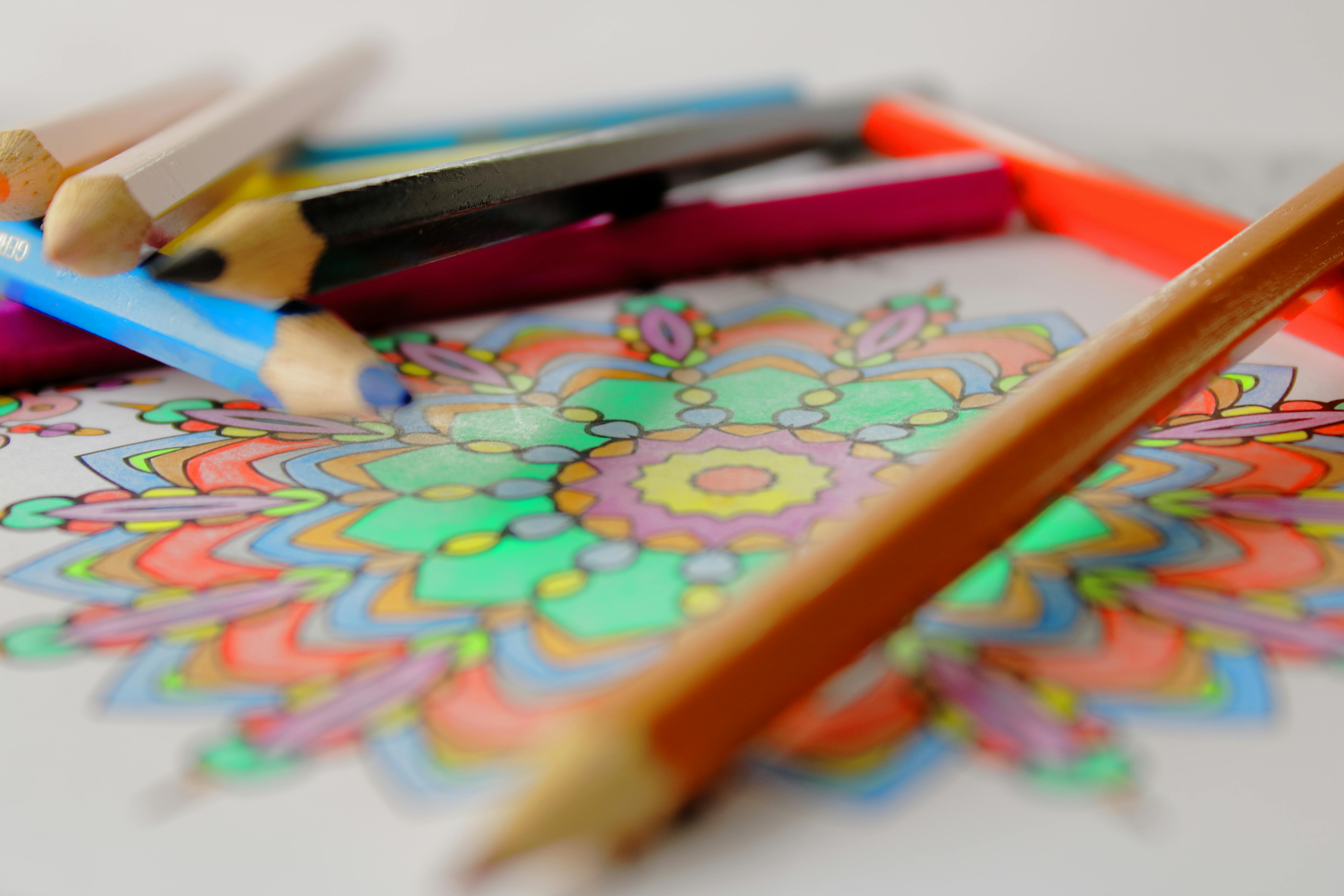
Of course, once you get comfortable, you might branch out. I've had incredible fun experimenting with colored pencils – they bring a whole new dimension to still life with their rich pigments and layering capabilities. Or maybe pastels, if you're feeling a bit more painterly. But for now, let's stick to the foundational graphite. Just ensure your paper is sturdy enough to handle the layers of graphite and any potential erasing – a good, heavy drawing paper is key for this!
The Art of Arrangement: Setting Up Your Still Life for Success
So, you've gathered your essential tools, ready for action. Now comes the truly artistic part – arranging your subjects. This, my friends, is arguably the most critical step. A well-arranged still life makes the drawing process infinitely smoother and the final piece far more captivating. I've learned this the hard way, trying to draw a pile of stuff that had no visual interest whatsoever. Don't be like past me; let's craft a scene that already whispers stories. This is where your still life composition truly begins.
Step 0: Preliminary Sketches and Brainstorming
Before you even touch your main drawing paper, spend a few minutes with a small sketchbook. Do some quick thumbnail sketches – tiny, rough drawings that explore different arrangements, angles, and cropping options. This helps you work out kinks in your still life composition quickly, without committing to a larger piece. It’s like storyboarding a film; you visualize the scene before shooting, saving yourself a lot of rework later. This low-stakes practice is a game-changer for me.
Step 1: Choosing Your Subjects – The Cast of Characters
Think variety, and think visual weight! I look for objects that offer different shapes, sizes, and textures. A shiny metal pot next to a soft fabric, a smooth stone contrasting with a rough piece of wood – these juxtapositions create dynamic interest. Personal items work wonders too – things with a story. They add an emotional resonance that's hard to replicate with generic props. Try to choose 3-5 objects that complement each other without being too similar or too distracting. Consider combining a crumpled piece of silk with a smooth ceramic bowl, or a stack of old books with a single, vibrant piece of fruit, to create a captivating still life symbolism.
Beyond the physical attributes, consider the psychological impact. Even in monochrome, the idea of warm, inviting objects (a worn mug, a comforting blanket) versus cool, sharp objects (a metal sculpture, a delicate glass) can influence the viewer's mood. Think about the story you want to tell. A group of childhood toys evokes nostalgia, while scientific instruments suggest intellectual curiosity. Avoid visual clutter – too many objects or objects that are too similar in form or value can overwhelm the eye and make it hard to establish a clear focal point.

Step 2: Composing the Scene – Guiding the Eye
Composition is absolutely key. This is where you, the artist, guide the viewer's eye through your drawing, creating a harmonious visual dialogue. Over the years, I've spent countless hours diving into the art of composition, and it truly makes all the difference.
Here's what I keep in mind when arranging my scene:
- Creating Depth with Overlap: Don't line objects up like soldiers on parade. Overlapping them is crucial; it instantly creates a sense of depth and three-dimensionality. It's like a visual conversation where objects lean into each other, hinting at layers in space.
- The Power of the Rule of Thirds: Imagine your paper divided into nine equal segments by two equally spaced horizontal and two equally spaced vertical lines. Placing your focal points (the most interesting parts of your still life) along these lines or at their intersections creates a more balanced, yet dynamic, feel. Why does it work? It leads the eye naturally through the composition, avoiding a static, bullseye effect, making the scene feel more engaging. For a deeper dive, check out the principles of still life composition.
- Positive and Negative Space: Positive space is your subject – the objects themselves. Negative space is the area around and between your subjects. Both are equally important. The shapes of the negative space actually define the positive space. Think of the empty area created by the handle of a mug; that's negative space, and learning to see its abstract shape is essential to the mug's form and your accuracy. It's often easier to draw the negative space correctly, which in turn fixes the positive space. Or, imagine the negative space as the holes in a Swiss cheese – those holes are just as defining as the cheese itself!
- Varying Heights and Forms: Create a visual rhythm. Arrange objects so there's a pleasing variety of heights, widths, and shapes. A tall vase, a round fruit, and a draped cloth create more interest than three similar-sized boxes. This variation adds visual movement and keeps the eye engaged.
- Establishing a Focal Point: While all objects contribute, usually one or two objects will be the star of the show – your focal point. Position them strategically (perhaps using the rule of thirds) to draw the viewer's eye first. You can establish a focal point by making it the most detailed, having the highest contrast in value, or even through unique color or texture, essentially giving it the loudest voice in your visual conversation.
I often arrange, step back, squint, rearrange, and repeat until something just clicks. It's not about stuffing the frame; it's about creating a harmonious visual dialogue. If you're struggling, check out my thoughts on understanding balance in art composition – it's a game-changer. For those who want to dive deeper, you can also explore advanced concepts like the Golden Ratio or dynamic symmetry, which offer further principles for visual harmony.
Step 3: Mastering the Light (And Shadow!) – Sculpting with Illumination
This is where your still life truly comes alive, where the magic of form is conjured. Good lighting will define forms, create depth, and set the mood. I almost always opt for a single light source. Why? Because it simplifies the highlights and shadows, making it infinitely easier to see, interpret, and render the three-dimensional forms of your objects. Multiple light sources create confusing, conflicting shadows that can flatten your subject and make understanding its form nearly impossible. It's like trying to listen to three different conversations at once – confusing, messy, and hard to discern anything clearly!
A lamp from one side (not directly overhead) works perfectly, or even natural window light, which tends to be softer and more diffused. Watch how the light falls, creating strong highlights, nuanced mid-tones, and deep, consistent shadows. Understanding light in art is foundational, and still life is the perfect playground for it, allowing you to explore the dramatic interplay known as chiaroscuro – the strong contrasts between light and dark, usually bold contrasts affecting a whole composition. Think of artists like Caravaggio, whose use of tenebrism (a dramatic form of chiaroscuro) could turn a simple basket of fruit into a profound, almost sacred subject.
Consider the type of light you're using. A hard, directional light (like a single lamp with a focused beam) will create sharp, dramatic shadows and bright highlights, emphasizing sculptural form and texture. A soft, diffused light (like an overcast window or a lamp bounced off a wall) will produce gentler transitions, subtle shadows, and a more serene mood. Both are valid, but they create vastly different visual effects, so choose what serves your narrative. A strong, singular light source simplifies the visual information and enhances the sculptural quality of your subjects. It's an absolutely crucial step for any drawing tutorial on still life.
My worst drawings always happen when I ignore the light source or have multiple conflicting ones. It's like trying to listen to three different conversations at once – confusing, messy, and hard to discern anything clearly! A strong, singular light source simplifies the visual information and enhances the sculptural quality of your subjects. It's an absolutely crucial step for any drawing tutorial on still life.

From Blank Page to Masterpiece: My Step-by-Step Drawing Process
Alright, you've got your setup, your tools, and a healthy dose of enthusiasm. Let's get drawing! This is my general approach, but remember, every artist develops their own rhythm. Think of it as a dance between keen observation and deliberate execution. This is a foundational drawing tutorial for any aspiring artist.
Before we dive into the details, here’s a quick overview of the phases:
Phase | Focus | Key Action |
|---|---|---|
| 0. Observational Drawing | Training the eye, quick captures | Gesture drawing, basic form studies |
| 1. Initial Sketch | Basic shapes, proportions, placement | Light lines, "pencil trick" for measuring |
| 2. Basic Value & Contours | Overall light/dark pattern, refining outlines | Light shading in shadow areas, defining edges |
| 3. Value & Form | Creating 3D illusion, deep shading | Building up tones, hatching, cross-hatching |
| 4. Texture & Details | Surface qualities, refining edges, final touches | Specific mark-making, subtle variations, crisp highlights |
Phase 0 (The Unseen Step): Observational Drawing from Life
Before I even commit to a still life, I often engage in quick observational drawing exercises. This isn't about making a finished piece, but about training my eye to truly see – to quickly capture gestures, relationships, and basic forms. It’s a bit like a musician practicing scales; it builds the fundamental skill of visual interpretation that will serve you well in still life. You're learning to translate the three-dimensional world onto a two-dimensional surface, and this preparatory step makes all the difference when you approach your main drawing.
Phase 1: The Initial Sketch – Finding the Form and Proportions
I always start with the lightest touch. Think of it as mapping out the battlefield before the battle. I use a light pencil (HB or even a harder lead if I have it) and focus on the basic shapes – cylinders for bottles, cubes for boxes, spheres for fruit. Don't worry about perfection here; you're just getting things in the right place and checking your proportions.
A great trick for accuracy is the "pencil trick": hold your pencil out at arm's length, close one eye, and align the tip of your pencil with the top of your vase. Without moving your arm, mark where the bottom of the vase falls on the pencil with your thumb. This measurement can then be compared to the width of your fruit bowl to see how many "vase heights" it is, or how tall the coffee cup is in relation to the book. You can also use a simple viewfinder (a cardboard frame) to help crop your scene and ensure a strong still life composition. I constantly remind myself not to press hard; these lines are guides, not commitments. These are your foundational sketching tips.
Phase 2: Basic Value Block-in and Refining Contours
Once I'm happy with the overall placement and proportions, I begin to lay down a very light, general value (the lightness or darkness of a shade, on a scale from pure white to pure black) in the major shadow areas. This helps to establish the overall light and dark pattern. Then, I start to refine the contours – the outer edges of the objects. This is where those basic shapes evolve into recognizable forms. I'll add more specific details, like the rim of a cup or the folds in a cloth, but still keeping it relatively light. It’s a bit like adding the framework to a building before the walls go up.

Phase 3: The Dance of Value – Shading and Sculpting Form
Now, the fun really begins! Value is how you create the illusion of three-dimensionality, transforming flat shapes into solid objects. Remember that single light source we talked about? Now's its time to shine. I often think of a value scale from 1 (pure white, brightest highlight) to 9 (pure black, darkest shadow), using 5 as a mid-tone grey. This mental map helps me ensure I’m hitting a full range of tones, from the luminous highlights to the deepest cast shadows.
I start by identifying the darkest shadows and the brightest highlights, then carefully work my way through the mid-tones. I often use graphite techniques like hatching (parallel lines) and cross-hatching (intersecting parallel lines) to build up my shadows, controlling pressure for depth. For smoother areas, I might use a blending stump or even the side of my pencil to lay down a consistent tone. Other techniques like scumbling (small, circular scribbling motions for textured areas) or stippling (dots for a grainy texture) can add variety and visual interest. These techniques are vital for mastering shading techniques in drawing.
I treat shading like sculpting. You're building up form, making objects appear solid and real. This phase takes the longest, building up values gradually to avoid overworking the paper, but it's incredibly rewarding to see flat shapes transform under your hand.
Phase 4: Adding Texture and Final Touches – The Soul of the Surface
With values established, I move on to texture. How does that metal pot feel? How does the fabric drape? This is where subtle variations in your marks come into play. It’s about conveying the tactile quality of a surface through visual means, an essential element of understanding texture in art.
Here’s how I approach different textures with graphite:
- Shiny Metal: Use very clean, sharp, distinct highlights (sometimes almost pure white paper) next to deep, abrupt darks. The transitions are often crisp and sudden, reflecting the light source clearly, almost like hard-edged geometric shapes of light and shadow.
- Soft Fabric: Employ varied line weights and subtle, gradual shading to indicate soft folds and wrinkles. Blend smoothly for luxurious drapes, or use more defined, broken lines for rougher textiles, paying close attention to how light catches each fold. Think delicate, feathery strokes to build up soft gradients.
- Rough Stone/Wood: Use short, broken, irregular marks. Scumbling or stippling can be very effective here. Vary the pressure to create uneven surfaces, mimicking the imperfections and natural patterns of the material. Don't be afraid to leave some texture in your pencil marks.
- Smooth Ceramic/Glass: Focus on very smooth, even transitions of value, with precise, often reflected highlights. These surfaces tend to pick up ambient light and reflections from their surroundings, so observe carefully what they are mirroring. Use light, even pressure and careful blending for seamless transitions.
I also go back and refine any edges, making some sharper to bring objects forward and letting others soften to recede. It's a constant back-and-forth, refining, adding, and sometimes even erasing to create crisp highlights. This is also when I might decide to add a dash of pastel or other medium for specific textures, truly unlocking the individual magic of each object. These final adjustments are key for strong art fundamentals.
Infusing Color: Beyond the Monochrome – A World of Expression
While this guide focuses on the foundational power of graphite, it's crucial to remember that still life is also a vibrant medium for color. Once you've mastered form and value in monochrome, imagine the possibilities! Color in still life can profoundly influence mood and narrative, adding another rich layer of personal interpretation to your captured moments.
Artists throughout history have used color with incredible intention in still life:

- Vincent van Gogh used bold, expressive, often complementary colors to convey intense emotion and vitality in his iconic Sunflowers, transforming simple blooms into a vibrant declaration of life.
- Paul Cézanne meticulously employed subtle, layered hues to build form and spatial relationships in his apples and fruit bowls, almost sculpting with paint, showing how color can define volume.
- Georgia O'Keeffe used vibrant, often magnified colors in her close-up floral still lifes, pushing abstraction while revealing the sensual beauty of nature's forms.
- Giorgio Morandi is another master, known for his contemplative, subdued palettes of bottles and everyday objects, creating quiet, harmonious arrangements that feel incredibly profound through their subtle color shifts.
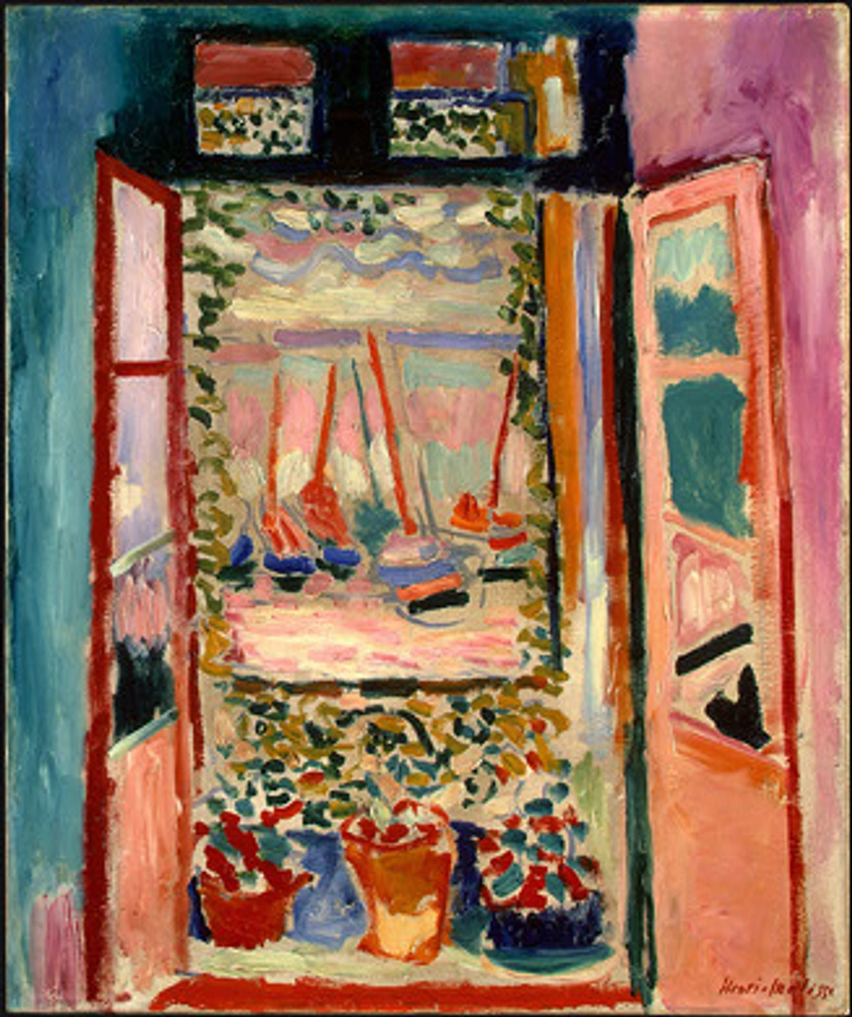
- And consider Henri Matisse, who, in his still lifes, often used bold, flat areas of pure, unmixed color to create decorative patterns and express emotional states rather than strict realism, showing how color can be a force unto itself.
Basic Color Theory in Still Life
Understanding a few fundamental concepts can unlock your approach to color:
- Complementary Colors: These are colors opposite each other on the color wheel (e.g., red and green, blue and orange, yellow and purple). Placing them next to each other creates high contrast and vibrancy, making elements pop. Imagine a bright orange next to a deep blue vase – instant visual energy! They can make your focal point sing.
- Analogous Colors: These are colors adjacent to each other on the color wheel (e.g., blues, blue-greens, and greens). They create harmonious, soothing, and cohesive compositions. A still life with various shades of green, yellow-green, and yellow feels calm and natural, creating a gentle flow for the eye.
- Color Temperature: Colors can feel "warm" (reds, oranges, yellows) or "cool" (blues, greens, purples). Warm colors tend to advance visually, making them appear closer to the viewer, because they have higher visual energy and often reflect more light. Cool colors tend to recede, appearing to move into the background, as they typically absorb more light and have a calming, less intense presence. This can be a powerful tool for creating depth and directing the viewer's eye. A warm, brightly lit object against a cooler, shadowed background can create dramatic impact, adding to the illusion of three dimensions.
credit, licence
Choosing a Color Palette for Mood and Narrative
Your color choices are just as important as your object selection in telling your still life's story:
- Vibrant & Energetic: Think primary and secondary colors, bold contrasts, and strong complementary pairings. This evokes joy, excitement, or a lively atmosphere. Perfect for celebrating abundance.
- Calm & Serene: Opt for analogous colors, muted tones, and pastel shades. Blues, soft greens, and gentle purples can create a tranquil, contemplative mood, inviting introspection.
- Dramatic & Intense: Use strong contrasts of light and dark values alongside rich, saturated hues. Deep reds, dark blues, and sharp highlights can create a powerful, almost chiaroscuro effect with color, enhancing the emotional impact.
- Earthy & Natural: Focus on browns, greens, ochres, and muted reds, reflecting organic materials and a rustic feel, evoking a sense of groundedness and authenticity.
Popular Color Mediums for Still Life
Medium | Characteristics | Pros | Cons | Best For |
|---|---|---|---|---|
| Colored Pencils | - Pigment in a wax or oil binder. - Excellent for detail, layering, and precise control. - Can achieve smooth blends or visible texture. - Portable and clean. | Fine detail, layering, precise control, clean to use, portable. | Can be time-consuming for large areas, requires many layers for deep color. | Fine details, realistic rendering, subtle color transitions, rich layering. |
| Pastels | - Pure pigment, vibrant colors. - Blends beautifully for soft transitions. - Available as soft, hard, or oil pastels. | Vibrant colors, soft blends, painterly effects, rich textures. | Can be messy, requires fixing (spray fixative), fragile. | Expressive, painterly effects, rich textures, vibrant color blocking. |
| Watercolors | - Transparent washes, luminous effects. - Dries quickly; good for layering. - Granulation and lifting techniques add interest. | Luminous transparency, soft edges, ethereal moods, quick drying. | Can be challenging to control for beginners, difficult to correct mistakes. | Luminous light effects, soft edges, ethereal moods, quick studies. |
| Acrylics | - Versatile, opaque or transparent when thinned. - Dries quickly, water-soluble. - Good for bold colors and texture. - Can be applied thinly like watercolor or thickly like oils. | Strong, vibrant colors, quick drying, versatile (opaque/transparent). | Dries quickly (less blending time), can stiffen brushes if not cleaned promptly. | Strong, vibrant colors, impasto texture, mixed media, bold statements. |
| Oils | - Rich, deep colors; slow drying time allows for extensive blending and reworking. - Can achieve luminous glazes and impasto textures. - Pigments suspended in oil (e.g., linseed oil). | Rich depth, nuanced blending, luminous glazes, long working time. | Requires solvents for cleanup, slow drying time (can be a con or pro). | Classic realism, rich depth, nuanced blending, subtle gradations. |
Exploring expressive color in still life allows you to add another layer of depth and personal interpretation to your captured moments. Don't be afraid to experiment; sometimes the most unexpected color combinations yield the most compelling results! It's all part of making the art truly yours.

My Hard-Learned Lessons: Common Pitfalls (and How to Swerve Them)
The path to drawing a captivating still life is paved with good intentions, and often, a few spectacular stumbles. I've made every mistake in the book, probably twice (or maybe three times, if I'm being honest). So, let me share some of my personal pitfalls, hoping it saves you some frustration:
- Over-Complicating the Setup: Resist the urge to include every cool trinket you own. Keep it simple, especially when starting. Less is often more, and it allows you to focus on the fundamentals of form, light, and composition. The magic is in the intentionality, not the quantity. My early still lifes looked like a tornado hit a thrift store – don't repeat my chaos!
- Ignoring the Light: I've said it before, but it bears repeating. If your light source is weak, conflicting, or messy, your drawing will struggle to convey form and depth. A strong, single light source is your best friend – it casts predictable, clear shadows and highlights, guiding your hand. It's like trying to navigate a dark room blindfolded; you just won't see clearly.
- Rushing the Initial Sketch: Patience, young padawan! The initial sketching phase is your foundation. If your proportions are wonky or objects are misplaced here, the whole drawing will suffer. Take your time, measure, correct, and be happy with your basic shapes before moving on. Those foundational lines are the silent scaffolding of your masterpiece, and five extra minutes here saves an hour of frustration later. Trust me on this one.
- Getting Bogged Down in Tiny Details Too Soon: This is a classic, and I'm still guilty of it sometimes. You want to draw every little pattern on that fabric or the intricate label on a bottle, but if the overall form and value structure aren't there, those details will just look glued on and flat. Build from general to specific. Get the big shapes and light/shadow patterns right first. The details are the icing, not the cake.
- Over-Blending: While blending is a useful technique for smooth transitions, excessive blending can lead to muddy values, a loss of crispness, and a flat, "dead" appearance. Knowing when to stop and when to allow pencil marks to show is crucial for maintaining life and energy in your drawing. Sometimes those expressive lines are exactly what's needed; don't smooth out all the vitality!
- Forgetting the Background: The background isn't just empty space; it plays a vital role in framing your subjects and enhancing the overall composition. It needs to be considered, subtly rendered, and balanced with your main objects, rather than being an afterthought. A well-considered background can ground your objects and prevent them from looking like they're floating in space. It's like the quiet supporting actor that makes the main character shine.
- Objects Floating on the Surface: This is often a symptom of inconsistent ground planes or disconnected shadows. Ensure that all objects appear to rest on a single, believable surface and that their cast shadows connect them visually to that surface and to each other. Even subtle variations in the angle of your ellipses or the perspective of your tabletop can make objects look like they're hovering. You want a sense of grounded reality.
- Comparing Yourself Too Much: This is a big one for me, and I suspect for many artists. It's easy to scroll through social media and feel like your work isn't good enough. Remember, everyone's journey is different. Focus on your progress, not someone else's highlight reel. Your unique vision is what truly matters, and your pencil marks are yours – that's beautiful.
Troubleshooting Common Still Life Drawing Challenges
Even with the best intentions and a solid plan, you might run into common issues. Don't worry, we all do! Here are a few and my quick fixes:
- "My objects look flat!" This usually means you're not seeing or rendering enough value variation. Flatness happens when there isn't enough contrast between light and shadow, making objects appear two-dimensional. Go back to your single light source – are you getting clear highlights, mid-tones, and deep shadows? Push your darkest darks, and ensure your highlights are preserved. Think of it as pushing the extremes of the value scale to create a full sense of form and space. Can you identify your darkest dark and lightest light in your setup? Make sure they're in your drawing!
- "My shadows are too dark/light or look muddy." This is often a light source issue (too many, too weak) or a blending problem. For shadows that are too dark, use a kneaded eraser to lift gently, bit by bit. For shadows that are too light, build up layers slowly with a softer pencil, applying consistent pressure. If they're muddy, try to identify conflicting light sources and simplify your setup to one strong direction. Remember, shadows should be consistent and reveal form, not obscure it. A clear shadow defines the plane it falls on, helping to ground the object.
- "My composition feels unbalanced or my objects look disconnected." Take a step back, literally, from your drawing and your setup. Squint at your scene – does one side feel heavier than the other? Are objects too evenly spaced, creating a boring rhythm? Re-evaluate your use of the rule of thirds and negative space. Sometimes shifting one object just an inch can make all the difference, creating a more harmonious flow. To unify objects, ensure their cast shadows connect to each other or to the background, creating a visual pathway and making them feel like they belong together. Subtle tonal connections between objects can also help.
- "My perspective feels wonky for simple objects." Even a mug has perspective! Always consider your eye-level (horizon line) relative to your objects. Objects above eye-level will show their underside, objects below will show their top, and objects at eye-level will show neither. Pay close attention to ellipses – the tops and bottoms of circular objects – which will appear flatter the closer they are to your eye-level. Accurate ellipses are often the giveaway for wonky perspective, so practice them! For more, dive into our definitive guide to perspective in art.
- "The scale of my objects seems off relative to each other." This goes back to Phase 1. You likely rushed your initial proportion checks. Go back to the "pencil trick" and carefully remeasure, comparing each object to another. Sometimes it helps to draw the bounding boxes (imaginary cubes or cylinders) around your objects first, ensuring they relate correctly in size before you tackle the internal details. Slow down and trust your measurements!
Frequently Asked Questions About Still Life Drawing
What makes a good still life subject?
Honestly, almost anything! Look for objects with interesting shapes, textures, or personal significance. Items that contrast well (e.g., smooth vs. rough, shiny vs. matte) make for dynamic compositions. Don't be afraid to experiment with everyday household items – kitchen clutter, a collection of old tools, or even a crumpled piece of paper can be incredibly effective. The beauty is often in how you interpret them, finding the hidden magic and transforming them through your unique perspective. What's sitting around you right now that tells a story?
credit, licence
How long should a still life drawing take?
There's no single answer! A quick sketch might take 15-30 minutes, focusing purely on capturing basic shapes and proportions. A highly detailed, shaded drawing could take several hours or even days. Focus on completing each phase (sketch, contours, values, details) thoroughly, rather than rushing to a finish line. The learning is in the process, not just the finished product. Allow yourself the time your observation demands – patience truly pays off in art.
Can I use photos for still life drawing?
You absolutely can, especially for practice or if you want to capture a fleeting arrangement. Photos are fantastic for studying complex lighting or textures that might be challenging to replicate from life directly. However, I always recommend drawing from life when possible.
Drawing from life helps train your eye to see subtle shifts in light, color, and depth that a two-dimensional photograph might flatten or distort. Photographs often simplify value transitions, lose subtle color nuances, and can present a distorted perspective due to lens effects. While they are a valuable tool, relying solely on them can hinder your ability to truly observe and interpret the three-dimensional world around you. Use photos as a reference, not a crutch. But hey, use whatever gets you drawing! It’s all part of your drawing tutorial journey.
What's the difference between still life drawing and still life painting?
The core principles – subject matter, composition, light, and value – are the same. The primary difference lies in the medium and the techniques involved. Still life drawing typically uses dry mediums like graphite, charcoal, or pastels, focusing on line, value, and texture in a monochrome or limited color palette. Still life painting, on the other hand, utilizes wet mediums like oils, acrylics, or watercolors, which allows for a much broader exploration of color, brushwork, and layered effects to build form and atmosphere. Both are equally valid and beautiful forms of expression, often complementing each other in an artist's practice.
What's the best paper for still life drawing?
For graphite pencils, I prefer drawing paper with a medium tooth (texture). This allows the graphite to adhere well and creates a nice range of tones without being too rough for details. Smooth bristol board is excellent for very fine lines and crisp details, while very textured paper might be better for charcoal or softer mediums where you want a grainier effect. A good quality cartridge paper or standard sketchpad (often a medium tooth) with a weight of at least 90lb (180gsm) is always a perfect starting point. The right paper enhances your graphite techniques.

credit, licence
How do I develop a personal style in still life drawing?
Developing a personal style is a journey of self-discovery, not a destination. It starts with consistent practice and keen observation. Experiment with different subjects, compositions, lighting, and drawing tools. Pay attention to what genuinely excites you – do you love dramatic lighting, specific textures, or unusual object combinations? Over time, your unique preferences and recurring choices will emerge. Don't force it; let your style evolve organically as you explore and refine your art fundamentals. Your style is simply your way of seeing the world. While some contemporary artists explore still life in digital mediums, even touching on areas like NFTs, the tactile experience and foundational skill development offered by traditional graphite remain paramount for truly understanding and developing your unique artistic voice.

Framing Your Vision: Presenting Your Still Life Artwork
You've poured your heart into creating a beautiful still life drawing; now, how do you ensure it gets the presentation it deserves? Framing isn't just about protection; it's about enhancing your artwork and making it shine, becoming part of the overall artistic statement.
- Matting: A mat (or passe-partout) is a board with a cut-out opening placed over the artwork and under the glass. It creates visual breathing room around your drawing, drawing the viewer's eye inward and preventing the artwork from touching the glass. Choose a neutral color that complements, rather than competes with, your drawing – off-white, cream, or a subtle grey often work best for graphite pieces. The mat itself is a compositional element, so choose wisely!
- Frame Choice: The frame should support the artwork, not overpower it. For still life drawings, simple, classic frames in wood or metal often work beautifully. Consider the mood of your piece: a rustic wooden frame for an earthy still life, or a sleek metal frame for something more contemporary. The frame acts as a window into your captured moment.
- Glass/Acrylic: Opt for conservation-grade glass or acrylic (such as UV-filtering or anti-reflective options) to protect your artwork from fading and environmental damage. This is especially important for pencil drawings, which can be delicate and susceptible to smudging or UV degradation. It's a small investment that protects your hard work for years to come.
A thoughtfully framed drawing elevates it from a sketch on paper to a finished piece of art, ready to be admired. It's the final touch that honors your creative effort and completes the dialogue between you and the viewer.
credit, licence
My Parting Thoughts: Just Start Drawing, The Magic Awaits
Drawing a still life is a profound exercise in observation, patience, and interpretation. It's not just about replicating what's in front of you; it's about infusing it with your own vision and understanding, revealing the quiet magic in the ordinary. It hones your ability to truly see the world, a skill that extends far beyond the drawing board.
Remember the core lessons: thoughtful composition, the power of a single light source, building form through values, and adding life with texture. Don't let the idea of 'perfection' stop you. My most valuable lessons came from drawings that didn't quite work out, forcing me to rethink and try again. Each line, each shadow, is a step closer to seeing the world anew, honing your art fundamentals.
And a quick thought: if you're using organic materials like fruit or flowers, consider how you might repurpose or compost them after your drawing session. It's a small way to connect your artistic practice with mindful living.
So, grab a pencil, find a few objects around you, and just start. Experiment, make mistakes, learn, and most importantly, enjoy the process. Don't delay – find your subject, gather your tools, and embark on this rewarding journey. The magic is waiting to be uncovered, and who knows, you might just discover a new passion, and perhaps even inspire others with the unique magic you find in the everyday. If you're curious about my artistic journey and how I translate these principles into my own contemporary art, feel free to explore my gallery or even visit my museum in Den Bosch sometime. There's a whole timeline of artistic exploration waiting for you.


