Prismacolor Premier Pencils: An Artist's Honest & In-Depth Review
Dive into my personal review of Prismacolor Premier colored pencils. Discover their creamy texture, vibrant pigments, and why they're a must-have for any artist. My experience, tips & honest pros/cons!
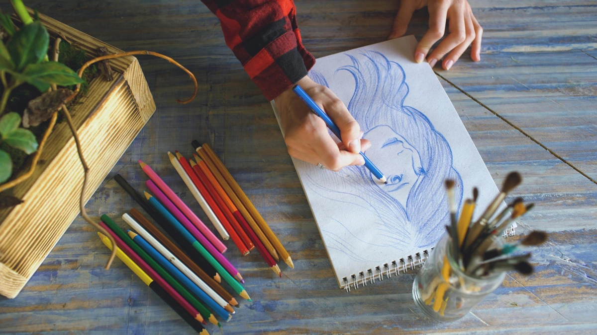
I guess this is a love story, albeit one with wax bloom and occasional breakage. Before we dive deep into the world of Prismacolor Premier colored pencils, I want to set the scene: my art journey, like many, started with crayons, then progressed to basic colored pencils – functional, but hardly inspiring. Then came the Premiers, and everything changed. It was like upgrading from a flip phone to a smartphone; suddenly, possibilities I hadn't even imagined were at my fingertips. I’m excited to share this journey with you, quirks and all. Because let's be honest, every great love story has its share of charming imperfections, right? And this, my friends, is definitely a love story with a dash of beautiful, buttery chaos. Think of this review not just as an analysis of art supplies, but as a candid, no-holds-barred look at what it means to truly connect with your tools, even when they're a little messy.
I’m going to be honest with you from the start. Like any good love story, my relationship with Prismacolor Premier pencils isn't without its dramatic moments. There are heartbreaks (usually involving a freshly sharpened pencil hitting the floor), moments of pure bliss (that buttery smooth blend!), and a constant learning curve. But it’s precisely these ups and downs, these charming imperfections, that have made them an indispensable part of my artistic life. If you’re here, chances are you’re either curious, struggling, or already smitten. Either way, pull up a chair; we’ve got a lot to unpack, and I promise, I won’t hold back.
I vividly remember the day I first laid hands on them. It wasn't in a pristine art studio, but on a cluttered desk in my tiny apartment, surrounded by half-finished sketches and the ghosts of art supplies past. I'd been battling a particularly stubborn patch of creative block, feeling utterly uninspired by my usual tools. Then, a friend, knowing my penchant for experimentation (and my occasional despair), dropped off a small set of these legendary pencils. I picked one up, a vibrant blue, and made a tentative mark. What happened next was less like drawing and more like melting butter onto warm toast. The pigment flowed, the color sang, and a forgotten spark ignited. It was a moment of pure, unadulterated artistic joy, a turning point that shifted my entire perception of what colored pencils could do. And from that day on, my art journey truly began its most vibrant chapter.

Prismacolor Premier Colored Pencils: My Honest, Slightly Obsessive Review
Everywhere you look in the art community, Prismacolor Premier colored pencils get a mention. They have this almost mythical reputation, primarily centered around their unparalleled softness and incredible blending capabilities. It’s almost as if someone took the soul of a pastel, the precision of a pencil, and the vibrancy of a marker, and gently coaxed them into one glorious stick of pigment. But does the reality live up to the breathless praise? In my experience, mostly yes, with a few charming quirks we’ll get into. They’re like that effortlessly cool friend who’s brilliant but occasionally forgets their keys.
Experimenting with art supplies? It's like embarking on a mini-adventure every time, isn't it? For the longest time, I admit, I relegated colored pencils to the realm of childhood nostalgia and quick sketches. They were, in my mind, a secondary tool, charming but not quite serious. Then, I met Prismacolor Premier. And let me tell you, it was a revelation that completely shifted my perspective, much like seeing abstract art for the first time after years of classical training. It was like finally understanding a secret language artists whispered about, a language of deep, resonant color and buttery smooth application that made my previous attempts at 'serious' colored pencil art look, well, a bit like a child’s scribbles (no offense to children, they're often more daring than us adults!). It wasn't just about coloring; it was about blending, layering, and seeing colors sing in a way I hadn't imagined possible with a pencil.
Maybe you've felt that spark too, that moment when a tool just clicks with your creative spirit. If you're on the fence, or just curious, pull up a chair; I've got a lot to say about these beauties. Consider this your candid, no-holds-barred journey through my personal love affair (and occasional frustration) with Prismacolor Premier. We’ll talk about the good, the challenging, and why, despite everything, they often remain my go-to choice for bringing a little extra magic to my art.
The Origins of Colored Pencils: A Brief History
Before we get lost in the vibrant present of Prismacolors, it's pretty cool to look back at where it all began. Colored pencils, as we know them today, are a relatively modern invention in the grand scheme of art supplies. While ancient Egyptians and Romans used wax-based crayons, the colored pencil we recognize began to emerge in the 19th century, with companies like Faber-Castell and Staedtler developing them for art and drafting. However, it wasn't until the early 20th century that artist-grade colored pencils really took off, with brands like Prismacolor (introduced in 1938 by Eagle Pencil Company) revolutionizing the medium by offering unprecedented vibrancy and blendability. It's a journey from simple utility to a sophisticated artistic tool, much like watching a caterpillar transform into a butterfly, right? We’re talking about a gradual evolution, from basic pigment sticks to the highly refined tools artists cherish today. The late 19th and early 20th centuries really saw an explosion of innovation, as companies began to perfect the balance of pigment, binder, and casing, paving the way for the vibrant and versatile pencils we now adore. It was a true industrial art revolution, transforming a niche tool into a widely accessible and respected medium. Companies like A.W. Faber (now Faber-Castell) were instrumental in these early developments, gradually shifting colored pencils from utilitarian marking tools to respected artistic instruments capable of nuanced expression.
But let's not forget the incredible history of drawing itself. Long before pencils, artists relied on charcoals from fire, natural earth pigments, and even silverpoint for delicate lines. These early tools, though far removed from our modern colored pencils, highlight humanity's enduring need to mark, express, and create. So, in a way, every stroke with a Prismacolor Premier is a nod to millennia of artistic innovation, a testament to how far we’ve come from cave paintings to vibrant, blendable sticks of joy. Imagine the meticulousness of medieval scribes, for example, creating intricate illuminated manuscripts with hand-ground pigments – a direct lineage to the careful craft we practice today.
But let's rewind even further! Before the 19th century's innovations, the idea of a colored drawing tool wasn't new. Ancient Egyptians and Romans utilized wax-based crayons, albeit in much cruder forms, for rudimentary marking and coloring. Medieval scribes used natural pigments bound with gum arabic or animal glue to create finely detailed illuminated manuscripts, often applying them with brushes or quills. These weren't pencils as we know them, but they were certainly precursors, hinting at humanity's enduring desire to capture and express color in a tangible, controlled way. It's fascinating to think about these early artists, meticulously grinding pigments, each stroke a testament to the slow, painstaking evolution of the tools we now often take for granted. This rich history reminds us that even our most modern art supplies stand on the shoulders of countless generations of creative problem-solvers. From the rudimentary chalks used in prehistoric cave paintings to the sophisticated binders of Renaissance drawings, the human impulse to make a mark has constantly driven the evolution of our tools.

Why Prismacolor Premier? The Buzz and the Reality
Understanding Art Grades: Student vs. Artist
Before we go any further, it's worth a quick chat about "art grades." You'll often hear about "student grade" and "artist grade" supplies, and colored pencils are no exception. Student-grade pencils are usually more affordable, with a higher ratio of filler to pigment. This means less vibrant color payoff, harder cores, and more effort needed for blending. Artist-grade pencils, like Prismacolor Premiers, are the opposite: high pigment load, softer binders, and superior lightfastness (for most colors). They're an investment, yes, but one that pays dividends in richness, blendability, and archival quality. Think of it like cooking: you can make a meal with basic ingredients, but a gourmet chef invests in premium, high-quality components for a truly unforgettable dish. Knowing the difference helps you understand why Premiers feel and perform the way they do. It’s not just about a price tag; it’s about the very composition of the material you’re working with. For instance, student-grade pencils often have a higher clay or filler content, which makes them harder and more resistant to breakage, but at the cost of pigment saturation and blending. Artist-grade, on the other hand, prioritizes pure pigment and a smooth binder, accepting a trade-off in fragility for unparalleled performance. Think of it like comparing a basic family car to a high-performance sports car – both get you from A to B, but the experience and capabilities are vastly different. Student-grade pencils are fantastic for casual sketching, learning color theory basics, or for younger artists. Artist-grade, however, is where you invest for lightfastness, superior blending, and professional-level results, much like a chef investing in high-quality knives for precision and durability.
The Heart of the Matter: Pigment Power and Lightfastness
Let's talk color, because really, isn't that why we're all here? Prismacolor Premiers are famous for their intensely vibrant pigments. It’s like they’ve captured a rainbow and distilled it into a wax-based core. One stroke often feels like ten, delivering a richness that can be truly breathtaking. I remember the first time I laid down a deep indigo; it wasn’t just blue, it was the blue, the kind that makes your eyes widen a little. They achieve this intensity through a high concentration of pigment, which is fantastic for impact. These pigments can be broadly categorized as organic (derived from carbon compounds) or inorganic (from mineral and earth sources). Organic pigments often yield brighter, more saturated hues, while inorganic pigments tend to offer greater lightfastness and earthier tones. Prismacolor cleverly balances both, giving us that stunning array of colors. Beyond just organic and inorganic, pigments can also be synthetic or natural. Synthetic pigments are engineered for consistency and often offer superior lightfastness and vibrancy, while natural pigments (derived from plants, minerals, or even insects) can offer unique, subtle hues and a connection to traditional art practices. Prismacolor, like many modern manufacturers, primarily uses synthetic organic and inorganic pigments to ensure a reliable and extensive color palette. It’s a fascinating blend of art and chemistry that goes into every single pencil, ensuring that the colors you lay down are not only beautiful but also predictable in their performance. For example, some historical pigments like genuine Lapis Lazuli (inorganic) offered incredible blues but were incredibly expensive, while synthetic Ultramarine now provides a similar hue at a fraction of the cost and with greater consistency.
Now, for the slightly more technical (and sometimes anxiety-inducing) bit: lightfastness. This is where, historically, some artists have raised an eyebrow. Lightfastness refers to how resistant a pigment is to fading when exposed to light over time.
Diving Deeper: Organic vs. Inorganic Pigments
The vibrancy and lightfastness of Prismacolor Premiers stem from a carefully selected blend of organic and inorganic pigments. Organic pigments, derived from carbon-based compounds, often provide brighter, more saturated hues, but can sometimes be less lightfast. Think of those dazzling neons and intense purples. Inorganic pigments, on the other hand, are typically mineral or earth-based, offering superior lightfastness and often more muted, earthy tones. The art is in the balance: Prismacolor cleverly combines these to offer a vast spectrum of colors, ensuring that while some brilliant organic hues might require more protection, the overall palette remains incredibly diverse and largely reliable for artists. Understanding this blend helps appreciate the chemical ballet happening in every single pencil! This careful selection allows them to achieve both the radiant purples and greens artists love, alongside the more stable, earthy browns and grays. While Prismacolor has improved over the years, and many colors are indeed quite lightfast, some of the more brilliant hues might not hold up as well as their oil-based or professional-grade counterparts in direct sunlight for decades. For client work or pieces intended for long-term display, it’s always a good idea to check individual color lightfastness ratings (usually available on their website or from art suppliers), often indicated by ASTM (American Society for Testing and Materials) ratings like ASTM D-6901. A "Lightfastness I" rating is usually considered excellent, meaning the pigment will resist fading for 100+ years under museum conditions. Ratings II and III are good for archival but may show slight fading over very long periods. For client work or pieces intended for long-term display, it’s always a good idea to check individual color lightfastness ratings (usually available on their website or from art suppliers), often indicated by ASTM (American Society for Testing and Materials) ratings like ASTM D-6901. A "Lightfastness I" rating is usually considered excellent, meaning the pigment will resist fading for 100+ years under museum conditions. Ratings II and III are good for archival but may show slight fading over very long periods. It’s a small extra step that offers significant peace of mind, much like putting on sunscreen before a day at the beach – a little prevention goes a long way. This meticulous attention to lightfastness is what truly distinguishes professional art materials, ensuring your legacy endures on the canvas as much as in your heart. You wouldn’t want a cherished memory to fade, would you? The same goes for your art. For sketchbook work, digital reproduction, or pieces that will be kept away from harsh light, it’s much less of a concern. Think of it like this: your favorite vibrant shirt will eventually fade if left in the sun, but that doesn't stop you from wearing it! Understanding these ratings can save you heartache later, especially if you're creating work meant to be cherished for generations. For gallery display or client commissions, I always recommend framing behind UV-protective glass and advising collectors to avoid hanging pieces in direct sunlight. It’s a small extra step that offers significant peace of mind, much like putting on sunscreen before a day at the beach – a little prevention goes a long way. This isn't just about preserving your art; it's about protecting your client's investment and your professional reputation.
ASTM D-6901, the standard typically referenced for colored pencil lightfastness, involves exposing pigment samples to controlled light sources over a specific period, then comparing any color changes to a blue wool scale. It's a rigorous process designed to give artists a reliable benchmark. While it might sound a bit dry, knowing this background helps demystify the ratings and reinforces why choosing the right colors for a truly archival piece matters. It's not just a number on a chart; it's a promise of longevity for your hard work.
But what makes them so vibrant? It's all about the pigment concentration and the binder. Prismacolor uses a high ratio of pigment to wax binder, meaning more pure color goes down on the page with less effort. This high pigment load is what gives them that "one stroke feels like ten" intensity. It's a noticeable difference compared to student-grade pencils, where you often have to press much harder and layer endlessly to get a similar effect. This also contributes to their smooth application; the wax acts as a lubricant, letting the pigment glide, creating that buttery feel. The binder itself—a carefully formulated mix of waxes and oils—is what holds those glorious pigments together, influencing everything from the pencil's hardness to its blending properties. It's a chemical ballet performed in every single pencil! The specific ratio and type of waxes and oils are often closely guarded trade secrets, as they are key to each brand's unique feel and performance.
Wax-Based vs. Oil-Based Cores: A Fundamental Difference
Since we're talking about cores, it's crucial to understand the main distinction in the colored pencil world: wax-based versus oil-based. Prismacolor Premiers, as you know, are famously wax-based. This gives them that signature soft, creamy texture and incredible blendability, allowing for seamless color transitions and heavy layering. The downside, as we've discussed, can be wax bloom and a tendency for the core to break.
Oil-based pencils, like Faber-Castell Polychromos or Caran d'Ache Pablo, use an oil binder. They tend to be harder, hold a sharper point for fine details, and generally produce less dust and no wax bloom. Their blending is different, often requiring more pressure or solvents. Neither is inherently "better"; it's all about your artistic style and what you're trying to achieve. Think of it like choosing between a plush velvet couch (wax) and a sleek, firm leather armchair (oil) – both are comfortable, but they offer different experiences. Knowing this distinction helps you choose the right tool for the job or even combine them in mixed media for unique effects. And just to complicate things (in a fun way, I promise!), there are also water-soluble colored pencils (like Caran d'Ache Supracolor or Faber-Castell Albrecht Dürer), which behave like watercolors when wet, and even some hybrid pencils that aim to bridge the gap between wax and oil. The world of colored pencils is far richer than just two categories, offering a smorgasbord of textures and effects for the adventurous artist! For instance, some artists even explore specialty pencils like aquarelle pencils (water-soluble) or even pastel pencils, which bridge the gap between chalk pastels and traditional pencils, offering a completely different range of effects and blending capabilities. Understanding this rich tapestry of options allows you to truly select the perfect tools to match your artistic vision, whether you're aiming for a photorealistic rendering or a loose, expressive sketch. Each type requires a slightly different approach, expanding your artistic vocabulary immensely.
If you're looking to combine wax and oil-based pencils in a single artwork, a useful tip is to apply the oil-based pencils first for your initial layers and fine details. Their harder nature and drier application create a good 'tooth' for the wax-based Prismacolors to adhere to. Then, you can layer the softer, creamier Premiers on top for blending and rich color saturation. Going the other way around (wax first, then oil) can sometimes lead to the oil-based pencils skittering over the waxy surface, making it harder to get pigment down. Experimentation is always key, but this general guideline can save you some frustration! I remember one time, trying to force an oil-based layer over a heavily burnished wax layer – it was like trying to walk on ice with slippery shoes. The oil-based pencil just skated across the surface, refusing to deposit any pigment. It was a valuable, if frustrating, lesson in understanding the unique physical properties of each binder. So, embrace the differences, work with your materials, and you’ll unlock a world of possibilities for intricate layering and unexpected mixed-media magic. This principle extends to other media as well; generally, drier, harder mediums are best laid down before softer, waxier ones.
The Magic of Movement: Blending and Layering Like a Dream
If Prismacolor Premiers have a superpower, it's their ability to blend. Oh, how they blend! Their wax-based core is soft, almost creamy, allowing colors to meld seamlessly on the paper. It’s not just about softening edges; it’s about creating entirely new hues right on your artwork. I’ve spent hours just playing, watching a vivid yellow transform into a fiery orange, then a deep crimson, all with just a few gentle passes. It feels less like drawing and more like painting with a dry medium.
Layering is equally satisfying. You can build up incredible depth and dimension, going from a light wash of color to an opaque, painterly finish. This is where the magic truly happens for me. I often find myself applying 5, 7, even 10 layers in some areas, pushing the boundaries of what I thought a colored pencil could do. The trick is a light touch initially, gradually increasing pressure, and using a blending tool or even a colorless blender pencil to really work the pigments into the paper's tooth. It's a forgiving process, which is great for someone like me who sometimes overthinks things.
Let's dive a little deeper into this magic. For blending, I often use small, circular motions, gradually building up the color. If I want a really smooth transition between two hues, I'll layer them lightly, then go back and forth with a colorless blender or even a lighter color to 'push' the pigments together. For instance, creating a gradient from blue to green might involve light blue, then a mix of light blue and light green, then pure light green, then medium green, and finally a colorless blender over the entire transition. The key is patience and a willingness to let the colors mingle on the paper. I often experiment with different blending strokes too: small circles for smooth areas, hatching for textured blends, or even scumbling (small, irregular circular motions) to create a soft, cloud-like texture. Each stroke brings a different character to the blend, allowing for immense versatility. Beyond circular motions, I've found cross-hatching (overlapping parallel lines) excellent for building tone and texture, especially in backgrounds, and stippling (tiny dots) creates a beautiful, subtle shimmer. Don't be afraid to combine these! A smooth blend in one area, a textured hatch in another – it's all about pushing the boundaries of what a pencil can do. My own journey with blending involved a lot of trial and error, sometimes leading to muddy patches, but eventually, I found that embracing the "what if" mentality opened up a whole new world of subtle transitions and rich color fields. Try even 'scumbling' – small, irregular circular motions – for a soft, cloud-like texture or to build up atmospheric perspective.
Pressure Blending and Feathering
Beyond just the direction of your strokes, mastering pressure is another layer of blending magic. Pressure blending involves gradually increasing or decreasing the pressure on your pencil to create seamless transitions from dark to light or one color to another. Start with a feather-light touch, barely kissing the paper, then slowly press harder. For intricate areas, try 'feathering' – using very short, light, overlapping strokes that resemble tiny feathers. This technique is particularly effective for delicate gradients in skin tones or soft skies, giving you a nuanced control that feels almost ethereal. It's a testament to the sensitivity of Prismacolors that they respond so beautifully to such subtle shifts in your hand.
Layering, on the other hand, is how you build intensity and depth. Imagine you're trying to create a rich shadow. You wouldn't just use one dark color. You might start with a soft layer of blue, then a layer of purple, then a touch of brown, and finally a deep indigo, all applied with increasing pressure. Each layer adds a nuance, a subtlety that a single color can't achieve. This is where Prismacolors truly shine; their softness allows for numerous layers without prematurely filling the paper's tooth, which is a common frustration with harder pencils. It feels like painting, but with the control of a pencil. And hey, sometimes it works wonders with other mediums too! I've had great results layering them over light washes of watercolor or even alcohol markers for added detail and texture, making them a true mixed-media powerhouse. For even more nuanced depth, try layering cool colors over warm underpaintings (or vice-versa) to create rich, vibrating shadows. It’s like adding a secret ingredient that makes the flavors sing. The beauty of this medium is its ability to create effects that blur the lines between drawing and painting. You can achieve ethereal washes, bold impasto-like textures, and everything in between, simply by varying your pressure, layering, and blending techniques. It's a truly versatile tool that rewards patience and a willingness to explore its endless possibilities, making every piece a unique discovery. You might even surprise yourself with what these pencils can do! I've had great results layering them over light washes of watercolor or even alcohol markers for added detail and texture, making them a true mixed-media powerhouse. Their wax-based opacity means they can stand beautifully on top of water-based mediums once dry. This is where the magic of perception comes in; our eyes blend these overlaid colors optically, creating a vibrancy that single colors can't match.
The Anatomy of a Prismacolor Pencil: What Makes Them Tick?
Before we dive into the quirks, let's peek under the hood, shall we? A Prismacolor Premier pencil isn't just a stick of color; it's a carefully engineered tool. At its heart is the soft, wax-based core, packed with highly concentrated pigments. This core is what gives them their signature creamy feel and incredible blending capabilities. This wax content is also the reason for their softness and, yes, their susceptibility to breakage and wax bloom.
Encasing this vibrant core is a barrel typically made from californian cedarwood. This isn't just for looks; the wood needs to be soft enough to sharpen smoothly without splintering, yet sturdy enough to protect the delicate core. The core is bonded to the wood casing, usually with a strong adhesive, to minimize breakage, especially during sharpening or if the pencil takes a minor bump. This "SV bonding" (Schwan Stabilo's patented system, though many manufacturers use similar methods) is crucial for protecting the delicate core. However, if they fall with any real force, that internal bond can break, leading to those infuriating instances of the lead crumbling every time you try to sharpen it – a phenomenon often called "invisible breakage" because the outside looks fine, but the core is fractured. It’s a delicate balance, much like trying to keep a toddler still for a family photo. Some brands also use different wood types; Californian cedarwood is prized for its softness and straight grain, allowing for smooth, even sharpening without splintering. It's a small detail, but it makes a big difference in preventing those sharpening heartbreaks. This careful selection of wood isn't just about ease of sharpening; it also contributes to the overall stability and feel of the pencil in your hand, making each stroke a more consistent and enjoyable experience. Sustainability in wood sourcing is also an increasing concern, with some manufacturers seeking FSC (Forest Stewardship Council) certified wood to ensure responsible forestry. This certification is a global benchmark, assuring consumers that the wood comes from forests managed in an environmentally appropriate, socially beneficial, and economically viable manner. As artists, choosing brands that prioritize such certifications is a small but significant way we can contribute to a healthier planet, aligning our creative passion with a conscious consumer choice. Beyond the ethical considerations, FSC-certified wood also tends to be of higher, more consistent quality, leading to better sharpening performance and fewer frustrating splintering incidents.
One particularly infuriating experience involved a brand-new Canary Yellow – a color I use constantly for highlights and sun-kissed accents. I'd barely used it, and then, thunk! It rolled off my desk, a mere foot onto a carpeted floor. Visually, it was fine. But from that moment on, every attempt to sharpen it resulted in the lead crumbling in tiny, heartbreaking shards. It felt like watching a beloved character slowly waste away. I ended up sacrificing half the pencil just to get past the invisible break. It was a painful reminder that even minor tumbles can have disproportionately tragic consequences for these delicate beauties. Lesson learned: invest in a good pencil case with individual slots!
The Inevitable Quirks: Breakage and Wax Bloom
Alright, let’s get real. No art supply is perfect, and Prismacolor Premiers have a couple of notorious characteristics that every user, new or seasoned, eventually encounters. The first is breakage. Because of their incredibly soft, wax-based core, they can be more prone to breaking if dropped, or if sharpened improperly. I’ve had my heart broken by a brand-new pencil snapping mid-sharpen, and it's frustrating! My advice? Invest in a good quality, sharp hand-held sharpener (like a Kum long-point or a standard metal one) and sharpen gently, rotating the pencil. Electric sharpeners can be too aggressive for the soft wax core, often leading to breakage. Some artists even warm their pencils slightly (by rolling them gently between their hands for a minute) before sharpening to soften the wax and reduce breakage.
Another ingenious tool for extending the life of your shorter pencils is a pencil extender. These clever devices, often a simple metal or plastic tube with a ring that tightens, securely hold a short pencil stub, allowing you to use it down to the last millimeter. It’s like giving your beloved, well-worn pencil a new lease on life, ensuring not a single bit of that precious pigment goes to waste. Plus, it saves your fingers from cramping when working with tiny nubs. It’s a small, affordable accessory that speaks volumes about an artist's frugality and affection for their tools.
The second quirk is wax bloom. This is a milky, hazy film that can appear on your finished artwork, especially with darker colors and heavy layering. It’s essentially excess wax rising to the surface. It’s not a defect, but a characteristic of wax-based pencils. Don’t panic! A quick, gentle wipe with a soft cloth (like microfiber) usually removes it.
For heavy layers in dark areas, where wax bloom tends to be most noticeable, I've found that a very light coat of workable fixative (applied sparingly and in a well-ventilated area, of course!) can act as a preventative measure. It creates a micro-barrier that helps to 'seal' the wax, preventing it from rising to the surface. It’s not a magic bullet, but it can significantly reduce the frequency and intensity of wax bloom, giving you peace of mind, especially on larger, time-consuming pieces. Think of it as a clear topcoat for your masterpiece. There are different types of fixatives too: workable fixatives allow you to add more layers on top, while final fixatives provide a more permanent seal. Always choose a fixative designed for pastels and charcoal, as these are formulated to be gentle on delicate dry media like colored pencils. Additionally, maintaining a consistent, moderate temperature in your studio can help, as extreme temperature fluctuations can exacerbate wax bloom.
And let's not forget storage-related breakage. While dropping a pencil is the most obvious culprit, sometimes pencils can break just from being stored improperly. If they’re rattling around loosely in a tin or a drawer, even minor jostling can cause micro-fractures in the delicate core. This is why a good pencil case, individual slots, or even a soft wrap is so important – it’s like giving your precious pencils their own little protective sleeping bags to keep them safe from everyday bumps and knocks. I personally swear by canvas rolls with individual elastic loops; they protect each pencil, keep them organized, and make transport a breeze. Believe me, a little prevention here saves a lot of sharpening heartbreak later. For prevention, some artists use a fixative or work with lighter pressure in final layers. You can also try burnishing your final layers with a colorless blender or a very light, hard pencil to push the wax back into the paper. Another trick is to alternate between lighter and darker colors, or use a thin layer of an oil-based pencil (like Polychromos) in between wax layers to create a barrier, although this changes the feel. It’s a small price to pay for that creamy blend, but something to be aware of, and thankfully, it’s usually easily remedied. Some artists even use a very light coat of workable fixative in between layers, especially for very dark, heavily layered areas, to 'seal' the wax and prevent it from rising. Just remember to use it sparingly and in a well-ventilated space!
And then there's the dust. Oh, the dust! Because of their softness and high pigment load, Prismacolors can produce a fair amount of pigment dust as you work, especially when blending or layering heavily. It's not a major issue, but it can smudge your work if you're not careful. My advice? Keep a soft brush (like a drafting brush or a clean makeup brush) handy to gently sweep away the dust from your drawing surface. Avoid blowing it, as that can spread oils from your breath onto the paper, which might repel subsequent layers of pigment. Consider it a minor inconvenience, like having a little glitter on your clothes after a crafting session – a small price for the sparkle. A dedicated drafting brush or even a clean, soft makeup brush works wonders for sweeping away dust without smudging. I keep mine religiously clean and separate from other brushes to ensure no stray pigments contaminate my current work. Trust me on this one; I once made the rookie mistake of blowing away pigment dust on a commission piece – a detailed botanical illustration with delicate white highlights. Big mistake! A tiny, almost imperceptible splatter of saliva landed on a critical area, and suddenly, no more white pencil would adhere there. It was like a tiny, invisible force field had been erected. I learned that day that patience and a proper brush are far superior to the quick (and potentially disastrous) breath method. My lungs were fine, but my artwork nearly wasn't! Seriously, a good, soft-bristled drafting brush is your best friend against unwanted smudges and airborne contamination.
Building a Balanced Prismacolor Palette: Beyond the Set
While large sets offer a fantastic starting point, truly mastering your Prismacolors involves thoughtfully building and refining your personal palette. Don't be afraid to purchase individual pencils to fill gaps, especially those unique hues you find indispensable or colors that complement your favorite subjects. Consider investing in extra whites, blacks, and key blending colors (like light grays or creams) as these tend to get used up faster. A balanced palette isn't just about having every color of the rainbow; it's about having the right colors that empower your specific artistic vision and allow you to mix almost any shade you can imagine. Think of it as curating your own custom art toolbox, perfectly tailored to your creative needs.
I once made the rookie mistake of blowing away pigment dust on a commission piece – a detailed botanical illustration with delicate white highlights. Big mistake! A tiny, almost imperceptible splatter of saliva landed on a critical area, and suddenly, no more white pencil would adhere there. It was like a tiny, invisible force field had been erected. I learned that day that patience and a proper brush are far superior to the quick (and potentially disastrous) breath method. My lungs were fine, but my artwork nearly wasn't!
And then there's the crumbling lead itself, a close cousin to breakage. This often happens not from an initial drop, but from repeated sharpening attempts where the lead just keeps falling out in small pieces. It's usually a sign of that internal bond being broken. The only real solution is to sharpen past the damaged section, which can unfortunately eat up a lot of pencil. Some artists try gently tapping the pencil on a hard surface (eraser end down) to reseat the core, but it's a hit-or-miss solution. It’s truly one of the most disheartening things when a new pencil starts this frustrating dance. You can often detect invisible breakage by gently tapping the pencil, tip-down, on a hard surface. If you hear a faint rattling or feel a subtle vibration, the core inside might be fractured. Unfortunately, the best (though painful) solution is often to keep sharpening until you get past the broken section, even if it feels like you're sacrificing a lot of pencil.
Another trick for the truly desperate (and patient!) involves carefully using a craft knife or X-Acto blade to gently expose the lead, bypassing the fractured section. This requires a very steady hand and a great deal of caution to avoid injury and further damage to the pencil. It’s not for the faint of heart, but if you're determined to salvage a beloved color from the invisible breakage monster, it can sometimes be a last resort. Just remember, safety first – those blades are sharp!
A Symphony of Shades: Color Range and Set Options
The Power of Open Stock: Replenishing Your Favorites
One of the unsung heroes of the Prismacolor ecosystem is the availability of open stock pencils. What does that mean? It means you don't have to buy an entire new set just because you've worn your favorite white or black down to a nub. You can purchase individual colors as needed, which is a lifesaver for budget and waste reduction. I always keep a few backups of my most-used colors on hand, because running out mid-project is an artist's nightmare, right? This also allows you to experiment with colors you might not find in standard sets without a huge commitment.
Prismacolor offers a fantastic range of colors, from vibrant neons to subtle earth tones, and a generous selection of grays. They currently boast over 150 individual colors, which means you’re rarely left wishing for that specific shade. I started with a smaller set, maybe 24 or 36, which was a great introduction. But as I grew more comfortable, I gradually expanded, eventually investing in one of their larger sets. There’s something truly inspiring about a box overflowing with every conceivable color.
Buying sets is usually the most cost-effective way to get started. You can find them in various sizes: 12, 24, 36, 48, 72, 132, and the magnificent 150-piece set. They also offer smaller themed sets, like 'Portrait' or 'Landscape,' which can be a smart way to fill gaps in your collection. What I appreciate is the availability of open stock pencils, meaning you can replace individual colors as they run out. Because trust me, your favorite white, black, and certain blues will disappear faster than a free cookie at an art opening. Building your own custom palette is also a rewarding journey; start with primary and secondary colors, add essential neutrals (blacks, whites, grays), and then gradually expand based on the subjects and color schemes you enjoy working with most. It's like curating your own personal art museum, one perfect color at a time. Consider the subjects you typically draw: portraits will benefit from a robust selection of skin tones and muted shades, while landscapes demand a spectrum of greens, blues, and earthy browns. Don't be afraid to start small and grow your collection organically, filling in gaps as your artistic needs evolve. For botanical artists, a rich array of greens, yellows, and subtle browns is essential. Urban sketchers might prioritize muted grays, blues, and earth tones with a few vibrant accents. Building a palette is a deeply personal journey, reflecting your unique artistic voice. It’s like curating your own custom art toolbox, perfectly tailored to your creative needs, ensuring you’re never left wishing for that perfect shade. Consider also the emotional impact you want to achieve; a warm, inviting palette differs greatly from a cool, contemplative one.
Prismacolor's range is also famous for its iconic, often aptly named, colors. Think of 'True Blue' that just feels like the perfect primary blue, or 'Grass Green' that truly captures the vibrancy of fresh foliage. Their 'Black Grape' is a deliciously deep, complex purple that's far more interesting than a simple dark purple. These signature hues often become staples in an artist's palette, not just for their beauty, but for their versatility. Learning to identify and utilize these stand-out shades can truly elevate your work and give it that unmistakable Prismacolor touch.
Beyond the standard sets, Prismacolor sometimes releases limited edition or special themed collections, which can be a fun way to discover new hues or get unique packaging. Keep an eye out for these if you're a collector or just love a bit of novelty! Also, don't underestimate the power of their specific colors. Their 'True Blue,' 'Grass Green,' and 'Crimson Red' are iconic for a reason – they're incredibly versatile and true to their names. And the sheer breadth, from the subtle 'Cream' to the intense 'Black Grape,' means you can tackle almost any subject matter without feeling limited. It's like having an entire orchestra of colors at your fingertips, waiting for you to conduct. For those seeking to expand their palette further, consider exploring specific color families that you use frequently. For instance, investing in a wider range of cool blues and warm blues, or a spectrum of greens from olive to emerald, can dramatically enhance your ability to create realistic and nuanced scenes, whether you’re painting a serene landscape or a bustling cityscape. These unique names and reliable hues become part of the artistic lexicon, making color selection almost intuitive for seasoned users.
Beyond the Hype: How Do They Stack Up Against the Competition?
In the colored pencil arena, Prismacolor Premiers often sit squarely in the 'artist-grade' category, but they’re not alone. You’ll frequently hear them compared to brands like Faber-Castell Polychromos or Derwent Coloursoft. So, how do they compare in my book?
Faber-Castell Polychromos: These are oil-based, and that's their defining difference. They are much harder, hold a sharper point, and are known for their exceptional lightfastness. Blending is different; it requires more pressure and a different technique. I love Polychromos for fine detail and work that absolutely must last for centuries, but for that buttery, painterly blend, Prismacolor still has my heart. It's like comparing a finely tuned sports car (Polychromos) to a luxurious, comfortable touring car (Prismacolor) – both excellent, just for different journeys. For more on lightfastness, you might find our guide on archival printmaking interesting, as the principles apply to pigment longevity.
A Note on Pigment Toxicity
While we've touched on general non-toxicity, it's worth noting that historically, some pigments used in art supplies contained heavy metals (like cadmium or lead) that could be toxic. Modern artist-grade colored pencils, including Prismacolor, are formulated to be non-toxic and safe for intended use. However, practicing good studio hygiene – washing hands after use, avoiding ingesting pigments, and not creating airborne dust from dry pigments – is always a wise habit for any artist, regardless of the medium. It's all about enjoying your creative process safely and responsibly. This includes ensuring your workspace is well-ventilated, especially if you're working with fixatives or solvents, and avoiding eating or drinking in the immediate vicinity of your art supplies.
Derwent Coloursoft: As the name suggests, these are also quite soft, perhaps a closer cousin to Prismacolor in feel than Polychromos. They offer good blending and vibrant color, often at a slightly lower price point. However, in my experience, Prismacolor still edges them out slightly in terms of sheer pigment saturation and the effortlessness of their blend. Coloursofts are a fantastic alternative, especially for students or those on a tighter budget, but I find the Premiers just sing a little louder.
Lyra Rembrandt Polycolor: Another excellent oil-based option, Polycolor pencils are known for their robust leads and high lightfastness. They offer a slightly firmer feel than Polychromos, making them fantastic for detailed work and crisp lines. While they lack the extreme creaminess of Prismacolors, their ability to hold a fine point and layer beautifully makes them a strong contender for artists prioritizing precision and permanence. Think of them as the reliable workhorse of the oil-based world.
Staedtler Ergosoft: These are a fantastic mid-range option, often lauded for their ergonomic triangular barrel which makes them super comfortable to hold for long drawing sessions. They're typically wax-based, offering a decent blend and good color payoff, making them a popular choice for students and hobbyists. While they don't quite reach the buttery heights of Prismacolors in terms of softness or pigment load, they're a wonderfully dependable and affordable alternative, especially for everyday sketching and coloring.
Arteza Expert Colored Pencils: A newer player in the artist-grade arena, Arteza has gained significant popularity for offering a wide range of vibrant colors at a very accessible price point. They are wax-based and surprisingly soft, offering good blendability and layering capabilities that often surprise artists used to higher-priced brands. While their lightfastness ratings might not be as universally high as some premium brands, they offer incredible value for money, making them a brilliant choice for artists who want to experiment with a large palette without breaking the bank.
Caran d'Ache Luminance: Now, these are the heavyweights, often considered the gold standard for lightfastness and blendability in a wax-based pencil. They are incredibly soft, smooth, and deliver intense, lightfast pigment. If Prismacolors are a luxurious touring car, Luminance pencils are a custom-built, top-tier luxury sedan. They blend even more effortlessly than Premiers, but they come with a significantly higher price tag. For professional artists whose work absolutely must endure, Luminance is often the choice. For everyday art and stunning results without breaking the bank, Prismacolor remains a strong contender.
Caran d'Ache Pablo: These are another high-quality, artist-grade option, but they are oil-based, sitting somewhere between the hardness of Polychromos and the softness of Coloursoft. They offer superb lightfastness, excellent layering, and a much cleaner application than wax-based pencils (no wax bloom!). While they don't have the exact same buttery feel as Prismacolors for heavy blending, they offer a very smooth application and exceptional precision, making them ideal for detailed work and artists who value clean layers. If Prismacolors are your plush art studio sofa, Pablos are a beautifully crafted, versatile desk chair – comfortable for different tasks.
Lyra Polycolor: These are another oil-based option, similar to Polychromos in their harder feel and ability to hold a fine point. They offer excellent layering and lightfastness, and often come at a more accessible price point than Polychromos. While they don't have the same buttery feel as Prismacolors, they are fantastic for detailed work and artists who prefer a firmer pencil. Think of them as a reliable, sturdy mountain bike compared to Prismacolor's smooth road cruiser. Each has its terrain where it truly shines.
Who Will Love These Pencils Most? Your Artistic Match
For Educators & Art Students: A Classroom Favorite
### For Fashion and Product Illustrators: Precision Meets Vibrancy
Prismacolor Premiers are a secret weapon for many fashion and product illustrators. Their ability to deliver intense, smooth color and subtle blending makes them ideal for rendering fabrics, textures, and product details with a high degree of realism and vibrancy. From depicting the luxurious sheen of silk to the matte finish of leather, these pencils can bring designs to life on paper. The wide color range ensures that designers can accurately represent brand palettes and intricate patterns, making them an indispensable tool in the world of commercial art where precision and impact are key. They are perfect for creating detailed product mock-ups, adding life to fashion sketches, and even for generating mood boards with rich, tactile color.
Prismacolor Premiers are a secret weapon for many fashion and product illustrators. Their ability to deliver intense, smooth color and subtle blending makes them ideal for rendering fabrics, textures, and product details with a high degree of realism and vibrancy. From depicting the luxurious sheen of silk to the matte finish of leather, these pencils can bring designs to life on paper. The wide color range ensures that designers can accurately represent brand palettes and intricate patterns, making them an indispensable tool in the world of commercial art where precision and impact are key.
Beyond individual artists, Prismacolor Premiers are often a beloved choice in art classrooms and for students. Their forgiving nature, ease of blending, and vibrant results make them an excellent teaching tool. Students can quickly grasp layering and color mixing concepts without the frustration often associated with harder, less pigmented pencils. For art teachers, they offer a balance of quality and accessibility that encourages exploration and boosts confidence in budding artists. It's like giving students a tool that actually wants to cooperate with their creative vision!
So, after all this gushing, who exactly are Prismacolor Premier colored pencils for? While they're often touted as professional-grade, their user-friendly softness and blending make them suitable for a surprisingly wide range of artists:
For Educators & Art Students: A Classroom Favorite
Beyond individual artists, Prismacolor Premiers are often a beloved choice in art classrooms and for students. Their forgiving nature, ease of blending, and vibrant results make them an excellent teaching tool. Students can quickly grasp layering and color mixing concepts without the frustration often associated with harder, less pigmented pencils. For art teachers, they offer a balance of quality and accessibility that encourages exploration and boosts confidence in budding artists. It's like giving students a tool that actually wants to cooperate with their creative vision!
For Fashion and Product Illustrators: Precision Meets Vibrancy
Prismacolor Premiers are a secret weapon for many fashion and product illustrators. Their ability to deliver intense, smooth color and subtle blending makes them ideal for rendering fabrics, textures, and product details with a high degree of realism and vibrancy. From depicting the luxurious sheen of silk to the matte finish of leather, these pencils can bring designs to life on paper. The wide color range ensures that designers can accurately represent brand palettes and intricate patterns, making them an indispensable tool in the world of commercial art where precision and impact are key.
- Beginners & Students: Their ease of blending means less frustration and quicker, more satisfying results, which is a huge motivator when you're just starting out. You can achieve beautiful effects without years of practice.
- Illustrators & Fine Artists: For those who prioritize vibrant color and seamless transitions, especially in styles that mimic painting, these are a dream. Portrait artists, still life artists, and botanical illustrators often swear by them.
- Coloring Book Enthusiasts: If you're serious about your adult coloring books and want to take your pages to the next level, the blending capabilities of Premiers will elevate your work significantly. No more streaky, flat colors!
- Mixed Media Artists: They play well with other mediums like markers, pastels, and even watercolors, offering another layer of versatility.
- Architectural Illustrators: For rendering textures, shadows, and subtle gradients in architectural drawings, their blendability can create convincing material effects.
- Comic & Manga Artists: The vibrant colors and smooth application are perfect for dynamic characters and expressive backgrounds, adding depth to line art.
The Mixed Media Explorer: Beyond Just Pencils
This is where things get really fun! If you're someone who loves to combine different art materials, Prismacolor Premiers are surprisingly versatile. I've used them to add fine details over gouache paintings, to deepen shadows in watercolor washes, or to create textured highlights on top of alcohol markers. Their wax-based nature means they can sit beautifully on top of water-based mediums once they're dry. They can also provide a resist effect if used under watercolors – think of drawing a pattern or specific areas you want to remain unpainted, and the wax acts as a barrier, repelling the watercolor. This can create stunning textured effects. The possibilities for experimentation are endless, and they truly shine when you let them interact with other art supplies, adding a unique texture and vibrancy that other mediums can't quite replicate.
Adding Texture Over Smooth Layers
One fascinating mixed-media approach is to use Prismacolors to add fine texture over otherwise smooth, opaque layers from other mediums. For example, after laying down a smooth, dry acrylic base for a background, you can use your Prismacolors to add subtle details like wood grain, fabric texture, or atmospheric effects. Their wax-based opacity means they won't disappear into the acrylic, but rather sit on top, adding a tactile dimension. This creates an intriguing interplay between the flatness of the underlying medium and the detailed texture brought by the pencils, inviting the viewer to look closer and appreciate the multi-layered artistry. It's like adding sprinkles to an already delicious cake – an extra touch of delightful detail. I've even used them lightly over soft pastels to add crisp details, or blended them into charcoal drawings for subtle color accents, proving their adaptability. The key is understanding the properties of each medium: wax-based pencils will sit atop most dry mediums beautifully, and their opacity means they can stand out even against darker backgrounds. Don't shy away from pairing them with ink washes, acrylic glazes (once dry!), or even delicate metallic paints for truly unique and shimmering effects. The only limit is your imagination! For example, a light application over a smooth acrylic background can mimic the subtle texture of concrete or worn wood, adding an unexpected tactile element.
Mixed Media Project Ideas
Ready to get your hands dirty? Here are a few project ideas to get you started with mixed media:
- Watercolor Underpainting with Pencil Details: Lay down a soft, abstract watercolor wash as your base. Once completely dry, use Prismacolors to add sharp details, highlights, and deepen shadows, creating a fascinating interplay between fluid and dry textures.
- Alcohol Marker Base with Pencil Texture: Use alcohol markers to establish flat areas of color and initial shading. Then, apply Prismacolors over the top to introduce fine textures like fabric weaves, wood grain, or atmospheric effects, giving your marker art a sophisticated finish.
- Gouache/Acrylic Layering: Create an opaque base with gouache or acrylics. Once thoroughly dry, use your colored pencils to add fine lines, subtle color shifts, or crisp highlights that would be difficult to achieve with paint alone.
- Charcoal and Colored Pencil Portraits: Start a portrait with charcoal for broad values and soft shadows. Then, introduce Prismacolors for lifelike skin tones, eye details, and hair texture, creating a portrait with incredible depth and realism.
- Ink Wash and Pencil Landscapes: Create atmospheric depth with light ink washes for skies and distant elements. Once dry, use your Prismacolors to define foreground details, foliage textures, and crisp architectural lines, making the landscape pop.
- Watercolor Underpainting with Pencil Details: Lay down a soft, abstract watercolor wash as your base. Once completely dry, use Prismacolors to add sharp details, highlights, and deepen shadows, creating a fascinating interplay between fluid and dry textures.
- Alcohol Marker Base with Pencil Texture: Use alcohol markers to establish flat areas of color and initial shading. Then, apply Prismacolors over the top to introduce fine textures like fabric weaves, wood grain, or atmospheric effects, giving your marker art a sophisticated finish.
- Gouache/Acrylic Layering: Create an opaque base with gouache or acrylics. Once thoroughly dry, use your colored pencils to add fine lines, subtle color shifts, or crisp highlights that would be difficult to achieve with paint alone.
- Charcoal and Colored Pencil Portraits: Start a portrait with charcoal for broad values and soft shadows. Then, introduce Prismacolors for lifelike skin tones, eye details, and hair texture, creating a portrait with incredible depth and realism.
Each of these approaches offers a unique set of challenges and rewards, pushing you to think differently about how mediums interact and complement each other. So go on, try something new, and let those creative juices flow!

For a truly dynamic mixed media piece, try sketching your initial composition with light alcohol markers, allowing their smooth, even coverage to establish your base colors and values. Once dry, dive in with your Prismacolor Premiers to add intricate details, rich textures, and deep shadows. The wax-based pencils will glide smoothly over the marker layers, creating a beautiful contrast in texture and allowing for a level of precision markers sometimes struggle to achieve. Or, for a softer, more painterly effect, lay down a light watercolor wash for your background and broad shapes. Once completely dry, use your Premiers to build up highlights, intensify colors, and introduce delicate line work. The wax will beautifully resist the watercolor if applied first, offering interesting effects, or layer seamlessly over it when the surface is dry. It's like having a full orchestra of art supplies at your command, each playing its unique part to create a symphony of color and texture.
If you're someone who loves to layer, blend, and create rich, saturated colors, and you're willing to embrace their wax-based quirks, then you and Prismacolor Premiers are likely a match made in artistic heaven.
Getting the Most Out of Your Premiers: My Top Tips and Tricks
The Nuance of Pressure: Mastering Your Touch
We touched on a light hand first, but let's dive deeper into pressure control, because it's a game-changer. Varying your pressure isn't just about dark and light; it's about creating texture, building intensity, and controlling your blends. A feather-light touch allows you to lay down delicate glazes of color, perfect for subtle transitions or underpaintings. As you increase pressure, the pigment saturates the paper's tooth more densely, creating rich, opaque layers. Learning to seamlessly shift between these levels of pressure is like gaining a new language in your artistic vocabulary, enabling a far wider range of expression with every stroke.
Having spent countless hours with these pencils, I've picked up a few things that might help you on your own Prismacolor journey:
- Paper Matters (A Lot!): Don't skimp on paper. A good quality paper with a bit of 'tooth' (texture) will grab the pigment better and allow for more layers. I often use Bristol Vellum for its smooth yet absorbent surface, Canson Mi-Teintes (smooth side up for softer blends, textured side for more tooth), or Stonehenge paper, which is a dream for its ability to handle multiple layers. The right paper is like the perfect canvas for a painter – it can make or break your final piece. Think of it this way: you wouldn't serve a gourmet meal on a paper plate, would you? The same goes for your art; give it a good foundation! Different papers will yield vastly different results, so experiment to find your personal favorite. For super smooth, photorealistic work, I sometimes reach for a hot press watercolor paper (like Arches Hot Press), which has almost no tooth but allows for incredible detail. For expressive, layered pieces, a sanded pastel paper (like Art Spectrum Colourfix) can be surprisingly fun, gripping pigments like crazy and allowing for a monumental number of layers, albeit with a very different aesthetic. Each paper has its own personality, and finding its perfect match with your pencils is a truly rewarding discovery.
Prepping Your Paper: Gesso and Primers
For artists looking to push the boundaries of layering even further, or to work on unusual surfaces, consider priming your paper (or other substrates) with clear or tinted gesso designed for mixed media. A very thin, evenly applied coat of gesso can provide additional 'tooth' to a smooth paper, allowing for more layers of colored pencil without oversaturation. It can also create a barrier between the paper and the wax, which some artists find helps to prevent wax bloom or allows for unique effects. While not always necessary, this preparatory step can transform the working surface and open up new artistic possibilities, making your paper even more receptive to those buttery Prismacolors. Tinted gesso, for instance, can provide a beautiful mid-tone base, saving you initial layering and allowing your colors to pop more vibrantly.
Consider also the weight of your paper, often measured in pounds (lb) or grams per square meter (gsm). Heavier papers (e.g., 140lb/300gsm or more) are generally more robust and can withstand heavier layering and blending without buckling or tearing, making them ideal for intensive colored pencil work. Lighter papers (e.g., 60-80lb/120-160gsm) are fine for light sketches or coloring book pages, but might not hold up to the extensive pressure and wax buildup that Prismacolors invite. It's a subtle but significant factor in how many layers you can comfortably build and how your colors ultimately sit on the page.
- Understanding Paper Tooth: To dive a little deeper, "tooth" refers to the microscopic peaks and valleys on a paper's surface. High tooth papers (like watercolor paper or certain drawing papers) grab more pigment, allowing for many layers and a textured finish. Low tooth papers (like Bristol smooth) result in smoother, more subtle blends but can fill up with wax quickly. For Prismacolors, a medium tooth often strikes the perfect balance, giving you enough surface to layer without quickly becoming oversaturated.
Prepping Your Paper: Gesso and Primers
For artists looking to push the boundaries of layering even further, or to work on unusual surfaces, consider priming your paper (or other substrates) with clear or tinted gesso designed for mixed media. A very thin, evenly applied coat of gesso can provide additional 'tooth' to a smooth paper, allowing for more layers of colored pencil without oversaturation. It can also create a barrier between the paper and the wax, which some artists find helps to prevent wax bloom or allows for unique effects. While not always necessary, this preparatory step can transform the working surface and open up new artistic possibilities, making your paper even more receptive to those buttery Prismacolors.
Consider also the weight of your paper, often measured in pounds (lb) or grams per square meter (gsm). Heavier papers (e.g., 140lb/300gsm or more) are generally more robust and can withstand heavier layering and blending without buckling or tearing, making them ideal for intensive colored pencil work. Lighter papers (e.g., 60-80lb/120-160gsm) are fine for light sketches or coloring book pages, but might not hold up to the extensive pressure and wax buildup that Prismacolors invite. It's a subtle but significant factor in how many layers you can comfortably build and how your colors ultimately sit on the page.
- Understanding Paper Tooth: To dive a little deeper, "tooth" refers to the microscopic peaks and valleys on a paper's surface. High tooth papers (like watercolor paper or certain drawing papers) grab more pigment, allowing for many layers and a textured finish. Low tooth papers (like Bristol smooth) result in smoother, more subtle blends but can fill up with wax quickly. For Prismacolors, a medium tooth often strikes the perfect balance, giving you enough surface to layer without quickly becoming oversaturated.
- Light Hand First: Always start with a very light pressure, especially when laying down initial colors. You can always add more pressure and more layers, but it's hard to take away.
- Colorless Blenders Are Your Friend: These are like magic wands for blending. They push the pigment into the paper, smooth out transitions, and reduce wax bloom. Prismacolor makes their own, but other brands work too.
- Work in Layers, Not Strokes: Think of painting. Build up your colors gradually, layer by layer, rather than trying to get the perfect color in one go.
- Sharpen Properly: As mentioned before, a good manual sharpener is key. Gentle rotation and a light touch prevent breakage.
- Embrace the Journey: Don't be afraid to experiment! Try different papers, different blending techniques, and even combining them with other mediums. That's where the real fun begins.
- Color Swatching is Essential: Before you dive into your masterpiece, take the time to create color swatches on the paper you intend to use. Colors can look different on paper than they do in the pencil, and swatching helps you understand how they'll blend and layer. It’s like a little cheat sheet for your palette!
- Rotate Your Pencils Regularly: This might sound strange, but if you tend to hold your pencil in the same grip and apply pressure on one side, you can develop a flat edge. Regularly rotating the pencil as you work helps maintain an even point, preventing premature wearing down on one side and ensuring consistent application.
- Consider Solvents for Blending: For incredibly smooth, paint-like effects, some artists use solvents like Gamsol (odorless mineral spirits) or even rubbing alcohol with a brush. A tiny amount on a brush can dissolve the wax binder, allowing the pigment to spread and blend seamlessly, almost like a watercolor wash. Just be sure to work in a well-ventilated area and test on scraps first, as not all papers can handle solvents. When experimenting with solvents, a light touch is paramount. Use a fine-tipped brush, dipping it minimally into the solvent, and then gently touch it to your colored pencil layers. The solvent will magically spread the pigment, softening edges and creating gradients. It’s a bit like working with watercolor, but with the rich, intense pigments of your colored pencils. Always have a paper towel handy to blot excess solvent from your brush. For larger areas, you can even use a cotton swab or a blending stump lightly dampened with solvent. Just remember, once the solvent dries, you can often go back in with dry pencils to add more layers and details, giving you the best of both worlds – smooth blends and crisp definition. I've found that Gamsol (odorless mineral spirits) offers a fantastic balance of effectiveness and low odor, making it a favorite in my studio, but even a small amount of rubbing alcohol can work in a pinch. Just ensure your workspace is well-ventilated; even odorless products release fumes, and safety first, always!
Dry Blending Techniques (Beyond the Blender Pencil)
While colorless blenders are fantastic, there are other dry tools that can achieve different blending effects. A chamois cloth can be used to gently buff layers for a very soft, diffused blend, particularly useful in backgrounds or soft transitions. Cotton balls or even a soft tissue can also be effective for larger areas. Some artists even use a clean, soft bristle brush to lightly sweep over layers, smoothing them out without adding more pigment. These methods avoid introducing solvents or additional wax, maintaining the dry medium feel while still achieving beautiful blends. Each tool offers a slightly different nuance to your blends, so explore them all!
### The Importance of a Clean Blending Tool
Just like you wouldn't paint with a dirty brush, using a dirty blending stump or colorless blender can quickly muddy your colors. After each use, especially when blending between different hues, make sure to clean your blending tool. For paper stumps, you can gently rub them on a sanding block or a piece of fine-grit sandpaper to remove accumulated pigment. For colorless blenders, simply wipe them on a clean scrap piece of paper until no more color transfers. A clean tool is a happy tool, ensuring crisp, pure blends and preventing accidental color contamination. This is one of those small habits that makes a massive difference in the clarity and vibrancy of your final piece; trust me, a muddy blender will haunt your artwork! If you're using cotton swabs, be sure to use a fresh one for each distinct color to avoid cross-contamination.
When experimenting with solvents, a light touch is paramount. Use a fine-tipped brush, dipping it minimally into the solvent, and then gently touch it to your colored pencil layers. The solvent will magically spread the pigment, softening edges and creating gradients. It’s a bit like working with watercolor, but with the rich, intense pigments of your colored pencils. Always have a paper towel handy to blot excess solvent from your brush. For larger areas, you can even use a cotton swab or a blending stump lightly dampened with solvent. Just remember, once the solvent dries, you can often go back in with dry pencils to add more layers and details, giving you the best of both worlds – smooth blends and crisp definition. I've found that Gamsol (odorless mineral spirits) offers a fantastic balance of effectiveness and low odor, making it a favorite in my studio, but even a small amount of rubbing alcohol can work in a pinch. Just ensure your workspace is well-ventilated; even odorless products release fumes, and safety first, always! 8. Color Swatching is Essential: Before you dive into your masterpiece, take the time to create color swatches on the paper you intend to use. Colors can look different on paper than they do in the pencil, and swatching helps you understand how they'll blend and layer. It’s like a little cheat sheet for your palette! 9. Rotate Your Pencils Regularly: This might sound strange, but if you tend to hold your pencil in the same grip and apply pressure on one side, you can develop a flat edge. Regularly rotating the pencil as you work helps maintain an even point, preventing premature wearing down on one side and ensuring consistent application. 10. Consider Solvents for Blending: For incredibly smooth, paint-like effects, some artists use solvents like Gamsol (odorless mineral spirits) or even rubbing alcohol with a brush. A tiny amount on a brush can dissolve the wax binder, allowing the pigment to spread and blend seamlessly, almost like a watercolor wash. Just be sure to work in a well-ventilated area and test on scraps first, as not all papers can handle solvents. 11. Color Temperature and Layering: Think about warm and cool colors. Layering a cool blue over a warm yellow, for instance, can create a rich green, but layering a warm red over a cool blue might create a muted purple. Understanding how color temperatures interact (definitive guide to color theory) allows for more sophisticated and intentional blending and depth in your work. It's a game-changer once you get the hang of it.
Embracing the Power of Grays
Don't underestimate the humble gray pencil in your Prismacolor arsenal! While not as flashy as a bright red or blue, a good set of grays (warm, cool, and neutral) can revolutionize your ability to create subtle shadows, mute vibrant colors, and establish realistic values. Layering a cool gray over a warm color can create a beautifully rich, desaturated shadow, while a warm gray over a cool color can add a touch of inviting complexity. They're the unsung heroes of depth and dimension, allowing you to control the intensity of your palette without resorting to muddiness. Think of them as the whisper in your artwork, adding nuance where shouting vibrant colors might overwhelm.
Advanced Techniques for Masterful Results
Ready to push your Prismacolors even further? Here are a few advanced techniques that can elevate your colored pencil art from great to absolutely stunning:
1. Sgraffito: Revealing Layers
Similar to impressing, sgraffito (Italian for "to scratch") involves applying layers of color and then using a sharp tool (like an X-Acto knife or a needle tool) to scratch away the top layers, revealing the colors underneath. This creates sharp, fine lines and textures, perfect for depicting hair, grass, or intricate patterns. It's a subtractive method that adds incredible depth and detail, allowing you to "draw" with light by revealing brighter colors beneath darker ones. Think of it like an archaeological dig, revealing hidden beauty.
Impressing for Texture: The Art of Subtle Indentation
This technique involves using a blunt tool (like a stylus, an empty ballpoint pen, or even a hardened pencil tip) to impress lines or dots into your paper before you apply color. When you then draw over these impressed areas, the pigment skips over the indentations, creating uncolored lines or textures. This is fantastic for adding fine details like whiskers, veins on leaves, or subtle patterns. It takes a bit of practice to get the pressure right, but the results can be incredibly delicate and realistic.
For example, if you're drawing a cat and want to create the illusion of fine whiskers, lightly impress the lines with a stylus before you color the fur. When you then apply your grays and browns for the fur, the impressed lines will remain untouched by pigment, appearing as subtle, bright whiskers. This method works wonders for anything requiring fine, uncolored lines or dots within a colored area, like dew drops on leaves, tiny stars in a night sky, or the delicate texture of woven fabric. It's a small detail that adds immense realism and sophistication to your work. Mastering impressing gives you an almost magical ability to add details that seem to glow from within your colored layers, a truly enchanting effect that elevates your realism.
For example, if you're drawing a cat and want to create the illusion of fine whiskers, lightly impress the lines with a stylus before you color the fur. When you then apply your grays and browns for the fur, the impressed lines will remain untouched by pigment, appearing as subtle, bright whiskers. This method works wonders for anything requiring fine, uncolored lines or dots within a colored area, like dew drops on leaves, tiny stars in a night sky, or the delicate texture of woven fabric. It's a small detail that adds immense realism and sophistication to your work.
For a truly dramatic effect with sgraffito, try layering a very dark, opaque color (like Indigo Blue or Black) over a bright, contrasting underlayer (like Canary Yellow or Hot Pink). Then, use your sharp tool to scratch away the dark top layer, revealing startlingly bright lines and shapes underneath. This technique is fantastic for creating dynamic light effects, sparkling water, or intricate patterns on dark fabrics. It's a bit like magic, watching those hidden colors burst through! I remember one portrait where I used sgraffito to create the fine, sparkling threads in a piece of jewelry, and the way the light caught those revealed colors was truly breathtaking. It’s a technique that adds an unexpected layer of depth and visual interest, turning a simple scratch into a brilliant design element.
2. Masking and Stenciling for Crisp Edges
Ever wanted a super crisp edge or a perfectly uncolored area amidst a sea of rich pigment? Masking can be your best friend. Use artist's masking tape (low tack!) or pre-cut stencils to cover areas you want to protect. Apply your colors, then gently peel away the mask to reveal pristine, sharp lines or shapes. This is particularly effective for geometric patterns, architectural elements, or when you want a stark contrast between colored and uncolored areas. Just remember to use very light pressure when applying color near the edges of your mask to prevent bleeding or damaging the paper when removed.
For even finer, more intricate masking, consider using liquid masking fluid (often used with watercolors) or drafting frisket film. Liquid masking fluid can be applied with a brush (be sure to use an old brush or coat it with soap first!) to create very delicate, organic shapes or fine lines. Once dry, you color over it, and then gently rub it off with a finger or a rubber cement pick, revealing the pristine paper underneath. Frisket film, a low-tack adhesive film, can be cut with an X-Acto knife into precise shapes. These tools open up a whole new world of sharp edges and intricate designs that would be near impossible to achieve with freehand drawing. I often use frisket film for architectural illustrations where I need perfectly straight, uncolored lines for windows or structural elements – it’s a lifesaver for achieving that crisp, professional finish. Remember to always apply liquid masking fluid to dry paper, and ensure it's completely dry before coloring over it, to prevent tearing the paper upon removal.
3. Impressing for Texture
This technique involves using a blunt tool (like a stylus, an empty ballpoint pen, or even a hardened pencil tip) to impress lines or dots into your paper before you apply color. When you then draw over these impressed areas, the pigment skips over the indentations, creating uncolored lines or textures. This is fantastic for adding fine details like whiskers, veins on leaves, or subtle patterns. It takes a bit of practice to get the pressure right, but the results can be incredibly delicate and realistic.
4. Burnishing for a Polished Finish
We touched on burnishing briefly for wax bloom, but it’s a powerful technique for achieving an ultra-smooth, polished, and intense finish. After you've built up several layers of color, use a colorless blender or a very light-colored, hard pencil (like a white or light grey Polychromos) with heavy pressure to "rub" the pigments into the paper's tooth. This compacts the wax and pigment, creates a glossy surface, and saturates the color to its maximum. Be aware that once you burnish, it's very difficult to add more layers, so make sure your colors are exactly where you want them! Burnishing essentially flattens the paper's tooth and compacts the wax and pigment, making it resistant to further layers. Think of it as reaching the absolute maximum saturation and smoothness your paper can hold. This means it's usually one of the final steps in your coloring process, best reserved for areas where you desire that intense, painterly sheen and no further color modifications are needed. If you're still undecided about color or value in an area, hold off on the heavy burnishing until you're absolutely sure! I once burnished a vibrant sunset too early, only to realize I wanted to add a subtle gradient, and found myself quite literally stuck. Lesson learned: patience is a virtue, especially with burnishing. This technique can also subtly deepen colors, making them appear richer and more saturated, almost like a thin coat of varnish.
5. Layering with Complementary Colors
For vibrant, dynamic shadows and rich, complex colors, don't be afraid to layer complementary colors (colors opposite each other on the color wheel, like red and green, blue and orange, yellow and purple). Applied lightly, they can mute each other and create beautiful, nuanced grays or browns, adding depth without making the color muddy. For example, a light layer of red over a green area can add warmth and complexity to the shadow. It’s a subtle trick that adds so much life to your work, and if you want to understand it better, check out our definitive guide to color theory. This interplay of colors is an essential element of art, adding depth and visual interest, much like how different instruments contribute to a symphony. Understanding these subtle interactions, and even diving into the elements of art, will unlock a whole new dimension in your colored pencil work. Experiment with layering a very light complementary color (e.g., a pale violet over a warm yellow) to gently mute it without creating mud, achieving a sophisticated, almost iridescent effect.
Exploring Gradients and Transitions
Beyond just mixing, mastering smooth gradients and transitions is a hallmark of skilled colored pencil work. This involves not only choosing the right colors but applying them with a delicate touch, gradually building intensity and shifting hues. To create a seamless gradient, start with the lightest color, apply it with minimal pressure, and extend it slightly into the area where the next color will go. Then, take your second color, overlap the first, and gradually increase pressure as you move into its designated area. Continue this process, often going back and forth with a colorless blender or a lighter pencil, until the transition is buttery smooth. It’s a dance of layers and pressure, and Prismacolors are exquisite partners in this ballet of color.
6. Dry Blending Techniques (Beyond the Blender Pencil)
While colorless blenders are fantastic, there are other dry tools that can achieve different blending effects. A chamois cloth can be used to gently buff layers for a very soft, diffused blend, particularly useful in backgrounds or soft transitions. Cotton balls or even a soft tissue can also be effective for larger areas. Some artists even use a clean, soft bristle brush to lightly sweep over layers, smoothing them out without adding more pigment. These methods avoid introducing solvents or additional wax, maintaining the dry medium feel while still achieving beautiful blends.
7. Using Heat (Carefully!)
This is an advanced technique, and one to approach with extreme caution! Some artists use a heat gun (on a very low setting) or even a hairdryer to very gently warm their finished colored pencil piece. The heat slightly melts the wax, allowing the pigments to meld and sink deeper into the paper, reducing wax bloom and creating an even smoother, almost painted finish. However, too much heat can ruin your artwork, causing colors to spread uncontrollably or even burn the paper. Always practice on a scrap piece first, keep the heat source moving, and hold it a good distance away. This is definitely not for the faint of heart, but can yield impressive results. When using a heat gun, maintain a distance of at least 8-10 inches and move the tool constantly, using quick, sweeping motions. Never let it linger in one spot, and always err on the side of less heat.
A Strong Word of Caution: I cannot stress enough the importance of extreme care when using heat on your artwork. A moment of inattention, holding the heat source too close, or using too high a setting can irreversibly damage your piece – melting wax unevenly, causing colors to run, or even scorching the paper. This technique is truly for experienced artists who have practiced extensively on sacrificial pieces and understand the precise balance of heat and distance required. If in doubt, skip this technique altogether! There are plenty of other ways to achieve beautiful blends and finishes without risking your masterpiece.
Caring for Your Investment: Keeping Your Pencils Happy
These aren't cheap pencils, so a little care goes a long way in ensuring they last and perform their best:
- Storage: Keep them in a case or tray where they won't roll around or be easily dropped. The original tin is fine, or you can get a dedicated pencil case or desk organizer.
- Avoid Extreme Temperatures & Humidity: Both extreme heat and cold can affect the wax core, making them more prone to breakage. Don't leave them in a hot car or a freezing studio. High humidity can also affect the wood casing, causing it to swell or warp, which can then put pressure on the core and lead to cracking. Conversely, extremely dry environments can make the wood brittle. Aim for a consistent, moderate room temperature and humidity level to keep your pencils in prime condition. They're a bit like fussy house plants – they thrive with consistent care! Think of a stable climate, not extreme swings. Sudden changes can cause the wood to expand or contract, potentially fracturing that delicate wax core inside. I once stored a tin of Premiers in a damp garage over a particularly humid summer, forgetting about them. When I rediscovered them, the wood casings felt slightly swollen, and many of the leads had developed faint cracks, leading to endless sharpening frustrations. It was a costly lesson in environmental control! Now, my pencils reside in a climate-controlled studio, treated with the respect they deserve, much like precious artifacts in a museum. High humidity can also affect the wood casing, causing it to swell or warp, which can then put pressure on the core and lead to cracking. Conversely, extremely dry environments can make the wood brittle. Aim for a consistent, moderate room temperature and humidity level to keep your pencils in prime condition. They're a bit like fussy house plants – they thrive with consistent care! Think of a stable climate, not extreme swings. Sudden changes can cause the wood to expand or contract, potentially fracturing that delicate wax core inside. A small hygrometer in your storage area can give you peace of mind, allowing you to monitor conditions and protect your investment. A stable environment prolongs the life of your pencils and prevents those infuriating sharpening issues. A small hygrometer in your storage area can give you peace of mind, allowing you to monitor conditions and protect your investment. A stable environment prolongs the life of your pencils and prevents those infuriating sharpening issues.
I once stored a tin of Premiers in a damp garage over a particularly humid summer, forgetting about them. When I rediscovered them, the wood casings felt slightly swollen, and many of the leads had developed faint cracks, leading to endless sharpening frustrations. It was a costly lesson in environmental control! Now, my pencils reside in a climate-controlled studio, treated with the respect they deserve, much like precious artifacts in a museum.
- Clean Regularly: If you get wax bloom on your artwork, gently wipe it off. Keep your drawing surface clean to avoid transferring dirt to your pencils. Also, consider occasionally wiping down the barrels of your pencils with a soft, damp cloth. This prevents accumulated dust and pigment from transferring to your hands and then to your artwork, keeping everything looking crisp and clean. A clean pencil is not just aesthetically pleasing; it also prevents accidental color transfer when you switch between hues.
- Protect from Drops: This is probably the biggest killer of soft-core pencils. Be mindful of where you're working and storing them. A dropped pencil can suffer internal lead breakage, making it notoriously difficult to sharpen without constant crumbling.
## Complementary Tools and Accessories: Your Prismacolor Power-Up Kit

0. Drafting Brushes & Dusting Tools: Your Clean Canvas Crew
Before we dive into sharpeners and erasers, let's talk about keeping your workspace pristine. Pigment dust, as we discussed, is an inevitable companion to soft-core pencils. A good quality drafting brush (or a very soft, clean makeup brush) is invaluable for gently sweeping away this dust without smudging your work. Avoid using your hand, which can transfer oils, or blowing, which can spread moisture and oils. A clean canvas is a happy canvas, and these brushes are the unsung heroes of a smudge-free drawing process.
While your Prismacolors are the stars of the show, a few supporting actors can make a world of difference in your artistic process. Think of these as your personal art-supply pit crew:
1. Sharpeners: The Unsung Heroes
As we discussed, a good sharpener is paramount. Beyond the Kum long-point or standard metal sharpeners, look into specialized colored pencil sharpeners that create a consistently sharp, yet not overly aggressive, point. Brands like Faber-Castell and Dahle also make excellent manual sharpeners. Some artists even use a knife for an extremely fine point, though this requires practice. Alternatively, a sanding board or block with fine-grit sandpaper is excellent for maintaining a needle-sharp point on your pencils without removing excessive wood. You can gently abrade the lead to a fine tip, which is fantastic for detail work. The key is to find a sharpening method that gently shaves the wood without snapping the delicate core and allows you to control the tip precisely. I'm a big fan of the Kum long-point sharpeners, which give you a beautifully elongated lead perfect for detail, or the simple but effective Caran d'Ache metal sharpeners. For those who dare, a craft knife offers ultimate control but demands a very steady hand. Experiment to find what feels right for you and your precious pencils!
Electric Sharpeners: A Careful Consideration
While I generally advise caution with electric sharpeners for soft-core pencils like Prismacolors due to their aggressive nature, some modern electric sharpeners are designed with adjustable settings that can work. Look for models with helix blades, auto-stop functions, and multiple point settings. Even then, use them gently and sparingly, constantly checking the point to avoid overheating the wax or causing breakage. For consistency and minimal waste, a good manual sharpener or sanding block often remains the safest bet, but if an electric sharpener is a must-have for your workflow, choose wisely and proceed with extreme care. It’s like driving a sports car – exhilarating, but demands respect!
2. Erasers: For Those 'Oops' Moments
While colored pencil can be notoriously difficult to erase completely, certain erasers work wonders. A kneaded eraser is fantastic for lifting pigment lightly without damaging the paper's surface. A "Tombow Mono Zero" eraser (a precision stick eraser) is excellent for lifting small details or cleaning up edges. For more stubborn mistakes, a soft vinyl eraser can work, but use it sparingly and with a light touch to avoid abrading the paper. Embrace the fact that colored pencil is a layering medium, and often, small 'mistakes' can be incorporated into subsequent layers.
- Electric Erasers: For pinpoint accuracy and effective pigment removal, an electric eraser can be a game-changer. These battery-operated tools have a small, rapidly spinning eraser tip that can lift pigment much more effectively than manual erasers, especially for highlights or correcting small errors. Just use a light touch to avoid damaging the paper's surface. These are particularly useful for creating fine highlights on dark areas or for removing small, stubborn mistakes without disturbing surrounding layers. Look for models with thin, replaceable eraser cords for maximum precision.
When using an electric eraser, consider creating a small stencil with a piece of paper or masking tape to protect surrounding areas, especially if you're working on delicate details. This prevents accidental over-erasing or smudging. A light, dabbing motion rather than a scrubbing one is usually most effective, allowing the eraser to gently lift the pigment without abrading the paper's surface. Think of it as precise surgery for your artwork! I’ve used an electric eraser to create the illusion of light catching individual strands of hair, or to add tiny, sparkling highlights to a still life. Its precision is unmatched for those moments when you need a crisp, bright spot amidst heavy layers. Always use a clean eraser tip; a dirty one can spread pigment and create more mess.
3. Blending Tools: Beyond the Blender Pencil
While Prismacolor's own colorless blender pencil is a staple, don't forget about paper stumps (tortillons) and blending stumps. These tightly rolled paper tools can be fantastic for pushing pigment around, creating smooth transitions, and blending in tight areas. Cotton swabs or even a clean fingertip (use very clean hands!) can also be used for softer blends, though be mindful of oils from your skin. Beyond manufactured tools, don't underestimate the power of a soft tissue wrapped around your finger for larger, softer transitions, or a dry, soft brush for a very diffused, ethereal effect. Each tool offers a slightly different nuance to your blends, so explore them all!
The Importance of a Clean Blending Tool
Just like you wouldn't paint with a dirty brush, using a dirty blending stump or colorless blender can quickly muddy your colors. After each use, especially when blending between different hues, make sure to clean your blending tool. For paper stumps, you can gently rub them on a sanding block or a piece of fine-grit sandpaper to remove accumulated pigment. For colorless blenders, simply wipe them on a clean scrap piece of paper until no more color transfers. A clean tool is a happy tool, ensuring crisp, pure blends and preventing accidental color contamination.
4. Fixatives: Protecting Your Masterpiece
Once your artwork is complete, especially if you've used heavy layering or dark colors prone to wax bloom, a good fixative is your best friend. Workable fixatives allow you to continue drawing on top, while final fixatives create a permanent, protective barrier. Look for a matte or satin finish spray fixative designed for pastels and charcoal, as these are often suitable for colored pencil. Always spray in a well-ventilated area, holding the can at a recommended distance, and apply in light, even coats to avoid oversaturation. This extra step ensures your colors stay vibrant and your wax bloom stays at bay for years to come. Workable fixatives, as the name suggests, allow you to continue layering and adding more detail after application, offering a temporary protective layer. Final fixatives, on the other hand, create a permanent seal, locking in your colors and offering maximum protection against smudging, dust, and wax bloom. Just remember the golden rules of spraying: well-ventilated area, recommended distance, and multiple light coats! When choosing a fixative, also consider the finish. Matte fixatives will maintain a non-reflective surface, which is often preferred for colored pencil work, while satin or gloss finishes can add a subtle sheen, intensifying colors but also potentially increasing reflections. Test your chosen fixative on a scrap piece of paper with similar colored pencil applications to ensure you like the final effect before spraying your masterpiece. It’s a small extra step that can save you from an unexpected (and unwanted) shiny surprise! I learned this the hard way after applying a gloss fixative to a delicate, matte portrait – the shine completely altered the mood I was going for. Now, I always test, because knowing how your artwork will look under different finishes is just as important as the colors you choose.
When choosing a fixative, also consider the finish. Matte fixatives will maintain a non-reflective surface, which is often preferred for colored pencil work, while satin or gloss finishes can add a subtle sheen, intensifying colors but also potentially increasing reflections. Test your chosen fixative on a scrap piece of paper with similar colored pencil applications to ensure you like the final effect before spraying your masterpiece. It’s a small extra step that can save you from an unexpected (and unwanted) shiny surprise! I learned this the hard way after applying a gloss fixative to a delicate, matte portrait – the shine completely altered the mood I was going for. Now, I always test, because knowing how your artwork will look under different finishes is just as important as the colors you choose.
Environmental Considerations and Sustainability: A Modern Artist's Dilemma
In today's art world, many of us are becoming increasingly aware of the environmental impact of our supplies. It's a valid question to ask: how do Prismacolor Premiers stack up in terms of sustainability?
Historically, art supplies haven't always been at the forefront of eco-conscious manufacturing, and Prismacolor, like many established brands, is working within existing frameworks. The pencils themselves are made from wood (often Californian cedar), which, if sourced sustainably, can be a renewable resource. Look for FSC (Forest Stewardship Council) certification if sustainable wood sourcing is a priority for you, as this indicates that the wood comes from responsibly managed forests. However, the exact sourcing details and the materials used in their wax cores and binders can be less transparent for many brands.
It's also worth considering the broader impact of wax-based materials. While wax itself can be natural, its extraction and processing, along with the other binders used, can have an environmental footprint. The potential for microplastic shedding from some binders and the disposal of sharpening waste (tiny bits of wood, wax, and pigment) all contribute to the overall environmental equation. As conscious artists, it's a conversation we should all be having with manufacturers, encouraging them to provide more detailed information on their entire supply chain, from raw material to end-of-life disposal.
As artists, what can we do? First, buy what you need, use what you buy. Avoid excessive purchasing. Second, invest in quality. While Prismacolors are an investment, their durability (with proper care!) means they last longer than cheaper alternatives, potentially reducing waste over time. Third, dispose responsibly. While colored pencils aren't typically recyclable in standard curbside programs, check with local art supply stores or creative reuse centers – some might accept used art materials. It's a complex issue, and no art supply is perfectly 'green.' But by making informed choices, caring for our tools, and advocating for more transparent and sustainable practices from manufacturers, we can all contribute to a more environmentally friendly art practice. It’s a journey, not a destination, much like mastering a new art technique.
It's a complex issue, and no art supply is perfectly 'green.' But by making informed choices, caring for our tools, and advocating for more transparent and sustainable practices from manufacturers, we can all contribute to a more environmentally friendly art practice. It’s a journey, not a destination, much like mastering a new art technique.
- End-of-Life Disposal & Recycling: While the plastic components in some pencil cases or blending tools might be recyclable, the pencils themselves (wood, wax, pigment) generally aren't accepted in standard curbside recycling. Consider creative reuse programs or TerraCycle boxes for hard-to-recycle art supplies if available in your area. Minimizing consumption and maximizing the lifespan of your pencils through proper care are your best bets for reducing environmental impact. While the pencils themselves are largely natural materials, the plastic trays in some sets, or accessory tools like sharpeners and erasers, often contain plastics. Seeking out brands that use recycled content, offer refillable options, or minimize plastic packaging is another way to vote with your wallet and support more sustainable practices in the art supply industry.
Considering the Carbon Footprint of Production and Shipping
Beyond the materials themselves, the manufacturing and shipping processes of art supplies contribute to their overall environmental impact. From the energy used in factories to the fuel consumed in transporting products across the globe, every step has a carbon footprint. While it's difficult for individual artists to ascertain these details for every product, supporting companies that invest in renewable energy, optimize their logistics, and actively work to reduce their emissions is a way to make a difference. It's a complex puzzle, but every piece of conscious consumption helps push the industry towards a greener future. This holistic perspective includes considering the entire life cycle of a product, from raw material extraction to manufacturing, distribution, use, and eventual disposal.
Considering the Carbon Footprint of Production and Shipping
Beyond the materials themselves, the manufacturing and shipping processes of art supplies contribute to their overall environmental impact. From the energy used in factories to the fuel consumed in transporting products across the globe, every step has a carbon footprint. While it's difficult for individual artists to ascertain these details for every product, supporting companies that invest in renewable energy, optimize their logistics, and actively work to reduce their emissions is a way to make a difference. It's a complex puzzle, but every piece of conscious consumption helps push the industry towards a greener future.
Health and Safety in Your Art Studio: Beyond the Pigment
Understanding Chemical Sensitivities
While most colored pencils are non-toxic, some artists can develop sensitivities to certain pigments or binders over time, especially with prolonged exposure. If you notice any skin irritation, respiratory issues, or persistent headaches, it’s worth consulting a doctor and reviewing the Material Safety Data Sheets (MSDS) for your specific products. Many brands provide these online. It’s always better to be safe than sorry, and knowing your body’s signals is crucial for a long and healthy art practice.
The Importance of Ergonomics
Beyond the materials themselves, our physical well-being in the studio is paramount. Spending hours hunched over a drawing can lead to strain in your hands, wrists, neck, and back. Invest in a comfortable, adjustable chair and ensure your drawing surface is at an appropriate height. Take regular breaks to stretch, walk around, and rest your eyes. Simple ergonomic practices, like using a drawing board at an incline or holding your pencil with a relaxed grip, can make a world of difference in preventing repetitive strain injuries and ensuring you can continue to create comfortably for years to come. Your body is your most important tool – treat it well!
Beyond environmental concerns, our own well-being in the studio is paramount. While colored pencils are generally considered one of the safer art mediums, there are still a few things to keep in mind, especially with consistent use:
Understanding Chemical Sensitivities
While most colored pencils are non-toxic, some artists can develop sensitivities to certain pigments or binders over time, especially with prolonged exposure. If you notice any skin irritation, respiratory issues, or persistent headaches, it’s worth consulting a doctor and reviewing the Material Safety Data Sheets (MSDS) for your specific products. Many brands provide these online. It’s always better to be safe than sorry, and knowing your body’s signals is crucial for a long and healthy art practice.
- Ventilation for Solvents: If you dabble in solvent blending (like Gamsol), always work in a well-ventilated area. Open windows, use a fan, or consider an air purifier. Even "odorless" solvents release fumes that aren't great for your respiratory system over time.
- Pigment Dust Management: We talked about pigment dust earlier. While not usually as harmful as pastel or dry pigment dust, prolonged inhalation of any fine dust isn't ideal. In addition to a soft brush, wearing a simple dust mask when working intensely with dark, dusty colors, or if you have respiratory sensitivities, is a smart move.
- Hand Hygiene: Always wash your hands after a coloring session, especially before eating or touching your face. While most pigments are non-toxic, some can contain heavy metals or other compounds that you don't want to ingest.
- Ergonomics: Hours of intense drawing can lead to hand, wrist, and neck strain. Ensure your workspace is ergonomically sound: a comfortable chair, good lighting, and taking regular breaks to stretch. It’s a marathon, not a sprint, and your body will thank you for the care!
Taking these small precautions helps create a healthier, more enjoyable creative space, allowing you to focus on the art itself without worrying about the unseen aspects of your practice. Your body is your most important tool – treat it well!
- Ventilation for Solvents: If you dabble in solvent blending (like Gamsol), always work in a well-ventilated area. Open windows, use a fan, or consider an air purifier. Even "odorless" solvents release fumes that aren't great for your respiratory system over time.
- Pigment Dust Management: We talked about pigment dust earlier. While not usually as harmful as pastel or dry pigment dust, prolonged inhalation of any fine dust isn't ideal. In addition to a soft brush, wearing a simple dust mask when working intensely with dark, dusty colors, or if you have respiratory sensitivities, is a smart move.
- Hand Hygiene: Always wash your hands after a coloring session, especially before eating or touching your face. While most pigments are non-toxic, some can contain heavy metals or other compounds that you don't want to ingest.
- Ergonomics: Hours of intense drawing can lead to hand, wrist, and neck strain. Ensure your workspace is ergonomically sound: a comfortable chair, good lighting, and taking regular breaks to stretch. It’s a marathon, not a sprint, and your body will thank you for the care!
Taking these small precautions helps create a healthier, more enjoyable creative space, allowing you to focus on the art itself without worrying about the unseen aspects of your practice.
Troubleshooting Common Prismacolor Problems: My Solutions for Your Headaches
We've covered some quirks, but what about those moments when you're mid-masterpiece and hit a snag? Here are a few common issues and my go-to solutions:
- "My white pencil isn't showing up!": This often happens when the paper's tooth is completely filled. Try a very light layer of a colorless blender first, then apply white. Or, if it's for highlights, consider using a white gel pen or gouache on top for a truly opaque pop. For ultimate brightness and crisp highlights, especially on heavily layered areas, I sometimes turn to a white gel pen or even a tiny dab of opaque white gouache. While this technically mixes mediums, it delivers a pop of brilliant white that even the most pigmented white pencil struggles to achieve on a saturated surface. It's a cheat code for instant luminosity! I remember a still life where I needed a tiny, glistening highlight on a glass vase, and no amount of white pencil would cut through the layers. A single dot of white gouache transformed it, making the glass truly sparkle. Don't be afraid to cheat a little if it serves your artistic vision! Another trick is to use an electric eraser with a fine tip to carefully lift pigment, revealing the bright paper underneath for precise highlights.
- "My colors look dull/muddy": This can be a sign of overworking, using too much pressure too early, or mixing too many complementary colors heavily. Try working with lighter layers, building up color gradually, and using a blending tool to integrate rather than just squashing colors together. Sometimes, stepping back and adding a fresh, vibrant layer of a dominant color can revive a muddy area. Another culprit for muddiness can be inconsistent pressure, leading to patchy application. Ensure your strokes are even and your layers are built up systematically, rather than attacking a single spot. Also, reconsider your color choices; sometimes, two beautiful colors just don't play well together, or a strong undertone in one color is clashing with another. A quick swatch test on scrap paper can often reveal these potential conflicts before they manifest on your masterpiece. I’ve definitely learned to embrace the swatch test – it’s a tiny investment of time that saves hours of frustration later. Sometimes, that vibrant red you love just makes a gorgeous green look sickly, and only a test swatch will reveal the truth! If an area does get muddy, sometimes a thin layer of a complementary color applied very lightly can help neutralize it, allowing you to build new layers on top.
- "My pencil keeps breaking when I sharpen it!": Besides using a good sharpener and a light touch, try rotating the pencil as you sharpen to ensure even pressure. If it's a persistent issue, the core might be internally fractured (invisible breakage). You can try warming the pencil slightly (rolling it between your hands) to soften the wax before sharpening. If it's a persistent issue, the core might be internally fractured (invisible breakage), as we discussed earlier in the quirks section. In such desperate times, a very careful hand with a craft knife to expose the lead past the break can sometimes salvage a beloved pencil, but proceed with extreme caution to avoid injury and further damage. Remember, safety first! Use a cutting mat and always cut away from yourself.
- "I can't get smooth transitions": This is often a paper issue or a pressure issue. Ensure your paper has enough tooth, and apply colors with extremely light, overlapping circular motions. A colorless blender is your best friend here, as is building layers slowly. Patience, my friend, is key!
- "I have indentations or 'ghosting' from pressing too hard!": This happens to the best of us. For minor indentations, you can sometimes gently rub the back of the paper with a smooth, hard object (like a spoon) to flatten the fibers. For areas you haven't colored yet, try a light layer of a colorless blender over the indented area before adding color, which can sometimes help the pigment fill the divots more evenly. Next time, remember that light touch we talked about! When using the 'spoon trick' (or a bone folder, which works even better), place a clean, smooth piece of paper between your artwork and the spoon to protect the surface. Apply gentle, even pressure and rub in small circular motions. Be patient; it might take a few passes to minimize the indentation. And as always, prevention is better than cure – a lighter hand is your best defense against unintended texture! It's one of those moments that makes you realize art is a constant dance between control and letting go – and sometimes, you just need a spoon to fix a mistake! Another preventative tip is to use a light backing board under your drawing paper to provide a firmer, more even surface when applying pressure.
These aren't perfect solutions, but they've saved many a drawing for me. Sometimes, art is less about perfection and more about creative problem-solving, right?
Organizing Your Prismacolor Collection: Keeping Your Rainbow in Order
Once you start collecting, organization becomes key. A well-organized studio saves time, prevents damage, and honestly, just makes you happy!
- Original Tins: The tins they come in are perfectly fine for basic storage and transport, especially for smaller sets. However, they can make it hard to see all your colors at a glance, and pencils can rattle around.
- Canvas Rolls/Wraps: These are fantastic for portability and protecting individual pencils. Each pencil has its own slot, preventing breakage and keeping them visible. They roll up neatly, making them ideal for plein air artists or those who like to work in different spots.
- Desk Organizers/Trays: For studio use, tiered desk organizers or custom wooden trays allow you to see your entire collection at once. I often organize mine by color family, making it easy to grab the exact shade I need without rummaging.
- Zip-Up Cases with Elastic Slots: These are a great hybrid, offering protection and individual slots in a compact, portable case. They come in various sizes and are perfect for larger collections or for taking to workshops.
- Color Swatch Charts: This isn't storage, but it's vital for organization! Create a swatch chart on your preferred paper, labeling each color. This shows you exactly how each color looks and helps you plan your palette, eliminating guesswork. It's like having a map for your creative journey. Whether you prefer vertical storage (like pencil cups or tiered holders for quick access) or horizontal (like flat drawers or cases for protection), the goal is to create a system that lets you see your colors and grab them easily. Some artists even organize by color temperature or value, not just hue, which can be a game-changer for planning complex palettes.
For a truly custom and budget-friendly solution, consider DIY storage! Simple cardboard boxes can be adapted with dividers made from foam core or even more cardboard to create individual slots. Old utensil trays can be repurposed. For portable options, fabric rolls with individual elastic loops are surprisingly easy to sew, offering excellent protection and visibility. The key is to find a system that not only protects your pencils but also makes your creative process smoother and more enjoyable. After all, a tidy workspace often leads to a tidier mind, allowing creativity to flow unimpeded. I often organize mine not just by color, but by value or temperature within each hue – having all my warm greens together, or my darkest blues, makes selecting the right shade almost intuitive. Some artists even create elaborate color wheels or gradient charts of their entire collection, turning organization into an art form itself. It’s like having a map for your creative journey, showing you every possible route your colors can take. For a truly custom and budget-friendly solution, consider DIY storage! Simple cardboard boxes can be adapted with dividers made from foam core or even more cardboard to create individual slots. Old utensil trays can be repurposed. For portable options, fabric rolls with individual elastic loops are surprisingly easy to sew, offering excellent protection and visibility. The key is to find a system that not only protects your pencils but also makes your creative process smoother and more enjoyable. After all, a tidy workspace often leads to a tidier mind, allowing creativity to flow unimpeded.
Investing a little time in organization makes your art practice smoother and more enjoyable, allowing you to spend more time creating and less time searching.
Overcoming Artist's Block with Prismacolor: My Secret Weapon
Embracing Abstract Play: No Goal, Just Flow
Sometimes, the pressure of creating a "finished piece" is what triggers artist's block. To combat this, try a session of pure abstract play. Pick a few random colors, put on some music, and just let your hand move. Doodle, scribble, blend without a plan, explore textures and overlaps. The beauty of Prismacolors is their forgiving nature, allowing you to experiment freely without fear of 'ruining' something. This no-pressure approach often loosens up your creative muscles and can unexpectedly spark ideas for your next serious project. It's like letting your inner child just have fun with the crayons again! Try a 'color story' exercise: pick three random pencils and create a small abstract piece using only those colors. See how they interact, how they blend, and what mood they evoke. It's a fantastic way to reconnect with the joy of the medium without the pressure of a finished product.
Embracing Abstract Play: No Goal, Just Flow
Sometimes, the pressure of creating a "finished piece" is what triggers artist's block. To combat this, try a session of pure abstract play. Pick a few random colors, put on some music, and just let your hand move. Doodle, scribble, blend without a plan, explore textures and overlaps. The beauty of Prismacolors is their forgiving nature, allowing you to experiment freely without fear of 'ruining' something. This no-pressure approach often loosens up your creative muscles and can unexpectedly spark ideas for your next serious project. It's like letting your inner child just have fun with the crayons again!
We've all been there: staring at a blank page, feeling utterly devoid of inspiration. Artist's block is a real beast, but sometimes, a change of tools or a new approach can kickstart creativity. For me, Prismacolor Premiers have often been that secret weapon.
- Embrace Play: Don't start with a masterpiece in mind. Grab a scrap piece of paper and just play. Swatch colors, blend random hues, draw abstract shapes. The low-pressure environment can often unlock new ideas. Try a 'color story' exercise: pick three random pencils and create a small abstract piece using only those colors. See how they interact, how they blend, and what mood they evoke. It's a fantastic way to reconnect with the joy of the medium without the pressure of a finished product.
- Focus on Texture: Because Prismacolors layer so beautifully, try a textural exercise. See how many different textures you can create with just one pencil and varying pressure or strokes – scumbling for clouds, hatching for fabric, tiny circles for stone. To take this further, grab a piece of textured paper (like cold press watercolor paper or even a sheet of embossed cardstock) and see how the pencils react to its inherent bumps and valleys. This can lead to unexpected and delightful textural discoveries, inspiring new ways to render surfaces in your art. It’s like collaborating with your materials, letting them guide your creative impulses!
- Color Studies: Pick a limited palette (say, three analogous colors and a complementary accent) and see what you can create. This constraint can paradoxically free your mind to focus on depth and blending rather than endless color choices. Try a 'value study' using only black, white, and a few shades of gray Prismacolors. Focus purely on light and shadow, ignoring color. This exercise can dramatically improve your understanding of form and dimension, skills that will then translate beautifully when you reintroduce your full spectrum of hues. It’s a powerful way to refine your observational skills and see the world in terms of pure light and dark. For an even more freeing exercise, try a 'blind contour drawing' using only your Prismacolors: pick a subject, don't look at your paper, and draw the outline without lifting your pencil. Then, with your eyes open, add color and shading. This exercise forces you to truly see your subject and often leads to surprisingly expressive and unique results, breaking free from ingrained habits.
- Mixed Media Exploration: If you're stuck in a colored pencil rut, combine them with another medium. Light watercolor underpainting, then details with Prismacolors? Or sketch with a marker and then add depth with pencils? The unexpected interactions can be incredibly inspiring. Try a 'blind contour drawing' using only your Prismacolors: pick a subject, don't look at your paper, and draw the outline without lifting your pencil. Then, with your eyes open, add color and shading. This exercise forces you to truly see your subject and often leads to surprisingly expressive and unique results, breaking free from ingrained habits.
- Copy a Master (for practice, not plagiarism!): Find an old master's drawing or a photo you admire and try to replicate a small section using only your Prismacolors. It's a fantastic way to learn about color mixing, light, and shadow without the pressure of original composition.
Sometimes, the act of simply engaging with the materials, letting them guide you, is enough to break through the wall. And who better to guide you than these buttery-smooth beauties?
Frequently Asked Questions (FAQ) about Prismacolor Premiers
Q: Are Prismacolor Premiers considered vegan or cruelty-free?
- A: This is a complex question with a nuanced answer. While Prismacolor generally states that their products are non-toxic, specific information regarding vegan or cruelty-free status (e.g., whether animal-derived ingredients are used in binders or if animal testing is conducted by suppliers) is not always readily available or explicitly stated. If this is a high priority for you, it's best to directly contact the manufacturer for their most up-to-date and specific policy information. As consumers, our questions help drive greater transparency in the industry.
Got more questions? You're not alone! Here are some common queries I hear about Prismacolor Premiers:
- Q: Are Prismacolor Premier pencils toxic?
- A: Generally, no. Like most modern art supplies, they are formulated to be non-toxic. However, always refer to the manufacturer's specific safety information and practice good hygiene (wash hands after use).
- Q: Can I use them on black paper?
- A: Absolutely! The high pigment load in Prismacolors makes them quite opaque, especially the lighter colors. They show up beautifully on dark surfaces, creating vibrant contrasts.
- Q: Do they fade over time?
- A: Some colors are more lightfast than others. Always check the individual lightfastness ratings (ASTM D-6901) for archival work. For general use, keeping artwork out of direct sunlight will significantly extend its vibrancy.
- Q: What's the best paper for Prismacolor?
- A: This really depends on your style! For smooth blends, Bristol Vellum or smooth drawing paper is great. For heavy layering and textured effects, Stonehenge or Canson Mi-Teintes (textured side) work wonderfully. Experiment to find your personal favorite!
- Q: Can I mix Prismacolors with other brands?
- A: Yes! Many artists love to combine them with oil-based pencils (like Polychromos) for details or harder lines, or even with softer brands like Derwent Coloursoft for different blending effects. Just be aware of how different binders might interact.
- Q: Can I use them on highly textured paper?
- A: Yes, but with a caveat! Highly textured papers (like some watercolor or pastel papers) will grab a lot of pigment, making your colors appear more granular and less smooth. This can be a desired effect for certain textures (e.g., stone, wood grain), but for smooth blends, you might need more layers and pressure, or opt for paper with a finer tooth. Experimentation is key to understanding how they react to different surfaces!
Hopefully, these answers clear up some of the most common curiosities you might have about these delightful pencils!
- Q: Can I use them on highly textured paper?
- A: Yes, but with a caveat! Highly textured papers (like some watercolor or pastel papers) will grab a lot of pigment, making your colors appear more granular and less smooth. This can be a desired effect for certain textures (e.g., stone, wood grain), but for smooth blends, you might need more layers and pressure, or opt for paper with a finer tooth. Experimentation is key to understanding how they react to different surfaces! My advice? Keep an open mind, and you might discover a whole new textural world for your art. For example, using a heavy tooth paper can emphasize the waxiness of Prismacolors, creating a beautiful, almost encaustic-like texture.
Ethical Sourcing and Manufacturing: A Deeper Look
Beyond environmental impact, the ethical considerations of how our art supplies are made are increasingly important. When we talk about Prismacolor Premiers, questions about labor practices, fair wages, and responsible resource management can arise.
- Transparency: Unfortunately, like many large corporations, detailed transparency about every step of the supply chain can be difficult to find. However, consumers are increasingly demanding more information, and brands are slowly responding.
- Labor Practices: Ideal ethical sourcing includes ensuring fair wages, safe working conditions, and no child labor throughout the manufacturing process, from wood harvesting to final assembly.
- Mineral Sourcing: Pigments often come from various mineral sources. Ethical sourcing in this area involves ensuring that these minerals are extracted responsibly, without contributing to conflict or exploitative labor.
As artists, our power lies in our purchasing decisions and our voices. By supporting brands that are transparent and committed to ethical practices, and by asking questions, we can encourage the entire industry to move towards more responsible and humane manufacturing. It's about aligning our creative values with our consumer choices, creating art that not only inspires but also reflects a commitment to a better world.
The Role of Certifications and Audits
To ensure ethical sourcing and manufacturing, look for third-party certifications (like Fair Trade for certain components, or Sedex for ethical supply chain audits) when available, though these are less common in general art supplies than in other industries. These certifications provide an added layer of assurance that a company is adhering to certain standards regarding labor practices, environmental impact, and responsible sourcing. While not all brands will have them, their presence signals a commitment to transparency and accountability, empowering you to make more informed choices that align with your values as an artist and global citizen. Beyond just the sourcing of materials, ethical manufacturing also encompasses the broader social responsibility of a company – from supporting fair trade practices to investing in local communities where their products are made. It's a holistic view of sustainability that empowers artists to be part of a positive change.
As artists, our collective voice holds power. By actively seeking out brands that demonstrate transparency in their supply chains, ask questions about their sourcing, and share our concerns, we can drive the industry towards more responsible practices. Supporting companies that prioritize fair labor, environmental stewardship, and community engagement isn't just about making ethical purchases; it's about casting a vote for the kind of world we want to create, both on and off the canvas.
The Role of Certifications and Audits
To ensure ethical sourcing and manufacturing, look for third-party certifications (like Fair Trade for certain components, or Sedex for ethical supply chain audits) when available, though these are less common in general art supplies than in other industries. These certifications provide an added layer of assurance that a company is adhering to certain standards regarding labor practices, environmental impact, and responsible sourcing. While not all brands will have them, their presence signals a commitment to transparency and accountability, empowering you to make more informed choices that align with your values as an artist and global citizen. Beyond just the sourcing of materials, ethical manufacturing also encompasses the broader social responsibility of a company – from supporting fair trade practices to investing in local communities where their products are made. It's a holistic view of sustainability that empowers artists to be part of a positive change. This includes commitments to fair labor standards, safe working conditions, and the absence of child labor, all verified by independent auditors.
The Bottom Line: Are They Worth the Investment?
The Joy of the Creative Process
Beyond all the technical aspects, the true value of Prismacolor Premier pencils often comes down to the sheer joy they bring to the creative process. There's an undeniable satisfaction in feeling that buttery smooth application, watching colors blend effortlessly, and seeing your artistic vision come to life with such vibrant intensity. This joy isn't just a fleeting emotion; it's a powerful motivator that keeps you coming back to your easel, experimenting, and growing as an artist. An art supply that makes you want to create more, to explore further, is arguably the most valuable investment of all.
The Joy of the Creative Process
Beyond all the technical aspects, the true value of Prismacolor Premier pencils often comes down to the sheer joy they bring to the creative process. There's an undeniable satisfaction in feeling that buttery smooth application, watching colors blend effortlessly, and seeing your artistic vision come to life with such vibrant intensity. This joy isn't just a fleeting emotion; it's a powerful motivator that keeps you coming back to your easel, experimenting, and growing as an artist. An art supply that makes you want to create more, to explore further, is arguably the most valuable investment of all. For me, that undeniable spark of creative delight is worth more than any technical spec or lightfastness rating; it’s the very heart of why I make art. This intrinsic motivation is what truly fuels a long and fulfilling artistic journey, and Prismacolors are certainly masters at igniting that flame.
So, after all is said and done, are Prismacolor Premier colored pencils worth their price tag? For me, the answer is a resounding yes, with a tiny asterisk. The asterisk is: if you're serious about colored pencil art, if you enjoy their specific blending capabilities, and if you're willing to learn to work with their quirks. They are an investment, no doubt. A large set can be a significant purchase, but the quality of the pigment, the joy of blending, and the sheer artistic possibilities they unlock make them, in my opinion, an invaluable tool for any artist who cherishes vibrant, rich color and a smooth application. They’ve certainly earned their permanent spot in my studio.
It's a bit like finding that perfect pair of jeans. They might cost a bit more, and you might have to break them in, but once you do, you can't imagine living without them. That's how I feel about my Prismacolors. They've become an extension of my hand, a trusted companion in my creative explorations. If you're on the fence, I truly believe a small investment in a basic set could be the catalyst for your next artistic revelation. Just be warned, you might find yourself falling a little bit in love.
Where to Buy and How to Spot Fakes: Navigating the Market
So you're convinced and ready to dive into the world of Prismacolor Premier? Fantastic! But where should you buy them, and how do you ensure you're getting the genuine article?
Where to Buy
- Reputable Art Supply Stores: Your best bet for authenticity and often good customer service. Think places like Blick Art Materials, Jerry's Artarama, or your local independent art shop. They often have sales, and you can sometimes test pencils in-store.
- Major Online Retailers: Amazon, without a doubt, carries them. However, be cautious about third-party sellers on these platforms. Always check the seller's ratings and reviews.
- Directly from the Manufacturer (or Authorized Dealers): Checking the Prismacolor website for a list of authorized retailers can be a good strategy to ensure you're getting the real deal.
How to Spot Fakes
Unfortunately, popular art supplies can be a target for counterfeiters. Here are a few red flags to look out for:
- Unusually Low Prices: If a deal seems too good to be true, it probably is. Genuine artist-grade pencils are an investment.
- Poor Packaging: Look for blurry printing, misspellings, flimsy cardboard, or inconsistent branding. Authentic Prismacolor packaging is generally high quality.
- Inconsistent Pencil Quality:
- Barrel: Fakes might have poorly printed names, uneven wood casings, or cheap-looking finishes. The genuine article has a smooth, consistent finish with clear, precise printing.
- Core: The most telling sign. Fakes often have harder, scratchier, or less pigmented cores that don't blend well. They might also break easily during sharpening or use.
- Scent: Believe it or not, some fakes have a distinct, unpleasant chemical smell.
- Lack of Open Stock Availability: If a seller only offers full sets and no individual pencils for replacement, it might be a sign they're not a legitimate dealer.
My advice? Always buy from trusted sources. The slight savings from a questionable seller aren't worth the frustration of ending up with an inferior product that dampens your creative spirit. You want the real magic, not a cheap parlor trick!
When purchasing online, especially from large marketplaces, scrutinize the seller's reviews and return policy. Look for official Prismacolor storefronts or authorized dealers. Some counterfeit products might even mimic batch codes or serial numbers, so if a deal seems truly too good to be true, it likely is. It's a sad reality in the art supply world, but being an informed consumer is your best defense against disappointment. Remember, your tools are an extension of your creative spirit; don’t let a fake diminish your artistic journey.
When purchasing online, especially from large marketplaces, scrutinize the seller's reviews and return policy. Look for official Prismacolor storefronts or authorized dealers. Some counterfeit products might even mimic batch codes or serial numbers, so if a deal seems truly too good to be true, it likely is. It's a sad reality in the art supply world, but being an informed consumer is your best defense against disappointment.
Final Strokes: My Continued Love Affair with Prismacolor Premier
Looking back at my journey from skeptical childhood-colored-pencil user to a full-blown Prismacolor enthusiast, it's clear these pencils transformed how I approach my art. They taught me patience, the beauty of layering, and the surprising depth possible with dry media. Yes, they can break. Yes, they can bloom. But like any true artistic partner, their strengths far outweigh their minor imperfections. They demand a certain finesse, a gentle hand, and a willingness to explore, and in return, they offer a world of vivid, blendable color that’s hard to match. If you've been curious, I encourage you to pick up a small set and experience the magic for yourself. Who knows, you might just find your own artistic revelation.
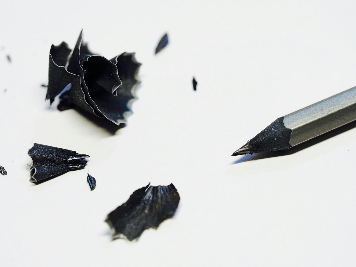
Community and Resources: Connecting with Fellow Artists
You're not alone in your Prismacolor journey! One of the beautiful things about the art community is the shared passion for tools and techniques. There's a wealth of resources out there to help you further explore the possibilities of these pencils:
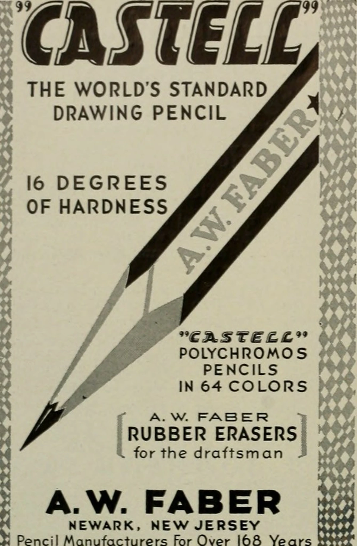
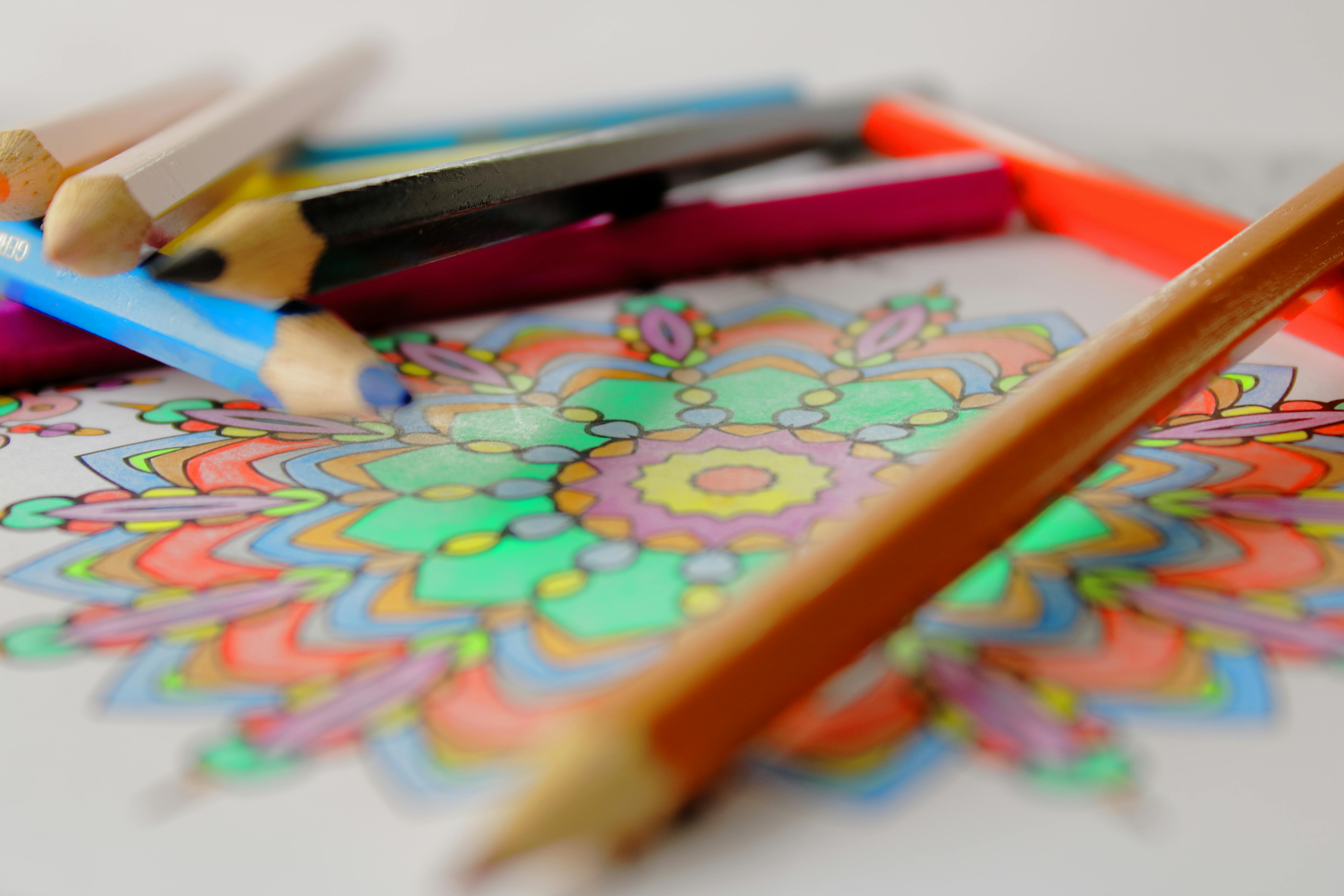
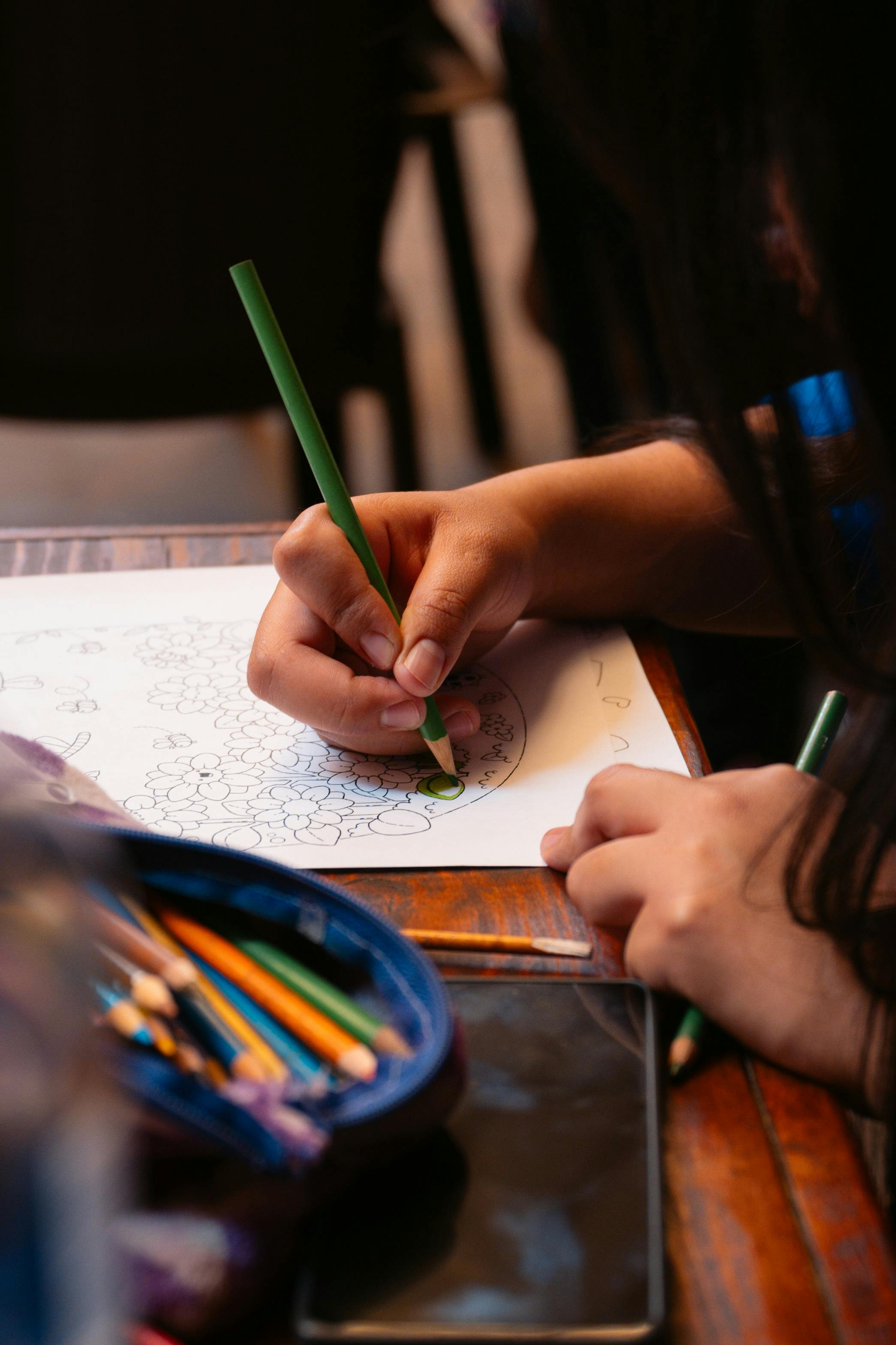
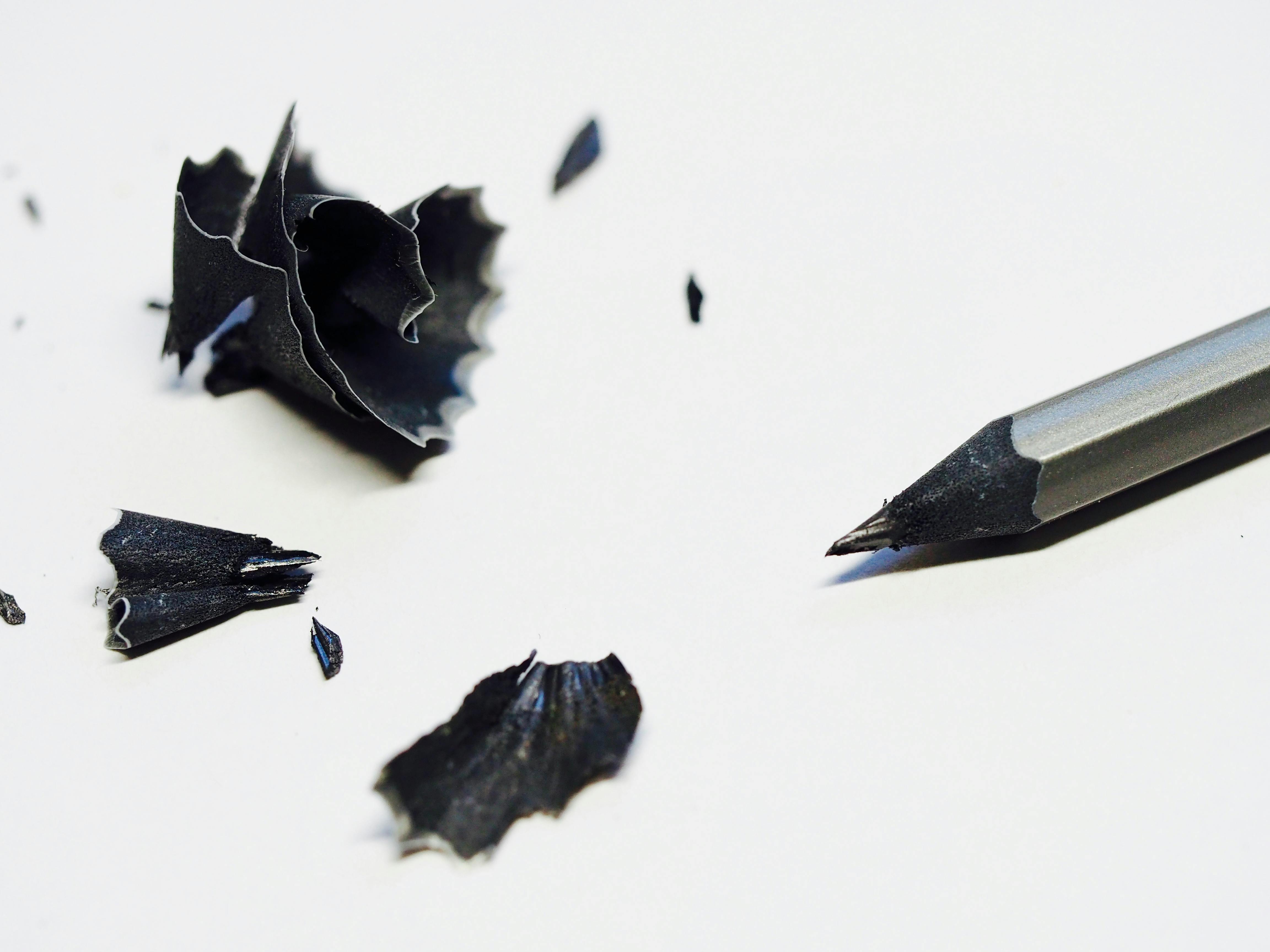
- Online Forums and Social Media Groups: Platforms like Reddit, Facebook, and even dedicated art forums host vibrant communities where artists share tips, troubleshoot problems, and showcase their work with Prismacolor Premiers. It's a fantastic way to learn from others and get inspired.
- YouTube Tutorials: Countless artists create in-depth video tutorials demonstrating various techniques, from basic blending to advanced mixed media applications. Watching someone else work with the pencils can be incredibly enlightening.
- Workshops and Classes: Many art centers and online platforms offer workshops specifically focused on colored pencil techniques. These can provide structured learning and personalized feedback from experienced instructors.
Understanding the "Tooth" of Digital Canvas
In the digital realm, the concept of "paper tooth" translates to brush textures and canvas settings. Just as a physical paper's tooth affects how colored pencil pigment is laid down, digital brushes with varying textures can mimic those effects. For artists transitioning or combining mediums, understanding this parallel can help you achieve similar rich, layered looks in your digital work. Experiment with digital brushes that simulate the granular quality of colored pencil or the smooth blend of burnished layers. The principles of layering, pressure (stylus pressure, in this case!), and blending you master with Prismacolors are surprisingly transferable to the digital canvas, making it a natural extension of your artistic exploration.
- Books and Magazines: Dedicated art books and magazines often feature articles, tips, and inspiration for working with colored pencils, sometimes even highlighting specific brands like Prismacolor.
Don't be shy about reaching out, sharing your work, or asking questions. The journey of an artist is often a shared one, and tapping into the collective wisdom of the community can accelerate your growth and keep your creative fires burning brightly. Many online platforms like Skillshare, Domestika, and Patreon host dedicated courses and communities for colored pencil artists, offering structured learning paths and opportunities for direct interaction with instructors and peers. It's like having a personalized art tutor at your fingertips! After all, art is about connection, both to your medium and to fellow passionate creators. And in this incredibly interconnected world, finding your tribe of fellow Prismacolor lovers is easier than ever. Many online platforms like Skillshare, Domestika, and Patreon host dedicated courses and communities for colored pencil artists, offering structured learning paths and opportunities for direct interaction with instructors and peers. It's like having a personalized art tutor at your fingertips! After all, art is about connection, both to your medium and to fellow passionate creators.
Local Art Groups and Workshops
Beyond the digital realm, don't underestimate the power of local art groups, guilds, and in-person workshops. These can provide invaluable hands-on learning, immediate feedback, and the chance to connect with fellow artists in your area. Sharing techniques, discussing challenges, and simply creating alongside others can be incredibly motivating and inspiring. There's a unique energy that comes from a shared physical space dedicated to art-making, and often, you'll discover tips and tricks that online resources simply can't convey. It's a wonderful way to foster both your artistic growth and your sense of community.
Understanding the "Tooth" of Digital Canvas
In the digital realm, the concept of "paper tooth" translates to brush textures and canvas settings. Just as a physical paper's tooth affects how colored pencil pigment is laid down, digital brushes with varying textures can mimic those effects. For artists transitioning or combining mediums, understanding this parallel can help you achieve similar rich, layered looks in your digital work. Experiment with digital brushes that simulate the granular quality of colored pencil or the smooth blend of burnished layers. The principles of layering, pressure (stylus pressure, in this case!), and blending you master with Prismacolors are surprisingly transferable to the digital canvas, making it a natural extension of your artistic exploration. It's like having a secret language that allows you to translate your physical art skills into the digital world, opening up even more creative avenues.