Why Some Art Just *Works*: A Personal Guide to the Principles of Design
Ever wonder why some art feels 'right'? I'll break down the core principles of design—balance, contrast, rhythm—in a simple, personal way. No jargon, just insights.
The Secret Language of Art: A Personal Guide to the Principles of Design That Make Art Work
Ever stood in front of a painting, or gazed at a sculpture, and just felt... something visceral? A sense of profound calm, or maybe an electric jolt of raw energy that vibrates through your very core? You might not be able to articulate why it moves you, but you undeniably know it’s working its magic, stirring something deep within. I've certainly been there countless times, not just as a captivated viewer utterly lost in a masterpiece, but also in the quiet solitude of my own studio, locked in a silent wrestle with a piece that stubbornly feels 'off,' resisting the very life I'm trying to imbue. It’s a universal experience for creators and observers alike – that profound, almost inexplicable moment when a piece of art just connects. It’s a feeling I relentlessly chase in my own work; that elusive 'aha!' moment that signals a painting has found its voice, its purpose, its very soul, transforming from mere pigment on canvas into a living entity.
That elusive magic, that compelling gut feeling, almost invariably boils down to a sophisticated, often subconscious, application of a set of foundational ideas that artists, architects, and designers have refined over centuries. These are what we call the principles of design. They are the silent architects behind every visually compelling experience, whether it's the profound impact of a Renaissance masterpiece, the satisfying logic of a perfectly designed product, or the magnetic pull of a powerful photograph. Think of them as the operating system for visual communication, dictating not just what we see, but how we experience it.
While the elements of art — like line, color, and texture — are the fundamental words in our visual vocabulary, the principles of design are the sophisticated grammar, syntax, and rhetoric. They dictate how you arrange those words to construct a compelling narrative, whisper an intimate secret, or shout a revolutionary idea across the canvas. This isn't some dusty, inaccessible academic rulebook; it's a living, breathing, practical guide to making profound sense of the visual world around us, a kind of intuitive logic that resonates deep within our human psyche. In essence, they are the architecture of aesthetic experience, offering a blueprint for why some art simply works, and other pieces, well, don't quite hit the mark. For a truly deep dive into the very essence of visual language, explore our definitive guide to the elements and principles of art. You can also expand your understanding with specific guides like elements of art line or a broader overview of all the building blocks with our guide to the art elements, and round out your perspective with insights into composition in art explained and the art of composition guiding viewers eye.
So, let's pull back the curtain together. No complex jargon, I promise. Just a straightforward, deeply personal look at the tools that help artists build entire worlds on a canvas, orchestrate emotions, and forge unforgettable visual experiences.
The Big Picture: Elements vs. Principles: The Architects of Aesthetic Experience
Alright, before we plunge deeper into the individual principles, let’s tackle a question that often causes a flicker of confusion, even for seasoned art lovers: What exactly is the difference between the Elements of Art and the Principles of Design? I like to think of it as the foundational scaffolding upon which all visual communication is built, and it's much simpler than it initially appears. Once you grasp this distinction, the visual world truly opens up. Historically, the formal articulation of these concepts emerged with the systematic study of aesthetics and art theory, gaining particular prominence during the Renaissance with figures like Leonardo da Vinci, who meticulously studied anatomy, proportion, and perspective, and Leon Battista Alberti, whose treatises codified theories of art and architecture. Later, during the influential Bauhaus era in the early 20th century, a German art school founded by Walter Gropius, there was a radical effort to establish universal rules for design across various disciplines, emphasizing functionality, accessibility, and a harmonious synthesis of art and technology. This rich historical context, from ancient Greek ideals of harmony and proportion articulated by Pythagoras and Euclid, to the structured beauty of Byzantine mosaics, the dynamic narratives of Baroque art, and eventually modern experimental and post-modern approaches, helps us appreciate their enduring relevance. It shows how these principles have been continuously reinterpreted, challenged, and even subverted across different artistic movements. It's not just about adhering to rules, but about understanding the traditions to intentionally break or innovate upon them, pushing the boundaries of visual expression.
- Elements are, quite simply, the fundamental building blocks, the raw materials of any visual creation. They are the nouns, if you will: line, shape, form, color, value (lightness/darkness), texture, and space. They answer the crucial question: What is the art made of? Think of them as the primary colors of your visual palette, the tangible components you can literally point to, the very DNA of visual expression. For a comprehensive journey through these building blocks, explore our guide to understanding the elements of design in art, or for a more direct approach, check out this beginners guide to line, shape, color and texture. To truly appreciate the foundational aspects of form and space, you might also find value in exploring the definitive guide to understanding form and space in abstract art principles perception and practice, and for an even deeper dive into how line defines and expresses, consider the definitive guide to understanding line in abstract art from gestural marks to geometric forms. Imagine trying to build a house without bricks or wood – that's what art would be without elements. They are the initial spark, the raw data, the very essence of what can be seen and felt in a visual piece.
- Principles are the dynamic organizing forces, the intellectual framework that dictates how those raw materials are arranged and interact. They are the verbs: balance, contrast, emphasis, movement, pattern, rhythm, unity/variety, proportion/scale, and hierarchy. They tell us how those elements are utilized to create a cohesive, impactful, and often deeply emotional experience. Think of it like a symphony: the elements are the individual notes, while the principles are the composition, dictating the melody, harmony, and rhythm that move the listener. It’s the difference between a random scattering of colors and a painting that sings; the principles are the song's structure. They are the invisible hand that guides your eye, the emotional orchestrator of the visual experience. Without them, even the most beautiful elements can fall flat, lacking direction or meaning. They're what elevate raw materials into genuine art, transforming them into a powerful statement. For a broader overview of how these principles shape the entirety of an artwork, our guide to understanding the principles of art composition offers an excellent perspective. Consider the chaos of a lumberyard versus a meticulously designed wooden house; the elements are the lumber, the principles are the carpentry, the blueprint, and the aesthetic choices that bring it all to life.
You see, you truly can't have one without the other; they are utterly symbiotic. You can't conjure a sense of rhythm without the careful repetition of a line or shape. You can't ignite contrast without juxtaposing different colors or values. Every masterful artwork is a testament to this inherent partnership, a delicate dance between the 'what' and the 'how'. It’s a bit like cooking; you have your ingredients (elements) and your recipe (principles). You can have the finest ingredients in the world, but without a good recipe and the knowledge of how to combine them, you won't get a culinary masterpiece. It's the difference between a pile of bricks and a cathedral, or a random assortment of words and a Pulitzer-winning novel. The principles provide the blueprint, the intent, and the means to create something truly profound and impactful.
Here’s a quick breakdown:
Concept | Role | What It Is (Quick Glance) | Key Questions to Ask | Examples |
|---|---|---|---|---|
| Elements of Art | The Raw Materials (The Nouns) | The fundamental components of any visual creation – the observable building blocks of any artwork. | What is it made of? What are the tangible visual components? | Line, Shape, Color, Texture, Value, Form, Space |
| Principles of Design | The Organizing Forces (The Verbs) | How the elements are arranged, governed, and interact to create meaning, impact, and a cohesive experience. | How are the elements put together? How does it make me feel? | Balance, Contrast, Rhythm, Emphasis, Unity, Variety, Proportion/Scale, Hierarchy, Movement, Pattern |
Understanding this distinction is the first step. It's the key to unlocking a deeper appreciation for any composition in art.
The Core Principles: A Guided Tour Through Visual Harmony and Discord
Alright, enough with the theoretical stage-setting. Let’s roll up our sleeves and delve into the very essence of what makes art 'work' – the core principles themselves. I'll walk you through each one, offering insights I constantly grapple with, both in the quiet solitude of my studio and during the captivating exploration of someone else's artistic narrative. Consider this your guided tour through the visual mechanics of masterpieces, a journey into the 'how' behind art's profound impact. We'll uncover how these principles, when masterfully applied, can elicit specific emotions, guide the viewer's gaze, and create a lasting impression. For me, this is where the real conversation with the canvas begins; it's the toolbox I instinctively reach for when a piece needs to find its footing, transforming raw intention into compelling visual reality.
Balance: The Art of Visual Weight and the Illusion of Stability
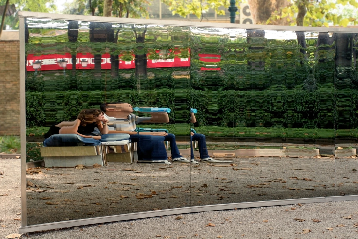
Balance is, quite literally, the art of visual equilibrium. It's about how the perceived 'weight' of the various elements — a splash of vibrant color, a heavy dark shape, a sprawling texture — is distributed across the entire composition. When achieved effectively, balance imbues a piece with a profound feeling of stability, harmony, and a satisfying 'rightness' that simply resonates with the viewer, tapping into our innate desire for order. Conversely, an intentionally unbalanced piece can evoke tension, discomfort, or a dynamic sense of impending action, which, as I've found, can be a potent artistic statement in itself. It’s all about control, even in chaos, and artists leverage this to evoke anything from serene contemplation to thrilling unease. Think of a tightrope walker – perfect balance creates a sense of effortless grace, while a slight wobble immediately injects drama, grabbing our attention. From my own experience, achieving balance often involves a subtle push and pull; it’s not just about placing elements, but about understanding their perceived 'optical weight' – how size, color intensity, texture, and even emotional charge contribute to how heavy or light something feels in the visual field. This constant adjustment is the secret to a dynamic, yet stable, composition.
There are a few key types of balance you'll encounter:
- Symmetrical Balance (Formal Balance): This is when elements are mirrored on either side of a central axis, creating a sense of perfect equilibrium, formality, and often, solemnity. Think of a butterfly's wings, or the perfectly aligned features of a classical portrait. It's predictable, reassuring, and conveys order.
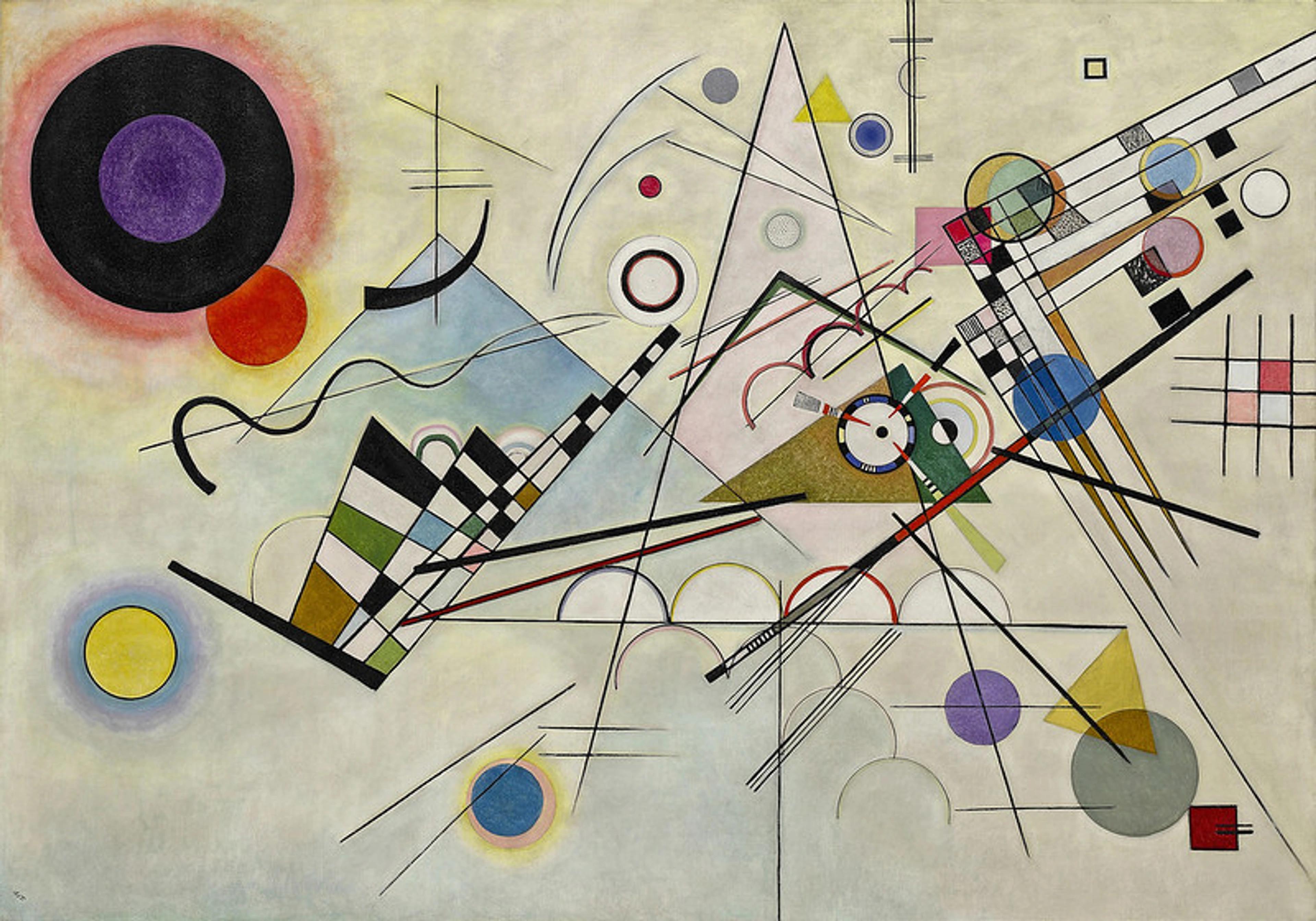
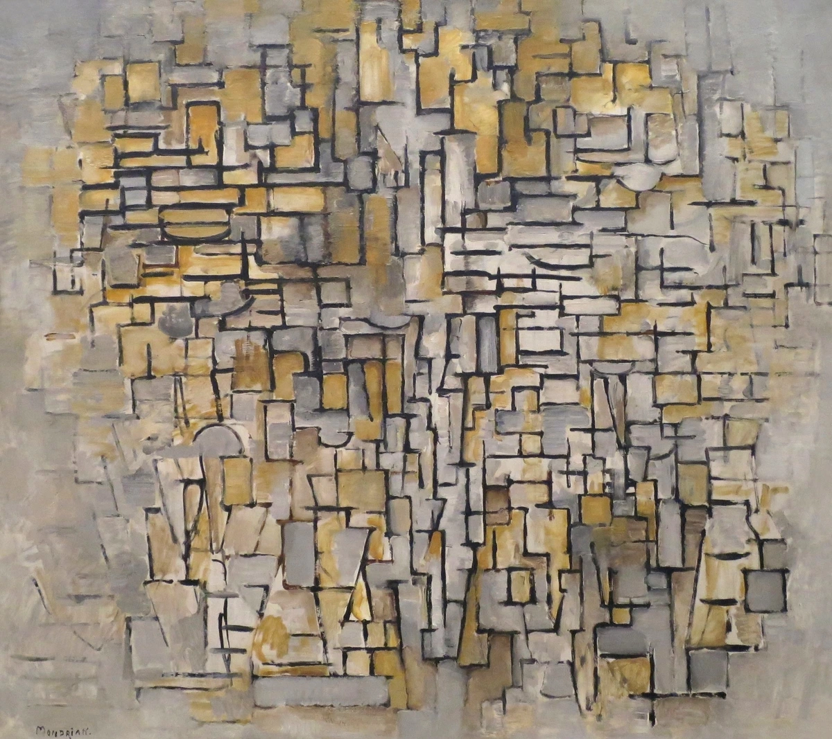
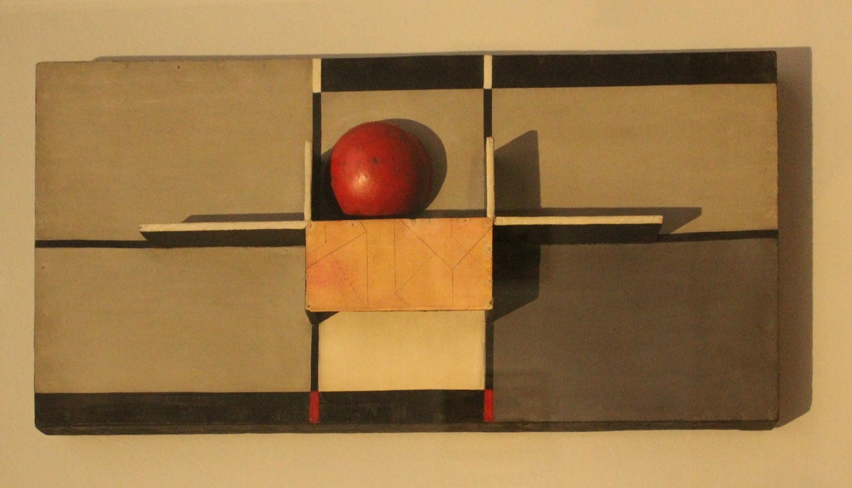
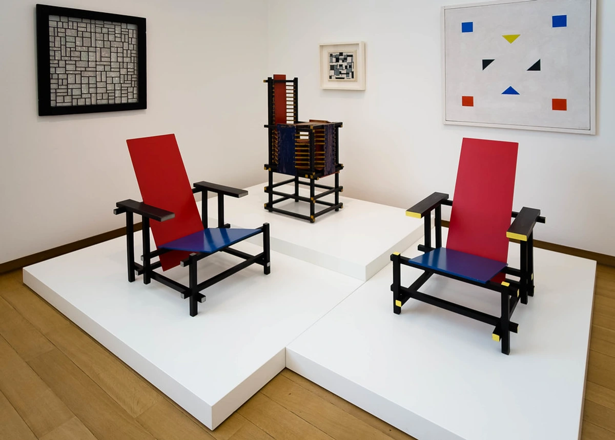
- Asymmetrical Balance (Informal Balance): This is achieved when dissimilar elements are arranged to create a sense of visual equilibrium. A large, simple shape on one side can be balanced by several smaller, more complex shapes on the other. It's dynamic, more visually interesting, and can feel more natural or spontaneous than perfect symmetry. Piet Mondrian was a master of asymmetrical balance. His iconic grids of lines and blocks of color feel perfectly poised, even though they are anything but symmetrical. It's a testament to the power of carefully calculated visual weight, a precise interplay of color, shape, and line that just clicks. His work demonstrates that balance isn't about mirroring, but about a dynamic tension of opposing forces achieving equilibrium, much like a well-designed mobile. It’s this carefully orchestrated tension that makes his compositions so enduringly compelling, challenging our innate desire for perfect symmetry while still delivering profound visual harmony. When I look at Mondrian, I see a constant negotiation, a subtle push and pull that finally settles into an almost meditative stillness, achieved through carefully considered weights and counterweights. It’s a profound lesson in restraint and deliberate placement, revealing the sophisticated art of finding equilibrium without strict duplication.
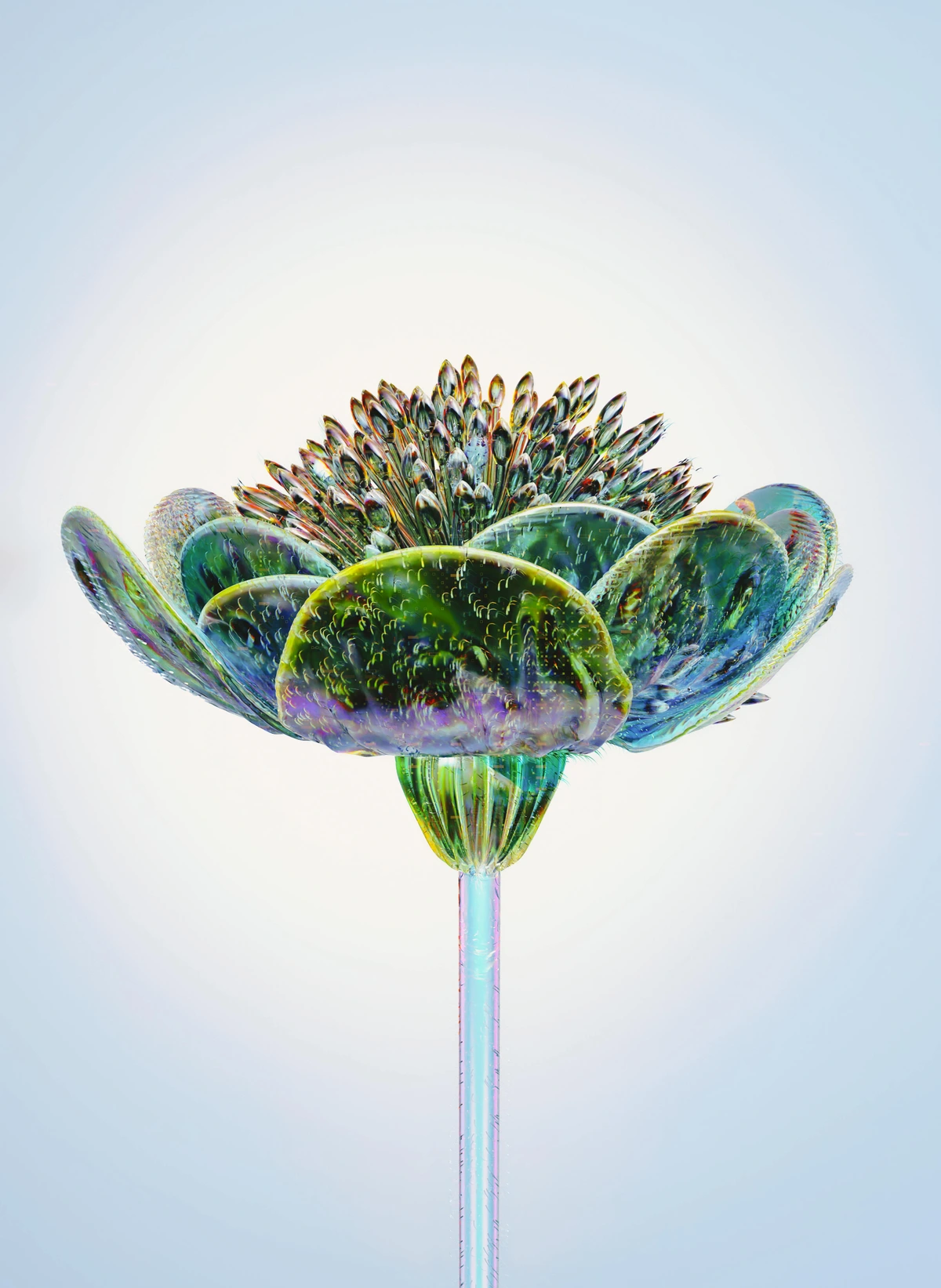
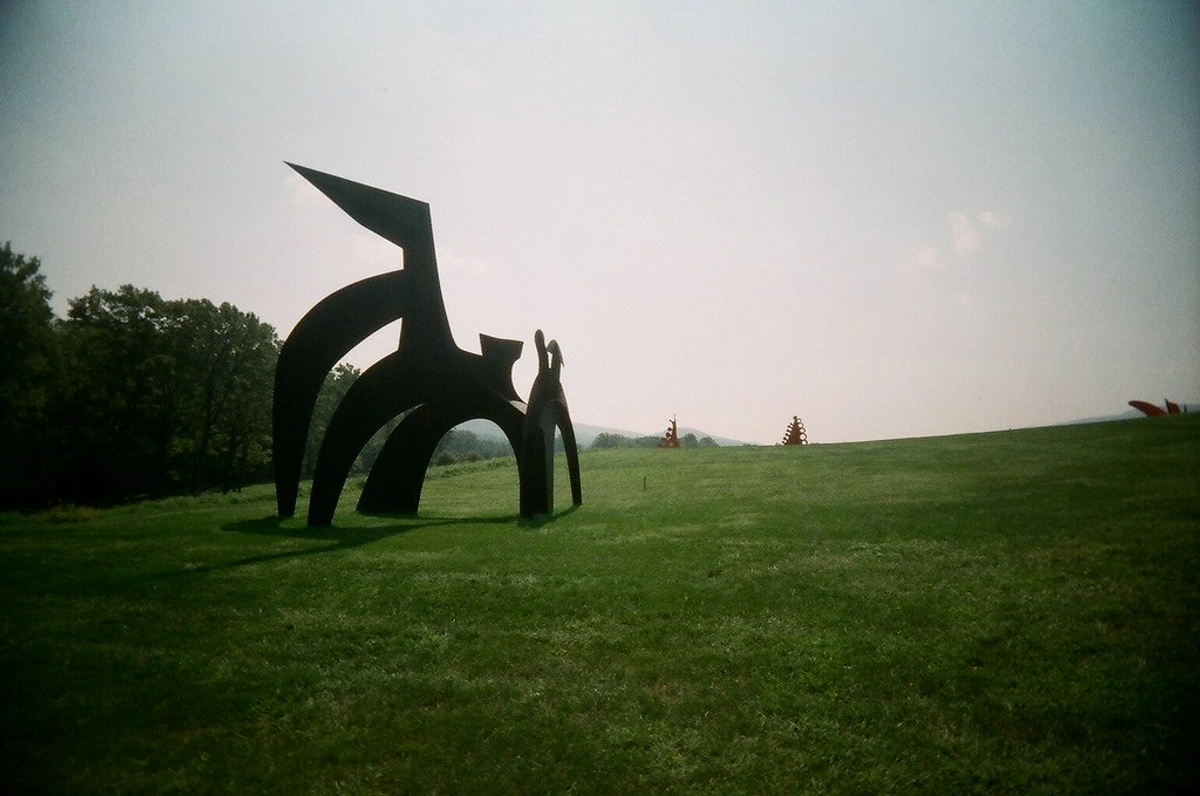
- Radial Balance: This occurs when all elements radiate outwards from a central point, like spokes on a wheel or petals on a flower. It creates a powerful sense of focus and movement towards or from the center, often seen in mandalas or rose windows in cathedrals.
- Crystallographic Balance (All-Over Pattern): Here, repetition of similar elements throughout the entire composition creates a uniform distribution of visual weight, with no discernible focal point. Think of a patterned wallpaper or certain abstract expressionist paintings. It evokes a sense of continuous flow and a lack of hierarchy.
If you want to dig deeper, I've written a whole piece on understanding balance in art composition. Or consider how artists like Wassily Kandinsky, in his abstract compositions, expertly distribute geometric forms and vibrant colors to achieve a dynamic yet stable equilibrium, often leaning into asymmetrical arrangements that feel inherently right, even without traditional subjects. It's about the subtle distribution of visual energies.

Contrast: Creating Drama, Focus, and Visual Vibrancy
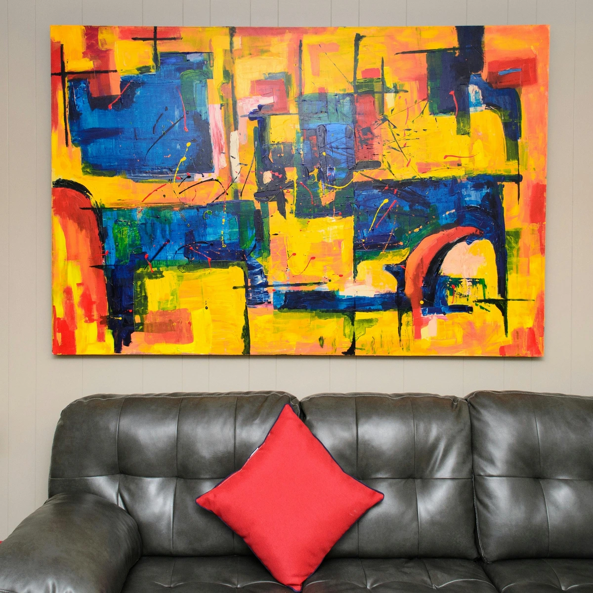
Contrast is, without a doubt, the adrenaline shot of the visual world. It's the indispensable secret ingredient for making art truly pop, for grabbing attention, and for creating a sense of dynamic tension and excitement. At its core, contrast is simply about placing distinctly different elements next to each other to generate visual interest and prevent any hint of monotony. Without it, an artwork can quickly devolve into a flat, unengaging whisper; with it, it becomes a vibrant, compelling shout. It’s the visual friction that sparks engagement. Psychologically, contrast is incredibly powerful; our eyes are naturally drawn to areas of significant difference, making it a primary tool for guiding perception and creating immediate impact, often before we even consciously register why. This is where the magic of visual storytelling often begins, a principle I find myself almost instinctively reaching for when a piece feels too 'nice' or complacent – it often just needs a little jolt of opposition, a deliberate visual challenge. Beyond the obvious visual pop, contrast also plays a vital role in creating a sense of dynamic energy. It's the visual equivalent of a dramatic pause in music, drawing you in and holding your attention.
You can generate this electrifying visual interest through countless contrasting elements. It’s like a chef balancing sweet and savory, or a musician juxtaposing loud and soft notes; the friction is where the flavor lies:
- Size (Scale): A colossal form next to a minuscule detail. This immediately draws attention and can imply importance or insignificance, grandeur or vulnerability. Imagine a giant, towering sculpture casting a shadow over a tiny, intricate carving at its base. The juxtaposition itself tells a story.
- Direction: Straight lines clashing with curved lines, or static horizontal forms against dynamic diagonals, injecting movement and tension. This is often used to break monotony or to symbolize conflict and energy, guiding the eye in unexpected ways.
- Value: The stark difference between light and dark tones. This is arguably the most powerful and fundamental form of contrast, capable of creating immediate drama, depth, and a compelling sense of three-dimensionality. Think of the intense shadows and bright highlights in a Rembrandt painting, where chiaroscuro (the use of strong contrasts between light and dark, usually bold contrasts affecting a whole composition) doesn't just define form but evokes profound emotion and atmosphere, pulling figures out of the darkness with an almost divine light. Carravaggio was another master of this, using extreme value contrast to heighten the drama in his religious scenes, making the mundane feel sacred and the sacred feel intensely human.
- Color: Juxtaposing warm colors against cool colors (think fiery reds next to calming blues), or employing complementary colors (colors opposite each other on the color wheel, like vibrant orange against deep blue or intense red against green) to make each truly sing and appear more saturated. The way colors react to their neighbors, a phenomenon known as simultaneous contrast, can make a seemingly dull color vibrate with energy when placed next to its complement, or a neutral grey take on a subtle hue from a surrounding vibrant color. It’s a fascinating optical trick that artists leverage to make their palettes leap off the canvas. We can further differentiate between contrasts of hue, where distinct colors are placed side by side; saturation, where a vibrant color is placed next to a muted one; and lightness/darkness, which closely aligns with value contrast. For a deep dive into the building blocks of visual art, explore our comprehensive guide to the elements of design in art.
- Texture: Placing a rough, impasto surface beside a smooth, polished area creates a tactile invitation for the eye, an irresistible visual friction. This isn't just about what you see; it’s about what you feel or imagine feeling, drawing you deeper into the artwork's physical presence and engaging multiple senses. Think of the gritty sands in a textured abstract piece against a slick, glossy resin pour; the contrast begs your hand to reach out and explore the surface.
- Shape: Mixing rigid, predictable geometric shapes (like squares and triangles) with fluid, unpredictable organic shapes (like amorphous blobs or natural forms) creates a fascinating visual dialogue, often symbolizing order against chaos, or the man-made versus the natural world.
- Conceptual Contrast: This goes beyond the purely visual, contrasting ideas or themes within a piece, like peace and war, old and new, or abstract against realistic. This kind of contrast can evoke deep thought and emotional resonance, forcing the viewer to confront dualities and deeper meanings. Think of a peaceful landscape suddenly interrupted by a jarring industrial structure; the contrast isn't just visual, but thematic. Or consider a delicate, ephemeral butterfly tattooed onto a hardened, muscular arm – a stark conceptual juxtaposition that creates an immediate, compelling narrative and often, profound emotional impact.
Kara Walker's silhouette work is a stunning example of maximum contrast. The stark black against white creates an immediate and powerful narrative impact that you can't ignore. It's a testament to how effectively even a minimalist approach can generate profound visual and emotional friction. Beyond the dramatic value shifts, consider the masterful color contrasts found in the works of Vincent van Gogh, where bold, unmixed hues are placed side-by-side to create intense vibrancy and emotional resonance. Or the textural contrasts in Rembrandt's later portraits, where thick impasto on faces contrasts with smooth, dark backgrounds, creating both depth and a profound sense of human presence.
Another compelling example can be found in the raw, visceral textures of abstract art. The interplay of smooth washes against gritty impasto, or deep charcoal marks next to expansive empty space, creates a different kind of compelling tension. I often find myself deliberately introducing a jarring textural element into an otherwise smooth painting, simply to make the viewer pause, inviting a deeper, more tactile engagement with the surface. It's a subtle form of contrast, but incredibly effective in enriching the viewing experience.
Emphasis (or Focal Point): The Star of the Show, Guiding the Viewer's Gaze
Emphasis is about creating a focal point—an area that grabs your attention first. It's the part of the story the artist wants to make sure you don't miss. How do you create it? Often, with contrast! But it's not just about sharp differences; emphasis can be achieved through various techniques: it's like a visual spotlight, guiding your eye to the most important character or moment in the scene, establishing a clear hierarchy of importance. I often find myself asking, 'Where do I want the viewer's eye to land first?' and then working backward to create that magnetic pull, a deliberate point of visual magneticism that draws the eye into the narrative. Think of a master storyteller; they know exactly when to highlight a character, a phrase, or a plot twist to ensure it lands with maximum impact. That's emphasis in action.
- Isolation: Placing an object alone in a vast, empty, or untextured space naturally draws the eye, imbuing it with a sense of significance, vulnerability, or even grandeur. Consider a single tree standing alone on a vast plain—it immediately becomes the focal point.
- Placement: Centrally located elements, or those strategically placed along compositional guidelines (like the rule of thirds or even the Golden Ratio), often become focal points, tapping into our subconscious understanding of balance and proportion. For a deeper dive into these structures, explore our guide to composition in art explained and the art of composition guiding viewers eye.
- Color/Value: A bright, saturated color amidst muted tones, or a stark light against deep shadow, instantly pulls the eye. This is a direct application of contrast to create focus, a visual 'aha!' moment that demands attention. A single red apple in a black and white photograph immediately commands the gaze. The emotional language of color in abstract art can further explain this power.
- Detail: An area rendered with exquisite detail in an otherwise simplified or abstract work will naturally become a point of interest. Our eyes are drawn to complexity and intricate information.
- Convergence: When multiple lines or elements in an artwork point towards a single area, they inevitably draw the viewer's attention there. Think of leading lines in a photograph, all pointing towards the main subject.
- Unusual or Unexpected Elements: A surprising texture, an odd shape, or an unexpected subject matter immediately stands out against the norm. This is the visual equivalent of a sudden, intriguing sound in a quiet room.
A splash of bright color in a muted painting, one highly detailed face in a blurry crowd, or a single large object among many small ones—these all create emphasis. It tells your eye exactly where to start its journey through the artwork, establishing a clear hierarchy of visual information. It's about priority, about saying: "Look here, first." Sometimes, that initial point of emphasis can be a subtle flicker, and other times, it's a bold, unmistakable declaration. This principle ensures that the artist's message is not lost in visual noise, but rather delivered with clarity and impact.
Emphasis Beyond Visuals: Guiding Perception in Unexpected Ways
While we primarily think of emphasis in visual terms, its underlying principle of 'directing attention' can be found in other sensory experiences. Think of a sudden crescendo in a piece of music, drawing your ear to a particular instrument or melody. Or a pivotal moment in a novel, where a single sentence or paragraph is crafted to stand out, forcing the reader to pause and reflect. These are all forms of emphasis, demonstrating its universal power to guide perception and heighten experience, proving that the 'spotlight' isn't just for our eyes. The way information is presented in a textbook, for example, uses emphasis through bolding and larger fonts to highlight key concepts.
Rhythm and Movement: The Viewer's Journey, The Pulse of the Canvas
Movement refers to the path your eye takes as it moves through a work of art. It’s the visual narrative, the dance across the canvas that the artist choreographs. Rhythm is what creates that movement, often through the careful repetition of elements, lines, colors, or shapes in a predictable or varied sequence. It's about designing a captivating journey for the viewer, ensuring their gaze doesn't just land, but travels through the composition, uncovering its secrets along the way, much like a dancer leading their partner across the floor. In my own work, I often think of it as building a visual current, a flow that carries the viewer from one area of interest to the next, revealing the narrative layer by layer.
Think of it like music. A steady beat can be created by repeating a shape or color at regular intervals. A flowing melody can be created by using sweeping, gestural lines. This principle is what makes a static image feel alive and energetic, imbuing it with a pulse. The emotional impact of rhythm is profound: a regular, predictable rhythm can evoke a sense of calm and order, while an irregular, broken rhythm can create tension, chaos, or excitement. It's the artist's choice of rhythm that often dictates the pace and mood of the visual narrative, akin to a film director using different editing speeds to build suspense or convey serenity. There are different types of rhythm, each creating a distinct visual cadence:
- Regular Rhythm: Elements are repeated at consistent intervals, creating a sense of order, stability, and predictability, like a marching band or the consistent beat of a clock. It reassures the eye with its consistent beat.
- Flowing Rhythm: Achieved through curved or undulating lines and shapes, mimicking natural forms like waves, winding rivers, or the graceful curve of a dancer's arm. This evokes a sense of organic movement and fluidity, a gentle sweep across the canvas.
- Progressive Rhythm: Elements change or evolve slightly each time they are repeated, creating a sense of growth, transformation, or a building narrative. Imagine a series of concentric circles gradually expanding, colors subtly shifting hue across a gradient, or forms increasing in size along a path, leading the eye on a journey of continuous change and development. This type of rhythm can be deeply symbolic, representing evolution, decay, or the passage of time.
- Alternating Rhythm: Two or more different elements are repeated in a sequence, adding complexity and variation, much like a musical motif with alternating notes or chords. This can introduce dynamic tension and visual interest, preventing monotony while maintaining structure. It creates a conversational back-and-forth for the eye.
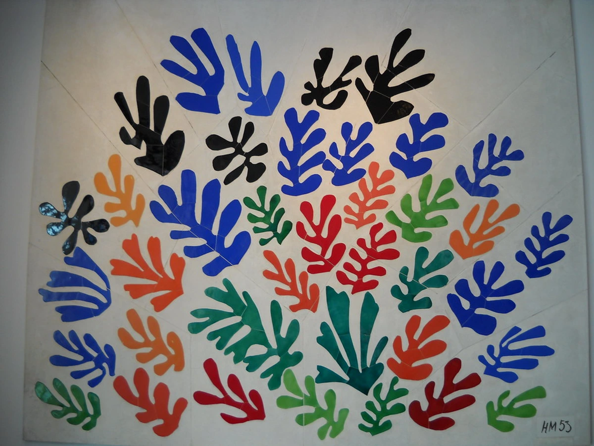
Henri Matisse's La Danse is pure rhythm and movement; you can almost feel the energy of the figures circling, their forms flowing seamlessly into one another, creating an unending visual loop. It’s a testament to the power of organic lines to evoke dance and continuous motion.

Stage Design and Set Design: Crafting Immersive Environments
In theater, film, and live events, stage and set designers are master manipulators of the principles of design. They use scale and proportion to create environments that can feel intimate or monumental, directing the audience's perception of the narrative world. Balance is crucial for structural stability and visual harmony, ensuring the set supports the action without overwhelming it. Emphasis is often achieved through lighting, color, and the strategic placement of props or architectural features, guiding the audience's attention to key focal points. Rhythm can be created through repeating architectural elements, patterns, or the way the stage is divided, influencing the pace and mood of the performance. And of course, unity ensures that all elements of the set work together to support the overall theme and story, while variety keeps the visual experience engaging and dynamic. A well-designed set is not just a backdrop; it’s an active participant in the storytelling, using these visual principles to immerse the audience in the world of the performance.
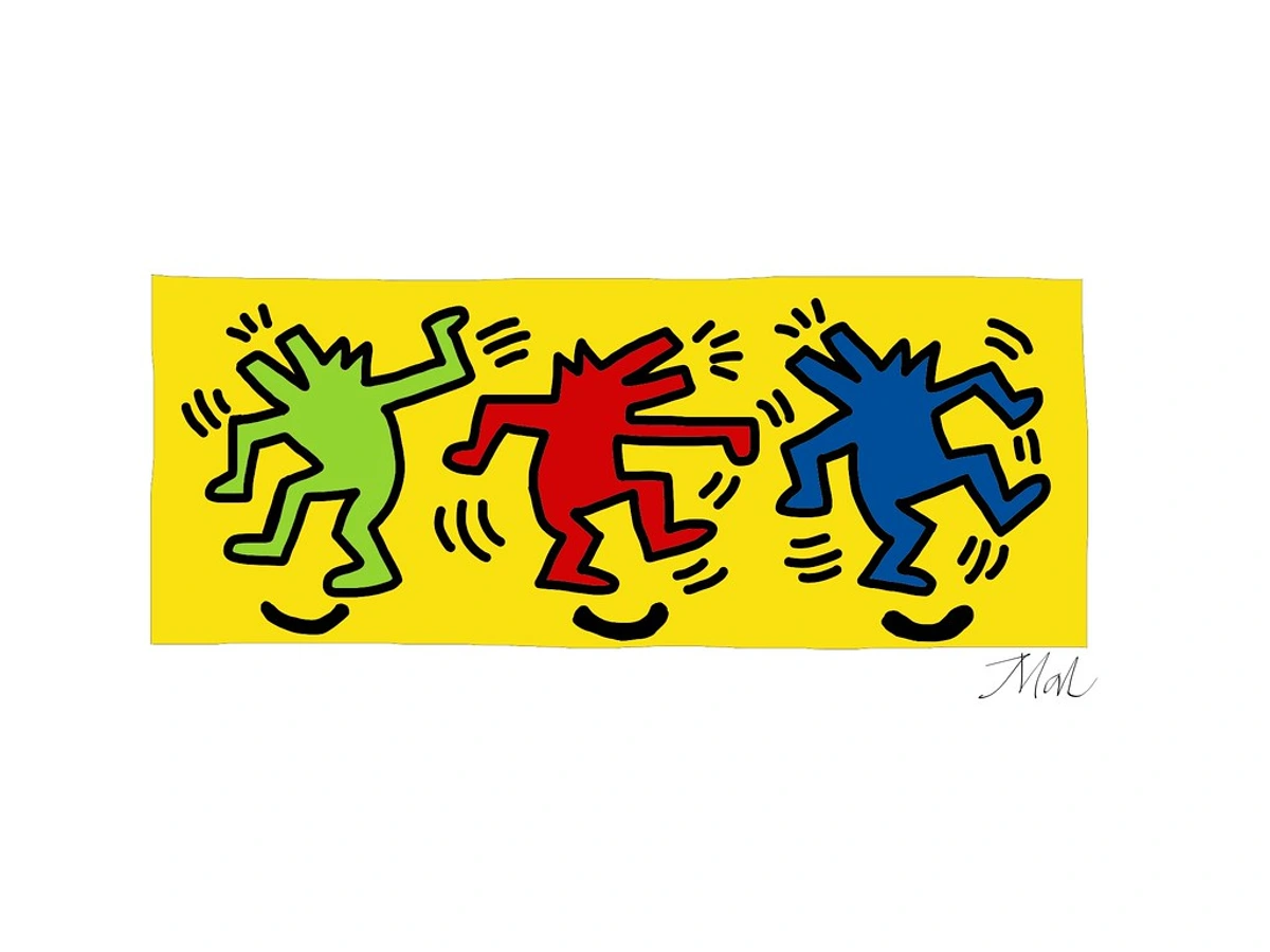
For a more contemporary and playful take, consider the iconic work of Keith Haring, whose dancing figures pulsate with an infectious, unbridled rhythm, each line radiating energy and contributing to an irresistible sense of movement and joy. His repetitive, bold outlines create an almost musical beat across the surface, pulling the viewer’s eye from one figure to the next with undeniable zest.
Or, in photography, a long-exposure shot of car taillights on a highway can capture the rhythm and movement of urban life, transforming static lights into flowing, ethereal lines. It's about capturing time and motion within a single frame, a fascinating visual trick that makes the ephemeral feel permanent, a testament to the artist's ability to manipulate our perception of reality. Even in abstract art, rhythm and movement are critical, creating dynamism and flow, as explored in the definitive guide to composition in abstract art principles techniques and impact.
Proportion and Scale: Getting the Relationships Right, Manipulating Perception
Proportion deals with the size relationships of parts to a whole and to one another. In a portrait, this means making sure the nose is the right size for the face relative to the eyes and mouth, ensuring a believable representation. Scale refers to the size of an object in relation to what's considered normal or to other objects in the composition. It’s a powerful tool, and sometimes, playing with these relationships can be profoundly unsettling or incredibly dramatic. I’m always fascinated by how a simple shift in scale can completely alter a viewer’s emotional response, turning the familiar into the monumental or the majestic into the delicate.
Artists can play with these for dramatic effect, often to challenge our perceptions or evoke specific emotions. Chuck Close's massive portraits use scale to create an overwhelming, intimate experience, forcing the viewer to confront every detail up close, almost demanding an uncomfortable intimacy. Distorting proportion can create feelings of unease, surrealism, or even caricature, seen in the elongated figures of El Greco or the fragmented bodies of Cubism. Techniques like foreshortening are all about mastering proportion to create a realistic illusion of depth, making a two-dimensional surface appear three-dimensional, which is a whole topic in itself connected to understanding perspective in art. Historically, the Renaissance masters meticulously studied human anatomy and perspective to achieve 'ideal' proportions, often employing principles like the Golden Ratio (a mathematical proportion found throughout nature and art, approximately 1.618:1) and the related Fibonacci Sequence, believing they reflected divine harmony and universal beauty. This quest for perfect balance and inherent beauty guided their artistic output, from sculptures like Michelangelo's David to architectural designs, shaping our understanding of aesthetic ideals. A towering sculpture in a vast, empty plaza, for example, uses scale to evoke awe and insignificance in the viewer, manipulating our perception of space and our own place within it. For a truly deep exploration of this fascinating topic, I highly recommend our definitive guide to proportion in art and understanding the golden ratio in art and design a guide to harmonious composition.
When considering scale, one of the most intriguing aspects is how artists manipulate it to create psychological effects. Monumental works can inspire awe and humility, while miniature pieces draw us in for intimate contemplation. The deliberate distortion of scale, often seen in Surrealism, can evoke a sense of dreamlike wonder or unsettling absurdity, challenging our ingrained perceptions of reality.
Hierarchy: The Visual Command Center, Directing the Narrative Flow
While closely related to emphasis (which focuses on a single focal point), hierarchy is a broader, more structural principle that dictates the visual importance of various elements within a composition. It's about organizing elements in a way that clearly communicates their relative significance, telling the viewer, without words, what to look at first, second, and so on. Think of it as the visual pecking order, the command center, or the flow chart of the artwork, establishing a clear path for comprehension and impact. Without effective hierarchy, an artwork risks becoming a visual jumble, overwhelming the viewer rather than inviting them in, like a conversation where everyone is shouting at once. It's about clarity of message and intentional guidance above all else, ensuring that the most vital information is effortlessly absorbed, leading to a more intuitive and satisfying viewing experience.
Artists achieve hierarchy through a strategic deployment of other principles, essentially combining them to create a visual roadmap:
- Size: Larger elements naturally draw more attention, often signifying importance, dominance, or proximity. A towering figure in a painting will always command more initial attention than a tiny one.
- Color and Value: Brighter, more saturated, or highly contrasting colors tend to stand out against more muted or harmonious backgrounds, creating a clear visual priority. A splash of vivid red amidst a sea of subtle grays will always demand to be seen first. This is where the emotional language of color in abstract art plays a significant role.
- Placement: Central or isolated elements often take precedence, as do those strategically positioned at key intersections within a compositional grid (like the rule of thirds). Our eyes are trained to recognize these 'power points' in a composition.
- Convergence: When multiple lines, forms, or implied vectors (like the gaze of figures) direct the eye towards a single point, that point inherently gains hierarchical importance. All roads, visually speaking, lead to Rome.
- Unusual or Unexpected Elements: A surprising texture, an odd shape, an unexpected subject matter, or a sudden break in a pattern immediately commands attention by disrupting the visual norm. This is the element that makes you do a double-take.
- Detail and Focus: Areas rendered with higher detail or sharper focus will naturally attract more scrutiny and hold attention longer than blurry, simplified, or less defined areas.
- Font and Typography (in design): In graphic design, variations in font size, weight, style, and color clearly establish a hierarchy of information, guiding the reader through the content. Think of a newspaper headline versus the body text; the difference in size immediately tells you what’s most important.
Effective hierarchy ensures that an artwork isn't just a jumble of interesting parts, but a well-ordered narrative that unfolds purposefully before the viewer's eye. It prevents visual anarchy and ensures clarity of message, transforming a mere collection of elements into a compelling visual statement. When a piece 'works,' its hierarchy is often so seamless that you don't even consciously notice it, you just intuitively understand where to look and what to feel. It’s the artist as a silent guide, directing your attention without you ever feeling explicitly told where to look. This is especially vital in complex works or those aiming to convey a specific sequence of information. Consider, for example, the intricate designs of Islamic art, where a clear hierarchy is established through repeating geometric patterns, leading the eye through layers of complexity while maintaining overall unity and spiritual meaning. Or in a Renaissance fresco, where the central figures are often larger, more brightly lit, and placed centrally, clearly establishing their narrative importance.
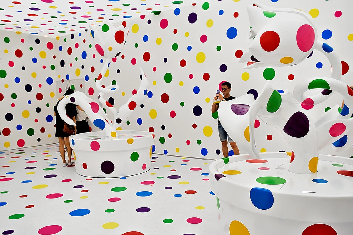
Pattern and Repetition: The Echo, The Rhythm, and The Predictable Delight
While we touched on rhythm earlier as a means of guiding movement, it’s crucial to isolate Pattern and Repetition as fundamental principles in their own right. They are the bedrock of visual consistency and often, quiet beauty. Repetition is simply using the same element (be it a line, shape, color, or texture) multiple times within a composition. It's the visual echo, creating continuity, cohesion, and a sense of visual comfort. When this repetition is organized, structured, and predictable, it evolves into a discernible Pattern. Think of the intricate weave of a fabric, the regular arrangement of bricks in a wall, the rhythmic beats in a song, or the hypnotic sequence of a mandala. Patterns can be found everywhere, from the dazzling symmetries of the natural world (think the hexagonal cells of a honeycomb, the stripes of a zebra, or the unfurling of a fern frond) to intricate architectural details, textile designs, and mesmerizing computer-generated fractal art. They offer a profound sense of order, familiarity, and visual stability, which can be deeply satisfying, almost meditative, to the human eye. My own work often starts with a spontaneous mark, and then I find myself repeating a variation of it, building a subtle pattern that lends structure to the chaos, anchoring the eye in a comforting predictability. Psychologically, patterns can be incredibly soothing and comforting, creating a sense of predictability and safety. Conversely, a broken or irregular pattern can introduce tension and disruption, forcing the viewer to re-evaluate their expectations and engage more actively with the artwork. The effective use of pattern can transform a chaotic collection of elements into a harmonious and visually compelling experience, inviting the viewer into a deeper engagement with the artwork's structure.
- Repetition creates a sense of consistency, continuity, and can powerfully unify an artwork by linking disparate parts. It provides a visual echo, reinforcing specific elements and establishing a sense of familiarity and harmony within the composition. It’s the visual glue that holds things together, making different elements feel like they belong.
- Pattern builds upon repetition, creating decorative or structural visual sequences. It introduces order, predictability, and often a soothing cadence to the viewing experience. It can be used to fill space, create intricate textures, establish a clear visual beat, or even create illusions of movement, depth, and three-dimensionality. Patterns can be overt, like in decorative wallpaper, or subtle, like the repeating brushstrokes in a painting that reveal the artist’s hand. For a fascinating dive into how abstract forms can create compelling patterns, explore the definitive guide to composition in abstract art principles techniques and impact.
From the ancient geometries found in Islamic art, with their profound spiritual significance and mathematical precision, to the bold, reproducible graphics of Pop Art (think Andy Warhol’s repeated soup cans), pattern and repetition are powerful forces for creating cohesion, movement, and a distinctive visual signature. They are the underlying melodies that connect the individual notes of an artwork into a harmonious whole. Consider the mesmerizing patterns in M.C. Escher's impossible tessellations or the intricate, often symbolic, designs in traditional textiles from cultures around the world – these are masterclasses in controlled repetition and pattern creation, revealing both artistic skill and deep cultural meaning.
Beyond the overt, I often find myself creating a pattern subconsciously, a recurring motif that ties a series of paintings together, almost like a visual signature. It's not always about overt regularity; even subtle, rhythmic echoes can create a powerful sense of connection and recognition for the viewer. This can involve repeating specific brushstrokes, a unique color combination, or a particular geometric form. It creates a sense of belonging for the elements, even if the overall composition is dynamic. It's about finding the hidden order within apparent spontaneity, allowing the viewer to discover a deeper structure upon closer inspection.
Unity and Variety: The Ultimate Balancing Act for a Cohesive and Engaging Work
This might just be the most profound and encompassing principle of them all: the ultimate push and pull, the delicate tension that ultimately holds an entire piece together and prevents it from dissolving into either mind-numbing dullness or utter visual chaos. I've often felt that all other principles are, in a way, subservient to this delicate equilibrium; they are the tools we use to achieve it. It's the Goldilocks Zone of art, where everything feels 'just right' – neither too uniform nor too disparate. Achieving this delicate balance is often the hallmark of a truly successful composition, allowing individual elements to shine, breathe, and assert their personality, while simultaneously contributing to a harmonious, compelling whole. It’s the difference between a random collection of beautiful things and a perfectly curated ecosystem, where every part supports and enhances the others, creating a rich and satisfying visual experience.
- Unity (sometimes referred to as Harmony) is the overarching sense that all the disparate parts of an artwork belong together, conspiring to form a coherent, aesthetically pleasing, and complete whole. It's achieved through consistency—perhaps a limited color palette, recurring shapes, a consistent style, or a shared theme. It creates a feeling of belonging and cohesion, making the artwork feel resolved and purposeful.
- Variety is the intentional introduction of diverse elements to create visual interest and prevent monotony. It's the spice that keeps the eye engaged—a sudden shift in color, a contrasting texture, an unexpected line, or a surprising form. Without variety, even the most unified piece can feel stagnant and uninspired, lacking the visual friction needed to truly capture and hold attention.
The magic, for me, truly happens when an artist finds that elusive sweet spot. A great artwork feels like an orchestra where every instrument is playing a different part, contributing its unique voice, but it all comes together into one beautiful, resonant symphony. It’s a concept I explore in detail when discussing unity and variety in art composition. Without unity, a piece feels fragmented, disjointed, and chaotic, leaving the viewer lost; without variety, it risks becoming bland, static, and utterly uninteresting. This constant negotiation, this dynamic interplay between predictability and surprise, is where an artist's true skill often lies, creating a compelling dialogue between order and delightful disruption. It’s a balancing act that never truly ends.
Beyond the Canvas: Principles Across Disciplines, The Universal Language of Visuals
It’s crucial to understand that these principles aren’t confined to painting alone. They are the universal language of visual communication, transcending mediums and cultures, speaking to our inherent aesthetic sensibilities. Once you start looking, you’ll find them everywhere, underpinning the effectiveness of everything from ancient architecture to modern digital interfaces. Their universality is what makes them so powerful, providing a framework for understanding visual appeal across diverse creative fields, demonstrating that the 'rules' of good design are deeply ingrained in human perception:
- Photography: A photographer uses emphasis to highlight their subject through focus, depth of field, or strategic placement, employs balance to create a stable or dynamically tense frame, and guides the viewer's eye with movement through leading lines or implied trajectories. They might use stark contrast between light and shadow to create drama and mood (think film noir), or repetition of elements to establish a visual rhythm within a series, transforming the ordinary into the extraordinary. The mastery of composition in art is just as vital behind the lens as it is with a brush, turning a simple snapshot into a compelling visual story that can transcend time. Even seemingly casual street photography, like that of Henri Cartier-Bresson, is often a masterclass in applying these principles instinctively, capturing the 'decisive moment' through expert compositional choices. Consider a portrait where the subject's face is in sharp focus (emphasis), while the background blurs into soft colors (contrast and unity), or a landscape where leading lines (rhythm and movement) draw the eye to a distant mountain.
- Drawing: Whether it's a quick sketch or a detailed charcoal portrait, drawing relies heavily on principles like value contrast to create depth and form, line to define shapes and suggest movement, and emphasis to highlight the subject's key features. Proportion is fundamental to realistic representation, ensuring believability, and rhythm can be found in repeated strokes or gestural lines, giving life and energy to a two-dimensional surface. Even the quality of a line – its thickness, weight, and direction – can imply emotion and movement, making drawing a powerful, immediate application of these principles. Whether you're working with charcoal, pencil, or pen, the deliberate choice of materials and marks allows for an intricate play of light and shadow, texture, and visual flow. From the meticulous detail in a botanical illustration to the raw energy of an expressive figure sketch, drawing actively leverages these principles to translate observation and imagination into compelling two-dimensional forms.
- Sculpture: Sculptors meticulously consider balance to ensure structural integrity and visual stability, whether it's a monumental outdoor installation or a delicate tabletop piece. They manipulate proportion to create realistic or distorted figures, conveying different emotions or symbolic meanings. Rhythm is used through repeated forms or textures to guide the viewer around the three-dimensional piece, encouraging exploration from all angles, creating a journey around the form. Even negative space plays a crucial role in the overall composition, actively shaping the object and its relationship to its environment, proving that what isn't there is just as important as what is. Modern sculptors often push these boundaries, using principles like asymmetry to create dynamic, precarious-looking forms that challenge traditional notions of stability, or employing repetition of modular units to build immense, rhythmic installations. Think of a towering bronze statue (scale and emphasis) with perfectly balanced forms, even if it depicts dynamic action. Or consider how a sculptor might use rhythmic repetitions of texture to guide your hand around a tactile piece, creating a sense of continuous flow.

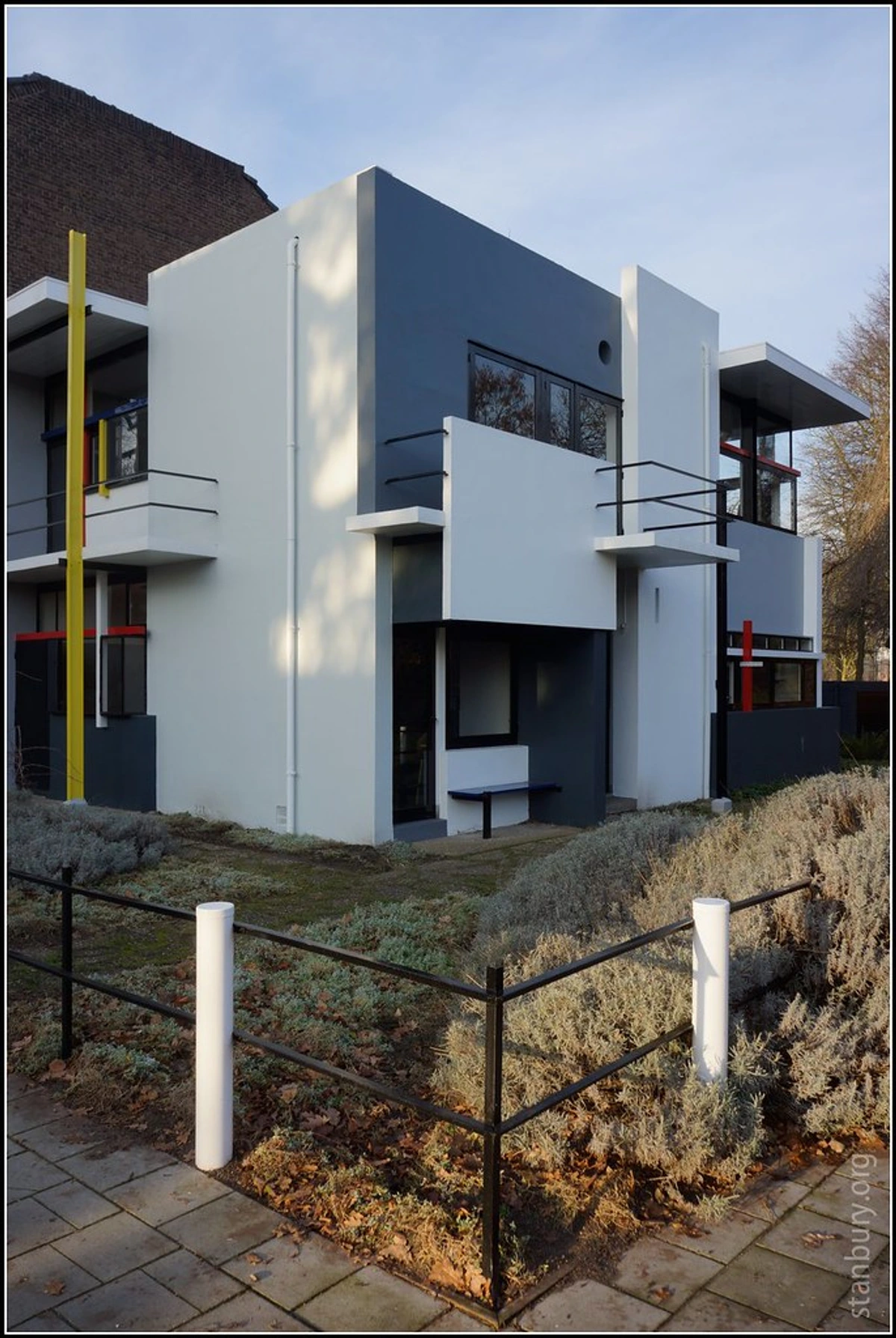
- Architecture: Buildings rely heavily on balance (both structural, ensuring the edifice stands firm and safe, and visual, ensuring it looks appealing and stable), proportion to relate parts to the whole (e.g., the size of windows to walls, or columns to the overall height), rhythm through repeated windows, columns, archways, or facade elements, and unity to create a cohesive structure that feels harmonious within its environment and serves its intended purpose. Think of the symmetrical grandeur of classical temples, designed to evoke order and timelessness, or the asymmetrical dynamism of modern skyscrapers that challenge our perceptions of stability. Architects are constantly orchestrating these principles to create spaces that are not only functional but also deeply impactful and emotionally resonant. They are, in a very real sense, designing an experience, meticulously considering how lines, forms, and spaces interact to shape human perception and interaction. From the monumental scale of ancient pyramids to the intricate patterns of Gothic cathedrals, and the minimalist lines of contemporary structures, architects consistently demonstrate a deep, intuitive understanding of these principles to create environments that evoke specific emotions, guide human movement, and ultimately, endure as powerful statements of human ingenuity and aesthetic aspiration.
- Printmaking: From intricate etchings to bold screen prints, printmaking employs repetition as a core technique, allowing for patterns and series, and creating a distinct visual signature. Contrast is often central in linocuts or woodcuts, with stark black and white areas generating immediate drama. The rhythm of printed marks and the careful composition within the plate or screen dictate the final visual impact. It’s a medium where planning and the principles of design are critical before the ink even touches the paper, as each impression is a testament to the underlying design decisions. The constraints and unique properties of different printmaking techniques—like the rich tonal possibilities of mezzotint, the graphic precision of linocuts, or the layered complexities of screenprinting—each offer distinct opportunities to explore contrast, pattern, and composition in fascinating ways, creating art that often celebrates the beauty of repetition and transformation.

- Graphic Design: Every advertisement, logo, magazine spread, or website layout is a masterclass in applying these principles. Hierarchy guides the eye to the most important information (headline first, then subtext, then call to action), contrast makes text readable and elements distinct (light text on dark background, or bold typography against delicate), and unity ensures a brand feels cohesive, professional, and trustworthy across all its touchpoints. Repetition is often used in branding to create a consistent visual identity and reinforce a message, while variety might come in the form of different design elements, imagery, or textual styles to keep things engaging and prevent visual stagnation. It’s about clear, effective visual communication, often distilled to its most potent form for immediate impact and memorability, making it crucial for everything from a powerful billboard to an intuitive app interface. Consider the deliberate use of negative space in logo design to create a sense of elegance and sophistication, or the precise rhythm of imagery and text on a magazine spread designed to effortlessly guide the reader through a complex narrative. Every successful visual brand is, at its heart, a masterclass in the cohesive and strategic application of these principles.
- Digital Art: In the realm of digital art, artists manipulate these principles with unparalleled precision and fluidity. Software allows for exact control over every pixel, facilitating extreme color contrast, intricate patterns, and complex rhythms that can be generated algorithmically or hand-crafted. Balance can be calculated digitally with mathematical precision, and emphasis created through highly targeted lighting effects, rendering detail, or subtle animation. The fluidity and non-destructive nature of digital tools mean experimentation with unity and variety can be rapid and extensive, allowing for dynamic compositions and visual narratives previously unimaginable, pushing the boundaries of traditional artistic methods. It's a playground for these principles, allowing for a blend of meticulous planning and spontaneous discovery, from interactive installations to stunning virtual reality experiences. Consider the vibrant, meticulously constructed patterns in computer-generated fractal art, or the perfectly balanced compositions in a digitally rendered architectural visualization. Even subtle animations on a website use principles of movement and rhythm to guide the user's eye and enhance the user experience.

Web Design and User Experience (UX): Crafting Intuitive Digital Journeys
In the digital landscape, the principles of design are critical for creating not just visually appealing websites and applications, but also highly functional and intuitive user experiences. Hierarchy is paramount: designers use variations in font size, color, spacing, and placement to guide the user's eye to the most important information first (e.g., a prominent call-to-action button). Balance ensures a layout feels stable and organized, preventing a cluttered or overwhelming interface. Contrast is used to differentiate clickable elements from static text, ensure readability, and draw attention to key features. Repetition of design elements (like consistent navigation bars, button styles, or branding elements) creates a sense of unity and familiarity, reducing cognitive load and making the interface easy to learn and navigate. Movement is subtly orchestrated through animation, transitions, and scroll behaviors, guiding the user through content. Ultimately, good web design is a masterclass in applying these visual principles to craft a seamless, enjoyable, and efficient digital journey, transforming complex information into accessible and engaging experiences.
Fashion Design: Sculpting the Body, Evoking Emotion
Even in the world of fashion, these principles are paramount. Designers meticulously consider proportion in the silhouette of a garment, ensuring it flatters the human form or intentionally distorts it for dramatic effect. Balance is crucial in symmetrical tailoring or the asymmetrical drape of avant-garde pieces. Rhythm is found in repeating pleats, stripes, or fabric textures, guiding the eye across the outfit. Contrast is used with bold color blocking, juxtaposing textures (like rough tweed against delicate silk), or pairing oversized garments with fitted ones. And ultimately, a successful collection achieves unity through a cohesive theme, color palette, and style, while offering enough variety to keep the audience captivated. A well-designed garment isn't just clothing; it's a wearable piece of art, a moving sculpture that communicates emotion and identity, projecting a story or mood without a single word. Think of the deliberate contrast between a flowing, ethereal fabric and sharp, structured tailoring in a high-fashion gown, or the rhythmic repetition of a specific motif throughout a designer's entire collection, creating a unified narrative. It's all about how these visual elements are composed on and around the human body.
Interior Design: Crafting the Lived Experience
Imagine a vast, open-plan living space. The interior designer might use a large, imposing piece of art (emphasis and scale) to anchor one wall, balanced by a cluster of smaller, more delicate objects on an opposing wall (asymmetrical balance). The repeated texture of linen curtains and a textured rug creates rhythm and unity, while a single brightly colored throw pillow provides a pop of contrast and variety. Each element is a deliberate choice, contributing to the overall feeling of the space.
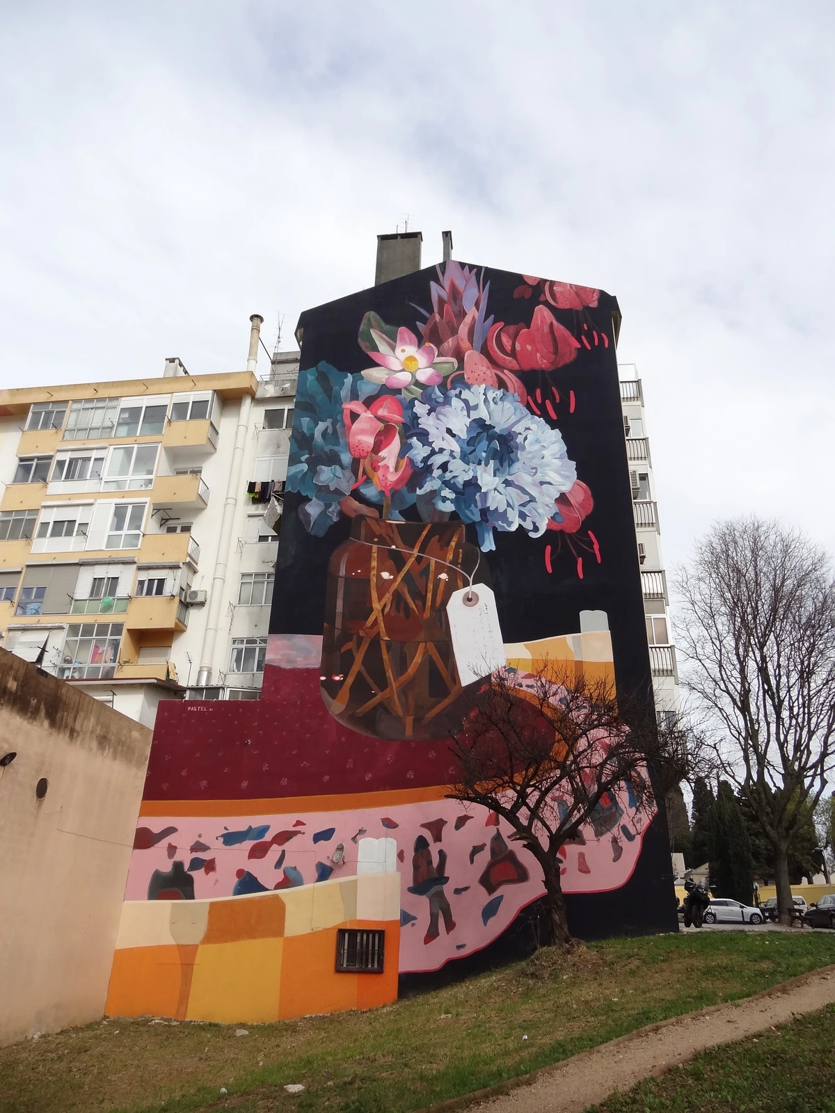
Street Art / Public Art: Art for All, Everywhere
Street art, from bold murals to subtle stenciled pieces, is a powerful application of design principles in the most accessible of settings: our urban environments. Artists like Banksy and countless anonymous creators utilize these principles to make profound statements that engage, provoke, and beautify public spaces. Contrast is often central, with vibrant colors against drab concrete, or stark black-and-white silhouettes creating immediate visual friction. Scale is frequently manipulated to create monumental impacts, turning mundane walls into epic canvases. Emphasis is achieved through strategic placement, drawing the eye to a unexpected corner or a compelling figure. Rhythm can be found in repeated motifs or patterns, especially in larger, sprawling murals, creating a continuous visual narrative across a city block. And ultimately, the most effective street art achieves unity with its environment while providing a crucial dose of variety to disrupt the everyday, transforming the urban landscape into a dynamic, open-air gallery. It’s a raw, immediate form of visual communication that often relies on these principles to deliver its punch with maximum impact.
Industrial Design: Form Meets Function with Purpose
From the sleek lines of a smartphone to the ergonomic curve of a chair, industrial design is a masterclass in applying design principles to everyday objects. Here, unity is paramount, ensuring all components work together seamlessly, both functionally and aesthetically. Proportion dictates the pleasing relationship between parts, making an object feel 'right' in the hand or eye. Balance ensures stability and visual harmony, while contrast in materials (think brushed metal against soft-touch plastic) or finishes highlights key features and improves usability. Rhythm can be found in repeated elements like buttons or vents, creating visual order. Ultimately, industrial designers leverage these principles to create products that are not only beautiful and desirable but also highly intuitive, efficient, and enjoyable to use. It's the art of giving form to function, a silent language spoken by every object we interact with daily. Take a well-designed ergonomic chair, for instance: its proportions are carefully calibrated to support the human body comfortably, its balance ensures stability, and the subtle contrasts in materials (perhaps a smooth, molded seat against a textured fabric backrest) not only enhance its aesthetic appeal but also provide tactile information to the user. Even the sequence of buttons on a remote control or the intuitive flow of a user interface on a device relies on the principles of hierarchy and rhythm to ensure ease of use and a satisfying user experience. Consider a beautifully designed coffee machine: the thoughtful proportion of its parts, the balanced visual weight of its components, and the contrasting textures of stainless steel and matte black plastic all contribute to a sense of quality and usability. The rhythmic placement of buttons and indicators creates a clear hierarchy, guiding the user through the brewing process intuitively. It’s a symphony of design choices, all working in harmony.

The Interplay and Synergy of Principles
It’s tempting to discuss each principle in isolation, but the true magic happens when they dance together, influencing and enhancing one another. You can't truly talk about emphasis without acknowledging how contrast often creates it. A sense of rhythm often relies on repetition, while the deliberate interruption of that repetition can introduce a vital variety. Unity is the grand orchestrator, bringing all these individual elements and their guiding principles into a cohesive whole, preventing them from devolving into chaos. Think of them not as separate entities, but as a team of master builders, each contributing their specialized skill to construct a magnificent edifice. A strong composition is rarely the result of a single principle working alone, but rather a complex, elegant synergy where each principle supports and amplifies the others, creating a richer, more profound visual experience. It's like a well-oiled machine, where every gear and lever works in perfect synchronicity to achieve a greater purpose, a testament to the artist's holistic vision. It's this intricate web of connections that makes truly great art feel so complete, so inevitable, so right. This constant interaction is what makes visual language so rich and capable of infinite expression. For a specific exploration of this synergy in abstract art, see the definitive guide to composition in abstract art principles techniques and impact.


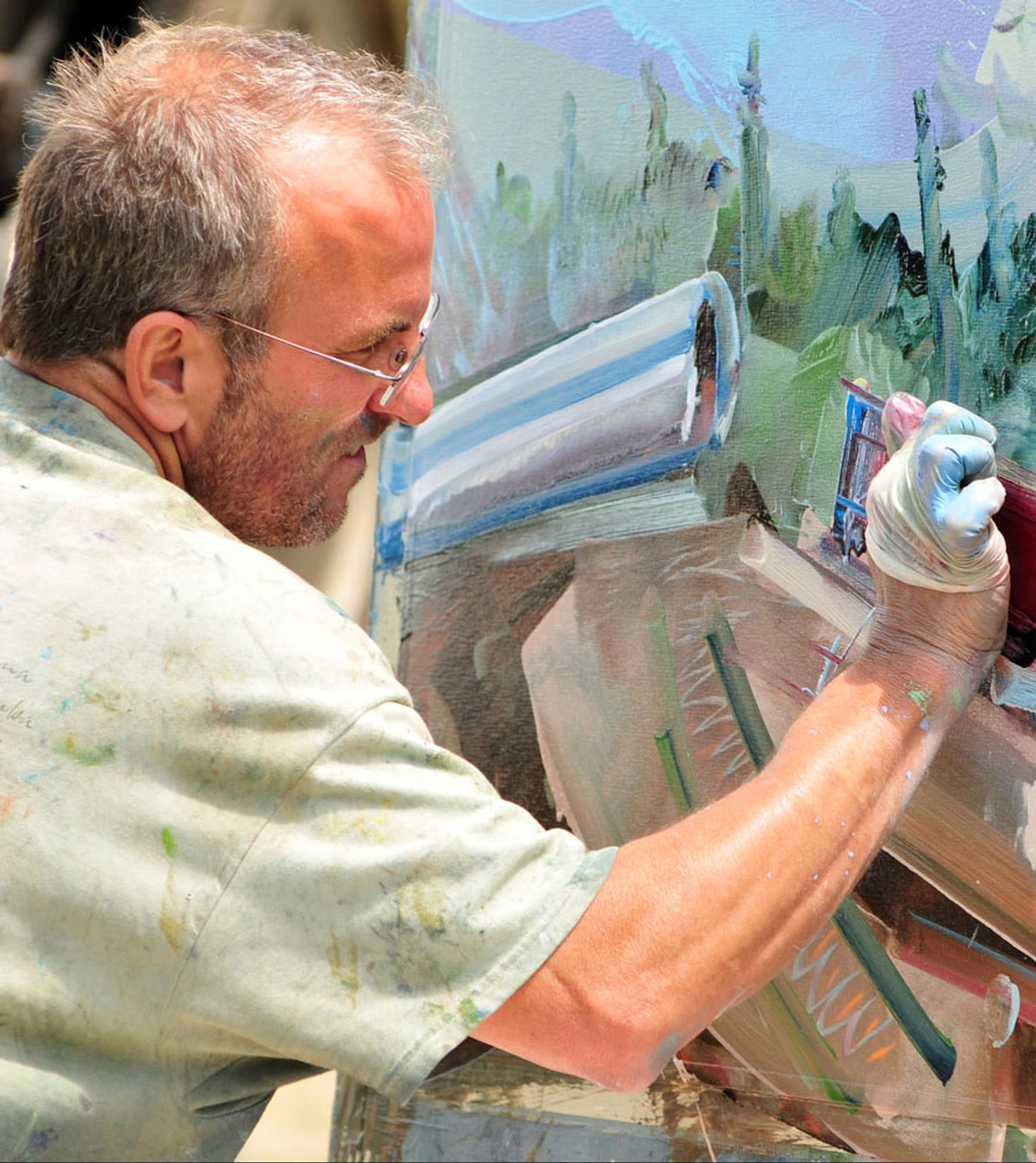
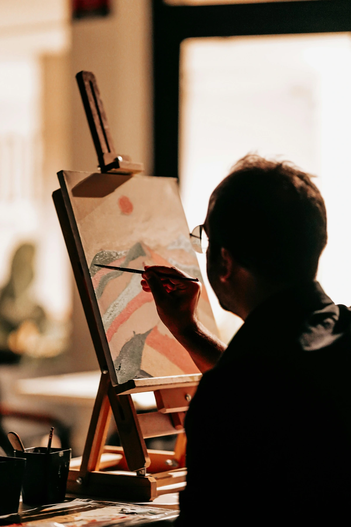
How I Use These Principles in My Work: An Intuitive Dance with the Canvas
Look, let's be honest: I don't sit down with a rigid checklist of principles before I even touch a brush to canvas. That would feel prescriptive, clinical, and frankly, it would suffocate the joy of pure, unadulterated creation. However, these ideas are absolutely, always, deeply simmering in the back of my artistic consciousness, guiding my hand and informing every decision. It’s less of a checklist and more of an intuitive, ongoing dance – a constant conversation between intention and accident. For me, the process is iterative, a back-and-forth negotiation with the emerging artwork, where these principles act as my silent collaborators.
My process often begins with a deliberate dive into chaos, embracing abundant variety in color, texture, and marks. My initial layers are usually a vibrant mess, a kaleidoscope of possibilities, almost a controlled explosion of raw creative energy. But then, the real work begins: the process becomes about coaxing unity out of that beautiful cacophony. I'll consciously select a dominant color palette to harmonize disparate elements, or introduce a subtly repeated shape to establish a visual rhythm, much like a recurring motif in a piece of music. I remember one particular abstract piece where I had a vibrant, almost chaotic burst of red on one side. It felt overpowering. My immediate instinct was to balance it, not by mirroring it, but by introducing a large, calming swathe of deep blue on the opposite side, punctuated by smaller, diffused yellow forms to distribute the visual weight. It’s this constant conversation with the canvas, a push and pull, a dialogue between intention and the unfolding reality of the artwork. I'm perpetually adjusting for balance; if I lay down a visually 'heavy' dark mark on the left, I feel an almost instinctive gravitational pull to counter it on the right – perhaps with a cluster of smaller, intensely bright colors, or a swath of dynamic negative space that gives the composition room to breathe. Emphasis might emerge organically as a particularly vibrant stroke or an unexpected juxtaposition catches my eye, and I then work to enhance it, guiding the viewer's gaze without dictating it too rigidly. It's this continuous push and pull, this subtle negotiation, that brings a piece to life, transforming raw energy into a coherent visual statement. Sometimes, it feels less like painting and more like 'debugging' a visual problem – identifying where the flow is interrupted, where the eye gets stuck, or where the message gets muddled, and then strategically applying a principle to solve it. It's about finding the elegant solution to a visual puzzle. The beauty of it is that every piece presents a new set of challenges, demanding fresh interpretations of these timeless principles. There's no single recipe, only a dance between intuition and informed decision-making. My commitment to this dance is what makes each artwork unique; it's the invisible struggle and triumph that ultimately gives the painting its soul. For more on how color specifically impacts my work, explore the psychology of yellow in my art: joy, optimism, and light or the soul of indigo: my personal connection to blue in abstract art.
The Role of Experimentation and 'Happy Accidents'
While understanding these principles is crucial, my studio practice also thrives on experimentation and what I lovingly call 'happy accidents.' Sometimes, a drip of paint, an unexpected brushstroke, or a spontaneous color combination will emerge that defies my initial plan. Instead of fighting it, I often lean into it, allowing it to introduce a new layer of variety or challenge my existing sense of balance. It’s in these moments that the principles become less about rigid rules and more about flexible guidelines, helping me integrate the unforeseen into a cohesive whole. The canvas becomes a collaborator, and the principles are our shared language for discussion, allowing for growth and surprising breakthroughs. This constant negotiation between control and letting go is, for me, where the real magic of creation lies, often revealing unexpected paths to visual harmony and meaning.
This entire journey, this process of discovery and refinement, is something I've tried to document in my personal timeline. It's a constant negotiation between letting go and taking control, and these principles are the very language of that negotiation, the silent conversation I have with my canvas. Sometimes, a piece will stubbornly resist, and I find myself returning to these fundamental principles, almost like debugging a complex program, to pinpoint why it isn't 'working.' And of course, the tangible results of these experiments are the very pieces you might find if you're looking to buy some art.
Developing Your 'Eye': Exercises and Practice to Unlock Visual Literacy
Understanding these principles intellectually is one thing; truly seeing them, and then applying them, is another entirely. It's a skill, like any other, that sharpens with deliberate practice and mindful observation. Here are a few ways I've found helpful to cultivate that crucial 'eye' for design, transforming passive viewing into active understanding, making you a more discerning and engaged observer of the world:
- Deconstruct Existing Art: Visit a gallery (like the fantastic Stedelijk Museum 's-Hertogenbosch, if you're ever in my neck of the woods) or browse art online. Pick a piece, any piece that catches your eye. Now, consciously break it down. Ask yourself: Where is your eye drawn first, and why (Emphasis)? How do the colors interact, and what emotions do they evoke (Contrast)? Does the artwork feel stable and serene, or is it intentionally unsettling and dynamic (Balance)? What path does my eye follow around the piece (Movement/Rhythm)? Do all the elements feel like they belong together, or is there a jarring element that creates intrigue (Unity/Variety)? What are the sizes of objects in relation to each other, and does that create realism or distortion (Proportion/Scale)? How is the negative space used to define the positive forms? You can even apply the concepts from the art of composition guiding viewers eye to really dig into its structure, uncovering the artist's subtle intentions.
- Focus on One Principle Intensely: For a week, dedicate your observations and even your creative output to a single principle. Look for examples of symmetrical balance in architecture, or powerful contrast in advertising. When you create your own art, try to intentionally focus on maximizing one principle. For example, try to create an entire piece focusing solely on radial balance, or another where the primary goal is to create maximum value contrast. It’s a fantastic way to internalize the concept and truly understand its potential, building a deeper, more visceral connection to its power.
- Timed Compositional Studies: Grab a sketchbook and a pencil. Set a timer for 5-10 minutes. Do quick sketches where you're not trying to create a masterpiece, but simply to solve a compositional problem. Try a series of sketches where you only use asymmetrical balance, or another where you experiment with different rhythms, perhaps through repeating lines or shapes. Don't worry about rendering or making it 'pretty'; focus purely on the arrangement of visual weight and flow, making conscious choices about every element's placement. This rapid iteration builds your intuitive understanding of composition faster than anything else I know, training your eye to see and respond quickly.
- Observe the Everyday as Art: These principles aren't confined to museums or galleries; they are the invisible architecture of our visual world. See the balance in a perfectly set dinner table, the rhythm in a picket fence, the striking contrast in a sunset, or the subtle hierarchy in a grocery store display. The world is your ultimate, endless art school – once you start truly looking, you’ll see them everywhere, and your creative mind will start making connections you never noticed before. It’s a habit I've cultivated for years, and it continuously enriches my artistic practice, transforming mundane observations into profound visual insights.
- Drawing the Negative Space: This is a fantastic exercise for developing a holistic view of composition. Instead of drawing the object itself (the 'positive space'), focus on drawing the shapes of the empty space around it. For instance, when drawing a chair, draw the shapes of the air between the legs and rungs. This forces you to see relationships, proportions, and how negative space actively contributes to the overall balance and form of a composition, making the 'unseen' visible and powerful. This exercise actively trains your brain to perceive forms relationally rather than as isolated entities, a critical skill for understanding visual flow and spatial arrangements in any artwork.
- Recreating Compositions: Take a photograph or a painting you admire. Instead of copying it precisely, try to recreate its underlying compositional structure using only simple shapes and lines. Focus on where the main elements are placed, how they relate in size, how your eye is led around the piece, and where the points of contrast and emphasis lie. This reverse-engineering process helps you internalize the artist's decisions and develop your own compositional toolbox.
A Quick Reference Table
Before we wrap things up and send you off to apply your newfound visual superpowers, here's a concise table that puts all these powerful concepts in one accessible place. Think of it as your cheat sheet for cracking the secret language of art.
Principle | What It Does | Key Question to Ask | Why It Matters |
|---|---|---|---|
| Balance | Distributes visual weight for stability. | Does the artwork feel stable or intentionally off-kilter? | Creates stability, tension, or harmony. |
| Contrast | Creates visual excitement and difference. | Where are the strongest differences in light/dark or color? | Adds drama, focus, and visual interest. |
| Emphasis | Creates a center of interest or focal point. | Where does my eye go first? | Directs viewer attention to key elements. |
| Movement | Guides the viewer's eye through the artwork. | What path does my eye follow around the piece? | Creates dynamism, narrative flow, and engagement. |
| Rhythm | Creates a sense of flow and connection. | Do I see any repeated elements that create a beat or pattern? | Establishes a visual tempo, connection, and energy. |
| Proportion/Scale | Manages size relationships. | Do the sizes of the objects feel realistic or distorted? Why? | Conveys realism, drama, or psychological effect. |
| Hierarchy | Organizes elements by importance. | What information or element is most prominent? | Ensures clarity, directs attention, establishes order. |
| Pattern/Repetition | Creates organized recurrence of elements. | Are elements repeated in a predictable or varied way? | Builds unity, rhythm, and visual texture. |
| Unity | Makes the artwork feel cohesive and complete. | Do all the parts feel like they belong together? | Creates harmony and a sense of completeness. |
| Variety | Adds interest to prevent monotony. | Are there enough different elements to keep me engaged? | Prevents boredom, adds visual richness and dynamism. |

FAQ - Your Questions Answered: Delving Deeper into Design Principles
I get it; this can feel like a lot to take in! So, let's tackle some of the common questions I hear, the ones that often come up when you start peeling back the layers of visual language. Consider this a direct conversation, aimed at solidifying your understanding and perhaps sparking even more curiosity.
Are there cultural differences in how principles are perceived?
Absolutely. While the underlying human perception of visual phenomena is universal, the application and cultural significance of these principles vary wildly across different societies and historical periods. For example, some cultures, like ancient Egyptians or certain religious traditions, prioritize symmetrical balance and rigid hierarchy to convey order, divinity, or timelessness, often reflecting their societal structures and beliefs. Their monumental architecture and art, like the Pyramids or hieroglyphs, are masterclasses in formal balance and clear visual command. Others, like many East Asian artistic traditions, might emphasize the profound importance of negative space (the empty area around and between subjects), flowing rhythms, and subtle asymmetry to evoke contemplation, natural harmony, and a sense of understated elegance, as seen in traditional ink wash paintings. Modern Western art, particularly from the 20th century onwards, has often intentionally challenged and subverted these traditional applications, embracing asymmetry, discord, and fragmentation to express new ideas or critique existing norms. Think of the dynamic, often jarring, compositions of Abstract Expressionism or the deliberate 'ugliness' embraced by movements like Dada. It's a fascinating reminder that art, and how we interpret its underlying structure, is always in dialogue with its cultural context and prevailing philosophies. There’s no single ‘right’ way to apply them, only different ways to express universal truths or explore new visual languages. It’s a beautiful testament to the human spirit's diverse ways of making sense of the visual world, all while utilizing the same fundamental toolkit. This adaptability is precisely what makes these principles so powerful and enduring across millennia and across the globe, constantly reinterpreted to suit new visions and purposes.
What are the main principles of design in art?
Traditionally, discussions often revolve around seven to ten key principles, though the exact list can sometimes vary and overlap. The core ones we've explored extensively in this guide include: Balance, Contrast, Emphasis, Movement, Rhythm, Proportion/Scale, Hierarchy, Pattern/Repetition, Unity, and Variety. I see them less as a rigid, immutable list and more as a family of interconnected ideas, each influencing and supporting the others, forming a comprehensive language for visual communication. The specific emphasis might shift depending on the art movement or the critic, but the underlying concepts remain foundational. Ultimately, these are the tools artists use to orchestrate the viewer's experience, guiding their eye and shaping their emotional response. Think of these as the fundamental vocabulary for discussing how art works, not just what it depicts. Mastering these principles allows for both conventional beauty and radical innovation, providing a robust framework for artistic expression that transcends any single style or era.
Here’s a concise table of the main principles, their purpose, and key considerations:
Principle | Purpose | Key Considerations | |
|---|---|---|---|
| Balance | Visual stability and weight distribution | Symmetrical, asymmetrical, radial, crystallographic | |
| Contrast | Creates visual interest, drama, and focus | Differences in size, value, color, texture, shape, concept | |
| Emphasis | Establishes a focal point, guiding the viewer's eye | Isolation, placement, color/value, detail, convergence | |
| Movement | Guides the eye's path through the artwork | Created by lines, shapes, repetition, rhythm | |
| Rhythm | Creates a sense of flow, repetition, and visual beat | Regular, flowing, progressive, alternating rhythms | |
| Proportion/Scale | Manages size relationships of parts to a whole | Realism vs. distortion, psychological impact, Golden Ratio | |
| Hierarchy | Organizes elements by relative importance | Size, color/value, placement, convergence, detail, typography | |
| Pattern/Repetition | Creates organized recurrence for unity, texture, rhythm | Consistent motifs, subtle echoes, predictable sequences | |
| Unity | Cohesion, harmony, and a sense of completeness | Consistent style, color palette, theme, underlying structure | |
| Variety | Introduces diversity and prevents monotony | Unexpected elements, contrasting forms, shifts in texture | It's the universal toolkit for visual storytellers. |
What is the relationship between Principles of Design and Composition?
This is a brilliant question, and often a point of subtle confusion! Think of composition as the overall arrangement of all the visual elements within an artwork to create a cohesive whole. It's the grand plan, the blueprint for the entire visual experience. The principles of design, on the other hand, are the rules, guidelines, and strategies you use to achieve that effective composition. They are the tools in your compositional toolbox. So, you use principles like balance, contrast, emphasis, and rhythm to construct a strong composition. A successful composition is a direct result of the masterful application of these principles. You can dive even deeper into this relationship with our guides on composition in art explained and the art of composition guiding viewers eye. It's the difference between merely having building materials and having an architectural plan that dictates how those materials will create a functional and beautiful structure.
What's the difference between the elements and principles of art again?
An easy, yet crucial, distinction! Think of the Elements as your foundational materials – the bricks, wood, and glass in a construction project. They are the raw 'what' of art – the tangible visual components you can point to (e.g., a specific shade of blue, a jagged line, a rough texture). The Principles, then, are your architectural plan, the blueprint, and the skilled labor that dictates how those materials are arranged to build a functional, beautiful, and purposeful structure. They are the 'how' – the organizational strategies and guidelines for using the elements effectively, transforming raw materials into meaningful expression (e.g., how that jagged line creates movement, or how the blue is balanced by a contrasting orange). It’s the difference between having all the notes (elements) and knowing how to compose a symphony (principles). You can learn more about this essential distinction in our guide to what is design in art.
Can a good artwork break these principles?
Absolutely! And often, that's precisely what catapults an artwork into the realm of true brilliance and innovation, forcing us to redefine what art can be. Picasso famously shattered traditional ideas of proportion and perspective in Cubism, challenging our very perception of reality and offering multiple viewpoints simultaneously. Jackson Pollock's dizzying drip paintings defied conventional notions of emphasis by having no single focal point, creating an 'all-over' composition that celebrated crystallographic balance, inviting the eye to wander freely. But here’s the critical insight, and this is where many misunderstand: these masters understood the rules they were breaking. They weren't ignorant of classical composition; they were intentional iconoclasts, pushing boundaries with profound awareness and a deep historical context. Breaking them with purpose creates a profound, powerful, and often revolutionary statement, forcing us to see and feel in new ways. It’s like a jazz musician who knows all the classical scales and then deliberately bends a note to create a new, compelling sound that electrifies the audience. Breaking them accidentally, well, that usually just results in a visual mess or a piece that simply fails to resonate. Mastery, it seems, often precedes intentional disruption. It’s about being deliberate, not defiant for defiance’s sake – it's about making a conscious choice to subvert expectations for a greater artistic purpose. A personal analogy I often use is that of a chef: a brilliant chef understands the fundamentals of cuisine (the rules) intimately, allowing them to innovate and break conventions to create revolutionary dishes. A novice attempting the same without that foundation is likely to produce something inedible. The principles are the foundation, not the ceiling. For more on how abstract art specifically challenges and reinterprets these rules, explore the definitive guide to composition in abstract art principles techniques and impact.
How do these principles apply to modern digital art?
Fantastically! In many ways, digital art and design are the purest manifestations of these principles in action, often allowing for precision and dynamic exploration that traditional mediums sometimes limit. Graphic designers use hierarchy to guide eye-tracking on a webpage, ensuring critical information is seen first. UX (User Experience) designers ensure balance and unity for intuitive and aesthetically pleasing user interfaces. Digital illustrators leverage contrast and emphasis with pixel-perfect precision, often using advanced lighting and rendering techniques. The ease of duplication and transformation in digital media makes pattern and repetition incredibly versatile tools for creating texture, rhythm, and visual branding. And, of course, animation, a dynamic form of digital art, is entirely built on movement and rhythm, choreographing sequences of images to tell stories or evoke feelings. It’s a medium that allows for endless experimentation with these foundational ideas, pushing visual communication to new frontiers and demonstrating their enduring relevance across technological shifts, from static digital paintings to immersive virtual reality experiences. In digital environments, artists can even create responsive works where these principles dynamically shift based on viewer interaction, creating an even more immersive and personalized aesthetic journey. The precision and replicability of digital tools also make them ideal for exploring complex patterns and rhythms, as well as refining subtle contrasts and harmonies that might be challenging in traditional media. Think of the intricate UI design of a complex app, where every icon, button, and visual element is placed with deliberate hierarchy and balance to guide the user seamlessly through their tasks. From the minimalist aesthetic of a modern app to the rich visual narratives of video games, these principles are the backbone of effective digital communication and immersive experiences. For more on the evolution of digital art, consider our guide on the ultimate guide to abstract art movements from early pioneers to contemporary trends.
Can these principles be applied to everyday life?
Absolutely, and this is where the true power of understanding these principles really hits home! Once you start seeing them, you’ll realize they’re not confined to museums or art studios; they are the invisible architecture of our entire visual world. Think about arranging furniture in your living room: you’re instinctively striving for balance and proportion. When you get dressed, you’re often thinking about contrast (a bold scarf with a plain top) or unity (a coordinated outfit). A well-designed grocery store aisle uses hierarchy and emphasis to draw your eye to promotions or new products. Even something as simple as setting a dinner table involves an intuitive understanding of balance and rhythm. Recognizing these principles in everyday objects and experiences not only deepens your appreciation for the designed world around you but can also empower you to make more intentional and aesthetically pleasing choices in your own life. It’s like unlocking a secret code that reveals the beauty and intentionality in the mundane, transforming passive observation into active visual literacy. From the layout of a garden to the composition of a photograph on your phone, these principles are constantly at play, shaping how we perceive and interact with our environment. Embracing them can turn mundane tasks into acts of thoughtful design, enriching your world one visual decision at a time.
Which principle is the most important?
Ah, the million-dollar question! It's akin to asking which ingredient is most important in a complex culinary creation – it profoundly depends on the 'cake' you’re aiming to bake! However, if I were pressed to choose, I would passionately argue that the dynamic, often subtle, interplay between Unity and Variety is the bedrock, the very foundation upon which everything else rests. Without that delicate balance, a composition inevitably collapses into either mind-numbing boredom (too much unity, no variety) or utter visual chaos (too much variety, no unity). I've seen countless pieces fall flat because they leaned too heavily on one side, failing to find that harmonious tension. All the other principles, in a sense, serve to achieve or enhance this grand balancing act, to find that 'just right' sweet spot. Beyond that, the 'most important' principle is always the one that best serves the artist's specific intention and the artwork's unique message – what are they trying to communicate, and how can they do it most effectively? It's about serving the vision, not rigidly adhering to a single rule, but rather understanding which tool best amplifies your artistic voice. Ultimately, the 'most important' principle is always the one that the artwork is lacking or the one that best serves the artist's specific intention. If a piece feels chaotic, it might need more unity or hierarchy. If it feels bland, it probably needs more contrast or variety. It's a dynamic assessment, not a static declaration. It's about the synergistic whole, not a single star player. This holistic view is crucial; it's the conductor understanding how each instrument contributes to the symphony, rather than elevating one above all others.
How can I get better at seeing and using these principles?
Practice, practice, practice! It's less about memorization and far more about cultivation of your visual intelligence. Look at art – a lot of it. When you're at a gallery, perhaps the wonderful Stedelijk Museum 's-Hertogenbosch, or just casually scrolling through images online, consciously challenge yourself to ask those probing questions from our reference table above. Don't just glance; genuinely interrogate the artwork. For your own creative endeavors, pick one principle to obsess over for a day or a week. Do a series of rapid sketches where you exclusively focus on achieving asymmetrical balance, or another where you ruthlessly maximize contrast. Experiment with limited palettes or unusual compositions. The more you actively seek and consciously apply these principles, the more intuitively you’ll begin to employ them, transforming your appreciation and your own creative output. It truly is a muscle that strengthens with use. Make it a daily habit to notice, to question, to deconstruct the visual world around you – from a perfectly arranged fruit bowl to a chaotic street scene – and you'll find your 'eye' becoming sharper than you ever imagined, revealing the hidden beauty and intentionality in every visual experience. This active engagement is the secret to moving from passively observing to truly understanding and creating compelling visuals. Don't be afraid to make mistakes; each attempt is a learning opportunity, refining your instincts and expanding your visual vocabulary.
Do these principles apply to abstract art?
Absolutely, perhaps even more so! While figurative art often uses realism as a guiding star, abstract art relies almost entirely on the principles of design to communicate, evoke emotion, and create meaning. Without recognizable subjects, it is the precise interplay of balance, rhythm, contrast, unity, and variety that gives an abstract piece its power, its structure, and its ability to resonate with the viewer. A seemingly chaotic abstract painting, if successful, is often a masterclass in these principles, orchestrated with incredible intention, as explored in our guide, the definitive guide to composition in abstract art principles techniques and impact. The artist of an abstract work might be communicating purely through the language of these principles, creating a direct visual experience unburdened by narrative. It’s a testament to their fundamental power that they can convey so much, even without recognizable forms, speaking directly to our subconscious.

Your Turn to Play: Becoming a Connoisseur of Visual Language
So, there we have it. The principles of design aren't rigid, dogmatic rules to be dryly memorized for some arbitrary test. No, they are infinitely more profound: they are sophisticated tools, a universal language, and a powerful lens through which we can begin to articulate why a piece of art moves us, stirs us, or simply captivates our gaze. They don’t diminish the magic of the creative process; rather, they demystify it, inviting you backstage to understand the subtle, brilliant alchemy of how the magician performs their most breathtaking visual tricks. My hope is that this definitive guide has equipped you with not just knowledge, but a new way of seeing, a richer vocabulary for engaging with the visual world – a visual literacy that transforms passive viewing into active understanding and appreciation.
The next time you encounter any visual composition – be it a masterwork in a gallery (like the vibrant Stedelijk Museum 's-Hertogenbosch), a striking photograph, a thought-provoking piece of composition in art explained, the clever design of a logo, or even the arrangement of objects on your own desk – I challenge you. Don't just see what it is; actively seek to understand how it's built. Look for the balance, the contrast, the rhythm, the intentional unity and variety, the subtle hierarchy at play. I guarantee you, with this newfound language, you'll start seeing the exquisite, underlying grammar of the visual world everywhere, and your appreciation for art, and the world itself, will deepen immeasurably. Go forth, and see. The world is now your open-air museum, waiting to be deconstructed and understood through the powerful lens of design principles. And perhaps, just perhaps, you'll feel that same electric jolt or profound calm I spoke of at the beginning, but this time, you'll understand just a little bit more about how that magic is made. It’s an empowering journey into the heart of visual communication, a lifelong pursuit of visual discovery that endlessly enriches your perception of beauty and purpose. And remember, if you're ever curious about my own explorations with these principles, you can always visit my studio online and perhaps even buy some art that speaks to you.