The Ultimate Guide to Finding Your Perfect Drawing Sketchbook
A personal, in-depth review of the best sketchbooks for drawing. We explore paper weight, tooth, binding, and our top picks for pencil, ink, and travel.

Your Next Sketchbook: A Deeply Personal Guide to Finding the One
I have a confession to make: I'm not just an artist, I'm a bona fide sketchbook hoarder. You know the type – not with secret compartments for ancient scrolls (though a girl can dream!), but with stacks overflowing from every available surface. Some remain pristine, their pages almost too intimidatingly perfect to mar with a clumsy line. Others are battered, bruised, and bulging with everything from grocery lists to what I swore was a masterpiece at 2 AM. For me, a sketchbook transcends mere paper and binding; it's a silent confidante, a portable studio, a safe haven for wild, terrible ideas, and sometimes, the unexpected birthplace of something truly special. It's a physical manifestation of your artistic journey, a tangible record of every fleeting thought, every hesitant stroke, and every glorious, learning mistake. And here’s the honest truth: finding the right one can utterly transform your relationship with drawing, unlocking new avenues of creative expression you never even knew existed. In fact, choosing the right sketchbook isn't just a practical decision; it's a profound act of self-care for your creative spirit. It’s about finding a companion that resonates with your unique style, supports your experiments, and encourages you to show up to the page, day after day. It's about empowering your hand, inspiring your eye, and giving your creative spirit a tangible home. Imagine the possibilities that open up when your tools genuinely support your vision – that's the magic we're chasing here.
But let’s be honest, walking into an art store (or scrolling endlessly online, lost in a sea of options) is overwhelming. GSM? Tooth? Cold press? Spiral-bound vs. case-bound? It feels like you need a degree just to buy some paper. And what about finding art supplies locally, supporting independent shops? It’s a wonderful idea, and sometimes you find hidden gems that way, but if you're not sure what you're even looking for, it's easy to get lost. So, let's cut through the noise. I’m going to walk you through what actually matters, based on years of my own trial and error, so you can find the sketchbook that feels like it was made just for you. Think of me as your personal art supply sommelier, guiding you through the often-confusing world of paper and binding. I've been there, staring at shelves packed with intimidating options, wondering where to even begin. My goal is to distill years of hands-on experience and countless experiments into actionable insights that will empower your artistic choices, turning confusion into confidence. Your ideal sketchbook isn't a mythical creature; it's waiting for you, and together, we'll find it. We'll explore everything from the subtle nuances of paper weight to the practicalities of binding, ensuring you're equipped to make an informed decision that truly elevates your art. This guide is built on a simple premise: your art deserves the right home, and finding that home should be an adventure, not a chore.
Why Keep a Sketchbook? The Unsung Benefits
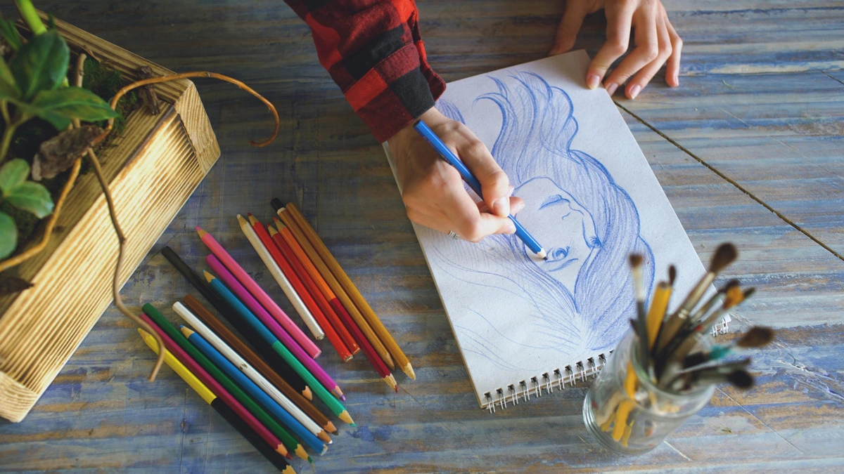
Before we dive into the nitty-gritty of paper specs, let's take a moment to appreciate why we even do this. Why bother with a sketchbook? For me, it's about freedom. It's a low-stakes environment to experiment, fail gloriously, and stumble upon happy accidents. It's a place where perfection isn't the goal; exploration is. It's where the magic truly happens, a space where you can let go of expectations and simply create. Your sketchbook can be:
- A Practice Ground: This is where you can truly sharpen your skills, tackle difficult subjects without fear of judgment, or just warm up your hand before diving into a larger piece. It’s where those wobbly lines slowly but surely transform into confident strokes, a testament to consistent effort.
- An Idea Incubator: Capture fleeting thoughts, brainstorm compositions, or map out future masterpieces. I've found that some of my most cherished pieces, even those now hanging on gallery walls, started as a tiny, barely legible scribble in a dusty sketchbook. Remember, even the wildest abstract art or complex artistic timelines start with a tiny spark.
- A Visual Diary: Document your life, travels, and observations. It's an unfiltered record of your unique perspective, a silent confidante holding memories that words can't quite capture. Imagine flipping through pages years from now and seeing the world through your past self’s eyes—it’s truly magical.
- A Safe Space: No judgment, just pure creative play. It's where your terrible ideas can safely live without demanding public scrutiny. And honestly, some of those "terrible" ideas turn into something genuinely intriguing later on! This freedom from external critique is, for me, one of the most liberating aspects of keeping a sketchbook.
- Observation Amplifier: A sketchbook forces you to truly see the world around you. Whether you're capturing the fleeting expressions on a stranger's face or the intricate patterns of a leaf, the act of sketching sharpens your visual perception, transforming passive looking into active observation. It's like a superpower for noticing details!
- A Source of Mindfulness & Stress Relief: In our fast-paced world, the simple act of putting pen or pencil to paper can be incredibly grounding. It’s a meditative practice, a chance to quiet the mental chatter and focus on the present moment. I've found that even five minutes of sketching can reset my mood and lower stress levels far more effectively than endless scrolling. It’s a digital detox for your brain, offering a tangible connection to your inner world.
- A Problem-Solving Playground: Sometimes, the best way to untangle a complex visual problem, whether it's a challenging composition or a tricky color palette, is to sketch it out. A sketchbook provides a safe, low-pressure space to iterate, refine, and discover solutions you might not have found just by thinking. It's a visual sandbox for your artistic dilemmas.
- Developing Your Artistic Voice: Through consistent sketching and experimentation, your sketchbook becomes a crucible for your unique style. It’s where you discover what truly excites you, what marks feel most authentic, and how you want to express yourself visually. It’s a space to shed external expectations and hone the artistic language that is uniquely yours, a tangible record of your evolving artistic timeline.
- Building a Visual Library & Reference: Every sketch, every observation, every color swatch becomes a valuable entry in your personal visual encyclopedia. Need to remember how a tree branch twists, or the folds of a particular fabric? Your sketchbook is your curated reference library, far more personal and useful than any stock photo, a wellspring of inspiration for future projects, perhaps even a piece for your
/buypage.
The Anatomy of a Sketchbook: What Really Counts
Okay, now that we've established why this little bound collection of paper is so vital, let's talk about its guts. You see, the fancy cover, while nice, isn't what makes a sketchbook truly work for you. It's all about how the paper feels under your pencil, how it reacts to your ink, and how it holds up to your creative chaos. Understanding these core elements is like learning the secret language of art supplies, a language I’ve spent years deciphering through countless experiments. This knowledge isn't just academic; it's about finding the tactile experience that fuels your particular artistic fire. The right paper can make your tools sing, while the wrong one can feel like a constant battle. I've certainly experienced the frustration of a beautiful drawing being ruined by flimsy paper or buckling under a simple wash. It's a battle you don't need to fight.
Paper Sizing (Surface Treatment)
Beyond tooth, sizing refers to chemicals (historically gelatin, now often synthetic) added to paper fibers during manufacturing to reduce absorbency. This is especially critical for wet media like watercolor and ink. Think of it as waterproofing for paper; without it, watercolors would immediately soak through, and ink would feather uncontrollably. For me, discovering the impact of sizing was a game-changer for my ink work; it’s the difference between crisp lines and a fuzzy mess. Understanding this seemingly minor detail can save you a lot of frustration, particularly if you love adding a bit of wash to your sketches. | Sizing Type | Characteristics | Best For | Considerations | | :--- | :--- | :--- | :--- | | Internal Sizing | Added to pulp during manufacturing. Evenly distributed. | Most general-purpose sketchbooks, drawing papers, ensures basic ink and light wash resistance. | Good for dry media, light inks, and very light washes; still prone to buckling with heavy water. | | External/Surface Sizing | Applied to paper surface after sheet formation. | Watercolor papers, mixed media papers, provides greater water resistance and strength. | Essential for wet media, prevents feathering, allows for lifting and layering. Can affect paper texture slightly. | | No Sizing | Rare for sketchbooks; mostly specialty papers. | Blotting paper, highly absorbent papers. | Will absorb liquids immediately, causing feathering and bleed-through. Not recommended for most art applications. |
💡 Pro Tip: Water Drop Test! If you're unsure about a paper's sizing, try a tiny water drop test in a hidden corner. If it beads up and takes a moment to absorb, the paper has good sizing. If it immediately soaks in and spreads, be cautious with wet media!
Paper Weight (GSM)
Paper weight, usually measured in grams per square meter (GSM) in most of the world or in pounds (lb) in North America, is basically how thick and sturdy the paper is. Think of it like this: a higher GSM or lb means a thicker, more resilient sheet. This is, in my opinion, probably the single most important factor when choosing a sketchbook, as it dictates what mediums your paper can confidently handle without protest. Imagine trying to paint a robust watercolor wash on flimsy printer paper – it’s a recipe for buckling, pilling, and utter frustration! The right GSM ensures your paper acts as a supportive partner, not a resistant adversary. High GSM papers typically have a tighter fiber weave, which means less bleeding and feathering, particularly crucial for ink and marker artists. Conversely, a very low GSM might be delightfully thin for quick studies but will warp severely with any moisture, and erase too easily. I've learned that a good GSM doesn't just prevent bleed-through; it provides a satisfying heft, a tactile feedback that encourages a more confident hand. And a little secret: many sustainable sketchbooks now offer excellent GSMs using recycled content, so you don't have to compromise on quality for your values. | Weight Category | GSM / lb Range | Best For | Ideal Media Examples | Pros | Cons | | :--- | :--- | :--- | :--- | :--- | :--- | | Lightweight | 90-120 GSM / 60-80 lb | Quick pencil sketches, brainstorming, dry media (graphite, colored pencil) | Graphite (H-4B), light colored pencils, non-bleed pens | Light, portable, usually cheaper. | Heavy ink will bleed-through easily, erasing can tear the page, buckles with wet media, quicker drying time for wet media. | | Mid-weight | 130-180 GSM / 90-110 lb | General drawing, graphite, charcoal, ink pens, light markers, pastels | Graphite (all ranges), charcoal, fine-liners, light water-based markers, soft pastels | Versatile, durable for finished drawings, good balance of cost and quality. | Still prone to bleed-through with heavy markers or buckling with significant washes, moderate drying time for wet media. | | Heavyweight | 200+ GSM / 120+ lb | Mixed media, gouache, acrylics, even heavy media like gouache and acrylics, and even light watercolor washes. | Watercolor (light washes), gouache, acrylics (thin layers), ink with washes, oil pastels, heavy charcoal | Tough, resists buckling, feels substantial, handles multiple layers and wet media. | Heavier, more expensive, can sometimes be too textured for fine detail, slower drying time for wet media. | | Cardstock/Heavy Board | 300+ GSM / 200+ lb | Serious mixed media, watercolor (including wet-on-wet techniques), heavy acrylics, collage, ink with multiple washes. | Heavy watercolor (wet-on-wet), acrylics (thick impasto), oil paints (if primed), collage, printmaking (monoprints) | Ultimate durability, archival quality, feels luxurious, can almost be treated like a canvas. | Very heavy, very expensive, less portable, pages can be very stiff to turn. |
💡 Pro Tip: The GSM/lb Conundrum Don't get too hung up on converting between GSM and pounds. Most manufacturers will list both, or stick to the dominant standard for your region. The key takeaway is: higher number = thicker paper. If you're planning to use wet media or markers, always err on the side of a higher weight to avoid frustration (and ruined art!). Trust me, there's nothing worse than seeing your beautiful ink drawing ghost onto the next page because you skimped on GSM.
Paper Acidity & Archival Quality
This might sound like a chemistry lesson, but it’s crucial if you care about your art lasting beyond your lifetime. Archival quality means the paper is designed to resist deterioration over time. The primary culprit in paper degradation is acid. Most wood pulp papers are naturally acidic and will eventually yellow, become brittle, and literally fall apart. Look for paper labeled "acid-free" or "pH neutral." This means it has a pH of 7 or higher and often contains an alkaline buffer to counteract future acid absorption from the environment. I used to think this was just for | Archival Quality | Characteristics | Longevity | Best For |
| :--- | :--- | :--- | :--- |
| Acid-Free / pH Neutral | pH 7 or higher, often buffered. | Decades to centuries (with proper storage). | All serious artwork, commissions, pieces for display or sale on your /buy page, journals you want to pass down. |
| Lignin-Free | Lignin is a natural polymer in wood that breaks down into acid over time. Lignin-free papers remove this component. | Enhanced archival quality, prevents yellowing. | Often combined with acid-free for superior longevity, particularly important for very white papers. |
| Not Archival (Acidic) | Lower pH, usually cheaper wood pulp. | A few years to a couple of decades (depending on environment). | Daily practice, ephemeral ideas, quick sketches where longevity isn't a concern, brainstorming. |
💡 Pro Tip: The Lingering Legacy Even if you only use your sketchbook for casual doodles, I encourage you to consider archival paper for any pieces you truly love. You never know what "practice" might turn into a masterpiece! Imagine discovering a centuries-old sketch by a master – it's the archival quality that allowed it to survive.
Paper Texture (Tooth)
Tooth refers to the surface texture, or 'grip,' of the paper. Imagine dragging a pencil across a pane of glass versus a piece of sandpaper. That's the spectrum of tooth! It profoundly impacts how your drawing medium lays down and how much pigment it "grabs" from your tools. This tactile experience is a huge part of what makes a particular paper feel "right." For instance, a paper with more tooth will beautifully capture soft graphite pencils (like 6B or 8B) for rich, dark tones, while a smoother surface is ideal for harder pencils (2H, 4H) where precision and light, even shading are key. It's the difference between a whisper and a shout on the page; your chosen medium will respond uniquely to each surface. When working with charcoal or pastels, a paper with a generous tooth will grab and hold the pigment, allowing for deep, buildable layers and vibrant color saturation, something a smooth paper simply can't achieve. I've often found that a subtle tooth can even enhance graphite blending, giving it a soft, velvety quality that a completely smooth surface can't replicate. It all depends on the effect you're aiming for! This is where personal preference truly shines; some artists adore the resistance of a rough surface, while others seek the buttery glide of hot press paper. It's a journey of discovery for your own hands. | Texture Type | Characteristics | Best For | Common Applications | Considerations | | :--- | :--- | :--- | :--- | :--- | | Smooth (Hot Press/Plate) | Very little or no texture. Feels slick to the touch. Sometimes called 'plate' surface, indicating an even smoother finish. | Fine detail, technical drawings, ink pens, markers, colored pencils (for smooth blends). | Botanical illustration, architectural rendering, comics, manga, intricate mandalas. | Can be challenging for graphite blending; lacks "grip" for soft pastels or charcoal. Hot press watercolor paper, for instance, is perfect for smooth washes and detailed line work, while hot press drawing paper is a dream for ink. | | Medium/Vellum Surface | A slight, subtle texture, like a very fine fabric. | General drawing, graphite, charcoal (to create rich, deep tones that truly pop), pastels, colored pencils, fine-liners. Excellent for both quick, gestural sketches and more detailed, rendered drawings. | Figure drawing, portraiture, still life, urban sketching, concept art, visual journaling. | A versatile all-rounder; generally forgiving for most dry media and light inks. This is my personal sweet spot for many mixed media experiments. | | Rough (Cold Press) | Distinct, pronounced texture, often visible to the eye. | Expressive charcoal drawings, soft pastels, watercolor, gouache (especially for textural effects). | Landscape painting, abstract art, expressive portraits, textural studies, mixed media collages. | Can be a nightmare for crisp, detailed pen work or smooth blending with fine pencils, as the texture shows through. Cold press watercolor paper is a classic for a reason, but it can be a commitment for detailed pen work. It's a texture you either love or hate! |
💡 Pro Tip: Play to the Tooth! Don't fight the paper's tooth! If you have smooth paper, lean into fine, crisp lines. If you have rough paper, embrace the texture for expressive, painterly marks. Trying to do highly detailed pen work on rough paper is like trying to ice skate uphill – frustrating and often messy. I once tried to do a hyper-realistic portrait on rough watercolor paper, and let's just say, the 'texture' became an unintentional abstract element!
The Binding Debate
How your sketchbook is held together might seem like a minor detail, but it matters more than you’d think. It profoundly affects how the book lays flat, its durability over time, and even how comfortable it is to work in. Let's unpick the common options: From preventing the dreaded 'gutter' that swallows part of your drawing to ensuring your book can survive being tossed into a backpack, the binding is a silent but critical partner in your creative process. I once had a glued binding completely give up on me mid-trip, scattering my precious sketches everywhere. Never again! The binding truly dictates the longevity and user-friendliness of your creative companion.
Binding Type  | Durability Rating | Pros | Cons | Best For... |
|---|---|---|---|---|
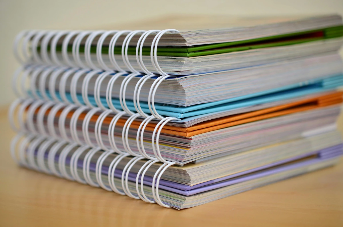
| Spiral-Bound (Wire-O / Coil) | Low-Medium | Lays completely flat, can be folded back on itself (ideal for tight spaces). Often allows for easy page removal. Excellent for both right and left-handed artists as there's no spine to contend with. | Pages can tear out easily if handled roughly, the spiral can get snagged on things in your bag, making it feel less 'archival'. The wire can also bend, making page turning difficult. | Field sketching, quick studies, using both sides of the paper, left-handed artists (no spine in the way!), or students who need to submit individual pages. |
| Case-Bound (Hardcover) | High | Very durable, looks professional, feels like a 'real' book. Excellent for archival purposes – creating a cohesive body of work (look for "acid-free" paper for true longevity and lightfastness). | Doesn't always lay perfectly flat (especially when new), leading to the dreaded 'gutter' issue (where the binding eats into your drawing area and can be hard to work across). Requires 'breaking in' to achieve a flatter lay. | Studio work, final presentations, creating a serious, long-term art journal, displaying your work, or as a gift for a discerning artist. |
| Stitched (Smyth Sewn / Perfect Bound) | Medium-High | Often lays flatter than case-bound when opened, especially with use. Found in many thinner, more portable journals. Smyth-sewn books are incredibly durable as pages are physically sewn together, while perfect-bound books have glued pages which can be less robust over time. | Perfect bound can be less durable than case-bound over time, especially if frequently forced open completely flat, leading to pages detaching. | Travel journals, pocket sketchbooks, journaling, quick-grab sketchbooks where durability isn't the absolute top priority, or for artists who prefer a subtle, flexible spine. |
| Ring-Bound (Disc-Bound / Traveler's Notebook style) | Medium | Pages can be easily added, removed, or rearranged. Highly customizable. Often allows for combining different paper types and inserts (e.g., calendars, lined paper). | Rings can be bulky and make it difficult to slip into tight bags, pages might not always turn as smoothly, less common for dedicated art sketchbooks as they can feel less 'permanent.' | Hybrid journaling, scrapbooking, creating themed collections of work, easy organization, artists who love to customize, or those who frequently experiment with different media and need to swap paper types. |
| Lay-Flat Binding | Medium-High | Specifically designed to open completely flat from the first page without force (often Smyth-sewn or a specialized glue binding). No gutter issues. | Can be more expensive, less common in very heavy paper weights, may not be as rugged as some case-bound options for extreme travel. | Artists who do frequent double-page spreads, detailed linework across the spine, or those who simply detest fighting with their sketchbook. |
| Accordion/Concertina Binding | Medium | Pages fold out continuously, allowing for expansive panoramic drawings or sequential narratives. Can be displayed freestanding. | Pages are single-sided (usually), less protective for individual works. Can be tricky to handle when fully extended. | Landscape artists, sequential artists (comics/storyboards), display purposes, or unique art journals. |
💡 Pro Tip: Embrace the Gutter! For case-bound sketchbooks, don't let the 'gutter' intimidate you. Some artists intentionally incorporate it into their compositions, using it as a natural break or a design element. Or, simply work on single pages and view the book as a collection rather than a continuous canvas. A little trick I use is to gently 'break' the spine by pressing down on the open book (while supporting the binding) to help it lay flatter over time. Just be careful not to overdo it! Remember, the goal is for the book to serve you, not the other way around.
Perforated Pages: Your Art, Freed!
A quick note on a handy feature: perforated pages. Some sketchbooks, particularly spiral-bound ones, offer pages with a micro-perforation near the binding. This means you can cleanly tear out your finished (or abandoned) artwork without destroying the rest of the book. This is fantastic if you:
- Plan to frame or give away individual pieces.
- Want to scan your work without the binding showing.
- Need to quickly share a drawing, perhaps for feedback or to include in a portfolio.
- Want to organize specific pieces into a separate binder or display them in a frame.
It might seem small, but for some artists, it's a game-changer! Especially if you like to share your work, sell prints, or simply keep your finished pieces separate from your experimental scribbles. It's like having a built-in gallery for your best bits, allowing you to easily curate your work for exhibitions or online portfolios. I've often found myself wishing for perforated pages after creating a particularly strong piece in a non-perforated book; it's a small detail that can make a huge difference to your workflow.
Beyond Paper and Binding: Other Key Features
While the paper and binding are undeniably the heart of any sketchbook, several smaller, often overlooked features can significantly enhance your user experience and protect your precious work. These are the thoughtful design elements that show a manufacturer truly understands an artist's needs, turning a simple book into a cherished tool. I’ve come to appreciate these subtle additions over the years, often realizing their value only after wishing I had them!
Elastic Closure Bands
A simple elastic band wrapped around the cover can be a godsend. It keeps your sketchbook securely closed in your bag, preventing pages from getting bent or contents (like loose scraps or ephemera) from falling out. For urban sketchers or travelers, this is practically a non-negotiable feature for protecting your artistic cargo from the bumps and jostles of everyday life. I've had too many loose papers go flying without one.
Pen Loops
Ever fumbled for a pen only to realize it's buried at the bottom of your bag? A small, integrated elastic or fabric loop on the spine of your sketchbook solves this problem beautifully. It keeps your favorite pen or pencil right where you need it, ready for that fleeting moment of inspiration. It’s a simple addition that saves countless moments of frantic rummaging.
Expandable Pockets (Gusseted Pockets)
Many journals and sketchbooks include a small, expandable pocket, usually at the back. These are perfect for tucking away reference photos, ticket stubs, small collaging materials, or even finished mini-sketches you've torn out. It's like a secret compartment for your creative treasures, an essential for holding all those little bits of inspiration you collect throughout the day.
Ribbon Bookmarks
While seemingly minor, one or two integrated ribbon bookmarks can be incredibly useful. They allow you to quickly jump to your current working page, or mark a favorite finished piece without dog-earing pages. It's a small touch that adds a lot of convenience and a touch of elegance, truly making the sketchbook feel more like a cherished book than a utilitarian pad.
Page Numbering & Index
High-end journals often come with pre-numbered pages and even a blank index at the front. This is a game-changer for organizing your work, especially if you use your sketchbook as a visual diary or for long-term projects. You can easily categorize themes, track progress, or quickly find specific entries. It transforms your sketchbook from a collection of pages into a searchable archive of your creative journey, almost like an artistic timeline. For someone like me who jumps between ideas, this feature is an absolute lifesaver for revisiting old concepts.
Sketchbook Size and Portability: Your Creative Canvas, Any Size
The size and orientation of your sketchbook aren't just practical considerations; they're creative choices. Do you want something small and discreet, easily slipped into a pocket for quick urban sketches? Or a vast, expansive surface that demands a full arm's movement in the studio? The dimensions of your artistic playground can profoundly influence your drawing style and the subjects you gravitate towards. It’s about matching the canvas to your ambition, whether that's a quick visual note or an elaborate composition. A small pocket sketchbook, for instance, might encourage rapid, gestural sketches and focus on intimate details, while a large format book could invite expansive compositions and bold, expressive movements, perhaps even reminiscent of abstract landscape line art.
Size Category | Common Dimensions | Best For |
|---|---|---|
| Pocket (A6 or smaller) | 4"x6" (A6), 3.5"x5.5" | Capturing fleeting moments, quick ideas, discreet urban sketching, or for those intimidated by large blank spaces. Think tiny portraits on the subway or rapid-fire gestural studies. |
| Medium (A5 or 6x9 inches) | 5.5"x8.5" (A5), 6"x9" | The quintessential all-rounder. Portable enough for most bags, but large enough for more developed pieces. My go-to for daily journaling and moderate studies. |
| Large (A4 or 9x12 inches and up) | 8.5"x11" (A4), 9"x12", 11"x14" | Ideal for studio work, detailed compositions, and when you want to make a statement. These offer plenty of room to stretch out and experiment with scale and grander visions. |
Orientation: Most sketchbooks come in portrait (taller than wide) or landscape (wider than tall) formats. Some artists even prefer square books for composition challenges, forcing a different way of seeing and offering a balanced, harmonious canvas. Consider how you typically frame your subjects and what feels most natural to your creative flow. For landscape paintings, for example, a landscape-oriented book might feel more natural, mirroring the horizon. Conversely, for portrait studies or architectural sketches, a portrait-oriented book offers ample vertical space. My advice? Don't be afraid to try a few different sizes and orientations; you might be surprised by which one sparks your imagination and aligns with your creative vision the most!
Paper Color and Tint: Beyond Brilliant White
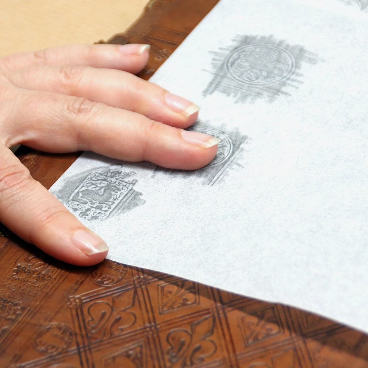
While brilliant white paper is the default for most sketchbooks, don't overlook the subtle power of colored or toned paper. It can dramatically impact the mood and luminosity of your artwork, and fundamentally shift how your colors are perceived. It's a crucial element that artists often overlook, but once you start experimenting, you'll see the profound difference it makes. Think of the paper's color as a pre-existing layer in your artwork; it influences every color you lay down on it, affecting perceived luminosity and even optical mixing. It’s a foundational decision that impacts the entire mood and temperature of your piece, guiding your palette choices from the very first stroke. For true connoisseurs, some premium papers even feature a watermark – a subtle, embedded design that's a hallmark of quality and traditional paper-making techniques, often only visible when held up to the light.
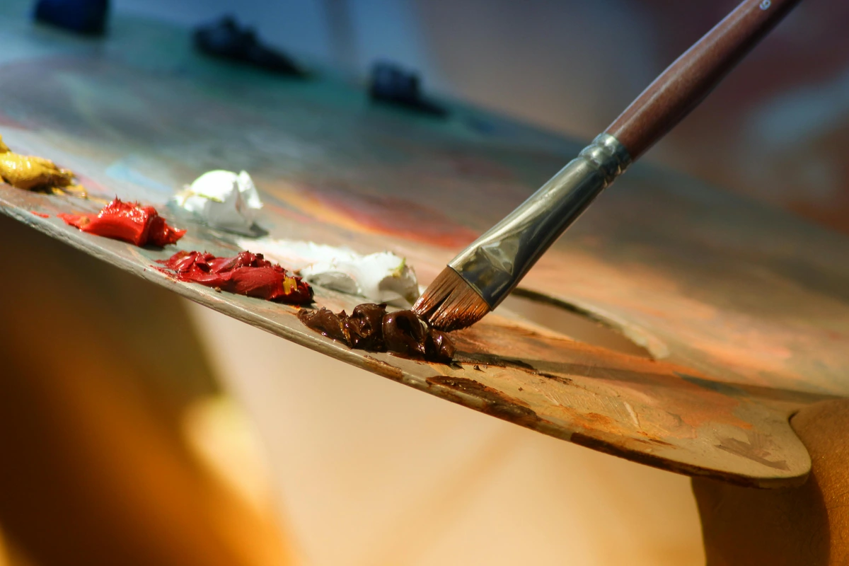
- Bright White: Reflects light most effectively, making colors pop and high-contrast work sing. It offers a crisp, neutral base that can sometimes feel intimidatingly stark, but it's perfect for pure color studies or when you want your whites to truly glow.
- Cream/Ivory: Offers a softer, warmer base, which can be lovely for graphite, sepia inks, or when you want a vintage feel. Moleskine is famous for its ivory pages. This tint can instantly soften your palette and can be particularly forgiving for artists working with a lot of mid-tones.
- Toned (Gray, Tan): My personal favorite for certain media. These papers provide a beautiful mid-tone base, allowing you to work with both shadows (adding darks) and highlights (adding whites, like white charcoal, gouache, or pastel). This can be incredibly liberating and teach you a lot about value, making the drawing process feel more intuitive as you're building out from a middle ground rather than always adding darkness to white. It’s particularly effective for subjects with subtle value shifts, like landscapes under diffused light or nuanced portraits.
- Black: A bold choice for opaque media like gel pens, Posca markers, pastels, or metallic paints. Your colors will absolutely sing against a black backdrop, creating a dramatic and often luminous effect. It's a fantastic way to challenge your color perception and create truly striking pieces.
Paper Color and Tint Chart
Paper Color/Tint | Characteristics | Best For | Artistic Effect/Mood | Considerations |
|---|---|---|---|---|
| Bright White | Reflects light, crisp base, colors pop. | Pure color studies, high-contrast work, detailed line art, when whites need to glow. | Modern, clean, vibrant, stark, pristine. | Can feel intimidatingly stark; some find it too cold. |
| Cream/Ivory | Softer, warmer base, vintage feel. | Graphite, sepia inks, nuanced portraits, soft palettes, forgiving for mid-tones. | Classic, nostalgic, warm, subtle, organic. | Can subtly alter perceived color temperature; not ideal for pure, cool whites. |
| Toned (Gray, Tan) | Mid-tone base, allows working with highlights and shadows. | Value studies, charcoal, pastels, white charcoal/gouache highlights, landscapes. | Atmospheric, dramatic, subtle, natural, harmonious. | Requires understanding of values; can be challenging for beginners. |
| Black | Dramatic backdrop, colors sing loudly. | Opaque media (gel pens, Posca markers, pastels, metallics), creating luminous effects. | Bold, striking, luminous, mysterious, luxurious. | Not suitable for transparent media; requires careful planning for color use. |
| Recycled/Kraft | Earthy, natural brown tone, often visible fibers. | Pen, pencil, charcoal, white opaque media for highlights, mixed media, collages. | Rustic, earthy, authentic, raw, textured. | Texture can vary, colors may appear muted, not ideal for pure whites, less archival. |
The "color" of your paper is an integral part of your palette; it's the base upon which all your other colors will react. Experimenting with different tints can open up entirely new artistic possibilities.
Cover Material and Durability: More Than Just a Pretty Face
The cover of your sketchbook isn't just for aesthetics; it plays a huge role in protecting your precious artwork and how the book feels in your hands. It's the first line of defense against the elements and the wear and tear of being carried around, so choosing wisely can save you a lot of heartache in the long run. I've personally experienced the heartbreak of a softcover sketchbook disintegrating in my bag during a sudden downpour, so I now pay close attention to this often-overlooked feature. Your cover is your work's bodyguard, and a good one is indispensable. It can be the difference between a treasured collection of work surviving years of adventures or becoming a soggy, crumpled memory. Beyond protection, the cover material also contributes to the overall tactile experience – the weight, the texture, the way it feels to hold – all play a part in fostering a connection with your creative tool.
Cover Type | Characteristics | Pros | Cons | Best For |
|---|---|---|---|---|
| Softcover (Paperback/Cardstock) | Flexible, often lightweight. | Lightweight, flexible, affordable, easy to slip into bags. | Less durable, prone to bending, offers minimal protection against spills. | Quick, disposable sketchbooks, minimal bulk, students, prolific sketchers. |
| Hardcover (Case-Bound) | Rigid, sturdy, often thicker. | Maximum protection, professional look, excellent for archival purposes. | Heavier, less flexible, can be more expensive, takes up more space. | Studio work, archival art journals, rugged environments, gifting. |
| Cloth/Linen Bound | Tactile, often elegant fabric finish. | Luxurious feel, ages gracefully, good durability, often on higher-end journals. | Can fray over time, may show dirt more easily, sometimes pricier. | Art journals, special projects, those who value aesthetics and feel. |
| Fabric/Textile (General) | Wider range of textures (canvas, denim, synthetics). | Offers varied aesthetic and tactile experiences, can be highly durable depending on material, allows for unique designs. | Durability varies greatly by material; some may be prone to staining or water damage. | Fashion sketchbooks, personalized journals, artists seeking a unique aesthetic. |
| Leather/Vegan Leather | Supple, durable, develops patina over time. | Superb durability, develops unique character, feels premium, built to last. | Most expensive, may require more care, not suitable for all ethical considerations. | Travelers, heirloom journals, artists seeking a truly lasting companion. |
| Water-Resistant/Synthetic | Often plastic, coated paper, or synthetic fabric covers. | Excellent protection against spills and light rain, very durable for outdoor use. | Can feel less tactile or 'organic', may not be as aesthetically pleasing for some. | Urban sketchers, outdoor artists, students in rugged environments, travel. |
Choosing the right cover is about balancing aesthetics with how you intend to use and carry your sketchbook. Will it live on a pristine studio desk, or be tossed into a muddy hiking pack? Remember, the cover is an extension of your artistic personality, so pick one that resonates with your style and practical needs.
Maintaining Your Artistic Companion: Care and Preservation
Your sketchbook isn't just a collection of paper; it's a repository of your creative journey, a tangible record of your thoughts and experiments. Treating it with care ensures that these memories and artworks endure. I've had the heartbreak of finding beloved sketches warped by humidity or faded by sunlight, so I've learned the hard way that a little prevention goes a long way in preserving your artistic legacy.
Protecting Against Environmental Damage
The elements can be surprisingly harsh on paper. Direct sunlight will inevitably fade colors and yellow pages, while extreme humidity can cause buckling, warping, and even encourage mold growth. Conversely, overly dry environments can make paper brittle.
- UV Protection: Store your sketchbooks away from direct sunlight. If displaying pages, consider UV-protective sleeves or frames.
- Temperature & Humidity Control: Aim for a stable environment. Avoid storing sketchbooks in basements, attics, or near windows where conditions fluctuate wildly. A stable room temperature and moderate humidity are ideal.
- Liquid Spills: A moment of carelessness can lead to disaster. Always keep drinks away from your workspace. For outdoor sketching, consider water-resistant covers or a plastic bag for unexpected rain.
Preventing Physical Wear and Tear
Your sketchbook might be a workhorse, but it still needs protection from physical damage that comes with regular use and transport.
- Handle with Care: Avoid bending or creasing the covers and pages, especially with case-bound books.
- Proper Storage: Store sketchbooks flat, or upright on a shelf, ensuring they are well-supported to prevent spine damage. Avoid cramming them into tight spaces where they can get crushed.
- Transport Protection: When carrying your sketchbook in a bag, place it in a dedicated sleeve or a sturdy folder to shield it from other objects that might cause dents, scratches, or tears.
Long-Term Archival Storage Best Practices
For those truly cherished sketchbooks that hold significant art or memories, going the extra mile for archival storage is a smart investment.
- Acid-Free Boxes: Store finished sketchbooks in acid-free archival boxes. These protect against environmental acids and physical damage, creating a stable micro-environment for your work. You can find more comprehensive advice in articles about art storage solutions for collectors.
- Interleaving Sheets: For sketchbooks with charcoal, pastel, or highly pigmented works, consider placing acid-free glassine or tissue paper between pages to prevent smudging and pigment transfer.
- Digital Backups: As a fail-safe, digitize your most important sketchbook entries. High-resolution scans or photographs ensure you have a record even if the physical book is damaged.
By treating your sketchbook as the valuable artistic archive it is, you ensure that your creative journey can be revisited and appreciated for years to come.
Beyond Just Drawing: Specialised Sketchbook Types
While "sketchbook" often conjures images of pencil and paper, the reality is far richer! Depending on your chosen medium, there are specific sketchbooks designed to optimize your creative experience. Understanding these can prevent frustrating bleed-throughs or paper buckling, ensuring your art has the best possible foundation to thrive. It’s about matching the tool to the task, just like a chef wouldn't use a butter knife to chop vegetables. Using a watercolor sketchbook for marker art would be a frustrating and wasteful endeavor, just as trying to achieve crisp calligraphy on highly textured pastel paper would be an exercise in futility. Understanding these distinctions saves both your art and your sanity.
- Watercolor Sketchbooks: Designed with heavy, often cold-press paper (200+ GSM / 120+ lb) that can absorb significant amounts of water without buckling. Look for "watercolor paper" specifically. They often feature robust bindings to handle the damp pages and are essential for achieving smooth washes, vibrant glazes, and successful layering without damaging the paper. If you're serious about watercolor, this is non-negotiable. For a deeper dive, check out my guide to the best watercolor paper for artists.
- Mixed Media Sketchbooks: The jacks-of-all-trades. These books typically feature mid-to-heavyweight paper (180-270 GSM / 110-185 lb) with a medium tooth, capable of handling dry media, ink, markers, and light washes. The Canson XL Mix Media is a prime example, offering excellent versatility for artists who love to blend different materials and techniques, like combining ink sketches with watercolor accents or exploring texture. I find these particularly useful when I'm unsure which direction a piece might take, allowing for spontaneous shifts in medium, which is often the most exciting part of the creative process.
- Marker Sketchbooks: Crucial for alcohol-based markers! These often have very smooth, bleed-proof paper, sometimes coated on one side. The paper itself is designed to prevent ink from soaking through to the next page, allowing for crisp lines and vibrant blending, which is essential for achieving those seamless color transitions. Using regular paper with alcohol markers is a recipe for disappointment (and ruined pages!), and I can tell you from experience, there's nothing more frustrating than seeing your carefully blended colors ghost onto the precious artwork beneath. For a broader look at marker options, delve into the best markers for coloring.
- Calligraphy & Lettering Journals: Often feature smooth paper that prevents ink feathering and allows nibs to glide effortlessly. The weight isn't always as high as watercolor paper, but ink-friendliness is paramount, allowing for crisp lines and elegant flourishes. For essential supplies for beginners in this beautiful art form, check out this guide to essential calligraphy supplies. The smooth surface ensures your nibs won't snag, leading to those satisfying, uninterrupted strokes and preventing the dreaded ink feathering that can ruin delicate script.
- Pastel Sketchbooks: Characterized by their textured, often 'toothed' paper (like Canson Mi-Teintes), designed to grab and hold layers of soft pastels, oil pastels, and charcoal without requiring excessive fixative. These papers come in a wide array of colors, which can act as a mid-tone or a base color for your artwork, making them incredibly versatile for dramatic lighting effects and rich color blending. For more on this medium, explore what is pastel painting. I find these papers particularly liberating, as they allow me to work with both highlights and shadows with incredible ease.
- Visual Journals / Art Diaries: These are less about specific media and more about an approach. Often, they're mixed-media friendly, but their defining feature is a focus on capturing daily life, thoughts, and experiments in a less formal, more introspective way. They might incorporate ephemera, collage, writing, and sketches, making them a truly personal archive of your journey. They often encourage a fluid, experimental approach to art-making, bridging the gap between a written diary and a purely visual sketchbook, a space where every thought, no matter how fleeting, has a home.
- Acrylic Sketchbooks: While mixed media books can handle light acrylics, dedicated acrylic sketchbooks often feature heavier, sometimes primed, paper that is specifically designed to prevent buckling and allow for thicker applications and layering of acrylic paints. The surface might be more robust to withstand vigorous brushing, and for more specific guidance on acrylics, you might want to look into best brushes for acrylic painting or best acrylic mediums for abstract artists.
- Oil Painting Sketchbooks: These are specialized, often featuring paper that is pre-primed with gesso or a specific oil-resistant coating to prevent the oil from soaking into the paper and degrading it over time. They allow artists to experiment with oil paints on a smaller, more portable scale without needing a canvas or board, making them ideal for quick studies or color mixing experiments before committing to a larger canvas. For more on this medium, check out the best oil paints for beginners and best oil painting brushes for artists.
- Acrylic Sketchbooks: While mixed media books can handle light acrylics, dedicated acrylic sketchbooks often feature heavier, sometimes primed, paper that is specifically designed to prevent buckling and allow for thicker applications and layering of acrylic paints. The surface might be more robust to withstand vigorous brushing.
- Oil Painting Sketchbooks: These are specialized, often featuring paper that is pre-primed with gesso or a specific oil-resistant coating to prevent the oil from soaking into the paper and degrading it over time. They allow artists to experiment with oil paints on a smaller, more portable scale without needing a canvas or board.
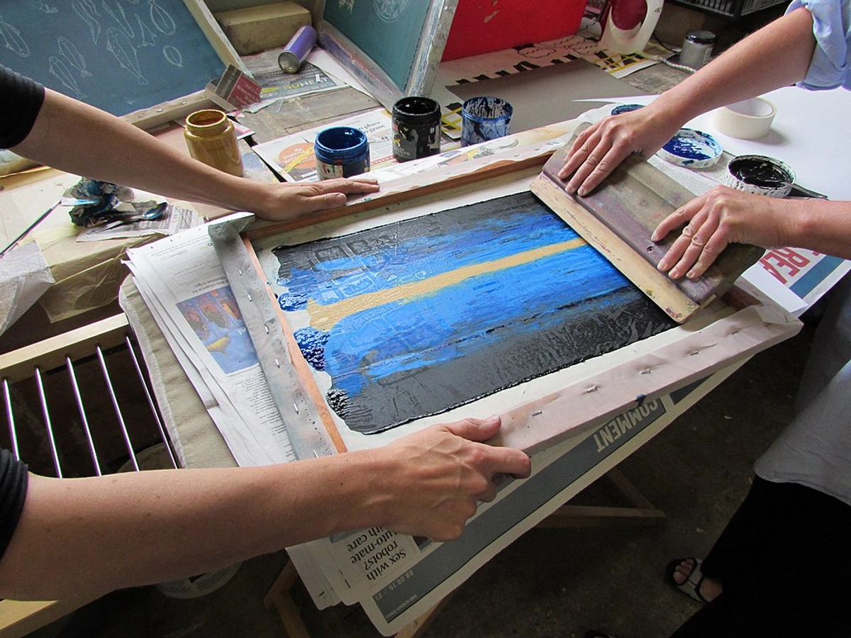
credit, licenceChoosing a specialized sketchbook means giving your chosen medium the best possible foundation to shine. It can drastically improve your results and reduce creative friction, turning potential frustration into pure artistic joy. There's nothing quite like the feeling of your materials working with you, not against you.
How to Choose Your Perfect Sketchbook: A Decision Guide
So, you've got the lowdown on paper, binding, size, and tint. Now, how do you pull it all together to find your sketchbook? It's a deeply personal quest, and one that evolves with your artistic practice, but here’s a framework I use to narrow down the options, ensuring I make an informed (and exciting!) choice. It’s less about a single definitive answer and more about a continuous process of self-discovery and material understanding. Think of it as dating for artists – sometimes you click instantly, sometimes it takes a few tries to find 'the one'.
- Identify Your Primary Medium: What will you be using most often? Pencil? Ink? Watercolor? Markers? Or perhaps a blend, like mixed media? This is your starting point, as it dictates the minimum paper weight and texture you'll need. Don't compromise here! The wrong paper for your medium is like trying to drive a nail with a screwdriver – it's just not going to work well. For example, trying to blend alcohol markers on a highly textured paper will give you blotchy, uneven results, while fine detail pen work on rough watercolor paper will be a frustrating battle against the grain. I once tried to paint a detailed watercolor botanical on a sketchbook with significant tooth, and the paint just sank into the texture, refusing to blend smoothly. It was a disheartening lesson in matching the right tool to the task!
- Consider Your Environment: Where will you be using it? In a cozy studio? On a bustling train? Hiking in the mountains, perhaps practicing some plein air painting? This informs your choice of size, binding, and cover durability. Portability versus expansive workspace is a key trade-off, and your environment will be the biggest factor in finding that balance. A rigid hardcover is perfect for studio stability but can be cumbersome on a crowded commute, while a flexible softcover might not protect your work from the elements during an outdoor adventure. Think about the daily life your sketchbook will lead. Will you be sketching covertly on the subway, capturing fleeting expressions like Edgar Degas? Or will you be sprawled in a park, engaging in plein air painting, needing a sturdy surface? Your environment isn't just about protection; it's about how the sketchbook integrates into your creative process wherever you happen to be.
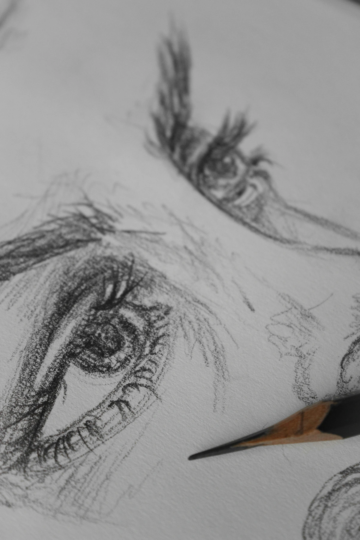
credit, licence 3. Define Your Purpose: Is this a daily doodle diary for rough ideas? A serious project book for more developed pieces? A travel journal to document adventures? An archival collection to showcase your best work? Your purpose helps you prioritize between cost, durability, and presentation. Understanding the why behind your sketchbook choice will guide you to the what. For ephemeral ideas, a cheap, plentiful pad is ideal, but for a visual legacy, investing in acid-free, high-quality paper and a durable binding is paramount. Your purpose also influences the ideal page count: a daily doodle journal might benefit from many thinner pages, while a project-specific sketchbook might need fewer, but higher-quality, sheets. It’s about aligning the physical attributes of the book with the artistic narrative you intend to create. This clarity of purpose acts as a compass, guiding you through the dizzying array of options. 4. Embrace Experimentation (Affordably!): Especially when starting out, don't commit to the most expensive option. Buy a few different affordable sketchbooks with varying specs. See what you naturally gravitate towards. You'll learn more from filling a cheap sketchbook than from staring at a pristine, expensive one, paralyzed by the fear of 'ruining' it. I’ve learned some of my best lessons from the cheapest pads! Don't be afraid to buy a few different types of paper or small, inexpensive sketchbooks to test out various media and see what feels good.
- Consider Your Artistic Goals (Long-term vs. Short-term): Are you documenting fleeting ideas, or are you creating a cohesive body of work intended for posterity? Your goals influence choices about archival quality, durability, and even the aesthetic presentation of the book. A temporary doodle pad might be perfect for quick brain dumps, while a special project might demand a high-quality, case-bound book that will stand the test of time.
- Test Before You Buy (If Possible): This is a huge one for me. While online shopping is convenient, nothing beats the in-person experience of flipping through pages, feeling the paper's texture, and testing the binding. Many art stores have 'swatch' books or samples. If you can, bring a few of your favorite pens or pencils and make a tiny mark in an inconspicuous spot (with permission, of course!). Your hands and eyes will tell you more than any spec sheet.
- Read Reviews (But Trust Your Gut): Online reviews are great for technical specs, but ultimately, the feel of a sketchbook is subjective. If you can, visit an art store and touch the paper, feel the cover, see how it opens. Your intuition knows best! Don't be afraid to fondle the paper, run your fingers over the binding – it's a sensory experience, and that connection is vital. While online reviews offer valuable insights into technical performance, they can't replicate that personal, tactile connection. Read reviews for objective facts, but ultimately, trust your own hands and artistic instincts. Your gut feeling often knows best when it comes to a tool that will become an extension of your creative self.
- Consider Your Budget: Let's be real, art supplies can get expensive. While it's tempting to splurge on the fanciest sketchbook, especially when starting out, remember that the best sketchbook is the one you actually use. Set a realistic budget and explore options within that range. Often, a mid-range sketchbook offers an excellent balance of quality and affordability, allowing you to experiment freely without the anxiety of "wasting" expensive pages. I always say, a cheap sketchbook filled with art is infinitely better than an expensive one sitting blank on a shelf. Keep an eye out for sales, student discounts, or even bundles, especially when exploring new brands or types. Many art stores offer loyalty programs that can also make those slightly pricier options more accessible over time. Remember, the journey is about creating, not about the cost of the paper you create on.
- Reflect and Review Periodically: Your artistic needs will evolve. What works for you now might not be the ideal choice in a year. Periodically take stock of your current sketchbook – what do you love about it? What frustrates you? What new mediums are you exploring? This reflective practice allows you to continuously refine your choices and ensures your sketchbook always remains the best possible companion for your ongoing artistic adventure. It's a conversation with your creative self, ensuring your tools are always aligned with your growth.
This journey of finding "the one" is part of the fun. Your perfect sketchbook might even change over time as your art evolves.
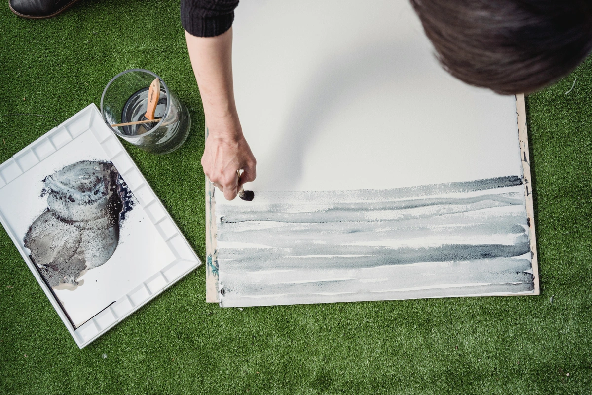
My Top Sketchbook Picks for Drawing
Okay, now for the fun part! After years of testing (and admittedly, a fair bit of hoarding), these are the sketchbooks I find myself coming back to again and again for different purposes. These aren't just recommendations; they're trusted companions that have seen me through countless ideas, successes, and beautiful failures. Each one has earned its place on my studio shelf or in my travel bag, proving its worth over time. These aren't just product recommendations; they're personal endorsements, born from countless hours of sketching, painting, and sometimes, glorious failure. They're the workhorses and the muses that have shaped my own artistic timeline and continue to inspire my work, much like the vibrant pieces you might find at the /den-bosch-museum.
For the Pencil & Graphite Enthusiast
If you live and breathe graphite, the subtle nuances of shading and blending are your language. You need paper with a reliable tooth that can grab onto pigment, but also stand up to vigorous erasing without pilling or tearing. The fundamental elements of art line truly shine when you have the right paper. For more on tools, check out my guide to the best sketching pencils for artists. When working with graphite, the tooth of the paper becomes a crucial partner, dictating how smoothly your pencil glides and how many layers of tone you can build. I've found that papers with a slight 'give' allow for a beautiful range of values, from the lightest whispers to the deepest, most velvety blacks. For example, an HB pencil might feel smooth and precise on a fine-tooth paper, perfect for subtle linework, whereas a soft 6B pencil will create rich, dark, buttery strokes, beautifully captured by the slight grit of a vellum surface, allowing you to build elements of art line with incredible depth.
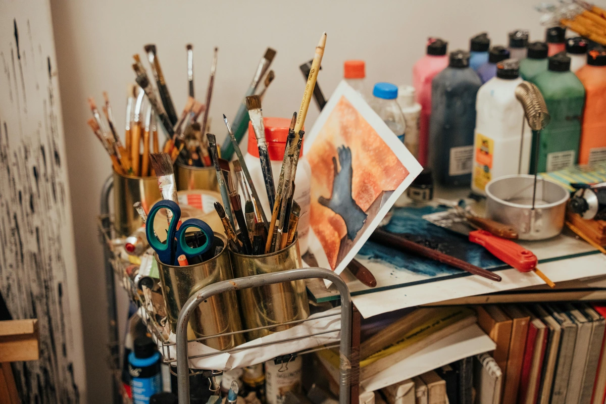
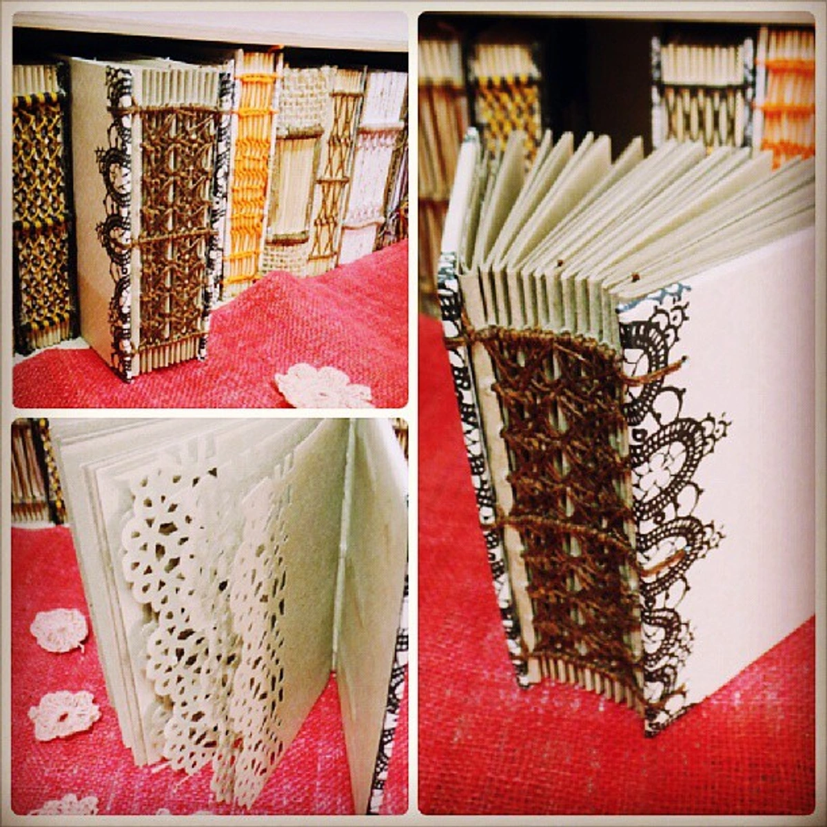
- Strathmore 400 Series Drawing: This is the undisputed workhorse of the graphite world. The paper boasts a lovely medium surface (vellum tooth) that’s just perfect for building up layers of graphite, charcoal, and even colored pencil. It’s tough enough to handle aggressive erasing and comes in a satisfying variety of sizes and bindings. Reliable and consistent – a true studio staple, it’s like the comfortable pair of jeans of your art supplies.
- Canson XL Mix Media: While technically designed for a broader range of media, the paper in these pads has a fantastic tooth for pencil work. It’s slightly lighter than the Strathmore, but offers incredible value for the number of sheets you get. A great choice for students, prolific sketchers, or anyone who goes through a lot of paper, allowing you to experiment freely without worrying about the cost per page.
For the Ink & Pen Artist
Ink demands respect. Artists working with fineliners, technical pens, gel pens, fountain pens, or even traditional dip pens need smooth, bleed-resistant paper that won’t feather or allow the ink to ghost through to the other side. The goal here is crisp, clean lines that hold their edge, resist feathering, and pop off the page with vibrant clarity. When a sketchbook's paper fibers are too absorbent or loosely bound, ink can spread unpredictably, ruining fine details. If you're looking for more specialized tools, delve into essential calligraphy supplies.
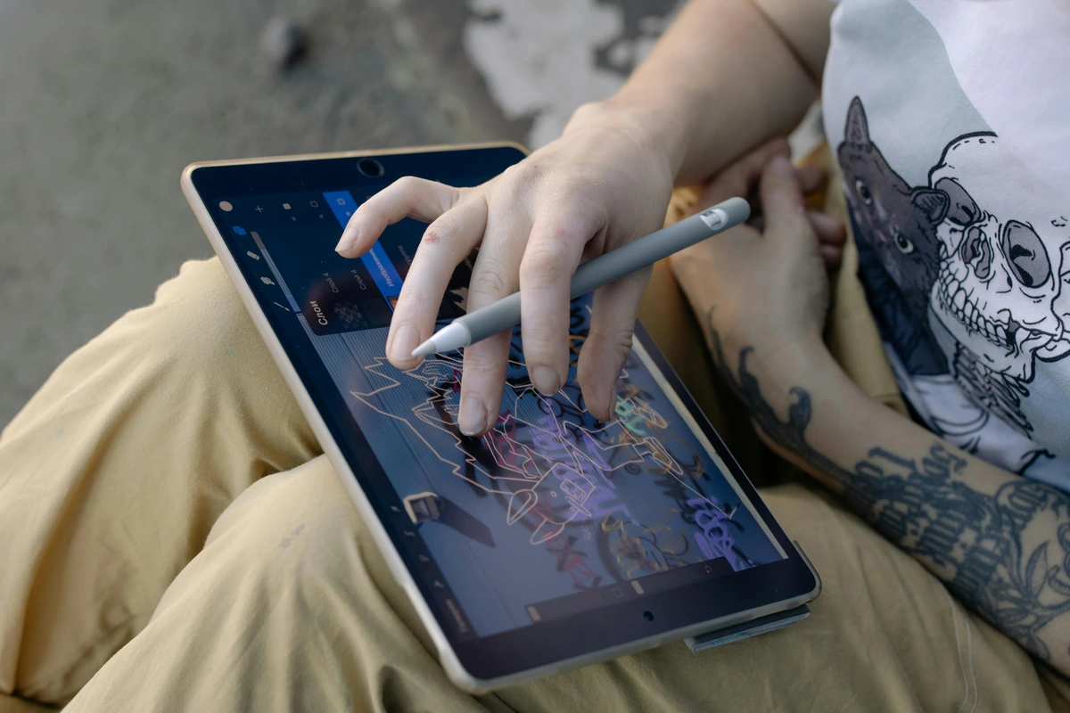
credit, licence For me, there’s nothing more satisfying than a smooth, consistent line – it speaks to the precision and intention behind every stroke. Pigment-based inks, for instance, tend to sit beautifully on the surface of smoother papers without feathering, ensuring crisp lines. Dye-based inks, while vibrant, can sometimes be more prone to bleeding on less suitable paper. Understanding these subtle interactions is key to achieving truly masterful ink work, preventing your carefully crafted lines from becoming fuzzy messes.

- Moleskine Art Sketchbook: A classic for a reason, and not just for its iconic little black book status. The smooth, ivory-colored paper is beautiful for ink, allowing pens to glide effortlessly. While some heavier alcohol markers might ghost or bleed slightly, it holds up remarkably well for most fineliners and fountain pens. The elegant, case-bound format also makes it a beautiful object to keep and revisit, almost like a piece of art itself.
- Stillman & Birn (Zeta Series): If you want the absolute best for ink, this is it. The Zeta series features heavyweight (270 GSM), ultra-smooth paper that can handle virtually anything you throw at it – even light watercolor washes over ink. It’s a bit of a splurge, but the quality is undeniable. Your ink drawings will look stunningly crisp and vibrant on these pages, and I’ve found it to be exceptionally forgiving even with multiple layers of ink.
💡 Pro Tip: The Pen Test Before committing to a new ink pen or a new sketchbook, always do a quick test in an inconspicuous corner of a page (or the very back) to check for bleed-through and feathering. A tiny scribble can save you from a big headache!
For the Marker Artist
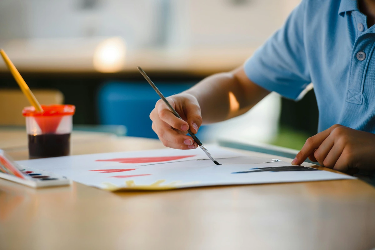
Markers, especially alcohol-based ones, are a beast of their own. They need paper that can prevent bleed-through and feathering, allowing for smooth blends and vibrant, saturated color. A standard drawing paper simply won't cut it. The wrong paper will drink the ink, feather your lines, and bleed right through to the next page, which is heartbreaking after you've poured your creativity onto the surface. For a deep dive into your options, check out the best markers for coloring.
- Copic Marker Pads / Specialty Marker Paper: Brands like Copic, Strathmore (Bristol Smooth), and other dedicated marker pads offer ultra-smooth, often coated, paper. This paper is specifically designed to prevent bleed and allow for seamless blending of alcohol markers. The ink tends to sit on the surface longer, giving you more time to work, which is crucial for achieving those smooth gradients and vibrant color transitions. These are purpose-built for marker mastery. The smooth, often non-absorbent surface allows the alcohol ink to sit on top, giving you more time to blend and create seamless gradients without the paper soaking up the pigment too quickly. This property also prevents the ink from bleeding through or feathering, which is essential for crisp edges and vibrant, consistent color fields, transforming your marker art from good to gorgeous.
- Stillman & Birn (Epsilon Series): Another fantastic offering from Stillman & Birn, the Epsilon series (150 GSM) provides a smooth, white surface that is surprisingly resistant to bleed-through with most markers and ink pens. It’s a great all-rounder if you use both ink and lighter marker applications, offering a versatile platform for mixed media marker experimentation without fear of ruining your work.
For the Traveler & Urban Sketcher
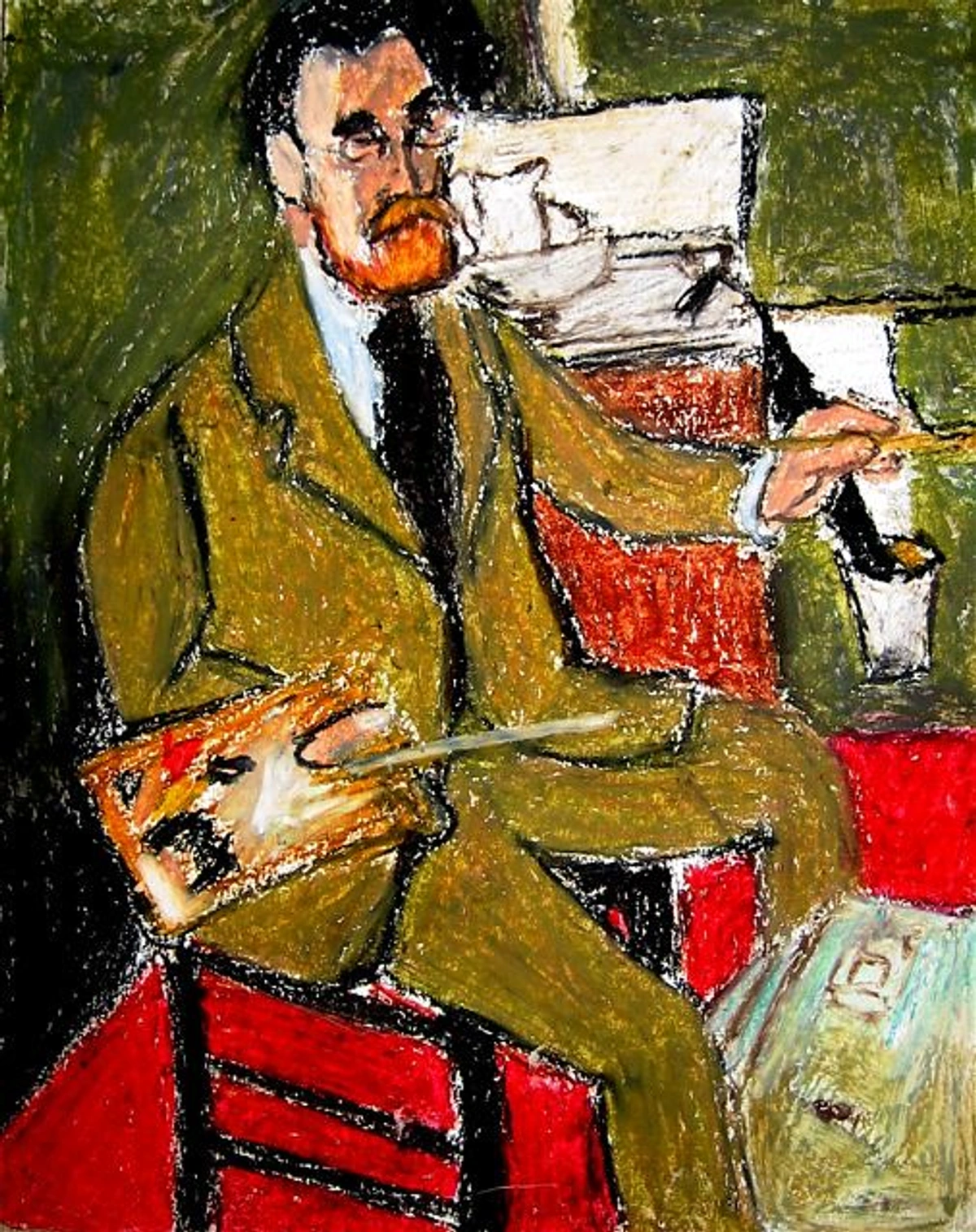
When you’re sketching on the go – whether it's capturing the chaotic energy of a city street or the serene beauty of a landscape – you need a sketchbook that’s durable, portable, and versatile. It needs to withstand the elements and the rough-and-tumble of your travel bag. Think about it: a coffee spill, an unexpected rain shower, or simply getting crushed between your water bottle and a travel guide – your sketchbook needs to be a trooper! I've lost too many sketches to the elements, so durability is key for me on the go.
- Pentalic Aqua Journal: Don't let the 'Aqua' name fool you. While it's superb for light watercolor washes (and can even handle more serious water media), the robust 140 lb (300 GSM) paper is also fantastic for ink, pencil, and even gouache. It’s tough as nails, and the sturdy hardcover protects your work from the perils of travel, making it an ideal choice for rugged adventures or simply tossing into a backpack without a second thought.
- Leuchtturm1917 Sketchbook: This is my personal favorite for travel, often accompanying me on trips that inspire pieces now found at the
/den-bosch-museum. It's case-bound but, remarkably, lays surprisingly flat with a bit of breaking in, a feature I truly appreciate for seamless double-page spreads. The 150 GSM paper makes it a great all-rounder for pencil, light ink, and even some dry pastels. Plus, it has numbered pages and a built-in table of contents, which is absolutely perfect for organizing your thoughts and sketches from a grand adventure or even just a quick trip to the coffee shop – a detail that appeals to my inner organizational nerd.
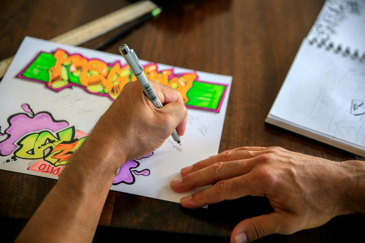
💡 Pro Tip: Waterproof Wonders for Urban Sketchers If you combine ink and watercolor on the go, invest in a good waterproof ink for your linework. This ensures your beautiful lines won't bleed or smudge when you apply watercolor washes over them. It's a small change that makes a huge difference in the final look of your urban sketches!
For the Watercolor & Mixed Media Artist
If your artistic playground involves brushes, water, and multiple layers of different materials, you need a sketchbook that can stand up to the challenge. Regular drawing paper simply won't do; it will buckle, pill, and probably tear. You need paper with serious backbone – paper that can withstand multiple layers, heavy washes, scrubbing, and lifting without pilling, buckling, or disintegrating. Regular drawing paper simply won't do; it will buckle, pill, and probably tear under the stress. For even more detail on selecting the right surface, explore my guide to the best watercolor paper for artists. The robust nature of these papers allows for techniques like lifting (removing paint to create highlights), scrubbing (for texture), and the use of masking fluid without damaging the paper surface, giving you true freedom in your mixed media explorations.
- Strathmore 400 Series Watercolor Sketchbook: A readily available and reliable choice. These sketchbooks feature sturdy, cold-press watercolor paper (usually 300 GSM / 140 lb) that can handle washes, glazes, and layering without significant buckling. It’s a great entry point for watercolorists looking for a dedicated sketchbook, offering a dependable surface for learning and experimenting.
- Stillman & Birn (Beta or Alpha Series): These are absolute powerhouses for mixed media. The Beta series (270 GSM / 180 lb) features a cold-press, heavy-duty paper that can take almost anything – heavy watercolor, gouache (which layers beautifully on this paper), ink, acrylics, and all dry media. The Alpha series (150 GSM / 100 lb) is a slightly lighter, vellum-surface option that still performs remarkably well with a variety of wet and dry media, making it a truly versatile studio companion. They're an investment, but one that pays dividends in artistic freedom.
- Canson XL Mix Media: (Yes, it's back!) While great for pencil, its 160 GSM (98 lb) paper also makes it an excellent, affordable choice for lighter mixed media work, including ink, markers, and very light watercolor or gouache washes. It's a fantastic value for experimenting, allowing you to push boundaries without breaking the bank.

💡 Pro Tip: Don't Fear the Heavy Hand (with the right paper!) When working with gouache or acrylics in a mixed media sketchbook, don't be afraid to build up layers! The heavier paper is designed for it. Just allow each layer to dry thoroughly before adding the next to avoid reactivating previous pigments or causing unnecessary buckling. This patience pays off, trust me. For more on different paint types, explore my definitive guide to paint types for artists, and if you're working with acrylics, a guide to best brushes for acrylic painting is essential for achieving the textures and effects you envision.
FAQ: Your Sketchbook Questions Answered
You've got questions, I've got answers! Choosing a sketchbook can sometimes feel like a commitment, a big decision for your creative journey, so it's natural to have a few lingering thoughts. Here are some of the most common questions I get, and a few I've asked myself over the years:
Q: What's the best sketchbook for a complete beginner?
A: For a complete beginner, my go-to recommendation remains the Canson XL Mix Media pad. It's incredibly affordable, the paper is wonderfully forgiving for a variety of dry media (especially pencil, where most people start), and its spiral binding makes it easy to work with and lay flat. The key is to start with something you won't be afraid to "ruin." Don't spend a fortune on your first sketchbook; spend your time filling it with experiments, doodles, and discoveries. The sheer joy of making a mark is far more important than the pedigree of the paper.
Q: Can I use markers in a regular drawing sketchbook?
A: It really depends on the markers and, more importantly, the paper's weight and absorbency. Alcohol-based markers (like Copics) will almost certainly bleed through any paper under 200 GSM unless it's specifically designed as a marker pad. For these, a dedicated marker sketchbook with bleed-proof paper is essential; trust me, I've learned this the hard way! Water-based markers are a bit more forgiving, but I always recommend putting a spare sheet of paper or a blotter behind the page you're working on, just in case. It's better safe than sorry, and it saves the page beneath! A simple piece of scrap paper can be your best friend here.
Q: How do I get over the fear of the first blank page?
A: Oh, the classic fear! That pristine, untouched page can be incredibly intimidating. My trick is to "ruin" the first page on purpose. Scribble on it, write your name and the date, test your pens, or even intentionally spill a tiny drop of coffee (carefully, of course!). Make it imperfect. Once that seal is broken, the pressure immediately drops. Remember, a sketchbook is for practice, play, and process – not for finished masterpieces. My own artistic timeline is paved with thousands of 'bad' sketchbook pages that ultimately led to a few good ideas. If you're really struggling, I've found that reading up on how to overcome fear of the blank canvas (which applies equally to sketchbooks!) can also offer some great strategies. Sometimes, the best art comes from letting go of the need for perfection on every single page; it's the journey, not just the destination.
Q: Is it worth buying expensive sketchbooks?
A: Yes and no. For daily practice, brain dumping, and sheer prolific output, affordable sketchbooks are often better because you won't be afraid to 'waste' pages. However, for a specific, more serious project, when working with high-quality materials (like professional watercolors or expensive inks), or when you want to create a truly archival body of work, a premium sketchbook (like a Stillman & Birn) absolutely can elevate your work and make the experience more enjoyable. The quality of the paper truly does make a difference in how your mediums perform and how your art endures, especially if you're creating pieces that you intend to keep for a long time or even sell on your /buy page. It's an investment in your artistic legacy, but not a requirement for the creative process itself.
Q: What about archival quality? How important is it?
A: Archival quality is crucial if you intend for your artwork to last for decades, even centuries, without degrading. It primarily refers to acid-free paper, meaning the paper has a neutral pH (or slightly alkaline) and won't yellow, become brittle, or degrade over time due due to acid content. Many art supplies, like certain inks or cheaper papers, can be acidic and will eventually damage your work. If you're creating pieces you plan to keep, frame, sell on your /buy page, or simply cherish as a long-term record of your artistic growth, then opting for archival paper is absolutely worth the investment. It's the difference between a temporary sketch and a lasting legacy, literally holding your memories for future generations.
Q: How do I care for and preserve my sketchbooks?
A: Your sketchbooks are a record of your artistic journey, so treat them well! Keep them away from direct sunlight and extreme humidity (both can cause paper to yellow or warp or even encourage mold growth). Store them flat or upright on a shelf to prevent covers from bending. If you're concerned about longevity, always look for "acid-free" or "archival quality" paper, as this prevents yellowing and degradation over time. For long-term storage, especially for cherished pieces, consider archival boxes; there's a lot to learn about art storage solutions for collectors that can be applied to your sketchbooks too! Think of it as preserving a piece of your personal history, a tangible connection to your past creative self.












Q: Should I date and sign my sketchbook entries?
A: Absolutely, yes! While it might feel a little formal for casual sketches, I highly recommend dating and even adding a tiny signature or initial to your sketchbook entries, especially those you're proud of or that mark a significant learning moment. It transforms your sketchbook into a true visual diary, making it incredibly rewarding to look back and see your progress over time. You'll remember when a piece was created, what you were exploring, and how your style evolved. It adds a layer of personal history and makes your journey tangible.
Q: What are some fun sketchbook prompts or exercises to get started?
A: The possibilities are endless! Don't feel pressured to create a masterpiece every time you open your book. Try these:
- Blind Contour Drawing: Draw an object without looking at your paper.
- Value Study: Choose an object and draw it using only 3-5 distinct shades of gray.
- Found Object Sketch: Sketch the first three random objects you see around you.
- Daily Doodle: Dedicate 5-10 minutes each day to drawing whatever comes to mind, no matter how silly.
- Color Swatch Play: Experiment with your art supplies by filling pages with color swatches, blending tests, and texture experiments. It's a great way to learn your materials!
- Draw a Hand a Day: Hands are notoriously tricky, so consistent practice helps. Pick a different pose each day!
Q: What are some common sketchbook myths?
A: Oh, there are so many! Here are a few that I've encountered and learned to ignore:
- Myth: Every page has to be good. Reality: Absolutely not! A sketchbook is a space for mistakes, experiments, and bad ideas. Some of my most valuable lessons came from pages I'd initially considered failures.
- Myth: You have to draw in chronological order. Reality: While some artists love a linear journey, feel free to jump around. Use those ribbon bookmarks or an index to keep track of your active projects. Your creative brain isn't linear, so your sketchbook doesn't have to be either.
- Myth: You need expensive supplies to start. Reality: A pencil and any old paper are enough to begin. The best sketchbook is the one you actually use, regardless of its price tag. Invest in better quality after you've developed a consistent practice and know what you truly need.
Q: What is a signature in bookbinding, and why does it matter?
A: In traditional bookbinding, a signature (also known as a gathering or section) is a group of folded sheets of paper nested together. These signatures are then sewn together to form the book block. For example, if you take a large sheet of paper and fold it twice, you get four leaves (eight pages), which forms one signature. Why does it matter? Smyth-sewn (stitched) bindings, which are known for their durability and ability to lay flatter, are created by sewing these signatures together. This method makes the book much more robust and flexible than simply gluing individual pages (perfect binding). So, when you see "Smyth-sewn" or "stitched" binding, it means your book is constructed from these durable signatures. It's a mark of quality that directly impacts how well your sketchbook will hold up over time and how comfortably it will open.
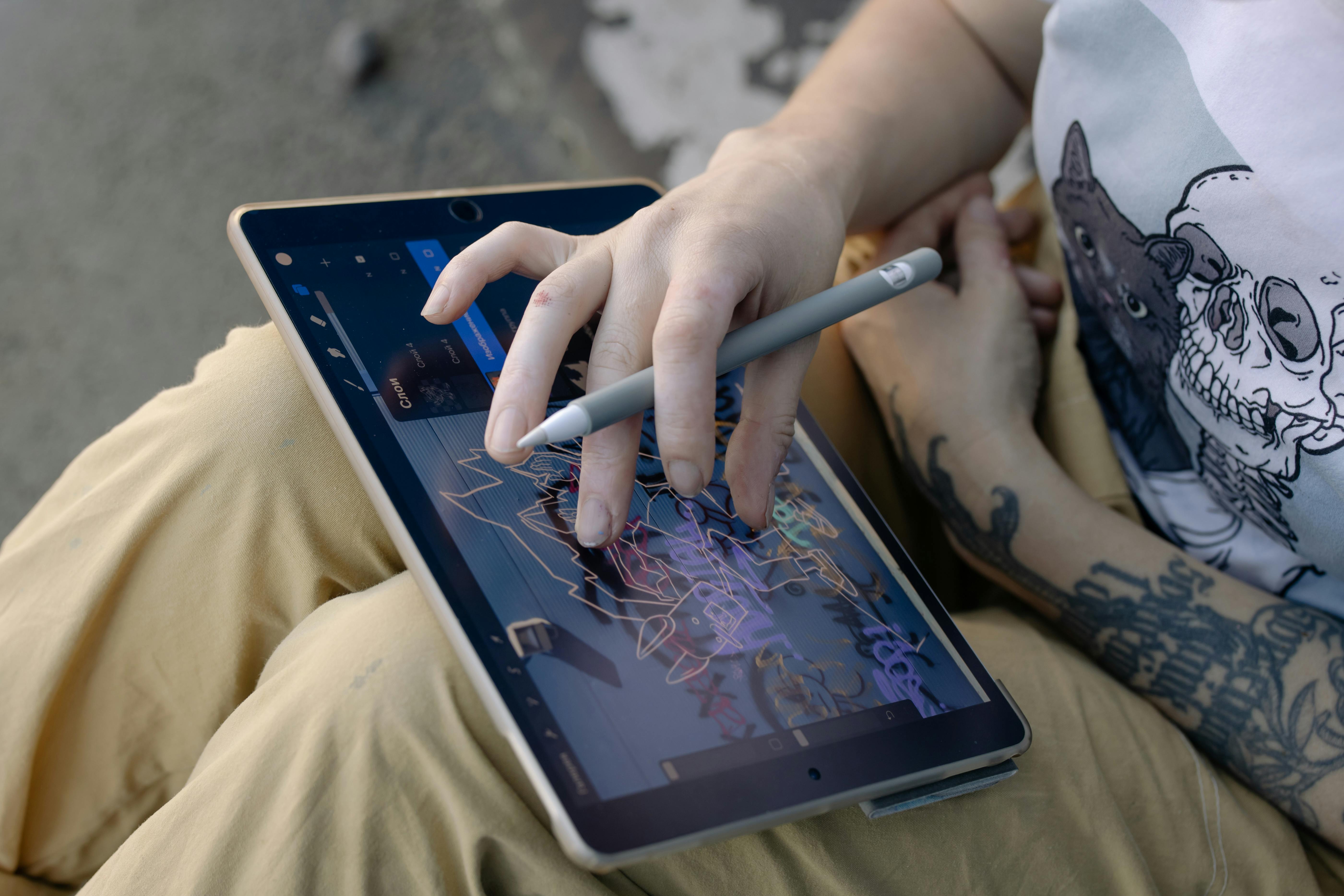
Q: What about digital sketchbooks and drawing apps?
A: Digital drawing tools have come a long way, and many artists use them in conjunction with, or even in place of, physical sketchbooks. Apps like Procreate, Clip Studio Paint, and Adobe Fresco offer incredible versatility, endless colors, and undo buttons that are a godsend! They are fantastic for experimentation, digital painting, and sharing work quickly. However, the tactile sensation of pen on paper, the smell of fresh paper, and the permanence of a physical mark are still unique to traditional sketchbooks. I believe there's room for both in an artist's life – each offers a distinct experience and set of benefits; one doesn't have to replace the other. Many artists, myself included, find joy in both the physical and digital creative realms. The beauty is that you don't have to choose; embrace whatever tools empower your creativity most effectively. Digital sketchbooks offer unparalleled flexibility for experimentation with colors, layers, and undo functions, making them perfect for refining compositions or creating purely digital art. Physical sketchbooks, however, offer a unique tactile experience, the satisfying resistance of paper, and the tangible permanence of a hand-drawn mark. Many artists, myself included, find joy in both the physical and digital creative realms, allowing each to inform and inspire the other, creating a richer, more diverse artistic practice.
Beyond the Basics: Sustainable Sketchbooking
In a world increasingly conscious of its environmental footprint, it’s worth thinking about the sustainability of your art practice. Your sketchbook, after all, is a product of paper, which comes from trees, and often involves various chemical processes. As artists, we're deeply connected to our materials, and becoming aware of their origin and impact is a natural extension of that connection. Making conscious choices about your supplies can be an act of creative integrity, aligning your art with your values. It’s a way to let your art reflect more than just your visual ideas, but your worldview too.

- Recycled Content: Look for sketchbooks made with a high percentage of post-consumer recycled paper. The quality has improved dramatically, and many brands now offer excellent recycled options that perform just as well as virgin paper. It's a simple switch that makes a big impact, reducing the demand for new timber and diverting waste from landfills. I've found some recycled papers have a unique texture that I actually prefer for certain media.
- FSC Certified: The Forest Stewardship Council (FSC) certification ensures that the paper used comes from responsibly managed forests, supporting ethical forestry practices. Always keep an eye out for this logo! It's a quick way to know your paper's origins are sustainable.
- Acid-Free Paper: While primarily for archival quality, acid-free paper also tends to be more stable, reducing the need for replacements due to premature degradation. This means your work lasts longer, and you're not contributing to unnecessary waste. A longer-lasting piece of art is, by its nature, more sustainable.
- Vegan Materials: For those conscious about animal products, look for sketchbooks that explicitly state they are vegan. This extends beyond leather covers to glues and paper processing, ensuring your art supplies align with your ethical stance. Many brands are increasingly offering transparent sourcing information, making it easier to make informed choices, and I'm always on the lookout for brands committed to this.
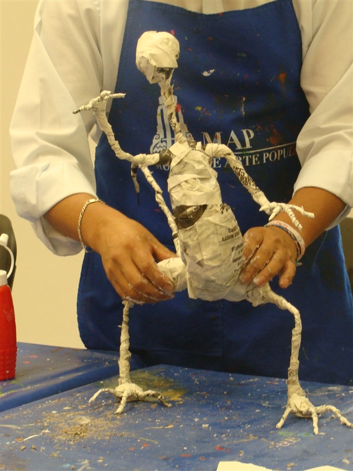
- DIY & Repurposing: Making your own sketchbook from salvaged paper, old books, or even packaging materials is the ultimate sustainable choice! It's also a fantastic creative challenge, pushing you to think outside the box and personalize your tools in a truly unique way. I've seen artists create stunning journals from old cereal boxes, fabric scraps, or even damaged books – each one a testament to resourcefulness and creativity. It's a wonderful way to give new life to materials and make something truly unique. Plus, the process itself can be a work of art!

- Mindful Consumption: Simply being more intentional about the sketchbooks you buy and filling every page rather than abandoning half-used ones makes a difference. Every little bit counts in reducing waste and honoring the materials we use. I've found that consciously choosing to use every last page not only reduces waste but also liberates me from the pressure of perfection on each individual drawing. It’s about valuing the process as much as the product.
- Eco-friendly Inks and Glues: Beyond the paper and cover, consider the internal components. Look for sketchbooks that use vegetable-based inks (if any printing is involved) and glues that are non-toxic and biodegradable. While this information isn't always readily available, a quick check of the manufacturer's website can often provide valuable insights into their commitment to sustainability.
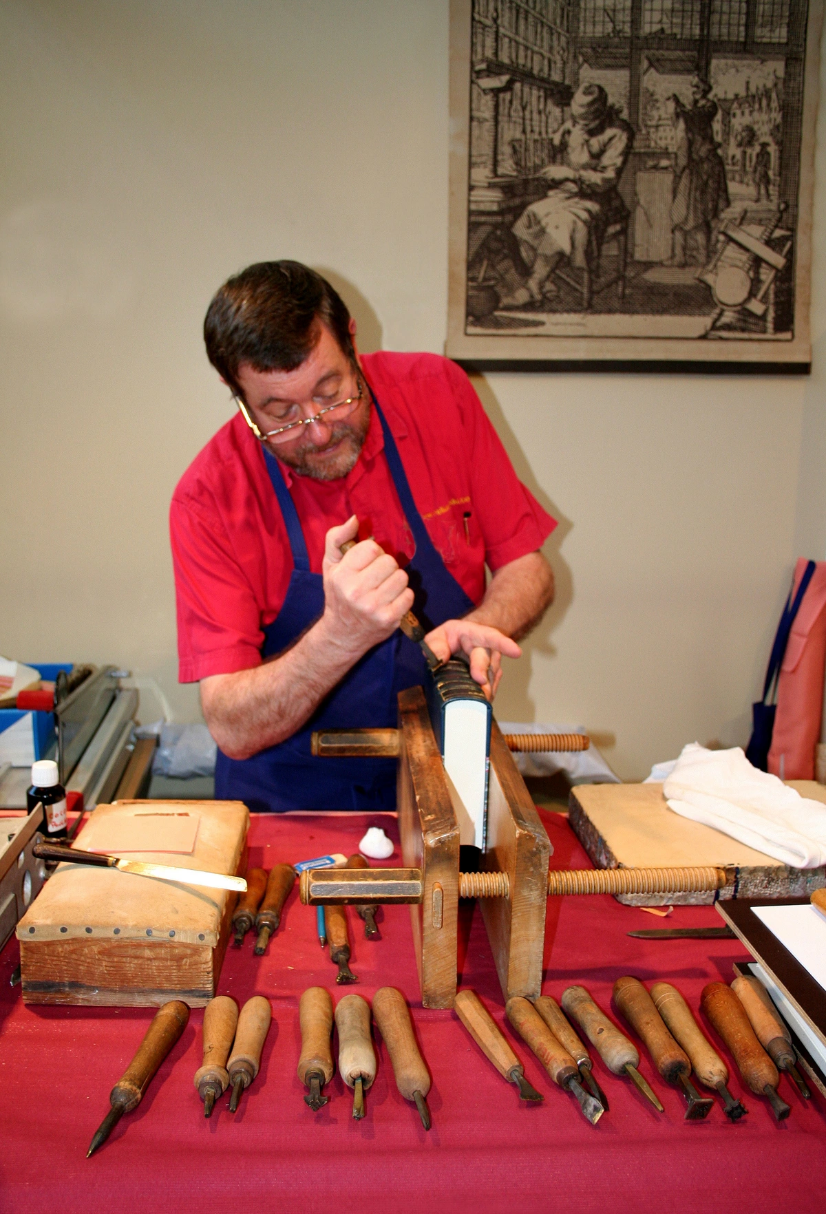
- Longevity & Repair: Choosing a well-made sketchbook from the start can significantly extend its lifespan, reducing the need for frequent replacements. But even the most durable sketchbook can suffer wear and tear. Learning basic book repair techniques (like mending a torn spine or reattaching a loose cover) can transform a "damaged" sketchbook into a cherished, well-loved companion. Think of it as giving your sketchbook a second life, a testament to the stories it holds. For more on extending the life of your art supplies, check out my guide to best eco-friendly art supplies for conscious artists.
Choosing sustainable art supplies doesn't mean compromising on quality. It's an opportunity to align your artistic values with your environmental ones, creating art with a clearer conscience.
The Final Word
Ultimately, the 'best' sketchbook isn't found in a review or a top-10 list; it's the one you'll actually use. It's the one that feels inherently right in your hands, the one whose pages call to you, inspiring you to make that first terrifying (or liberating!) mark. Your perfect match might even change over time as your style evolves, or as you explore new mediums and moods. Don't be afraid to experiment! Try a small one, a big one, a cheap one, an expensive one. That's part of the fun of the journey. For me, the true magic of a sketchbook lies not in its pristine state, but in the stories it tells through its smudges, worn edges, and heartfelt art.
Your sketchbook is far more than just paper bound together; it's a living, breathing record of your artistic journey. It’s a place to learn, to fail spectacularly, to discover unexpected insights, to process emotions, and to simply play. It's a testament to your unwavering commitment to creativity, an archive of your visual thoughts. So, pick one up, open to that terrifyingly blank first page, and make your mark with conviction. It doesn’t have to be perfect; it just has to be yours. And who knows? If you pour your heart into it, you might just find a piece you truly love – a piece worthy of turning into a print you can find for sale on my /buy page, ready to share with the world. Embrace the journey, and let your sketchbook be your most loyal artistic companion, a silent witness to your growth, your struggles, and your triumphs. The blank page isn't an enemy; it's an invitation. Go make your mark. It’s your story, told in lines, colors, and textures, a personal artistic timeline that no one else can replicate. Don't just make art; live your art, one page at a time.