The Building as the Brushstroke: How Architecture Shapes Our Art Experience
Explore how architectural features in art spaces—from light-filled atriums to intimate galleries—transform how we perceive contemporary art. Your ultimate guide to immersive art environments.
The Building as the Brushstroke: How Architecture Shapes Our Art Experience
Ever walked into a gallery and felt your breath catch before you even saw the art on the walls? It’s that jolt of pre-awareness, the slight quickening of the pulse—a feeling I’ve chased for years. This phenomenon, where the vessel primes your emotions before the content even registers, is the silent power of architecture. We meticulously analyze brushstrokes and pigments, often forgetting that the space surrounding the art is the real puppet master, capable of turning an object into an icon or an afterthought. This article is an exploration of that invisible hand—the myriad ways a building’s bones, its light, its very texture, become co-authors of your experience.
To understand this, we need to start with a simple, almost radical idea: the building is the first artwork you encounter. Before your eyes focus on a single canvas or sculpture, the architecture has already begun its work. That visceral reaction—the slight quickening of the pulse, the involuntary pause in your step—that’s architecture whispering to your subconscious. It’s a feeling I’ve chased for years, trying to understand why a single canvas can feel like a religious icon in one space and just a decorative object in another. The answer, I’ve learned, is almost never just the art itself. We obsess over color palettes and brushwork, scrutinizing every pigment like detectives at a crime scene. But the space surrounding the art is the silent curator, the unseen hand that can elevate a piece from mere object to profound experience. It sets the stage, directs your gaze with the subtlety of a film director, and amplifies emotion in ways the artwork alone could never achieve. Let’s dismantle the myth that art exists in a vacuum. The buildings holding our most cherished pieces aren’t passive containers; they’re active collaborators, co-conspirators in the grand act of storytelling.
This silent collaboration is what transforms a simple visit into a memorable event, and it’s rooted in a concept I call atmospheric attunement. Have you ever noticed how your shoulders drop the moment you step inside a library, or how your energy spikes in a crowded train station? That’s attunement in action. Before your conscious mind even begins to process brushstrokes or composition, the architecture has already set the emotional baseline—is this a space for quiet reverence, playful discovery, or intellectual provocation? That initial impression isn’t an accident; it’s a carefully orchestrated environmental overture, a subtle calibration of your senses to prepare you for what lies ahead.
There’s a deep, fascinating science behind this magic, a field known as environmental psychology. It's the study of how our physical surroundings hijack our nervous system, often without our conscious permission. That sudden hush you feel in a vaulted gallery isn’t just about good insulation; it’s a complex neurological cocktail, a response to shifts in air pressure, light, and spatial scale. The building isn’t just a backdrop; it’s a cunning manipulator, laying down psychological groundwork long before your conscious mind even recognizes the first painting. This operates on a purely physiological level, where the very air you breathe feels different. Stephen Kaplan and Rachel Kaplan, pioneers in the field, introduced the concept of Attention Restoration Theory (ART), and it’s a game-changer. ART proposes that environments which are fascinating without being overwhelming—like a truly well-designed art space—act as a balm for our exhausted brains. They allow our overtaxed directed attention, the kind we use to navigate work and daily life, to rest and passively recover. So, when you say a museum trip “recharges” you, you’re not being poetic; you’re describing a neurological reality. Your brain is literally rebooting.
And this psychological groundwork isn’t a niche observation confined to academic papers. It’s a cornerstone of visitor experience, meticulously crafted at institutions from New York’s intimate Frick Collection to the sprawling Centre Pompidou in Paris. The building doesn’t start its work when you stand in front of a painting; its influence begins the moment you glimpse its facade from the street, the moment you make the conscious decision to cross the threshold. This is the great, unspoken contract of an art visit—the silent promise that the container will be an active part of the story. The facade itself is the first chapter, a teaser, a piece of communication before the communications even begin. Think about it: Frank Gehry’s gleaming, titanium-scaled Guggenheim Bilbao isn’t just a building; it’s a spectacle, a landmark that single-handedly redefined an entire city’s identity, birthing the term 'the Bilbao effect'. In stark contrast, the brutalist concrete of the Barbican in London makes a different declaration entirely: this is a fortress of culture, and entering requires your full, committed attention. They are forming a psychological relationship with you long before you hand over your ticket.
The Awe Before the Art: Why Space Matters
I used to be a “head-down, get-to-the-art” kind of visitor, treating gallery spaces as little more than inconvenient corridors between masterpieces. Big mistake. That’s like focusing only on the lyrics and ignoring the music’s swelling orchestration. You miss the context, the mood, the very soul of the thing. Architecture doesn’t just house—it frames, it sculpts perception, it choreographs the entire dance between viewer and creation. It is the container that gives the content its initial flavor.
It took me years to realize I was viewing things upside down. I was so focused on the destination—the artwork—that I was ignoring the journey. The architecture isn't the corridor; it's the landscape the art inhabits. It provides the gravity, the atmosphere, the very rules of physics for the world you're about to enter.
This connection between space and experience isn't a modern invention. You can trace its roots all the way back to the Wunderkammer of the Renaissance, the "cabinets of curiosities" that preceded modern museums. Those weren't neutral containers; they were immersive environments designed to overwhelm the senses and induce awe through sheer density and wonder. They were micro-worlds, reflecting the boundless curiosity of their owners. The shift to the modern gallery in the 19th and 20th centuries didn't erase this, it just channeled it. It replaced cluttered amazement with a more directed, focused awe.
To understand this, let’s break it down with a few visceral examples. When sunlight floods a gallery through a high clerestory window, a vibrant abstract print can glow with the celestial intensity of stained glass, its colors shifting from a cool morning blue to a fiery afternoon amber, like a living organism breathing with the day.
This temporal shift is key. Unlike static artificial light, natural light introduces the fourth dimension—time—into the viewing experience. You become aware that the art is not a fixed image, but an object in the world, subject to the same rhythms and cycles as everything else. It’s a subtle reminder of impermanence.
Movement and space work the same way. When architects design corridors that intentionally narrow, forcing you into a compressed, intimate tunnel, and then dramatically widen into a vast hall, they are orchestrating a visual symphony. This builds a physical tension and release that mimics a musical crescendo, making the final reveal feel earned and monumental. The building becomes the unseen first brushstroke, the initial low note in a composition you don’t just see, but experience with your whole body.
We are a species wired for space. Cognitive psychologists have a term for how our minds map environments: spatial cognition. We don't just process dimensions; we create mental models laced with memory and emotion. A room with a twenty-foot ceiling doesn't just feel big; it can induce a mild state of reverence or intimidation, a physiological echo of standing in a forest clearing or a sacred space. The architecture is giving our ancient brains a set of instructions, a subconscious stage direction that says, "Slow down. Look up. Behold."
This process isn't universal; it's deeply gendered and cultural. Research by scholars like Beatriz Colomina has famously explored how the white walls and clean lines of modernist architecture were designed around a presumed "ideal" user—often a male one. This isn't dry theory—it shapes who feels comfortable lingering, who feels seen, who feels they have a right to be there. A truly great space transcends those outdated biases, seeking not to intimidate but to invite all its visitors into a shared state of awe, questioning who gets to decide which bodies a space is designed for.
This sensory manipulation is rooted in the psychological theory of Gestalt, where the whole is seen as greater than the sum of its parts. You don’t perceive the painting and the wall it hangs on as separate entities; your brain stitches them into a single, unified experience. A dark, matte wall makes colors pop forward, acting as a void that isolates and intensifies the artwork. Conversely, a glossy or lightly colored surface creates a different kind of tension, integrating the artwork with its surroundings or creating a reflective dialogue.
It’s almost criminal to overlook this. It means the choice of backdrop is not an aesthetic afterthought; it's a primary compositional tool. Once you become aware of it, you start seeing this principle everywhere. It scales from the microscopic to the monumental. On a small scale, consider how a stark, white border on a photographic print isolates the image, while a dark frame can make a painting feel like a contained, infinite universe. It’s all Gestalt. Your brain is always trying to form a coherent whole, and the container—be it a building, a wall, or a frame—becomes part of that equation.
On a larger scale, the gallery orchestrates your visual experience. Imagine trying to listen to a single violin in a symphony. It's almost impossible. Your brain automatically groups the sounds. The gallery does the same thing with your vision. It creates a specific set of visual "rules"—a consistent light temperature, a recurring material, a paced rhythm—that tell your brain, "All these different artworks belong to one unified experience." A jagged, chaotic line of artworks in one room, followed by a rigid, symmetrical hang in the next, isn't just a stylistic choice. It's a switch from jazz to a military parade, and the architecture of each room is the conductor.
But here\’s the kicker: this Gestalt effect isn't just about a wall and a painting. It scales up to the entire museum journey. This is where embodied cognition comes into play—the idea that our understanding of the world is shaped by our physical interaction with it. The dappled, grey paving stones in a sculpture garden, the weight of a solid bronze door handle, the cool touch of a brass handrail worn smooth by a million hands—these aren't just details. They are micro-events that your body registers before your conscious mind does. They add texture, weight, and a subconscious sense of quality and permanence, making the contemporary art meaning feel both immediate and timeless.
This is why the same artwork can feel provocative in a gritty, unfinished loft and utterly somber in a traditional museum hall. An abstract canvas bursting with chaotic energy might feel at home in a raw, post-industrial space with exposed brick and concrete, but feel jarringly out of place against fine-grained marble and gilded moulding. The artwork hasn’t changed; its context has profoundly shifted its meaning. The architecture isn’t a mere frame; it’s an active ingredient in the chemistry of perception, fundamentally altering the taste of the art it presents.
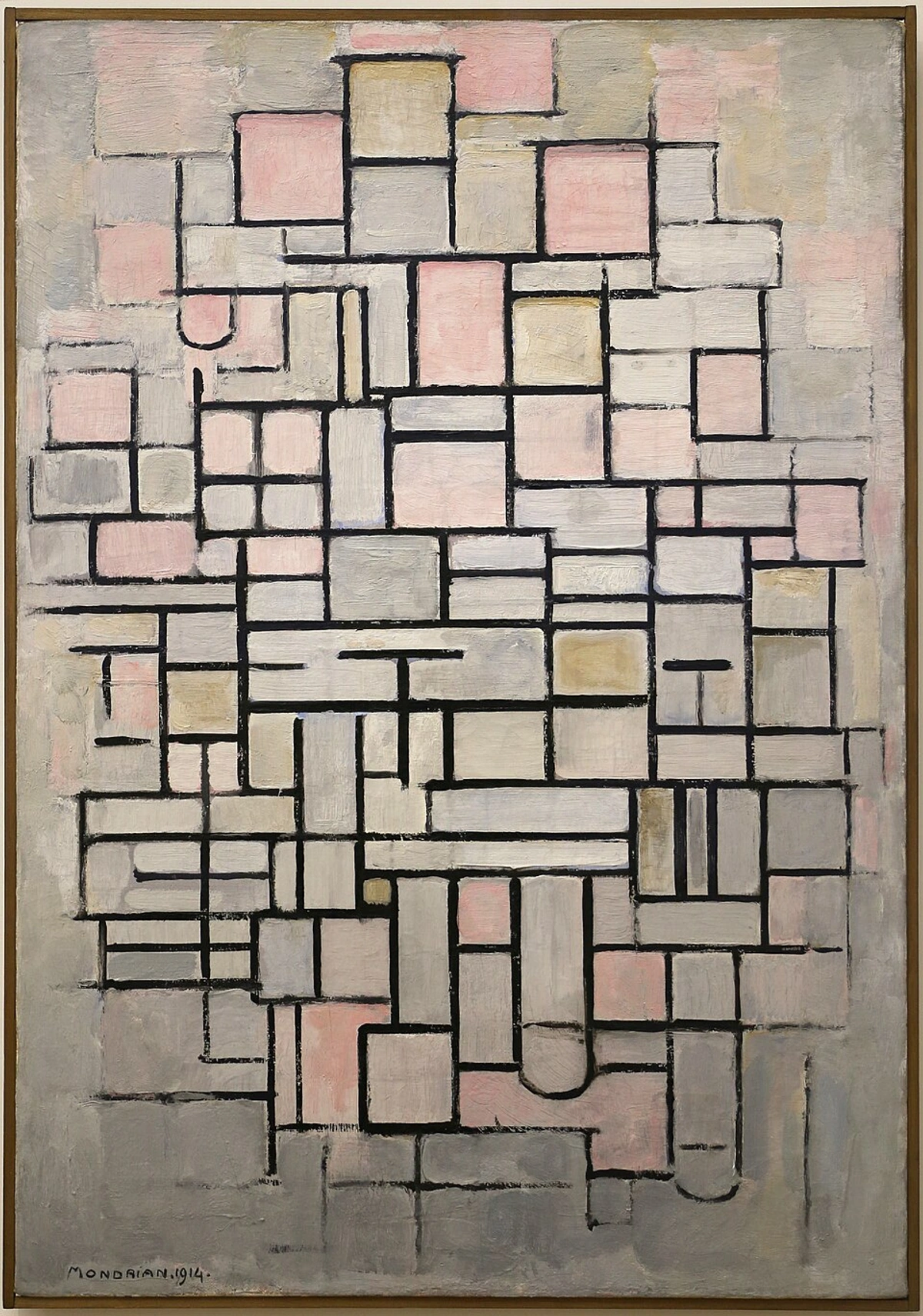
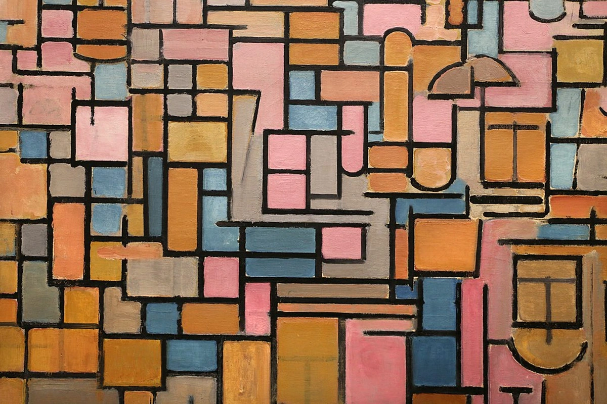
Piet Mondrian\’s "Composition No. IV" (1914). A prime example of De Stijl, it features a precise grid of black lines and rectangles filled with shades of light pink, gray, and off-white, showing his transition towards pure abstraction.
credit, licence
Unseen Curators: Key Architectural Elements in Art Spaces
The physics of awe aren’t magic—they’re design. Before we dive into the specific elements themselves, it’s worth laying out the toolkit, the hidden levers these architectural puppet masters pull to shape your reality inside an art space. An architect designing a gallery isn't just a builder; they're a composer for the deaf, a choreographer for the motionless. Here are the tools they use, often without us even realizing it. Think of this as a scorecard for your next visit, a way to become literate in the silent language of space.
Why do we need to know this? Because understanding these tools transforms you from a passive consumer of art into an active participant. You stop just seeing what’s on the walls and start feeling the entire orchestration of the visit. You appreciate the how as much as the what.
Forget the myth of the neutral white cube—the most innovative contemporary art spaces are masterclasses in applied spatial psychology, actively manipulating light, sound, and material to create an immersive narrative arc. This isn’t decoration; this is the engineering of perception. An architect designing a gallery is like a composer writing a silent symphony, where the notes are shafts of light, the rests are moments of compression, and the crescendo is that breathtaking moment a vast new gallery opens up before you. Let’s dissect how the most impactful features whisper to your senses, often operating far below the level of conscious awareness:
The ultimate goal of these masterfully curated environments isn't just to be beautiful, but to induce a state of profound mindfulness—a heightened, almost meditative focus on the present moment. They achieve this through a radical act of subtraction. By stripping away the relentless visual noise of the outside world—no advertisements, no clocks, no jarring sounds—they create a vacuum, a controlled silence. This deliberate sensory deprivation of the mundane forces your brain into a corner. With its usual distractions removed, it has no choice but to turn its full, undiluted attention to the object in front of you. The architecture is effectively performing a magic trick: it makes the rest of the world disappear, if only for a moment.
This pursuit has a name: Erfahrungsraum, a wonderfully precise German term that literally translates to 'experience space'—an environment optimized not just for function, but for the sheer quality of feeling and perception it enables. A museum, at its best, is a machine for making you forget your to-do list.
Feature | Role in Art Experience | Example in Practice |
|---|---|---|
| Thickness | Creates transitions, conveys permanence, and signals hierarchy. The mass of a wall speaks volumes before you read a single word on a plaque. | A thick, load-bearing concrete wall at a gallery entrance feels monumental and important, demanding respect. A thin, temporary partition, meanwhile, signals flexibility and impermanence. |
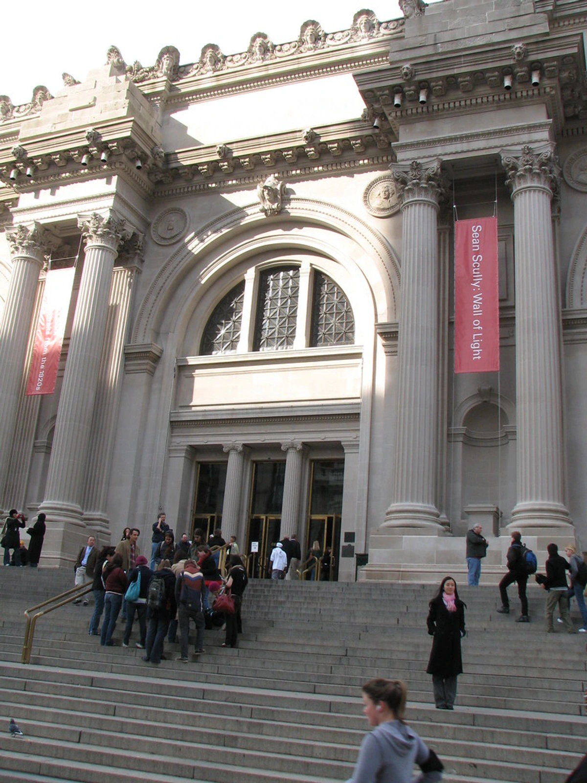
| Temperature | Influences mood, perception of comfort, and crucially, the amount of time you spend in a space. | The cool touch of stone in a classical sculpture hall (like the Met) evokes a timeless chill, a memento mori. The warm wood floors of a modern gallery, in contrast, suggest intimacy and domesticity. |
| Natural Light | Sculpts color perception, adds dynamism, and creates a rhythm that changes with the hour and the season. It makes the space feel alive. | The Guggenheim Bilbao’s titanium canopy diffusing light into ethereal luminescence; Cycladic art basking under the pure Attic sun in the Acropolis Museum. |
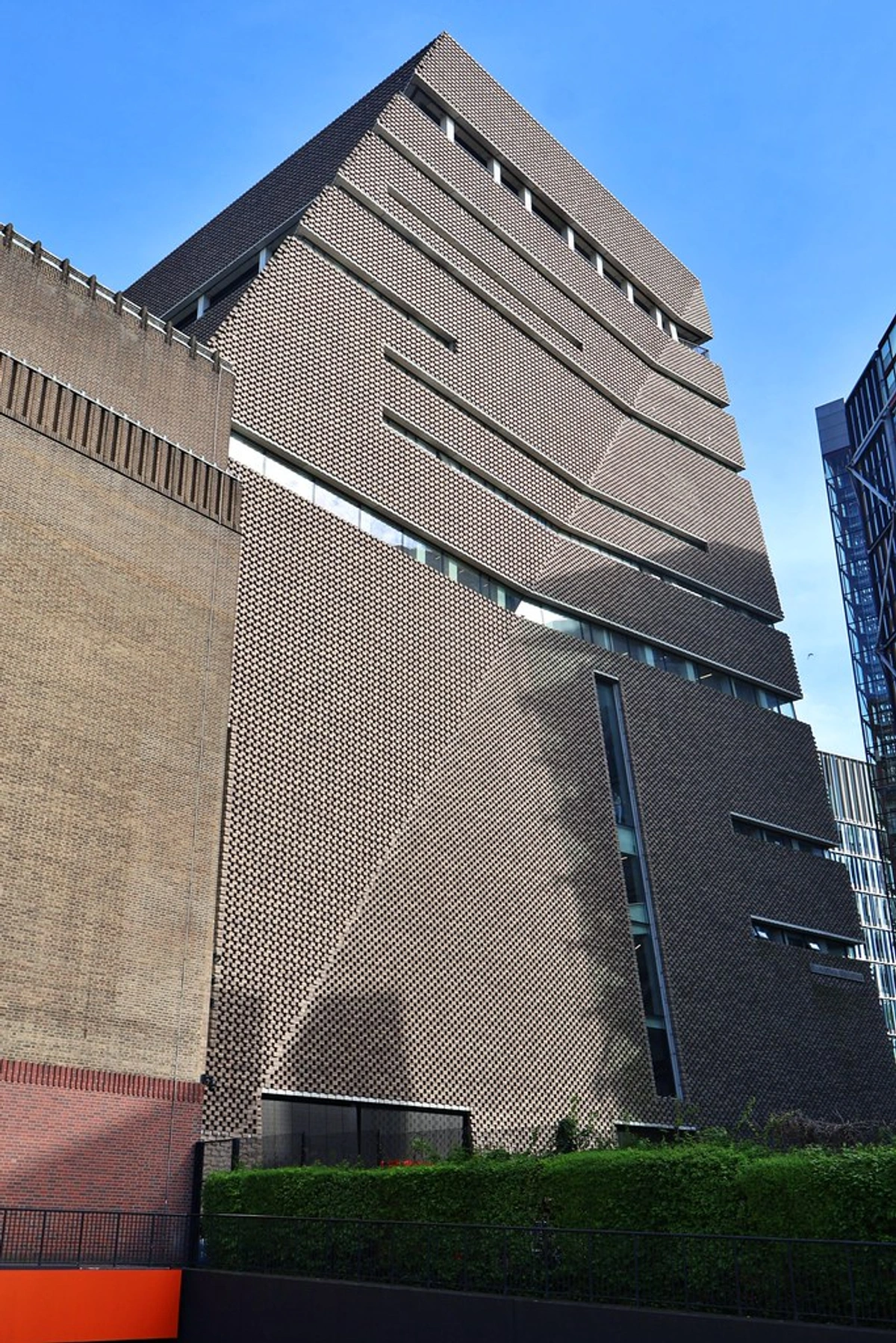
| Spatial Flow | Directs movement, builds narrative tension through compression and release, and controls the pace of your journey. | TATE Modern’s turbine hall acts as a gigantic decompression chamber, transitioning you from industrial colossus to the intimate white cubes beyond. |
| Materiality | Creates tactile & emotional resonance, adding layers of historical context and subconscious texture. | Louisiana Museum’s warm brick and wood blend feels deeply human. The Met\’s cool stone floors physically ground the ancient sculptures they hold. |
| Scale | Amplifies an artwork’s impact, creating either visceral awe or profound intimacy. It is the most direct tool for emotional manipulation. | Dia Beacon’s vast, converted factory halls demand large-scale engagement, making you feel small. A single Vermeer in a hushed, low-ceilinged room creates an almost suffocating sense of intimacy. |
| Acoustics | Shapes the auditory environment, influencing mood and focus. Sound makes space tangible. | Berlin’s Neues Museum uses natural reverberation to create a sense of timeless sanctity. Modern galleries use sound-dampening panels to create an unnerving, total silence. |
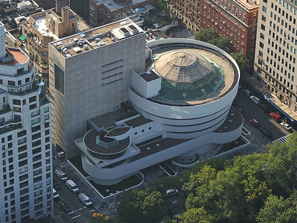
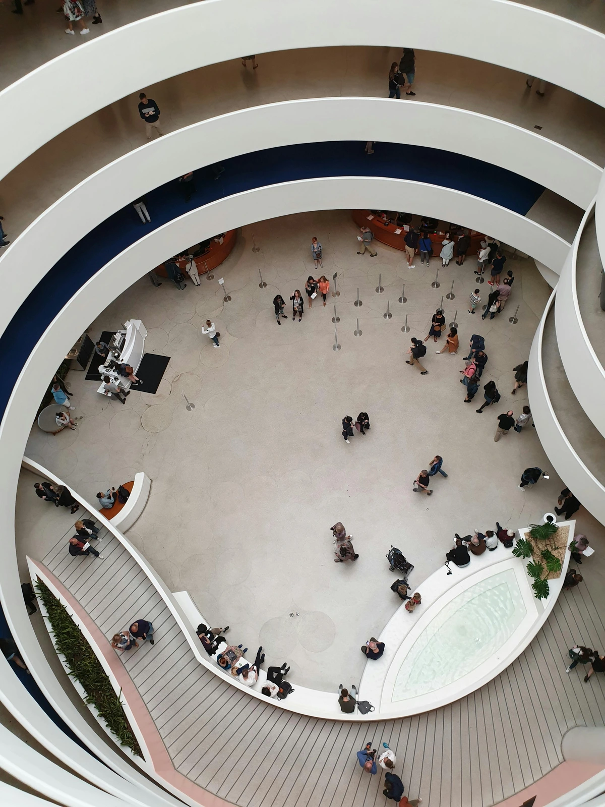
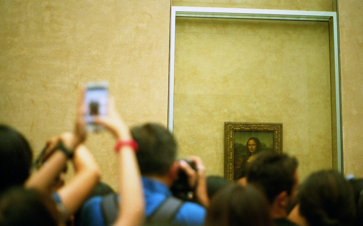
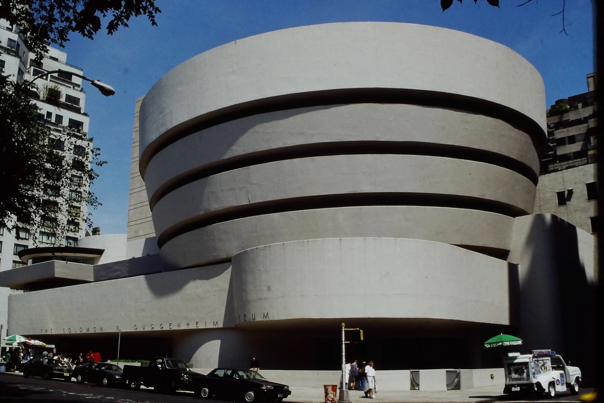
| Circulation Path | Forces perspective, creates a curated journey, and dictates the sequence in which you encounter art. It is the storyboard of the visit. | Guggenheim NYC’s iconic ramp creates a continuous, unfolding narrative. The Louvre\’s enfilade creates a stately, royal progression fit for a king. |
| Color & Texture | Defines mood and focus, influencing emotional response and how the eye moves across a space or artwork. | A deep maroon wall in a portrait gallery can lend a sense of intimacy and drama, pulling you closer to the subject. A room with rough-textured plaster can make a smooth, minimalist sculpture appear even more sleek and precious. |
Natural Light: I have a vivid memory of standing before a yellow monochrome painting years ago, watching it shift from a buttery gold to a fiery, almost electric amber as clouds scudded across a massive skylight. That wasn’t just illumination; it was a full-blown performance, a living, breathing partner to color theory. It revealed dimensions and depths a static, artificial bulb could never hope to find. This dynamic quality is why architects obsess over it; it makes the artwork a participant in the dance of time.
This is why museums like the Menil Collection in Houston are obsessed with creating the perfect 'natural' light. Renzo Piano designed a complex system of ferroconcrete "leaves" for its roof, which act like a giant, permanent set of louvers to filter and diffuse the intense Texan sun. He wasn't just illuminating the art; he was taming the daylight, turning it into a soft, controllable material. This setup allows the lighting of the artwork to subtly shift, never becoming static or sterile, inviting you to keep looking.
Spatial Flow: Ever notice how truly great galleries force you to pause, to inhale? Narrow corridors squeeze your perception, focusing your gaze like a telescope before a grand, breathtaking reveal. Think of the winding paths in a sculpture garden; they’re never just about efficiency. They’re choreographed suspense, a slow burn that makes the final discovery a moment of genuine revelation. This is rooted in a powerful principle called prospect-refuge theory. We’re drawn to the safety of those narrow spaces (the refuge) precisely because they offer a tantalizing glimpse of the expansive, open gallery beyond (the prospect). It’s not just architectural poetry; it’s an ancient survival instinct cleverly repurposed for an afternoon of art appreciation. For a different rhythm, consider the enfilade in grand palaces—a long, uninterrupted sequence of rooms aligned on a single axis. This enforced, stately procession was a power move, a choreography of absolute authority. The TATE Modern’s ramp creates an entirely different experience, a slow, continuous ascent with constantly shifting perspectives, like a film’s long tracking shot.
Materiality: Those cold, sterile white cubes we’ve been conditioned to associate with galleries? Incredibly overrated, in my opinion. A weathered brick wall behind a minimalist acrylic can make the painting feel grounded, even profoundly human. The warm grain of old wood underfoot subconsciously primes your brain for organic abstraction, for textures that feel alive. Materials don’t just hold the art; they add emotional layers, historical whispers, and sensual context the art alone never could. The cool, slightly yielding concrete at the Louisiana Museum feels fundamentally different from the slick, polished stone at the Getty. One is raw and of the earth; the other is ethereal, almost weightless. The choice of material is a form of honesty—or dishonesty. Placing priceless artifacts on rough-hewn wood feels authentic, true to their origins, while gilding a modern gallery in cold, perfect marble can feel like a superficial performance of value. Materiality sets the truth-value of the entire experience.
The aesthetic decisions architects make about materials often have a deeply practical, rather than purely artistic, origin. The ubiquitous use of oak in high-end galleries, for example, isn't just about its warmth. Oak is a dense, fine-grained hardwood that expands and contracts minimally with humidity fluctuations, making it an incredibly stable choice for the construction of floors, wall panels, and plinths that must last for decades in climate-controlled environments.

Case Studies in Feeling: How Great Art Spaces Work
Architectural theory is great on paper, but it only comes alive when you see it—and feel it—in action. Let's move from the theoretical toolkit to the real-world masters. These buildings aren’t just famous for their looks; they’re legends because of the physical and emotional experiences they orchestrate on a subconscious level. They are the ultimate proof that a building can be a co-conspirator in the art experience.
Before we dive into these titans, it’s helpful to understand the two opposing philosophies they often represent. On one hand, you have the Functionalist approach, epitomized by the 'white cube', where the building is a neutral, flexible machine for showing art. On the other hand, you have the Experiential approach, where the building itself is an expressive vessel with a strong personality. The spaces we're about to explore—from the serene landscape of Louisiana to the explosive energy of Bilbao—fall firmly into the second camp. They believe the container isn’t just background; it’s the overture and the finale all at once.
Architectural theory is great on paper, but it only comes alive when you see it—and feel it—in action. These buildings aren’t just famous for their looks; they’re legends because of the physical and emotional experiences they orchestrate.
Let’s geek out over three spaces where architecture flat-out refuses to play second fiddle, where the building isn’t a backdrop but a central character in the story. These aren’t just containers; they’re amplifiers, confidantes, and provocations all in one. Each of these buildings has a distinct personality, a set of rules it imposes, and a story it insists on telling.
But before we dive in, let’s quickly define two opposing philosophies of museum design to give these examples context. On one hand, you have the Functionalist approach, where the building is a neutral, adaptable machine for showing art—a "white cube." The goal is maximum flexibility and neutrality. On the other hand, you have the Experiential approach, where the building itself is an expressive vessel with a strong personality. Its materials, shapes, and flow are integral to the art experience. The spaces we're about to explore fall firmly into the second camp. They believe the container isn't just a background; it's the overture and the finale all at once.
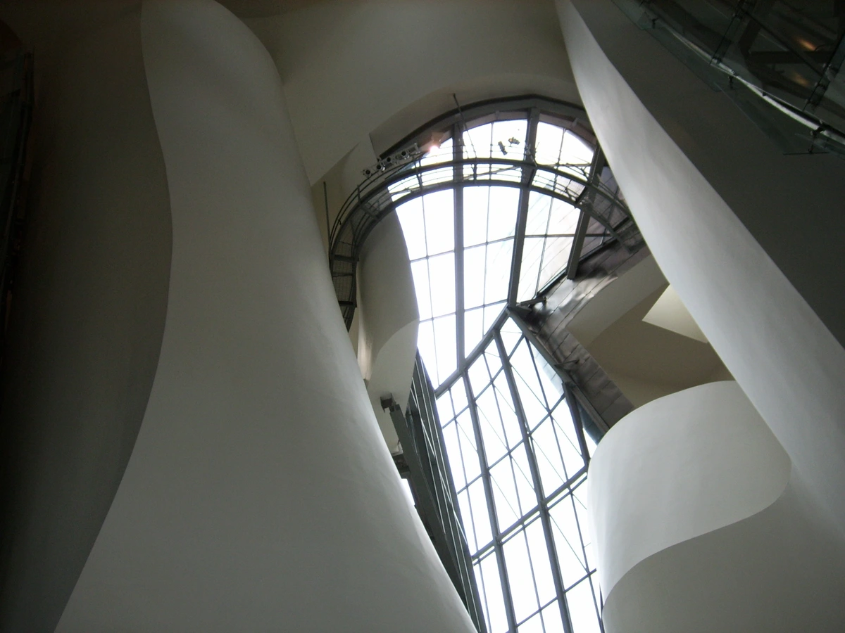
3. Guggenheim Bilbao, Spain
If the Louisiana Museum is a whispered poem, the Guggenheim Bilbao is a primal scream. It’s the architectural equivalent of a firework display—a swirling, shimmering titanium volcano erupting in the middle of a post-industrial Spanish city. Before its opening in 1997, Bilbao was known primarily for its shipping industry. Now, it’s a global pilgrimage site, a phenomenon so powerful it was christened the "Bilbao Effect."
The building is an event before you even step inside. Its curves reflect the river, the sky, and the surrounding city in a constantly shifting kaleidoscope, making the facade itself a dynamic, living canvas. It was designed using advanced 3D aerospace software (CATIA), allowing Gehry to achieve forms that would have been structurally impossible just a few years earlier. Walking into the central atrium is like stepping into the belly of a colossal, metallic whale.
This isn’t a neutral container; it’s what I call a Counter-Container, a building whose overwhelming sculptural presence forces the art within it to either surrender, engage in a violent dialogue, or risk being completely ignored. It uses what could be termed a "psychology of spectacle." The scale and form are intended to overwhelm, inducing a state of awe that primes you for the large-scale works within. It’s architecture that doesn’t just house art, but actively performs alongside it. Large-scale works by Richard Serra find a perfect home here, their massive steel curves echoing the building’s own torqued forms. A small, delicate watercolor, however, would be utterly annihilated. The Bilbao Guggenheim proves that architecture can be more than a frame; it can be the main event.
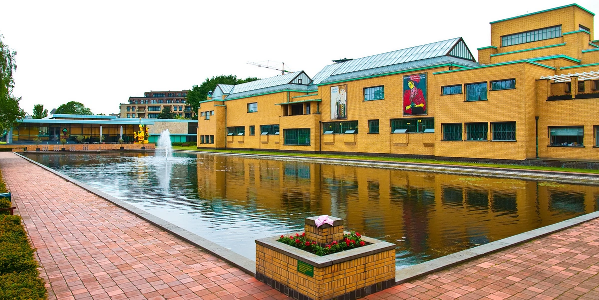
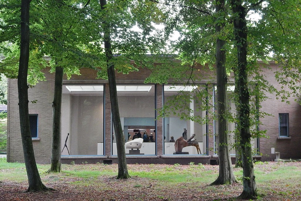
Louisiana Museum of Modern Art, Denmark
This place? A love letter to organic dialogue. Designed to be in harmony with nature, the Louisiana sits on the coast of Humlebæk, a short drive from Copenhagen. Its low-slung, horizontal profile of curved concrete walls and glass seems to emerge from the landscape itself. Curved walls, soft as dunes, wrap around outdoor sculpture gardens like protective arms, framing glimpses of the Øresund sound beyond. The building isn’t a box—it’s a landscape in its own right, unfolding and revealing itself piece by piece as you wander through it.
The museum's genius lies in its mastery of prospect-refuge theory. It constantly creates protective, intimate spaces—the 'refuge'—like small, wood-paneled rooms, only to offer framed views of expansive, open landscapes or seascapes—the 'prospect.' This isn't just pleasant; it's a deeply satisfying primal rhythm of compression and release. It turns a simple walk through the galleries into an emotional journey. The building itself feels alive, breathing, shifting its character with the Danish weather, making every visit unique. On a clear day, it feels optimistic and open; on a misty day, it becomes a moody, contemplative cocoon.
It all started in 1958 with architect Jørgen Bo, working with philanthropist Knud W. Jensen, who believed art shouldn’t be locked away but integrated with life itself. The museum was deliberately built into the landscape, not plopped on top of it. Those curved walls you see today weren’t just aesthetic whims; they were born from respecting the natural contours of the coastline.
The building’s tactile materiality is a masterclass in understated Scandinavian craft. Warm, local woods, smooth cast concrete that still bears the imprint of its formwork, and expanses of glass create a palette that feels both raw and intensely considered. This is the opposite of a sterile white cube; it’s a building that invites you to touch it. Even the outdoor sculpture park, featuring icons like Henry Moore and Alexander Calder, doesn’t feel like a curated outdoor gallery so much as a collection of ancient, weathered forms that simply belong to the earth. The building teaches you to see art not as something separate, but as a continuation of the world outside.
In many ways, the Louisiana is also a precursor to biophilic design—the idea that humans have an innate need to connect with nature. By refusing to seal the art off from the landscape, it acknowledges that our aesthetic experiences are deeply enriched by glimpses of sky, water, and living things.
2. TATE Modern, London & Adaptive Reuse
The concept of adaptive reuse, where old buildings are repurposed for new functions, isn’t just about saving money on demolition. It’s a profound architectural conversation between past and present. TATE Modern is the undisputed masterclass in this.
Imagine climbing inside the cavernous belly of a defunct power station and turning it into a vast cathedral for modern art. The colossal turbine hall, with its sheer scale and vertigo-inducing ceiling of raw steel and skylights, doesn’t just house installations; it dwarfs them, making even the most ambitious piece feel simultaneously monumental and fragile. The jarring switch from this industrial grit below to the sanitized, intimate white cubes upstairs? It’s a deliberate bait-and-switch. You don’t just exit the Turbine Hall—you exhale, decompressing from its overwhelming presence. The building’s narrative—its past life, its epic scale—is inseparable from the art it now houses. They feed each other, creating a richer, more layered experience than a purpose-built structure ever could.
Crucially, the architecture doesn't fight the building's history; it lionizes it. The soot-stained brick walls aren't cleaned but preserved as a record of the structure's former life. Walking through the Turbine Hall is an archaeological experience as much as an aesthetic one. You feel the weight of its past. This is a powerful lesson in adaptive reuse. Rather than demolishing a building with a strong identity, the architects found a way for that identity to become the engine of a new experience, creating a dialogue between the industrial age and the digital, artistic present.
This concept isn’t limited to London. Consider how a Parisian train station, the Gare d'Orsay, was gutted and reborn as the breathtaking Musée d'Orsay. The grand, cavernous central nave, once filled with the smell of steam and coal, now houses monumental 19th-century sculptures, the arched glass ceiling transforming daylight into a golden, romantic haze. The building’s DNA as a transportation hub is still palpable, giving the art within it a sense of movement and journey. It proves that sometimes the most powerful architecture is the kind that respects the stories already held within the walls. This is the palimpsest effect: the old structure is not erased but remains as a ghostly, influential presence, creating a rich, layered history that a new building simply could not replicate.
This masterpiece of adaptive reuse is the brainchild of Swiss architects Herzog & de Meuron. When they won the competition to transform Giles Gilbert Scott’s Bankside Power Station (closed in 1981) into TATE Modern in 1994, their decision was brave and brilliant: don’t erase the building’s industrial soul—celebrate it. The Turbine Hall is more than a space; it’s a cultural phenomenon, made famous by monumental commissions known as the Unilever Series, where artists like Olafur Eliasson filled the void with artificial suns, and Ai Weiwei covered the floor with millions of porcelain sunflower seeds.
The success of this approach is a direct result of Herzog & de Meuron's core philosophy. They approach buildings not as sculptures to be plopped on a site, but as complex social and historical interventions. For them, the most interesting architecture happens at the intersection of a building, its history, and the public life that flows through it. Opening in 2000, TATE Modern didn't just become a museum; it became a symbol of a revitalized London, a place where a gritty, industrial past was reimagined as a platform for contemporary culture. The building’s narrative—its past life, its epic scale—is inseparable from the art it now houses. They aren’t just neighbors; they are in constant, compelling dialogue.

1. Dia Beacon & The Art of Subtraction
What if, instead of adding more, an architect’s greatest skill was knowing how much to take away? This is the quiet philosophy behind Dia Beacon. This former Nabisco packaging plant doesn't hide its past; it meticulously pares it down to its most essential elements. Those impossibly high ceilings and banks of north-facing sawtoothed windows are a masterclass in zen-like, neutral-toned illumination, washing massive Minimalist works in an even, almost reverent light. You feel the ghosts of industry not as a cluttered memory, but as a purified, atmospheric presence. It's an architecture of profound humility, where the building's only goal is to serve as a perfect vessel for light and space.
This approach is a perfect illustration of respecting an artwork's phenomenological demands. Phenomenology, in simple terms, is the study of how we experience things as they appear to our consciousness, before we analyze them intellectually. For Minimalist artists like Donald Judd or Agnes Martin, the experience—the way light kisses the surface of a steel box over the course of an hour, the way a room's volume makes a large canvas feel like a pixelated wall—is the content. Dia Beacon’s architecture is sensitive to this. The even, consistent light from the sawtooth roof is an active ingredient in the art. It ensures that a Robert Ryman white-on-white painting reveals its subtle, chalky texture, or that a Dan Flavin fluorescent tube installation glows without the interference of shifting daylight. You aren't just looking at the art; you are registering its presence in space, its relationship with the light and with your own body. It teaches you that seeing is not a single, momentary action, but a durational, meditative practice.
Dia Art Foundation, founded in 1974, had always championed artists whose work demanded radical space—people like Donald Judd, Dan Flavin, and Agnes Martin. When they found the 300,000-square-foot factory in Beacon, designed by Nabisco in 1929, they didn’t want a typical renovation. Working with OpenOffice (now SO–IL), their mission was simple: honor the building’s bones.

The collaboration with artist Robert Irwin for the site adaptation was crucial. Irwin, himself a seminal figure in the Light and Space movement, treated the renovation as an artistic project. He understood that art isn't just placed in a room—it happens in a room. The sawtoothed roof was preserved, flooding the galleries with controlled northern light—perfect for the subtle tonal shifts of a canvas by Robert Ryman or the glowing tubes of a Flavin installation. The polished concrete floors, the exposed steel beams, and the sheer, unbroken walls became essential partners to the art. Dia Beacon proves that sometimes, the most profound reverence comes not from building something new, but from listening carefully to the stories already held within the walls. The art doesn’t just live in the building; it completes a conversation the factory started a century ago.
Creating Your Own Art Sanctuary: Home Edition
Not all of us have sprawling museum galleries in our backyards, and frankly, the thought of dusting all that space is exhausting. But borrowing these core architectural principles? It’s completely transformative, turning a mere room into a space that respects and elevates the objects within it. It’s about retraining your eye to see the ‘room-ness’ of a room—its light, its proportions, its texture—as a collaborator with your favorite pieces. You don’t need Frank Gehry blueprints or a degree in phenomenology—just a little bit of thoughtful, deliberate intentionality, and maybe a fresh coat of paint.
This process allows the architecture of your home to become an extension of your own creative expression. It’s a subtle form of curation, and the best part is that it doesn't have to be—and probably shouldn't be—perfect. An overly styled, magazine-perfect home can feel like a museum in the worst way: sterile, distant, and unwelcoming. The goal is to embrace a kind of "perfect imperfection," creating a dialogue between the art, the architecture, and the lived reality of your home. A home should look like it is loved and lived in, not just looked at.
The magic really happens when you begin to think like a lighting director, a material scientist, and a choreographer all at once. It's about becoming hyper-aware of the sensory information your home is broadcasting and learning to curate it, just as a museum director would.
You might be wondering, "What's the core mistake most of us make at home?" The answer is simple: we design for function first and forget about focus. We place a chair for watching TV, not for looking at a painting. We choose a lamp for reading, not for casting a beautiful shadow. The goal here is to borrow a little of that museum magic—that radical focus—and bring it into the lived-in reality of your home. Think of it as creating a series of small, private altars to the things you love.
- Control the Light (It's Your Best Tool): Forget the central "big light." The real magic happens at the edges. Position your most vibrant pieces opposite a window, but not directly in the sun's path. That indirect, reflected light from the sky will give you depth without the harsh glare. Invest in one or two simple, adjustable picture lights. A warm, 2700K bulb will make reds and oranges sing, while a cooler, 4000K light will make blues and whites feel crisp and electric. If an artwork feels flat on your wall, the problem usually isn't the art—it's the light. It's like listening to a brilliant guitar solo on laptop speakers; you're just not getting the full range.
Embrace Texture Play (Create a Conversation): The most interesting rooms have a dialogue, not a monologue, between the walls and what hangs on them. This is where texture comes in. Instead of defaulting to a predictable flat white wall, try a rough limewash plaster for an organic, cave-like feel, or a reclaimed wood panel for a touch of rustic history and warmth. A radiantly slick, high-gloss painting hung against a matte, deeply textured wall creates a kind of visual tension that’s electric. It makes both the art and the architecture feel more intentional, more chosen. Think like a color therapist: a deep, moody charcoal wall isn’t just a backdrop; it’s a void that makes any vibrant abstract print look like it's floating in deep space.
Design a Path of Purpose (Choreograph the Reveal): Architecture is, at its core, the choreography of movement. You don’t need a spiral ramp to do this at home. Start at your front door. What’s the first thing you see? What do you want to see? If the answer is a pile of shoes and a coat rack, it’s time for a rethink. Even in a tiny apartment, you can create a threshold moment—a small entryway table, a tall plant, anything that forces a slight turn and breaks the immediate sightline. This creates a small moment of compression before the room fully reveals itself. It’s a simple, almost subconscious trick that transforms a boxy room into a sequence of events. For a bigger impact, frame a favorite piece at the end of a hallway, making it a destination rather than an afterthought. You’re not just decorating; you’re directing.
- Master the Acoustics of Space (Sound Influences Sight): Ever notice how a quiet room can make a painting feel louder? Your ears are the warm-up act for your eyes. A room full of hard, reflective surfaces (bare floors, glass tables, empty walls) will have a bright, sharp acoustic. Every footstep echoes. While this can feel energetic, it can also make it hard to concentrate. This is where soft materials come in like acoustic heroes. A single, dense rug or a set of heavy linen curtains can absorb that auditory crispness, creating a muffled, contemplative hush that encourages lingering. It’s not about creating absolute silence, but about managing the quality of the silence. I can't stand a stiflingly quiet room, so I use a small tabletop fountain to add a gentle, non-intrusive layer of ambient sound—a kind of "acoustic perfume." It doesn’t just mask noise; it defines the quality of the space, turning it from a box into an environment.
Heighten Your Eye Line: The International Gallery Standard is to hang the center of a piece at 57 inches (145 cm) from the floor. This is a great starting point, a baseline of order that creates a comfortable viewing experience for most people. But it's also just a suggestion. Use it to create a cohesive line for a salon-style hang of multiple pieces, letting them share a common horizon. Then, strategically break the rule. Hang one powerful, smaller piece on its own at 65 inches. Your eye will be forced to travel up to meet it, changing your posture and imbuing that single work with monumental importance. Sometimes, breaking a rule by just a few inches is all it takes to make an object truly sing.
- The Ground Beneath Your Feet: Don’t just look at your walls—look down. Your flooring is the first surface your eye processes upon entering a room, and it sets a powerful subconscious baseline. Polished concrete is an effortless canvas for modern art, establishing a cool, neutral foundation for vibrant color. A richly textured vintage rug can create a sense of layered history and warmth, cradling your furniture and art like a precious artifact. It’s a subtle cue, but one your whole body responds to. I've even used large, flat stones as stable bases for sculptures, visually "grounding" them to the floor in a way that a plinth somehow can't, blending the line between object and architecture.
It’s worth mentioning that I'm notoriously terrible at following most interior design rules. They feel prescriptive and joyless. But these principles? They aren’t rules. They’re observations. My own studio's creaky old floorboards are a perfect example—they amplify the silence when I stop to really look at a painting in progress. The imperfection, the life in the materials, becomes part of the creative process itself. You don’t need to renovate your entire life. Sometimes, the most impactful change is hanging one piece of art in a different light, or simply repositioning your favorite armchair to create a dedicated looking spot. I used to have a print that I never really connected with. It sat on a shelf for a year. On a whim, I hung it in a narrow hallway, opposite a small window that catches the late afternoon sun. The light hits it for about 15 minutes a day, and in that brief moment, the colors come alive in a way I had never seen. Now, it’s one of my favorite moments in the house. It wasn’t the art that was wrong; it was the architecture. It’s imperfect. It’s alive. And that’s precisely the point.
FAQ: Architecture & Art (Your Unspoken Questions)
Great questions deserve thoughtful, personal answers. Here are the things you might not have thought to ask, but were probably wondering all along.

Q: Why do purpose-built art spaces feel fundamentally different from our living rooms?
A: It’s because they’re meticulously engineered for what I call a suspension of normality. Everyday rooms are about utility—eating, sleeping, watching TV. Art spaces are about stripping all that away. They eliminate visual noise, banish clutter, and manipulate acoustics to create a vacuum. Often, high ceilings lift your gaze, subtly shifting your posture and mindset towards awe, while smooth, hard walls create reflective sound properties that turn ambient chatter into a reverent hush. They’re engineered not just for viewing, but for total immersion. It’s the difference between a conversation in a busy café and a whispered secret in a cathedral. This deliberate stripping away of worldly distraction is a form of what I like to call architectural editing. It’s a classic example of 'less is more.' By eliminating the visual chatter of advertising, the urgency of timekeeping, and the sonic clutter of the street, the building’s designers act as editors, cutting away the extraneous "noise" to leave only the essential "signal"—the artwork and the viewer’s relationship to it. It’s a carefully controlled environment designed to have as few interruptions as possible, liberating your mind to fully engage with the art. This is the architectural equivalent of putting your phone on airplane mode so you can finally read a book.
The space is also engineered to induce a state of mild sensory deprivation of the mundane. There are no windows showing traffic, no thermostats demanding your attention. It's a carefully controlled environment designed to have as few interruptions as possible, liberating your mind to fully engage with the art.
Q: Can’t plain white walls just work fine for my art at home?
A: If your goal is absolute neutrality, like a laboratory for viewing, then sure, a clean white wall can serve as a blank slate. But here’s the secret: pure white doesn’t just recede—it absorbs and scatters light, often muting the most vibrant colors in your work. It tells a painting to 'be quiet.' Next time you're in a high-end gallery, look closely at the walls. They're rarely a true, sterile white. They're usually a very subtle off-white, cream, or light gray. This tiny shift neutralizes glare and actually makes colors appear more saturated and true to life. Using deliberate architectural contrast—a deep charcoal alcove for a vibrant abstract, or a warmly textured brick wall behind a portrait—makes the art shout, creating a dynamic interplay that’s far more memorable.
Furthermore, a white wall isn't a neutral choice; it's a stylistic one that whispers 'modernism.' It has a personality. Sometimes that personality is a perfect match for the art. But for a baroque cherub, a vibrant folk art tapestry, or a raw, gestural oil painting, a white wall can feel like a straitjacket, suppressing the life force, the very soul within the work.
How do I find the right balance between art and architecture in my own home?
Start small, with just one room. Pick a single piece of art, ideally your boldest or most personally meaningful one. Then, have a conversation with it. Stand there and ask: 'What do you need to truly sing?' Does it need more light, maybe a spotlight to create drama and shadow? Would warmer textures around it—a wooden frame, a linen curtain—help ground it? Or does it need more breathing room, a less cluttered backdrop to claim its own space? Let the art guide the architectural tweak, not the other way around. I started with a single nook in my studio, treating it like a miniature chapel for one piece. It completely changed how I see the rest of the house. Your home isn’t a public gallery; let the partnership feel personal, intuitive, and organic.
It's also about editing. People often ask 'how high should I hang art?'
or 'how much space between pictures in a group?'

These are technical questions, but the real issue is often one of overcrowding. A wall with too many pieces can feel like a crowded closet. Before adding another piece, try taking one away. See how the remaining pieces seem to breathe a sigh of relief and expand into their newfound space.
Does the architecture truly influence how we interpret the art itself?
Absolutely, more than we ever give it credit for. Think about it: placing a small, delicate portrait at the end of a massive, cold marble hall doesn’t just make it feel small—it amplifies its intimacy, its profound vulnerability against a backdrop of institutional authority. Conversely, squeezing a massive, soaring installation into a low-ceilinged, raw brick room can transform it from an object into a heroic act of creative rebellion. It's the architectural equivalent of changing a word's meaning by placing it in a different sentence.
A famous historical example is the relocation of Michelangelo’s David. Originally commissioned for the cathedral roofline, it was instead placed in the political heart of Florence, the Piazza della Signoria. The architecture of the public square reframed the biblical hero as a powerful political symbol of republican freedom, a meaning it never would have had atop a church. The context doesn't just frame the art; it fundamentally alters the grammar of how we understand it. Architecture doesn’t just display; it’s an active co-author, reframing meaning and emotion through its masterful manipulation of scale, material, and light.
Q: What’s the biggest misconception about modern gallery design?
A: The pervasive, almost dogmatic belief that stark minimalism automatically equals 'good design.' Those sterile, over-sanitized white cubes don’t elevate most art; they suffocate it, stripping away any context or emotional resonance. Rich materials, thoughtful and sometimes dramatic lighting, and playful spatial curves add essential tension, warmth, and humanity. Great art thrives in environments that have a personality of their own—in places with stories to tell, not in vacuum-sealed, personality-free boxes. The 'white cube' emerged from a specific historical moment, but it's not the universal default—it's just one tool in a much bigger kit. It grew out of a 20th-century desire for neutrality, a way to divorce art from its aristocratic, decorative past and present it as pure idea. But the problem with a 'neutral' space is that true neutrality is a myth. Every space has a personality. The white cube’s personality is cool, distant, and serious. It works beautifully for some conceptual art, but it can be a death sentence for a baroque painting or a warm, expressive abstract piece. The question isn’t 'is this a white cube?' but 'what kind of conversation does this space want to have with my art?'
A Global Tour of Architecture as Art
To really drive this home, let’s take a quick world tour—without leaving our seats—and see how different cultures and climates birth radically different philosophies of art display. It’s like a crash course in architectural linguistics. Visiting these places taught me that a museum is never just a building; it’s a cultural Rorschach test. The way a society chooses to frame its art reveals its deepest values about history, light, narrative, and public life. From the sun-drenched coast of Japan to the heart of Cape Town, these institutions show us that there is no single "correct" way to house art—there are only more interesting conversations to be had.
Chichu Art Museum, Naoshima: Architect Tadao Ando built this museum almost entirely underground, like a secret buried to preserve the island's natural landscape. Visiting it is a meditative pilgrimage. You descend into the earth, and the museum's primary materials become light, shadow, and raw concrete. It houses only a handful of works (by Claude Monet, Walter De Maria, James Turrell), creating an intense, almost monastic focus. The architecture isn’t just a house for art; it becomes a frame for experiencing nature itself.
Zeitz MOCAA, Cape Town: Housed in a repurposed grain silo, this museum is a jaw-dropping masterpiece of brutalist transformation. The central atrium was carved out of forty-two massive concrete tubes, creating a cathedral-like space that feels both industrial and sacred. It demonstrates how to honor a building's raw, functional history while creating a breathtaking new context for contemporary African art.
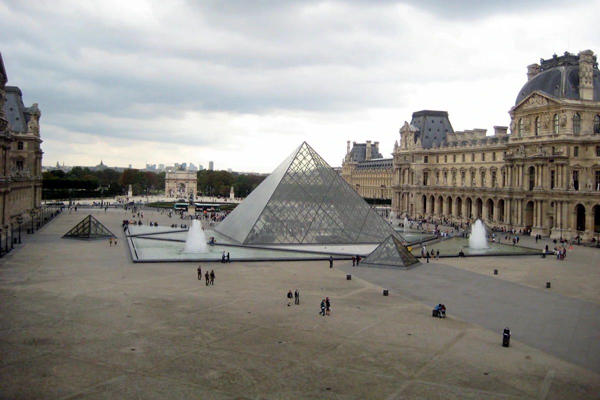
The Louvre Pyramid, Paris: I.M. Pei’s glass pyramid is the ultimate act of architectural dialogue. Placed in the courtyard of a 12th-century palace, it is a nexus between eras. Its transparency is its genius; it sits in front of the heavy, opaque stone facade without competing. It reflects the sky and palace, acting as a kind of architectural chameleon. It dares you to question the boundary between old and new, proving a building can be a bridge, not just a statement.
The Getty Center, Los Angeles: Perched on a hill, Richard Meier’s Getty is a campus dedicated to light and procession. The journey is part of the experience: park underground, take a tram up the hillside, and arrive at a travertine plaza. The complex is a series of pavilions with courtyards and gardens for rest and reflection. It embraces the Southern California sun, its surfaces designed to diffuse, reflect, and celebrate natural light, making the architecture feel weightless and ethereal. It answers the question: what if a museum weren’t a single building, but an entire landscape for contemplation?
The Unseen Stage: Architecture's Final Word
So the next time you pass by a museum, don't just think about the treasures inside. Think about the treasure that is the vessel itself. It is the silent conductor of an invisible orchestra, playing a symphony of light, scale, and material that shapes every single work within. And in doing so, it shapes you, too. It reminds you that to truly see something, you first have to build a space for it. It reminds you that to truly see something, you first have to build a space for it.

This entire conversation is essentially a plea for a deeper kind of awareness, a more integrated way of seeing. It’s about realizing that our desire to create a sacred space for art—whether in a world-renowned museum or on a single wall of a spare room—is a fundamental human impulse. It's a recognition that the environment is never truly neutral, and that by thoughtfully curating it, we can deepen our connection to the things we value most. We have been building shelters for our most precious objects and ideas since we first drew on cave walls. The container has always been part of the content.

Whether you’re wandering Louisiana Museum’s windswept lawns, marveling at Gehry’s titanium curves, or meticulously hanging a cherished print in your hallway, remember this one thing: the space isn’t just background noise. It’s an active, dynamic part of the story. It’s a collaborator in the creation of meaning. It’s part of your story, too.
So the next time you pass by a museum, don't just think about the treasures inside. Think about the treasure that is the vessel itself. It is the silent conductor of an invisible orchestra, playing a symphony of light, scale, and material that shapes every single work within. And in doing so, it shapes you, too.