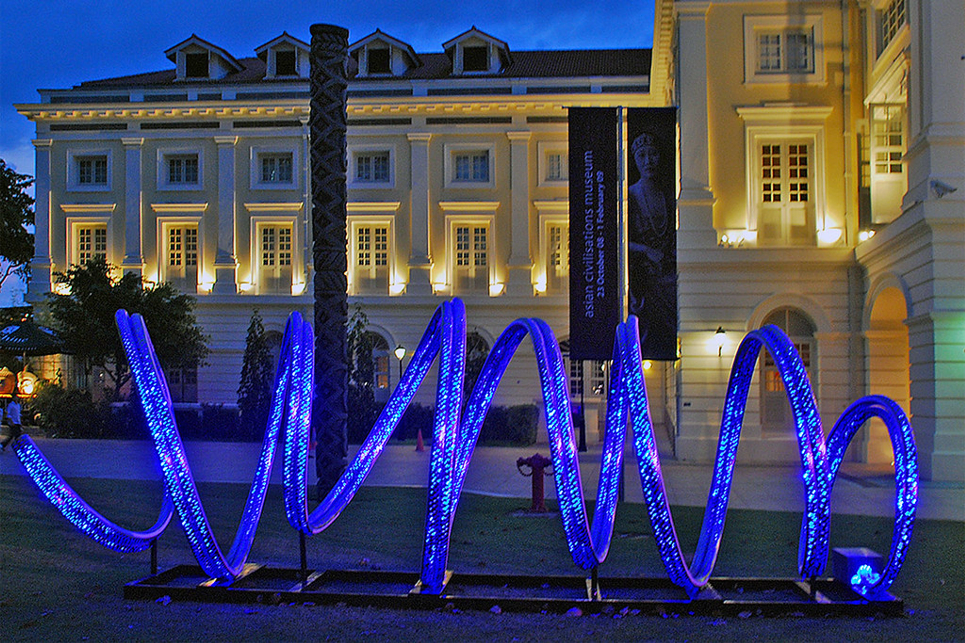
Understanding Light Sources in Art: A Color Artist's Journey
Your ultimate guide to mastering light in art—natural, artificial, and beyond. Discover how light shapes perception with practical insights and personal reflections.

Understanding Light Sources in Art: A Color Artist's Journey
There's that moment every artist knows—when you step back from your work and realize the light in your studio has completely betrayed you. I remember standing in my studio at 3 AM, staring at a painting that looked magical under my tungsten desk lamp. But when dawn hit? Total disaster. The colors shifted, the shadows flattened, and the whole piece felt... dead. That moment crystallized something for me: light isn't just illumination in art—it's a character, a director, a silent collaborator. Mastering light sources isn't technical drysuit material; it's about learning to speak the language that makes your art breathe. Let's unpack this together, shall we?
The Historical Dance: Light Through Artistic Eras
Before we dive into modern techniques, let's appreciate how our relationship with light has evolved through art history. The ancient Egyptians painted with flat, symbolic light that served more as decoration than reality. Fast forward to the Renaissance, and suddenly we have Leonardo da Vinci studying how light falls on faces, creating that subtle sfumato effect that makes Mona Lisa's smile so elusive. Then came Caravaggio with his dramatic tenebrism, where light slices through darkness like a spotlight on the human condition.
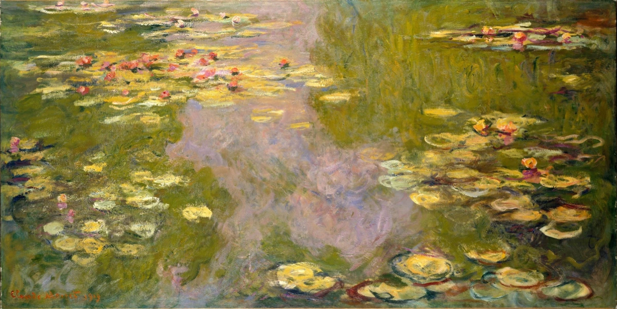
The Impressionists? They were obsessed with how light changes color throughout the day. Monet painted the same cathedral over and over, not because he was bored, but because he was mesmerized by how light transformed stone from cool gray to warm gold in minutes. Contemporary artists like James Turrell have taken this obsession to new dimensions, creating installations where light itself becomes the sculpture. Understanding this historical context helps us see that light isn't just a technical consideration—it's part of our artistic DNA, woven into how we've always tried to capture the essence of existence.
The Alchemy of Light & Art
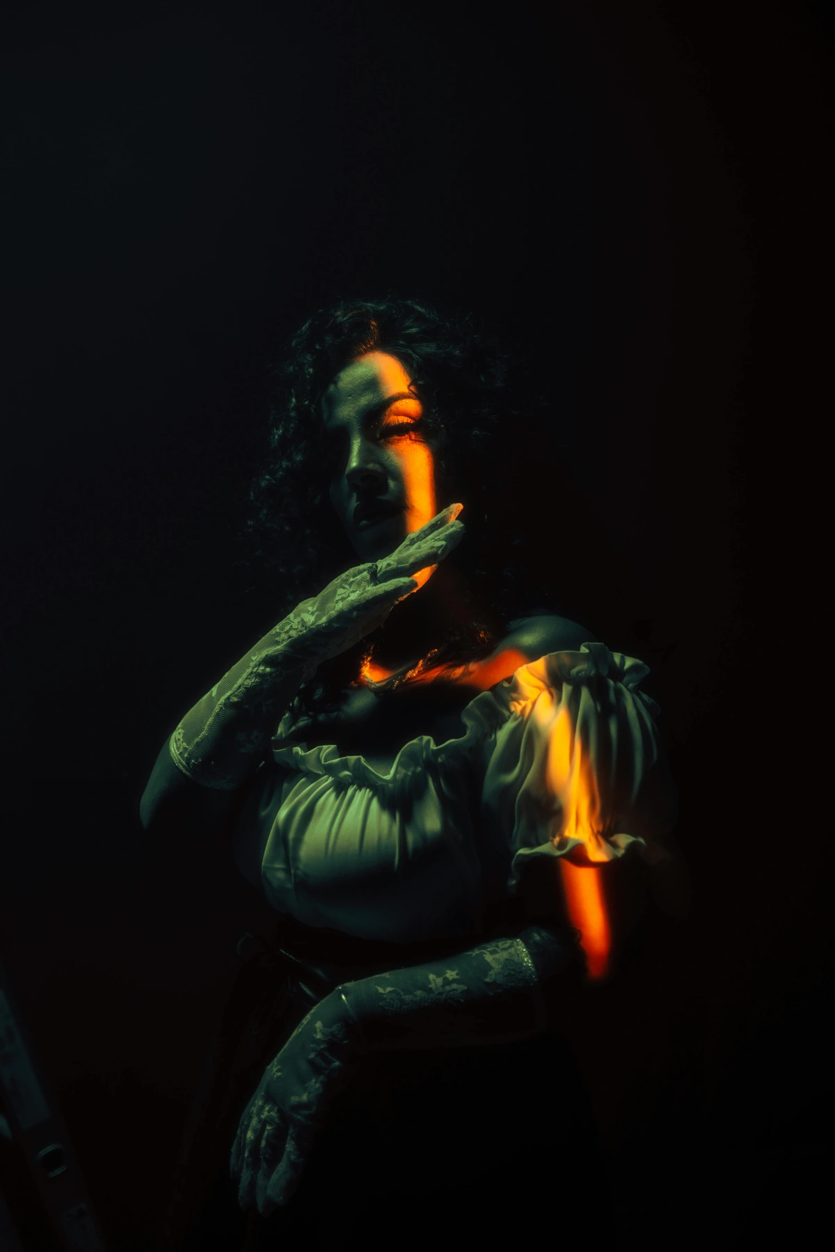
Art without light is silent. Seriously. Imagine Van Gogh's "Starry Night" without those swirling, moonlit yellows or Rembrandt's portraits without those dramatic, soul-streaking shadows. Light is where the magic happens—it creates depth, mood, and emotional resonance. As artists, we're not just placing paint on a surface; we're curating how viewers experience that surface through light's lens.
The Physics Behind the Magic
Let's get slightly nerdy for a moment. Light behaves in ways that directly impact our artistic choices:
- Reflection: When light bounces off a surface, it determines how shiny or matte your artwork appears
- Absorption: How much light a surface absorbs affects whether your colors appear deep or washed out
- Refraction: When light bends through transparent materials, it creates those beautiful rainbow effects in glass or water
- Diffraction: Light bending around edges creates those soft, dreamy halo effects around objects
Understanding these basic principles helps you predict how materials will behave under different lighting conditions. It's like having a cheat sheet for how light will play with your chosen medium.
Here's what makes light so powerful:
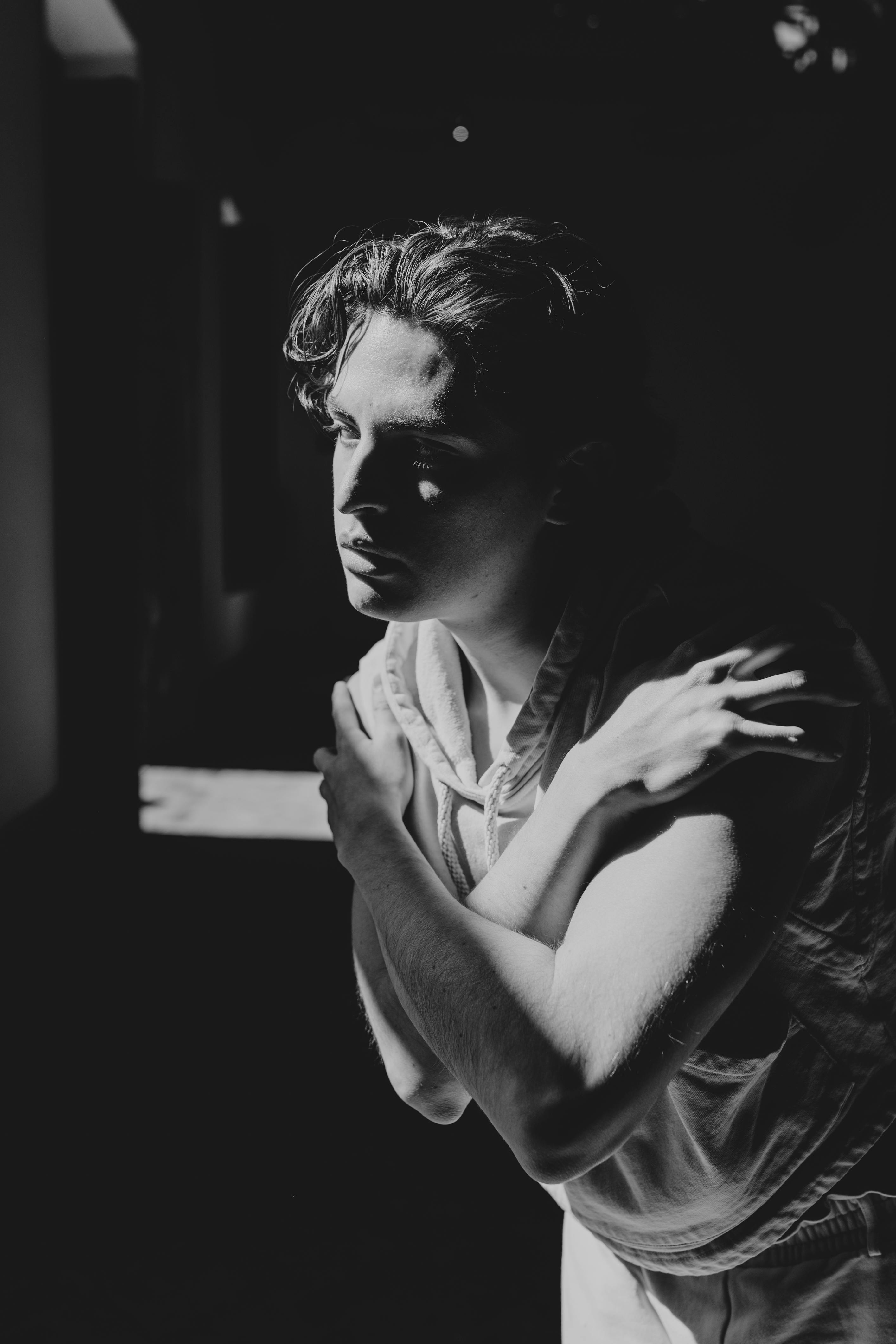
- Emotional Tone: Warm, golden light (think sunset) evokes nostalgia. Cool, clinical light (think hospital fluorescents) feels distant. Ever notice how coffee shops use yellow-tinted bulbs? That's emotional engineering with light. The color temperature of light directly affects our psychological response—warm light triggers relaxation and comfort responses, while cool light engages our analytical thinking.
- Dimensional Illusion: Light reveals texture and form. A glossy acrylic surface reflects light differently than a matte watercolor wash. The way light hits a surface creates the illusion of volume—flat lighting makes everything look flat, duh. This is why artists often use raking light (light coming from a low angle) to reveal brushstrokes and surface textures that might otherwise be invisible.
- Focal Points: We instinctively follow where light leads. Strategic highlights draw the eye to focal points, like a glowing star in an abstract composition. Our brains are wired to notice brightness differences, making lighting one of the most effective tools for guiding viewer attention.
Natural vs. Artificial: Light Source Showdown
Let’s compare the main contenders. Which one suits your practice?
Light Source  | Characteristics | Best For... | Caveats |
|---|---|---|---|
| Natural Light | Directional, color shifts (blue at noon, golden at sunset) | Understanding true colors, plein air work, organic moods | Unpredictable, time-sensitive, can bleach colors |
| LED Lights | Consistent, adjustable color temp (2700K-6500K), energy-efficient | Studios, color accuracy, extended work sessions | Some "flicker" risks (check specs), can feel "sterile" |
| Fluorescent | Cool-toned, even coverage | Cost-effective general lighting | Poor color rendering, can cause eye strain |
| Tungsten/Halogen | Warm, rich depth, minimal flicker | Creating intimate, cozy atmospheres | Heat output, high energy use |
| Candle/Incandescent | Extremely warm, dynamic shadows | Romantic, vintage, textured effects | Fire risk, inconsistent, dim |
My studio has a south-facing window (yes, I stalked apartments for lighting) supplemented with 5500K LEDs for daylight replication. Golden hour? Pure magic. But I'll admit—sometimes I miss the drama of a single 100W tungsten bulb casting cavernous shadows. There's beauty in imperfection, people.
Deep Dives into Light Behaviors
The Mystery of Color Temperature
Ever painted your perfect only to see it turn sickly green under fluorescent lights? Welcome to the Kelvin scale—light's version of chromatic DNA. It measures hue dominance:
- < 3000K: Warm (amber/yellow) – feels intimate, nostalgic, cozy
- 3000K–4000K: Warm White – residential comfort zones
- 4000K–5000K: Cool White – commercial, office environments
- 5000K–6500K: Daylight – technical accuracy, outdoor reference
- > 6500K: Cool Blue – clinical, analytical environments
Color Temperature in Different Media
Medium | Optimal Color Temperature | Reasoning | Common Issues |
|---|---|---|---|
| Oil Painting | 5000K-5500K | Matches gallery viewing conditions | Warm light can make blues appear muddy |
| Watercolor | 4000K-5000K | Reveals transparent layers accurately | Cool light can wash out delicate hues |
| Digital Art | 5000K-6500K | Matches screen calibration | Mixed lighting causes screen mismatch |
| Sculpture | 4000K-5500K | Reveals texture and form | Extreme temps flatten dimensional effects |
| Mixed Media | 4500K-5500K | Balanced for diverse materials | Need to test under final display conditions |
Pro tip: Shoot in Daylight White (5000K) LED mode if you photograph your art. It's the closest match to natural viewing conditions. For galleries, ask about their lighting specifications—many now use 4000K spotlights with high CRI to make artwork "pop" while maintaining color accuracy.
chiaroscuro: The Drama Club
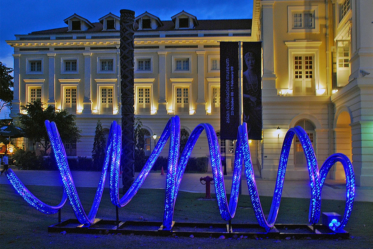
High-contrast lighting. Think Caravaggio's tenebrism where light slices through darkness like a spotlight. Master this, and your abstracts gain cinematic weight. I once painted a series using a single 25W bulb at 45° angles. The deep shadows made the neon pops feel electric. Low-risk, high-reward technique.
Diffusion vs. Hard Light
- Hard Light: Direct, sharp shadows (sunlight, spotlights). Creates drama, texture, mystery.
- Diffused Light: Soft, gentle shadows (cloudy days, umbrellas, tracing paper). Flattens texture, evokes calm.
I keep a roll of tracing paper in my studio bag to soften LED spotlights. It’s like asking the light to please play nice.
Practical Toolkit: Lighting Your Practice
1. Lighting Your Workspace: The Artist's Command Center
Your studio lighting should be like a good pair of glasses—helpful, invisible, and essential. Here's how to set up different types of workspaces:
Painter's Studio Lighting
- 3-point lighting system: Key light (main illumination), fill light (softens shadows), back light (highlights edges)
- Overhead diffused lighting: 5000K LED panels for general illumination
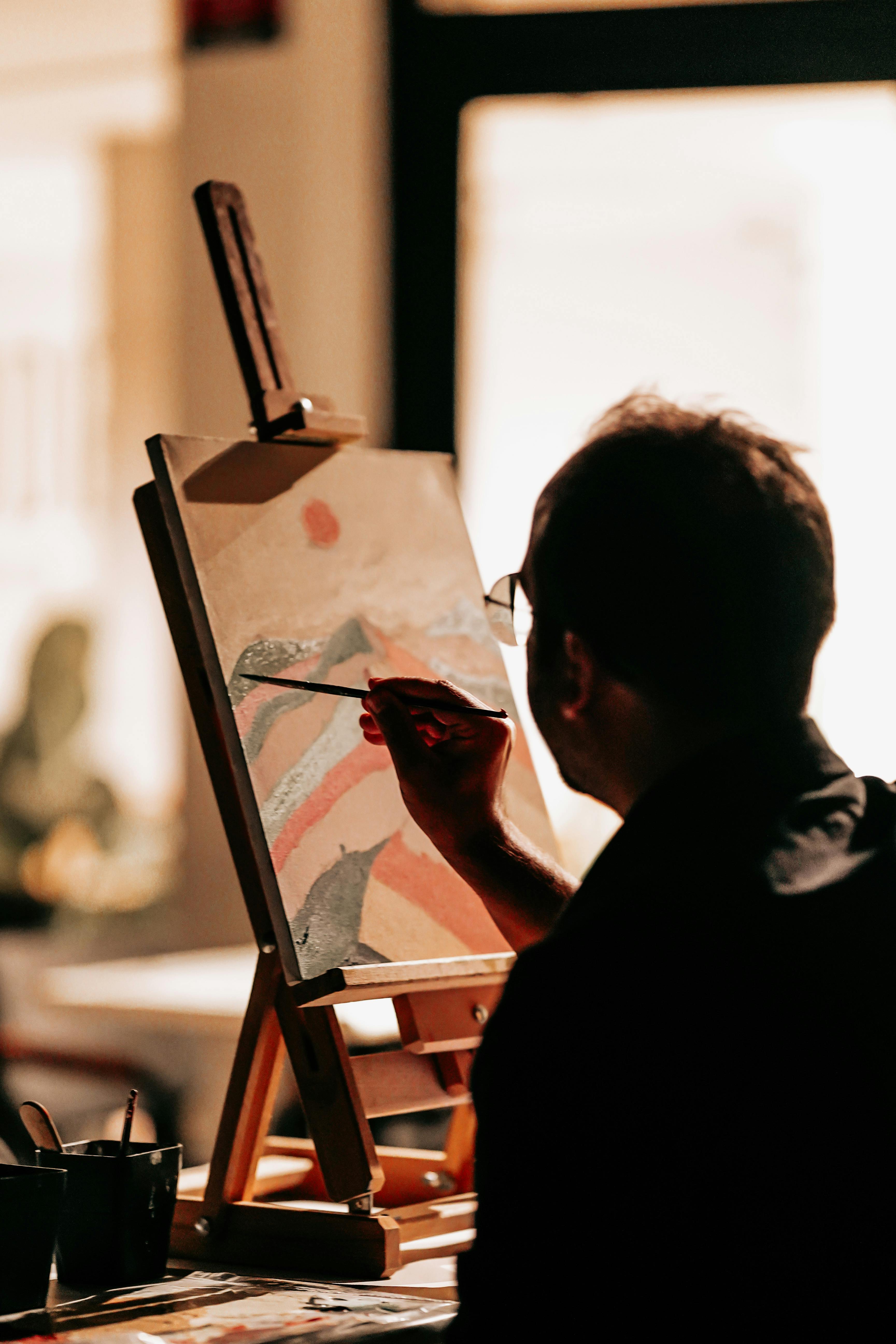
- Easel lighting: Adjustable spotlights for canvas-specific illumination
- Color temperature consistency: All lights should be within 100K of each other
- Positioning: Lights should not reflect in your wet paint—typically positioned at 45° angles
Digital Artist's Workspace
- Monitor calibration: Hardware calibration (SpyderX, i1Display Pro) every month
- Ambient lighting: 5000K LED panels, positioned to avoid screen glare
- Task lighting: Adjustable desk lamp for traditional sketching alongside digital work
- Ergonomic considerations: Monitor positioned to avoid eye strain from lighting contrast
- Screen brightness: Match to ambient room lighting to reduce eye fatigue
Sculptor's Studio Setup
- Raking light: 45° angle lighting to reveal texture and form
- Multiple viewing angles: Lights positioned to show the piece from various perspectives
- Underlighting: For translucent or floating pieces
- Spotlight positioning: Adjustable to highlight specific features
- Safety considerations: Heat-free LED lighting for working with sensitive materials
2. Capturing Art Faithfully: Documentation Best Practices
Photographing your artwork isn't just documentation—it's creating the first impression for potential buyers. Here's how to do it right:
Equipment Essentials
- Camera: DSLR or mirrorless with manual controls
- Lens: 50mm prime lens for minimal distortion
- Format: RAW for maximum flexibility in post-processing
- Lighting: Daylight-balanced bulbs (5000K-5500K)
- Background: Neutral gray or white seamless paper
Setup Protocol
- Clean your artwork: Dust and fingerprints will show up under good lighting
- Position camera: At viewer's eye level, perpendicular to the artwork
- Light placement: 45° angles to avoid reflections and reveal texture
- Test shots: Check for color accuracy, focus, and exposure
- Shoot multiple angles: Include details and overall composition
Common Mistakes to Avoid
- Phone flashes: They create harsh shadows and inaccurate colors
- Mixed lighting: Different color temperatures cause color casts
- Uneven illumination: Creates distracting hot spots and shadows
- Incorrect angles: Perspective distortion and reflections
- Poor focus: Blurry images don't do justice to your work
3. Digital Art Lighting Tricks: Virtual Light Mastery
In software like Procreate or Photoshop, you have infinite control over light. Here's how to simulate realistic lighting digitally:
Brush Techniques for Light Effects
- Soft Brushes: Low opacity, large size for natural glow effects
- Textured Brushes: Add grain for realistic light diffusion
- Custom Brushes: Create your own light brushes with specific falloff patterns
- Pressure sensitivity: Adjust brush pressure for varying light intensity
Layer and Blend Magic
- Overlay: Multiplies dark areas, screens light areas for realistic lighting
- Soft Light: Subtle contrast boost that mimics natural lighting
- Screen: Brightens underlying layers, perfect for highlights
- Multiply: Darkens, ideal for shadows
- Color Dodge: Intense highlights for dramatic effects
Advanced Lighting Simulation
- Gaussian Blur: Soften light edges for realistic diffusion
- Gradient Maps: Create complex color temperature shifts
- Curves Adjustment: Fine-tune light falloff and contrast
- Channel Mixer: Isolate and adjust specific light channels
- Histogram Analysis: Ensure proper light distribution
Digital Lighting Workflows
- Base Layer: Establish your artwork without lighting effects
- Light Layer: Create separate layer for lighting effects
- Masking: Use layer masks to control where light applies
- Blending: Adjust blend modes for realistic integration
- Fine-tuning: Use opacity and flow controls for subtle effects
The Digital Lighting Paradox: NFTs and Virtual Galleries
Full disclosure: I'm skeptical. The digital "light" in NFT galleries is algorithmic—no physics, no real photons. Colors shift wildly depending on the viewer's screen, background color, or even phone brightness. It's like judging a painting through fogged glass. But let's dig deeper into this fascinating challenge:
The NFT Lighting Challenge
Factor | Impact on Digital Art | Artist Considerations |
|---|---|---|
| Screen Calibration | Varies wildly between devices | Artwork may look completely different to each viewer |
| Browser Rendering | Different browsers interpret colors differently | Test across multiple platforms |
| Ambient Lighting | Room lighting affects screen perception | Can't control viewing environment |
| Device Type | Phones, tablets, desktops show colors differently | Optimize for most common viewing methods |
| Platform Algorithms | Gallery platforms auto-adjust images | Original vision may be altered by platform |
Strategies for NFT Lighting
- Conservative Color Palettes: Stick to less saturated colors that translate better across devices
- High Contrast Designs: Ensure visibility even on poorly calibrated screens
- Multiple Preview Options: Offer different lighting scenarios for the same piece
- Educational Descriptions: Explain how lighting affects the digital viewing experience
- Physical Companions: Consider offering a physical print with gallery-matched lighting
The Future of Digital Lighting
Emerging technologies are addressing these challenges:
- HDR Displays: Better color range and contrast
- Color-Managed Browsers: More accurate color reproduction
- VR Galleries: Immersive viewing with controlled lighting
- Blockchain-Verified Color: Immutable color specifications tied to the NFT
- AI Lighting Simulation: Algorithms that predict how artwork will appear on different devices
The reality is that digital art lives in a different lighting universe. While traditional artists fight to control every photon, digital artists must embrace the medium's inherent flexibility. It's not about replicating physical lighting—it's about creating lighting experiences that work within the digital ecosystem.
My Light-Aha Moments: Lessons from the Studio Trenches
The Great Bulb Upgrade: 4000K to 5000K
Switching from 4000K to 5000K LEDs made my blues sing. My cerulean blues stopped looking muddy. Game-changer. But here's what I didn't anticipate—my warm colors became more critical. Suddenly, any hint of orange or red that worked under warmer light now felt jarring. This taught me that lighting changes aren't just about accuracy—they're about creating new challenges and opportunities. The lesson? When you upgrade your lighting, be prepared to revisit and adjust your entire color palette.
The Backlight Fail: Gallery Nightmares
I once backlit a translucent panel work. Beautiful in studio. Under gallery spotlights? It looked radioactive. The gallery's 4000K spotlights created this strange greenish cast that completely destroyed the piece's intended mood. What I learned:
- Always test under final installation conditions
- Document lighting specifications for each venue n- Create lighting notes for curators and installers
- Consider venue lighting limitations during creation
- Have backup plans for unfavorable lighting situations
The cost of that mistake? A gallery show where my piece looked completely different from my artist statement. Ouch.
The Candle Experiment: Cheap Sources, Amazing Results
Using tea lights under glass for my "Luminescence" series? Pure alchemy. Shadows danced like ghosts. Never discount cheap sources. But here's the thing about candle light—it's incredibly inconsistent. Flickering, changing intensity, creating shadows that move with every breath. I had to embrace this chaos rather than fight it. The series became about impermanence, about light that was alive rather than static.
Additional Light Revelations
- The Window Reflection Trap: I once spent weeks on a piece, only to realize I'd been working under north light that made everything look more blue than it actually was. My solution? I now have a "reference painting" I keep on my desk that I only look at under different lighting conditions to calibrate my eyes.
- The Phone Camera Test: I take quick phone photos of my work throughout the day. This helps me see how colors shift as natural light changes, and it's become an essential part of my quality control process.
FAQ: Burning Questions About Light in Art
Q1: Why does my art look different at galleries? A: Galleries use high-output spotlights (often 4000K) with high Color Rendering Index (CRI 90+). Your home lighting? Probably softer/toned. Solution: Test under similar light before shipping.
Q2: How do I "fix" a painting that looks off under certain light? A: Identify the problem. If colors muddy under warm light, add cool undertones (violets, blues). If shadows are too harsh, add mid-tone neutrals. It's like dialing in a radio station—tweak until it clicks.
Q3: Can artificial light ever match natural light? A: Modern LEDs with 95+ CRI get terrifyingly close. But natural light has soul—the way it filters through leaves, reflects off rain, or deepens at dusk. Artificial light is a reliable friend; natural light is the chaotic, brilliant muse.
Q4: What's the cheapest effective studio lighting? A: Painter’s floodlights (daylight bulbs) + foil reflectors. Seriously. Don’t overcomplicate it. I’ve sold works lit by this combo for years.
Q5: How does light affect color perception in different cultures? A: Fascinating! Some Middle Eastern/Mediterranean art embraces intense high contrast, while Japanese aesthetics often favor subtle, diffused light. Light reflects culture as much as medium.
Your Next Step: Paint with Light - The Complete Studio Lighting Guide
Light isn't a hurdle—it's your playground. Next time you're stuck, ask yourself: "What emotion does this light evoke?" Then adjust. Add warmth. Soften shadows. Push highlights into abstraction. I still experiment weekly. Yesterday? I held my acrylic palette under a rose-tinted lamp for a series about dawn. Was it practical? No. Was it fun? Oh yes.
Complete Studio Lighting Setup Guide
Step 1: Assess Your Space
Before buying anything, evaluate your studio:
- Window placement: North light is most consistent, south light is brightest
- Ceiling height: Higher ceilings allow for more lighting options
- Wall color: White walls reflect more light, dark walls absorb it
- Electrical capacity: Some professional lighting requires significant power
Step 2: Choose Your Primary Lighting System
Studio Type | Recommended Lighting | Budget Range | Pros/Cons |
|---|---|---|---|
| Small Home Studio | 2x 5000K LED panels + reflectors | $100-300 | Affordable, good basic coverage |
| Professional Studio | 4-6 track lighting system with dimmers | $500-2000 | Professional control, expensive |
| Outdoor/Portable | Battery-powered LED lights | $200-600 | Flexible, limited runtime |
| Budget-Constrained | Daylight bulbs + household lamps | $50-150 | Creative solutions, inconsistent |
Step 3: Position Your Lighting
Create a lighting grid that covers your entire workspace:
- Overhead: Diffused panel for general illumination
- Sides: Adjustable spotlights for specific areas
- Task: Desk lamp for detailed work
- Ambient: Soft background lighting
Step 4: Add Specialty Lighting
- Macro lighting: For detailed close-up work
- Backlighting: For translucent materials
- Color-changing LEDs: For mood-based experimentation
- UV lighting: For fluorescent or UV-reactive materials
Lighting for Different Artistic Needs
Color-Critical Work
- Requirements: 5000K-5500K, 95+ CRI, no flicker
- Equipment: Professional LED panels, calibrated monitors
- Process: Regular light meter checks, controlled environment
- Cost: $500-3000 for professional setup
Mood-Based Work
- Requirements: Adjustable color temperature, dimmable
- Equipment: RGB LED strips, variable temperature bulbs
- Process: Experiment with different emotional tones
- Cost: $200-800 for versatile setup
Textural Work
- Requirements: Raking light, multiple angles
- Equipment: Adjustable spotlights, movable fixtures
- Process: Test lighting from various angles
- Cost: $300-1000 for comprehensive coverage
Lighting Maintenance Schedule
- Weekly: Clean light fixtures and check for dust buildup
- Monthly: Verify color temperature consistency
- Quarterly: Replace aging bulbs (they lose intensity over time)
- Annually: Full system calibration and professional assessment
Advanced Lighting Techniques
The Three-Light Method
- Key Light: Main illumination, positioned at 45° angle
- Fill Light: Softens shadows, positioned opposite key light
- Rim Light: Separates subject from background, positioned behind
Color Temperature Mixing
Create dynamic lighting by mixing different color temperatures:
- Warm + Cool: Creates depth and dimension
- Saturated + Neutral: Adds visual interest
- High + Low Contrast: Creates dramatic effects
Motion Lighting
For time-based art, consider lighting that changes:
- Dimming cycles: Simulate natural light changes
- Color transitions: Move through emotional states
- Pulsing effects: Create rhythm and movement
Troubleshooting Common Lighting Issues
Problem | Cause | Solution |
|---|---|---|
| Colors look muddy | Wrong color temperature | Switch to 5000K bulbs |
| Harsh shadows | Single light source | Add fill light or diffuser |
| Eye strain | Poor contrast or glare | Adjust lighting angles, add ambient light |
| Inconsistent colors | Mixed lighting types | Standardize all light sources |
| Hot spots | Uneven distribution | Add more lights or adjust positioning |
Your Personal Lighting Journey
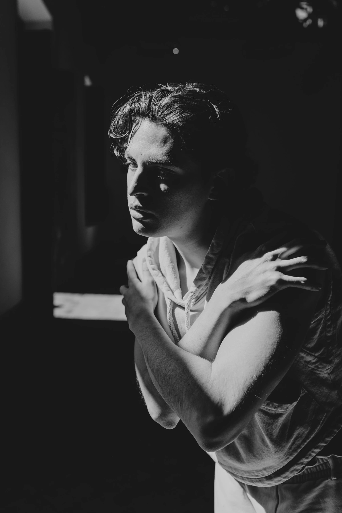
Your relationship with light evolves. What starts as technical how-to becomes intuitive conversation. Go play. Let the light lead you. And if you want to see how this translates into my own work, well—you can peek at my journey here.
Resources for Further Learning
- Books: "Lighting for Digital Photography" by Syl Arena
- Courses: Coursera's "Lighting Fundamentals" course
- Communities: Reddit's r/ArtLighting forum
- Tools: Light meter apps for smartphones
- Suppliers: B&H Photo, Adorama, local art supply stores
Remember: Great lighting isn't about having the most expensive equipment. It's about understanding how light affects your work and using that knowledge to create the best possible conditions for your artistic vision.
Note: Images would be embedded here in practice—all sourced via Unsplash/Pexels for educational purposes. Example placeholders shown for concept.
[credit] Unsplash, [licence] https://unsplash.com/license