The Final Touch: Knowing When Your Painting is Truly Finished
A personal, practical guide for artists on the crucial final 5% of a painting. Learn about highlights, composition tweaks, and the secrets to a polished piece.

The Agony and Ecstasy of the Final 5%: Mastering the Last Brushstrokes
It’s a strange feeling, isn't it? As artists, we pour our souls onto the canvas, navigating bold gestures and subtle refinements. We strive for that elusive moment of completion, that perfect balance where a piece transcends its parts and breathes on its own. Often, the journey takes us to 95% done, a place of near-perfection. But it's in this final 5% that the real magic, and sometimes the deepest struggle, resides. This narrow margin is where a good painting can become truly great, or tragically, where it can be overworked into a muddy, lifeless mess. Believe me, I've navigated both sides of that treacherous line more times than I care to admit. It’s a minefield, this last leg of the journey, where a promising piece can get lost in the noise or find its true voice. I’ve lived on both sides of that equation more times than I can count, and it’s why I want to share some hard-won wisdom about making those final, crucial decisions. It’s a paradox, really: the smallest adjustments hold the greatest power, but also the greatest risk. This article is my attempt to map that territory, offering you not just techniques, but a mindset, for navigating the exhilarating, and sometimes terrifying, final moments of creation.
People often ask me how I know when a painting is finished. The honest answer? Sometimes, I genuinely don't. It's less a definitive checklist and more an emergent intuition—a quiet hum in the studio that whispers, or sometimes shouts, "Stop. Don't touch it anymore." This internal compass is hard-won, honed through countless hours of both triumph and regret. It's a feeling, a resonance, a quiet sense of 'rightness' that permeates the piece, signaling that further intervention would only diminish its unique voice. But getting to that point, trusting that feeling, requires a specific set of tools and a mindset that's quite different from the expansive, broad-strokes phase of initial creation. It's about shifting from explorer to surgeon, from builder to finisher. It's about refining, not reinventing. The true mastery here is in discernment: knowing what to add, what to remove, and, most importantly, what to leave untouched. Let's talk about those final, crucial touches that don't just complete a painting, but truly bring it home, allowing it to resonate with its own unique emotional resonance and speak its truth.
Step Away From the Canvas (Seriously)
Before you even think about adding a final highlight or deepening a shadow, the most important thing you can do is walk away. I mean it. Prop the painting up somewhere you can see it, but don't stand in front of it with a brush in your hand. Live with it for a day or two. See it in the morning light, glance at it while you're making coffee, notice it out of the corner of your eye. Better yet, try these visual tricks: turn the painting upside down, view it in a mirror (this offers a fresh, reversed perspective that often highlights imbalances), or take a photo of it on your phone and crop it, perhaps even converting it to grayscale. For an even more intense shift in perspective, try looking at it through a reducing glass, or from a different room entirely. These methods strip away your emotional attachment and allow you to see the composition and values with a detached, critical eye. They trick your brain into seeing the work as if it were brand new. I've found that photographing your work in various lighting conditions – natural daylight, studio lights, even dim evening light – can reveal unexpected nuances in color and form that your eye might miss during prolonged studio sessions. It's like having a dozen extra sets of 'fresh eyes'.
This period of passive observation, this act of benign neglect, does several incredibly powerful things for me, both for the painting and for my own creative well-being. It’s a vital mental and emotional reset, allowing a separation from the intense, almost obsessive, focus of active creation. This detachment is where true clarity can emerge, revealing the painting's true needs rather than your imposed desires.
- It breaks your hyper-focus. When you're nose-to-canvas, deep in the fray, it's almost impossible not to get lost in the minutiae. You become hyper-focused on a tiny brushstroke, a subtle blend, losing all sense of the greater whole. Distance is your optical reset button; it gives you back the crucial perspective needed to see the forest, not just the trees. It allows you to step back from the elements of art: line and form to see the complete narrative. Is that shadow truly deep enough, or does it just feel deep because you just spent twenty minutes blending it?
The Power of Limiting Your Palette in the Final Stages
I know, I know, it sounds counterintuitive. After all the vibrant exploration, why tie your hands now? But in the final 5%, a restricted palette can be your greatest ally. By consciously limiting yourself to perhaps three or four key colors (plus white, of course), you force yourself to focus on value, tone, and composition rather than getting lost in endless color choices. This restriction often leads to a more harmonious and sophisticated final piece, preventing the dreaded "rainbow effect" that can dilute impact. It's about making deliberate, surgical decisions with color, pushing existing hues to their fullest potential rather than introducing new ones. This disciplined approach often reveals the true strength of your underlying color study and how effectively you've understood the nuances of your paint types. I've found it especially liberating with acrylics, where a limited palette of Liquitex Basics can yield surprisingly rich results. 2. It lets the painting speak. Seriously, it will. Once you're out of its direct gravitational pull, the artwork begins to assert its own needs. A passage might suddenly feel too heavy, a color might jump out with an unintended aggression, or an entire area might simply feel inert, crying out for a spark of life or a moment of stillness. You simply cannot hear these subtle cues when you're actively pushing paint around; you can only hear them when you're truly listening—when you've surrendered the need to control every single outcome. This is a vital part of my art of intuitive painting. What’s more, I often find myself having a mental conversation with the piece during this time, asking it what it truly needs, rather than imposing my will. It sounds a bit mad, I know, but trust me, the answers often come to you in those moments of quiet observation.
Cultivating Your Critical Eye: Beyond the Brush
Before we even touch paint, let's talk about the most powerful tool you possess: your eye. This isn't just about seeing; it's about discerning. After you've stepped away, and before you dive back in, dedicate time to critical observation.
Diagnostic Questions for Fresh Eyes
Creating a Personal Checklist/Rubric
Beyond general questions, I've found immense value in developing a personalized checklist, almost a rubric, for my own work. This isn't a rigid dogma, but a flexible guide based on patterns I've observed in my successes and challenges. It might include specific reminders like: "Check the top-left corner for unintended distractions," or "Is there enough visual tension between the foreground and background?" This bespoke tool, developed over years of self-critique, helps me bypass generic advice and address my particular artistic habits and tendencies. It's a living document, evolving with every finished piece, allowing me to hone my internal critic with precision.
I find it helpful to ask myself a series of questions that go beyond "do I like it?" and move towards "what does the painting need to be complete?" These aren't just questions; they're a framework for genuine critique, a way to peel back your personal bias and see the artwork for what it truly is, and what it aspires to be. Often, I pretend I'm seeing it for the first time in a gallery, trying to discern its core message and impact. It helps to imagine a complete stranger's first impression. Is it compelling? Does it hold their gaze? Does it tell its story, or just my story about making it?
Journaling Your Observations
During your periods of stepping away, consider keeping a dedicated "painting journal." Instead of immediately grabbing a brush, write down your observations, feelings, and questions about the piece. What draws your eye? What feels unresolved? What emotions does it evoke? This practice not only deepens your connection to the work but also creates a tangible record of your decision-making process, helping you recognize patterns and articulate your artistic intent more clearly. It's a conversation with your subconscious, laid out on paper, offering insights you might otherwise overlook.
Expanding Your Diagnostic Toolkit
Beyond the fundamental questions, I've developed a more extensive list over the years, a kind of internal 'audit' for my work:
- What is the focal point? Is it clear? Does it draw the eye naturally, or is the viewer's gaze wandering aimlessly? Is it strong enough to command attention without being aggressive?
- What is the overall emotional tone? Does it match my intention, or has the piece taken on a different mood? Does it evoke the feelings I originally set out to express, or has something unexpected emerged that I should embrace?
- Is there a consistent light source? Even in abstract work, an implied light source can create depth and coherence. Is the quality of light (warm, cool, diffused, sharp) consistent and believable throughout the piece?
- Are the values balanced? Do I have a full range from darkest darks to lightest lights, or does it feel muddy or washed out? Does the value structure effectively create a sense of depth and narrative?
- Does anything feel "stuck" or "dead"? An area that lacks energy or feels unresolved. Is there any part that feels too stiff or too chaotic, disrupting the overall flow?
- Is there enough visual breathing room? Sometimes, less is indeed more. Are there areas for the eye to rest, or is it overwhelmed by information? What about the negative space? Does it actively contribute to the composition?
- Does any area feel "stagnant" or "too busy"? These are signs that something needs to be added, subtracted, or redefined. Think about the visual rhythm; is it engaging or monotonous?
- What is the narrative or story? Even in abstract work, there's often an implied journey or emotion. Does the painting tell the story you intend, or has a new one emerged? How does the composition guide the viewer through this narrative?
- Is there sufficient variety? Too much of the same thing (e.g., all soft edges, all similar values) can lead to monotony. Look for deliberate variations in line, shape, color, and texture to keep the eye engaged. Does it need a surprising element to break the uniformity?
- Does it hold up to scrutiny from different distances? What happens when you look at it from across the room? What details emerge when you get close? A successful painting works on multiple levels.
This process is about listening, not dictating. It’s about becoming a detective, searching for clues the painting itself offers about its completion. And sometimes, those clues come from outside the studio.
The Power of a Fresh, Trusted Eye (or Many Eyes!)
While the ultimate decision is always yours, a trusted friend, fellow artist, or even a non-artist whose aesthetic you respect, can offer invaluable insights. They see the work without your history, your struggles, or your intentions. This is where a little vulnerability goes a long way. Ask open-ended questions: "What do you feel when you look at this?", "What's the first thing you notice?", "Does anything feel unresolved?" Be prepared to listen without defensiveness; remember, their feedback is a gift, not a judgment. You don't have to act on every suggestion, but often, just hearing another perspective can confirm an intuition you already had, or highlight a blind spot. Even better, view your work in a digital format and solicit feedback online – a common practice in the contemporary art world (though be mindful of your sources!). Remember that the most valuable feedback often isn't prescriptive ("add more blue here") but descriptive ("this area feels a bit cold" or "my eye gets stuck on that corner"), allowing you to interpret the 'why' and formulate the solution.
The Artist's Final Toolkit: Techniques That Make a Difference
Alright, you've stepped away, you've looked, you've listened, and perhaps you've even sought some external wisdom. Now, the moment arrives to engage with the canvas again. This isn't a free-for-all; it's a focused mission. We're not talking about starting over (unless, in rare cases, that's truly what the piece demands!). Instead, we're talking about those incredibly precise, often small, strategic interventions that nudge a painting across the finish line.
The Importance of Medium and Its Properties
Before diving into specific tools, it's crucial to remember that your chosen medium dictates much of what's possible in the final 5%. Oils allow for long blending times and rich glazes, while acrylics dry quickly, demanding a more immediate, layered approach. Watercolors rely on transparency, and mixed media often involves unique adhesion and drying considerations. Understanding the inherent properties of your paint types – their transparency, drying time, texture, and archival qualities – is fundamental to making informed decisions for those crucial last touches. Trying to force an oil technique onto acrylics, for instance, will likely lead to frustration and a less-than-ideal finish. Embrace your medium's strengths, and work with its nature, not against it.
Once you’ve taken that invaluable break and returned with genuinely fresh eyes, you can approach the canvas again. But this time, it's a different game. You’re no longer a painter in the broad-strokes phase; you're a sculptor refining a masterpiece, a surgeon performing delicate, strategic adjustments. This isn't about grand overhauls; it's about making precise, impactful decisions with a specific, limited toolkit that honors the work already done. It’s about building upon the unseen layers that are already there. Think of it as a specialized arsenal for the finish line, where every tool has a surgical purpose, and every touch is considered.
The Right Tool for the Final Touch: Beyond the Broad Brush
Just as a surgeon wouldn't use a sledgehammer, we, too, need specialized instruments for these delicate final operations. While your trusty large brushes did the heavy lifting, the final 5% calls for precision. It's about finding the perfect nuance, the subtle adjustment that makes all the difference. Think of it as choosing the right specialized tool from your best brushes for acrylic painting (or oils!) for a specific surgical stroke, not a broad gesture.

- Rigger or Liner Brushes: These are your secret weapons for those minute details—the glint in an eye, a fine line of texture, or a subtle signature. Their long, thin bristles hold a surprising amount of paint and allow for incredible control, allowing for delicate marks that elevate a detail. They are also excellent for subtle dry-brush effects or for adding delicate calligraphic lines.
- Small Detail Brushes (Round & Flat): Beyond riggers, tiny round brushes offer precise dots and tight curves, while small flats are perfect for crisp, minute edges or tiny washes in confined areas. They are essential when the utmost precision is required.
- Palette Knives (Small & Flexible): Not just for scraping, a small, flexible palette knife can apply impasto highlights, create crisp, thin lines, or even gently remove excess paint. They offer a directness that a brush sometimes can't, imparting a unique, often bold, texture, and can be surprisingly effective for creating subtle, broken color passages.
- Soft Blending Brushes (or even fingers!): For subtle glazes, softening edges, or gently diffusing a highlight, a very soft brush (or even a clean finger) can make all the difference, preventing harsh lines and promoting seamless transitions. Think about creating a dreamy, atmospheric effect, or a seamless gradient in a delicate sky.
- Sponges and Cloths: For creating textures, applying washes, or gently lifting paint for a soft highlight, these unconventional tools can offer effects a brush simply cannot replicate. Experiment! You might find your new favorite technique in a household item. I've often discovered accidental magic with a crumpled rag or a kitchen sponge, creating effects that a brush simply can't achieve.
Understanding Value: The Unsung Hero of Depth
Before we get to the glint and the sparkle, let’s talk about value. In art, value refers to the lightness or darkness of a color, independent of its hue. It's the skeleton beneath the skin, the underlying structure that gives your painting its sense of form, dimension, and impact. When a painting feels "flat" or "muddy," it's often a value problem, not a color problem. This is a common pitfall, especially for artists captivated by vibrant hues. The most dazzling colors can fall flat without a strong underlying value structure.
In the final 5%, paying close attention to your value structure can be transformative. Squint at your painting until the colors blend into shades of grey. Do you see a clear hierarchy of light and dark? Are the areas you want to recede truly lighter or darker than the areas you want to bring forward? Sometimes, all it takes is a subtle darkening of a background element or a slight brightening of a focal point to dramatically shift the perceived depth and drama. It’s like turning up the contrast on a photograph – suddenly, everything has more punch. This understanding is key to mastering what is design in art and how it impacts perception. Think about how a landscape painting gains immense realism from accurate atmospheric values, or how a portrait comes alive when the subtle value shifts around the eyes are just right. Even in abstract work, contrasting values create visual tension and focal points that guide the eye.
Color Theory in the Final 5%: Beyond Hue
While value is the skeleton, color is the vibrant flesh. In the final 5%, a nuanced understanding of color theory isn't just about choosing pretty hues; it's about making colors work for your painting. Consider:
- Saturation and Desaturation: A tiny pop of highly saturated color can draw the eye like a magnet, while subtly desaturating a background element can make it recede.
- Color Temperature: Warm colors (reds, yellows, oranges) tend to advance, while cool colors (blues, greens, violets) recede. A micro-adjustment in temperature can dramatically shift perceived depth and focus.
- Complementary Colors: Using tiny accents of complementary colors can create incredible vibrancy and visual tension. A dot of vibrant orange against a blue area, for example, can make both colors sing. This deliberate manipulation of color, going beyond simple aesthetic preference, is where the true mastery of the psychology of color comes into play, building on hours of prior color study and observation. Remember, every color choice in the final stages should be intentional, serving the overarching narrative and emotional impact of your piece.
The Squint Test: Your Best Friend for Value
I can't overstate the power of the "squint test." When you squint, your eyes lose the ability to distinguish subtle color variations and instead, you see the world (or your painting) in broad masses of light and dark. This immediately reveals if your values are strong, if your focal point stands out, or if areas are getting lost. If your painting looks muddy or confusing when squinted at, you have a value problem, regardless of how beautiful your colors are. Conversely, if it reads clearly and powerfully, you're on the right track.
The Power of Scumbling: Softening and Texturizing
Before we get to the dazzling highlights, let's talk about scumbling. This is a subtle yet powerful technique, especially effective in the final stages to add softness, texture, and atmospheric effects. Scumbling involves applying a thin, opaque or semi-opaque layer of lighter paint over a darker, dry underpainting, using a dry brush and a light, scrubbing motion. The key is that the paint is applied sparingly, allowing the underlying color to show through in parts. Think of it as painting with smoke – a delicate, broken application that allows the history of the painting to show through, creating a rich tapestry of interwoven colors.
- Softening Edges: Scumbling is fantastic for creating a soft, diffused edge that melts into the background, perfect for clouds, distant foliage, or blurring an overly sharp transition.
- Adding Texture: The broken, interrupted marks of scumbling naturally create a painterly texture, mimicking rough surfaces, light catching on fabric, or the dappled effect of sunlight filtering through leaves. It’s fantastic for creating convincing atmospheric effects in landscapes, like mist or distant clouds, or for giving texture to fabric in a portrait.
- Modifying Tone/Color: It can subtly lighten an area without obscuring the base color, or introduce a new color temperature that optically mixes with the existing one, creating a richer, more complex hue. Think of it as a soft veil of color, perfect for unifying disparate elements or softening an overly vibrant section. For example, a warm scumble over a cool green can create a shimmering, lively effect, like sunlight hitting foliage.
This technique is about building luminosity and visual interest without adding harshness, truly enhancing the perceived depth of your abstract art. It's a fantastic way to create a sense of history and subtle complexity in your work, hinting at layers beneath the surface.
The Power of the "Zing": Highlights and Accents
A well-placed highlight can be the single most transformative final touch, a true "zing" that electrifies a painting. It’s the glint in an eye, the fleeting flash of light on a wet surface, or a tiny, unexpected dot of pure, vibrant color that instantly draws and directs the viewer's attention. And please, for the love of all that's artistic, I'm not talking about indiscriminately slathering on thick white paint! The most impactful final highlights are almost always subtle, thoughtfully colored, and strategically placed. They’re a dance between precision and emotion. When executed correctly, highlights don't just add brightness; they add life, energy, and a dynamic focal point to your piece.
- Think in temperature: This is critical. Is your primary light source warm (like sunlight or candlelight) or cool (like moonlight or diffused window light)? Your final highlight should reflect this. A highlight isn't just "white"; it might be a pale, warm yellow, a crisp mint green, a delicate lavender, or even a nuanced peachy tone. Understanding the psychology of color goes a long way here, as does understanding how artists use color to create mood. Remember, a highlight isn't just about brightness; it's about the quality of light. A perfectly executed warm highlight in a cool light source, or vice-versa, can feel jarring, pulling the viewer right out of the illusion.
- Less is more: This adage has never been truer. One or two exquisitely placed, key highlights possess far more power and impact than a dozen scattered, ill-considered ones. You're not trying to illuminate everything; you're curating the visual experience, guiding the eye directly to the focal point, the emotional core of the piece. What story do you want that highlight to tell? I often think of it like jewelry – a single, perfectly chosen gem outshines a whole handful of scattered trinkets. It's about precision and intention, not abundance.
- Vary your application: Don't get stuck in a rut. A tiny, almost microscopic dot from the tip of a fine rigger brush can create a pinprick of light (a specular highlight), mimicking the intense reflection off a wet surface or a polished gem. A thin, deliberate line dragged with the edge of a palette knife can suggest a sharp reflection. Or perhaps a gentle, almost invisible smudge with your finger or a soft cloth can create a diffused glow (a diffuse highlight), like the soft sheen on skin or a distant cloud. Even the texture of the highlight itself, like a bit of impasto, can add significant visual interest, drawing the eye not just with light, but with tactile presence. This is where the art of mark making truly comes into play, making each mark count.
Deepening Shadows: Crafting Depth and Drama
If highlights are the sparkle, then shadows are the soul. They create form, define space, and add profound depth and drama to your work. In the final stages, assessing and enriching your shadows can be as impactful as adding the brightest highlight. Shadows are not merely the absence of light; they are full of subtle color, reflected light, and atmosphere, acting as crucial counterpoints to your highlights. Neglecting them can leave your painting feeling stark and lacking dimension.
- Not just black: Please, for the love of art, stop reaching for tube black! Rich, nuanced shadows are almost always created with mixtures of dark, transparent colors. Think about the local color of the object in shadow, and then consider the ambient light. A shadow might be a deep indigo, a transparent mixture of Alizarin Crimson and Viridian, or even a cool, earthy umber. I often use a mix of Ultramarine Blue and Burnt Sienna – it creates a beautiful, deep, warm black that has life in it. The key is transparency, allowing the underlying colors to subtly influence the shadow's character, preventing it from looking flat or muddy. Consider also a mix of Phthalo Blue and Alizarin Crimson for a cool, rich shadow, or even a touch of Payne's Grey for an instant deep, smoky effect. The possibilities are endless, but always aim for complexity and depth, not just darkness. You can dive deeper into color theory and what is a color study in art to really master this, understanding how complementary colors can create the deepest, most vibrant shadows.
- Soft vs. Hard Edges: Just like with your focal points, the edges of your shadows are crucial. A soft, "lost" shadow edge suggests form turning away from the light, creating a sense of roundness or atmosphere. A crisp shadow edge, on the other hand, defines a sharp plane change or a strong cast shadow. Deliberately playing with these edges can significantly enhance the illusion of three-dimensionality.
- Atmospheric Depth: Deepening distant shadows with a slightly cooler or more muted glaze can enhance atmospheric perspective, making foreground elements pop and giving your composition a vast, expansive feel. This is about inviting the viewer to step into the world you've created, and shadows are your guides.
Achieving Atmospheric Perspective with Shadows
Beyond defining local forms, shadows are incredibly effective in creating a sense of distance and vastness within your painting. This concept, known as atmospheric perspective, dictates that objects appear lighter, bluer, and less saturated as they recede into the distance, due to the scattering of light by air particles. The air itself becomes a 'veil,' subtly changing the appearance of forms further away.
In your final 5%, by applying slightly cooler or more muted glazes to distant shadows, you can dramatically enhance this illusion. Think of distant mountains appearing hazier and bluer, even in their shadowed areas, or a far-off forest losing its distinct greens and becoming more subdued. This subtle manipulation of shadow temperature and intensity pushes background elements back, making foreground elements pop with clarity and drawing the viewer's eye into the depth of your composition. It's a powerful way to create a convincing sense of space, whether in a sprawling landscape or a complex abstract piece, allowing the viewer's eye to travel deep into your painted world.
Whispers, Not Shouts: Subtle Glazes and Washes
Sometimes, the painting doesn't need something explicitly added, but rather something harmonized, unified, or deepened. This, my friends, is the magical realm of glazes and washes. A glaze is, at its heart, a thin, transparent layer of paint applied over a dry (or nearly dry) underpainting, subtly modifying the colors beneath it without fully obscuring them. It’s a whisper, a breath of air, a delicate veil.
Think of it as adjusting the mood lighting. Want to subtly push a background further into the distance, giving your foreground elements more prominence? A thin, dark, transparent glaze – perhaps a mixture of Ultramarine Blue and Burnt Sienna, heavily diluted with an appropriate medium – can achieve wonders, creating a sense of atmospheric perspective. Conversely, if an entire area feels a bit too cool or lifeless, a transparent yellow or orange glaze can be like adding a wash of late afternoon sunlight, instantly warming and unifying the scene. This technique is absolutely fundamental to how artists use color to create profound depth, subtle transitions, and evocative mood. It's a masterclass in the alchemy of layers.

Let's break down glazes and washes:
Technique  | Description | Purpose | Best For |
|---|---|---|---|
| Glaze | A thin, transparent layer of paint, often mixed with a medium, applied over dry paint. | Subtly shifting hues, unifying disparate colors, deepening existing colors without obscuring them, creating atmospheric effects. | Adding warmth or coolness, pushing elements back, enriching shadows, unifying a palette. |
| Wash | A highly diluted, often watery, transparent layer of paint, applied broadly. | Laying down initial tonal values, tinting areas, creating soft transitions, implying textures on absorbent surfaces. | Backgrounds, atmospheric effects, softening hard edges, unifying large areas. |
Varnishing for Unity and Protection (Post-Curing)
While we discussed when to varnish in the FAQ, it's worth noting here that varnishing is the ultimate final touch, serving both aesthetic and protective purposes. A final varnish unifies the sheen of the painting, deepening darks and saturating colors, making the artwork 'pop' in a way no other step can. More importantly, it provides a crucial layer of protection against dust, UV light, and environmental pollutants. Choosing between a gloss, satin, or matte varnish depends on your artistic intent and the desired presentation. A gloss varnish enhances vibrancy, a matte varnish reduces glare and softens the image, and a satin offers a balance. Remember, this step must be done only after the painting is fully cured – patience here is absolutely non-negotiable for the longevity of your masterpiece. It's the final embrace, sealing your creation for the world to behold for generations to come.
Subtle Color Temperature Shifts
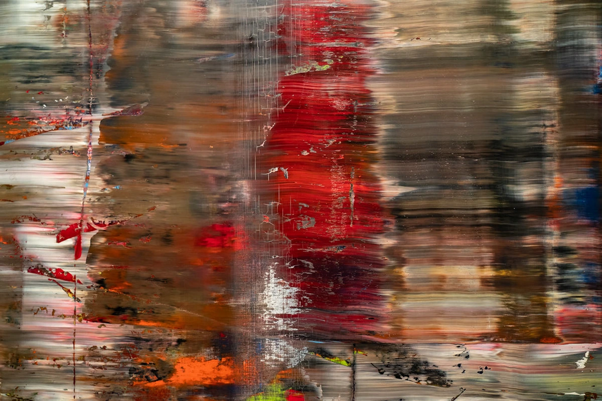
Beyond just glazes and washes, sometimes the final nuance a painting needs is a subtle shift in color temperature in a specific area. If an area feels too cold and sterile, a microscopic amount of a warm transparent color (like a touch of quinacridone gold in a medium) can breathe life into it. Conversely, if something feels overly dominant or aggressive, a thin, cool glaze can recede it. It's like adjusting the warmth or coolness of a light bulb in a room – it changes the entire mood without drastically altering the objects themselves. This is particularly effective in abstract work where emotional resonance is paramount. Imagine a cool, clinical blue area suddenly receiving a whisper of warm yellow glaze – it instantly adds vibrancy and shifts the mood without altering the fundamental blue. Or, a fiery red section could be calmed with a thin violet-blue layer, creating a more complex, less aggressive presence. These are the nuances that elevate a painting from merely "colored" to truly "felt."
The Dance of Warm and Cool: Temperature as a Final Touch
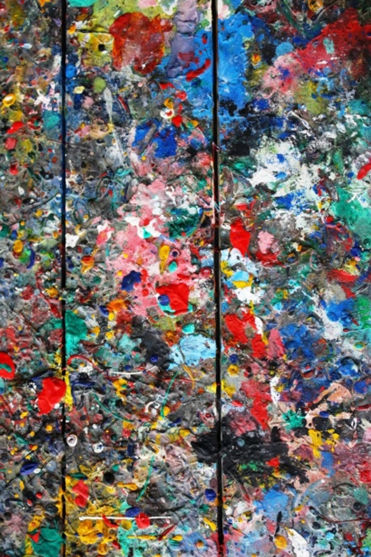
While we've discussed general color temperature shifts in glazes, a more explicit focus on the interplay of warm and cool colors in the final 5% can dramatically enhance your painting. Warm colors (reds, oranges, yellows) tend to advance and create excitement, while cool colors (blues, greens, violets) recede and evoke calm. By strategically placing tiny warm accents in cool areas, or vice-versa, you can create a vibrant push-and-pull, adding dynamism and depth without resorting to heavy value changes. It's a subtle way to create visual vibration and emotional nuance, a delicate temperature adjustment that can bring a cold area to life or quiet an overly boisterous one. I often think of it like adding a pinch of spice to a dish – just enough to enhance, not overpower.
The Role of Contrast: Beyond Value
While value contrast is fundamental, let's also talk about color contrast and textural contrast in the final 5%. Sometimes, a painting needs a visual jolt, a point of immediate differentiation to capture and hold attention.
- Color Contrast: This isn't just about complementary colors (though they are powerful!). It's about placing a vibrant hue next to a muted one, or a warm color against a cool one. A tiny, pure pop of a complementary color, strategically placed, can electrify an otherwise harmonious area. It's the visual equivalent of a well-timed chord change in music.
- Textural Contrast: Think of a smooth, polished area next to a heavily impastoed one, or a finely detailed passage juxtaposed with a broadly washed section. These differences create tactile interest and guide the eye, offering varied experiences within the same frame. Just as with value and color, too much sameness in texture can lead to visual boredom; judicious contrast keeps things engaging.
By consciously manipulating these forms of contrast, you can create dynamic tension and focal points, guiding the viewer's journey through your piece with greater intention. It's about orchestrating a visual experience, ensuring the eye always has something new and interesting to discover, without becoming overwhelmed or bored. I find that textural contrast, in particular, appeals to a primal sense, a desire to touch and experience the artwork beyond just sight. It's a way to invite a deeper, more haptic engagement with the canvas.
The Signature: Your Final Mark
Signing your painting is the ultimate declaration that it's finished. It's a ritual. But where and how you sign can impact the final piece.
My advice, after years of experimenting (and some truly regrettable signatures), is this: treat your signature as a legitimate compositional element. It's the final grace note, not an afterthought. Don't just slap it in the bottom right corner out of rote habit, as if it's a postage stamp. Ask yourself:
- Does the overall composition in art need a small visual anchor in a particular spot? Perhaps a bit of dark in a light area, or a vertical element in a predominantly horizontal one, to help balance the visual weight? Your signature, placed thoughtfully, can be that subtle counterpoint that brings everything into harmony.
- What color should the signature be? This is crucial. It should harmonize subtly with the painting, perhaps picking up a dominant dark or light tone, or a muted version of a key color. It should never scream for attention or jump out aggressively, detracting from the artwork itself. You want it to integrate, not dominate. I often blend a small amount of an existing dark or light color from the painting, rather than using a pure, contrasting hue.
- How big should it be? Almost universally, smaller is better. A discreet mark speaks volumes more than a sprawling declaration. Think of it as a quiet whisper of authorship, rather than a loud pronouncement. Consider the medium too; a delicate graphite signature on a watercolor will be vastly different from an impasto oil signature on a large canvas. Also, consider the permanence: for archival longevity, an oil painting should be signed with archival oil paint, not a marker that might fade over time. For acrylics, use a permanent, lightfast acrylic paint. For mixed media, ensure your chosen method is compatible with all layers and will stand the test of time, an indelible part of the work's history. This isn't just about aesthetics; it's about safeguarding your legacy. Remember, your signature is the last deliberate mark you make, a final act of care for your creation.
Edge Control: Directing the Eye with Precision
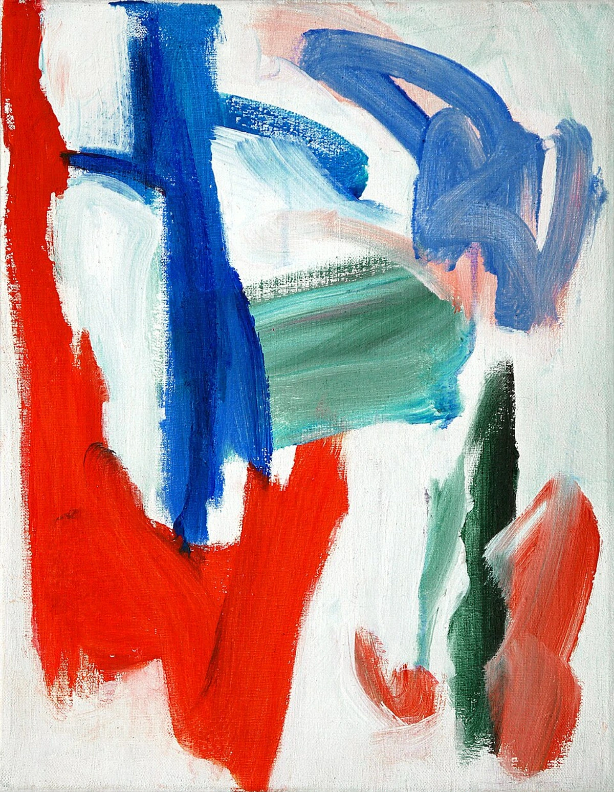
Before we dive into broader compositional nudges, let's talk about something incredibly powerful in the final 5%: edge control. The sharpness or softness of an edge is a potent tool for directing the viewer's eye and creating atmosphere. It's about visual hierarchy, guiding the gaze, and controlling the perceived distance and clarity of elements. Are all your edges equally sharp? If so, your painting might feel flat or static, with no clear focal point. Are they all soft? Then it might feel blurry and undefined, lacking definition and energy. The mastery is in the deliberate variation of edges.
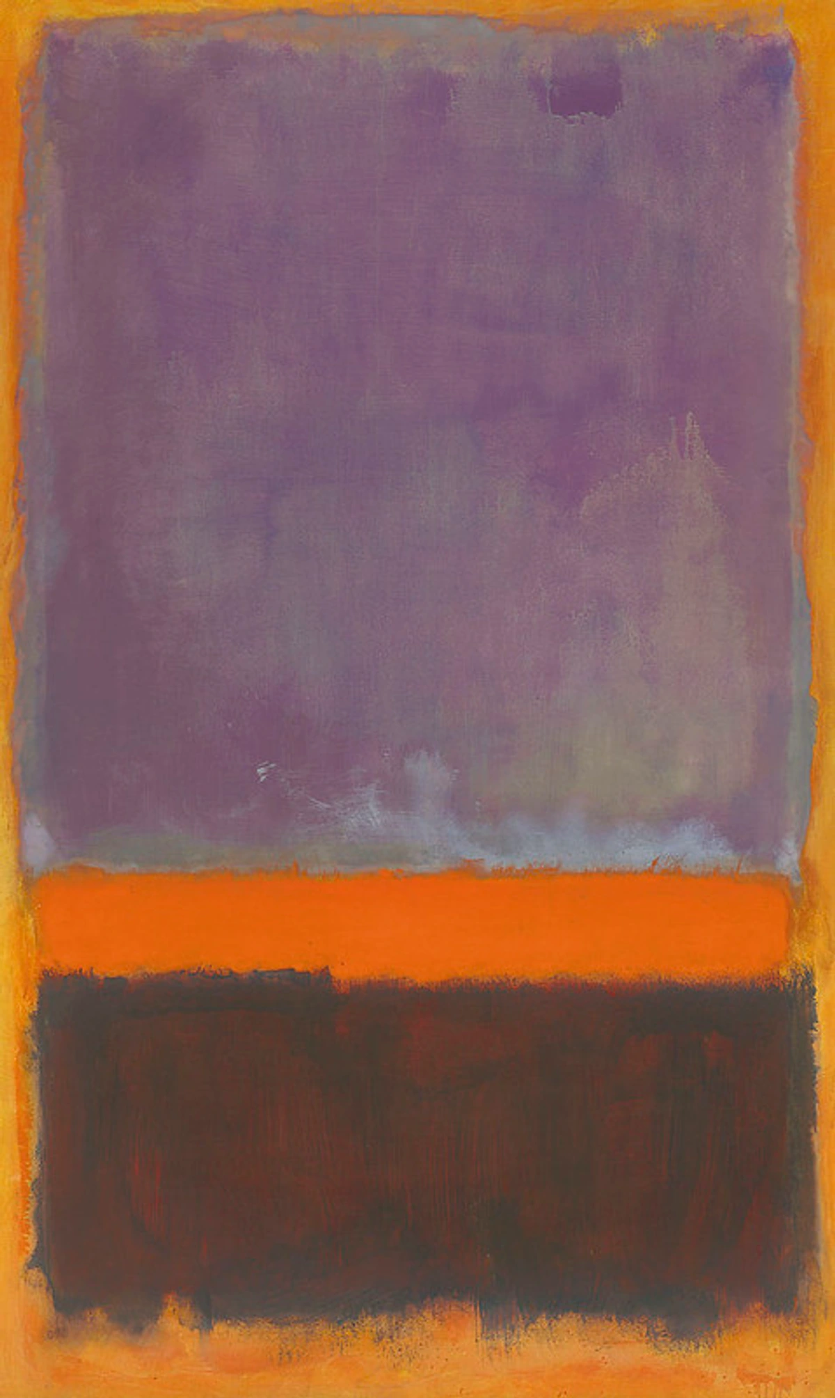
Think about it: a sharp edge demands attention, pulling the eye in. A soft, lost edge, on the other hand, allows the eye to glide past, creating a sense of distance, atmosphere, or mystery. In the final stages, I often go back in and deliberately soften certain edges to push elements back or create a sense of ethereal fog, and sharpen others to bring a focal point crisply into view. It’s a subtle dance, but the impact is immense, adding another layer to how we understanding line in abstract art. For example, in a portrait, a soft edge around the hair can suggest softness and light, while a crisp edge on the eyes brings them into sharp focus, drawing the viewer into the subject's gaze. This deliberate control makes all the difference.
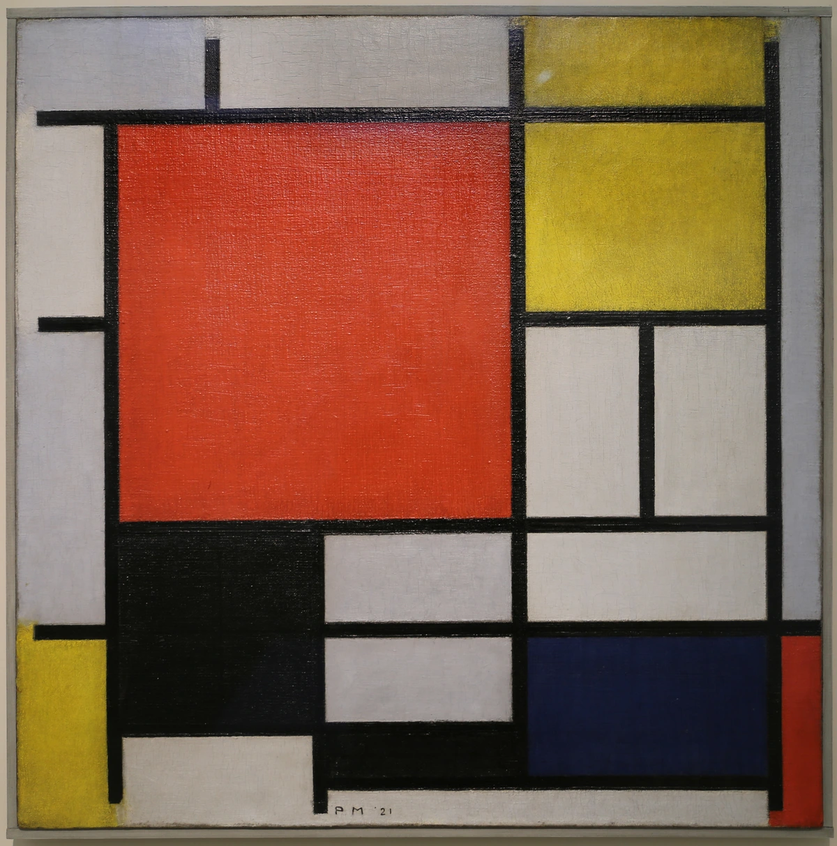
Here's how I think about edge control:
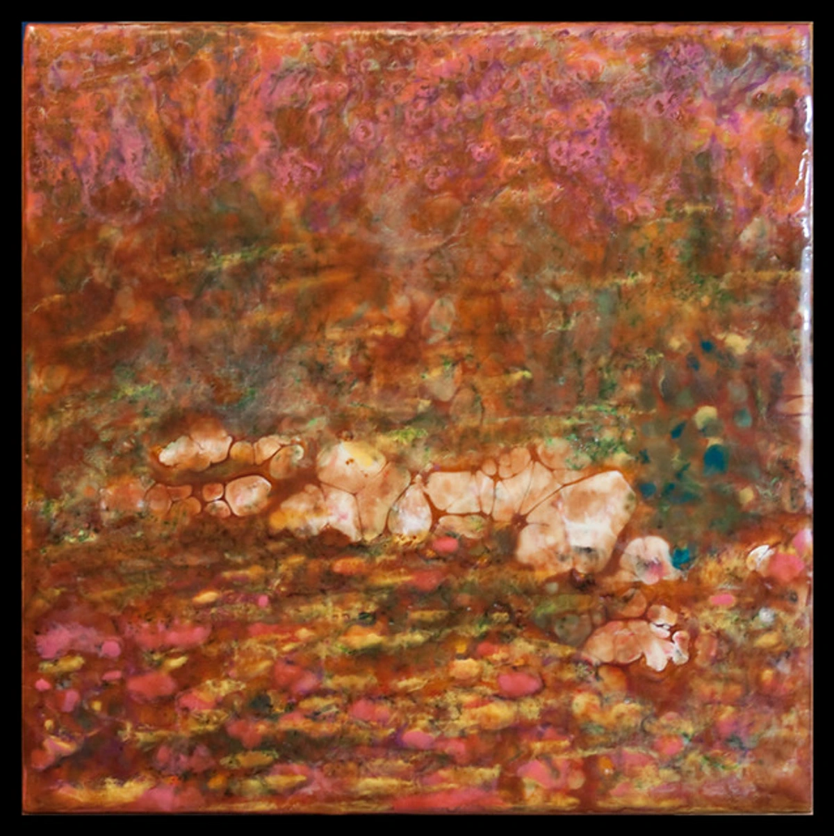
Edge Type | Visual Effect | Artistic Purpose |
|---|---|---|
| Hard Edge | Crisp, well-defined, sharp. | Demands attention, defines form, creates focal points, suggests closeness, energy, or strong light. Think of the sharp outline of a distant mountain against a clear sky, or a bold graphic element. |
| Soft Edge | Blurry, indistinct, fading. | Allows the eye to glide, creates a sense of atmosphere, distance, mystery, or movement. Great for implying clouds, fog, or a blurred background that emphasizes foreground sharpness. |
| Lost Edge | An edge that merges seamlessly into its surrounding, disappearing. | Creates continuity, softness, and ambiguity. It can suggest a form turning away from the light, or an element that is less important and blends into the environment, promoting visual flow. |
| Found Edge | An edge that reappears after being lost, often subtly. | A delicate way to re-establish form or detail after a passage of softness, adding sophistication and visual interest without being abrupt. |
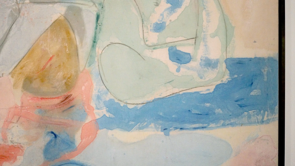
The Power of Negative Space: What You Don't Paint
It sounds counterintuitive, doesn't it? Thinking about what isn't there. But negative space—the areas around and between the primary subjects of your painting—is a hugely powerful compositional tool, especially in the final stages. It’s the silence between the notes, the pause that allows the melody to resonate.
If your painting feels crowded, busy, or lacks a certain elegance, often the answer isn't to add more, but to subtract. By refining the shapes and relationships of your negative space, you can enhance the positive forms, create a sense of harmony, and direct the viewer's eye with incredible subtlety. Sometimes, simply painting out a distracting element in the background, or allowing an edge to soften and merge, can transform a chaotic scene into a tranquil one. It's about giving your artwork room to breathe, inviting the viewer's eye to rest, and emphasizing the dialogue between form and emptiness. Master painters often "paint the negative space" to define positive forms more accurately. For example, painting the space between the branches of a tree can define the tree itself with more precision and elegance than merely outlining the branches. In abstract compositions, shaping the voids can create a rhythm and flow that is just as powerful as the painted shapes, demonstrating that what you don't paint is often as important as what you do.
Compositional Tweaks: The Art of the Nudge
This is where you can truly elevate a piece, shifting from good to captivating. The final touches often revolve around adjusting the visual weight and honing the understanding balance in art composition. It’s about more than just what's in the painting; it's about how those elements feel to the eye. I often squint my eyes until the painting dissolves into a series of abstract shapes and values. Where does my eye instinctively go? Does it get stuck somewhere? Does the visual flow feel natural, harmonious, almost musical? This abstract view helps me diagnose imbalances I might miss when focused on detail. It’s like being a conductor for an orchestra, ensuring every instrument (every element of your painting) plays its part without overpowering another, all working towards a unified, resonant whole.
A small, unexpected dark mark in a predominantly light area, or a tiny, vibrant pop of color in an otherwise neutral zone, can utterly redirect the viewer's gaze and subtly rebalance the entire canvas. It’s like adding the perfect pause in a piece of music, or the definitive period at the end of a profound sentence. It provides closure, resolution, and helps in the overall decoding abstract art.
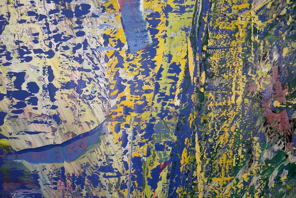
Interruption and Rhythm: Guiding the Visual Flow
Sometimes, a painting needs a deliberate interruption to its rhythm to prevent monotony and re-engage the viewer. This isn't about chaos, but about calculated disruption. A sudden sharp angle in a field of curves, a contrasting texture in a smooth expanse, or even a fleeting, unexpected splash of color can serve to reset the eye and revitalize the composition. Conversely, reinforcing a subtle rhythm – through repeated marks, colors, or implied lines – can create a harmonious visual journey, guiding the viewer's eye through the narrative without them even realizing it. It's about consciously orchestrating the viewer's experience, ensuring their gaze travels where you intend, and rests where you desire.
Here are some compositional principles I often lean on for those final nudges:
Principle | Description | Final 5% Application |
|---|---|---|
| Rule of Thirds | Dividing your canvas into nine equal parts with two horizontal and two vertical lines, placing key elements at the intersections or along the lines. | Even if you didn't start with it, a tiny adjustment of a focal point by a centimeter or two can bring it closer to a "sweet spot" intersection, adding subconscious balance and appeal. This can create a sense of harmony and visual interest without disrupting the established flow. This principle, while seemingly simple, is a cornerstone of compelling compositions and can instantly elevate the visual impact of your piece. |
| Leading Lines | Lines (actual or implied) that guide the viewer's eye through the composition. | A subtle adjustment to a brushstroke, a sharpened edge, or a deepened shadow can reinforce or create a leading line, ensuring the eye flows smoothly through the piece to the intended focal point, rather than getting stuck or exiting the frame prematurely. Think of it as a gentle hand guiding the viewer's journey through your painted world. |
| Asymmetry | Achieving balance with dissimilar elements, creating dynamic tension. | If a painting feels too static, introduce a small, visually heavy element on one side, balanced by a larger, lighter area on the other. This creates a more dynamic and less predictable sense of balance in art composition. |
| Visual Weight | The perceived "heaviness" of an element due to size, color, value, or texture. | Adding a small, dark, high-contrast element to a visually "light" area, or conversely, softening an intense color, can dramatically rebalance the composition. It's about ensuring no single area screams for attention unless intended. Balance is key in understanding balance in art composition. |
| Repetition | Repeating elements like shapes, colors, or textures. | If your piece feels chaotic, a subtle repetition of a color or a mark-making style can bring a sense of rhythm and unity. If it feels monotonous, introduce a slight variation to a repeated element to keep it interesting. This creates a visual language within your painting, a series of echoes that resonate and connect disparate parts, making the whole feel more deliberate and harmonious. |
| Proportion and Scale | The relative size of elements within a composition. | In the final stages, assessing if elements are proportionally correct to each other and to the overall canvas is crucial. Sometimes a slight enlargement or reduction of a key form can dramatically improve the visual balance and narrative impact, making objects feel more grounded or more ethereal as needed. |
| Unifying Elements | Introducing or enhancing elements that tie disparate parts of the composition together. | This could be a recurring subtle texture, a dominant color appearing in varied intensities across the canvas, or a consistent directional flow. The goal is to make the individual elements feel like they belong to a single, coherent story, even in abstract art. |
| Rhythm and Movement | The organized recurrence of elements or the implied direction of the eye through the composition. | A repetitive series of marks, a flowing line, or a sequence of color accents can create a visual rhythm that guides the viewer's eye and instills a sense of dynamism or calm. This is about establishing a visual beat, a pulse that draws the viewer deeper into the artwork's emotional landscape. |
| Hierarchy | The arrangement of elements in order of importance, guiding the viewer's attention. | Ensure that your focal point is clearly the most important element, supported by secondary points of interest, preventing the eye from being overwhelmed or confused. This is about clearly communicating what you want the viewer to see first, and then how you want their eye to travel through the piece. This is crucial for making a strong, intentional statement. |
Adding Texture: Beyond the Brushstroke
Texture, whether actual or implied, is another powerful tool in the final 5%. It’s not just about thick impasto paint (though that’s certainly one way!). Sometimes, a subtle scrape with a palette knife, a dry brush application, or even the careful embedding of a small, unexpected material can add incredible visual and tactile interest. Texture can create a focal point, break up a monotonous area, or simply provide a moment of tactile delight for the viewer. It speaks to the senses beyond just sight, inviting a more intimate, haptic engagement with the artwork. I find myself often returning to my favorite techniques for adding depth to abstract paintings in these moments, leveraging the way texture can evoke a sense of history, age, or even vulnerability within the piece.
Expanding Your Textural Repertoire
Beyond the methods above, consider these advanced textural approaches for that truly unique final touch:
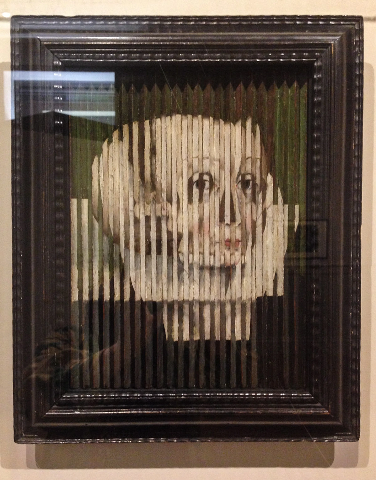
- Grattage: Scraping paint off the canvas to reveal underlying layers or the canvas texture. This can create raw, energetic lines and unexpected patterns, perfect for hinting at decay or historical layers.
- Decalcomania: Pressing a sheet of paper or glass onto wet paint and then pulling it away to create unusual, organic textures, often resembling natural formations like moss or clouds. It’s a wonderfully unpredictable technique for abstract work.
- Impression Transfer: Carefully pressing textured objects (leaves, lace, netting) into wet paint to leave an impression, then removing them. This creates a ghost-like textural echo that adds subtle interest.
Remember, texture isn't just about what you apply; it's also about how you manipulate the surface itself. These techniques invite the viewer to explore the physical landscape of your artwork, adding another dimension to their experience.
Here are a few texture techniques I often employ:
Technique | Description | Effect on Artwork |
|---|---|---|
| Impasto | Applying paint thickly, often with a brush or palette knife, so it stands out from the surface. | Creates actual physical texture, adds dynamism, draws attention, suggests weight and solidity. Perfect for highlights or focal points that you want to literally pop off the canvas. This is a powerful technique for creating a sense of physicality in your art. |
| Sgraffito | Scratching into wet paint to reveal the layers or canvas beneath. | Adds gestural lines, raw energy, and reveals hidden histories within the painting. Can create a sense of movement or fine detail with a rugged feel. It's like archaeological excavation on your canvas. |
| Dry Brush | Applying paint with a brush that has very little moisture, creating broken, textured marks. | Suggests rough surfaces, atmospheric effects, or subtle highlights. It’s excellent for implying texture without adding bulk, or for creating a sense of age or wear. This technique can evoke a sense of weathered surfaces or distant, hazy forms. |
| Stippling/Dabbing | Using the tip of a brush or sponge to create small dots or irregular marks. | Builds up texture gradually, creates optical mixing of colors, can suggest granular surfaces, foliage, or a soft, diffused light. Adds a delicate, almost pointillist quality. It's a subtle way to introduce visual vibration and complexity. |
| Subtle Collage | Incorporating small, flat materials (paper, fabric) delicately into the painting's surface. | Introduces unexpected visual and tactile interest, adds narrative layers, breaks uniformity. This needs to be done with archival consideration, of course, but a tiny, well-placed piece can add immense character. You can see more about this in my approach to my journey with mixed media. This can introduce a touch of the unexpected, a whisper of a story from another world. |
Your Final Touches Checklist: A Holistic Review
Before you call it definitively done, I urge you to run through a thorough, almost meditative, mental checklist. Sometimes, externalizing these thoughts in a table can help organize and clarify that elusive "gut feeling." This isn't about rigid rules, but about prompting a holistic review. It's about stepping back and asking, with genuine curiosity, if the painting is truly serving its highest purpose. This final examination is where you synthesize all your observations and instincts, making sure every element contributes to the overall success of the piece.
Technique | Purpose | Key Questions for Reflection | Self-Correction / What to Do If... |
|---|---|---|---|
| Value Adjustment | Enhance contrast, create depth, establish focal points, define form. | Does the painting have a full range of values? Does it feel flat when squinted at? Are the darkest darks deep enough, and the lightest lights bright enough? | If flat: Punch up contrasts. If muddy: Clarify darks/lights. If overwhelming: Soften some contrast, perhaps with a unifying glaze or by slightly reducing the intensity of a dominant light or dark area. |
| Highlights & Accents | Direct viewer's gaze, create focal points, add sparkle and life. | Does the painting have a compelling, singular point of interest? Is the implied light source consistent and impactful? Are my highlights deliberate, not decorative? Do they truly serve the narrative or emotional core? | If too sparse: Add one small, strategic "zing." If too many: Simplify, remove distracting ones, or reduce their intensity by glazing over them with a more subdued color. Remember, less is almost always more with highlights. |
| Deepening Shadows | Increase contrast, enhance depth, add drama, ground elements. | Do the dark areas feel rich, resonant, and truly deep, or do they appear flat or muddy? Does the contrast serve the emotional tenor of the piece? | If flat/muddy: Add transparent, deep glazes. If too harsh: Soften edges with a blending brush or finger, or reduce opacity with a thin glaze of a lighter, transparent color. |
| Color Glazing/Washes | Unify color harmony, adjust temperature, create atmospheric perspective. | Do any colors feel jarringly out of place? Could an area benefit from a subtle shift in warmth or coolness to enhance depth or mood? | If discordant: Apply a unifying, transparent glaze. If too cool/warm: Add a complementary temperature glaze. |
| Edge Work | Guide focus, create movement or stillness, define form vs. atmosphere. | Are all edges equally sharp, or equally soft? Where can I purposefully lose an edge to create mystery, and where must an edge be crisp to hold attention? | If static: Vary edges, soften backgrounds, sharpen foregrounds. If blurry: Introduce a few crisp edges, particularly around focal points, to create definition and bring elements forward. |
| Negative Space | Enhance positive forms, create harmony, provide visual resting places. | Does the space around the main elements feel intentional, or is it just "leftover" background? Is there enough breathing room? | If crowded: Subtly refine background shapes, paint out distractions, soften some edges to merge elements, or introduce a delicate scumble to create more atmospheric space. |
| Texture Application | Add subtle physical or visual interest, break monotony, evoke tactility. | Does any area feel visually or physically inert? Could a small, unexpected touch of texture add character, history, or a moment of intrigue? | If boring: Introduce a small area of impasto, sgraffito, or dry brush. If distracting: Tone down overly aggressive texture with a thin glaze, or by gently scraping it back with a palette knife. |
| Compositional Nudges | Fine-tune visual weight, balance, and flow, redirect the eye. | When viewed abstractly, does the painting feel balanced? Is the viewer's eye moving through the piece as intended? Is anything pulling too much attention? | If unbalanced: Add or subtract visual weight (color, value, texture) from opposing areas. If stuck: Introduce a subtle leading line or point of interest, or adjust the visual weight of an element by altering its value or color saturation. |
| Overall Harmony/Unity | Ensure all elements work together as a cohesive whole. | Does the painting feel like a singular statement, or a collection of disparate parts? Is there a consistent atmosphere or emotional undercurrent? | If disjointed: Use a unifying glaze, repeat a subtle color/texture, reassess value hierarchy, or introduce a consistent rhythm to pull disparate elements together. |
| Signature Placement | The final compositional element, declaration of completion, historical mark. | Where will my signature integrate seamlessly without detracting from the art, yet still be discoverable? What is its optimal size and color and medium? | If jarring: Adjust size, color, or placement. Ensure it doesn't compete with the art, but rather complements it. Ensure it's archival for the chosen medium. |
| Emotional Resonance | Ensure the artwork evokes the intended feelings, or a compelling unexpected mood. | Does the piece 'feel' right? Does it communicate its core message effectively, or has it become emotionally muddled? Is the emotional impact clear and consistent? | If muddled: Reassess color choices, value contrasts, or compositional flow to simplify and clarify the emotional message. Sometimes, a subtle glaze can unify disparate emotional tones. |
| Archival Soundness | Ensure the longevity and preservation of the artwork. | Have I used archival materials throughout? Are all layers dry and stable? Is it protected from environmental damage? | If not: Take steps to ensure proper curing and protection, which may involve waiting longer before varnishing or adding a protective layer. |
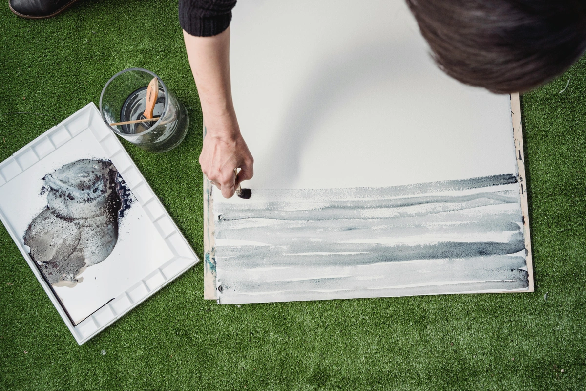
Knowing When to STOP: The Art of Letting Go
We’ve talked about techniques, but the most challenging "final touch" is often psychological: knowing when to actually put the brush down and walk away for good. This isn't just about finishing a painting; it's about finishing a conversation, releasing your creation into the world to live its own life. It's the ultimate act of artistic maturity, an acknowledgement that the work now has its own voice and destiny. For me, this is where the art truly begins to breathe on its own, independent of my constant intervention.
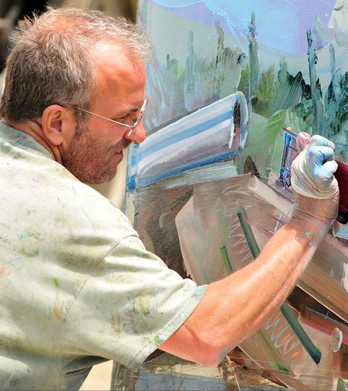
The Perfectionism Trap: When Enough is Truly Enough
The Art of the Intentional Pause
Beyond the involuntary stepping away, I've learned the power of the intentional pause. This is a scheduled break, a pre-determined period of non-engagement with the artwork. It's not about avoidance, but about strategic disengagement to allow for subconscious processing. Setting a timer for 30 minutes, a few hours, or even a full day, and strictly adhering to it, can be incredibly effective. During this pause, my mind can wander, make connections, and often, solve problems that felt insurmountable while actively working. It's a way to harness the brain's natural ability to consolidate information and achieve clarity, bringing a fresh perspective that's crucial for the final, delicate decisions.
One of the biggest hurdles I face, and I know many artists do, is the insidious pull of perfectionism. It's the voice that whispers, "Just one more tiny adjustment..." or "If only I could make this corner absolutely flawless..." This is a dangerous trap, because perfection, especially in art, is often an illusion. The pursuit of an unattainable ideal can lead to overworking, stripping a piece of its spontaneity, freshness, and life. Learning to recognize this voice and consciously override it is a critical skill in the final 5%—it’s about embracing the beauty of the imperfect, the handmade, the human touch. Sometimes, a subtle 'flaw' can be the very thing that gives a painting its unique character and charm.
The Inner Dialogue of Completion
We’ve talked about techniques, but the most challenging "final touch" is often psychological: knowing when to actually put the brush down and walk away for good. This isn't just about finishing a painting; it's about finishing a conversation, releasing your creation into the world to live its own life. It's the ultimate act of artistic maturity, an acknowledgement that the work now has its own voice and destiny. For me, the decision to declare a piece "done" rarely comes with a fanfare. More often, it’s a quiet cessation of need. I find myself no longer asking "What does it need?" but rather, "Does adding anything else improve it, or merely busy it?" The moment you start making changes out of anxiety rather than clear artistic intent, you’re likely already past the finish line. It’s a subtle shift, but a crucial one.
The Role of Self-Compassion in Finishing
Look, we're human. We pour our hearts into these creations, and it's easy to get caught in a cycle of self-criticism. In the final 5%, practicing self-compassion is as important as any technique. Recognize that no painting will ever be "perfect" in an absolute sense. It's a snapshot of your journey, your skills, and your emotional state at that particular moment. Allow for imperfections; often, they are what give a piece its unique character and a sense of the human hand behind it. Be kind to yourself, acknowledge the effort, and trust that you've done your best within the confines of the moment. This act of self-acceptance is often the true key to knowing when to release a piece, freeing both you and the artwork to move forward.
Sometimes, a painting just feels right. It achieves a resonance, a balance, a completeness that transcends my initial intentions. That's the "hum" I spoke of earlier. Other times, I have to consciously decide to stop, even if there’s a tiny imperfection. Embracing imperfection is part of the process, a testament to the human hand and the journey. You can learn more about this philosophy in the power of imperfection. This is also where the trust comes in—trusting your own eye, your own intuition, and the inherent life of the artwork itself. It's a skill that develops over time, a muscle you strengthen with every piece you complete—or bravely decide to stop working on.
Frequently Asked Questions (The Stuff We All Worry About)
What if I absolutely hate my painting in the final stages?
Oh, the dreaded "ugly phase"! It's a rite of passage for almost every artist, especially in those final moments where you have so much invested. First, take a breath. And then, seriously, walk away. Often, what feels like "hate" is really frustration, exhaustion, or a temporary loss of perspective. Give it days, sometimes even weeks. During this time, look at art you love, read, go for walks – anything to refill your creative well and reset your eyes. When you return, approach it as a stranger. Ask those diagnostic questions. Sometimes, you'll find it wasn't as bad as you thought, or a small, precise change will unlock its potential. Other times, yes, it might be a goner. And that's okay. Every "failed" piece is a profound lesson in disguise, a stepping stone on your artistic journey. Embrace the learning, salvage what you can (even a section you do like can be cut out and reimagined!), and move on. The courage to abandon, or radically transform, is as important as the courage to create. I've been there countless times, staring at a canvas thinking, "What have I done?" Only to realize later that a small shift in perspective, or a single bold stroke, was all that was needed.
How do I know when a painting is truly finished?
This is truly the million-dollar question, isn't it? And the answer is as personal and elusive as the creative spark itself. For me, a painting is done when adding anything further feels like a distraction, an intrusion, rather than an enhancement. It's when the piece resonates, when it feels resolved and self-sufficient, capable of standing on its own without my continued intervention. It’s that internal "hum" I mentioned earlier, that moment of quiet resonance where the piece feels both complete and alive. If you find yourself hesitating, questioning every brushstroke, it is almost always better to stop too early than too late. You can always revisit a piece later with fresh insights, but you can’t easily undo the damage of overworked paint, which can quickly sap a painting of its vibrancy and freshness. The mastery lies in that delicate balance of knowing when to push and when to pull back, and when to simply let the artwork breathe. Trust your gut; it’s usually right.
What if I overwork the final details?
Oh, it happens to all of us. It's the artist's lament: you get carried away by enthusiasm or anxiety, and suddenly, the freshness, the spontaneity, the very life of a passage is gone. When you’ve overworked an area, sometimes you have to be incredibly brave. Take a deep breath, grab a palette knife, and literally scrape that overworked area off. Or, if it's already dry, embrace the idea of painting over it completely, treating the underlying texture as a new foundation. Remember, it's just paint. Don't be afraid to "destroy" a small part to save the integrity and spirit of the whole. This is where the power of imperfection truly comes into its own; often, the save creates something even more interesting than the original intention. It’s a moment of liberation, a reminder that the journey is often more important than the initial plan. And sometimes, that "overworked" area isn't a mistake but an unexpected texture or depth that, with a little finessing elsewhere, can become a unique feature. It's about seeing possibility in perceived failure.
Should I varnish my painting right away? And what about mixed media?
No. Absolutely not. This is a common mistake that can have heartbreaking consequences. Varnishing too early can trap moisture and solvents beneath the surface, leading to cracking, cloudiness, or even a sticky finish that attracts dirt. The curing process is about the paint layers completely drying and hardening through oxidation or evaporation, depending on the medium. Patience here is not just a virtue; it's a critical component of preserving your artwork for the long haul.
- Oil Paints: Require a significant amount of time to fully cure—anywhere from 6 to 12 months, and sometimes even longer for very thick impasto layers. This isn't just surface dry; it's through-and-through dry.
- Acrylics: Are much faster, often dry to the touch within hours, but still benefit from a few weeks to a month before varnishing to ensure all water content has evaporated and the polymer film has fully hardened.
- Mixed Media: This is where it gets tricky, and patience is even more crucial. Any non-paint elements (papers, fabrics, glues, pastels, charcoal) must be completely stable and dry. If using multiple wet media, allow ample drying time between layers. Seal non-paint elements with appropriate archival mediums before varnishing to prevent degradation or bleeding. Always research the compatibility of your varnish with all the materials used in your mixed media piece. When in doubt, wait longer, or test on a small sample piece.
To make it a bit clearer, here's a quick guide to general drying times before varnishing:
Medium | Minimum Drying Time Before Varnishing |
|---|---|
| Oil Paint | 6 - 12 months (or longer for thick impasto). Must be completely cured, not just surface dry. |
| Acrylics | 2 - 4 weeks. Allows for complete evaporation of water and full hardening of the polymer film. |
| Watercolor | 24 hours (ensure all layers are completely dry to the touch). |
| Gouache | 24 hours (similar to watercolor, ensure thorough dryness). |
| Mixed Media | Varies wildly. Each layer and material (glue, paper, charcoal, pastel) must be fully dry and stable. Consult manufacturer guidelines for individual components and add extra time for safety. |
Patience here is not just a virtue; it's a critical component of preserving your artwork for the long haul. Think of it as giving your painting its final, protective coat—you wouldn't rush to seal a damp wall, would you? Wait until you are absolutely certain the work is stable. Consider using a retouch varnish for oils in the interim if you need to protect it or unify its sheen before the final varnish.
How do I protect my finished painting during transport or exhibition?
After all that effort, the last thing you want is for your masterpiece to be damaged! Proper handling and packing are paramount. This isn't just about physical protection; it's about safeguarding your legacy, ensuring your art can be enjoyed for generations to come.
- Ensure it's Fully Dry: This goes back to varnishing. Never pack a painting that's not thoroughly dry, especially if it's oil.
- Glassine or Archival Paper: Place a sheet of glassine paper (or acid-free parchment paper) over the surface of the painting. This protects against dust and minor abrasions without sticking to the paint.
- Corner Protectors: Use cardboard or foam corner protectors to shield the most vulnerable parts of the frame or canvas.
- Wrap Securely: Wrap the painting in several layers of bubble wrap (bubbles facing outwards to avoid impressions on the surface), or use a specialized art-packaging material.
- Crating (for larger works): For larger or more valuable pieces, a custom-built wooden crate is essential. Ensure the interior is padded to prevent movement.
- Label Clearly: Mark the package "Fragile," "Artwork," and "This Side Up." Include your contact information.
- Insurance: Always insure your artwork, especially if shipping or transporting valuable pieces over long distances.
Transporting art can be nerve-wracking, but with careful preparation, you can minimize risks and ensure your creation arrives safely at its destination.
What if I get stuck in the 'overworking' loop?
This is a familiar trap, isn't it? That feeling that if you just keep going, you'll fix it, but you only make it worse. My antidote is usually a hard stop, immediately, for at least 24-48 hours. Remove the painting from your sight if you have to. During this time, engage in something entirely different – read a book, go for a walk, cook a complex meal, visit a museum (seeing other art can be incredibly inspiring and perspective-shifting!), or even just doodle freely without any pressure. The goal is to completely reset your visual and mental palate, letting your subconscious work on the problem in the background. When you return, approach the painting with fresh eyes and that critical diagnostic mindset we discussed earlier. Sometimes, it’s not about fixing, but about accepting what is, or being brave enough to scrape back and start a section anew.
Is it ever okay to revisit a "finished" painting later?
How do different mediums affect the 'final 5%'?
Each medium brings its own set of considerations to the final stages. Oils offer longer drying times, allowing for more leisurely blending and glazing, but also demand much longer curing times before varnishing. Acrylics, while fast-drying and versatile, require quicker decisions and can be layered more rapidly. Watercolors and gouache rely on luminosity and directness, with final touches often involving careful lifts or precise details. Mixed media, as discussed, is a dance of compatibility and archival care for disparate materials. Understanding these intrinsic properties, rather than fighting them, is crucial for effective final touches. It means adjusting your approach, your tools, and your patience to the specific demands and gifts of your chosen medium. This is where truly mastering your craft, and not just the techniques, comes into play.
What role does intuition play in the final decisions?
Intuition, that quiet hum or sudden 'knowing', is absolutely paramount in the final 5%. While I advocate for diagnostic questions and checklists, these are ultimately tools to inform your intuition, not replace it. It's the culmination of countless hours of practice, triumphs, and 'failures' that builds an internal compass. Sometimes, a piece just 'feels' complete, even if a logical critique might point to a minor imperfection. Learning to trust that deep, emergent sense of resolution is perhaps the most advanced skill an artist can cultivate. It's about listening to the painting itself, letting it tell you when its story is fully told, rather than imposing your will upon it indefinitely.
Can digital tools help in the final stages of traditional art?
Absolutely, and this is a rapidly evolving area! I've found digital photography, image editing software, and even basic drawing apps incredibly useful. Taking a high-resolution photo of your painting allows you to digitally 'test' potential final touches without committing paint to canvas. You can experiment with different color glazes, adjust values, try out highlights, or even explore compositional shifts. This digital 'sandbox' is invaluable for brainstorming and risk-free experimentation, especially for those who fear overworking. It’s a powerful way to leverage modern technology to enhance traditional practices, offering a fresh perspective that bridges the gap between pixels to paint and can even inform decisions about lighting and display for maximum impact.
How do I market and sell my finished work?
Once your masterpiece is truly complete, the next exciting step is sharing it with the world. Marketing and selling your art is a whole other journey, but here are some pointers:
- Online Presence: A professional website or portfolio, social media (Instagram is huge for artists), and online galleries are essential.
- Exhibitions: Seek out local galleries, art fairs, or open studio events.
- Networking: Connect with other artists, collectors, and art professionals.
- Pricing: Research comparable artworks and consider your materials, time, and experience. Don't undersell yourself!
- Storytelling: Craft an engaging artist statement for each piece. What inspired it? What does it mean to you? This adds depth and connection for potential buyers. Remember, selling art is about connecting with people who resonate with your vision. Your art, once complete, is ready to find its home, as you can see with many of my own available works that have found their way into collections.
Absolutely! Art isn't static, and neither are we. While the goal is to declare a piece "done," sometimes years later, with a new perspective or a different skill set, you might look at an older piece and see an opportunity for enhancement. This isn't overworking; it's evolution. Just approach it with the same mindful, deliberate intention you would the final 5% of a new piece. Treat it as a collaboration with your past self, respecting the original, but not being bound by it. Sometimes, an older piece can serve as a canvas for new experiments, a foundation upon which to build entirely new concepts. It's a testament to the ongoing dialogue an artist has with their work throughout their lifetime.
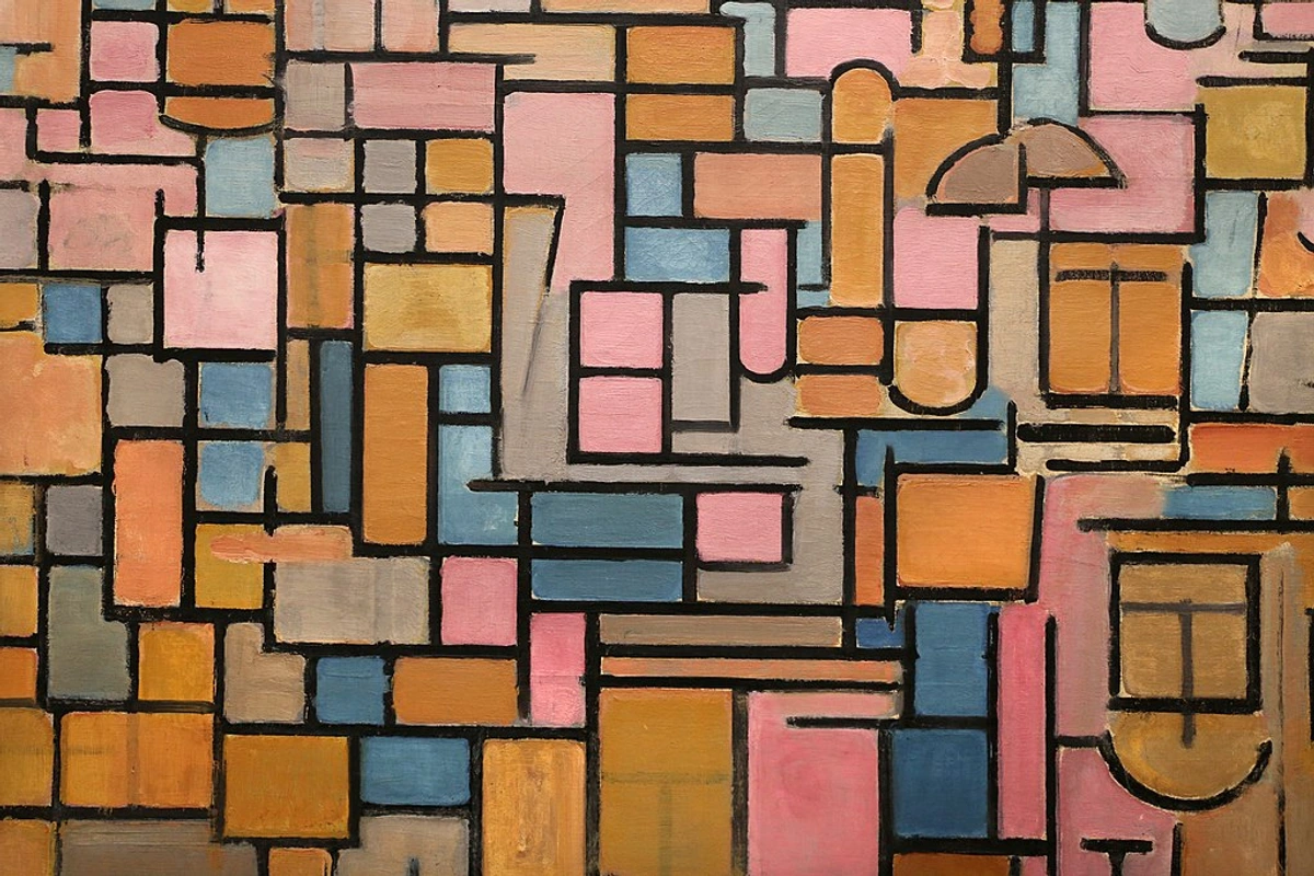
Framing and Presentation: The Final Statement
The very last touch, the one that prepares your artwork for its public life, is often its framing and presentation. This isn't a mere afterthought; it's an extension of the artwork itself, influencing how it is perceived and experienced by the viewer. It's the stage upon which your masterpiece will perform, and as such, it deserves careful consideration, a topic I delve into often in my articles on decorating with art and art above the sofa.
- Choosing the Right Frame: A frame shouldn't compete with the artwork; it should enhance it. Consider the style, period, and colors of your painting. A minimalist floating frame might suit a contemporary abstract, while a more ornate frame could complement a traditional piece. The frame acts as a visual boundary, separating the art from its environment and drawing the eye inward.
- Mounting and Matting: For works on paper, proper archival mounting and matting are crucial to prevent damage and provide visual breathing room. The mat can be a subtle transition or a deliberate design element, guiding the eye to the artwork's core.
- Lighting: Think about how the artwork will be lit. The right lighting can dramatically bring out colors and textures, while poor lighting can flatten a masterpiece. If you're planning for an exhibition or home display, consider the interplay of light and shadow, and how it will interact with your final touches. This consideration is vital for the art of display: how to light and position abstract art for maximum impact.
- Environment: Consider the context in which your art will be viewed. The walls, the surrounding furniture, and even the overall mood of the space all play a role in the viewer's experience.
By paying attention to these final presentation details, you ensure that your painting not only stands on its own but also makes its most impactful statement in the world.
Documenting Your Work: The Digital Archive
In our increasingly digital world, documenting your finished artwork is just as crucial as the painting process itself. This isn't just for posterity; it's essential for promotion, insurance, and creating a professional portfolio. Think of it as creating a digital twin of your physical masterpiece.
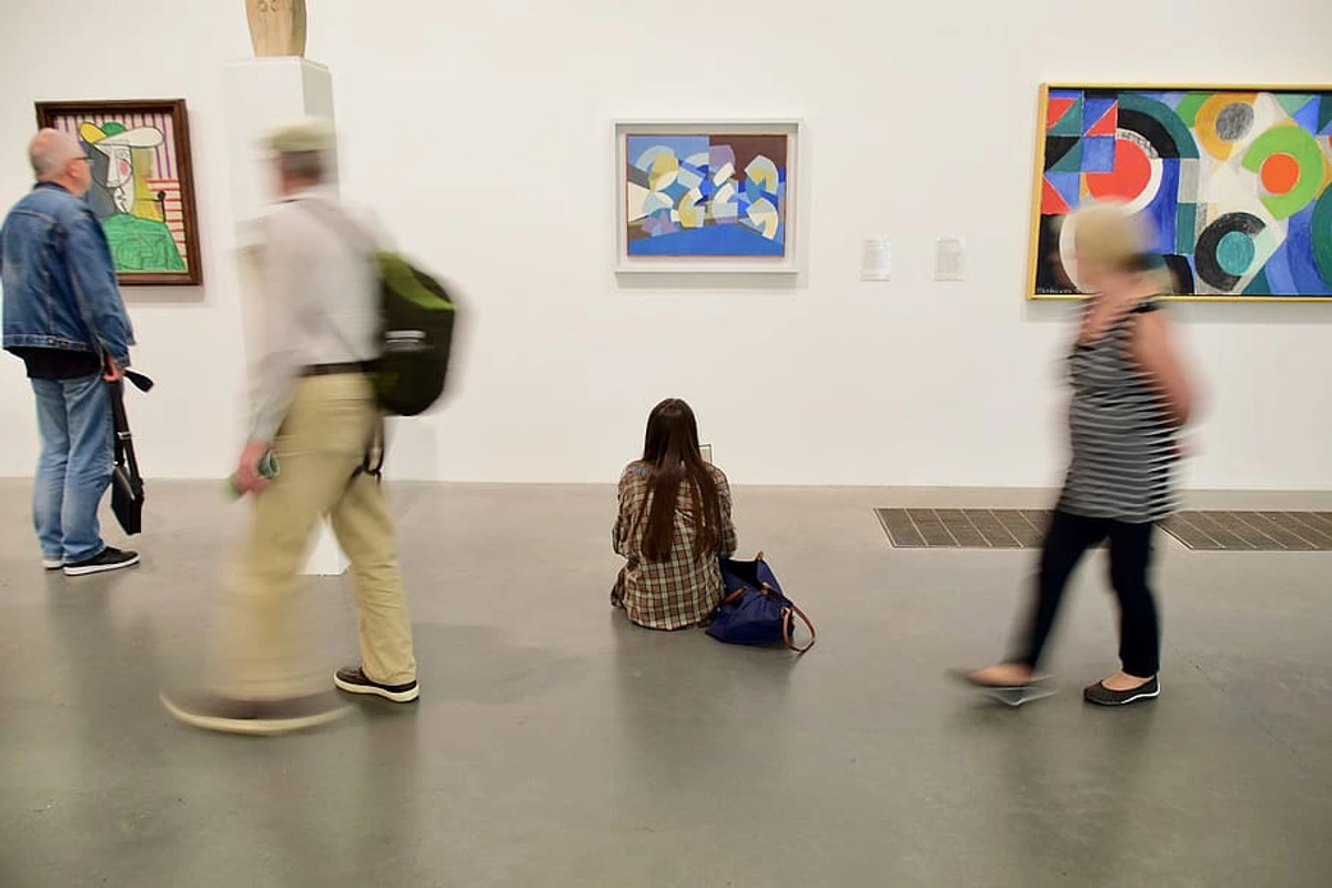
- High-Quality Photography: Invest in good lighting and a decent camera (or hire a professional). Take multiple shots from different angles, including close-ups of texture and detail, and overall shots that show the scale and context. Ensure accurate color representation.
- Metadata and Information: Keep meticulous records. This includes the title, date of completion, medium, dimensions, a brief artist statement or narrative behind the piece, and any specific installation instructions. This information becomes part of your artwork's story and its provenance.
- Digital Backups: Store your high-resolution images and data in multiple secure locations – cloud storage, external hard drives – to prevent loss. Consider a password-protected portfolio website for easy sharing with galleries or clients.
- Copyright: Understand your rights. Generally, as the creator, you own the copyright to your artwork from the moment of creation. Displaying a copyright notice (e.g., © [Your Name] [Year]) is good practice. While blockchain technology has been suggested for provenance, I remain cautiously skeptical; traditional, verifiable documentation still holds the most weight in the art world.
This digital archive serves as a living legacy of your work, allowing it to transcend its physical form and reach new audiences, proving invaluable for understanding art appraisals and market value.
The Spiritual Side of Completion
Beyond the techniques and the critical eye, there’s an undeniable spiritual dimension to completing a work of art. For me, it’s a process of deep listening, a conversation with something beyond myself. Each painting, whether abstract or representational, carries a piece of my soul, my journey, my struggles, and my triumphs. The act of bringing it to a close is not just about aesthetics; it’s about acknowledging that transformation, releasing the energy I poured into it, and allowing it to exist independently. It’s a moment of surrender, a quiet reverence for the emergent beauty, and an understanding that the work now has its own life and its own story to tell the world. This is where the initial spark of creation finds its ultimate resolution, a profound quietude.
The Last Brushstroke
Completing a painting is a quiet conversation between you and the canvas. The final touches are the last few words of that conversation. They should be thoughtful, deliberate, and serve the greater whole. When you put the brush down, and the piece feels balanced, alive, and independent of you, that’s when you know. It’s done. And it’s time to start the next conversation with a fresh canvas, carrying the wisdom of this completed journey with you. Remember, the true mastery isn't just in the making, but in the knowing when to stop, to let go, and to trust the inherent power of your creation. It's about finding that sweet spot where adding more would diminish, and subtracting would weaken. That, to me, is the true ecstasy of the final 5%: the moment of perfect balance, the resonant hum of a piece finally complete, ready to embark on its own journey and speak to the world.


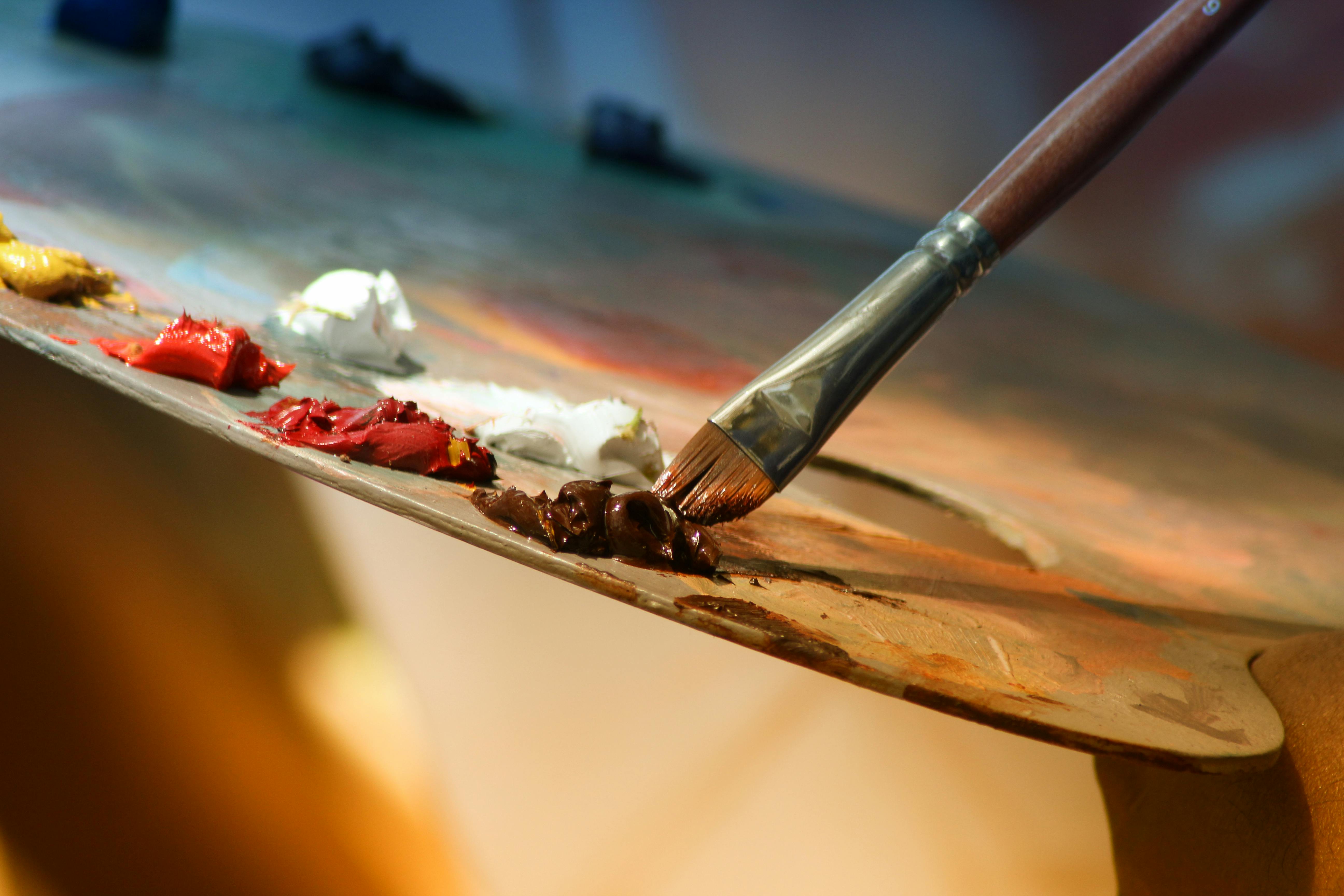


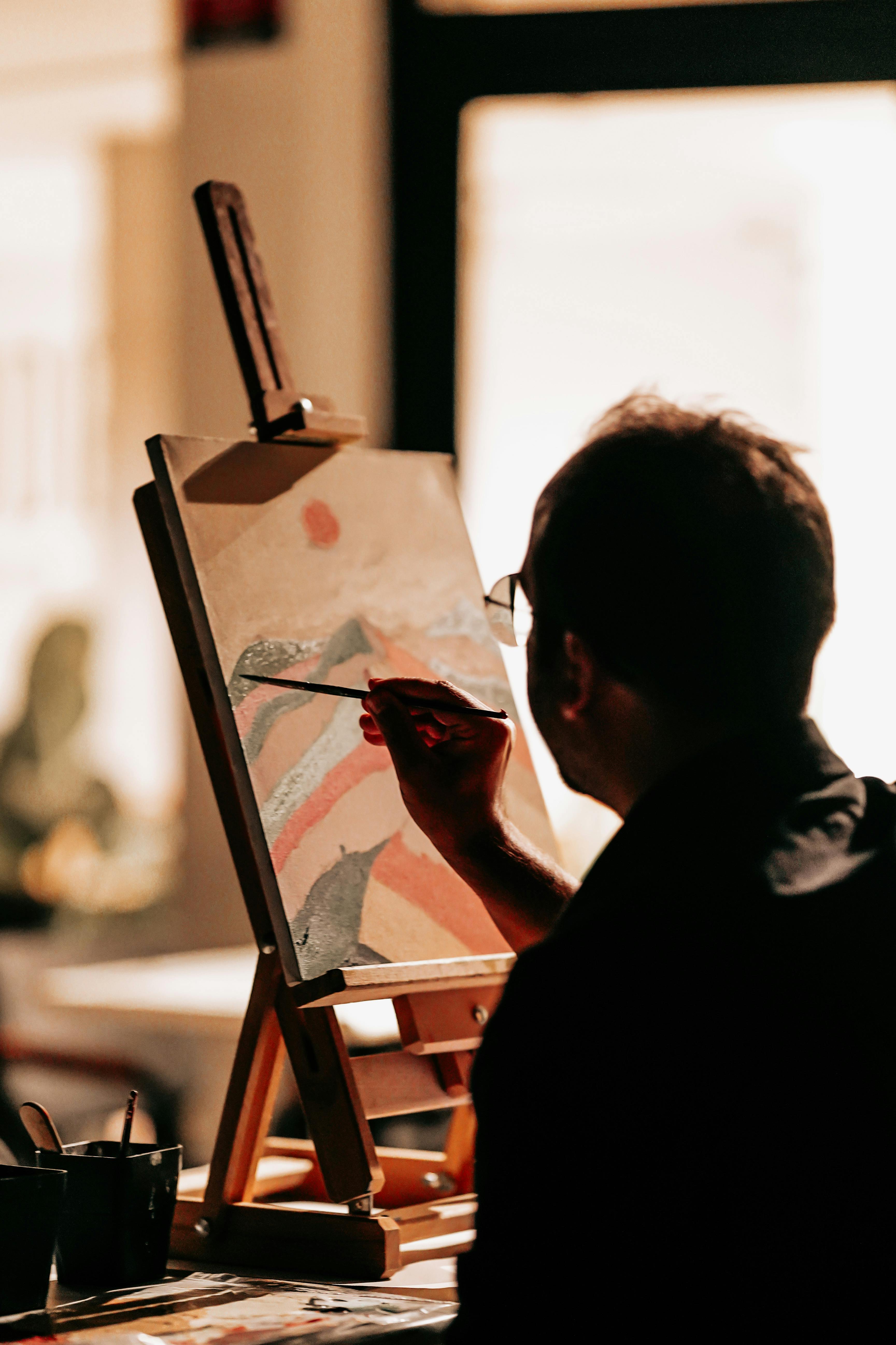


If you're interested in seeing how these final touches come together in a finished piece, you can see some of my completed works available to /buy.