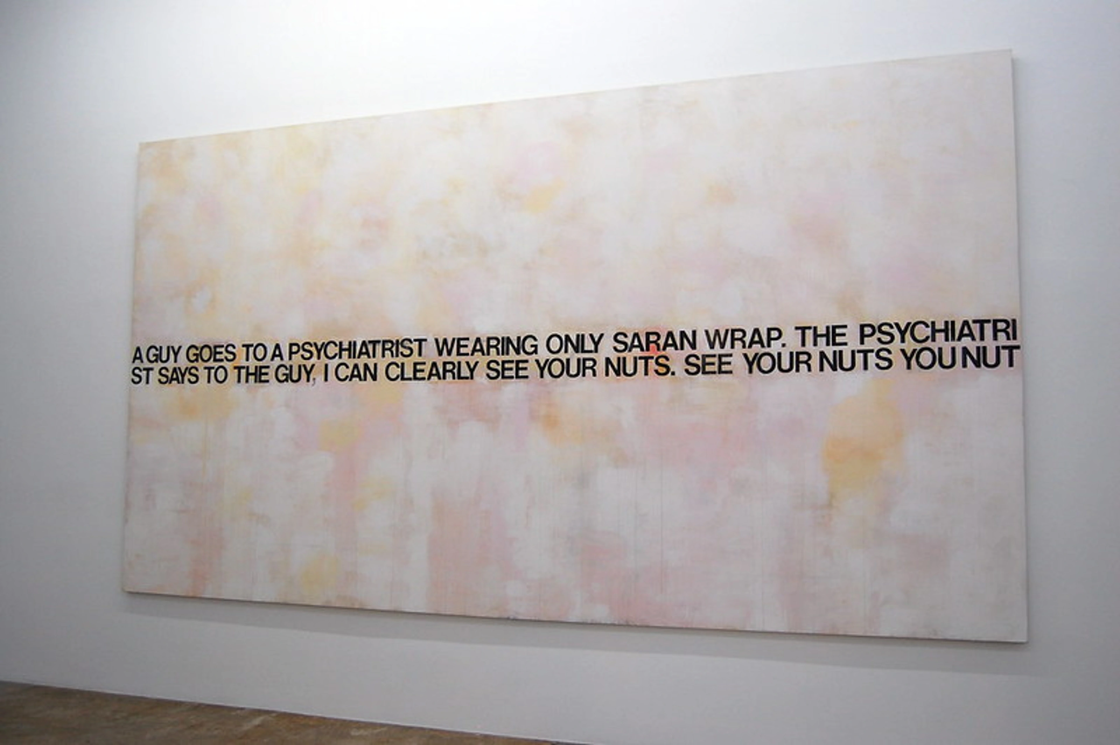
First Impressions Count: A (Slightly Obsessive) Guide to Choosing Art for Your Entryway
Transform your entryway from a boring corridor into a stunning first impression. My personal, comprehensive guide covers everything from scale and style to lighting and unique art forms.

First Impressions Count: The Ultimate (and Slightly Obsessive) Guide to Choosing Art for Your Entryway
I remember the entryway to my first apartment. It wasn't really an 'entryway' so much as a 1-meter square of sad, beige linoleum where the front door swung open. It was a place for discarded shoes and a general feeling of, 'well, I'm home, I guess.' It had all the personality of a cardboard box. The first impression it gave was... no impression at all. But oh, how I yearned for it to be more! I wanted a 'wow,' a 'hello,' a 'this is me' moment that truly sang, even in such a tiny footprint. That's the power of entryway art, and it's a topic I've obsessed over for years. This isn't just about decorating a wall; it's about curating an experience, a personal greeting that transforms a functional space into a statement of who you are, what you love, and the atmosphere you've cultivated within your home. I've found this to be true not just for myself, but for every home I've ever had the pleasure of transforming. Because let's be honest, your home's story doesn't start in the living room; it begins the very moment someone steps through your front door.
Your entryway isn't just a place you pass through; it's your home’s opening line, a visual overture. It’s the handshake, the first chord of a song, the unspoken promise of what awaits beyond the threshold. This small, yet mighty, space sets the entire tone for your home, a silent prelude of the style, comfort, and personality that awaits within. It’s the very first glimpse into your aesthetic, your personal narrative, and the warmth you offer. And yet, for so many of us, it becomes a forgotten corridor, a dumping ground for keys, mail, and forgotten responsibilities. I'm here to passionately argue that this little patch of real estate is your home's most powerful, and most neglected, opportunity. The fastest, most impactful way to claim that power is with carefully chosen art that instantly connects, delights, and sets the stage for everything beyond.
Choosing art for an entryway isn't just about filling a blank space; it's about crafting an immediate emotional response, telling a story, and making a statement about who you are before anyone even steps foot in your living room. It’s a chance to welcome, to intrigue, and to truly ground your space. It's a foundational element in art for your entryway. Consider this your definitive, no-stone-unturned manual. In this ultimate guide, we'll dive deep into every single aspect of entryway art, meticulously covering everything from precise sizing and optimal lighting to exploring unique and unexpected art mediums. My goal is to equip you with all the knowledge and a healthy dose of inspiration to make your first impression truly unforgettable, turning your entryway into a captivating prelude to your home.
But I get it, I really do. Choosing art for this space can feel incredibly tricky, sometimes even daunting. It's often physically small, sometimes perpetually dark, and almost always has to be undeniably practical. You might be grappling with questions about the perfect size that doesn't overwhelm or get lost, the right style that resonates with your home's overall aesthetic, or even how to ensure your chosen art is durable enough to withstand the inevitable bumps and splashes of a high-traffic zone. So, let's walk through it, one slightly obsessive but entirely necessary step at a time, uncovering all the secrets to making your entryway art not just functional, but truly sing.
Step 1: Measure Your Ambition (and Your Wall)
The single, most glaring mistake I see people consistently make in their hallways and entryways is choosing art that's simply too small. It’s akin to wearing a hat that's two sizes too tiny—it just looks timid, a bit lost, and completely unintentional. Trust me, your entryway can not only handle more drama than you think, it often craves it. This is your chance to make a confident statement, not a quiet apology.
A great rule of thumb, one I practically live by and preach to anyone who will listen, is the 75% rule. This principle dictates that if you have a blank wall, you should find a piece of art that takes up about 75% of the width of that wall. Similarly, if you're hanging it above a console table or a bench, aim for something that is approximately 75% of the furniture's width. This isn't merely about filling space; it's about creating a powerful visual anchor, a sense of gravitas and intention that makes the art feel like an integral part of the design, not an afterthought. Think of it as a perfectly tailored suit for your wall – confident, well-proportioned, and undeniably chic. Too small, and it looks like it shrunk in the wash, leaving the space feeling unfinished and awkward.
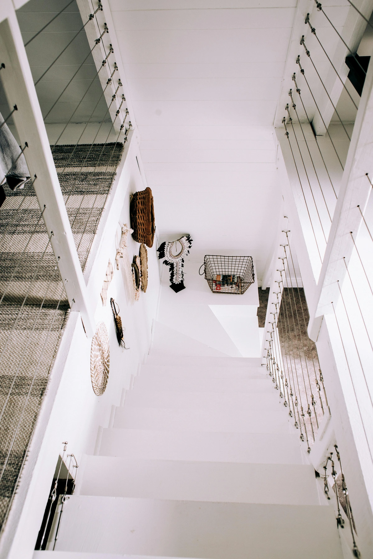
Beyond just physical dimensions, consider the visual weight of the piece. This often overlooked aspect is less about actual mass and more about how much a piece draws the eye and occupies the visual field. For instance, a very dense, dark, or intricately detailed artwork—perhaps a striking piece from the Harlem Renaissance or a bold abstract piece created using oil sticks—will inherently feel 'heavier' than a light, airy, minimalist abstract, even if they share the exact same physical size. Artworks with high contrast, deeply saturated colors, or busy, complex compositions also carry significantly more visual weight. This means you might lean slightly smaller with a 'heavy' piece to prevent overwhelming the space, and conversely, go slightly larger with a 'light' one to achieve optimal balance and presence. It's a delicate, intuitive dance that, when mastered, truly makes an impact, ensuring your art commands attention without shouting. And speaking of balance, here's a quick table to help you avoid common sizing pitfalls:
Mistake  | Description | Solution | Why it Matters |
|---|---|---|---|
| Too Small | Art looks lost or insignificant on a large wall or above furniture. | Use the 75% rule; opt for larger pieces or gallery walls. | Creates a timid, unintentional look; lacks visual impact, making the space feel unfinished. |
| Too Large | Art overwhelms the space, feels cramped, or impedes traffic flow. | Scale down, consider vertical stacks, or move to a larger room. | Makes the entryway feel claustrophobic, unbalanced, and can even be a tripping hazard. |
| Wrong Proportions | Art's orientation (vertical/horizontal) clashes with wall shape. | Match vertical art to tall, narrow walls; horizontal to wide walls. | Enhances architectural features, creates harmonious flow, and visually expands or elevates the space. |
| Ignoring Visual Weight | Hanging a dark, dense piece of art that feels 'heavy' in a small space. | Balance with lighter pieces, or choose art with more negative space. | A heavy piece in a small space can feel oppressive and shrink the perceived area. |
| Incorrect Eye Level | Art is hung too high or too low, making it uncomfortable to view. | Center at 57-60 inches from the floor for most adults. | Ensures optimal viewing comfort and integration with the space, making the art feel part of the home, not just an object. |
| Ignoring Adjacent Elements | Art is hung too close to doors, windows, or architectural features. | Maintain clear margins (at least 6-12 inches) around permanent fixtures. | Creates visual clutter and makes the space feel cramped, disrupting the flow. |
| Overlooking Walkway Clearance | Art protrudes too far from the wall in a narrow entryway. | Choose shallow pieces, canvas prints, or metal prints without deep frames. | Can impede traffic flow, risking damage to both the art and people. |
| Ignoring Entryway Scale | A tiny piece in a vast foyer, or a massive piece in a cramped apartment entry. | Match art scale to the overall architectural volume of the space. | Creates a disproportional, awkward feeling, undermining the intended impact. |
### Beyond the 75% Rule: Eye-Level is Key
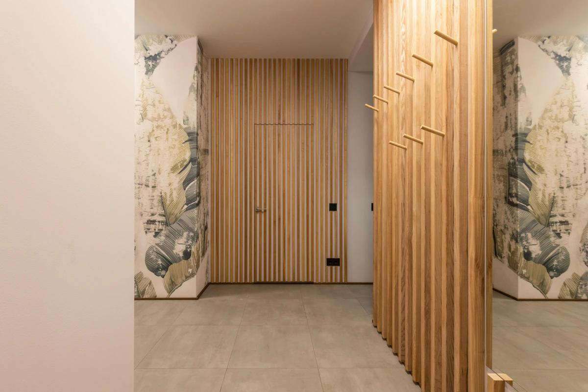
While the 75% rule provides a fantastic starting point for width, ensuring your art has sufficient presence, height is equally, if not more, crucial. The general gallery standard for hanging art is to place its center at eye level, which typically falls between 57 to 60 inches (about 145-152 cm) from the floor. This ensures the art is comfortably viewed by most adults as they stand. However, in an entryway, you might adapt this slightly based on context. If you have a bench where people might sit to remove shoes, consider lowering the art slightly so it can also be appreciated from a seated position, inviting a moment of pause. Conversely, if your entryway boasts very tall ceilings or is part of a stairwell, you might raise the art a touch to encourage the eye upwards, emphasizing the room's height and grandeur, but always keeping the primary standing viewing experience in mind. It's about finding that sweet spot where the art feels seamlessly integrated into the space, rather than floating awkwardly high or being too low to truly connect with. I've often seen beautiful pieces utterly lost because they were hung too high, leaving visitors staring at an empty wall while the art hovered unappreciated.
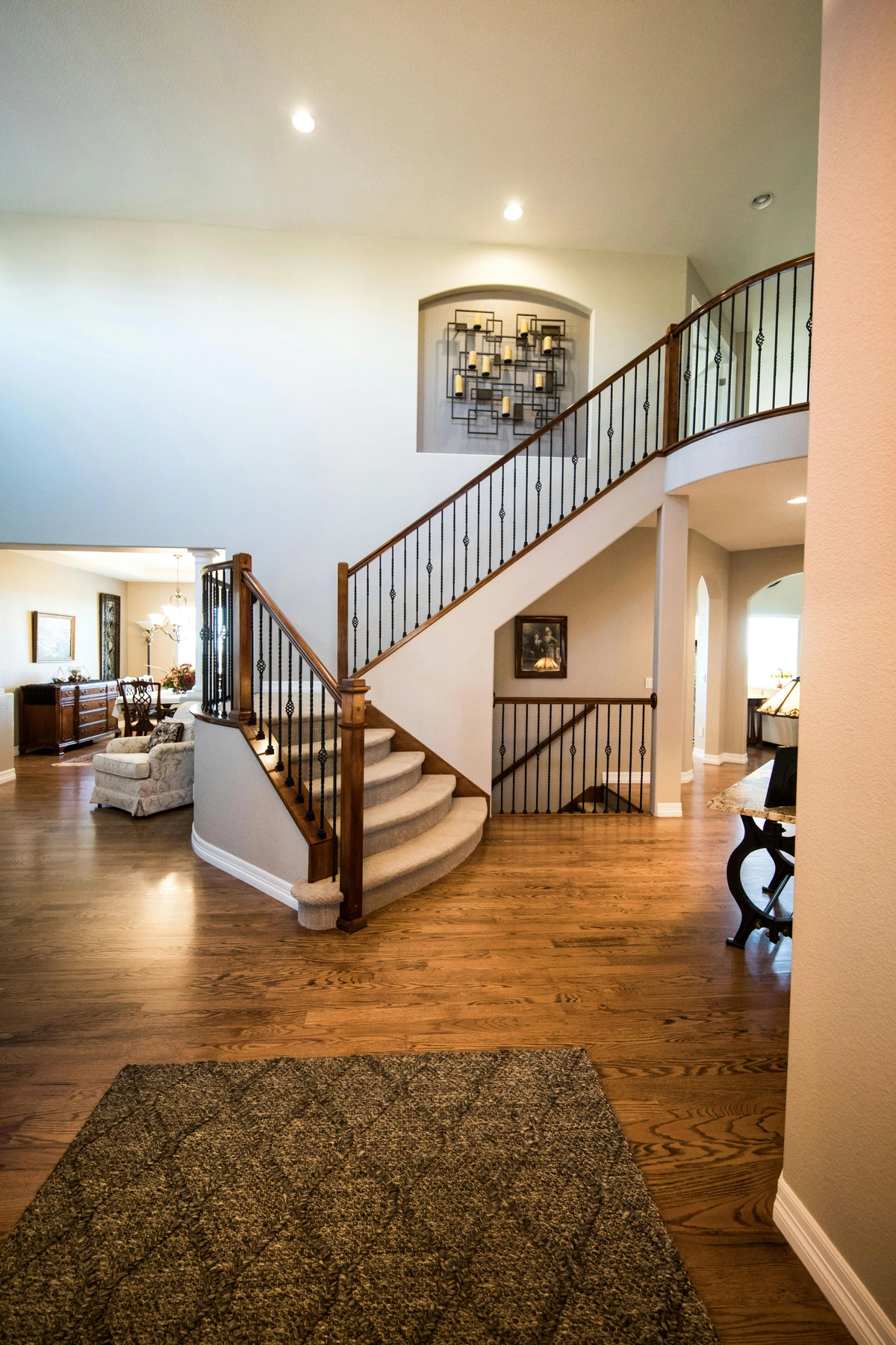
Sometimes, a single piece isn't the answer. For those truly long, uninterrupted hallway walls, I'm a huge fan of creating a sense of movement with multiple pieces. This can take the form of a thoughtfully curated gallery wall or a series of complementary artworks hung in a linear fashion. The key is to guide the eye, transforming a mere passageway into an engaging visual journey. This approach can also solve the challenge of awkward, irregular wall spaces – think about stairwell landings or walls with multiple doors. Here, a gallery wall or a sequence of smaller pieces can bridge disparate elements, making the space feel intentionally designed rather than disjointed. You can explore more ideas for these types of spaces in my guide to art for long hallways and choosing art for stairwells. Think beyond just hanging; consider how the arrangement itself tells a story and connects different architectural elements.
Think about orientation, too. A long, narrow hallway practically begs for a horizontal, panoramic piece or a series of smaller pieces arranged in a line to emphasize length and flow, making the space feel more expansive. A tall, narrow space between two doors? That’s the perfect spot for a vertically oriented piece that draws the eye upward, adding a sense of grandeur and height.
It's amazing what a well-composed gallery wall can do for a narrow passage, making it less like a corridor and more like a curated experience. It turns an often-overlooked area into a focal point, inviting guests to pause and explore. For truly grand entryways or those with exceptionally high ceilings, consider art that can command the vertical space, such as a monumental canvas or a stacked series that emphasizes the room's impressive dimensions. This ensures the art feels perfectly proportional, not dwarfed by the scale of the architecture. You can also explore how to use art to complement different ceiling heights in my guide on maximizing impact, choosing art for high ceilings. Don't let a grand space intimidate you; let it inspire grand art!
Integrating Art with Entryway Furniture and Features
Your entryway isn't merely a blank canvas; it often includes crucial functional elements like elegant console tables, practical benches, discrete hooks for coats, or even clever built-in storage solutions. The art you choose should always complement and integrate with these features, rather than compete for attention. A striking statement piece hung above a console table acts as a powerful anchor, creating a cohesive and inviting vignette that draws the eye. If you have a functional coat rack, consider a series of smaller, more linear pieces, or even sculptural hooks that are artistic in themselves, maintaining functionality without visually overwhelming the space. For benches, ensure art is hung at a comfortable viewing height from a seated position, inviting a moment of pause and reflection before you step further into the home. It's about creating a harmonious ecosystem where every element serves both purpose and beauty, transforming everyday necessities into artistic opportunities and enhancing the overall design narrative.
Creating Dynamic Hanging Arrangements: Beyond the Single Piece
Even with a single, magnificent piece, the way you hang it can create profound drama and visual interest. Consider an asymmetrical hang where a smaller piece is intentionally placed slightly off-center next to a larger one, creating a dynamic tension and balance. Or imagine a vertical stack of two or three pieces that gracefully draws the eye upwards, emphasizing the height of a tall wall. For wider, expansive walls, two complementary pieces hung with a deliberate, artful gap can create a sense of expansive calm and thoughtful composition. The goal is to move beyond simply centering a picture (though there's a time and place for that!) and instead, choreographing a visual dance that enhances the architecture of your entryway, guiding the eye through the space and creating an immediate, engaging experience. The visual flow you create is just as important as the art itself, a silent conductor of your home's aesthetic symphony.
Here's a breakdown of common hanging arrangements and their impact:
Arrangement Type | Description | Ideal Space | Visual Impact | Design Tip |
|---|---|---|---|---|
| Single Statement Piece | One large artwork, often centered. | Feature walls, above consoles/benches. | Bold, focal point, strong impression. | Ensure it's 2/3 to 3/4 the width of furniture below. |
| Symmetrical Pair | Two identical or highly complementary pieces side-by-side or stacked. | Narrow walls, above a small dresser/table. | Formal, balanced, creates order. | Maintain consistent spacing (2-4 inches). |
| Linear Series | Multiple pieces of similar size hung in a straight line. | Long hallways, above long furniture. | Guides the eye, creates movement, elongates space. | Keep artwork aligned at the top, bottom, or center. |
| Gallery Wall (Grid) | Multiple pieces in a neat, organized grid. | Medium to large walls, behind a sofa. | Structured, formal, tells a cohesive story. | Use templates for perfect alignment, consistent spacing. |
| Gallery Wall (Organic) | Various sizes and shapes clustered freely. | Stairwells, eclectic spaces, creating a narrative. | Dynamic, personal, engaging, adaptable. | Start with an anchor piece and build outwards. |
| Vertical Stack | Two or three pieces hung one above the other. | Tall, narrow walls, between windows/doors. | Draws the eye up, adds height, elegant. | Consider proportional scaling (larger at bottom, smaller at top). |
| Asymmetrical Balance | Mixing different sizes/orientations to achieve visual equilibrium. | Any wall where you want dynamic interest. | Modern, intriguing, less rigid. | Use visual weight to balance, not just physical size. |
| Layered Display | Overlapping pieces, often with a mix of framed art and objects. | Eclectic spaces, above a console, creating rich depth. | Bohemian, personal, multidimensional, conversational. | Vary heights and depths to avoid a flat, cluttered look. |

Here’s a quick-and-dirty guide, perfect for brainstorming your entryway's artistic footprint:
Entryway Size | Wall Space | Art Suggestion | Scale Considerations | Key Impact |
|---|---|---|---|---|
| Small/Apartment | The wall facing the door | A single, bold vertical piece or a tight stack of two complementary horizontal pieces. | 24x36" (60x90cm) up to 30x40" (75x100cm) | Draws the eye up, adds height, creates a focal point in limited width. |
| Medium/Standard | Above a small console table or bench | A significant horizontal piece (75% of table width) or a curated gallery of 3-5 smaller pieces. | 36x24" (90x60cm) to 48x36" (120x90cm) | Anchors furniture, establishes clear style, allows for thematic storytelling. |
| Long/Narrow Hallway | Uninterrupted side wall | A linear series of 2-4 horizontal pieces, or a panoramic diptych/triptych. | Each piece 18x24" (45x60cm) to 24x36" (60x90cm), with 4-6" (10-15cm) spacing. | Emphasizes length, creates visual journey, prevents a "tunnel" effect. |
| Tall/Grand Foyer | The main, uninterrupted wall or a narrow pillar between doors. | An oversized statement piece, a monumental vertical canvas, or a large-scale gallery wall that extends vertically. | 48x60" (120x150cm) up to 72x96" (180x240cm) for truly grand spaces. | Commands attention, balances architectural scale, adds grandeur and vertical drama. |
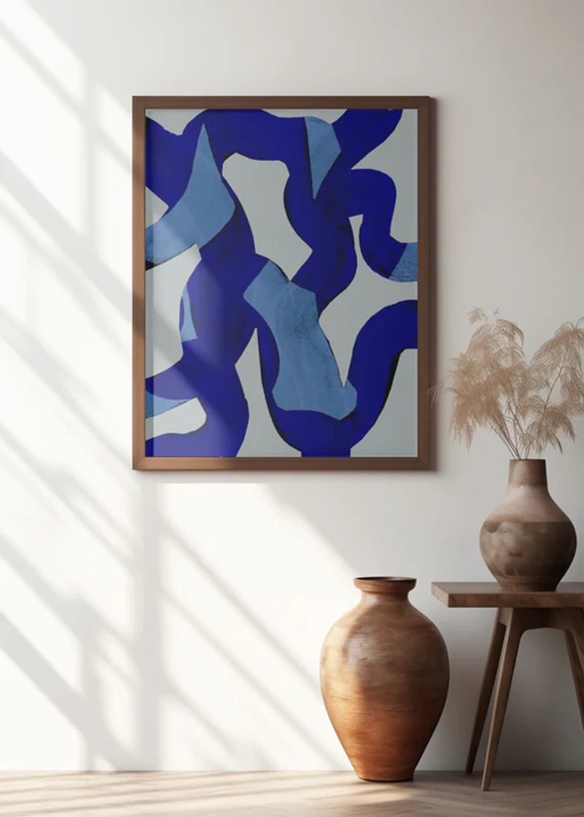
Step 2: What's the Vibe? Setting the Tone at the Door
What do you want to feel when you walk in? What do you want your guests to feel? The art in your entryway is your mission statement, the emotional compass for your home. It’s a chance to telegraph your personal style and the atmosphere you’ve cultivated within. It's not just about what's visually appealing, but what resonates on an emotional level. Do you want a burst of energy or a calming embrace? This is where your entryway truly becomes a portal, a curated transition zone that cues your entire home's narrative.
- Sophisticated & Elegant: Perhaps you envision a refined entry, a space that exudes quiet luxury and speaks volumes without a single shouted word. Here, I’d steer you towards timeless choices like classic portraiture (whether modern or traditional, perhaps even a striking historical portrait like Whistler's Mother if you're feeling particularly bold!), delicate etchings, or perhaps abstract art rendered in a muted, rich color palette with subtle textures. Think sumptuous dark wood frames, perhaps with a subtle gilt detail, or sleek polished metal. A classic black and white photograph, especially one with a strong composition, can perfectly capture this understated opulence and timeless appeal. Consider art that conveys a quiet confidence, often characterized by strong compositional balance and a refined aesthetic. This style often aligns beautifully with homes that embrace modern farmhouse interiors but with a more polished, elevated edge, or even classic industrial interiors seeking a softer, more integrated touch.
- Natural & Organic: If your home speaks the language of natural textures, earthy tones, and a deep, abiding connection to the outdoors, your entryway art can, and should, reinforce that beautiful narrative. Consider botanical prints, ranging from intricate herbarium-style pressings to vibrant, detailed flora illustrations. Abstract pieces inspired by geological forms, flowing water, or organic patterns, perhaps with a subtle, tactile quality, would be perfect. Woven textile art—think macrame, tapestries, or even minimalist felted pieces—brings in incredible tactile warmth and handmade charm, often helping with acoustics too. Serene landscapes, wall-mounted earthy pottery, or art crafted from natural fibers like linen, jute, or raw canvas all evoke this sense of grounded tranquility. Even evocative photography capturing misty forests, expansive coastlines, or sweeping desert vistas can invite a breath of fresh air indoors. This aesthetic often pairs beautifully with minimalist design principles, creating spaces that are both serene and engaging, much like the balanced compositions seen in Japandi style homes. It’s about creating a living, breathing connection to the natural world, even if you're in the heart of a bustling city.
- Calm & Welcoming: Is your primary goal to create a serene transition from the chaotic world outside, a gentle decompression zone that allows you to exhale the moment you arrive home? Then lean into art that evokes peace and ease. Think soft, ethereal abstract landscapes, simple yet profound minimalist line art, or pieces featuring a soothing color palette dominated by gentle blues, tranquil greens, and muted earth tones. The focus here is on creating a sense of visual quietude and a feeling of calm the moment you step inside, like a visual sigh of relief. This is a key principle in a Scandinavian-style home, where tranquility reigns, often incorporating simple forms and light-colored wood frames. Consider pieces that feel open, uncluttered, and offer ample negative space, allowing the eye to rest. You can explore the profound nuances of these calming hues in discussions on the psychology of color in abstract art. Think of it as creating a mindful moment, a gentle transition from the outside world into your personal haven.
- Bold & Energetic: Perhaps you want your home to greet you with a jolt of pure energy, a vibrant exclamation point that proudly declares, 'life happens here, and it's exhilarating!' This is where you can truly go wild with art that pops—think intensely vibrant abstract art (my personal favorite, of course!), playful pop art (perhaps even a cheeky nod to Andy Warhol's Campbell's Soup Cans or other iconic figures), or a statement piece with intensely saturated, almost glowing, colors. Think large-scale pieces that command attention the moment the door swings open, or a dynamically arranged gallery wall brimming with personality and unexpected juxtapositions. My own work often lands squarely in this category, because I fundamentally believe a home should feel alive, a constant source of inspiration and unbridled joy. You can see some examples of what I mean on my buy page. This aesthetic often thrives in eclectic interiors or industrial-chic spaces, where raw beauty meets bold expression. It's about letting your personality explode onto the walls in the most artful way possible.
When you're trying to nail that elusive vibe, do not, under any circumstances, underestimate the profound power of color psychology. Blues and greens, for instance, are natural champions of calm and serenity, perfect for a welcoming space that feels like a gentle exhale after a busy day, promoting a sense of peace and refreshment. Reds and oranges, on the other hand, are the fiery igniters of energy and passion, making a bold, unforgettable statement and instantly warming up even the chilliest of spaces. Yellows, oh yellows, they bring sunshine, optimism, and a playful creativity, instantly brightening even the smallest nook and adding an undeniably cheerful pop. Purples can suggest everything from opulent luxury to boundless creativity, or even a touch of intriguing mystery, entirely dependent on their specific hue and saturation. Even the deliberate absence of color, in a striking black and white piece, can create incredible drama or minimalist sophistication, offering a timeless elegance that never fades. And let's not forget metallics – silvers, golds, and coppers can add a touch of glamour, modernity, or even rustic charm, reflecting light and shifting perception. So, think deeply about the emotional resonance you want to create the very moment you step through the door – your art can be its maestro, conducting the emotional temperature for your entire home.
Here's a quick reference for matching colors to the mood you want to create:
Color Palette | Emotional Impact | Ideal Vibe | Associated Styles |
|---|---|---|---|
| Blues & Greens | Calm, serene, refreshing, peaceful | Welcoming, tranquil, natural | Scandinavian, Coastal, Traditional |
| Reds & Oranges | Energetic, passionate, warm, inviting | Bold, vibrant, dynamic | Eclectic, Industrial, Modern |
| Yellows | Optimistic, cheerful, creative, bright | Uplifting, joyful, sunny | Bohemian, Contemporary, Playful |
| Purples | Luxurious, creative, mysterious, sophisticated | Elegant, dramatic, unique | Glam, Traditional with a Twist, Eclectic |
| Black & White | Dramatic, sophisticated, timeless, minimalist | Modern, classic, understated | Minimalist, Industrial, Classic Contemporary |
| Metallics (Gold, Silver, Copper) | Luxurious, glamorous, dynamic, industrial | Glam, Modern, Industrial, Eclectic | High-end, Art Deco, Contemporary Luxury |
| Earth Tones | Grounded, organic, warm, comforting | Natural, rustic, cozy | Modern Farmhouse, Bohemian, Traditional |
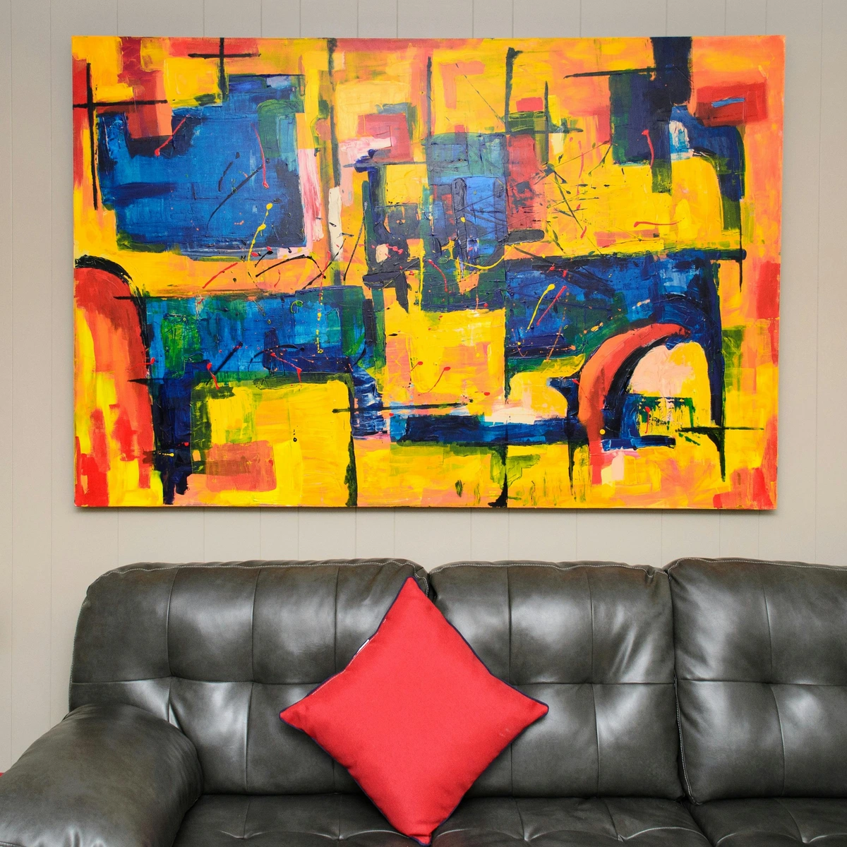
The Power of Texture: Adding Depth to Your Welcome
Beyond the obvious impact of color and style, do not, for a second, underestimate the profound role of texture in setting your entryway's vibe. A piece of art isn't just a flat image; its tactile quality, the way light plays across its surface, can greatly influence the overall feeling and perception of depth. Imagine a heavily impastoed painting, perhaps created with generous, almost sculptural layers of acrylic mediums or exquisite glazing techniques in oil painting. Or consider a soft, woven tapestry, a rustic macrame piece, or a sculptural object crafted from rough, natural elements like reclaimed wood or unpolished stone. These pieces instantly add warmth, depth, and a compelling tactility, inviting guests to engage more deeply and sensually with the space. Conversely, a sleek, glossy metal print or a minimalist piece with smooth, unblemished lines can convey a crisp, modern, and almost ethereal aesthetic. Thinking about how the art 'feels' (even before you physically touch it) adds an incredibly rich layer to crafting that perfect, nuanced first impression. This often plays a crucial role in understanding balance in art composition, where varied textures contribute significantly to the overall visual harmony and interest. Consider materials like raw canvas, chunky knit wool, smooth glass, polished concrete, or intricate mixed media collages to add unparalleled tactile richness.
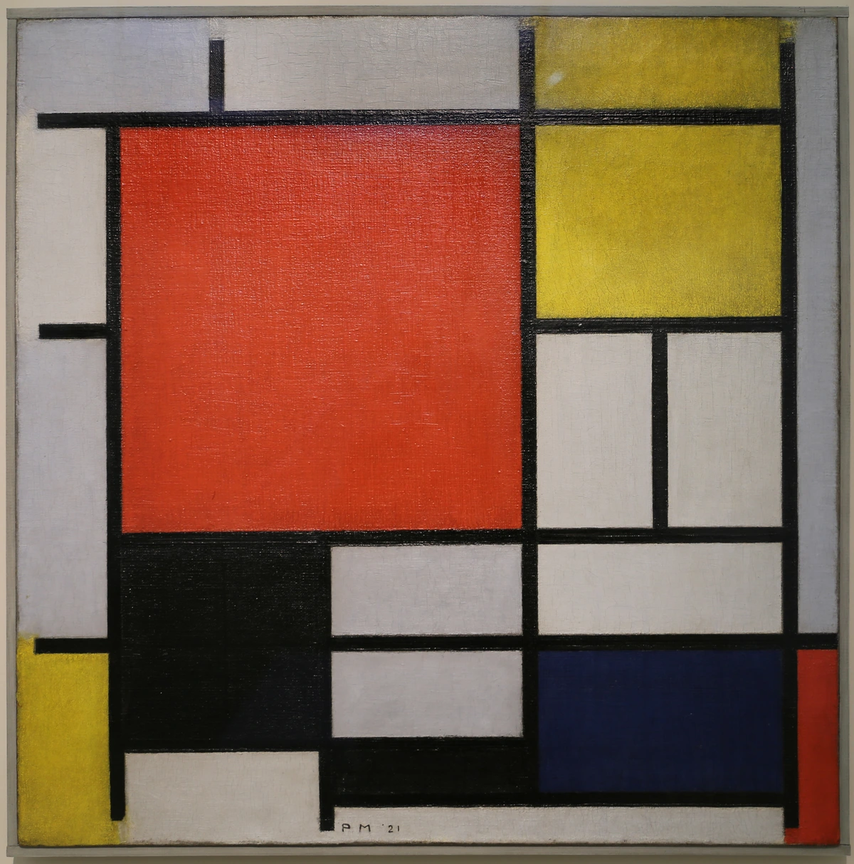
- Minimalist & Modern: For those who appreciate the austere beauty of clean lines, uncluttered spaces, and a profound sense of understated sophistication, minimalist art is the undeniable way to go. Think crisp geometric abstracts like this piece, serene monochromatic pieces, or stark, powerful photography that emphasizes pure form and strategic negative space. The goal here is a highly curated, intentional look that complements modern or contemporary architecture without ever overwhelming it. Materials like polished concrete, sleek steel, gleaming glass, or even unadorned white plaster pair beautifully with this aesthetic, creating an almost gallery-like feel that speaks volumes in its quietude. This approach often echoes the principles found in how to abstract art where simplicity and form reign supreme. I often find that less is truly more in these spaces, with each carefully chosen piece making a profound impact.
- Eclectic & Collected: This vibe is all about celebrating and expressing your unique journey, diverse tastes, and the rich tapestry of your life experiences. It’s a joyful, often unexpected, mix of periods, styles, and origins, artfully brought together. Here, your entryway art can be a delightful blend of antique botanical prints, a vibrant contemporary abstract painting, perhaps a piece of hand-crafted folk art from a far-flung trip, and deeply personal photographs. The key is thoughtful juxtaposition, creating a fascinating conversation between seemingly disparate elements that, against all odds, somehow just works. This truly is a powerful chance for your entryway to tell an evolving story about you, your travels, your passions, and your personal evolution, inviting guests into your unique narrative the moment they arrive.
- Quirky & Personal: This, I must confess, is my personal favorite, and it’s where your entryway can truly shine with unapologetic individuality and charm. An entryway is the absolutely perfect place for a gallery wall that tells a vibrant, multi-faceted story—a delightful mix of fine art prints, deeply meaningful family photos (perhaps from different eras!), cherished kids' drawings, and weird, wonderful flea market finds that spark joy and conversation. It’s a space that boldly declares, 'real people live here, and they're wonderfully interesting.' It’s a living, breathing snapshot of your life, your adventures, your humor, and your evolving aesthetic, all lovingly curated for that powerful, memorable first impression. Don't be afraid to include unexpected objects like vintage postcards, quirky illustrations, or even a framed handwritten recipe from a beloved family member.
Considering Your Home's Architectural Style
Crucially, don't forget to let your home's inherent architectural style be your primary guide. The structure itself often whispers clues about the art that will truly sing within its walls. A grand Victorian home, with its ornate details and historical character, might lean towards classic, framed pieces, perhaps rich oil paintings or delicate etchings that echo its decorative flourishes. Conversely, a sleek mid-century modern home would come alive with abstract art that blends retro charm with contemporary expression, or bold, graphic prints and sculptural wall pieces that complement its clean lines. A more rustic, farmhouse-style home could beautifully embrace natural textures, warm landscapes, or perhaps a tactile textile art piece for added softness and an artisanal touch. The goal isn't to perfectly match, which can feel sterile, but rather to create a harmonious, engaging dialogue between the art and the unique architectural personality of the space it inhabits. I've often seen how art can either clash horribly or sing beautifully with a home's bones, and trust me, you want the latter. Consider a concise summary of how architectural styles influence art choices:
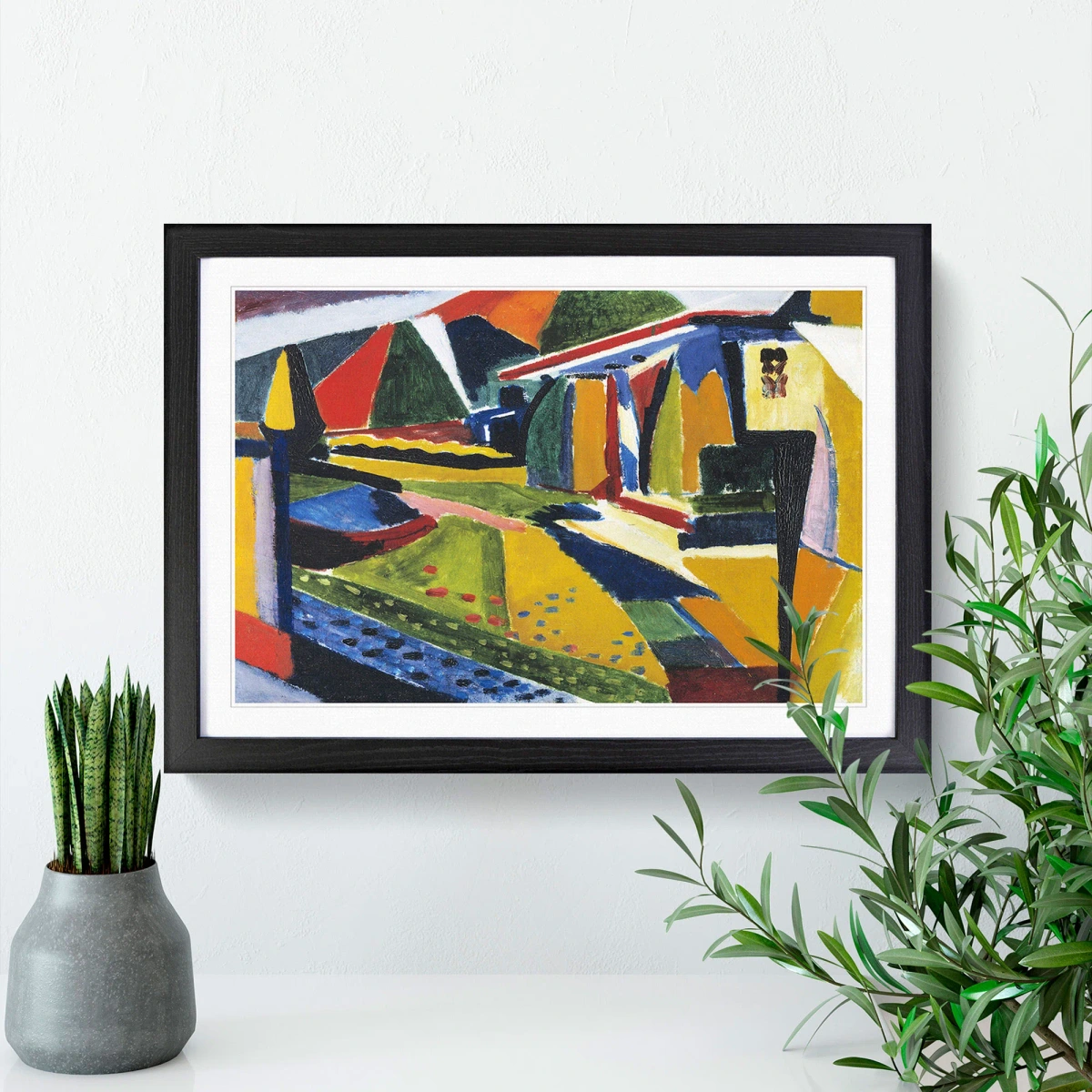
| Architectural Style | Recommended Art Vibe | Example Art Forms | |---|---|---|---| | Victorian | Classic, ornate, historical | Traditional portraits, etchings, framed botanical prints | | Mid-Century Modern | Retro-chic, bold, geometric | Abstract art, graphic prints, sculptural wall pieces | | Farmhouse/Rustic | Natural, warm, textured | Landscapes, botanical prints, woven textile art, ceramic plates | | Minimalist/Contemporary | Clean lines, understated, stark | Geometric abstracts, monochromatic photography, metal prints | | Industrial | Raw, edgy, functional | Abstract expressionism, mixed media, urban photography | | Bohemian | Eclectic, global, free-spirited | Tapestries, collected prints, folk art, personal artifacts |
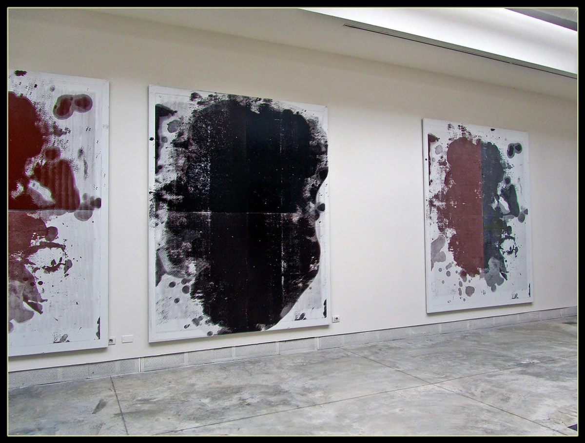
Step 3: Let There Be Light (Or Let's Fake It)
Many entryways are basically caves with a door. If you're not blessed with a sun-drenched foyer, your art choice is even more critical. You're not just decorating a wall; you're strategically creating a light source and expanding the perception of space. This is a game-changer for those often-dim areas.
This is a topic I've thought a lot about, and you can find a deeper dive in my guide on how to choose art for a room with low light. But the short version is this: choose art with a lot of white or bright background space to literally bounce light around. Vibrant, warm colors—yellows, oranges, pinks—can also bring a sense of warmth and light, injecting a much-needed dose of sunshine into a shadowy corner. Think of it as painting with light, using your art to illuminate and invigorate the space. Consider pieces with metallic accents or glossy finishes, as these surfaces are excellent at reflecting what little ambient light is available, adding a subtle shimmer and dynamic interaction with movement. For truly effective light enhancement, I often recommend pieces that feature highly reflective elements, such as gold leaf accents or polished resin coatings. These aren't just decorative; they actively engage with any available light, making the space feel more dynamic and less enclosed.
Art for Entryways with No Natural Light
For those truly subterranean entryways, where natural light is a distant, almost mythical dream, your art becomes not just vital, but transformative. Here, I lean unashamedly into the dramatic. Consider innovative solutions like back-lit art installations with integrated LEDs, or even a sophisticated digital art display that can emanate its own dynamic light and animation. Abstract pieces with bold, glowing colors, or high-contrast black and white photography, especially with stark shadows, can make an incredibly powerful statement. The goal isn't just to decorate a wall, but to actively create an intentional focal point that defies the darkness, turning a potential drawback into an opportunity for unexpected brilliance and intrigue. I often find that the vibrant, layered textures in abstract art can create a compelling illusion of depth even in challenging lighting conditions, inviting the viewer to explore deeper into the canvas. Look for art that intentionally utilizes highly reflective paints or materials, or even a piece with a subtle glow-in-the-dark element for a truly playful and surprising touch after sunset.
Harnessing Natural Light (and managing its challenges)
If your entryway does happen to be blessed with natural light from a window or a skylight, congratulations, you're in luck! This opens up a delightful array of possibilities for art that might subtly shift in appearance throughout the day, catching different nuances of light and shadow. However, this blessing also brings a few crucial considerations. Direct, intense sunlight can be a silent assassin of delicate pigments, causing valuable or paper-based art to fade irreversibly over time. For such pieces, UV-protective glazing is non-negotiable, or simply place the art out of the direct sun path entirely. Glare can also be a persistent issue, making highly reflective pieces hard to truly appreciate at certain times of day. This is where matte finishes or specialized anti-reflective glass become your best friends, diffusing harsh reflections. Conversely, indirect natural light is an absolute dream, allowing colors to appear true, vibrant, and incredibly nuanced. I've personally seen too many beautiful pieces dulled over time by an unforgiving sunbeam, and it's always a sad, preventable sight. So, planning for natural light, even when you're fortunate enough to have it, is just as important as strategically faking it when you don't. For truly valuable pieces, I cannot stress enough the importance of consulting with an expert art framer who can advise on the very best UV-protective and anti-glare solutions for your specific environment, ensuring your art's longevity and optimal viewing. This meticulous attention to detail is crucial in preserving the vibrancy and integrity of your cherished collection. It's an investment in the future beauty of your home.
Dealing with Glare and Reflections
If your entryway boasts windows or features highly reflective surfaces (think gleaming polished floors or high-gloss painted walls), you will almost certainly encounter frustrating issues with glare on your art. This can unfortunately render a beautiful piece virtually unappreciable at certain times of the day. My go-to solutions? Invest unequivocally in anti-glare or museum-quality acrylic/glass for all your framed pieces. This specialized glazing is engineered to diffuse reflections, allowing the artwork to be seen clearly and brilliantly from various angles, truly making it pop. For unframed art like metal prints, consider placement with almost surgical precision to avoid direct hot spots. Sometimes, a seemingly simple shift in angle, or moving the piece to an adjacent wall, can make all the difference in viewing pleasure. Matte finishes are your undeniable friend here, absorbing light rather than reflecting it back. Another clever trick is to angle recessed lights or picture lights ever so slightly, so they illuminate the art without creating a direct, blinding reflection back to the viewer. This thoughtful, strategic placement ensures your art is always presented in its absolute best light, free from distracting glares. Trust me, there's nothing more frustrating than a beautiful piece of art that's impossible to see because of a persistent reflection.

Another fascinating and often overlooked nuance is the color temperature of your lighting. This is a truly huge factor in how your art (and by extension, your entire entryway) feels and is perceived. Warm white bulbs (around 2700K-3000K) emit a softer, more yellow light that can make warm-toned art glow with an inner fire, creating a cozy, inviting, and intimate atmosphere—perfect for a traditional or earthy vibe. Cooler white bulbs (3500K-4000K or higher), on the other hand, emit a crisper, bluer light that can make blues and greens pop with incredible vibrancy, lending a more modern, clean, and crisp feel, aligning beautifully with minimalist or contemporary aesthetics. Experimenting with different bulb types and even smart lighting systems that allow adjustable color temperature can dramatically alter how your art is perceived, and thus, the entire mood of your entryway. Conversely, a very dark, moody piece might simply get lost in a dim hallway, unless it's specifically lit with a dedicated picture light (which, I must say, is a very chic and thoughtful move!). And speaking of dedicated lighting, never, ever dismiss the transformative power of a well-placed picture light. These aren't just for stuffy galleries; a sleek, modern picture light can highlight your artwork beautifully, turning it into an illuminated focal point and instantly adding a layer of undeniable sophistication. Beyond picture lights, consider strategically placed wall sconces that cast a soft, ambient glow, discreet, adjustable recessed lighting to brighten the overall space and direct light precisely, or even strategically placed floor lamps that illuminate a piece from below or to the side, creating dramatic shadows and intriguing depth. Even a well-chosen pendant light can serve as both a primary light source and a sculptural art piece in itself. Lighting truly is magic, and it's your best friend in a challenging entryway, elevating even a simple print to gallery status. I once helped a client transform a notoriously dim, forgotten hallway into a vibrant, engaging art corridor, purely by adjusting the color temperature of the bulbs and adding a few carefully aimed picture lights. The difference was astonishing, almost like a magic trick!
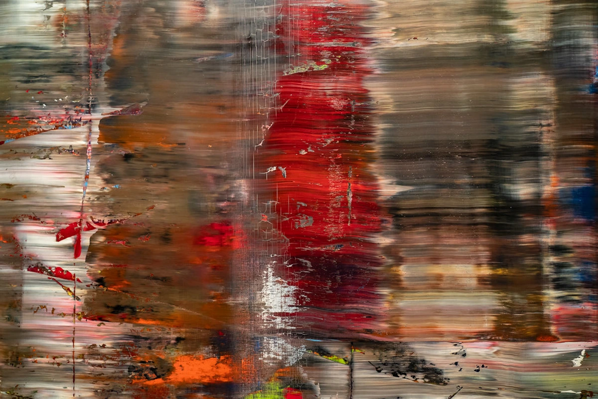
Illumination Techniques: Beyond the Picture Light
While a dedicated picture light is a wonderfully chic way to spotlight your art, don't limit your thinking. Wall sconces can cast a soft, ambient glow, illuminating the art indirectly while adding architectural interest, and they're particularly effective in creating a warm, inviting feel in traditional or transitional spaces. Recessed lighting with adjustable gimbals allows you to direct light precisely onto your artwork, creating a subtle museum-like effect, perfect for highlighting specific details or textures. For larger pieces or a dramatic flourish, strategically placed floor lamps can up-light or side-light art, creating intriguing shadows and depth, adding a dynamic, theatrical touch. Even a well-chosen pendant light can serve a dual purpose, acting as both a primary light source and a sculptural art piece in itself, drawing the eye upwards and adding a focal point to the ceiling. The key is to layer your lighting, ensuring both functional illumination for navigating the space and aesthetic light that makes your art sing, transforming your entryway into a welcoming stage for your art. Consider smart lighting systems that allow you to adjust brightness and color temperature to suit different moods or times of day, making your art truly dynamic. This level of control allows you to showcase your art perfectly, no matter the time of day or the desired ambiance. Imagine being able to shift from a warm, inviting glow for an evening gathering to a crisp, bright light for a morning rush – all with a tap on your phone.
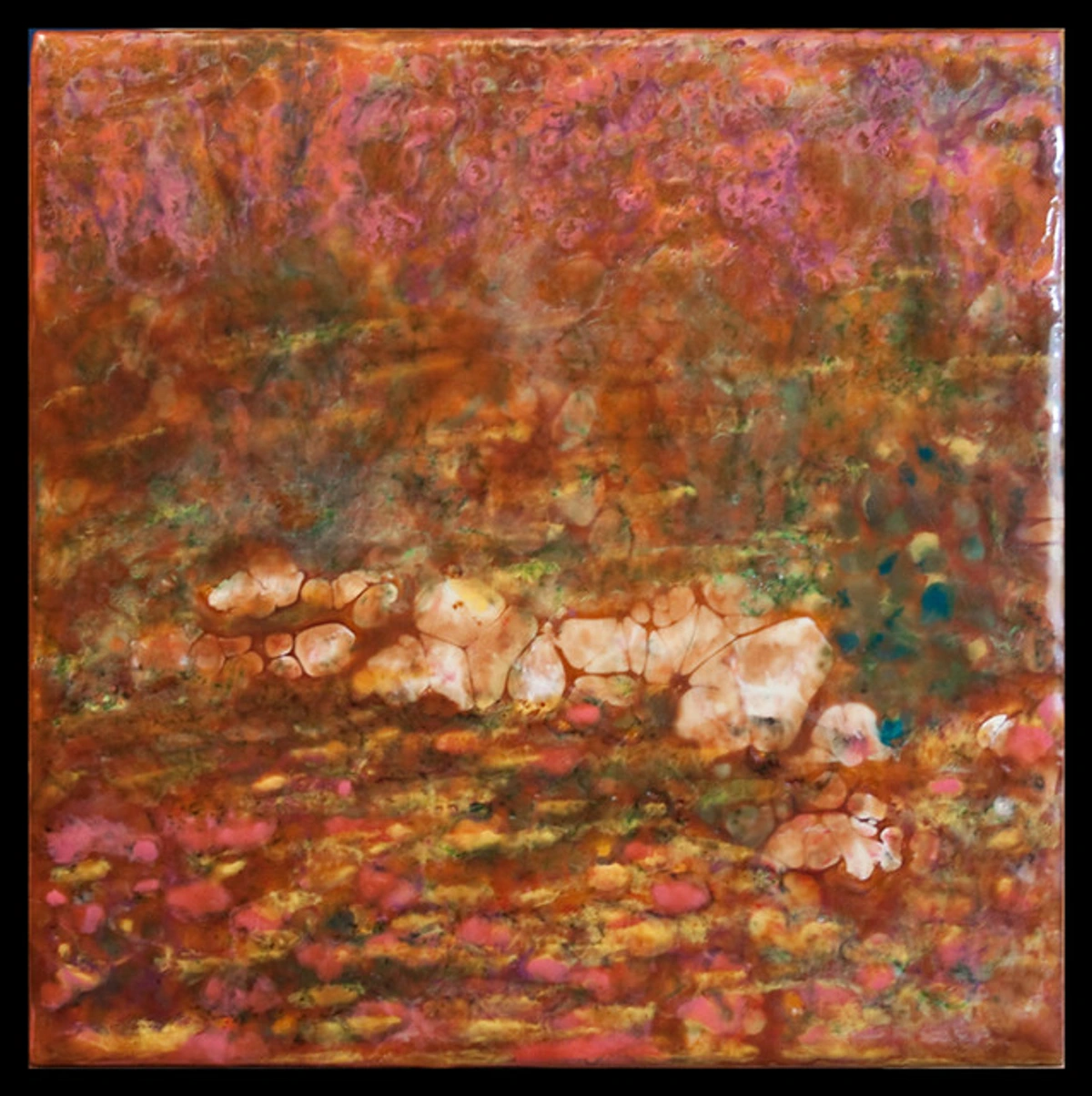
A beautifully framed mirror can be a light source and a piece of art all in one, reflecting light and making a small space feel expansive. It’s a design trick as old as time, and for good reason—it works wonders. Not only does it add decorative flair, but it also creates the illusion of more square footage, a clever spatial expansion technique. Think about the style of mirror – an antique gilded mirror like this Rococo mirror can add classic elegance, while a modern, frameless design brings sleek sophistication. Strategically placed, a mirror can reflect a window from an adjacent room, bringing in more light, or even reflect another piece of art, creating a delightful dialogue and making the space feel doubly curated. For maximizing light, consider placing a large mirror directly opposite a window or an important light source; it's astonishing how much ambient light it can pull into an otherwise dim space.
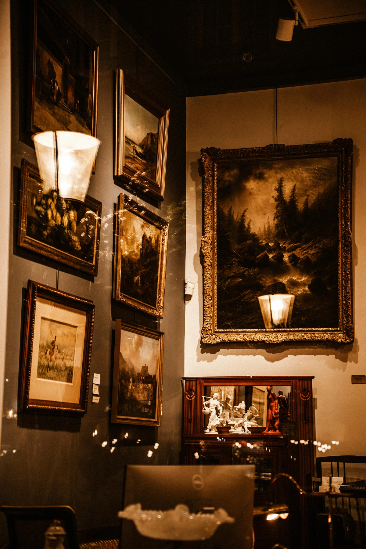
Light-Enhancing Art Ideas for Dim Entryways
To summarize, when battling a dark entryway, prioritize these art characteristics. This isn't just about making the space brighter; it's about making it feel brighter, more open, and more inviting, even on the gloomiest days. Think of it as painting with light, using your art to illuminate and invigorate the space:
Characteristic | Description | Why it Works in Low Light | Ideal Art Examples |
|---|---|---|---|
| High Contrast | Strong delineation between light and dark elements, or opposing colors. | Creates visual punch and ensures the art doesn't disappear into shadows. | Bold graphic prints, black and white photography, abstract expressionism, digital art with stark contrasts. |
| Reflective Surfaces | Art incorporating metallic accents, gloss finishes, polished resin, or mirrored elements. | Catches and amplifies ambient light, scattering it subtly through the space. | Metal prints, artworks with gold leaf or silver leaf, glass art, mirrors with decorative frames, polished sculptures. |
| Sparse Composition | Less 'busy' art with ample negative space. | Allows the eye to rest, prevents the space from feeling cluttered or heavy, and enhances perceived openness. | Minimalist line art, abstract geometric forms, simple landscapes with open skies, geometric abstracts with ample white space. |
| Artwork with Integrated Lighting | Contemporary pieces that have their own backlighting or LED elements. | Turns the art itself into a subtle, self-contained light source, creating instant ambiance. | LED canvas art, backlit acrylic panels, smart art displays, lightboxes. |
| Light Color Palettes | Predominantly white, cream, pale pastels, or bright, saturated warm colors (yellows, oranges). | Literally bounces light around the room, making the space feel brighter and more expansive. | White abstracts, sunny landscapes, vibrant pop art, art with significant white space, watercolor art. |
| Illusion of Depth | Art that creates a sense of three-dimensionality or infinite space. | Tricks the eye into perceiving a larger, more open entryway. | Trompe l'oeil murals, deep perspective landscapes, abstract pieces with layered transparency, surreal fantasy landscapes. |
| Iridescent or Pearlescent Finishes | Art with subtle shimmer or color shifts depending on the viewing angle. | Catches minimal light and creates dynamic interest, adding a touch of magic without direct glare. | Art with mother-of-pearl inlay, certain types of resin art, abstract pieces with iridescent paint. |
Practical Magic: Beyond the Frame
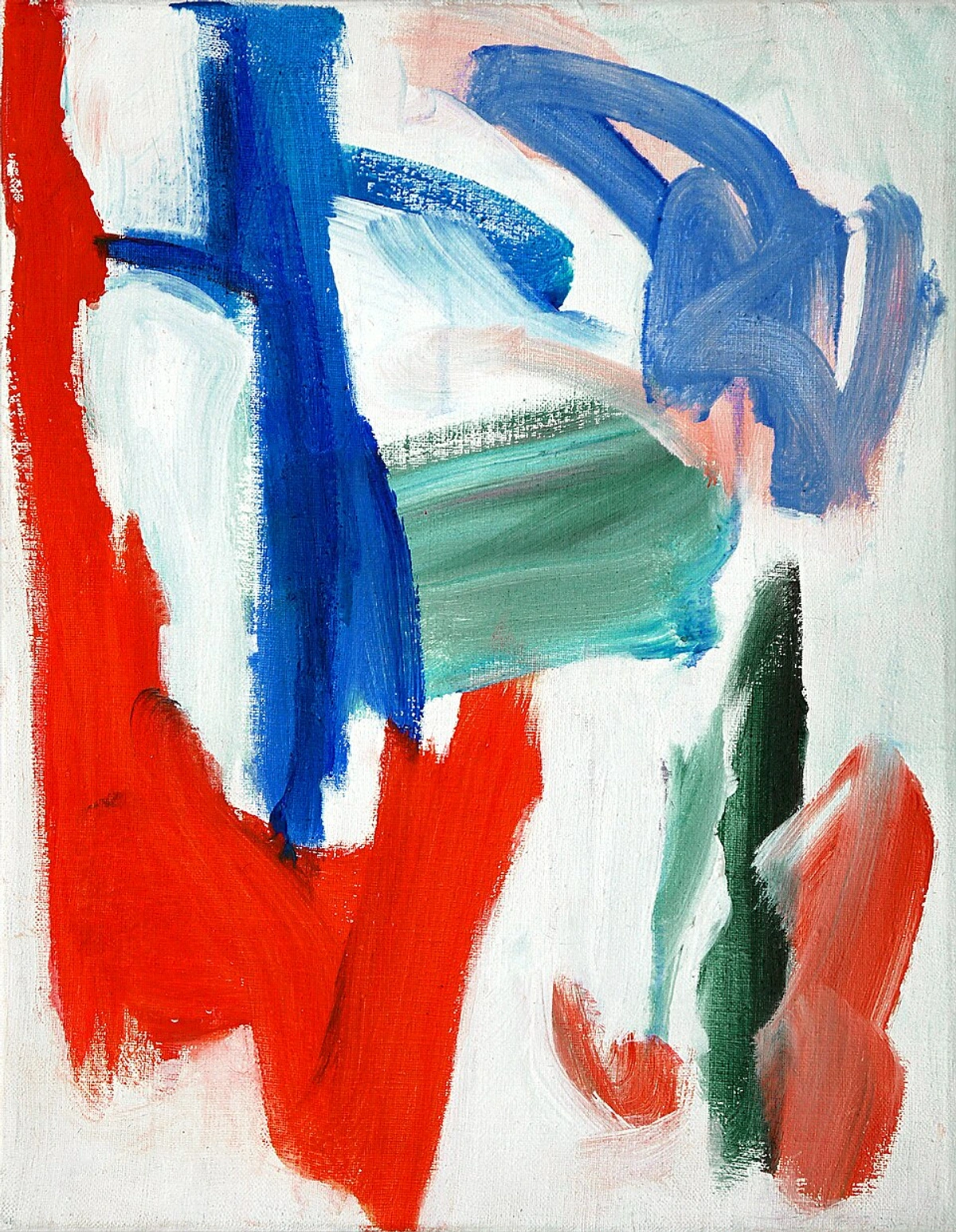
Who says art has to be a painting? Your entryway is a high-traffic, narrow space, which actually makes it perfect for exploring other types of art that have texture and dimension without taking up floor space.
Wall Murals & Decals: Big Impact, Low Commitment
For a truly immersive and dramatic statement, especially in a larger entryway or one you want to completely transform, consider a wall mural or a large-scale decal. A hand-painted mural, like the stunning Baroque ceiling frescoes of old, can create a bespoke landscape, a vibrant abstract backdrop, a whimsical fantasy scene, or even a clever trompe l'oeil effect that makes the wall recede into an imagined scene, effectively transforming a flat wall into a captivating portal to another dimension. If permanence is a concern (hello, fellow renters!), high-quality, removable vinyl decals offer a fantastic, low-commitment alternative. These can range from subtle graphic patterns and elegant botanical designs to bold abstract shapes that mimic painted art. They offer huge visual impact without the commitment or cost of traditional artwork, allowing you to easily update your entryway's personality as often as your mood strikes. I absolutely love how a mural can completely redefine a space, turning a simple wall into a portal to another world. Consider a bold, expressive graffiti mural for a truly urban, dynamic statement, bringing the raw energy of street art indoors. For a more subtle yet impactful choice, geometric murals, or even simply painted color blocks, can add architectural interest and beautifully define zones within a larger entryway, adding structure and sophistication. The transformative power of a mural, turning a mundane wall into a masterpiece, is something I consistently marvel at.
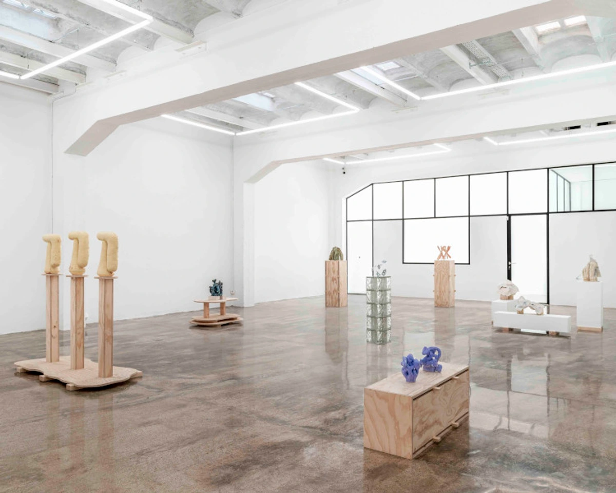
- Textile Art: A lush woven wall hanging, an intricate macrame piece, or a vibrant tapestry adds instant warmth, softness, and an undeniable tactile quality, which can be a beautiful and much-needed contrast to hard floors and stark walls. Beyond their visual appeal, they also serve the practical purpose of sound dampening—a welcome bonus for echo-prone entryways and a great way to improve the acoustics of an open-concept space. Look for pieces with intriguing textures, intricate patterns, and even a touch of global or bohemian flair. From intricate hand-embroidered pieces and elaborate quilts to minimalist felted designs and bold abstract fiber art, textile art brings a unique, tactile dimension to your walls, inviting a closer, more sensory engagement. They're particularly effective in creating a cozy, inviting atmosphere, especially when thoughtfully paired with natural wood furniture or potted plants. Imagine a soft, neutral macrame piece adding instant texture and calm, or a bold, graphic tapestry from a global adventure, proudly telling a story on your wall. These pieces are particularly good for homes that embrace a bohemian aesthetic, a rustic charm, or even a contemporary look seeking organic softness. And as a bonus, they're surprisingly effective at absorbing sound, which is a blessing in echo-prone entryways!
- Prints & Photography Series: Never, ever underestimate the enduring power of a cohesive series of prints, thoughtfully arranged. This could be a captivating series of abstract photography, detailed architectural studies, a collection of vintage travel posters from places you've dreamed of, or even a thematic grouping of botanical illustrations. They offer compelling visual storytelling without the significant investment or commitment of an original painting. These series can be meticulously curated to a specific theme, color palette, or era, and are easily changed out with the seasons or as your taste evolves. This is an excellent, flexible way to introduce a rich narrative into your entryway, and they're particularly fantastic for renters who want to make a bold statement without permanent alterations. When curating a series, always consider a consistent frame style or matting to create powerful visual cohesion, even if the content within varies wildly. For a truly personal touch, mix in high-quality prints of cherished family photos (perhaps in black and white for an artistic touch) alongside fine art prints, creating a narrative that's uniquely and intimately yours. You can explore how renowned photographers like Henri Cartier-Bresson used series to tell powerful, poignant stories, or delve into the vast world of digital downloads for even more flexibility and cost-effective options. The beauty of a well-curated series lies in its ability to build a compelling story, inviting viewers to move through the narrative you've crafted.
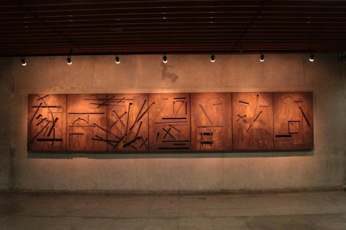
- Mixed Media & Assemblage: For a truly unique, conversation-starting touch, consider a piece that ingeniously combines various materials and techniques. This could be a dynamic collage incorporating diverse textures and found papers, an intriguing assemblage of found objects that tells a layered story (much like the fascinating, subversive work of Man Ray), or even a cutting-edge piece that integrates digital art with traditional painting or sculptural elements. These multifaceted pieces often spark immediate conversation and add incredible depth, inviting closer, repeated inspection and revealing new details upon each viewing. This assemblage is a prime example of profound visual storytelling, showcasing how diverse, often unexpected, elements can be brought together to form a cohesive, intriguing narrative. They are absolutely perfect for those who appreciate Dadaism's unconventional spirit, or for anyone who wants to incorporate tangible elements of their own personal journey and collected memories into their decor in a truly artistic way. I confess a deep love for these pieces; they're like visual puzzles that constantly offer new discoveries.
- Sculptural Wall Pieces: Don't limit your vision to flat art! A curated set of decorative ceramic plates, a collection of shallow woven baskets (perhaps from different cultures), a sleek metal wall sculpture, a robust wooden relief carving, or even an intricate paper sculpture can add incredible three-dimensional interest that dynamically changes with the light throughout the day. These pieces create fascinating shadows and depth, making the wall itself a constantly evolving, living canvas. They're a fantastic way to incorporate sculptural art into modern interiors, adding architectural intrigue and tactile richness without taking up valuable floor space. Consider pieces with sharp geometric forms for a bold modern edge, or organic, flowing shapes for a softer, more natural, and serene feel. Think about how a minimalist, abstract metal form could bring contemporary flair, or how a series of delicate ceramic birds could add a touch of charming whimsy. I'm always drawn to how these pieces actively engage with the light and the viewer, offering a fresh perspective with every subtle shift in angle.
- Functional Art: I love to challenge the notion that art can't also serve a purpose. Why can't beauty and utility coexist in perfect harmony? Think about a beautifully designed coat rack that doubles as an abstract sculpture, a key holder with undeniable artistic flair, or even a custom-built, impossibly narrow shelf that is, in itself, a stunning piece of woodworking art. These pieces elegantly blur the lines between utility and aesthetics, making them absolutely perfect for a hardworking entryway, especially in smaller homes where every single inch counts. Consider a wall-mounted clock with a unique artistic design, perhaps a bold graphic or a handcrafted element, or even a magnetic board that's a piece of art in itself, allowing for ever-changing notes, displayed mementos, or ephemeral creations. This approach wholeheartedly embodies the principle of 'form follows function' but with a delightful artistic twist, transforming mundane objects into unexpected, engaging conversational pieces that enhance daily life. Who says your coat hooks can't be a piece of art?
- Holographic or Digital Art: For a truly contemporary, cutting-edge, and surprising element, especially in a minimalist or high-tech smart home, consider a piece of holographic art or dynamic digital art displayed on a sleek, high-resolution screen. These captivating artworks offer movement, light, and an ever-evolving visual narrative in a completely unique way, ensuring your entryway is anything but static. Imagine the striking, fluid patterns of this digital abstract subtly animating your space, transforming with the viewer's movement or a preset algorithm. While the world of NFTs and blockchain art is evolving (and certainly has its complexities), the core appeal of digital art in an entryway is its undeniable ability to offer dynamic, ever-changing visuals without the need for physical prints. This provides a conversation starter that's both modern and visually captivating. Ensure you choose displays with excellent resolution, vibrant color accuracy, and perhaps even a matte screen finish to fully appreciate the digital artistry and minimize glare. It's a bold step into the future of art, right at your front door.
- Interactive Art: Why simply look at art when you can actively interact with it and become part of its creation? This is where true engagement happens! Consider pieces like magnetic art boards where you can arrange and rearrange smaller elements—notes, photos, small sculptural magnets—creating a constantly shifting composition. Chalkboards or dry-erase boards offer a wonderfully analog space for daily messages, spontaneous doodles, or evolving quotes that reflect the family's mood. Or perhaps a smart digital frame that cycles through a curated collection of family photos, generative art, or even responsive art that changes with ambient sound or movement. These pieces aren't just decorative; they actively invite engagement, transforming your entryway into a dynamic, evolving canvas that genuinely reflects the life happening within its walls. Imagine a rotating display of abstract animations or generative art that subtly shifts and evolves, offering endless visual intrigue and providing a constantly fresh first impression that speaks to your personality. This approach taps powerfully into the idea of visual storytelling in a dynamic, ever-changing way, making it particularly good for families, creative households, or those who simply enjoy a playful, evolving aesthetic. It’s a delightful way to keep your entryway feeling perpetually fresh and alive.
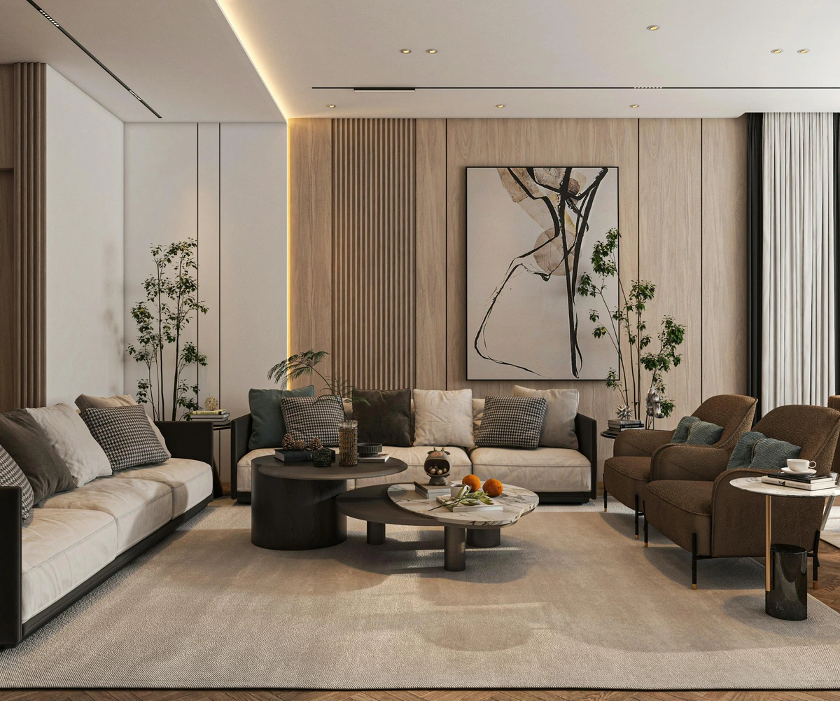
A piece of modern abstract digital art can infuse your entryway with a contemporary, high-energy aesthetic, proving art is ever-evolving.

What I truly love, perhaps obsessively so, about these non-traditional options is their unparalleled ability to truly transform a space. They boldly challenge our preconceived notions of what "art" should be and enthusiastically invite us to engage with the entryway on a far richer, more sensory level. The comforting texture of a hand-woven tapestry, the sharp glint off a polished metal sculpture catching the light, the profound illusion of depth in a well-placed mirror – or the mesmerizing, ever-shifting light of a digital art piece – these elements add so much more than just color to a wall. They elevate a mundane transition zone into an immersive experience, a captivating conversation starter, and a vibrant, undeniable reflection of your home's unique character and spirit.
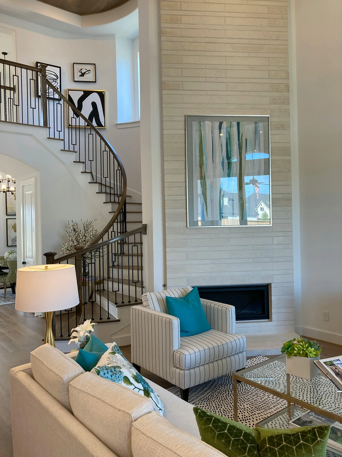
For those who love a story woven into their decor, a mixed media assemblage can be a captivating choice, offering endless visual intrigue.
FAQ: Your Entryway Art Questions, Answered
I get a lot of questions about entryway art, and that's totally understandable. It's a pivotal space! Here are some of the most common queries I hear, along with my take on them. Think of this as your personal art consultant, answering all those niggling questions that pop up when you're trying to perfect your entryway. Many of these answers draw upon principles discussed in my other guides, such as The Evolution of Art in Interior Design or even What is Design in Art? where foundational elements of aesthetic planning are explored.
Maintaining Your Entryway Art: Keeping it Pristine
Given the entryway's high-traffic nature, thinking about long-term maintenance is incredibly smart. Different art types require different care, so let's break it down. Regular, gentle care will ensure your entryway art continues to make a stunning impression for years to come. For more on the lifespan of different paint types for artists, understanding their durability can inform your purchase decisions:
Art Medium | Recommended Cleaning | What to Avoid | Longevity Tips |
|---|---|---|---|
| Framed Prints (with glass/acrylic) | Dust lightly with a microfiber cloth. For smudges, use a mild glass cleaner (for glass) or a specific acrylic cleaner (for acrylic). | Ammonia-based cleaners (can damage acrylic), abrasive cloths. | Ensure airtight framing to prevent dust/moisture ingress. Keep out of direct sun to prevent color fading. |
| Metal Prints | Wipe with a soft, damp cloth. Mild soap can be used for stubborn marks. | Abrasive cleaners or scrubbers that can scratch the surface. | Avoid sharp impacts. Generally very durable and fade-resistant. Inspect hanging hardware regularly. |
| Canvas Prints (coated) | Lightly dust with a soft, dry brush or cloth. For minor marks, a very slightly damp cloth can be used gently. | Harsh chemicals, excessive moisture, scrubbing. | Re-coat every few years with a UV-protective varnish for added protection. Avoid hanging where it might be easily brushed. |
| Textile Art (macrame, weaving) | Gentle vacuuming with an upholstery attachment or light dusting. Spot clean very carefully with mild soap and water. | Submerging in water, harsh detergents, aggressive scrubbing, strong direct sunlight. | Keep away from moisture and direct sunlight to prevent fading or mildew. Periodically re-tie loose threads. |
| Sculptural Wall Pieces (wood, ceramic, metal) | Dust with a soft brush or cloth. For wood, use wood-specific cleaners; for metal, a damp cloth. | Abrasive materials that could scratch or dull finishes. | Inspect mounting periodically for security. Apply wax or sealant to wood/metal as needed. Avoid placement where they can be easily knocked. |
| Original Oil/Acrylic Paintings (unframed/unprotected) | Do not clean yourself beyond very light dusting. Consult a professional art conservator for any marks or damage. | Water, chemical cleaners, rubbing, direct contact. | Protect from dust with a light frame or ensure it's in a less exposed area. Consider professional framing for delicate pieces. For significant investments, regular professional inspections are a wise choice. |
| Wall Murals/Decals | Wipe painted murals gently with a damp cloth; for decals, follow manufacturer's instructions for adhesive cleaning. | Harsh abrasives, scrubbing (for murals), picking at edges (for decals). | Ensure good ventilation for painted murals. For decals, avoid direct sun to prevent adhesive degradation. |
| Digital Art Displays | Gently wipe screen with a soft, lint-free cloth designed for electronics. | Harsh chemical cleaners, abrasive cloths, direct pressure on the screen. | Ensure proper ventilation, keep software updated, and protect from power surges. |
Regular, gentle care will ensure your entryway art continues to make a stunning impression for years to come.
Beyond Aesthetics: Choosing the Right Medium for High-Traffic Areas
Okay, we've talked about what looks good. But let's get real for a second: your entryway isn't a pristine gallery. It's where muddy shoes get kicked off, where backpacks get flung, where mail piles up, and where, frankly, things get bumped and splattered. This means the durability of your art is a legitimate consideration—it’s not just about aesthetics, it’s about practicality. I've learned this the hard way with a few chipped frames and smudged prints over the years! Choosing the right medium, and indeed the right protection, can save you a lot of heartache (and repair costs).
Framing Materials and Finishes: The Unsung Heroes of Durability
The frame itself is an absolutely critical layer of protection, often acting as the first line of defense. For high-traffic entryways, I always, always recommend looking for frames made from incredibly sturdy materials like solid wood, robust metal (think aluminum or steel), or high-quality composite materials. Consider the finish meticulously: a matte or brushed finish can be far more forgiving of small scuffs, fingerprints, and minor impacts than a highly polished, glossy one, which tends to highlight every imperfection. When it comes to glazing, acrylic (often known as plexiglass) is a superior choice over traditional glass due to its shatter resistance and significantly lighter weight, making it much safer in an active entryway. If your budget allows, opt for conservation-grade acrylic, as it offers vital UV protection to prevent your precious artwork from fading over time—a legitimate and often overlooked concern if your entryway receives any direct sunlight. For even more specific, tailored advice on framing choices, consider consulting with an expert, as outlined in my QA with an Expert Art Framer guide; their knowledge can be invaluable.
Here's my quick guide to what holds up best, especially if you have kids, pets, or just a particularly active household. This is where practicality meets style, ensuring your beautiful choices withstand the rigors of daily life. For valuable pieces, consider consulting with an expert art framer who can provide tailored solutions to maximize durability and protection: I always say, a good framer is worth their weight in gold when it comes to preserving your cherished art.
- Framed Prints with Acrylic Glazing: This is a fantastic, versatile option. Acrylic (often called plexiglass) is lighter and far more shatter-resistant than traditional glass, making it significantly safer in case of an accidental knock. Plus, modern, high-quality prints give you incredible visual impact with vibrant colors and sharp details, often indistinguishable from originals at a glance. For example, a crisp print of this abstract piece behind acrylic would be both striking and durable.
- Metal Prints: These are incredibly durable, waterproof, scratch-resistant, and surprisingly lightweight. The image is infused directly into a sheet of aluminum, creating a vibrant, modern, almost luminous look that can withstand a lot of abuse (and even a splash or two from a wet umbrella!). They require no framing, offering a sleek, minimalist aesthetic.
- Canvas Prints (with protective coating): While an exposed, unprotected canvas painting might be vulnerable, a high-quality canvas print often comes with a protective UV-resistant and scratch-resistant coating. This makes it quite resilient, and the lack of glass means no reflections. They offer a softer, gallery-wrapped look.
- Wood or Ceramic Art: These natural materials are inherently sturdy and offer wonderful texture. Sculptural wood pieces, decorative ceramic plates (securely mounted, of course!), or even robust tile mosaics can add texture and dimension without fragility. They're often easy to clean and resist minor bumps.
- Textile Art: Woven tapestries, macrame, or felted art pieces are naturally soft and forgiving. If bumped, they won't chip or break, and they add a fantastic tactile element. They can also absorb sound, making the entryway feel less echoey.
- Avoid: Delicate paper artwork without robust protection (like in a high-quality frame with acrylic), or unframed, exposed original paintings in prime "bumping zones." Also, be wary of anything too intricate or fragile that could easily snag or break. Trust me, I've seen too many beautiful but fragile pieces meet an untimely end in a bustling entryway!
Environmental Considerations: Humidity, Temperature, and Dust
Entryways are, by their very nature, often exposed to more significant environmental fluctuations than other, more controlled rooms in your home. The constant opening and closing of the front door can lead to dramatic swings in humidity and temperature, especially if you live in an area with distinct, intense seasons. This erratic environment can be incredibly detrimental to delicate art, causing paper to warp, canvases to expand and contract (leading to cracking), or even paint layers to crack over time. To mitigate these risks, ensure your framed pieces are properly sealed with acid-free backing and dust covers. For unframed pieces or textiles, consider their inherent resilience to moisture and temperature changes. Dust, of course, is another perennial foe; regular, gentle dusting as outlined in the maintenance table is absolutely key, but strategically choosing art with smoother, less intricate surfaces can also significantly reduce dust accumulation, making maintenance far easier.

For a deeper dive, I've got a whole article on choosing art for high-traffic areas. It's definitely worth a read if your entryway is a veritable Grand Central Station, seeing constant comings and goings! There's no shame in prioritizing practicality, especially when it comes to preserving your beloved art. It covers everything from material science to smart placement strategies.
When considering framing and protection, it's all about making sure your chosen piece stands the test of time and the bustling activity of an entryway. But it's also about more than just the art itself – secure mounting is just as crucial. A piece of art, no matter how durable, is only as safe as its weakest hanger.
Secure Mounting: Keeping Your Art Safe and Sound
Beyond the art's material, how you hang it matters immensely, especially in a high-traffic zone. You don't want a piece crashing down from a slammed door or an accidental bump. My recommendations:
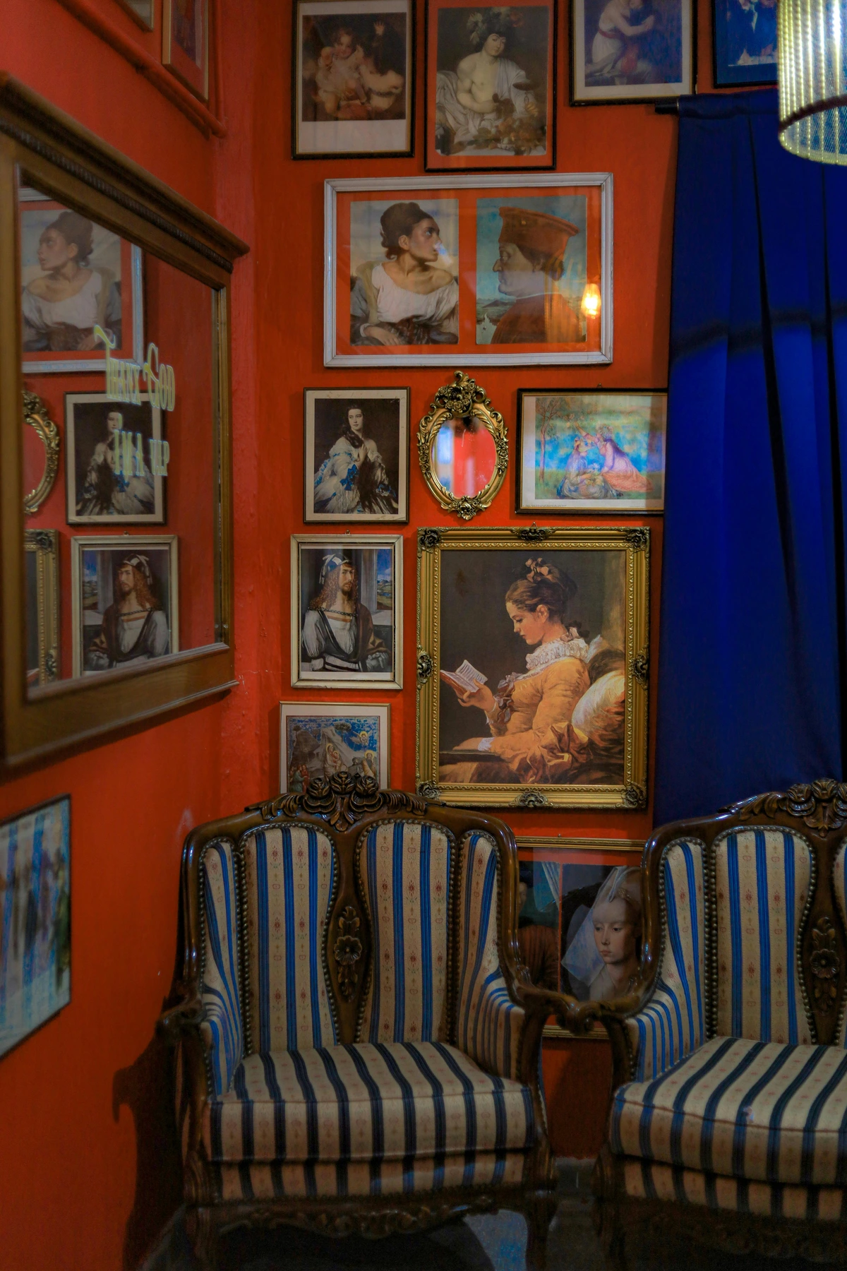
- D-Rings and Wire: This classic and reliable method involves two D-rings securely screwed into the vertical sides of the frame (about 1/3 down from the top) and connected by strong picture wire. When hung on a single picture hook, this creates a stable triangle, often proving far more secure and stable than relying on a single central hook, which can allow the art to pivot or shift.
- Security Hardware: For really valuable, irreplaceable, or exceptionally heavy pieces, absolutely consider investing in actual security hardware. This specialized hardware, often utilized in professional galleries and museums, locks the art securely to the wall, virtually eliminating the risk of accidental falls from bumps, vibrations, or even intentional tampering. These systems are invaluable for peace of mind.
- Proper Anchors: This is non-negotiable! Never, ever rely on a tiny nail in drywall for anything but the absolute lightest pieces. Always use appropriate, heavy-duty wall anchors specifically designed for your wall type—whether it's drywall, plaster, or solid masonry—to ensure a genuinely strong, reliable hold that can withstand the test of time and entryway activity. Different anchors are required for different materials; do your research or ask at your local hardware store. For heavier pieces, I've seen some clients use specialized picture rail systems, which offer both flexibility and immense security.
- Avoid Over-the-Door Hangers: While seemingly convenient for quick installation, these types of hangers are generally a poor choice for displaying art in an entryway. They can cause the art to swing, rattle, or even vibrate excessively with door movement, significantly increasing the risk of damage to both the artwork and the door itself. Opt for wall-mounted solutions instead, even if it means a small hole.
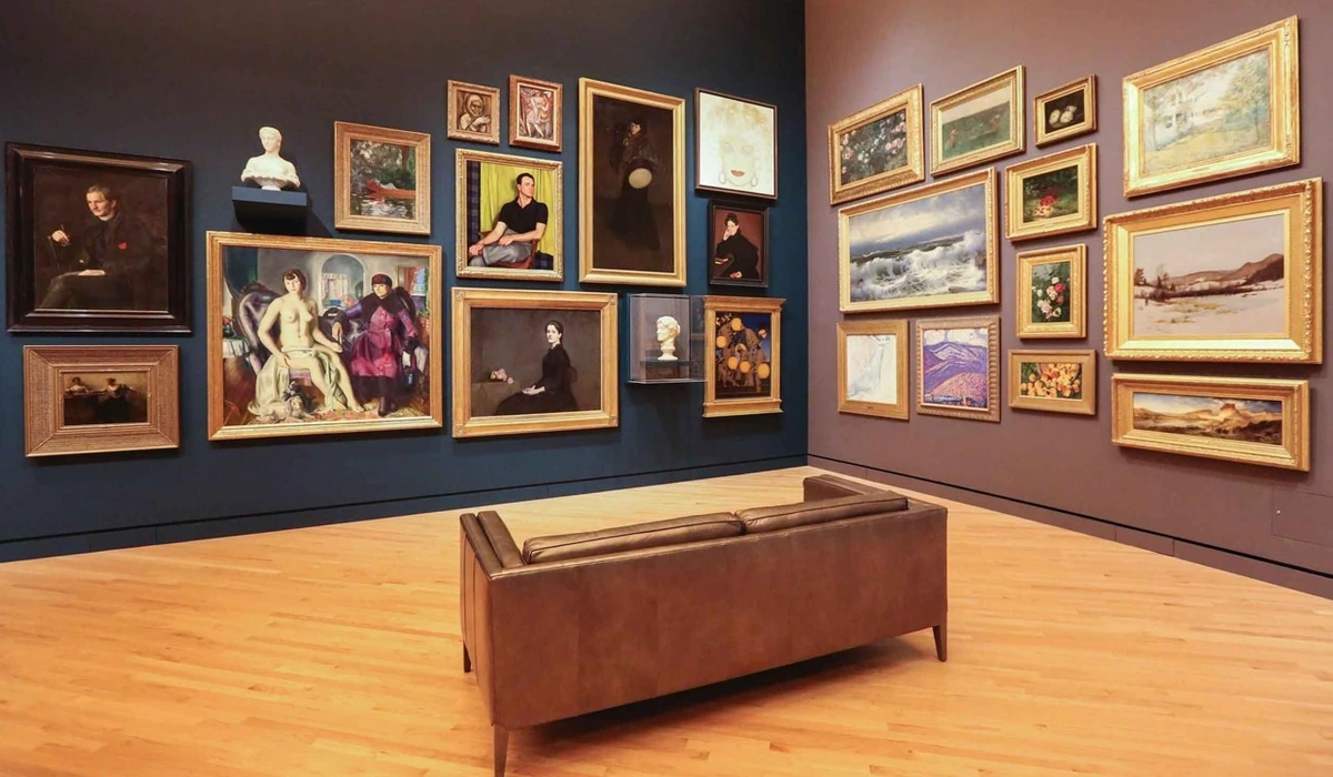
FAQ: Your Entryway Art Questions, Answered
I've mentioned gallery walls a few times, and for good reason: they are an absolute game-changer for entryways. A thoughtfully arranged collection can transform a blank wall into a dynamic, story-rich focal point. It’s like creating a mini-museum of your life and loves right where everyone walks in. But how do you create one that looks curated, not chaotic? Here’s my workflow, breaking it down into manageable steps for maximum impact. I find that a well-executed gallery wall is one of the most powerful ways to infuse personality into a space, especially a often-overlooked area like an entryway.
### Designing Your Entryway Gallery Wall: Layouts and Logistics
- Gather Your Treasures: The fun begins here! Collect all the pieces you want to include—this could be a diverse array of framed prints, cherished photos, small canvases, even a tiny decorative mirror, a piece of textile art, or small sculptural elements. Don't be shy about variety! Lay them all out on the floor or a large table, creating a preliminary mock-up of your intended arrangement. This initial visual allows you to see how everything interacts before a single nail is hammered. I find it helpful to group similar pieces together initially, then start to intentionally break those groupings for a more dynamic feel.
- Find Your Anchor: From your gathered treasures, pick one central, often larger, piece. This will serve as the undeniable heart of your gallery wall, and you'll artfully arrange everything else around it, much like planets orbiting a sun. This anchor piece usually sets the tone, scale, or overarching theme for the entire display, providing a gravitational pull for the eye.
- Map it Out (Seriously – this step is a lifesaver!): This is the single most important step to avoid a Swiss cheese wall. Trace each frame onto kraft paper or newspaper, cut out the templates, and label them clearly (e.g., 'Large Abstract,' 'Family Photo B'). Use painter's tape (it's less damaging) to stick these paper templates on your entryway wall. Experiment with different arrangements—shifting, rotating, re-spacing—until you absolutely love the composition. This crucial mock-up allows you to visualize the spacing, balance, and overall impact, and most importantly, it helps you avoid unnecessary nail holes! You can try different layouts: a precise symmetrical grid for a formal, elegant look (perfect for a more traditional entryway); an organic cluster for a more bohemian, free-spirited feel (great for eclectic homes); or a linear arrangement that emphasizes length in narrow hallways. Consider how different groupings can create mini-narratives within the larger wall.
- Mind the Gaps: As you arrange your templates, aim for consistent spacing between your frames, typically in the range of 2-4 inches (5-10 cm). This thoughtful, consistent spacing creates a pleasing visual rhythm and prevents the wall from looking either too cluttered and chaotic or too sparse and disjointed. However, for a truly eclectic 'salon' style, you can strategically vary spacing slightly, allowing certain pieces a bit more breathing room to stand out, while grouping others more tightly for a curated, layered effect. The goal is intentionality in spacing, whatever your chosen style.
- Mix it Up, Keep it Cohesive: This is where the magic truly happens! Don't be afraid to mix frame styles (vintage ornate next to sleek modern), different frame colors, or even diverse art mediums. The trick is to establish a unifying element that subtly ties everything together. This could be all black frames (even if the art inside is wildly different), a common accent color repeated throughout the artwork, or a powerful single theme (like "nature," "travel," or "abstract forms") that acts as a narrative thread. Variety undoubtedly adds immense interest and personality; thoughtful cohesion prevents visual chaos and makes the eclectic feel intentional.
- Incorporate Dimensional Objects: Remember, don't limit your vision purely to flat art! This is your chance to add incredible depth and intrigue. Integrate small floating shelves adorned with sculptural objects (a delicate ceramic hand, a polished stone), wall-mounted planters brimming with greenery, or even a bold statement clock that acts as both timepiece and art. These three-dimensional elements beautifully break up the flatness of frames, creating engaging shadows and visual interest. This is truly where the 'quirky and personal' really comes to life, turning your gallery wall into a miniature, evolving installation.
- Hang with Confidence: Once your paper templates are absolutely perfect and you've double-checked every spacing and alignment, it's time for the satisfying part! Hammer your nails directly through the paper templates at the marked hanging points, then simply tear the paper away. Voila! Instant gallery wall, beautifully designed and perfectly aligned. Remember, no art display is truly permanent – you can always adjust, evolve, and refresh your display over time as your tastes change and your collection grows. It’s a living, breathing part of your home.
It’s a truly rewarding process, and you can delve even deeper into the concept in my guide on what is a gallery wall. Trust me, once you master the art of the gallery wall, you'll be looking for blank walls everywhere!
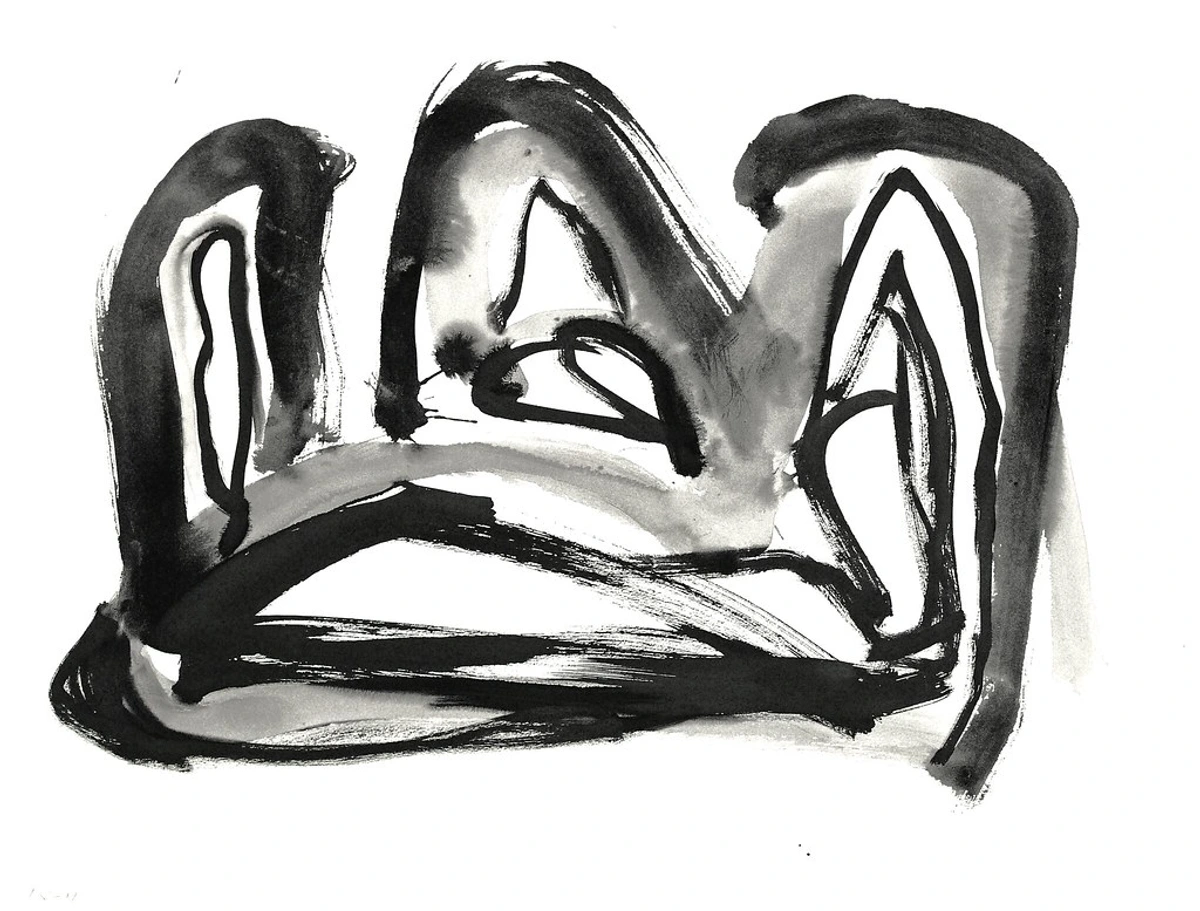
A well-executed gallery wall is more than just a collection; it's a narrative, a visual symphony of your personal style.
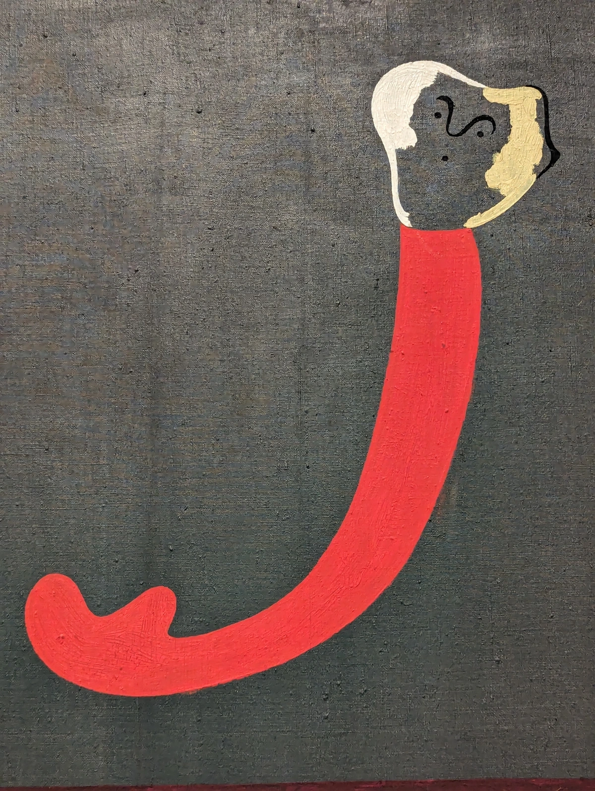
## Budgeting for Entryway Art: Smart Choices for Every Wallet
Now, I know what some of you are thinking: "This all sounds lovely, but my budget for entryway art is... zero." Or maybe, "I don't want to spend a fortune on a hallway!" And you know what? That's perfectly fine, and a very common concern! You absolutely don't need to empty your savings to create an impactful, stylish entryway. Art is for everyone, and there are brilliant ways to find pieces you love at any price point, from free to a splurge. It's all about smart sourcing and a little creativity. I once found a perfectly charming, slightly-too-large abstract painting at a thrift store for twenty dollars, brought it home, painted the frame black, and it became the unexpected focal point of a small hallway for years. It's those little triumphs that make it fun! The thrill of the hunt, for me, is almost as good as the art itself.
Here are some clever ways to curate your entryway art collection without breaking the bank:
- High-Quality Prints: As I mentioned before, this is your undeniable secret weapon for achieving incredible visual impact without the hefty price tag often associated with original art. You can find stunning reproductions of famous artworks, vibrant contemporary abstract pieces, or breathtaking photography for a mere fraction of the cost of an original. Many artists (myself included!) offer high-quality prints—often giclée prints, which are known for their exceptional color accuracy and longevity—that retain the vibrancy and intricate detail of the original. Online art marketplaces like Etsy, Saatchi Art, or even specific artist websites (my own buy page offers a range of vibrant prints perfect for an entryway!) are fantastic resources for discovering both established and emerging artists offering accessible, high-quality prints. Don't underestimate the power of a well-chosen print to elevate your space dramatically. It's a smart way to get the look you want without the financial strain.
- Support Local Artists & Students: This is a truly rewarding approach. Actively seek out local art fairs, student exhibitions at universities or art schools, community galleries, or online platforms dedicated to showcasing emerging talent. You might just discover an incredible, original piece by an emerging artist before they hit the big time, often at very accessible, budget-friendly prices. It's a beautiful win-win situation: you acquire unique, meaningful art that often comes with a personal story, and you directly support the creative community, helping to cultivate and encourage the next generation of artistic voices. It feels good, and your home will reflect that authenticity. There's a certain energy that comes from owning a piece directly from a creator, a story woven into the canvas or paper that you simply don't get elsewhere.
- Thrift Stores & Flea Markets: Oh, these are absolute treasure troves for the patient, discerning hunter! With a keen eye and a bit of imagination, you can unearth incredible vintage paintings, evocative old photographs, unique, ornate frames that can be repurposed, or even interesting decorative objects that can be transformed into art. Sometimes, a little DIY magic—a fresh coat of spray paint on a tired frame, a new mat board for a forgotten print, or simply cleaning up a dusty canvas—is all it takes to transform a dusty find into a chic, personal statement piece. Don't be afraid to think radically outside the box; an old map, a beautiful piece of vintage fabric or wallpaper, or even a striking page from a discarded book can be framed as art! I once found a perfectly charming, slightly-too-large abstract painting at a thrift store for a mere twenty dollars, brought it home, painted its dated frame black, and it became the unexpected, beloved focal point of a small hallway for years. It's those little triumphs that make it so much fun! You'd be amazed what hidden gems are waiting to be discovered, needing only a little love and a new perspective.
- DIY Art: Please, please, never underestimate your own innate creativity and artistic potential! Simple abstract paintings (even just intuitive color washes like a serene watercolor piece), beautifully pressed flower art (a wonderful way to preserve memories), or even a stunningly patterned piece of fabric or wallpaper, carefully framed, can make an incredibly personal and meaningful statement. It doesn't have to be gallery-worthy to be perfect for your home; it just has to be you, reflecting your unique aesthetic and story. Learning a new skill like drawing with charcoal or trying a basic screen printing technique can open up a whole new world of affordable, personalized art that truly speaks to your soul. The process can be incredibly therapeutic and rewarding. Sometimes, the most meaningful art is the art you've created yourself, or with loved ones.
- Digital Downloads: This is a remarkably flexible and cost-effective option that's gained immense popularity. Many talented artists (myself included!) offer high-resolution digital files of their work that you can purchase and then print yourself at a local print shop, an online printing service, or even at home if you have a good quality printer. This offers incredible flexibility in sizing, allowing you to choose the perfect dimensions for your space, and can lead to huge cost savings, especially for larger pieces or if you're someone who loves to swap out art frequently. You're essentially paying for the artist's creative vision, and then handling the production and framing yourself, giving you ultimate control over the final presentation.
- Public Domain Art & Creative Commons: Prepare to dive into the truly vast, rich world of publicly available art! Major museums and galleries worldwide are continually digitizing their incredible collections and making high-resolution images available for free under public domain or Creative Commons licenses. This means you can legally download iconic masterpieces (think Renaissance paintings or ancient sculptures), intricate historical maps, exquisite botanical illustrations, stunning vintage posters, or even abstract digital patterns, and then print them yourself to your desired size. It's an unparalleled resource for unique, high-quality art at virtually no cost (beyond the printing and framing expenses). Just be sure to double-check the specific license for any usage restrictions, but generally, public domain means free for personal use! It’s an incredible resource that can make your home feel like a curated gallery of historical masterpieces.
- Art Rental & Subscription Services: Yes, you read that right – these wonderfully innovative services exist, and they're gaining traction! For a manageable monthly fee, you can often rent original artwork or high-quality prints, allowing you the luxurious flexibility to rotate pieces in and out of your home, experiencing different styles, artists, and moods without the significant financial commitment of outright purchase. It's a fantastic, low-pressure way to live with art, experiment with various aesthetics, and truly see what resonates with you before making a long-term investment, especially if you're someone whose tastes evolve often. It's like a revolving gallery in your own entryway! This is a fantastic option for commitment-phobes or those who simply crave constant visual stimulation.
The focus should always be on acquiring something that resonates with you and enhances the feeling of your home, not purely on its monetary value. The joy and connection a piece brings are truly priceless. And remember, art isn't just an object; it's an experience, a conversation, and a daily source of inspiration.
Embracing your inner artist or exploring affordable avenues can lead to truly unique and personal entryway decor, making your home feel authentically 'you.'
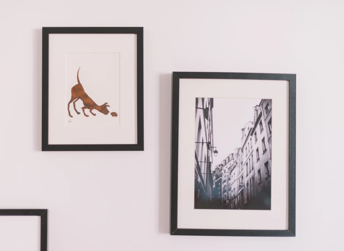
### Strategic Investment: When to Splurge (and When Not To)
While I passionately advocate for accessible art, and believe everyone deserves to live with pieces they adore, there are undoubtedly times when a strategic, thoughtful splurge makes absolute sense. If you fall completely head-over-heels for an original piece by an artist you adore, and it perfectly captures the very essence and soul you want for your entryway, it might very well be worth the investment. Think of it as cultivating a long-term, deeply meaningful relationship with a piece that brings you immense joy, inspiration, and connection every single day. However, for trend-driven pieces, or for areas prone to frequent redecoration and style shifts, budget-friendly options are often the far smarter, more practical choice. It's always about finding that perfect balance between passion and practicality, allowing your heart to guide some decisions, and your head for others. I've often advised clients that an entryway, because you interact with it multiple times a day, is an excellent place for a statement piece you truly love. It's a small investment for a constant source of daily joy and inspiration.
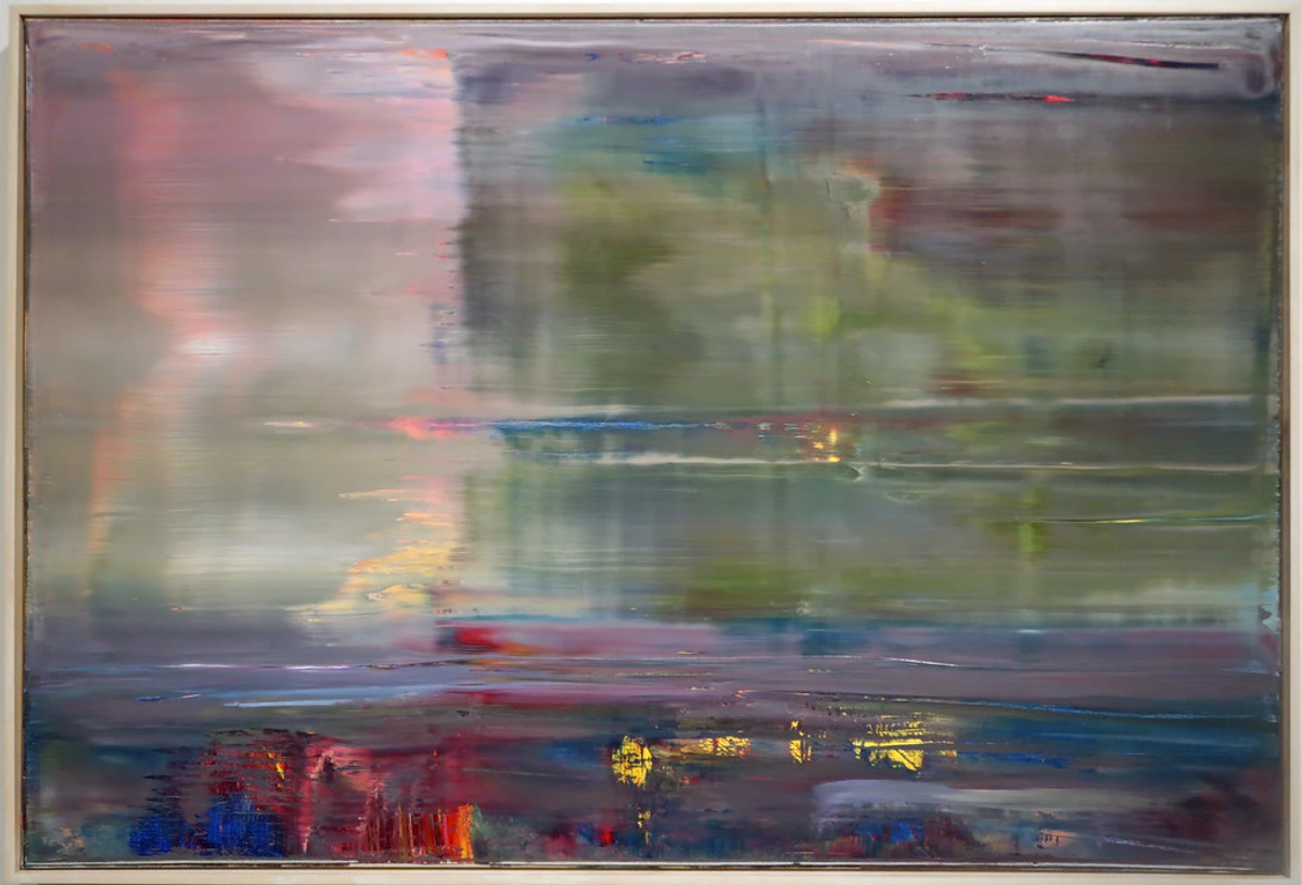
## Seasonal & Thematic Rotations: Keeping Your Entryway Fresh
I’m a big believer that your home should evolve with you, and that includes your art! Your entryway, being the first impression, is a fantastic place to lean into seasonal changes or thematic shifts. It doesn't mean redecorating entirely, but a simple swap of artwork can dramatically refresh the space and reflect the mood outside (or inside your head!). It's like giving your home a mini-makeover without breaking the bank. I often rotate my own entryway art to match the changing seasons, bringing in warmer tones for autumn or bright, airy pieces for spring. It's a small change that makes a big impact on how the space feels.

- Spring/Summer: For these seasons, think light, airy abstracts, fresh botanical prints, or vibrant, sun-drenched landscapes. Pieces with bright sky blues, lush greens, and cheerful yellows can instantly bring a sense of freshness, vitality, and warmth, beautifully reflecting the energy of longer days and blooming nature. Consider marine themes, abstract wave patterns, or lighthearted, whimsical illustrations that evoke carefree summer days. I personally love a dynamic pop of blue and green abstract to usher in the spring, it just feels so right.
- Autumn/Winter: As the days shorten and the air grows crisp, lean into richer, deeper tones that evoke coziness, warmth, and introspection. Think warm reds, burnt oranges, deep forest greens, or moody abstracts with earthy undertones. Perhaps some evocative photographic prints of cozy interior scenes, misty rustic landscapes, or tactile, textured textile art for added warmth and significant visual weight. This is the perfect time to bring in art that feels like a comforting embrace, preparing your home for the cooler months.
- Holidays: For holidays, a small, tastefully festive print, a subtly themed piece (without being overly kitschy, I implore you!), or a sophisticated holiday-inspired abstract can be an incredibly charming touch. The key here is restraint. Just don't overdo it; the art should complement, not overwhelm, your existing decor. The goal is a festive nod, a warm seasonal greeting, not a complete, jarring transformation into a North Pole workshop or a Halloween haunted house. Think elegant, not garish.
- Personal Mood: Your art can be an incredibly powerful, almost therapeutic, tool for manifesting the mood you desire in your daily life. If you're feeling energetic and inspired, swap in a bold, dynamic, perhaps even vibrant abstract piece. If you're craving calm, peace, and a sense of gentle decompression, bring out something serene and minimalist, perhaps a soft landscape or a monochromatic study. This allows your entryway to genuinely reflect your inner state, becoming a responsive extension of your well-being. It’s a wonderful way to practice intentional living, starting right at your front door.
The beauty of prints and smaller framed pieces is how easily they can be rotated. It keeps the space feeling alive and prevents you from getting bored with your own decor, offering a fresh perspective whenever you desire. It also allows you to showcase different facets of your personality throughout the year. It's a wonderful, low-commitment way to constantly refresh your home's narrative.
Storing Your Rotating Art Collection
If you're going to fully embrace seasonal or thematic art rotations (which I highly recommend!), you'll absolutely need a smart, protective way to store your off-season pieces. Here are a few indispensable tips, born from years of safely tucking away my own evolving collection. Remember, proper storage is not just good practice; it's absolutely crucial to prevent irreparable damage and preserve the longevity of your cherished art, much like understanding the proper care for different paint types on a canvas. If you're going to embrace the joy of rotating art, then you simply must also master the art of storing it well! For a deeper dive, my guide on art-storage-solutions-for-collectors offers even more comprehensive advice.
Art Storage Solutions: Essential Tips for Protecting Your Collection
Storage Method | Best For | Key Benefits | Important Considerations |
|---|---|---|---|
| Flat Files / Portfolio Cases | Unframed prints, delicate paper art, photos, textiles. | Excellent protection from dust, light, physical damage. Keeps items flat. | Can be expensive; requires dedicated space; ensure acid-free materials. |
| Custom Archival Boxes | Framed art (especially delicate/unusual sizes), valuable originals. | Snug, padded protection; minimizes bumps/abrasions; environmental stability. | Costly; tailored to specific pieces, limiting flexibility for future art. |
| Vertical Storage Racks | Multiple framed pieces, canvases. | Efficient use of space; easier access than stacking. | Requires padded dividers; ensure stability and prevent leaning/shifting. |
| Climate-Controlled Rooms | All valuable or sensitive art. | Stable temperature and humidity; prevents warping, cracking, mildew. | Can be expensive; requires specialized equipment or dedicated space. |
| Interleaving Materials | All stacked/stored prints, photos, drawings. | Prevents adhesion, smudging, and chemical reactions. | Must be acid-free tissue paper, Mylar, or archival glassine. |
| Protective Wrapping | All framed art before moving or storing. | Shields from dust, scratches, minor impacts. | Use acid-free materials like bubble wrap or soft blankets; avoid tape on art. |

- Flat Files or Portfolio Cases: For unframed prints, delicate paper artwork, or sensitive textiles, investing in a professional-grade flat file cabinet or a large artist's archival portfolio case can offer excellent, long-term protection from dust, damaging light exposure, and accidental physical damage. Always ensure individual pieces are interleaved with acid-free tissue paper or Mylar sheets to prevent adhesion and chemical reactions.
- Custom Storage Boxes: For framed art, particularly those with intricate or delicate frames, or pieces of unusual sizes, consider having custom archival storage boxes made. These bespoke boxes provide snug, padded protection against bumps, abrasions, and damaging environmental shifts, offering a superior level of security compared to generic storage. This is a worthwhile investment for truly valuable pieces.
- Vertical Dividers: If you're storing multiple framed pieces in a closet or art storage rack, utilize padded vertical dividers. These can be purpose-built dividers, or even improvised with thick pieces of cardboard wrapped in old blankets or bubble wrap, to prevent frames and glazing from rubbing against each other, minimizing scratches and damage during storage and retrieval.
- Document & Photograph: Before carefully tucking away any piece for storage, make it a habit to take a quick photograph of each artwork. Additionally, note its size, specific storage location, and any special care instructions (e.g., 'fragile frame,' 'store flat,' 'no direct sun'). This simple cataloging makes retrieval and rotation infinitely much easier, saving you time and preventing frustrating searches.
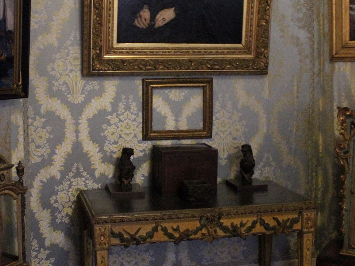
- Protect Frames and Glass: Always diligently wrap framed art in generous layers of bubble wrap or soft moving blankets. For an extra layer of crucial protection, especially if you anticipate any stacking (which should be kept to a minimum), cut custom-sized pieces of acid-free cardboard or foam core to place between frames, preventing scratches and pressure damage to the glazing or frame details.
- Flat Storage: Ideally, store larger pieces upright, perhaps resting on protective blocks, rather than flat, to minimize pressure and potential warping. If you absolutely must stack pieces (and keep it minimal!), ensure the heaviest pieces are always placed at the very bottom, with lighter pieces carefully layered on top, always with protective interlayers.
- Climate Control: This is paramount. Avoid storing art in areas prone to extreme temperatures and dramatic humidity fluctuations, such as attics, garages, or damp basements. These environments are a recipe for disaster, leading to warping, cracking, mildew, and pest damage. A spare closet, a dedicated art storage unit, or even under a bed in a climate-controlled room within your living space is usually the ideal, safest option.
- Label Everything: This might seem obvious, but it's often overlooked in the flurry of packing. Clearly label all boxes or wrapped pieces with the artwork's title, artist, and perhaps a small thumbnail image. This ensures you know exactly what’s inside without having to painstakingly unwrap everything, saving time and preventing unnecessary handling that could lead to damage.
How to integrate entryway art with the rest of your home's decor?
Your entryway art doesn't, and shouldn't, have to perfectly match every single room in your home. That can feel forced and uninspired. Instead, it should feel like it belongs to the same 'family' of style and mood, a harmonious prelude rather than an identical echo. Think of it as a captivating preview of the aesthetic journey that awaits. If your home is generally modern and minimalist, for instance, a heavily rustic farmhouse piece in the entryway might feel jarring and out of place. Aim instead for a cohesive flow of style, a thoughtfully considered color palette, or a unifying theme that gently and gracefully transitions guests (and yourself!) into the rest of your living space. You can achieve this sophisticated cohesion with a subtly shared accent color, a consistent level of formality, or repeating design elements like sleek metallic frames or organic natural textures. The ultimate goal is to create an undeniable sense of harmony and intentionality from the very moment one steps inside, preparing them for the aesthetic journey ahead. My comprehensive guide on creating a cohesive art collection across different rooms delves even deeper into this crucial concept. Remember, it's about fostering a rich visual conversation, not imposing a rigid uniform.
How to Choose Art for a Minimalist Entryway: Simplifying for Impact
For those who embrace the serene beauty of minimalism, your entryway art is about intentionality and impact. The goal isn't just to fill space, but to create a focal point that speaks volumes in its simplicity. Think large-scale abstract pieces with clean lines and a limited color palette, or powerful black and white photography that emphasizes form and negative space. Materials like polished metal, sleek glass, or even unadorned canvas can reinforce the minimalist aesthetic. Avoid clutter at all costs; one thoughtfully chosen piece will always outperform a busy, fragmented display in a minimalist setting. It's about quiet confidence and profound aesthetic clarity. It's about letting your home's personality flow effortlessly from one space to the next.
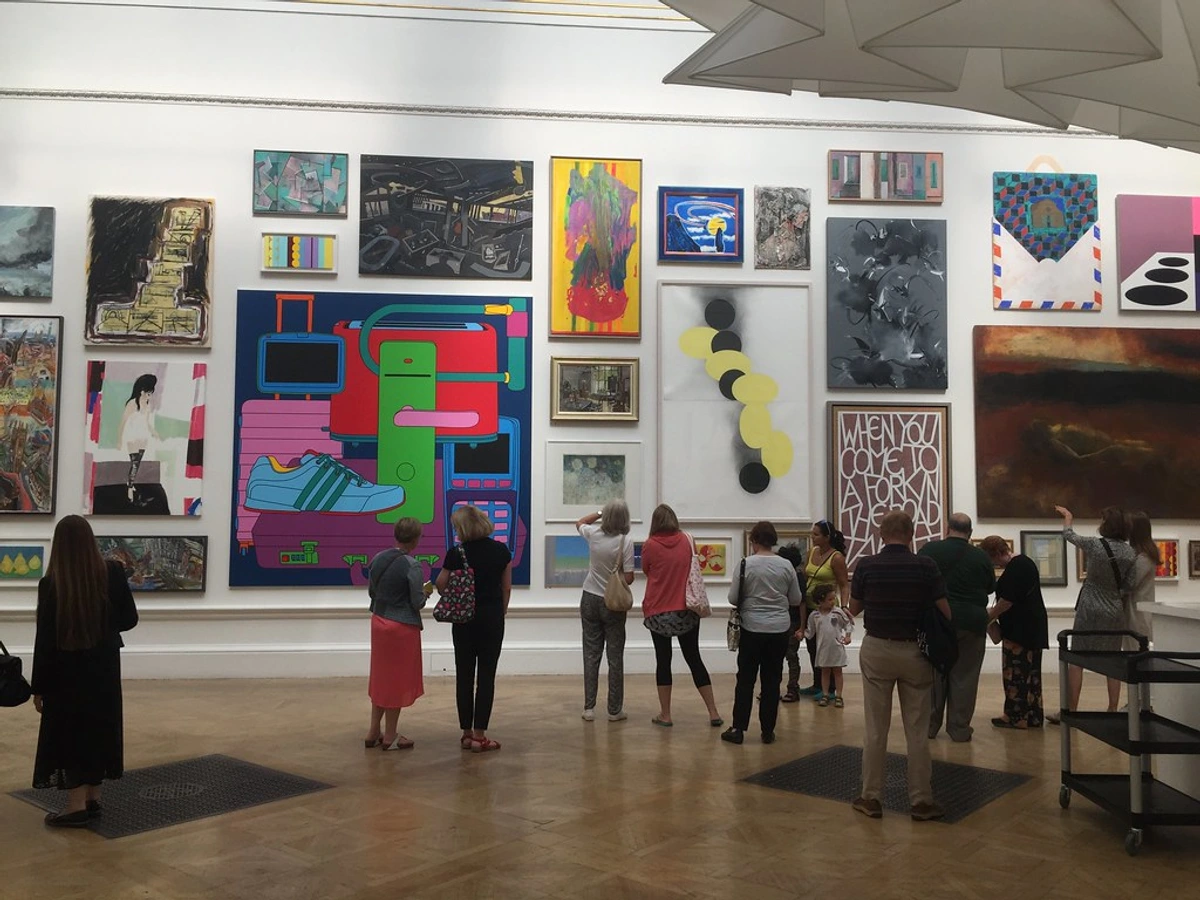
How to choose art for an entryway with an open-concept layout?
Open-concept layouts present a unique opportunity and challenge for entryway art. Since the entryway often flows directly into living areas, your art here serves as a critical bridge, setting the tone for the entire open space. The key is to choose art that complements (rather than clashes with) the adjacent rooms' aesthetics. Consider a large, cohesive statement piece that can be viewed from multiple angles, or a carefully curated gallery wall that incorporates elements from the broader color palette or theme of your open plan. Avoid overly busy or fragmented displays that might disrupt the visual flow. Think about how the art guides the eye into the rest of the home, creating a harmonious transition rather than an abrupt halt. It's about making your entryway a welcoming prelude to your home's expansive narrative. For further reading, consider my guides on choosing art for your living room or choosing art for a dining room. It's all about ensuring your entire home sings in harmony, starting with that crucial first note.
How far should art be from furniture in an entryway?
This is an incredibly common question, and one that, surprisingly, trips many people up! If you have a console table, a decorative bench, or even a low shoe rack in your entryway, the general, golden rule of thumb is to hang the art so the bottom of the frame is precisely 6-8 inches (15-20 cm) above the top of the furniture. This creates an aesthetically pleasing and cohesive grouping, making the art and furniture feel like a single, intentional vignette rather than two disconnected, floating pieces. Of course, always consider the height of your ceilings and the overall scale of the room – sometimes you need to go a little higher or lower to make it feel just right, maintaining that crucial visual balance. This careful placement creates a profound sense of intentional design, rather than a piece floating awkwardly above its companion furniture. This exact principle is very similar to how you would thoughtfully choose and place art above the sofa in a living room, ensuring harmony and presence. It's a foundational design tenet that, once mastered, will elevate all your art displays.
### What's the best height to hang art in a hallway?
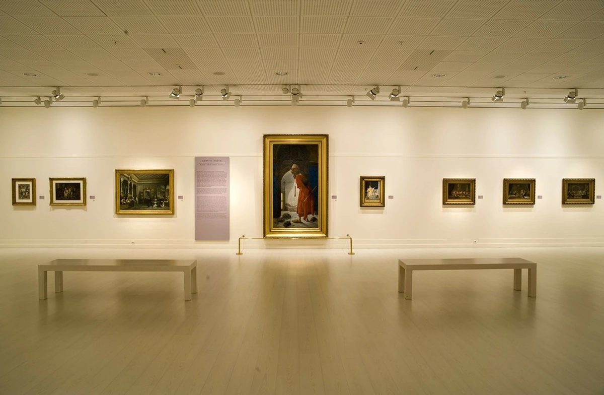
The established gallery standard, a principle I adhere to religiously, is to hang art so its absolute center is at eye level, which typically falls roughly between 57 to 60 inches (about 145-152 cm) from the floor for the average adult. This rule holds universally true for hallways and entryways, ensuring the art is comfortably viewed without craning your neck or stooping down. If your entryway boasts very high ceilings, you can, of course, cheat it up a little bit to acknowledge the verticality, but I caution you: don't go too high! The ultimate goal is for the art to be easily and comfortably viewed, allowing for immediate connection, not an awkward physical exertion.
What about very large/oversized art in an entryway?
Oversized art in an entryway can make an absolutely monumental, breathtaking statement! It truly works best when the available wall space can genuinely support its scale without the piece feeling overwhelming or claustrophobic. For grand foyers with soaring high ceilings or expansive, uninterrupted walls, a single, commanding piece can create incredible drama, draw the eye upwards, and profoundly emphasize the architectural scale of the space. The crucial factors are always balance and proportion – ensure the piece doesn't dwarf the entrance, block architectural features, or, most importantly, impede traffic flow and pathways. If you have a particularly wide, uninterrupted wall, an oversized horizontal piece can create a sense of sweeping grandeur and expansive calm. Always remember the 75% rule as a guiding principle, even for monumental pieces; it helps ensure the art feels intentional and integrated, not merely plunked down. For more nuanced tips on incorporating larger pieces, definitely check out my guide on maximizing impact, choosing art for high ceilings. I've personally seen oversized art transform a merely large entryway into a truly breathtaking, unforgettable space, and it's a design move I highly recommend if your space allows for it.
### What if I'm renting? Can I still hang art in my entryway?
Absolutely, unequivocally yes! Being a renter most certainly does not mean sacrificing your personal style or living in a bland, uninspiring space. There are tons, and I mean tons, of ingenious renter-friendly ways to hang and display art. Command strips, temporary adhesive hooks, and specialized picture hanging strips are fantastic for lighter pieces and, when removed correctly, won't damage paint or drywall. For heavier items, look for industrial-strength adhesive hooks designed for substantial weight, or consider using toggle bolts if your landlord permits small, easily patched holes. Leaning larger framed art against a wall on a console table or directly on the floor is also an incredibly chic, sophisticated, and completely no-damage solution. Don't forget that sculptural pieces, decorative mirrors, or textile art can also add immense impact without requiring complex or permanent installation. The key is to be creative, resourceful, and to actively utilize non-permanent solutions that allow you to express your style freely and fearlessly. My comprehensive guide on creating a cohesive art collection in a rented apartment has even more invaluable tips and tricks. I truly, deeply believe that even temporary spaces deserve to feel personalized, inspiring, and unequivocally yours. Don't let a landlord's rules stifle your inner decorator!
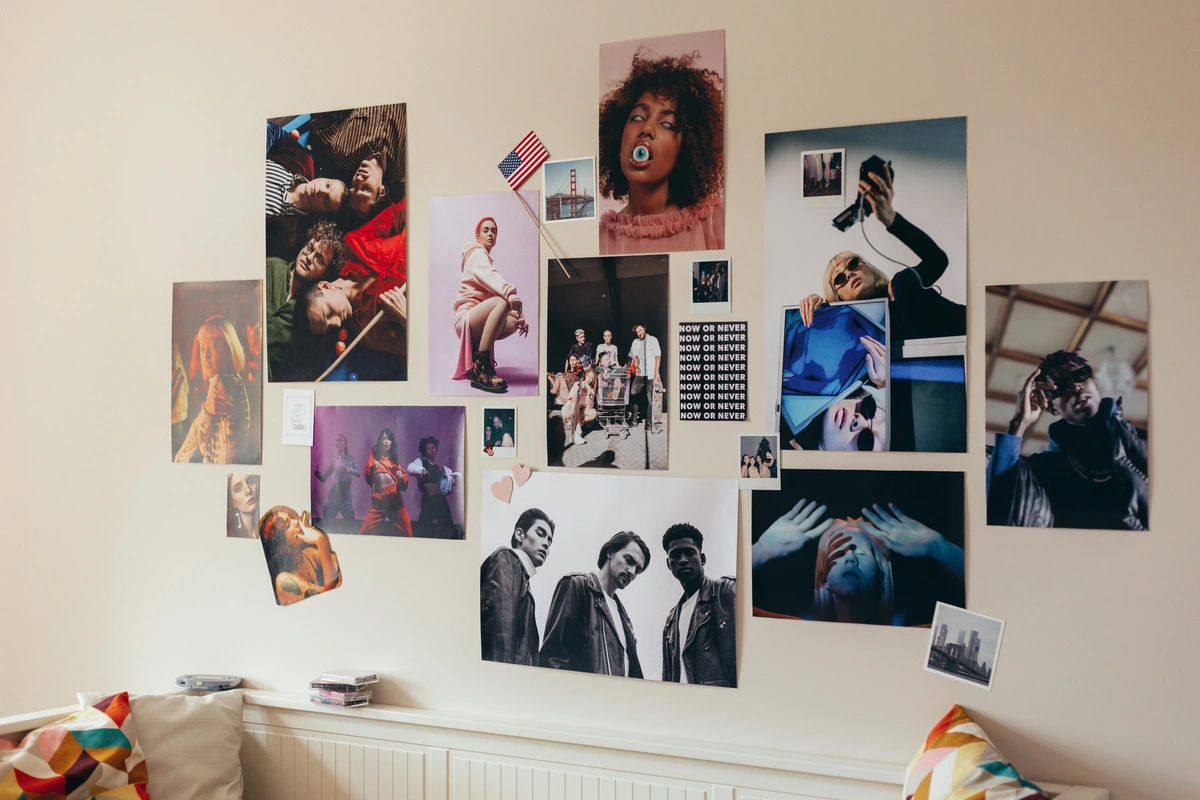
My entryway is basically non-existent. What can I do?
I feel you, truly. This is where you get to unleash your creativity and truly embrace the transformative power of clever design. If you have minimal wall space, your greatest ally is often vertical space! A single tall, thin piece of art, or a carefully arranged stack of three small, complementary prints, can create a powerful focal point without demanding much wall width. Consider also pairing a shallow, narrow console table with a striking vertical piece directly above it, or even installing a small, elegant floating shelf with a captivating sculptural object. This is a challenge akin to choosing art for a small apartment, where every single inch counts, and every design decision is magnified in its impact. Think 'maximum impact per square inch'! For these compact spaces, a piece with strong visual weight, even if physically small, can make a huge statement, effortlessly drawing the eye and making the absolute most of limited real estate. Even a thoughtfully placed small mixed media assemblage can provide significant, layered visual interest in a tiny footprint. It’s about being incredibly strategic and intentional with every element you introduce.
Can I use family photos as entryway art?
Absolutely, and I encourage it wholeheartedly, even passionately! Family photos, when curated thoughtfully and with artistic intention, can add immense warmth, personality, and an unparalleled, genuine 'welcome home' feeling to your entryway. The trick is to treat them with the same discerning artistic intention and careful presentation as any other piece of fine art. Consider printing them in cohesive black and white or soft sepia tones for a timeless, elegant look, or choose frames that perfectly complement your overall aesthetic rather than clashing. Mixing candid family photos with fine art prints, dynamic abstract pieces, or even small sculptural elements within a gallery wall can create a deeply personal, layered, and visually rich narrative that speaks volumes about who lives there and what they cherish. It transforms casual snapshots into cherished art, making your entryway uniquely and authentically yours. I truly love seeing a family's story unfold right at their front door; it's a powerful invitation! This is a perfect, heartfelt example of visual storytelling techniques applied to your most personal spaces. It’s a profound way to share your journey and invite connection right from the start.
### Can I mix different art styles in my entryway?
Absolutely, and in fact, I encourage it wholeheartedly! A curated mix of styles can create a far more interesting, dynamic, and personal entryway than a rigidly matched scheme. Think about a bold abstract piece next to a vintage landscape, or a modern photograph paired with a classic etching. The juxtaposition can be incredibly compelling and speaks to a well-travelled, thoughtful eye. The key is to find common threads that subtly link the pieces – perhaps a shared color palette, a consistent frame style (even if the art varies wildly), or a unifying theme (like "nature" or "travel"). It's about building a conversation between pieces, letting them bounce off each other, rather than forcing them into a strict uniform. This approach reveals a thoughtful curator behind the display, not just someone buying matching sets. For more on this, check out my guide on mixing and matching art styles for a cohesive gallery wall. It's where your personal flair truly gets to shine. Don't be afraid to break some rules, as long as you do it with intention!
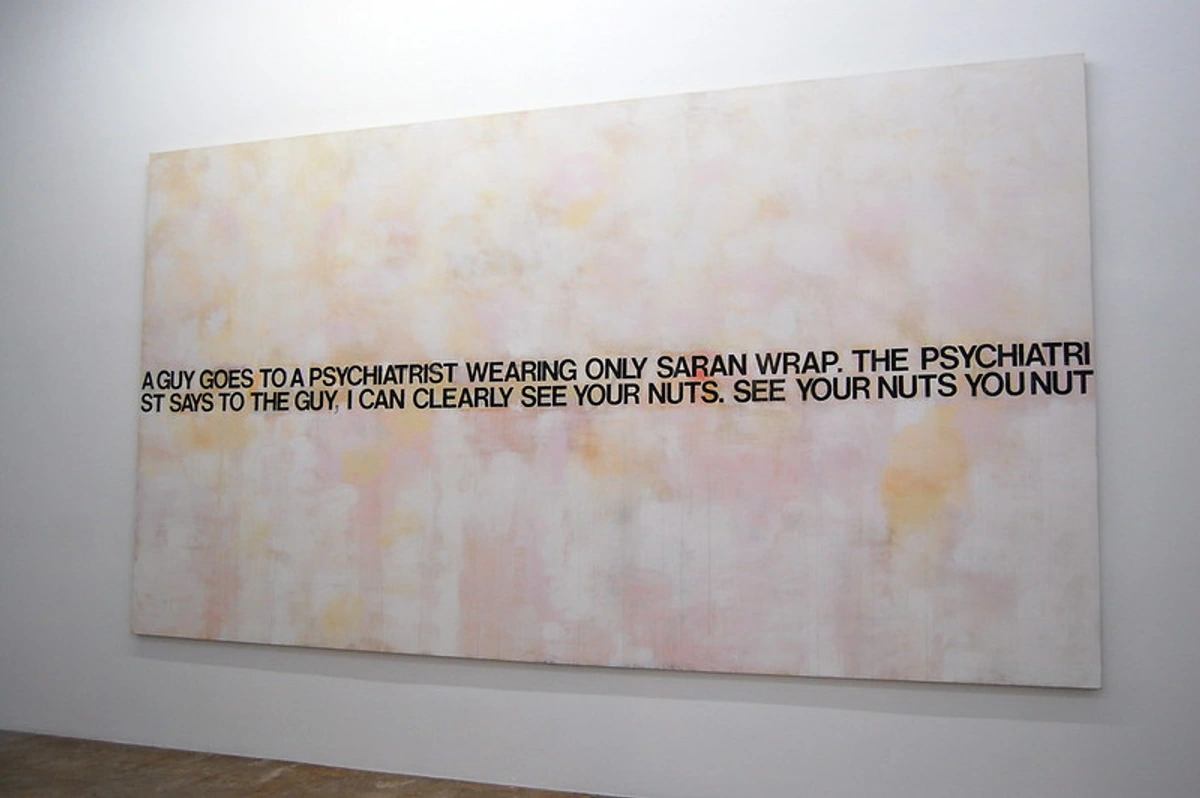
What is the role of symmetry in entryway art?
Symmetry can play an incredibly powerful role in creating an immediate sense of order, formality, and profound calm in an entryway. A perfectly symmetrical arrangement, like two identical pieces elegantly flanking a console table or a precisely gridded gallery wall, instantly communicates a timeless elegance and impeccable balance. It's a classic, sophisticated choice for traditional, formal, or minimalist homes, offering a visual sigh of relief and a structured welcome as you step inside. However, boldly embracing asymmetry can, conversely, create a far more dynamic, modern, and intriguing feel, suggesting movement, spontaneity, and a curated, less rigid style. It’s ultimately all about what mood and impression you want to evoke. While symmetry offers a comforting predictability and structured harmony, asymmetry can spark far more visual interest, initiate deeper contemplation, and foster engaging conversation. Neither is inherently 'better'; it's about what best serves your desired aesthetic and beautifully complements the architectural lines of your unique space. This entire concept is deeply rooted in understanding balance in art composition, where both symmetrical and asymmetrical approaches can achieve perfect harmony. It's a delicate dance, but when executed well, it creates an undeniable sense of intention and beauty.
### Should the art match my front door or my rug?
No, please, please don't. This is a common pitfall that can drain life from your decor. Think 'complement' and 'dialogue,' not 'match' and 'replication.' Your art should absolutely not be a perfect color copy of your front door, your rug, or your throw pillows – that approach can feel flat, lifeless, and utterly uninspired. Instead, it should share a mood or an overarching feeling, a subtle, resonant echo that creates harmony without being overly prescriptive or literal. You can, for instance, pick out one or two subtle accent colors from the artwork and echo them thoughtfully in a decorative pillow on a nearby bench, a unique vase on a console table, or even a delicate throw draped over a chair. It's about creating an engaging conversation between all the pieces in your entryway, making them feel like they organically belong together, rather than forcing them to wear a rigid, identical uniform. The art should elevate the decor, inspire emotion, and lead the eye, not just passively blend in. I often tell clients that art should always be the lead singer, the star of the show, not just another backup dancer in the decor band. Let it command attention and set the tone!
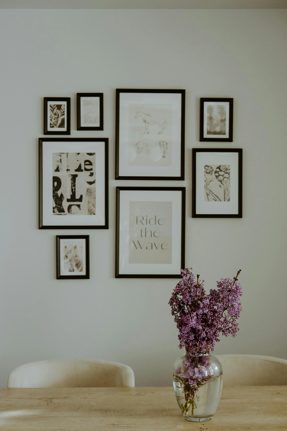
How do I maintain and protect entryway art?
Maintenance and long-term protection are, indeed, incredibly smart and proactive considerations for a high-traffic, often vulnerable area like an entryway. For detailed, granular guidance on cleaning various art mediums and meticulously protecting them from environmental factors, accidental bumps, and the rigors of daily life, I cannot emphasize enough how much I recommend reviewing the dedicated sections on "Maintaining Your Entryway Art: Keeping it Pristine" and "Beyond Aesthetics: Choosing the Right Medium for High-Traffic Areas" earlier in this comprehensive guide. These sections offer truly comprehensive, actionable advice, covering everything from choosing inherently durable materials to implementing proper, gentle cleaning techniques, all designed to ensure your art remains beautiful, vibrant, and impactful for years, even decades, to come. You can also find more general, foundational tips in my guide on choosing art for high-traffic areas. Remember, a little preventative care and thoughtful consideration go an incredibly long way in preserving the beauty, integrity, and investment of your chosen pieces. Your art deserves to be enjoyed for a lifetime, not just a season.
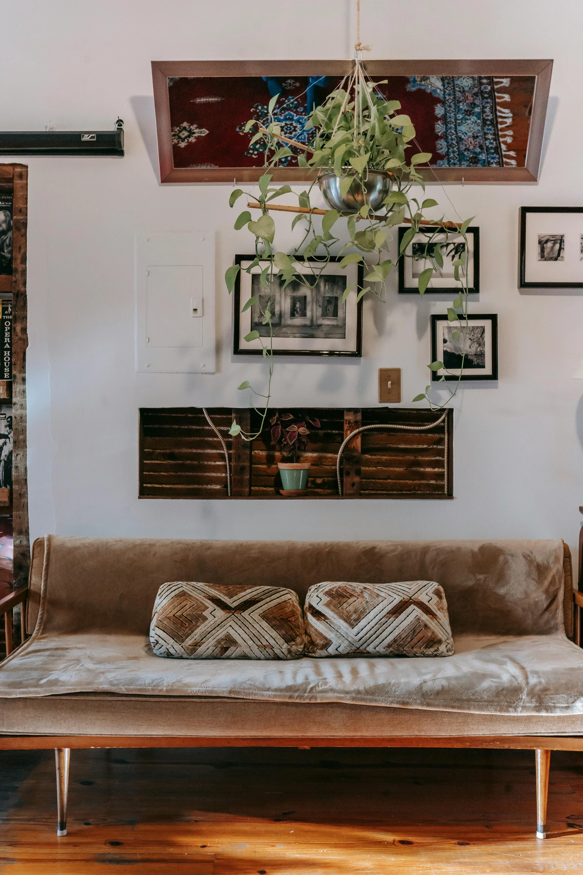
How often should I change my entryway art?
There's truly no hard and fast rule here – and that's the beauty of it! How often you change your entryway art is entirely up to your personal preference, your lifestyle, and your evolving aesthetic sensibilities. Some people, myself included, absolutely love to swap out their entryway art seasonally, bringing in warmer tones for autumn or bright, airy pieces for spring. Others change it purely when their mood strikes, or when they acquire a new piece that feels inherently right for the space. For those who genuinely enjoy frequent refreshes, curating a collection of prints or smaller, easily rotated pieces makes this process simple, enjoyable, and surprisingly impactful. If you have a core collection you adore, there's absolutely no need to change it at all! The beauty of art is its inherent fluidity; let it evolve with you, mirroring your life's changes. Think of it less as a chore and more as an exciting opportunity to refresh your home's first impression as often as you like. It's about responding to what feels right for you and your home at any given moment. For inspiring ideas on seasonal themes beyond just colors, consider exploring different artistic styles that reflect the time of year or your current emotional landscape. The goal is to create an entryway that feels in sync with the rhythm of your life and the world outside.

### Is it safe to put valuable art in an entryway?
It absolutely depends, and this is a question that requires careful, thoughtful consideration. Several critical factors come into play: direct sunlight (which is a notorious culprit for fading delicate colors over time), significant humidity changes from the constant opening and closing of the front door, and, of course, the inherent risk of it being accidentally bumped or brushed in a high-traffic area. For a truly valuable, irreplaceable original artwork, an entryway, despite its prominent location, might genuinely not be the safest or most suitable spot for long-term preservation. This is precisely where high-quality, museum-grade prints are a fantastic, anxiety-free solution—you achieve all the visual impact and aesthetic joy with none of the constant worry. If you do possess a precious piece you simply must display in your entryway, ensure it's placed in the most well-protected area possible, perhaps behind museum-grade, UV-protective acrylic glazing, and securely mounted away from direct traffic paths. Sometimes, admiring true treasures from a slightly safer distance is indeed the wisest and kindest approach to preserve their beauty for generations.
## A Final Thought: Your Entryway, Your Story
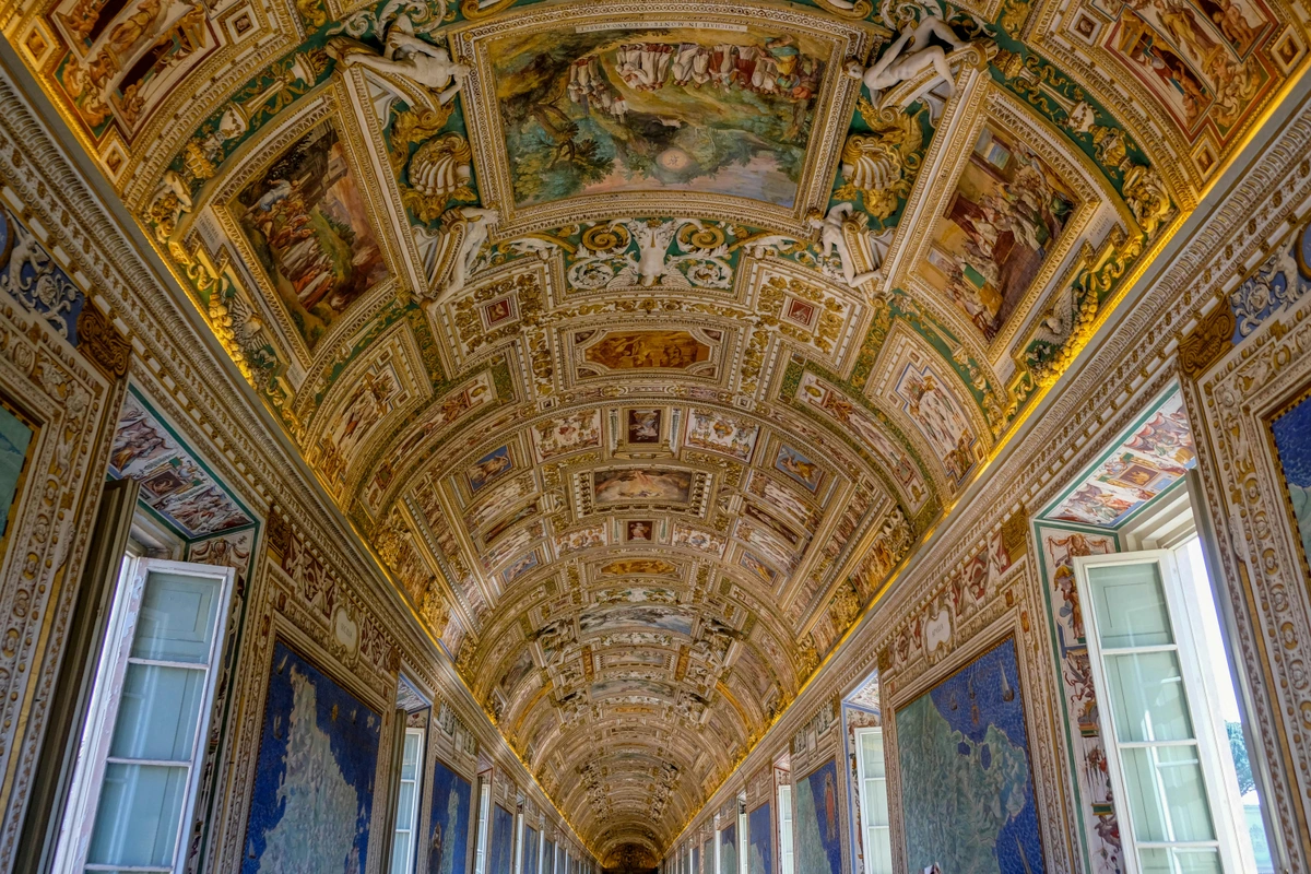
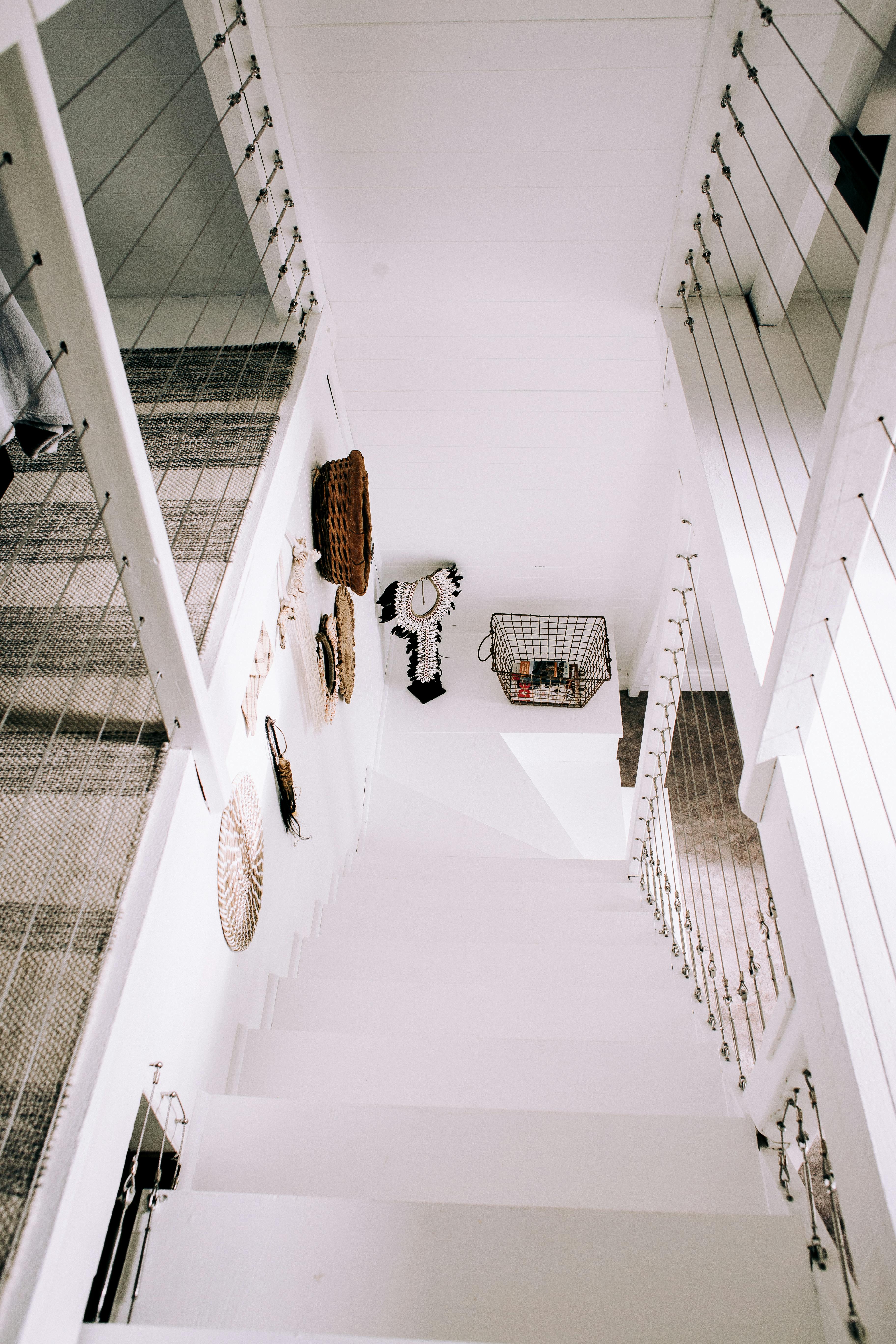

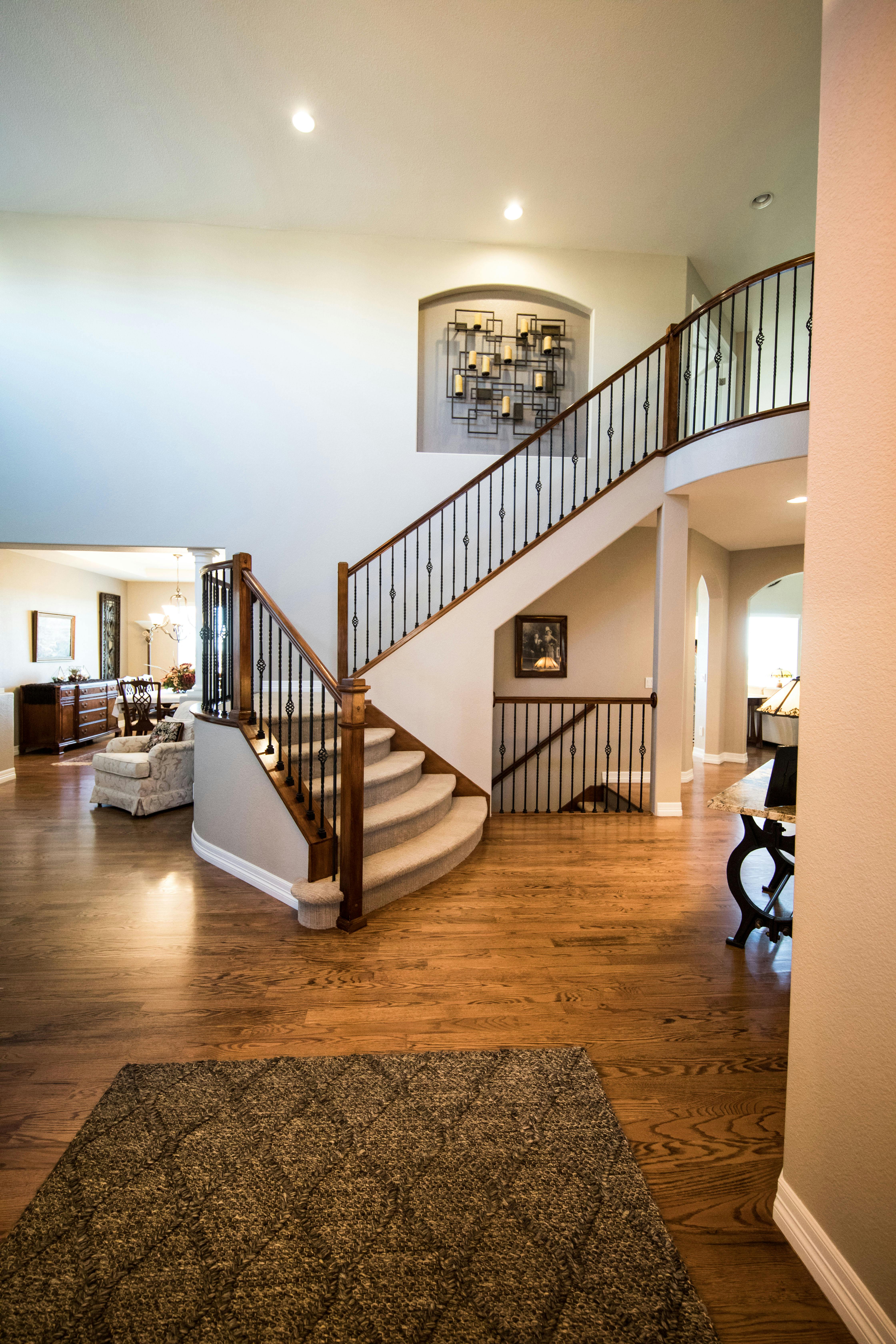


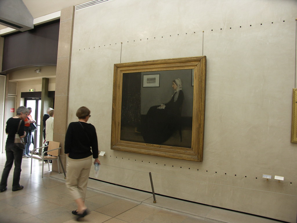
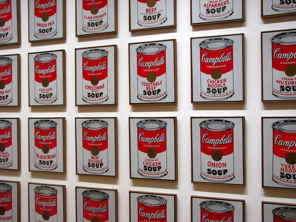
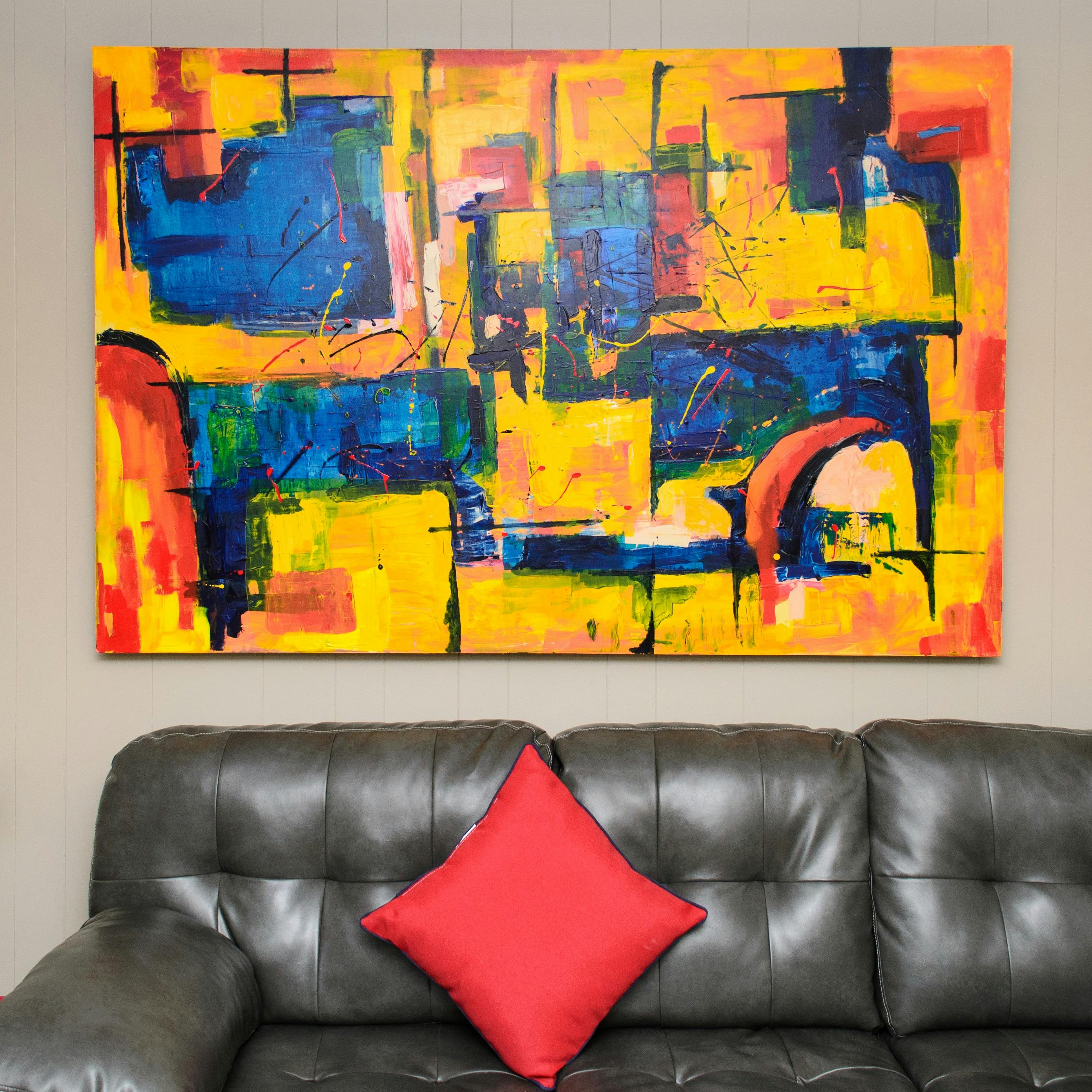


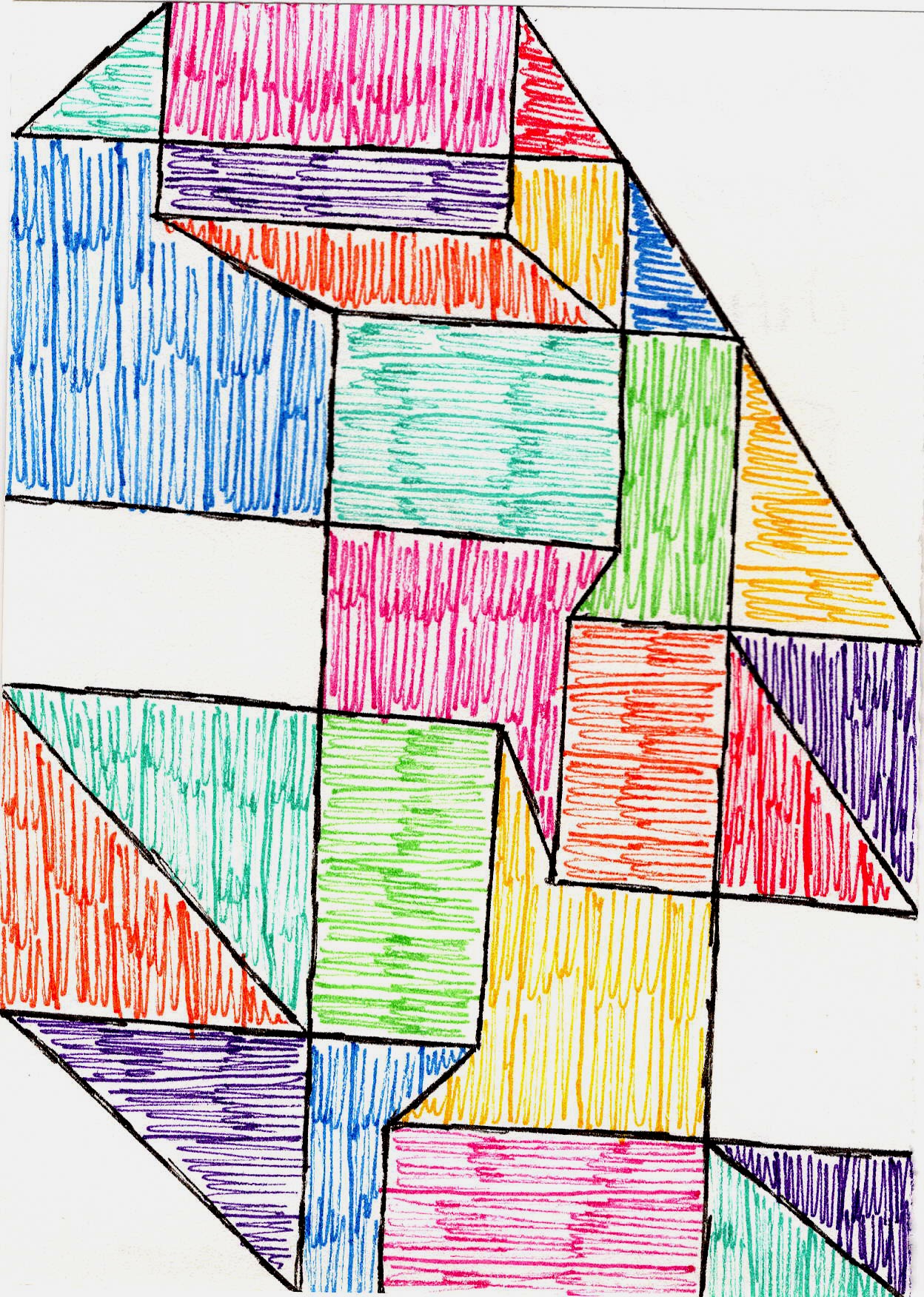
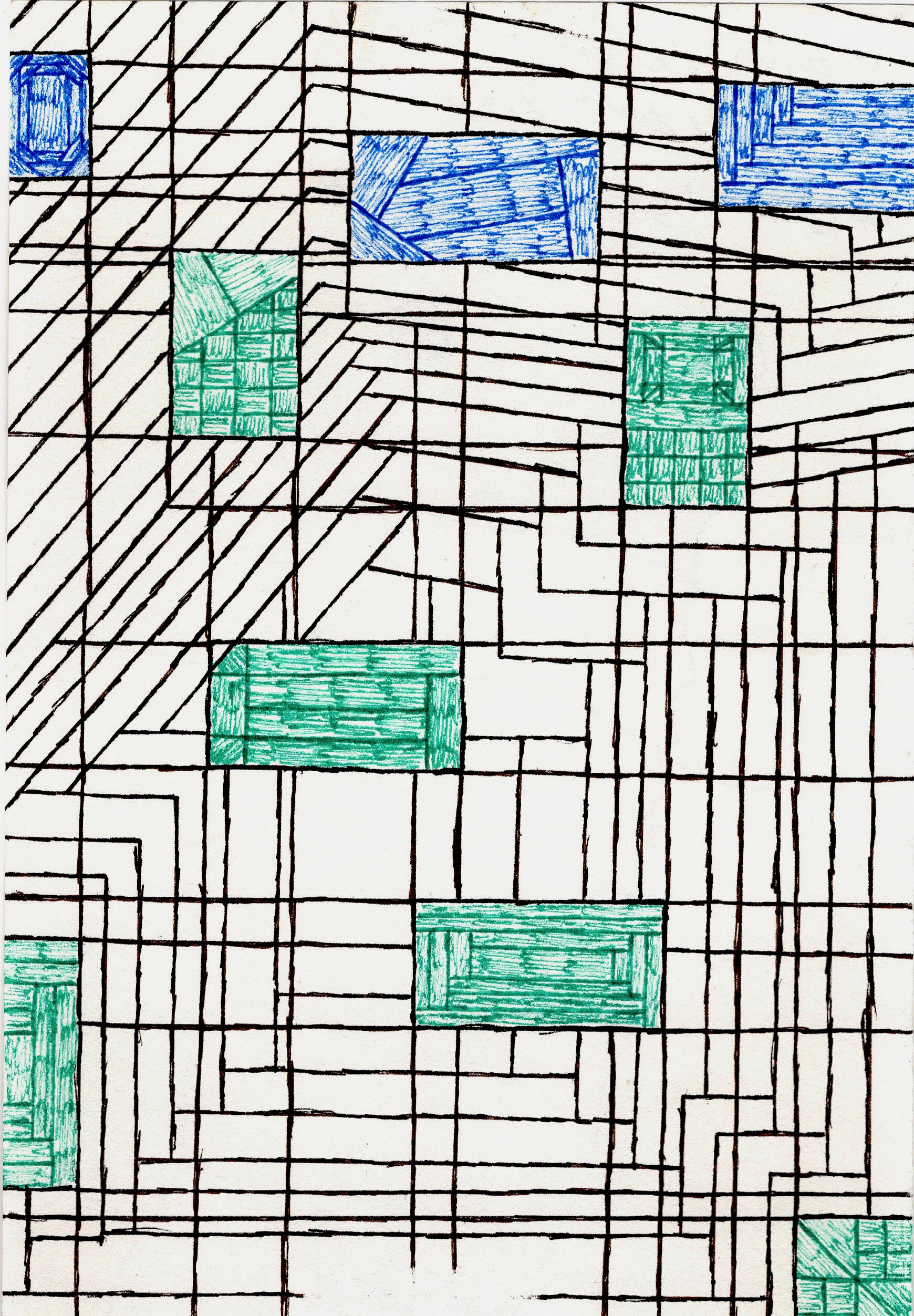






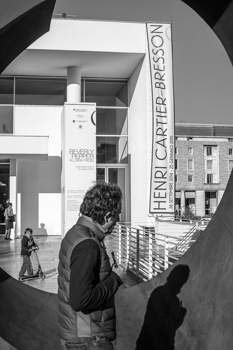
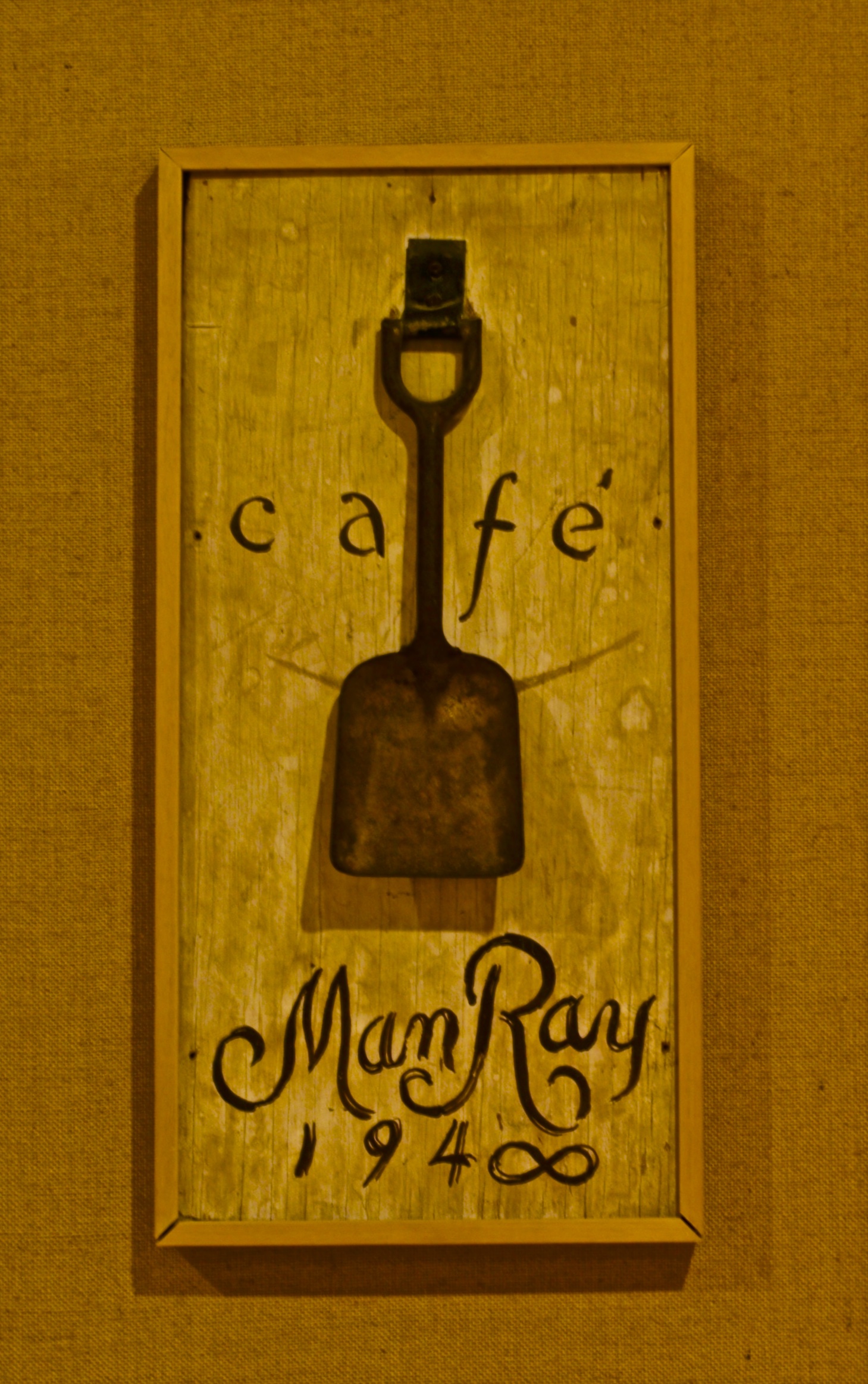
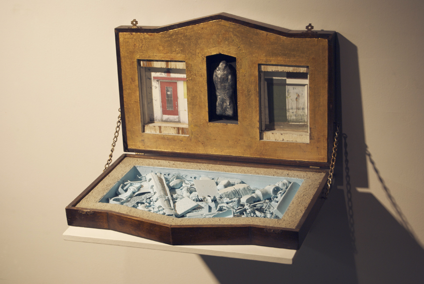
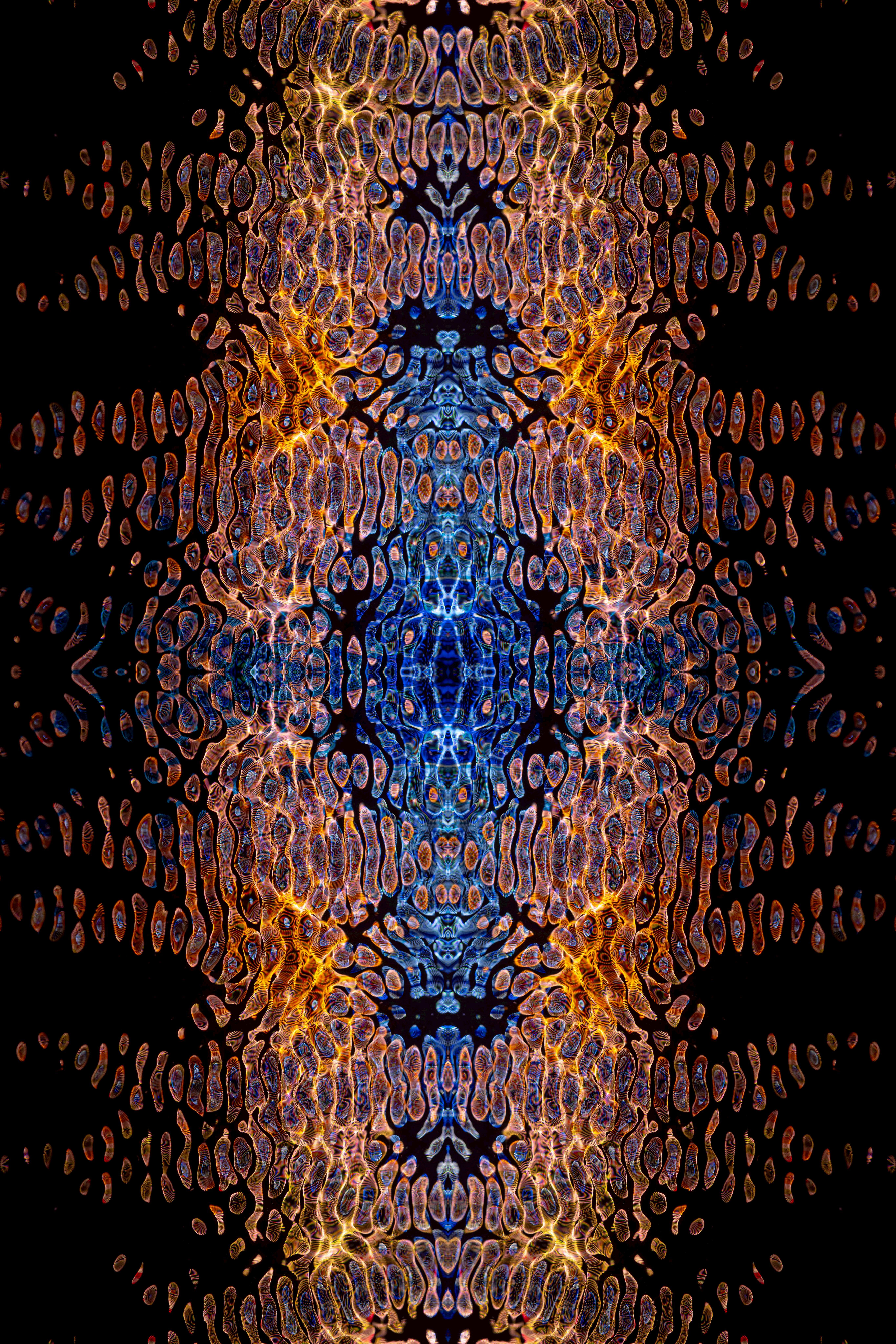

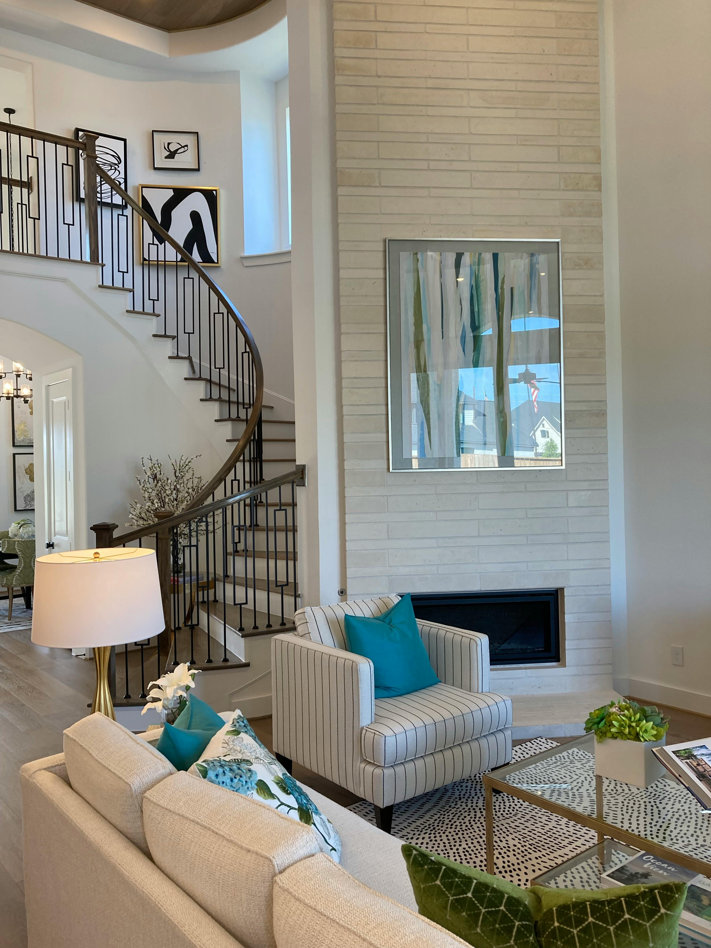
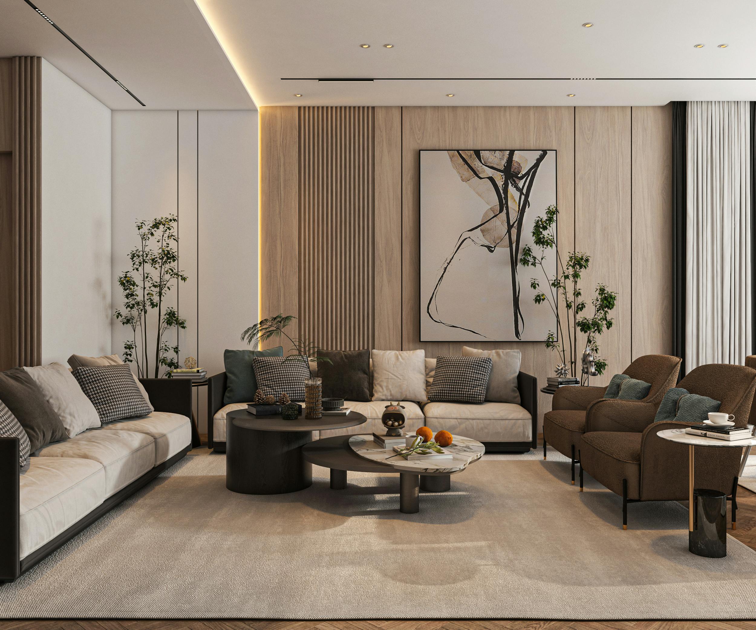





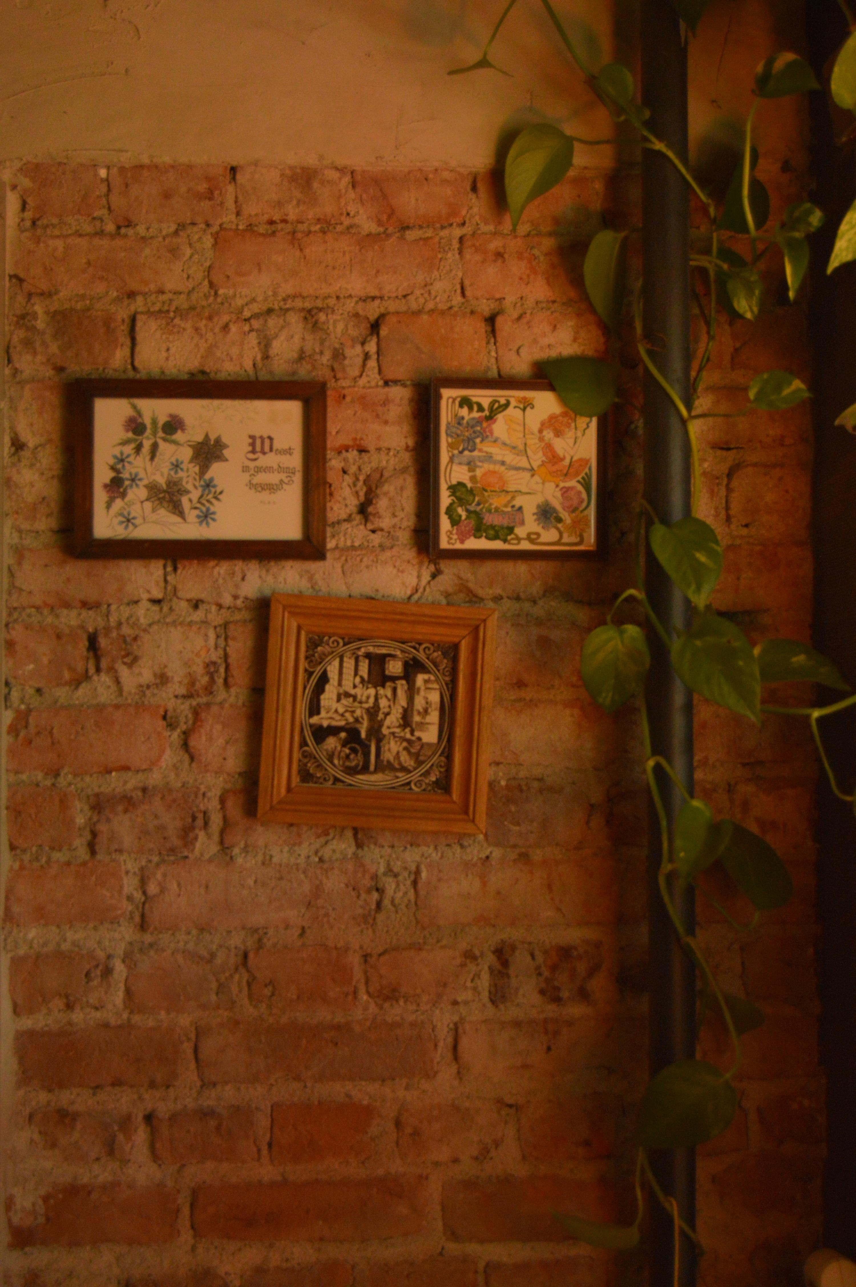


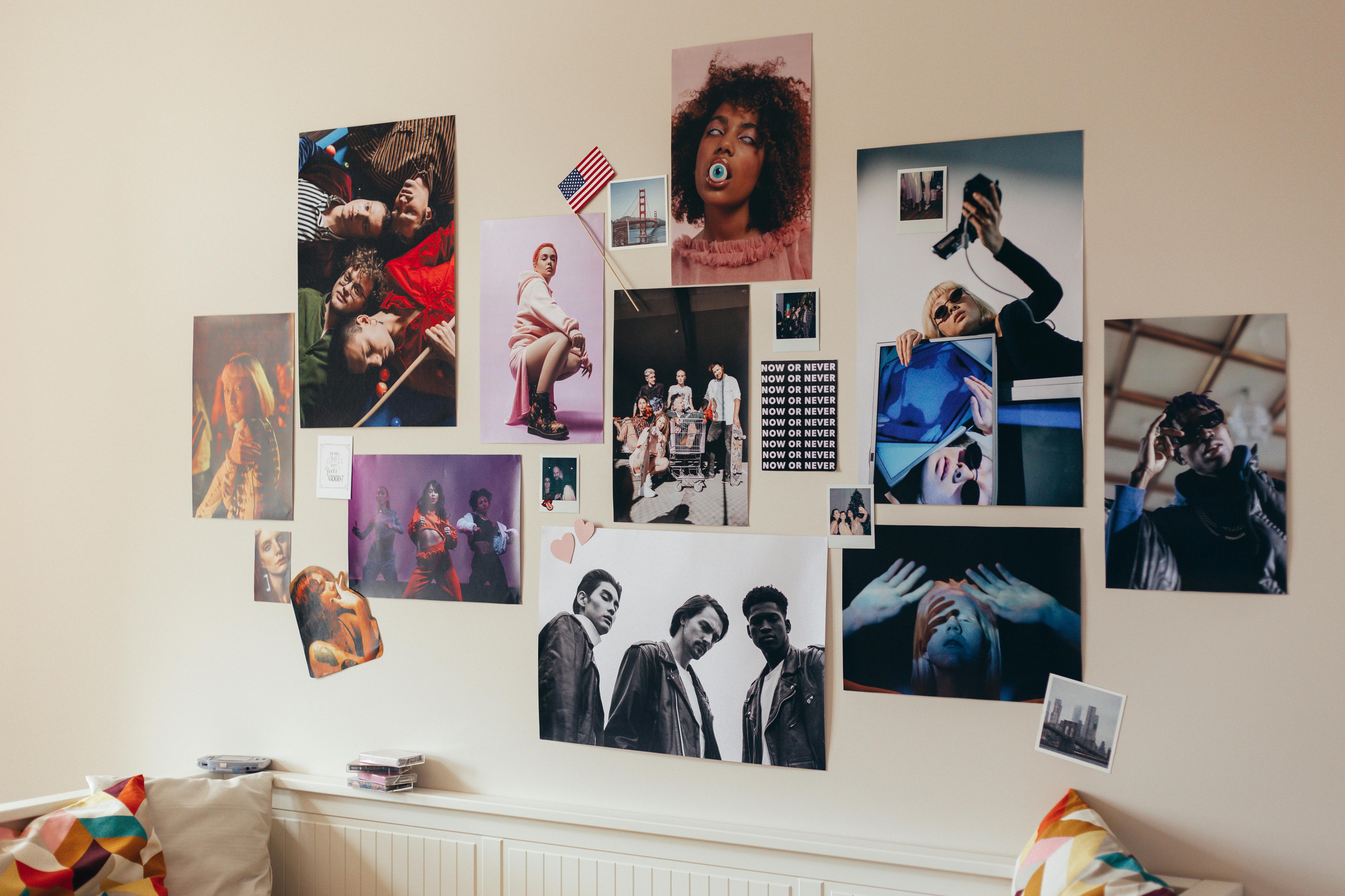

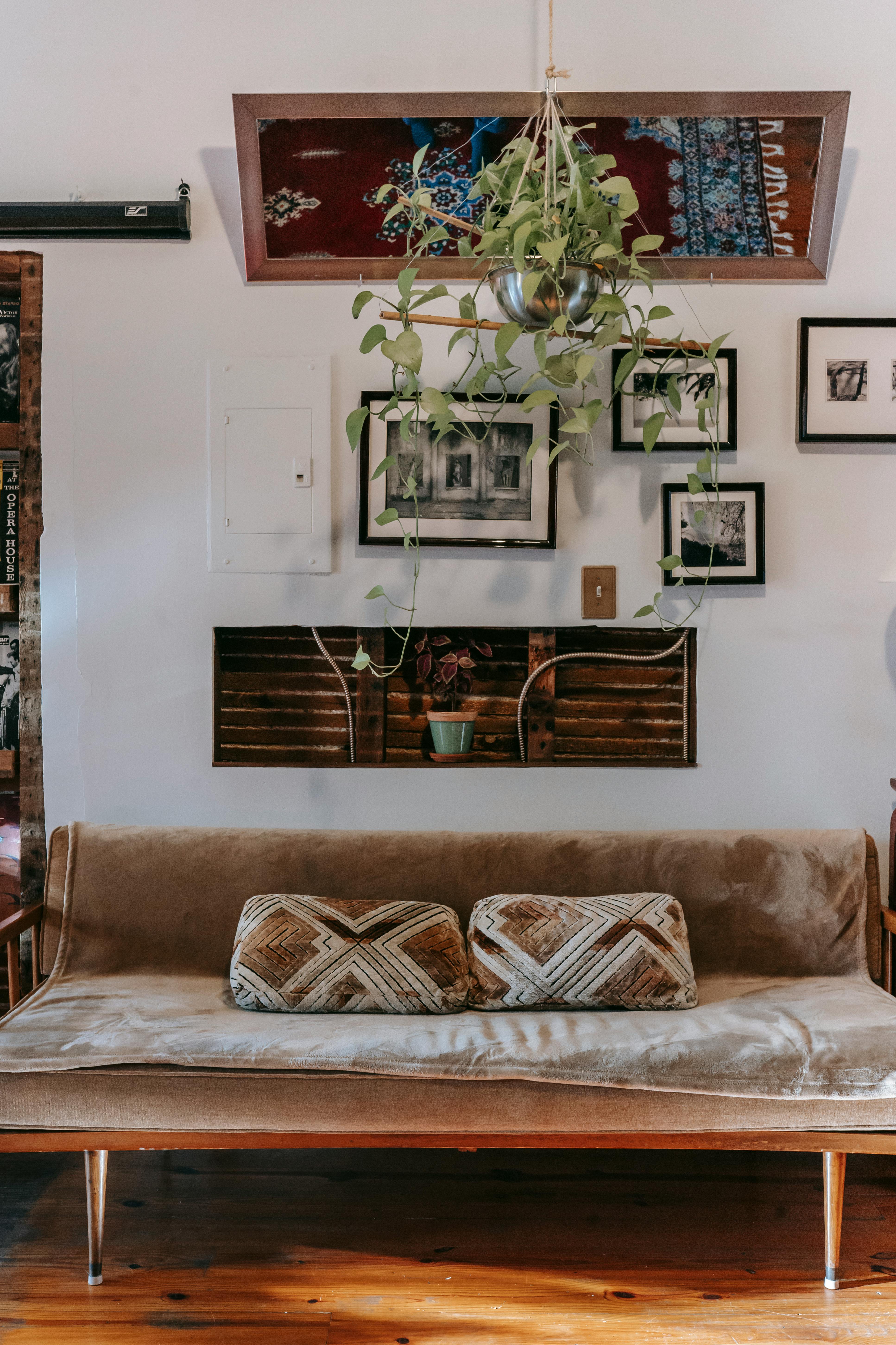


Look, at the end of the day, I know we're talking about a pass-through space, a mere transition zone. But that absolutely, unequivocally doesn't mean it has to be a forgotten or uninspired one. Don't let the myriad of "rules" paralyze you or make you feel like you need a formal design degree to make good choices. My ultimate goal for you, my dearest reader, is to find something you absolutely love to see the moment you get home, a piece that offers a genuine 'hello' and a soothing 'goodbye' as you leave for the day. It's about creating a deeply personal sanctuary, an immediate reflection of comfort and joy, starting right at the threshold of your home. Because let's face it, that first impression you get when you walk in should always be a good one, for you.
Start small. Choose just one piece that truly speaks to you. Live with it. See how it feels as the seasons change and your own tastes inevitably evolve. The truly wonderful thing about art, especially when displayed in a dynamic space like the entryway, is its inherent fluidity. It isn't, and shouldn't be, permanent in the way a built-in cabinet is, and that, my friend, is incredibly liberating! You are free to move it, change it, swap it out, and let your home's narrative gracefully unfold with you, reflecting who you are at any given moment in your life's journey. Your entryway is the very first page of your home's unique story—a dynamic, ever-changing introduction that can constantly be re-edited, refined, and joyfully rewritten. So, take a deep breath, trust your instincts, quiet the inner critic, and have immense fun writing it. After all, first impressions count, profoundly so, but the feeling you get every single day as you arrive and depart counts even more. Make it a feeling you cherish, a genuine, heartfelt 'welcome home' every single time you cross that threshold. Because in a world that often demands so much, your home should always be your most comforting embrace.