
Mastering the Expansive Canvas: Your Ultimate Guide to Decorating a Large Wall
Transform daunting, expansive walls into dazzling statements of personal style. This ultimate guide covers essential preparation, statement art, dynamic gallery walls, immersive murals, architectural depth, sustainable choices, future trends, and FAQs, empowering you to tell your unique story.
Mastering the Expansive Canvas: Your Ultimate Guide to Decorating a Large Wall
I remember staring at the massive, intimidating wall in my first studio apartment. It wasn't just there; it was a vast, silent canvas practically screaming for attention, yet completely paralyzing me. Have you ever felt that profound mix of dread and boundless opportunity when faced with an empty expanse that feels impossibly huge? You're certainly not alone. I've spent years pondering, experimenting with, and, frankly, sometimes getting completely wrong how to tackle these monumental spaces. My first attempt at a gallery wall looked less like curated art and more like a herd of startled squirrels had escaped a frame shop, with pieces too small and haphazardly spaced, creating visual chaos! But that's how we learn, isn't it? We learn from the joyful messes and the "oh-no" moments. And remember, nobody wants their carefully chosen artwork to decide it wants to redecorate the floor unexpectedly, so let's get this right!
Forget about perfectly replicating a Pinterest board; this is about giving you the tools and confidence to tell your story on that big wall, to make it feel less like a void and more like a carefully considered, captivating part of your home. This guide is your roadmap, breaking down the daunting into the doable, and empowering you to turn that intimidating expanse into a statement of your personal style. We'll explore everything from grand statements and subtle layers to smart architectural integrations, ensuring every corner of your expansive canvas reflects your unique style. Trust me, it's easier than you think to turn a daunting space into a dazzling focal point. Did you know that a well-decorated wall can actually influence your mood and perception of space? Let's dive in and unlock that potential, covering everything from powerful statement pieces and evolving gallery walls to smart architectural integrations, future trends, and essential practicalities.
Wall Preparation: The Unsung Hero of Wall Decor
Before any masterpiece can grace your wall, or any elegant shelving system can be installed, a crucial step is often overlooked: wall preparation. This isn't the most glamorous part of decorating, but it's the unsung hero that ensures longevity and a flawless finish for all your efforts. A well-prepared wall is like a perfectly primed canvas – it takes paint better, adhesives stick stronger, and anything you hang will look its absolute best. Think of it as the essential, often unseen, underpainting that makes a vibrant masterpiece truly sing.
Key Steps for a Ready Wall:
- Cleanliness is Next to Artliness: Always start by thoroughly cleaning your wall. Dust, grime, and grease can prevent paint from adhering properly and reduce the effectiveness of glues or tapes. A simple wipe-down with a damp cloth and mild soap (ensure it's completely dry afterward!) is usually sufficient. Also, check for existing textures or finishes (like old wallpaper, glossy paint) that might need special removal or additional prep like scuff-sanding to create a receptive surface. For optimal results, ensure your wall's temperature and humidity are stable, as drastic fluctuations can affect paint and adhesive drying times and adhesion.
- Patch and Smooth: For any significant holes, cracks, or uneven textures, patching compound and light sanding are essential. Investing in a good putty knife (in various sizes for different repairs) and a sanding block with appropriate grit sandpaper will make this much easier. A smooth, uniform surface is critical for murals, wallpapers, or even large artworks where imperfections could be highlighted by light. For particularly textured walls (like popcorn finishes or rough plaster), you might need to skim-coat the entire surface for a truly smooth base – it's more work, but the results are worth it for a high-impact wall. If you're in an older home, it's always wise to test for lead paint before disturbing any painted surfaces; professional testing is recommended if you're unsure.
- Prime Time: Applying a good quality primer, especially on new drywall, patched areas, or if you're making a dramatic color change, creates a consistent base. Primer ensures even paint absorption, better color vibrancy, and improved adhesion for wallpaper or heavy art mounts. If you're decorating in a high-humidity area (like a bathroom or kitchen), consider a moisture-resistant primer to prevent issues down the line. Different primers exist too: stain-blocking primers for covering old stains and bonding primers for challenging surfaces like glossy tiles. Choosing the right primer is like giving your wall a strong foundation for whatever comes next.
- Structural Integrity: Before hanging anything heavy, ensure the wall itself is sound. For older homes, or if you're unsure, consulting a professional can save you a lot of future headaches. Knowing where your studs are (with a reliable stud finder) is invaluable for securely mounting shelves, large mirrors, or heavy art pieces, preventing them from falling or damaging your wall. Remember, we don't want any unexpected redecoration of the floor!
- Working Around Fixtures: For fixed wall features like light switches, thermostats, or wall vents, plan how your decor will interact. Sometimes painting them the exact wall color camouflages them beautifully. Other times, they can be cleverly integrated into a gallery wall arrangement or a geometric paint pattern to make them feel intentional rather than accidental. For large or unsightly vents, consider decorative grilles or even custom-built enclosures that blend with your decor, turning an eyesore into a feature.
I've seen too many stunning art pieces ruined by poor wall prep – bubbling wallpaper, cracking paint, or even a cherished painting taking an unexpected dive. A little effort upfront makes all the difference.
Quick Tip for Wall Preparation:
- Clean & Smooth: Always start with a clean, patched, and smooth wall surface, checking for old finishes (like wallpaper, glossy paint) that need removal or scuff-sanding for optimal results. Consider skim-coating very textured walls and test for lead paint in older homes. Ensure stable temperature and humidity.
- Prime for Perfection: Use good quality primer (stain-blocking, bonding, moisture-resistant as needed) to ensure consistent paint color, vibrancy, and strong adhesion.
- Securely Mount: Always locate studs for heavy items (using a reliable stud finder) to ensure safety and stability – a small investment in peace of mind. Consult a professional for monumental pieces.
- Integrate Fixtures: Creatively incorporate or camouflage fixed wall features like switches and vents (with paint, decorative grilles, or strategic placement) to make them feel intentional within your design.
Historical Echoes: Decorating Through the Ages
Before we jump into modern techniques, it's fascinating to look back. Decorating large walls is far from a new challenge; it's a timeless pursuit that echoes through history. From the grand frescos of Pompeii and the elaborate tapestries adorning medieval castles to the stately paneling of Renaissance palaces and the dramatic salon-style hangings of the 19th century, humans have always sought to transform blank expanses into narratives, symbols, and expressions of status or comfort. It reminds me that while our tools and styles change, the fundamental desire to personalize our surroundings is constant. What can we learn from those who tackled massive walls without the convenience of peel-and-stick wallpaper?
Consider the frescos of Pompeii, where artists used wet plaster and pigment to create vivid, enduring scenes of mythology, daily life, and stunning trompe-l'œil architectural illusions that made rooms feel larger. The architectural innovations of Romanesque arches and Gothic vaults allowed for larger, uninterrupted wall spans, indirectly opening up even grander canvases for artistic expression. Think of the immense scale of Baroque altarpieces, or the exuberant Rococo interiors that seamlessly integrated wall paintings, mirrors, and decorative plasterwork to create total, immersive environments. This wasn't just decoration; it was a demonstration of power, patronage, and artistic skill.
Medieval tapestries, for example, served not only as elaborate visual narratives and storytelling devices but also as crucial insulation against the cold stone of castles, much like modern acoustic panels might manage sound in a grand, open-plan space. The invention of cheaper printing techniques in later centuries, for example, democratized wallpapering, bringing intricate patterns to more modest homes. Even in more modest homes, decorative schemes like wainscoting and picture rails offered structure to large walls, setting the stage for more personal art collections.
We can also find inspiration in non-Western traditions, such as the exquisite Byobu folding screens of Japan, which transformed entire rooms with sweeping painted narratives and delicate natural scenes, offering both beauty and movable divisions of space. Or consider the intricate Islamic geometric tilework and calligraphy that adorned vast mosque walls, creating mesmerizing, spiritual patterns that transcend mere decoration – patterns often rooted in deep philosophical and mathematical principles, making them endlessly captivating. In indigenous cultures, particularly in parts of Africa, large wall surfaces in homes and community buildings have traditionally been adorned with intricate patterns, symbols, and storytelling murals, often created using natural pigments and reflecting cultural identity and spiritual beliefs. These examples, from across continents and centuries, highlight the universal impulse to tell stories and create beauty on a grand scale.
Consider the ornate corridors of the Vatican, lined with centuries-old maps and intricate frescoes. These weren't just decorative; they were educational, symbolic, and awe-inspiring. They understood that a large wall could tell a monumental story. Or think of the grand halls of European châteaux, where immense canvases depicted historical battles or mythological scenes, often filling entire wall sections, framed by elaborate plasterwork or rich stucco. They perfected the art of making a space feel both opulent and intentional. Drawing inspiration from these historical approaches, we can see that scale, intentionality, and creating a sense of wonder have always been key. They teach us that even today, a large wall is an opportunity for grand artistic expression and a profound statement within a space.
The Bold Impact of a Single Statement Piece: Commanding Attention with Confidence
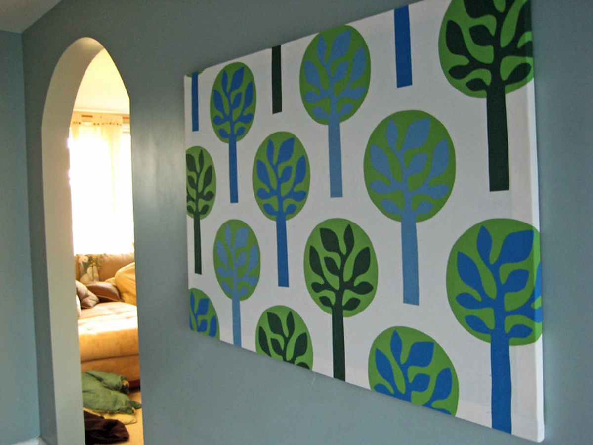
Sometimes, the simplest solution is the boldest: one really large piece of art. When I say large, I mean large enough to command attention, to hold its own against the expanse of the wall, without looking lost or busy. It's a singular, confident statement that declares, "I know what I like, and here it is." I've seen too many people try to fill a massive wall with a collection of small pieces that just end up looking lost and busy. A large piece, by contrast, gives the eye a clear place to land and can dramatically define the mood of an entire room. It acts as a visual anchor, pulling the room together.
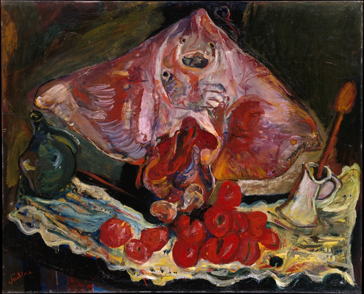
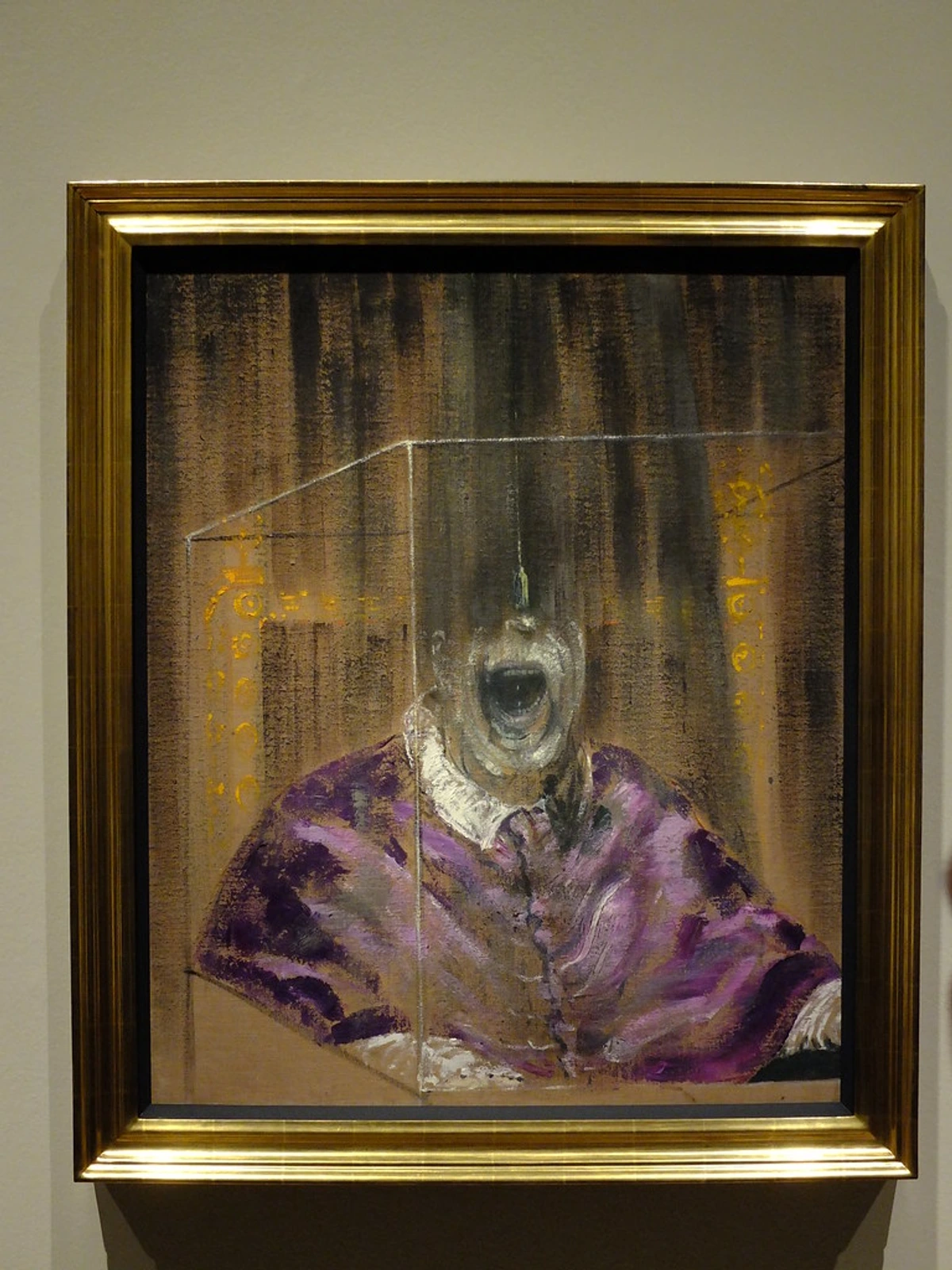
Think about what you want your room to feel like, and consider the theme or subject matter of the artwork in relation to the room's purpose. Is it calm and serene? Then a sweeping abstract landscape in cool tones, much like the contemplative color fields of an Agnes Martin or the serene washes of a Mark Rothko, might be perfect. Do you want energy and vibrancy? Perhaps something with bold colors and dynamic movement from my collection could be the answer, or a lively Pop Art piece for an unexpected jolt. For an almost raw, textural monumentality, consider the work of Anselm Kiefer. For something enigmatic and thought-provoking, a Surrealist piece could work. The key is understanding scale and visual weight. Scale refers to the physical size of the artwork relative to the wall and room, while visual weight is how much attention it draws, often influenced by color, detail, and contrast. For example, a piece with deep, rich colors or intricate patterns will have more visual weight than a light-toned, minimalist piece of the same physical dimensions and actual size. Imagine two canvases of the exact same 3x4 feet: one is a dense, dark abstract with heavy impasto, the other a sparse, light-filled landscape with delicate lines. The dark abstract will undeniably feel heavier and command more attention, despite being the same physical size. A common mistake is choosing something too small; it simply gets swallowed by the expanse. Remember, the art should relate to the wall's size and the overall proportions of the room, not just the furniture below it.
Beyond just its physical size, consider the internal composition of the artwork itself. A large piece with a vast, open landscape will feel different than one densely packed with intricate details. Both can work, but understanding their internal 'breathing room' helps you balance the overall wall. For optimal placement, consider the 'rule of thirds' or the Golden Ratio to position your art slightly off-center for a more dynamic, engaging feel. And don't forget the framing! A bold, ornate frame can amplify the statement, while a thin, minimalist frame or a floating frame allows the art to speak more quietly, yet profoundly. For very large or heavy pieces, I always recommend professional installation to ensure safety and perfect alignment – it's an investment in peace of mind.
Quick Tip for Statement Pieces:
- Go Big: Don't fear the void; embrace monumental art. Err on the side of larger rather than smaller.
- Match Visual Weight: Ensure the artwork's intensity (colors, details, theme) can hold its own against the room's furniture and overall presence. Think dark backgrounds and rich textures for more weight, or a lively Pop Art piece for energy.
- Consider Internal Composition & Framing: A large piece can feel open or dense; choose what complements your space's feeling. The right frame can amplify or soften its impact.
Murals and Wallpapers: Creating Immersive Experiences
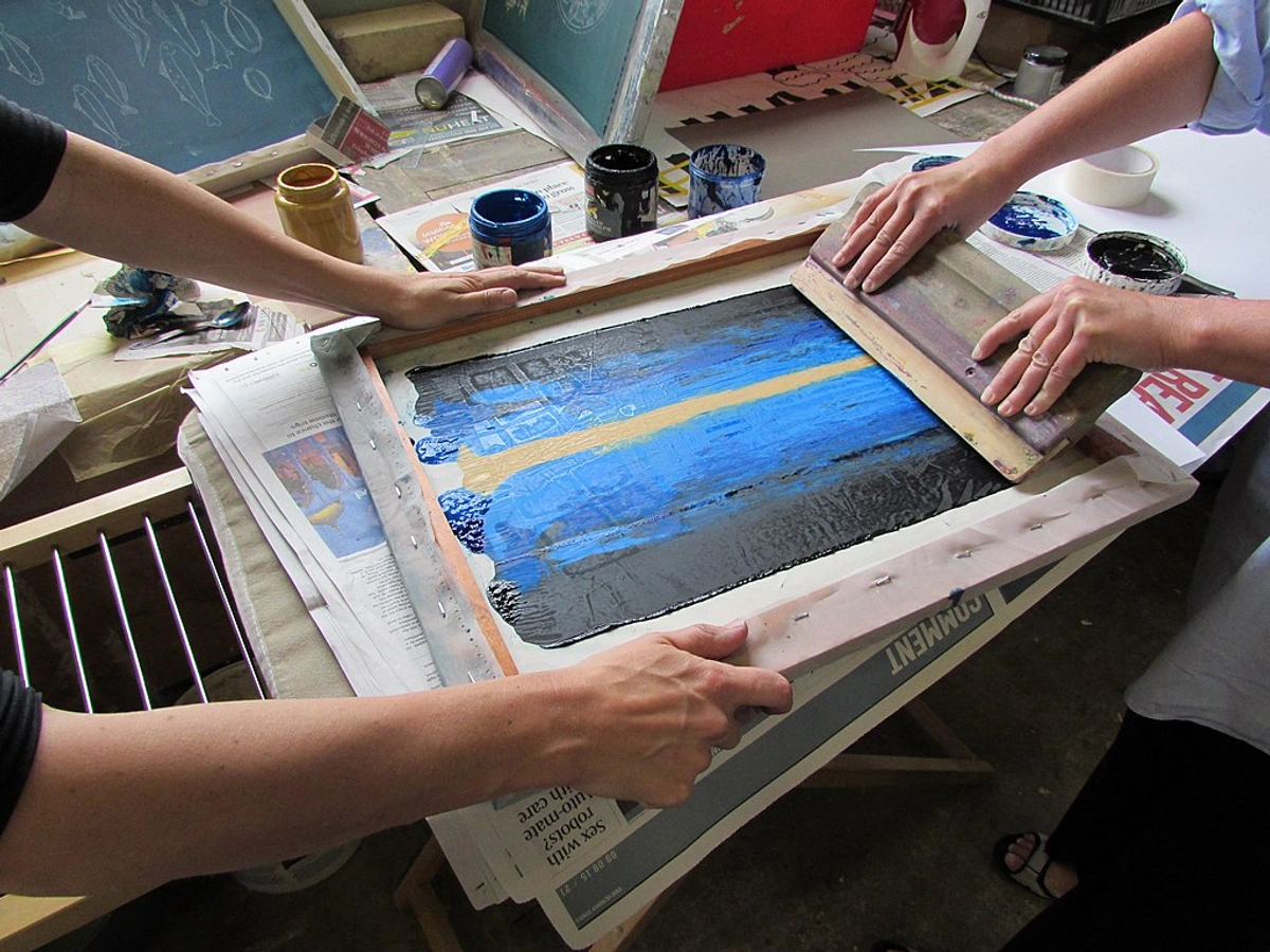
If you're feeling particularly adventurous (and maybe a little rebellious, like me!), consider a mural or large-scale wallpaper. These aren't just for kids' rooms anymore. A hand-painted mural, a high-quality peel-and-stick design, a printed fabric mural, or even a digitally printed wallpaper mural on various substrates (vinyl, non-woven, embossed paper, or even natural grasscloth) can transform a wall into an immersive experience. I once helped a client install a breathtaking forest mural in their reading nook, and it utterly changed the feeling of the entire space – from merely a corner to a serene escape. Or imagine a striking trompe l'oeil cityscape for a dramatic entryway, creating the illusion of a window overlooking a bustling metropolis, or a whimsical botanical scene filling a sunroom with life. It's a commitment, yes, but the payoff in personality and impact is immense. I've always admired spaces that aren't afraid to take design risks, and a well-chosen mural certainly falls into that category. It's like living inside a piece of art, really.
Historically, murals adorned everything from ancient Roman villas (think Pompeii's vibrant frescoes) to Renaissance churches, often depicting grand narratives or illusions of depth. Wallpaper, too, evolved from simple block-printed patterns in the 16th century to elaborate scenic designs in the 18th and 19th centuries, offering an accessible way to cover large walls with intricate imagery or texture.

When choosing, think about the room's function and the psychological impact you desire. A calming nature scene for a bedroom (think deep greens or muted blues), a dynamic geometric pattern for a living area (bold yellows or energetic reds), or even an architectural trompe l'oeil for a narrow hallway can all work wonders. Don't forget that large-scale patterns can add drama without being too busy if the colors are cohesive and the overall contrast is managed – and if the internal elements of the pattern aren't too small, which can make a large wall feel chaotic. For textured walls like brick or rough concrete, a mural might require more surface preparation. This could involve cleaning, patching, sanding to smooth out significant bumps, and often priming the wall to ensure proper adhesion and a uniform finish. However, the contrast between the art and the raw texture can be incredibly striking, making the extra prep worthwhile. And if you're working with repeating patterns in wallpaper, be mindful of the pattern repeat – the distance before a pattern segment repeats. Planning for this is crucial to ensure a seamless look, especially across a large wall, and to minimize waste.
Consider the type of wallpaper too. Beyond simple printed paper, you have flocked wallpaper (with raised, velvety patterns for tactile luxury and a soft, traditional feel), grasscloth (natural fibers for organic texture, warmth, and a subtle, sophisticated look), embossed vinyl (durable, washable, often mimicking architectural textures like plaster or tin tiles), or even silk wallpaper for ultimate opulence and a lustrous sheen. Each offers a different aesthetic and durability. Vinyl wallpapers are incredibly durable and washable, making them ideal for high-traffic areas like kitchens and bathrooms. Non-woven wallpapers are breathable and often easier to remove, great for living areas. Natural grasscloth offers unparalleled texture but can be delicate and harder to clean. Installation for large-scale murals or wallpaper can be complex, especially managing seams across a vast area, matching patterns perfectly, and working around existing electrical outlets or vents. Hiring a professional is often a wise investment to ensure a flawless finish and avoid those frustrating air bubbles or misalignments. Traditional pasted wallpapers are more permanent, while peel-and-stick options offer flexibility for renters or those who like to change their decor frequently. For a truly unique touch, many companies now offer custom-designed murals, allowing you to use your own high-resolution photos or a specific artistic brief to create a personalized, one-of-a-kind wall statement.
Quick Tip for Murals & Wallpaper:
- Theme by Room: Align the mural's theme (e.g., calming nature, energetic geometrics) with the room's primary function and desired psychological effect.
- Surface Prep is Key: Especially for textured walls, thorough cleaning, patching, and priming will ensure a smooth, lasting finish.
- Scale for Impact, Not Business: Large patterns can be bold without being overwhelming if the color palette is carefully considered and cohesive, and if the internal pattern elements aren't too small. Plan for pattern repeat to ensure a seamless look.
- Consider Wallpaper Types & Durability: Explore flocked (velvety), grasscloth (organic), embossed vinyl (textured), non-woven (breathable/removable), or silk (opulent) for varied aesthetics and durability; professional installation often yields best results for large-scale applications. Choose vinyl for high-traffic, non-woven for breathability, and grasscloth for unique texture. Explore custom-designed murals for personalized art.
Shelving, Mirrors, & Architectural Details: Building Dimension
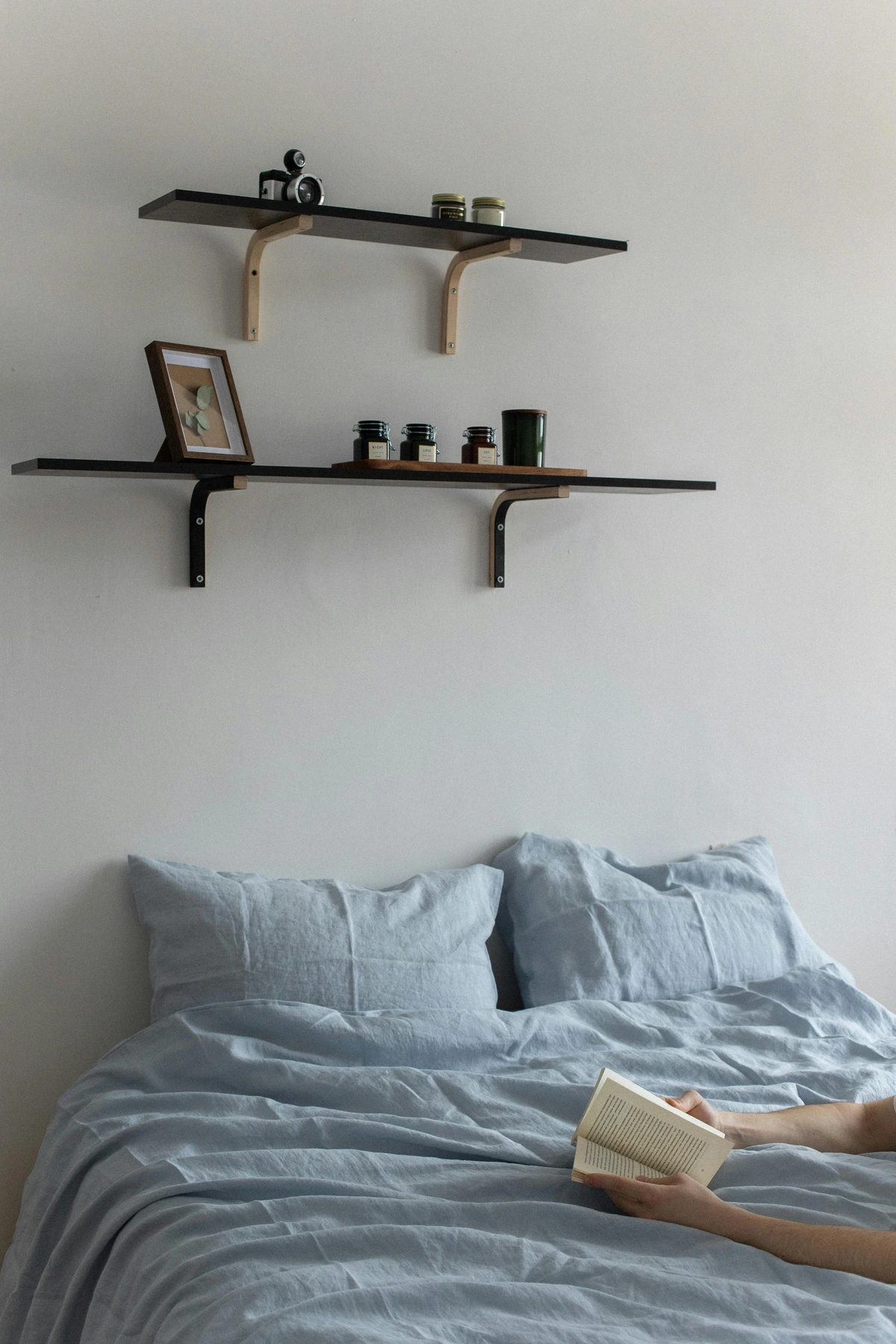
Who says a wall has to be flat? Adding shelving, large mirrors, or even faux architectural details can completely transform a large wall, giving it dimension and purpose. I'm a huge fan of floating shelves, especially when styled thoughtfully. They offer a chance to display books, small sculptures, plants, and smaller art pieces without the commitment of hanging everything directly on the wall. It's like creating a mini-gallery that changes with your mood. I remember once trying to install some floating shelves in a very old apartment with uneven walls – it was a true test of patience, but the layered display we created afterward was so worth the effort!
When styling shelves, remember the 'rule of threes' and vary heights to create visual interest – don't just line things up uniformly! Here's a little "bookshelf recipe" that I often share:
Element | Proportion | Styling Notes |
|---|---|---|
| Books | 40% | Mix vertical stacks with horizontal piles (use a few visually appealing bookends to keep them tidy). Vary book sizes and orientations for dynamic arrangement. |
| Decor Objects | 30% | Include vases (different shapes/materials), small sculptures, decorative boxes, framed photos, candles, or trailing plants (like Pothos or String of Pearls). Vary textures (ceramic, metal, wood, glass) and materials for richness. |
| Open Space | 30% | Crucial for visual breathing room; prevents a cluttered look. Arrange items to leave purposeful gaps, allowing the eye to rest and appreciate each object. Think of it as the white space in a composition. |
For bracketed or built-in shelving, consider incorporating integrated lighting or different background colors within the alcoves to further enhance the display. The deliberate creation of built-in niches or alcoves can also add architectural depth and serve as perfect display spots for individual sculptures or treasured objects, making them feel intrinsically part of the wall.
Large mirrors are another secret weapon. They not only fill space but also reflect light, making a room feel bigger and brighter – a real trick of the eye that I rely on often, especially in smaller rooms or those with low light. A series of large, ornate mirrors can create an incredible focal point, or a single oversized mirror with a striking frame (be it minimalist metal, rustic wood, or an arched ornate design) can stand alone as a statement piece. Consider the shape too: a round mirror can soften a room full of hard lines, while a rectangular one might bring a more formal touch. Don't be afraid to lean a large mirror against the wall for a casual, yet impactful, look – just ensure it's securely anchored if in a high-traffic area. Strategically placed, a mirror can also visually extend a hallway or reflect a beautiful view from an adjacent window, blurring the lines between inside and out and making the room feel more connected to its surroundings. For an even bolder statement, explore mirrored furniture (like a console table or cabinet) that directly interacts with the wall, or antique mirrors with their unique patina, adding a layer of history and subtle reflective quality. Even convex or concave mirrors can create playful distortions and add an unexpected artistic element. For a truly luxurious touch, consider a mercury glass mirror for its antique, speckled finish, or a beveled mirror to add faceted detail and sparkle.
Lastly, consider subtle architectural details. Even just adding picture rail molding, wainscoting (like classic Shaker paneling for a clean, simple look; elegant board and batten for vertical emphasis; or refined raised paneling for a traditional, formal aesthetic), a contrasting paint block, custom wood paneling, or dramatic metalwork can break up a large wall and give it a sense of structure without adding clutter. These foundational approaches set the stage for whatever art or decor you choose to layer on top, acting as an elegant frame for your future displays. Historically, grand halls and salons often used elaborate paneling and decorative plasterwork to add richness and break the vastness of walls, and we can draw inspiration from those timeless techniques. For instance, wainscoting can create a visual base, allowing art to be hung above it, while a vertical paint block (a painted strip of contrasting color) can create a "feature strip" that frames a tall piece of art or defines a zone. You could even create a geometric paint pattern by masking off sections with painter's tape for an abstract, architectural effect. Dramatic metalwork, such as laser-cut decorative screens or bespoke grilles, can add industrial chic or intricate patterns. For awkward features like radiators, a decorative radiator cover can transform an eyesore into a functional display shelf or a sculptural element, and a vent can sometimes be cleverly disguised by painting it the exact wall color or integrating it into a subtle geometric paint pattern. You can even create faux architectural elements like a mantelpiece, a framed archway, or decorative pilasters using lightweight materials and paint, adding grandeur without major construction.
Quick Tip for Dimension:
- Layer with Shelves: Use floating, bracketed, or built-in shelves to create dynamic vignettes of books, plants, and small art, always varying heights and textures, and consider integrated lighting. Remember the "bookshelf recipe" of 40% books, 30% decor, 30% open space. Explore built-in niches or alcoves for integrated displays.
- Reflect with Mirrors: Large mirrors visually expand space and amplify light; choose shapes and frames (metal, wood, ornate) to complement your style and reflect desired elements. Explore mirrored furniture, antique, convex/concave, mercury glass, or beveled mirrors for added interest.
- Define with Architecture: Add subtle details like wainscoting (Shaker, board and batten, raised paneling for different aesthetics), paint blocks (vertical strips, geometric shapes), decorative metalwork, or even faux architectural elements (like a mantelpiece) to give structure without adding visual clutter. Use decorative grilles to camouflage awkward features.
Essential Practicalities: Sizing, Placement, and Beyond
Before you grab your hammer (or call your trusty handyman), let's think about a few practicalities. I've learned these lessons the hard way, so you don't have to! Understanding these foundational aspects will save you headaches, time, and potentially some patching. It's all about working with your wall, not against it, and sometimes, that means challenging expectations – a lesson I've always embraced in my own art. For example, some rules are meant to be understood, then artfully broken.

Sizing and Placement: The Goldilocks Zone for Large Wall Art
Finding the right size is crucial. My general rule of thumb is that artwork (or a collection of pieces) should occupy about two-thirds to three-quarters of the width of the furniture or the wall space it's hanging above, or if it's a standalone piece on an empty wall, it should relate to the overall width of that wall segment. For instance, if you're hanging above a sofa, aim for your art to be roughly two-thirds the width of the sofa, and hang it about 6-8 inches above the back of the furniture (measured from the highest point of the sofa back). This creates a cohesive look and prevents the art from floating too high or being hidden by the furniture. For a standalone piece on a large, empty wall without furniture, try to center it at eye level (around 57-60 inches from the floor to the center of the piece), allowing for ample negative space around it – I usually aim for at least 12-18 inches of clear wall space from corners and ceilings to let the art truly breathe. The depth of your furniture (e.g., a deep sectional vs. a slim console) can also influence how far out your art feels from the wall; deeper furniture often pairs well with slightly larger or more visually weighty art. If your wall is particularly high, don't be afraid to allow your art to fill more vertical space, embracing the grandeur of tall ceilings by extending gallery walls upwards or choosing truly monumental pieces that span more than just the immediate eye-level zone. Remember, a common pitfall is choosing something too small; it simply gets swallowed by the expanse. When in doubt, mock it up! Use painter’s tape or cut-out paper templates to visualize the size and placement before making any holes. Trust me, it saves a lot of patching later. This step is a small investment of time that pays huge dividends in peace of mind, preventing those "oh no" moments after the first nail goes in. Also, consider the art's scale relative to other major elements in the room, like a fireplace or a large window – the art should complement, not compete with, these features.
Lighting: Shine a Thoughtful Light on Your Art
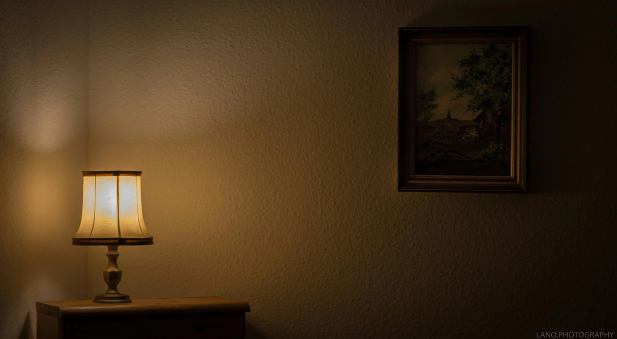
Good lighting can elevate your wall decor from nice to breathtaking. Beyond just highlighting art, a thoughtful layered lighting scheme can transform the entire mood of your room. Ambient lighting (general room illumination from overhead lights, pendants) sets the overall brightness, while task lighting (lamps for reading, cooking) provides functionality. Crucially, accent lighting (track lighting, picture lights, or strategically placed floor lamps) focuses directly on your chosen pieces, making them pop and emphasizing textures or brushstrokes, adding depth and drama. Consider the color temperature of your light bulbs too, measured in Kelvin (K): warmer lights (around 2700K-3000K) create a cozier atmosphere and can enhance warm tones in art, while cooler lights (3500K-4500K) can make colors appear crisper and more contemporary, often preferred for modern or abstract pieces. And for valuable pieces, consider UV-filtered lighting to protect your art from fading over time. I mean, what's the point of having amazing art if no one can properly see it, right? It's like putting on your best outfit and then sitting in the dark!
Don't forget the power of natural light. If your large wall receives abundant natural light, consider how it interacts with different textures and colors throughout the day. For walls with mixed lighting conditions – some natural, some artificial – choose art that can hold its own in both. Pieces with good contrast or metallic accents often adapt well. For picture lights, explore options like classic swing-arm lights (often hard-wired for a seamless look), wireless, battery-operated LED strips (great for renters or easy installation), or frame-integrated lighting for a minimalist approach. Each offers different aesthetic and installation benefits. Also, consider directional uplighting from floor lamps placed near plants or textured wall features to create dramatic shadows and add another layer of depth. For showcasing textured art or sculptures, adjustable spotlights or track lighting are particularly effective, allowing you to highlight specific features and create dynamic plays of light and shadow.
Budget and DIY: Get Creative and Resourceful!
Decorating a large wall doesn't have to break the bank. Thrift stores, flea markets, and even online marketplaces are treasure troves for unique frames and art. Don't underestimate the power of DIY – printing large-format photos, creating your own abstract paintings (I started somewhere, too!), framing interesting fabrics, or even old maps and vintage wallpaper samples can be incredibly rewarding and budget-friendly. Remember that amazing IKEA fabric wall art I mentioned earlier? Total DIY win!
For a concrete DIY project idea, try a Fabric Collage Wall Art. Gather a collection of fabric scraps in a cohesive color palette or theme (old clothes, remnants, or affordable fabric cuts). You'll need a large canvas or a piece of plywood (cut to your desired size and primed), fabric adhesive (like Mod Podge or fabric glue), and a brush. Simply cut your fabrics into various shapes (geometric, organic) and arrange them on your primed surface, overlapping and layering until you're happy with the composition. Adhere them, then seal with a top coat of Mod Podge for durability and a consistent finish. It's surprisingly easy, incredibly satisfying, and allows for massive, custom art!
For larger frames, look for old posters or large mirrors that can be repurposed. You could also create your own oversized abstract art using a large canvas (or even a drop cloth stretched over a frame) and simple techniques like paint pouring, large stencils, creating textures with joint compound (a common drywall material that can create fantastic sculptural effects), or geometric patterns with painter's tape. Another fun approach is fabric collage using scraps or even old clothes, or upcycling large found objects into sculptural wall art. You could even print large-format versions of your own personal photographs or family portraits for a deeply meaningful and budget-friendly display. For affordable large-scale frames, consider custom-cut mats from hardware stores paired with standard-sized frames, or exploring online custom framing sites during sales. Exploring estate sales, local art school exhibitions, or online platforms dedicated to emerging artists can also yield stunning, unique pieces without the hefty gallery price tag. Don't be afraid to experiment! My own attempts at "controlled chaos" in the studio sometimes turn into the most unexpected pieces. Sometimes, the best art comes from letting go a little.
Temporary Solutions for Renters and the Undecided
What if you love transforming walls but are in a rental or simply like to change things up frequently? You still have plenty of options. Large leaner mirrors or oversized artworks can simply rest against the wall. You can use tall shelving units or bookcases to fill vertical space and display art, books, and objects. Even tall plants or floor-standing sculptures can create a significant visual impact without a single nail. Command strips can also be your best friend for lighter frames, but always test them in an inconspicuous area first and be mindful of their weight limitations. Or, consider using temporary peel-and-stick wallpaper or large fabric panels hung with tension rods for a bold statement without commitment, just ensure your wall surface is suitable for adhesion and damage-free removal (brands like Chasing Paper or Tempaper are often reliable for this). Large vinyl decals are another excellent, removable option for graphic impact, letting you add intricate patterns or bold graphics without permanence.
credit, licence
Quick Tip for Practicalities:
- Measure & Mock: Always use painter's tape or paper templates to visualize placement and size before hanging, allowing 12-18 inches of negative space around standalone pieces from corners/ceilings. For art above furniture, aim for 2/3 the furniture's width and 6-8 inches above its highest point. Consider art's scale relative to other major room features.
- Light Strategically: Use a layered lighting scheme (ambient, task, accent) with track, picture lights (hard-wired, wireless LED, or frame-integrated), and directional uplighting to make your art pop and define the room's mood; consider color temperature (Kelvin) and UV-filtered options for preservation. Manage natural light interactions. Use adjustable spotlights for textured art.
- Budget Creatively: Explore DIY (fabric collage, paint pouring, joint compound textures, upcycled objects, large-format personal photos), thrift stores, and emerging artists for unique and affordable large-scale decor.
- Rent-Friendly Options: Leaner art, tall furniture, and temporary adhesives (like Command strips, peel-and-stick wallpaper, large vinyl decals, tapestries with tension rods) are your friends for non-permanent solutions.
The Art of the Gallery Wall: Weaving Your Visual Story
Ah, the gallery wall. My old friend! This is where you can truly let your personality shine, weaving together disparate pieces into a cohesive visual story. It's an excellent solution for a large wall because it allows for flexibility, evolution, and the integration of diverse elements. I mean, who doesn't love a good collection, right? For tips on how to build one, check out my article on how to hang a perfect gallery wall: a step-by-step guide.
When creating a gallery wall on a large expanse, think big but also think balance. You don't want it to feel like a random explosion of frames. Here's a little table I put together based on my own trial-and-error, especially considering larger walls:
Strategy | Description | Best For... | Avoid This Mistake... | Focal Point? | Pro-Tip |
|---|---|---|---|---|---|
| Symmetrical Grid | Uniform frames, evenly spaced, creating a clean, orderly look. | Formal spaces, minimalists, showcasing similar themed art or photography. | Too many small pieces looking lost in vastness. | Achieved by central positioning or repeating strong elements. | Use a level and consistent spacing (2-4 inches) for a polished finish. |
| Asymmetrical Flow | Varied frame sizes, styles, and spacing, creating an organic, dynamic feel with a clear focal point (e.g., a significantly larger piece, bolder color, or unique framing). | Eclectic homes, personal collections, mixing photos with art. | Clutter without a clear visual path; uneven visual weight distribution. | Essential; often a single, dominant piece. | Lay everything out on the floor first; photograph and adjust before hanging. Use digital layout tools for complex arrangements. |
| Edge Alignment | Pieces align along an invisible horizontal or vertical line (e.g., matching top/bottom edges), even if sizes vary, for subtle order and cohesion. This creates a neat baseline while allowing for creative variation above/to the side, making an eclectic mix feel anchored. | Adding structure to an eclectic mix, connecting different zones. | Ignoring overall balance; pieces feeling disconnected from the 'line'. | Can subtly guide the eye to an implied center. | Choose one strong edge (top, bottom, left, or right) to align to for impact. |
| Focal Point Start | Begin with one central, cherished piece and build outwards, creating visual gravity. | First-time gallery wall creators, making a treasured piece stand out. | Allowing the focal piece to be too small, or burying it in too much surrounding art. | The entire wall builds around this piece. | Ensure your focal piece is at least 1/3 the width of your intended gallery area. |
| Vertical Extension | Utilize the full height of a tall wall by extending the gallery upwards, perhaps with fewer, larger pieces or tall, narrow botanical prints, ensuring adequate spacing and consistent negative space. This strategy draws the eye up, emphasizing ceiling height. | Spaces with high ceilings, drawing the eye up and maximizing impact. | Not enough negative space; making the wall feel too busy top-to-bottom. | Can be multiple focal points at different heights. | Consider staggering heights to create dynamic vertical movement, or using a series of framed botanical prints or narrow abstract pieces. |
| Horizontal Span | Spread a gallery across a very wide wall, using varying sizes but maintaining a consistent eye-level 'band' in the middle, or creating distinct groupings. | Long, narrow walls or open-plan spaces. | Creating a 'tunnel effect' with too many pieces lined up in a single row. | Can use multiple focal points within distinct groupings. | Group pieces into smaller, intentional clusters on very long walls, or use a triptych with strong horizontal flow. |
| Grouping by Theme/Color | Create distinct clusters of art within a larger gallery, each group unified by a shared color palette, style (e.g., all black and white photos), or subject matter (e.g., all landscapes, all abstracts). | Breaking up a very large wall into visually digestible zones; organizing diverse collections. | Random groupings that lack a clear connection or consistent visual weight. | Each group can have its own mini-focal point. | Use consistent framing within each group, or a unifying mat color, to enhance cohesion. |
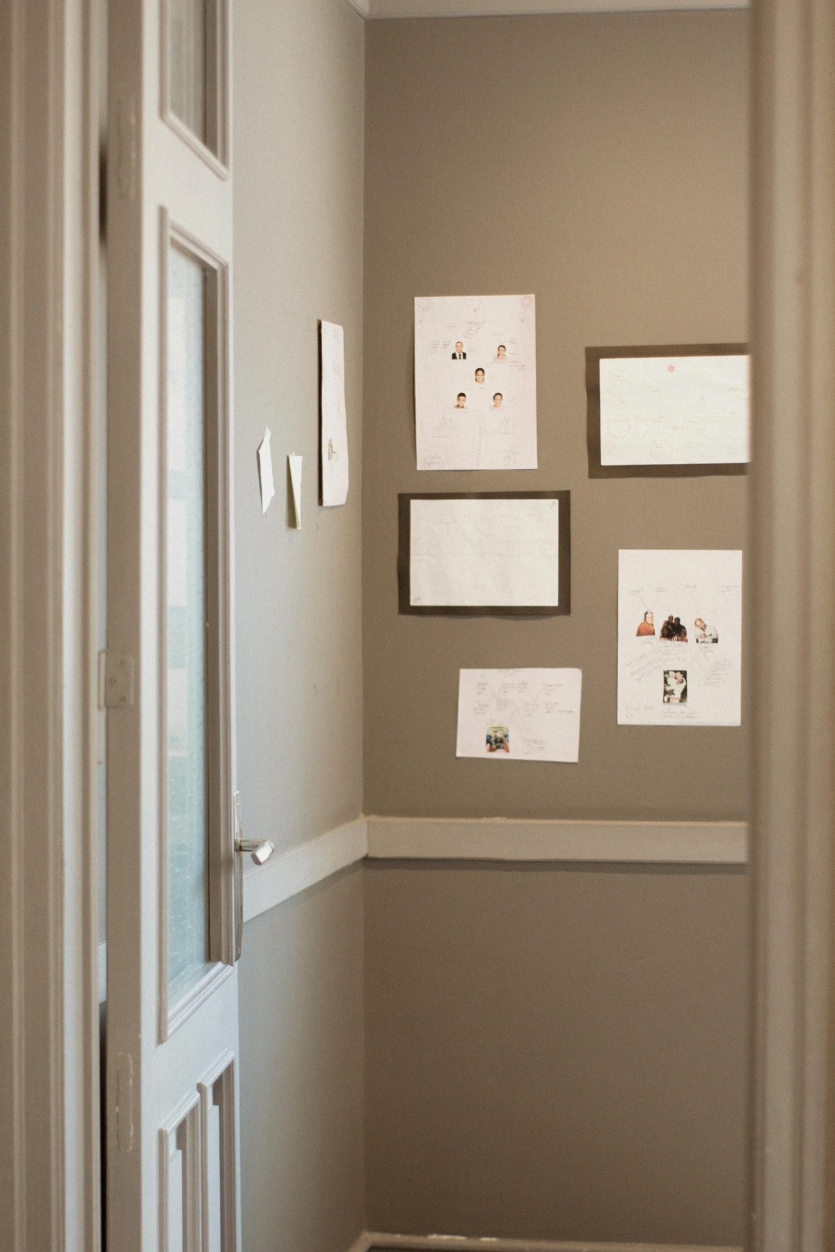
Remember, a gallery wall isn't just for paintings. I love mixing in objects like small mirrors, framed textiles, personal mementos, sculptural elements (even a wall-mounted display of vintage cameras or ceramic plates!). It’s all about creating texture and depth. The negative space between your pieces is just as important as the pieces themselves; it's the intentional "breathing room" around your art – the empty wall that allows each piece to stand out and be appreciated, much like the rests in music give impact to the notes, or the white space on a page allows the words to be read. Don't forget to consider how to incorporate family photos seamlessly too – I once spent an entire weekend figuring that out, and it was worth it! You can find more ideas on mixing and matching in my guide to how to create a cohesive art collection across different rooms.

Quick Tip for Gallery Walls:
- Balance & Breathe: Mix sizes and styles but ensure adequate negative space (breathing room) between pieces to prevent clutter. Remember that the empty space is as important as the art itself.
- Define a Focal Point: Even in an asymmetrical arrangement, one larger or bolder piece (or a carefully chosen group) guides the eye and provides visual gravity. Consider grouping by theme/color for large walls to create digestible zones.
- Mix Media: Incorporate objects, mirrors, and textiles alongside art for added texture and personal storytelling.
- Plan Layout: Consider using paper templates or a digital layout tool to visualize your arrangement on the floor or virtually before committing to holes.
Diptychs & Triptychs: Harmonious Divisions for Grand Spaces
If a single giant artwork feels too monolithic, but a full gallery wall feels too chaotic, consider the elegant solution of diptychs or triptychs. These are artworks presented in two (diptych) or three (triptych) panels that are designed to be displayed together. They offer the visual weight of a large piece but with an inherent rhythm and segmentation that can feel more approachable. It's like a visual breath between parts, a pause that actually enhances the whole. I think of it as a story told in chapters, where each chapter is distinct but contributes to the larger narrative, often creating a sense of movement or progression across the wall – imagine a sweeping landscape where the horizon line flows seamlessly across three panels, feeling more dynamic than a single print. I've found these particularly effective for clients who want significant impact but prefer a more structured, cohesive look than a mixed gallery wall. The division can also create a subtle tension or reveal a new perspective with each panel, drawing the viewer in for a closer look at the relationship between the parts. I remember a particularly stunning triptych of abstract geometric forms that a client commissioned – each panel was strong on its own, but together, they created this incredible, rhythmic dance across the entire wall, much more impactful than a single large block.
They work wonderfully over large sofas, long dining tables, or in hallways that might otherwise feel barren. Imagine a diptych with cool, calming tones above a minimalist sofa, or a vibrant triptych visually connecting two seating areas in an open-plan living space. The consistent style and color palette across the panels ensure cohesion, while the division adds interest. It's a fantastic way to fill a significant space without needing to meticulously curate multiple individual pieces, offering a sophisticated and intentional look. Themes that work particularly well include landscapes (where the horizon can flow across panels), abstract color fields (where subtle shifts are emphasized by the break), sequential narratives that unfold from left to right (like a series of figures in motion or an evolving botanical illustration), large-scale portraits where the subject's face is fragmented across panels for a modern effect, or even architectural schematics or geometric compositions that gain depth from their divisions. Beyond traditional paintings, large-format prints, photographic series, or even abstract wall-mounted sculptures presented in two or three segments can achieve this effect. Remember to maintain consistent spacing between each panel – usually 1-3 inches – to ensure the artwork reads as a unified whole. This careful spacing is crucial; too close and the division is lost, too far and the panels become disconnected.

Quick Tip for Diptychs & Triptychs:
- Structured Impact: Achieve the visual weight of a large piece with the added rhythm and sophisticated segmentation of multiple panels.
- Narrative Flow: Use the divisions to imply movement, progression, or a story told in parts across your wall (e.g., a landscape with a continuous horizon, abstract color shifts, sequential narratives, fragmented portraits, or geometric compositions).
- Consistent Cohesion: The unified style and palette across panels, along with consistent spacing between them (1-3 inches), ensure a sophisticated, intentional look. Careful spacing is key for a unified impression.
Textile Art & Wall Hangings: Adding Softness, Texture, and Warmth
Sometimes a large, flat wall just needs a bit of texture and warmth. This is where textile art and large wall hangings come in beautifully. Think large woven tapestries (like a detailed Gobelin or a geometric Navajo weaving), intricate macrame wall hangings, hand-dyed fabrics (Shibori, Ikat), framed quilts, or even stretching a beautiful piece of fabric over a frame, much like you might with a painting. I saw a brilliant example once where someone used an IKEA fabric with a striking pattern, stretched it over a frame with a simple staple gun, and boom – instant, affordable, and massive wall art. It’s a wonderful way to soften hard architectural lines and absorb sound in a large room, making it feel cozier and more intimate. The tactile quality adds a layer of depth that a flat print often can't replicate, effectively contributing to the room's acoustics by dampening echoes. Just imagine a beautifully woven piece absorbing some of the echo in a grand, open-plan space. This concept of using textiles for both aesthetic and acoustic purposes is also seen in acoustic panels themselves, which can be custom-designed with artistic fabrics and come in various thicknesses and densities for sound management, making them both functional and beautiful.
For a more modern take, you can also explore abstract fabric panels, large-scale embroidery (like a crewel embroidery or contemporary cross-stitch), vintage rugs re-purposed as wall art, or even painted geometric designs directly onto the wall. When choosing, consider how to properly hang and care for your chosen textile. Lighter pieces might do well with decorative clips and a curtain rod or a simple dowel rod, while heavier tapestries or rugs might require a sturdy wall mount, a cleat system (a two-part interlocking bracket that distributes weight evenly across the wall), or even a system of Velcro strips carefully sewn to the top edge and attached to the wall for a seamless, floating effect. For truly valuable pieces, consider mounting them on stretchers like a canvas or framing them with acid-free backing and UV-protective glass to protect the fabric from environmental damage and fading. Remember that a beautiful rug doesn't just belong on the floor! Vintage kilim rugs, a hand-knotted wool rug, or even a striking modern rug with an abstract pattern can add unparalleled warmth and character when hung vertically. This practice aligns with "slow decor," encouraging investment in pieces that are unique, often handmade, and designed to last, reducing the cycle of discarding and replacing.
Caring for Textile Art:
- Dust Regularly: Use a soft brush or a vacuum cleaner with a low suction and brush attachment to gently remove dust.
- Avoid Direct Sunlight: Prolonged exposure can cause fading; consider UV-filtering window treatments or rotate pieces.
- Professional Cleaning: For deep cleaning or stain removal, consult a professional textile conservator, especially for delicate or valuable pieces. Avoid harsh chemicals or machine washing unless specifically instructed by the manufacturer.
- Proper Hanging: Ensure even weight distribution to prevent sagging or distortion over time. A cleat system or stretcher bars are excellent for heavier pieces.
Quick Tip for Textile Art:
- Softness & Sound: Textiles add warmth, texture, and absorb sound (improving acoustics), making large rooms feel cozier and more intimate. Artistic acoustic panels can also serve this dual purpose.
- Repurpose Creatively: Transform vintage rugs (kilims, wool rugs) or patterned fabrics (IKEA fabric, hand-dyed, Shibori, Ikat) into unique, large-scale wall art. Explore modern abstract fabric panels or embroidery.
- Careful Hanging & Care: Match your hanging method (clips, rods, sturdy mounts, cleat systems, Velcro strips, stretchers, or framing with acid-free/UV-protective materials) to the textile's weight and delicacy for longevity. Maintain with gentle cleaning and protection from sunlight and uneven weight distribution. Consider dowel rods for lighter pieces.
Colour and Mood: Painting with Emotion on Your Big Canvas
As an artist, I know the profound impact color has on a space, and a large wall offers an expansive canvas to truly play with this. Color isn't just decorative; it's psychological. It can energize, soothe, inspire, or ground a room. For example, my abstract pieces often use vibrant hues to evoke emotion, and seeing them on a big wall amplifies that effect exponentially. Understanding color psychology can help you make intentional choices that subtly influence the inhabitants' emotional state. What feeling do you want to create?
- Bold & Energetic: Deep crimson reds (for passion and stimulation), vibrant cerulean blues (for innovation and clarity), or strong sunshine yellows (for optimism and warmth) can turn a large wall into an immediate energizer. These choices, often linked to increased heart rate and metabolism, are perfect for a living room, dining room, or creative studio, stimulating conversation and creativity. Think of the bold, primary colors often found in Bauhaus design, creating a sense of dynamic structure. The saturation and brightness of these colors are key to their impact. Or consider using color blocking – painting large, distinct sections of the wall in contrasting or complementary colors – to create an abstract art piece directly on your wall, offering dynamic shifts in mood. For a home theater or games room, consider deep indigos or charcoal grays with pops of electric blue or orange for an immersive, focused atmosphere, often leading to increased mental engagement.
- Calm & Serene: Soft sage greens (for balance and nature), muted dusty rose (for comfort and warmth), pale grey-blues (for tranquility and focus), or a monochromatic palette with subtle textural variations can create a tranquil retreat. These colors, known for their calming effects, are ideal for bedrooms, serene reading nooks, or home offices, allowing the eye to rest and contributing to an atmosphere of peace and relaxation. Think of subtle earth tones layered with warm creams for a guest room, or muted lavenders for a spa-like bathroom. They encourage reflection and ease.
- Harmonizing Your Hues: Use the art on your large wall to tie together other colors in the room. This means picking a prominent color from your artwork and echoing it in smaller elements like throw pillows, a rug, or even a ceramic vase. This creates incredible cohesion and a 'designer' look, even if the elements were gathered over time. For example, deep blues and charcoal grays paired with gold accents can create a sophisticated, moody atmosphere, while vibrant oranges and hot pinks can evoke a playful, energetic vibe. Remember, even a neutral palette can be incredibly rich when layered with varying textures and subtle shifts in tone, like warm creams paired with cool greys and natural wood, creating a sophisticated depth. And don't forget texture as a 'color' element – a deeply textured wall treatment or a woven textile in a neutral shade can add as much visual interest and depth as a bold paint color, creating subtle shifts in how light is absorbed and reflected.
Quick Tip for Colour & Mood:
- Psychological Power: Choose colors (bold and saturated for energy, muted for calm) based on the desired emotional effect for the room's function (e.g., blues for productivity, greens for balance, yellows for happiness; deep indigos for home theaters). These choices impact mental engagement and relaxation.
- Color Blocking & Geometric Shapes: Experiment with painting large, distinct sections of the wall in complementary or contrasting colors for a dynamic, artistic effect, or use geometric shapes for a modern statement.
- Echo & Harmonize: Pull prominent colors from your art to echo them in small decor elements throughout the room for cohesion (e.g., deep blues/grays + gold for sophisticated, or vibrant oranges/pinks for energetic).
- Neutrals with Depth: Don't underestimate the richness of a layered neutral palette with varying textures and subtle tonal shifts. Consider texture itself as a 'color' element for added visual interest and light interaction.
Layering and Depth: Beyond the Flat Surface
Decorating a large wall isn't just about what you hang on it; it's about how you create visual depth and interest that pulls the eye in. Think in layers, much like an artist builds up a painting, where each brushstroke adds to the richness of the whole. This adds sophistication and prevents your wall from feeling like a flat, one-dimensional display. It's about creating a conversation between objects, where some peek out from behind others, or cast interesting shadows, inviting a closer look.
- Front and Back: Experiment by leaning a smaller framed print (perhaps a vintage photograph) or a sculptural object (a small ceramic bust) in front of a larger piece of art that’s hung on the wall. Imagine a sleek vase on a console table, partially obscuring the bottom edge of a large abstract print, or a delicate trailing plant draped over the corner of a frame. This instantly creates foreground and background elements, adding a dynamic, multi-dimensional feel, almost like a stage set for your art. You could even use built-in shelving or alcoves as existing layers to create natural depth, allowing items to recede and protrude. Consider using different finishes on the wall itself, perhaps alternating matte and satin paints in stripes or blocks, to create subtle visual layers that interact with light.
- Sculptural Elements: Integrate three-dimensional pieces like decorative wall sconces, small shelves with objects, or even a framed mirror that protrudes slightly. These elements cast shadows, adding another layer of depth and visual intrigue. Consider a series of wall-mounted ceramic plates, a collection of vintage masks, a compelling assemblage sculpture like some of the Dadaists created, or even a large, intricate metal wall hanging that creates dynamic shadow play. The way light interacts with their forms adds a dynamic quality that flat art simply can't replicate. Integrating living plants in wall-mounted planters or shelves also adds organic, three-dimensional layers.
- Lighting as a Layer: Strategically placed picture lights or uplighters can highlight textures and create dramatic shadows, effectively adding another dimension to your wall display. This is a topic I often emphasize in my work, as good lighting truly elevates art. For instance, a focused picture light above a textured painting can make its brushstrokes leap out, while an uplighter near a tall plant can cast beautiful, organic shadows across the wall, turning the wall itself into an art piece. Remember to balance accent lighting (focused on the art) with ambient lighting (general room illumination) for a cohesive and inviting atmosphere. Discover more about this in my guide on how to choose the right lighting to enhance your abstract art collection.
- Furniture Integration: Don't forget how furniture plays a role. A console table below a gallery wall, styled with varying heights of objects, creates a natural 'stage' for the wall art above, adding both depth and functionality. It bridges the gap between the wall and the floor, making the entire composition feel intentional. Think of a tall floor lamp (like an arc lamp or a multi-headed tree lamp) or a strategically placed armchair that partially interacts with the wall display, drawing the eye in from different vantage points, effectively blurring the lines between what's on the wall and what's in the room. A large, decorative screen or even a standing fan can also create foreground interest.
Quick Tip for Layering & Depth:
- Create Foreground/Background: Lean smaller objects (vintage photos, ceramic busts, sleek vases) in front of hung art, or use built-in elements like alcoves and varied wall finishes, for instant dimension.
- Integrate Sculptural Elements: Wall sconces, small shelves, or objects that protrude (ceramic plates, vintage masks, metal wall hangings, living plants) add shadows and visual intrigue, acting as three-dimensional layers.
- Light Smartly: Use focused lighting (picture lights, uplighters) to highlight textures and create dramatic depth, balancing accent with ambient lighting.
- Furniture as a Stage: Use console tables or tall furniture (like decorative screens, arc lamps, or floor lamps) to ground wall art and create a cohesive display, blurring the lines between wall and floor and integrating the display into the room's overall design.
Interactive & Functional Art: Engaging Your Wall
Why just look at your wall when you can interact with it? This is where art meets utility, especially useful for large, expansive surfaces that might otherwise feel cold. I've always been fascinated by how art can enhance daily life, and a large wall provides so many opportunities for this. I once helped a family design a dynamic art wall for their kids' playroom, proving that beauty and utility can joyfully coexist. Imagine a wall that sparks creativity every day – what would you draw first?

- Chalkboard or Whiteboard Walls: Paint a section of your large wall with chalkboard or whiteboard paint. This becomes a dynamic, ever-changing canvas for notes, creative drawings, or even an artistic calendar. You can frame the section with decorative molding for a more polished look, or even paint intricate patterns or borders directly with the chalkboard paint (using tape for crisp lines). Consider using liquid chalk markers for a cleaner, more vibrant look, or traditional chalk for a classic, dustier feel. It’s perfect for a teenager's room or a busy family kitchen. You could even designate a weekly "art day" for family members to contribute to a collaborative mural.
- Maintenance Note: For chalkboard walls, season the surface by rubbing the entire wall with the side of a chalk stick and then wiping it clean; this prevents ghosting (faint outlines of previous writing). For whiteboard walls, use only dry-erase markers and specialized cleaner to avoid permanent staining.
- Magnetic Art Boards: Install large magnetic sheets or paint with magnetic primer, then cover with your chosen color or even a subtle wallpaper. This allows you to easily display prints, photos, or even light sculptural elements without permanent hanging. It's a fantastic solution for evolving collections or temporary seasonal decor, or even for displaying children's artwork in a coordinated and ever-changing way. For a seamless look, paint over the magnetic primer with a few coats of your desired wall color. Consider using magnetic clipboards for a uniform look, or flexible magnetic strips to hold delicate art prints. You can even use magnetic spice racks to store small items, turning them into a visual display.
- Maintenance Note: Magnetic surfaces generally require minimal maintenance, simply wipe clean with a damp cloth. Avoid harsh abrasives that could scratch the surface or remove the magnetic properties.
- Pegboard Systems: A well-designed pegboard system can be an artistic statement in itself. Beyond tools, use it to hang framed art, small plants, decorative baskets, or even your favorite hats. The grid pattern can be visually striking, and its functionality makes it incredibly versatile for a family hub or a creative studio. Consider painting the pegboard a bold color to make it a feature, or match it to the wall for a more understated look. Imagine a 'creative corner' pegboard with art supplies neatly organized alongside small inspirational framed quotes and personal mementos. Different hook and shelf types maximize versatility for various objects. Wood pegboards offer a warm, natural aesthetic, while metal pegboards lend themselves to a more industrial or contemporary feel. The possibilities for customization are vast, allowing you to continually re-arrange your display as your needs and tastes evolve.
- Maintenance Note: Pegboards require occasional dusting. For painted or metal pegboards, a damp cloth can be used. For natural wood, avoid excessive moisture to prevent warping.
Quick Tip for Interactive Art:
- Dynamic Surfaces: Chalkboard, whiteboard (use dry-erase markers, season chalkboard walls to prevent ghosting), or magnetic walls (or magnetic primer with paint over it) offer an ever-changing canvas for creativity and utility, allowing for intricate patterns or borders and even collaborative art days. Use liquid chalk markers for vibrant results.
- Flexible Display: Magnetic boards allow for easy rotation of prints, photos, and light objects without permanent commitment, using tools like magnetic clipboards or strips, or even magnetic spice racks. They are great for displaying children's artwork or seasonal decor. Maintain by wiping clean.
- Organized Art: Pegboard systems combine storage with display, creating functional yet artistic arrangements with varied hook and shelf types, and come in different materials like wood or metal to match your aesthetic. They allow for continuous rearrangement. Requires occasional dusting.
Sustainability in Wall Decor: Mindful Choices for Your Space
As our awareness grows, so does our desire for sustainable choices. When decorating your large wall, consider options like using reclaimed wood for frames, choosing eco-friendly paints with low VOCs (Volatile Organic Compounds, which can emit harmful gases), or sourcing art from artists who use sustainable materials and practices. Repurposing vintage textiles or old maps is not only budget-friendly but also a fantastic way to give new life to existing materials. Even supporting local artists reduces the carbon footprint associated with shipping, making your impactful wall statement also an ethical one. Think about the story an upcycled frame or a piece of art made from found objects can tell – it adds another layer of depth to your decor and a connection to its past life. This approach aligns with "slow decor," investing in pieces that have lasting value and personal meaning, reducing the cycle of discarding and replacing.
Sustainable Wall Decor Ideas:
- Reclaimed & Upcycled: Seek out frames made from reclaimed wood, repurpose vintage furniture elements as wall decor, or transform old windows into decorative pieces. Consider art made from recycled glass mosaic or reclaimed metal sculptures. Even old record albums can be creatively upcycled into wall art. Look for materials like reclaimed barn wood or driftwood for a natural, rustic feel. You might even find unique pieces made from paper pulp art, which utilizes recycled paper.
- Eco-Friendly Materials: Opt for natural fiber textiles (organic cotton, hemp, linen, jute, wool) for hangings, or artwork created with plant-based dyes, recycled paper, and non-toxic pigments. Look for paints and wallpapers with certified low-VOC or zero-VOC ratings from reputable brands like Farrow & Ball, Little Greene, Earthborn, or AFM Safecoat. Biodegradable wallpapers made from sustainably sourced pulp are also excellent choices.
- Local & Ethical Sourcing: Purchase art from local artists or craftspeople, reducing shipping impact and supporting your community. Research artists who prioritize sustainable practices in their creation process, or explore ethical online marketplaces dedicated to eco-conscious decor (like Etsy, or specific fair-trade art sites). Visiting local art markets is a great way to find unique, handmade pieces.
- Longevity & Timelessness: Invest in high-quality, timeless pieces that you'll love for years, reducing the cycle of discarding and replacing. A well-chosen piece of art can be a lifelong companion. Consider vintage posters, classic prints, or original art that holds its value and aesthetic appeal over time. This mindful approach extends the lifespan of your decor.
- Digital Alternatives: For a truly minimal physical footprint, consider the emerging digital art trends (discussed below), which offer dynamic, changeable visuals without physical materials or waste, and can come with a minimal energy footprint compared to constantly producing and discarding physical decor, especially if screens are energy-efficient LED or OLED displays. While the world of NFTs can be energy-intensive due to blockchain processes, the display of digital art itself can be a greener choice if implemented thoughtfully, focusing on efficient display technologies rather than the underlying blockchain infrastructure.
Choosing sustainably doesn't mean compromising on style; it means adding an extra layer of meaning and responsibility to your beautiful space.
Quick Tip for Sustainability:
- Reclaim & Repurpose: Use vintage or upcycled materials (reclaimed wood, old windows, recycled glass mosaic, paper pulp art, reclaimed barn wood) for frames, art, and decor. This aligns with "slow decor."
- Go Local & Ethical: Support local artists and choose materials with low environmental impact (natural fibers, plant-based dyes, non-toxic paints with low-VOC certification like Farrow & Ball, Little Greene), exploring ethical marketplaces.
- Invest in Longevity & Digital: Opt for timeless, high-quality pieces that reduce waste over time. Consider digital alternatives (displayed on energy-efficient screens) for a minimal physical footprint, focusing on efficient display rather than energy-intensive blockchain.
Future Trends in Large Wall Decor: Dynamic and Evolving Canvases
The world of interior design is constantly evolving, and large walls are becoming canvases for exciting innovations. Keep an eye out for how technology and biophilic design are reshaping how we interact with our expansive spaces. These approaches offer dynamic, evolving solutions for the truly expansive canvas, moving beyond static displays.
- Augmented Reality (AR) Art Installations: Imagine scanning your wall with a smartphone or tablet and seeing dynamic digital art overlay your physical space. This offers changeable, personalized, non-permanent, and endlessly variable wall art without physical commitment. It's like having an entire museum at your fingertips, where the art can shift with your mood or the season, purely through a screen. While still nascent for widespread home use, the potential is immense for displaying seasonal themes, abstract patterns, or even interactive narratives to unfold on your wall. This also touches on concepts of digital provenance, ensuring the authenticity of your virtual display through digital certificates rather than physical ones.
- Interactive Digital Art Screens: More than just TVs, these dedicated, large-scale screens display ever-changing abstract patterns, photographic sequences, or even generative art (art created algorithmically) that responds to movement or sound in the room. They can mimic the texture of paint or the flow of water, providing a living artwork that evolves in real-time. This combines the visual impact of a large art piece with the dynamic flexibility of digital media, and can even be integrated with smart home systems for seamless control. Explore different types of generative art, from complex algorithmic patterns to AI-generated landscapes, offering endless customization and unique visual experiences. Some systems allow for user input, changing the art in response to gestures or voice commands, truly making the wall a dynamic, living entity.
- Energy Considerations: While the creation and transaction of NFTs on certain blockchains can be very energy-intensive, the display of digital art on a screen is significantly less impactful than the continuous production and replacement of physical decor. Choose energy-efficient LED or OLED screens and utilize smart home features to turn them off when not in use to minimize their environmental footprint. The emphasis here is on the display of digital art as a dynamic and resource-efficient decorative option, separate from the complexities of blockchain creation.
[credit], licence
- Biophilic Design Elements: Integrating living plants directly into vertical wall gardens or intricate moss art is gaining popularity. These installations bring nature indoors on a grand scale, contributing to well-being by improving air quality, reducing stress, and adding vibrant, living texture to your wall. Think large installations of easy-care ferns, succulents, or even custom-designed moss panels that require minimal maintenance. Explore different types of vertical gardens, from simple pocket planters and modular systems to advanced hydroponic or aeroponic systems, each transforming the wall into a breathable, evolving ecosystem. These living walls not only offer aesthetic beauty but also contribute to a healthier indoor environment and a deeper connection to nature, literally bringing your wall to life.
These innovative approaches offer exciting possibilities for future-proofing your large wall decor, ensuring it remains engaging, relevant, and responsive to your evolving lifestyle.
Quick Tip for Future Trends:
- Embrace Digital: Explore AR overlays for dynamic, changeable art (personalized, non-permanent, endlessly variable) or interactive screens for generative art and AI-generated visuals. Consider smart home integration and mitigate energy use with efficient screens and smart controls, focusing on display efficiency.
- Live Walls: Integrate vertical gardens or moss art for biophilic design that adds living texture, improves well-being, and transforms the wall into an evolving ecosystem. Explore various types of vertical garden systems.
- Stay Flexible: Future trends emphasize adaptability, allowing your wall to evolve with technology and personal preferences, offering digital provenance for virtual displays and interactive narratives, and promoting a deeper connection to the environment.
Frequently Asked Questions About Decorating Large Walls
I know you've got questions, because I've asked them all myself over the years. Here are some of the most common ones I hear, with quick answers and links to deeper dives if you need them:
Q: My large wall is behind a sofa. How high should I hang the art?
A: Generally, you want the bottom of your artwork (or the lowest piece in a gallery grouping) to be about 6-8 inches above the highest point of your sofa back. This creates a cohesive look and prevents the art from floating too high or being hidden by the furniture. Always aim for the center of the art to be at eye level if possible, which is typically around 57-60 inches from the floor. This ensures a comfortable viewing experience whether standing or seated. For more specific guidance, check out my article on art above the sofa: a guide to perfect placement and scale.
Q: What's the best way to measure and plan for large wall art to avoid mistakes?
A: The absolute best way, beyond initial measurements, is to create a mock-up. Use painter's tape or large sheets of kraft paper (cut to the size of your artwork or gallery grouping) and tape them to the wall. This allows you to visualize the scale, placement, and negative space without committing to holes. Step back, live with it for a day or two, and even view it from different rooms to get a true sense of the impact. Take photos! This simple step, while seemingly extra work, is a massive time-saver for avoiding mistakes and ensuring you achieve that perfect "Goldilocks Zone" for your art. For gallery walls, lay all your pieces out on the floor first to experiment with arrangements before transferring the layout to the wall with paper templates, or try using a digital layout app.
Q: I have very high ceilings. Does that change how I decorate a large wall?
A: Absolutely! High ceilings invite you to think vertically. Embrace the height with vertical gallery walls that extend upwards, or truly monumental statement pieces. Don't be afraid to let art climb, making the most of that impressive vertical expanse. Just ensure adequate spacing between pieces to prevent a cramped look. My article on maximizing impact: choosing art for high ceilings offers more in-depth advice.
Q: What if I have a lot of large furniture? How do I balance the wall decor?
A: This is where visual weight becomes paramount. If your furniture is substantial, your wall decor needs to match its presence. A small, delicate piece of art will be lost above a bulky sectional. Opt for larger, bolder pieces, or a densely packed gallery wall to hold its own, creating a "visual counterpoint." Alternatively, use architectural details or shelves with functional items to break up the visual bulk without adding more art. The key is to avoid making either the furniture or the wall art feel disproportionate or overwhelmed. Sometimes, a carefully chosen contrasting color block on the wall can also help define zones and balance heavy furniture. You could also try grouping smaller pieces into one large, cohesive unit to create sufficient visual weight, ensuring it's roughly two-thirds the width of the furniture below.
Q: Can I mix different styles of art on a large wall?
A: Absolutely! Mixing styles is one of my favorite ways to create a dynamic and personal space. The trick is to find common threads – a consistent color palette, similar frame styles, or a unifying theme – to tie everything together. It's like a well-composed symphony; different instruments, but all playing in harmony. Don't be afraid to pair a modern abstract with a vintage landscape, for example, as long as there's a unifying element like a shared dominant color or a similar aesthetic in their framing. My guide on how to create a cohesive art collection across different rooms offers even more tips.
Q: How can I display collections of objects on a large wall, not just art?
A: I love this idea! A large wall is perfect for displaying collections. Consider using slim floating shelves to showcase small sculptures, vintage cameras, or ceramic plates. Vary the depth of the shelves if your objects have different sizes to add more visual interest. Shadow boxes can house smaller, delicate items and create a unified look. For larger items, a well-lit display cabinet or even a series of wall-mounted transparent boxes can turn your collection into a true feature. The key is thoughtful arrangement, creating vignettes (small, pleasing arrangements), and ensuring adequate lighting so each piece can be admired. It's all about making your passions part of your decor!
Q: What about decorating a large wall in a commercial space versus a residential one?
A: The principles of scale, balance, and focal points remain the same, but the purpose shifts. In a commercial space (e.g., an office, lobby, or waiting room), the art should often reflect the brand's identity or create a specific atmosphere for clients and employees. For instance, abstract art that encourages innovation might suit a tech company, while calming landscapes could be ideal for a healthcare facility. Durability, ease of maintenance, and universal appeal might be higher priorities. Residential spaces, on the other hand, are all about personal expression and creating comfort. You might opt for more personal mementos at home, whereas a commercial setting might benefit from more universally appealing or abstract pieces to inspire without alienating.
Q: How do I avoid a large wall looking empty or overwhelmed?
A: It's a fine line, isn't it? To avoid emptiness, ensure your chosen piece or collection has enough visual weight and scale to hold its own on the wall – remember the two-thirds to three-quarters rule relative to furniture or the wall segment. Don't shy away from large-scale. To avoid overwhelm, ensure adequate negative space around your art. Think of it as visual breathing room. A large piece needs space around it to truly shine, and a gallery wall needs calculated gaps between frames to prevent visual clutter. Also, balance busy areas with calmer zones on the wall, perhaps by pairing an intricate gallery with a simpler, textural element. When in doubt, mock up your arrangement with paper templates before making any holes.
Q: How do I choose the right scale for a very long, narrow wall?
A: For a long, narrow wall, you'll want to avoid making it feel even longer and narrower. Instead of many small pieces lined up, which can create a tunnel effect, consider using one or two larger, elongated pieces that fill the length without overwhelming the height. Alternatively, a gallery wall that's wider than it is tall, or a triptych with a strong horizontal flow, can work beautifully. The goal is to draw the eye along the wall, creating a sense of journey rather than emphasizing its narrowness. Ensure pieces are still at an comfortable eye-level for viewing when standing. My guide on art for long, narrow hallways might offer additional insights.
Q: What's the best way to hang very large or heavy pieces safely?
A: Safety first! For anything substantial, I always recommend using wall anchors appropriate for your wall type (toggle bolts for drywall, expansion anchors for plaster/masonry) or, ideally, mounting directly into wall studs. A reliable stud finder is your best friend here. For truly monumental or extremely heavy pieces, don't hesitate to call a professional art installer. They have specialized tools and expertise (like specific lifting equipment and cleat hanging systems) to ensure your artwork is securely hung, preventing damage to both the art and your wall – and saving you from a lot of potential headaches and patching. It's an investment in peace of mind.
Q: Should art match my furniture, or be a contrasting element?
A: This is a classic design question with no single right answer, and often, the most interesting spaces use a mix! Matching art can create a serene, harmonious, and sophisticated feel, especially if you pick colors or styles that echo your furniture or overall room palette. This often works well in minimalist or contemporary settings. However, contrasting art can create a dynamic focal point, adding energy and personality to a room. A bold, vibrant piece can enliven a neutral space, or an abstract work can provide an unexpected counterpoint to traditional furniture. My advice? Start with what you love, and then consider how it interacts. Often, a piece that slightly contrasts but shares one or two subtle color notes with the room ends up being the most engaging.
Q: How do I deal with awkward architectural features like radiators or oddly placed windows when decorating a large wall?
A: Awkward features are design challenges, not roadblocks! For radiators, custom radiator covers can transform them into functional console tables or benches, which you can then style above. For oddly placed windows, consider visually balancing them. If one window is off-center, a taller plant or a narrow vertical piece of art on the opposing side can restore symmetry. Another trick is to extend curtain rods beyond the window frame, hanging drapes that make the window appear larger or more centered than it is. For very high, small windows, let them be part of a larger gallery wall, or paint a feature block around them to integrate them intentionally. You can also use large, decorative screens or tall floor-standing sculptures to strategically obscure or reframe awkward elements. The goal is to make the feature feel intentional rather than accidental. Creative integration often turns a challenge into a unique design opportunity.
Q: Can I use temporary wallpaper or decals for a large statement wall?
A: Absolutely! Temporary peel-and-stick wallpaper and large vinyl decals are fantastic solutions for renters, or for those who love to change their decor frequently without commitment. They come in an incredible array of patterns, textures, and even photo-realistic murals. The key is to ensure your wall surface is clean, smooth, and suitable for adhesion and damage-free removal (always check the manufacturer's guidelines, as some surfaces might react differently). These options allow you to make a bold, large-scale statement without the permanence or extensive prep of traditional wallpaper, offering ultimate flexibility and creative freedom. They are your friends for ever-evolving designs!
Q: How do I choose art for a room with mixed lighting conditions (natural and artificial)?
A: This is a common scenario! The best approach is to choose art that isn't overly reliant on one specific lighting type to shine. Look for pieces with good internal contrast – strong differences between light and dark elements – as these tend to maintain their impact regardless of lighting shifts. Art with metallic accents or rich textures can also be very adaptable, as they catch and reflect light in interesting ways from various sources. Avoid pieces that rely solely on subtle color nuances that might get lost in low light or washed out in bright natural light. Ultimately, observe the space at different times of day to understand the light and choose art that feels balanced and engaging throughout. Consider my guide on how to choose art for a room with low light for more insights.
Q: Can I use DIY solutions for very large, heavy art?
A: For very large or very heavy art, while DIY spirit is admirable, safety should always come first. Lighter DIY solutions like stretched fabric over a frame or large paper collages are perfectly safe for standard hanging. However, if your DIY creation involves heavy materials (e.g., thick wood panels, heavy sculptural elements) and is substantial in size, it's wise to still employ professional hanging techniques. This means using appropriate wall anchors, locating studs, and potentially using a cleat hanging system that distributes weight more evenly. If there's any doubt about structural integrity or your ability to safely lift and position the piece, call a professional installer. Your safety and the preservation of your beautiful work are paramount.
Q: What are the latest trends in framing for large-scale art?
A: For large-scale art, framing trends often focus on enhancing the artwork without distracting from its grandeur. Thin, minimalist frames (like gallery black, white, or natural wood) remain popular, letting the art speak for itself. Floating frames (where the canvas appears to 'float' within the frame, creating a subtle shadow line) are also highly sought after, adding a contemporary edge. For a bolder statement, oversized, ornate frames are making a comeback, particularly when paired with modern or abstract art for an intriguing juxtaposition. Another trend is frameless display for canvas art, where the edges are either painted or wrapped, allowing the art to extend fully to the wall. Finally, custom-colored frames that pick up a subtle hue from the artwork itself are gaining popularity, creating a deeply cohesive and intentional look. When choosing, consider how the frame material (e.g., brushed metal, reclaimed wood, polished lacquer) complements the art and the room's aesthetic.
Q: What are some temporary solutions for decorating a large wall in a rental property?
A: Renters, rejoice! You don't have to live with blank walls. Beyond what's covered in the 'Temporary Solutions' section above, consider large tapestries or fabric panels hung with tension rods that don't damage walls. Oversized floor mirrors or standing art easels can fill significant vertical space without a single nail. You can also create command strip gallery walls for lighter frames – just remember to test them. Tall, architectural bookcases or shelving units can serve as an impressive backdrop for objects and art. Finally, large botanical prints or unframed canvases can be hung with damage-free picture hanging strips, providing impact without permanence. The key is to leverage gravity and temporary adhesives.
Q: What's the best type of lighting for showcasing textured art or sculptures?
A: For highlighting the tactile qualities of textured art or the three-dimensionality of sculptures, accent lighting is your best friend. Specifically, adjustable spotlights or track lighting are highly effective. These allow you to direct light precisely, creating dramatic shadows and revealing the depth and contours of the piece. You can also experiment with directional uplighting from floor-standing lamps positioned strategically to graze the surface and emphasize texture. The goal is to create a play of light and shadow that makes the piece 'pop' and reveals its material richness. Consider cooler color temperatures (3500K-4000K) to make textures appear crisp, though warmer tones can add a cozy glow to certain materials like wood or natural fibers.
Q: How can I create a focal point on a very large, plain wall without overwhelming it?
A: Creating a focal point on a large, plain wall requires thoughtful consideration of scale and visual weight. Instead of overwhelming it with too many small elements, opt for a single, impactful strategy. A monumental statement piece (one very large artwork) is the most direct way to create a clear focal point. Ensure its size is proportionate to the wall, occupying roughly two-thirds of the wall's width. Alternatively, a carefully curated gallery wall with a strong central piece can draw the eye. You could also use an architectural feature, real or faux, like a dramatic wainscoting design, a large mirror with an ornate frame, or even a bold color block paint treatment to define a specific area as the focal point. The key is to use scale, contrast, and intentional design to guide the eye without creating visual clutter.
Q: What are some common mistakes people make when decorating large walls?
A: Over my years of experimenting and observing, I've seen a few recurring pitfalls. The most common mistake is choosing art that is simply too small for the expansive wall; it gets swallowed by the space and looks insignificant. Another is poor spacing – either cramming too many pieces together without enough negative space (creating visual clutter) or spacing them too far apart (making the wall feel disjointed and empty). A lack of a clear focal point can also leave a large wall feeling directionless. Underestimating the importance of wall preparation can lead to issues like bubbling wallpaper or falling art. Lastly, ignoring the lighting scheme means even the most beautiful art won't be seen in its best light. Remember, it's all about balance, intention, and ensuring every element contributes meaningfully to the overall story you're telling on your wall.
Conclusion: Your Wall, Your Story – Embrace the Process
Decorating a large wall shouldn't be a source of anxiety, but rather an exciting opportunity to showcase your personality, passion, and style on a grand scale. Whether you opt for a single, powerful statement piece, a meticulously curated gallery wall, the rhythmic elegance of a diptych, the soft texture of textiles, the functional beauty of shelving and mirrors, an interactive element, or even the dynamic possibilities of future tech, the goal is the same: to make your space feel complete, considered, and utterly you. Don't be afraid to experiment, to make mistakes (I've made plenty!), and to ultimately create a wall that tells your unique story. Remember, your wall is a canvas for your life's story; embrace the opportunity to tell it boldly and beautifully. Let your intuition guide you, and enjoy the transformation. And if you're struggling, remember: every grand masterpiece started with a blank canvas and a vision – sometimes a slightly messy one, but a vision nonetheless!
I encourage you to sketch out your wall layout this weekend, or simply start by identifying one piece that truly speaks to you. Take a photo of your wall now, and then imagine one bold change you could make. This ultimate guide aims to be the most comprehensive resource you'll find, empowering you to approach your expansive canvas with confidence and creativity. Now, go forth and transform that wall! If you're feeling inspired to find that perfect piece, whether you're drawn to the bold energy of contemporary abstracts or the timeless appeal of classic landscapes, my timeline showcases the evolution of my artistic journey, and my gallery is filled with pieces that might just be the perfect answer to your wall's call. Your perfect wall art awaits!


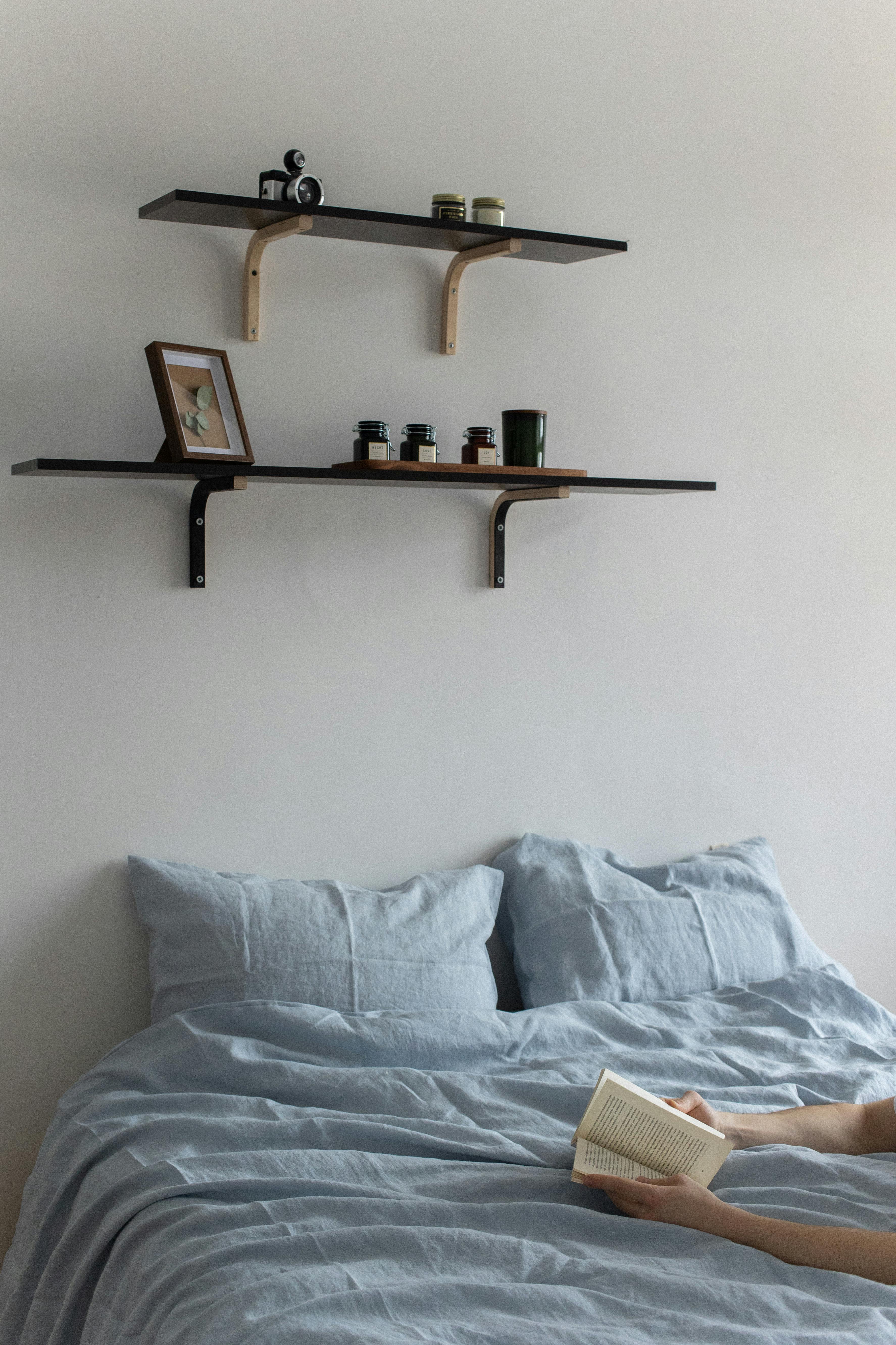