Art Above Your Sofa: The Ultimate Guide to Placement, Style, and Personal Expression
Master the art above your sofa! This ultimate guide covers scale, height, framing, lighting, arrangement, and breaking rules. Get practical tips and personal insights to choose art that truly resonates and creates a harmonious living space.
Art Above Your Sofa: The Ultimate Guide to Perfect Placement, Style, and Personal Expression
Let's be honest, we've all been there: drill in hand, tape peeling, standing amidst a constellation of unnecessary holes in the wall, wondering if our artistic eye is actually just a perpetually confused blink. The blank expanse above your sofa, ripe with potential, can quickly become a battleground of doubt. My own personal moment of surrender? A vibrant, oversized abstract canvas I adored. I pictured it as a magnificent, sweeping statement. The reality, after enough painter's tape to outline a small car and an hour of existential design angst, was less grand: it either devoured my modest two-seater like an angry, artistic eyebrow or simply vanished, a forlorn postage stamp lost in a desert. Neither felt right. And by 'not right,' I mean it completely disrupted the room's visual harmony, making the space feel awkward and deeply unbalanced. That spot above the sofa isn't just any wall; it's often the focal point of your living room, setting the tone, sparking conversations, and grounding the whole aesthetic. When it's off, the entire room feels... well, a bit off-key, like a beautiful song played slightly out of tune. Over the years, wrestling with this dilemma in my own home and helping countless others, I've gathered some hard-won insights. So, if you're ready to transform that frustration into a flawless design, consider this your definitive roadmap to a truly harmonious living room. We’ll dive into practical, tried-and-true advice, covering everything from nailing the scale and height, to unlocking the power of framing, and ultimately, choosing a piece that speaks to your soul and your space, drawing on principles that have guided art placement for centuries.
The Goldilocks Zone: Nailing Scale, Height, and Visual Weight
This is truly where most people, myself included, tend to stumble. You don't want your cherished artwork to look like a postage stamp lost on a vast wall, nor do you want it to overwhelm the sofa, making the whole arrangement feel top-heavy. It’s about finding that sweet spot, the 'just right' Goldilocks zone. While design styles evolve dramatically, the fundamental principles of balance and proportion have guided art placement for centuries—from the meticulously proportioned frescoes of Pompeii to the grand tapestries of European castles, and now to modern canvases. The tools change, but the quest for visual harmony remains, and I've found it's remarkably similar to how ancient civilizations thought about balancing monumental sculptures with architectural grandeur. It's about respecting the dialogue between the art and its environment.
For a single piece of art, or even a cohesive diptych (two panels) or triptych (three panels) treated as one visual unit, I usually aim for the art to be roughly two-thirds to three-quarters the width of the sofa's main seating area. This isn't a rigid law, but it’s a fantastic starting point. When I say 'main seating area,' I'm talking about the upholstered portion where you actually sit. For a traditional sofa, this often means excluding overly wide arms. For a sectional or L-shaped sofa, focus on the longest continuous seating section that acts as the primary visual anchor, or consider the arrangement relative to your coffee table as a central reference point. My "angry artistic eyebrow" debacle really clicked for me when I understood this two-thirds rule; it provides enough visual weight to hold its own against the sofa without competing. This crucial guideline ensures the art feels grounded and intentional, preventing it from looking like an afterthought. Oh, and here’s a nuance: consider the viewing distance. In a very long room, a slightly larger piece might be necessary to maintain its impact from across the space, while a cozy, compact room might call for something closer to the two-thirds mark to avoid overwhelming.
But here's a nuance that often gets overlooked: consider the visual weight versus just the physical dimensions. Visual weight refers to how much an object 'draws the eye' or feels substantial in a space, influenced by its size, color, texture, and complexity. A very busy, dark abstract piece might feel heavier and command more attention than a minimalist, light-colored one of the same physical size. Think of a dense, dark tapestry versus a light, airy watercolor – same physical size, vastly different visual impact. In abstract art, for example, a piece with thick impasto textures and deep, saturated colors will carry far more visual punch than a delicate line drawing with soft washes, even if their physical canvases are identical. It's much like how a dark, plush velvet sofa visually weighs more than a sleek, light linen one of similar physical dimensions. Experiment with this, even with your paper templates, to see how different visual densities interact with your sofa's scale. Also, a low-profile, sleek modern sofa might handle a slightly wider piece than a plush, traditional one that already commands significant visual presence. Beyond the art itself, a wall with bold patterns or intricate architectural details (like decorative molding or a heavy mantelpiece) also adds visual weight to the background, which you'll want to balance with your chosen artwork. The physical depth of art, like a thick sculpture compared to a flat canvas, also influences how we perceive its scale, often making a 3D piece feel heavier than a flat one of similar dimensions, though the two-thirds rule remains a solid foundation.
Now for height, another one of those things I used to get wrong constantly. My default was always to hang it too high, floating somewhere near the ceiling as if trying to escape. The trick is to treat the art and the sofa as one cohesive unit. The bottom of your artwork (or the lowest piece in a grouping) should generally be about 6 to 8 inches above the back of your sofa. This creates a comfortable visual connection, making the two elements feel like they belong together. Think of it as a natural extension, not a separate entity. This common mistake of "hanging art too high" often creates a visual disconnect, making the art seem to hover aimlessly, shouting rather than conversing with the furniture below.
Of course, if you have particularly high ceilings (and by that, I mean significantly over 9 feet), you might find that 8-10 inches feels more balanced, allowing the art to 'grow' with the room's vertical space. Always keep that connection in mind, though. You want a comfortable visual dialogue, not a shouting match across a chasm. Oh, and don't forget to eye any tall floor lamps or imposing plants you might have between the sofa and the wall – they subtly eat into that vertical space, so factor them in. And speaking of walls, consider their texture too. A heavily textured wall, like exposed brick or shiplap, might demand simpler art or a more robust frame to avoid visual clutter, while a smooth, painted wall offers a blank canvas for almost anything. Remember, the goal is visual harmony, making the entire wall composition feel like a single, considered statement. And crucially, think about the empty space around the art – it’s not just a void, but an active participant. Giving your art room to breathe prevents the wall from feeling too cramped or visually busy, especially in smaller spaces.

Finding Your Artistic Soulmate: Connection, Style, and Story
Okay, so you've navigated the technicalities of scale and height. But before we even talk about hanging, let's address the most exciting part: finding that beautiful, expressive piece of art you're about to fall in love with for the room. This is where your unique taste truly comes into play, blending seamlessly with your sofa's style and the overall room aesthetic. I once thought a bold, vibrant abstract would never work with a classic, tufted velvet sofa, but with the right framing and surrounding decor, it created an unexpected and utterly captivating contrast. It's all about intentionality, and knowing what resonates with you.
Different art styles naturally lend themselves to various interior aesthetics. For instance:
- Minimalist Art: Clean lines, subtle colors, or geometric shapes often pair beautifully with sleek, modern sofas and uncluttered spaces, reinforcing a sense of calm and order. And don't underestimate the power of negative space here—the untouched areas around and within the art. In minimalist pieces, negative space isn't empty; it's an active element, giving the eye room to breathe and allowing the art to make a strong, quiet statement against the wall.
- Maximalist or Eclectic Art: Rich colors, intricate details, or a mix of periods can shine above a vintage or boldly patterned sofa, contributing to a vibrant, layered look.
- Traditional or Classical Art: Landscapes, portraits, or still lifes in classic frames can anchor a formal living room with a traditional sofa, creating an enduring sense of elegance.
- Abstract Art: This is my personal passion. Abstract pieces, with their dynamic energy and expressive colors, are incredibly versatile. They can introduce a contemporary edge to a traditional setting or enhance the modern feel of a minimalist room. The key is to find colors and compositions that either complement or offer a welcome, intentional contrast to your sofa and existing decor. I often think about how abstract art complements various interior styles, and the truth is, a well-chosen abstract piece can surprisingly fit almost anywhere, adding a touch of modern sophistication or a burst of playful energy. Imagine one of my vibrant, color-blocked abstracts bringing a contemporary edge to a classic study, or a more serene, layered piece adding depth to a minimalist bedroom. It’s all about finding that dialogue, that subtle conversation between art and space. If you're curious, you can always browse my art for sale.
- Photography or Prints: These can range from documentary to abstract, offering immense flexibility. A large-scale landscape photograph can bring a sense of openness, while a striking portrait can add personality.
To really hone in on your aesthetic, try this little exercise, and really take your time with it: close your eyes and visualize your ideal personal sanctuary. What colors dominate? What textures are present? Does it feel energetic or serene, intricate or expansive? Think about your favorite clothing brand, the music you listen to, or even your ideal vacation spot. Do they lean toward bold and energetic, or calm and reflective? Do you prefer intricate details or sweeping gestures? Answering these questions can reveal your core aesthetic preferences, making the art selection process feel less daunting and more intuitive. And when considering art, think about its longevity. Will this piece still bring you joy in five or ten years, or is it a fleeting trend? A true art soulmate stands the test of time. For broader discovery, don't limit yourself to just what you see online; explore local art fairs, pop-up galleries, and even interior design exhibitions to see how art is being used in different contexts. Sometimes, understanding the artist's intent or the story behind the piece can deepen your connection, turning a mere decoration into a cherished narrative. To delve into an artist's intent, seek out artist statements, interviews, or even social media posts; often, their journey and inspiration are as compelling as the art itself.
Choosing your piece goes beyond the technicalities. The scale and placement rules are great, but they're just mechanics. The heart of it is choosing something you genuinely love, something that speaks to you. When I create my abstract pieces, I'm often thinking about emotions, moments, and the vibrant chaos of life. I believe art should evoke a feeling, a memory, or simply a sense of joy, and this is what 'resonating' truly means – that deep, personal connection. Don't be afraid to trust your gut. To help with this, try a little exercise: close your eyes and think about the mood you want to create in your living room. Is it calm? Energetic? Thought-provoking? Now, look at potential pieces and see which ones resonate with that desired feeling.
Art for Renters and Temporary Spaces
Not everyone wants to (or can) drill holes in their walls, and that's perfectly okay! If you're renting, live in a temporary space, or just prefer flexibility, you still have fantastic options for showcasing art above your sofa. Think about the power of leaning art. A larger canvas, even one significantly wider than your sofa, can be artfully leaned against the wall on a narrow console table or the floor, creating an effortlessly chic, contemporary look without a single nail. For lighter pieces, high-quality adhesive hangers (like Command Strips) can be surprisingly robust – just be sure to check their weight limits meticulously. Another ingenious solution is using a picture rail system if your space has one, or even installing one yourself (it's less invasive than individual hooks). These systems allow you to hang art with hooks and wires that slide along a track, offering immense flexibility to rearrange without patching holes. It's all about working with your limitations to find creative, beautiful solutions, because your walls deserve art, no matter the lease agreement.
One invaluable tip before committing: Proof it! You could even create a simple "mood board" (physical or digital) with images of your sofa, pillows, and other decor elements to visualize how a new piece will integrate. Better yet, if you have a projector, project an image of the artwork onto your wall to get a true sense of scale and color impact in your actual space. For a more detailed guide, start by taking photos of your wall and sofa. Then, using a simple photo editor (even your phone's), overlay potential art pieces. Alternatively, for the projector method, measure the artwork, scale the projected image to those dimensions, and stand back. Does it offer a welcome contrast, or does it complement your existing decor? If you're looking to choose the perfect art for your living room, remember it's not just about what hangs on the wall; it's about how it dialogues with your coffee table, side lamps, and other treasured possessions. This is your home, after all, and the art above your sofa should feel like a conversation starter, a reflection of you. I often get inspiration from my trips, which you can read about on my timeline or see showcased at my museum in 's-Hertogenbosch.

Beyond the Canvas: The Power of Framing and Presentation
Okay, so you’ve found your art soulmate – fantastic! But trust me, the journey doesn’t end there. The unsung hero of art presentation is often the frame. It’s not just a border; it's a bridge between the artwork and your wall, a stylistic statement, and a crucial element in how a piece is perceived. I’ve seen my own abstract paintings transform entirely when given the right frame, almost as if they find their voice. A chunky, ornate gold frame can elevate a minimalist abstract, like a stark geometric piece, to an opulent statement, even making it feel more historically significant. Conversely, a sleek, thin black frame can ground a vibrant, maximalist piece, offering a moment of visual calm amidst its dynamic energy, suggesting a more modern, sophisticated context. The psychological impact is profound: a heavy, traditional frame can impart a sense of permanence and value, while a minimalist metal frame might suggest cutting-edge contemporary relevance.
Consider the frame's material, color, and thickness. A light wood frame can bring warmth to a cool-toned abstract, while a stark white frame can enhance a modern, clean aesthetic. Think about the style of the frame too: a rustic barnwood frame might clash with a sleek, contemporary abstract, while a polished chrome frame could feel out of place with a traditional landscape. The frame should complement both the art and the room's existing decor, creating a cohesive visual story. Beyond the basics, explore options like floating frames (where the canvas appears to float within the frame, perfect for showcasing gallery-wrapped pieces) or shadow box frames (which create depth for three-dimensional objects or layered art). Each choice subtly communicates something different about the art and the space.
Matting also plays a significant role. A wide mat can give a smaller piece more visual presence, effectively making it feel larger and more important within its frame, drawing the eye in and adding a sense of breathing room around the art. Think about a double mat for added depth and sophistication, or selecting a mat color that picks up a subtle hue from the artwork itself. And don't forget the glass! Non-glare or museum-quality glass can make a world of difference, reducing reflections and allowing the true colors and textures of the art to shine through without distraction, preserving its integrity for years. Choosing the right frame and presentation is like giving your art the perfect outfit – it makes it feel complete and ready to captivate, subtly influencing how it interacts with the other stars of the room, like your sofa and surrounding decor.
Lighting Your Masterpiece: Illuminating Your Art's True Beauty
Once you've nailed the perfect scale, height, and framing, it's worth taking a moment to consider how your art will literally shine. Good lighting can make your art sing, literally bringing out colors and textures you might otherwise miss. While natural light is always a gift, and the direction and intensity from nearby windows can dramatically alter a piece's appearance throughout the day, artificial lighting is your secret weapon for consistent impact. I've personally seen how a piece I thought was rather subdued in daylight comes alive under the right evening spotlight, revealing hidden depths and vibrant nuances. A carefully placed picture light, adjustable track lighting, or even strategically angled recessed lighting can ensure your piece shines even on a cloudy day or in the evening. This isn't just about visibility; it's about creating mood and emphasizing the subtleties of the artwork.
When choosing artificial light, consider LED options for their energy efficiency, longevity, and versatility. Pay close attention to color temperature (Kelvin): warmer tones (2700-3000K, think soft, inviting yellow light) often enhance traditional art and create a cozy atmosphere, while cooler tones (3500-4000K, think crisp, bright white light) suit modern pieces and energize a space. Most importantly, look for a high CRI (Color Rendering Index) of 90+ to ensure colors are accurately represented – a low CRI light can make your vibrant blues look muddy, which would be a tragedy for any piece! Just be mindful of glare! A harsh spotlight can create unwanted reflections on glass-fronted frames, turning your masterpiece into a mirror. Positioning the light source at a roughly 30-degree angle to the artwork usually minimizes this effect. Think of it as painting with light, highlighting the details you want to emphasize and softening shadows. (For those who want to dive deeper into the magic of lighting, I've explored the technicalities and artistic nuances in The Art of Display: How to Light and Position Abstract Art for Maximum Impact.)
The Art's Own Glow: How Colors and Luminescence Affect Ambiance
Beyond simply illuminating your artwork, consider how the art itself contributes light and color to the room. A vibrant, richly colored piece can, especially under certain lighting conditions, seem to glow, casting subtle hues onto nearby walls or enhancing the overall warmth or coolness of the space. Imagine a piece with deep blues and greens bringing a serene, almost watery light into a room, or a fiery abstract injecting bursts of energy. This isn't just about what you see in the art, but what the art gives to the room. It becomes an active, contributing element to the room's entire ambiance, almost like a window to another world, or a contained burst of sunset within your living space.
Art in Context: Room Function, Architecture, and Mood
Once you've illuminated your art, let's shift our focus to its dialogue with the entire room. The best art placement takes into account not just the sofa, but the room's overall purpose and ambient light. Is this a formal sitting room, a casual family den, a vibrant home office, or perhaps a serene bedroom? The art you choose, and how it’s placed and lit, can dramatically shift the perception and feeling of the space. It’s about creating a cohesive narrative that aligns with the intended purpose of the room.
Harmonizing with Architectural Features
Your room's architecture isn't just a backdrop; it's an integral part of the composition. Does your sofa sit in an alcove? Perhaps above a fireplace mantel? Or against a wall with prominent built-in shelving? These features demand attention. For an alcove, the art should ideally fit snugly within its confines, embracing the cozy feel. Above a fireplace, the art becomes the paramount focal point in the room, often dictating the scale and style of other decor. You might choose a single, powerful piece that commands attention, or a carefully curated symmetrical gallery wall. Built-in shelving often means integrating art into the shelving or ensuring the piece above the sofa complements the displayed objects without competing. Don't fight your architecture; let it guide and enhance your art placement.
Furthermore, consider the room's overall purpose and the walls themselves. In a bustling family room, perhaps a durable, less precious piece of art is more practical, or one that adds a burst of playful energy with bold colors. For a more serene, formal living area, a sophisticated abstract or a calming landscape might set the perfect tone, encouraging quiet contemplation. The art should always align with the intended feeling of the space. For instance, in a vibrant home office, an energetic abstract might boost creativity, while a serene, muted piece could be ideal for a meditation space or a bedroom where calm is key. And what about your walls? A dark, dramatic wall color can make art pop with intense contrast, while a subtle, textured wall might call for art with simpler compositions to avoid visual clutter. This interplay of art, color, and light can also have a profound psychological impact, influencing mood and well-being within a living space. Blues and greens often evoke calmness and focus, yellow can spark optimism, while reds and oranges can energize or stimulate, sometimes even increasing appetite (which is why you often see them in kitchens!). It’s like setting the emotional stage for your daily life. (For a deeper dive into how colors affect us, check out The Psychology of Color in Abstract Art: Beyond Basic Hues.)
The Art of Arrangement: Beyond the Center Line
Once you've got the perfect size and height locked in, and you've thought about the broader room context, the real fun begins: thinking about how to arrange it all. Sometimes, a slightly off-center placement can create a more dynamic, interesting composition, especially if you have other elements like a floor lamp or a side table nearby. I've found that moving beyond a simple center-line approach opens up a whole new world of creative possibilities. Don't be afraid to deliberately break the rules if it serves a stronger visual story – maybe a smaller, impactful piece leaned casually against the wall on a narrow console table for an edgy, contemporary feel, or an art piece significantly wider than the sofa to create a bold, expansive statement that draws the eye across a minimalist room.
When faced with a sectional sofa, the "centering conundrum" is real. Instead of simply centering over the longest part (which often looks awkward and unbalanced), think about the main seating area or the section that faces the room's primary vantage point (often the television or fireplace). You can also use the coffee table as a central reference. The goal is to anchor the art to the most visually important part of the sofa arrangement, creating a sense of balance and intentionality rather than just an arbitrary measurement.
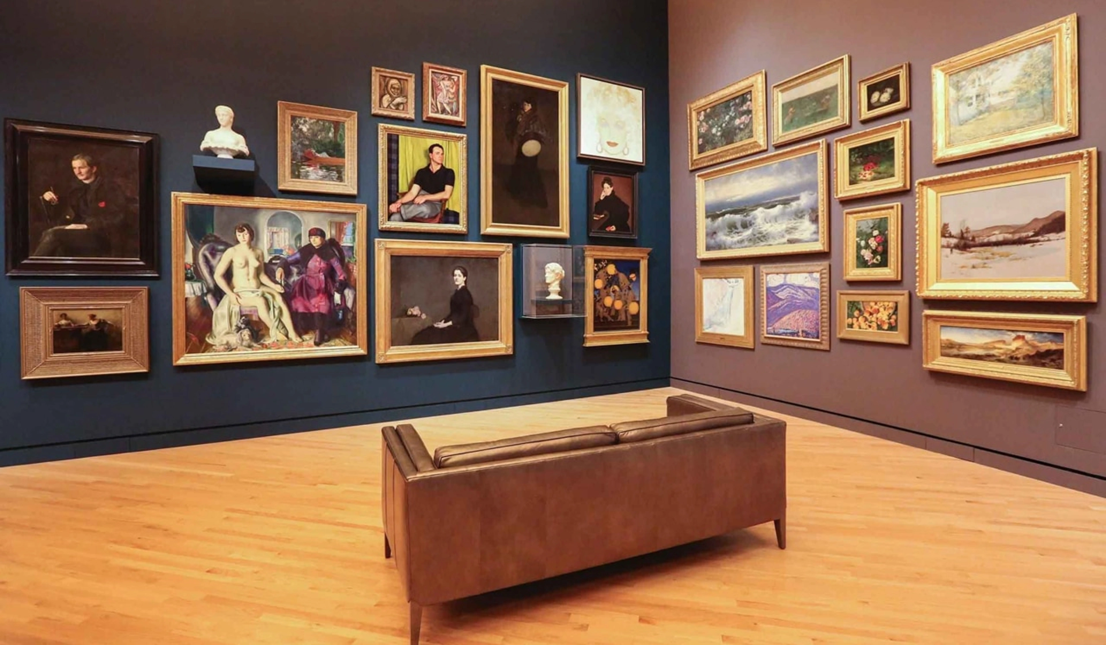
And then there's the wonderful world of the gallery wall. Oh, the gallery wall! It’s a fantastic way to tell a story, layer textures, and bring together a collection of pieces you love. I've found that with abstract art, curating a gallery wall can feel like creating a larger, collaborative artwork. You're thinking about negative space, flow, and how each piece speaks to its neighbor. It's a joyful puzzle, and one I've written about extensively in my step-by-step guide to curating your perfect gallery wall. When it comes to specific layouts, consider a classic grid for a more formal look above a traditional sofa, or an organic, asymmetrical cluster that flows around a window or door frame for a more contemporary vibe. Before you even hang a single piece, consider the overall shape you want your gallery wall to take: a neat rectangle, a more dynamic diamond, or an organic, free-form cluster. This overarching shape provides a framework. The key to a successful asymmetrical gallery wall is understanding visual weight: balance larger, bolder pieces with smaller, more delicate ones, and distribute colors and textures evenly, even if the physical layout isn't perfectly mirrored. This ensures the arrangement feels cohesive, not chaotic.
When it comes to grouping, you've got options beyond just formal gallery walls. A linear grouping (smaller pieces arranged in a neat horizontal line) offers a sense of order and calm, often working beautifully above a more traditional or minimalist sofa. A clustered grouping, on the other hand, embraces asymmetry and can feel more dynamic and contemporary, allowing you to mix and match different sizes and shapes, even integrating low-profile sculptural elements or small, floating shelves. This is sometimes called an art cluster, a looser, more organic arrangement than a rigid gallery wall, perfect for showcasing a few related pieces without the commitment of a full wall display. The key to successful asymmetry is finding balance through visual weight, even if the physical layout isn't perfectly mirrored. For a truly impactful look, you might also consider how your art creates a focal point in the room, directing the eye and defining the space.
Integrating Diverse Art Types Beyond Flat Canvas
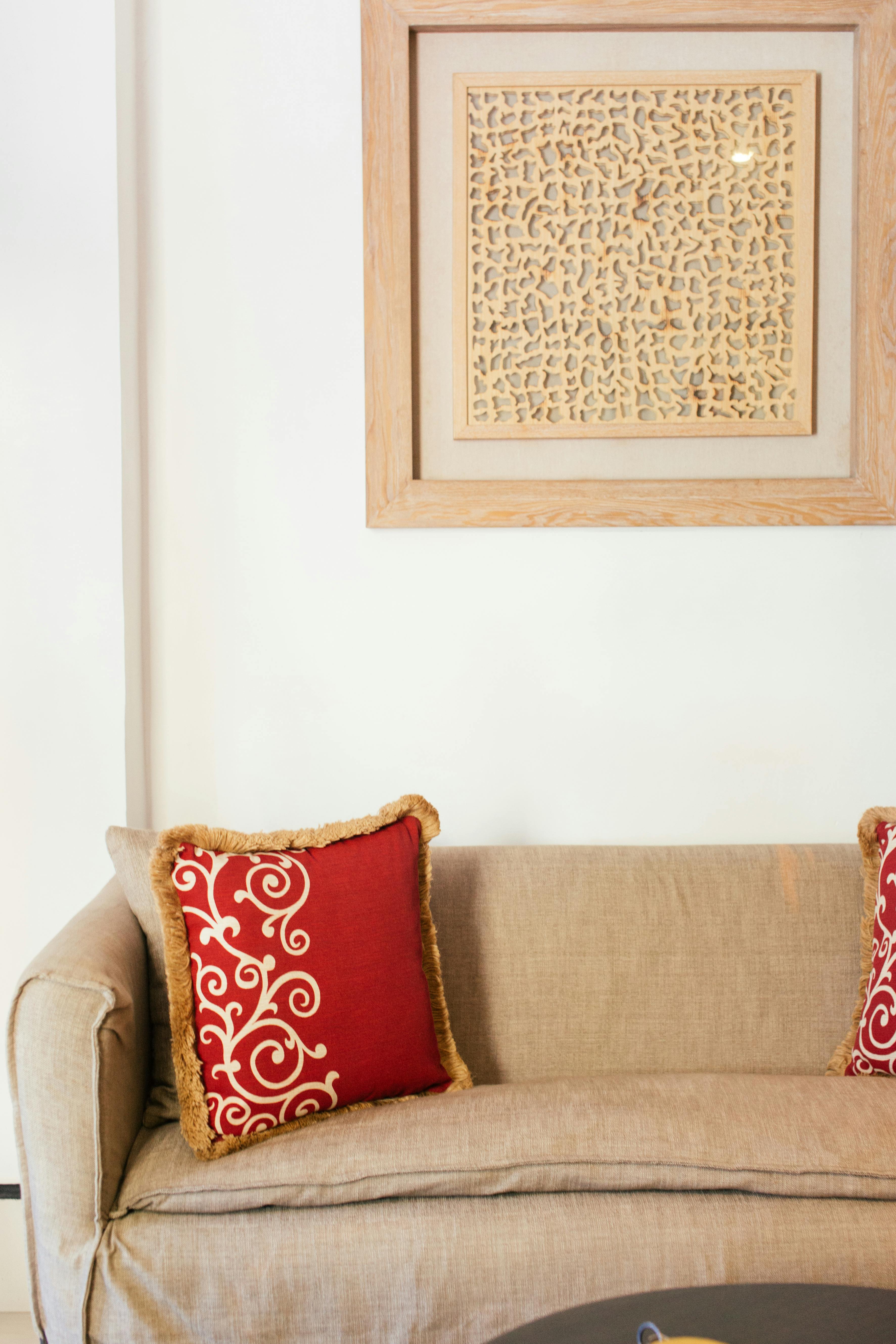
What about different types of art beyond framed prints? For unframed canvases, remember they often have a more contemporary, gallery-wrapped edge, which means you might hang them slightly further from the wall or use a floating frame to give them presence. Tapestries or textile art bring incredible warmth and texture; they're often lighter than framed pieces but require specific hanging methods, like a decorative rod or even velcro strips, to hang evenly without sagging. Dive deeper into incorporating them with Decorating with Textile Art: Weaving Warmth and Texture into Your Home. Sculptural elements or 3D art (like the woodcraft in the first image, for instance) introduce depth and shadows, and their weight will dictate very robust hanging hardware. These pieces often benefit from being slightly offset or integrated into a cluster rather than being perfectly centered, adding another layer of visual interest. For more ideas, explore How to Incorporate Sculptural Art into Modern Interiors.

Nailing the Install: Avoiding Pitfalls & Pro Tips for a Flawless Finish
Beyond just getting the scale wrong, there are a few other common missteps I've seen (and made!) that can turn your art-hanging dreams into a headache. But fear not, most are easily avoidable with a little foresight. Let's look at some of these common frustrations and my go-to solutions:
- Paper Templates are Your Best Friend (Seriously, Don't Skip This!): This is a non-negotiable step for me now. Before even thinking about a nail, cut out pieces of butcher paper or old newspapers to the exact size and shape of your artwork (or each piece in a gallery wall). If you're using frames, draw the outer dimensions of the frame and even simulate matting if that's part of your plan. Crucially, mark where the hanging mechanism will be on the paper. Tape them to the wall with painter's tape. Step back. Live with it for a day. Move them around. This lets you visualize the scale and placement without committing to holes. For gallery walls, lay them out on the floor first, then transfer them to the wall, paying attention to the spacing between each piece and the overall shape you're aiming for. Seriously, it's a game-changer.
- Use a Level (Seriously, Use One!): A crooked piece of art is like a nagging thought in the back of your mind—once you see it, you can't unsee it. A small level is all you need. For gallery walls, ensure the entire grouping is visually level, even if individual pieces are intentionally offset, as that provides a sense of underlying order.
- The Buddy System: If possible, grab a friend or partner. One person holds the art (or template), the other steps back to direct. "A little higher!" "To your left, just a touch!" "Perfect!" It makes a huge difference in getting that perfect eye-level placement.
- Secure Hanging for Art Weight and Wall Material: One big pitfall is failing to secure art properly. A simple nail in drywall might hold a lightweight print, but for anything substantial, you'll need the right wall anchors or to ideally hit a stud. A piece of art falling off the wall isn't just a shame for the art itself (my glorious abstract once took a tumble, thankfully onto a plush rug!), but it can also be a significant safety hazard. Always check the weight of your artwork against the weight rating of your hanging hardware. Drywall, plaster, brick, or wood will all require different hanging hardware. For heavier or particularly valuable pieces, say anything over 20-30 lbs, you'll need more robust hardware than a simple picture hook. Consider using D-rings (small metal rings with flat plates and screw holes, designed for secure picture hanging) or picture wire attached to two separate wall anchors for increased stability and even weight distribution. For very large or intricate installations, especially on drywall, a French cleat system (two interlocking pieces of wood or metal, one attached to the wall, one to the art, providing strong, level support) offers exceptional support, though it typically requires professional installation for optimal safety and aesthetics. Never underestimate the importance of secure hanging; a falling artwork is not just a damaged piece but a potential hazard. When in doubt, especially with irreplaceable or significantly valuable art, always consult a professional art installer – it's an investment in peace of mind.
- Mind Minor Architectural Details: Another pitfall is neglecting minor architectural details that can throw off an otherwise perfect placement. A slightly uneven ceiling, a door frame that’s not quite plumb, or even a subtle shift in wall texture can make a perfectly level artwork look crooked. Trust your eye after using the level, and be prepared to make tiny, intuitive adjustments. And don't forget the practicalities! Always consider the proximity of electrical outlets, light switches, or vents when planning art placement; these can easily disrupt an otherwise perfect visual composition or make future access difficult.
- Protect from Sunlight: Here’s a crucial one: avoid hanging precious art in direct, prolonged sunlight. Over time, UV rays can cause colors to fade significantly, irreversibly damaging your cherished piece. If direct sunlight is unavoidable, consider UV-protective glass for framed pieces or rotate your art periodically.
- Trust Your Gut (Again!): After all the measuring and planning, step back. How does it feel? Sometimes, a tiny shift, a subtle adjustment to spacing that defies the ruler, makes all the difference. Your home should feel like you, so let your intuition have the final say.
Quick Reference Guide for Art Above Your Sofa
Guideline | Recommendation |
|---|---|
| Width of Art | 2/3 to 3/4 the width of your sofa's main seating area |
| Height Above Sofa | 6 to 8 inches above the top of the sofa back (8-10 inches for high ceilings) |
| Viewing Distance | Adjust art scale: larger for longer rooms, smaller for compact rooms |
| Visual Weight | Consider density/color/texture of art and surrounding wall features |
| Gallery Wall Spacing | Maintain consistent spacing (e.g., 2-4 inches) between pieces, balanced for asymmetry |
| Gallery Wall Shape | Plan an overall shape: rectangle, diamond, or organic cluster |
| Centering Sectionals | Center over main seating area or coffee table, not longest length |
| Framing | Choose frame & matting to enhance art; non-glare/museum glass ideal |
| Lighting (Artificial) | Use picture lights, track lighting, LEDs (high CRI, suitable temp) |
| Lighting (Natural) | Avoid direct, prolonged sunlight; consider UV glass |
| Room Function/Walls | Align art style/durability with room purpose & wall color/texture |
| Architectural Features | Integrate art with alcoves, fireplaces, built-ins |
| Proofing | Use paper templates or digital projections before hanging |
| Secure Hanging | Use appropriate anchors/hardware for art weight and wall material |
| For Renters | Lean art, use adhesive hangers, or picture rail systems |
Beyond the Sofa: Crafting a Harmonious Home
Remember, the art above your sofa is often the star of its own show, but it should also play nicely with other pieces in the room, creating a harmonious visual symphony. It's about crafting an environment that feels uniquely you, a personal narrative told through color, form, and texture. This is truly the art of living with art—allowing your collection to evolve with you, embracing how different pieces interact over time, and finding joy in the constant re-discovery. If you're looking for more guidance on integrating art into your space, I've shared many thoughts on decorating your home with art, and on how the overall collection contributes to a cohesive aesthetic. You can find more tips on how to decorate a house more broadly as well.
Ultimately, hanging art isn't about rigid rules, but about understanding timeless guidelines so you can confidently break them (or reinterpret them!) to create a space that genuinely reflects your personality. It’s an evolving process, a journey of discovery, and a wonderful way to bring joy and beauty into your everyday life. So, trust your eye, embrace a little playful experimentation, and let your walls tell your story. What tale will your sofa art whisper to your guests? I can’t wait to see what you create, so please, share your art-hanging triumphs – perhaps tag me on social media or send a photo! (Okay, I know, I still need to get on social media more myself… but that’s a story for another day, and probably a whole other guide!).


