Choosing Art for Low-Light Rooms: An Artist's Guide to Illuminating Your Space
Transform dim rooms into captivating showcases. An artist's guide to selecting vibrant, textured art, optimizing lighting, and strategic placement, maximizing visual impact and warmth in any low-light setting.
Choosing Art for Low-Light Rooms: An Artist's Guide to Illuminating Your Space
Ever walked into a dimly lit room and felt it was a challenge, not an opportunity? I know the feeling. For a long time, I used to see those spaces—the cozy nook, the north-facing living room, the basement haven—as difficult. But I've always found something wonderfully intimate about a room bathed in low light, and my journey as an artist has taught me it's not a limitation; it's an invitation. An invitation to create mood, to enhance texture, to let certain pieces of art truly sing in their own quiet way. For me, these spaces, often overlooked, are where art can perform its most magical trick: transforming perception with carefully chosen light and color. It's a bit like a subtle magic trick, coaxing new life from the quiet corners of your home. This guide isn't just about picking pictures; it's about empowering you to transform even the dimmest corners into captivating showcases of your unique style, proving that art truly shines, whatever the light. And don't worry, I'll walk you through every practical step to make it happen. Ready to unlock the hidden potential of your quiet corners?
Understanding and Embracing Low Light: More Than Just Darkness
First things first, let's talk about what we mean by "low light." It's not just about a lack of sunshine; it's about the quality and direction of the light that is present. Is it artificial? Is it a soft, indirect glow from a small window? Understanding your room's unique light signature is step one to making art selection a joy, not a chore. I remember one client who swore her living room was a "black hole," but after observing it for a day, I realized it had this incredibly consistent, soft northern light that just needed the right art to come alive. It truly shifted her perception.
Defining "Low Light": Beyond Just the Shadows
I often think of low-light rooms as having a natural filter, like an old film camera, typically existing below 50-100 lux for extended periods (which, to put it simply, is roughly equivalent to a softly lit restaurant or the ambiance of a twilight evening, rather than the brighter 300-500 lux common in a typical living room during the day). They might be north-facing rooms that get consistent, cool, indirect light all day, or interior rooms with no windows at all. Perhaps it's a basement office or a hallway that only relies on overhead fixtures. Beyond the obvious, consider rooms with dark architectural features like heavy wood paneling or stone, or those with awkward window placements that create specific shadow patterns. Even very small, enclosed spaces like a powder room or walk-in closet fall into this category. These spaces, though shy of direct sunlight, often hold a quiet, enduring beauty and constancy that can be a canvas in itself, a quiet stage for contemplation.
A Glimpse into History: Art Before Electric Light
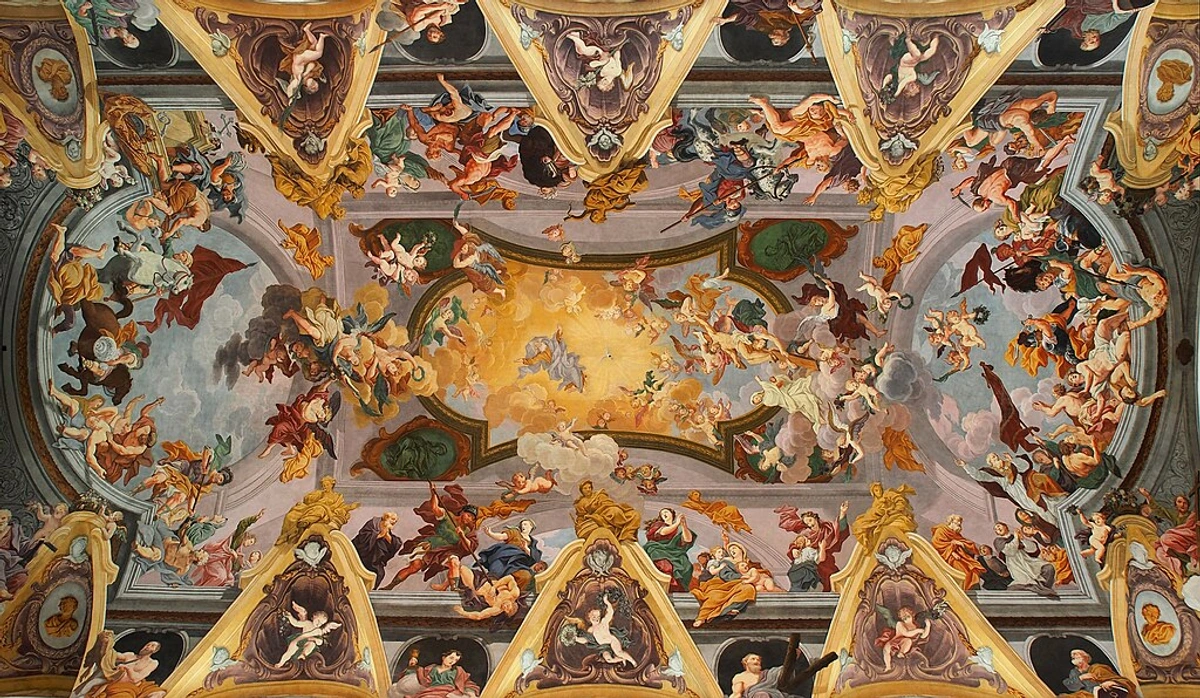
Historically, many grand spaces – think ancient temples or stately homes before electricity – relied on diffused light. This meant art was often designed to be viewed in subtle, shifting illumination. Take Baroque religious art, for instance: artists like Caravaggio mastered chiaroscuro (the strong contrast between light and dark) to create dramatic effect, knowing their work would be seen by flickering candlelight or the filtered light of stained glass. The Dutch Masters often painted interior scenes with soft, northern light, creating intimate atmospheres where subtle details slowly revealed themselves. Beyond these, consider the intricate gold leaf of Byzantine mosaics, which were specifically designed to catch and refract the minimal light in dimly lit basilicas, creating a shimmering, ethereal effect. Or the rich pigments of illuminated manuscripts, whose vibrant colors and delicate details would have been pored over in muted light, inviting a slow, deliberate engagement. These periods teach us that art isn't always meant for a spotlight; sometimes, the dimness is part of its magic, allowing for deeper engagement and a sense of discovery.

Setting the Mood: How Low Light Influences Atmosphere
Before you even think about the art, take a moment to feel the room. Is it meant to be a calm sanctuary, a dramatic den, or a cozy retreat? Low-light rooms naturally lean into intimacy and atmosphere, almost inviting introspection. This isn't a flaw; it's a feature! Psychologically, lower light levels can encourage relaxation and a sense of calm, but they can also foster deeper introspection, enhance focus on subtle details (like the texture of a painting), or even create a sense of mystery and drama. Physiologically, our pupils dilate in dim light, allowing us to perceive subtle nuances more readily, while the constant light can positively impact circadian rhythms. Your art choices should complement this inherent mood, either by leaning into it with deep, rich tones that create a sense of grounded tranquility, or by purposefully contrasting it with bursts of light and color to inject vibrant energy and surprise. With this understanding of the room's inherent character and your desired emotional landscape, we can now explore how art can amplify or thoughtfully contrast these qualities.
Choosing Art That Truly Shines (Even Without Direct Sun)
Now for the fun part: picking out the art! This is where you get to play with perception, making pieces come alive even when the sun has decided to take a day off. It's about coaxing out light and vibrancy where you least expect it, a challenge I absolutely adore in my own artistic process.
Brightening Up: Colors and Tones that Work
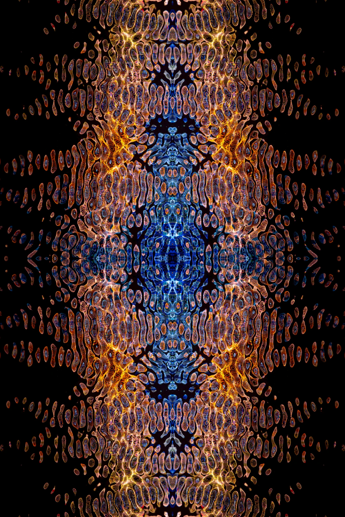
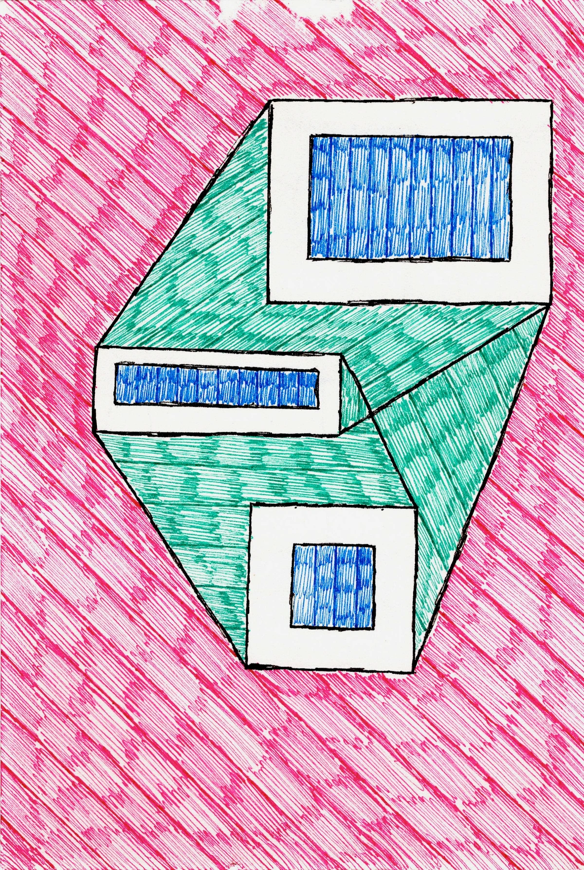
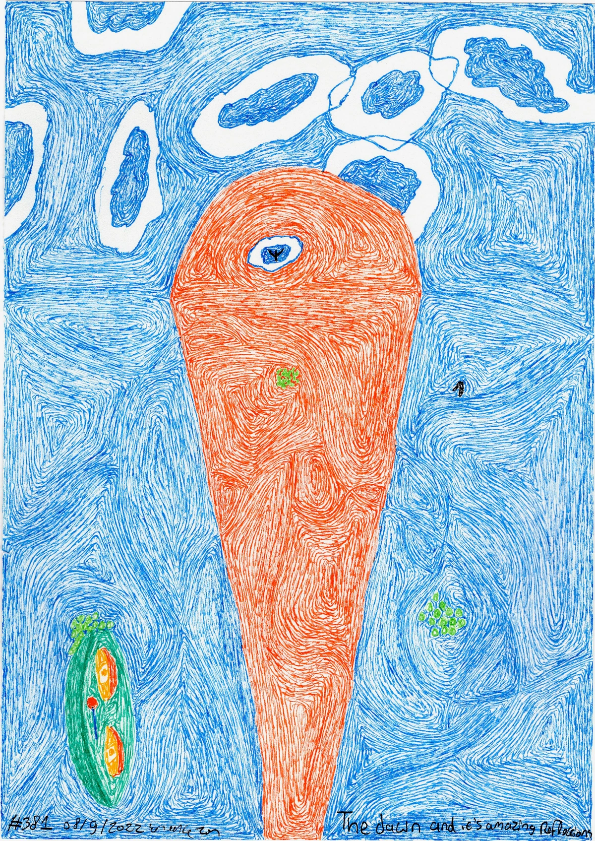
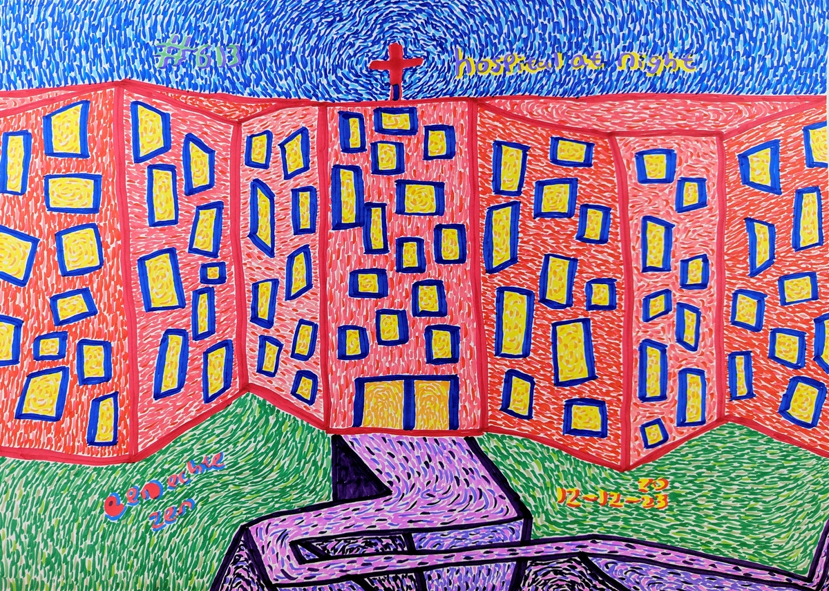
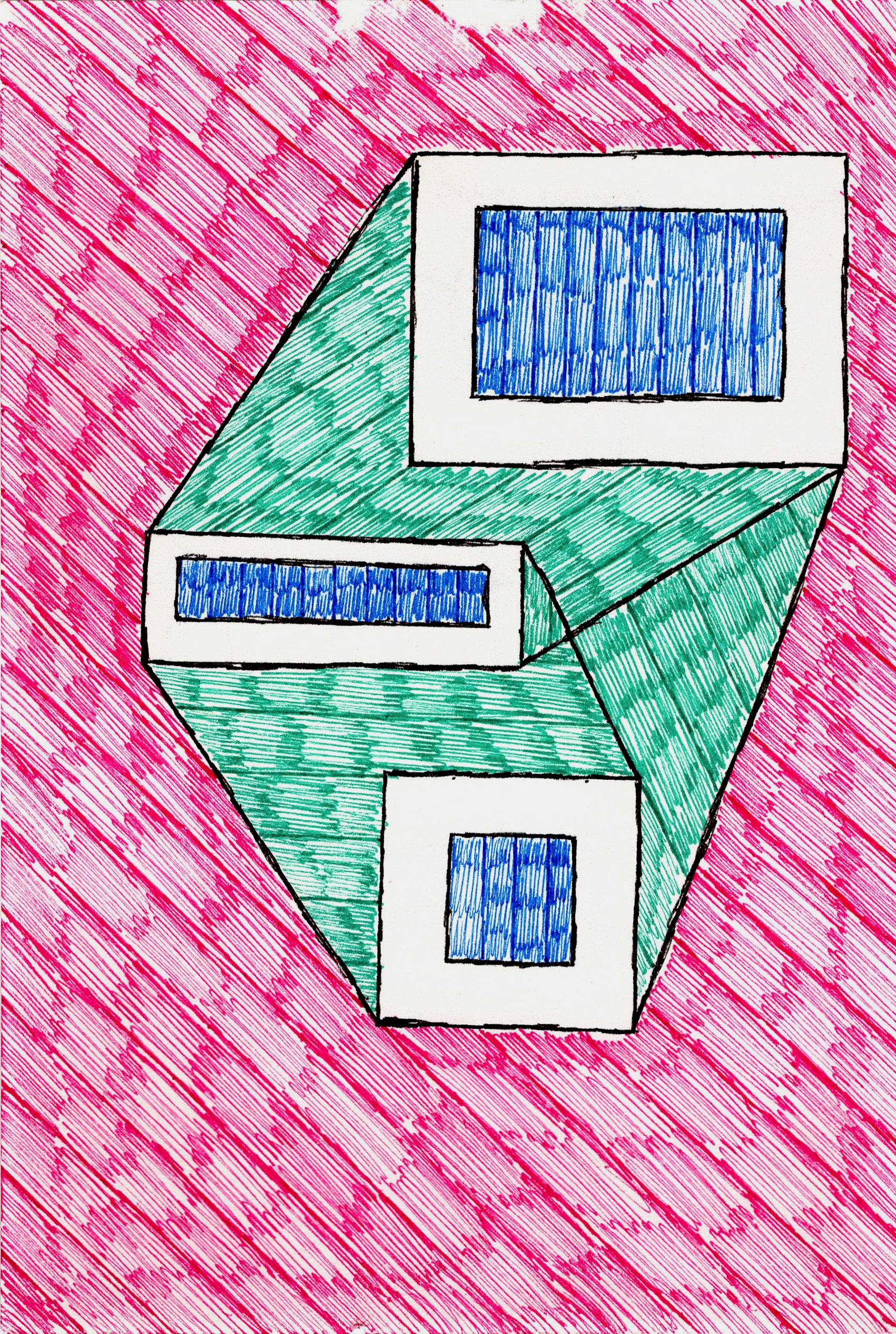
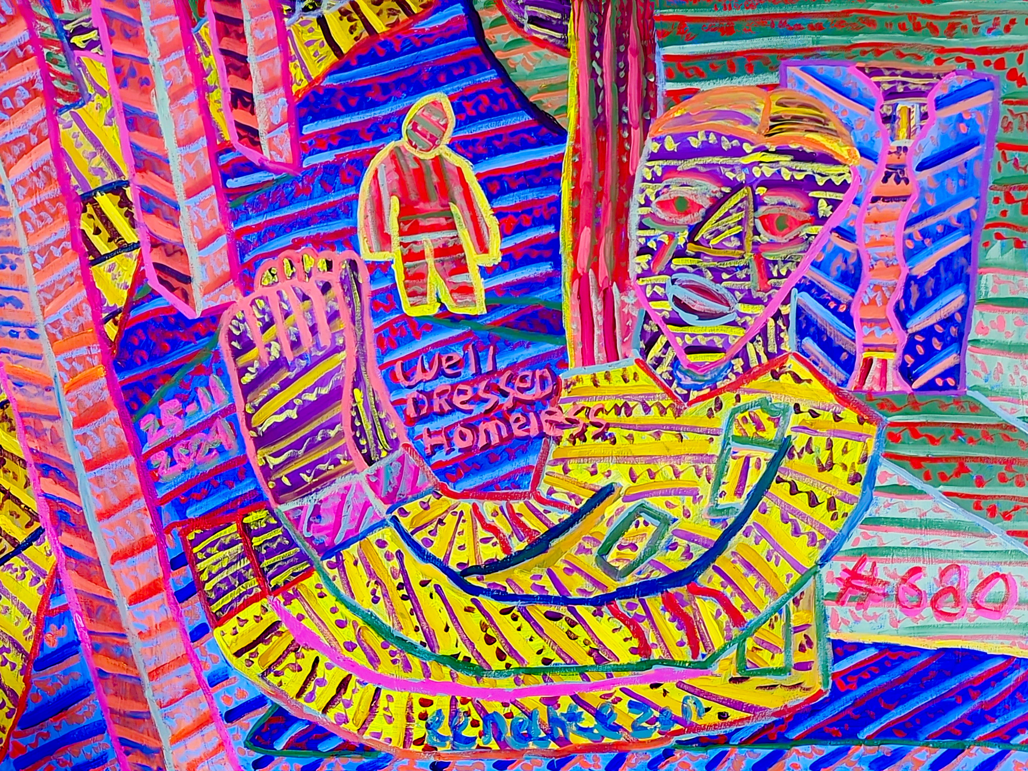
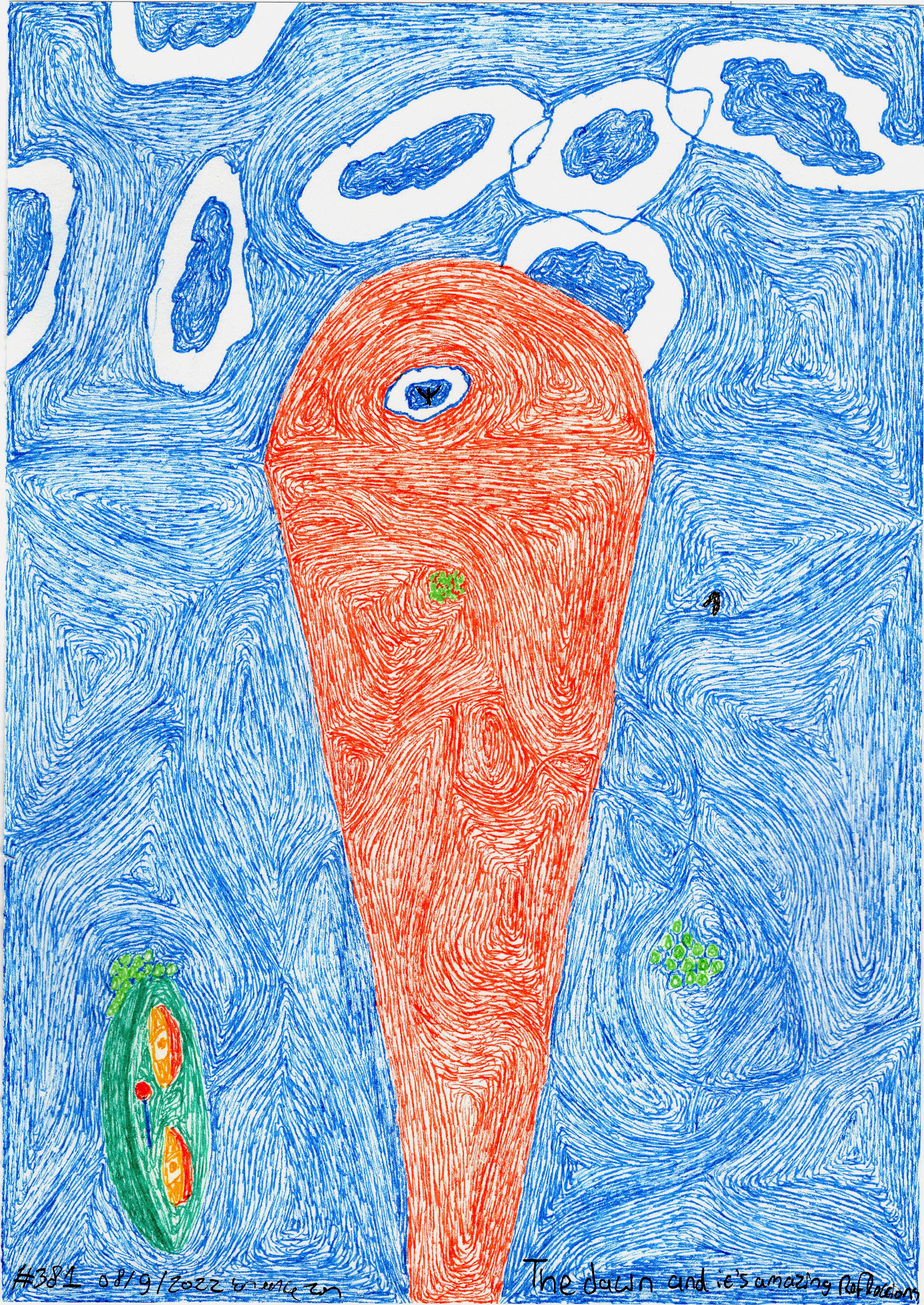
This might seem counter-intuitive, but sometimes the best way to brighten a dim room isn't just with light, but with color. From my perspective as an artist, I'm a huge fan of vibrant abstracts in these settings because they can dramatically uplift a space. Think bold blues, lively greens, fiery oranges, or even soft yellows. Jewel tones—like emerald, sapphire, ruby, and amethyst—are particularly striking. They don't just sit there; they vibrate visually, creating an almost internal glow through intense color contrast and dynamic brushwork, making the piece feel alive. This is precisely the kind of dynamic energy that I strive to infuse into my own abstract pieces, aiming to bring a spark of life to any room, regardless of its natural light. And my personal tip? Don't be afraid of bold choices here; often, the safest choice – a timid one – is the least impactful. A dim room needs a statement, something to draw the eye.
Consider art with:
- Lighter backgrounds or those that incorporate reflective elements. Metallics, subtle shimmering paints, iridescent pigments, or even resin finishes can catch and bounce what little light is available, creating an illusion of luminosity that changes subtly with your viewing angle. My abstract works often incorporate these elements to ensure they hold their own.
- Warmer colors (reds, oranges, yellows) in low-light rooms because they tend to feel more inviting and can visually "warm up" a cooler, north-facing space. However, a bold, deep blue or emerald green can add a touch of drama and sophistication that really works if that's the vibe you're going for, especially when paired with strong contrasts. For a nuanced palette, consider pairings like deep teal with burnt orange (reminiscent of a moody sunset), or a rich eggplant with mustard yellow (like unexpected autumn foliage)—these combinations provide contrast and depth without overwhelming a subdued environment. For a tranquil mood, consider deep blues with accents of muted gold, reminiscent of twilight by the sea. For vibrant energy, try emerald green with bursts of coral, like a jewel box coming to life.
- Optical illusions or trompe l'oeil effects within the artwork. Art that creates a sense of depth, a window into another world, or plays with perspective can make a small, dim room feel larger and more expansive. Think trompe l'oeil murals or even subtle anamorphic art that reveals itself from a specific vantage point.
Texture and Dimension: More Than Just Color
When light is scarce, texture becomes your best friend. A piece with significant texture or dimension creates subtle shadows and highlights even in minimal illumination, giving it depth and making it more engaging. Think:
- Sculptural wall art
- Mixed media pieces with raised elements
- Paintings with thick, impasto brushstrokes (where paint is applied so thickly it stands out from the surface)
- Materials like metal leaf, textured paper, woven elements, or even fabric. My own abstract assemblages often utilize varied materials to create these exact subtle plays of light and shadow, inviting a closer look that a flat print simply can't achieve. And in painting, the subtle, hazy transitions of sfumato (a technique epitomized by Leonardo da Vinci) can truly thrive in subdued light, inviting the eye to slowly uncover forms rather than being struck by sharp outlines.
As for finishes, a glossy or semi-gloss finish can be incredibly effective, as it reflects light more readily than a matte finish. I'm not saying avoid matte entirely—it has its own quiet beauty—but in a truly dim spot, a little sheen can make a big difference. If you're unsure, my personal advice is to start small and experiment with different textures; sometimes a small, highly textured piece can reveal surprising depth you wouldn't expect.
The Power of Materiality
Beyond brushstrokes, the very materiality of the artwork can deeply influence its interaction with low light. Consider pieces incorporating:
- Rough stone or concrete: These materials offer rugged, natural textures that create dramatic, shifting shadows with even the slightest light source, inviting a primal, grounded feeling.
- Smooth silk or velvet: Fabrics can absorb light in fascinating ways, creating soft, diffused forms and deep, rich color saturation that feels luxurious and intimate.
- Grainy wood or natural fibers: These bring organic warmth and subtle, repetitive patterns that emerge gradually from the dimness, adding a tactile element that draws the viewer closer.
- Glass art: Such as stained glass (designed for churches, it plays with transmitted light beautifully) or fused glass with embedded textures, which can sparkle and shift with minimal illumination.
- Translucent materials: Like alabaster or frosted glass in sculpture, which can glow softly from within if backlit, or catch ambient light in ethereal ways.
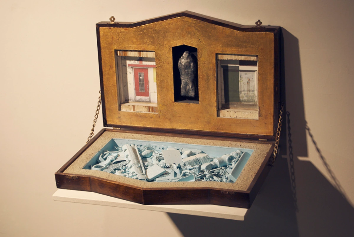
- Found objects or ephemera: These often come with inherent textures and stories, casting unique shadows and inviting contemplation of their history, as I often explore in my own mixed media work.
Each material has its own "voice" in low light, adding another layer to the sensory experience of the artwork.

Here's a quick table to guide your initial thoughts:
Art Type vs. Low-Light Suitability
Art Type | Suitability in Low Light | Why It Works (or Doesn't) | Recommendation |
|---|---|---|---|
| Vibrant Abstract | Excellent | Colors pop, less reliance on literal detail, creates energy; encourages subjective interpretation in subtle light. My own pieces often exemplify this. | Go for bold hues, dynamic compositions, look for intense color contrasts. |
| Textured/Mixed Media | Excellent | Creates depth and shadows, tactile appeal; light plays across surfaces, adding visual interest. | Look for raised elements, varied materials, thick brushstrokes (impasto), woven pieces, or ceramic forms. |
| Textured Abstract | Excellent | Combines the energy of abstraction with the depth of texture, creating dynamic light play and sensory engagement. | Seek pieces with visible brushwork, collage elements, or sculptural additions; ideal for intimate interaction. |
| Sculptural Pieces | Excellent | Three-dimensionality means inherent light/shadow play, offering constantly evolving visuals as light shifts. | Opt for materials that reflect or absorb light uniquely; consider polished metals, carved wood, or translucent forms. |
| Glossy Finish Paintings | Excellent | Reflects ambient light, adds luminosity; bounces available light to enhance perceived brightness. | Enhances brightness, can create a subtle glow; consider semi-gloss for less direct reflection. |
| Photography (High Contrast) | Good | Strong visual impact, clear forms stand out; inherent drama suits intimate settings, leveraging chiaroscuro effects. | Choose images with dramatic light and shadow; black & white can be particularly striking. |
| Light-Background Art | Good | Visually expands the space, enhances perceived brightness; helps a piece stand out against darker walls. | Helps a piece stand out against darker walls; consider art with ample negative space to prevent visual clutter. |
| Digital Art on Screens | Good | Screens provide their own illumination, offering vibrant, dynamic displays. | Ensure proper color calibration and manage screen reflections with matte finishes or careful placement. |
| Dark/Monochromatic Art | Moderate (with good lighting) | Can create drama, but may disappear without accent lighting; can add depth and mood if carefully illuminated. | Best with dedicated spotlights; ensure enough contrast to define forms. |
| Delicate Details/Pastels | Low | Details get lost, colors appear muted or washed out; intricate work becomes muddy without strong illumination. | Avoid unless heavily supplemented with direct, focused lighting. |
Subject Matter: Evoking Light, Mood, and Openness
Sometimes, it's not just the color or texture, but the story within the art that matters. Consider art that depicts light sources, like a painting of a window, a cityscape at night, a cozy lamp, or even a serene dawn landscape. These pieces introduce a psychological element of brightness and hope. Even abstract works that evoke movement, energy, or a sense of vastness can bring a feeling of openness to a contained space, suggesting a world beyond the immediate confines. Artists in movements like Impressionism, though often capturing bright outdoor scenes, were masters at depicting the nuances of light itself – a principle that can inspire choices even for dim interiors, focusing on how light interacts with color and form rather than just the scene itself.
On the flip side, if the room is a personal retreat, art with comforting, cozy themes can enhance the intimate atmosphere. Think soft landscapes, gentle portraits (especially those using dramatic lighting to convey emotional depth), or even still life pieces that evoke warmth and familiarity. For photography, beyond high-contrast, consider noir-inspired urban scenes, moody still lifes that play with muted tones, or even macro photography that reveals intricate details often missed in brighter light. It's all about what emotion you want to cultivate in that particular spot, and how the art, through its subject, can whisper or sing to that mood. Also, consider the scale: a large, bold piece can make a statement and visually expand a small, dim room, while a smaller, more intimate piece invites a closer, more personal connection, especially if it utilizes significant negative space (the empty area around or between the subjects) to create visual calm. Always remember that understanding the artist's biography or the artwork's provenance can add a profound layer of appreciation, especially in an intimate setting where you have time to contemplate its history.
Artistic Styles Designed for Subtlety and Depth
For my part, as an artist drawn to color and abstraction, I find that certain styles are particularly forgiving and even enhanced by a low-light environment. They don't just exist in the room; they become part of its very atmosphere because their intrinsic qualities are amplified by nuanced illumination.
Abstract Art: A Natural Fit
Abstract art, especially the kind with bold colors and strong compositions, is almost tailor-made for these spaces. Why? Because it doesn't rely on literal representation. You don't need perfect, glaring light to appreciate a vibrant swirl of color or a dynamic interplay of shapes. In fact, the less defined light can even add to its mystery, inviting closer inspection and deeper, more personal interpretation. It's fascinating how a piece might shift its mood as the ambient light changes, revealing new facets; a deep blue might deepen to near-black, while a metallic accent might catch a stray beam and shimmer. Many of my own pieces, with their inherent vibrancy and sometimes unexpected color juxtapositions, thrive in these settings, offering a burst of energy, resilience, or even quiet contemplation without needing direct sunlight. The way my expressive brushstrokes and geometric forms interact with subtle illumination is something I intentionally build into the work, knowing it will transform the room. If you're exploring Decorating with Abstract Art in Bohemian Chic Interiors: A Guide to Layering and Texture, you'll find similar principles apply to creating depth in any room, regardless of light.
Photography: High Contrast, Atmospheric
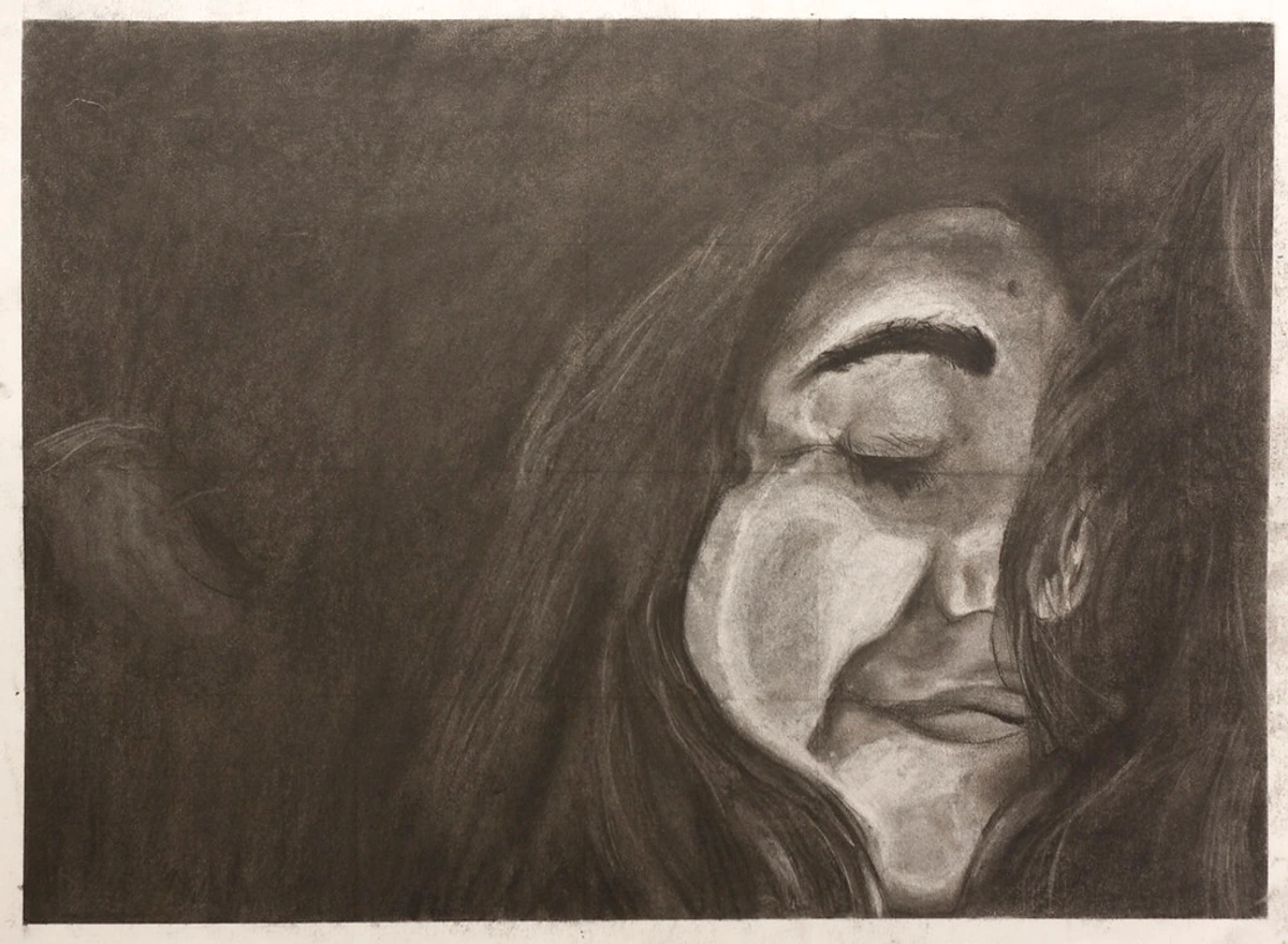
Similarly, high-contrast photography can be stunning. Black and white images, or photos with dramatic light and shadow (known as chiaroscuro), hold their own incredibly well. The subdued lighting of the room only adds to their atmospheric quality, enhancing the mood rather than detracting from the details. It turns a viewing experience into something more contemplative and profound, almost like a whispered secret in the quiet of the room. Think of a powerful portrait where deep shadows define the contours of a face, or a stark landscape emphasizing texture over color. This is where those noir-inspired urban scenes or moody still lifes I mentioned earlier can truly come to life.
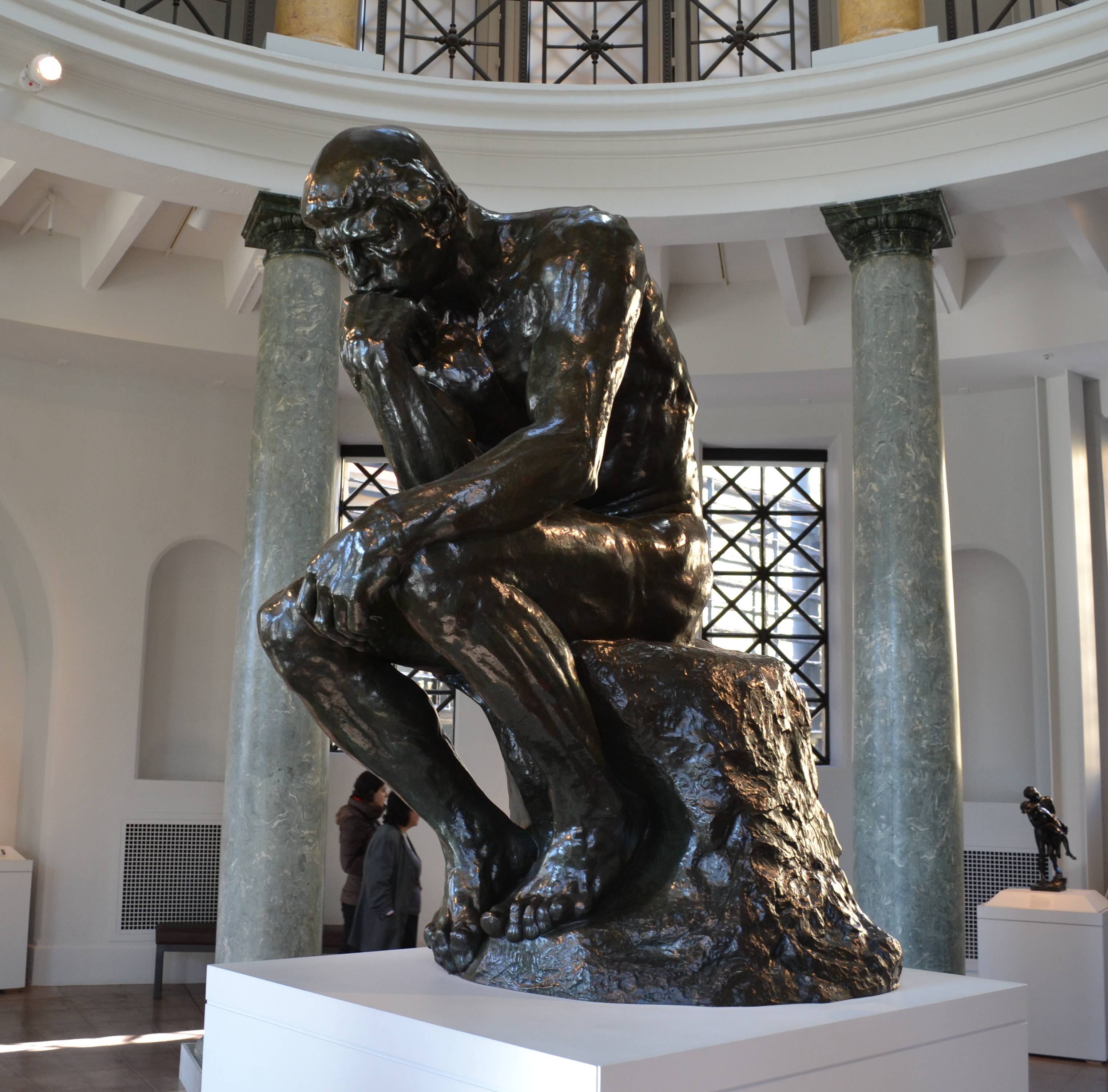
Sculpture and Three-Dimensional Art: Playing with Shadow
Don't limit your thinking to flat surfaces! Sculptural pieces, whether freestanding or wall-mounted, are inherently designed to interact with light in fascinating ways. Even minimal illumination will create dynamic shadows and highlights across their forms, adding incredible depth and movement. Consider pieces made from polished metals (like bronze or steel) that can subtly reflect ambient light, or textured ceramics and carved wood that invite tactile exploration. Even translucent materials like alabaster or frosted glass, or intricately perforated structures, can create captivating light patterns and evolving visuals that truly enhance a dim space. It's almost as if the artwork itself is performing a quiet dance with the available light, constantly revealing new facets and dimensions.

The Secret Weapon: Strategic Lighting
Alright, let's talk about the real game-changer: artificial lighting. In low-light rooms, lighting isn't just about seeing the art; it's about activating it. It's about bringing out those vibrant colors and textures we just discussed, coaxing them to reveal their full potential. Think of it as painting with light itself. And honestly, it's one of my favorite parts of designing a space, because it can literally transform how a piece is perceived. For more comprehensive insights into this, don't miss our guide on How to Choose the Right Lighting to Enhance Your Abstract Art Collection.
Spotlighting Your Masterpiece: Accent Lighting
This is where I truly believe in the magic of focused light. Picture lights mounted directly above the frame are classic for a reason—they wash the art in a beautiful, even glow. For a more flexible approach, track lighting with adjustable heads allows you to direct beams precisely onto your artwork, highlighting specific areas or textures. When choosing bulbs, pay attention to the color temperature (measured in Kelvin). For art, I generally recommend warmer tones (around 2700K-3000K) for a cozy feel, as they enhance reds, oranges, and yellows. Think of 2700K as the warm glow of a candle or traditional incandescent bulb, while 3000K is closer to the crispness of early morning sunlight. Cooler tones (3500K+) can make colors feel crisp but might make a warm room feel less inviting. And always, always, consider LEDs for their efficiency, longevity, and low heat emission; they've come so far in mimicking natural light beautifully. A quick but important note on ethics: while these lights are designed to bring out the best in your art, be mindful of UV light exposure from any light source over long periods, especially for delicate or older pieces, as it can cause fading. Modern LEDs often mitigate this, but it's always worth checking. Another crucial factor is the Color Rendering Index (CRI), which measures how accurately a light source reveals the true colors of objects compared to natural light. Aim for a CRI of 90 or higher for the most authentic representation of your artwork's palette.
Beyond the Art: Ambient, Task, and Wash Lighting
Remember, art lighting shouldn't exist in a vacuum. It should be part of a larger, layered lighting scheme. The key is layering your light – combining ambient, task, and accent lighting to create depth and interest. Think about ambient lighting (your general room illumination from overhead fixtures or floor lamps) and task lighting (like a reading lamp by a chair). All these elements work together. If your room is dim, you might need a higher overall ambient light level to properly appreciate your art. Sometimes, a well-placed floor lamp can do wonders, even if it's not aimed directly at the art. It's about creating a harmonious glow that supports both the function of the room and the beauty of your chosen pieces. Additionally, consider wash lighting, where light is aimed at a wall to create a soft, even illumination across a larger surface. This can enhance the overall brightness of the room and soften shadows. For textured walls or architectural features, grazing lighting (where light is placed close to the surface, shining across it) can dramatically highlight their three-dimensionality, adding another layer of visual interest that indirectly benefits the art. For more comprehensive strategies on integrating all your light sources, you can find insights in articles like The Art of Display: How to Light and Position Abstract Art for Maximum Impact.
Placement and Presentation: Maximizing Impact
Even the best art and lighting can fall flat with poor placement. In a low-light room, every decision about where and how to display your art carries extra weight. It's about creating a dialogue between the art and its environment, and in a dimmer room, that dialogue becomes more intimate. It's also where the color of your walls comes into play; a darker wall can make bright art pop, while a lighter wall can soften the overall effect.
The Right Spot: Where to Hang Your Art
In a dimmer room, you might not have the luxury of a sun-drenched wall, so you need to be strategic. Consider areas that naturally draw the eye, like above a sofa (check out Art Above the Sofa: A Guide to Perfect Placement and Scale) or a console table. Don't be afraid to experiment with slightly higher placements if you have tall ceilings, allowing the art to catch light from overhead fixtures and draw the eye upwards, creating an illusion of grandeur. If you have any mirrors in the room, consider placing art opposite them. The mirror will reflect not only the art itself but also any light falling on it, effectively doubling its presence and creating a sense of expanded space. When considering wall color with your lighting, remember that on a dark wall, strategically placed spotlights will make a vibrant abstract pop, enhancing its drama. On a lighter wall, a softer wash of light can create a more serene atmosphere, making the art feel integrated rather than spotlighted. This is where you trust your gut; sometimes the "wrong" spot can feel just right because of the mood it creates. And if you're unsure, try moving things around! It's truly surprising how a fresh perspective – and perhaps a different wall – can reveal a piece's true potential. For very compact or challenging dim spaces, our guide on Abstract Art for Small Spaces: Maximizing Impact in Compact Areas might offer even more tailored solutions.
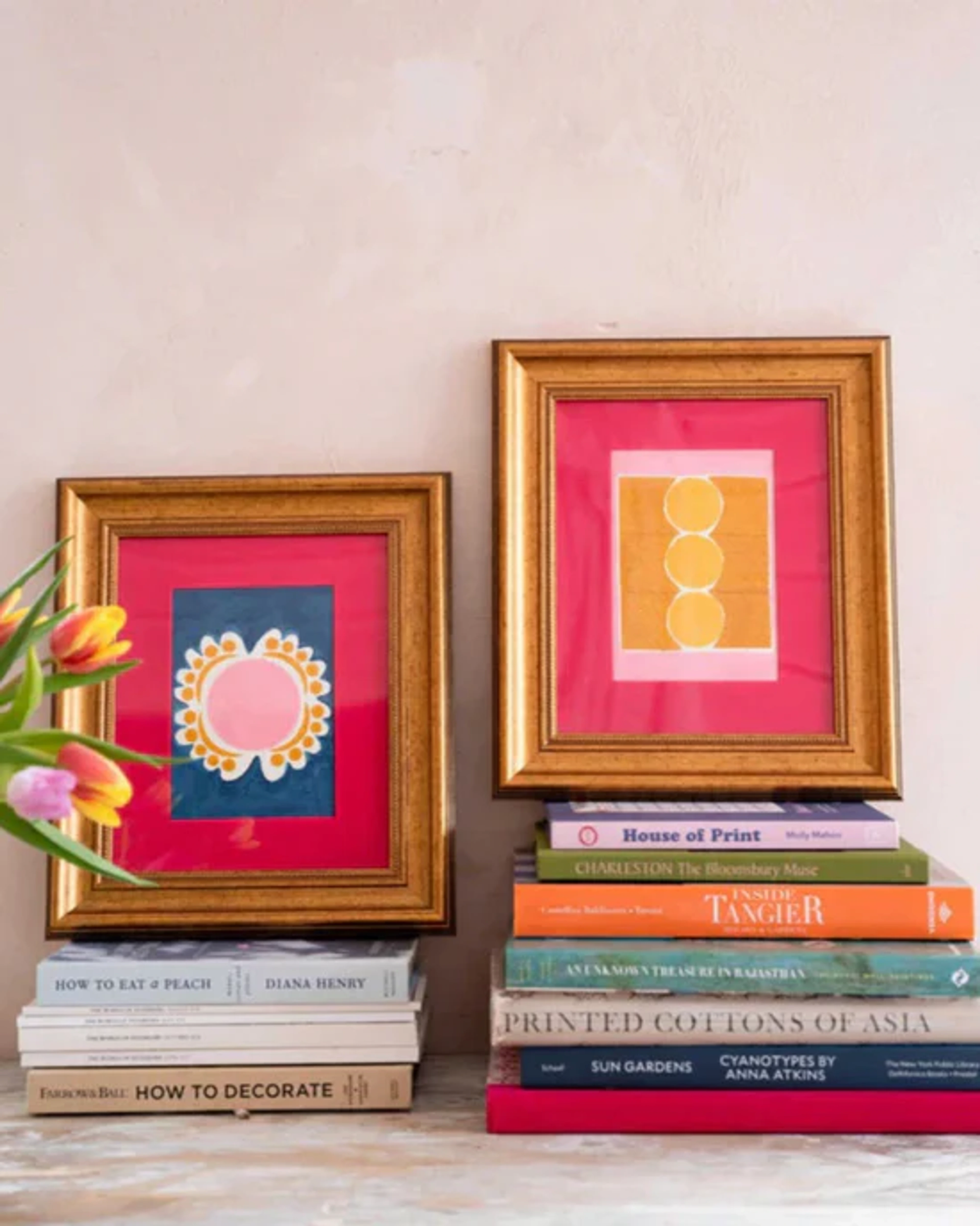
Framing and Matting: The Supporting Cast
The frame and mat are not just accessories; they are part of the overall presentation, especially in low light. I tend to favor lighter, wider mats in these situations. They create a visual breathing room around the artwork, making it stand out more against a potentially darker wall and enhancing its perceived luminosity. This ample negative space provided by the mat helps to prevent the artwork from feeling "swallowed" by a dim environment. As for the frame itself, brushed metals or light woods with subtle textures can complement a contemporary piece, reflecting a bit of light without being overtly flashy, while a classic dark frame might add depth and gravitas, provided the art itself isn't too dark. Remember, it's about balance. One crucial consideration for any room with dedicated art lighting, but especially low-light rooms, is non-glare or museum glass. Standard glass can create distracting reflections from your accent lights, obscuring the very art you're trying to highlight. Investing in non-glare glass is a small step that makes a huge difference, allowing the art to truly be seen, not just its reflection.

Tailoring Art to Specific Low-Light Spaces
Different low-light rooms have different needs and moods. Here's how to customize your approach:
- The Cozy Reading Nook or Study: Here, intimacy is key. Opt for art that invites closer inspection—perhaps a piece with rich texture, subtle impasto, or a meditative subject. Task lighting is essential, but the art itself can be a soft focal point that doesn't demand bright illumination. Think warm color palettes and tactile materials.
- Dramatic Home Theaters or Dens: These spaces thrive on mood. Darker, high-contrast art or pieces that play with a limited, sophisticated color palette work wonderfully. The art should complement the cinematic feel, perhaps with themes that are mysterious or evocative. Accent lighting should be dimmable and precise, allowing the art to emerge when desired without competing with the main screen.
- Basement Rooms or Powder Rooms: These often lack natural light entirely, making artificial solutions paramount. This is where you can be bold with vibrant abstracts, reflective elements, or even large-scale pieces that visually expand the space. Art that features windows or landscapes can also create an illusion of openness. Focus on robust lighting strategies to compensate for the absence of daylight, ensuring the art truly glows.
Originals vs. Reproductions: Subtlety in Print
In low-light conditions, the distinction between an original artwork and a reproduction becomes surprisingly pronounced. An original painting or sculpture carries inherent texture, depth, and a unique way of interacting with light that even the highest quality print struggles to replicate. The impasto brushstrokes, the subtle shimmer of mixed media, or the nuanced play of light across a sculptural form—these elements are truly alive and shift with ambient light. A flat print, no matter how vibrant, lacks this three-dimensionality. When choosing art for a dim room, I often lean towards originals or very high-quality textured prints (like giclées on canvas) because their physical presence adds a layer of richness that's truly appreciated when light is scarce, inviting a closer, more sensory engagement that a perfectly flat image simply can't offer.
Avoiding Over-illumination: The Art of Subtle Light
While the goal is to make your art shine in low-light rooms, there's a fine line between strategic illumination and over-lighting. The inherent charm of a dimly lit space is its intimacy and mood. Blasting your art with overly bright, harsh spotlights can destroy this ambiance, making the room feel stark and the art appear flat. The trick is to create a focused glow that brings out the best in the artwork without overwhelming the surrounding environment. Experiment with dimmer switches, narrower beam angles, and lower wattage bulbs. Remember, it's about enhancement, not eradication, of the low-light atmosphere. The art should feel integrated into the room's subtle glow, not like it's fighting against it.
A Note on Emerging Art Forms: Digital and AI
In our increasingly digital world, displaying art on screens is a growing trend. In low-light rooms, digital art can be a fantastic option, as the screen provides its own illumination. However, there are nuances to consider:
- Screen Brightness and Calibration: Ensure your screen's brightness is appropriate for the ambient light—too bright, and it can be jarring; too dim, and the art loses impact. Regular color calibration ensures the colors you see are what the artist intended.
- Reflections: Glossy screens can be highly reflective, especially when paired with accent lighting. Consider screens with matte finishes or strategically position them to minimize glare from windows or other light sources.
- Dynamic Displays: Digital art can offer dynamic, moving pieces that bring incredible life to a dim room, creating a constantly evolving focal point.
While AI-generated art offers fascinating possibilities in terms of customizable visuals and digital displays, I find it often lacks the inherent human touch and unique materiality that gives a piece its soul, especially in nuanced low-light settings where texture and artist intent truly resonate. However, the technology is evolving rapidly, and its capacity to create dynamic, light-reactive imagery on screens is undeniable. My personal focus remains on the tangible and expressive qualities that only a human hand can impart, particularly when a piece is meant to engage intimately with its environment.
Art Care in Low-Light Environments
While low light can be a friend to art in terms of mood and presentation, it's also important to touch briefly on conservation. Generally, less light (especially less direct sunlight) means less fading and degradation for your artwork. However:
- UV Protection: Be mindful of any light source. Even modern LEDs, while low in UV, can contribute to cumulative damage over decades for very delicate pieces. Museum-quality glass offers excellent UV protection. Consider rotating pieces periodically if they are particularly sensitive.
- Temperature and Humidity: Dim rooms, especially basements, can sometimes be prone to higher humidity or temperature fluctuations. An unstable environment can lead to: paper embrittlement (making paper art brittle and prone to cracking), canvas warping (canvases expanding and contracting), paint cracking (especially with oil paints), or mold growth (on paper, canvas, or frames). Ensure a stable environment (ideally 45-55% relative humidity and consistent temperature of around 20-22°C or 68-72°F) to prevent such damage. Simple hygrometers and dehumidifiers can be readily available solutions for monitoring and managing these factors, offering peace of mind for your precious collection.
- Dust and Cleaning: Low light can sometimes mask dust accumulation. Regular, gentle dusting with a soft, dry cloth is important for maintaining the clarity and vibrancy of your art, especially pieces with texture.
Frequently Asked Questions (FAQ)
Q: Can I hang dark art in a low-light room?
A: Absolutely, and it can be incredibly impactful! Darker art can create drama, sophistication, and a sense of depth, much like the chiaroscuro techniques seen in historical masterworks. The key is dedicated accent lighting (like a picture light or spotlight). Without proper illumination, its intricate details and rich colors may indeed be lost in the shadows. With precise lighting, a dark piece can be truly captivating, revealing its nuances as if under a theatrical spotlight. I've seen some utterly stunning transformations with deep, moody pieces.
Q: What kind of light bulbs should I use for art lighting?
A: I strongly recommend LED bulbs for their energy efficiency, longevity, minimal heat emission, and excellent color rendering. For color temperature, aim for 2700K to 3000K (warm white) for a cozy, inviting feel that enhances most art colors, especially warmer tones. Crucially, look for bulbs with a high Color Rendering Index (CRI) of 90 or higher to ensure colors are accurately represented, truly bringing your art to life as the artist intended.
Q: Should I avoid glass frames in low-light rooms?
A: Not necessarily, but it's an important consideration. Standard glass can cause distracting glare and reflections from artificial lights, which are essential in low-light rooms. These reflections can obscure the very art you're trying to highlight. If you use glass, I highly recommend investing in non-glare or museum-quality glass. This significantly reduces reflections, allowing you to appreciate the art without distraction and ensuring the piece looks its best. It's a game-changer, honestly.
Q: How do I choose art if my room has no natural light at all?
A: For rooms with absolutely no natural light, strategic choices are even more critical, almost like designing a stage set. Prioritize art with vibrant colors, significant texture, or reflective elements that can interact dynamically with artificial light. Specific types of abstract art, particularly those incorporating metallic pigments, iridescent finishes, or layered resins, can truly glow. Dedicated art lighting becomes non-negotiable here; it will be the sole source of illumination for your piece, so make it count. Consider light-themed subject matter or bold abstracts that create their own visual energy, bringing a sense of life where the sun cannot. Don't be afraid to experiment with mixed media or sculptural pieces that thrive on artificial highlights.
Q: Does the size of the artwork matter in a low-light room?
A: Yes, absolutely! In a dim room, a larger, bolder piece can actually help to visually expand the space and make a more impactful statement, acting as a powerful focal point that commands attention. Smaller, more delicate pieces can get lost without very precise accent lighting. If you opt for smaller works, consider grouping them as a gallery wall to create a collective presence that holds its own in the subdued environment. The key is to ensure the art has enough visual weight to truly shine, so it doesn't just fade into the background. For more insights on scaling art to your space, consider our guide on Maximizing Impact: Choosing Art for High Ceilings, many principles apply regardless of ceiling height.
Q: How does wall color affect art in a low-light room?
A: Wall color plays a significant role. Darker wall colors can create a dramatic backdrop, making lighter or vibrant art truly pop and adding depth to the room. However, they can also make a room feel smaller and absorb more light. Lighter wall colors, on the other hand, reflect more light, helping to brighten the space and making the art appear softer. The best approach often involves using a medium tone that offers enough contrast for your chosen artwork without making the room feel enclosed, or strategically contrasting a dark feature wall with a bright piece.
Q: What if I have budget constraints for art and lighting?
A: Don't despair! You can still achieve stunning results. Prioritize one truly impactful piece with good texture or reflective qualities. For lighting, start with a single, high-CRI spotlight on a dimmer, which you can often find affordably. Consider high-quality prints (like giclées) on textured paper instead of originals, or explore local artist markets for unique, smaller pieces. Sometimes a creative DIY solution, like adding a subtle metallic paint detail to an existing frame, can also make a surprising difference.
Q: How do I test art in my room before buying?
A: This is a fantastic question and something I always recommend! If possible, ask the gallery or artist if you can "try" a piece in your home for a day or two. Failing that, take detailed photos of your room (with and without current lighting) and bring them with you when shopping. Many online galleries offer virtual placement tools. For physical art, you can also print a small, color-accurate version and tape it to your wall to get a sense of scale and color interaction. Observe it at different times of day to see how the available light changes its appearance.
Q: Can I use natural elements (plants, etc.) to complement art in low light?
A: Absolutely! Natural elements like plants, dried botanicals, or even textured branches can add organic warmth and a sense of life to a low-light room, beautifully complementing your art. They introduce their own subtle textures and shadows, enhancing the overall sensory experience. Just be sure to choose plants that thrive in low-light conditions, so you're not constantly struggling to keep them alive. Think about how their forms and shadows can create an interesting dialogue with the art itself.
Conclusion: Let Your Art Shine, Whatever the Light
Choosing art for a low-light room isn't about compromise; it's about intelligent design and a little bit of creative vision. These spaces offer a unique opportunity to cultivate a specific mood, to highlight textures, and to truly make your chosen artwork the star of the show. My journey as an artist has taught me that every space, no matter how challenging, holds untapped potential for beauty and expression. With the right selection of vibrant colors and rich textures, strategic layering of light, and thoughtful placement, you can turn any dimly lit corner into a captivating gallery that reflects your unique style and tells your story. The way we appreciate art is ever-evolving, and embracing the nuances of subtle illumination opens up entirely new dimensions of beauty and engagement. So go ahead, embrace the shadows, let your intuition guide you, and watch as your chosen art brings its own vibrant light and transforms your home. I'd love to hear about your low-light art transformations! Perhaps you'll even find the perfect vibrant abstract piece in my collection to begin your own transformation, or explore the rich history of art at Den Bosch Museum.


