Franz Kline's Black and White Paintings: The Power of a House Painter's Brush
A deep dive into Franz Kline's black and white painting technique. Discover the surprising materials, the myth of spontaneity, and the raw power behind his iconic works.

The Secret Life of a House Painter's Brush: Getting Real About Franz Kline's Black and White Paintings
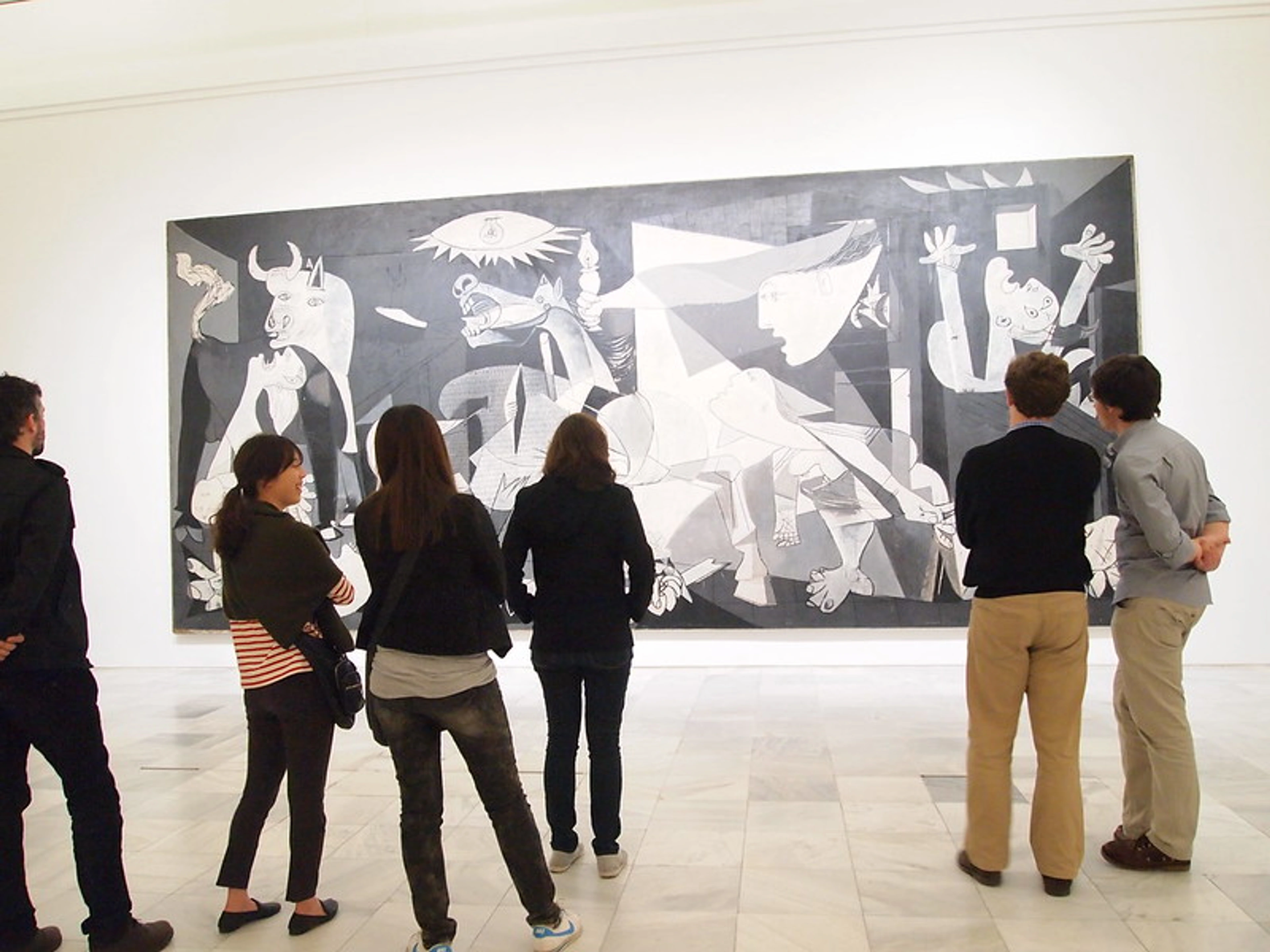
You know that feeling when an artwork just slaps you across the face? That's what a Franz Kline painting does to me, every single time. It wasn't just a picture; it was a force of nature, a monumental declaration frozen in pigment. I still remember the first time I confronted one – the sheer scale, the audacious black cutting through the white like a seismic event. My mind immediately went to 'how?' and then, 'what is this raw, almost brutal elegance?'
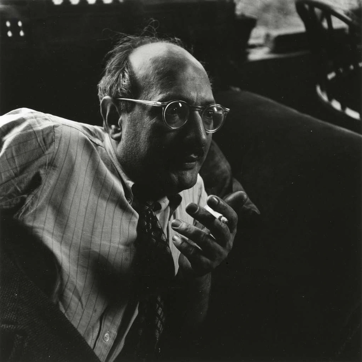
And that's the beautiful paradox of Kline, isn't it? His work feels utterly spontaneous, a visceral roar of paint, yet beneath that kinetic energy lies a profound intelligence, a rigorous structuring that often goes unnoticed. His work grabs you by the collar. It's not polite; it doesn't whisper; it roars. You're not just looking at a painting; you're confronting an action that has been frozen in time. People love to talk about Abstract Expressionism as this big, emotional, spontaneous outburst – a chaotic, almost primal urge unleashed onto canvas. And yes, there's certainly that raw, unbridled energy. But with Kline, I've always felt there's a deeper, almost architectural intelligence at play, a rigorous structuring beneath the seeming frenzy. It’s not just chaos; it's a controlled, brutalist poetry, a symphony of tension and release, all waiting to be unraveled.
If you want to understand what truly makes his black and white paintings tick, from the hardware store paint to the beautiful myth of his process, you've definitely come to the right place. We're going to pull back the curtain and dive into the nuts and bolts, exploring not just what he painted, but how he thought, why he chose his iconic palette, and the profound impact he had on the art world. Prepare to see the familiar roar of Kline's brush with fresh eyes, and discover the meticulous mind behind the monumental gesture. This isn't just a story about paint; it's about an artist who dared to strip away everything but the essential to find something truly profound.
The Roots of the Roar: Franz Kline's Early Years and Figurative Beginnings
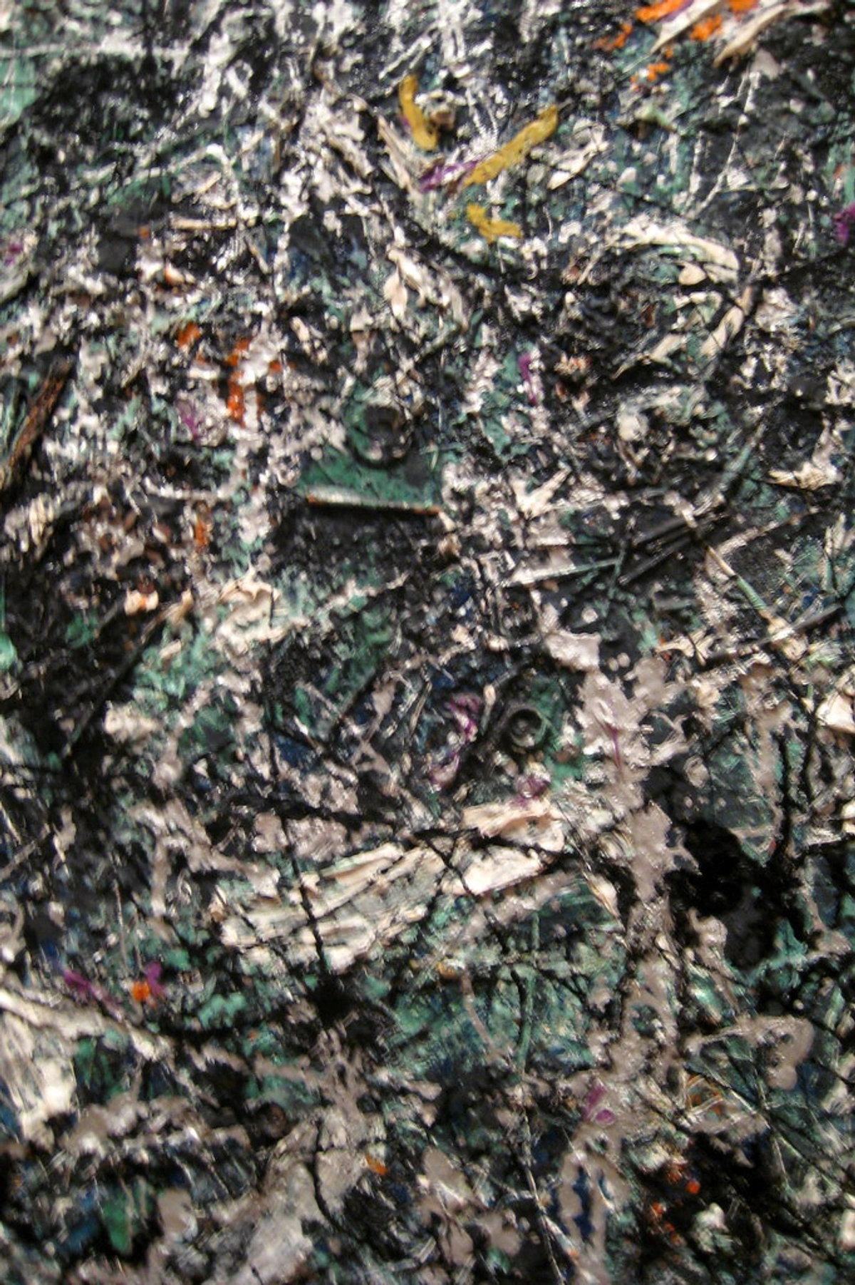
Franz Kline, born in Wilkes-Barre, Pennsylvania, in 1910, had a childhood steeped in the industrial landscape of coal mines and railroad tracks. This early environment, I believe, subtly imprinted on his visual vocabulary, even if he didn't explicitly paint it. Before the colossal black and white gestures that define his legacy, Kline was deeply immersed in a more traditional artistic path. He studied art extensively, notably at Boston University and then the Art Students League of New York. This wasn't just a casual fling with art school; it was serious, foundational training where he honed his eye and hand, learning the 'rules' of art before he spectacularly broke them. I mean, think about it: mastering classical figure drawing and composition before unleashing those raw, abstract forms? That’s dedication, and it’s a crucial aspect often overlooked when people talk about abstract art.
His early work was largely figurative, focusing on portraits, expressive landscapes, and gritty cityscapes executed in a representational style. You can see the echoes of European masters like Goya and Rembrandt in his early portraits, in the way he captured a sitter's inner life, or the dramatic chiaroscuro that added weight and psychological depth. But he was also, I suspect, deeply influenced by American Realists like the Ashcan School artists, who captured the raw energy and grittiness of urban life – a precursor to the industrial forms that would later dominate his abstract work. This blend of European tradition and American grit forged a unique observational capacity. He was a skilled draftsman, meticulously honing his ability to capture form and light long before he abandoned explicit subject matter. Just look at some of his early self-portraits; they show an artist intensely engaged with observation, not just raw emotion, but also the structural integrity of the human figure, the bone beneath the skin. It’s that deep understanding of structure that would later inform his abstract compositions.
This foundational training, I think, is absolutely crucial. It’s far too easy to dismiss abstract art as lacking skill or being a 'mess,' but artists like Kline didn't just stumble into abstraction. They arrived at it through a deep, almost visceral understanding of traditional principles, much like a musician mastering classical scales before improvising jazz. You know the rules so well, you know exactly how to break them with intention and power. He wasn't trying to escape realism because he couldn't do it; he transcended it, not because he couldn't paint reality, but because he understood it so profoundly that he could distill it to its essence. This intellectual rigor, the ability to build and then deconstruct, is what separates true masters of abstraction from mere imitators. He understood that true abstraction isn't an absence of skill, but a distillation of it, a process I often return to in my own explorations of why I paint abstract: my personal philosophy and artistic vision.
Let's look at the trajectory of his early artistic development:

Phase of Development  | Characteristics | Key Influences & Focus |
|---|---|---|
| Academic Training (Pre-1940s) | Formal study at institutions like Boston University and the Art Students League. Focused on figurative art: academic portraits, expressive landscapes, and gritty cityscapes. Emphasized drawing from life and classical techniques. | European masters (Rembrandt, Goya, Velázquez for psychological depth and chiaroscuro), American Realists (Ashcan School for urban grit and energy), developing strong draftsmanship and understanding of form and light. |
| Transitional Period (Early-Mid 1940s) | Gradually shifting from strict representation to more expressive, simplified forms. Experimentation with bolder brushwork, flattened perspective, and a nascent interest in the inherent power of the mark itself. | Post-Impressionism (Cézanne's structural approach), German Expressionism (for emotional intensity), early Abstract art, seeking a personal style beyond direct observation and exploring the psychological impact of color and form. |
| Emergence of Abstraction (Late 1940s) | Increasing simplification of forms, emphasis on raw, uninhibited gesture and broad, sweeping strokes. Black and white studies begin to dominate, becoming a primary mode of intense visual exploration. | New York School peers (Willem de Kooning, Jackson Pollock), the brutalist elegance of the urban environment, the syncopated rhythms of jazz music, and a profound desire for raw, direct, and immediate expression unburdened by narrative. |
His journey to pure abstraction wasn't a sudden leap, but a gradual, almost inevitable evolution. It was propelled by the vibrant, often chaotic, post-war art scene of New York, a city buzzing with new ideas and a rejection of old conventions. The sheer energy of the city itself – its steel girders, its towering structures, its relentless pace – deeply resonated with Kline. This wasn't just aesthetic appreciation; it was a visceral connection to the very bones of modernity. The experimental spirit of his peers and the intense, late-night dialogues with fellow artists like Willem de Kooning (a close friend and lifelong influence) and Jackson Pollock slowly nudged him towards a more expressive, non-objective language. These were not polite conversations; they were passionate, sometimes argumentative explorations of what art could be, challenging every orthodoxy. It was a language where the subject wasn't something out there in the world, but something internal, something about the very act of painting and the raw emotion it could convey. It's a fundamental part of what is abstract art – finding new ways to express, and a journey many abstract artists embark upon to translate emotion into abstract art.
From Intimate Gesture to Monumental Statement: Kline's Deliberate Process
Everyone thinks of Kline and his buddy Jackson Pollock as these 'action painters' just flinging paint in a frenzy. And while the final canvases have that incredible, kinetic energy, the story with Kline is far more deliberate, more considered. It’s one of the best tricks in art history, if you ask me – making the meticulously planned appear utterly spontaneous. It's a calculated ferocity, a carefully orchestrated explosion of energy. His journey from an initial flicker of an idea to a monumental canvas was a testament to his intellectual rigor, proving that true spontaneity often requires profound preparation.
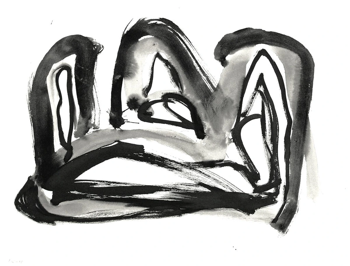
He didn't just walk up to a giant canvas and let loose; that's the romanticized myth we often cling to, and frankly, it diminishes the intellectual depth of his process. Most of his iconic black and white works started their lives as small, quick, almost frenetic sketches. He'd tear pages from telephone books (can you imagine, using a phone book for serious art? I love that defiance, that rejection of preciousness!), grab an old brush and some ink, and just furiously work out compositions. These weren't precious studies; they were raw, immediate explorations of form and gesture, often with a decisive flick of the wrist. Sometimes they were elegant, sometimes brutal, always charged with energy. He was obsessed with the power of a single line and its weight, its direction, its ability to convey immense energy in miniature. It’s like a musician practicing scales – the small gestures inform the grand performance, allowing for a freedom in the final execution that feels utterly uninhibited. They were almost like quick visual notes, capturing a fleeting idea, a direct transcript of his unconscious artistic drive. He generated hundreds, perhaps thousands, of these small drawings, a tireless quest for the perfect balance of dynamism and structure.
This is where, for me, the real magic happened: the metamorphosis from the intimate to the monumental. Kline famously had a Bell-Opticon projector, a relatively common piece of equipment for graphic designers or illustrators of the time. But in Kline's hands, it became a revolutionary artistic tool. He’d take these tiny, rough sketches and blow them up onto the huge canvases. A casual flick of the wrist on a phonebook page, an almost accidental smudge of ink, became a monumental, girder-like beam of black when projected onto a vast canvas. It wasn't just about enlarging the image; it was about transforming its essence, revealing structural relationships and dynamic tensions that were only latent in the smaller format. The scale shift itself became a creative act, allowing him to perceive and refine the structural integrity of his gestures in a way no smaller study could. This projection allowed him to do something incredibly clever: to refine, to adjust, to find the perfect balance and tension in art composition before a single drop of paint was committed to the final, expensive canvas. It gave him a way to study the gesture, to see how a small, intimate mark would feel when it dominated a wall. It’s a process of scaling up not just the image, but the impact, the presence, and the emotional weight – allowing the spontaneity to be both preserved and meticulously controlled.
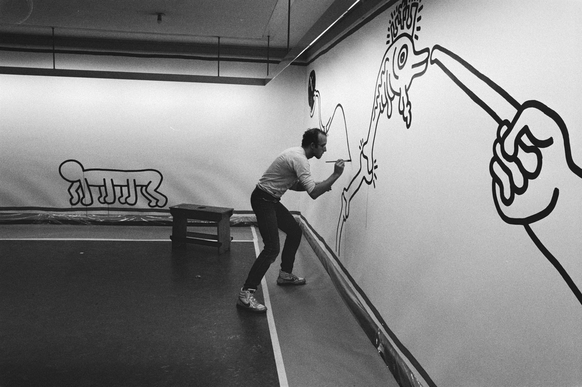
To truly grasp the genius of Kline's apparent spontaneity, it helps to break down his method. It's a journey from a whisper to a shout, carefully choreographed:
Stage of Creation | Characteristics | Purpose & Impact |
|---|---|---|
| Initial Sketches | Small, rapid, ink-on-paper (often phonebook pages or discarded scraps). Fluid, gestural, raw forms, energetic marks, often exploring pure line and composition. | Capture initial impulse, spontaneously explore dynamic compositions, quickly iterate ideas without commitment to a large canvas. Develop the core gestural vocabulary. |
| Projection & Study | Enlarging chosen sketches onto large canvases (or a wall), using a Bell-Opticon projector. The image is distorted and magnified, transforming an intimate gesture into a potentially monumental statement. This is where he saw the conceptual leap of his work. | Visualize the monumental impact of a small gesture, identify latent structural strengths/weaknesses, and understand scale relationships before paint is applied. This stage is about intellectual refinement, seeing how the gesture performs at a grand scale. It was a conceptual leap, not just a technical trick, allowing for compositional refinement, monumental impact, and controlled spontaneity. |
| Refinement & Adjustment | Subtly shifting projected lines, enhancing or minimizing tensions, manipulating the composition's balance and tension. This is a critical period of intense visual editing before execution, akin to a conductor fine-tuning an orchestra before a performance. | Ensures the final composition possesses the desired power, drama, and structural integrity, minimizing wasted paint and canvas. It's a rehearsal for the final performance, allowing for deliberate precision despite the eventual speed of application. |
| Final Painting | Energetic, decisive application of industrial paint on a large canvas, often with a "rehearsed spontaneity." The act is fast, but the underlying structure is well-understood, making the execution feel both immediate and inevitable. | Translate the raw gesture from the sketch into a commanding, physical presence on a monumental scale, imbuing it with a sense of immediate, raw action while retaining compositional rigor. This is the moment where the intellectual work becomes a physical testament. |
| Emotional & Physical Impact | The dramatic scale amplifies the initial intimate gesture, transforming it into a physical confrontation for the viewer. The viewer experiences the artist's action and decision-making on a grand scale, feeling the energy and struggle embedded in the paint. | Elevates a private thought or quick mark into a commanding, visceral experience, embedding the artist's action and challenging the viewer to engage with pure form and energy. It's a dialogue between artist, canvas, and viewer, amplified by scale. |
The Crucible of Creativity: Kline and the New York School
The mid-20th century in New York was an explosion of artistic energy, a crucible for new ideas that would redefine art. Franz Kline was right there, in the thick of it, part of what became known as the New York School. He wasn't working in a vacuum; his ideas were forged in intense dialogues, late-night bar conversations (I bet the Cedar Tavern saw some legendary debates, fueled by cheap beer and existential angst!), and shared studio visits with giants like Willem de Kooning (a close friend and lifelong influence) and Jackson Pollock. This camaraderie, the fierce debates, the push-and-pull of differing approaches, created an incredibly fertile ground for radical artistic innovation. It was a time of questioning old masters and forging new paths, and Kline’s unique blend of raw energy and considered structure fit right into that ethos of artistic revolution, positioning him as a key figure in the evolution of abstract art.
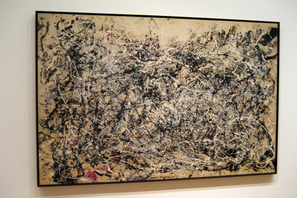
Scaling Up: The Genius of Projection
Kline's use of the Bell-Opticon projector wasn't just a technical trick; it was a conceptual leap. He didn’t simply enlarge an image; he transformed the experience of it. A small, intimate gesture suddenly commanded an entire wall, forcing the viewer into a direct, almost physical confrontation with the expanded mark. This process allowed him to:
Aspect | Benefit of Projection for Kline |
|---|---|
| Compositional Refinement | Allowed him to adjust forms and tensions on a grand scale without committing paint. |
| Monumental Impact | Translated an intimate sketch into a powerful, architectural presence. |
| Controlled Spontaneity | Enabled the final, energetic brushstrokes to be informed by a precise underlying structure. |
| Material Economy | Minimized wasted large-scale canvases by allowing pre-visualization of the full effect. |
| Dynamic Reinterpretation | The act of enlarging often revealed new possibilities and relationships in the original sketch. |
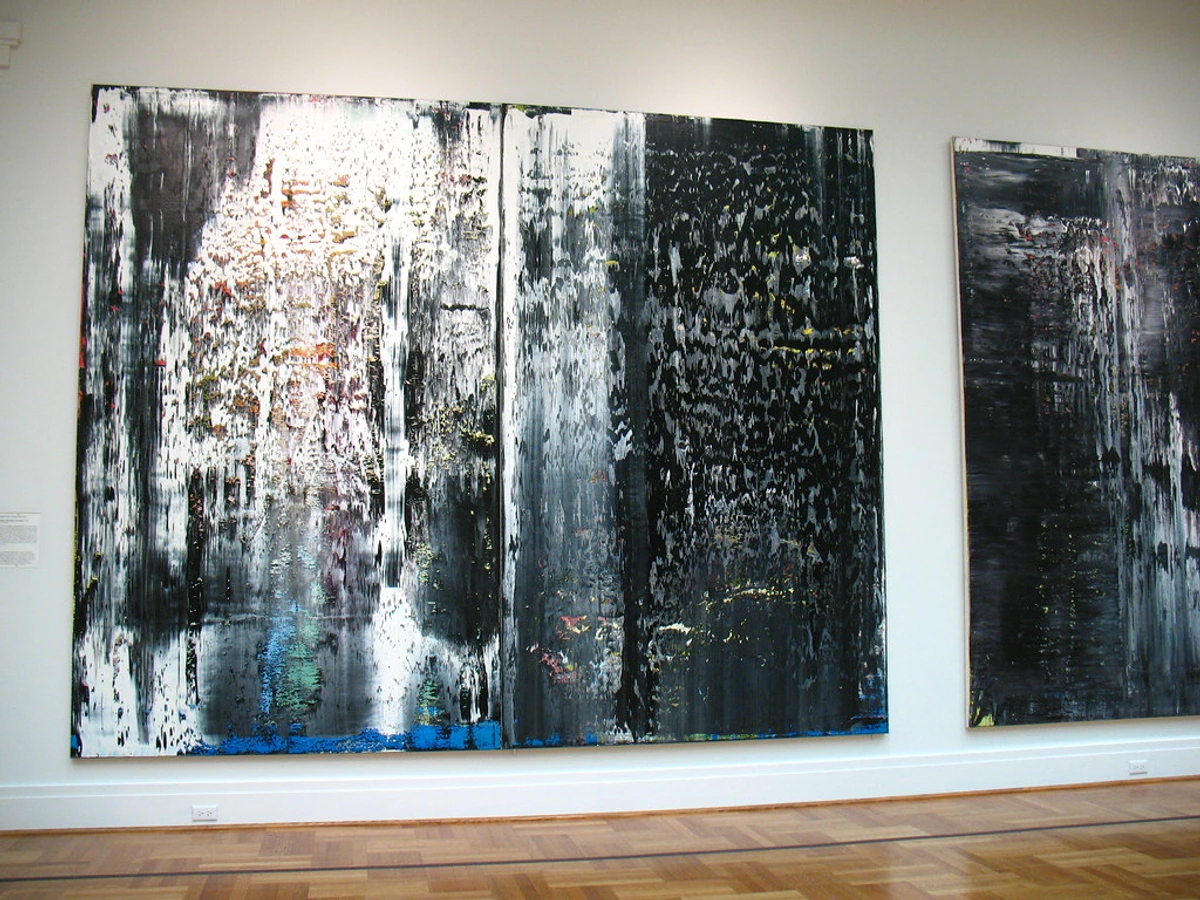
It’s a process of scaling up not just the image, but the impact, the presence, and the emotional weight.
Not Just Any Paint: The Hardware Store Revolution
This is my favorite part of the Kline story, and honestly, it blows the lid off a lot of the 'sacredness' often associated with art materials. In the early days, he wasn't reaching for fancy, expensive artist oils for these massive works. Oh no. He was using commercial house paint. Often, it was Bell Telephone black enamel – the kind you’d find at any hardware store, usually for industrial or home use. He wasn't just using "any" house paint; he gravitated towards robust, fast-drying enamels and industrial lacquers. Think about that for a second. The material itself—common, industrial, functional—is deeply embedded in the final artwork, a quiet rebellion against the pristine world of fine art and its often-precious materials. It really makes you think about the definitive guide to paint types for artists and how many options there are. This wasn't just a cost-saving measure – though I'm sure his wallet appreciated it, especially when working on canvases that were often larger than his studio! – it was a profound philosophical statement, democratizing the act of painting itself. By choosing materials from the local hardware store rather than the specialized art supply shop, Kline was subtly but powerfully rejecting the elitism often associated with fine art, and the preciousness of "artist's grade" materials. He was saying, in essence, that profound artistic statements could emerge from the most humble, everyday materials, grounding his high-minded abstraction in the tactile reality of urban existence. It connected his monumental gestures to the industrial grit of the city around him, blurring the lines between art and life, and celebrating the raw, unrefined energy of the American metropolis. He wasn't just using "house paint"; he was deliberately employing commercial enamels and industrial lacquers, which provided the specific viscosity, opacity, and drying characteristics he craved for his bold, sweeping strokes. This choice spoke volumes, essentially stating that the intent and action of the artist transcended the supposed 'purity' or expense of the materials. It was a conscious decision that elevated the mundane to the monumental, challenging the very definition of what 'art materials' could be. It was, in a way, an early form of artistic punk rock, a raw rejection of polished conventions.
It makes perfect sense when you think about it from a practical standpoint:
Material Characteristic | Why It Worked for Kline |
|---|---|
| Cost-Effective | Painting on a monumental scale requires a lot of paint. House paint was affordable, freeing him to experiment and work without financial constraint holding back his ambition. It allowed him the freedom to fail, to experiment, and to work on the colossal scale he desired. |
| Fluidity & Viscosity | Commercial enamels were fluid enough for his broad, sweeping gestures without much medium, yet still held their body and didn't lose their intensity, allowing for both speed and structural integrity. This balance was crucial for capturing his spontaneous yet controlled marks. |
| Unique Finish | It dried to specific finishes—sometimes matte, sometimes with a slight sheen—which added to the raw, non-precious, almost utilitarian feel of the work. This wasn't about a smooth, glossy veneer; it was about tactile honesty, lending an industrial authenticity to his abstract forms. |
| Potent Opacity | He needed a deep, solid black that could dominate the canvas and provide stark contrast against the white, and industrial paint delivered with unparalleled intensity and coverage, ensuring his marks had the desired visual punch. |
| Rapid Drying Time | Many industrial enamels dry quickly, allowing him to build layers or work rapidly without smudging, crucial for his energetic process and preventing unintended muddiness. This facilitated his layered approach to mark-making. |
| Durability & Robustness | These paints were designed for tough, industrial applications, making his canvases incredibly robust, almost like architectural elements themselves, capable of withstanding the force of his application and the test of time. |
Beyond these practicalities, the impact of his material choices was profound:
Philosophical Impact | Artistic Statement |
|---|---|
| Democratization of Art | Challenged the elitism of "fine art" materials, making art accessible from everyday sources. It was a statement that profound art isn't just for the privileged few, but for anyone who could wield a brush. |
| Connection to Urbanity | Directly linked his abstract forms to the industrial landscape and gritty energy of New York City, making his art a direct, visceral reflection of its environment and its raw power. |
| Emphasis on Gesture | Shifted focus from the inherent value of materials to the power of the artist's mark and action, highlighting the performative, almost dance-like aspect of his painting, where the process became part of the statement. |
| Rejection of Preciousness | Declared that profound statements could be made with humble, non-traditional mediums, valuing intent and execution over the pedigree or cost of the materials. He proved that high art didn't require high-end supplies. |
| Authenticity & Rawness | Lent a raw, unvarnished honesty to his work, reflecting a direct, unmediated engagement with his environment and his inner world. It felt real, unfiltered, and deeply human in its imperfections. |
| Conservation Challenges | The industrial nature of some paints, particularly enamels and lacquers, can present unique challenges for conservation over time, a quiet testament to their raw, unvarnished origin and the inherent impermanence of some artistic choices. This adds another layer to the authenticity of his material choices. |
Kline wasn't precious about his materials. He used whatever tool got the job done, whether it was a fine art brush, a six-inch house painter's brush, a palette knife, or even a rag to wipe away or drag paint. This democratic approach demystifies the process and makes it so much more relatable. It’s not about the sacredness of the materials; it’s about the power of the vision and the sheer physical act of creation. It’s a core tenet of how to abstract art—the intent matters more than the pedigree of your paint. This philosophy is something I deeply resonate with in my own work, often layering different mediums to build the unseen layers: my process of building depth and narrative in abstract mixed media.
The Brushwork: A Full-Body Experience
Watching films of Kline at work is incredible. It’s not just a painter at an easel; it’s almost a performance, a physical dance with the canvas. Painting for him wasn't a delicate wrist action, a polite flick of the brush; it was a visceral, full-body movement, a shoulder, arm, and core thrust of energy. He would stand back, absorb the canvas, then charge forward, applying a stroke with the force and grace of an athlete. The sheer physicality, the sweat and strain, is embedded in every mark. You can practically feel the force behind the strokes, the way his entire body engaged with the canvas, a prime example of basic brushstrokes for acrylic painting taken to a monumental scale. This wasn't merely spontaneity; it was a rehearsed spontaneity, where the freedom of the final gesture was deeply informed by the rigorous structural studies that preceded it, creating an exhilarating tension between raw action and profound control. The canvas was not just a surface, but a battlefield for his internal struggles and triumphs, each stroke a testament to a decisive moment. The edges of his black forms tell the whole story, a fascinating, almost biographical residue of his physical engagement and the unique interaction between his chosen materials and his aggressive technique:
- Scumbling and Dragging: These aren't just techniques; they're confessions of speed, friction, and the sheer resistance of the canvas itself. You can see precisely where the brush, loaded with thick, industrial paint, first made forceful contact and then scraped across the canvas as the paint ran out, revealing the texture of the canvas beneath and creating a powerful sense of velocity, raw energy, and tactile texture. It’s like watching a geological force in action, the sheer power of the stroke leaving its undeniable mark.
- Impasto and Dry Brush: You'll also find incredible instances of thick impasto where the paint stands proud from the surface, a testament to the sheer volume applied, often contrasted with areas of delicate dry brush where only a whisper of pigment clings to the canvas weave, creating a fascinating push-and-pull of visual weight and lightness. These dramatic variations in paint application are vital to the tactile and dynamic experience of his work, adding a sculptural dimension to his two-dimensional canvases.
- Feathered and Splayed Edges: The sheer width and stiffness of his house painter's brushes, combined with the force he applied, meant the bristles would often splay and split under pressure, leaving these stunningly complex, almost frayed edges. They are neither perfectly sharp nor conventionally blurry; instead, they possess a vibrant, almost vibrating quality, as if the forms themselves are humming with latent energy. It's like seeing the ghost of the brush's powerful journey across the canvas, a direct record of his action, a visual echo of his profound physicality.
- The White is as Important as the Black: This is absolutely crucial, and perhaps the most misunderstood aspect of his black and white works. Kline vehemently insisted he was 'painting the white' as much as the black. The white isn't just the background, or some passive negative space behind the action. It's an active shape, a positive force pushing back against the black structures, containing them, shaping them, and locking them into place, creating a dynamic, almost sculptural tension. You can often see where he has boldly painted white over black to sharpen an edge, subtract a form, or completely alter a shape – literally sculpting the white with his brush, defining its boundaries and infusing it with energy. It's a relentless, dynamic battle for dominance, for balance in art composition, playing out on the canvas, a constant negotiation between presence and absence, positive and negative, almost like a structural dance. It's a dialogue, not a monologue, and both voices are equally powerful, each essential to the profound tension and energy of the work.
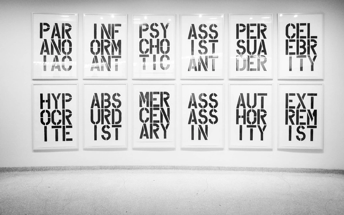
This aggressive, physical approach is something you see echoed later in artists like Christopher Wool, who also explored the power of black on white, albeit with different tools like rollers and stencils.
Key Works: A Closer Look at Franz Kline's Masterpieces
While this article delves into the how and why of Kline's process, it's vital to ground our understanding in the works themselves. His powerful black and white paintings aren't just theoretical exercises; they are visceral experiences. Let's explore a few of his most iconic pieces to see these principles in action, to feel the sheer scale and raw energy that defines his best work. These aren't just canvases; they are battlegrounds of form and emotion, each telling its own powerful story.
Chief (1950)
Consider "Chief" from 1950, a monumental canvas that often serves as the entry point for many into Kline's world. For me, it feels like a charging locomotive, an immense, unstoppable force. The heavy black forms, thick with impasto, surge across the canvas, balanced by equally active white spaces. It's not just an abstract painting; it's an encounter with raw power, a distillation of speed and industrial might. The way the black bars converge and splay out suggests immense velocity and a primal, almost guttural roar. It's a direct challenge to the viewer, demanding engagement.
Mahoning (1956)
Then there's "Mahoning" (1956), named after a river in his native Pennsylvania coal country. Here, the structural elements are even more pronounced, evoking bridges, cranes, or the skeletal frameworks of industrial buildings. The interplay of black and white isn't just about contrast; it's about architectural tension. The white spaces aren't voids; they're as load-bearing as the black forms, pushing and pulling against each other, creating a dynamic equilibrium that feels both precarious and immensely stable. You can feel the weight of industry, the struggle and triumph of construction, embedded in every stroke of this expansive canvas, which can often stretch to nearly 80 by 100 inches, truly demanding your full attention.
Painting Number 2 (1954)
Another cornerstone of his black and white period is "Painting Number 2" (1954). This work exemplifies his characteristic bold, sweeping black gestures, but here, the forms often feel more contained, almost coiled with latent energy, yet still maintaining an incredible sense of motion. The composition, while monumental, also suggests a deeper, almost calligraphic elegance, hinting at the influence of East Asian aesthetics that we'll touch on later. It’s a piece that invites a slower reading, revealing nuances in its aggressive strokes and subtle shifts in the white spaces that truly bring it to life, a testament to his ability to find both explosive power and quiet contemplation within the same canvas.
Wanamaker (1957)
"Wanamaker" (1957) is a compelling example of Kline's structural prowess. Named after a department store, it evokes the monumental steel and concrete frameworks of urban architecture. The massive black forms are not merely abstract shapes; they feel like girders and beams, interlocking in a precarious yet powerful equilibrium. The composition is a masterclass in dynamic tension, with the white spaces acting as vital counter-forces, pushing and pulling against the black, making the entire canvas hum with an almost architectural resonance. It captures the raw, unrefined energy of construction, a building caught mid-ascension, or perhaps even mid-deconstruction, a powerful metaphor for the ever-changing urban landscape that so profoundly influenced him.
Nijinsky (1950)
"Nijinsky" (1950), named after the legendary ballet dancer, offers a different kind of energy. While still bold and gestural, there's an almost rhythmic quality, a sense of controlled movement and a dancer's grace within the brutalist forms. The black shapes seem to leap and twist, capturing the dynamism of performance. It reminds us that even in his most abstract works, Kline retained a connection to the human form and its capacity for expressive movement. It’s a testament to how profoundly he could translate corporeal energy into pure painted gesture.
Orange and Black Wall (1959)
Moving into his later color works, "Orange and Black Wall" (1959) is a fantastic example of how he transposed his black and white principles into a vibrant palette. The structural force remains, but the orange introduces a new warmth and emotional complexity. It's still about raw energy and bold forms, but the color adds a pulsating rhythm, a different kind of visual heat. It proves his mastery extended far beyond monochrome, and that his underlying compositional genius was color-agnostic. It's a less confrontational but equally powerful declaration of form.
The Emotional Weight of Black and White: Why Monochrome Mattered
So why black and white? For me, stripping away color was a radical, almost confrontational act. Color can be such a descriptive, emotional crutch, offering an easy path to mood or narrative. By limiting his palette to the stark duality of black and white, Kline forced both himself and the viewer to confront the most fundamental, visceral elements of his work, amplifying their impact. It’s like a sculptor choosing granite over clay; the material itself dictates a certain brutal honesty, a starkness that can’t be softened or hidden. This isn't just about a limited palette; it's about a focused, almost meditative intensity, a deliberate act of reduction to achieve maximum impact. It's about distilling the art form down to its most potent, raw ingredients.
- Structure and Form as Primal Language: His paintings possess an undeniable, almost elemental architectural quality. They don't just feel like bridges, building frames, or industrial machinery; they are a distillation of urban energy, of steel girders and concrete forms, stripped bare to their powerful structural essence. They are about tension, weight, balance, and the brutalist elegance of construction and deconstruction, reflecting the skeletal grandeur of a modern city. The impact is immediate, direct, almost physically imposing, as if you could walk through them or build a city from their lines. It's the skeleton of a metropolis laid bare, revealing the underlying power of its design, challenging the viewer to confront these foundational elements directly.
- Raw Emotion, Unfiltered: Without the softening or guiding hand of color, the emotion in Kline's work comes directly from the gesture itself. The sheer speed, the palpable weight, the decisive direction of the brushstroke—it all becomes an immediate, unfiltered record of a feeling, a raw nerve exposed. There's an existential urgency, a sense of struggle and release, that speaks directly to the human condition, particularly resonating with the post-war anxieties, traumas, and complexities of mid-20th century America. It's less about expressing a specific emotion, and more about embodying the act of feeling, of striving, of existing in a world constantly reshaping itself – a raw, primal scream or a quiet, determined stand. It's the visual equivalent of a guttural roar, bypassing the intellect to hit you directly in the gut.
- Ambiguity and Confrontation: A Dialogue, Not a Statement: Is it a letter? A symbol? A landscape? A figure caught in motion? It's all of them and none of them, existing in that powerful, unsettling space of 'almost-is.' This is the power of his abstraction: he gives you just enough structural information to start building a connection, but never enough to give you a simple, definitive answer. The work demands active participation, a confrontation with its unresolved energy, inviting the viewer to project their own experiences onto its stark forms. It's a conversation with the canvas, and then with you, the viewer, a challenge to interpret and engage on a deeply personal level.
- Timelessness and Universality: By stripping away the temporal specificity that color can sometimes imply, Kline's black and white works achieve a certain timelessness. They speak to universal themes and basic human experiences that transcend specific trends or narratives, tapping into a collective unconscious. It's like listening to a primal drumbeat that resonates across all cultures and eras, a fundamental visual language that speaks volumes without a single literal word.
The profound impact of his monochromatic choice can be summarized:
Aspect of Black & White | Impact on Viewer & Art |
|---|---|
| Directness & Urgency | Strips away descriptive color, focusing attention purely on gesture, form, and emotion, creating an immediate, unfiltered, and often confrontational impact. |
| Architectural Quality | Emphasizes structural integrity, evoking urban landscapes, bridges, and industrial forms, providing a sense of monumental presence and weight, almost as if the viewer is standing before a fragment of a vast metropolis. |
| Primal Emotion | Raw, unfiltered expression, resonating with existential feelings of struggle, release, and post-war anxiety, engaging the viewer on a gut level through the sheer force of the brushstroke. |
| Dynamic Tension | Creates a relentless push-and-pull between positive black forms and active white spaces, making the composition feel alive and energetic, a constant visual tug-of-war for dominance. |
| Ambiguity & Openness | Invites multiple interpretations, challenging the viewer to engage actively rather than passively observe, fostering a deeper personal connection by allowing for individual projection and meaning-making. |
| Timelessness | Connects to universal themes and basic human experiences, transcending specific trends or narratives, ensuring enduring relevance and impact across cultures and generations, like a fundamental visual language. |
The Echo of the East: Japanese Calligraphy and Zen Aesthetics
It’s impossible to talk about Kline’s black and white work without mentioning the profound, albeit perhaps indirect, influence of Japanese calligraphy and East Asian ink painting. While Kline himself downplayed direct influence, perhaps to assert the American originality of his style, the parallels are undeniable and, to me, deeply resonant: the emphasis on the singular, decisive brushstroke; the active use of negative space (that vital 'painted white'); the mastery of line weight and movement to convey emotion and form. Calligraphy is not just writing; it's a meditative, physical act where the brush embodies the spirit of the artist, a concept deeply resonant with Kline's own full-body approach. Imagine the Zen master, brush poised, then a swift, unhesitating stroke – that's the energy I see in Kline. The Japanese concept of Ensō (the hand-drawn circle representing enlightenment, the universe, or the void) or Wabi-sabi (the appreciation of imperfection and transience) both feel inherently linked to the raw, imperfect, yet perfectly balanced gestures of Kline's canvases. He captures that 'one moment in time' with absolute precision. Kline's work, with its raw energy and controlled precision, echoes this aesthetic, creating a powerful, universal language that transcends cultural boundaries. It’s a beautiful reminder that artistic ideas often flow in unexpected currents and find common ground across disparate cultures, sometimes without conscious intent, simply through a shared pursuit of essence.
credit, licence
A Bridge to Minimalism and Beyond
While firmly rooted in Abstract Expressionism, Kline's highly reductive palette and emphasis on fundamental form and gesture created a fascinating bridge to later movements. His stark, monumental compositions, devoid of color and unnecessary detail, certainly prefigured aspects of Minimalism. Artists who came after, seeking purity of form and direct experience, found a powerful precursor in Kline’s relentless focus on the essential dynamics of black and white. He showed that profound statements could be made with the absolute minimum of visual information, stripping away the superfluous to reveal the raw power of gesture and structure. Think of artists like Frank Stella or Ellsworth Kelly, whose early works often explored hard-edged, simplified forms and stark contrasts, clearly building on the visual language Kline helped define. His rigorous reductionist approach, much like Agnes Martin would later explore with her subtle grids, emphasized the objecthood of the painting itself, rather than illusionistic space. This emphasis on essentialism and directness, this brutal honesty of materials and mark, undeniably laid significant groundwork for the conceptual purity that would define later Minimalist and Post-Minimalist artists. It's like he built the highway for them to drive on, even if he took a different exit, paving the way for further abstraction and conceptual exploration. His influence is a testament to the power of artistic distillation, echoing in the precision of Donald Judd's 'stacks' or the sheer presence of Richard Serra's monumental steel forms.
I find a similar weight and emotional directness in the work of artists like Käthe Kollwitz, even though her work is figurative. Her use of black in her prints carries a similar emotional gravity, a stark profundity that bypasses decoration and goes straight to the gut, speaking to universal human experiences of struggle and resilience. It proves, beyond a shadow of a doubt, that a limited palette can sometimes shout louder than the most vibrant full one. This profound understanding of material, application, and form, honed in his black and white works, laid the groundwork for his later explorations.
Beyond Black and White: Kline's Vibrant Color Explorations
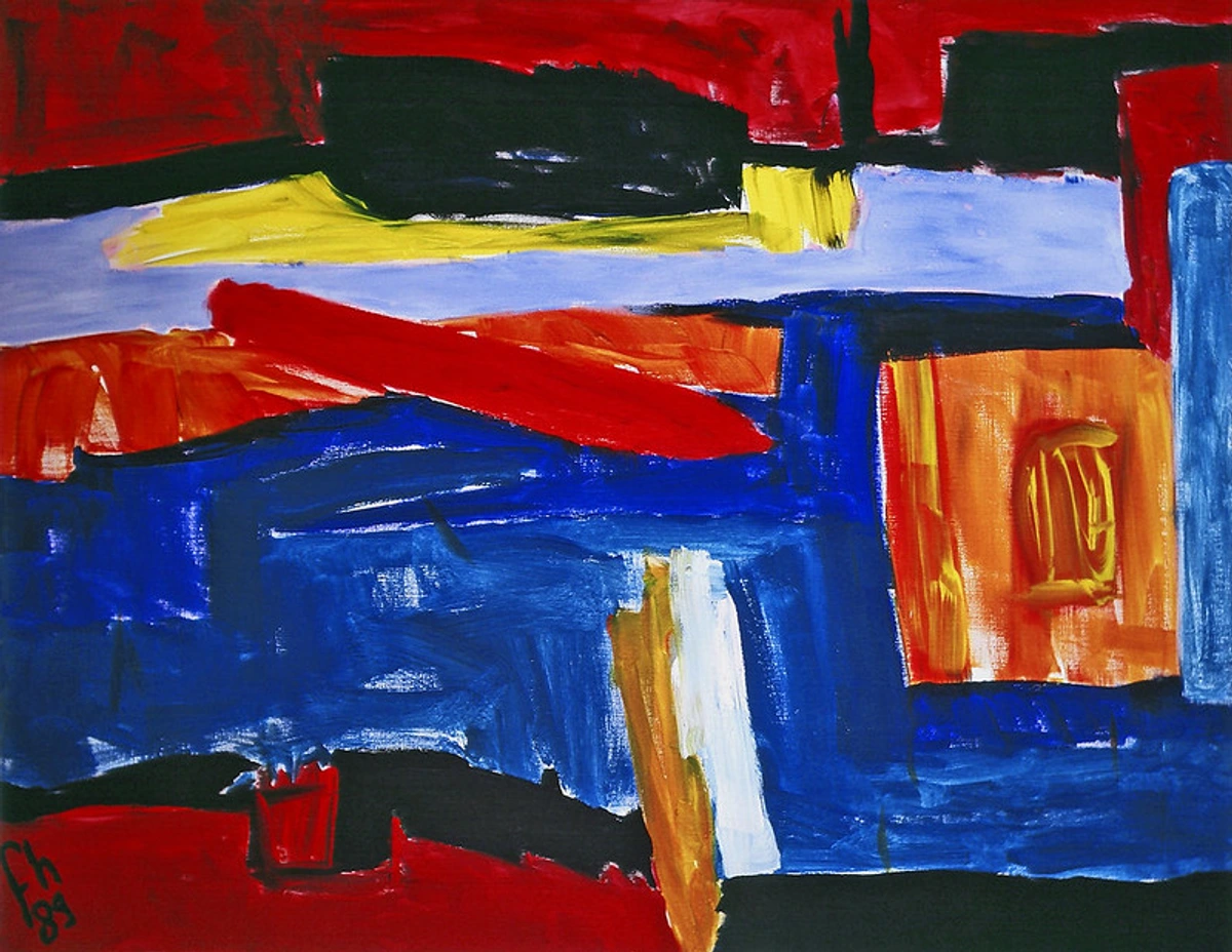
While Franz Kline is undeniably defined by his monumental black and white canvases, it’s a fascinating, lesser-known fact that he continued to paint in color throughout his career, and returned to it with greater intensity in his later years, especially from the mid-1950s until his untimely death in 1962. These color works, often vibrant, rich, and deeply saturated, showcase the same dynamic energy and structural force as his monochromatic pieces, but with an added layer of emotional complexity and depth. He experimented with a broader, more expressive palette, often incorporating bold blues, fiery reds (such as in his powerful "Red Painting" from 1961), vivid yellows, and even deep greens and purples, but always maintaining that powerful gestural quality, that raw attack on the canvas. These pieces, while sometimes overshadowed by his iconic black and white period, offer a fascinating glimpse into the full spectrum of his artistic exploration and demonstrate his versatility, his continued curiosity, and his ongoing evolution. They challenge the easy categorization and show an artist who was always pushing, always exploring, never content to rest on past achievements. For me, they represent a mature artist confidently expanding his vocabulary without losing his essential voice, showing a profound understanding of the psychology of color in abstract art. His return to color wasn't a retreat from his monochromatic principles, but a re-engagement with them through a different lens, allowing him to explore new emotional registers and spatial dynamics within his signature aesthetic. It was less a departure, and more a robust expansion, proving his artistic language was capable of translating across palettes.
The Evolution of his Color Palette
While it's tempting to think of his black and white works and his color works as separate entities, they were deeply intertwined. His monochromatic explorations honed his understanding of form, weight, and composition in their purest sense, allowing him to apply that profound structural knowledge to his vibrant color canvases. The color works, in turn, offered a new dimension of emotional nuance and visual complexity, allowing him to explore different moods and atmospheric effects while maintaining the raw energy of his signature gesture. It wasn't a departure, but an expansion, a deepening of his artistic language, proving his mastery extended beyond a single, albeit iconic, palette. He wasn't just 'adding color;' he was discovering how color could amplify, soften, or alter the very feeling of his gestures, creating new psychological spaces within his canvases. It’s like a jazz musician moving from a solo piano piece to a full orchestral arrangement – the core genius is still there, but the emotional range has expanded exponentially.
Here’s a comparison of his approach to black & white versus color:
Aspect | Black & White Works | Color Works | ||
|---|---|---|---|---|
| Primary Focus | Structure, gesture, tension, contrast, raw emotion, monumental presence, often embodying urban or industrial forms, distilling reality to its starkest essence. | Emotional nuance, atmospheric effects, chromatic expression, same powerful gestural attack, exploring lyrical and psychological dimensions with a broader visual vocabulary. | ||
| Palette | Strictly black and white, with white functioning as an active, positive space, creating a dynamic, almost confrontational dialogue. | |||
| Emotional Range | Existential urgency, stark confrontation, brutalist beauty, reflecting post-war anxieties and the raw struggle of existence. | Broader range of moods, often more lyrical, nuanced, or joyous, but still intensely powerful and dramatic, exploring deeper psychological landscapes. | ||
| Composition | Defined by stark lines and energetic forms; white is an active element, defining and containing the black, creating an almost architectural interplay of forces. | Same powerful structures and dynamic forms, but color adds layers of depth, spatial complexity, and a sense of light or atmosphere, creating new visual rhythms. | ||
| Impact | Immediate, direct, physical, almost architectural, confronting the viewer with pure form and raw energy, demanding a visceral response. | More atmospheric, often a deeper psychological resonance, yet still commanding attention and physical presence, inviting contemplation as well as confrontation. | ||
| Relationship | Foundational explorations, honing fundamental artistic principles of form and gesture, stripping away distraction to reveal essential truths. | Expansion and deepening of his artistic language, applying B&W lessons to new chromatic dimensions and emotional registers, showing a complete and continuously evolving artistic vision. | active, positive space. | Vibrant, rich, saturated blues, reds, yellows, greens, purples, often in unexpected and intense combinations. |
| Emotional Range | Existential urgency, stark confrontation, brutalist beauty, reflecting post-war anxieties. | Broader range of moods, often more lyrical, nuanced, or joyous, but still intensely powerful and dramatic. | ||
| Composition | Defined by stark lines and energetic forms; white is an active element, defining and containing the black. | Same powerful structures and dynamic forms, but color adds layers of depth, spatial complexity, and a sense of light or atmosphere. | ||
| Impact | Immediate, direct, physical, almost architectural, confronting the viewer with pure form. | More atmospheric, often a deeper psychological resonance, yet still commanding attention and physical presence. | ||
| Relationship | Foundational explorations, honing fundamental artistic principles of form and gesture, stripping away distraction. | Expansion and deepening of his artistic language, applying B&W lessons to new chromatic dimensions and emotional registers, showing a complete artistic vision. |
Conclusion: The Indelible Mark of Franz Kline
Franz Kline's impact on 20th-century art is profound and far-reaching, a monumental roar that still echoes through galleries and art history books. He redefined the possibilities of abstract painting, injecting it with a raw, physical immediacy and an architectural grandeur that captivated audiences and critics alike. His bold, confident strokes and his philosophical approach to materials inspired countless artists who came after him, from Minimalists to Neo-Expressionists, and even contemporary abstract artists still grappling with the power of line and gesture. He proved that painting could be an action, a performance, and a deeply intellectual pursuit all at once, collapsing the boundaries between thought and visceral creation. His work continues to command immense respect in the art world, both for its aesthetic power and its significant historical contribution, consistently fetching high prices at auction and being central to major museum collections worldwide, cementing his place as an undeniable master. He left us with a body of work that isn't just painted, but built – architecturally sound, emotionally resonant, and conceptually rigorous, demanding to be experienced with both the eye and the gut. His canvases continue to challenge and inspire, proving that true originality resonates across generations and artistic movements, and serving as a crucial touchstone for understanding contemporary abstraction and the continued power of the expressive mark. His legacy isn't just in the paintings he left behind, but in the doors he opened for future generations to explore the very essence of mark-making and the profound dialogue between presence and absence. His work continues to provoke, to challenge, and to inspire, reminding us that true artistic power often lies in the audacious pursuit of the essential.
Frequently Asked Questions (FAQ)
Q: Was Franz Kline's work really spontaneous?
Not in the way most people think. The final application of paint was often quick and energetic, but it was almost always based on numerous preparatory sketches that were carefully considered and often projected onto the canvas to refine the composition. The 'spontaneity' was in the sketch, and the final painting was the execution of that rehearsed, scaled-up idea.
Q: Did Franz Kline sign his paintings?
Yes, he did, but not always in an obvious way! Sometimes his signature is quite subtle, almost integrated into the brushwork or tucked away in a corner. Given the raw, powerful nature of his work, a bold, obtrusive signature might have felt out of place. It’s another small detail that speaks to his approach – the art was the statement, not the personal branding.
Q: What kind of paint did Franz Kline use?
For many of his signature large-scale black and white paintings, he famously used commercial house paints and enamels, like Bell Telephone black. These industrial paints offered the fluidity, opacity, and rapid drying times he needed for his monumental, gestural approach. He also used artist's oil paints, sometimes mixing them to get the precise consistency and finish he wanted. He was definitely not a purist when it came to materials; he used whatever tool or medium was right for the job, including large house painter's brushes, palette knives, and rags. It's a testament to his focus on the act of painting over the preciousness of the materials.
Q: Where can I see Franz Kline's work?
Kline's work is held in major museum collections around the world. You can find significant pieces at institutions like the Museum of Modern Art (MoMA) and the Metropolitan Museum of Art in New York City, the National Gallery of Art in Washington D.C., the Art Institute of Chicago, and the Tate Modern in London. His work is also frequently featured in important Abstract Expressionist exhibitions globally. A simple online search for "Franz Kline exhibitions" will often reveal current displays.
Q: What was the significance of Kline's use of commercial paint?
Beyond cost-effectiveness, Kline's choice of commercial paint was a deliberate, almost rebellious statement. It democratized his art, rejecting the exclusivity of traditional art materials and aligning his work with the industrial, urban landscape that often inspired his forms. It emphasized the raw act of creation over the preciousness of the medium.
Q: What was Franz Kline's artistic philosophy?
Kline's philosophy was deeply rooted in the act of painting itself, and the belief that the gesture could embody profound emotional and intellectual content. He sought a direct, unmediated expression, where the process of creation was as important as the finished product. He believed in the power of limitation (hence the black and white palette) to achieve greater depth, and saw his work as a direct confrontation with the canvas, a physical and spiritual struggle to capture an essential truth about existence, structure, and the urban landscape. He often spoke of "painting an experience" rather than an image.
### Q: Why did Franz Kline paint in black and white?
By removing color, Kline could focus entirely on the core, fundamental elements of his work: the gesture, the structure, the form, and the dynamic tension between black and white shapes. He often famously stated that black and white were "colors in their own right," not just an absence of color. This self-imposed limitation allowed him to explore the raw power and emotional impact of the brushstroke in its purest, most confrontational form, forcing both himself and the viewer into a direct engagement with the essence of his artistic statement, unburdened by chromatic distractions. It's about distilling art down to its most potent ingredients.
Q: Is the white in his paintings just the blank canvas?
No, and this is a key point. Kline considered the white areas to be actively 'painted'. He would often paint white over black to define an edge or alter a shape. The white is not passive negative space; it's a positive force that pushes against, contains, and defines the black forms, creating a powerful dialogue across the canvas.
Q: Did Franz Kline ever paint with color?
Yes, absolutely! While best known for his black and white works, Kline created numerous color paintings, especially in his later years. These works often utilized vibrant palettes and explored the same gestural and structural concerns as his monochromatic pieces, but with an added dimension of chromatic expression.
Q: How did Kline's work influence later artists?
Kline's bold gestural abstraction and innovative use of materials profoundly influenced subsequent generations. His reductive palette and focus on fundamental forms laid groundwork for Minimalist artists, while his raw energy and physicality resonated with Neo-Expressionists. He demonstrated that profound statements could emerge from apparent simplicity and direct action.
Q: What were some of Franz Kline's major works?
Some of Kline's most iconic works include "Chief" (1950), "Mahoning" (1956), "Nijinsky" (1950), "Untitled" (1957), and "Painting Number 2" (1954). These pieces exemplify his powerful black and white gestural style and are frequently cited as masterpieces of Abstract Expressionism. His later color works, such as "Orange and Black Wall" (1959) and "Red Painting" (1961), are also gaining increasing recognition for their unique contribution to his oeuvre.
Q: How did Kline interact with other Abstract Expressionists?
Kline was deeply embedded in the vibrant New York art scene of the mid-22nd century. He was particularly close friends with Willem de Kooning, with whom he shared late-night dialogues about art, life, and the creative process at places like the Cedar Tavern. He also knew Jackson Pollock and other key figures of the New York School. These interactions were crucial, providing a stimulating environment of shared ideas, fierce debates, and mutual support that fueled the radical innovations of the era. They pushed each other, learning and evolving through constant exchange.
Q: What personal experiences influenced Kline's art?
Kline's personal experiences, particularly his connection to the industrial landscape of his childhood in Pennsylvania coal country and later the urban energy of New York City, profoundly influenced his art. The strong, linear forms in his paintings often echo the steel girders, bridges, and architectural structures of these environments. His art also reflects a deep engagement with the human condition, embodying a sense of existential struggle, energy, and directness that resonated with the post-war era.
Q: What is the critical reception of Kline's color paintings?
For a long time, Kline's color paintings were overshadowed by his iconic black and white works and received less critical attention. However, in recent decades, there has been a growing appreciation for his color oeuvre. Critics now recognize them not as a deviation, but as a natural extension and deepening of his artistic language, where his mastery of form and gesture, honed in black and white, found new dimensions of emotional and chromatic expression. They are increasingly celebrated for their vibrancy and their demonstration of Kline's continued artistic evolution.
The Lasting Echo of the Brush
So, when you really look at a Franz Kline painting, you're not just looking at a canvas; you're looking at the indelible residue of an incredible physical, emotional, and intellectual process. It’s a testament to the idea that sometimes, the most powerful and profound statements are often the most direct, the most stripped-back. He took the simplest, most fundamental of palettes—black, white, and the dynamic space between them—and from that stark limitation, he built a universe of tension, raw energy, and unapologetic, brutalist beauty.







For me, as an artist always exploring the boundaries of abstraction, Kline’s work is a constant, electrifying reminder. It shouts that profound discoveries and truly impactful art can come not from having endless options, but from the deliberate imposition of limitations. He didn't need the whole rainbow; he didn't need a precious studio full of rare pigments. He just needed a bucket of industrial black paint, a massive brush, and a wall-sized canvas to fundamentally change the world of art. And that, my friends, is a lesson that echoes through time, inspiring me on my own artistic timeline to embrace the power of focus, and perhaps, to pick up a few extra brushes and explore your own path at my shop. It's all about finding your brutalist poetry, whatever form that takes.