
Master Visual Literacy: Your Ultimate Guide to Decoding Our Image-Saturated World
Unlock profound visual literacy with this artist's comprehensive guide. Learn to interpret, analyze, and create visual information, master art elements, navigate misinformation, and find your voice in a visually complex digital age.
Master Visual Literacy: Your Ultimate Guide to Decoding Our Image-Saturated World
Have you ever felt completely overwhelmed by the sheer volume of images we're bombarded with daily? I know I have. Even as an artist who lives and breathes visuals, there are moments where the digital deluge feels less like a river and more like a tsunami. It wasn't until I truly embraced the concept of visual literacy that the noise started to make sense, that I found my way through the torrent. It was like suddenly being handed a sophisticated map for a territory I thought I already knew.
Imagine you've been speaking a language all your life, but never quite grasping its intricate grammar or hidden meanings. Then, suddenly, someone hands you the ultimate guide, unlocking a rich new layer of understanding, revealing the silent conversations happening all around you. That's what visual literacy is: the profound ability to not just look at images, but to interpret, analyze, evaluate, understand the context of, and even create visual information effectively. In our visually saturated world—from social media feeds and news reports to abstract art, data visualizations, and user interfaces—this isn't just a niche skill for art critics. It's the essential lens through which we navigate reality, decode subtle messages, express ourselves powerfully, and protect ourselves from clever deceptions. It is, quite simply, one of the most fundamental literacies for the 21st century.
Table of Contents
- Beyond Just Looking: Unpacking the Core of Visual Literacy
- The Power of Creation: Building Empathy Through Making
- Why Visual Literacy is Your Most Crucial Skill (Spoiler: It's Everywhere)
- Navigating the Digital Deluge: Visual Literacy in the Age of AI
- Visual Pitfalls and Fallacies: When Images Deceive
- The Language of Signs: Semiotics and Iconography
- Typography: More Than Just Words
- UI/UX Design: Guiding the Digital Experience
- Decoding the Visual Language: Elements and Principles of Art and Design
- Principles of Visual Design: How Elements Work Together
- A Deeper Dive into Color: My Personal Palette and Practical Models
- Cultural Nuances in Visual Symbolism
- Understanding How We See: Gestalt Principles of Visual Perception
- A Brief History of Seeing: How Visual Communication Evolved
- Practical Steps to Sharpen Your Visual Acuity
- Slow Down and Observe: The Art of Deliberate Looking
- Ask Questions: Become a Visual Detective
- Consider Context: Beyond the Frame
- Understanding Visual Metaphors and Allegories
- Cultivating a Visual Journal
- Engage in Visual Comparison Exercises
- Deconstruct Everyday Objects
- Mastering Maps: The Visual Language of Geography
- Decoding Data Visualizations: Spotting Misleading Information
- Create Your Own Visuals: From Viewer to Maker
- My Journey with Visuals: The Beating Heart of My Art
- Frequently Asked Questions about Visual Literacy
- What's the difference between visual literacy and art appreciation?
- Is visual literacy an innate skill or can it be learned?
- How does technology impact visual literacy?
- Can visual literacy help with creativity?
- Why is symbolism important in visual literacy?
- How can visual literacy help me in my career?
- Are there specific tools or techniques for improving visual analysis?
- How does visual literacy compare to other forms of literacy?
- What about visual literacy and NFTs/blockchain art?
- How does visual literacy foster empathy?
- How does visual literacy intersect with accessibility?
- How important is visual literacy education in schools?
- Conclusion: See the World with New Eyes, and Create Your Own
Beyond Just Looking: Unpacking the Core of Visual Literacy
We all look. We scroll past countless images on our phones, glance at billboards, or wander through a gallery (and if you're ever in the Netherlands, I invite you to my own space in my art studio in Den Bosch). But looking, to me, is passive. It’s superficial, a mere acknowledgement. Seeing, on the other hand, is active. It's engaging your mind, asking questions, and meticulously pulling apart the visual tapestry to understand its threads, its intentions. It's the profound difference between hearing background noise and truly listening to a symphony, or reading words without grasping the grammar that gives them nuanced meaning. As an artist, I learned very early that true vision isn't just about what your eyes transmit; it's about your mind’s relentless, active participation. I think of it as a crucial toolkit for your eyes and brain, each tool building on the last:

- Interpretation: What is this image truly trying to tell me? What emotions does it evoke, and why? What's the artist's (or designer's) intent, both conscious and subconscious? Is there a subtle narrative, or a hidden suggestion? For example, the elongated figures and sharp angles in an Expressionist painting aren't just shapes; they interpret a profound feeling of anxiety or distortion. This goes beyond the surface to grasp the underlying message, the feeling it aims to transmit.
- Analysis: How is it composed? What elements are being used (line, color, shape, form, texture, space, value), and how do they work together to create meaning or impact? I often ask myself how an Impressionist painter uses short, broken brushstrokes and vibrant colors to analyze and capture the fleeting quality of light, or how a photographer uses leading lines to guide your eye precisely through a scene. It's breaking down the grammar of the visual language.
- Evaluation: Is it effective in its communication? Is it truthful, or is it cunningly manipulative? Does it achieve its purpose, whether aesthetic, informational, or persuasive? This component is absolutely vital in a world rife with cleverly crafted visuals designed to sway opinion, from advertising to political propaganda. It's your critical shield.
- Creation: Can I communicate my own ideas visually? This is where my journey as an artist truly comes into play, but it’s a skill anyone can develop, even if it's just sketching a simple diagram, carefully arranging a room, or choosing the right emoji to convey a precise tone. The very act of making helps you understand the maker's intent, fostering a powerful visual empathy.
- Contextualization: This is often the forgotten piece. What is the historical, cultural, social, and personal backdrop against which this image exists? Who created it, when, and for whom? Understanding context prevents misinterpretation and reveals deeper layers of meaning. It’s the difference between seeing a classical sculpture and understanding its original purpose within ancient Roman society. Without context, an image is just a pretty picture; with it, it becomes a window into a different time, culture, or mind.
The Power of Creation: Building Empathy Through Making
When you move from merely consuming visuals to actively creating them, even in the simplest forms, something profound shifts within you. It's like my own experience: I didn't truly grasp the complexity of abstract art, the subtle interplay of forces, until I started grappling with the canvas myself, trying to bring my inner world to life. You begin to viscerally understand the decisions, the struggles, and the intent behind every image you encounter. Whether you're trying your hand at digital art, meticulously composing a photograph, sketching out a graphic design concept, or even just practicing visual note-taking (sketchnoting), the act of making inherently builds visual empathy. You wrestle with composition, wrestle with color, wrestle with conveying a message without words. This struggle, this intimate dance with creation, makes you a far more discerning and insightful viewer of others' work.
Why Visual Literacy is Your Most Crucial Skill (Spoiler: It's Everywhere)
Honestly, I used to think of visual literacy as something exclusive to art critics or cloistered academics. But then I looked around, really looked, and a stark realization hit me: our world isn't just text anymore; it's a vibrant, sometimes overwhelming, visual feast. Social media feeds, slick advertising campaigns, crucial data visualizations in reports, news headlines, even the subtle design of an app's user interface – it’s all powerful visual communication, relentlessly vying for our attention and understanding. John Berger, the influential art critic, famously said, "Seeing comes before words." He posited that the way we see the world fundamentally influences how we understand it, and that images inherently carry profound political and social weight. If we don't actively engage with these visuals, we're simply letting them wash over us, often without truly understanding their impact.
If you're not visually literate, you're essentially walking around with blinders on, or at least with your critical thinking shield dangerously down. Advertisers want to subtly influence you, news outlets might want to sway you (sometimes with misleading imagery), and even well-meaning friends might unknowingly share visuals that distort truth. Developing this skill is about profound empowerment. It's about being able to discern truth from fiction, understand underlying messages, appreciate the incredible beauty and complexity of the visual world, and crucially, protect yourself from manipulation. It’s also about finding your own voice and expressing yourself effectively in a world that increasingly speaks in images. Perhaps that's why I'm so drawn to abstract art myself; it speaks a language beyond mere words, demanding active, engaged interpretation, inviting viewers to engage their own visual literacy to complete the conversation.

Navigating the Digital Deluge: Visual Literacy in the Age of AI
We are swimming in images. The sheer volume of visual content generated and consumed daily across platforms like TikTok, Instagram, and news aggregators is nothing short of staggering. This digital deluge, while often enriching, also presents profound challenges. Misinformation spreads virally through cleverly crafted memes and doctored images. And let's not forget the unnerving rise of "deepfakes" – synthetic media where a person's likeness is swapped, challenging our very ability to trust what we see. But it goes deeper. We're now contending with AI-generated narratives where algorithms construct visual stories with inherent biases, and algorithmic bias itself can subtly influence the images we see, reinforcing stereotypes or obscuring alternative viewpoints. For example, an AI trained predominantly on Western datasets might generate images that consistently depict certain professions or roles with a specific gender or ethnicity, even when prompted generally. Learning to detect manipulation isn't just about spotting an obvious deepfake; it's about looking for subtle visual artifacts (like inconsistencies in lighting or perspective), unusual blurs, or even using reverse image searches to trace an image's origin. Understanding the deliberate choices in digital layouts, the emotional triggers embedded in social media graphics, and the subtle biases woven into data visualizations isn't just a niche skill anymore; it's a fundamental requirement for informed citizenship, personal well-being, and frankly, maintaining a grasp on reality in a hyper-visual world.
Visual Pitfalls and Fallacies: When Images Deceive
Beyond outright manipulation like deepfakes, visual information can subtly, almost invisibly, lead us astray. It's a game of smoke and mirrors, and a visually literate eye is your best defense. I've personally seen how these tactics are used constantly, from art marketing to political campaigns. Recognizing these common fallacies is a huge leap towards critical visual literacy:
- Confirmation Bias: We've all done it. We interpret images in a way that confirms what we already believe. Think of a controversial news photo: those who agree with the headline will "see" evidence supporting their view, while those who disagree will pinpoint flaws, often overlooking contradictory visual cues. It’s human nature, but visual literacy helps us challenge that instinct, pushing us to seek objective understanding.
- Pathos over Logos: This is rampant in advertising and politics. Imagery designed to evoke strong emotions – fear, nostalgia, joy – often bypasses logical reasoning entirely. Imagine a charity ad with a tear-jerking image of a malnourished child; it’s designed to make you feel immediate pity rather than think critically about the charity's long-term impact or financial transparency. The emotional punch can entirely overshadow factual consideration.
- False Authority: This tactic uses visual cues to lend credibility where none exists. Show a 'doctor' in a pristine lab coat endorsing a questionable health product on a slick website, or a 'celebrity expert' promoting a risky financial scheme. A military general in uniform endorsing a political candidate, or a stern-looking scientist in a lab setting promoting a questionable supplement. The visual of authority is meant to shut down your critical faculties and make you trust without questioning.
- Slippery Slope Fallacy: This is when a sequence of alarming images implies inevitable negative outcomes from a seemingly minor first step. A series of photos showing a seemingly harmless trend (e.g., kids spending more time on screens) escalating into a bleak future of social isolation and societal collapse is a classic visual slippery slope. The implication is: if X happens, then Y will certainly happen, visually presenting a chain reaction that isn't logically guaranteed.
- Cherry-Picking Data: In infographics and charts, this means presenting only the data that supports a particular argument, while omitting crucial context. For instance, a bar chart showing a dramatic "increase in sales" might hide the fact that the y-axis starts at 90% of the maximum value, making a tiny gain look like an enormous leap. A visually literate eye immediately checks the axes and overall scale, understanding that a truncated y-axis can dramatically exaggerate differences.
- Framing Effects: How an image is cropped, angled, or what's included (or excluded) in the frame dramatically alters its interpretation. A wide shot of a protest might show a peaceful crowd, while a tight crop on a single confrontational individual could frame the entire event as violent. The perspective (high-angle, low-angle) can also make subjects appear powerful or vulnerable, subtly shifting your perception without you even realizing it.
Understanding how visual elements are strategically used to trigger these responses is absolutely crucial for developing a critical eye and protecting yourself from being swayed without conscious thought. It's about seeing beyond the immediate emotional punch to the underlying agenda, recognizing that what's not shown can be just as important as what is.
The Language of Signs: Semiotics and Iconography
As an artist, I'm profoundly aware that every line, shape, and color I put on a canvas is a sign, laden with potential meaning. This is the heart of semiotics: the study of signs and symbols and their interpretation. For me, it's about dissecting how a simple visual cue communicates complex ideas, even without words. It's the unspoken language of the visual world.
Semiotics, as a field, often breaks down signs into a few key types, originally popularized by thinkers like Charles Sanders Peirce:
- An icon resembles what it represents. Think of a picture of a coffee cup on a cafe sign, a restroom sign with a stick figure, or a computer desktop icon for an application. They communicate directly through resemblance.
- An index has a direct, causal, or existential link to what it represents. Smoke indicates fire, a footprint indicates someone walked there, a spilled ink stain on a document indexes a hasty action, or an arrow pointing to a direction is an indexical sign. They point to something else.
- A symbol has an arbitrary or culturally agreed-upon meaning. These meanings are learned through culture and convention. Examples include a red octagon meaning 'stop', the Christian cross, the Islamic crescent moon, national flags, or even the 'thumbs up' emoji (which means approval in many Western cultures but can be offensive elsewhere). Their meaning is not inherent in their form but assigned by collective understanding.
Understanding these distinctions helps you decipher the subtle layers of meaning in everything from traffic signs to corporate logos. A related, specialized area is iconography, which delves into the traditional or conventional images, motifs, and symbols used in art and culture, often tied to specific historical, religious, or mythological contexts. When you see a halo in a Renaissance painting, your visual literacy, enhanced by an understanding of iconography, immediately tells you this represents sanctity. But iconography isn't just about ancient art; think about the consistent use of a 'shopping cart' icon in e-commerce (modern iconography) or a company's specific brand colors and shapes. Without understanding these underlying visual languages, much of the world around us remains a beautiful, yet silent, mystery, and you're missing out on a huge part of the conversation.
Typography: More Than Just Words
Even the way words look contributes profoundly to visual literacy. Typography – the art and technique of arranging type to make written language legible, readable, and appealing – is an incredibly powerful visual tool, often overlooked. The choice of font, its size, the spacing between letters (kerning), the spacing between lines (leading), and its overall arrangement on a page all convey distinct meaning and set a tone. Poor kerning can make words difficult to read, while careful leading can create an inviting visual flow.
Font Type | Characteristics | Common Associations | Example Brands/Uses |
|---|---|---|---|
| Serif | Small decorative strokes (feet) at letter ends | Tradition, formality, trustworthiness, readability for long text | The New York Times, academic papers, classic books |
| Sans-serif | Clean, without decorative strokes | Modernity, cleanliness, directness, minimalist, digital-friendly | Google, Apple, Wired Magazine, web content |
| Script | Mimics handwriting, fluid, elegant | Elegance, personal touch, creativity, luxury, invitations | Wedding invitations, high-end boutiques, elegant branding |
| Display | Often ornate, highly stylized, bold, unique | Impact, specific themes, headlines, artistic flair | Movie posters, album covers, unique brand logos |
A headline in a bold, assertive sans-serif font screams urgency, while one in an elegant, flowing script whispers sophistication. The weight and color of a font can signal importance or subtlety. I often think about how a jagged, fragmented typeface might visually echo a feeling of chaos or disruption, becoming a visual metaphor in itself. It's a subtle but pervasive aspect of visual communication that often goes unnoticed until you start actively seeing it. For me, choosing the right text for an exhibition label is as crucial as choosing the right frame for a painting; it sets the tone and guides the viewer's entire expectation. It’s all part of the silent conversation, communicating everything from professionalism to playfulness without a single word of explanation.

UI/UX Design: Guiding the Digital Experience
Visual literacy extends powerfully into the realm of User Interface (UI) and User Experience (UX) design. Every app, every website, every digital tool you interact with is a carefully constructed visual environment. UI/UX designers leverage elements like color, shape, typography, and space to create intuitive, efficient, and enjoyable digital journeys. Think about it: a red exclamation mark immediately signals an error or warning (semiotics at play!), while a green checkmark confirms success. The consistent placement of a menu icon (often three horizontal lines, a 'hamburger' icon) or a shopping cart button provides visual cues that guide your actions without a single word of instruction. Visual hierarchy, achieved through size and placement, directs your attention to the most important information first. A visually literate eye understands these subtle directives, recognizing why an interface feels easy or frustrating to use, and how design choices are intentionally communicating functionality and emotion. It's about recognizing the invisible hands guiding your digital interactions.
Decoding the Visual Language: Elements and Principles of Art and Design
Alright, so how do we actually do this? How do we move from just looking to truly seeing? It starts with understanding the building blocks, the grammar of visual language. We're talking about the fundamental elements that artists and designers use to communicate. Think of it like learning the notes and scales before you can compose a symphony, or learning individual words before you can write a poem. And believe me, understanding these has profoundly shaped my approach, allowing me to create what I hope are visually rich and engaging pieces you might even find at my art for sale.
Here’s a quick overview of some key visual elements, what they often convey, and how they help create meaning:
Element | Description | What it can convey | Example in Art/Design |
|---|---|---|---|
| Line | The fundamental mark that guides the eye; a path of a moving point. | Direction, movement (e.g., vertical for stability, diagonal for motion), emotion (e.g., jagged for chaos, flowing for grace), structure, connection. | The bold, dynamic lines in a Cubist painting like Picasso's often fragment reality to convey multiple perspectives and a sense of disruption. Or consider the precise, clean lines of architectural blueprints conveying order and function. Thin lines can evoke delicacy, thick lines strength; a horizontal line can suggest calm, a vertical one aspiration. |
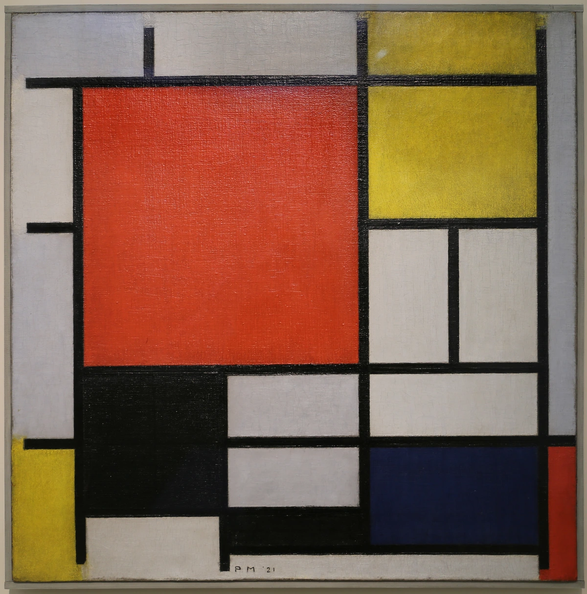
| Shape | A 2D enclosed area defined by lines, color, or value (geometric or organic). | Form, identity, stability (e.g., squares, triangles), fluidity (e.g., organic shapes), order, randomness, tension, harmony. Shapes are the basic units of composition. | The strong geometric shapes in a Mondrian painting emphasize order and balance, creating a sense of serene composition. Think also of the distinct, recognizable silhouettes used in logo design to convey a brand's identity, or how the sharp, angular shapes in a propaganda poster can convey aggression. |
| Color | Hue, saturation, and value; a property of light reflected by an object. | Mood (e.g., warm colors for energy, cool for calm), emotion, symbolism (e.g., red for passion or danger), emphasis, energy, temperature, depth, contrast. A powerful psychological trigger. | Van Gogh's vibrant yellows and blues create intense emotion and energetic movement in his landscapes, communicating a heightened subjective experience. Or the deliberate color choices in branding to evoke trust (blue) or excitement (red). A desaturated palette can evoke nostalgia or sadness, while highly saturated colors feel modern and dynamic. |
| Texture | The perceived surface quality of an object (rough, smooth, soft, hard, bumpy), either actual or implied. | Sensory experience, realism, contrast, comfort, discomfort, age, authenticity, depth. It adds a tactile dimension to visuals. | The impasto technique in a Rembrandt portrait creates a palpable sense of the sitter's skin and clothing texture, adding realism and intimacy. In web design, subtle background textures can add depth and warmth without distraction. Smooth, glossy textures can imply luxury; rough textures, naturalness or age. |
| Form | A 3D object or the illusion of 3D on a 2D surface, possessing volume and mass. | Volume, weight, depth, presence, solidity, mass. Crucially, it defines an object's spatial presence, unlike 2D shape, allowing for the communication of tangible existence and physical reality. | A classical marble sculpture like Antonio Canova's 'Psyche Revived by Cupid's Kiss' masterfully uses form to convey realistic human anatomy and elegant movement. Even a well-rendered digital illustration can achieve a convincing illusion of 3D form, communicating physicality and making objects appear solid. |
| Space | The area around, between, or within objects (positive or negative space). | Depth, distance, isolation, unity, hierarchy, movement, emptiness, fullness. This element helps organize and give meaning to the other elements, creating a sense of dimension or containment. | The vast, empty spaces in a traditional Chinese landscape painting evoke feelings of awe and spiritual contemplation, communicating tranquility and grandeur. Think also of 'white space' (negative space) in graphic design to improve readability and emphasize key information, creating breathing room for the eye. |
| Value | The lightness or darkness of a color or tone, independent of hue; the gradation of light. | Contrast, mood (e.g., high contrast for drama, low for subtlety), drama, depth, emphasis, dimension, atmosphere. It defines forms and creates visual hierarchy, guiding the eye and establishing a scene's lighting. | Caravaggio's dramatic use of chiaroscuro (strong contrasts between light and dark) creates intense emotional impact and focuses the viewer's eye on key figures, communicating tension and narrative. A monochromatic photograph relies entirely on value for its visual power, conveying mood and form through light and shadow, defining edges and volume. |
I delve much deeper into these concepts in understanding the elements of design in art: a comprehensive guide, and I truly encourage you to explore it if you want to sharpen your visual vocabulary. Understanding these basic building blocks is the first step to unlocking the full power of visual analysis.
Principles of Visual Design: How Elements Work Together
Understanding the elements is one thing, but knowing how they are arranged and organized – that's where the true magic happens. These are the principles of visual design, the "rules" of composition, though like any good artist, I often find myself breaking them strategically for impact, because knowing the rules allows you to break them effectively. Rudolf Arnheim, a pioneering psychologist of art, beautifully articulated that visual perception is an active, form-giving process; we, as viewers, actively structure the visual field using these very principles.
Principle | Description | What it can convey | Example in Art/Design |
|---|---|---|---|
| Balance | The distribution of visual weight, creating stability or dynamism. It's about how the elements are arranged to feel right and harmonious. | Stability, dynamism, tension, calm, order, harmony, unease. | Symmetrical balance feels formal and stable, like a perfectly mirrored landscape or a classical portrait with a central figure, communicating order. Asymmetrical balance is more dynamic, where a large object on one side is counterbalanced by several smaller elements on the other, creating subtle tension and visual interest, often seen in my abstract compositions. |
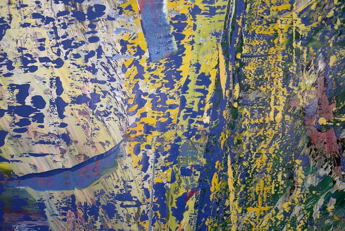
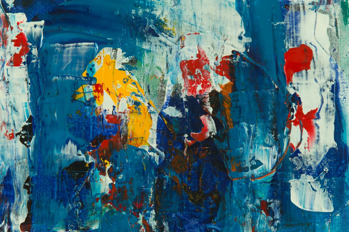
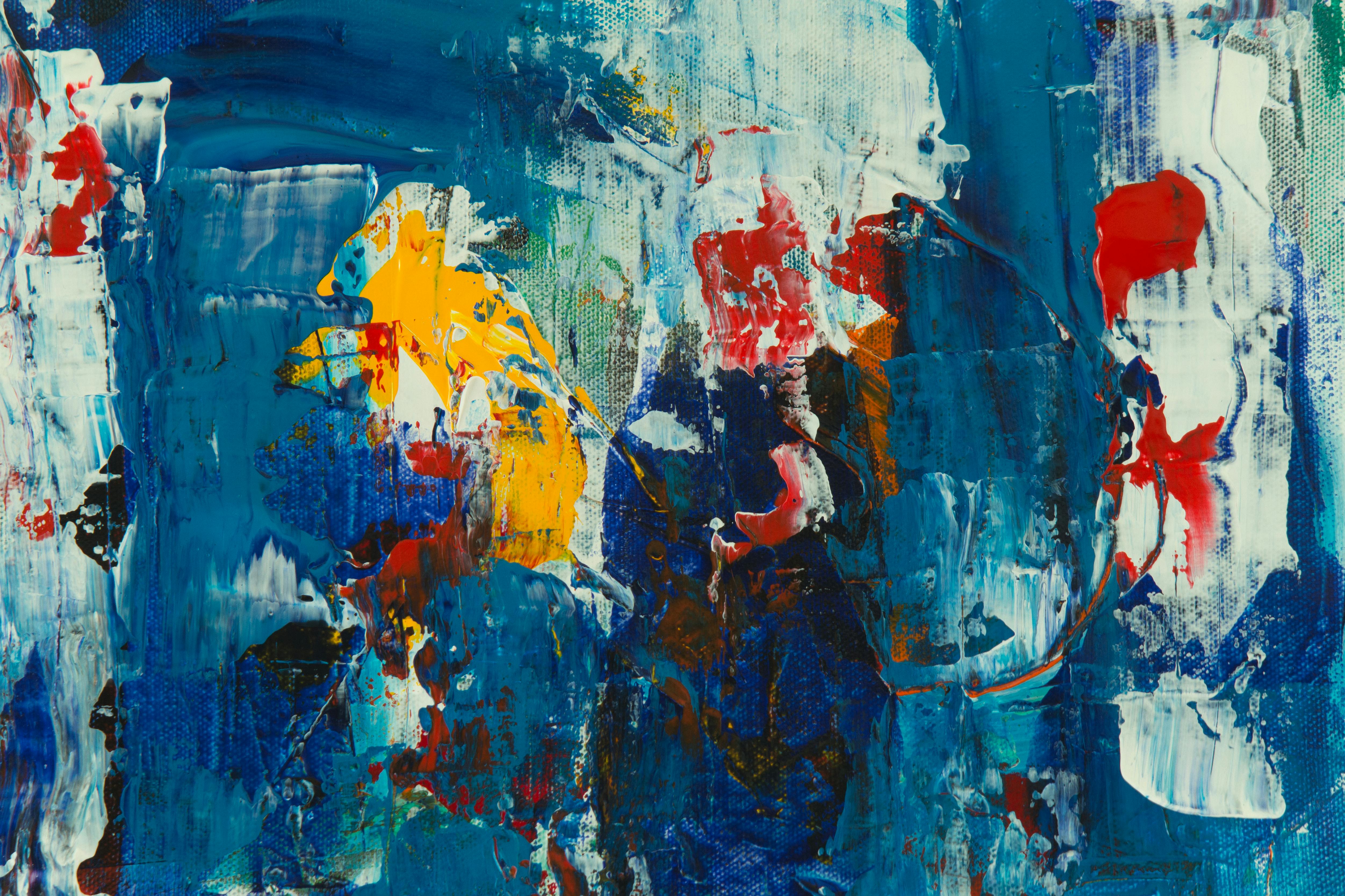
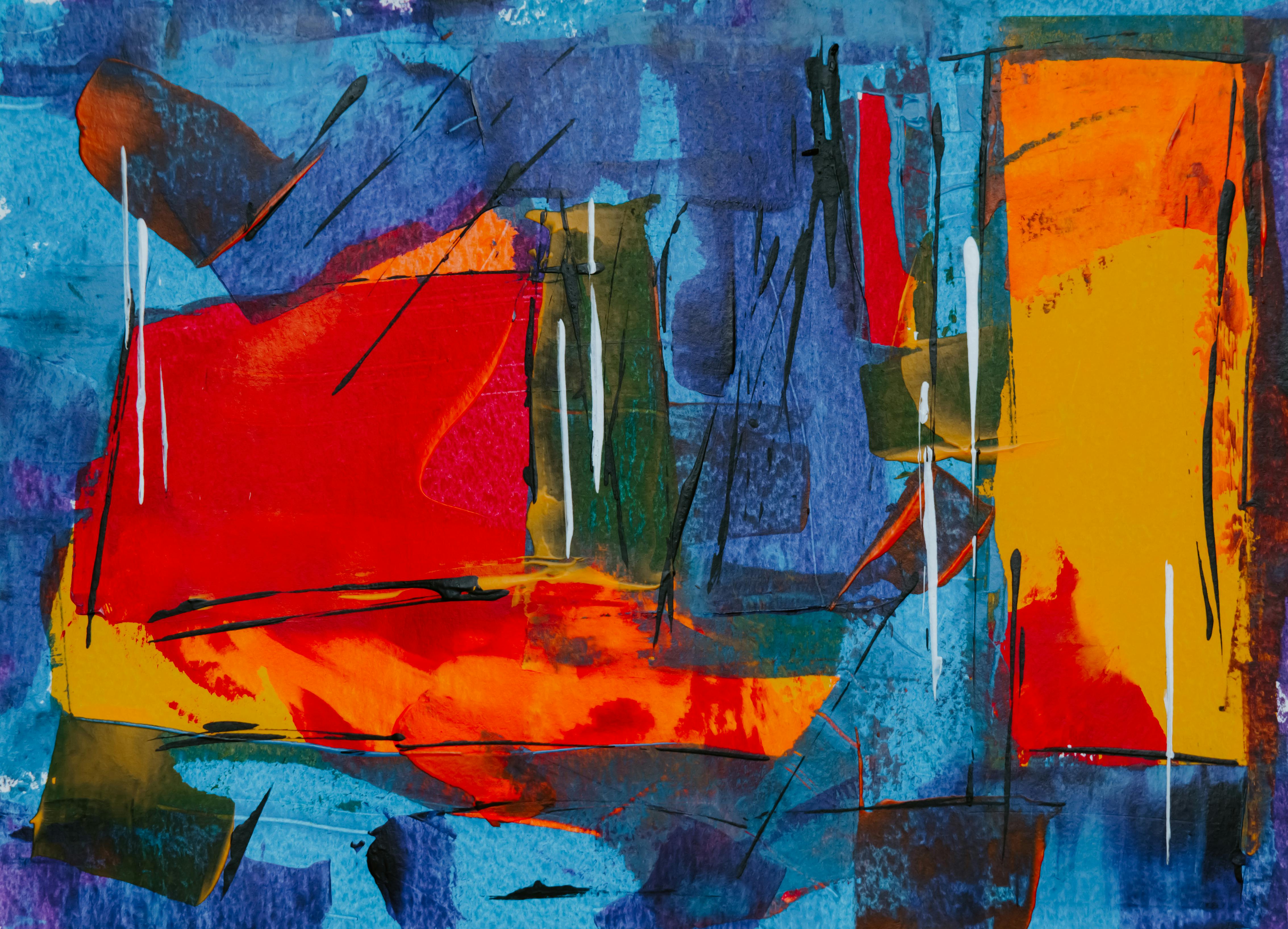
| Contrast | The difference between elements (light/dark, rough/smooth, large/small, complementary colors) that creates visual interest, emphasis, and drama. | Visual interest, emphasis, drama, conflict, clarity, separation, excitement. | My abstract work often thrives on sharp contrasts (e.g., a vibrant red against a deep blue) to inject raw energy and communicate intensity and dynamism. In photography, high contrast can create drama, while low contrast can evoke a soft, dreamy mood. It's essential for readability in typography. |
| Emphasis | Creating a focal point or area of interest to draw the viewer's eye. This is where the artist wants your attention to land first. | Importance, hierarchy, direction, focus, message clarity. | This can be achieved through color (a single bright spot), size (a large figure), placement (a central element), or striking contrast – it's where you want the eye to land first, communicating what's most important. In advertising, the product is almost always emphasized. |
| Movement | The way the artist guides your eye through the work, often to a focal point or along a deliberate path, creating a visual journey. | Visual flow, narrative, dynamism, direction, energy. | Lines, shapes, and repeated elements all contribute to this visual flow, telling a story or directing attention. Think of the swirling brushstrokes in Van Gogh's 'Starry Night' that create a sense of energetic movement, or leading lines in a photograph drawing your eye to the subject. Even implied lines can create powerful movement. |
| Pattern | The repetition of an element or elements in a recognizable organization, creating visual rhythm and unity. | Order, continuity, rhythm, decoration, predictability, unity, visual interest. | Think of repeating geometric shapes in Islamic art or a regular grid pattern, communicating order and continuity. Pattern is the repeated element – like bricks in a wall or a repeating motif in fabric. It can be regular or irregular, but always involves recurrence. |
| Rhythm | The repetition of visual elements to create a sense of organized movement, much like a visual beat or tempo. | Energy, flow, sequence, movement, anticipation, dynamism. | While pattern is the repeated element, rhythm is the flow and timing created by that repetition, communicating energy and sequence. Think of the undulating waves in a Hokusai print or the recurring shapes and colors in a piece of music translated visually. It's about how the eye moves from one element to the next. |
| Proportion/Scale | The relationship of the size of parts to the whole, or the size of one object in relation to another. | Grandeur, intimacy, distortion, realism, dominance, subordination. | Think of how a monumental sculpture can dwarf a viewer, communicating awe, or a miniature painting draws you in with its intricate detail. Distorted proportions (as in Mannerism) can create unease; realistic proportions, a sense of veracity. |
| Unity/Harmony | The feeling that all the elements in an artwork belong together and create a cohesive whole. It's about visual agreement, where nothing feels out of place. | Cohesion, completeness, calmness, belonging, visual agreement, purpose. | This principle ensures that even with purposeful contrast, a piece feels resolved and intentional, communicating a sense of completeness and visual agreement. A unified composition feels finished and impactful, even if it contains a multitude of disparate elements. |
For a truly immersive understanding, I recommend exploring understanding balance in art composition for how vital balance is to any visual work, or the ultimate guide to abstract art movements where artists deliberately played with and often broke these rules to achieve new forms of expression.
A Deeper Dive into Color: My Personal Palette and Practical Models
Ah, color! It's probably the most immediate, visceral thing we react to, isn't it? A vibrant yellow can feel instantly joyful, while a deep, cool blue might evoke calm or a hint of melancholy. I constantly wrestle with color in my own work, always trying to get it to speak precisely what I intend, to convey an emotion without a single word. It’s a powerful psychological trigger, and truly understanding it goes far beyond just recognizing basic hues. It's about knowing how colors interact, how they affect mood, and how they behave in different contexts.
For instance, I frequently use complementary colors (like red and green, or blue and orange) placed side-by-side to create an intense visual vibration and emphasis – a real pop! This is a technique I use to inject raw energy and dynamism into my abstract pieces. On the other hand, analogous colors (colors next to each other on the color wheel, like blues and greens) create a sense of flowing harmony and calm, which can be just as impactful for a serene composition. Just a few weeks ago, I was struggling with a new abstract piece that felt… well, flat. It wasn't until I introduced a subtle complementary accent, a flash of unexpected warmth, that the whole composition vibrated with life. That’s the real-world power of understanding color theory! Beyond these relationships, understanding primary (red, yellow, blue), secondary (orange, green, purple), and tertiary colors, as well as the impact of saturation (intensity) and value (lightness/darkness), allows for incredible nuance. A desaturated blue feels entirely different from a highly saturated one, evoking entirely different emotional landscapes – one might feel nostalgic, the other invigorating.
It’s also crucial to remember that how we experience color changes depending on the medium. Think of it like this:
- In the digital world, screens use an RGB (Red, Green, Blue) additive color model. Here, you're mixing light. Imagine three stage spotlights – one red, one green, one blue – overlapping. Where they all combine, you get white light. The more light primaries you add, the brighter the result, eventually creating white light. This is why screens glow.
- For print, however, we use a CMYK (Cyan, Magenta, Yellow, Black) subtractive model. With inks, you're subtracting light. Imagine mixing physical paints; the more colors you mix, the more light is absorbed, and the darker the result, eventually approaching black. This is why getting your digital artwork to print perfectly often requires careful color management; the digital RGB experience won't directly translate to CMYK inks without adjustments. I've learned this the hard way many times when preparing prints of my own art!
Understanding how artists use color, and the very real psychological impact it has, is a huge step in developing visual literacy. If you’re curious to explore more, I’ve written extensively about how artists use color and the psychology of color in abstract art beyond basic hues. It’s fascinating stuff, I promise you, and foundational to seeing the world more vividly.
Cultural Nuances in Visual Symbolism
This brings me to a crucial point that often gets overlooked: the profound impact of cultural nuances in visual symbolism. An image, a color, or even a gesture that means one thing in one culture can mean something entirely different – or even offensive – in another. When I create art, especially abstract pieces, I'm always wrestling with how universally or specifically a color or shape might be 'read.' Deciphering these cues requires more than just looking; it demands a sensitivity to the cultural backdrop of an image and an openness to diverse interpretations. It’s why understanding symbolism isn't just about art history, but about global citizenship and mindful communication.
Here are some examples of how color symbolism varies across cultures, a topic I find endlessly fascinating:
Color | Western Culture Associations | Eastern/Other Culture Associations |
|---|---|---|
| White | Purity, innocence, weddings, cleanliness | Mourning, death, funerals (many Asian cultures); good luck (some African traditions) |
| Red | Love, passion, danger, anger, urgency | Good luck, prosperity, celebrations (China); purity (India); mourning (South Africa) |
| Green | Nature, growth, money, envy, luck | Islam (sacred color), fertility (some Middle Eastern cultures), banishment (parts of Indonesia); disease (some South American cultures) |
| Blue | Calm, trust, peace, sadness, stability | Mourning (Iran); immortality, protection (Egypt); prosperity (Hinduism); truth (Middle East) |
| Yellow | Happiness, optimism, sunshine, caution | Sacred, royalty (China); mourning (Egypt); courage (Japan); joy, celebration (many African cultures) |
| Black | Death, evil, sophistication, formality | Mourning, death (Western); associated with wealth (Egypt); masculinity, experience (Africa); evil, mystery (Japan) |
I’ve delved much deeper into these fascinating differences in articles like understanding the symbolism of colors in different cultures – it's an eye-opening journey that underscores how truly relative visual interpretation can be.
Understanding How We See: Gestalt Principles of Visual Perception
Before we move on, it's worth briefly touching upon how our brains are actually wired to make sense of the visual world. It’s not just about individual elements, but how we naturally group and organize them. This is where the Gestalt Principles of Visual Perception come in. Developed by German psychologists in the early 20th century, these principles describe how we instinctively perceive complex visual scenes as organized wholes rather than just collections of disparate parts. Understanding them helps you see why certain designs work and others don't, because they tap into fundamental human cognitive processes:
- Proximity: Objects close to each other are perceived as a group. Think of dots on a page: if they're clustered, you see distinct groups, not just individual dots.
- Similarity: Objects that look alike (in shape, color, size, texture) are perceived as belonging together. Imagine a grid of circles and squares; you'll naturally see rows or columns of circles and squares, not a mixed pattern.
- Closure: Our brains tend to complete incomplete figures or forms. If you see a broken circle, you still perceive it as a circle, filling in the gaps. This is powerfully used in logo design.
- Continuity: We tend to see elements arranged on a line or curve as belonging together, and we follow the smoothest path when viewing lines. A winding road is seen as a single, continuous entity, even if parts are obscured.
- Figure-Ground: We instinctively separate a visual field into a dominant 'figure' (the main subject) and a subordinate 'ground' (the background). Think of the classic Rubin's vase illusion, where you can see either a vase or two faces, but not both simultaneously. This dictates what we focus on.
- Symmetry: Symmetrical elements are perceived as belonging together and forming a cohesive whole. Symmetrical designs often feel balanced, stable, and aesthetically pleasing.
Understanding these natural tendencies of human perception allows artists and designers to create visuals that are not just aesthetically pleasing, but also inherently intuitive and easily understood. It’s a powerful insight into the hidden mechanics of seeing itself.
A Brief History of Seeing: How Visual Communication Evolved
To truly appreciate the profound importance of visual literacy today, it helps to understand its long and utterly fascinating lineage. Visual communication isn't a modern invention; it's deeply, inextricably ingrained in the human story, evolving right alongside us. Think about how our 'ways of seeing' have been shaped over millennia:
- Cave Paintings (Prehistoric): Our earliest ancestors didn't have written language, but they communicated complex narratives, histories, and perhaps even spiritual wisdom through images on cave walls. The Lascaux paintings, for example, aren't just pretty pictures of animals; they're intricate visual narratives of survival, community, and belief, speaking across tens of thousands of years. They are our first visual records.
- Hieroglyphs and Pictograms (Ancient Civilizations): Civilizations like the Egyptians and Mesopotamians developed sophisticated systems where images literally represented words, ideas, or sounds, seamlessly merging the visual with the symbolic. Think of the Rosetta Stone as a key to unlocking these rich, ancient visual languages, demonstrating a complex interplay between image and text.
- Medieval Art and Stained Glass (Middle Ages): For a largely illiterate population, the dramatic frescoes, intricate tapestries, and vibrant stained-glass windows of churches weren't just decoration; they served as powerful visual Bibles, conveying complex narratives and moral lessons. Art was the primary educator and moral compass of society, 'read' by everyone, regardless of their textual literacy.
- The Printing Press and Early Printmaking (15th - 18th Centuries): While Gutenberg's press revolutionized text, the rise of printmaking (woodcuts, engravings, etchings) allowed for the mass reproduction of images. Suddenly, visual ideas – from detailed anatomical illustrations and scientific diagrams to political cartoons and satirical prints – became widely accessible, accelerating the spread of information and opinion and fostering a new kind of visual public discourse. This era also saw the rise of propaganda posters during wars, where powerful, often emotionally charged, visuals were used to sway public opinion and mobilize populations. Deciphering these messages required early forms of critical visual literacy.
- Renaissance and the Birth of Perspective (14th-17th Centuries): This was a game-changer. Artists like Brunelleschi and Masaccio mastered linear perspective, creating the illusion of three-dimensional depth on a two-dimensional surface. This wasn't just an artistic trick; it profoundly changed how humans perceived reality in art, creating a sense of order, logic, and a single, fixed viewpoint, essentially training the eye to interpret space differently and fostering a new form of visual realism.
- Mass Media and Photography (19th & 20th Centuries): The advent of photography, film, and later television fundamentally transformed how we perceive the world. Images could now capture and transmit 'reality' with unprecedented immediacy and reach. Photojournalists like Dorothea Lange and Henri Cartier-Bresson documented pivotal events, shaping public opinion and challenging our understanding of truth in ways never before possible. This is truly where the modern need for critical visual evaluation began to blossom, as the public grappled with the 'truthfulness' of images for the first time on a mass scale.
- Modern Art Movements (Late 19th & 20th Centuries): These movements radically altered how we understood art and demanded new levels of visual literacy:
- Impressionism (Monet, Renoir) challenged academic norms by focusing on capturing the fleeting effects of light and atmosphere, asking viewers to 'see' with a new immediacy and subjectivity, rather than just recognizing objects. You had to interpret light itself.
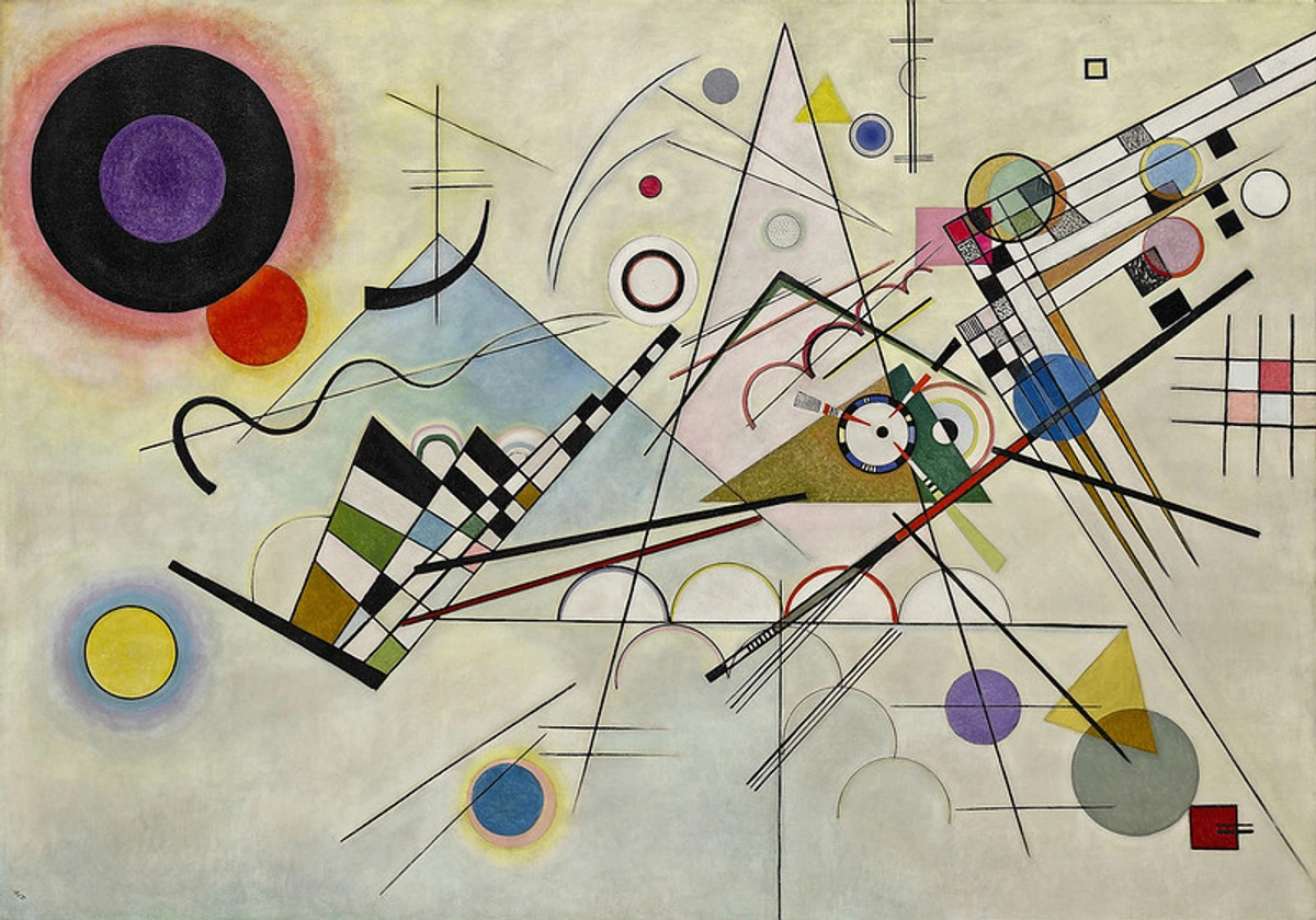
- Cubism (Picasso, Braque) shattered traditional perspective, presenting multiple viewpoints simultaneously, forcing us to interpret fragmented realities and actively piece together meaning from disparate visual information. It broke the single, fixed viewpoint and demanded active mental reconstruction.
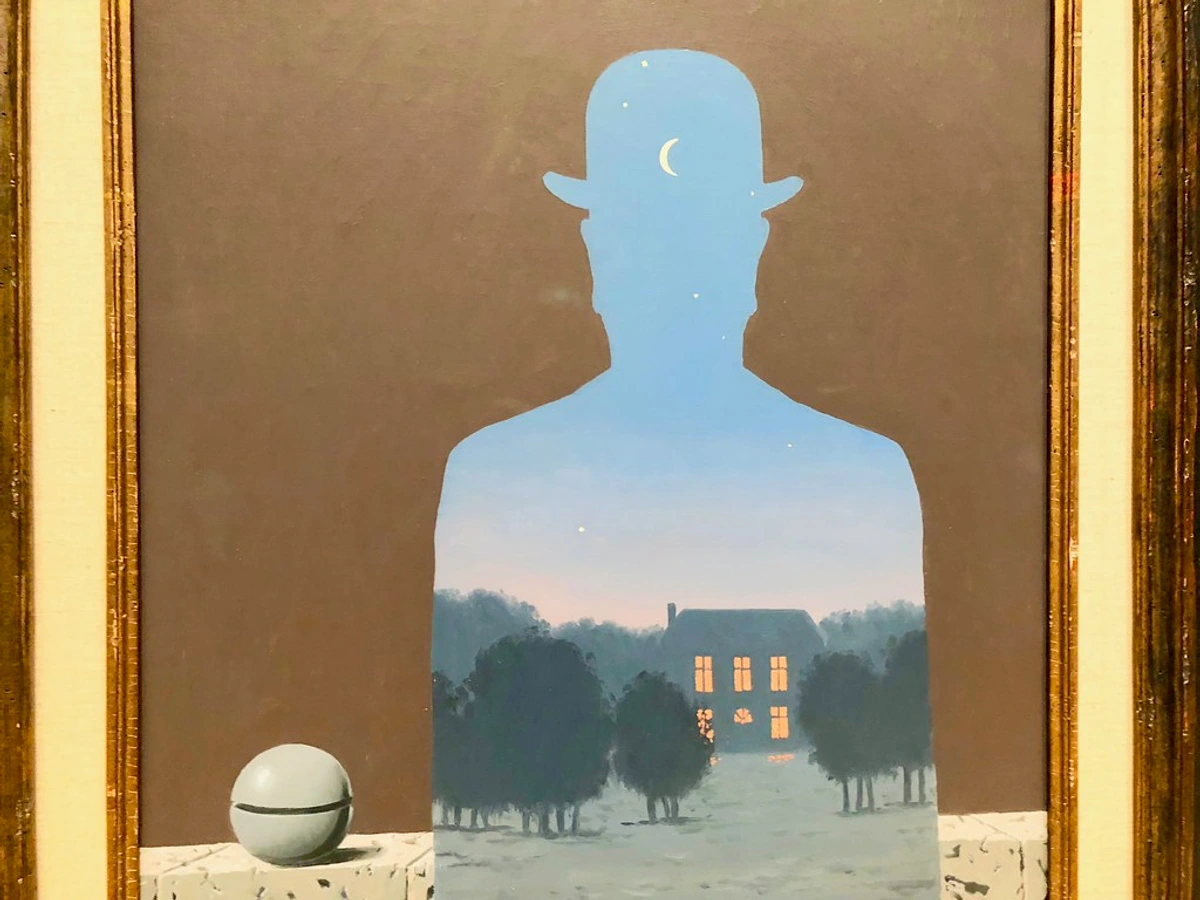
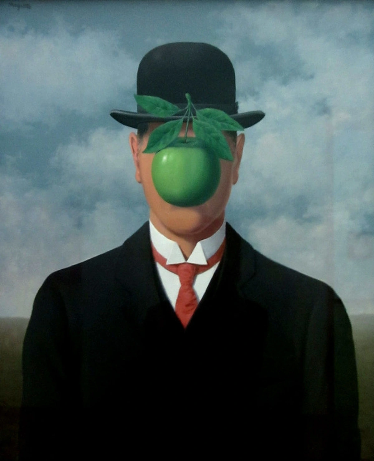
- Surrealism (Dali, Magritte) delved into the subconscious and dream logic, deliberately distorting conventional visual perception to tap into deeper psychological truths. It demanded an interpretation beyond the literal, into the symbolic and irrational.
- The Digital Age (21st Century): And now, we're in an era of ubiquitous digital images, where creation, manipulation, and dissemination happen at lightning speed. Each historical shift has layered new demands and complexities onto our ability to 'read' the world visually, making our current moment perhaps the most visually challenging, yet equally exciting, chapter in this long story. We're not just consuming images; we're quite literally swimming in them, and without a solid anchor of visual literacy, it's easy to get lost.
Practical Steps to Sharpen Your Visual Acuity
Alright, so how do we actually do this? How do we move from just looking to truly seeing, becoming those sharp-eyed individuals who effortlessly decode the visual world? It’s not about being an art historian, though that certainly helps. It’s about building deliberate habits and retraining your brain to engage. Think of these as your daily visual workouts:
Cultivating Observational Skills
These practices are all about training your eyes to truly see the details and nuances of any visual.
Slow Down and Observe: The Art of Deliberate Looking
This is perhaps the hardest one in our relentlessly fast-paced world. But it's absolutely essential. Pick an image – any image, really. A photograph, a painting, even a cereal box. Don't just glance. Linger. Let's take a classic example, not necessarily one of my works, but something universally recognizable like the sculpture 'Allegory of Faith' by Antonio Corradini.
Initially, you might just see a veiled figure. But slow down. Notice the textures: the delicate lace, the heavy folds of her dress, the way the veil appears translucent despite being carved from solid marble. Observe the delicate features of her face, the way her hand clutches her chest. What does her posture convey? What elements of line, form, and texture are most striking? The more you look, the more details emerge, and the more meaning you can start to construct. It's like peeling back layers of an onion, each revealing a new insight. I find myself doing this constantly, even with my own abstract work; a subtle shift in line or a different color can entirely change the feeling of a piece, making me sit back and truly see it again.
Deconstruct Everyday Objects
Visual literacy isn't just for art galleries. It applies to your everyday environment. Start seeing the intentional design everywhere.
- Smartphone Interface: What visual cues on your phone screen guide you? How do icons, colors, and layout make it intuitive (or frustrating) to use? Why is the 'send' button green and the 'delete' button red? What subtle animations are at play?
- Coffee Cup Design: Think about your favorite coffee cup. What does its shape, texture, and pattern communicate? Is it rugged, elegant, playful? How do these visual attributes influence your experience of drinking from it? Consider the handle, the rim, the base – every detail is a design choice.
- Furniture Layout: Consider how furniture is arranged in a room. How does it create a sense of balance, flow, or emphasis? How does the "negative space" (empty areas) contribute to the overall feeling of the room, communicating openness or intimacy? This is often a subconscious experience; making it conscious sharpens your perception.
Honing Analytical Tools
These steps focus on how to actively question and break down the visual information you encounter.
Ask Questions: Become a Visual Detective
Once you’ve slowed down, start interrogating the image. Become a detective! I literally do this in my head when I'm walking through a gallery or sketching new ideas for an abstract piece. It's about proactive inquiry, turning passive viewing into active investigation.
Here's a framework I use, often called the "5 W's and 1 H":
Question | Focus | What it reveals |
|---|---|---|
| Who? | Creator, subjects depicted, target audience | Artist's intent, social context, power dynamics, representation. Who benefits from this message? |
| What? | Objects, actions, symbols, emotions, narrative | Narrative, underlying messages, immediate subject matter, emotional impact. What is the explicit and implicit message? |
| When? | Time period of creation and depiction | Historical context, stylistic trends, relevance to current events. Does it reflect its time? |
| Where? | Place of creation, setting of image, viewing context | Cultural influences, geographical significance, intended display environment. Where would this image typically be seen? |
| Why? | Creator's purpose, message, function | Inform, persuade, provoke, beautify, record, commemorate. What is the ultimate goal of the visual? |
| How? | Techniques, materials, composition, elements, principles | Artistic choices, skill, medium's impact, structural integrity, visual language. How does the visual language contribute to the message? |
Let's apply this to a hypothetical luxury car advertisement. You see a sleek car, maybe on a winding coastal road, with a successful-looking couple smiling.
- Who? Created by an advertising agency for the car company, targeting affluent, aspirational individuals. The couple represents the ideal consumer.
- What? A beautiful car, scenic drive, happy couple, implying luxury and freedom. No specific words, but strong visual cues of success and desire.
- When? Contemporary. The car model is new, the couple is modern, implying current trends and status.
- Where? A picturesque, perhaps exotic, location, suggesting escapism or high status, and linking the car to desirable lifestyles.
- Why? To associate the car with success, happiness, freedom, and luxury; to persuade you that buying this car will bring you these feelings and status, appealing to aspirational desires.
- How? High-contrast lighting, saturated colors to make it pop, leading lines from the road guiding your eye to the car, a wide-angle shot making the car look powerful and desirable. The subtle visual cues are doing most of the work here, creating an emotional appeal rather than a logical one.
These questions force you to engage deeply, pulling out information you might otherwise miss, and transforming passive viewing into active understanding. It's like cracking a visual code.
Consider Context: Beyond the Frame
An image rarely exists in a vacuum. Its meaning can be profoundly shaped by its historical, cultural, and social context. My experience creating abstract art, which often relies heavily on individual interpretation, has made me acutely aware of how context can completely reframe a piece. Take Manet's 'Luncheon on the Grass', for instance.
Today, we might see it as a beautiful, albeit unusual, picnic scene. But in 1863 Paris? It was scandalous! A nude woman staring directly at the viewer, unashamed, alongside fully clothed men in a contemporary setting. This wasn't a classical nude goddess; this was a modern woman, and society was not ready for such a direct challenge to academic norms and societal hypocrisy. Understanding that context completely changes your interpretation of the artwork from mere depiction to a bold, provocative statement about art, women, and public morality. I've explored this extensively in articles like understanding symbolism in contemporary art, recognizing that even the most abstract forms carry contextual weight.
Understanding Visual Metaphors and Allegories
Sometimes, an image isn't trying to show you something directly, but rather allude to it through a deeper, symbolic meaning. This is where visual metaphors and allegories come in. To truly be visually literate, you have to move beyond the literal, recognizing that visuals can speak in layers.
- A visual metaphor uses one image to stand for another, creating a symbolic connection – like a broken chain representing freedom, or a wilting flower representing lost youth. It's a direct, often powerful, comparison of two unrelated things sharing common characteristics, allowing for complex ideas to be conveyed instantly. Think of an hourglass with sand running out representing time running short in an environmental ad.
- An allegory extends this, using an entire narrative or series of images to convey a complex moral or abstract idea, often with characters or objects personifying concepts. Think of a painting depicting Lady Justice with her scales and blindfold; she's not just a woman, but an allegory for the concept of impartial justice itself. Or a medieval painting showing a battle between virtues and vices. In contemporary media, a film like Animal Farm is an allegory for totalitarianism, using animals to represent political figures and ideologies. Deciphering these layers requires moving beyond the literal and into the symbolic, a truly advanced form of visual literacy that enriches your understanding of storytelling.
Engage in Visual Comparison Exercises
Another excellent practice is to actively compare and contrast images.
- Compare News Photos: Find two different news photos of the same event from different sources (e.g., a left-leaning and a right-leaning publication). How do they differ in framing, cropping, lighting, and focal point? What subtle (or not-so-subtle) messages do these choices convey about the event or the photographer's/editor's intent? This is crucial for understanding media bias and how visuals can shape public opinion.
- Analyze Logos: Pick two logos for similar products or companies (e.g., two coffee brands, two tech companies). Break down their use of shape, color, and typography. What different messages do they send about the brands? How do they make you feel differently? This reveals how visual identity is constructed and manipulated to target specific audiences.
Mastering Maps: The Visual Language of Geography
Maps are an often-overlooked but incredibly potent form of visual communication. They simplify complex geographical data into symbols, colors, and lines. A visually literate person understands that maps are not perfect reflections of reality, but rather interpretations that carry inherent biases or specific purposes. Think about:
- Projections: Different map projections distort landmasses in various ways (e.g., the Mercator projection inflates the size of land near the poles, making countries like Greenland appear much larger than they are relative to Africa). Understanding this prevents misinterpretations of global scale and political importance.
- Color-coding: Political maps use color to differentiate countries, but these colors are arbitrary. Weather maps use color to show temperature or precipitation, immediately communicating patterns and severity. Understanding the legend is key.
- Symbols: Icons for cities, mountains, or airports are universal visual shortcuts. The size of a symbol might indicate the size of a city or the intensity of a phenomenon.
Learning to read and critically evaluate maps, understanding their symbols and inherent limitations, is a vital aspect of comprehensive visual literacy, enabling you to interpret spatial information with nuance and avoid being misled by visual representations of data.
Decoding Data Visualizations: Spotting Misleading Information
Data visualizations – infographics, charts, graphs – are everywhere, from news reports to business presentations, and they can be incredibly powerful tools for communication. But, and this is a big but, they can also be incredibly misleading if you don't have a critical, visually literate eye. I've seen countless examples of this trying to sway opinion, sometimes deliberately, sometimes just due to poor design. Here’s how a visually literate eye approaches them:
- Check the Axes: Always, always look at the Y-axis. Does it start at zero? If it's truncated (starts at a higher value), even small changes can look massive. Conversely, a stretched axis can make significant changes appear minor. This is a classic trick to exaggerate or minimize data.
- Scale and Proportion: Are the visual representations proportional to the data they represent? In a bar chart, if one bar is twice as high, does it represent twice the value? Sometimes, graphic designers inadvertently (or deliberately) distort the visual scale.
- Labels and Units: Are all axes clearly labeled? Are the units consistent? Are there missing labels that make interpretation ambiguous? Ambiguity often hides uncomfortable truths.
- Source and Context: Who created the visualization, and what is their agenda? Is the data cherry-picked to support a particular narrative? Is there crucial context missing that would change your interpretation (e.g., showing a growth chart without acknowledging a massive prior decline)?
- Correlation vs. Causation: Just because two lines on a graph move together doesn't mean one causes the other. A visually literate person understands that charts can show relationships, but can't inherently prove cause and effect without further evidence.
For instance, imagine a bar chart showing "Company Profits" that goes from $90 million to $100 million. If the y-axis starts at $80 million instead of $0, that tiny $10 million increase will look like a massive, exponential leap, deliberately designed to impress investors or sway public opinion. A visually literate person spots these tricks immediately. This is about seeing beyond the pretty graph to the underlying truth, or lack thereof, and is a vital component of critical media literacy.
Engaging in Creative Practice
These practices move you from a consumer to a creator, deepening your empathy and understanding.
Cultivating a Visual Journal
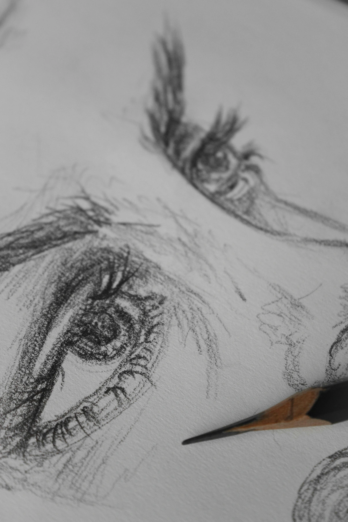
One of the most powerful things I've done for my own visual acuity is to keep a visual journal. It's not about perfect drawings; it's about active engagement, a space for visual thinking.
- Sketch and Annotate: Pick any image – a photograph, a piece of art, an advertisement. Sketch its main elements, then write down your observations. What lines do you see? What colors dominate? What emotion does it evoke? What questions does it raise? How is it composed? This practice forces you to slow down and analyze.
- Deconstruct Ads: Choose three advertisements and sketch their key visuals. Analyze their persuasive tactics: what colors are used to appeal to you? What kind of typography? What visual metaphors or fallacies are at play? How do they frame their message? This uncovers the hidden agenda behind commercial visuals.
- Mood Boards for Emotions: Create collages or digital mood boards representing specific emotions (e.g., 'Anxiety', 'Joy', 'Peace'). This forces you to think about how different visuals combine to convey complex feelings, building your visual vocabulary for expressive purposes and making you more aware of emotional triggers.
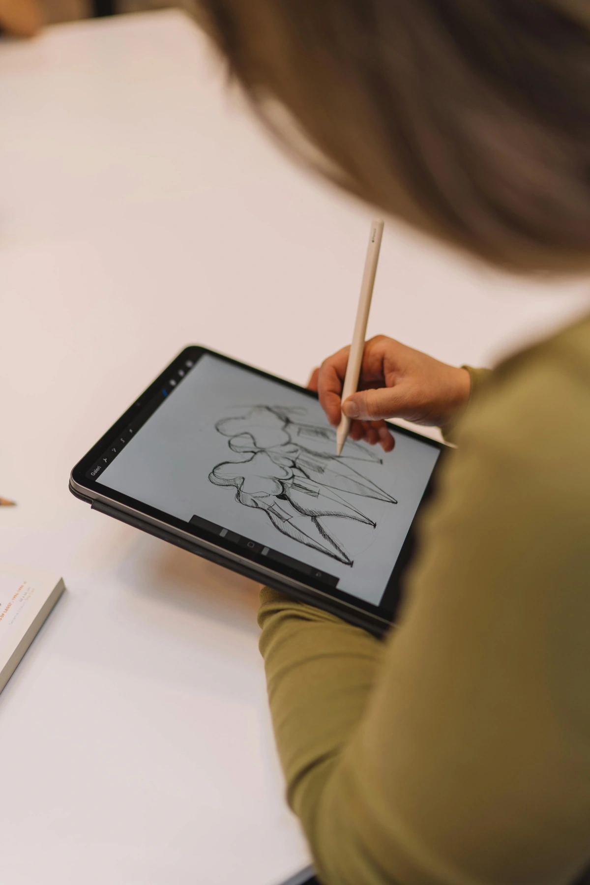
Create Your Own Visuals: From Viewer to Maker
This is a truly transformative step, even if you don't consider yourself an "artist." Try sketching, taking photos, arranging objects in your home, or even just making a mood board for a project. When you attempt to create, you inherently start thinking about line, color, composition, and how to convey a message effectively. My early attempts at pottery, for instance, taught me more about three-dimensional form and texture than any book ever could. It makes you a more empathetic and insightful viewer because you understand the challenges and decisions involved in visual communication firsthand. Even simple exercises like arranging colors or shapes on a page (like what you might do in graphic design or even a digital drawing app) can open up a whole new level of understanding. Want to dive deeper into making? Explore how screen printing works in this image, or consider the principles of how to apply gesso to canvas.

My Journey with Visuals: The Beating Heart of My Art
For me, visual literacy isn't just a concept; it's the beating heart of my artistic practice. Every brushstroke, every color choice, every compositional decision is an attempt to communicate something without words. My abstract pieces, in particular, invite you to engage your own visual literacy, to bring your own interpretations to the shapes and colors, to complete the conversation. It's a dialogue without speech, a conversation started by lines and concluded by your own perception.
When I'm creating, I'm constantly asking myself: how will this line be read? What emotion will this color evoke? Is the balance right? (Speaking of which, understanding balance in art composition is a crucial read!) Just last week, while working on a new abstract series, I spent hours adjusting a single patch of blue, trying to get it to convey both serenity and a hint of melancholy simultaneously. The problem was, it was too muted, lacking contrast. It wasn't until I introduced a vibrant, complementary orange accent that the blue truly ' popped' and achieved the complex emotional resonance I was aiming for. It's a continuous process of learning and refinement, trying to make my visual language as clear and impactful as possible. Perhaps it's why I also find such joy in watching people engage with art in places like The Photographers' Gallery, seeing how they interpret the visual stories laid before them.

It’s this ongoing dialogue, this silent communication, that makes art, and indeed all visual information, so powerful. If you’re curious about my artistic journey, you can always explore my art timeline, or if a piece truly resonates, perhaps consider a visit to my art for sale a piece that speaks to you. After all, what is art but a deeply personal conversation, a visually woven story?
Frequently Asked Questions about Visual Literacy
Understanding visual literacy often sparks many questions. Here are some of the most common ones I encounter, often reflecting concerns about navigating our visually complex world:
What's the difference between visual literacy and art appreciation?
They're closely related but distinct, like cousins. Art appreciation often focuses on understanding the history, aesthetics, and cultural significance of fine art. It might involve knowing about specific artists, movements, and techniques, and enjoying the beauty and emotional impact of an artwork. Visual literacy, on the other hand, is a broader, more fundamental skill set that applies to all visual information, not just art. It provides the analytical tools (like dissecting elements, context, and intent) that enable deeper art appreciation, but also help you critically evaluate an advertisement, a political cartoon, a misleading infographic in a scientific report, or the design of a user interface. It's the engine that powers nuanced art appreciation, but its applications are far wider, equipping you for the entire visual world.
Is visual literacy an innate skill or can it be learned?
Definitely learned! While some people might have a natural inclination for visual thinking or a keen eye (like a natural talent for music or sports), the core components of visual literacy – observation, analysis, interpretation, contextualization, and creation – are all skills that can be developed and sharpened with dedicated practice and conscious effort. It's exactly like learning any other language or a complex sport: you start with basic vocabulary (elements), learn grammar (principles of design and perception), and eventually become fluent enough to express complex ideas and understand nuanced messages. Think of it as developing a 'visual muscle' that strengthens with consistent use and training, getting better with every image you actively engage with.

How does technology impact visual literacy?
Technology has amplified the need for visual literacy exponentially. We're flooded with images from social media, digital news, video, and immersive virtual reality experiences. This constant, overwhelming stream means we need stronger visual literacy skills than ever before to navigate misinformation (like deepfakes and doctored images), understand complex data visualizations, discern authentic content from manipulated images (especially AI-generated content), and participate effectively in digital communication. This doesn't just mean recognizing outright fakes, but also understanding the subtle biases that AI algorithms might embed in generated visuals, potentially homogenizing visual styles or prioritizing certain aesthetics over genuine artistic expression. Moreover, social media algorithms personalize our feeds, creating filter bubbles that can reinforce existing visual biases and limit exposure to diverse viewpoints. It's both a profound challenge and an incredible opportunity to become better 'readers' of our screens and the visually rich digital world. We are more visually active than any generation before us, making this skill more critical than ever.
Can visual literacy help with creativity?
Absolutely! By deconstructing how visual elements work and how different artists communicate their ideas, you gain a richer vocabulary to express your own concepts. It helps you break down complex visual problems, experiment with new approaches, and develop a more informed and sophisticated creative vision. It allows you to see possibilities you might have missed before, inspiring novel compositions, color palettes, and thematic explorations in your own work. It's not about copying, but about understanding the rules so you know how to break them effectively, just as a composer masters scales before writing symphonies. It expands your creative toolbox immensely, enabling you to articulate your inner world more precisely through visual means.
Why is symbolism important in visual literacy?
Symbolism is crucial because many images convey meaning not literally, but through established or implied symbols. Understanding these symbols – whether they are universal archetypes (like a dove for peace, a snake for temptation, or light for knowledge, darkness for ignorance) or culturally specific signs (like specific colors representing different emotions in various traditions) – allows for a much deeper and richer interpretation of visual messages. Without understanding symbolism, much of art, advertising, and even everyday visual communication would remain superficial and, frankly, a mystery. You'd be seeing shapes and colors without grasping the stories they tell or the ideas they represent. I've explored this extensively in articles like understanding symbolism in contemporary art and even specific deep dives into understanding the symbolism of trees in art or understanding the symbolism of flowers in art history.

How can visual literacy help me in my career?
In virtually any modern career, visual literacy is an indispensable asset. Marketers use it to create compelling campaigns, scientists to communicate complex data through infographics, educators to design engaging learning materials, designers to craft intuitive user interfaces, and even doctors to interpret medical scans. It allows you to present your ideas more persuasively, understand audience reactions to visuals, and make informed decisions based on visual data. It's about being able to 'speak' and 'understand' the language of images in a professional context, making your communication more impactful and effective – a true competitive edge in a world where visual information is paramount. It helps you both create better visuals and critically evaluate those created by others, leading to smarter strategic decisions.
Are there specific tools or techniques for improving visual analysis?
Beyond the practical steps we discussed (slowing down, asking questions, considering context, practicing, creating), you can certainly use specific techniques. Try visual journaling, where you sketch or write about images you encounter, actively deconstructing them. Engage in active observation exercises, focusing on one element (like line) across many different images. Learn basic graphic design principles to understand composition, hierarchy, and visual flow. Utilize online resources like art glossaries or visual culture studies frameworks. Even simple apps that allow you to manipulate photos can help you understand the profound impact of light, color, and cropping. The key is to move from passive absorption to active, systematic deconstruction and reconstruction of images. It's about training your eye and your brain together, making critical visual analysis a natural habit.

How does visual literacy compare to other forms of literacy?
That's an excellent question, and one that gets to the heart of its unique value. While verbal literacy (reading and writing text), digital literacy (navigating technology), and even emotional literacy (understanding feelings) are all crucial, visual literacy offers a distinct and indispensable lens on the world. It’s not a replacement, but a vital complement. Verbal literacy helps us decode words; visual literacy helps us decode images. In a world where images often carry more immediate emotional weight and persuasive power than text, visual literacy equips us to critically assess those messages, preventing manipulation and fostering deeper comprehension. It allows us to process information presented visually (like infographics or maps) much more effectively than if we only relied on text. Think of it as adding a powerful new sensory input to your overall intelligence, making you a more holistic and discerning interpreter of information, regardless of its format. It's arguably the most fundamental literacy for the 21st century because of the sheer volume and impact of visual communication today.
What about visual literacy and NFTs/blockchain art?
While new digital art forms explore novel ownership and distribution models like NFTs and blockchain, the core principles of visual literacy remain paramount regardless of the medium or platform. Whether an image exists as a physical painting or a tokenized digital asset, its visual impact, compositional integrity, and communicative intent are still judged through the lens of visual literacy. The technology used to certify ownership (like blockchain for NFTs) is separate from the artistic qualities or the visual message conveyed by the artwork itself. We are generally cautious about speculative technologies like NFTs; their long-term artistic and cultural merit remains unproven, and the core value of art lies in its intrinsic visual qualities and communicative power, independent of underlying technology. Furthermore, the potential for AI to homogenize visual styles or prioritize certain aesthetics over genuine artistic expression raises further questions about the long-term impact on artistic diversity and innovation, concerns that a visually literate eye is well-equipped to assess.

How does visual literacy foster empathy?
Visual literacy is a powerful tool for building empathy. By actively interpreting and contextualizing images, you are essentially stepping into another's shoes, trying to understand their perspective, experiences, and emotions as communicated visually. When you analyze a photograph of a historical event, a portrait of someone from a different culture, or even an abstract piece of art, you're engaging with the maker's intent and the subject's reality. This practice cultivates a deeper understanding of diverse human experiences, challenges your own assumptions, and broadens your capacity for compassion. It forces you to look beyond your immediate worldview and appreciate the rich tapestry of human visual expression, leading to a more nuanced and compassionate understanding of others.
How does visual literacy intersect with accessibility?
Visual literacy plays a crucial role in accessibility by ensuring that visual information is understood and perceivable by as wide an audience as possible, including those with visual impairments or cognitive differences. This means actively considering how images are presented and described. For example, providing descriptive alt-text for images online allows screen readers to convey visual information to blind users. Using clear visual hierarchy, high contrast, and avoiding overly complex or distracting designs can make content more accessible for individuals with cognitive disabilities or low vision. A visually literate designer actively thinks about clarity, simplicity, and alternative forms of conveying visual meaning, recognizing that effective communication means reaching everyone.
How important is visual literacy education in schools?
Visual literacy education is becoming increasingly vital in schools, particularly in our image-saturated digital age. Teaching children and young adults to critically read images equips them with essential skills to navigate misinformation, understand advertising tactics, and interpret complex visual data in subjects ranging from science to history. It fosters critical thinking, media literacy, and creativity, moving beyond passive consumption to active, informed engagement. By integrating visual analysis and creation into the curriculum, educators empower students to become more discerning citizens, articulate communicators, and innovative thinkers, preparing them for a world where visual information is as prevalent and influential as text.
Conclusion: See the World with New Eyes, and Create Your Own
So, there you have it. Visual literacy isn't just a buzzword; it's a fundamental, indispensable skill for navigating our incredibly visual world. It empowers you to go beyond surface-level looking, to truly see and understand the messages, emotions, and intentions embedded in every image you encounter, from a cave painting to a deepfake or a misleading infographic. It sharpens your critical thinking, enhances your creativity, and allows for a richer, more engaged experience of life.
It's a journey, as I said, and one I'm still very much on. But with every piece of art I create, and every visual I deconstruct, I feel a little more connected, a little more aware. I encourage you to embark on this journey yourself. Start today: pick an image, any image – perhaps a social media ad, a news photograph, or an infographic you stumbled upon – and spend five minutes really seeing it, asking questions (Who, What, When, Where, Why, How?), and considering its context. You might be surprised at what new insights open up for you, and how much more vibrant and understandable the world around you becomes. Perhaps you'll even find yourself drawn to telling your own visual stories, just as I do in my art – a profound and ever-evolving conversation without words. The ability to truly see is, after all, the ability to truly live.