The Ultimate Guide to Signac's Pointillism Techniques
Discover the mesmerizing world of Signac's pointillism. Learn optical color theory, materials, step-by-step techniques, and overcome common challenges in this authoritative guide.
The Ultimate Guide to Signac's Pointillism Techniques
Ever stood inches away from a painting, watching it dissolve into shimmering dots of color? That breathtaking moment when individual points condense into vivid landscapes? Yeah—that's the magic of Signac’s pointillism. I remember first seeing The Port of Saint-Tropez at 17, thinking: "What galaxy trickery is this?" I’d lean closer expecting a brushstroke, only to discover a universe of crimson and sapphire staring back. It’s why I came to love how this technique isn’t just painting—it’s physics playing with your eyes.
This guide is your companion into that universe. We'll journey from the scientific rebellions of 1880s Paris to the specific brushes you should hold in your hand right now. You'll discover not just what pointillism is, but why it continues to captivate artists and viewers—how its principles sneak into everything from your smartphone screen to modern digital art, and even how it can fundamentally shift the way you see the color of a shadow. Whether you're a curious beginner reaching for a brush for the first time or a seasoned painter looking to understand color in a radical new way, this is where you start. Let's unpack the magic, one dot at a time.

What Exactly Is Signac's Pointillism?
Let’s clear the air: pointillism isn’t just "dotting paint." It’s a calculated rebellion against the flamboyant, emotion-dripping brushstrokes of the Romantics and the fleeting impressions of the Impressionists. These movements prioritized feeling and instantaneity; pointillism demanded patience and calculation. Instead, tiny, pure-colored pigments merge visually in the viewer's eye, not on the palette. This method, initially called Divisionism (and sometimes Chromo-luminarism), was a radical re-imagining of painting as a science of light—a method where brushstrokes became optical data and the canvas a living retina.
Paul Signac (alongside his friend and collaborator, Georges Seurat) pioneered this in the 1880s, rejecting traditional brushwork for precise, scientific application. Think of it like pixels forming a digital image, but with soul, intention, and oil paints. The canvas becomes a grid where every "point" is a deliberate data point in an optical algorithm—a tiny packet of pure color information. The point was the new brushstroke; the color theory was the new composition. It was a movement where Post-Impressionism truly broke from its predecessors, not just in style, but in its very philosophy.
The Foundational Ideas: Chromoluminarism and Divisionism
So, why did they invent a whole new way to paint? In the heady, scientific atmosphere of late 19th-century Paris, a group of artists started to believe that the old ways were, frankly, sloppy. The loose brushwork of the Impressionists, while beautiful, seemed to sacrifice vibrancy for speed. They wanted a method that was as logical and powerful as the scientific discoveries they were reading about.
Here’s the core trio of ideas that launched a thousand dots:
- Chromoluminarism: This mouthful of a term was Seurat's preferred name for the movement. It literally means "color-light-ism." The central idea was that you could create a more luminous painting by placing pure colors next to each other, rather than mixing them into mud on the palette. The light would reflect off each individual pigment and "mix" in the viewer's eye, creating a brilliance that blended colors could never achieve. It's like turning your canvas into a prism.
- Divisionism: This is the mechanical side of the coin. It literally means to "divide" or separate color into its component parts. Instead of mixing red and blue on the palette to get violet, a divisionist would place a dot of pure red next to a dot of pure blue on the canvas. From a distance, your eye does the mixing, creating a violet that seems to vibrate with more light and energy than any palette-mixed version ever could. It was a radical idea: the artist doesn't create the final color; the viewer does.
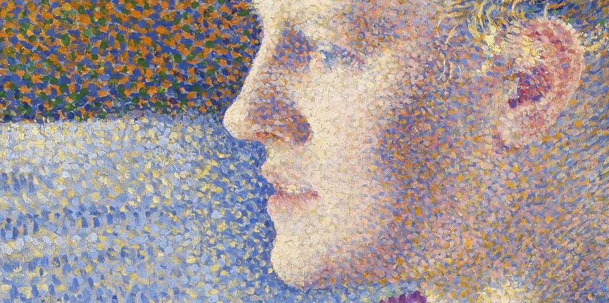
- Optical Mixing: This is the magic trick itself—the phenomenon that makes it all work. It's the moment when your brain, unable to resolve two distinct colors from a distance, fuses them into a single, perceived hue. It's less about the physics of light and more about the quirks of human perception. Seurat and Signac weren't just painters; they were early psychologists, exploiting the software of our visual cortex to create illusions of light.
The goal was to create a new kind of painting: one that wasn’t a mere representation of light, but a scientific and emotional reconstruction of it. They were trying to build a sun, not just paint one.
Critics of the day were baffled, some even offended. To an audience accustomed to blended gradients and visible craftsmanship, these paintings looked cold, mechanical, and unfinished. They called the artists "flea-bitten" or claimed the canvases needed to be "put behind a grating." They saw a barren field of dots where a smooth picture should be, entirely missing the revolutionary idea. Signac wasn't hiding the brushstroke; he was elevating the dot to the level of a fundamental building block, a quanta of color. He was proving that the artist's most powerful tool wasn't their hand, but the viewer's brain. The artwork wasn't complete on the canvas; it was finished inside your head.
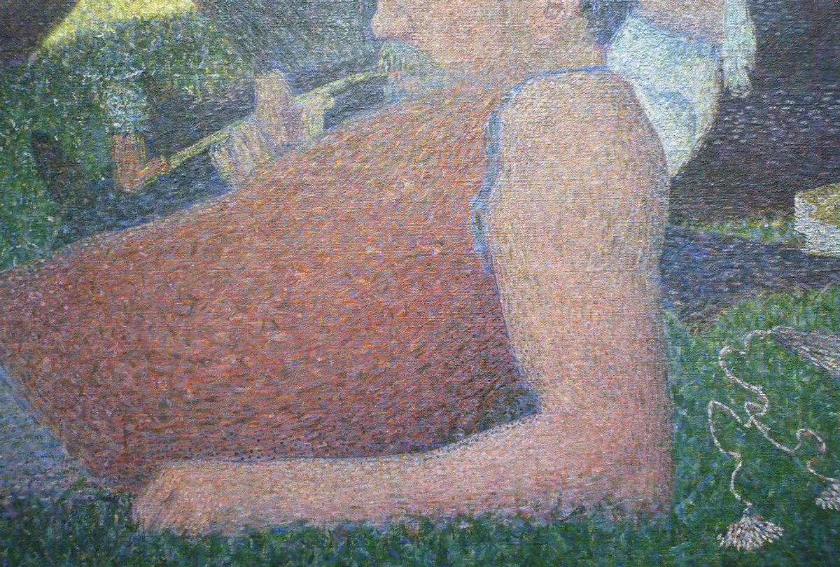
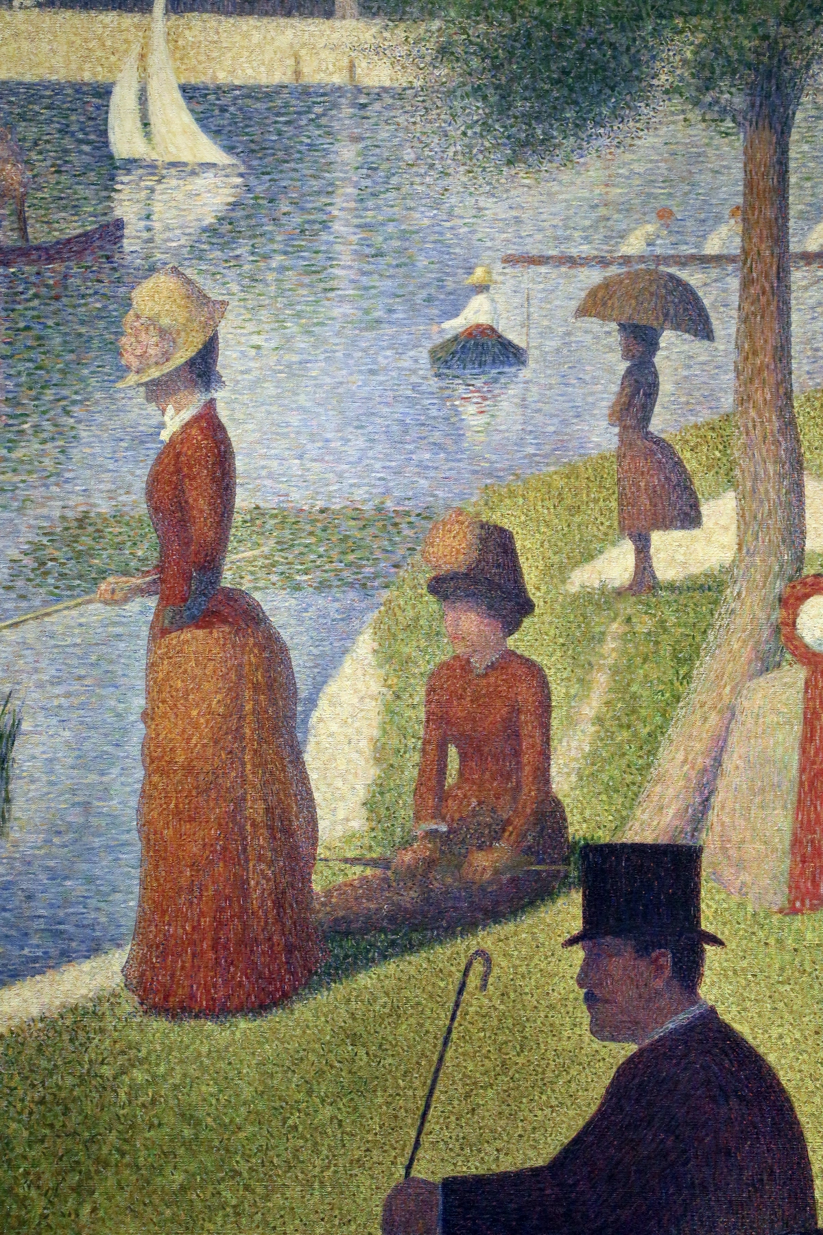
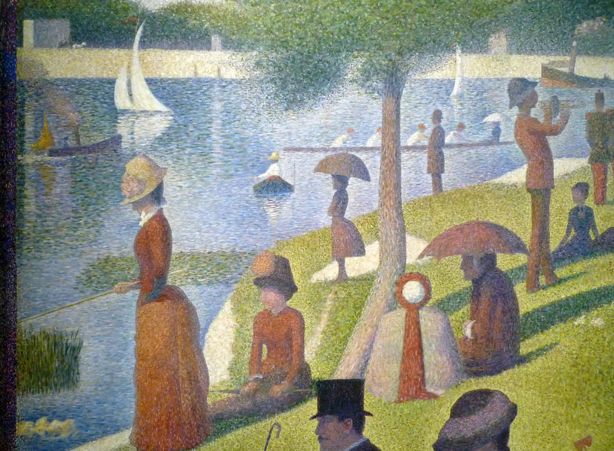
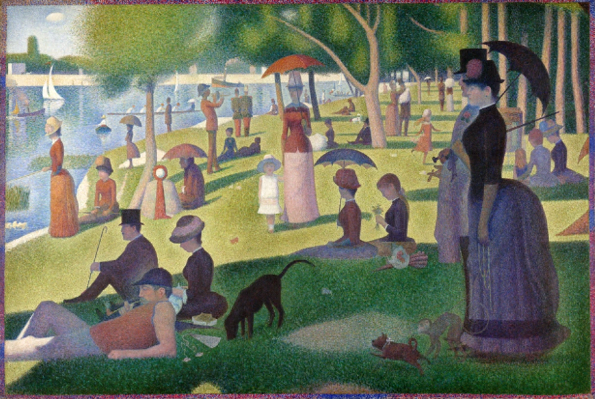
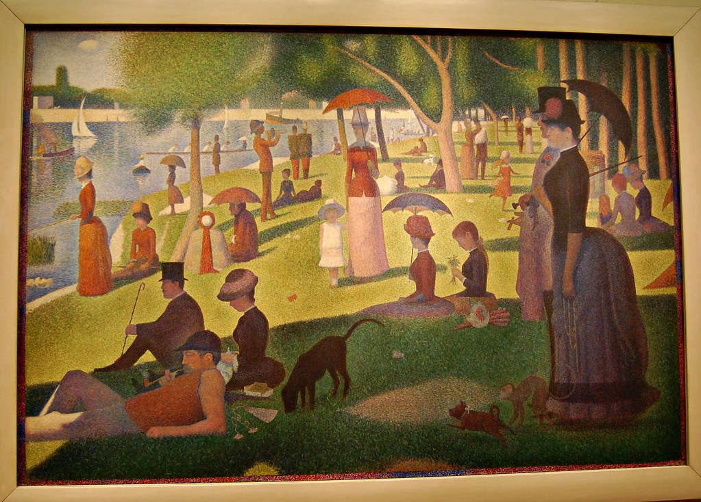
But here's the crucial distinction, the crack in the scientific facade: Signac was not Seurat. This isn't a minor point—it's the key to understanding the soul of the movement. Seurat, the method's brilliant inventor, prioritized a near-fanatical mathematical precision—plotting dots like a human printer, driven by an almost obsessive logic. His painting, A Sunday on La Grande Jatte, feels like a frozen, timeless theorem, a world where every leaf and limb is locked into a perfect, unmoving harmony.
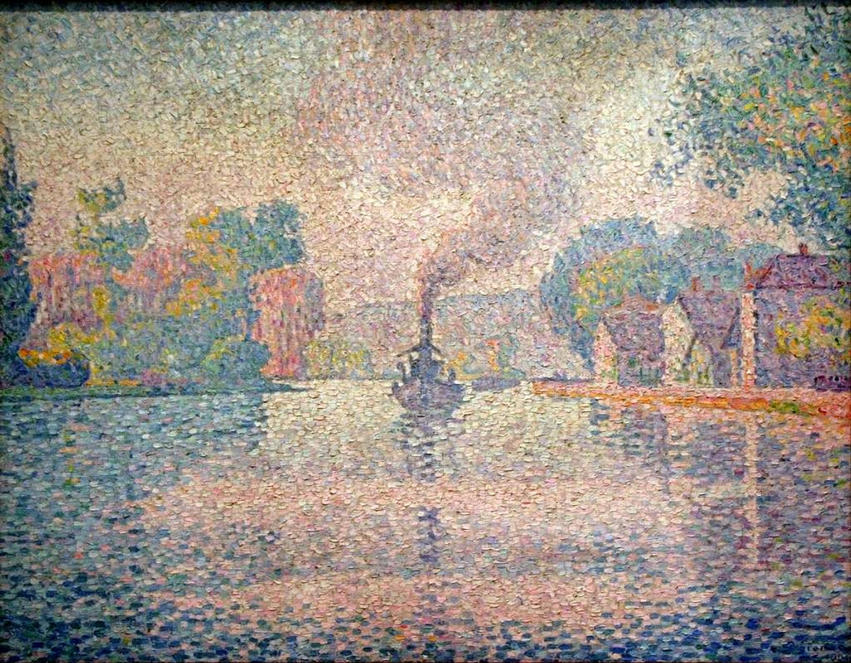
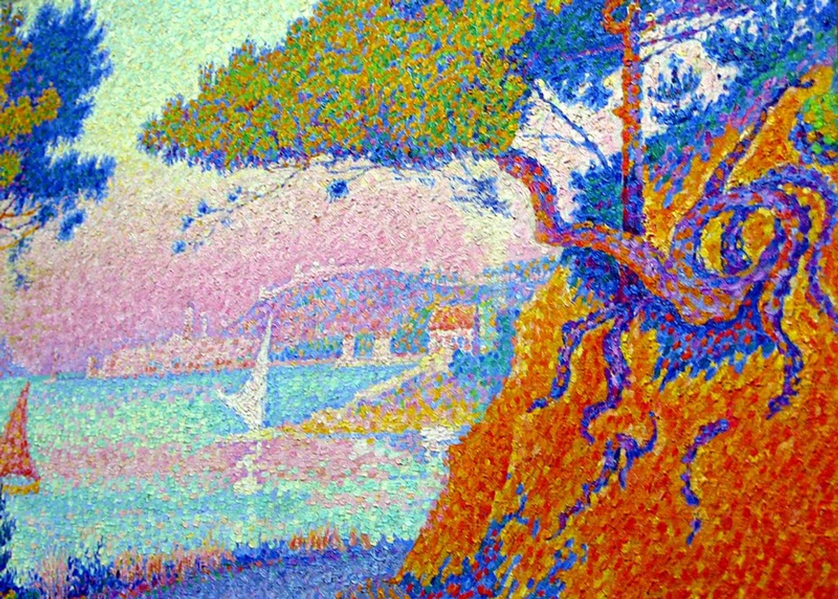
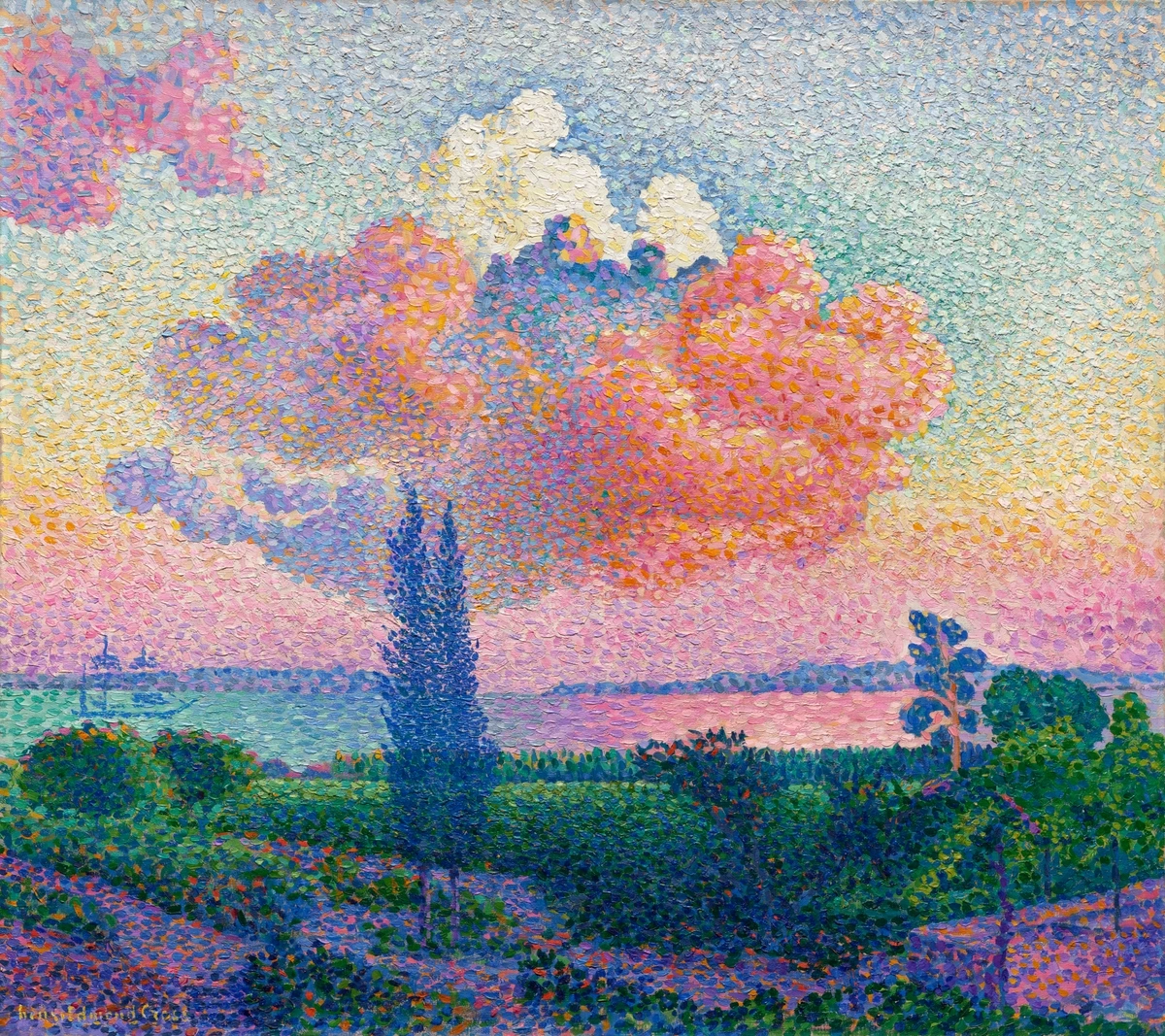
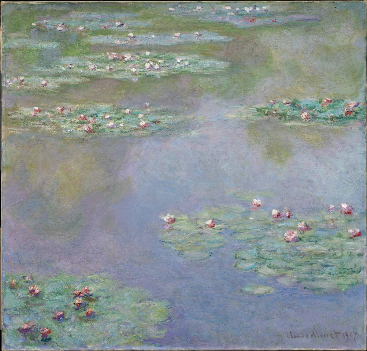
Signac, however, was the movement's passionate poet. He traded the lab coat for a sense of rhythmic spontaneity. Where Seurat sought order, Signac sought life. His brushwork was more "dance-like," varying dot size and pressure to create texture and movement. Looking at his 1901 masterpiece, The Port of Saint-Tropez, you can almost feel the Mediterranean wind ruffling the flags and the shimmer of heat on the water. The dots don't just build an image; they capture an atmosphere. This is pointillism with a heartbeat. It demands intentional stillness from the artist, but its goal is to make the canvas shimmer with captured energy.
Why the Dots? The Science Behind It All
Here's where it gets nerdy in the best way: optical color mixing. When red and blue dots sit side-by-side, your eyes perceive them as violet—not because they’re blended on the canvas, but because your brain performs the mix from a distance. This phenomenon, a cornerstone of the Neo-Impressionist movement that encompassed pointillism, is deeply rooted in the theory of simultaneous contrast. It tricks our visual processing system into seeing a color that isn't physically there, creating a vibrant, buzzing energy that palette-mixed colors can't achieve.
This wasn't just artistic whimsy; it was a scientific revolution on canvas. The Post-Impressionists were obsessed with the new scientific theories of their day, treating color not as a decorative element but as a quantifiable force. Signac's bible was the work of French chemist Michel Eugène Chevreul, who in 1839 published The Principles of Harmony and Contrast of Colours. Chevreul, while working at the Gobelins tapestry factory, realized that the perceived color of a thread was drastically altered by the threads surrounding it. A color's identity, he argued, was relational—not absolute. A single strand of red yarn could look dull and brownish on its own, but placed next to a blue one, it would burst into a fiery crimson. This idea—that color is a dialogue, not a monologue—was the intellectual spark for pointillism.
Signac and Seurat, along with co-thinkers like Camille Pissarro for a time, took this idea and ran with it. They also devoured the writings of American physicist Ogden Rood, whose 1879 book Modern Chromatics provided a scientific breakdown of additive and subtractive color mixing. Furthermore, the art critic Charles Blanc's Grammaire des arts du dessin proposed that color could be systematically organized to create harmony, much like musical notes. These artists weren't just illustrators; they were visual researchers. They essentially turned the canvas into a laboratory for testing how we see, creating a bridge between the scientific revolution of the 19th century and the world of fine art. Here’s a simple breakdown of what they learned:
Physical Mixing (Palette) | Optical Mixing (Canvas) | Example |
|---|---|---|
| Paint + Paint = New Hue | Hue + Hue = Perceived Blend | Red + Blue = Optical Violet |
| Pigments blend into each other, losing vibrancy. | Pigments remain separate, so light reflects off each one individually. | Yellow + Blue = Muddy Green vs. Vibrant Optical Green |
| Results in matte, often duller tones. This is subtractive mixing (towards black). | Creates brilliant, shimmering, and luminous colors. This is additive mixing (towards white). | The glowing, almost ethereal skies in Signac’s seascapes are a prime example of this luminous effect. |
The key takeaway? Physical mixing is subtractive—each pigment you add absorbs more light, pulling you towards black. Optical mixing is additive—the light bouncing off separate, pure dots combines in your eye, pulling you towards a more vibrant, luminous white. You're not just painting an object; you're engineering how light hits the viewer's retina.
This is why pointillism glow—literally. Light bounces off each pigment and scatters, creating a luminosity impossible through traditional blending. Remember: you’re not painting an object; you’re directing how light hits the viewer’s retina.
Your Toolkit: What You Actually Need
Don’t overcomplicate it. Signac worked with basic tools, but quality matters. The right materials don't just make the process easier; they are fundamental to achieving the luminous, vibrant effect at the heart of pointillism. Before you lay down your first dot, let's get your studio—or kitchen table—set up correctly. Here's your essential kit, broken down by necessity. Think of it as packing for a very patient, very colorful expedition.
First, let's talk about your work surface. Because you'll be working up close for hours, proper setup is non-negotiable. Ensure your easel or table is at a comfortable height to prevent back and neck strain. I can't tell you how many sessions I've ruined by hunching over a coffee table like a gargoyle. Ideally, your canvas should be tilted slightly towards you to reduce glare and give you a direct, perpendicular "stamping" angle for your dots. This simple ergonomic adjustment can save you from a world of physical pain and make the entire marathon of dot-laying feel almost meditative. If you're using a table easel, a small wedge or a book under the back legs can achieve this tilt perfectly.

Essential: The Non-Negotiables
- Brushes for Pointillism: For dots, you need control. Round brushes are your best friend. Sable or high-quality synthetic rounds in sizes 0, 1, and 2 will give you pinpoint precision. The goal is a sharp, needle-like point that can deposit a single, perfect dot of paint with a single tap. For larger, more directional dots or "taches" (patches), a small, stiff flat or bright brush works wonders. Some artists even use the handle end of a brush for perfectly uniform dots of a specific size. The key is a springy, responsive brush that snaps back after each tap. It should feel like an extension of your fingertip. And for heaven's sake, buy a few of each size you like. There's nothing more frustrating than ruining a session because your favorite #1 brush gave up the ghost.
- Paint Quality is Everything: This is where you cannot compromise. Pure, intense pigments are the soul of pointillism. Avoid "student grade" paints that are filled with fillers and weak pigments; they will produce muddy, lifeless optical mixes every single time. You want artist-grade paints. Start with a limited palette: a true Cadmium Red (or a Napthol Red for a safer, more affordable option), Ultramarine Blue, a Hansa or Cadmium Yellow Light, and a Zinc White. These three primaries and white will give you the cleanest secondary mixes (your oranges, greens, and violets) and the most vibrant results. While modern chemistry gives us a wider range of stable, non-fading colors, sticking to these basics for your first painting forces you to master optical mixing without a crutch.
- Surface: Canvas board or stretched canvas works, but the smoother the tooth, the crisper your dots will be. Rough textures can cause the paint to "sink in" and lose its crisp edge. A perfectly smooth panel, like gessobord or Masonite sealed with at least three thin layers of gesso and lightly sanded with fine-grit sandpaper between coats, is the professional's choice. You're building a mosaic of light; you need a flat, stable foundation to make each tile of color count.
Helpful: Making Life Easier
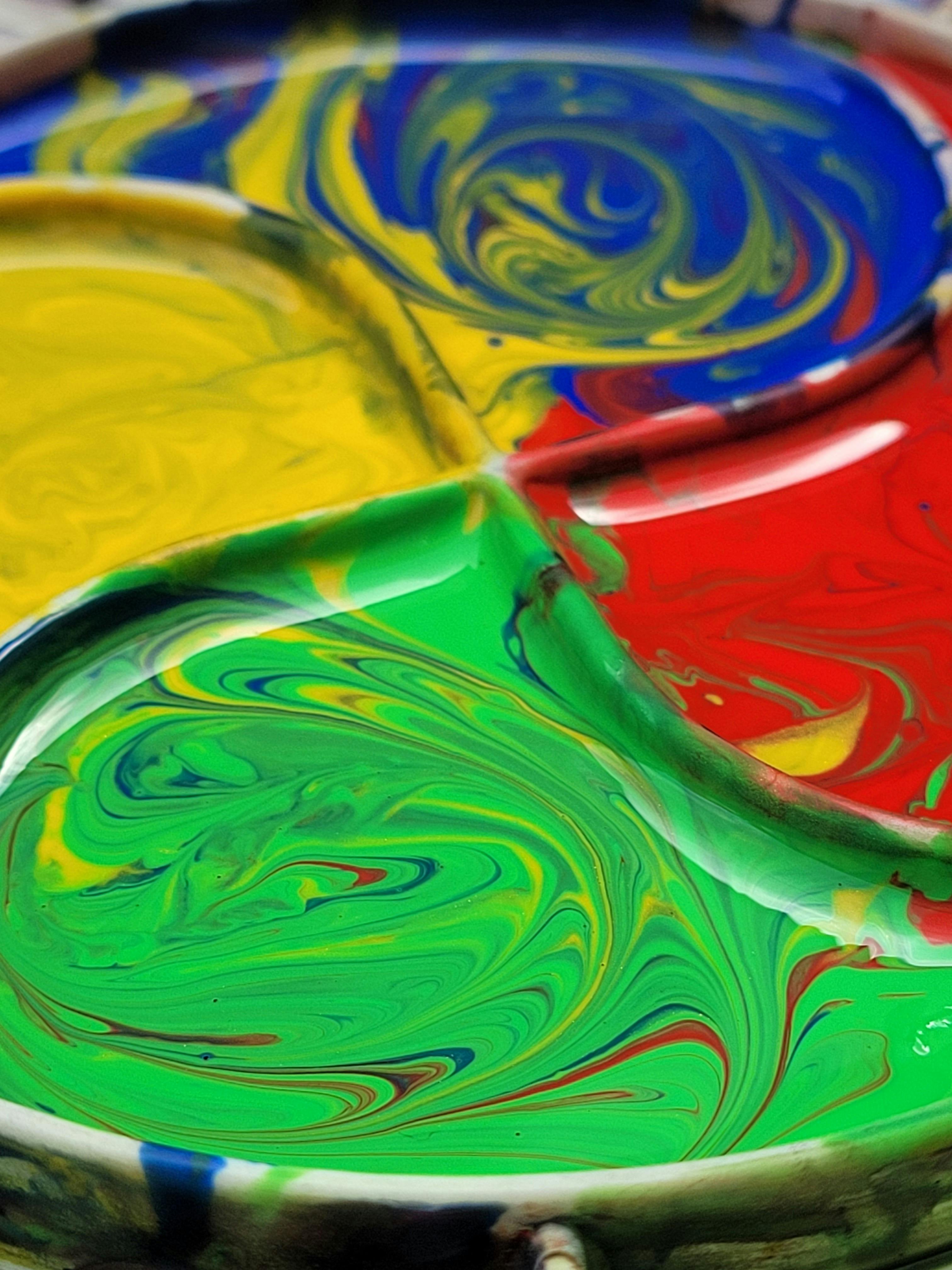
- Palette: A glass palette is ideal, as you can scrape it perfectly clean between sessions, ensuring no old color contaminates your new dots. A simple white ceramic plate also works perfectly. The goal is a clean, light-reflective surface that helps you judge your colors accurately. For oils, a wooden palette is fine, but the non-porous nature of glass makes cleanup a joy.
- Mediums: This is the alchemy of consistency. If using oils, a small amount of a fast-drying medium like Liquin or Galkyd can help your dots set faster. For a more authentic experience, you can make your own medium using a mix of 1 part linseed oil to 3 parts odorless mineral spirits (OMS), with a drop of cobalt drier if you're feeling adventurous. For acrylics, a retarder is non-negotiable. It keeps your paints from drying on the brush between dots. Without it, you'll be fighting a losing battle against time, scraping little clay-like pellets off your expensive sable brush.
- Mahl Stick: This is a thin rod, often with a soft leather ball on the end, that you rest your painting hand on to keep it steady and off the surface of the canvas. It's a lifesaver for preventing smudges and keeping your dots precise, especially in large, detailed areas. If you don't have one, a long, thin wooden dowel or even a clean ruler can work in a pinch. It's like training wheels for your painting hand, giving you stability for those perfectly vertical tap-down motions.
- Magnifying Lamp or Good Lighting: You'll be working close. Having a bright, focused light source (around 5000-6500 Kelvin to mimic daylight) or a magnifying lamp can prevent eye strain and help you see exactly where each dot is being placed. Your eyes are your primary tool; protect them. I've found that a simple clip-on LED light with an adjustable neck, positioned just right, can transform a dim corner into a perfect workspace.
- Comfort and Patience: This is listed as a tool because it is. Invest in a comfortable stool or chair if you're sitting, and stand on an anti-fatigue mat if you're standing. You will be trading speed for luminosity. Embrace the slowness. Your enemy isn't making a mistake—it's rushing and getting physically cramped. Think of each dot not as a chore, but as a tiny grain of sand on a beach—on its own it's nothing, but together they form something magnificent.
Step-by-Step: Painting Like Signac
Here’s how to approach it, from blank canvas to "Wait, those are dots?" This isn't a rigid formula, but a recipe for a mindset. The goal isn't to copy Signac, but to internalize his logic of seeing and building an image from pure color. Let's break it down into phases: conception, execution, and refinement.
But before we dive in, I need to make one thing clear: you are signing up for a marathon, not a sprint. The single biggest mistake beginners make is choosing a subject that's far too complex for their first attempt. Your goal for your first painting isn't to create a masterpiece; it's to learn the rhythm and feel of the technique.
Choose your first subject with care:
- Do: A simple landscape with a clear horizon line, a lone boat on water, or a still life with two or three brightly colored objects.
- Don't: A portrait of your family pet, a complex cityscape with hundreds of windows, or anything with intricate details or fine lines.
The reason is simple: the subject should be a vehicle for the color, not a challenge in itself. You want to spend your mental energy thinking "what color dot should I place here to make the sky vibrate?" not "how do I accurately render the sadness in my dog's eyes with a thousand tiny stabs of paint?" Give yourself a fighting chance. Start simple.

1. Sketch With Your Mind (Not Pencil)
This might be the most counter-intuitive step for a classically trained artist. Signac rarely sketched in the traditional sense. A detailed pencil drawing was a cage he refused to enter, a rigid roadmap that would force him to "color within the lines." Instead, his "sketch" was a mental map of color and light. He was thinking in zones, not in lines. He was thinking like a mosaic artist approaching a wall with a pile of colored tiles.

Try this radical approach:
- Identify Major Value Shapes: Forget nouns like "sky" and "water." Think in adjectives of color and light: "warm yellow," "deep blue," "violet shadow." Break your subject down into its most basic color components. Look at your chosen subject and mentally blur your eyes. What are the three or four largest blocks of color you see? A simple landscape? It's not a horizon line; it's a block of light-infused yellow meeting a block of receding blue.
- Annotate, Don’t Draw: Use your pencil not to create an outline, but to make tiny, light annotations on the canvas. A small "Y" for a yellow zone, a "B" for a blue zone, an "R" for a red zone. These are placeholders, parking spots for your colors, ensuring you know where to "park" a color without the rigid confines of a drawing. This freedom, which I call "painting from the inside out," allows you to build the image purely with color relationships, which is the entire point of the technique. It forces you to solve problems with color, not with line.
2. The Dotting Dance: Precision Meets Rhythm
This is where your meditation begins. Loading your brush properly is the first step. Dip just the tip into your pure pigment (thin it slightly with medium if needed) and tap it once on your palette to form a sharp point. You want a "loaded needle," not a soppy mess.
Now the motion:
- Holding the Brush: Hold the brush vertically, like a conductor's baton poised over an orchestra. Your motion should come from your fingers and wrist, not your arm.
- The Tap: Bring the brush down straight onto the canvas and lift it straight up. It's not a painting motion; it's a stamping or "tapping" motion. Think controlled mallet taps. The goal is to leave a distinct, singular dot of color.
- Spacing is Everything: Place your next dot about one dot's width away. Too close and they'll bleed together; too far and they'll never merge optically. This spacing is the rhythm of your painting.
- Vary Pressure: This is how you create texture and value. Lighter pressure creates smaller, airier dots for highlights. Heavier pressure creates larger, more solid dots for shadows and depth. Signac used this to make rocks feel solid and water feel ephemeral.
- Layer Strategically: Let your first layer of dots dry completely before adding another. Dots are semi-transparent veils. Build your depth by layering colors over one another, not by making the dots thicker.
3. Optical Blending is Your Co-Pilot
This is the most crucial feedback loop in the entire process. Your painting will look like a chaotic mess up close. That's not just okay; it's correct. Your goal is to stop thinking like a painter up close and start thinking like a viewer from afar. You are essentially painting two different pictures: one of abstract dots for the close-up observer, and one of shimmering reality for the person standing back.
- Work for the Fuse Point: The "fuse point" is the distance at which your brain can no longer distinguish the individual dots, and the optical blend kicks in. For most paintings, this is between 4 to 12 feet away. You are painting for this specific point in space.
- The Step-Back Ritual: Make it a habit. Every 30 to 45 minutes, or whenever you start to feel lost in the dots, get up and walk away from your canvas. Walk at least six feet away and turn around. Does the water look wet? Does the sky glow? Is the form reading clearly? This is your quality control check. Don't skip it.
- Troubleshooting Your Blend: If the effect isn't working, you have two primary dials to adjust: spacing and color.
- Dots look sparse and "measly"? You're spacing them too far apart. Move in a little closer with your next layer. The painting needs more data points for the eye to process.
- Dots look muddy and are bleeding together? You're crowding them. Give them a little more breathing room. You've lost the separation needed for optical mixing.
- Color looks flat? Your palette is too limited. Introduce a complementary color into your dots to create optical vibration. A shadow isn't just darker; it's often the complement of the light that's hitting the object.### 4. Know When to Stop (The hardest part)
Signac often left paintings "unfinished" by conventional standards. If dots stop merging optically? You’re done. Adding more ruins the magic.
4. The Final Layer: Glazing for Unity
Once all your dots are down and the painting is optically working, you have a final, secret weapon in your arsenal: the glaze. Signac sometimes used this technique to unify the painting and enhance its luminosity.
A glaze is a thin, transparent layer of paint. Mix a tiny amount of a neutral color (like a mix of your dominant hues) with a generous amount of medium. Using a large, soft brush, lightly drag this wash over a specific section (like the sky or water). It will tint the entire area, subtly shifting the color temperature and making the dots underneath feel more cohesive, like they're all vibrating in the same light. It's a finesse move, but a powerful one.
Common Hurdles (And How to Kick Them)
Challenge | Solution |
|---|---|
| Muddy colors | Rinse brush between colors. Never mix wet washes. Use separate brushes for each color if possible. |
| Dots look sparse/floating | Layer complementary colors next to each other (e.g., red + green for depth). Ensure 1-2 dot spacing. |
| Hand cramps | Stretch every 30 mins. Use shorter brushes to reduce reach fatigue. Consider ergonomic painting tools. |
| Discouraged by "slow progress" | Remember: Each dot is a brushstroke. It accumulates. Set small daily goals (e.g., "complete one color zone"). |
| Colors not blending optically | Check viewing distance. Ensure consistent dot size. Add intermediate colors between problem areas. |
| Paint drying too fast | Use open acrylics or slow-drying mediums. Work in smaller sections. Keep covered when not painting. |
| Canvas texture showing | Use smoother canvas or apply extra gesso coats. Sand lightly between layers. |
| Uneven dot sizes | Practice on scrap paper first. Use consistent brush loading. Develop muscle memory for pressure. |
| Colors looking flat | Add complementary colors in shadows. Vary dot sizes subtly. Use broken color in highlights. |
| frustration with technique | Take breaks. Watch videos of professional pointillists. Remember: Signac struggled too—it's about the journey! |
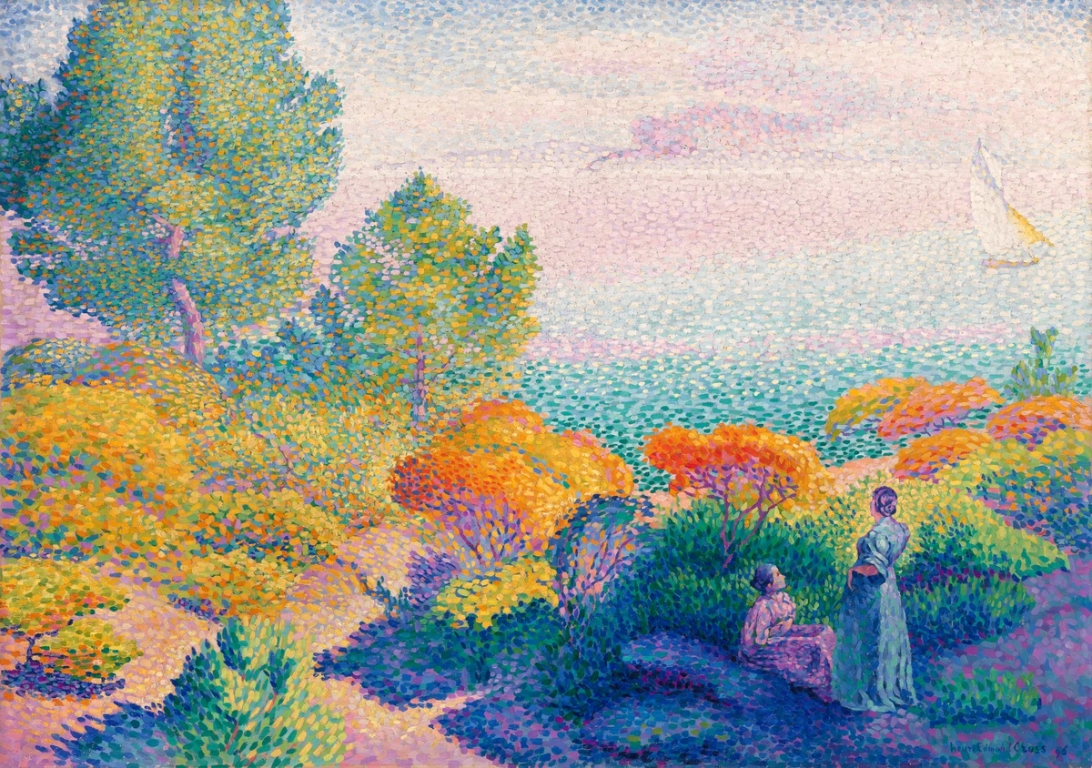
Pointillism Beyond Theory: Famous Signac Pieces
Reading about the technique is one thing, but seeing it in action is where the penny drops. These paintings aren't just pretty pictures; they're textbooks on how to build a luminous world from pure color. Study them virtually (or make the pilgrimage in person if you're near a museum like our Den Bosch museum)—paying close attention to the size, shape, and proximity of the dots.
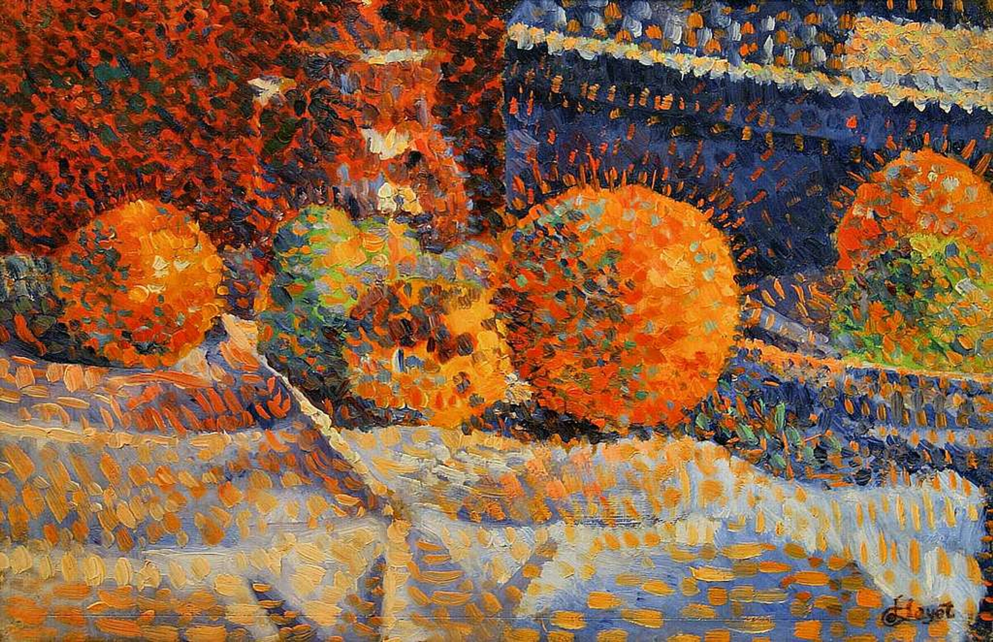
- The Town of Saint-Tropez (1892): This piece is a masterclass in dappled light. Look closely, and you'll see how Signac doesn't just paint shadows. He layers blues, violets, and oranges next to the bright yellows and pinks of the sunlit facades, creating a palpable sense of shimmering heat and vibrant light bouncing between the buildings. It feels less like a static scene and more like a single, perfect moment of afternoon sun captured on canvas.
- The Port of Saint-Tropez (1901): Perhaps his most famous work, this painting is the essence of simplification. The subject is complex—boats, water, buildings, flags—but Signac breaks it down into powerful, clean color zones. The red hulls, the yellow masts, and the brilliant blue water are rendered with rhythmic, confident brushwork. This painting practically glows with an internal light, proving that complexity can emerge from simple, organized strokes.
- Women at the Well (1892): This proves that pointillism isn't just for landscapes. Here, Signac applies the technique to the human form with stunning results. The figures are solid yet ethereal, constructed entirely of light and color. It demonstrates how the technique can imbue figurative work with a unique, monumental stillness, as if the figures are carved from the very light that surrounds them.
Advanced Concepts: The Artist's Mind
Before we get to the questions that everyone asks, let's touch on a few advanced ideas that separate the hobbyist from the dedicated student of pointillism. This is where you move from following a recipe to understanding the philosophy in the kitchen. This is also where many people discover that pointillism isn't just a style, but a complete theory of visual perception, one that throws out centuries of painting tradition in favor of a radical new logic.
Let's address the most common question right away: why go through all this effort? The answer lies in the unique effect that cannot be achieved any other way. A traditionally blended painting, even a beautiful one, sits on the canvas. A pointillist painting seems to shimmer above it, a field of light generated by your own eyes. It's the difference between hearing a recording and being in the room with a live orchestra. The energy is simply different.
The Theory of Simultaneity and Harmony
Signac didn't just place dots randomly. He followed a theory of "simultaneity," which held that certain colors, when placed next to each other, would produce a more vibrant, luminous effect than if they were mixed on the palette. It was a direct application of the color theories of Chevreul and Rood. This wasn't abstract; it was a set of rules.
A key principle was using colors in shadow that contained a hint of the local color's complement. This is why you'll often see tiny, isolated dots of orange in the shadow of a blue sail, or specks of green in the shaded side of a red roof. Your brain registers this visual "noise" not as a mistake, but as a more vibrant, living kind of color. It's the visual equivalent of adding a pinch of chili to a chocolate dessert—it makes the main flavor pop in a way you can't quite identify but can't ignore. This technique, where the shadow contains the seeds of its opposing light, is what makes pointillist paintings feel so alive, as if the entire canvas is buzzing with internal energy.
The Signac Color Wheel: Signac took this a step further, creating his own color wheel based on the laws of harmony. He broke colors into:
- Dominants: The overall local color of an object (e.g., the red of a hull).
- Shadows: The local color's complement, darkened (e.g., blue-greens in a red hull's shadow).
- Half-Tones: Mixtures of the dominant and its complement.
- Lights: The pure dominant, mixed with white.
Following this logic, a single red sail is not just "red." It's a carefully orchestrated symphony of pure reds, oranges, and yellows in the light, and violets, blues, and greens in the shadow, all blending optically to create the "idea" of a red sail. It's painting by recipe, but the recipe is baked into the physics of sight.
Pointillism vs. Digital Pixels: A Critical Distinction
It's tempting to call Seurat and Signac the "inventors of the pixel," but this is a romantic and slightly inaccurate misunderstanding. The comparison is seductive, but it falls apart under scrutiny. A pixel is a uniform, abstract unit with a single, fixed color value (RGB). It is a passive piece of data, identical to its neighbors, waiting to be illuminated by a backlight.
A pointillist dot, on the other hand, is an active, intentional paint stroke. It has physical texture—you can feel the impasto of the paint on the canvas. It can vary in size and shape from one stroke to the next—tiny for delicate highlights, larger and more aggressive for shadowed rocks. Most importantly, its color is a pigment that reflects light, not a light source itself. The magic of pointillism is in this tension between the physical, handmade mark of the artist and the optical illusion it creates. A pixel blends data. A pointillist dot blends light, atmosphere, and—dare I say it—soul. It's the difference between a perfect digital photograph of a sunset and the actual, messy, awe-inspiring, and deeply emotional experience of seeing one.
Frequently Asked Questions (FAQ)
Is Signac's technique harder than traditional painting?
"Harder" is the wrong word. It's different. If your brain is wired for expressive, gestural painting, the discipline of pointillism can feel like meditation for the first hour and then like a straitjacket. You're trading the freedom of the arm for the precision of the wrist. But if you find peace in process, in building an image stroke by deliberate stroke, you might find it less stressful. There's no worrying about a "perfect" gradient or blending "wet-into-wet." Mistakes are just misplaced dots that can be painted over. I've messed up entire skies by making the dots too big and turned them into more interesting, stormier sunsets by layering in darker colors. It's incredibly forgiving because you build it up in layers—it's additive, not reductive.
Can I use acrylics instead of oils?
Absolutely! Acrylics have one major advantage: their fast drying time is perfect for layering—one of the core tenets of the technique. You can lay down a field of red dots in the morning and be adding blue ones on top in the afternoon without any risk of smudging. The challenge is that they dry too fast on the brush. Here's the solution: use open acrylics (like Golden's Open line), which have a much longer working time, or add a good acrylic retarder to your paint. This slows the drying time, giving you the workability of oils with the layering speed of acrylics. If you don't have those, work in smaller sections and keep a spray bottle to mist your palette. Just be aware that acrylics can dry slightly darker than they appear when wet, a phenomenon known as "value shift," so always do a test swatch first.
How long does a pointillist painting take?
This is the question every beginner asks, and the answer is: longer than you think, but less than you fear once you find your rhythm.
For a 12" x 12" (30x30cm) canvas with moderate detail, budget for 40-80 hours of actual painting time. This isn't a weekend project; it's a practice to be savored over weeks or months. The work is cumulative, like building a mosaic tile by tile.
My advice? Don't time it. Don't race. The slowness is the point. It forces you to really see the color you're putting down, to be intentional with every single dot. Break the work into small, manageable zones—one sailboat, one patch of grass, one section of sky per session. The painting is done not when the canvas is covered, but when you stand back and it sings to you from across the room.
What’s the biggest misconception about pointillism?
That it's a cold, tedious, purely mathematical exercise—like painting by numbers. This couldn't be further from the truth. While rooted in science, Signac's work is profoundly lyrical and passionate. It's not about erasing the artist's hand; it's about channeling it in a new, disciplined way. It's structured freedom. Like composing jazz—you have a set of rules and scales (your color theory and dot spacing), but the magic happens in the improvised notes, the personal rhythm, the soul you pour into it. A pointillist painting is the visual equivalent of a complex musical score, where every dot is a note contributing to a luminous symphony. The science is the instrument, but the music is entirely up to you.
Where can I see original Signacs?
There's no substitute for standing in front of the real thing. You can read about the shimmer all you want, but feeling it in person is a different experience entirely. The texture, the scale, the way the light hits the impasto of the dots—it's transformative. Many major museums hold his work, but a few have exceptional collections that are worth the trip:
- Musée d’Orsay, Paris: The motherlode. With dozens of works, you can see the full evolution of his style, from his early pointillist experiments to his later, freer watercolors. It's a pilgrimage for any color enthusiast.
- The Metropolitan Museum of Art, NYC: Home to the iconic The Town of Saint-Tropez, a masterpiece of dappled light that will make you understand the technique in an instant.
- MoMA, NYC: Has several key Post-Impressionist pieces where you can see Signac's work in the context of his peers.
- The Hermitage Museum, St. Petersburg: Holds a significant collection of his later, more liberated watercolors, showing how he evolved beyond strict pointillism.
- Local Museums: Don't overlook smaller national or regional museums, which often have one or two stunning examples in their permanent collection. Check our timeline page for current exhibitions and locations where you might find his work near you.
From Dots to Legacy: Pointillism's Enduring Influence
The pointillist experiment didn't end with Signac. While the style's peak was brief, its influence was monumental—a shockwave that rippled through modern art and continues to echo today. It's a classic example of a movement whose impact far outweighed its lifespan. The structured, analytical approach to form fed directly into the geometry of Cubism, teaching artists like Picasso and Braque how to deconstruct reality into facets. On a broader level, the concept of building an image from discrete, individual marks is the philosophical ancestor of everything from television screens to Chuck Close's massive photorealistic portraits, which only resolve into a face from a distance.
Let's trace that lineage a bit more clearly:
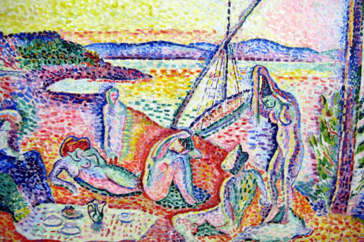
- The Fauvist Explosion: The idea that color could be broken down into its component parts directly paved the way for the explosive, liberated color of the Fauves like Matisse and Derain, who abandoned the dots but kept the raw, emotive power of pure color. Where Signac used color scientifically, the Fauves used it emotionally, but they learned from him that color didn't have to be descriptive. It could be an independent force.
- The Birth of Abstraction: By proving that a painting could be built from non-representational units (dots of color that mean nothing on their own), pointillism helped lay the philosophical groundwork for pure abstraction in the 20th century. It opened the door for artists to think about a painting not as a window to the world, but as an object with its own internal logic.
- Pop Art and Beyond: The mechanical, almost digital look of pointillism found a strange echo in the Ben-Day dots used by Roy Lichtenstein. While Lichtenstein was commenting on mass media, the visual language he used—an image broken down into a field of colored dots—is a direct conceptual descendant of the Neo-Impressionist project.
Signac's true legacy, however, isn't in the technique itself, but in the radical idea behind it: that the artist's job isn't to represent light, but to re-create it with pigments on a surface. He taught us that the most important part of a painting isn't on the canvas—it's in the mind of the person looking at it. He handed half the creative process over to the viewer, making them a collaborator in the act of seeing.
Wrapping Up: Your Dot-Starting Journey
Pointillism isn’t a relic—it’s a living dialogue between artist and light, a meditation on how we see. It asks you to slow down, trust perception, and surrender control to a process that is both scientific and profoundly spiritual. I still mess up dot sizes. I still lean too close too soon, getting lost in the abstract beauty of the marks and forgetting the big picture. But I’ve learned that this technique forces a different kind of discipline, one that is becoming increasingly rare in our fast-paced world. It teaches you to find fulfillment not in the final product, but in the accumulation of thousands of tiny, perfect moments of focus.
But I’ve learned: the magic happens when you stop forcing and start trusting. The dots will coalesce. The painting will breathe. The shimmer will emerge, not because you commanded it, but because you patiently allowed it to. And when you finally step back and see that field of chaos resolve into a living, shimmering whole, you'll understand what Signac was chasing. You won't just have a painting; you'll have a deeper understanding of the fragile, beautiful mechanics of sight itself.
It’s a beautiful lesson in art and in life: sometimes, to create something whole and brilliant, you have to let go of the big, sweeping gestures and focus on getting one tiny, perfect dot right at a time.

Ready to try? Find quality materials in our shop and explore more artist techniques.
Actionable Checklist: How to Paint Your First Pointillist Piece
Here is a step-by-step checklist you can follow to get started. Print this out, stick it on your easel, and check it off as you go.
Phase 1: Planning & Preparation
- Subject: Choose a simple subject with 3-4 major color blocks (e.g., a bright boat on blue water). Avoid complex portraits for your first attempt.
- Canvas: Prepare a small, smooth canvas (e.g., 8"x10"). Apply 2-3 coats of gesso, sanding lightly between each. You want a surface as smooth as glass.
- Paints: Procure at least three high-quality, pure pigments: Cadmium Red, Ultramarine Blue, Cadmium Yellow, and Zinc White. This is not the time for student-grade paints.
- Tools: Gather your small round brushes (sizes 0-2), a glass or ceramic palette, and your chosen medium (e.g., Liquin for oils, retarder for acrylics).
Phase 2: The Initial Layer (Day 1)
- Mental Sketch: Resist the urge to sketch. Lightly pencil in zones like "Y" for yellow, "B" for blue.
- Focus on One Zone: Pick your lightest, brightest zone (e.g., the sun). Load your brush with yellow and tap on your first layer of dots. Focus on even spacing and consistent pressure.
- Work Methodically: Complete this one zone before moving to the next. Embrace the meditative rhythm. Let the layer dry completely.
Phase 3: Building Depth (Day 2 onwards)
- Move to Mid-Tones: Add your next major color (e.g., blue for the water). Keep dots spaced about a dot's width apart. Let it dry.
- Introduce Shadow: Add a darker version of your base colors (e.g., violet in the blue zone for wave shadows, orange in the yellow for sun gradients).
- Add Complementary Vibrations: Once the main forms are established, go back and add tiny, isolated dots of complementary colors in your shadows and mid-tones to make them "sing." This is the magic step.
- Step Back: After every session, stand at least 6 feet away to check if the colors are starting to blend optically. This is your most important quality control step. Trust the process, even if it looks messy up close.
Phase 4: Finishing Touches
- Add Vibrations: Once the main forms are established, go back and add tiny, isolated dots of complementary colors in your shadows and mid-tones to make them "sing."
- Find Your Stopping Point: The painting is done not when you're tired, but when you stand back and the image resolves clearly and vibrantly. More is not always better. Know when to walk away.
Remember: Your first piece may not be a masterpiece. That's okay. The true masterpiece is the patience you learn and the new way you start to see the world—not as objects, but as fields of vibrating color.
A Contemporary Echo: Pointillism in the Digital Age
It's fascinating to see how the core principles of pointillism are more relevant than ever. Every time you look at a photo on your phone or watch a movie on an LED screen, you're experiencing the same optical magic Signac was chasing. The pixels on your screen are just very, very small, mass-produced dots of red, green, and blue light.
Contemporary artists continue to play with this legacy. Some use hole-punch paper, digital glitches, or thousands of hand-painted dots to create massive, immersive portraits that only resolve from a distance. They prove that Signac's central question—how do our eyes build a world from fragments?—is a timeless one. It's a bridge between the 19th-century salons of Paris and our hyper-connected, pixelated modern world.