Using Yellow Ochre in Art: A Warm Embrace of Earth and Light
Discover the history, symbolism, and practical magic of yellow ochre in art. Learn mixing techniques, psychological impact, and creative applications in this essential artist's guide.

Using Yellow Ochre in Art: A Warm Embrace of Earth and Light
Remember that feeling of holding a chunk of warm clay as a kid? That visceral, earthy sensation – that's yellow ochre. It's not just a pigment; it's a primal yellowness scraped from red earth, carrying millennia of sunlight and sediment. I remember the first time I consciously used it in a piece: the way it sang against cobalt blue, how grounded the painting suddenly felt. It was like adding a soul to the canvas. So, let's dig into why this humble, historical hue remains such a powerhouse in modern art.

What Exactly IS Yellow Ochre, Anyway?
At its core, yellow ochre is a naturally occurring clay pigment. Think of it as the sunshine trapped in stone. Its primary component is hydrated iron (III) oxide – that's the scientific name for the chemical stuff that gives it that warm, mustard-yellow to golden-brown hue. But there's more to it than just chemistry.
The Science Behind the Warmth
Yellow ochre gets its characteristic color from hydrated iron oxide (Fe₂O₃·H₂O), but its properties are shaped by its clay base. The tiny clay particles act as a binder, creating a pigment that's both transparent enough for glazing and opaque enough for coverage. This dual nature makes it incredibly versatile.
The particle size affects how it behaves: finer particles create more transparent effects, while coarser particles give that wonderful granular texture we love. And unlike many modern pigments, ochre's color comes from natural mineral deposits rather than chemical synthesis.
Lightfastness and Chemical Stability
One of ochre's most remarkable properties is its exceptional lightfastness. This means:
- UV Resistance: The iron oxide structure doesn't break down under sunlight
- Color Permanence: Colors remain true for centuries, unlike many organic pigments
- Chemical Inertness: It doesn't react with other pigments or environmental factors
- Thermal Stability: It maintains its color at high temperatures
This stability comes from the crystalline structure of iron oxide, which is one of the most stable compounds in nature. It's essentially rust that won't change – a perfect example of chemistry serving art.
A Journey Through Time
It's been mined and used for since, like, forever. Seriously, prehistoric people were grinding this stuff onto cave walls tens of thousands of years ago to create those incredible handprints and animal figures. The earliest known ochre mines date back over 100,000 years, making it one of humanity's oldest artistic materials.
Historical Mining and Processing
The way ochre has been mined and processed reveals much about human technological development:
Ancient Mining Techniques
- Surface Collection: Early humans simply collected ochre that had naturally weathered to the surface
- Shallow Pits: As demand grew, simple pits were dug to access richer deposits
- Shaft Mining: By the Bronze Age, more sophisticated shaft mining techniques developed
Traditional Processing Methods
- Grinding: Ochre was ground on stone metates with quartz or sandstone grinding stones
- Washing: Raw ochre was washed to remove impurities and concentrate the pigment
- Drying: The processed ochre was sun-dried for storage and transport
- Binding: Early binders included animal fats, plant gums, and water
These traditional methods are still used today by some artists seeking historically authentic materials.
The Practical Powerhouse
It's incredibly lightfast (meaning it doesn't fade easily in sunlight) and mixes incredibly well with other pigments. It's the unshakeable, reliable workhorse of the warm Earth tones. When properly prepared, it's non-toxic, stable, and archival-quality – qualities that have made it beloved by artists for centuries.
Modern Processing and Quality Control
Today's ochre pigments benefit from centuries of knowledge combined with modern technology:
Industrial Processing
- Milling: Modern ball mills create consistent particle sizes
- Chemical Treatment: Some ochres are washed and treated for purity
- Synthetic Alternatives: While natural ochre is preferred, synthetic iron oxides offer consistent alternatives
- Quality Testing: Modern pigments undergo rigorous testing for lightfastness, toxicity, and color consistency
Artist-Quality Considerations When selecting ochre today, consider:
- Pigment Load: Higher pigment load means more intense color
- Binders Quality: Professional binders ensure longevity and workability
- Additives: Some ochres contain extenders or preservatives
- Environmental Impact: Consider sustainable sourcing when possible
The result is ochre that maintains its ancient magic while benefiting from modern reliability.
credit, licence
The Psychology & Symbolism: More Than Just a Color
Yellow ochre isn't just visually warm; it feels warm. Psychologically, it taps into deep associations with:

- Earth & Stability: It connects us to the ground, to soil, to roots. It feels solid and dependable.
- Sunlight & Warmth: It evokes the gentle heat of the sun, not the harsh buzz of neon yellow. Think autumn afternoons.
- Nostalgia & History: Because it's so old, it carries a sense of timelessness, memory, and heritage. It reminds us of old photographs, dusty libraries, and terracotta pots.
- Comfort & Simplicity: It’s a color that feels familiar, approachable, and unpretentious. Not flashy, but profoundly present.
This makes it incredibly versatile. In an abstract piece, it can suggest grounding energy amidst chaos. In a landscape, it defines the sunlit earth. In a portrait, it brings warmth and life to skin tones. It's the emotional anchor point for many compositions. I often find myself reaching for it subconsciously when I want to project a sense of calm, warmth, or enduring strength in a piece. It’s the color of a hug made of light.
Yellow Ochre Through Art History: An Enduring Legacy
Yellow ochre wasn't just available; it was essential for centuries. Its permanence and warmth made it indispensable.
The Journey Through Art Movements
Art Period  | Key Artists & Works | Why Ochre Shined |
|---|---|---|
| Prehistory | Lascaux Cave Paintings, Venus of Willendorf | Ubiquitous natural pigment used for decoration and ritual marking. |
| Ancient Egypt | Tomb paintings, Book of Dead illustrations | Symbolized gold, divinity, and eternal life; mixed with binders for wall painting |
| Classical Greece/Rome | Greek pottery, Roman frescoes | Used for flesh tones, architectural details, and decorative painting |
| Medieval Period | illuminated manuscripts, church frescoes | Created warmth in religious scenes, economical alternative to precious metals |
| Renaissance | Leonardo da Vinci (Mona Lisa), Michelangelo (Sistine Chapel) | Foundation for flesh tones, landscapes, architectural elements underpainting. |
| Baroque | Rembrandt van Rijn, Caravaggio | Mastered glazing techniques; ochre created depth in shadows, warmth in light. |
| Romanticism | J.M.W. Turner, Caspar David Friedrich | Used for atmospheric effects, golden hour lighting, emotional landscapes |
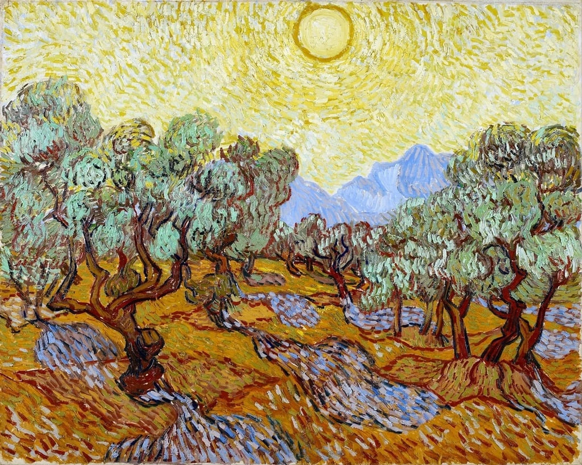
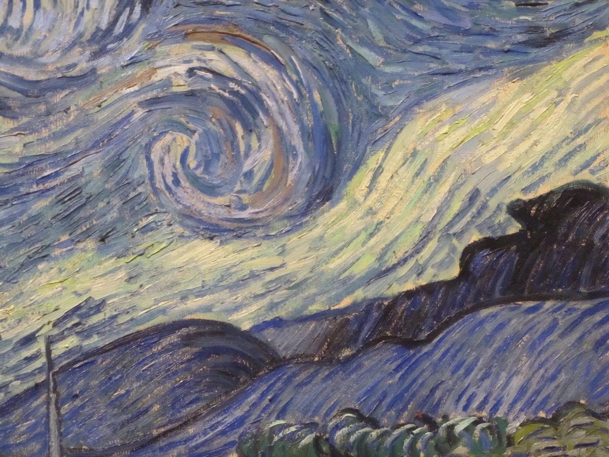
| Impressionism | Vincent van Gogh (Starry Night), Claude Monet | Used for vibrant sunlit fields, earth roads, and warm highlights with directness. |
| Post-Impressionism | Paul Cézanne, Paul Gauguin | Used for structural elements, earth tones in still lifes and figure painting |
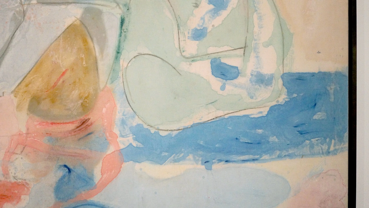
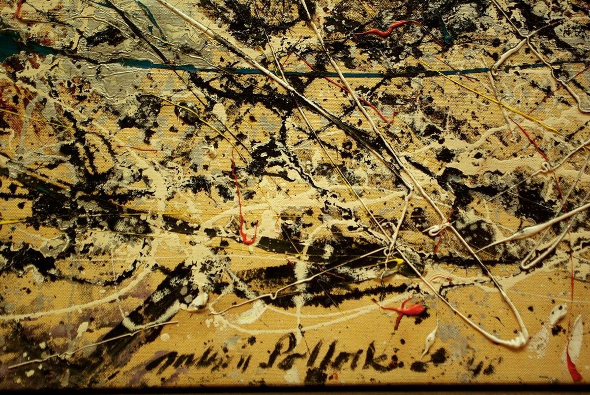
| Modern Art | Mark Rothko (Color Fields), Jean Dubuffet | Abstract expressionists used it for emotive weight, earthiness, and raw texture. |
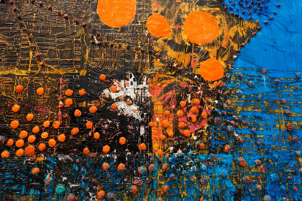
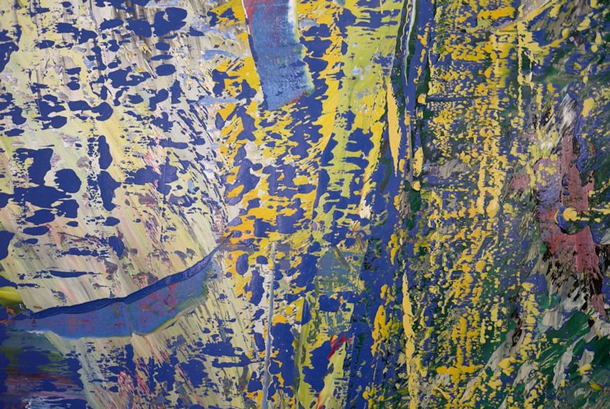
| Contemporary | Anselm Kiefer, Gerhard Richter | Used for historical commentary, textural effects, and conceptual earth references |

Look at a Van Gogh wheat field. That vibrant, sun-drenched gold? Often yellow ochre was the base, layered with other yellows and glazes. Rembrandt? Those incredible deep, glowing tones in his portraits and biblical scenes? Built on layers of ochre and browns. It's the bedrock upon which countless masterpieces were laid. Even as synthetic pigments exploded in popularity, artists kept returning to ochre for its unique, soulful quality that synthetics often struggle to replicate perfectly.
Renaissance Mastery: The Science of Warmth
During the Renaissance, artists discovered that yellow ochre was perfect for creating realistic flesh tones. Leonardo da Vinci used it as a base layer, building up translucent glazes of pink and red that seemed to glow from within. Michelangelo's Sistine Chapel figures used ochre extensively for the underpainting, which showed through the translucent layers above, creating a warm, lifelike quality.
Baroque Drama: Light and Shadow
Rembrandt was a master of using ochre to create depth. He would often use thin, transparent ochre glazes over darker backgrounds, creating a sense of light emanating from within the painting. Caravaggio used ochre to warm up his dramatic shadows, making the light sources seem even more intense by contrast.
Impressionist Revolution: Capturing Light
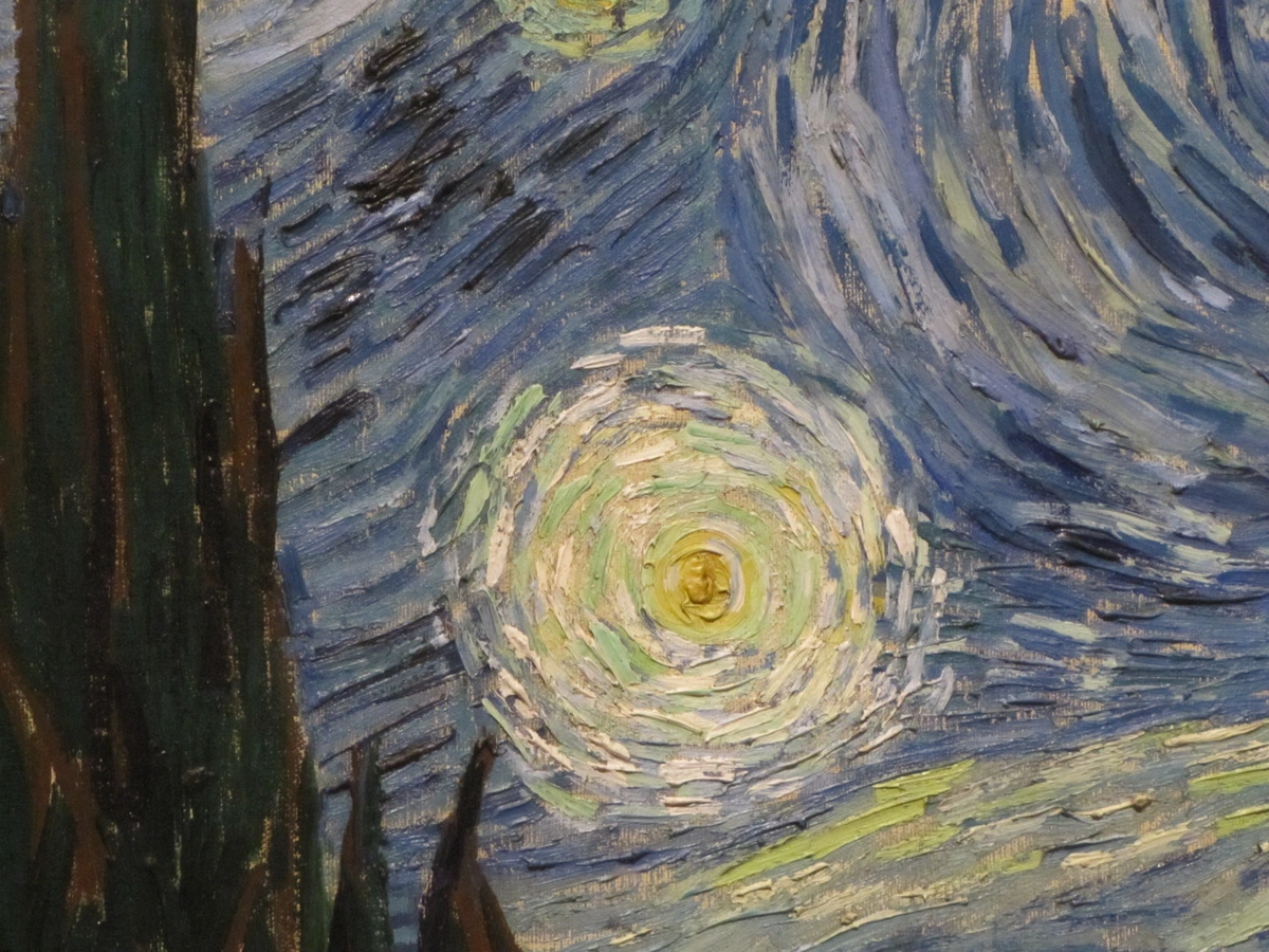
The Impressionists broke with tradition by using ochre more directly and boldly. Monet used it for the sunlit paths in his gardens, while Van Gogh applied it thickly in impasto to create the textured, energetic quality of his wheat fields. They appreciated ochre's ability to capture the way light actually interacts with the earth.
Practical Magic: Using Yellow Ochre in Your Art
So, how do you harness this historical powerhouse in your own work? Here are techniques and tips that go beyond the basics.
Starting Your Ochre Journey
Beginning with ochre can feel daunting, but it's surprisingly accessible:
- Simple Start: Begin with just three colors - yellow ochre, white, and black
- Small Experiments: Try small pieces to understand ochre's behavior
- Observe Nature: Look for ochre colors in landscapes, buildings, and everyday objects
- Study Masters: Look at how artists like Van Gogh, Rembrandt, and Monet used ochre
- Embrace Mistakes: Some of the best discoveries come from "mistakes" with ochre
Remember, ochre has been used successfully by artists for over 100,000 years. You're in good company!
Before You Begin: Preparation Matters
The quality of your ochre experience starts with how you prepare it:
- Tube Paint Quality: Invest in artist-grade ochre from reputable brands. Student grade may have more fillers and less pigment intensity.
- Pigment vs. Pre-mixed: Making your own ochre paint from raw pigment is possible but requires grinding and a proper binder. Most artists prefer the consistency of tube paint.
- Testing: Always test your ochre on scrap material before committing to a major piece. Different brands vary in transparency and undertone.
Safety Considerations
While ochre is generally safe, it's important to handle it properly:
- Ventilation: Always work in a well-ventilated area, especially when using dry pigment or solvents.
- Dust Control: When handling dry ochre pigment, wear a dust mask to avoid inhaling particles.
- Skin Contact: Some people may be sensitive to ochre. Wear gloves if you have sensitive skin.
- Eye Protection: Wear safety glasses when grinding or mixing pigments to avoid eye irritation.
Mixing & Color Harmony
Yellow ochre's true power is revealed in its relationships with other colors.
- The Ultimate Neutralizer: Add a tiny touch of yellow ochre to any mix to instantly warm it and reduce its harshness. A drop into a cool blue-grey? Instant complexity. A streak into a stark white? Creates an off-white that feels alive, not blank.
- Earth Tones Perfected: It's the star of the Earth tone show. Mix it with:
- Ultramarine Blue: Creates rich, warm greens (think mossy earth, not emerald).
- Burnt Sienna: Deepens and browns it out instantly (think rich soil, walnut shells).
- Alizarin Crimson: Creates stunning oranges and rusts (think autumn leaves, terracotta pottery).
- White: Gives you delicate, warm creams and beiges (think parchment, sandstone).
- Subtle Skin Tones: Instead of peach or pink, start flesh tones with yellow ochre and white, then add just a hint of red or pink. It feels infinitely more natural and grounded. It’s the secret to getting that sun-kissed, olive, or deep ebony look without it looking pasty.
- Dialing Down Intensity: If a yellow feels too bright or "hysterical," dull it down with a touch of yellow ochre. It tames yellows without draining their warmth.
Mixing Combination | Resulting Color | Effect & Atmosphere |
|---|---|---|
| Yellow Ochre + White | Warm Cream/Beige | Softness, elegance, parchment, sun-washed stone |
| Yellow Ochre + Burnt Sienna | Deep Brown | Rich soil, walnut wood, stability, earthy warmth |
| Yellow Ochre + Ultramarine Blue | Warm Moss Green | Depth, nature, tranquility, damp forest floor |
| Yellow Ochre + Alizarin Crimson | Rust/Orange | Autumn, decay, energy, warmth with a fiery edge |
| Yellow Ochre + Black | Deep Umber | Shadow, mystery, aged wood, intense depth |
| Yellow Ochre + Cadmium Red | Vibrant Orange | Sunset, energy, warning signs, tropical vibrancy |
| Yellow Ochre + Viridian Green | Olive Green | Wilderness, camouflage, natural foliage, calmness |
| Yellow Ochre + Dioxazine Purple | Muted Brown-Gray | Elegance, sophistication, twilight, aged documents |
| Yellow Ochre + Naples Yellow | Golden Yellow | Sunlight, optimism, royalty, ancient gold |
| Yellow Ochre + Cobalt Blue | Gray-Green | Storm clouds, distance, mist, melancholy atmosphere |
Advanced Painting Techniques with Ochre
Once you've mastered the basics, these advanced techniques will elevate your ochre work:
Multiple Glazing System Create depth through systematic glazing:
- Start with a warm ochre underpainting
- Apply transparent glazes of complementary colors
- Finish with thin ochre glazes to unify and warm the entire piece
Textural Layering Build physical texture with ochre:
- Apply thick ochre in impasto strokes
- While still wet, press texture tools into the paint
- Once dry, glaze over with transparent colors to reveal the texture
Sfumato with Ochre Master the subtle transitions that Leonardo pioneered:
- Use very thin ochre washes as transitions
- Blend edges with soft brushes
- Build up multiple layers for seamless gradations
Painting Techniques for Maximum Impact
How you apply ochre changes its personality:
- Underpainting: Start your landscape or portrait with a thin wash of yellow ochre diluted with solvent (for oils) or water (for acrylics/watercolor). This "toning" unifies your canvas, creates a warm base for subsequent glazes, and subtly influences all layers above. It’s like a bass note for your color symphony.
- Glazing (especially in Oils): Apply thin, transparent glazes of yellow ochre (mixed with a little medium and solvent) over a darker underpainting. This deepens the color, adds richness, and creates a luminous, sun-kissed effect, like warm light filtering through something. I love doing this to make skies or flesh tones glow from within.
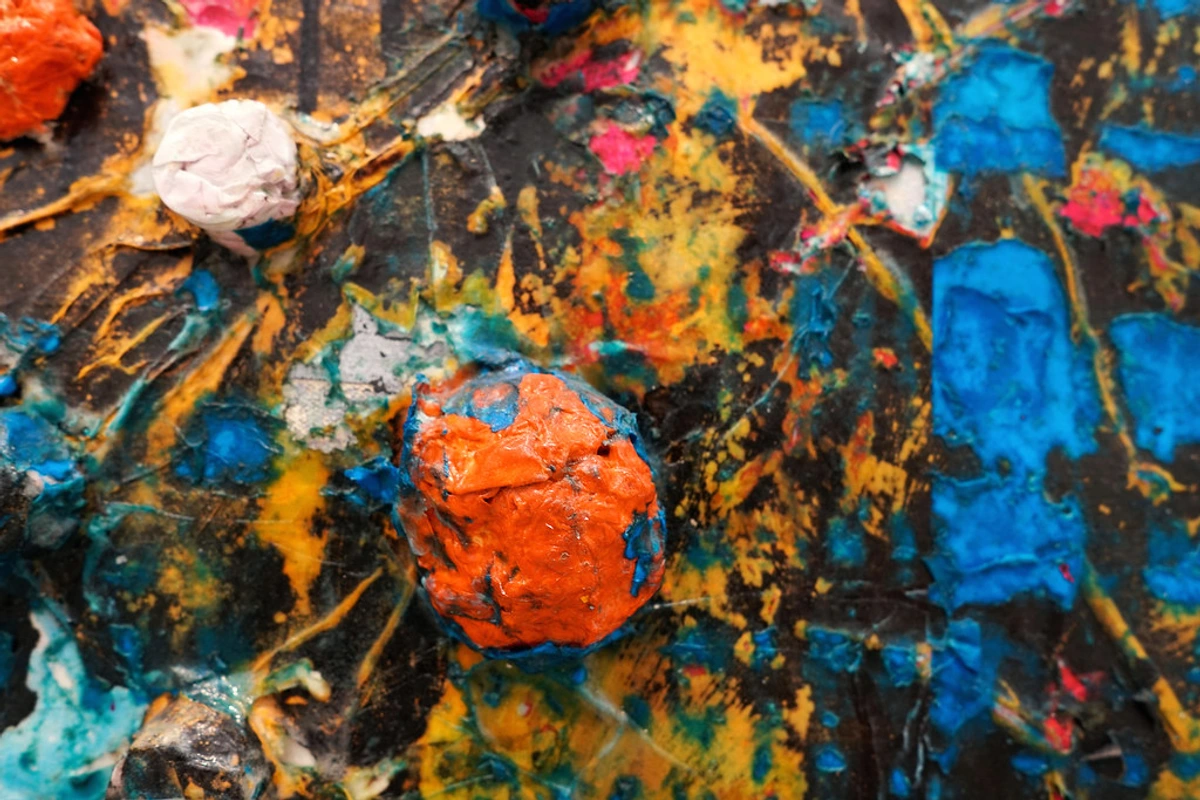
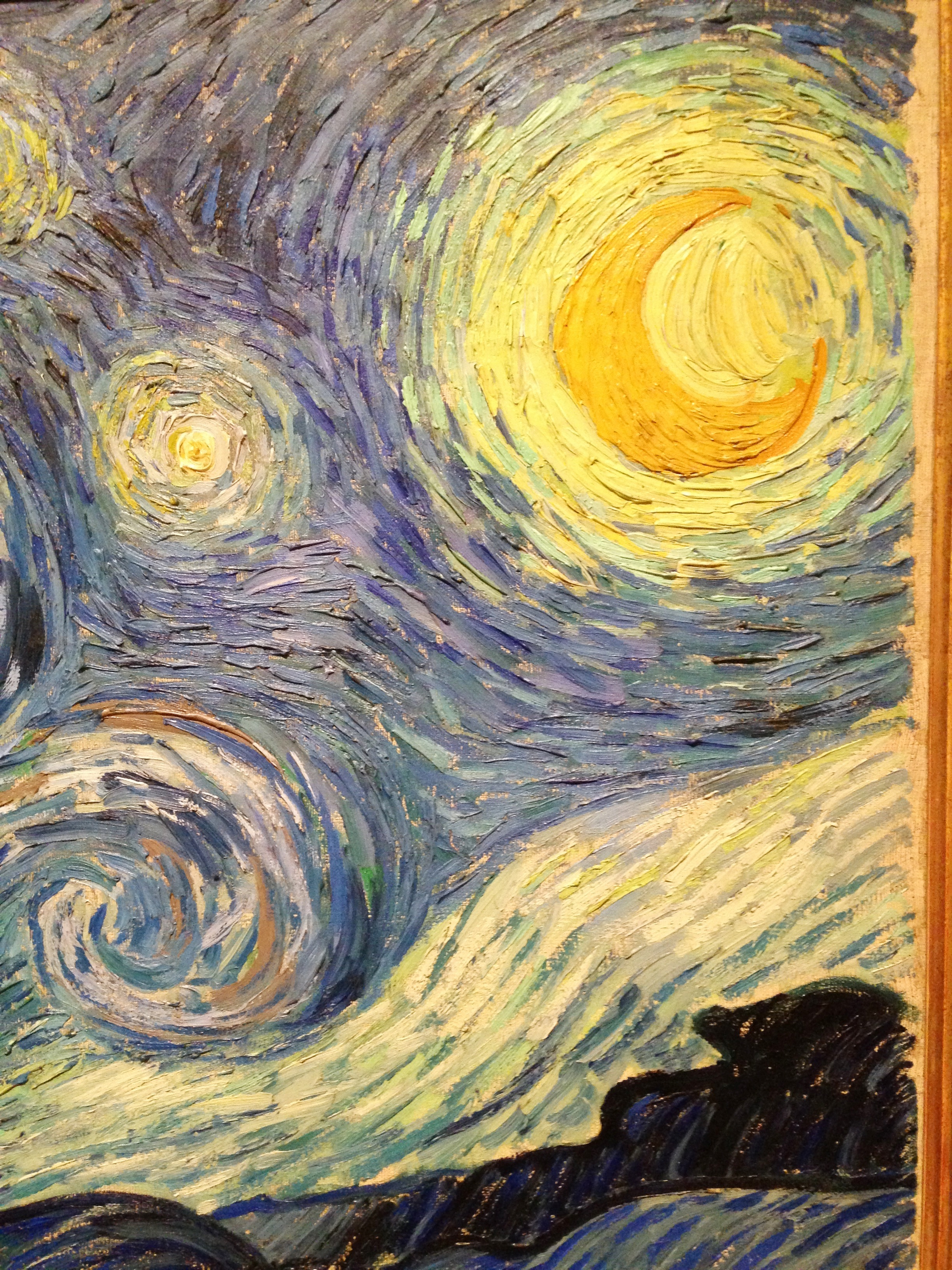
- Impasto & Texture: Use ochre straight from the tube, thickly applied. This creates a physical presence, evoking the raw pigment itself. Think of the chunky, expressive texture of a Van Gogh sky. It adds tactile energy.
- Washes & Tints (Watercolor/Acrylic): Dilute ochre significantly for transparent, glowing washes over white paper or canvas. Perfect for creating warm skies, subtle shadows, or the first layers of a sunlit scene.
Common Mistakes & How to Avoid Them
I’ve made these, you’ve probably made these – let’s own it and fix it!
- Mistake: Making it look muddy. Fix: Be deliberate! Don’t just throw ochre everywhere. Use it strategically for warm highlights or specific areas. If it gets muddy, it often means it was mixed with too many other pigments or applied too thickly over a damp layer – patience is key.
- Mistake: Using it too thinly and it looks weak and washed out. Fix: Mix it with a touch of white to get that creamy richness, or use it straight from the tube for impact. Don’t be afraid of its strength!
- Mistake: Assuming all "ochres" are the same. Fix: They aren’t! Pigment manufacturers offer variations: Raw Sienna (similar but yellower, more transparent), Burnt Sienna (darker, reddish-brown, made by heating Raw Sienna), and Burnt Umber (even darker, browner). Explore them! They are ochre’s relatives and each has its own voice.
- Mistake: Using it only for earth tones. Fix: Break out! Use it in skies (sunrise/sunset), to warm up grays, to create stunning subtle greens with blue, to add warmth to cool shadows. It’s more versatile than you think!
FAQ: Your Burning Yellow Ochre Questions Answered
Here are the questions I hear most often about working with this incredible pigment:
Buying and Sourcing Questions
Q: Where can I buy high-quality yellow ochre? A: You can find excellent ochre at:
- Art Supply Stores: Professional art stores carry artist-grade ochre from major brands
- Online Retailers: Websites like Jerry's Artarama, Blick Art Materials, and specialized pigment suppliers
- Direct from Mines: Some artists source directly from historical ochre mines
- Specialty Art Supply Shops: Smaller, independent art stores often carry unique ochre varieties
When buying, look for labels indicating "artist grade" or "professional quality" and check the lightfastness rating (should be I or II).
Q: Is yellow ochre a good color for beginners? A: Absolutely! It’s one of the most forgiving and versatile pigments. Its warm, earthy nature is easy to mix with, and its lightfastness means your work will last. I often recommend starting with a primary triad of Cadmium Yellow (or a warm lemon yellow), Ultramarine Blue, and Alizarin Crimson, but yellow ochre is a fantastic fourth or even replacement for the lemon yellow in many mixes, offering more subtlety.
Q: How do I lighten yellow ochre without making it look chalky? A: Mix it gradually with white. Add a little at a time. If you need a very light tint, consider starting with a pale yellow ochre (if available) or using a tiny bit of ochre in a pre-mixed warm white instead of straight white mixed with ochre. The key is to maintain that slight warmth in the lightest tones.
Q: Can I use yellow ochre for portraits? A: Absolutely! In fact, many portrait artists consider ochre essential. It's perfect for:
- Creating natural skin tones without looking "makeup-y"
- Adding warmth to shadows
- Creating believable flesh tones that don't look pasty
- Establishing the basic structure of facial features before adding color
The secret is to use it as a foundation rather than the final color. Start with ochre mixtures and then add small amounts of red, pink, or blue to get the specific skin tones you want.
Q: Can I use yellow ochre in digital painting? A: Yes! Nearly all digital art software includes a version of yellow ochre in their color pickers. Look for names like "Ochre," "Indian Yellow," or "Raw Sienna" (which behaves similarly). Use it for the same effects: warming mixes, creating earth tones, underpainting digitally, adding that historical feel to a piece.
Q: Why is my yellow ochre looking greenish? A: This usually happens when it’s mixed with a blue pigment (especially Phthalo Blue or Prussian Blue types), which inherently carry a green bias. This isn't necessarily bad! It creates a warm mossy green. If you want a pure warm yellow and green, mix ochre with a warmer, more transparent red or orange instead, or choose a different base yellow (like Cadmium Yellow) for the warmer greens. Understanding pigment bias is crucial.
Q: Is yellow ochre expensive? A: Generally, no. Historically, it was one of the most common and affordable pigments because it's abundant and relatively easy to mine and process. It usually falls into the mid-range price point for artists' pigments, much more affordable than Cadmiums or Cobalts.
Q: Can I use yellow ochre with other mediums besides oil paint? A: Yes! Yellow ochre is incredibly versatile across mediums:
Medium | Application Tips | Best Effects |
|---|---|---|
| Watercolor | Use transparent washes; enjoy natural granulation | Luminous skies, earthy landscapes, warm shadows |
| Acrylic | Mix with retarder for longer working time | Textured impasto, smooth glazes, quick drying times |
| Gouache | Mix with white for opaque effects | Illustrative work, smooth flat areas |
| Pastel | Use as a base layer or mixed with other colors | Rich textures, soft blends |
| Ink | Mix with acrylic medium for body | Calligraphic effects, washes |
| Encaustic | Mix with beeswax for unique effects | Translucent layers, textured surfaces |
| Casein | Mix with water for smooth application | Matte finishes, quick drying |
The key is to understand how ochre behaves in each medium and adjust your techniques accordingly.
Q: Should I buy tube paint or make my own with pigment? A: Unless you have a specific reason for maximum control or historical accuracy (like a museum reproduction), tube paint is perfect. Modern tubes offer consistent quality, suitable binders, and convenience. Making your own involves sourcing pigment, grinding, and mixing with a binder, which is a fascinating deep dive but usually impractical for most artists. Start with good quality tube paint and experiment!
Q: How do I store ochre paint properly? A: Proper storage extends the life of your ochre pigments:
- Tube Storage: Keep tubes tightly closed and store upright to prevent pigment separation
- Temperature: Store in a cool, stable environment (avoid freezing or extreme heat)
- Light: Keep away from direct sunlight, even though ochre is lightfast
- Humidity: Moderate humidity is fine, but avoid damp environments that could encourage mold
- Palette Care: For palette paint, cover with plastic wrap or a damp cloth
- Dried Paint: Don't discard dried ochre on palettes - it can often be rehydrated
Well-stored ochre can remain usable for years, maintaining its color and consistency.
Q: How does yellow ochre age compared to other pigments? A: Yellow ochre is one of the most stable pigments art history has known. Here's how it compares:
Pigment Type | Lightfastness | Stability Over Time | Common Issues |
|---|---|---|---|
| Yellow Ochre | Excellent (I) | Superior | Very few |
| Cadmium Yellow | Good (II) | Good | Can darken over time |
| Azo Yellow | Good (II) | Good | Can fade in sunlight |
| Hansa Yellow | Variable | Moderate | Can brown over time |
| Naples Yellow | Good | Good | Contains toxic lead |
| Indian Yellow | Poor | Poor | Fades quickly, often fugitive |
Yellow ochre's stability comes from its iron oxide composition, which is chemically inert and extremely resistant to environmental factors. This is why paintings from centuries ago still have their ochre colors intact.
Final Brushstroke: Why We Keep Coming Back
Think about it – we’ve been using yellow ochre since our species first picked up a piece of charred earth to make a mark. It’s in our DNA. It’s the color of warmth, of earth, of enduring light. It’s not flashy or trendy. Its power lies in its simplicity, its grounding nature, and its incredible versatility. It’s the anchor that stops a vibrant painting from floating away, the whisper that adds depth to silence, the sunbeam that grounds a dreamscape.
Yellow Ochre in Contemporary Art
Modern Applications and Innovations
While ochre has ancient roots, contemporary artists continue to find fresh ways to use this timeless pigment:
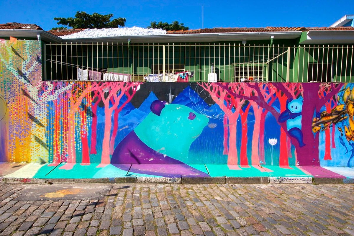
Street Art and Murals Many street artists use ochre for its bold visibility and historical resonance. It works well outdoors and creates a connection to traditional art forms in modern contexts.
Installation Art Artists create immersive environments using ochre's warm, inviting qualities. The pigment's earthy nature makes it perfect for works that explore themes of land, memory, and human connection.
Digital Art Integration Modern artists often scan textured ochre surfaces and use them as digital brushes or overlays in digital art, creating a bridge between traditional and contemporary techniques.
Sustainable Art Practices As environmental concerns grow, many artists turn to ochre as an eco-friendly alternative to synthetic pigments, aligning their practice with sustainability values.
The Future of Ochre
The enduring appeal of yellow ochre suggests it will remain relevant in art for centuries to come. As artists seek authenticity and connection to materials, ochre offers a direct link to both human history and the natural world.






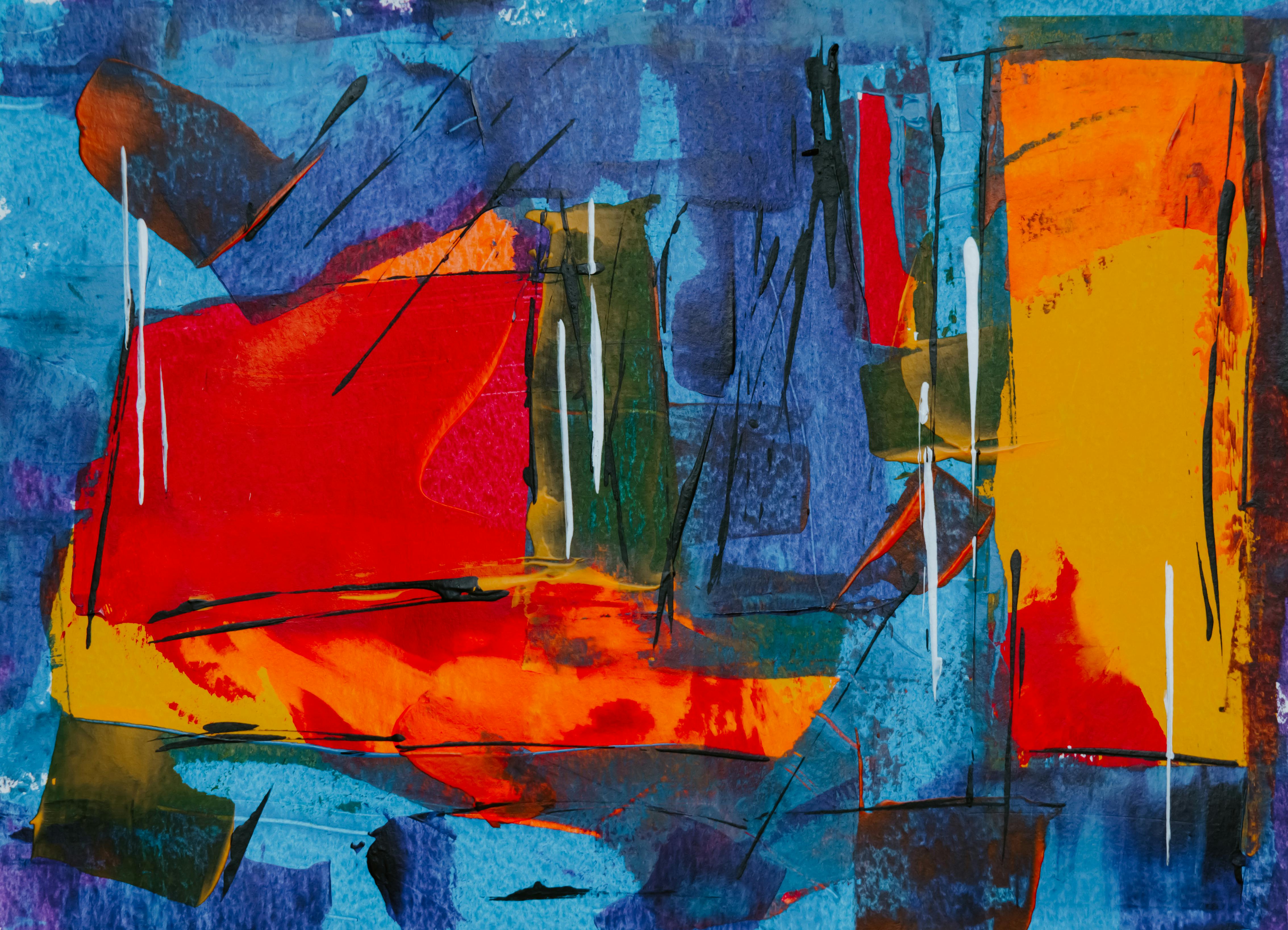

So, next time you stand before a blank canvas, don’t underestimate the quiet magic of that warm, earthy tone. Scoop some up, mix it with a wild abandon or a whisper of care, and see what happens. Your art might just find the soul it was looking for. And if you’re inspired to explore more color journeys, especially those rooted in history and emotion, my timeline at /timeline might spark your next creative leap. Now go make something beautiful and grounded.