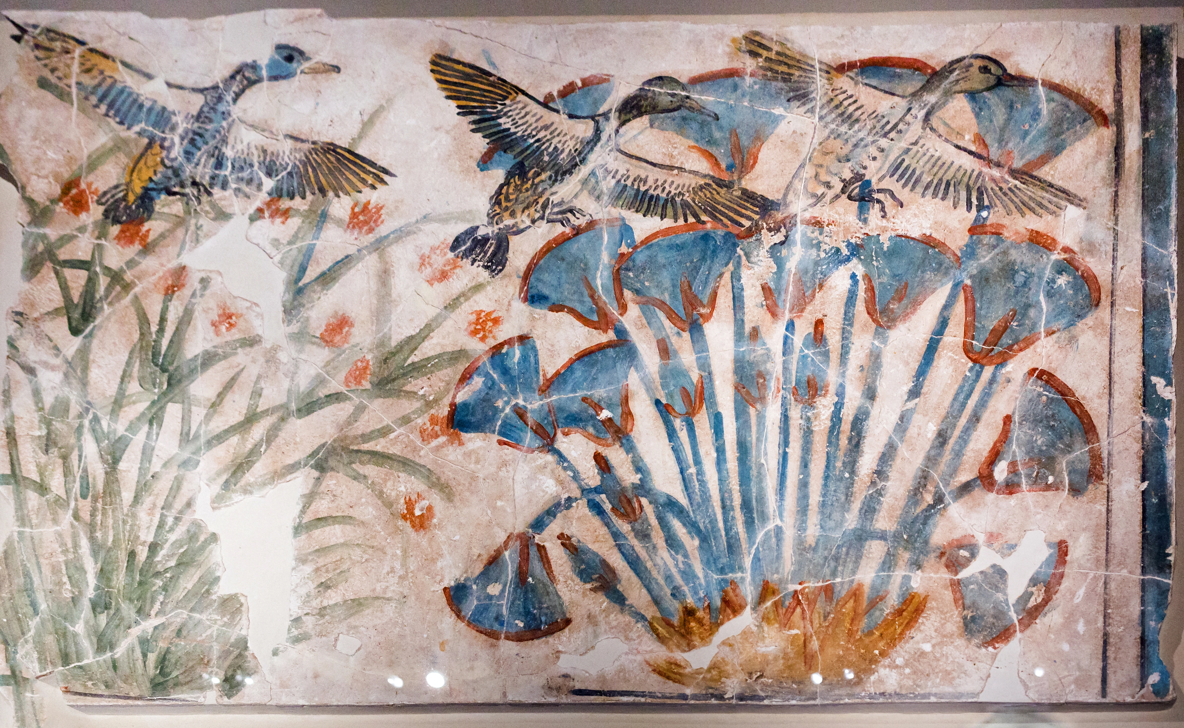
What is Yellow Ochre Paint? Earth Pigment's Warm Embrace
Discover the rich history, properties, and modern applications of yellow ochre paint. A complete guide for artists and art enthusiasts.

What is Yellow Ochre Paint? Earth Pigment's Warm Embrace
There's a color that feels like sunshine trapped in stone. Not synthetic, not manufactured, but wrested from the earth itself. I remember holding my first tube of yellow ochre as a student – that solid, earthy weight, the promise beneath the cap. It smelled of rain on clay and ancient secrets. But what is yellow ochre paint, really? It's more than just a pigment; it's a bridge between our hands and the planet's memory, a color worn smooth by millennia of human touch.
Yellow ochre represents one of humanity's oldest artistic connections to the natural world. When you hold ochre pigment, you're touching something that has been part of human expression for at least 400,000 years – predating modern humans, even. This ancient relationship continues today, as contemporary artists rediscover ochre's unique properties and cultural resonance. Whether you're a traditional painter, a mixed media artist, or simply someone curious about the intersection of art and geology, yellow ochre offers a fascinating journey through time, chemistry, and creative expression.
Unearthing the Essence: What Exactly is Yellow Ochre?
At its core, yellow ochre is a natural iron oxide earth pigment. "Ochre" comes from the Greek ōkhros, meaning pale yellow – a name that captures its subtle, sun-bleached luminosity. What we see as "paint" is essentially refined earth. Miners extract raw ochre clay (hydrated ferric oxide, FeO(OH)·nH₂O), which contains golden-yellow to reddish-brown iron deposits. This raw material is washed, purified, ground into fine powder, and then bound with oil or acrylic medium.
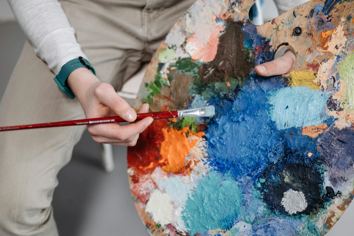
What makes ochre magical isn't just its composition, but its DNA. Unlike dyes absorbed into material, ochre pigments remain on the surface. Think of it as microscopic, rust-colored confetti suspended in binder, catching light differently than transparent colors. That tiny physical difference translates to how it feels under a brush and how it ages on a canvas.

The Geological Formation of Ochre
Yellow ochre forms through a fascinating geological process that takes millions of years. It begins with the weathering of iron-rich rocks, particularly those containing hematite (Fe₂O₃) and goethite (FeO(OH)). As these rocks break down through water and wind erosion, iron particles leach into surrounding soil and clay deposits. Over time, these iron compounds undergo oxidation, transforming into the characteristic yellow, orange, and red ochre pigments we recognize today.
The specific color of ochre depends on several factors:
- Iron Oxide Content: Higher concentrations create deeper, richer colors
- Clay Matrix: The surrounding clay affects both color and working properties
- Impurities: Manganese, quartz, and other minerals create nuanced variations
- Geological Age: Older deposits often have more complex color profiles
Chemical Composition and Properties
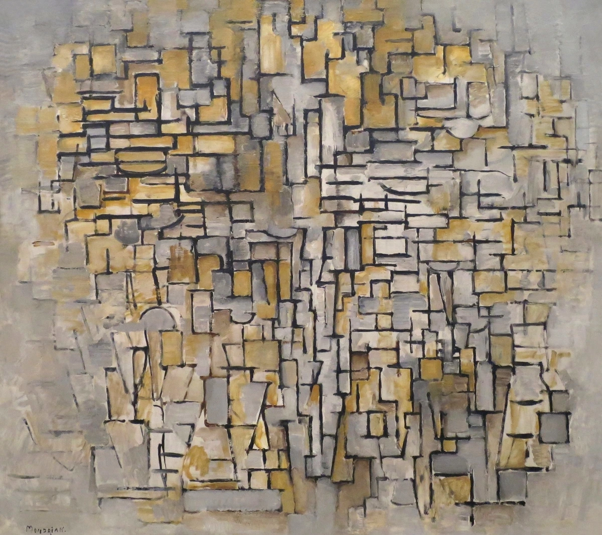
While we often think of ochre as a single pigment, it's actually a complex mixture of compounds. Modern analysis reveals that true yellow ochre typically contains:
Compound  | Percentage | Role in Color | Lightfastness |
|---|---|---|---|
| Goethite (FeO(OH)) | 40-70% | Primary yellow pigment | Excellent (I) |
| Hematite (Fe₂O₃) | 10-30% | Creates warm undertones | Excellent (I) |
| Clay Minerals | 15-40% | Binder and texture modifier | Stable |
| Quartz/Silica | 5-15% | Adds opacity and structure | Stable |
| Organic Matter | Trace | Can affect color aging | Variable |
This complex composition gives ochre its unique characteristics:
- UV Resistance: The iron oxide structure naturally resists ultraviolet light degradation
- Thermal Stability: Ochre pigments can withstand high temperatures (up to 1200°C)
- Chemical Inertness: They don't react with most binders or environmental factors
- Granular Texture: The microscopic particle structure creates distinctive optical effects
Physical Properties of Ochre Paint
When working with ochre, you're dealing with pigment particles that behave quite differently from synthetic alternatives. Here's how ochre physically interacts with various materials:
| Property | Description | Practical Implication |
|----------|-------------|----------------------|
| **Particle Size** | 1-10 microns | Creates velvety texture when ground fine |
| **Density** | 3.8-4.3 g/cm³ | Heavier than most synthetic pigments |
| **Refractive Index** | 2.94-3.22 | Strong light scattering, creates opacity |
| **Surface Area** | 5-15 m²/g | High pigment loading in binder possible |
| **Moisture Content** | 3-8% | Natural water retention affects drying |
These physical properties directly impact how ochre paint behaves on canvas, paper, or other surfaces. The granular nature creates a unique tactile quality that synthetic pigments simply cannot replicate.
Property | Description |
|---|---|
| Composition | Primarily hydrated iron oxide (FeO(OH)) + clay minerals. |
| Origin | Natural clays worldwide (France, Cyprus, Australia, etc.). |
| Color Code | Pigment Index PY43 for true ochre mixtures. |
| Key Trait | Semi-opaque, lightfast, earthy undertones. |
| Toxicity | Non-toxic (inert iron compounds). |
| pH Level | Neutral to slightly alkaline (7.0-8.5) |
| Solubility | Insoluble in water, acids, and most solvents |
| Thermal Stability | Stable up to 1200°C (ideal for ceramics and encaustic) |
| Granulation | Fine to medium granulating effect in water-based media |
What yellow ochre isn't is synthetic. Those brilliantly artificial "ochres" you see? They're usually synthetic iron oxides mixed with extenders. True ochre whispers instead of shouting; it has the depth of sun-baked soil, the muted authority of ancient ruins.
The Synthetic vs. Natural Debate
Modern art supply stores often confuse consumers with labeling. Here's how to distinguish genuine ochre from synthetic alternatives:
Label Type | Authenticity | Characteristics | Cost | Lightfastness |
|---|---|---|---|---|
| Yellow Ochre | Genuine | Granular texture, natural variations Higher | Excellent | |
| Yellow Ochre Hue | Synthetic | Uniform color, smooth texture Lower | Good to Excellent | |
| Raw Sienna | Genuine | Warm undertones, organic feel Premium | Excellent | |
| Burnt Sienna | Genuine | Deep red-brown, complex tones Premium | Excellent | |
| Cadmium Yellow Hue | Synthetic | Bright, uniform, artificial Medium | Good |
The price difference reflects the labor-intensive mining and processing required for natural ochre versus the chemical manufacturing of synthetic alternatives. While synthetic pigments offer consistency, natural ochre provides a connection to geological time and cultural history that no laboratory can replicate.
A Journey Through Time: From Cave Walls to Contemporary Canvases
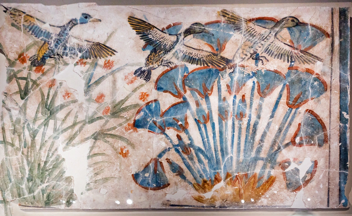
Imagine touching the same pigment used by our Palaeolithic ancestors 40,000 years ago. That's ochre's magic. Archaeologists crushed ochre into thick pastes with animal fat and applied it to cave walls at sites like Lascaux. No tubes, no premixed mediums – just hand-ground earth and human intuition.
The Eardest Artistic Medium
What makes ochre truly remarkable is its status as humanity's oldest continuous artistic medium. Recent archaeological discoveries have pushed ochre usage back even further:
- 800,000 years ago: Evidence of ochre processing in South Africa
- 500,000 years ago: Simple ochre crayons used by Homo erectus
- 300,000 years ago: Complex ochre mixtures found in Israel
- 40,000 years ago: Sophisticated cave art at Lascaux and Chauvet
This incredible timeline means ochre was used by multiple human species, suggesting a deep-seated psychological and cultural connection to this particular pigment across different hominid species.
This relationship with ochre persisted through civilizations:
- Ancient Egypt: Burial shrouds were dyed with ochre; sarcophagi were painted with it for resurrection rituals. Tutankhamun's tomb contained ochre pigments preserved for over 3,000 years.
- Classical Greece: Olympians rubbed ochre on their bodies before competition – the first pre-workout stain? The term "ochlos" (crowd) may derive from ochre-stained athletes.
- Renaissance Masters: Caravaggio used it for the warm flesh tones in The Calling of St Matthew; Rembrandt in chiaroscuro masterpieces for light catching skin. Titian created rich, luminous glazes with ochre in his Venetian landscapes.
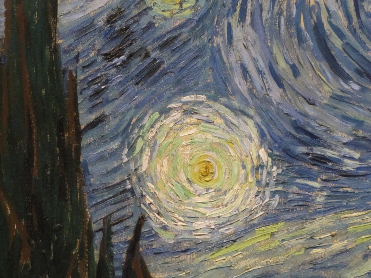
- 19th Century Impressionists: Monet layered it for haystacks at dawn; Van Gogh mixed it with ultramarine for starry skies. Cézanne used ochre as his primary earth tone in his structural landscapes.
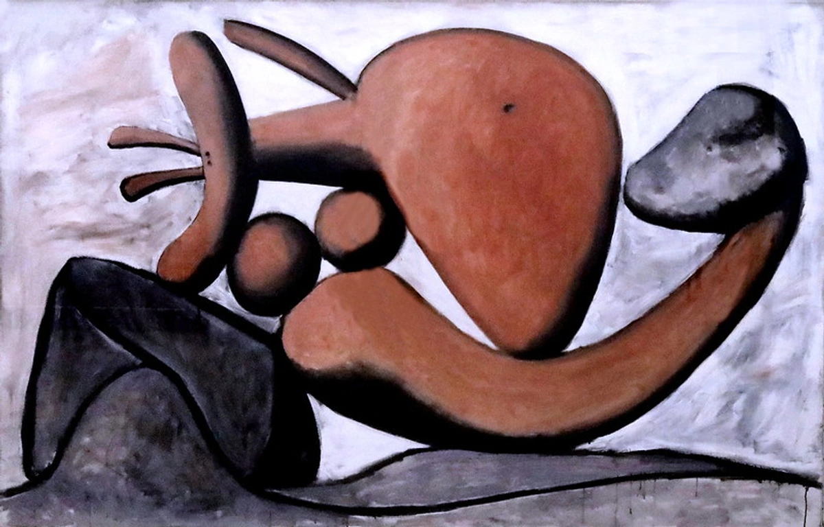
- 20th Century Modernists: Picasso incorporated ochre into his "Blue Period" transition; Mark Rothko used ochre in his color field paintings; Anselm Kiefer employed ochre to create historically charged, earthbound works.
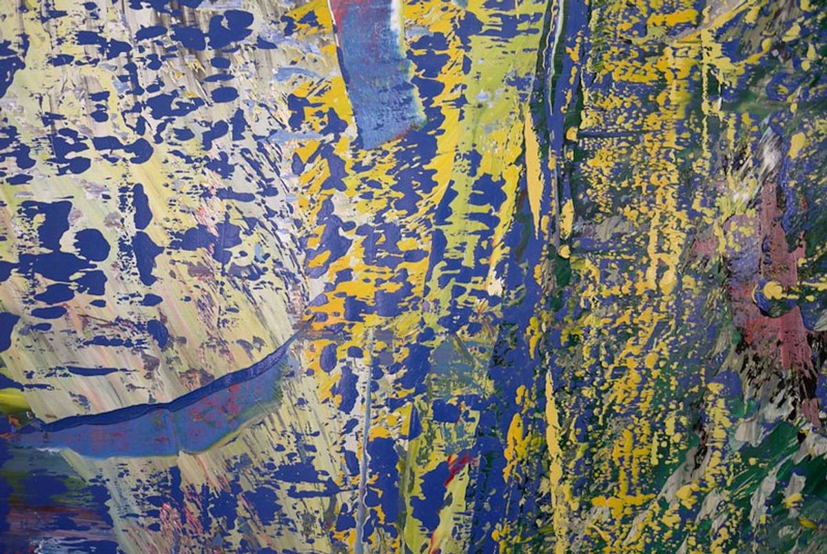
- Contemporary Artists: Anselm Kiefer uses ochre for its historical weight; Gerhard Richter incorporates ochre in his abstract compositions; contemporary Indigenous artists maintain ochre as a vital cultural medium.
Industrial pigments almost erased ochre in the 20th century. Why mine clay when you can mass-produce chemical colors? Yet ochre persists, because it carries history in its granular structure. When you paint with ochre, you're participating in an artistic line older than writing itself.
The Renaissance of Natural Pigments
In recent decades, there's been a remarkable resurgence of interest in natural pigments, including ochre. Several factors have driven this movement:
- Environmental Awareness: Growing concern about the ecological impact of synthetic pigment production
- Health Considerations: Artists seeking non-toxic alternatives to heavy metal pigments
- Cultural Heritage: Reconnection with traditional artistic practices and materials
- Aesthetic Authenticity: Desire for the unique qualities that only natural pigments provide
- Historical Accuracy: Conservation and restoration work requiring authentic materials
Contemporary artists like myself are rediscovering what our ancestors knew instinctively: that ochre offers qualities beyond mere color. It provides a connection to place, history, and the natural world that synthetic alternatives simply cannot match. In an increasingly digital and artificial world, ochre grounds us in physical reality – literally.
Modern Applications: Why Ochre Still Shines
In an age of neon synthetics, why choose ochre? Because it speaks the language of authenticity. It doesn't pretend to be brighter than the sun; it embraces nuance.
Contemporary Art Movements and Ochre
Ochre has found renewed relevance in various contemporary art movements:
- Earth Art: Artists like Robert Smithson and Andy Goldsworthy use ochre in site-specific installations that connect with natural landscapes
- BioArt: Scientists and artists collaborate using ochre in living sculptures and organic materials
- Digital Nostalgia: As digital art becomes ubiquitous, ochre represents a tangible connection to analog traditions
- Environmental Art: Ochre's natural origins make it perfect for works addressing ecological themes
- Minimalism: The subtle variations in natural ochre align with minimalist aesthetics of simplicity and authenticity
The Science Behind Ochre's Appeal
Modern color science is beginning to understand why ochre has such enduring appeal:
- Color Temperature: Ochre sits in the psychologically "warm" zone of the color spectrum, triggering feelings of comfort and security
- Cultural Conditioning: Millennia of ochre use has created deep psychological associations with earth, stability, and tradition
- Biological Response: The warm, earthy tones of ochre may trigger primal responses related to soil, safety, and survival
- Visual Harmony: Ochre's muted quality creates visual calm in compositions, reducing eye strain
- Historical Continuity: Our brains may have evolved to recognize and appreciate ochre as a sign of human presence and cultural depth

Art Form | Ochre's Role |
|---|---|
| Oil Painting | Base layer for skin tones; glazes for warm shadows; earthy landscapes. |
| Watercolor | Creates granulating washes; ideal for sun-bleached architecture. |
| Acrylics | Versatile opaque color; textural impasto effects possible. |
| Ceramics | Natural slip color for ancient-looking glazes. |
But ochre travels beyond the easel:
Architecture and Interior Design
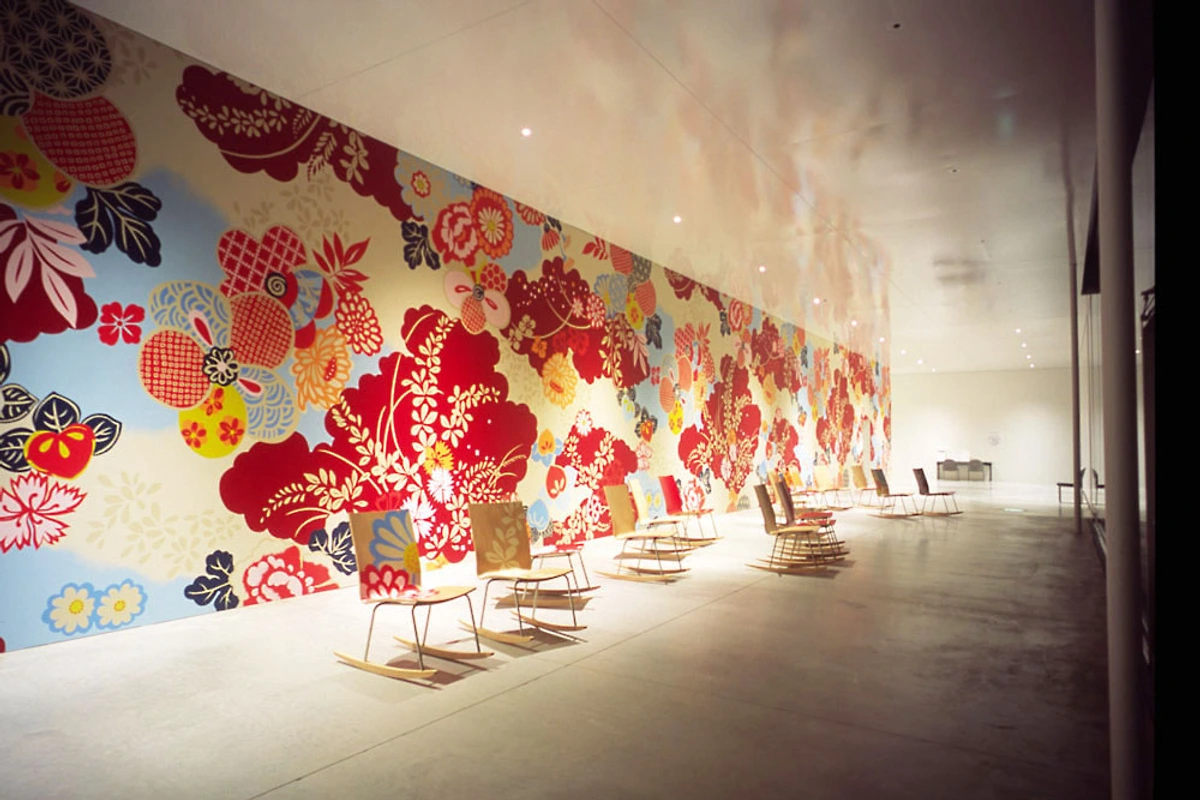
Architecture: Venetian plaster finishers use ochre for aged Mediterranean walls. Modern architects like Tadao Ando incorporate ochre tones in concrete structures to create warm, human-scale spaces. The natural pigment provides authentic aged patina that synthetic colors cannot replicate.
Interior Design: Ochre creates spaces that feel grounded and welcoming. Designers use it in:
- Feature walls as focal points
- Textiles and upholstery for organic warmth
- Accents in minimalist spaces to prevent sterility
- Historical restoration projects requiring authentic colors
Fashion and Textile Design
Fashion: Designers like Dries Van Noten weave ochre-dyed fabrics into autumn collections. The versatility of ochre in fashion stems from its ability to:
- Complement both warm and cool color palettes
- Age beautifully, developing character over time
- Connect clothing wearers to natural cycles and seasons
- Provide alternative to synthetic dyes with environmental concerns
Textile Applications:
- Natural dyeing processes for sustainable fashion
- Traditional techniques like batik and ikat
- High-fashion runway shows featuring earth tones
- Workwear that needs to maintain color integrity
Beauty and Cosmetic Industry
Makeup: Mineral makeup lines use it for natural blush (no harsh pink tones). Ochre's popularity in cosmetics comes from:
- Skin Compatibility: Warm undertones complement most skin tones
- Natural Appearance: Creates believable, healthy flush rather than artificial color
- Gentle Formulation: Non-toxic nature makes it suitable for sensitive skin
- Longevity: Resists fading better than many synthetic colorants
- Multi-function: Can be used for blush, eyeshadow, and contouring
Digital Design and UI/UX
Digital Design: UI color specialists study ochre's warmth for inviting user interfaces. In digital contexts, ochre provides:
- Accessibility: High contrast while remaining gentle on eyes
- Psychological Impact: Creates feelings of approachability and trust
- Cultural Resonance: Connects digital experiences to natural, tactile qualities
- Versatility: Works across various screen types and lighting conditions
Specific Applications:
- Welcome screens and onboarding flows
- Educational platforms for approachable learning environments
- Healthcare interfaces that reduce anxiety
- E-commerce sites that create trustworthy shopping experiences
Product Design and Manufacturing
Ochre's applications extend into industrial design:
- Automotive: Used in vintage and luxury car restoration
- Furniture: Natural wood finishes and upholstery accents
- Packaging: Sustainable alternatives to synthetic dyes
- Building Materials: Natural plasters and concrete colorants
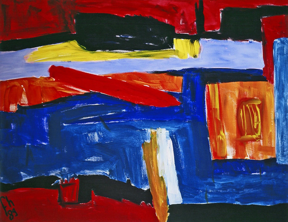
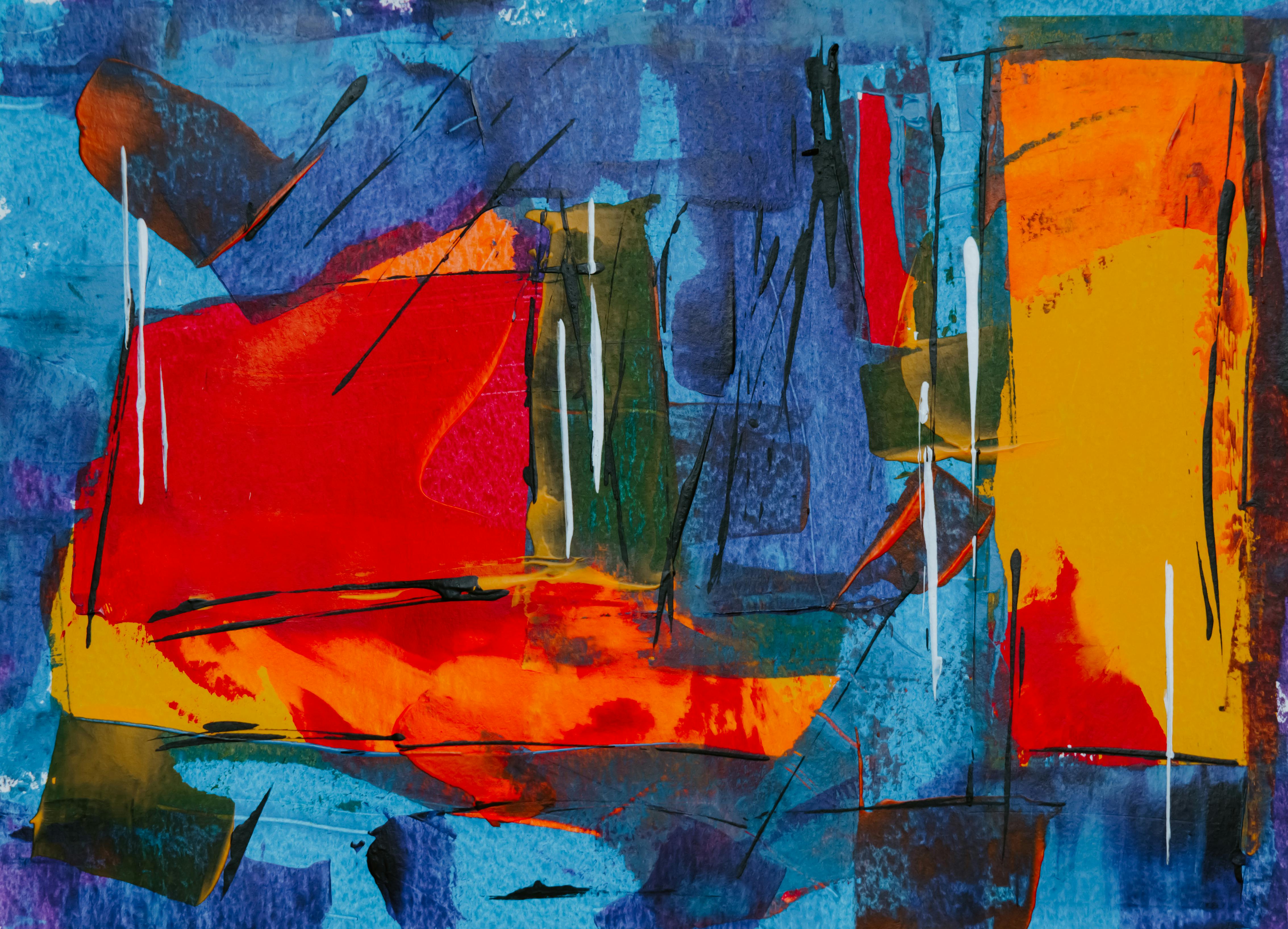
In my abstract work, ochre isn't just a color – it's an anchor. It stops chaotic compositions from floating, grounds them like roots in soil. You can feel its weight, its connection to the physical world even in abstract form.
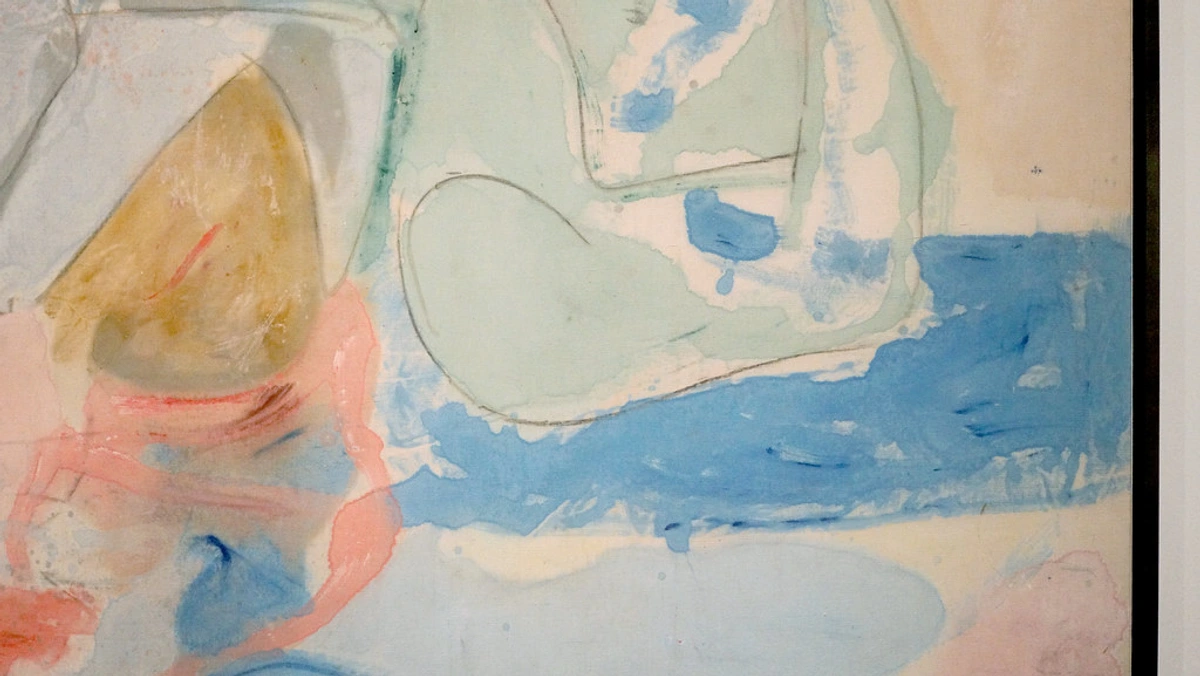
Ochre in Contemporary Abstract Art
Contemporary abstract artists have developed sophisticated techniques for working with ochre:
- Layering and Glazing: Multiple thin layers create depth and luminosity that single applications cannot achieve
- Mixed Media Integration: Combining ochre with sand, soil, or other natural materials creates textural complexity
- Chemical Interactions: Artists sometimes introduce mild acids or alkalis to create unique oxidation effects
- Digital Enhancement: Scanning ochre textures and incorporating them into digital compositions
- Installation Art: Using ochre in large-scale environmental installations
Case Study: Contemporary Ochre Techniques
Many contemporary artists have developed signature ochre techniques:
- Anselm Kiefer: Uses ochre mixed with straw and ash to create historically charged, textural surfaces that speak to themes of memory and decay
- Gerhard Richter: Incorporates ochre in his color field paintings to add warmth and human presence to otherwise cool compositions
- El Anatsui: Uses ochre-dyed materials in his large-scale textile installations that address themes of colonialism and cultural exchange
- Contemporary Indigenous Artists: Maintain traditional ochre techniques while incorporating contemporary themes and materials
The Science of Color: How Ochre Interacts with Light
Understanding ochre's behavior requires examining how it interacts with light at the molecular level:
Light Interaction Properties
- Scattering: Ochre particles scatter light in all directions, creating opacity
- Absorption: The iron oxide structure absorbs blue and green wavelengths, reflecting warm yellows and oranges
- Granulation: Particle size affects how light interacts with the pigment surface
- Binder Compatibility: Different binders (oil, acrylic, egg tempera) alter ochre's optical properties
- Surface Texture: The physical texture of the painted surface affects how ochre appears under different lighting conditions
| Lighting Condition | Ochre Appearance | Technical Explanation |
|-------------------|------------------|----------------------|
| **Natural Daylight** | Warm, golden | Full spectrum reveals ochre's natural warmth |
| **Incandescent** | Deeper, more orange | Warm light enhances ochre's warm undertones |
| **Fluorescent** | Can appear greenish | Cool blue light can affect warm yellow perception |
| **UV Light** | Fluoresces subtly | Some ochre contains trace elements that fluoresce |
| **Mixed Lighting** | Dynamic color shifts | Ochre reveals different aspects under various light sources |
This understanding of light interaction helps artists make informed decisions about:
- Which lighting conditions best showcase their ochre work
- How to layer ochre with other pigments for desired effects
- How ochre will appear in different exhibition spaces
- How to photograph ochre artwork accurately
Conservation and Lightfastness
The exceptional lightfastness of ochre makes it ideal for works intended to last:
- Museum-Quality: Professional conservators prefer ochre for its stability over centuries
- Outdoor Art: Ochre's UV resistance makes it suitable for exterior murals and sculptures
- Archival Quality: Documents and artworks containing ochre resist fading better than those with synthetic pigments
- Historical Preservation: Restoration projects use authentic ochre to match original colors
- Climate Resilience: Ochre performs well in various climate conditions, resisting humidity and temperature fluctuations
Practical Matters: Choosing, Mixing, and Working with Ochre
Ready to experience ochre? Here's how to make it shine:
A Comprehensive Guide to Ochre Selection
Choosing the right ochre requires understanding both the market and your specific artistic needs. Here's what to consider:
Market Analysis and Pricing
Ochre Type | Price Range | Quality Indicators | Best For |
|---|---|---|---|
| Professional Grade | $15-30 per tube | PY43 pigment code, natural label High pigment load | Serious artists, gallery work |
| Student Grade | $5-15 per tube | May contain synthetic hues Good for practice | Beginners, large projects |
| Raw Pigment | $10-25 per ounce | Unprocessed, requires mixing | Custom color creation, artists who prefer grinding their own |
| Prepared Paint | $8-20 per tube | Ready-to-use, consistent quality | Convenience, quick projects |
| Historical Reproductions | $20-40 per tube | Authentic processing methods | Conservation work, historical accuracy |
Geographic and Cultural Varieties
Different regions produce ochre with distinct characteristics:
Region | Characteristics | Cultural Significance | Availability |
|---|---|---|---|
| France (Ardeche) | Warm golden yellow, smooth texture | Prehistoric cave art origins | Widely available |
| Australia | Deep golden tones, fine grind | Indigenous Australian art | Specialty suppliers |
| Cyprus | Rich orange undertones | Classical Mediterranean art | Limited availability |
| United States | Variable by location | Native American traditions | Regional suppliers |
| India | Warm yellow with red undertones | Traditional Ayurvedic use | Specialty imports |
Authenticity Testing
How to verify that ochre is genuine:
- Visual Inspection: Authentic ochre has subtle color variations and visible particle texture
- Water Test: Genuine ochre particles will settle differently in water
- Smell Test: Natural ochre may have a faint earthy aroma
- Burn Test: Heating authentic ochre produces characteristic iron oxide smells
- Microscopic Examination: Natural ochre shows irregular particle shapes
Advanced Mixing Techniques
Ochre's true potential emerges through sophisticated mixing strategies:
1. Reading the Label
Avoid marketing confusion!
- Look for "Natural"/"Earth" Pigment: Guarantees authenticity.
- Check PY43 Index: Authentic ochre pigment code.
- Avoid "Hue" Labels: "Cadmium Yellow Hue"? Synthetic imposter.
- Lightfastness: Should be rated I (Excellent) on tube.
2. The Mixing Magic
Ochre rarely works alone. Its power emerges in conversation with other colors:

| Your Base | Mix With Ochre For...              | Resulting Atmosphere               |
|-----------|------------------------------------|-------------------------------------|
| **Cerulean Blue**  | 1:2 ratio                          | Misty morning landscapes.           |
| **Burnt Sienna**   | Equal parts                        | Urgent, volcanic earth tones.      |
| **Prussian Blue**  | Small accent dots                  | Ancient patina on metallic objects.  |
| **Titanium White** | Layer thinly over                 | Sunlight filtering through dust.   |
| **Ultramarine Blue** | 3:1 ratio (ochre:blue)          | Twilight skies, mystical atmosphere |
| **Cadmium Red**    | 4:1 ratio (ochre:red)            | Warm sunset tones, romantic mood   |
| **Viridian Green** | 2:1 ratio with white added       | Spring foliage, fresh earth tones   |
| **Alizarin Crimson**| Small touches for depth         | Rich, complex shadows              |
3. Pro Techniques
Underpainting Techniques
Underpainting: Use ochre as imprimatura on portraits – it unifies tones. The classical underpainting technique using ochre involves:
- Imprimatura: Thin transparent ochre wash over entire canvas
- Velasquez Method: Build up layers of ochre and white for gradual tonal development
- Modern Abstraction: Use ochre underpainting as foundation for contemporary abstract compositions
- Sgraffito: Scratch through wet ochre underlayer to reveal underlying colors
- Frottage: Press textured materials into wet ochre underpaint for interesting effects
Glazing and Layering Methods
Glazing: Thin acrylic ochre layers over cool blues create luminous warmth. Advanced glazing techniques include:
- Multiple Thin Glazes: Apply 5-10 successive thin layers for deep luminosity
- Glazing Mediums: Use specialized glazing mediums to control drying time and transparency
- Color Temperature Control: Use warm ochre glazes over cool underpaintings for spatial depth
- Local Color Enhancement: Apply ochre glazes selectively to warm specific areas
- Atmospheric Perspective: Use ochre glazes to create distance and aerial perspective
Textural Applications
Texturing: Add coarse ochre powder to gel mediums for tactile impasto. Textural techniques include:
- Impasto: Build up thick layers of ochre gel medium for sculptural effects
- Collage Integration: Mix ochre with paper, fabric, or other materials
- Sand and Grit: Add natural sand to ochre mixtures for authentic earth textures
- Crackle Medium: Create aged, crackled effects with ochre over crackle medium
- Molding Paste: Use ochre with molding paste for three-dimensional effects
Dry Brush: Techniques include:
- Dry Brush Basics: Load brush minimally, work on dry surface
- Weathered Wood Effects: Use ochre white mix for realistic aging
- Stone Textures: Combine ochre with grays for stone-like effects
- Fabric Representation: Create realistic fabric folds with ochre dry brush
- Atmospheric Effects: Use ochre dry brush for misty, atmospheric backgrounds
4. Important Considerations
Economic and Sustainability Factors
Cost vs. Value: True ochre costs more than synthetics (mining > chemical plants). Worth every grain. Economic considerations include:
- Supply Chain: Authentic ochre requires ethical sourcing from responsible mines
- Environmental Impact: Compare ochre mining to synthetic pigment production
- Long-term Value: Investment in quality ochre pays off through longevity and performance
- Market Trends: Growing demand for natural pigments may affect availability and pricing
- DIY Processing: Cost savings vs. time investment in processing raw ochre
Quality Control and Consistency
Batch Consistency: Natural pigments vary slightly. Stock up when you find your perfect shade. Quality control involves:
- Supplier Relationships: Build relationships with suppliers who provide consistent quality
- Testing Procedures: Develop personal testing methods for new ochre batches
- Storage Solutions: Proper storage maintain ochre quality over time
- Documentation: Keep records of batch numbers and characteristics
- Quality Tolerance: Understand and accept acceptable variations in natural pigments
Longevity and Preservation
Fading Risk? Negligible if you choose genuine PY43 ochre. Cave art proves its longevity. Preservation considerations:
- Environmental Factors: How humidity, temperature, and light affect ochre artworks
- Conservation Techniques: Professional methods for preserving ochre works
- Preventative Care: Proper framing and display techniques
- Chemical Stability: Understanding ochre's resistance to environmental pollutants
- Archival Quality: Creating museum-quality works that will last generations
Troubleshooting Common Issues
Even with the best materials, artists encounter challenges with ochre:
Color Issues
Problem | Cause | Solution |
|---|---|---|
| Ochre appears too greenish | Contamination with organic matter | Test with different lighting conditions |
| Color seems flat | Insufficient particle size variation | Try different grinding methods |
| Uneven mixing | Binder-pigment incompatibility | Test with different binders |
| Excessive granulation | Too large particle size | Regrind to finer consistency |
| Color shifts over time | Chemical reactions in mixture | Use stable binders and additives |
Technical Challenges
- Brush Loading: Ochre can be dense, requiring different brush techniques
- Drying Time: Natural ochre may dry differently than synthetic pigments
- Viscosity Control: Adjusting ochre mixtures for different applications
- Surface Preparation: Proper grounds for ochre painting
- Cleaning and Maintenance: Special considerations for ochre brushes and palettes
FAQ: Oker Questions Answered
Technical and Practical Questions
Why does ochre sometimes look brownish?
Iron oxidation levels vary naturally. Higher oxidation = warmer red-browns; lower = lemon yellows. This unpredictable shift is part of its charm, not a flaw. The color variation occurs because:
- Geological Factors: Different mineral deposits contain varying iron oxide concentrations
- Processing Methods: Grinding and purification techniques affect final color
- Environmental Exposure: Natural ochre may contain trace elements that affect color
- Lighting Conditions: Ochre appears different under various light sources
- Aging Process: Some ochre colors develop character over time through oxidation
Is ochre waterproof after drying?
Yes, when properly bound (oil/acrylic/tempera). Prehistoric ochre applied wet to rock still resists rain thousands of years later. No magic, just stable chemistry. The waterproof nature depends on:
- Binder Quality: Different binders provide varying levels of water resistance
- Application Thickness: Thicker applications create more complete binder coverage
- Curing Time: Proper curing allows complete binder polymerization
- Environmental Conditions: Humidity and temperature affect drying and curing
- Surface Preparation: Proper ground materials ensure adhesion and durability
Can I make my own ochre paint?
Absolutely! Dig yellow clay, soak to remove impurities, dry, grind to powder, mix with oil/water. Warning: It's messy and labor-intensive. Buying premixed respects both your time and pigment quality. DIY ochre processing involves:
- Source Selection: Finding appropriate clay deposits
- Purification: Removing impurities through washing and settling
- Drying: Proper drying to prevent mold and bacterial growth
- Grinding: Achieving appropriate particle size for painting
- Quality Testing: Ensuring the final product meets artistic standards
Artistic and Historical Questions
Why do artists use ochre for skin tones? Isn't it too yellow?
Exactly! Skin isn't "pink." It's warm ochre with blue undertones. Ochre creates that living, breathing warmth synthetic "flesh" tones can't replicate. Skin tone applications work because:
- Color Theory: Ochre sits in the warm zone of the color wheel
- Psychological Response: Warm tones trigger feelings of health and vitality
- Cultural Conditioning: Millennia of ochre use in portraiture
- Natural Appearance: Ochre mimics the way light interacts with skin
- Versatility: Can be adjusted for various skin tones and lighting conditions
Should I use ochre in kid's art projects?
Absolutely! Non-toxic, easy to clean, connects children to ancient art-making. Let them feel the grit of the earth under their brush – it's tactile learning. Kid-friendly ochre applications include:
- Safety Considerations: Non-toxic nature makes it suitable for children
- Educational Value: Teaching about natural materials and art history
- Sensory Experience: Different textures and smells enhance learning
- Cultural Connection: Linking to ancient artistic traditions
- Environmental Awareness: Understanding natural materials vs. synthetics
Advanced and Technical Questions
How does ochre compare to other earth pigments?
Pigment | Color Characteristics | Lightfastness | Typical Applications |
|---|---|---|---|
| Yellow Ochre | Warm golden yellow | Excellent | Landscapes, skin tones |
| Raw Sienna | Golden brown with undertones | Excellent | Warm shadows, landscapes |
| Burnt Sienna | Deep red-brown | Excellent | Rich shadows, warm accents |
| Raw Umber | Dark brown with green undertones | Excellent | Deep shadows, earth tones |
| Burnt Umber | Very dark brown-red | Excellent | Extreme shadows, aged wood |
What about ochre alternatives like mars yellow?
Mars yellow is a synthetic iron oxide, not natural ochre. Key differences:
- Composition: Mars yellow is chemically pure iron oxide
- Consistency: Synthetic pigments offer uniform color
- Granulation: Natural ochre has unique textural qualities
- Historical Authenticity: Only natural ochre connects to artistic traditions
- Environmental Impact: Mars yellow may have different ecological considerations
How do I store ochre paint properly?
Proper storage preserves ochre's qualities:
- Temperature Control: Store in cool, stable environments
- Light Protection: Keep away from direct sunlight
- Container Sealing: Airtight containers prevent moisture absorption
- Positioning: Store upright to prevent pigment settling issues
- Shelf Life: Natural ochre has virtually unlimited shelf life when stored properly
Why does ochre sometimes look brownish?
Iron oxidation levels vary naturally. Higher oxidation = warmer red-browns; lower = lemon yellows. This unpredictable shift is part of its charm, not a flaw.
Is ochre waterproof after drying?
Yes, when properly bound (oil/acrylic/tempera). Prehistoric ochre applied wet to rock still resists rain thousands of years later. No magic, just stable chemistry.
Can I make my own ochre paint?
Absolutely! Dig yellow clay, soak to remove impurities, dry, grind to powder, mix with oil/water. Warning: It's messy and labor-intensive. Buying premixed respects both your time and pigment quality.
Why do artists use ochre for skin tones? Isn't it too yellow?
Exactly! Skin isn't "pink." It's warm ochre with blue undertones. Ochre creates that living, breathing warmth synthetic "flesh" tones can't replicate.
Should I use ochre in kid's art projects?
Absolutely! Non-toxic, easy to clean, connects children to ancient art-making. Let them feel the grit of the earth under their brush – it's tactile learning.
Conclusion: Holding a Piece of the Earth
Yellow ochre paint isn't just a tool in your arsenal. It's a dialogue across millennia. When you squeeze its warmth onto your palette, you join a lineage of humans who felt compelled to capture the sun's kiss in clay. It humbles you, grounds you, reminds you that art isn't separate from nature – it's distilled from it.
The next time you face a blank canvas, consider ochre. Not because you must use earth tones, but because it offers something rare: authenticity in an age of simulation. It's the color of worn stone, of skin warmed by sun, of history beneath your fingertips. It simply is – no pretense, no chemicals, no expiration date. Just earth, oil, and the timeless urge to make your mark.
If you're ready to let ochre speak through your work, explore how I translate these earth tones into contemporary abstractions. Discover my ochre-infused originals here.
For deeper pigment histories, trace ochre's journey through my interactive color timeline.
And if authenticity calls, visit where earth becomes art at the Zen Museum in Den Bosch.
Further Exploration and Resources
Books and Academic Resources
- Earth Pigments and Their Historical Uses by Diana Attwood
- The Artist's Guide to Natural Pigments by Sarah Parks
- Color: A Natural History of the Palette by Victoria Finlay
- Pigments, Paintings and Conservation by Jo Kirby
- The Chemistry of Artist's Materials by R.J. Gettens
Online Resources and Communities
- Pigment Database: Comprehensive database of natural and synthetic pigments
- Artist Forums: Communities for sharing ochre techniques and experiences
- Conservation Organizations: Resources for ethical pigment sourcing
- Educational Platforms: Online courses on traditional painting techniques
- Art Historical Archives: Digital collections featuring ochre artworks
Workshops and Educational Opportunities
- Traditional Painting Workshops: Learn historical techniques using authentic materials
- Pigment Processing Classes: Hands-on experience making ochre from raw materials
- Conservation Training: Professional development for art conservationists
- Artist Residencies: Programs focused on natural material experimentation
- Museum Workshops: Educational programs about historical pigment use
The Future of Ochre in Contemporary Art
As we move forward, ochre continues to evolve in contemporary artistic practice:
Emerging Trends
- Sustainable Art Practices: Growing movement toward environmentally conscious materials
- Cross-Cultural Exchange: Indigenous knowledge influencing contemporary art practices
- Technological Integration: Digital artists incorporating ochre textures and colors
- Scientific Collaboration: Artists working with scientists to develop new ochre applications
- Climate Change Art: Ochre used to address environmental themes
Challenges and Opportunities
The future of ochre in art presents both challenges and opportunities:
- Supply Chain: Ensuring ethical sourcing of natural materials
- Cultural Appropriation: Respecting the cultural origins of ochre traditions
- Technological Change: Balancing traditional techniques with modern innovations
- Environmental Concerns: Sustainable practices in ochre mining and processing
- Educational Outreach: Teaching the value and history of natural pigments
Concluding Thoughts: The Enduring Legacy of Ochre
Yellow ochre represents more than just a pigment – it's a bridge between past and present, between human creativity and natural materials. In our increasingly digital and synthetic world, ochre reminds us of our deep connection to the earth and our artistic heritage.
When you work with ochre, you're participating in a tradition that spans hundreds of thousands of years. You're using the same materials that our earliest ancestors used to express themselves, the same pigments that Renaissance masters used to create timeless masterpieces, and the same earth tones that contemporary artists use to connect with timeless themes.
The beauty of ochre lies not just in its color, but in its story – a story of human creativity, geological time, and the enduring relationship between art and nature. As you experiment with ochre in your own work, remember that you're not just using a pigment; you're joining a conversation that has been happening for millennia, a dialogue between human hands and the earth itself.
In the words of artist Robert Rauschenberg, "Art is the elimination of the unnecessary." Ochre, in its authentic, unadorned form, embodies this principle perfectly. It doesn't need to be brighter or more artificial than necessary. It simply is – earth, time, and creativity distilled into color.
As you continue your artistic journey, may ochre serve as your anchor, your connection to the natural world, and your reminder that art, at its best, brings us closer to the earth and to each other.
Yellow ochre: de warmte van de aarde, nu op je canvas
Er is een kleur die voelt als in de zon gedroogde klei gevangen, niet van een fabriek, maar letterlijk de aarde zelf. Als student greep ik voor het eerst naar een tube geel oker – dat zware, aardse gewicht, de belofte onder de dop. Het rook naar geurend regenbui op klei en eeuwenoude geheimen. Maar wat is geel okerverf eigenlijk? Het is meer dan een pigment; het is een brug tussen onze handen en de planeet's geheugen, een kleur die gladgemaakt is door millennia menselijke aanraking.
Geel oker vertegenwoordigt een van de oudste artistieke verbindingen van de mensheid met de natuurlijke wereld. Wanneer je okerpigment vasthoudt, raak je iets aan dat al minstens 400.000 jaar deel uitmaakt van menselijke expressie – zelfs voor moderne mensen. Deze oude relatie gaat vandaag door, terwijl hedendaagse kunstenaars de unieke eigenschappen en culturele resonantie van oker herontdekken. Of je nu een traditionele schilder, een mixed media kunstenaar bent, of gewoon iemand bent die geïnteresseerd is in de intersectie van kunst en geologie, geel oker biedt een fascinerende reis door tijd, chemie en creatieve expressie.
Het Hart van de Aarde: Wat is Geel Oker Precies?
Geel oker is een natuurlijk ijzeroxide aarde pigment. "Oker" komt van het Griekse ōkhros, wat bleekgeel betekent – een naam die zijn zachte, door de zon gebleekte glans vangt. Wat we "verf" noemen, is eigenlijk verfijnde aarde. Mijners winnen okerklei (gehydrateerd ijzeroxide, FeO(OH)·nH₂O) uit de grond, dat goudgele tot roodbruine ijzerafzettingen bevat. Dit ruwe materiaal wordt gewassen, gezuiverd, tot fijn poeder gemalen en dan gebonden met olie of acryl medium.
Wat oker magisch maakt, is niet alleen zijn samenstelling, maar zijn DNA. In tegenstelling tot kleurstoffen die in materiaal doordringen, blijven okerpigmenten aan de oppervlakte. Stel het je voor als microscopisch, roestkleurig confetti in de bindmiddel, dat licht anders vangt dan transparante kleuren. Die kleine fysieke verschil vertaalt zich naar hoe het voelt onder de penseel en hoe het veroudert op een canvas.
Eigenschap | Omschrijving |
|---|---|
| Samenstelling | Voornamelijk gehydrateerd ijzer (FeO(OH)) + kleimineralen. |
| Herkomst | Natuurlijke klei wereldwijd (Frankrijk, Cyprus, Australië, etc.). |
| Kleurcode | Pigmentindex PY43 voor echte okermengsels. |
| Sleutelkenmerk | Halfondoorzichtig, lichtecht, aardige ondertoon. |
| Giftigheid | Niet-giftig (inactieve ijzerverbindingen). |
Wat geel oker niet is, is synthetisch. Die fel kunstmatige "okers" die je ziet? Meestal synthetische ijzeroxides gemengd met vulstoffen. Echte oker fluistert in plaats van te schreeuwen; het heeft de diepte van zonovergoten zand, de gedempte autoriteit van oude ruïnes.
Reis door Tijd: Van Grotwanden na Hedendaagse Canvas
Stel je voor dat je hetzelfde pigment aanraakt dat onze paleolithische voorouders 40.000 jaar geleden gebruikten. Dat is de magie van oker. Archeologen maakten oker tot dikke pasta's met dierlijk vet en brachten het aan op grotwanden zoals Lascaux. Geen tubes, geen gemengde mediums – alleen handgemalen aarde en menselijke intuïtie.
De Oudste Artistieke Medium
Wat oker werkelijk opmerkelijk maakt, is zijn status als de oudste continue artistieke medium van de mensheid. Recente archeologische vindingen hebben het gebruik van oker nog verder teruggeschoven:
- 800.000 jaar geleden: Bewijs van okerverwerking in Zuid-Afrika
- 500.000 jaar geleden: Eenvoudige oker krijtjes gebruikt door Homo erectus
- 300.000 jaar geleden: Complexe okermengsels gevonden in Israël
- 40.000 jaar geleden: Geavanceerde grotkunst in Lascaux en Chauvet
Deze ongelooflijke tijdlijn betekent dat oker door meerdere menselijke soorten werd gebruikt, wat een diepgewortelde psychologische en culturele connectie met dit specifieke pigment suggereert tussen verschillende hominidensoorten.
Deze relatie met oker hield stand door beschavingen:
- Oud Egypte: Begrafenissen stoffen waren met oker gekleurd; sarcofagen werden ervoor geverfd voor opwekkingsrituelen.
- Klassiek Griekenland: Olympiërs wrijvden oker op hun lichaam voor competities – de eerste pre-workout vlek?
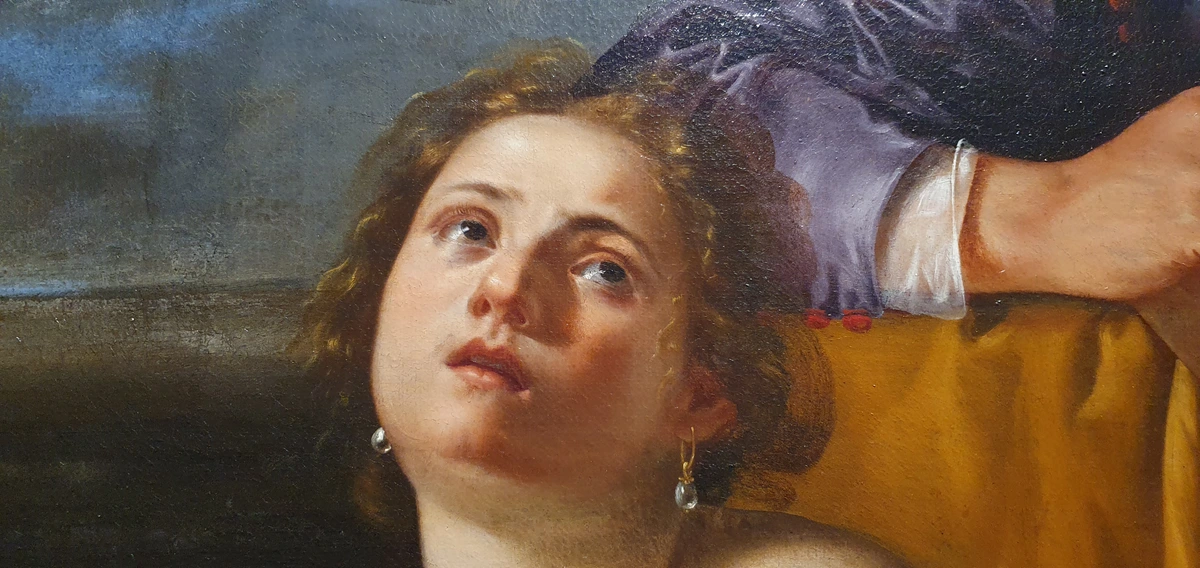
- Renaissance Meesters: Caravaggio gebruikte het voor warme huidtonen in De roeping van Matteus; Rembrandt in clair-obscur meesterwerken voor licht dat huid raakt.
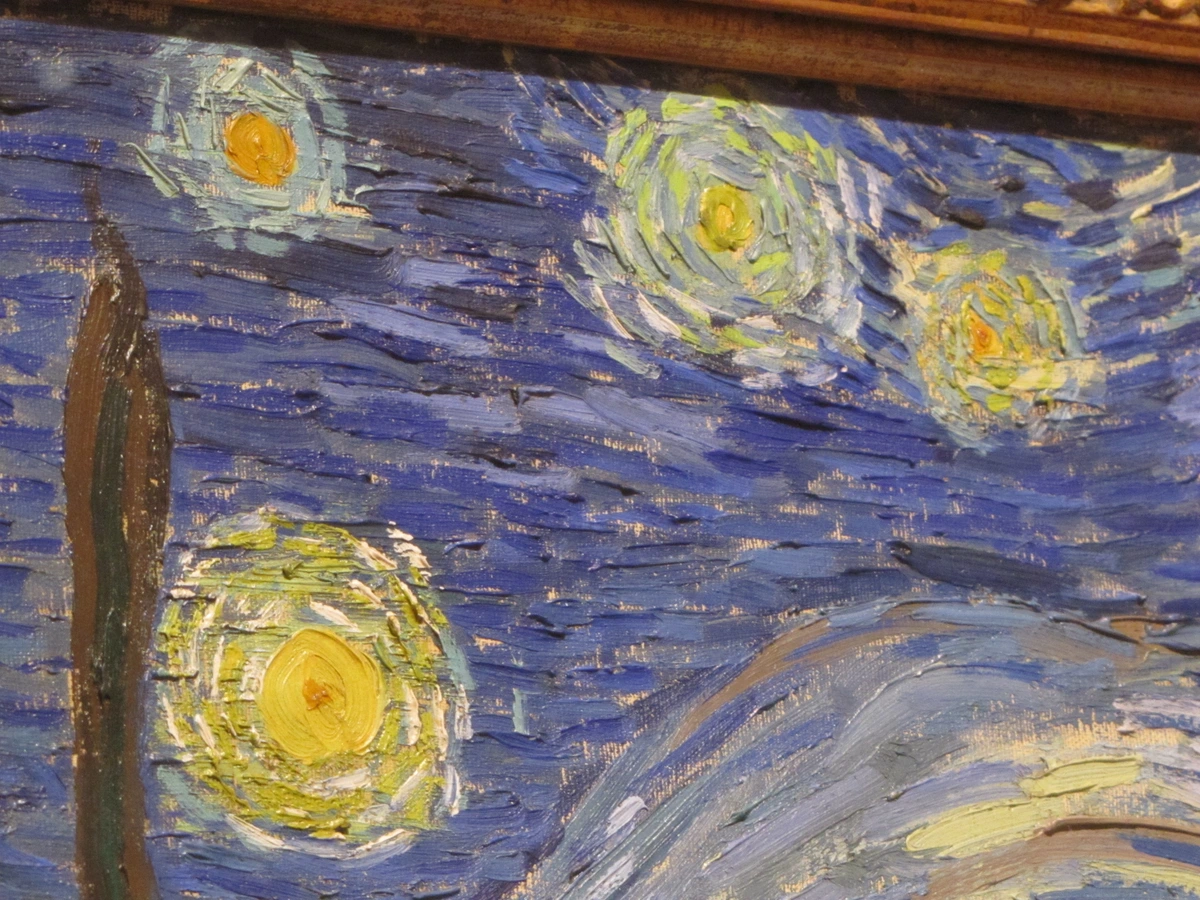
- 19e Eeuwse Impressionisten: Monet legde het voor hooibergen bij zonsopgang; Van Gogh mengde het met ultramarijn voor sterrenhemels.
Industriële pigmenten dreven oker bijna uit in de 20e eeuw. Waarom klei winnen als je chemische kleuren kunt massaproduceren? Toch overleeft oker, omdat het geschiedenis in zijn korrelige structuur met zich meedraagt. Wanneer je met oker schildert, neem je deel aan een artistieke lijn ouder dan schrift zelf.
Moderne Toepassingen: Waarom Oker Nog Altijd Schijnt
In een tijdperk van neonchemie, waarom kies je oker? Omdat het de taal van authenticiteit spreekt. Het doet niet alsof het lichter is dan de zon; het omarmt nuance.
Oker in Hedendaagse Kunstbewegingen
Oker heeft opnieuw relevantie gevonden in verschillende hedendaagse kunstbewegingen:

- Aarde Kunst: Kunstenaars zoals Robert Smithson en Andy Goldsworthy gebruiken oker in locatiespecifieke installaties die verband houden met natuurlijke landschappen
- BioKunst: Wetenschappers en kunstenaars werken samen met oker in levende sculpturen en organische materialen
- Digitale Nostalgie: Terwijl digitale kunst alomtegenwoordig wordt, vertegenwoordigt oker een tastbare verbinding met analoge tradities
- Milieukunst: Oker's natuurlijke oorsprong maakt het perfect voor werken die ecologische thema's adresseren
- Minimalisme: De subtiele variaties in natuurlijke oker sluiten aan bij minimalistische esthetiek van eenvoud en authenticiteit
Kunstvorm | Oker's Rol |
|---|---|
| Olieschilderij | Basislaag voor huidtinten; glaceren voor warme schaduwen; aardse landschappen. |
| Waterverf | Creëert korrelende waslagen; ideaal voor zonovergoten architectuur. |
| Acryl | Veelzijdig dekkende kleur; texturale impasto-effecten mogelijk. |
| Keramiek | Natuurlijke slipkleur voor antieke uitziende glazuren. |
Maar oker reist buiten de easel:
- Architectuur: Venetiaanse stucwerkers gebruiken oker voor verweerde Middellandse Zee-wanden.
- Mode: Ontwerpers zoals Dries Van Noten weven oker-gekleide stoffen in herfstcollecties.
- Make-up: Mineralen make-up-lijnen gebruiken het voor natuurlijke blush (geen harde roze tinten).
- Digitaal Ontwerp: UI kleurexperts bestuderen okers warmte voor uitnodigende interfaces.
In mijn abstract werk is oker niet alleen een kleur – het is een anker. Het voorkomt dat chaotische composities zweven, verankert ze als wortels in de bodem. Je voelt zijn gewicht, zijn verbinding met de fysieke wereld zelfs in abstracte vorm.
Praktische Zaken: Kiezen, Mengen en Werken met Oker
Klaar om oker te ervaren? Zoals het tot zijn recht komt:
Een Omvattende Gids voor Okerselectie
Het kiezen van de juiste oker vereist begrip van zowel de markt als je specifieke artistieke behoeften. Hier is waar je op moet letten:
Marktanalyse en Prijzen
Oker Type | Prijsbereik | Kwaliteitsindicatoren | Geschikt Voor |
|---|---|---|---|
| Professionele Kwaliteit | €15-30 per tube | PY43 pigmentcode, natuur label Hoog pigmentgehalte | Serieuze kunstenaars, galerijwerk |
| Studentenkwaliteit | €5-15 per tube | Kan synthetische tinten bevatten Goed voor oefening | Beginners, grote projecten |
| Ruwe Pigment | €10-25 per ounce | Onbewerkt, vereist mengen | Aangepaste kleurencreatie, kunstenaars die het zelf willen malen |
| Voorbereide Verf | €8-20 per tube | Klaar voor gebruik, consistente kwaliteit | Gemak, snelle projecten |
| Historische Reproducties | €20-40 per tube | Authentieke verwerkingsmethoden | Conservatie werk, historische nauwkeurigheid |

1. Het Etiket Lezen
Vermijd marketing verwarring!
- Zoek naar "Natuurlijk"/"Aardpigment": Garandeert authenticiteit.
- Controleer PY43 Index: Echte okerpigmentcode.
- Vermijd "Hue" Labels: "Kadmiumpath Yellow Hue"? Synthetische imitator.
- Lichtechtheid: Moet beoordeeld worden I (Uitstekend) op de tube.
2. De Mengmagie
Oker zelden alleen. Zijn kracht ontvouwt zich in gesprek met andere kleuren:
| Basis         | Meng Met Oker Voor...             | Resulterend Sfeer              |
|---------------|-----------------------------------|--------------------------------|
| **Hemelsblauw** | 1:2 ratio                        | Mistige ochtendlandschappen.   |
| **Siena Gebrand**| Gelijkmatige delen               | Urgente, vulkanische aardetinten. |
| **Prussian Blue**| Kleine accenten                  | Antieke patina op metalen objecten. |
| **Titandioxide**| Dunnig overlaag                 | Zonlicht door stof filterend.  |
| **Ultramarijn Blauw** | 3:1 ratio (oker:blauw)      | Twilight hemels, mystieke sfeer |
| **Kadmiumpath Rood**| Kleine aanrakingen voor diepte | Rijke, complexe schaduwen      |
| **Vergroen Groen** | 2:1 ratio met wit toegevoegd  | Lentebladeren, verse aardetonen |
3. Pro Technieken
Onderverf Technieken
Onderverven: Gebruik oker als imprimatura bij portretten – het uniformeert tinten. De klassieke onderverftechniek met oker omvat:
- Imprimatura: Dunne transparante okerwas over het hele doek
- Velasquez Methode: Bouw lagen van oker en wit op voor geleidelijke tonale ontwikkeling
- Moderne Abstractie: Gebruik okeronderverf als basis voor hedendaagse abstracte composities
- Sgraffito: Krassen door natte okeronderlaag om onderliggende kleuren te onthullen
- Frottage: Druk textuurmaterialen in natte okeronderverf voor interessante effecten
Glaceren en Laagtechnieken
Glaceren: Dunne acryl okerlagen over koelblauw creëren lichtgevende warmte. Geavanceerde glacerentechnieken omvatten:
- Meerdere Dunne Glaceren: Pas 5-10 opeenvolgende dunne lagen toe voor diepe luminositeit
- Glaceremedia: Gebruik gespecialiseerde glaceremedia om droogtijd en transparantie te controleren
- Kleurtemperatuurcontrole: Gebruik warme oker glaceren over koel onderverven voor ruimtelijke diepte
- Lokale Kleurversterking: Pas oker glaceren selectief toe om specifieke gebieden te verwarmen
- Atmosferische Perspectief: Gebruik oker glaceren voor afstand en luchtperspectief
Textuur Toepassingen
Textuur: Grof okerpoeder toevoegen aan gel mediums voor tastbare impasto. Textuureffecten omvatten:
- Impasto: Bouw dikke lagen van oker gel medium op voor sculpturale effecten
- Collage Integratie: Meng oker met papier, stof of andere materialen
- Zand en Grit: Voeg natuurlijk zand toe aan okermengsels voor authentieke aardetexturen
- Kraak Medium: Creëer verouderde, gekruimelde effecten met oker over kraak medium
- Vorm Pasta: Gebruik oker met vorm pasta voor driedimensionale effecten
Droog Penseel: Technieken omvatten:
- Droog Penseel Basis: Laad penseel minimaal, werk op droog oppervlak
- Verweerd Hout Effecten: Gebruik oker wit mengsel voor realistische veroudering
- Steen Texturen: Combineer oker met grijzen voor steenachtige effecten
- Stof Representatie: Creëer realistische stofplooien met oker droog penseel
- Atmosferische Effecten: Gebruik oker droog penseel voor nevelige, atmosferische achtergronden
4. Belangrijke Overwegingen
Economische en Duurzaamheidsfactoren
Kosten vs. Waarde: Echte oker kost meer dan synthetische (mijnbouw > chemische fabrieken). De moeite waard elk korreltje. Economische overwegingen omvatten:
- Toeleveringsketen: Authentieke oker vereist ethische sourcing van verantwoorde mijnen
- Milieueffect: Vergelijk okermijnbouw met synthetische pigmentproductie
- Lange termijn Waarde: Investering in kwaliteit oker betaalt zich terug door duurzaamheid en prestaties
- Markttrends: Groeiende vraag naar natuurlijke pigmenten kan beschikbaarheid en prijzen beïnvloeden
- DIY Verwerking: Kostbesparing vs. tijdsinvestering in verwerking van ruwe oker
Kwaliteitscontrole en Consistentie
Batchconsistentie: Natuurlijke pigmenten variëren lichtjes. Voorraad aanvullen als je je perfecte tint vindt. Kwaliteitscontrole omvat:
- Leveranciersrelaties: Bouw relaties op met leveranciers die consistente kwaliteit bieden
- Testprocedures: Ontwikkel eigen testmethoden voor nieuwe okerpartijen
- Opslossingen: Correcte opslag behoudt okerkwaliteit over tijd
- Documentatie: Houd bij van partijnummers en kenmerken
- Kwaliteitstolerantie: Begrijp en accepteer aanvaardbare variaties in natuurlijke pigmenten
Duurzaamheid en Conservering
Vervagingsrisico? Verwaarloosbaar bij echte PY43 oker. Grotkunst bewijst zijn duurzaamheid. Conserveringsoverwegingen:
- Milieufactoren: Hoe vochtigheid, temperatuur en licht oker kunstwerken beïnvloeden
- Conservatietechnieken: Professionele methoden voor het behoud van oker werken
- Preventieve Zorg: Correcte lijsten en presentatietechnieken
- Chemische Stabiliteit: Begrijp oker's weerstand tegen milieuvervuiling
- Archiefkwaliteit: Creëren van museumkwaliteit werken die generaties zullen duren
FAQ: Oker Vragen Beantwoord
Technische en Praktische Vragen
Waarom ziet oker soms bruinig eruit?
IJzeroxidatie niveaus variëren natuurlijk. Hogere oxidatie = warmere roodbruinen; lagere = citroengele. Onvoorspelbare verschuiving is deel van zijn charme, geen gebrek. De kleurvariatie treedt op omdat:
- Geologische Factoren: Verschillende mineralenafzettingen bevatten verschillende ijzeroxide concentraties
- Verwerkingsmethoden: Malen en zuiveringstechnieken beïnvloeden uiteindelijke kleur
- Milieublootstelling: Natuurlijke oker kan sporenelementen bevatten die kleur beïnvloeden
- Belichtingsomstandigheden: Oker verschilt onder verschillende lichtbronnen
- Verouderingsproces: Sommige okerkleuren ontwikkelen karakter over tijd via oxidatie
Is oker na drogen waterdicht?
Jazeker, correct gebonden (olie/acryl/ei tempera). Prehistorische op natte rook toegepaste oker weerstaat millennia later nog steeds regen. Geen magie, stabiele chemie. De waterdichte aard hangt af van:
- Kwaliteit Bindmiddel: Verschillende bindmiddelen bieden verschillende niveaus van waterbestendigheid
- Toepassingsdikte: Dikkere toepassingen creëren volledigere bindmiddelbedekking
- Uithardingstijd: Correct uitharding staat volledige bindmiddelpolymerisatie toe
- Milieumomenten: Vochtigheid en temperatuur beïnvloeden drogen en uitharden
- Oppervlaktevoorbereiding: Correcte grondmaterialen zorgen voor hechting en duurzaamheid
Kan ik mijn eigen okerverf maken?
Absoluut! Graaf gele klei, week om te ontdoen van onzuiverheden, droog, maal tot poeder, meng met olie/water. Waarschuwing: Het is rommelig en arbeidsintensief. Premixed kopen respecteert zowel je tijd als pigmentkwaliteit. DIY okerverwerking omvat:
- Bronselectie: Geschikte kleiafzettingen vinden
- Zuivering: Onzuiverheden verwijderen via wassen en bezinken
- Drogen: Correct drogen om schimmel en bacteriegroei te voorkomen
- Malen: Bereiken van geschikte deeltjesgrootte voor schilderen
- Kwaliteitstesten: Zorgen dat het eindproduct aan artistieke normen voldoet
Waarom ziet oker soms bruinig eruit?
IJzeroxide niveaus variëren natuurlijk. Hogere oxidatie = warmere roodbruinen; lagere = citroengele. Onvoorspelbare verschuiving is deel van zijn charme, geen gebrek.
Is oker na drogen waterdicht?
Jazeker, correct gebonden (olie/acryl/ei tempera). Prehistorische op natte rook toegepaste oker weerstaat millennia later nog steeds regen. Geen magie, stabiele chemie.
Kan ik mijn eigen okerverf maken?
Absoluut! Graaf gele klei, week om te ontdoen van onzuiverheden, droog, maal tot poeder, meng met olie/water. Waarschuwing: Het is rommelig en arbeidsintensief. Premixed kopen respecteert zowel je tijd als pigmentkwaliteit.
Gebruiken kunstenaars oker voor huidtinten? Is het niet te geel?
Precies! Huid is niet "roze". Het is warm oker met blauwe ondertonen. Oker creëert die levende, ademende warmte synthetische "vlees" tinten niet kunnen repliceren.
Moet ik oker in kinderkunstprojecten gebruiken?
Absoluut! Niet-giftig, makkelijk schoon te maken, verbindt kinderen met oudere kunstvorming. Laat de grit van de aarde onder hun penseel voelen – tastbaar leren.
Conclusie: Een Stuk Aarde in Handen
Geel okerverf is niet alleen een hulpmiddel in je gereedschapskist. Het is een dialoog door millennia. Wanneer je zijn warmte op je palet drukt, sluit je je aan bij een lijn van mensen die zich gedwongen voelden de kus van de zon in klei vast te leggen. Het humblet je, verankert je, herinnert je eraan dat kunst niet los van de natuur staat – het is er gedestilleerd uit.
De volgende keer dat je voor een blanco canvas staat, overweeg oker. Niet omdat je moet aardetinten gebruiken, maar omdat zeldzaamheid biedt: authenticiteit in een tijd van simulatie. Het is de kleur van verweerd steen, van huid verwarmd door zon, van geschiedenis onder je vingertoppen. Het is gewoon er – geen pretentie, geen chemicaliën, geen houdbaarheidsdatum. Alleen aarde, olie, de tijdloze drang je sporen te achterlaten.
Als je oker door je werk wilt laten spreken, ontdek hoe ik deze aardetinten in hedendaagse abstracties vertaal. Ontdek mijn oker-doorlopen originele kunst hier.
Diepere pigmentgeschiedenis, traceer okers reis door mijn interactieve kleurenlijn.
En als authenticiteit roept, kom waar aarde kunst wordt bij het Zen Museum in Den Bosch.
Verdere Verkenning en Bronnen
Boeken en Academische Bronnen
- Aarde Pigmenten en hun Historische Gebruik door Diana Attwood
- De Kunstenaarsgids voor Natuurlijke Pigmenten door Sarah Parks
- Kleur: Een Natuurlijke Geschiedenis van de Palet door Victoria Finlay
- Pigmenten, Schilderijen en Conservering door Jo Kirby
- De Chemie van Kunstenaarsmaterialen door R.J. Gettens
Online Bronnen en Gemeenschappen
- Pigment Database: Comprehensieve database van natuurlijke en synthetische pigmenten
- Kunstenaars Forums: Gemeenschappen voor het delen van okertechnieken en ervaringen
- Conservatie Organisaties: Bronnen voor ethische pigment sourcing
- Educatieve Platformen: Online cursussen over traditionele schildertechnieken
- Kunst Historische Archieven: Digitale collecties met okerkunstwerken
Workshops en Educatieve Kansen
- Traditionele Schilder Workshops: Leer historische technieken met authentieke materialen
- Pigment Verwerkingslessen: Praktijkervaring in het maken van oker uit ruwe materialen
- Conservatie Training: Professionele ontwikkeling voor kunstconservatoren
- Kunstenaars Residencies: Programma's gericht op natuurlijke materiaalexperimentatie
- Museum Workshops: Educatieve programma's over historisch pigmentgebruik
De Toekomst van Oker in Hedendaagse Kunst
Naarmate we vooruitgaan, ontwikkelt oker zich verder in hedendaagse artistieke praktijk:












Opkomende Trends
- Duurzame Kunstpraktijken: Groeiende beweging naar milieubewuste materialen
- Cross-Culturele Uitwisseling: Inheemse kennis die hedendaagse kunstpraktijken beïnvloedt
- Technologische Integratie: Digitale kunstenaars die okertexturen en kleuren incorporeren
- Wetenschappelijke Samenwerking: Kunstenaars die samenwerken met wetenschappers om nieuwe okertoepassingen te ontwikkelen
- Klimaatverandering Kunst: Oker wordt gebruikt om ecologische thema's aan te pakken
Uitdagingen en Kansen
De toekomst van oker in kunst biedt zowel uitdagingen als kansen:
- Toeleveringsketen: Zorgen voor ethische sourcing van natuurlijke materialen
- Culturele Appropriatie: Respect voor de culturele oorsprong van okertradities
- Technologische Verandering: Balans tussen traditionele technieken en moderne innovaties
- Milieubehoeften: Duurzame praktijken in okermijnbouw en -verwerking
- Educatieve Uitbreiding: De waarde en geschiedenis van natuurlijke pigmenten onderwijzen