
A Practical Guide to Josef Albers' Color Theory for Artists
Ditch the rigid color wheel. A personal guide to using Josef Albers' revolutionary ideas about color interaction to transform your painting practice.

The Artist's Guide to Seeing: Putting Josef Albers’ Color Theory into Practice
Color is one of the most powerful tools in an artist's arsenal. It can evoke emotions, create depth, and transform a simple composition into a masterpiece. Josef Albers, a pioneer in the field of color theory, revolutionized the way artists perceive and use color. His book, Interaction of Color, is not just a guide but a manifesto that challenges traditional perceptions and encourages experimentation. This article aims to be your ultimate guide to understanding and applying Albers' theories in your own work.
Color theory is not just about mixing hues; it's about understanding how colors interact, influence emotions, and shape perceptions. Albers' work is a testament to the idea that color is not static but dynamic, constantly shifting based on its context. Whether you're a painter, designer, or simply an art enthusiast, this guide will help you see color in a new light.
I have a confession. For years, I thought I understood color. I knew the color wheel, I could mix a decent-looking secondary green, and I knew that complementary colors made each other 'pop'. I had the 'rules' down. Then I picked up Josef Albers' Interaction of Color, and I realized I didn't know anything at all. It was like I’d been reading a cookbook my whole life without ever tasting the food.
Albers' work is not just about color; it’s about perception, experimentation, and the endless possibilities of visual expression. His teachings challenge traditional perceptions and encourage a more dynamic and experimental approach to art. This article aims to be your ultimate guide to understanding and applying Albers' theories in your own work.
Albers’ work is not just about color; it’s about perception, experimentation, and the endless possibilities of visual expression. His teachings challenge traditional perceptions and encourage a more dynamic and experimental approach to art. This article aims to be your ultimate guide to understanding and applying Albers' theories in your own work.
Albers wasn’t a theorist in the stuffy, academic sense. He was a teacher, an experimenter. He was an artist who spent a lifetime staring at colored squares of paper, not to create rules, but to shatter them. His central idea, the one that can fundamentally change your work, is this: color is relative. No color is an island; it’s constantly changing based on its neighbors. It’s the most deceptive, magical, and frustrating element in art.
Albers' approach to color theory is rooted in the idea that color is not a fixed entity but a dynamic experience. This perspective transforms the way artists perceive and use color, making it a powerful tool for creative expression.

This isn't just an article about what is color theory; it's a practical guide to taking Albers' mind-bending ideas out of the book and into your studio. It's about learning to see color with your own eyes, not just with your brain.
By the end of this guide, you’ll have a deeper understanding of how to apply Albers' principles to your own work, whether you're a painter, designer, or simply someone who appreciates the beauty of color.

Why Josef Albers Matters
Josef Albers was a pioneer in the field of color theory, but his contributions extend far beyond academic circles. His work has influenced generations of artists, designers, and educators. By focusing on the relational nature of color, Albers challenged traditional perceptions and encouraged a more dynamic and experimental approach to art. His teachings are not just about color; they are about perception, experimentation, and the endless possibilities of visual expression.
Albers' influence can be seen in various artistic movements and disciplines. His emphasis on experimentation and perception has inspired artists to explore new ways of seeing and creating. Whether you're a painter, designer, or educator, Albers' principles can transform your approach to color and creativity.
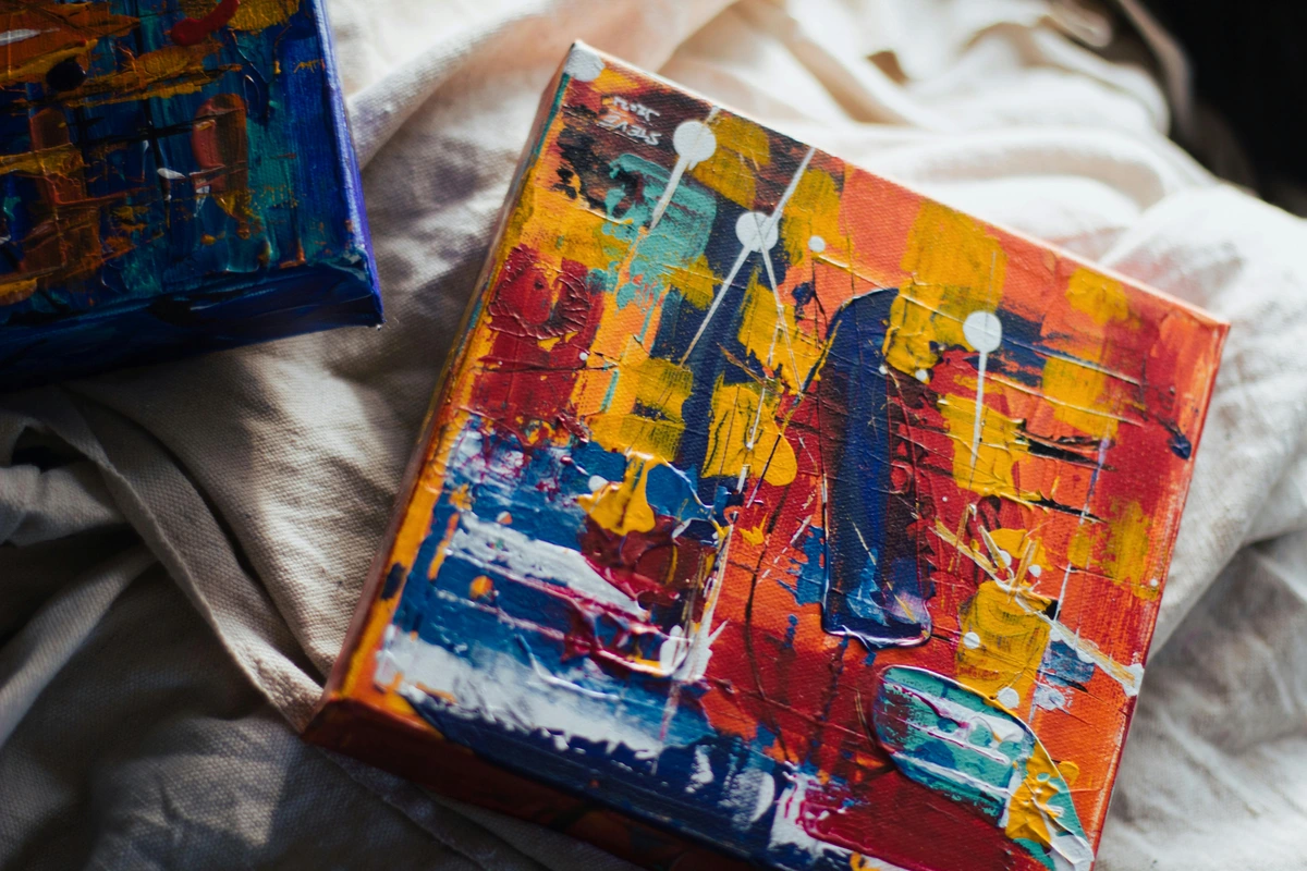
The Core Idea: One Color Can Look Like Two
Forget everything else for a moment and just focus on this. This is the cornerstone of Albers' teaching. He proved, with simple exercises, that you can take one single, physical piece of colored paper and make it look like two completely different colors simply by changing its background.
This concept, known as color relativity, is fundamental to understanding how colors interact and influence each other. It challenges the traditional notion of color as a fixed entity and opens up a world of creative possibilities.
The Science Behind Color Relativity
Albers' experiments are rooted in the science of perception. Our eyes and brain work together to interpret color, and this interpretation is heavily influenced by context. When a color is placed against different backgrounds, our brain adjusts its perception based on the surrounding hues. This phenomenon is known as simultaneous contrast, and it is a fundamental principle in both art and design.
Understanding simultaneous contrast can help artists create more dynamic and visually engaging compositions. By manipulating the context in which colors are perceived, artists can evoke specific emotions and guide the viewer's eye.
I know, it sounds like a magic trick. But when you do it yourself, it feels like unlocking a new sense. It’s the moment you stop telling the color what it is and start asking it.
Your First Albers Exercise: The Deception
You don’t need fancy equipment. Grab some colored paper (construction paper is perfect) or mix up a few patches of paint. The goal is to make one color appear as two.
This exercise is designed to help you understand the principles of color relativity and simultaneous contrast. By experimenting with different color combinations, you'll gain a deeper appreciation for how colors interact and influence each other.
- Choose Your Cast: Pick three colors. Let's say a medium green (our 'actor'), a bright, light yellow (background #1), and a deep, dark blue (background #2).
- Set the Stage: Take your two background colors, the yellow and the blue. Place them side-by-side.
- The Performance: Cut a smaller square of your medium green. Then cut that square in half. Place one half in the center of the yellow background and the other half in the center of the blue background.
- Observe: Now, step back and look. I mean really look. The green on the yellow background will likely appear darker, duller, and maybe even a bit bluish. The exact same green on the dark blue background will seem brighter, more vibrant, and possibly lean a little yellowish.
Congratulations. You’ve just proven Albers' point. You’ve seen the relativity of color firsthand. This isn't an optical illusion; it's the reality of perception, and it's the secret to creating truly dynamic and surprising color relationships in your work.
The Three Ways Colors Influence Each Other
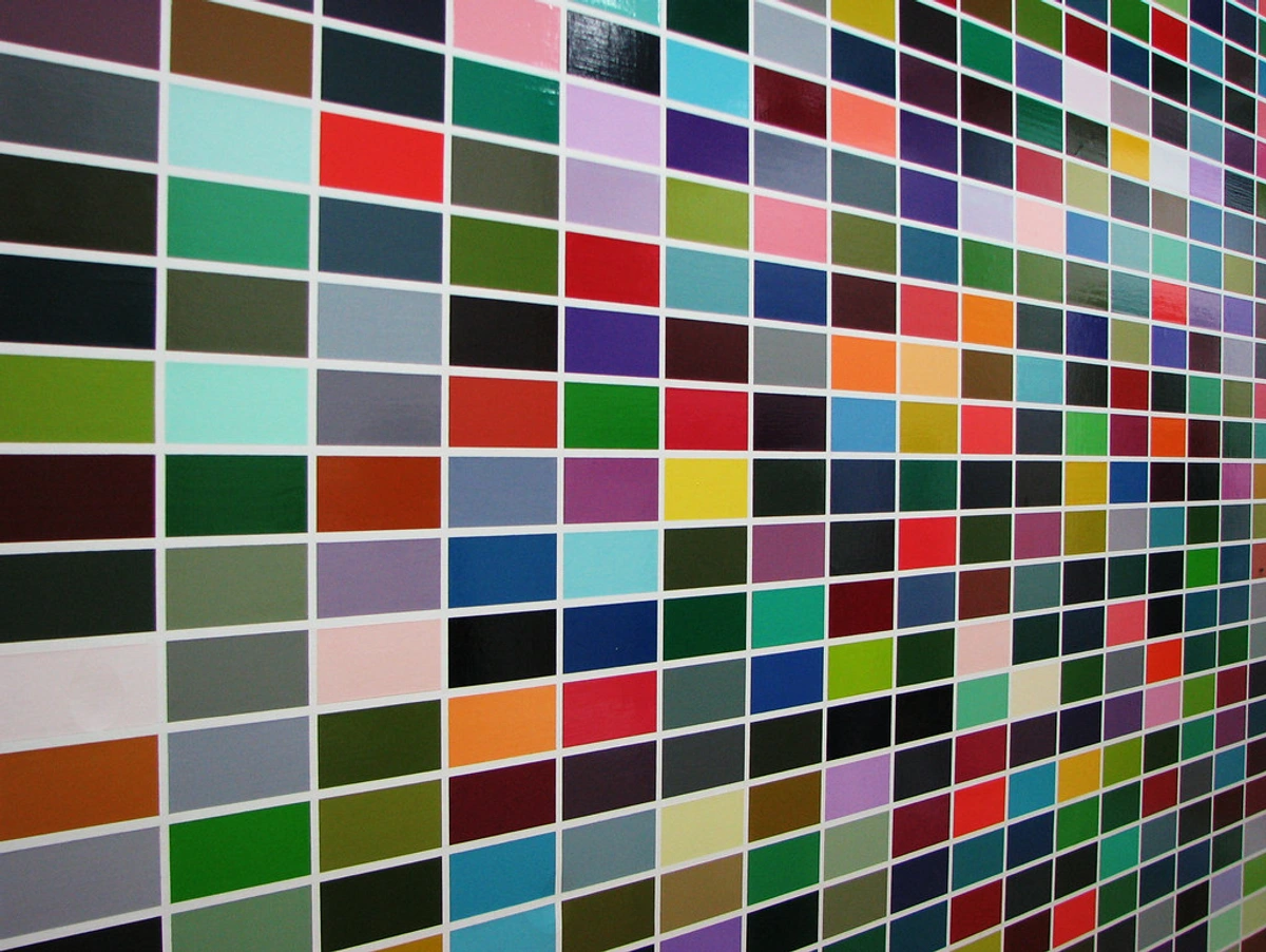
Albers broke down these interactions into three main categories. Understanding them helps you predict and control these color shifts, moving from accidental discovery to intentional composition. It’s a core concept in how artists use color effectively.
These interactions are essential for creating harmonious and visually engaging compositions. By mastering these principles, artists can manipulate color to evoke specific emotions and guide the viewer's eye.
Practical Applications
Understanding these interactions can transform your approach to art:

- Light/Dark (Value): Use this principle to create depth and dimension in your work. By manipulating the perceived lightness or darkness of a color, you can guide the viewer's eye and create focal points.
- Hue: Experiment with complementary hues to create vibrant contrasts or subtle harmonies. This can add complexity and interest to your compositions.
- Intensity (Saturation): Play with saturation to evoke different moods and emotions. High saturation can create energy and excitement, while low saturation can convey calmness and subtlety.
Interaction Type  | What It Affects | How It Works (A Simple Rule of Thumb) |
|---|---|---|
| Light/Dark (Value) | The perceived lightness or darkness of a color. | A color will look lighter on a dark background and darker on a light background. |
| Hue | The perceived color 'family' (e.g., is it a bluish-green or a yellowish-green?). | A color will seem to take on the complementary hue of its background. (e.g., a neutral grey on a red background will look greenish). |
| Intensity (Saturation) | The perceived brightness or dullness of a color. | A bright color can make its neighbor look duller, and a dull color can make a neighboring color seem more vibrant by contrast. |
Common Mistakes and How to Avoid Them
- Over-Reliance on Theory: While understanding the theory is important, don't let it stifle your creativity. Experiment and trust your eyes.
- Ignoring Context: Always consider the context in which your colors will be viewed. Lighting, surrounding colors, and even the medium can affect perception.
- Fear of Failure: Embrace mistakes as part of the learning process. Some of the most interesting discoveries come from unexpected outcomes.
This table is just a starting point. The real learning happens when you start mixing colors and seeing these principles in action. This is the heart of my approach to color mixing – less about formulas, more about relationships.
From Paper Scraps to Palette: Applying Albers to Painting
It's one thing to play with colored paper, but how do we use this on a canvas full of wet, messy paint? This is where the real fun begins.
Translating Albers' principles to painting requires a different approach. Paint allows for blending, layering, and texture, which can add depth and complexity to your color interactions. This section will guide you through the process of applying Albers' theories to your painting practice.
Transitioning from Paper to Paint
While paper exercises are a great starting point, translating these principles to paint requires a different approach. Paint allows for blending, layering, and texture, which can add depth and complexity to your color interactions. Here are some tips to help you make the transition:
- Start Small: Begin with small studies to test how colors interact on canvas.
- Experiment with Mediums: Different mediums (oil, acrylic, watercolor) behave differently. Experiment to see how each affects color perception.
- Document Your Process: Keep a journal or sketchbook to document your experiments and observations.
The Power of the Underpainting
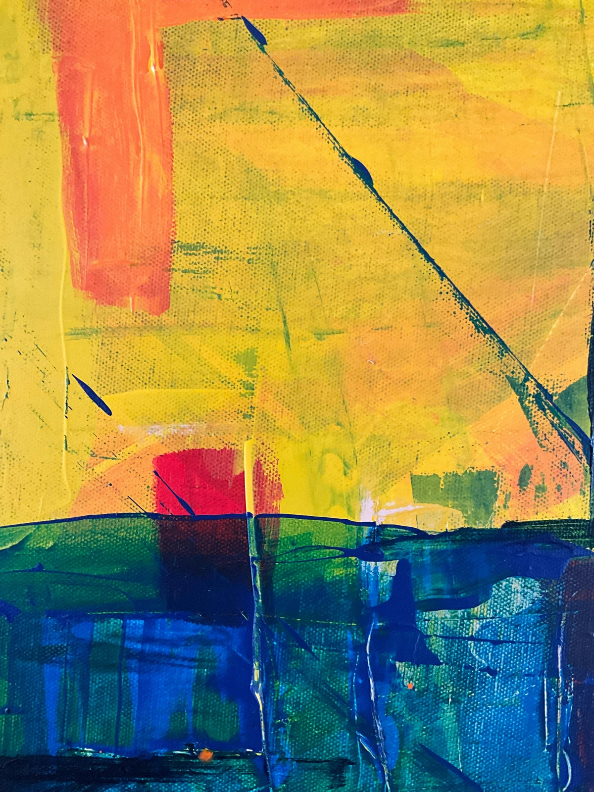
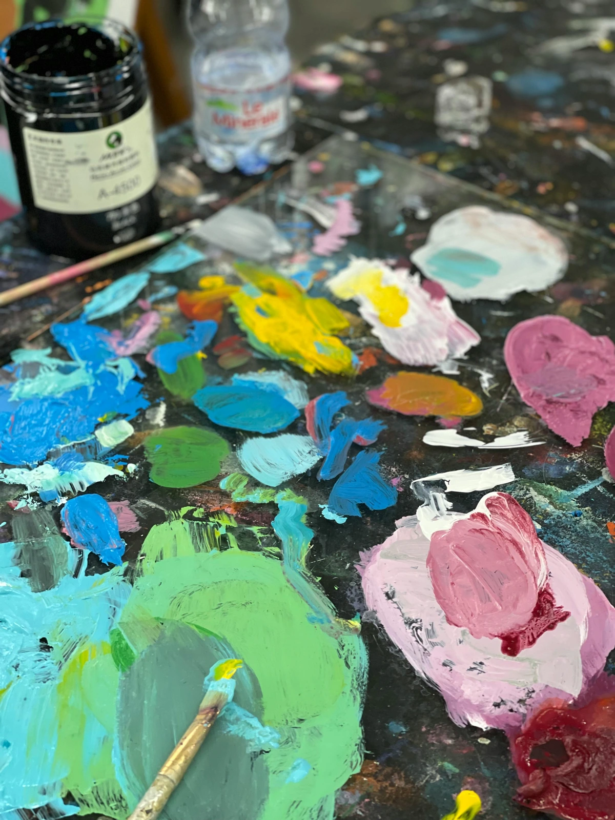
Albers' work shows that what’s under a color is just as important as what’s next to it. Before you even start your main composition, try laying down a solid field of a single color. A vibrant orange, a dull grey, a deep blue. Then, as you paint your intended layers on top, watch how that underpainting 'glows through' and influences every subsequent color. It will unify the painting and create unexpected harmonies.

Underpainting is a powerful technique that can add depth and complexity to your work. By experimenting with different underpainting techniques, you can create unique and visually engaging compositions.
Techniques for Effective Underpainting
- Monochromatic Underpainting: Use a single color to establish values and composition before adding color.
- Complementary Underpainting: Choose a color that complements your intended top layers to create vibrant contrasts.
- Textured Underpainting: Experiment with different textures and techniques to add depth and interest to your underpainting.
Each of these techniques offers a unique way to explore the relationship between colors and how they interact with one another. By mastering these methods, you can create paintings that are rich in depth and visual interest.
Glazing: Albers in Action
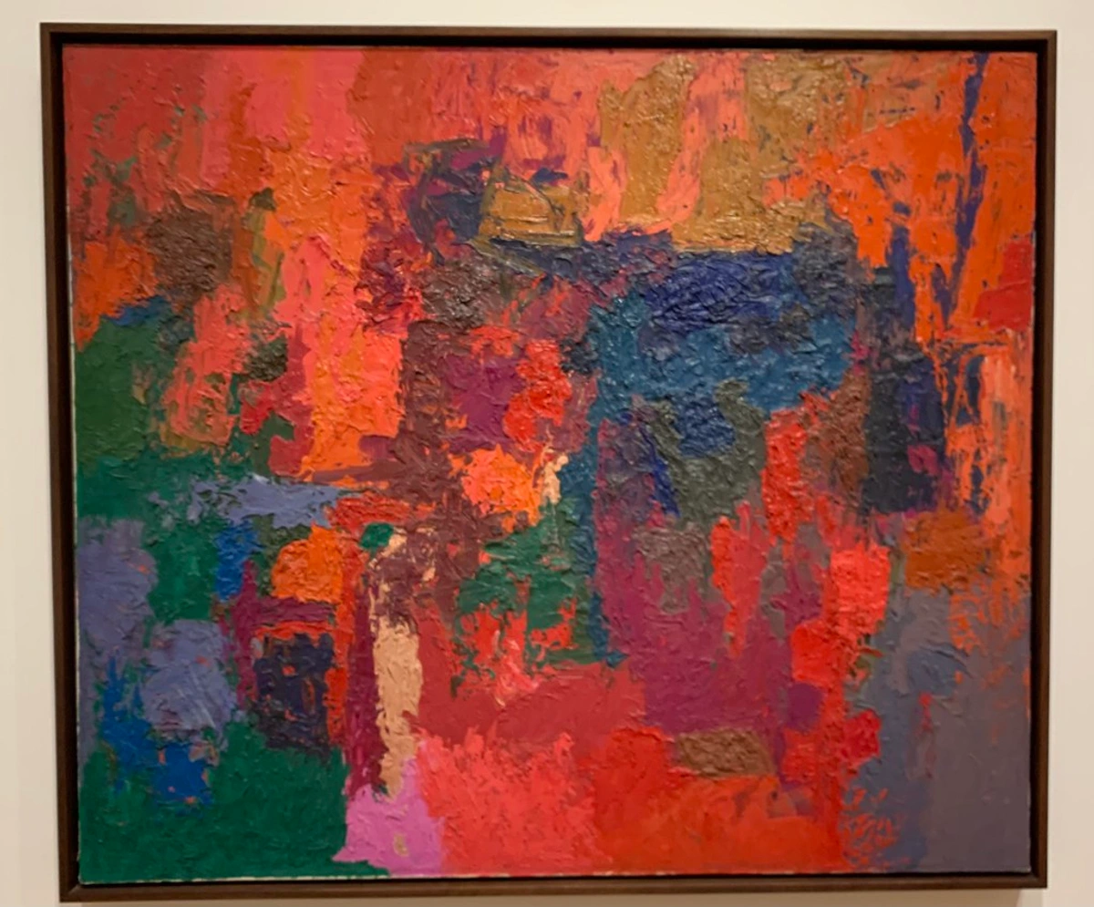
I believe one of the most direct applications of Albers' theories in painting is glazing. When you apply a thin, translucent layer of paint over another, you are literally creating a color interaction where two hues mix in the viewer's eye, not on the palette.
Glazing is a versatile technique that can add luminosity and depth to your paintings. By layering translucent colors, you can create subtle shifts in hue and value, enhancing the overall visual impact of your work.

Glazing Techniques
- Layering: Apply multiple thin layers of translucent paint to build depth and complexity.
- Color Mixing: Experiment with different color combinations to see how they interact when layered.
- Drying Time: Allow each layer to dry completely before applying the next to avoid muddying the colors.
By mastering these glazing techniques, you can create paintings that are rich in luminosity and depth. This method allows for a level of control and subtlety that is difficult to achieve with other techniques.

Want to make a patch of yellow sing? Glaze a whisper-thin layer of violet next to it. Need to push a green into a cooler, more mysterious space? A transparent glaze of blue will do it without turning it into muddy sludge. It’s a subtle but powerful technique. If you're serious about color, you have to explore the art of glazing.

Boundaries and Edges
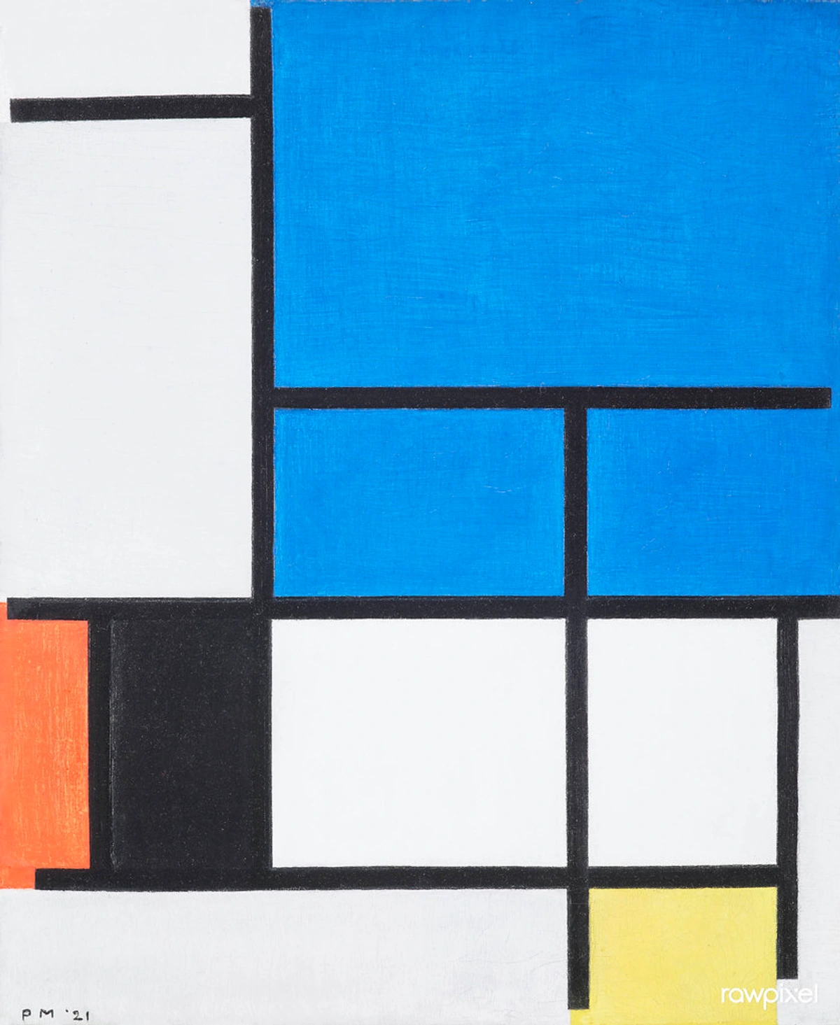
Pay close attention to where two colors meet. Is the edge hard and sharp, or is it soft and blended? A hard edge creates a powerful, vibrating contrast. A soft, blended edge creates a gentle transition where the colors can speak to each other more quietly. Albers called this vibration 'fluting'. It's that shimmering, almost uncomfortable energy you get when two highly contrasted colors touch. You can use it to draw the viewer's eye or create a sense of unease or excitement.
Understanding the role of edges in color interactions can help you create more dynamic and visually engaging compositions. By experimenting with different edge techniques, you can evoke specific emotions and guide the viewer's eye.
Exploring Edge Techniques
- Hard Edges: Use hard edges to create bold contrasts and draw attention to specific areas of your painting.
- Soft Edges: Soft edges can create a sense of movement and fluidity, allowing colors to blend seamlessly.
- Fluting: Experiment with fluting to add energy and dynamism to your work. This technique can create a sense of tension and excitement.
By mastering these edge techniques, you can create paintings that are visually dynamic and emotionally engaging. Each technique offers a unique way to manipulate the viewer's perception and create a sense of depth and movement.
It’s a Philosophy, Not a Formula
Ultimately, the most important lesson from Josef Albers isn't a specific exercise or trick. It's a mindset. It's about approaching color with humility and curiosity. It's about trusting your eyes over your brain.
Albers' philosophy encourages artists to embrace experimentation and trust their instincts. By adopting this mindset, you can unlock new creative possibilities and develop a deeper understanding of color.
Embracing the Albers Mindset
Adopting Albers' philosophy can transform your artistic practice:
- Humility: Recognize that there is always more to learn and discover about color.
- Curiosity: Approach your work with a sense of wonder and experimentation.
- Trust: Trust your eyes and your instincts. Let your observations guide your creative decisions.
By embracing these principles, you can develop a more intuitive and dynamic approach to color, leading to more expressive and engaging artwork.
Your brain will tell you, "That is red." Your eyes, trained by Albers' methods, will ask, "Yes, but what kind of red is it right now, in this light, next to that blue?" This shift from knowing to questioning is what separates a good painter from a great one. It’s how you find the true emotional language of color in your own work.
The Emotional Language of Color
Colors have the power to evoke emotions and convey meaning. Understanding the emotional language of color can add depth and resonance to your work:
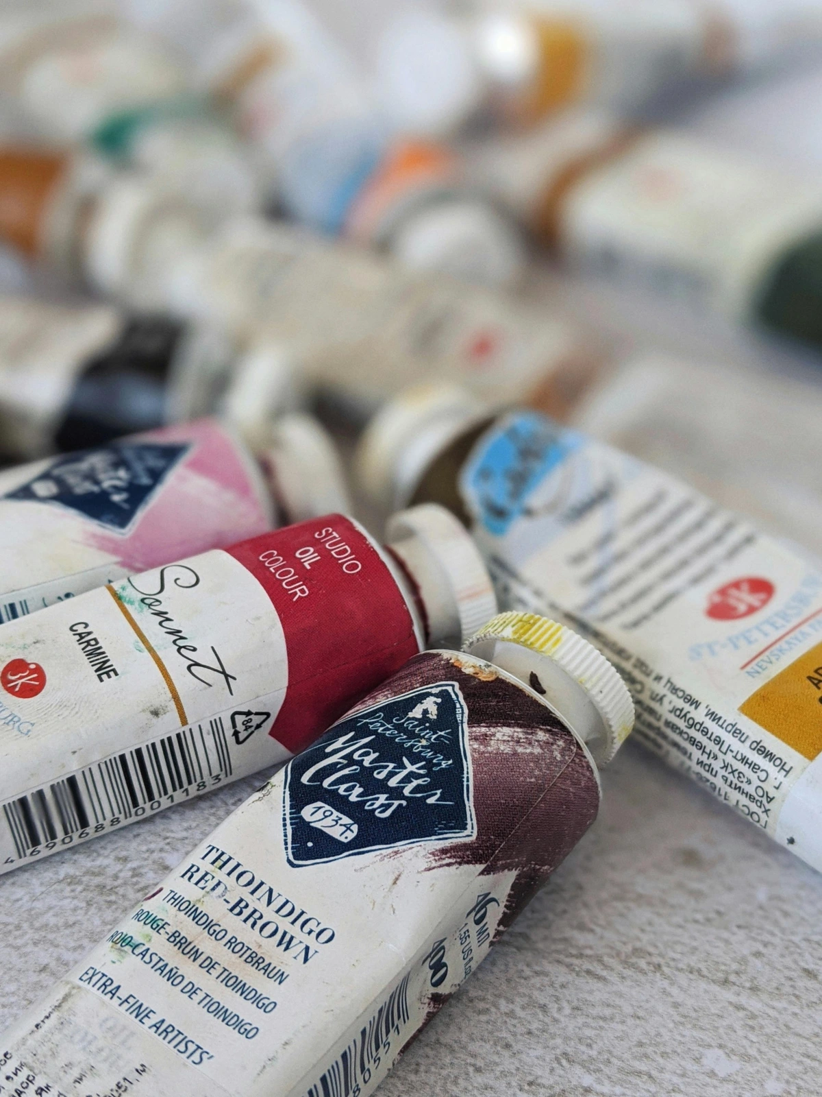
- Red: Passion, energy, and intensity.
- Blue: Calmness, tranquility, and depth.
- Green: Growth, harmony, and renewal.
- Yellow: Joy, warmth, and optimism.
Experiment with different color combinations to explore their emotional impact and create meaningful connections with your audience.
By mastering the emotional language of color, you can create artwork that resonates on a deeper level, evoking specific emotions and conveying complex ideas.
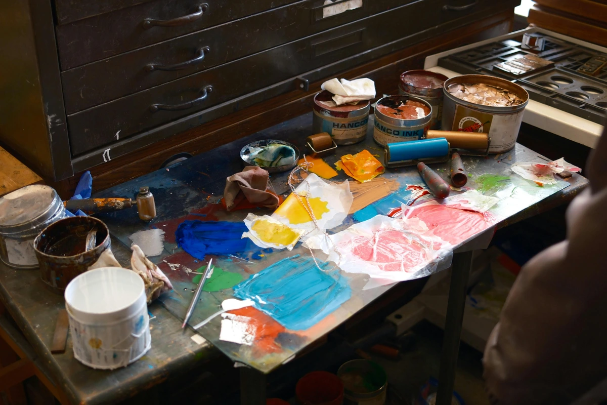
So, my advice is to go get some cheap construction paper or your student-grade paints and just play. Try to make one color look like two. Try to find two different colors that look the same. You will fail, you will make a muddy mess, and then, you will have a breakthrough. You will start to see.
The Journey of Discovery
Embarking on this journey of color discovery is both challenging and rewarding. Here are some final thoughts to guide you:
- Embrace Failure: Every mistake is an opportunity to learn and grow.
- Stay Curious: Keep experimenting and exploring new possibilities.
- Trust Your Eyes: Let your observations guide your creative decisions.
Remember, the goal is not to master color but to understand its endless possibilities and to find your unique voice in the world of art.
Frequently Asked Questions (FAQ)
Q: What is the most important book by Josef Albers for artists?
A: Without a doubt, it's Interaction of Color. It's not a traditional textbook you read from cover to cover. It's more of an instruction manual for experiments. It's one of the best books on color theory ever published, precisely because it's about practice, not just theory.
Q: How can I apply Albers' theories to digital art?
A: Digital tools like Procreate and Photoshop offer unique opportunities to experiment with color. Use layers and blending modes to explore color interactions and create dynamic compositions. However, it's also beneficial to work with physical materials to gain a deeper understanding of color perception.
Q: How is Albers' approach different from a standard color wheel?
A: The traditional color wheel is a diagram of presumed relationships (complementary, analogous, etc.). It’s a useful map. Albers' approach is the actual exploration of the territory. He cared less about the 'rules' of the wheel and more about what happens in the real world, under specific conditions. He taught that context trumps theory every time.
Q: Can Albers' theories be applied to other forms of art, such as sculpture or photography?
A: Absolutely! While Albers' work is often associated with painting, his principles can be applied to any form of visual art. In sculpture, consider how color interacts with form and texture. In photography, explore how lighting and composition affect color perception.
Q: Do I need to paint squares like Albers to use his theories?
A: Absolutely not! His Homage to the Square series was his laboratory. He used that simple format to eliminate distractions and focus solely on color. You should take his principles—relativity, interaction, the importance of context—and apply them to whatever you paint, whether it's portraits, landscapes, or wild abstractions.
Q: How can I incorporate Albers' theories into my daily artistic practice?
A: Start by setting aside time each day to experiment with color. Keep a sketchbook or journal to document your observations and discoveries. Over time, these experiments will become an integral part of your creative process.













Q: Can I use digital tools like Procreate or Photoshop for these exercises?
A: Yes, and it's a fantastic way to experiment quickly! Using a digital color picker to confirm that two colors are, in fact, identical can be a real eye-opener. However, I strongly encourage you to try it with physical materials too. The way light hits real pigment and the subtle imperfections of mixed paint teach you things a screen never can. It helps you avoid making muddy colors when you understand how pigments interact physically.
Q: What are some common challenges artists face when applying Albers' theories?
A: Some common challenges include over-reliance on theory, ignoring context, and fear of failure. To overcome these, focus on experimentation, trust your eyes, and embrace mistakes as part of the learning process.