Mastering Art's Visual Language: The Elements of Design Explained by an Artist
Unlock art's secret visual language! This comprehensive guide explores the seven elements of design (line, shape, form, space, value, texture, color) from an artist's perspective. Discover how these fundamental building blocks empower you to create, appreciate, and critically analyze art, gaining profound visual superpowers.
The Visual Language of Art: Mastering the Elements of Design
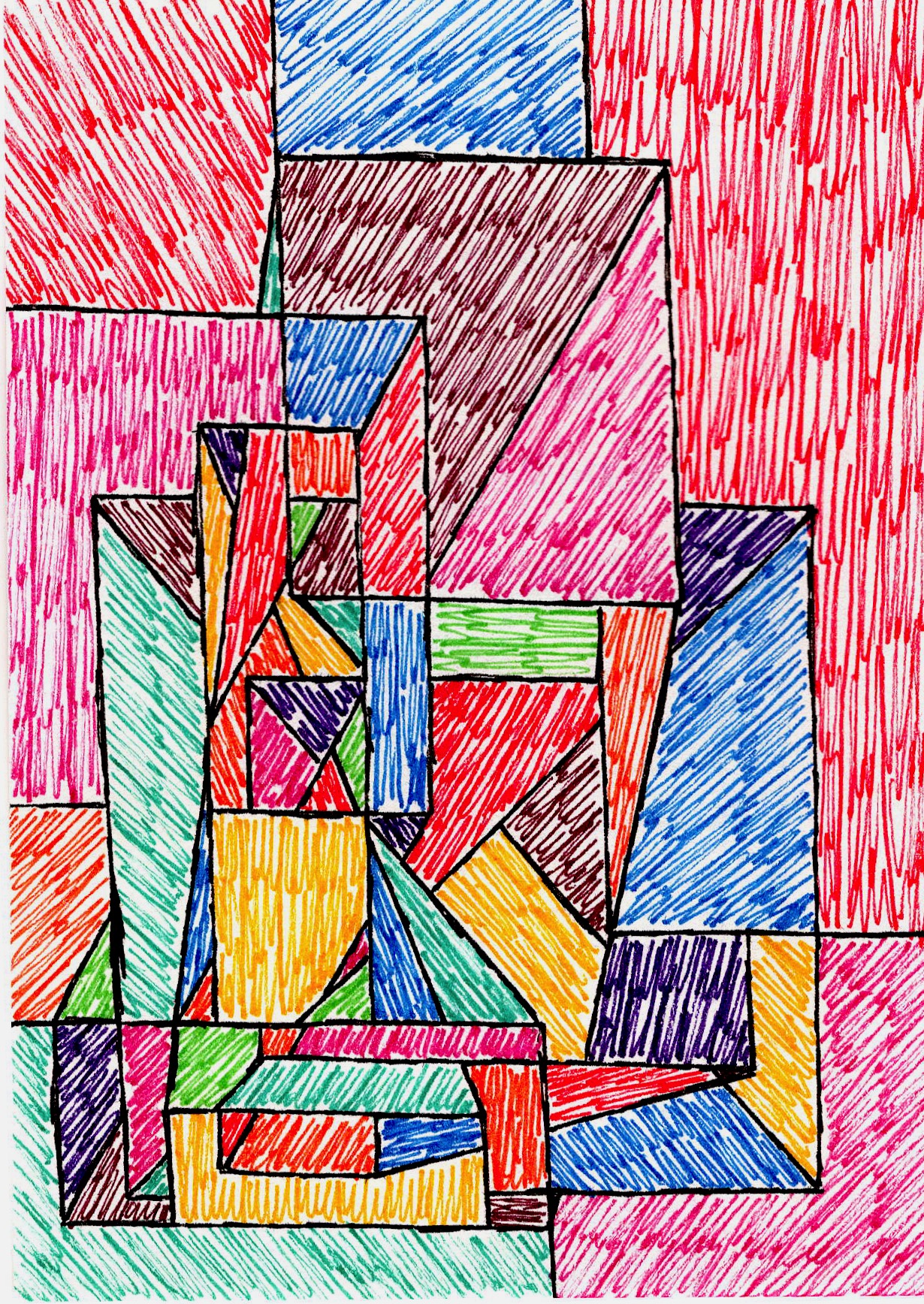
I'll admit it: when I first stumbled upon the 'elements of design' on my artistic journey, it felt less like a revelation and more like trying to decipher an ancient, dusty textbook. You know, the kind you’d rather forget existed. I thought I needed a decoder ring for every masterpiece, a secret handshake for every compelling visual. But here’s the game-changer, the actual secret: truly understanding these elements isn't just about memorizing jargon; it's about learning to speak the visual language of art itself. It’s about unlocking why a piece resonates with you, why it feels calm, or chaotic, or utterly breathtaking. For me, this was one of the most liberating discoveries in my creative life, radically transforming how I see, critique, and intentionally create art. Beyond a mere academic exercise, it gifted me with new 'visual superpowers,' enhancing my appreciation for everything from a grand painting to the pattern on a coffee cup, and even empowering me to deconstruct the visual narratives of media and advertising. In this comprehensive guide, we're going to pull back the curtain on each of these seven fundamental building blocks—line, shape, form, space, value, texture, and color—sharing not just what they are, but how I personally navigate them in my own practice and how they can empower you to see and appreciate art with new depth. Think of them not as abstract theories, but as the living, breathing tools that shape every visual experience. And remember, these elements are the nouns of art; the verbs are what we call the principles of design, which we'll touch on throughout.
What Even Are These Elements, Anyway? The DNA of Art
Think of the elements of design as the fundamental building blocks, the individual words in art's visual vocabulary – the nouns of art, if you will. They’re the raw ingredients an artist uses to craft a masterpiece, or even just a doodle on a napkin. Without them, visual communication simply wouldn't exist. For centuries, artists and theorists have grappled with categorizing these core components, striving for a universal understanding. This isn’t just an academic exercise; it’s crucial for analyzing, critiquing, and, most importantly, intentionally creating compelling art. From classical ideals of beauty and proportion during the Renaissance (Leonardo da Vinci's meticulous studies of human anatomy and proportion come to mind) to the systematic, almost scientific approaches championed by the Bauhaus movement in the 20th century, the quest has been to define art's very DNA. The way these elements are perceived and emphasized has also shifted dramatically with movements; consider Impressionism's revolutionary focus on how light and color interact, or Cubism's deconstruction of form and space into fragmented planes. Even earlier, in ancient Egypt, the emphasis was often on clear lines and forms to convey symbolic meaning and hierarchy, with color often used symbolically rather than naturalistically. Baroque artists like Caravaggio, for example, masterfully manipulated value through dramatic chiaroscuro to heighten emotion and create striking three-dimensionality.
Different cultures, too, bring their own interpretations; Indigenous Australian art, for example, often uses line and dot patterns to tell complex narratives and map ancestral lands, where the spiritual and symbolic significance of elements might outweigh purely aesthetic concerns. In Islamic art, the intricate repetition of geometric shapes and lines creates elaborate patterns, serving both decorative and contemplative purposes. More recently, contemporary artists continue to push and even deconstruct these elements, challenging traditional notions of line, shape, and form in installation art or digital media. While the most commonly accepted seven include line, shape, form, space, value, texture, and color, it's worth noting that light is often considered the fundamental source of all visual perception, without which nothing can be seen, and is thus intrinsically linked to value and color, rather than a separate structural element. Each element plays its own unique role, and when combined, they begin to tell a story – or rather, enable the artist to tell a story, which is where the principles of design (the verbs of art) come into play. But we’ll get to those fascinating principles a little later.
I remember countless hours staring at a blank canvas, feeling utterly lost. It wasn't until I started breaking down what I wanted to achieve into these basic elements that things began to click for me. It’s like learning to cook – you need to know what salt does, what sugar does, before you can whip up something truly delicious. My early attempts at baking were a disaster until I understood how each ingredient fundamentally contributed, not just to the taste, but to the texture, the rise, the entire experience. Understanding these individual components is the first step towards mastering the entire visual kitchen. If you're curious about the broader picture of how art works, you might find my thoughts on what design truly means in art helpful, or even a more comprehensive overview of the elements and principles of art.
Line: The First Whisper, The Boldest Statement
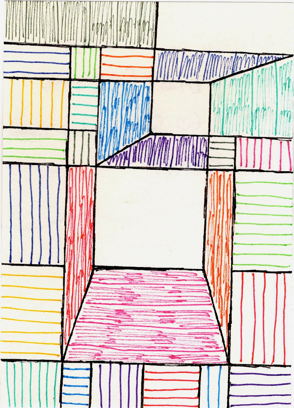
Let's start with the most fundamental building block of all, the one that whispers first, or makes the boldest statement: the line. It’s where it all begins, isn't it? A simple point moving through space. Think of it as the skeleton of your artwork, or perhaps the initial path of a playful thought. But oh, the stories a line can tell! Is it a delicate, flowing curve, suggesting grace and movement? Or a sharp, jagged zigzag, screaming energy and tension? And then there's line weight – a thick, bold line feels different from a delicate, thin one, adding another layer of expression and even contributing to the sense of visual weight and hierarchy. I’ve found that even in my most abstract pieces, the lines are often the first thing I lay down, guiding the eye, creating rhythm, or even implying a direction for the viewer's gaze, sometimes even creating optical illusions of motion or depth. They can be explicit, like the bold outlines in a cartoon, or implied, like the edge where two colors meet or the way our eye connects a series of dots to form a perceived path. My early experiments with line were clumsy; I once tried to capture the essence of a turbulent sea, and my lines looked more like a startled spider had a wrestling match with the canvas. The real breakthrough for me came when I started to think about not just drawing lines, but feeling them, allowing the brush to capture an emotion or a fleeting idea. Over time I realized the sheer power in a single, confident stroke – it can define, connect, or disrupt everything else. Think of a child’s drawing: a few lines for a house, a stick figure for a person. Simple, yet instantly recognizable.
Beyond structural and contour lines, there are more expressive types. Gestural lines, for instance, are rapid, energetic marks that capture movement and emotion, often the very first impulse on a canvas, conveying raw feeling directly. They're a favorite in my abstract work – a topic I've explored deeply in articles like The Language of Line and The Art of Mark Making. Think of contour lines that define the edges of forms, implied lines that our brains create when points or shapes are arranged in a sequence, or even calligraphic lines that flow with the grace of writing. And don't forget structural lines, like the architectural grids that underpin many modern compositions, providing an invisible armature for the entire piece. Each type adds another layer to the visual dialogue. Consider the emotional and psychological impact of lines:
Line Type | Characteristics | Emotional/Psychological Impact |
|---|---|---|
| Horizontal | Calm, static, at rest | Peace, stability, expansiveness |
| Vertical | Upright, formal, balanced | Dignity, strength, grandeur |
| Diagonal | Dynamic, moving, active | Energy, tension, action, instability |
| Curved | Flowing, soft, organic | Grace, comfort, sensuality, movement |
| Jagged | Sharp, abrupt, aggressive | Chaos, anxiety, excitement, danger |
Try to spot how lines define and connect things in the world around you today!
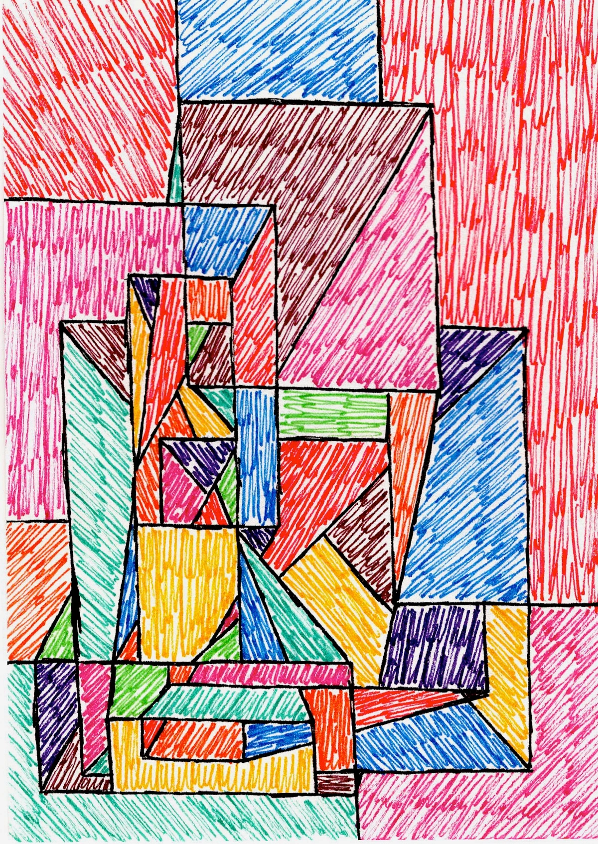
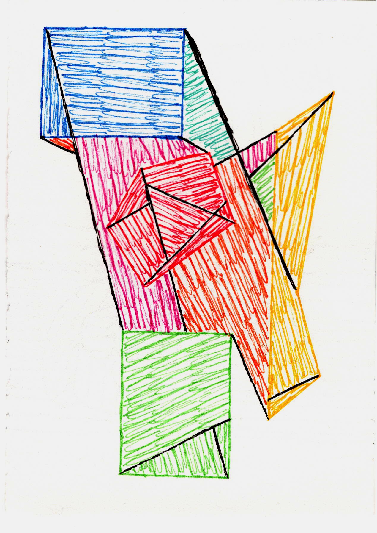
Shape & Form: Building Blocks of the Universe (or My Canvas)
Once we have our foundational lines, they begin to enclose and define, leading us to the next fundamental building blocks: shape and form. Now, these two often get confused – and honestly, who hasn't stared blankly when someone asks for the difference? But they’re pretty straightforward once you get the hang of it. Think of shapes as the LEGO bricks of art. A shape is two-dimensional: it has height and width. Think squares, circles, triangles, or the silhouette of a tree against the sky. They can be geometric (like a perfect circle or a stark stop sign), organic (like a cloud, a puddle, or a naturally occurring leaf), or abstract – non-representational forms that artists invent purely to evoke ideas, feelings, or visual tension, distinct from merely simplifying natural forms. For example, a Kandinsky painting might use abstract shapes to suggest musicality without depicting any recognizable objects. Artists often combine geometric rigor, organic fluidity, and abstract invention to create visual tension or harmony, perhaps pairing a sharp triangle with a soft, flowing curve to create a dynamic contrast. A specific type of organic shape, biomorphic shapes, mimic natural, living organisms – think of the amoeba-like forms often seen in surrealist art, or the fluid shapes in my own abstracts. Importantly, shapes aren't just defined by explicit lines; they can also be defined by areas of negative space surrounding an object, where the 'empty' space itself outlines the subject.
Form, on the other hand, is three-dimensional: it has height, width, and depth. It’s what gives a sculpture its tangible presence, or makes a drawn apple appear as if you could pick it up. Artists achieve the illusion of form on a flat canvas primarily by manipulating value (light and shadow), along with techniques like perspective and even foreshortening – cleverly drawing an object or figure to create the convincing illusion of projection or recession in space, making things appear closer or further than they are on a 2D surface. This pursuit of volume and depth often involves manipulating light and shadow, much like the dramatic contrasts found in techniques like chiaroscuro (a strong contrast between light and dark) which we’ll delve into more deeply when we talk about value. I love playing with both; sometimes I want the flat, graphic impact of a strong shape, and other times I crave the illusion of depth that form provides. It's like deciding between a flat, graphic comic panel and a deeply rendered 3D scene, and the choice profoundly impacts the narrative.
How do you feel when you encounter a purely geometric shape versus a soft, organic one? Take a moment to consider how artists use these fundamental building blocks to craft their visual worlds.
Space: Breathing Room (or Intentional Crampedness)
Space is often overlooked, but it's incredibly powerful. It's the area around, between, and within objects. Think of positive space as the subject itself – the actual painted figures or shapes. Negative space is everything else, the empty areas surrounding them. An artist carefully orchestrates both, and the arrangement of these spaces directly influences the viewer's emotional response and perception of hierarchy, creating visual weight and guiding the eye. Sometimes, I want a canvas to feel incredibly busy and full, every inch bursting with activity. Other times, I intentionally leave large areas of negative space, allowing the artwork (and the viewer's mind) room to breathe. That emptiness isn't empty at all; it defines and emphasizes the positive elements, much like how the empty space around text makes the words legible. For me, mastering negative space was an "aha!" moment, realizing that the 'nothing' was actually something crucial to the composition in art, often creating a sense of hierarchy or drawing the eye to specific focal points. Imagine a single tree in a vast, empty field; the space around it amplifies its solitude and presence, making the tree feel monumental.

We use space not just to arrange elements but profoundly to create the illusion of depth in relation to the picture plane (the imaginary flat surface where the artwork exists). This can be through foreground, middle ground, and background for a clear sense of recession, or by manipulating atmospheric perspective, where distant objects tend to appear lighter, less detailed, and subtly shift towards cooler, bluer tones, mimicking the effect of haze or atmosphere. Artists also play with deep space, which creates a vast sense of distance and openness, making elements feel far removed (common in Renaissance landscapes), or conversely, shallow space and flat space, where the elements feel compressed, intentionally close to the picture plane, and often emphasize two-dimensionality without much illusion of depth (often seen in Japanese woodblock prints or some modern art). It's all about creating balance, tension, or a focal point by strategically placing elements within the visual field.
Value: The Drama Queen of Design
And now, the element that truly brings the drama and gives objects their tangible presence: value! This is the lightness or darkness of a color, or how light or dark something is on a scale from pure white to pure black. Value is the ultimate drama creator, and crucially, it's what creates contrast, a key principle of design that draws the eye and creates visual interest. Historically, techniques like chiaroscuro (a strong contrast between light and dark, usually bold contrasts affecting a whole composition) relied heavily on manipulating value to create dramatic scenes and the convincing illusion of three-dimensionality. But it's not just about sharp drama; artists also use techniques like sfumato, where transitions from light to dark are so soft and gradual that forms emerge subtly from shadow, creating a hazy, dreamlike effect, famously exemplified in Leonardo da Vinci's works. Beyond these, artists consciously arrange values into value patterns to create rhythm, movement, or stability, and crucially, to establish a specific atmosphere or mood—from somber reverence to ethereal light. These can be:
- Radiating patterns: Drawing the eye outwards from a central point, like ripples in a pond.
- Banded patterns: Creating rhythmic progression across the composition, similar to stripes or layers.
- Diagonal shifts: Injecting dynamism and movement into a piece, creating a sense of instability or progression.
Think of a checkerboard pattern of alternating dark and light values creating a sense of order, or a scattered, broken pattern hinting at chaos. A symmetrical arrangement of values, on the other hand, can create a powerful sense of stability. High contrast values (very light next to very dark) create excitement and draw the eye to a focal point, while low contrast values (lots of similar mid-tones) create a sense of calm or subtlety. Value allows an artist to create the illusion of light and shadow, giving objects tangible form and compelling depth. Think of a high-key painting, full of bright whites and light tones, often evoking optimism or spaciousness, versus a low-key painting, dominated by dark tones and deep shadows, which can feel mysterious, dramatic, or contemplative. Even in my abstract work, I might use a sudden shift from a dark, brooding purple to a brilliant, almost neon yellow to create a striking focal point, even without a recognizable 'object'. If you're really keen to delve into this powerhouse element, I've got a comprehensive guide on The Definitive Guide to Understanding Value in Art: Light, Shadow, and Form that I pour my soul into.
Without value, everything would just be a flat wash of color, devoid of dimension – like a coloring book page before anyone has picked up a crayon, all outlines and no depth. I use value constantly to guide the viewer’s eye, to create focal points, and to evoke a particular mood – a bright, high-key painting feels different from a dark, moody one. Even in abstract art, where there might not be 'objects' in the traditional sense, varying values create depth and visual interest. I remember struggling with a landscape piece that felt flat until I dramatically pushed the darks in the foreground and lightened the distant hills; suddenly, it had incredible depth. For a simple visual, think of a black and white photograph, where only the shades of grey tell the story and create forms.
How does the interplay of light and shadow in an artwork affect your emotional response? Now that we've explored how depth and lightness work, let's explore how we feel surfaces with texture.
Texture: The Invisible Touch
Next, we arrive at texture, the perceived surface quality of a work of art. It’s what makes you want to reach out and touch a painting (even though you absolutely shouldn’t!). We have actual texture, which is how a surface actually feels – think of impasto paint that stands out from the canvas, the roughness of a sculpture made from raw clay, or the smooth coolness of polished marble. Then there's implied texture, which is the illusion of texture created by the artist through various techniques, making a smooth surface look rough or fuzzy. For example, artists use techniques like cross-hatching (intersecting sets of parallel lines), stippling (dots), scumbling (applying thin, opaque layers of paint to create a broken, shimmering effect), or dry brush effects to simulate the look and feel of different textures, even on a flat canvas. More broadly, we can think of visual texture as any perceived surface quality – whether actual or implied – often created through the repetition of elements or patterns that trick the eye into seeing texture, even if it's perfectly flat. Interestingly, artists can also use specific color choices and value contrasts to enhance the illusion of texture, making a painted rock look stony even if the canvas is perfectly smooth. Beyond its own sensory appeal, texture also profoundly influences our perception of other elements and, importantly, our emotional response: a rough, raw texture, for instance, can evoke feelings of unease or grit, while a smooth, polished surface might suggest calm, sophistication, or even coldness. It can even carry symbolic meaning, such as the fragility of a crumbling surface or the enduring strength of a weathered one. It adds a whole other sensory dimension.
I'm a big fan of actual texture in my abstract pieces, often layering paints or using different mediums to create interesting tactile experiences. There’s a certain intimacy that texture brings, an invitation for the viewer to get closer. I remember seeing a Van Gogh painting for the first time – the sheer physicality of his impasto wasn't just paint, it was emotion, making the surface vibrate with energy. More often than not, I've found myself getting lost in the details of a textured surface, forgetting for a moment the grander composition. For more on this, I've shared some of my favorite techniques for adding depth through texture and discussed the role of texture in abstract art, and even a more comprehensive guide on The Definitive Guide to Texture in Abstract Art. But now, let's inject some serious emotion and life into it with the vibrant world of color!
What textures do you find yourself most drawn to in art or in everyday life?
Color: My Obsession, Your Emotion
Oh, color! My absolute favorite playground. This is where art truly comes alive for me. Color is light reflected off surfaces, and it's a direct route to emotion. Think about it: deep blues often feel calming, vibrant reds ignite passion, yellows bring joy. Understanding color involves looking at things like hue (the pure color, like red, blue, green), saturation (how intense or dull a color is, sometimes also called chroma), and value (how light or dark a color is – which we've just covered, but it's intrinsically linked here). Saturation and value are incredibly crucial because they dramatically amplify or subdue the emotional impact and visual weight of a pure hue; a highly saturated, light red feels very different from a desaturated, dark red. Don't forget color temperature either; warm colors like reds and oranges tend to advance and feel energetic, while cool colors like blues and greens recede and feel tranquil. This is a general tendency, of course, and can be influenced by other elements and artistic intention. For instance, a fiery red abstract piece might scream urgency and passion, while a cool blue landscape could evoke serene reflection. Importantly, while we often associate colors with universal emotions, individual color perception can be highly subjective, influenced by culture, personal experience, and even biological factors like color blindness, adding another fascinating layer to this visual language. For example, red can symbolize love in Western cultures but mourning in parts of Africa, showing how context profoundly shapes interpretation.
Artists also leverage various color harmonies to evoke specific moods. These are like carefully chosen chords in music, creating a particular feeling:
Harmony Type | Description | Effect/Feeling |
|---|---|---|
| Complementary | Colors opposite on the color wheel (e.g., red & green, blue & orange) | Vibrant contrast, visual excitement, high energy. Due to simultaneous contrast, they appear more intense next to each other. |
| Monochromatic | Variations of a single hue (different values and saturations) | Subtlety, sophisticated unity, calm, harmonious |
| Analogous | Colors next to each other on the color wheel (e.g., blue, blue-green, green) | Harmony, calm, gentle flow, cohesive |
| Split-Complementary | A base color and the two colors adjacent to its complement (e.g., blue + orange-yellow & orange-red) | Vibrant yet less jarring contrast than pure complementary, balanced excitement |
| Triadic | Three colors equally spaced on the color wheel (e.g., red, yellow, blue) | Bold, balanced, lively compositions, strong visual impact |
And don't forget achromatic colors – black, white, and gray – which, despite lacking hue, profoundly impact mood and depth, often emphasizing the values and textures of a piece. They’re the unsung heroes of contrast and mood! I’ve got a whole guide on The Definitive Guide to Understanding Color Theory in Abstract Art if you want to dive deeper into this.
I spend an absurd amount of time agonizing (and delighting!) over color choices in my own work. It's not just about what looks 'good' together; it's about what story the colors are telling. What mood are they setting? What energy are they radiating? I vividly remember the frustration of a piece feeling "off" until I pushed the saturation on a particular blue, and suddenly, the whole composition sang. I’ve probably spent more time staring at color wheels than I care to admit, trying to make them behave! I've written extensively about this, from how artists use color to the emotional language of color in abstract art, and even the psychology of color beyond basic hues. If you're anything like me, you'll find it a fascinating journey. For a simple visual, picture a sunset, ablaze with warm hues, or a deep blue ocean, evoking calm.

What colors are calling to you most strongly today, and why do you think that is?
Bringing It All Together: My Own Artistic Dance (and the Medium's Influence!)
So, how do I, as an artist, actually use these elements? It's less like following a rigid recipe and more like an intuitive dance, a constant push and pull, a complex orchestration of visual conversations. I don't consciously tick off a checklist: "Okay, got my line... now my shape..." No, it’s far more fluid. Often, I might start with a bold splash of color that instantly dictates the mood or energy I want to convey – maybe a fiery red that screams urgency. Then, I’ll build lines and shapes to define and contain that initial burst, or perhaps create negative space around it to emphasize its power. For example, in a recent abstract, I started with a raw, gestural black line to establish an initial surge of energy – those early lines looked like someone had spilled coffee and tried to clean it up with a single, aggressive swipe. Then, I layered vibrant, overlapping geometric shapes around it, chosen for their symbolic power and visual weight. I used warm, high-saturation reds and yellows to create a focal point, intentionally contrasting them with cooler blues in the background to make them advance. Finally, layers of thick impasto paint gave it a rough, actual texture, while carefully modulated values created deep shadows and bright highlights, pulling the viewer's eye through the composition. One of the biggest challenges was making sure the implied lines didn't clash with the actual ones; it took a lot of fiddling, but eventually, the composition found its rhythm, like a conductor coaxing harmony from an orchestra.
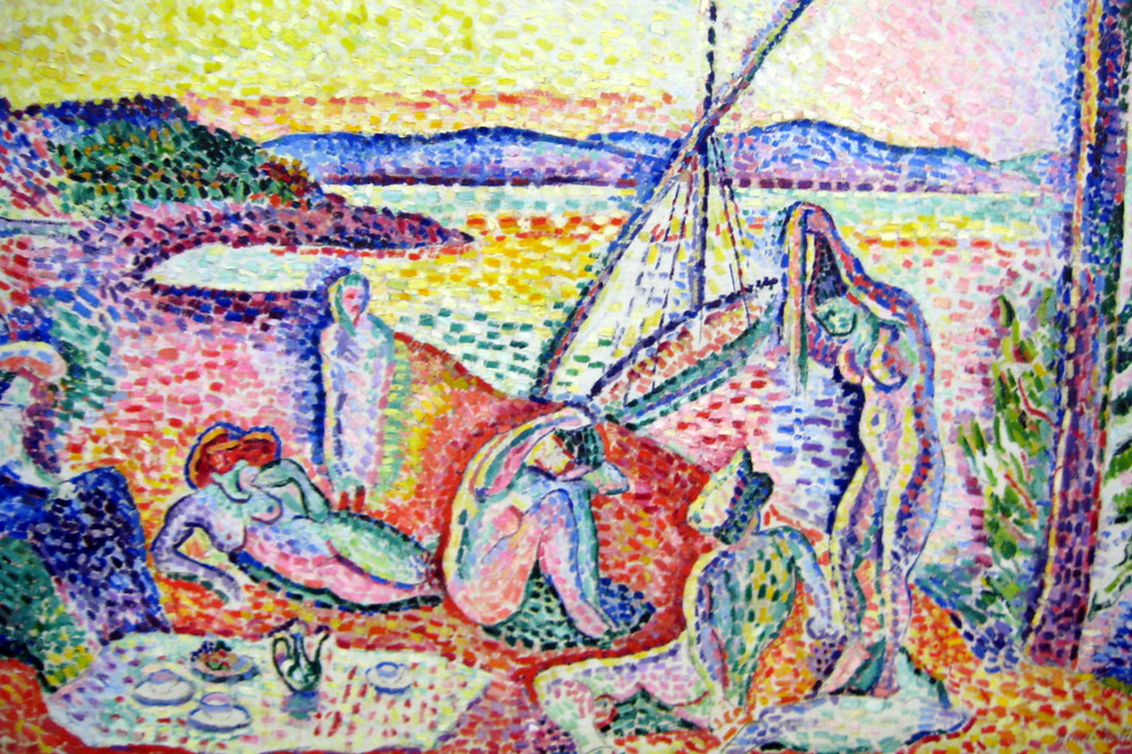
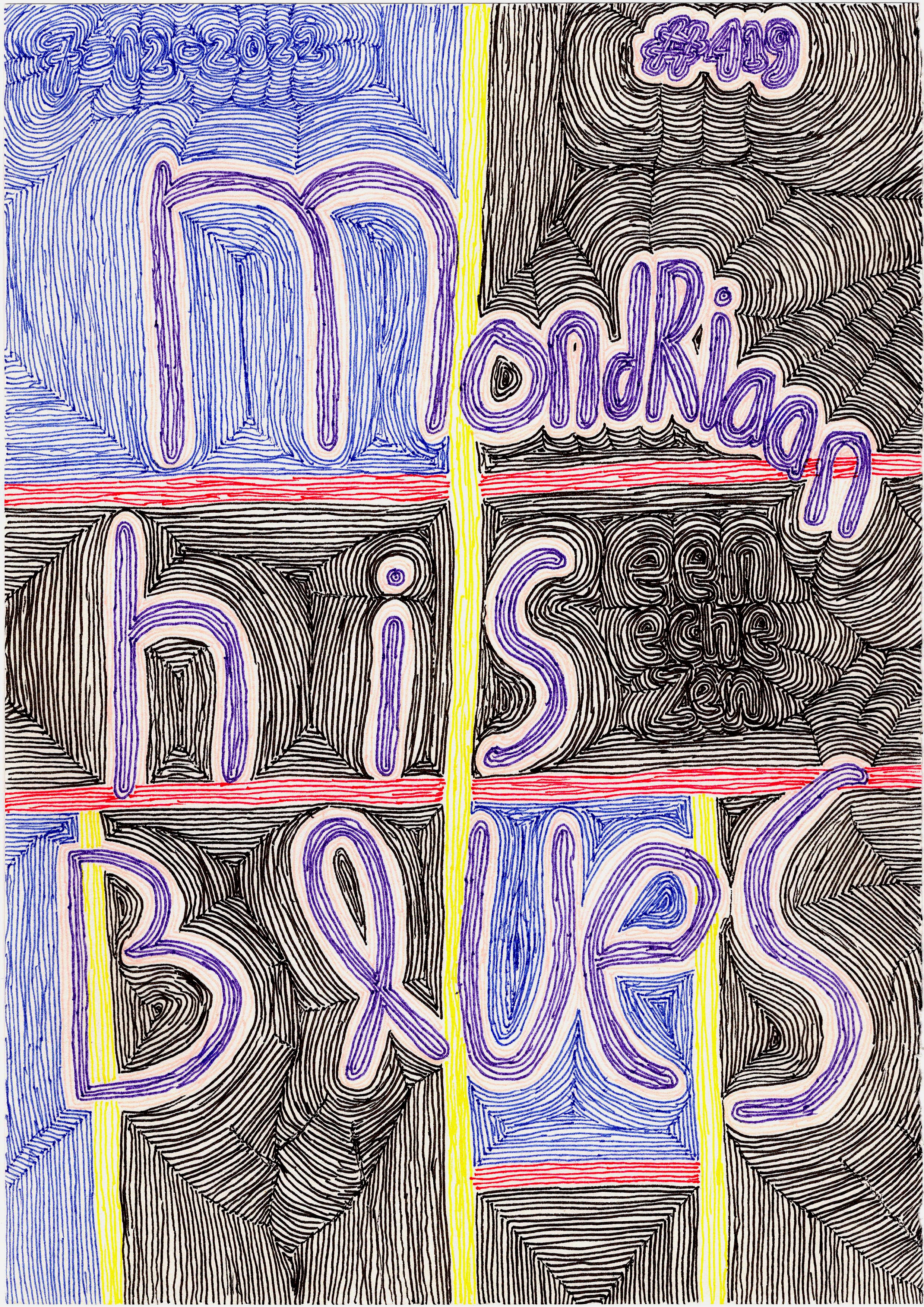
Every artwork you see, whether it's one of my vibrant abstracts or a classic portrait in a museum, is a carefully orchestrated symphony of these elements. Consider how a master like Piet Mondrian uses stark lines and geometric shapes to create dynamic balance, or how a Rothko painting uses vast fields of color and subtle value shifts to evoke profound emotion. Think of Vincent van Gogh, whose thick impasto not only created rich, actual texture but also shaped his forms and amplified the emotional intensity of his colors. Or Henri Matisse, who used bold, simplified shapes and vibrant, flat colors to define form and space, often abstracting reality to emphasize visual pleasure and emotional impact.
It's not just what elements you use, but profoundly how the medium itself inherently influences their expression and visual weight:
- Oil paints allow for rich texture and slow blending for nuanced values and soft transitions, making them perfect for sfumato and deep, atmospheric forms.
- Watercolors demand precise control of washes for transparent color and subtle spatial effects, often lending themselves to implied textures and ethereal moods.
- Charcoal drawings inherently lend themselves to dramatic value contrasts and expressive lines, often focusing on capturing light and shadow.
- Sculpture is all about palpable form and actual texture, begging to be touched and experienced dimensionally, manipulating space in three dimensions.
- Photography masterfully manipulates these elements; a photographer uses leading lines to guide the eye, controls light and shadow (value) to create depth and drama, and selects specific colors and textures to evoke mood.
- Digital art, of course, opens up infinite possibilities for manipulating every single element with precision, offering tools to simulate traditional effects or invent entirely new visual languages, but still relies on the same underlying principles.
These elements are the invisible currents that guide every visual choice, making everything turn. If you'd like to see how I play with these elements, feel free to browse my art for sale – you'll notice how line, shape, and especially color are always at the forefront.
Why Bother with All This? Gaining Your Visual Superpowers
I get it, sometimes it feels like overthinking. But trust me, understanding these elements won't just make you a better artist (if that's your path); it'll make you a more discerning and appreciative viewer of art. You'll move beyond simply saying "I like it" or "I don't like it" to understanding why you feel that way. You'll start to recognize the choices artists make, the techniques they employ, and the subtle messages they're weaving into their work. You'll begin to notice how an artist uses a specific, desaturated blue to evoke sadness, or how a sharp, diagonal line creates an unsettling tension, moving beyond a superficial "it's pretty" to a deep, informed appreciation. It's like gaining superpowers for your eyes! In fact, this trained eye can even help you spot inconsistencies or stylistic anomalies, sometimes offering clues when authenticating a piece or distinguishing it from a forgery – not that I'm advocating a career in art crime, just saying! These elements are the building blocks, and the principles of design (like balance, contrast, rhythm, and unity) are how artists actually apply and arrange them to create a compelling piece – the verbs to the elements' nouns. Our brains are even wired to instinctively organize visual information through things like Gestalt principles, which describe how we perceive patterns and relationships, and which these elements powerfully influence:
- Proximity: We tend to group elements that are close together. Lines and shapes dictate this closeness.
- Similarity: We group elements that look alike (in terms of color, value, or texture). This creates visual unity.
- Closure: Our tendency to complete incomplete forms, influenced by implied lines and shapes. Our mind fills in the gaps.
- Figure-Ground Relationship: Our perception continuously shifts between the main subject (figure) and its surrounding context (ground), a dynamic interaction directly manipulated by elements like space and value. This is fundamental to how we discern objects.
Understanding these elements also boosts your creative problem-solving skills in surprising ways. Whether you're arranging furniture, designing a presentation, or even plating a meal, you're subconsciously applying principles of balance, contrast, and visual flow derived from these fundamental elements. And crucially, it empowers you to become a more critical consumer of visual information in advertising, media, and even political imagery, allowing you to deconstruct their messages and understand how they're designed to influence you. Your own unique style and intent as an artist (or even just a thoughtful observer) will profoundly influence how you emphasize or subdue each element, shaping the very dialogue you have with the visual world. Different cultural backgrounds or levels of art education can also lead to varied interpretations, making the visual language rich and multifaceted.
It’s a journey, like any creative pursuit. My own journey, for instance, has had its twists and turns, which you can read about on my timeline. And if you're ever near 's-Hertogenbosch in the Netherlands, you could even visit my museum to experience these elements in action across a wider collection of art, seeing firsthand how different artists have mastered this visual language.
Frequently Asked Questions (FAQ)
Q: Are the elements of design the same as the principles of design?
A: Ah, that's a classic question! Think of it this way: the elements are the nouns of art – the actual things you see or create (line, shape, color). The principles are the verbs – how you use or arrange those elements to make something compelling (balance, contrast, rhythm, emphasis, unity). They work hand-in-hand, but they're distinct concepts. I've covered this more deeply in a definitive guide on elements and principles if you're curious.
Q: Do all artworks use all the elements of design?
A: Technically, yes, almost always! Even a single dot on a canvas is a shape, has value, and takes up space. However, an artist might intentionally minimize or subdue certain elements to emphasize others, or to achieve a particular minimalist effect. For example, a purely monochromatic piece might downplay hue differences to focus almost entirely on value and texture. While a minimalist sculpture might appear to be solely about form and space, its material still possesses an inherent texture, its surface still has value variations, and its edges still define lines – they are simply not the primary focus, but subtly present and contribute to the overall impact. So, while all elements are inherently present, their prominence and emphasis are entirely up to the artist's conscious choices.
Q: Is one element more important than the others?
A: Not really, at least in my opinion. Their importance depends entirely on the artist's intention and the message they want to convey. While all are crucial, certain elements might be more dominant or defining in specific artistic movements or individual works. For example, line is often paramount in Cubism or Expressionism, while color takes center stage in Fauvism or Color Field painting. They all contribute to the whole, like instruments in an orchestra, but sometimes one section gets a powerful solo! It's about how they play together, and which instrument the conductor chooses to highlight.
Q: How can I start practicing my 'visual superpowers' today?
A: Great question! Start by actively observing. When you look at a photograph, try to identify the dominant lines or shapes. In a piece of architecture, notice how space is used. When choosing an outfit, think about the colors, textures, and values you're combining. Even just sketching simple forms, focusing on how shading creates depth, or experimenting with different line weights, can dramatically enhance your visual literacy. Or, try a specific exercise: pick an object and draw it five times, each time focusing on exaggerating one element (e.g., make the lines super thick, then focus only on shades of grey for value, then imagine its texture). It's all about training your eyes to see actively, not just passively look.
Q: Can I use these elements in photography or other creative fields?
A: Absolutely! The elements of design are universal. Whether you're a photographer, graphic designer, interior decorator, or even a chef plating a dish, understanding line, shape, color, texture, and value will dramatically improve your work. They are the bedrock of all visual communication.
Q: How do these elements apply to digital art or mixed media?
A: Universally! Digital artists use pixels to create lines, shapes, and forms, manipulate color values and saturation, and simulate textures. Mixed media artists layer different materials, directly engaging with actual texture and how it interacts with space and form. The fundamental visual language remains the same, regardless of the medium.
Final Thoughts: Your New Visual Superpowers Await!
So there you have it: my slightly-less-than-textbook take on the elements of design. My sincere hope is that this conversation has sparked a new way for you to look at art, whether it's a profound painting in a gallery or the simple pattern on your morning coffee cup. These elements aren't just for 'artists'; they're for anyone who wants to truly understand the rich, visual world around them a little better. Go forth and see with new eyes, armed with your newly activated visual superpowers, and let your appreciation for art, and the world itself, deepen! Don't just passively look; truly see how every line, shape, color, and texture speaks a part of the secret language of art, waiting for you to decipher its vibrant message. Start noticing them today, and you might just surprise yourself with how much more depth and meaning you perceive in every visual experience.


