Mastering the Art of Arranging Pictures on a Wall
Unlock the secrets to beautifully arranging pictures on your wall. This comprehensive guide covers composition, balance, spacing, and practical layouts, shared through personal insights and actionable steps to transform any room.
Mastering the Art of Arranging Pictures on a Wall
Oh, the elusive art of hanging pictures on a wall. It sounds so simple, doesn't it? Yet, I've spent more hours than I care to admit staring at a blank wall, a pile of framed memories or beautiful canvases, utterly paralyzed. It's like a blank page for a writer, but instead of words, you're trying to compose a visual symphony with hooks, hammers, and the terrifying prospect of too many nail holes. But don't worry, you're not alone in this delightful predicament. I've learned a few things over the years, often through trial and error (mostly error, if I'm being honest), and I'm here to share the lessons from my own sometimes-wonky, sometimes-wonderful wall arrangements. This isn't just about hammering a nail; it's about telling a story, creating a mood, and letting your personality shine through. It's about finding that sweet spot where every piece feels like it's exactly where it's meant to be. Let's dive in, shall we?
The Core Principles: More Than Just 'Looks Good'
Before we get into the nitty-gritty of layouts, let's talk about the underlying principles that make a picture arrangement truly sing. These aren't rigid rules etched in stone, but rather guiding lights that help you navigate the vast sea of possibilities. Think of them as your trusty compass.
Balance and Harmony
This is about visual weight. Imagine your wall as a seesaw. You don't want all your heavy, large pieces on one side, do you? Balance can be symmetrical, creating a formal, classic look, or asymmetrical, which offers a more dynamic and modern feel. The trick with asymmetry is to still feel balanced. A large piece on one side might be balanced by a cluster of smaller pieces on the other, or by furniture below.
Spacing: The Silent Storyteller
This is where many people, myself included, often falter. Too close, and everything feels cramped; too far apart, and your arrangement looks scattered and lost. There's no single magic number, but a good starting point is usually 2-4 inches (5-10 cm) between frames in a gallery wall. For a single statement piece, give it room to breathe. The negative space around your art is just as important as the art itself. It allows the eye to rest and appreciate each piece.
The Focal Point: Where Do Your Eyes Go?
Every great story has a protagonist, and your wall arrangement should too. This could be your largest or most vibrant piece, or a carefully curated cluster of smaller ones. Once you establish this focal point, the other pieces act as supporting characters, drawing the eye towards and around it. Sometimes, the focal point isn't even art; it could be a fireplace or a stunning piece of furniture, and your art simply enhances it. I often think about how to create a focal point with art in any room, and it really shifts how I approach a wall.
Scale: The Right Fit
Scale refers to the size of your art in relation to the wall, the room, and the furniture beneath it. A tiny picture on a huge wall will look lost, while a massive piece in a small nook might feel overwhelming. A common guideline is that art above furniture (like a sofa or sideboard) should be about two-thirds to three-fourths the width of the furniture. And remember, sometimes one bold, large piece makes more impact than a dozen small ones. If you're pondering how to choose art for a room with low light, scale plays a huge role in making that art visible and impactful.
Practical Layout Examples: Visualizing Your Wall
Now for the fun part: bringing these principles to life with actual layouts. I've found that sketching these out or using paper templates on the floor (more on that later!) saves a lot of heartache.
1. The Single Statement Piece
This is your grand declaration. One large, impactful piece that instantly grabs attention. Ideal for above a sofa, a bed, or in a minimalist setting. It's deceptively simple, but getting the height and scale right is crucial. For instance, art above the sofa needs careful consideration.

2. Paired Perfection
Two pieces of similar size and style, hung side-by-side or one above the other. This creates a balanced, refined look. Perfect for adding symmetry without feeling overly formal. It's a great choice for smaller spaces or to frame a specific piece of furniture.
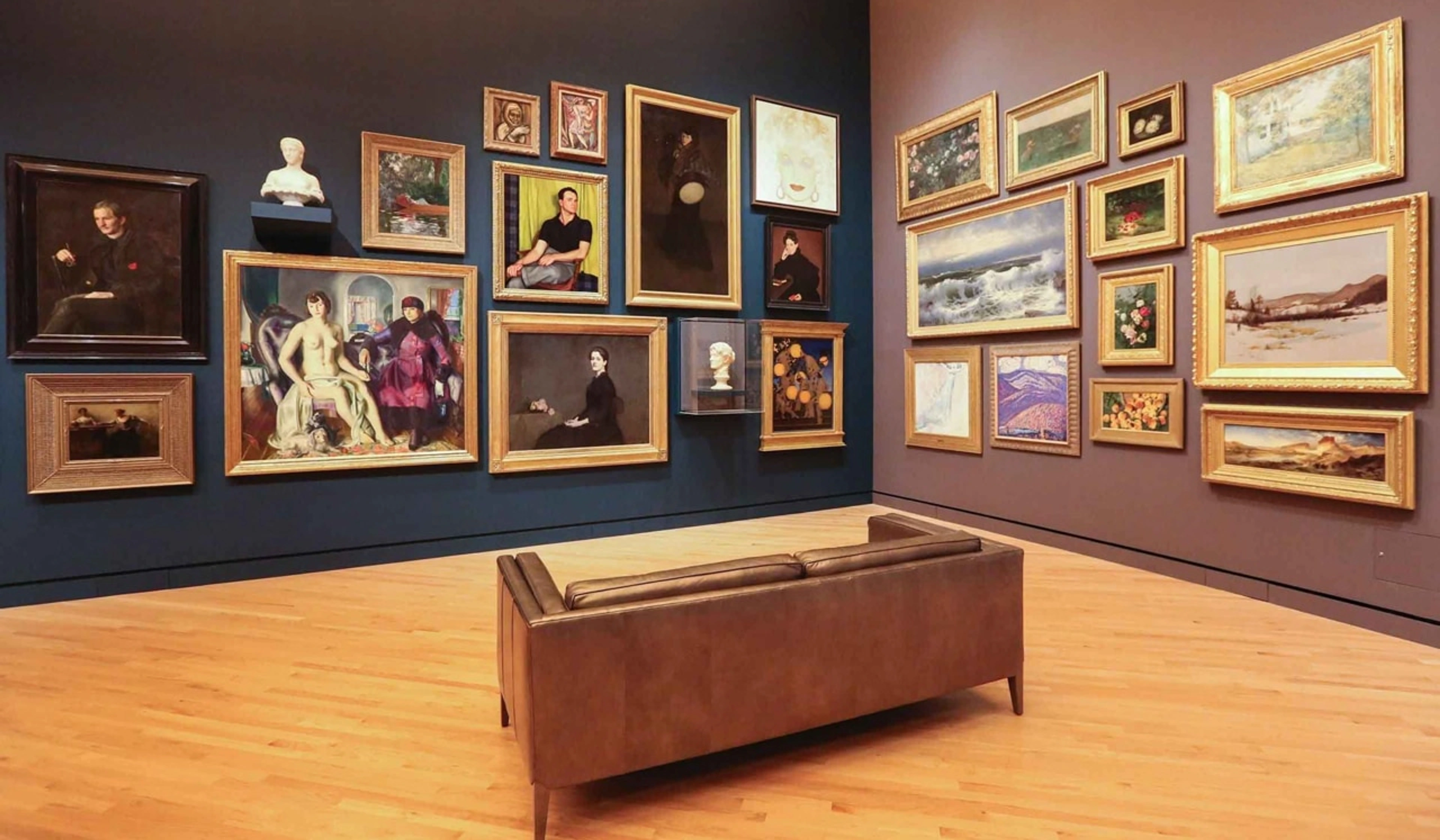
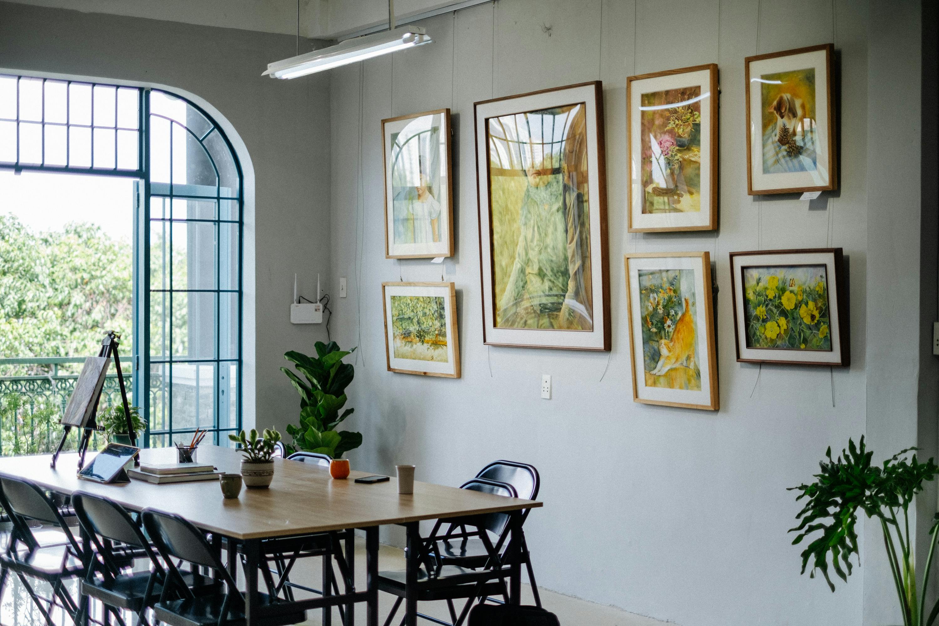
3. The Grid Gallery Wall
This is my go-to when I want order. Identical frames, evenly spaced, forming a neat, symmetrical grid. It's clean, modern, and makes a strong visual statement. It takes a bit of meticulous measuring, but the payoff is a beautifully organised display. If you're diving into this, check out how to hang a perfect gallery wall – it's a lifesaver!
4. The Salon Style / Freeform Gallery Wall
Ah, the charming chaos! This is where different sized frames, often in varying styles, are arranged organically. It's more personal, more eclectic, and can feel like a curated collection rather than a strict display. The secret? Still maintaining an overall sense of balance, and ensuring consistent spacing (even if the frames themselves are disparate). For more on this, my friend, read about creating salon style hang step-by-step. It's also fantastic for curating your perfect gallery wall.

5. Linear / Horizontal Arrangement
Ideal for above a long piece of furniture like a sofa, credenza, or headboard. Three or more pieces of similar size, arranged in a straight line. This creates a sense of flow and extends the visual line of the furniture below. It's simple, elegant, and hard to get wrong if you maintain consistent spacing.
6. Vertical Arrangement
Great for narrow walls, between windows, or alongside a staircase. Stack two or three pieces vertically to draw the eye upwards and add height to a space. It works wonders in tight spots. I've found it super useful when thinking about how to choose art for a staircase.
The "How-To" Process: My Step-by-Step Approach
Okay, enough theory! Let's get practical. This is my tried-and-true method for arranging pictures without ending up in a frustrated heap of crooked frames and plaster dust.
Step 1: Gather Your "Players"
Lay out all the artwork you want to include. Consider their frames, colours, subjects, and sizes. Do they tell a coherent story? Or are you aiming for an eclectic vibe? This is where you might decide to swap out a piece, or realise you need one more to fill a gap. It's a bit like casting for a play – everyone needs to play their part.
Step 2: The Floor Plan (My Secret Weapon!)
This is, without a doubt, the most important step. Don't eyeball it! Cut out pieces of newspaper or craft paper in the exact size of each frame. Label them. Now, arrange these paper templates on the floor in front of the wall you want to decorate. Play around with different configurations, moving them until you find a layout that feels just right. Take photos! Step back, move closer. Live with it for a bit. This is your chance to make all the mistakes without making any holes in your wall. This method is a lifesaver, especially for a complex gallery wall.
Step 3: Transferring Your Masterpiece to the Wall
Once you're happy with your floor layout, carefully transfer it to the wall using painter's tape to secure the paper templates. Now, here's the clever bit: for each paper template, mark exactly where the hook of the frame will be (this varies by frame, so measure each one!). Hammer your nails or drill your anchors through the paper templates at your marked spots. Once all your hanging hardware is in place, simply tear down the paper. Voila! Perfect placement, minimal guesswork.
Step 4: The Actual Hanging
Now, for the satisfying moment: hanging your art! Place each piece carefully on its designated spot. Stand back, admire, and make minor adjustments if needed. Sometimes, even with perfect planning, a slight tilt or shift can enhance the overall look. Remember, the best arrangement is the one that makes you happy. Need specific advice for hanging art on drywall or even trickier surfaces like brick walls or concrete walls? We've got you covered.
Quick Guide: Common Picture Arrangement Challenges & Solutions
Challenge | Description | Solution |
|---|---|---|
| Too Many Small Pieces | Wall looks cluttered, no clear focal point. | Group them into a cohesive gallery wall (grid or salon style) to create a single, larger visual unit. Consider introducing one larger piece to anchor the collection. |
| One Large Piece on a Huge Wall | The art looks lost and insignificant. | Ensure the piece is appropriately scaled (aim for 2/3 to 3/4 the width of any furniture below). If it's still dwarfed, consider adding two smaller companion pieces or framing it with sconces or plants to broaden its visual impact. |
| Uneven Spacing | Creates a chaotic or amateurish look. | Use a ruler and level meticulously. For gallery walls, use consistent spacing (2-4 inches is a good start). The paper template method (Step 2 above) is your best friend here. |
| Too High or Too Low | Uncomfortable viewing height, doesn't relate to furniture. | The general rule: center of the artwork (or arrangement) at eye level (approx. 57-60 inches / 145-152 cm from the floor) for a standing viewer. Above furniture, leave 6-8 inches (15-20 cm) of space between the bottom of the frame and the top of the furniture. Always factor in the height of your furniture, like when choosing art above a fireplace. |
| Clashing Styles/Colors | Artworks fight for attention, create visual discord. | Find a common thread: maybe a consistent frame color, a dominant color palette, or a unifying theme. Spread out highly contrasting pieces. Consider creating separate arrangements for different styles if they truly don't blend. |
Arranging Pictures in Specific Spaces
Different rooms present different opportunities and challenges. What works in a sprawling living room might not cut it in a cosy dining nook. I've learned to adapt my approach, and you will too!
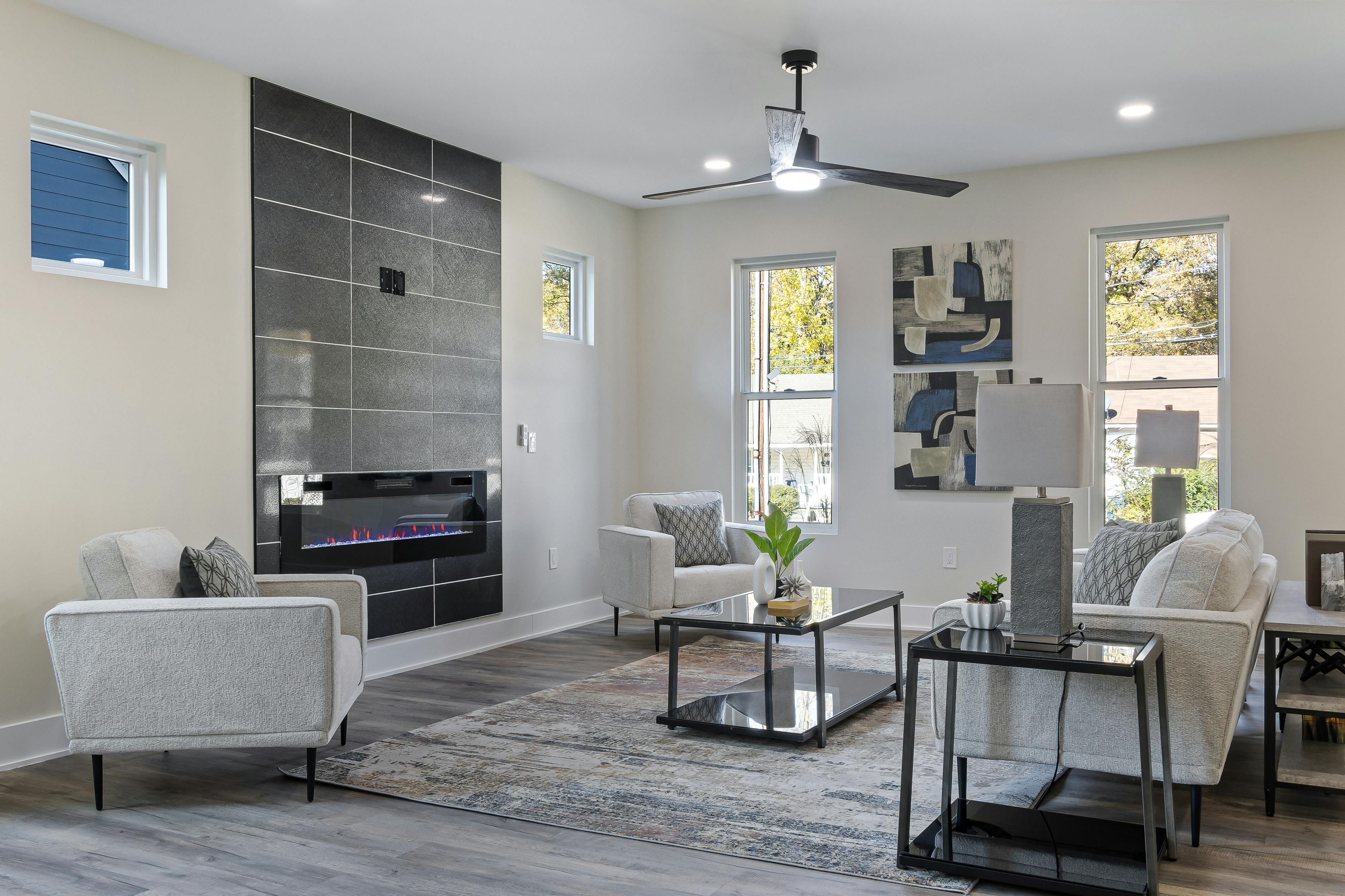
Living Room: The Heart of the Home
This is often the grand stage for your art. Think about the dominant features – fireplace, sofa, TV. The art should complement these. A large statement piece often works wonders above a sofa or fireplace. If you're tackling how to arrange art around a TV, remember to integrate it, not compete with it. A gallery wall can fill a large blank wall beautifully.
Dining Room: Conversation Starters
Here, art can set the mood for gatherings. I prefer something that sparks conversation but isn't too overwhelming. A single impactful piece or a sophisticated grid of two to four pieces often works well. I personally love abstract pieces in a dining room; they offer intrigue without being too literal. If you're exploring how to choose art for a dining room, think about the ambiance you want to create.

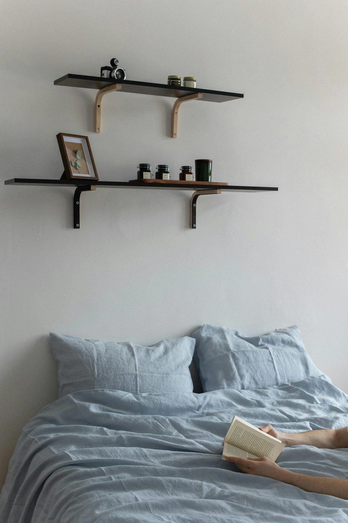
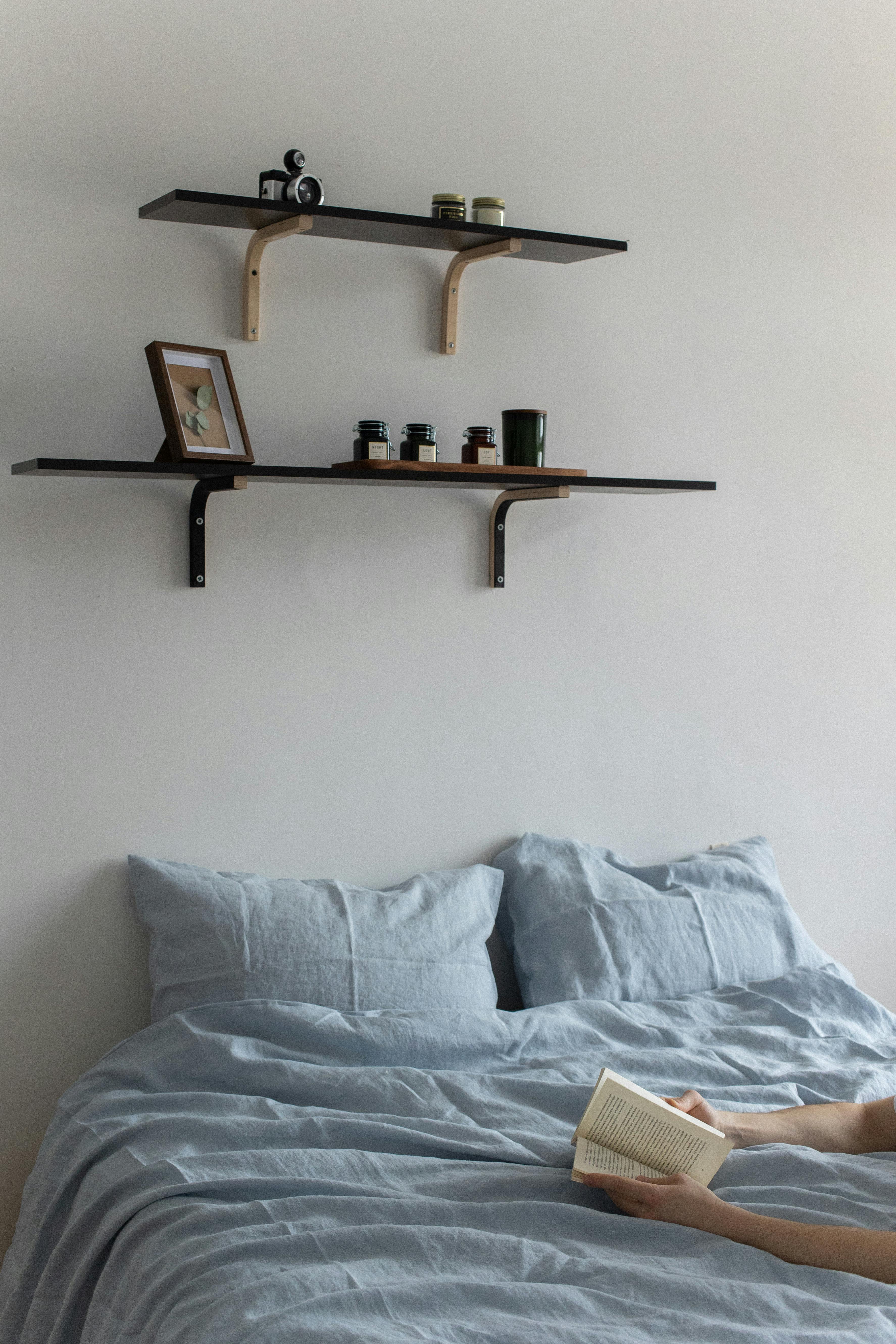
Bedroom: Your Personal Sanctuary
Soft, serene art often works best here. Above the bed is a classic spot for a statement piece, or a symmetrical arrangement of two. Avoid anything too jarring or visually busy right above where you sleep. Calming colours and abstract forms, like many of my own pieces, can contribute to a peaceful atmosphere. For more on this, check out how to decorate above a bed.
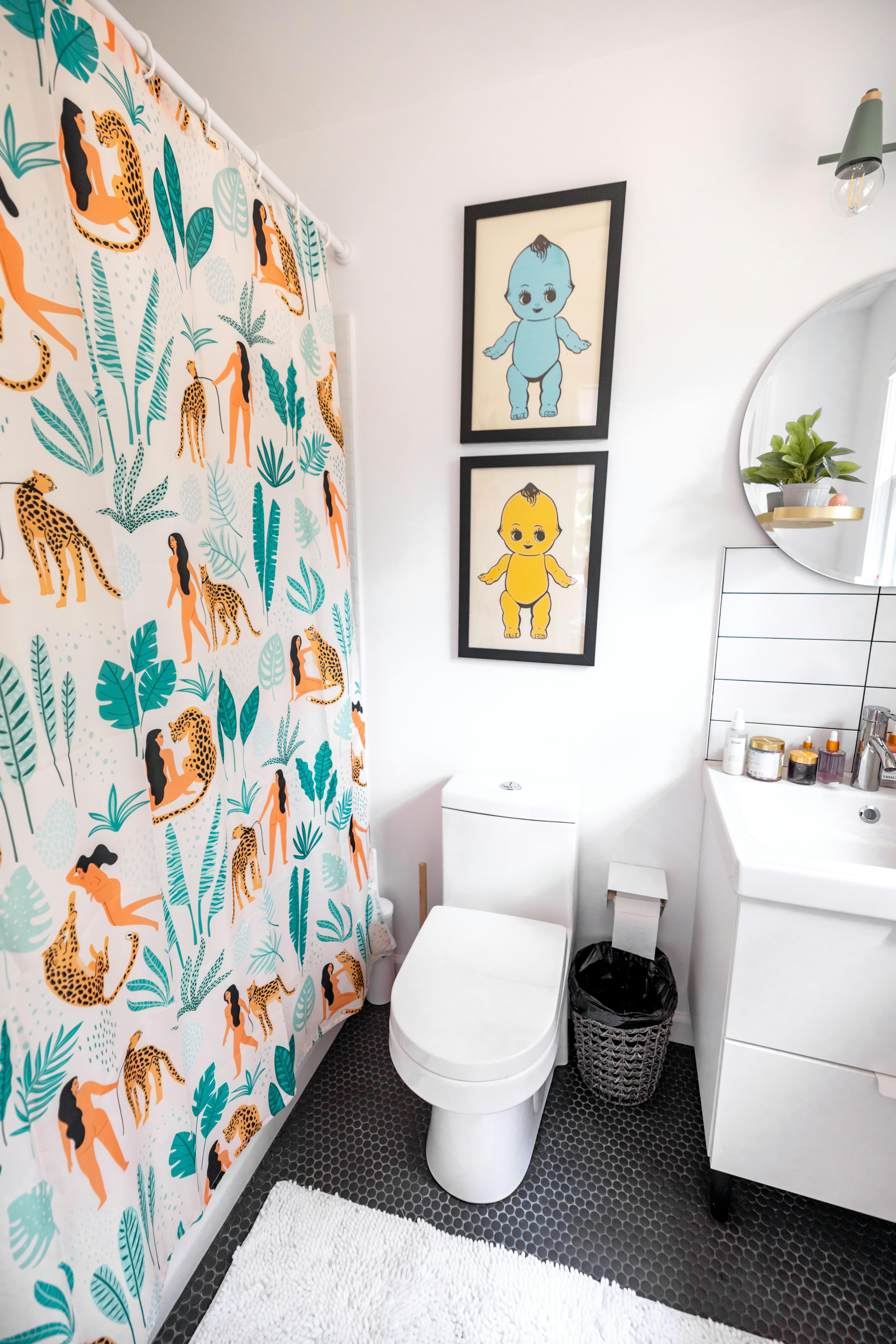
Bathroom: Unexpected Delights
Don't neglect the bathroom! Small spaces offer a chance for quirky, personal touches. Moisture-resistant art is key here. A small gallery wall of quirky prints or a single striking piece can elevate a simple bathroom into something special. If you're pondering how to choose art for a bathroom, remember to think about the practicalities of the environment.

Frequently Asked Questions (FAQ)
Q: How high should I hang pictures on a wall?
A: Generally, the centre of the artwork (or the centre of a gallery wall arrangement) should be at eye level for an average person, which is typically 57-60 inches (145-152 cm) from the floor. If hanging above furniture, leave about 6-8 inches (15-20 cm) of space between the bottom of the frame and the top of the furniture.
Q: Should all my picture frames match?
A: Not necessarily! Matching frames create a cohesive, formal look (great for grid gallery walls). Mixing frame styles, colours, and materials can create a more eclectic, personal, and dynamic feel, especially for salon-style gallery walls. The key is to find a common thread or a balanced distribution of different frames.
Q: How do I arrange pictures of different sizes?
A: The paper template method (as described in Step 2 above) is your best friend. Arrange them on the floor first, playing with different configurations until you achieve visual balance. For a freeform gallery wall, aim for an imaginary outer perimeter that creates a pleasing shape (e.g., a rectangle or oval), and maintain consistent spacing between individual frames.
Q: What's the best way to hang heavy pictures?
A: For heavier pieces, especially those over 10-15 lbs, standard picture hooks might not suffice. Consider using wall anchors (for drywall or plaster), toggle bolts, or even two D-rings with picture wire for added stability. Always ensure your hanging hardware is rated for the weight of your art. If you're dealing with specific wall types, like lath and plaster walls, you'll need specialized techniques.
Q: Can I arrange pictures on a textured wall (like brick)?
A: Yes, absolutely! Hanging art on textured surfaces like brick or concrete requires different hardware and techniques than smooth drywall. For brick, you might use brick clips (which don't require drilling) or masonry drill bits and anchors. For concrete, a hammer drill and concrete anchors are usually necessary. Check out our guides on how to hang art on brick walls and how to hang art on concrete walls for detailed instructions.
Final Thoughts: It's Your Story
Arranging pictures on a wall can feel intimidating, a daunting task that often gets pushed to the bottom of the to-do list. But I hope this guide has demystified the process a little, perhaps even sparked a bit of joy in the possibilities. Remember, there's no single "right" way; there's only your way. It's about personal expression, creating a space that feels like you. Don't be afraid to experiment, to move things around, or even (gasp!) to leave a few pieces unframed or propped on a bookshelf for a more relaxed vibe. Your home is a canvas, and your art is the brushstroke. So gather your favourite pieces, unleash your inner curator, and start telling your visual story. And hey, if you're looking for new pieces to add to your collection, feel free to browse my unique abstract art – it might just be the perfect conversation starter for your next wall arrangement. Happy hanging!


