
The Art of Distraction: Making Your TV Part of the Gallery (Not Just a Black Box)
Struggling to style art around your TV? I share my personal tips and tricks for creating a cohesive and beautiful display, turning your screen into a design element, not an eyesore. Get inspired!
The Art of Distraction: Making Your TV Part of the Gallery (Not Just a Black Box)
I'll be honest, the television. It's often the elephant in the room when we talk about interior design, isn't it? This big, dark rectangle demanding prime real estate, often right in the center of our living spaces. For years, I struggled with it. How do you make something so inherently utilitarian, so purely functional, blend seamlessly, beautifully, into a curated space filled with art? My instinct was always to hide it, to pretend it wasn't there. But let's face it, we watch TV. A lot of us do. So, instead of fighting it, I started thinking: what if we embraced it? What if the TV wasn't a design flaw to conceal, but a challenging canvas around which to create something truly spectacular?
The Black Hole Dilemma: Why the TV is So Tricky
You know that feeling, right? You've got your beautiful sofa, maybe a striking abstract piece above it – speaking of which, if you're curious about art above the sofa, I've definitely got thoughts on that! – and then BAM, there's the TV. It just sucks all the light, all the aesthetic energy, into its glossy void when it's off. It's a statement piece, but not usually the kind we want. The key, I've found, is to treat it less like a disruptive appliance and more like a permanent installation. Yes, a very large, very dark piece of art in itself. Once you accept that, the possibilities open up.
Principle One: Scale and Balance – Don't Go Tiny
My biggest mistake early on was trying to 'minimize' the TV by putting tiny pieces of art around it. All that did was make the TV look even bigger and more dominant. It's like trying to hide a mountain with a pebble. Doesn't work. When you're thinking about choosing art for your living room with a TV in mind, you need to think big. Not necessarily one huge piece, but a collection that collectively holds its own. The overall width of your art arrangement should be roughly 2/3 to 3/4 the width of the TV console (if you have one), or at least 1.5 times the width of the TV itself if it's wall-mounted with nothing below.
Principle Two: The Gallery Wall Around the Screen
This, my friends, is my go-to strategy. It's classic, it's versatile, and it's forgiving. Think of your TV not as the enemy, but as the largest, darkest frame in your gallery wall. I've always loved how a well-executed gallery wall can tell a story, and now your TV gets to be a central character. Here's how I approach it:
- Start with the TV: It's your anchor. Decide if you want a tight, dense gallery around it, or something more airy and spread out.
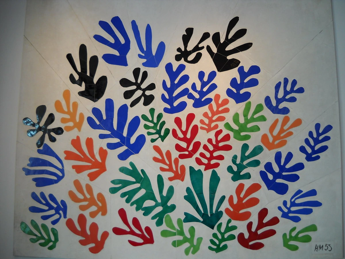
- Mirror the Mood: If your TV is modern and sleek, abstract or geometric pieces can create a cohesive vibe. I mean, look at this kind of organised chaos:It picks up on the clean lines but injects color and personality. On the other hand, if you're going for a more eclectic, bohemian chic interior, you might mix frames, textures, and even small sculptural art pieces. It's all about intentional contrast.
- Vary Sizes and Shapes: Don't get stuck with all squares or all rectangles. Mix it up! Ovals, small round mirrors, or even a tiny framed shelf can add interest and break up the monotony. This also helps distract from the TV's rigid shape.
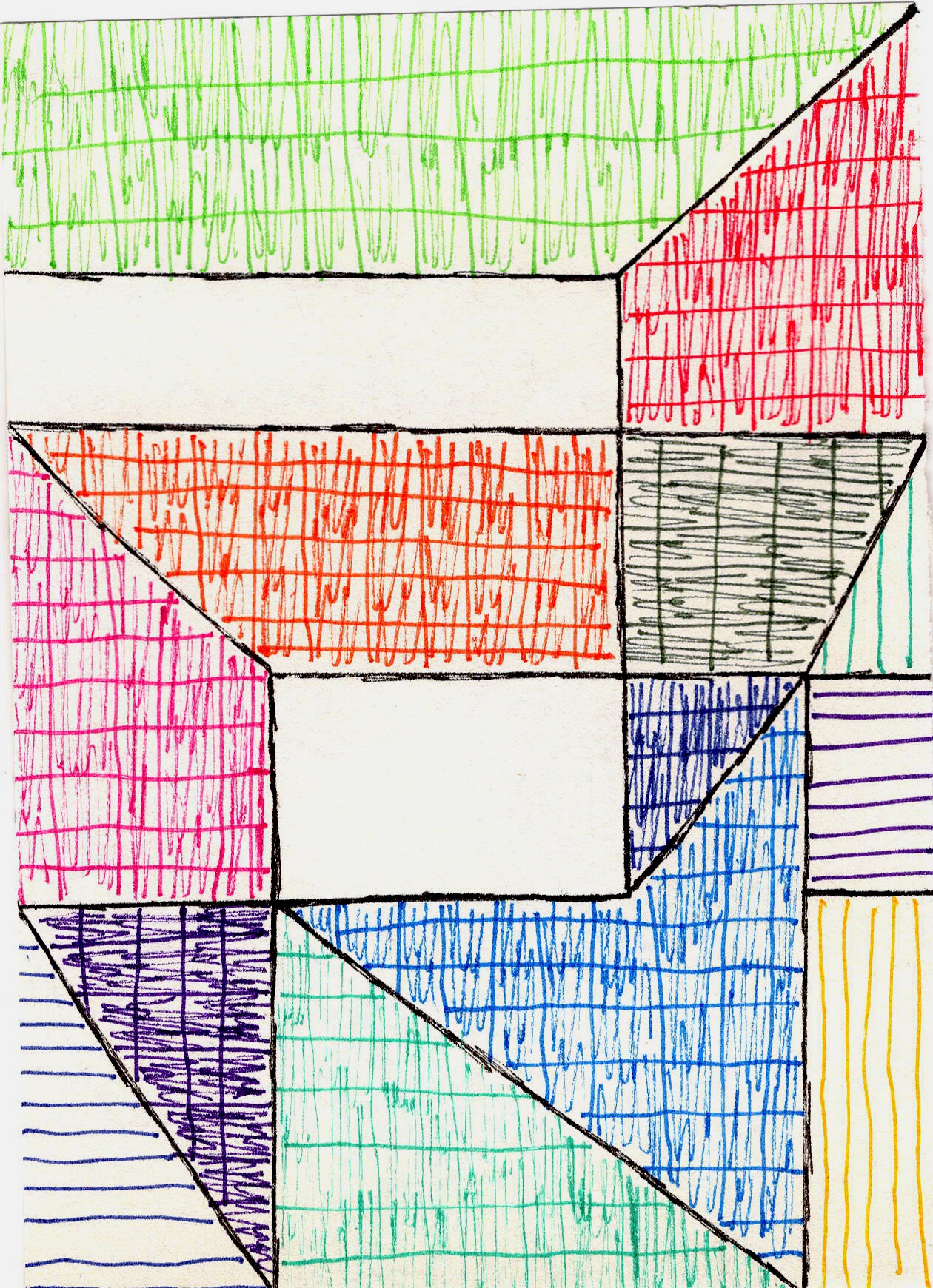
- Maintain a Cohesive Color Palette (or a deliberate clash): I often lean towards colorful pieces, which is no surprise if you've ever seen my art for sale. But when it's around a TV, sometimes a more subdued palette with pops of color works wonders. Or, go wild with contrasting colors and textures like this:
 The goal isn't to make the art invisible, but to make the TV less of a solo performer and more part of an ensemble.
Beyond the Gallery: Other Clever Approaches
- The Symmetrical Statement: If you're a creature of order (unlike me, usually), symmetrical arrangements can be incredibly satisfying. Two identical pieces, one on each side of the TV, perhaps mirroring its height, can create a sophisticated, balanced look. Or, two vertical stacks of smaller pieces. It's a more formal approach, but it grounds the TV beautifully.
- Art Above and Below: This isn't just for TVs mounted high. Even with a console, placing art above and a few small, framed pieces or even sculptures on the console itself can create depth and pull the eye away from just the screen.
- The 'Frame' Effect: Sometimes, I'll use art pieces that act almost like a frame for the TV. This means aligning the outer edges of the art with the outer edges of the TV, or even slightly overlapping imaginary lines to create a larger 'art zone' where the TV lives. It sounds a bit abstract, but it truly works to integrate it.
- Making the TV Disappear (Almost): For those who really, really don't want the TV to dominate, consider a dark accent wall. If the wall behind the TV is a deep charcoal, navy, or even black, the TV itself will recede into it, becoming far less conspicuous. Then, add brighter, more contrasting art around it to bring the visual interest back. It's a bit of a magic trick, actually. And for truly minimalist interiors, this can be a game-changer.
Practical Considerations I've Learned (Sometimes the Hard Way)
- Lighting: Oh, the lighting! It's so important for displaying abstract art generally, and even more so when competing with the glow of a screen. Avoid direct glare on the TV, obviously, but consider subtle picture lights above your art, or strategically placed floor lamps that illuminate the wall without washing out the screen. It can make all the difference, trust me.
- Height: Just like hanging art anywhere else, the center of your art pieces (or the collective center of your arrangement) should ideally be at eye level when you're seated. With a TV, this means the bottom of the TV needs to be high enough for comfortable viewing, but not so high that all your art is crammed up to the ceiling. It's a balancing act.
- Cable Management: This might be the most mundane, but also one of the most crucial. There's nothing that screams 'afterthought' more than a tangled mess of cables. Run them through the wall if you can, use cable covers, or simply tie them neatly behind the console. Clean lines make everything look more intentional and polished. It’s part of the whole decorating your home journey, really.
FAQ: Quick Answers to Common Quandaries
- Q: Can I hang art directly above the TV?
- A: Absolutely! Just make sure there's enough space (at least 4-6 inches) between the top of the TV and the bottom of the art. And remember that scale principle – one substantial piece, or a few smaller ones that collectively feel weighty enough to balance the TV below.
- Q: Should the art match the TV's width?
- A: Not necessarily. In fact, it often looks better if the art above is slightly narrower than the TV for a focused look, or if the entire art arrangement is wider to create a grander, more integrated wall. It all depends on the effect you're going for.
- Q: What about reflective art near the TV?
- A: Good question! Glass or highly glossy art can cause distracting reflections from the TV screen. I tend to prefer matte finishes or art under anti-glare glass in these scenarios. Or, embrace it! Sometimes a little reflection adds an interesting, dynamic layer, especially if you're going for a really modern, almost gallery-like feel, like the pieces you'd see at my museum in 's-Hertogenbosch.
A Final Thought on Personal Expression
Ultimately, arranging art around your TV is about making your space yours. It's about taking a functional object and weaving it into the tapestry of your personal aesthetic. Don't be afraid to experiment! Move things around, try different combinations. What looks good in a magazine might not feel right in your home. Your art, much like your life, is a reflection of you. So, make it playful, make it thoughtful, make it bold. Just make it. And hey, if you find yourself needing more art to fill those newfound spaces, you know where to look.


