
Mastering Gouache: Your Ultimate Guide to Essential Supplies, Techniques & Creative Freedom
Unlock gouache's unique matte vibrancy with this comprehensive guide. Explore essential paints, versatile brushes, optimal paper, and advanced techniques. Learn pro tips, color mixing, and preservation for your gouache art.
Mastering Gouache: Your Ultimate Guide to Essential Supplies, Techniques & Creative Freedom
Imagine the luminosity of watercolor, but with the power to cover mistakes and lay down bold, velvety strokes like acrylic – that's the captivating paradox of gouache. If you've ever stood before an art supply store shelf, eyes wide with the bewildering array of options, and felt that familiar knot of 'where do I even start?', especially with a medium that feels like a chameleon, somewhere between watercolor’s luminous transparency and acrylic’s bold, flat opacity, then I understand completely. I've been there, many times over. It promised a unique kind of matte vibrancy that felt distinctly modern, almost screen-print like, without that distracting plastic-y sheen. That ability to lay down a solid, velvety block of color was what truly hooked me. And then, one day, I simply decided to dive in. What a revelation it has been!
This isn't about assembling a 'perfect' kit — perfection, as I've learned, is often the enemy of progress in art. Instead, consider this a heart-to-heart about the tools and knowledge that have genuinely streamlined my gouache journey, saved me from countless headaches (and a few ruined paintings, we don't talk about those particular incidents), and truly helped me understand this captivating, forgiving medium. Forget the fancy frills; we're focusing on the essentials, my honest take on why they matter, and how to harness them. If you’re ready to truly explore the depths of this fascinating paint, I’ve got a detailed exploration of what gouache painting is that you’ll find incredibly insightful. Let's unlock its secrets together.
Quick Start: The Bare Essentials to Begin Your Gouache Journey
For those eager to dive in without delay, here are the absolute must-haves to get you started:
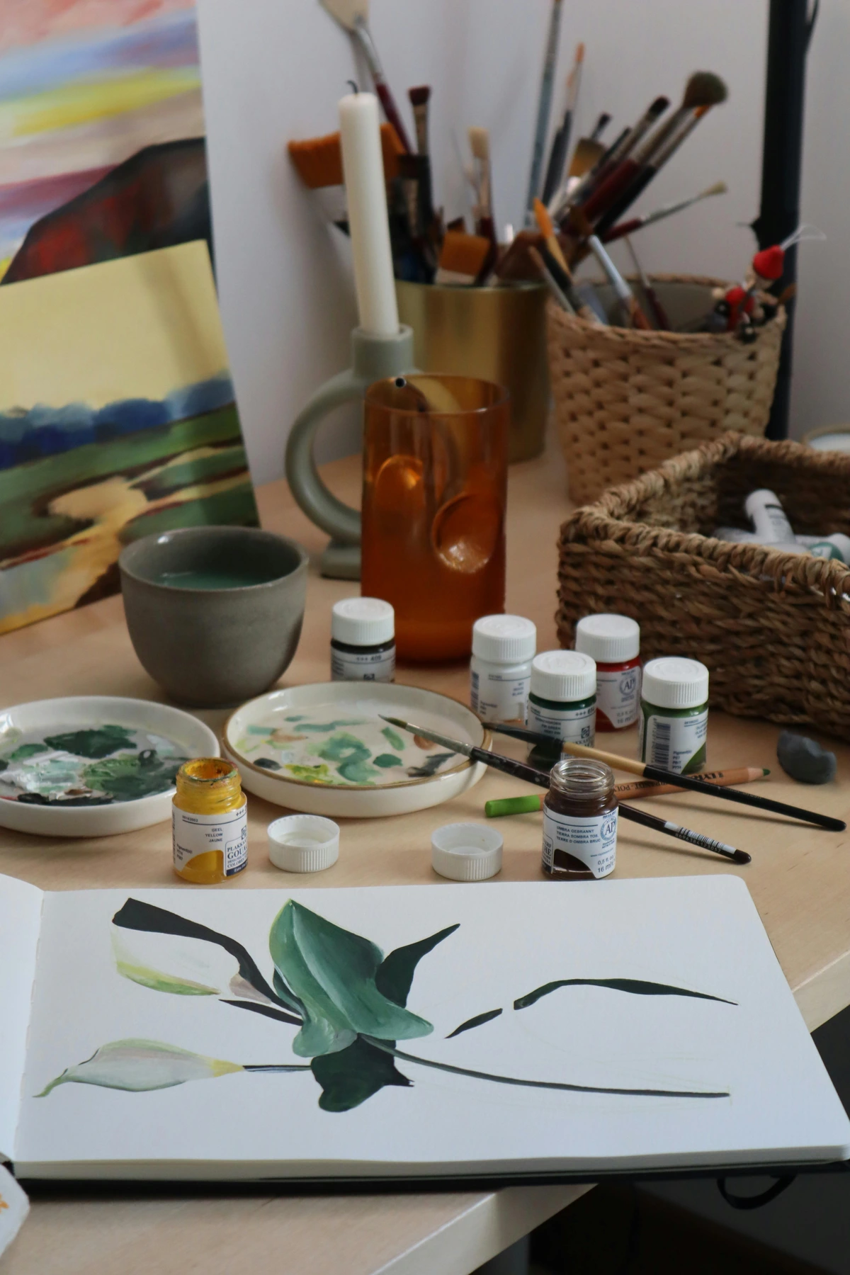
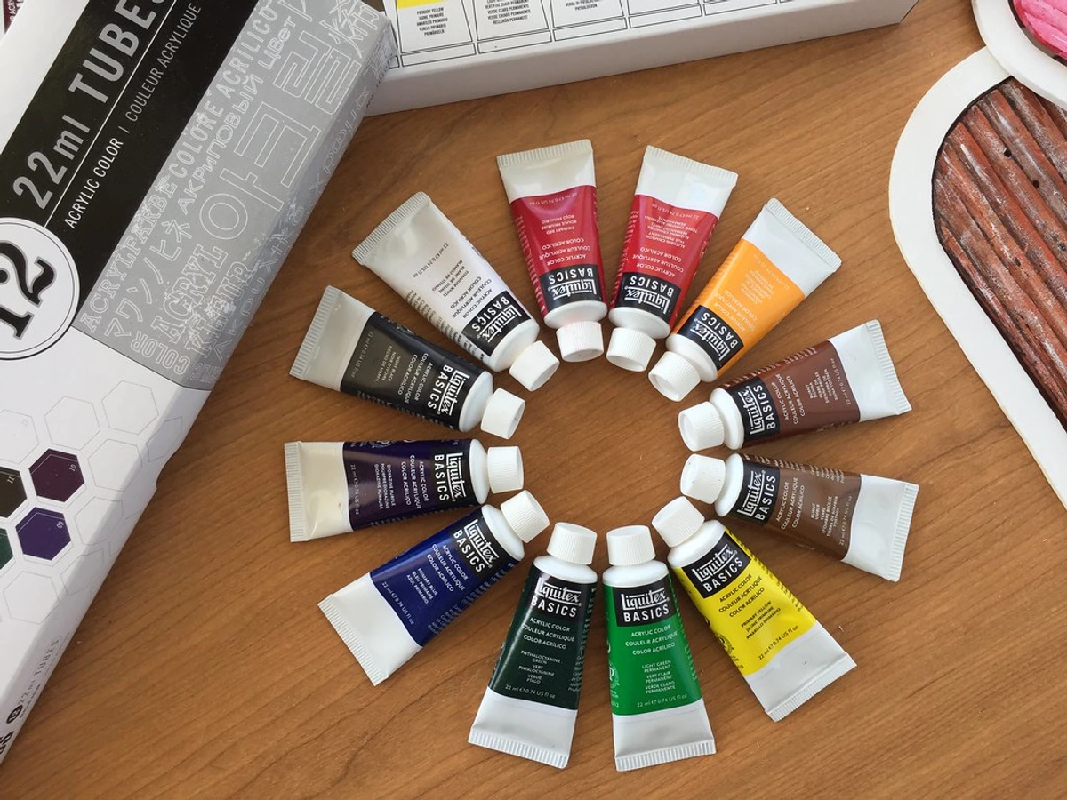
- Student-Grade Gouache Set: A basic set of primary colors plus black and white is more than enough. Don't splurge initially!
- A Few Synthetic Brushes: One round (#6 or #8) and one flat (1/4" or 1/2") will cover most needs.
- 140 lb (300 gsm) Cold Press Watercolor Paper: This is non-negotiable for minimizing warping and frustration.
- Two Water Containers & a Non-Absorbent Palette: Simple household items work perfectly here.
- Paper Towels or a Rag: For brush control and cleanup.
That's it! Armed with just these items, you're ready to begin experimenting and falling in love with gouache. Seriously, don't let a lack of specialized gear hold you back.
The Heart of the Matter: Gouache Paints Themselves
My initial encounter with gouache was a real head-scratcher. Was it watercolor's bolder, more assertive cousin? Or a chameleon-like matte acrylic? The truth, as I discovered, is that it's a beautiful, intriguing blend of both. Gouache is fundamentally a water-soluble paint, much like watercolor, but here's the magic: it dries to an opaque, velvety matte finish. This duality offers immense creative freedom, allowing for both delicate washes and bold, flat applications, making it incredibly versatile for illustration, design, and fine art.
The secret, as I've come to understand, lies in its unique composition. Gouache typically boasts a significantly higher pigment load than traditional watercolors, but crucially, it also includes a white filler, such as calcium carbonate (chalk), kaolin (china clay), or sometimes dextrin or other opacifying agents. This filler is precisely what gives gouache its distinctive opacity. When the paint dries, these finely ground particles subtly scatter and diffuse light, reducing any sheen and creating that characteristic velvety, matte appearance. Think of it like a myriad of tiny mirrors in the paint, shifting how light interacts with the surface as it dries. It's a physical property that defines the medium and sets it apart, a beautiful interplay of light and pigment that gives gouache its unique charm.
Now, for a quick distinction: while gouache is sometimes referred to as 'opaque watercolor,' it's not quite the same as tempera paint, which you might also encounter. Tempera, particularly egg tempera, is also opaque and water-based, but its binder is usually egg yolk, which dries to an incredibly durable, permanent, and often slightly luminous finish. Gouache, with its gum arabic binder, remains re-wettable and is designed for that specific matte, velvety look. Different tools for different artistic jobs, you see.

Gouache Binders: The Glue That Holds It All Together
The binder in gouache is the unsung hero, the ingredient that holds the pigment particles together and ensures they adhere beautifully to your paper. Most commonly, gouache uses gum arabic, a natural gum derived from the acacia tree. It's the reason gouache is so wonderfully re-wettable, allowing you to reactivate dried paint on your palette or even on your artwork for blending or lifting.
Some manufacturers might also incorporate other additives: plasticizers to improve flexibility and prevent cracking (especially with thick applications), or small amounts of other gums (like dextrin) to adjust consistency or drying time. Understanding the binder's role is key: it allows for that smooth, opaque lay-down and, crucially, permits those paint layers to be reactivated – a feature that truly sets gouache apart from acrylics, where the binder forms a permanent plastic film once dry. It's this delicate chemical dance that gives gouache its unique flexibility and forgiving nature.
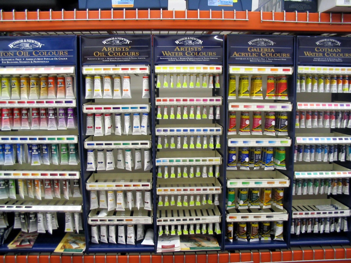
Student vs. Artist Grade: Where to Begin?
When you're embarking on any new creative venture, please, for the love of uninhibited expression, do not feel pressured to spring for the most expensive artist-grade tubes. Student-grade gouache is absolutely perfect for getting a feel for the medium. It's a fantastic, low-stakes way to experiment, make mistakes, and discover your preferences without a huge financial commitment. You'll typically identify the grade from the label (often "Student" or "Professional/Artist" clearly marked) or the price point. The key differences usually boil down to:

Feature | Student Grade Gouache | Artist Grade Gouache |
|---|---|---|
| Pigment Concentration | Lower pigment load, often more fillers and less expensive dyes. | Higher, purer pigment concentration. Richer, more vibrant colors. |
| Opacity | May require multiple layers for full opacity, can appear chalky. | Excellent opacity, often one stroke for full coverage, smoother application. |
| Lightfastness | Variable, often lower, prone to fading over time. Typically not rated or rated ASTM III. | Superior, crucial for archival work and preventing fading. Often rated ASTM I or II. |
| Texture & Smoothness | Can be grittier or streakier, less consistent. | Smoother, more consistent texture; a dream to mix and apply. |
| Re-wetting Properties | Generally re-wettable, but can be less consistent or smooth. | Re-wets easily and consistently from dried state, minimizing waste. |
| Cost | More affordable, ideal for beginners and practice. | More expensive, an investment for professional work. |
For sheer experimentation and learning the ropes, student sets are brilliant. I vividly remember buying a huge set of student paints when I first started, and it taught me so much about color mixing and application without causing any stress about wasted expensive paint. When you're ready to explore options, I've even reviewed some of the best gouache sets for beginners and a broader range of best gouache paint brands for artists.
Tubes vs. Pans: Your Gouache Vessel
You'll primarily find gouache packaged in tubes, or occasionally as dry cakes in pans, similar to watercolors. I personally lean towards tubes because they make it easier to squeeze out a consistent amount of paint, and I find they re-wet beautifully if they happen to dry on my palette. To prevent tubes from drying out or separating prematurely, always make sure the cap is tightly sealed after use. For partially used tubes, a simple bulldog clip or binder clip can help push paint to the front and seal off the unused portion, minimizing air exposure.
Pans, however, are incredibly portable, making them ideal for travel or for something like plein-air painting, often with a portable easel on location. They also boast an incredibly long shelf life if stored correctly, often lasting years without issue, whereas tubes can sometimes dry out or separate over extended periods if not properly sealed. From an environmental perspective, pans or larger tubes can sometimes generate less plastic waste over time compared to frequently buying small tubes. And honestly, the environmental aspect is always something worth considering, isn't it? Every little bit helps.
Quick Tip: Don't despair if your gouache dries on the palette! This is one of its most forgiving characteristics. A little spritz of water or a few drops will often bring it right back to life, ready to be used again. (Though, fair warning, some brands and pigments re-wet more smoothly and cleanly than others, so a quick test swatch is always a good idea.) This re-wettability is a distinct advantage over acrylics, which are essentially permanent once dry, and a huge benefit for reducing paint waste – a win-win for your wallet and the planet.
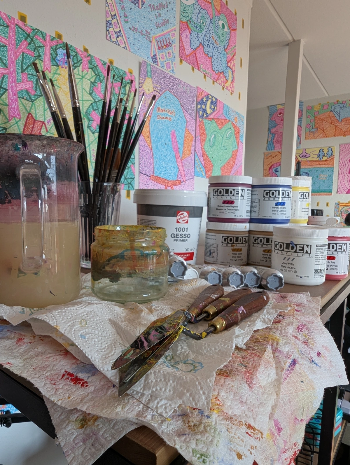
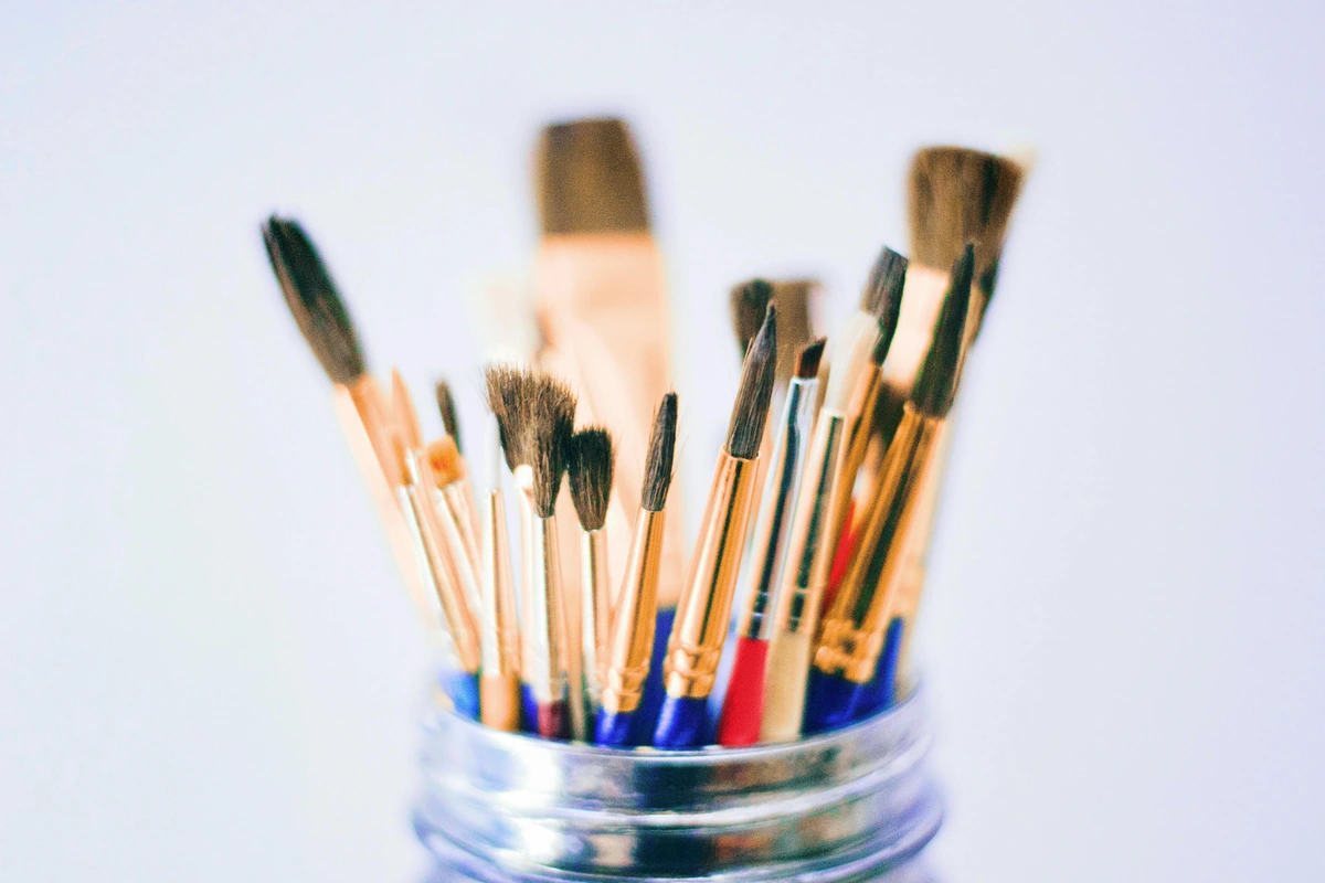
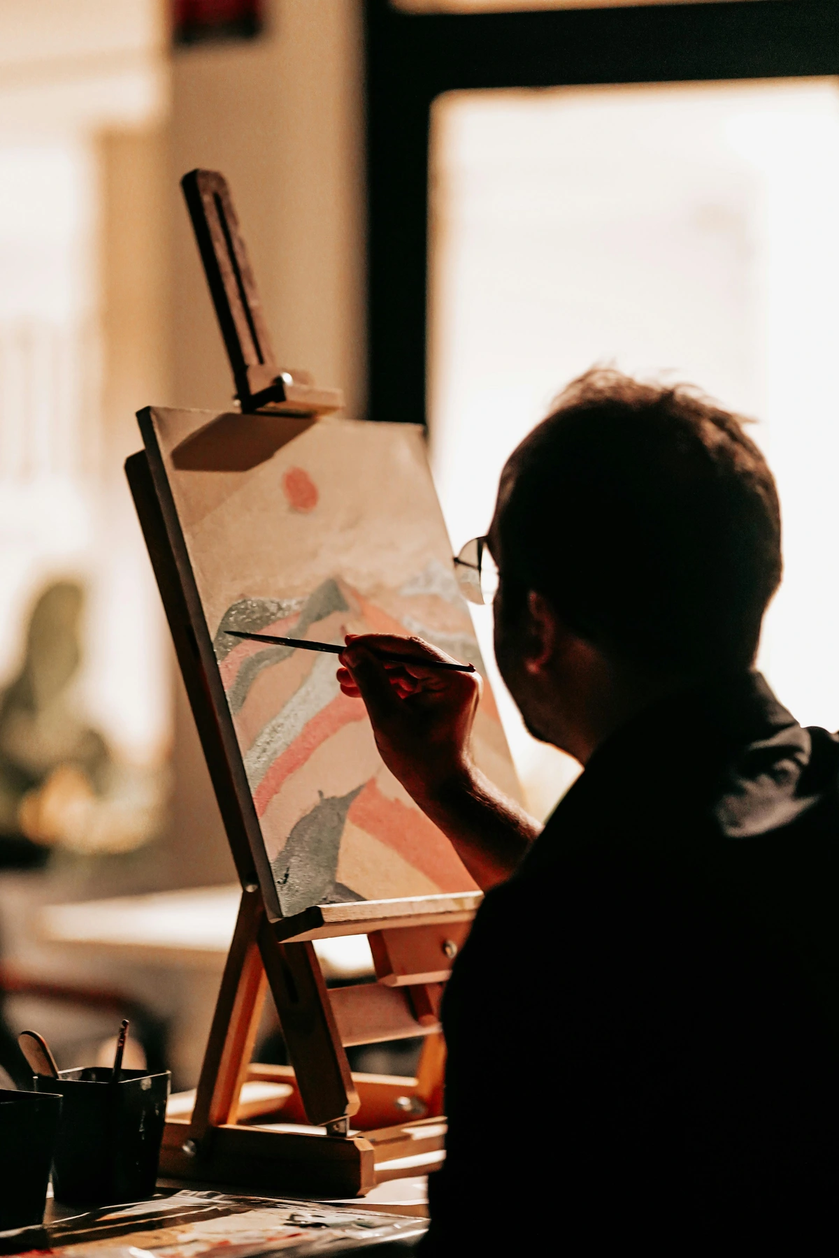
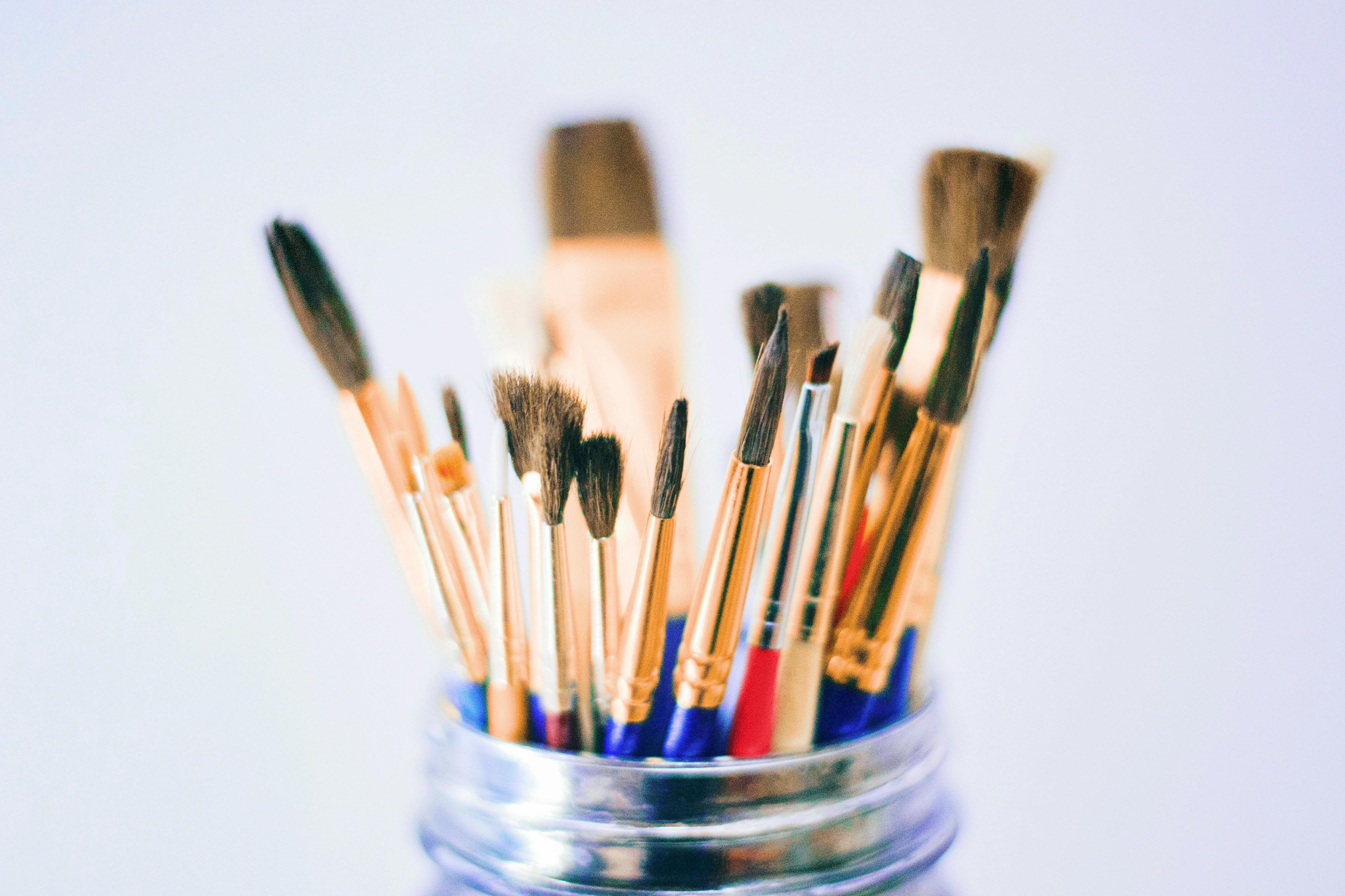
Brushing Up: Choosing Your Tools
Okay, now that we've got a handle on the paint itself, let's talk about the magic wands that apply it – our brushes. My studio is probably a testament to a mild brush addiction over the years – some gathering dust, some worn down to beloved nubs, some tragically lost to the dog (we really don't talk about those incidents). But for gouache, you absolutely don't need a sprawling arsenal. Think versatility and control. Since gouache is water-based, many brushes you’d typically reach for in watercolor painting or even acrylic painting will serve you just fine. I even have some thoughts on best acrylic paint brushes for artists that might offer some crossover insights for gouache.
My go-to recommendation for beginners is to start with a few good synthetic brushes. Why synthetic? They're incredibly durable, which means they'll last longer. Crucially for gouache, they hold a good amount of water without getting overly floppy, giving you essential control over the paint's opacity and consistency. This means you can easily go from a thin wash to a thick, opaque stroke with good control. You'll find different synthetic bristle types, from very soft, sable-like brushes perfect for smooth applications, to stiffer, hog-bristle-like synthetics that can push thicker paint for texture. And perhaps best of all, they clean up like a dream. Natural hair brushes, while luxurious for watercolor, often soak up too much water for gouache, making it harder to manage the opaque layers and sometimes leading to streaky application. Plus, natural hair can sometimes trap opaque pigment more stubbornly in the ferrule, leading to quicker splaying if not cleaned perfectly. If you do use natural hair for very specific effects, remember they need extra gentle cleaning and reshaping to prevent damage to their delicate natural fibers.
Essential Brush Shapes for Gouache
Learning to control these shapes with gouache's unique consistency is a rewarding journey, opening up a world of expressive possibilities. For a broader overview, consider my definitive guide to essential paint brush types for artists.
Brush Type | Shape & Size Suggestion | Primary Use | Why it Works for Gouache | Specific Gouache Application |
|---|---|---|---|---|
| Round | #6 or #8 Medium | Details, lines, general painting, controlled washes. | Versatile, excellent point for fine lines, belly holds enough paint for smooth strokes without reloading constantly. | Painting delicate petals, adding small details to characters, controlled outlines, fine linework. |
| Flat/Bright | 1/4 inch or 1/2 inch | Crisp edges, blocking in areas, bold, geometric strokes. | Excellent for geometric shapes, architectural elements, and achieving even, opaque coverage. Its sharp edge is perfect for clean transitions and that 'screen-print' quality. | Creating clean-edged buildings, blocking in backgrounds quickly, bold textural marks, flat color fields. |
| Wash/Mop | 1/2 inch or 1 inch | Covering large areas, laying down backgrounds or smooth gradients. | Spreads paint smoothly and minimizes visible brushstrokes, ideal for expansive, flat color fields. Its high water retention allows for longer, unbroken strokes, great for even washes. | Laying down a sky, creating even base layers, smooth, subtle gradients on larger areas. |
| Liner/Rigger | #0 or #1 Small | Fine details, long thin lines, intricate lettering. | Great for precision work, holds a good amount of thinned paint for continuous lines without needing to reload. Excellent for delicate, controlled marks. | Adding fine hairs or eyelashes, drawing intricate patterns, delicate script, precise outlines. |
| Filbert | #4 or #6 Medium | Soft, rounded edges, blending, creating organic forms. | Its curved edge allows for smooth transitions and subtle blending without harsh lines, useful for organic forms like petals or leaves. Great for softer edges, like those in clouds or foliage. | Blending colors in a sunset, creating soft edges on clouds, shaping animal fur, feathering. |
Brush Care: Keep Them Happy
And speaking of cleaning, please, please, please take care of your brushes! It's such a simple habit, but it makes an enormous difference in their lifespan and performance. For gouache, thorough rinsing is key to prevent pigment from drying and building up in the ferrule (the metal part that holds the bristles), which can splay the bristles and ruin the brush's shape over time. I even dedicated a whole article to cleaning and caring for your paint brushes because it's that important to me. Trust me, a clean brush is a happy brush, and happy brushes make for truly happy painting. I've had brushes survive years of heavy use, simply because I've treated them right (and maybe had one or two tragic incidents I still mourn, like that time I accidentally left a good sable in a jar of paint water overnight – RIP little guy).

The Canvas of Your Creativity: Paper
Now, this is an area where many beginners, myself included initially, tend to stumble. It seems so straightforward, doesn't it? Just paper. But with a water-based medium like gouache, the right paper is nothing short of transformative. If you opt for thin, flimsy paper, it will buckle and warp like crazy, leading to a frustrating experience that might prematurely dampen your enthusiasm. I once tried to save a few pennies by using a lighter sketching paper for a detailed gouache study, and within minutes, it was waving at me like a flag in a hurricane. Who needs that kind of frustration when you're trying to be creative? You absolutely need something robust, something that can handle a fair bit of moisture without complaining – something that truly supports your creative endeavors.

My unwavering go-to is watercolor paper. Yes, the very same stuff you’d use for watercolor painting! A good cold-press watercolor paper around 140 lb (300 gsm) is fantastic. It possesses enough 'tooth' (that lovely subtle texture, almost like a very fine fabric, that gives the paint something to grab onto) to effectively grab and hold the opaque gouache pigments, and its thickness is crucial for minimizing frustrating warping. Believe me, cheap sketching paper just won't cut it. It will drink your paint, pill (meaning the paper surface will break up into tiny, annoying balls of fiber), and leave you wondering why your masterpiece isn't quite working out. If you're curious about different types and brands, you can definitely check out my detailed thoughts on the best watercolor paper for artists review.
Another little secret to paper's magic is sizing. This is a gelatin or synthetic substance integrated into the paper during manufacturing (internal sizing) or applied to the surface (external/surface sizing). Think of sizing like a sealant for the paper's pores; it controls how absorbent the paper is. With gouache, you want paper that’s adequately sized – if it's too absorbent, your paint will sink in, look dull, and be harder to reactivate. If it's too non-absorbent, the paint will just sit on the surface, making layering tricky and potentially leading to flaking. Watercolor paper is perfectly sized for this delicate balance.
Understanding the paper pulp is also insightful. Papers made from 100% cotton rag are typically the highest quality, offering superior strength, archival properties, and a beautiful surface that handles moisture exceptionally well without yellowing over time. Wood pulp papers are more affordable and perfectly adequate for practice and studies, but may not offer the same longevity or resistance to warping.

Pro Tip: Think of your paper as the foundation of your painting. A shaky foundation leads to a shaky structure. Investing a little extra in decent paper saves so much frustration and genuinely enhances the painting process. It’s one of those small investments that yields huge creative dividends. Seriously, my advice? Spend a little more on good paper than you think you need to. You'll thank yourself later, especially when your finished pieces lay flat and vibrant, rather than curling up like old potato chips.
Understanding Paper Surfaces for Gouache
Different paper surfaces interact uniquely with gouache, offering distinct effects. Gouache will highlight these textures beautifully, especially with dry brush techniques, allowing the underlying paper to contribute to the visual interest of your artwork. Your choice of surface can even influence the composition; smoother surfaces often lend themselves to graphic, precise designs, while textured surfaces invite more expressive, painterly approaches.
Paper Surface | Texture | Best for Gouache | Considerations | Archival Quality | Recommended Brands |
|---|---|---|---|---|---|
| Cold Press | Medium | Versatile for most techniques, excellent for layering and washes, accepting both fine details and broad strokes. My personal favorite. | Its tooth holds pigment beautifully, minimizes buckling, and offers a pleasing surface resistance. | Excellent | Arches, Fabriano Artistico, Strathmore 500 Series |
| Hot Press | Smooth | Ideal for fine details, crisp lines, smooth gradients, and lettering due to its lack of texture. | Less tooth can make heavy washes tricky; paint tends to sit more on the surface, making blending harder; less absorbent overall. | Excellent | Arches, Fabriano Artistico, Fluid 100 |
| Rough | Pronounced | Perfect for dry brush effects, expressive strokes, and visible texture, adding a raw, painterly quality. | The deep valleys can be challenging for fine details and tend to use more paint; creates a highly textured, expressive look. | Excellent | Arches, Fabriano Artistico |
| Vellum | Slightly Textured (often translucent) | Great for detail and line work, takes light washes well, and can be good for mixed media applications with drawing. | Can warp with heavy washes, less absorbent than watercolor paper, good for a blend of drawing and painting approaches. | Good | Borden & Riley, Canson |
| Bristol Board | Smooth to lightly textured | Excellent rigid surface for illustration and detailed work, prevents warping entirely. Often used for graphic, precise styles. | Less forgiving for lifting mistakes compared to watercolor paper due to different sizing and a denser surface. | Good to Excellent | Strathmore 300/400/500 Series, Canson |
| Illustration Board | Smooth to lightly textured | Provides a firm, stable surface, good for precise work and flat washes, especially if it's hot press. | Can be less forgiving than watercolor paper for extensive layering or lifting due to its often denser core. Ideal for crisp, commercial art. | Good to Excellent | Crescent, Bainbridge |

Beyond watercolor paper, you can also use bristol board or even mixed-media paper, but always, always aim for something thicker and sturdier than standard printer paper. The weight of the paper (gsm or lb) is a key indicator of its ability to withstand moisture without warping excessively. For gouache, the heavier, the better – I rarely go below 140lb (300gsm) for finished work, though lighter weights are fine for quick sketches and studies.
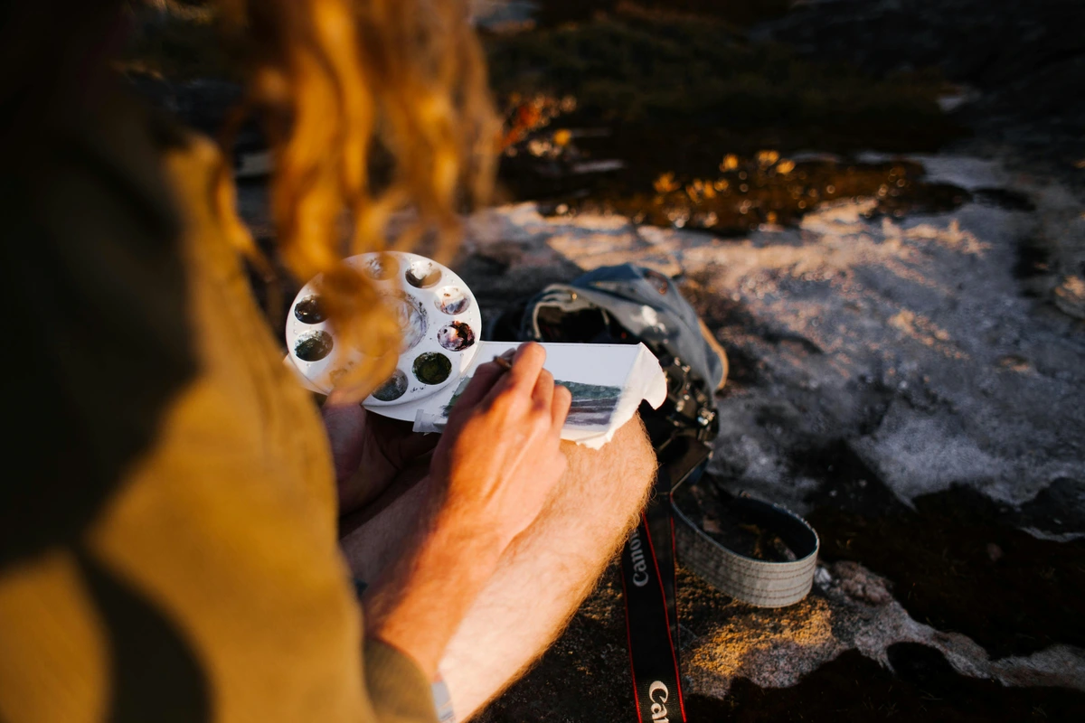
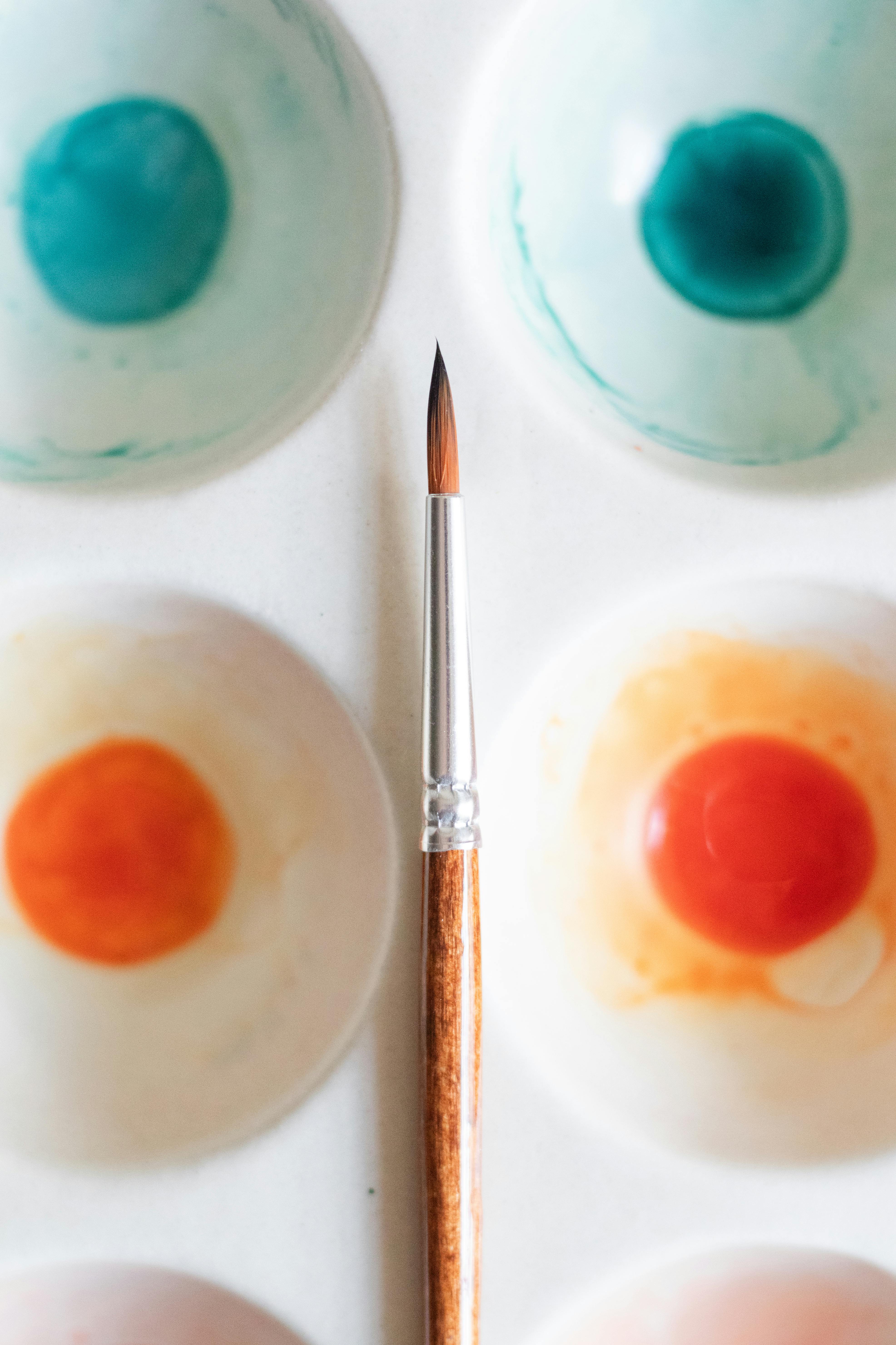
Essential Sidekicks: Palettes & Water
Okay, this section is mercifully short, because frankly, you don't need anything fancy here, which is always a relief, right? These are the unsung heroes of your setup, quietly supporting every brushstroke.
For a palette, anything non-absorbent will absolutely work. A ceramic plate (my usual go-to, an old dusty one from the kitchen), an old plastic lid, or a dedicated ceramic watercolor palette – they're all fantastic for holding your paints and allowing them to be easily re-wet. The beautiful re-wettability of gouache means you can let it dry on your palette and reactivate it later, which is a real money-saver if you ask me. This also means you don't have to clean your palette thoroughly after every single session; just cover it, and you're good to go for next time. To truly save paint, if you're using a palette with wells, you can squeeze out small amounts of tube gouache into the wells, let them dry, and then treat them like pan gouache, reactivating them with a damp brush. This method works wonderfully, though you might notice a very slight difference in consistency or vibrancy over very long periods compared to fresh paint from the tube.
For water containers, grab two. This is my golden rule. One for rinsing the bulk of the paint off your brush (this will be your 'dirty' water), and a second one for a cleaner rinse before dipping into a new color (your 'clean' water). This incredibly simple trick prevents your colors from getting muddy too quickly, preserving their vibrancy. Two old jam jars, plastic cups, or even sturdy mugs are perfectly adequate. No need for special art store containers, unless you genuinely want them.
Quick Tip: Keep a small spray bottle handy! A light mist can keep your gouache paints moist on your palette during longer painting sessions, or help reactivate them faster once dry. This is particularly useful if you live in a dry climate or prefer to work slowly, keeping your paint workable for extended periods. It's like a little spa treatment for your paints, keeping them pliable and ready for action.
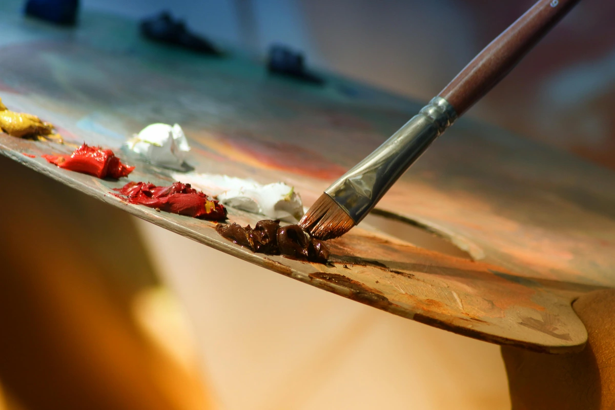
Color Mixing: On the Palette or On the Paper?
Gouache offers a unique flexibility: you can mix colors on your palette, like acrylics, for precise control over your hues. But its re-wettability also means you can often mix on the paper to some extent, especially with wet-on-wet techniques or by reactivating a dry layer and blending a new color into it. I've found that mixing on the palette offers more predictable results for opaque layers, while a quick blend on the paper can create beautiful, soft transitions and happy accidents. The choice really depends on the effect you're after and your comfort level with experimentation! For more general principles of color, you might find my guide on how to mix acrylic paint surprisingly applicable.

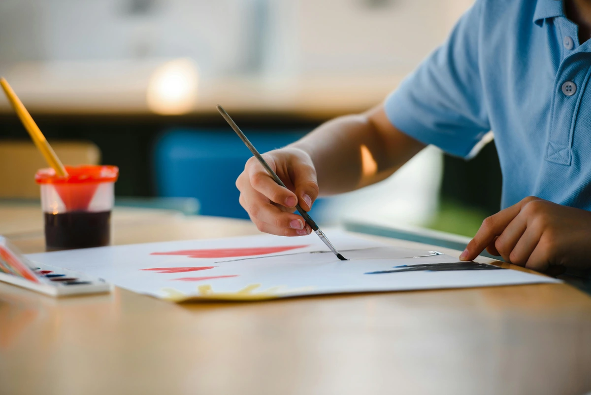
Unlocking Gouache: Key Techniques & Color Insights
With your essential supplies gathered, it's time to truly unlock the potential of gouache. This is where the magic really happens – bridging the gap between having the tools and actively creating art. One of the most exciting aspects of this medium is its remarkable versatility. It's a paint that genuinely rewards experimentation, allowing you to achieve effects reminiscent of both transparent watercolors and opaque acrylics. If you’re eager to dive even deeper into how to handle the paint, my comprehensive guide on how to use gouache covers a lot more ground.
The Gouache Color Challenge: Mixing, Opacity & Drying Shifts
Gouache's opacity fundamentally changes the game for color mixing when compared to transparent watercolors. You're working with opaque pigments, so the mixing process feels much more akin to working with acrylics. I recommend starting with a limited palette of primary colors (e.g., Cadmium Yellow Hue, Cadmium Red Hue, Ultramarine Blue) plus Titanium White and Ivory Black. You'll be genuinely amazed at the vast range of colors you can create. For even more detailed insights into color theory and practical mixing, you could explore my article on how to mix acrylic paint, as many of the principles cross over remarkably well, especially concerning creating secondary and tertiary colors and managing saturation.
Here’s a common 'gotcha' with gouache that almost every beginner (and honestly, even seasoned artists like me sometimes) encounters: it almost always dries lighter than it appears when wet. This is due to those opaque fillers we talked about earlier and the way the pigments interact and settle as the water evaporates. Imagine mixing a rich, velvety midnight blue, only to have it dry to a softer, duskier shade, like a twilight sky losing its intensity. Similarly, as gouache dries, the finely ground chalk, kaolin, or other filler particles become more prominent and scatter light more effectively, making the color appear less saturated and lighter. A clever trick of chemistry, really! Pigments like Ultramarine Blue or Phthalo Green often exhibit more noticeable drying shifts, while earth tones or Cadmium Yellows might shift less dramatically. This can be a little frustrating at first; you might mix a gorgeous, vibrant hue, only for it to look slightly duller or paler once dry. The trick? Learn to anticipate it. Paint a small swatch and let it dry to see the final color, or simply embrace this slight shift as part of gouache's unique charm. Over time, I promise, you'll develop an intuition for how your colors will change, a skill that becomes second nature. Isn't it fascinating how even with these little quirks, gouache still offers so much?

Pro Tip for Counteracting 'Drying Lighter': If you absolutely need a specific wet color to translate precisely to dry, try mixing your color slightly darker or more saturated than you intend. With practice, you'll find the sweet spot. Also, working on slightly toned paper can sometimes make the dried colors appear more vibrant by offering a contrasting background, rather than losing impact on stark white. Another great strategy is to use a limited palette; with fewer colors, you quickly learn the drying shifts of each and can adjust instinctively.
One thing to keep in mind is tinting strength. This refers to a pigment's ability to alter the color of another pigment it's mixed with. Some pigments (like phthalo blues, quinacridones, or Ivory Black) have extremely high tinting strength, meaning even a tiny amount can significantly change a mixture, especially when working with opaque gouache. This is often due to their small particle size and high refractive index. Others (like earth tones, Cadmium Yellows, or Zinc White) have lower tinting strength. For example, a tiny dot of Phthalo Blue can completely overpower a large puddle of yellow to make green, while it might take much more Raw Sienna to significantly alter a blue. Learning the tinting strength of your core pigments will make your mixing much more predictable and efficient, especially when trying to maintain the vibrancy of lighter colors.
- Making Gouache Opaque: This is gouache's superpower! Use less water and a higher pigment load directly from the tube. Adding Titanium White (PW6) is the most effective way to increase opacity, create beautiful pastel-like tints, and enhance the paint's covering power. While adding white can desaturate a color, it creates a new, brighter value that can feel incredibly vibrant in contrast. This is especially useful when painting light objects over dark backgrounds.
- Making Gouache Transparent (like Watercolor): Yes, you absolutely can use gouache like watercolor! Simply dilute it with more water. The more water you add, the more translucent it will become, allowing underlying layers or the paper to show through. This is fantastic for initial washes, building subtle atmospheric effects, or creating soft gradients. The key difference from true watercolor is that even diluted gouache still contains those opaque fillers, so it won't be quite as luminous as a pure watercolor wash, but it's remarkably close and offers a unique soft glow. Using Zinc White (PW4) instead of Titanium White for mixing can also increase transparency subtly, as Zinc White is naturally more translucent and has lower tinting strength.
- Using Gouache like Acrylic: Gouache shares acrylic's ability to layer opaque colors on top of each other without affecting the underlying layers (once dry). It offers that satisfying, flat color application perfect for graphic styles, illustration, and design work. The main differences are gouache's re-wettability (acrylics are permanent once dry and form a plastic film) and its characteristic matte finish (acrylics typically dry with a slight sheen unless a matte medium is added). This makes gouache an excellent choice for detailed work where precision layering is key, and you might want to adjust things later.

Common Gouache Techniques to Master
Exploring these techniques will give you a solid foundation for your gouache practice, helping you to harness its unique properties and allowing you to push the boundaries of what you thought was possible with a water-soluble paint.

Technique | Description | Why it Works Well with Gouache | Potential Challenges | Artistic Application |
|---|---|---|---|---|
| Layering (Opaque) | Applying opaque layers of paint over previously dried layers, building up color and form. | Gouache's inherent opacity makes corrections easy and allows for robust building up of forms and colors without muddying. Dry each layer completely to prevent reactivating the previous one and avoid cracking by not applying too thickly. | Too many overly thick layers can lead to cracking or flaking once dry. Ensuring layers are fully dry is key to preventing reactivation and muddying. | Building up forms in a portrait, creating subtle shadows under drapery, painting light over dark. |
| Wet-on-Dry | Applying wet paint onto a completely dry underlying layer or dry paper. | This is the foundation of opaque gouache painting, allowing for crisp, clean layers without disturbing previous work, ideal for building complex scenes. | Requires patience for layers to dry, and incorrect water ratios can lead to streaks or reactivating the underlayer. | Creating precise architectural elements, clean-edged illustrations, adding sharp foreground details. |
| Dry Brush | Using a nearly dry brush with thick, undiluted paint to create textured, broken strokes. | Emphasizes the paper's texture beautifully, ideal for creating subtle visual interest, rough textures (e.g., foliage, stone, wood grain), or fabric textures. Its matte finish enhances the effect. | Requires careful control of paint and water; can look scratchy or unintentional if overdone. Good for adding texture to objects and creating a sense of depth. | Depicting weathered wood, shimmering water, textured fabrics, or distant foliage. |
| Wet-on-Wet | Applying wet paint onto a wet surface (pre-wet paper) or a wet previous layer, allowing colors to blend softly. | Can yield soft, diffused blends similar to watercolor, especially with thinner applications. Pre-wetting the paper surface (or previous layer) evenly helps with control over blooms and feathering. | Control is harder due to gouache's opacity and relatively quick drying time compared to watercolor; can lead to muddy, uniform masses if not managed. Vary water-to-paint ratio to control opacity and flow. | Creating soft skies, atmospheric backgrounds, subtle gradients, or diffused light effects. |
| Lifting | Removing dried paint with a damp brush or cloth to create highlights or make corrections. | Especially effective with student-grade or re-wettable artist gouache for creating highlights or making corrections. Most effective on thicker, less absorbent paper where paint sits more on the surface. | Some artist-grade paints or staining pigments can be more resistant, making lifting harder or impossible without damaging the paper. Test first. | Creating glinting highlights on metal, lifting out clouds from a dark sky, correcting a misplaced line. |
| Glazing (Transparent) | Applying thin, translucent layers of diluted gouache to build color depth or modify underlying tones, similar to watercolor glazing. | Requires diluting gouache considerably (almost like a watercolor wash) to create delicate transparent veils. Use minimal water and quick strokes over a completely dry underlayer to prevent reactivation and maintain transparency. | Can be challenging to maintain transparency without reactivating underlying layers if too wet. Can also look streaky if not applied quickly and evenly. Patience and light touch are crucial. Note that gouache glazes will have a softer, less luminous quality than pure watercolor due to its opaque fillers. | Adding subtle warmth to a cool area, deepening shadows without making them too harsh, creating atmospheric haze. |
| Stippling/Dabbing | Using the tip of a brush to create small dots or textures by applying paint with light, tapping motions. | Excellent for creating realistic foliage, textured surfaces, stippling for fur, or achieving a subtle pointillist effect (e.g., dappled light, rough terrain, cloud texture). Offers fine control over density. | Can be time-consuming; consistency in dot size and density is key for the desired effect. Requires a steady hand and building up layers for depth. | Building up textured tree canopy, rendering animal fur, adding dappled light effects on a path, creating a pointillist field of flowers. |
| Scumbling | A dry brush technique where a small amount of paint is lightly dragged or flicked over a dry surface, allowing the underpainting to show through, creating a broken, atmospheric effect. | Creates a broken, ethereal texture, fantastic for atmospheric effects, old stone, misty landscapes, or adding subtle color shifts. It’s like a whisper of color over a stronger tone. | Requires a very dry brush and precise touch; too much paint or water will result in solid coverage. Best for building light texture and subtle shifts. | Creating a weathered stone wall, depicting mist over a distant mountain, adding subtle highlights to textured objects, achieving a soft glow. |
| Sgraffito | Scratching through a wet top layer of gouache to reveal a dried underpainting or the paper beneath, creating sharp lines or textures. | Capitalizes on gouache's ability to layer opaquely. It allows for crisp, incised lines that can't be achieved with a brush alone, adding dynamic texture and detail. | Requires the top layer to be at the right consistency – too wet and it will smudge, too dry and it will resist scratching or flake. Experiment with tools like the back of a brush handle or a palette knife. | Creating fine hair, wood grain details, sharp cracks in a surface, or intricate patterns over a contrasting underlayer. |
Mastering these techniques will transform your gouache practice, allowing for a wide range of expressive possibilities from precise illustration to atmospheric landscapes.
Beyond the Basics: Protecting Your Gouache Paintings
This is a frequently asked question, and the answer is a little nuanced. Generally, gouache paintings are traditionally left unvarnished, as varnishing can alter their characteristic matte finish and unique luminosity. The velvety matte surface is, after all, part of its charm and defining aesthetic!
Applying liquid varnishes to gouache carries significant risk and is generally not recommended for preserving its signature matte finish. The re-wettability of gouache means any liquid application can disturb the paint layers, causing bleeding, smudging, or a dramatic change in appearance. Your best bet for long-term preservation and maintaining its original charm is almost always framing under glass.
However, if you want to protect your gouache painting, especially from dust, UV light, or minor surface damage, and are willing to accept the risks, there are options:
- Framing Behind Glass: This is the most common and highly recommended method. Framing your gouache painting under glass (ideally UV-protective glass) offers excellent protection without altering the paint surface. Make sure there's a mat board separating the painting from the glass to prevent sticking and allow for air circulation.
- Spray Varnishes (Use with Extreme Caution!): If you absolutely must varnish, use a matte or satin spray varnish specifically designed for water-media, and apply it with extreme caution. Products like Golden Archival Varnish (Matte), Lascaux UV Protect (Matte), or Winsor & Newton Professional Matt Varnish can be considered, but always, always test first! The type of paper can also impact varnish adhesion and how the final sheen appears; more absorbent papers might soak up more varnish, potentially affecting transparency or finish. Be aware that some varnishes, especially cheaper ones, can yellow over time, altering the perceived colors of your artwork.
- Test First: Always test on a swatch of dried gouache on the same paper before applying to your finished artwork. This cannot be stressed enough!
- Light Coats: Apply several very light, even coats from a good distance (10-12 inches). A heavy, wet coat can reactivate the gouache, causing it to bleed, smudge, or dramatically change its appearance. Allow each coat to dry completely.
- Matte Finish: Choose a matte or ultra-matte finish to preserve the velvety look. A glossy varnish will completely change the aesthetic. If you're aiming for a slightly satin finish, a very light application of a satin spray varnish could achieve this, but again, the risk of reactivating the paint or altering its unique qualities is high.
Remember, the unique composition of gouache means it responds differently than oil or acrylics to protective coatings. Your best bet for long-term preservation and maintaining its original charm is almost always framing under glass.
Troubleshooting Common Gouache Problems
Even with the right supplies and techniques, you might encounter a few quirks with gouache. Don't worry, it's all part of the learning process! Here's a quick guide to common issues:
Problem | Cause | Solution |
|---|---|---|
| Streaky Application | Too much water, inconsistent paint load, fast drying in dry climates, dirty brush. | Use less water for opaque layers, ensure consistent paint on brush, work faster, use a spray bottle to keep palette moist, ensure brush is clean. |
| Muddy Colors | Dirty rinse water, overworking wet layers, mixing too many pigments, using brushes with residual paint. | Use two water containers (one for dirty, one for clean rinse), allow layers to dry completely before layering, limit palette to 2-3 colors per mix, clean brushes thoroughly between colors. |
| Paint Cracking/Flaking | Applying paint too thickly, stiff paper, excessive layering without drying, lack of flexibility in binder. | Apply thinner layers, allow each layer to fully dry, consider adding a tiny bit of glycerin (start with 1-2 drops per dollop of paint on your palette) or a flow improver (test first!). Use paper with adequate sizing. |
| Pigment Separation (in tube/pan) | Pigment and binder separating over time (natural with some paints), inadequate mixing during manufacturing. | Knead the tube gently before opening, stir pans vigorously with a wet brush. For chronic separation, try another brand. |
| Chalky/Dull Finish | Too much white pigment, high filler content in student grade, overworked paint, overly absorbent paper, using too much water for opaque layers. | Reduce white, use artist-grade paints, avoid excessive scrubbing. Glazing with a transparent layer can restore vibrancy. Using less absorbent, properly sized paper helps. Ensure you're not over-diluting for opaque layers. |
| Gummy Texture | Old paint, paint left exposed to air, certain binders with high dextrin content. | Re-wet thoroughly with fresh water, knead tubes if paint has stiffened. Some paints naturally feel gummier due to binder composition. |
| Gritty Texture | Undissolved pigment, poor quality fillers, paint drying on brush, hard water. | Grind pigments on palette with brush and water thoroughly, clean brushes frequently. Use distilled water if tap water is very hard. |
| Uneven Drying | Inconsistent paint application, varying paper absorbency, working too slowly. | Apply paint quickly and evenly, use appropriate paper sizing. Ensure good, consistent humidity in your workspace. |
| Lost Vibrancy (after drying) | The natural drying shift of gouache, overly absorbent paper. | Mix colors slightly darker/more saturated, use a swatch test, work on toned paper. Use properly sized, less absorbent paper. |
| Paint Dried Out (in tube) | Poorly sealed tube, old paint, tubes stored improperly. | Cut open the tube, re-wet dried chunks with water and glycerin, transfer to a sealed pan. Store tubes upright with caps tightly sealed. |
| Strange Odor | Contamination, old binder, bacterial growth. | Discard paint immediately. Clean palette/brushes thoroughly to prevent spread. |
| Too Stiff/Watery (consistency) | Incorrect water-to-paint ratio for desired effect, paint separating in tube. | Add water for fluidity, add fresh tube paint for stiffness/opacity. Knead tubes before use. |
| Too Transparent/Opaque (undesired) | Wrong water ratio or white pigment added/not added, pigment inherent transparency. | Adjust water (more for transparent, less for opaque), add Titanium White for opacity, use Zinc White for subtler transparency. |
| Water Spots/Blooms | Too much water on the brush when applied over a dry or partially dry layer, or accidental water drips on dried paint. | Ensure brush is properly dabbed for wet-on-dry techniques. Work carefully to avoid drips. Can sometimes be lifted if caught quickly, or re-covered with an opaque layer. |

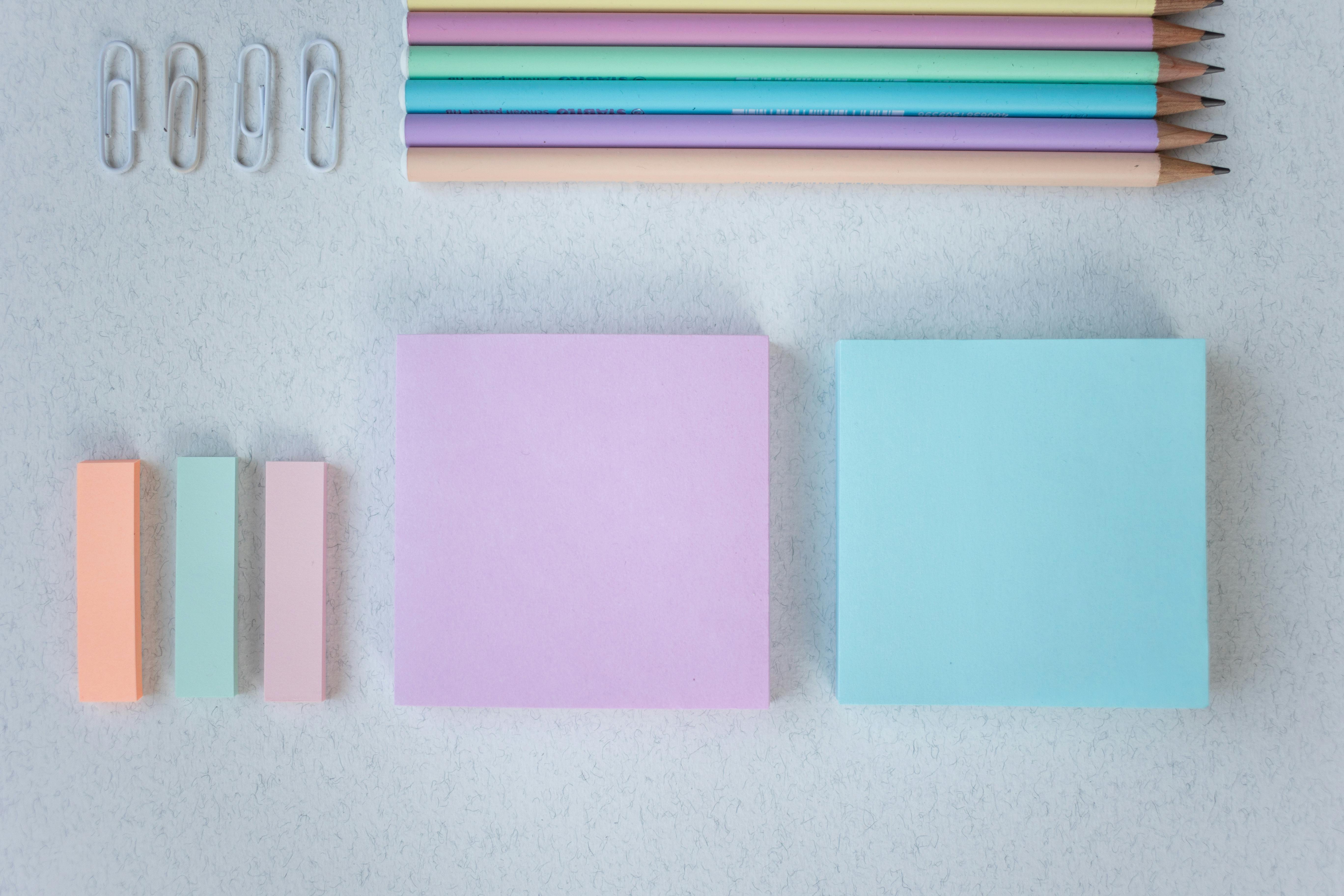
Don't Forget the Details: A Few Extras
Beyond the core trio of paints, brushes, and paper, a few additional items can significantly enhance your gouache experience, turning a basic setup into a truly comfortable and efficient workspace. These are the supporting cast that make the stars (your paints) truly shine:
- Paper Towels or a Rag: Absolutely non-negotiable! These are essential for dabbing brushes to control water, wiping off excess paint, cleaning up inevitable spills, and generally keeping your workspace tidy. I always have a roll next to me – a messy studio is a happy studio, but a controlled mess is even happier. Opt for lint-free paper towels or an old cotton rag for best results.
- Pencil and Eraser: For light sketching before you paint. A soft pencil (like a 2B or 4B) and a kneaded eraser are perfect because they won't leave harsh marks that show through even the most opaque gouache layers. They also allow for easy adjustments without damaging the paper surface. This is often where your initial drawing supplies for beginners will come in incredibly handy.
- Artist's Tape (Highly Recommended): If you're using thinner paper (though I recommend 140 lb!) or simply crave perfectly crisp edges, taping your paper down to a board can beautifully prevent warping and give you those satisfying clean lines. Artist's tape is superior to standard masking tape because it's typically pH-neutral and has a less aggressive adhesive, significantly reducing the risk of tearing your precious paper upon removal. It's a small investment that saves big headaches, trust me.
- Palette Knife: While not essential for everyone, a small palette knife can be incredibly useful for mixing colors cleanly without staining your brushes. More than that, it can be used for scraping back dried paint from your palette, or even for applying thick, textured marks directly onto the paper. Beyond just scumbling, try creating defined ridges for architectural details, sharp lines by dragging the edge for a graphic effect, or building up small, impasto-like sections for tactile interest. This adds another dimension to your work, exploring techniques like using a palette knife for scumbling.
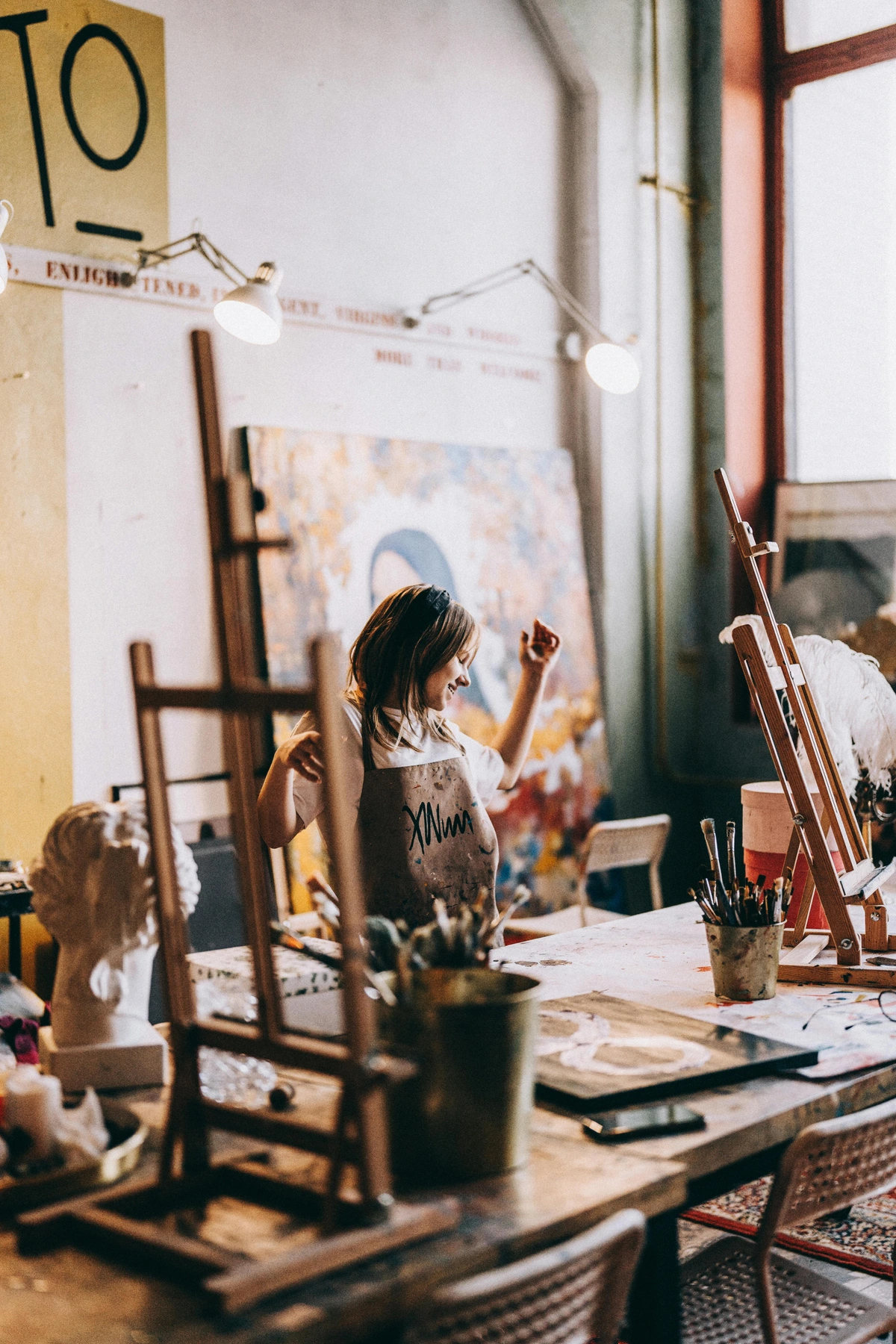
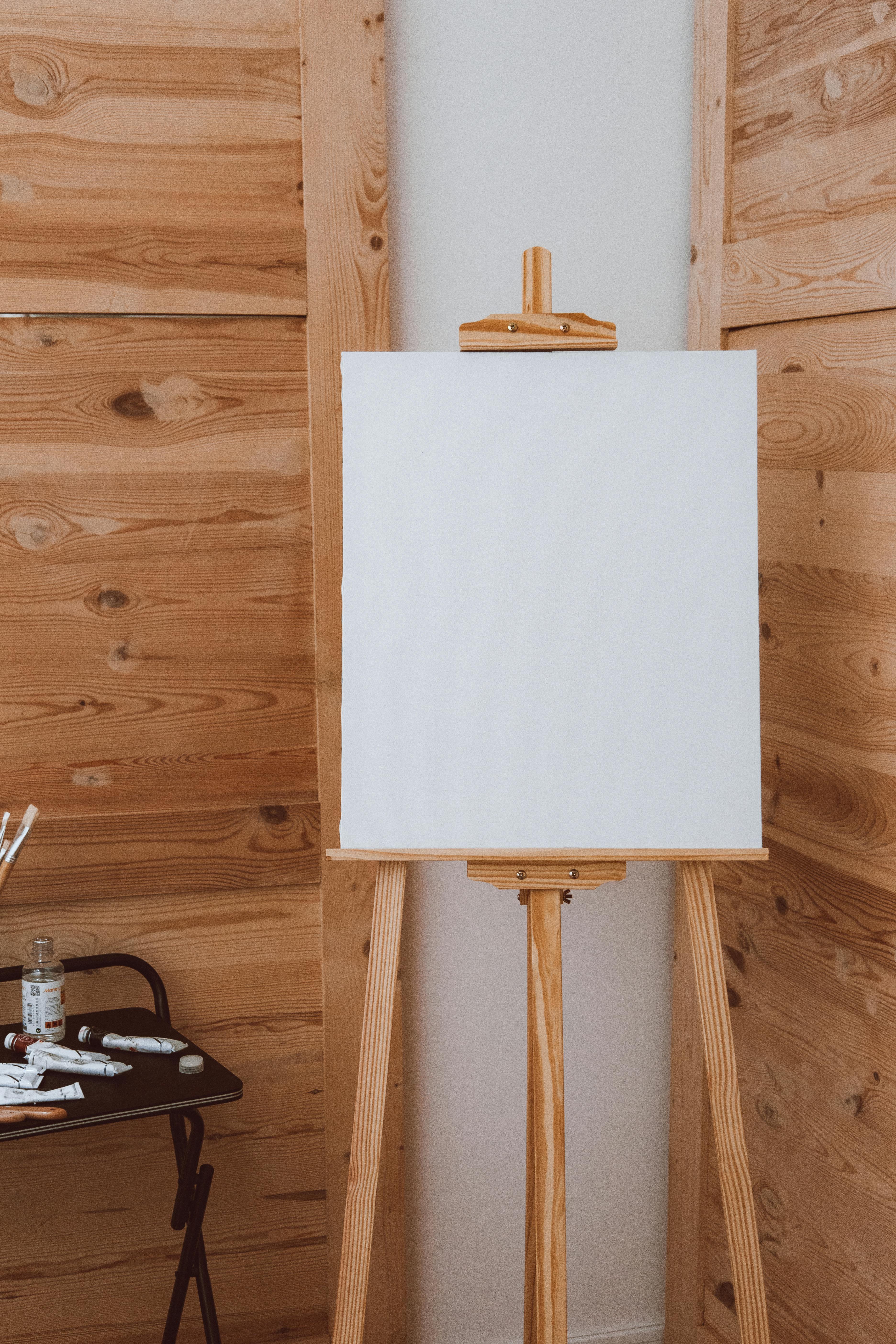
- A Solid, Comfortable Surface: This might sound obvious, but it’s crucial. Make sure you have a comfortable, flat, and stable surface to work on. Whether it's a simple drawing board, your kitchen table, or a dedicated studio easel (I’ve used them all!), comfort is absolutely key to prolonged, joyful creative sessions. Wouldn't you agree? An uncomfortable setup is a quick path to creative fatigue.
- Storage Solutions: Once you start accumulating tubes, thinking about proper storage becomes important. Keeping tubes upright in a jar or a small box prevents leaks and keeps your workspace organized. For dried gouache on your palette, a palette with a lid can keep dust off and make re-wetting easier for your next session, extending its life and preventing valuable paint from going to waste. Trust me, I've had to mourn more than one tube of glorious paint that dried out prematurely because I was lazy with the cap. Don't be like past-me.
Working on Non-Paper Surfaces: A Quick Primer
While paper is gouache's natural home, its versatility means you can venture onto other absorbent surfaces. If you're keen to paint on wood or even canvas, you'll need to prepare the surface first. This usually involves applying gesso, a primer that creates a slightly absorbent, even surface for the paint. I usually apply 2-3 thin, even coats of acrylic gesso, allowing each to dry completely and lightly sanding between coats for extra smoothness. You can learn more about how to apply gesso to canvas for a detailed guide. Remember, gouache is not permanent like acrylics once dry, so these pieces would still ideally need to be framed under glass or carefully protected if you want them to last.
A Glimpse into Gouache's Past: A Brief History
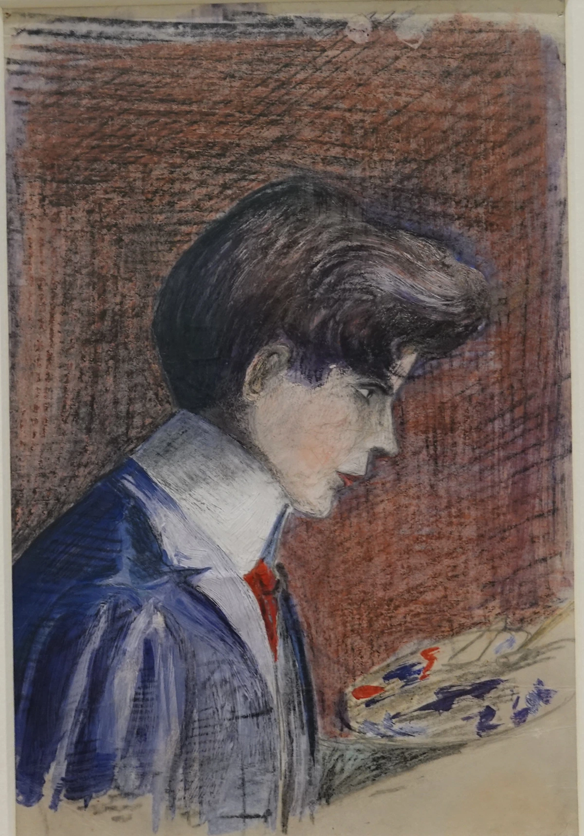
Gouache isn't a modern invention at all! Its roots stretch back centuries, with artists appreciating its unique opaque qualities long before acrylics were ever conceived. Some art historians trace its use to ancient Egypt, where it was employed for illuminating papyrus, but it became more formally developed during the European Middle Ages. Here, it was extensively used for manuscript illumination, often combined with gold leaf, due to its rich, velvety finish that mimicked tempera and provided excellent covering power. Medieval artists like Jean Fouquet utilized gouache's opacity for vibrant, detailed miniatures.
It gained significant popularity during the 18th and 19th centuries, especially among landscape painters for preparatory sketches and illustrators who needed a matte finish for reproduction in printed materials. Artists like J.M.W. Turner and Paul Sandby extensively used gouache, often combining it with watercolor to achieve dramatic effects and build up luminosity. Japanese Ukiyo-e artists, like Hokusai, also leveraged similar opaque water-based paints for their iconic woodblock prints. Later, in the Art Nouveau and Art Deco periods, gouache was a staple for graphic designers and illustrators, appearing prominently in vibrant posters, book illustrations, and commercial art due to its bold, flat color capabilities. Iconic mid-century illustrators also championed gouache for its graphic punch, and even early animators, particularly at Disney, used it for painting cels due to its smooth, even coverage and vibrant, non-reflective colors.
Today, gouache continues its resurgence, beloved by contemporary illustrators, designers, and fine artists for its unique blend of traditional charm and modern versatility, proving its timeless appeal. So, while it feels fresh and contemporary in its current resurgence, you're tapping into a rich artistic lineage that spans millennia! Isn't that a wonderful thought? You're literally part of a historical artistic conversation every time you pick up a tube.

Gouache Painting Supplies Checklist
To make sure you're fully equipped for your gouache journey, here's a handy checklist of essential and recommended supplies. Remember, you don't need everything at once; start with the essentials and build your kit as you explore and discover your preferences. Think of it as your personalized gouache shopping list, evolving with your skills and creative curiosity.
Category | Essential Items | Recommended Additions |
|---|---|---|
| Paints | Student or Artist Grade Gouache (Primary colors + Black & White) | A wider selection of colors (e.g., earth tones, pastels, specialty metallic or iridescent gouache), transparent white (Zinc White) for subtler mixes. |
| Brushes | 2-3 Synthetic Round Brushes (#6, #8) | Synthetic Flat, Wash, Liner, Filbert brushes (e.g., 1/4", 1/2", #0, #4), larger wash brushes for backgrounds and expansive areas, a dedicated brush for white paint. |
| 1-2 Synthetic Flat Brushes (1/4", 1/2") | ||
| Paper | 140 lb (300 gsm) Cold Press Watercolor Paper | Hot Press or Rough watercolor paper for different textures, Bristol board or mixed-media paper, illustration board, 100% cotton rag paper for archival work. |
| Palette | Non-absorbent surface (ceramic plate, plastic lid) | Dedicated ceramic palette with wells and a lid for paint preservation, a separate small palette for white/light mixes. |
| Water | Two water containers (jars, cups) | Small spray bottle for re-wetting paint and keeping it moist, a brush cleaning tank with a grid. |
| Extras | Paper towels or a rag | Artist's tape for securing paper, small natural sponge for textures, a ruler for crisp lines, drafting compass, frisket/masking fluid for sharp edges. |
| Pencil (2B) & Kneaded Eraser | Palette knife for mixing and texture, a comfortable drawing board or easel, storage solutions for paints/brushes, matte/satin spray varnish (use with extreme caution!), tracing paper for compositions, a light source (e.g., desk lamp) for consistent lighting. |
Frequently Asked Questions About Gouache Painting
Let's tackle some common questions that often pop up when artists are exploring the wonderful world of gouache, offering clear and concise answers to get you started with confidence. What are your burning questions about this unique medium?
Q: Can I use gouache like watercolor? A: Absolutely! Gouache is water-soluble, meaning you can dilute it with water to create transparent washes, much like traditional watercolor. The main difference is that even when diluted, gouache retains some of its opaque quality due to the white filler, offering a slightly softer, less luminous transparency than pure watercolor. Experiment with water ratios to find your preferred transparency, from a subtle tint to a semi-opaque glaze.
Q: Can I use gouache like acrylic paint? A: Yes, in many ways! Gouache excels at opaque, flat applications, similar to acrylics, and you can layer it just like acrylics (once the previous layer is dry). This makes it excellent for graphic styles and crisp illustration. The key distinctions are that gouache remains re-wettable even when dry (unlike permanent acrylics, which form a plastic film), and it dries to a characteristic matte finish without any plastic-like sheen.
Q: How do I make gouache more transparent? A: To make gouache more transparent, simply add more water. The more water you mix with the paint, the more translucent it will become. You can create very thin washes that allow underlying layers or the paper to show through, achieving beautiful watercolor-like effects for initial layers or atmospheric backgrounds. Using Zinc White (a more transparent white pigment) instead of Titanium White for mixing can also increase transparency subtly.
Q: How do I make gouache more opaque? A: To make gouache more opaque, use less water and a higher concentration of paint directly from the tube. The richest opacity comes from applying it straight or with minimal water. Adding a touch of Titanium White to any color is the most effective way to significantly increase its opacity and create vibrant, dense coverage, perfect for highlights or covering mistakes.
Q: What's the best way to clean gouache brushes? A: Because gouache is water-soluble, cleaning brushes is quite easy! Rinse your brushes thoroughly in water (using two containers: one for dirty rinse, one for clean rinse), gently working out all the pigment until the water runs clear. Pay special attention to the ferrule to prevent pigment buildup. For stubborn paint, use a mild soap specifically designed for artist's brushes, like a brush soap or baby shampoo. Reshape the bristles and let them dry flat or brush-head-down to prevent water from seeping into the ferrule and damaging the brush head. You can find more detailed advice in my guide on cleaning and caring for your paint brushes.
Q: Is gouache good for beginners? A: Absolutely! Gouache is an incredibly forgiving medium for beginners. Its re-wettability means mistakes can often be corrected or lifted, and its opacity allows for easy layering and cover-ups. Student-grade sets are affordable and perfect for experimentation, making it a low-pressure way to learn. It builds confidence quickly as you can easily paint over areas that aren't quite right.
Q: What is the shelf life of gouache? A: Gouache in tubes generally lasts for several years if properly sealed and stored in a cool, dark place. If tubes dry out, they can often be re-activated with water, though consistency might change slightly. Gouache pans can last for many, many years, even decades, as they are designed to be re-wet from a dry state. Always ensure lids are tightly closed to prevent premature drying and separation.
Q: Can I combine gouache with other art mediums? A: Yes, gouache is wonderfully versatile for mixed media! It works beautifully with colored pencils, ink, pastels, and even over dried watercolors or light acrylic washes. You can use it for opaque details over transparent layers, or create expressive marks on top of other dry mediums. Just be mindful of its re-wettability when applying wet mediums over dry gouache layers. You can even combine it with alcohol markers for vibrant underpaintings and opaque gouache details on top, though test the alcohol interaction first on a scrap piece.
Q: How can I achieve different sheens (matte vs. satin) with gouache? A: Gouache naturally dries to a characteristic matte finish. To achieve a slightly satin or semi-gloss finish, you generally need to apply a very thin, even coat of a matte or satin spray varnish specifically designed for water-media, after the painting is completely dry. However, this carries the risk of reactivating the paint or altering its unique velvety appearance, so extensive testing on a scrap piece is crucial. There aren't many gouache-specific mediums to alter sheen directly within the paint itself without significantly changing its properties. The matte finish is part of its defining charm, and I personally embrace it!
Q: How do different pigments behave in gouache (drying shifts, lifting)? A: Pigment behavior in gouache can vary significantly. Earth tones (like Raw Sienna or Burnt Umber) often exhibit less dramatic drying shifts and tend to be more staining, making them harder to lift completely. Brighter, more synthetic pigments (like Phthalo Blue or Quinacridone Magenta) might show more noticeable drying shifts and can sometimes be more easily lifted, depending on the brand and amount of binder. White gouache, especially Titanium White, is the most opaque and least likely to shift dramatically, making it a reliable mixer for opacity. Experimenting with your specific set of paints will help you learn their individual quirks.
Q: What is the archival quality of gouache? A: The archival quality of gouache depends heavily on the lightfastness of the pigments used and the quality of the paper. Artist-grade gouache with high lightfastness ratings (often indicated on the tube with ASTM ratings like I or II) on acid-free, archival watercolor paper (like 100% cotton rag) can last for many decades without significant fading or discoloration. Student-grade paints or those using less permanent dyes may fade over time. Framing under UV-protective glass is always recommended for long-term preservation.
Q: Can I use gouache on different surfaces like wood or fabric? A: While gouache is primarily designed for paper, you can use it on other absorbent surfaces like wood or canvas, but with caveats. On wood or canvas, you'll need to prime it first with gesso (you can learn more about how to apply gesso to canvas) to prevent excessive absorption and ensure better adhesion. On fabric, it will behave more like a temporary dye and is generally not wash-fast or permanent unless mixed with a textile medium or sealed extensively. For best results on these surfaces, acrylic paints or specific fabric paints are usually more suitable due to their permanence. Remember that gouache remains re-wettable, so these pieces would still ideally need to be framed under glass or carefully protected if you want them to last.
Q: How does gouache compare to traditional watercolor with added white? A: While adding opaque white to watercolors can give you some gouache-like effects (often called 'bodycolor'), it's not quite the same. Traditional watercolors are formulated for transparency, and adding white can sometimes make them appear chalky or less vibrant than true gouache, which is designed from the ground up for its opaque, matte finish. Gouache also typically has a higher pigment load and different binder ratios, leading to a richer, smoother opaque application.
Q: How can I transition to gouache if I'm used to watercolors? A: Great question! You already have an advantage with brush control and water management. Focus on gouache's opacity: use less water for bold, flat areas, and embrace the ability to layer light over dark. Practice mixing colors slightly darker to account for the drying shift. Think of your white gouache as a powerful tool for tints and highlights, something you'd rarely use in pure watercolor. Your watercolor paper will work beautifully, so you're already halfway there!
Q: How can I transition to gouache if I'm used to acrylics? A: The opaque layering will feel very familiar! The main difference is the re-wettability and the matte finish. Don't stress about mistakes – you can reactivate and lift gouache in ways you can't with acrylics. Be mindful of water ratios; gouache layers need to dry completely before new layers, much like acrylics, but remember you can re-activate if you desire blending. Enjoy the lack of plastic sheen!
Q: How can I transition to gouache if I'm used to colored pencils? A: Gouache can be a fantastic next step for you! Think of it as painting with solid blocks of color, similar to how you lay down rich pigment with pencils, but with the added fluidity of paint. The opacity will allow you to build up layers and cover mistakes, much like layering pencils. You can even combine them, using gouache for large color fields and pencils for fine details or texture on top. You'll love the matte finish.
Q: How can I achieve smooth gradients with gouache? A: Achieving smooth gradients can be a bit trickier with gouache due to its fast drying time and opacity. Key strategies include: working quickly with a slightly wetter mix, working in small sections, using a soft, clean brush (like a mop brush) to blend edges while wet, or building up very thin, translucent layers (glazes) over a dry base. The wet-on-wet technique can also create soft, blended transitions, especially on pre-wet paper, but requires practice to control.
Q: Are there eco-friendly gouache options? A: Yes, there are! Look for gouache brands that prioritize sustainably sourced pigments and binders, and those that offer paints in pans or larger tubes to reduce single-use plastic. Some brands are transparent about their ingredient sourcing. For paper, choose 100% cotton rag or recycled paper options. Cleaning practices that minimize water waste also contribute to eco-friendliness.
Q: How do Titanium White and Zinc White differ in gouache? A: This is a great nuance! Titanium White (PW6) is extremely opaque, high-tinting, and creates strong, bright pastels. It's your go-to for covering power and bold highlights. Zinc White (PW4), often called 'Mixing White' or 'Permanent White,' is more transparent, has lower tinting strength, and creates softer, more translucent tints. It's excellent for subtly lightening colors without making them too opaque, preserving vibrancy, and for delicate glazing effects. I usually keep both on hand, as they serve distinct purposes.
Q: Can I use gouache for large-scale paintings? A: While typically associated with smaller works and illustration, gouache can absolutely be used for larger-scale paintings, especially on rigid surfaces like illustration board or wood panels. The main consideration is managing drying time (a spray bottle is your friend!) and using larger brushes for broader strokes to avoid streaking. The matte finish can be stunning on a grand scale, but remember the protection challenges for very large, unframed pieces.
Q: What is the tactile quality of a finished gouache painting? A: This is one of my favorite aspects! A finished gouache painting, when unvarnished, has a unique velvety, chalky-soft feel. The matte surface absorbs light rather than reflecting it, giving the colors a remarkable depth and richness. Running your finger lightly over a dry gouache painting feels distinctively different from the smooth, often slick surface of acrylics or oils. It's subtle, but it adds another layer of appreciation to the artwork, a quiet invitation to truly experience the piece.
My Personal Gouache Philosophy: Just Start!
So, there you have it – a comprehensive dive into the world of gouache, from the very paints themselves to the subtle magic of applying them. We've talked about everything from its unique opaque nature to mastering its layered techniques, from the tactile joy of good paper to the endless possibilities of color. I could easily wax poetic about lightboxes, fancy brush rests, and a myriad of other art gadgets (and believe me, I have a few of those too!). But honestly, the single most essential piece of advice I can offer you is this: just start.
Don't wait for the 'perfect' setup, the 'right' time, or the most expensive supplies. Grab some student-grade gouache, a basic synthetic brush, and some watercolor paper, and simply begin. The true learning, the real joy, comes from the act of creation itself, from feeling the brush move, from watching colors mingle and dry. Gouache is wonderfully forgiving, inviting you to experiment, make glorious messes, and discover your own unique voice within its velvety embrace. Its re-wettability, its opaque layering capabilities, and its vibrant matte finish make it the perfect medium to truly embrace that 'just start' philosophy, offering second chances and fostering confidence. It's a medium that celebrates experimentation and happy accidents, making every painting session an adventure, a personal exploration of color and form.
If you’re captivated by the vibrant possibilities and enjoy bold, expressive color work, consider exploring my art collection for inspiration on how gouache (or mediums with similar opaque, bold color qualities) can be used to create impactful work. Or, if you're ever in the area, feel free to drop by the den-bosch-museum to see art in person. The journey of an artist is one of continuous discovery, and I'm genuinely excited for you to begin yours with gouache. Happy painting, and enjoy the beautiful matte magic!