What Is Alizarin Crimson? The Artist's Secret Weapon
Unlock the history, science, and artistic soul of alizarin crimson—the red that shapes creativity.

What Is Alizarin Crimson? The Artist's Secret Weapon for Depth and Emotion
I remember the first time I squeezed a dollop of alizarin crimson onto my palette. It wasn’t just paint—it was a quiet scream, a deep sigh, a color that felt like it had its own heartbeat. If you’ve ever stood in an art supply aisle wondering why this specific red holds such mystique, you’re not alone. Alizarin crimson isn’t just a pigment; it’s a conversation starter, a time capsule, and my most trusted collaborator.
The Crimson Conundrum
So what’s the big deal about alizarin crimson? At its core, it’s a synthetic organic pigment, chemically known as PR177 (Pigment Red 177). But let’s skip the textbook jargon for a second. Think of it as the sophisticated cousin to cadmium red. It’s deeper, more nuanced, and carries echoes of history in every stroke. While vibrant at first glance, it’s a red that thinks—it shifts under light, revealing crimson, magenta, or wine-like tints depending on its companions.
A Walk Through History
Alizarin crimson’s story begins in the 1860s when chemists synthesized the dye once extracted from the madder root. Before this, artists crushed roots and waited—patiently—for lakes to form. Imagine Van Gogh stirring aloe vera tears into ochre under Provence sun, or Titian layering crushed madder for glowing robes. synthetic alizarin democratized this rich history. Now anyone could access its depth without foraging. Funny how we romanticize the ‘old ways,’ yet reach for the tube without hesitation today.
The Madder Connection
Original madder lake was a labor of love. Roots harvested, fermented, and washed through cloth repeatedly. The resulting color? Earthy, warm, but often fugitive—fading like memories under sunlight. I've seen Renaissance paintings where the once-vibrant reds have faded to pale pinks, a heartbreaking reminder of how precious these colors were—and how precious modern alizarin crimson is by comparison. The invention of synthetic alizarin in 1868 by German chemists Carl Graebe and Carl Liebermann was a seismic shift. It wasn’t just an innovation; it was a democratization of color, severing the reliance on seasonal root harvests and making this sumptuous red accessible to all artists.

Lightfastness: A Commitment to Permanence
Here's a number every artist should engrave in their mind: 50 years. That's the expected lifespan of an artist-grade alizarin crimson under normal gallery conditions before any noticeable fading might occur. It's rated as "Excellent" or "Very Good" for lightfastness by major manufacturers, a stark contrast to the fugitive, sun-shy madder lakes of the past.
This reliability isn't just chemistry; it's a pact with the future. It's for the collector who wants their painting to endure, and for us, the artists, who want our emotional expression to outlast our lifetimes. The German chemists who first synthesized it in 1868 didn't just give us a new pigment; they gave us a legacy. Modern alizarin lets us focus on the dance of color, not the chemistry of preservation.

Science Meets Studio Magic: The Physics of a Pigment
Let’s geek out for a moment. Alizarin crimson is an anthraquinone dye—basically carbon-based rings with oxygen atoms dancing in between. This molecular architecture is the true source of its power, dictating everything from its staining behavior to its spectral fingerprint. It's more than just chemistry; it's a study in optical physics. When light hits an alizarin crimson stroke, not all wavelengths are treated equally. It hungrily absorbs most of the green and blue parts of the spectrum and, like a shy performer, allows only its specific shade of crimson-red light to reflect back to our eyes.

This isn't just a parlor trick. This selective absorption is why it's so phenomenally useful for color mixing. If you mix a color that reflects a lot of blue (like ultramarine) with a color that absorbs a lot of blue (like a yellow), you get mud—a neutral gray-brown. But mix ultramarine blue with alizarin crimson, and you get a stunning violet. Why? Because they're not fighting for dominance; they're collaborating. Alizarin absorbs the greens, ultramarine absorbs the reds, and together they reflect a glorious shared purple. It's color harmony written in the language of light.
The Transparency Quotient: Painting with Light, Not Paint
I think of pigments on a spectrum from opaque to transparent. Titanium white is a wall; it blocks light completely. Alizarin crimson is a stained-glass window. This transparency is its defining characteristic. It's what separates a merely red object from a luminous one. When light hits an opaque pigment, it stops dead at the surface. When it hits a layer of alizarin crimson, it penetrates the paint film, bounces off the white of the canvas or paper beneath, and travels back through the pigment, glowing with an inner fire.
When you layer it—a technique known as glazing—it modifies the color beneath without obliterating it. Imagine laying a wash of crimson over a dry yellow base. The light passes through the red, hits the yellow, and bounces back as a fiery orange glow. You haven't mixed orange on your palette; you've built it with light. This is why it’s so brilliant for creating shadows that feel alive—a shadow glazed with alizarin isn't just a black hole; it's a depth filled with the ambient color of its surroundings.
Why It Stains (And Why It's a Good Thing)
Ever tried to wash it off a brush? Good luck. That tenacity comes down to particle size and chemistry. The alizarin dye has an almost molecular-level affinity for binding with surfaces, especially natural fibers like the hairs in a kolinsky sable brush. It's a dye, not just a ground-up mineral, which means its particles are incredibly fine and can wedge themselves into microscopic pores.
While frustrating for cleanup, this staining power is a gift on the canvas. First, it ensures your painting’s reds remain vibrant, resisting the fading that plagues more fugitive pigments. Second, that same power that stains your brush also means the pigment grabs onto the canvas fibers with authority. This allows for remarkable control when working wet-on-wet in watercolor or acrylics; the pigment stays put where you place it, creating crisp edges and defined shapes instead of feathering out uncontrollably like some softer pigments do. It's the difference between a disciplined artist's tool and a chaotic one.
Comprehensive Mixing Guide
Alizarin crimson's true magic reveals itself through mixing. Here's an expanded mixing chart that covers the most common combinations and their artistic applications:
Mixing Partner  | Result | Use Case | Technique Tips |
|---|---|---|---|
| Ultramarine Blue | Deep purple/violet | Moody shadows, twilight landscapes | Use sparingly—overmixing creates muddy grays |
| Cobalt Blue | Rich burgundy | Wines, deep shadows, velvets | Excellent for glazing layers |
| Cadmium Yellow | Burnt orange/sienna | Autumn leaves, fire, warm glows | Start with yellow, add crimson gradually |
| Hansa Yellow | Coral pink | Sunsets, tropical fish, delicate flowers | Creates vibrant, clean oranges |
| Titanium White | Soft pink | Skin tones, cherry blossoms | Mix thoroughly for even color |
| Zinc White | Transparent pink | Glazing, atmospheric effects | Better transparency for layering |
| Viridian Green | Dirty muted red | Damp earth, antique fabrics | Use sparingly for muted effects |
| Raw Sienna | Warm brown | Tree trunks, weathered wood | Creates natural, earthy tones |
| Burnt Umber | Deep red-brown | Shadows, aging effects | Excellent for underpainting |
| Naples Yellow | Peach/coral | Flesh tones, warm highlights | Creates life-like skin complexity |

Advanced Mixing Techniques
- Temperature Control: Alizarin crimson leans cool (slightly blue-red). To warm it, add tiny amounts of cadmium red or orange. To cool it further, add ultramarine blue.
- Value Gradation: Create smooth transitions by mixing with white in gradual steps. Start with pure alizarin, then add 10% white, 20% white, etc.
- Glazing Secrets: For transparent glazes, mix alizarin crimson with a medium (like linseed oil for oils or gum arabic for watercolors) and apply over dry layers.
- Neutralizing Power: Use alizarin crimson with small amounts of its complement (green) to create natural, muted colors for shadows and backgrounds.
Why Every Artist Needs It in Their Life
1. It’s a Master of Atmosphere
Alizarin crimson doesn’t just describe a color—it evokes feeling. Use it thin for glazing, and you get transparent warmth that builds dimension in portraits. Use it thick, and it stops viewers mid-sigh. I often use it in abstracts to create focal points—like embers in snow.
2. The Staining Superpower
Unlike carbon-based blacks or some blues, alizarin crimson stains fabric permanently. I once had a student panic because she'd gotten some on her favorite white shirt. By the end of the semester, she'd turned that "stain" into a feature, incorporating it into her personal style as a badge of honor. Accidentally spill it on your jeans? Congratulations—you’ve got permanent abstract art on your pants. This permanence means your paintings resist fading and look vibrant years later. (Though I wouldn’t recommend testing that theory.)
3. The Budget-Friendly Elegance
True cadmium red costs a fortune. Alizarin crimson delivers similar depth at a fraction of the price. For creatives building palettes on a shoestring budget, it’s a hero.
Cautionary Chromatics & Troubleshooting
No pigment is perfect. Alizarin crimson has quirks, but understanding them helps you work with rather than against its nature:

Common Issues & Solutions
Problem | Cause | Solution | Prevention |
|---|---|---|---|
| Fading over time | Poor quality pigment or improper storage | Use artist-grade, lightfast versions | Store paintings away from direct sunlight |
| Muddy appearance | Overmixing with complementary colors | Use alizarin crimson sparingly as an accent | Test mixes on scrap paper first |
| Brush staining | High pigment concentration and staining power | Use dedicated brushes or walnut oil for cleaning | Keep separate "red brushes" for crimson work |
| Drying issues | Oil content affecting drying time | Add small amounts of cobalt drier or use alkyd medium | Allow proper drying time between layers |
| Allergic reactions | Some sensitive individuals | Use gloves and ensure good ventilation | Test sensitivity before prolonged use |

Studio Safety & Maintenance
- Brush Care: The moment you're done, wipe excess paint off with a rag. Then, swish the brush in walnut oil or a dedicated brush cleaner to break down the oil. Finally, wash with a gentle, pH-neutral soap and thoroughly rinse. A permanently pink-tinted brush is a rite of passage for any serious painter.
- Storage: Keep tubes tightly sealed and store them horizontally. This prevents air from entering and keeps the oil from separating from the pigment, ensuring a consistent mixture every time you squeeze.
- Ventilation: While modern alizarin crimson is considered non-toxic, no artist should breathe in fumes from solvents or paint dust. A well-ventilated studio is non-negotiable, not just for health, but for clear thinking.
- Skin Contact: Though non-toxic, prolonged contact can stain skin and may cause irritation for some. Wear nitrile gloves if you have sensitive skin or are working on a large, glaze-heavy piece. It's a simple habit that saves a lot of scrubbing later.
Beyond the Canvas: A Pigment's Journey Through Other Mediums
In Photography & Design
Designers harness alizarin crimson as a CMYK reference for print because its specific wavelength is easily reproducible with modern inks, making it a reliable anchor for brand colors. As a C:0, M:100, Y:70, K:20 mix, it's the standard for rich, deep reds that feel both luxurious and urgent. Photographers, especially in portrait work, use backdrops of this color to create stunning contrast. It makes cooler tones like silver jewelry, white fabrics, or blue eyes pop with an almost supernatural vibrancy. It's a tool for focus, using color to tell the viewer exactly where to look.
In Textiles and Fashion
It's no accident that the robes of cardinals and the carpets of power are often a deep crimson. Throughout history, textiles dyed with madder root (alizarin's ancestor) were a symbol of status and authority. Today, synthetic alizarin dyes provide fashion designers with a means to achieve that same psychological weight in a garment. The color speaks of passion, elegance, and a deep, grounded confidence. It's less about a fleeting trend and more about a permanent statement.
In the Culinary World
While you won't find the pigment in your spice rack, the color itself is deeply embedded in our perception of food. We are instinctively drawn to foods that are reddish in hue—they signal ripeness, richness, and high nutritional value, like a ripe strawberry or a perfect cut of meat. Alizarin crimson is the platonic ideal of that appetizing red, the visual promise of flavor before a single bite is taken.
Alizarin at Work: Its Role in My Abstract Compositions
I’ll admit—sometimes I’m lazy. I’ll grab a pre-made earth tone because mixing feels like work. But alizarin crimson? It’s my temptation. For me, painting isn't about depicting an object; it's about discovering an emotional frequency. Alizarin crimson is my primary tool for finding that vibration. It's not just a color; it's the catalyst for the entire composition.
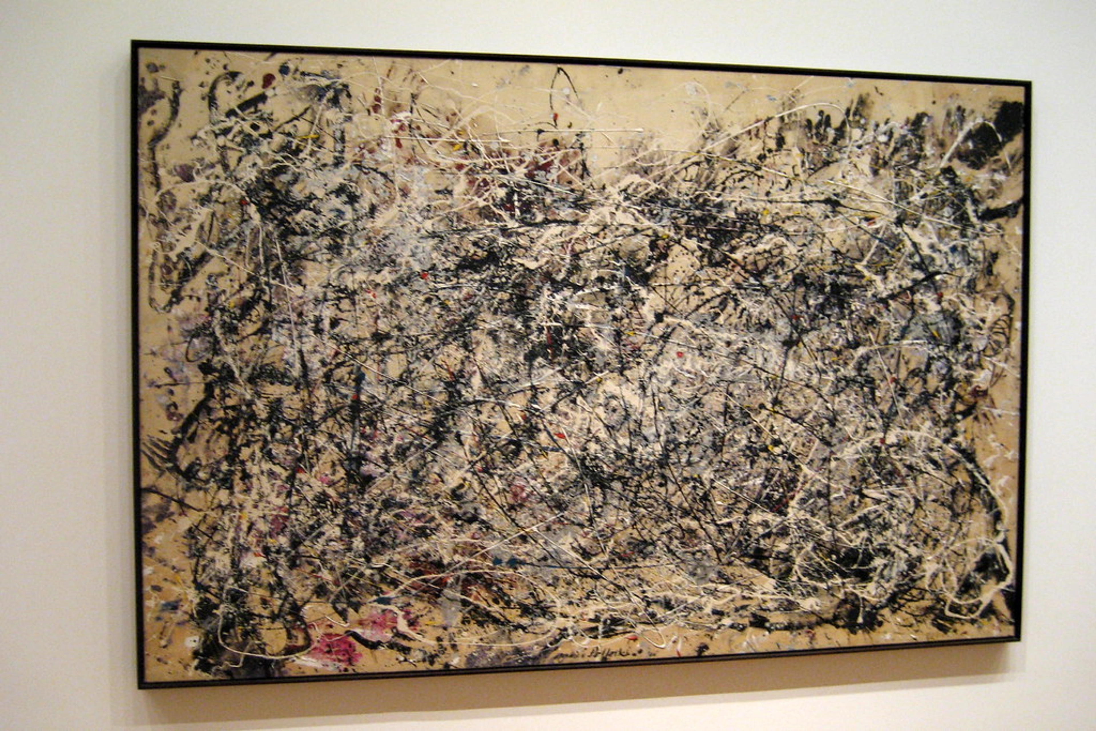
In my latest series, I begin with large, gestural washes of raw umber or payne's grey, establishing a field of quiet energy. Then, I'll take a heavily loaded brush of alizarin crimson, diluted just enough to flow, and make a single, deliberate stroke. It bleeds into the darker underpainting, creating a halo of warm crimson around a core of deep violet. That one stroke of alizarin becomes the emotional anchor of the piece. It's the point of focus, the concentrated feeling that the rest of the canvas serves. It's the evidence of the first decision, the one that every subsequent mark must answer to. It's my quiet collaborator, my secret weapon. You can see how it shapes my abstract compositions here.

Making Smart Choices: How to Select the Right Alizarin Crimson for You
With so many variations on the market, selecting the right tube can feel overwhelming. Here’s my practical guide to navigating the options and finding the perfect fit for your palette and budget.
Artist Grade vs. Student Grade: A Critical Difference
The most important choice you'll make isn't the brand, but the quality tier. Student-grade paints (like Winsor & Newton Winton, or Gamblin 1980) are significantly cheaper because they use less pigment and more filler. This means weaker color strength, less transparency, and a greater chance of muddy mixes. For a demanding pigment like alizarin crimson, this is a disaster. You lose all the subtle magic that makes it special. Artist-grade paints (like those from Daniel Smith, Schmincke, or Old Holland) are more expensive, but they're packed with pure, high-quality pigment. They're an investment in the longevity and vibrancy of your work. My rule of thumb: buy the best you can afford, even if it means starting with just a few key tubes.
Understanding Tube Labels: Pigment Codes and Hues
Learning to read paint labels is like learning a secret language. Look for the Color Index Name (e.g., PR177). This tells you the actual pigment inside. If the tube just says "Alizarin Crimson" without a code, be suspicious. A tube labeled "Alizarin Crimson Hue" contains a different pigment (or mix of pigments) designed to look like alizarin. This isn't necessarily bad—many "Hues" are modern, more lightfast alternatives like Quinacridone Red (PV19). Know what you're buying. If you want the classic color with maximum permanence, look for a "Permanent Alizarin Crimson" made with PR177 or PV19.
Brands I Trust: A Quick Rundown
- Daniel Smith: Known for exceptional watercolors and a massive range of unique pigments. Their "Permanent Alizarin Crimson" (PV19) is a Quinacridone-based powerhouse.
- Winsor & Newton: A classic for a reason. Their "Winsor Red" (PR177) is a brilliant, lightfast "permanent alizarin" in their Artists' Oil and Watercolour ranges.
- Schmincke: A top-tier German brand loved by professionals for its buttery consistency and high pigment load. Their Mussini "Alizarin Crimson" is beautiful, but check if it’s the genuine (PR83) or permanent version.
- Gamblin: An excellent American brand for oils. They focus on making traditional materials safer and more consistent. Their "Alizarin Permanent" (PV19) is a great choice for oil painters.
Step-by-Step Project: Your First Masterpiece—a Luminous Sunset Sky
Reading about a color and painting with it are two entirely different things. One is a distant admiration, the other is an intimate conversation. So let's move from theory to practice, from thinking about crimson to feeling it on your brush. This project is designed to be simple enough for a beginner but holds enough depth to keep even a seasoned painter engaged. It's not about painting a photorealistic sunset; it's about experiencing the behavior of alizarin crimson—its transparency, its power in glazing, and its ability to create luminous, atmospheric depth.
The goal is to create a memory of a color, one that you can call upon in your future work.

Materials You’ll Need:
- Stretched watercolor paper (140lb or heavier) or a pre-primed canvas for acrylics.
- A tube of artist-grade Permanent Alizarin Crimson.
- Ultramarine Blue and Cadmium Yellow (or Hansa Yellow).
- A large round brush and a smaller detail brush.
- Two cups of water (one for rinsing, one for clean water).
- Paper towel or a clean rag.
The Process:
The Process: Painting in Layers of Light
- The Sketch (Lightly): Using a pencil, lightly sketch the horizon line about one-third of the way up from the bottom of your paper or canvas. Add a simple circle for the sun just above it. All lines should be barely visible. The goal is a faint suggestion, not a rigid prison.
- Wet the Sky (for Watercolor): Using your large brush and clean water, thoroughly wet the entire sky area above the horizon line. You want the paper to be damp and shiny, but not pooling with water. This dampness is your partner in creating soft, ethereal blends. (Skip this step if you're using acrylics and prefer a more controlled, layered approach.)
- The First Wash - The Yellow Glow: Mix a very dilute, pale yellow with your Cadmium Yellow and a lot of water. Starting at the sun, paint this yellow wash, letting it fade outwards into the damp sky area. The wet paper will create a soft, diffused glow. This is the source of your light. Let this layer dry completely.
- Building the Crimson: Now, mix a medium-toned wash of your Alizarin Crimson. Not too dark! Paint a band of this crimson starting just outside the yellow glow, and pull it up towards the top of the paper. This is your transition zone. Because the paper is dry, you can create a harder edge at the top, which will suggest the edge of the clouds. The bottom edge will naturally be softer as it nears the yellow glow. Let this dry.
- Deepening the Drama: This is where the magic happens. Mix a darker, more concentrated wash of alizarin crimson. Load your brush and paint a stronger band of color at the very top of the sky. Now, take your Ultramarine Blue and, while the dark crimson is still wet, touch the tip of your brush to it and let the blue bleed down slightly into the crimson. This creates a stunning, deep purple transition from blue to red to yellow. This is the color harmony principle in action.
- The Final Glaze (Optional): For extra richness, once everything is bone dry, you can mix a very thin, transparent glaze of alizarin crimson and gently paint it over the entire sky area (avoiding the sun itself). This will unify the colors and deepen the overall effect without making it look muddy.
And there you have it. You've used the transparency and glazing properties of alizarin crimson to build a luminous, believable sky, something that would be impossible with an opaque paint. You've just experienced its superpower. If you're feeling adventurous, try a second version. This time, invert the colors: start with a wash of alizarin crimson for the sky, and let the cool blues of the horizon bleed up into it. Notice how the feeling of the piece shifts completely—it becomes a sunrise instead of a sunset, a beginning instead of an end. It's the same color, but its relationship with the other hues on the canvas completely changes its meaning.
I could talk about this color for hours. It’s one of those topics that seems simple on the surface but reveals infinite complexity the deeper you go—much like the color itself. But at some point, you have to stop reading and start painting. So consider this not an ending, but an invitation to start your own conversation with this incredible pigment. Keep a tube of it on your palette, not just for what it is, but for the questions it asks of you and the other colors. It will teach you about light, transparency, and the power of a single, deliberate choice.

Q1: Is alizarin crimson the same as carmine or cadmium red?
The Red Trio: Alizarin, Carmine, and Cadmium
A: No, and this is a crucial distinction. They are three entirely different substances, each with its own story and purpose. Carmine is a historical lake pigment made from the crushed bodies of the cochineal insect (Dactylopius coccus). It creates a beautiful, rich crimson but is notoriously fugitive, meaning it fades dramatically over time under light. Many of the vibrant reds in Renaissance paintings that are now a dull pink were once a brilliant carmine.
Cadmium Red is a modern, completely different chemical beast—an inorganic pigment based on cadmium sulfide. Prized for its opacity, incredible tinting strength, and warm, orange-leaning hue, it's a powerhouse. It's what you use when you need a red that refuses to be ignored.
Alizarin crimson is a synthetic organic pigment that leans cool (towards purple) and is highly transparent. Think of them as very different tools in a toolkit: Cadmium is the sledgehammer for power and coverage, while Alizarin is the precision screwdriver for achieving subtlety and depth.
Q2: How do I clean brushes stained by alizarin crimson?
Winning the Battle Against the Stain
A: It’s stubborn, but don’t panic. Your first move is critical: never let it dry. As soon as you've finished painting, wipe off as much wet paint as you can with a rag. For oil painters, the next step is crucial. Swish the brush in a dedicated brush cleaner, walnut oil, or even some linseed oil. The oil acts as a solvent, breaking down the alizarin dye that’s already clinging to the bristles. After swishing, work the bristles against the bottom of the jar to loosen the pigment. Then, gently wash the bristles with a mild, pH-neutral soap (like The Masters Brush Cleaner) under lukewarm water, reshaping the tip as you rinse. For acrylics, warm, soapy water is your best bet, but you must act fast before the acrylic polymer dries and locks the pigment in permanently. Despite your best efforts, a faint pink tint is almost guaranteed. Consider it a badge of honor—a sign of a well-used, dedicated brush.
Q3: Can I use it in watercolor?
Finding its Spiritual Home in Watercolor
A: Absolutely! It isn't just usable in watercolor; many artists believe that is where it finds its truest expression. Its transparency makes it a superstar for glazing—building up luminous, jewel-like layers of color to create skin tones, sunset skies, or the delicate petals of a flower. But its magic goes further. When mixed with plenty of water and applied to rough paper (like a 300lb cold-pressed sheet), alizarin crimson granulates. This means the pigment particles settle into the paper's valleys, creating a beautiful, mottled texture that's impossible to achieve with a brush. Brands like Winsor & Newton, Daniel Smith, and Schmincke all have highly regarded, lightfast versions developed specifically for the demands of watercolorists. Look for a tube labeled "Permanent Alizarin Crimson," which is often made with the much more stable Quinacridone Red (PV19).

Q4: Why does it turn muddy when mixed with white?
The White Problem: A Battle of Personalities
A: This is a classic issue that reveals the personality of your paints. It isn't so much "muddy" as it is "chalky" or "milky." The problem is a conflict of character: Titanium White is an aggressive, opaque, mineral-based pigment. It works by completely blocking light, creating a solid wall of white. Alizarin Crimson is a delicate, transparent, dye-based pigment that works by filtering light. When you mix them, you're asking a bulldozer to dance with a ballerina. The Titanium White physically smothers and scatters the light, destroying the delicate transparency of the alizarin and creating a pink that looks flat and lifeless.
For a cleaner, more luminous pastel pink, Zinc White is the superior choice. It's naturally more transparent and gentler on your delicate colors because it has less hiding power. It doesn't fight the alizarin; it lightens it while still allowing some of that inner glow to shine through. It's a partnership, not a takeover.
Q5: Is there a more eco-friendly version?
The Sustainability Equation: More Than Meets the Eye
A: This is a complex question with no easy answer, forcing us to define what "eco-friendly" truly means. On one hand, modern synthetic alizarin crimson involves a chemical manufacturing process with a carbon footprint. On the other hand, some advocate for returning to traditionally made madder lake, which comes from a renewable plant source and is biodegradable. However, this route has hidden environmental costs. Madder is a resource-intensive crop, requiring vast tracts of agricultural land and significant water. To produce even a small amount of pigment, you need an enormous quantity of roots.
Furthermore, madder lake is notoriously fugitive and will fade over time. This means a painting might need to be restored or, worse, deemed a failure and discarded, creating more waste. The longevity of modern, lightfast Alizarin Crimson—a painting that endures for generations without fading, conserving the materials and emotional energy invested in it—could be seen as the more sustainable choice in the long run. The most eco-friendly practice might be to buy a high-quality, artist-grade tube of a “Permanent Alizarin” (like a Quinacridone-based one), use every last drop, and create a work that lasts.










Final Thoughts
Alizarin crimson isn’t just a tool—it’s a partner. It challenges, comforts, and surprises. Whether you’re a new artist or a seasoned pro, keep a tube handy. When words fail, it speaks. When the world feels too loud, it whispers depth. And who knows? Maybe your next masterpiece starts right here. Dive into the world of color, see how it shapes my own abstract compositions, or even take a piece of it home with you.
Visit my Den Bosch studio to see alizarin crimson in action.