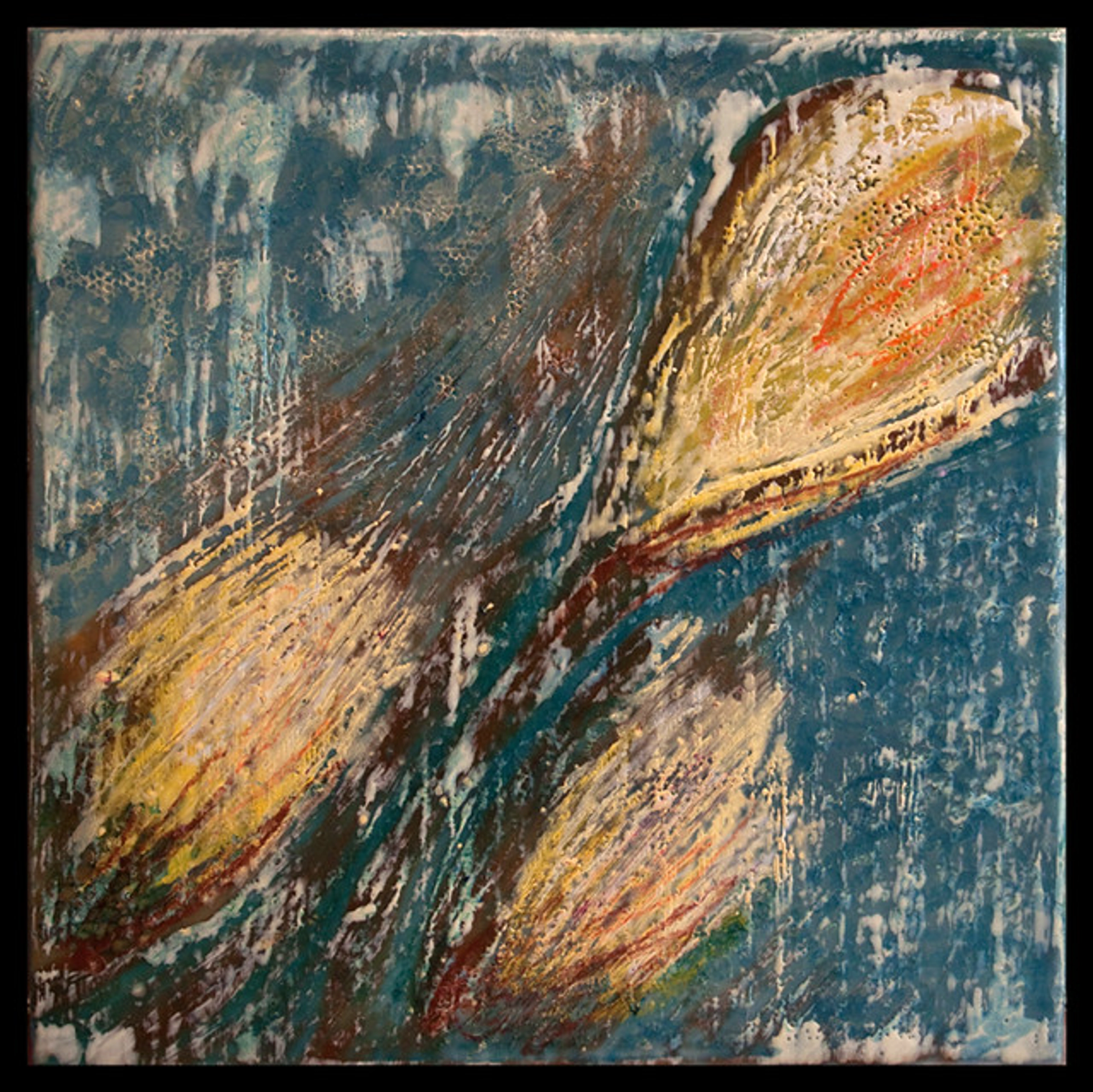
What Is Thioindigo Red-Brown Pigment?
Dive into the world of Thioindigo Red-Brown, a unique vat dye pigment. Understand its complex chemistry, explore its deep, earthy color, and see why it's a prized tool for artists seeking rich, transparent shades.

What Is Thioindigo Red-Brown Pigment? A Deep, Rich Red from the Vat
I have a soft spot for colors with a backstory, a secret identity you have to work a little to uncover. Thioindigo Red-Brown is a perfect example. Frankly, it sounds like something a chemist would whisper in a lab, not the name of a color you'd use to capture the last light of sunset. But maybe that's where its quiet magic lies. And believe me, once you understand its lineage—a 20th-century industrial workhorse born from the same science that dyes your blue jeans—you'll never look at another earthy tone quite the same way again. It's a pigment that rewards curiosity and technical understanding, offering a unique blend of old-world depth and modern, scientific assurance.
You've probably seen shades like this before. It's the deep, reddish-brown of a dried rose petal that's been forgotten in a book for years, holding onto a whisper of its former vibrancy. It's the earthy tone of old mahogany wood, polished by generations, or the rich, muted hue of a brick wall that's spent a century in the sun and rain. It doesn't shout. It hums, and that hum resonates with a depth that feels both ancient and utterly modern. It's a color that exists in the liminal space between red and brown, carrying the intensity of the former and the stability of the latter.
This pigment, a marvel of 20th-century chemistry, is formally known as Pigment Red 41 or Colour Index 73300. Its creation was part of a broader industrial quest for dyes that could stand up to rigorous industrial processes. Imagine the era: factories were churning out everything from car upholstery to workwear, and everything needed to be colorfast. The textile industry, demanding vibrant colors for fabrics resistant to washing and sunlight, drove this innovation. Thioindigo Red-Brown found its initial application in dyeing textiles, leather, and even plastics—the mundane, sturdy objects of the modern world. But its unique properties—deep color saturation, incredible transparency, and almost supernatural resistance to fading—soon caught the discerning eye of artists, leading to its adoption in high-quality paints. Its journey from factory floor to artist's palette is a compelling story of unintended artistic utility. You're literally painting with a byproduct of the industrial revolution's ingenuity. Its invention in the early 20th century, perfected by the 1930s, marked a shift from relying on natural sources to engineering color with precision.
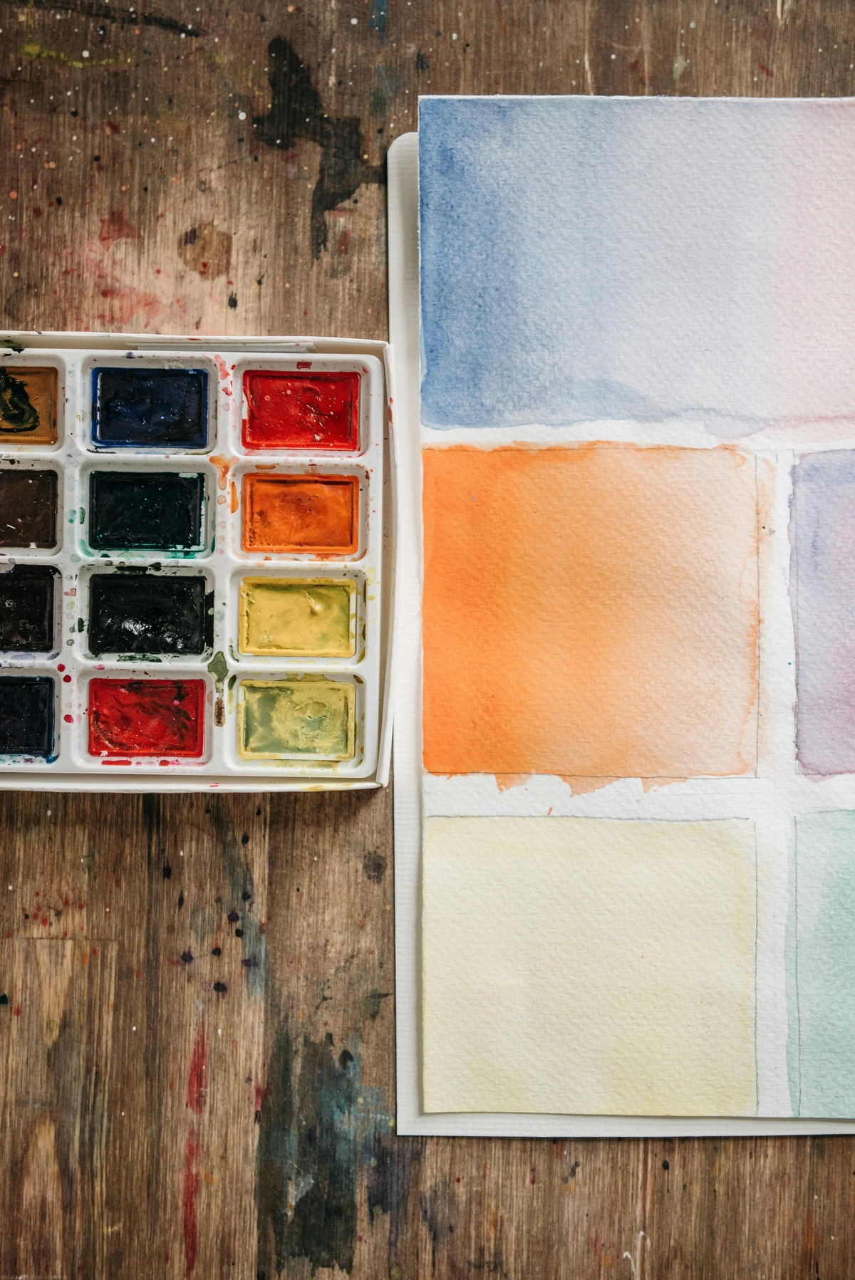
Today, I want to peel back the layers of this fascinating pigment. We'll not only define what thioindigo red-brown is but also dissect its molecular identity, its classification as a vat dye, and its crucial physical properties like lightfastness and transparency. We’ll explore specific techniques for using it, compare it directly to other pigments you might be tempted to use instead, and finally, answer the most common questions artists have. More importantly, we'll see how it fits within the larger ecosystem of your artistic practice, from its unexpected industrial origins to its role in the evolution of 20th-century art. The journey from a laboratory experiment to a tool for capturing subtle light is a story worth telling. Let's dive in.
A Closer Look at the Name: Thioindigo Red-Brown
The name itself is a perfect clue. Let’s break it down.
It's a fusion of three distinct descriptors:
- Thio-: This prefix immediately signals the presence of sulfur (from the Greek theion). In the world of chemistry, introducing a sulfur atom into an organic molecule can dramatically alter its properties, often enhancing stability or shifting its color. In Thioindigo Red-Brown, this sulfur atom acts like a sturdy internal bridge, locking the molecule into a specific, highly stable shape. Without these sulfur "scaffolding" atoms, the molecule would be floppy and unstable—a completely different chemical proposition. This sulfur linkage is the key to its legendary resistance to heat, light, and chemical degradation.
- Indigo: This isn't just about a color; it's about a chemical family. Indigo is a legendary, near-mythical vat dye, prized for millennia for its deep blue hues and exceptional durability. By naming this pigment "Thioindigo," chemists are telling us it shares a core structural architecture—the indigoid structure—with that ancient dye. They are engineering cousins, born from the same conceptual blueprint, but with a sulfur twist that fundamentally alters the final color and performance.
- Red-Brown: This is the final, delightful result of all that engineering. The specific arrangement of atoms, shaped by that sulfur bridge and other carefully chosen attachments (often chlorine atoms), absorbs particular wavelengths of light, reflecting back that unique, sophisticated shade—a deep, reddish-brown that feels both organic and somehow scientifically precise. Replace a hydrogen atom with a chlorine, and you can shift the entire spectrum of absorbed light.
Together, the name is like a miniature technical datasheet: a sulfur-based, indigo-like compound that produces a red-brown color. It tells you where it came from, how it's built, and what it does. To me, that's far more interesting than a simple, generic name like "Burnt Sienna" or "Van Dyke Brown." This name has a legacy.
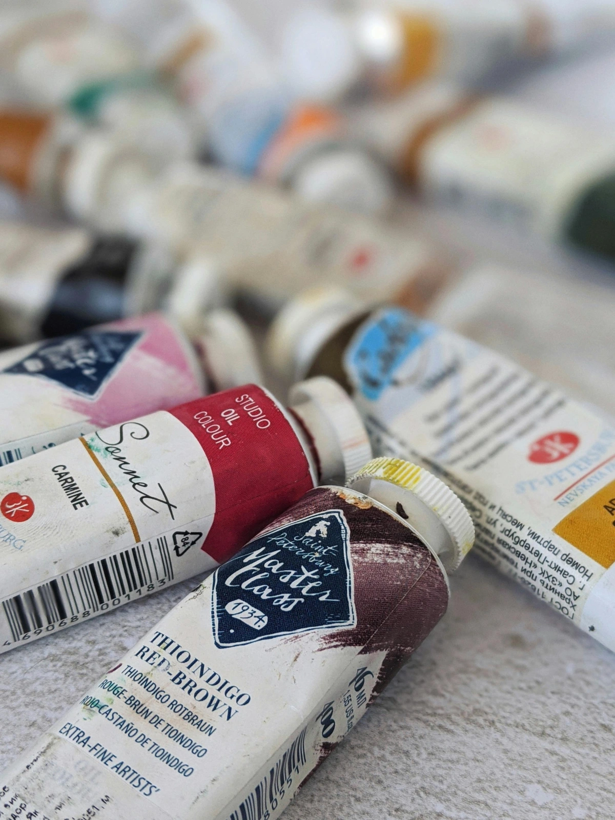
Before we get too technical, think of it like a family tree, a lineage of color. The "indigo" part tells us that this pigment is part of the vat dye family, sharing a similar chemical structure and application process with the ancient and revered color, indigo. It's the difference between a medieval ale and a craft beer brewed with perfect scientific precision—both are beer, but the modern version is engineered for consistency and impact. It’s a synthetic organic pigment, a modern marvel of chemistry that allows us to achieve a color with properties—like its exceptional transparency and lightfastness—that are simply impossible to get from grinding up rocks or plants.
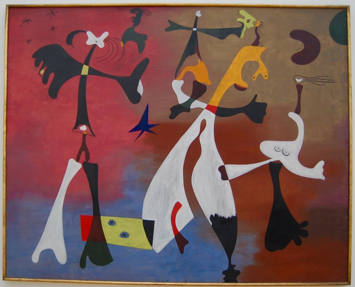
As a visual artist, I can tell you that this classification isn't just academic fluff. When a pigment is a vat dye, it often means you’re dealing with something potent, transparent, and capable of producing incredibly rich, deep tones. It's the difference between a thin wash and a color that feels like it has genuine depth.
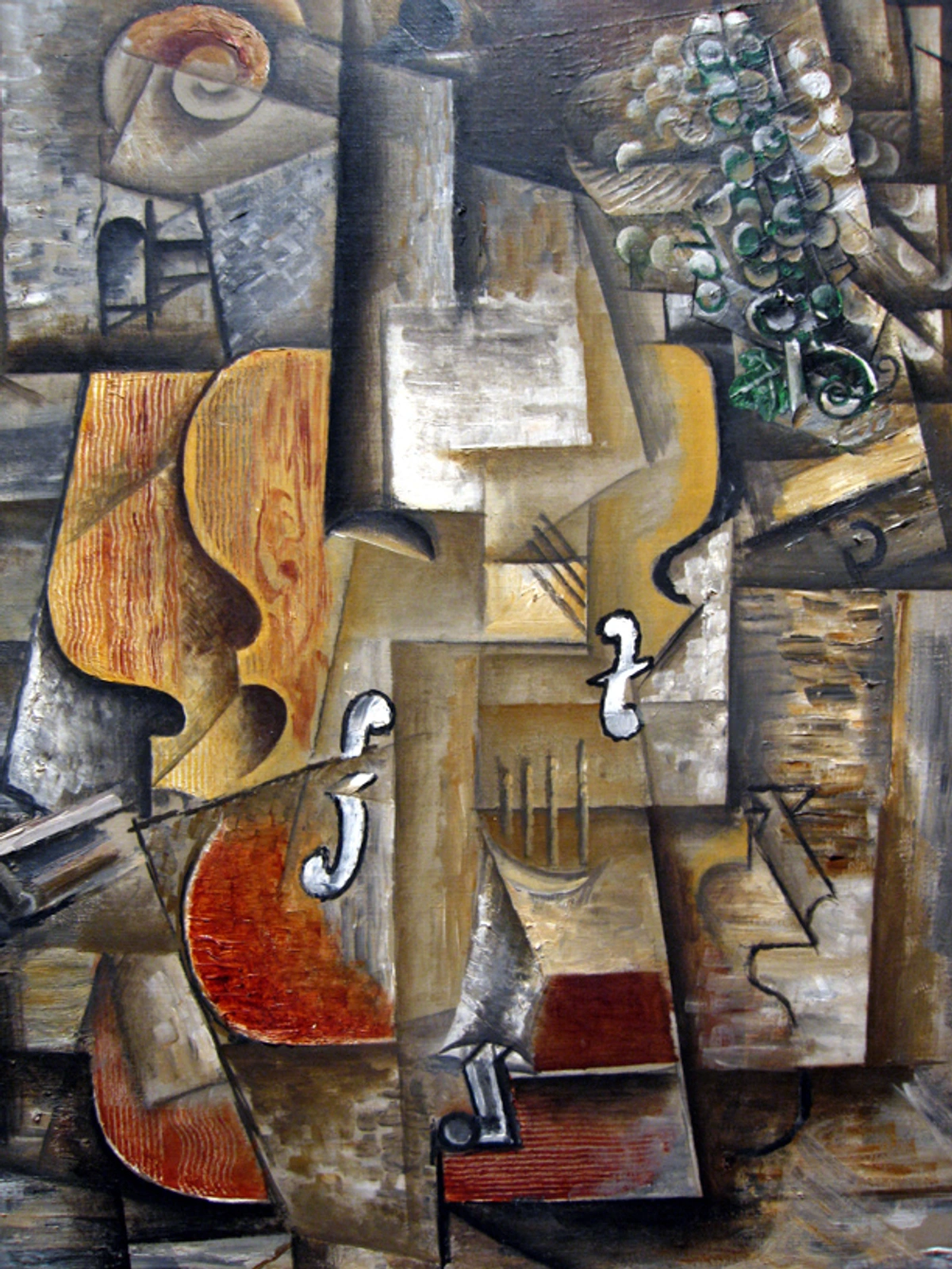
The Chemistry of the Color
Now, if the thought of organic chemistry sends you into a panic, don't worry. I'm not going to throw a textbook at you. But I do think it's fascinating to understand just a tiny bit about what's happening on a molecular level. It helps explain why this pigment behaves the way it does. It’s like knowing how a car engine works—you don’t need to be a mechanic to drive well, but it sure helps you understand why the car feels a certain way when you push the pedal.
The pigment gets its name and its core stability from the thioindigo group, a robust framework of atoms including a sulfur bridge (that's the "thio" part) that locks the molecule into a remarkably stable configuration. This specific architecture is the secret to its most prized qualities as an artist's material.
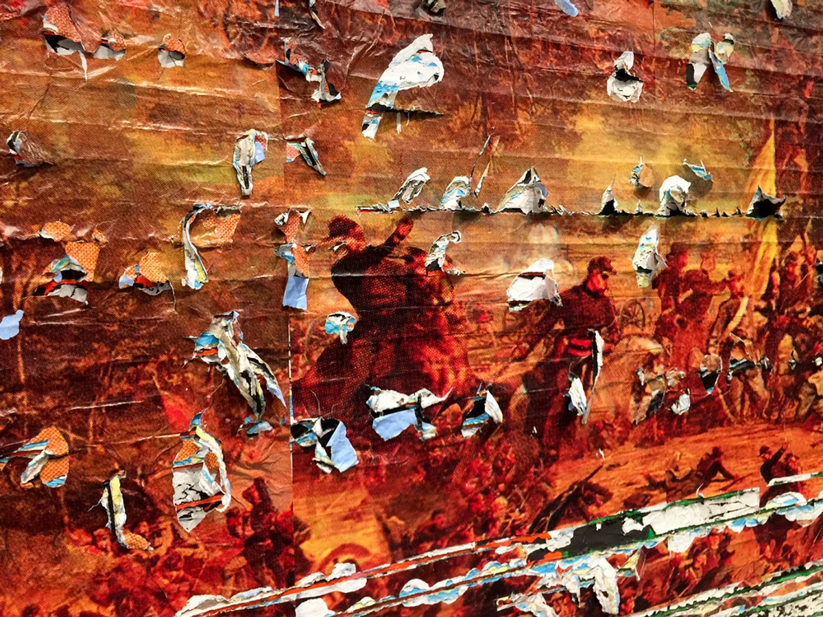
The chemical formula for this specific molecule is often cited as C24H12Cl2O2S2, a complex dance of carbon, hydrogen, chlorine, oxygen, and sulfur atoms. If you're picturing a Lego set, the sulfur bridges act as the critical locking pins holding a flexible but strong scaffold in place. The chlorine atoms and other attached chemical groups are like the final decorative pieces—they're the crucial tweaks that fundamentally shift the molecule's properties, differentiating it from its cousins. It's this precise molecular arrangement that causes it to absorb light in such a way that it reflects a deep, cool red-brown instead of a bright orange or a muted yellow.

1. Lightfastness is a Legacy: This is the big one. Thioindigo Red-Brown has excellent lightfastness. In plain English? It does not fade. This is a non-negotiable for any work you care about. Watching a piece slowly bleach into a ghost of its former self is heartbreaking. A pigment like this is built to outlast us. It’s rated I (Excellent) on the ASTM lightfastness scale, a testament to the inherent molecular stability of the thioindigo structure, particularly that rigid sulfur-bridged core that dissipates UV energy harmlessly. This isn't an accident; it's a core design feature inherited directly from its industrial textile dye ancestry.
2. The Magic of Transparency: The fine particle size and organic crystalline structure of thioindigo pigments mean they don't scatter light; they let it pass through. This creates a color that is intensely transparent. This is the key to building luminous, deep shadows with layer after layer of glazes, instead of just slapping on an opaque dark that can look chalky and dead. When light passes through a transparent glaze, bounces off the white ground, and returns to your eye, the color achieves a depth and vibrancy that an opaque pigment simply cannot match. This property is a direct consequence of its molecular structure and expert milling during paint manufacture.
3. The Stability Factor: That sulfur bridge isn't just for show; it acts like a tough, welded joint in a steel frame, making the molecule surprisingly resistant to heat and chemical reactions. This means it won't react with other pigments on your palette or on the canvas, preventing unwanted color shifts or dulling over time. This durability allows you to layer it over other dry paints without lifting or muddying them, making it a dream for complex glazing techniques where you need to work in discrete, isolated layers. The pigment keeps its cool, refusing to participate in the chemical chaos that can turn a vibrant palette into a muddy mess over the decades.
4. Tinting Strength and Dispersion: This is the 'personality quirk' you need to know. Thioindigo Red-Brown has an exceptionally high tinting strength. A pinhead-sized dab can alter the hue of an entire brush-load of white or another color, a testament to its potency. This is because its fine organic particles have a very high surface area, enabling them to effectively scatter and absorb specific light wavelengths. During manufacturing, it requires expert milling to break down any aggregates and disperse the pigment particles evenly throughout the binder. This is why professional-grade versions are critically important; student-grade 'hues' often use cheaper, less powerful pigments like azo dyes that simply can't match the saturation and permanence of a true thioindigo formulation.
Think of it this way: a transparent pigment lets the light travel through the paint layer, bounce off the white canvas beneath, and travel back to your eye, creating a deep, luminous glow. An opaque pigment just sits on top, blocking the light completely. It’s the difference between looking into a deep pool of water versus looking at a painted wall. That's why, when you're building a glazed shadow, you almost can't overdo it. Every single layer you add multiplies the depth, making the final color feel bottomless.
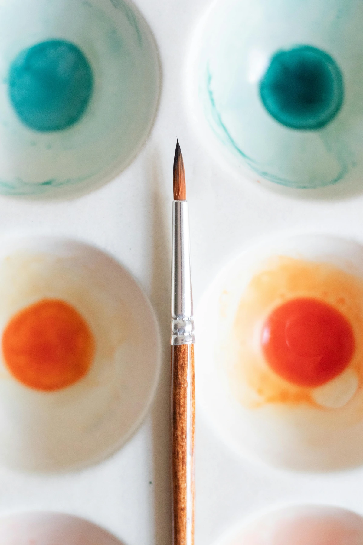
The Industrial Alchemy: From Textile Vats to Artist's Tubes
The term "vat dye" does sound a bit medieval, doesn’t it? And in a way, it is. The process is an ancient alchemy. These incredibly durable dyes are naturally insoluble in water. To get them onto fabric, dyers have to perform a bit of chemical magic, using a "vat" to reduce the dye into a water-soluble form.
The cloth is submerged, and once it's pulled out and meets the air, a final oxidation step locks the color back into an insoluble, permanent form within the fibers. This chemical reduction-oxidation "dance" is the hallmark of vat dyes, and it's what makes them so incredibly resistant to fading and washing. Natural indigo is one, and its synthetic 20th-century cousins like Thioindigo are another. This entire process ensures that the final molecule is engineered, from the ground up, for permanence—a quality artists would kill for.
A Nod to History: The Textile Industry and the Rise of Synthetic Dyes
To truly appreciate what you're holding, you have to go back in time to Germany in the early 20th century. This was the epicenter of a chemical revolution, with titans like BASF and Bayer leading the charge. They weren't just making chemicals; they were fundamentally reshaping the material world. Their objective was ambitious: to synthesize in the lab what had only ever been found in nature, and to do it better, cheaper, and more reliably.
The primary driver for this innovation was the roaring textile industry. Factories were demanding dyes that could survive the new industrial laundries, resist bleaching, and stay vibrant under the punishing sunlight of an urban or rural landscape. They needed a spectrum of colors that were not just beautiful but almost indestructible. The story of Thioindigo Red-Brown, a pivotal invention emerging in the 1930s, is intrinsically linked to that of its famous blue relative: synthetic indigo. Once chemists successfully recreated the natural indigo molecule in the lab, a new frontier opened up. They realized that by systematically playing with the indigo structure—substituting an atom here, adding a molecular "decoration" there—they could create entirely new molecules with entirely new colors. This was a period of intense creativity, not in an art studio, but in a laboratory. Thioindigo Red-Brown was a brilliant result of this "what if" approach—a deliberate, engineered variation on a timeless theme. The discovery was likely the work of unsung chemists experimenting with sulfur-containing compounds, tweaking the core indigoid structure to see what new colors they could conjure, resulting in a class of dyes known as thioindigoids. It was during this era of industrial expansion that the foundation for its creation was laid, even though its artistic potential wasn't immediately apparent.
For us artists, the process is much simpler. The pigment has already been created in this final, stable, insoluble state. The journey from vat to tube involves several precise steps, a combination of chemical alchemy and mechanical refinement:
- Synthesis: The pigment is first created through a complex multi-step organic chemical reaction, often starting from simpler aromatic compounds. This establishes its fundamental color, stability, and molecular structure—it's the birth of the color.
- Isolation & Purification: The raw pigment slurry is then filtered, washed, and purified to remove any leftover solvents, reactants (salts, acids), or by-products from the synthesis. This is the crucial "cleaning up" phase, because a purer pigment means a more vibrant, consistent, and chemically stable final color.
- Conditioning & Drying: The purified pigment "presscake" is often "conditioned" by adding small amounts of agents to modify its surface properties, ensuring the particles have the right physical characteristics for milling. It is then carefully dried to a fine powder. This preps it for its final physical transformation.
- Milling & Formulation: This is the final, and arguably most artistically relevant, step. The dry pigment powder is meticulously ground into a specific binder. For oil paints, that's linseed oil. For watercolors, it's gum arabic. For acrylics, it's an acrylic polymer emulsion. This grinding process must be done with expert care using specialized equipment (e.g., three-roll mills) to break down pigment clumps (aggregates) and achieve an ideally smooth, fine dispersion that maximizes transparency and color strength.
Only after these steps is it ready for your palette, a journey of science culminating in a tool for art.
It joins a family of heavy-hitters born from the same mid-20th-century explosion of chemical innovation. The quinacridones and perylenes, like Thioindigo, are part of this generation of synthetic organic high-performance pigments. They were born of the same overarching quest for durability and brilliance that gave us synthetic indigo and azo dyes, forever changing both the textile industry and the artist’s palette. But while they are in the same league, they play different positions.
Let me paint a picture of this family. Imagine the mid-20th century was the golden age of Hollywood, and the major chemical companies were the powerful film studios. These new organic pigments were their brilliant new starlets, each with a unique personality and specialty. You had your character actors—the earth tones and ochres that had been around for centuries. But these new pigments were the leading ladies, capable of a level of performance—of vibrancy, transparency, and permanence—previously unimaginable. Thioindigo Red-Brown wasn't the flashiest name on the marquee, but it was the one directors knew they could rely on for a deep, complex, and powerful performance, scene after scene.

- Quinacridones offer a spectrum of pinks, reds, and violets with vibrant transparency and stunning permanence. They're masters of pure, high-chroma color.
- Perylenes excel at deep, maroon-like reds and dark, transparent browns, also prized for their exceptional stability.
Thioindigo Red-Brown sits in this esteemed company, offering its own unique character. It's less "violet" than a quinacridone deep red and less "ruby" than a perylene maroon. Its signature is that complex, earthy red-brown—a color of immense sophistication rather than pure chromatic power. When you have a tube of this on your palette, you're painting with a color born from a legacy of industrial innovation and extreme durability. That little tube contains over a century of scientific progress.
The Artist's Advantage: Painting with Layers of Light
I remember trying to paint a storm cloud years ago, layering black over grey over white, and just ending up with a flat, dead patch on the canvas. That's the problem with opaque darks—they stop light, they stop depth, they just sit there like a wall. Let's get practical. What does 'chemically stable, highly transparent, lightfast' actually mean when you've got a brush in your hand? It means you have a repertoire of advanced techniques and color mixing possibilities at your disposal, elevating it from a simple pigment to a core part of a professional toolkit.
It means you have a tool for creating depth that feels almost like cheating. It's a shortcut to complexity. It’s the difference between trying to carve a shape out of fog versus building it with panes of tinted glass. One is vague and soft, the other has clarity and dimension, even in the deepest shadows. You’re building a color space, not just applying a flat hue.
Think of it as the "stained glass" approach to painting shadows. When light hits your painting, it passes through the layers of transparent paint layer, bounces off the white of the canvas, and travels back to the viewer's eye. The color they see is the sum of all those filters. With an opaque pigment, light just bounces off the top surface—it's an impenetrable wall of color. With Thioindigo Red-Brown, every glaze you add deepens the color by filtering more light, creating a profound, incremental darkness that is somehow both deep and light-filled. This is why glazing has been a master technique for centuries, and this pigment is one of its modern champions.
Imagine you’re painting a portrait. Thioindigo Red-Brown, with its deep, transparent nature, is perfect for rendering the warm, rich shadows in hair. It can capture the subtle violet darkness in the cleft of a chin or the deep warmth in the hollow of a cheek. It mixes beautifully with other colors, like Ultramarine Blue, to create deep, complex blacks and near-blacks that are far more interesting than a straight-from-the-tube black. Mixed with a little Burnt Sienna, it can produce stunning, warm, glowing neutrals.
In landscape work, its applications are just as critical. It's an unparalleled choice for shadowed areas on old brick walls, the dark furrows of a plowed field, or the deep, cold shadows cast by trees onto snow. It brings a sense of structure and weight, making landscapes feel anchored and real.
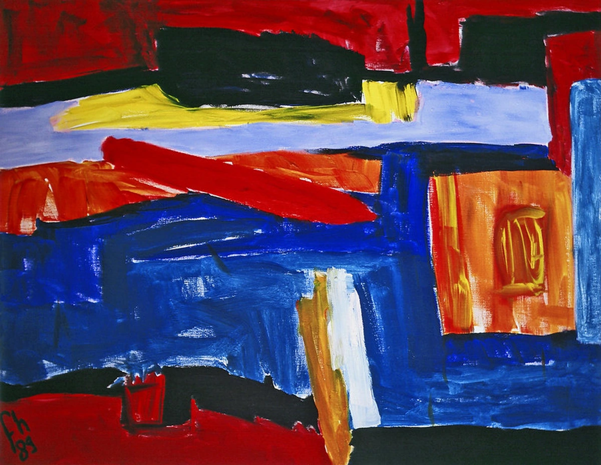
In abstract art, this pigment is even more potent. I often think of my abstract work as building an architecture of color, a kind of invisible scaffolding that gives a piece its presence. Transparent darks are the pillars of that structure. An entire painting can be built using layer upon layer of Thioindigo Red-Brown, resulting in a field of color with genuine depth—a luminous, breathing darkness that draws you in, not a flat, dead one. It allows a two-dimensional surface to hold a kind of contained space, an internal light.
Another practical advantage? Its stability. Because it’s so chemically inert and non-reactive, you can layer it over most other dry paints without the underlying layer lifting, blooming, or muddying. This lets you use it for final 'surgical' glazes to deepen shadows, unify disparate areas, or shift color temperatures hours or even days after your initial layers are down, something more reactive or acidic pigments would never tolerate. It gives you the freedom to make late-stage decisions, to adjust and refine a painting almost like a writer revising a sentence, without risking the integrity of your previous work.
A Practical Playbook: How to Actually Use It
Alright, enough theory. How do you, the artist, actually deploy this color on a canvas? Its high transparency and tinting strength are its greatest assets, but they demand a specific approach.
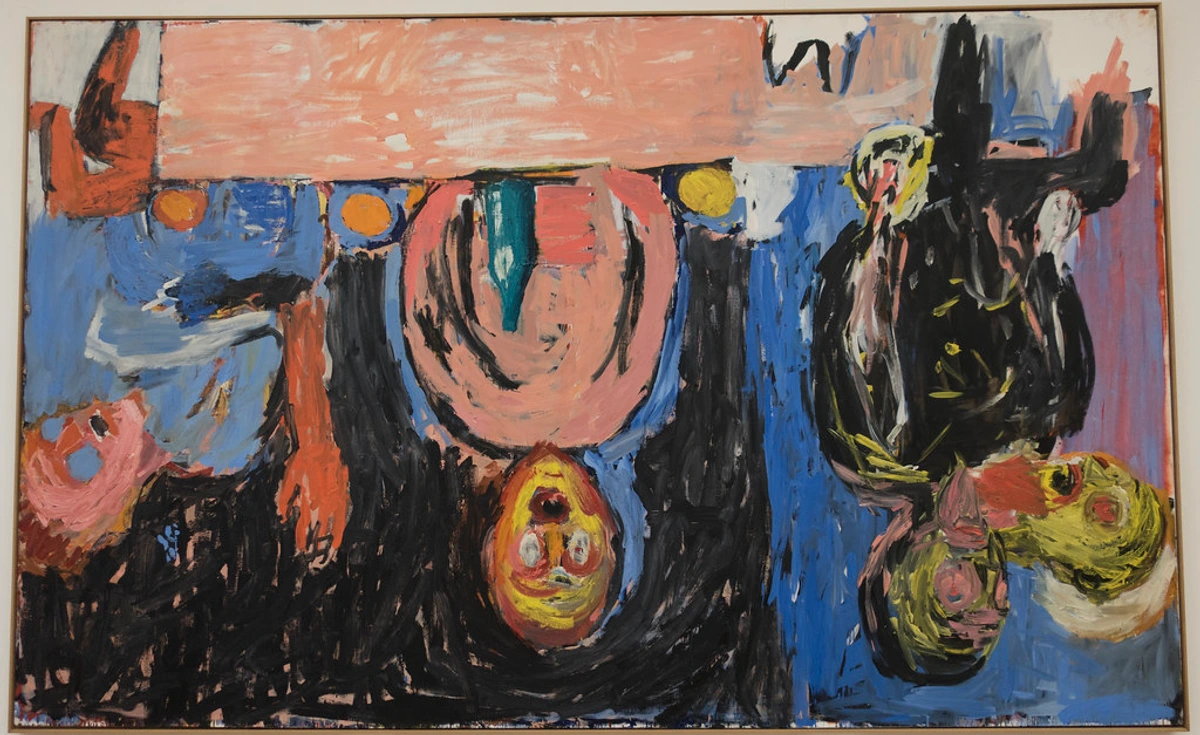
For Portraits:
- Deepening Shadows in Hair: Mix a minute amount of Thioindigo Red-Brown into Burnt Umber or even a dark Sienna to create luminous, warm shadows in brown or auburn hair. A single, thin glaze can add incredible dimension without turning the hair into a flat, opaque mass. It captures the deep, cool tones that occur in the shadows of a subject's hair, especially in natural or cool lighting conditions.
- Complex Flesh Tones: Need to paint the deep, cool shadow on the side of a nose that faces away from the light? A whisper of this pigment mixed with a bit of your base flesh tone can achieve a subtle, realistic darkness far more sophisticated than a simple black or raw umber. It's particularly effective for the shadowed areas around the eyes, mouth, and neck, which often have a slightly purplish or cool brown quality.
For Landscapes:
- Architectural Glazing: That old brick wall? Paint the bricks in their local color first. Then, use thin, graded glazes of Thioindigo Red-Brown to define the mortar lines and suggest the deep, shadowed recesses where the light doesn't reach. The transparency allows the warmth of the brick to glow through the cool, dark shadows on top, creating a powerful sense of three-dimensionality.
- Foreground Shadows: For dark, rich soil, plowed furrows, or shadowed tree bark, lay down an underpainting of a warmer, more opaque brown like Burnt Umber. Then, glaze Thioindigo Red-Brown over the top to create the impression of deep, heavily shadowed earth. This combination anchors the landscape, giving it weight and a dramatic sense of receding space. It’s also brilliant for suggesting the deep shadows cast by rocks or foliage.
For Abstract Work:
- Creating Spatial Depth: In non-representational art, color is the primary tool for creating spatial illusion. Use Thioindigo Red-Brown to create dark, recessive areas that seem to pull the eye 'inward.' By surrounding these deep, tranquil glazed passages with brighter, more aggressive opaque colors, you create a dynamic push-pull effect that can make a canvas feel infinitely deep. It builds a kind of invisible architecture that you feel more than you see.
- Mixing Dynamic Neutrals: Forget pre-mixed blacks. The most vibrant, complex blacks and near-blacks come from mixing complementary colors. Try mixing Thioindigo Red-Brown with a viridian or phthalo green. The result is a near-black with a subtle, magnetic complexity, a deep chromatic dark that's alive. Similarly, mixing it with a dark blue like Ultramarine or Indanthrone Blue creates a profound, stormy dark, perfect for creating moody, atmospheric fields of color that are far more interesting than a simple Payne's Grey.
In my own practice, I see it as a "color amplifier" or a "darkness magnifier." It's not just a brown; it's a tool for controlling how light behaves on a two-dimensional surface.
Handling the Power: Tinting Strength and Mixing
So, it's not all simple chemistry and happy accidents. Before you rush out and buy a tube, there's one personality trait you need to meet head-on: its sheer, unadulterated power. Mastering this is what separates a good painting from a great one when using this pigment. If you're not careful, it will take over your palette, your painting, and your entire studio practice. It's that potent.
Thioindigo Red-Brown has a shockingly high tinting strength. This isn't a trivial point; it's the single most important practical characteristic you need to respect when using it. We're not talking about a gentle suggestion of color here; this pigment is a directive. A dab the size of a pinhead can dominate an entire palette knife of white. If you're not careful, it will bully weaker, less potent colors into submission. This pigment demands respect and rewards a light touch, patience, and incremental additions.
Think of it this way: if most earth pigments are like adding a splash of soy sauce to a soup, Thioindigo Red-Brown is like a drop of pure liquid smoke. Its potency is legendary among experienced painters. I’ve learned this the hard way, completely overpowering a careful mix of subtle greys by adding just a bit too much. So when you start mixing, the golden rule is: use the tip of a palette knife, dipped and barely touched to the mix, not a scoop. You can always add more, but you can’t take it back. It's a pigment that teaches you discipline.
A Practical Guide: Choosing the Right Deep Reds and Browns
Look, choosing a color is like casting a play. You wouldn't cast the same actor for every role. It helps to see how different 'actors' stack up to understand which one is right for your specific scene. It's about matching the pigment’s inherent personality—its texture, transparency, and color bias—to the emotional core of what you're trying to express. Each pigment brings its own history and behavior to the mix, creating a unique performance on the canvas. This isn't just about hue; it's about character, about the story the color tells before you even draw a single line.
To make an informed decision, you need a clear understanding of the field. You wouldn't buy a car without comparing the specs, right? The same principle applies here. I've put together some practical information that goes beyond a simple table, giving you the context you need to choose with confidence. Let's see how Thioindigo Red-Brown stacks up against some of its closest relatives and common alternatives. Understanding these nuances is what allows an artist to select the perfect tool for the job.

Property  | Thioindigo Red-Brown | Alizarin Crimson (Historical) | Burnt Umber | Quinacridone Red (e.g., PV19) | Perylene Maroon (e.g., PR179) |
|---|---|---|---|---|---|
| Origin/Chemistry | Synthetic Organic (Vat Dye) | Synthetic Organic (Lake) | Natural Inorganic (Earth) | Synthetic Organic (Quinacridone) | Synthetic Organic (Perylene) |
| Transparency | High | High | Medium to Low | High to Very High | High |
| Lightfastness (ASTM) | Excellent (I) | Fair to Good (III) | Excellent (I) | Excellent (I) | Excellent (I) |
| Tinting Strength | Very High | High | Medium | Very High | Very High |
| Color Character | Deep, cool red-brown, transparent | Cool, bluish crimson | Warm, earthy, opaque | Vibrant, cool crimson, very transparent | Deep, neutral maroon, very transparent |
| Key Use Case | Glazed shadows, luminous darks, mixing rich blacks | Historical favorite for cool violets (now often replaced) | Underpainting, warm shadows, initial blocking | Brilliant reds, pinks, purples | Deep maroons, complex transparent darks |
(ASTM Lightfastness Ratings: I = Excellent, III = Fair)
The story here is in the trade-offs and distinct personalities.
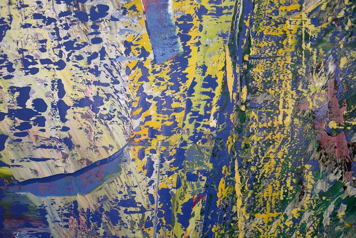
- Thioindigo Red-Brown vs. Alizarin Crimson: Alizarin is a historic favorite for its cool, violet-red color, but it's a pigment with a notorious weakness: potential to fade. For any serious work where permanence matters, Thioindigo is the vastly superior choice, offering a similar (though not identical) cool, transparent character without the anxiety. Alizarin has increasingly been replaced by more lightfast alternatives like Quinacridone Red or Carbazole Violet in modern palettes.
- Thioindigo Red-Brown vs. Burnt Umber: This is a classic comparison of function. Umber is your foundational, granular workhorse: it's relatively opaque, warm, and perfect for toned grounds or blocking in initial shadows. Thioindigo is the sophisticated specialist: it's luminous, cool-toned, and designed for layering and glazing. You build with Umber, and you refine and deepen with Thioindigo.
- Thioindigo Red-Brown vs. Quinacridone Red: The big difference here is color temperature. Quinacridone Red, especially PV19, is a much cooler, bluer, more magenta-leaning red. It's not really a brown at all in its pure state. Thioindigo Red-Brown is inherently a brown, with a distinct earthy warmth and less overt chromatic vibrancy. They are different tools for different jobs.
- Thioindigo Red-Brown vs. Perylene Maroon: These two are the closest competitors in terms of function and lightfastness. Both are modern, transparent, high-performance pigments. The main difference is subtlety and neutrality. Perylene Maroon (often PR179) is a more neutral, cooler, almost blackish maroon. Thioindigo Red-Brown has a characteristic earthy warmth and red-brown character. The choice between them becomes highly personal, a matter of which "flavor" of deep, transparent dark best serves your vision.
Ultimately, the choice often comes down to permanence and transparency. When I want a cool, transparent dark that I know will be around for centuries, it's thioindigo every time. When I need a warm, foundational brown, it's umber. Knowing the difference is a big part of using color with intent. It's the difference between casting the star of the show versus a reliable supporting actor—both essential, but for very different reasons.
Frequently Asked Questions
Let’s wrap up by tackling some common questions that come up. I've spent years answering these, both for myself and for other painters, and getting the right information is crucial for using a pigment with confidence. These are the practical, real-world questions that stop artists in their tracks, the ones that bridge the gap between theory and practice.
Q: Is it the same as Vat Orange?
A: This is a fantastic and very common question. No, they are not the same, but they are extremely close chemical cousins in the thioindigoid family. It's the classic example of how a tiny molecular tweak can completely change the outcome.
Think of the core thioindigo structure as a shared chassis for two different cars. The fundamental design is the same, but the specific parts—the attachments and side groups—are what differentiate them. The difference between Thioindigo Red-Brown and Vat Orange typically comes down to these attachments:
- Thioindigo Red-Brown (PR41): Usually contains chlorine atoms in specific positions on its molecule. These chlorine groups are electron-withdrawing, which helps deepen the color, red-shift the absorbed light, and push it further into the red-brown territory.
- Vat Orange (Pigment Orange 78): Often features different and simpler attachments, like methyl groups (-CH₃), which are electron-donating. This results in the pigment absorbing less energy from light (a shorter wavelength), shifting its perceived color to a brighter, more vibrant orange.
For artists, this distinction is critical. Vat Orange is a glowing, transparent orange, perfect for creating vibrant sunsets or mixing brilliant secondary colors. Thioindigo Red-Brown is a deep, shadowy red-brown, a foundational dark for creating depth and complex neutrals. They are two distinct tools in the same family, each brilliant at its specific job.
Q: How do you pronounce it?
A: Don't worry, it's not as scary as it looks. It's typically pronounced thigh-oh-IN-di-go. Break it down: thigh (like the body part), then oh, then IN, then di, then go. It flows quite nicely once you get the hang of it. Now you can say it with confidence at the art store without resorting to pointing. For bonus points, you can casually mention its Colour Index number, PR41, which is much easier to say! It's a little bit of studio-nerd speak that signals you know your pigments.
Q: Is it safe to use?
A: This is the most important question. As a synthetic organic pigment, Thioindigo Red-Brown (PR41) is generally considered to have low toxicity, especially once it's bound in a paint medium like linseed oil or gum arabic. However, this is not food. Never ingest it, and avoid getting it in your eyes or inhaling its dust. It's crucial to practice good studio hygiene: wet-mop or wipe down surfaces to avoid creating pigment dust, and wash your hands thoroughly after use.
In the United States, the Art & Creative Materials Institute (ACMI) is the main body that certifies art materials. They provide two seals: "AP" (Approved Product, meaning it's non-toxic) and "CL" (Cautionary Labeling). Most professional-grade paints containing PR41 are typically AP certified. However, you may occasionally see a Proposition 65 warning from manufacturers. This is a California law that requires businesses to provide warnings about significant exposures to chemicals that the state has identified as causing cancer, birth defects, or other reproductive harm. The list is broad, and the detection limits can be exceptionally low. The presence of this warning is often a legal formality and does not, by itself, indicate that the product is unsafe for its intended artistic use. The most reliable source of information is always the Safety Data Sheet (SDS) for the specific paint you are using. Treat it with healthy respect, but don't be afraid to use it.
Q: Where can I get Thioindigo Red-Brown?
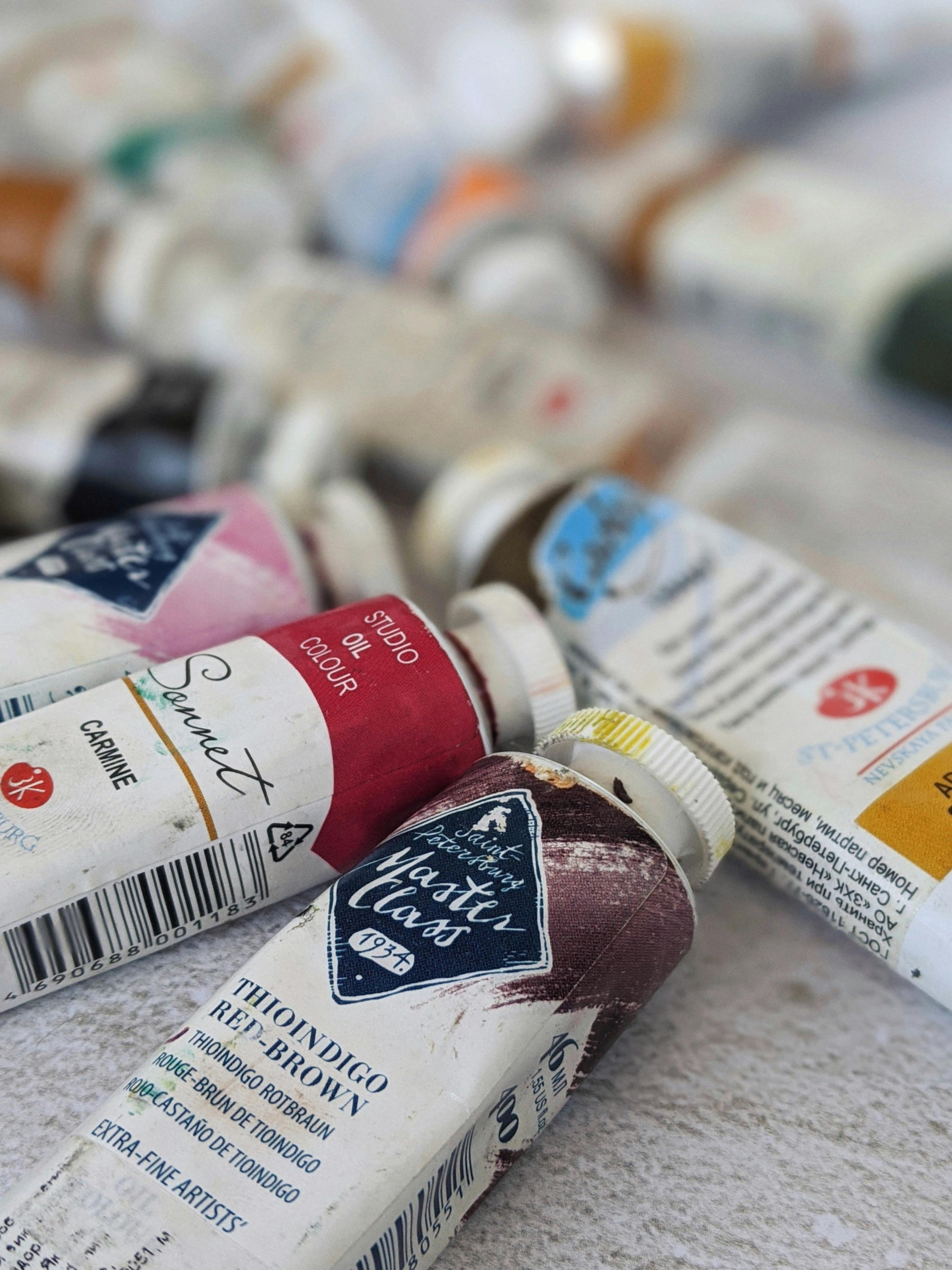
A: You won't find this in a student-grade set; it's a specialist's pigment. It’s a pro-grade color, so look to manufacturers who cater to working artists. The hunt is part of the fun—it’s like finding a secret ingredient that not everyone knows about. When searching, brands known for carrying it in their professional lines include Winsor & Newton (in artists' oil and watercolor), Schmincke, Daniel Smith (known for their watercolors), Old Holland (noted for their extensive pigment library), and M. Graham (especially in their oil paints).
To be absolutely sure you are getting the authentic pigment, always look for its formal identification on the tube or the manufacturer's color chart: Pigment Red 41 (PR41) or Colour Index 73300 (C.I. 73300). This is non-negotiable. Some manufacturers may offer a "hue" or an "imitation" made from cheaper, less-permanent pigments, often a mix of azo reds and blacks. These will not perform the same way. They will lack the permanence, transparency, and depth. It is always, always better to have a small tube of the real thing than a large tube of an imitation.
The Last Word
I find myself drawn to these quiet, complex colors. The ones that don’t shout. Thioindigo Red-Brown isn’t the flashiest pigment you'll own. It won't grab you by the collar like a cadmium red. It's subtle, sophisticated, and asks you to come a little closer. It’s the color of a secret, a color with something to hide and something to reveal—a perfect paradox in a tube of paint.
Ultimately, it's a tool for creating depth that lasts. It's the product of a deep understanding of both chemistry and artistry. Getting to know a pigment like this is like getting to know a new friend. You learn its quirks, its strengths, and its frustrating habits. You figure out what it can do and, just as importantly, where it fails. You learn to appreciate its stubborn permanence, its quiet transparency, its need for a gentle, disciplined hand. In the process, you expand your own creative vocabulary and deepen your connection to the physical act of painting.










So, the next time you're in your studio, hunting for that perfect, deep, earthy tone that resonates with history and scientific brilliance, skip the obvious choices. Pick up a tube of Thioindigo Red-Brown. Embrace its complexity, respect its power, and learn its language. It might just become your new best friend—a quiet, powerful ally in the quest to put something permanent, resonant, and true onto the canvas.