
Choosing Oil Paints: My Definitive Guide to Quality, Brands & Lasting Art
Discover the world of oil paints. This guide breaks down what makes a paint 'good,' from pigment load and binder quality to lightfastness and handling, with personal recommendations for artist-grade and budget-friendly brands.
Choosing Oil Paints: My Definitive Guide to Quality, Brands & Lasting Art
Look, I get it. Walking into an art store, or even just browsing online, for oil paints can feel like trying to pick a favorite star in the night sky. There are so many brands, so many claims, and honestly, a lot of jargon that can make you just want to throw your hands up and go back to pencils. I’ve been there. More than once, I've stood in front of a wall of tubes, feeling that familiar mix of excitement and utter bewilderment. It's almost as challenging as navigating the continuous evolution of my own artistic journey—a process of figuring out what truly works. Discovering the perfect palette, much like refining my artistic path, is no small feat, believe me. Or perhaps, don't believe me, but trust the journey. This guide is all about helping you find your way through that dazzling array, focusing on what truly matters to create art that lasts.
For years, I just grabbed whatever was on sale or whatever I saw another artist using. It took a while—and quite a few lackluster paintings, I'm not afraid to admit (some of which looked suspiciously like a toddler's tantrum in my early abstract expressionist phase)—to realize that what you paint with matters almost as much as how you paint. This isn't just about spending more money; it's about understanding your tools, understanding what makes a good paint truly good, and finding what resonates with you. But through trial and error, and a few less-than-stellar canvases, I began to understand that the magic wasn't just in my brushstrokes, but in the very tubes I was squeezing. So, grab a coffee (or a strong tea, if you prefer), and let's talk about the brands that have, over time, earned a permanent spot on my palette, from the luxurious French masters to the dependable workhorses and smart budget choices. This isn't a definitive, scientific list, mind you. It's a journey through my own studio experiences, the good, the bad, and the beautifully vibrant. In this guide, we'll dive into both the "why"—what makes a paint truly exceptional—and the "what"—my personal recommendations for brands that consistently deliver.
More Than Just Pigment: What Really Makes an Oil Paint 'Good'?
So, what separates a truly magnificent tube of paint from a mediocre one? Before we dive into specific brands, let's unpack what we're even looking for. It’s easy to think "paint is paint," but oh, how wrong that is. It's like saying all wine is just "grape juice." Technically true, but utterly missing the point. For me, a truly great oil paint hits a few crucial notes.

Pigment Load and Purity: The Heart of the Matter
This is, without a doubt, the number one thing. A high-quality oil paint has a high pigment load. What does that mean? Basically, it’s packed with actual color particles, not just fillers or extenders. Think of it like a rich, dark chocolate – you want more cocoa, less sugar. More pigment means more vibrant, intense colors that stand up beautifully, offering excellent tinting strength. It also means you use less paint to achieve the same effect, which, over time, can actually make expensive paints more economical. Purity is also key; you want the right pigment, not a hue that's trying to mimic it with cheaper alternatives. I've learned this the hard way with some student-grade reds that just... faded into oblivion, leaving me with a rather embarrassing pink sky where a fiery sunset should have been. Some pigments, often derived from organic dyes, are inherently fugitive, meaning they will fade rapidly even under minimal light exposure. Classic examples of historically fugitive pigments include Alizarin Crimson (the original version, though modern lightfast versions exist), Opera Rose, and some of the more vibrant organic violets and magentas found in student ranges. These are almost never found in artist-grade paints, and you should steer clear for any work intended to last. You'll also notice that some pigments within the same brand are priced differently—this is often due to series pricing, a common practice across many artist-grade brands, where rarer or more expensive raw pigments fall into higher series (e.g., Series 4 or 5) and thus command a higher price per tube. Generally, Series 1 or 2 pigments are the most affordable, while those like genuine Cadmiums, Cobalts, genuine Lapis Lazuli, or some rare earth pigments will be in the higher series, reflecting their rarity and processing cost. Speaking of quality, the milling process also plays a huge role. Brands like Old Holland, for example, are known for their traditional triple-roller milling, which ensures incredibly fine pigment dispersion and a smooth, consistent paint that truly glows, even if it contributes to the higher price tag. This meticulous grinding is part of what separates the truly great from the merely good.
Binder and Vehicle: Oil's Unsung Heroes
Oil paints are pigments suspended in a drying oil, usually linseed oil, which is a fantastic all-rounder, but sometimes poppy, safflower, or walnut oil, each bringing its own nuances. Poppy oil, for instance, yellows less over time, making it great for whites and pale blues, while walnut oil dries a bit faster and has a lovely buttery consistency. Safflower oil is also known for its minimal yellowing and smooth flow, a good middle ground. This oil, the binder, is critical. It affects drying time, consistency, and the paint's longevity. Good binders are finely processed and don't yellow excessively over time. The magic truly happens as the oil in your paint undergoes a process called polymerization – essentially, it chemically reacts with oxygen to form a durable, flexible paint film. Think of it like a liquid transforming into a solid plastic, but a very beautiful, subtle one. You might also hear about refined vs. unrefined oils. Refined oils (like alkali-refined linseed oil) are processed to remove impurities, reducing yellowing and ensuring consistent drying. Unrefined oils, while more 'natural,' can yellow more and dry less predictably. For archival work, refined oils are generally preferred. The vehicle refers to the liquid component that allows the paint to spread. Some brands incorporate additives like alkyd resins to alter texture and drying rates. While alkyds can speed drying and create a more robust paint film, I tend to prefer paints with minimal additives, allowing me to control the medium myself; this lets me dial in the exact consistency and drying time I need for a specific oil painting technique. This approach gives me a pure ingredient list; I know exactly what I'm working with. It's also worth noting that some pigments naturally have higher oil absorption rates than others, meaning they require more oil to be properly bound. This directly impacts how much binder is needed and, consequently, the paint's final consistency and feel, even within the same brand. High-quality paints typically have an optimal pigment-to-oil ratio, often unique to each pigment, ensuring both stability and vibrancy without unnecessary fillers or excessive oil. Beyond the binder in the tube, artists also use various oils (like linseed, poppy, or stand oil) as mediums to further adjust the paint's flow, gloss, and drying characteristics. And remember, different oils have different natural drying times—linseed is moderate, walnut is faster, and poppy/safflower are slower, which is something to consider when you're mixing, or even just planning your layers.
Handling and Drying Times: The Pace of Your Practice
Beyond consistency, the inherent drying time of different oils, and even specific pigments, dramatically impacts your workflow. Linseed oil, the most common, offers a moderate drying time that's perfect for most techniques. Walnut oil is generally faster, while poppy and safflower oils are notably slower, making them ideal for 'wet-on-wet' techniques or for preserving brilliant whites and pale tones, as they yellow less. Understanding these nuances lets you compose your layers with intent, allowing faster-drying layers beneath slower-drying ones—a crucial principle of 'fat over lean' painting to prevent cracking. This isn't just a technical detail; it's about finding the rhythm that allows your ideas to unfold on the canvas.
Lightfastness: The Test of Time
Imagine pouring your heart into a piece, only for the colors to start fading within a few years. Heartbreaking, right? Lightfastness is a measure of how resistant a pigment is to fading when exposed to light. High-quality paints typically rate their lightfastness using ASTM standards (I, II, III). Think of it like a report card for how well a pigment resists fading from light exposure.
ASTM Rating | Lightfastness | Description |
|---|---|---|
| I | Excellent | No perceptible change after 100+ years. Ideal for all fine art. |
| II | Very Good | Slight change after 50-100 years. Suitable for most fine art. |
| III | Fair | Noticeable change after 20-50 years. Generally not recommended for permanent works. |
Always look for paints rated I or II for works you intend to last. Frankly, I avoid anything rated III or lower for serious work because I don't want my art to become a ghost of its former self in a few decades. I mean, my art is going to outlive me, ideally! (Though I'm still working on my own timeline, so who knows?)
Opacity, Transparency, and Undertone: Beyond the Surface Color
But there's more to pigment than just its quantity and purity. How a color behaves when applied or mixed is equally fascinating. Some pigments are naturally opaque, meaning they cover well and block out what's underneath, like a thick coat of house paint. Think of a bold Cadmium Yellow or a Titanium White. Others are beautifully transparent, allowing light to pass through and creating luminous glazes, perfect for building subtle depth, much like a stained-glass window. Ultramarine Blue or a Burnt Sienna are often great examples. Then there are undertones – the subtle hue that reveals itself when the paint is thinned or spread thinly. A seemingly warm red, like Alizarin Crimson, might have a cool, bluish undertone, which entirely changes how it behaves when mixed; for example, if you mix that red with a yellow, instead of a vibrant orange, you might get a duller, more muted orange that leans towards brown because of that underlying blue. Understanding these characteristics is like knowing the secret personality of each color on your palette. What hidden depths are your colors concealing?
Consistency and Texture: A Painter's Touch
This is where personal preference really comes into play. Do you like a buttery, soft consistency that glides? Or a stiffer, more viscous paint that holds brushstrokes? The consistency, or body, of the paint can vary wildly between brands and even colors within the same brand. Some paints are milled to a super-fine texture, ideal for smooth glazes and delicate blending, while others have a slightly grittier feel, perfect for capturing texture. Neither is inherently "better," but finding what feels right in your hand and on your canvas is crucial. It impacts how you blend, layer, and achieve impasto effects. It's also about the handling – how the paint feels under your brush or palette knife. Does it drag delightfully, or glide effortlessly? Is it sticky, or smooth? These tactile qualities are incredibly personal and form a deep connection between you, your tools, and your canvas. It's a truly tactile experience, and sometimes, you just know when it feels right.
Key Takeaways: What Makes a Truly Great Oil Paint?
Before we move on to specific brands, let's quickly recap what we've learned. When I'm looking for a truly exceptional oil paint, I keep these core principles in mind:
- High Pigment Load: More pure color, less filler, leading to vibrancy and tinting strength.
- Quality Binder: Refined oils (like linseed, poppy, walnut) that ensure stability and minimal yellowing.
- Excellent Lightfastness: ASTM I or II ratings mean your colors won't fade into oblivion.
- Predictable Handling: Consistency and texture that aligns with your preferred style, whether it's smooth blending or expressive impasto.
- Clear Labeling: Transparency about pigments, series, and lightfastness helps you make informed choices.
Beyond the Standard: Specialty Paints for Unique Effects
While many of my go-to brands offer fantastic iridescent, metallic, and fluorescent colors within their main lines, it’s worth a dedicated moment to appreciate these unique paints. They’re usually achieved with finely ground metal particles or synthetic dyes, offering a visual texture, a subtle shimmer, or a bold pop that traditional pigments can't replicate. Now, a word of caution: their lightfastness can vary significantly compared to traditional pigments, as the nature of these optical effects often relies on less stable dyes or particles. So, while I wouldn't typically use them for a foundational layer in an archival piece, they are absolutely brilliant for adding a unique visual texture, a subtle shimmer, or a bold pop in abstract or mixed-media works. I once experimented with an iridescent blue on a piece, using it as a thin, atmospheric veil over a darker background. The way it caught the light, shifting from a deep navy to an almost electric sapphire as you moved around the painting, was pure magic – it added an ephemeral depth that was utterly captivating and completely transformed the mood. Just remember to check those lightfastness ratings and understand that their unique optical properties might mean they interact differently with traditional oil mediums or other paint types, often best applied in thinner, top layers rather than mixed directly into a heavy impasto. Beyond metallics and fluorescents, you might even find phosphorescent (glow-in-the-dark) or thermochromic (color-changing with temperature) paints, though these are more for experimental or conceptual work due to even greater lightfastness concerns. Always check the label for lightfastness ratings, especially with these unique paints! They’re not for every painting, but for those moments when you want to surprise, delight, or simply push the boundaries of what paint can do, they are an exciting addition to the toolkit.
Student vs. Artist Grade: Knowing the Difference
Now that we've unravelled what truly makes a good paint tick, let's shift our focus to the practical reality of paint grades you’ll encounter. It's a common question, and one worth dedicating a moment to. You'll often see paints labeled 'student grade' or 'artist grade,' and while both are oil paints, their differences are more profound than just price. Understanding these distinctions is key to making informed choices for your artwork.
Beyond just lightfastness, the overall permanence of a paint is crucial. Artist-grade paints, with their superior binders and meticulous milling, are far less prone to issues like cracking, brittleness, or delamination over the decades and centuries—a testament to their archival quality. In contrast, lower-grade paints achieve their affordability and consistency not just with less pigment, but often by incorporating a higher proportion of fillers or extenders – inert substances like chalk, barytes, or alumina hydrate. These reduce the cost, bulk up the paint, and can make the consistency more uniform across different colors, which is helpful for student lines. However, they dilute the pigment's intensity, reduce tinting strength, and can sometimes contribute to a less stable paint film over time. For instance, an excess of fillers can lead to a chalkier, less cohesive paint film that may become more brittle or prone to flaking as it ages, and different expansion/contraction rates between excessive fillers and the pigment/binder matrix can contribute to cracking. This is also why I generally advise against mixing artist-grade with student-grade paints on a single canvas for serious, archival works. While a subtle difference in binder might be manageable (say, two linseed-oil-based paints), the vastly different pigment loads, often greater filler content, and varying binder qualities in student paints can lead to inconsistencies in film strength, adhesion, and differential aging of the paint layers, potentially causing cracks or delamination over time—issues you really want to avoid for lasting art.
Feature | Student Grade Oil Paint | Artist Grade Oil Paint |
|---|---|---|
| Pigment Load | Lower; more fillers/extenders | High; rich concentration of pure pigment |
| Pigment Quality | Often uses 'hues' (synthetic alternatives) or less expensive pigments | Primarily uses genuine, pure pigments |
| Binder Quality | May use lower quality or larger quantities of oil/additives | Uses finely processed, high-quality drying oils (linseed, poppy, etc.) |
| Lightfastness | Varies; often lower ratings (II or III) for some colors | Consistently high ratings (I or II) for longevity |
| Tinting Strength | Weaker; more paint needed to achieve color intensity | Strong; little paint needed for intense color and mixing |
| Color Vibrancy | Less vibrant, can appear duller when dry | Rich, luminous, and consistently vibrant |
| Consistency/Handling | More uniform, can feel slightly greasy or stiff | Varies greatly by pigment/brand, often buttery or viscous |
| Price Point | More affordable, accessible for beginners/studies | Higher price point, a long-term investment |
| Ideal Use | Practice, studies, learning color mixing, casual sketching | Professional works, commissions, archival pieces, building a lasting collection |
For any serious work, anything you want to endure, or certainly for pieces intended for exhibition or sale, I unequivocally advocate for artist-grade paints. They’re an investment in the longevity and integrity of your artistic legacy, connecting you to a tradition of craftsmanship that has unfolded over centuries.
A Glimpse into History: The Enduring Legacy of Craftsmanship
This dedication to craft and quality isn't new; it echoes a rich history that has shaped the very paints we use today. While the 15th-century Netherlandish masters like Jan van Eyck truly refined oil painting, its roots stretch back even further, long before its European heyday. Evidence suggests ancient artists in Asia, and later Romans, used various oil-based paints for decorative and protective purposes. However, it was van Eyck and his contemporaries who, with their meticulous techniques of grinding pigments with drying oils, truly transformed oil painting into the versatile and luminous medium we know and love. This tradition of excellence, particularly amongst Dutch masters, laid the groundwork for the brands we still cherish today. When I consider this rich artistic heritage, I can't help but feel a deep connection to my own museum in 's-Hertogenbosch, nestled in the heart of this enduring legacy. It’s a powerful reminder that every tube of high-quality paint you hold connects you directly to centuries of artistic innovation and craftsmanship – a legacy Old Holland, for instance, still passionately upholds today.
Furthermore, the evolution didn't stop there. Over time, artists and manufacturers, including early chemists who helped standardize pigment production and oil refining, continued to innovate, leading to the development of various painting mediums beyond just pure oils—from traditional varnishes and resins to modern alkyd mediums, which can accelerate drying times and enhance paint film strength, to contemporary solvent-free approaches that prioritize artist safety and environmental impact. This continuous refinement of materials means that even today, we have choices, allowing us to control the very essence of our paint and technique, much as the masters did, only with an expanded toolkit.
My Go-To Brands: A Personal Deep Dive
Alright, enough with the theory. Let's get down to the juicy bits – the brands that have won my affection and continue to impress.
Sennelier: The French Elegance
Ready for a touch of Parisian elegance on your palette?
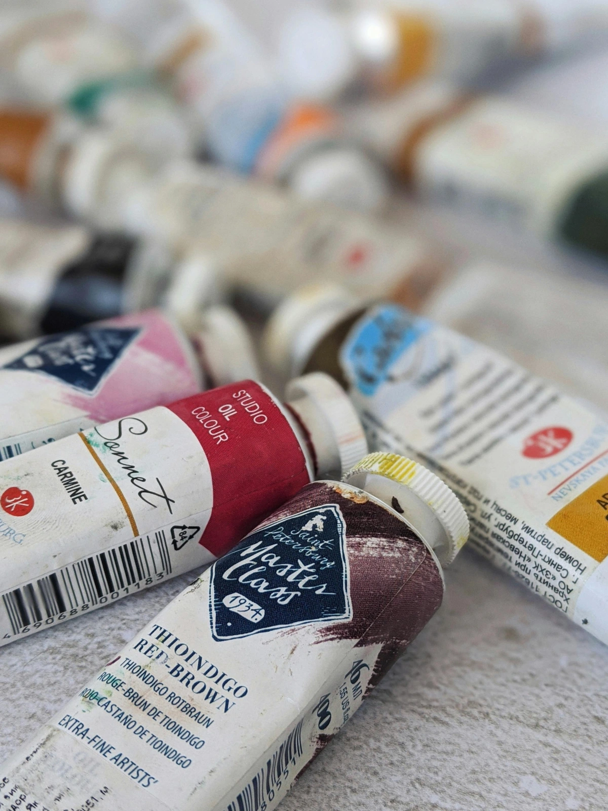
Sennelier. Just saying the name makes me feel a little more sophisticated. These French masters have been around since 1887, and quite frankly, their dedication to craftsmanship is palpable in every tube. Their paints are incredibly rich, with a creamy, buttery consistency that just melts off the brush. The pigment load is exceptional, leading to incredibly vibrant and saturated colors. Their range includes some unique pigments too; for instance, their Sennelier Red is a standout for its luminosity and mixing potential, often benefiting from their unique inclusion of honey as a stabilizing agent, which maintains moisture and fluidity. Yes, they can be on the pricier side, but believe me, a little goes a very long way. If you're looking for that luxurious feel and intense color, especially for a key focal point or a vibrant abstract piece (like some of the art you might explore for sale on this site, if I do say so myself!), Sennelier is a dream. Their Iridescent and Metallic colors are also fantastic for adding a subtle shimmer. If you're chasing that feeling of pure, unadulterated color, reach for Sennelier – your palette will thank you.
Winsor & Newton Professional: The Reliable Workhorse
Looking for a steadfast partner in paint, a reliable workhorse you can always count on?

You can't talk about oil paints without mentioning Winsor & Newton. Their "Professional" line (and yes, professional is key here, don't confuse it with their "Winton" student grade, which is also good but a different beast entirely) is a staple for a reason. They offer an extensive palette, consistent quality, and excellent lightfastness across the board. The consistency is generally smooth and slightly firm, making it versatile for various oil painting techniques, from glazing to impasto. I remember once, in the middle of a complex landscape, I needed a very specific, muted green. I reached for their Permanent Sap Green, and without a moment's hesitation, it delivered the exact hue and handling I needed. It was a small moment, but those are the times you truly appreciate a paint that just works. It's like that trusty friend who's always there, always performs. Not the flashiest, perhaps, but utterly dependable. For consistent quality and an expansive, reliable palette, Winsor & Newton Professional is your steadfast companion.
Gamblin Artist's Oil Colors: The Modern Classic
Curious about a brand that blends tradition with a thoughtful, modern approach?

Gamblin is a brand that truly impresses me with its commitment to quality, artist safety, and thoughtful innovation. Based in the USA, they're known for their incredibly pure pigments and an excellent consistency that feels just right – not too stiff, not too runny. I particularly love their whites, especially their Radiant White for its bright, clean appearance and its unique blend of titanium and zinc for a brilliant, yet slightly transparent, mixing white. They also offer a fantastic range of mediums that work seamlessly with their paints. For me, knowing that a brand is actively working to reduce toxicity and improve studio air quality with things like lead-free alternatives and low-odor solvents makes a huge difference. It allows me to focus on the art itself, not worry about my health, and that peace of mind is invaluable. Their colors are intense, clean, and beautifully blendable. A true artist's choice, in my opinion. Embrace modern innovation and safety without sacrificing vibrant purity; Gamblin delivers on all fronts.
Old Holland: The Heritage Pick
What if you could literally paint with centuries of tradition, with colors so rich they practically hum?
If you're looking for history in a tube, Old Holland is it. Established in 1664, these Dutch masters make paints with an astronomical pigment load. They are known for their incredibly rich, dense colors and a somewhat stiff, buttery consistency that holds brushstrokes beautifully. Their traditional triple-roller milling process ensures an exquisite texture and unparalleled pigment dispersion, which is part of what justifies their price. You'll often find that a single tube of Old Holland paint can last you an incredibly long time because you need so little to achieve powerful color. The downside? They are expensive. Seriously, eye-wateringly expensive for some colors. My bank account occasionally weeps when I reach for a tube, but then my artistic soul absolutely pours onto the canvas. I remember buying a tube of their Caput Mortuum once, almost feeling guilty about the price, but the depth and richness it gave to a particular abstract piece was just... unmatched. These are the paints I reserve for when I'm feeling particularly extravagant, for a critical focal point, or when a very good sales month allows me to indulge. It’s for those moments when only the most profound visual impact will suffice, making them a true, albeit pricey, investment in your art. But if you want the absolute best tinting strength and historical quality, and you're treating your art like a long-term investment, Old Holland is peerless. I tend to save these for key, high-impact colors. When only the deepest history and unparalleled pigment concentration will do, Old Holland is a profound, if pricey, investment.
For the Budget-Conscious but Quality-Minded: Finding Your Value
But let's be real, not every painting session calls for the crème de la crème, and sometimes, your wallet just isn't ready for a full French immersion. And that's perfectly fine! I started out on a shoestring budget myself, carefully selecting each tube. Being budget-conscious doesn't mean compromising entirely on quality. It's about finding the best value – that sweet spot where price meets performance.
Gamblin 1980 Oil Colors and Winsor & Newton Winton Oil Colours are my top recommendations here. They offer good pigment loads, decent lightfastness, and a workable consistency at a more accessible price point. While they sometimes use hues – modern synthetic alternatives designed to mimic the color of more expensive or toxic pigments (e.g., 'Cadmium Red Hue' instead of genuine Cadmium Red, or 'Cobalt Blue Hue' instead of genuine Cobalt Blue) – it's crucial to understand that a 'hue' is a substitute, not the genuine pigment itself. Modern technology has come a long way, and many are quite good. Hues are often developed to be safer, more stable, or simply more affordable alternatives to genuine pigments. The trade-offs, however, typically include less tinting strength, slightly less depth, and sometimes a different 'feel' or handling quality compared to their pure pigment counterparts. For example, a Cadmium Red Hue might appear slightly less luminous or have a different, less complex undertone than genuine Cadmium Red. They're perfect for practice, studies, or when you need larger quantities of certain colors. It's worth noting that even in these budget lines, some specific colors, particularly earth tones like Burnt Umber or Yellow Ochre, might still use genuine, naturally abundant pigments, offering excellent value. A quick tip for discerning quality, even in budget paints, is to always scrutinize the tube's label. Look for transparency in naming (e.g., "PB29" for Ultramarine Blue, or "Cadmium Yellow Hue"), the series number, and clear lightfastness ratings (ASTM I, II, or III). This detailed labeling indicates a brand's commitment to informing the artist, even with their more economical lines. Think of them as your reliable everyday car, while the others are your weekend sports car. Both get you where you need to go, just with different experiences.
Mixing and Matching: A Practical Approach
One of the beautiful things about oil paints is that you're not locked into one brand. Seriously, don't feel like you have to commit to a lifetime of just Sennelier or just Gamblin; it's a creative freedom that many artists, including myself, revel in.
Don't Be Afraid to Blend Brands
I mix brands all the time. It allows me to cherry-pick the best characteristics from each. Maybe I love Sennelier's Cadmium Red but prefer Gamblin's Ultramarine Blue. Go for it! As long as both are artist-grade and use similar binders (which most do, usually linseed oil), you're generally fine. Just be aware that drying times might vary slightly if you're mixing, say, a poppy-oil-based paint with a linseed-oil-based one, or if their consistencies are vastly different. These subtle changes can be managed, or even embraced! It's also worth understanding that even within artist-grade paints, mixing different oil types (like a fast-drying walnut oil paint with a slow-drying poppy oil paint) can subtly affect your drying schedules and film flexibility, so keep an eye on those labels.
However, as I mentioned earlier in the "Student vs. Artist Grade" section, I strongly advise against mixing artist-grade with student-grade paints on a single canvas for serious, archival works. The vastly different pigment loads, potential for greater filler content, and varying binder qualities in student paints can lead to inconsistencies in film strength, adhesion, and differential aging of the paint layers—issues you really want to avoid for lasting art. Think of it like trying to build a durable structure with mismatched materials; some will inevitably degrade faster or behave differently, compromising the whole. While a subtle difference in binder might be manageable between two artist-grade paints (like both being linseed-based, but from different manufacturers), the fundamental differences in ingredients between artist and student grades pose a real risk to your artwork's longevity. Experimentation, after all, is your friend here, but with an eye towards permanence. What unique combinations will you discover?

Building Your Core Palette
My advice? Start with a core palette of high-quality primary colors, a good white, and a few earth tones from an artist-grade brand you like. Then, as you discover specific colors you use frequently or want a particular quality from, you can upgrade or add individual tubes from other premium brands. Perhaps a vibrant Cadmium Red from Sennelier, and a dependable Ultramarine Blue from Gamblin. It's a journey, not a sprint. You'll find your rhythm, your favorites, and your own unique color language over time. What colors will form the backbone of your artistic expression?
FAQ: Your Paint Questions Answered
Q: What's the difference between student and artist grade oil paint?
A: Generally, artist-grade paints have a higher pigment load, use purer pigments, and have better lightfastness and overall permanence. Student-grade paints often use less expensive pigments (sometimes hues instead of pure pigments) and more fillers, resulting in less vibrant colors, lower tinting strength, and potentially less archival stability. They're great for practice, but for serious work, artist-grade is the way to go. (For a more detailed comparison, check out the dedicated section above!)
Q: What are 'hues' and why are they used?
A: "Hues" are modern synthetic pigments or mixtures of pigments designed to closely mimic the color of more expensive, toxic, or fugitive (non-lightfast) genuine pigments. They are used to make paints more affordable, safer (e.g., Cadmium Hue instead of genuine Cadmium, which contains heavy metals), and sometimes more lightfast than their traditional counterparts. While modern hues can be excellent, they often have less tinting strength and depth compared to genuine pigments.
Q: How can I tell if a pigment is genuine or a hue?
A: The best way is to check the paint tube's label. Genuine pigments are usually listed by their traditional name (e.g., "Cadmium Red") and often include a Color Index Name (e.g., "PR108"). Hues will almost always have the word "Hue" in their name (e.g., "Cadmium Red Hue") and will list the specific synthetic pigments used (e.g., "PR254, PO73"). Transparency in labeling is a good indicator of a reputable brand.
Q: How do I know if an oil paint is archival?
A: A truly archival oil paint will have excellent lightfastness (ASTM I or II), a high pigment load of pure, non-fugitive pigments, and be bound with a high-quality, refined drying oil. The overall film stability and resistance to cracking over time are also key. Always check the tube for lightfastness ratings and ingredient transparency. If a brand explicitly states 'artist grade' and provides detailed pigment information, you're generally on the right track for archival quality.
Q: What are the most important colors to have in a starter artist-grade palette?
A: For a versatile starter palette, I'd recommend a warm and cool of each primary, plus a good white, and a few earth tones. So, think Cadmium Yellow Light (cool) and Cadmium Yellow Medium (warm), Ultramarine Blue (warm) and Phthalo Blue (cool), and Cadmium Red Light (warm) and Alizarin Crimson (cool). Add a large tube of Titanium White, Burnt Umber, and Yellow Ochre. This gives you a fantastic range for mixing almost any color you'll need!
Q: How do I clean my brushes after using oil paints?
A: My go-to method: first, wipe off as much excess paint as possible with a rag or paper towel. Then, use an odorless mineral spirit or a brush cleaner to rinse out the remaining paint. Finally, wash with soap and water (like dish soap or a specialized brush soap, such as The Masters Brush Cleaner and Preserver, or even a natural, eco-friendly option) to get them truly clean. For a deeper dive, check out this guide on cleaning and caring for your paint brushes. Reshape the bristles and let them dry flat or brush-side-up.
Q: Can I mix different brands of oil paint?
A: Absolutely, yes! As long as they are both artist-grade, oil-based paints, you can mix them. Just be mindful that differences in oil binders (linseed vs. poppy, etc.) might subtly affect drying times or consistency, but generally, it's not an issue. Think of it as inviting different personalities to the same party – they can get along beautifully, you just need to understand their quirks! However, I strongly advise against mixing artist-grade with student-grade paints for serious, archival works due to significant differences in pigment load, binder quality, and fillers that can compromise your artwork's longevity. Experimentation is highly encouraged within appropriate boundaries!
Q: How do I store my oil paints?
A: To keep your oil paints fresh and prevent them from drying out in the tube, store them upright with the caps tightly sealed. Avoid extreme temperature fluctuations. For paints on your palette, you can often cover the palette tightly with plastic wrap or place it in an airtight container in the freezer (yes, the freezer!) to slow down drying for a few days. If you notice some oil separation in your tubes, especially in higher-pigment-load artist paints, don't fret! Often, a vigorous kneading of the tube can re-emulsify the oil and pigment, making the paint perfectly usable again.
Q: Do oil paints go bad, and how can I tell?
A: Oil paints generally have a very long shelf life, often many years if stored correctly. They don't really 'spoil' in the way food does, but they can dry out in the tube if air gets in, or the oil might separate. If it's hard to squeeze out, lumpy, or if there's excessive oil separation that doesn't mix back in easily, it might be past its prime. However, often a vigorous kneading of the tube can re-emulsify separated oil. As long as it's workable and the pigment hasn't lost its integrity, it's likely still good.
Q: What about the environmental impact or sustainability of oil paints?
A: This is a growing concern for many artists, including myself. Some traditional pigments can be toxic, and their production might involve heavy metals. Many brands, like Gamblin, are actively researching and developing safer, non-toxic alternatives and more sustainable manufacturing processes. Look for brands that are transparent about their ingredients and ethical sourcing, and consider using eco-friendly solvents and brush cleaners. For instance, brands that openly list their pigment sources (especially earth tones, which are often naturally abundant and less processed) and avoid heavy metals where alternatives exist are a great choice. It's about making conscious choices where you can.
Q: What role does the painting surface play in oil painting?
A: The surface, or support, you choose is incredibly important! Whether it's canvas, linen, wood panel, or paper, it affects how the paint adheres, how it's absorbed, and the final texture of your work. Oil paints require a properly primed surface (like gessoed canvas) to prevent the oil from soaking into the fibers, which can cause the paint film to crack over time and the canvas to rot. A smooth panel will give you very different results than a heavily textured canvas. The choice of support should align with your technique and desired outcome; for example, thin glazes show beautifully on a smooth, white surface, while impasto thrives on a sturdy, textured one, sometimes referred to as having more 'tooth' – a slight roughness that helps the paint adhere and build structure. It's another layer of decision, but one that profoundly impacts your finished piece.
Q: What are common solvents used in oil painting and why?
A: Solvents like odorless mineral spirits (OMS) or traditional turpentine are often used in oil painting for thinning paints, creating washes, and cleaning brushes. They evaporate quickly, reducing the paint's viscosity and helping it spread more easily. However, many artists, myself included, are moving towards solvent-free painting by using specific mediums (like alkyd-based ones or walnut oil) for thinning and brush soaps for cleaning. This is largely due to health concerns over inhaling solvent fumes and a desire for a more environmentally friendly studio practice. If you do use solvents, ensure your studio is well-ventilated!
Q: Can I use oil paints over acrylic paints?
A: Yes, you absolutely can! The general rule of thumb is "fat over lean," and that also applies to layering different types of paint. You can paint oil over acrylic, but never acrylic over oil. Acrylics dry to a flexible, non-porous film, which provides a stable foundation for oil paints. Just make sure the acrylic layer is completely dry before applying oils. This versatility opens up exciting possibilities for mixed-media techniques and creating unique textures.
Final Strokes: Trusting Your Instinct
Ultimately, the "best" oil paint brand is the one that works best for you. It's a deeply personal choice, intertwined with your technique, your subject matter, and even your budget. Don't let anyone tell you there's only one right answer. Experiment, play, and trust your instincts. Feel the paint on your brush, see how it blends, how it sits on the canvas. That's the real test.
The journey of an artist is one of continuous learning and discovery. Finding the right tools is just one exciting part of that. As I continue to explore new pigments and refine my own approach, often pushing the boundaries of what's possible with color and texture in my abstract works, I encourage you to embark on your own vibrant exploration. Now go forth, create something beautiful, and maybe, just maybe, use some of these brands to make it truly sing. Your canvas awaits!


