The Hidden Geometry: How Degree Angles Secretly Rule Your Art
A deep dive into the surprising physics and psychology of how degree angles shape artistic composition.

The Hidden Geometry: How Degree Angles Secretly Rule Your Art
A deep dive into the invisible language of lines and how their tilt shapes every emotional response you have to an image.
Ever stared at a piece of abstract art and felt an inexplicable sense of tension or flow, but couldn't quite put your finger on why? I know I have. You might think it's all about the colors (and it partly is), but there's a silent, more structural puppet master pulling the strings: the degree angles.
Before you click away thinking this is about tedious geometry class, let me confess something. I used to be the person who rolled their eyes at the idea of 'mathematical rules' in art. Art is about freedom, feeling, and expression, right? Absolutely. But I've come to realize that understanding these hidden structures isn't about putting up a cage; it's about learning why certain keys unlock specific emotions. Think of it less like a rulebook and more like the physics of a wave—you can surf it beautifully without knowing fluid dynamics, but knowing them can teach you how to carve a more powerful line. This guide is the equivalent of a surf instructor pointing out how the shape of the wave affects your ride. We're not here to kill the joy with jargon, but to amplify it with a little bit of behind-the-scenes knowledge.
This article started as a simple exploration of how a line's tilt can change a painting's mood, but it's since evolved into a comprehensive guide to visual emotion itself. We'll dissect the silent, primal language of angles, from the gentle roll of a 20° slope to the frantic urgency of a 70° diagonal. You'll learn how masters of every era, from the Renaissance to the Digital Age, have wielded this invisible geometry. We'll connect this to the mind-bending perspectives of anamorphic art, the deliberate choices of photorealism, and the clean lines of Minimalism. More importantly, you'll walk away with a practical toolkit to diagnose why a piece feels 'off' and how to infuse your own work with intention. We’ll touch upon the technical nuances of linear perspective and how pioneers like Kazimir Malevich found profound meaning in basic geometric forms. Finally, we’ll offer hands-on exercises to train your eyes, helping you finally see the world not as a collection of things, but as a dynamic web of lines and forces waiting to be captured.

So, let’s get into it. How can a simple line, tilted at 45 degrees versus 30, change the entire soul of your painting?
What a Degree Angle Actually Is (And Why You Should Care)
At its core, a degree angle is just the measurement of rotation between two intersecting lines. We measure it in a circle, which has 360 degrees, a number chosen by the ancient Babylonians who really liked base-60 numbers.
But why should you, an artist reading this, care?
Because your brain is hardwired to react to these angles on a primal level. A 90-degree angle feels fundamentally different from a 30-degree one. One shouts, the other whispers. One is a brick wall, the other is a gentle slope. It's not just about geometry; it's pre-programmed psychology. I find it fascinating that a seemingly abstract concept can trigger such concrete feelings.
This hardwiring likely stems from our evolutionary relationship with the physical world. A horizontal plane is the ground we walk on, the surface we sleep on—it signals safety and rest. A vertical structure is a tree we can climb for safety or a cliff face we must avoid—it signals power and a barrier. A diagonal is a fallen tree, a sloping hill, a predator lunging—it signals instability, movement, and potential threat. Your brain isn't just seeing a line; it's reading a million years of survival data. This isn't conscious calculation; it's gut-level instinct, a story told by the tilt of a line.
This primal language is reinforced by what we see in the natural world. Consider the concept of divine proportion or the Golden Ratio (approximately 1:1.618). Found in nautilus shells and galaxy spirals, this ratio underpins shapes we perceive as naturally beautiful. A nautilus shell, a sunflower's seed pattern, a pinecone's bracts—they all unfold according to this mathematical logic. While artists have used this principle for millennia to create pleasing compositions, its power doesn't lie in the number itself, but in how its logarithmic spiral naturally guides our attention and feels intrinsically 'right.' It's nature's own brand of visual language.
The Emotional Spectrum of the Protractor
Let's break down how our brains interpret the main players. Don't think of this as a rigid formula, but as a general map of the territory. The following table summarizes the primary emotional weights these angles carry, which we'll then explore in more detail.
Angle / Orientation  | Primary Keywords | Sensation | Risk of Overuse | Found In |
|---|---|---|---|---|
| Horizontal (0°) | Calm, Rest, Stability, Earth | Passive, quiet, grounding | Static, heavy, dull | Seascapes, sleeping figures, Rothko's color fields |
| Vertical (90°) | Strength, Formality, Authority | Assertive, stable, upright | Rigid, cold, unyielding | Skyscrapers, standing figures, totems, Egyptian friezes |
| Shallow Diagonal (20-30°) | Gentle movement, Onset of change | Slow, subtle, anticipatory | Weak, directionless | Rolling hills, leaning figures, subtle tension |
| Balanced Diagonal (45°) | Dynamic Action, Energy, Tension | Powerful, exciting, unstable | Chaotic, unresolved | Baroque battle scenes, thrusting limbs, arrows in flight |
| Steep Diagonal (60-70°) | Urgency, Anxiety, Imbalance | Frantic, aggressive, tipping | Stressful, overbearing | Falling bodies, crashing waves, Munch's The Scream |
| The Circle (No Angle) | Unity, Eternity, Wholeness | Enclosed, protective, focused | Confining, isolating | Mandalas, halos, targets, focal points |
| Compound Angles (15°, 75°) | Nuance, Specificity, Ambiguity | Complex, layered, intriguing | Overworked, overly detailed| Near-perfect alignment or precarious leans |
The Horizontal (0°): The Dreamer
Imagine a horizon line, the surface of a perfectly still lake, a person sleeping. That's the feeling of 0 degrees. It's calm, stable, almost lazy. It represents peace, rest, and the earth itself. In composition, a strong horizontal can ground a chaotic piece, offering a moment of quiet. But use too many, and your work can feel static, heavy, and, well, a bit boring. Yet, this 'boring' quality can be a powerful tool. Think of Mark Rothko's nearly horizontal color field paintings. By removing diagonals almost entirely, he forces the viewer into a meditative state, where all that's left is the subtle interaction of color and the quiet weight of the horizontal forms themselves. It’s the difference between a gentle hum and absolute silence. I find it's also the language of vastness and potential. Think of the Dutch polder landscapes, where the horizon stretches out endlessly, creating a sense of quiet anticipation of what might be over that flat, distant edge.
The Vertical (90°): The Sentinel
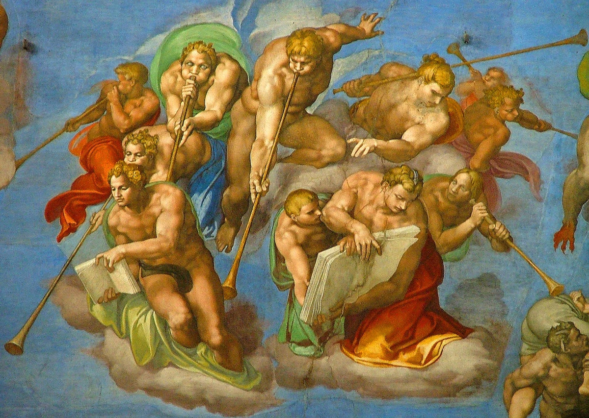
Stand up straight. Look at a towering skyscraper or a mighty oak tree. That's 90 degrees. This is the axis of power, dignity, and stature. It defies gravity. Verticals can make a composition feel formal, authoritative, and strong. They're the pillars holding everything up. The flip side? Too much verticality can feel rigid, cold, and unyielding. It’s the difference between a superhero posing and a strict principal pointing a finger. The power of the vertical is also deeply tied to our own bodies; we are vertical beings. A figure standing straight and tall immediately conveys confidence, defiance, or authority. An army of such figures, like in an ancient Egyptian frieze, creates an overwhelming sense of power and permanence. It's the compositional language of gods, kings, and empires.
Conversely, a figure that breaks from this grid immediately tells a story. A subtle 10-degree lean can suggest curiosity or hesitation. A more pronounced 30-degree lean implies weariness or casual intimacy. It's this deviation from the absolute vertical that infuses a figure with narrative potential. During a life drawing session, I once had a model stand ramrod straight for twenty minutes. The resulting sketches felt monumental, but lifeless. The moment she shifted her weight, popping a hip and leaning just a few degrees, the entire drawing came to life. That tiny shift was the difference between a statue and a person.

The Diagonal (30° - 60°): The Rebel
This is where things get exciting. The diagonal is the engine of dynamic art. It's movement, energy, instability, and drama. It has a special term in the art world: dynamic symmetry. A composition based on dynamic diagonals inherently possesses an energy that a static grid can never replicate.
- A shallow diagonal (around 20°-30°) feels like a slow, gentle climb. It’s the beginning of movement, a subtle suggestion of change. It's the most hesitant of the diagonals, but it still breaks the static peace of the horizontal.
- A medium diagonal (around 45°) is pure, balanced action. It splits the canvas perfectly between the horizontal and vertical, creating maximum tension and energy. It's the most "honest" diagonal, an equal partner to both stability and instability. The masters of the Baroque period, like Peter Paul Rubens, built entire careers on the power of the 45° diagonal to infuse scenes with explosive energy.
- A steep diagonal (around 60°-70°) is frantic and urgent. It feels like something is about to tip over, creating suspense and anxiety. It’s far more committed to its instability than its shallower cousins.
I’ve found that playing with the subtle difference between a 35° and a 55° tilt in a single brushstroke can shift a piece from "energetic" to "aggressive." It's a knife's edge. And when multiple steep diagonals intersect, you create the visual equivalent of a cacophony—a sense of conflict that can evoke anything from the glorious chaos of a battle scene to the internal torment of a psychological portrait. It's the compositional tool used by artists like Jackson Pollock, whose poured paintings are a labyrinth of competing diagonals, a frozen record of physical energy.
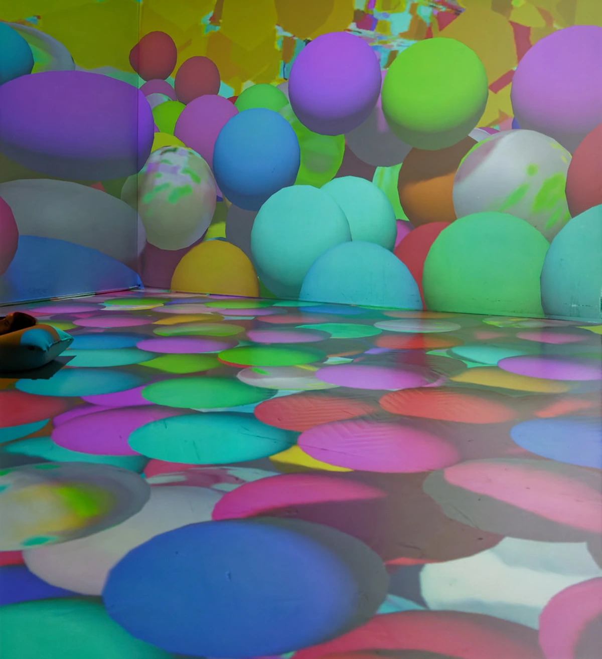
Compound Angles (like 15° or 75°) are the nuanced, subtle players in this game. These aren't the primary 30°, 45°, or 90° powerhouses, but the smaller or more specific angles that can refine the overt messaging of their stronger counterparts. A shallow 15° diagonal feels hesitant, even more so than a 30°, suggesting a slow creep or an almost-imperceptible shift. A steep 75° diagonal implies extreme urgency, instability, a feeling of being on the absolute precipice of total collapse, more intense than a 60° lean. Think of them as the adjectives that give specific flavor to the core verbs of 30°, 45°, and 90°.
Obliques & Implied Angles: The Web of Influence
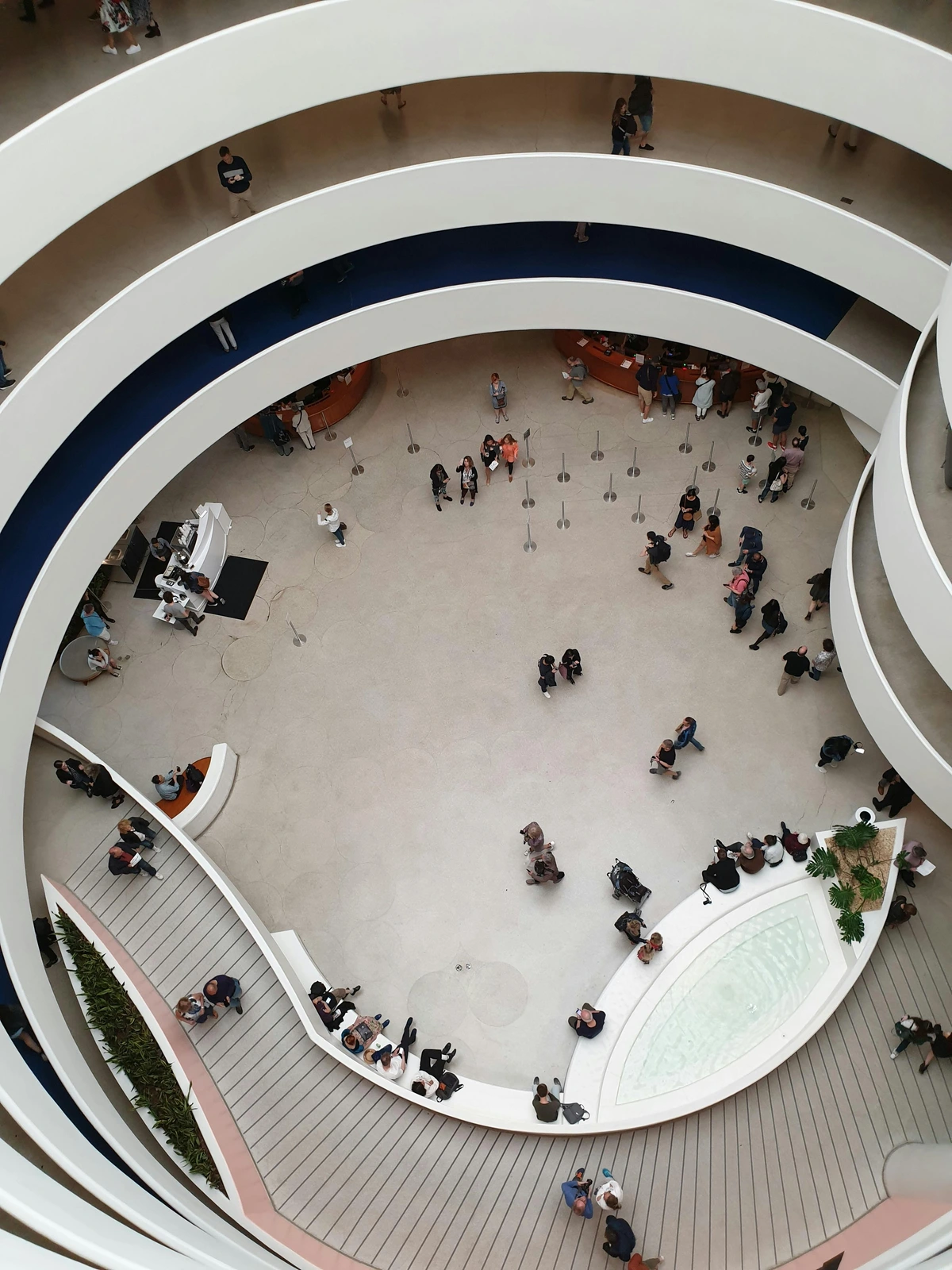
Not every angle is a solid line you can trace with a ruler. Often, it's the implied angle that's most powerful. This is the heart of compositional movement. Imagine two figures in a painting. One stands straight up (90°), the other leans against a post at, say, 70°. Your brain instantly creates that invisible 70° line. Now, a third figure crouches down low. Instantly, you have a web of implied angles creating a dynamic, unstable triangle.
This is the secret sauce. It’s not just about the lines you draw, but the invisible geometry you create between your subjects. The angle of an outstretched arm, the tilt of a head, the slope of a roof in the background—they all talk to each other, creating a silent conversation that the viewer feels long before they understand it intellectually. This technique is masterfully used in anamorphic art, where hidden images and dramatic angles are revealed only from a specific vantage point, forcing the viewer to engage physically with the work. It shows that the most powerful geometry is often the one you have to discover yourself.
Think of it as a kind of social geometry. When two figures in a painting interact, the implied lines between them form angles of relationship. Parallel lines of two standing figures suggest agreement or unity. A 45° vector from one figure pointing towards another can imply aggression, pleading, or offering. A 90° divergence, where one figure's line is perpendicular to another's, can suggest conflict, independence, or a fundamental disconnection. It's the body language of your composition. This principle is also at play in photorealism, where artists meticulously render every subtle angle of light and shadow to imply a reality so convincing it tricks the eye. While the final image looks smooth, its skeleton is built on the exact same principles of angle and form. The ultimate expression of this is anamorphic art, where the entire image is a distorted web of extreme angles that only resolves into a coherent picture from one single, specific viewpoint—a physical manifestation of these principles.
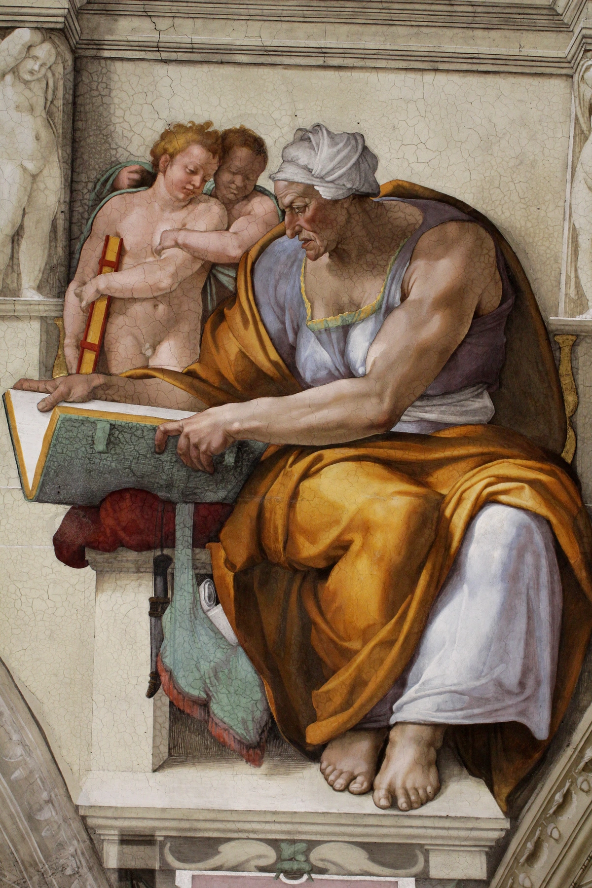
Let's look at a practical example using the humble triangle. A composition's stability can be dictated by the type of triangles it forms.
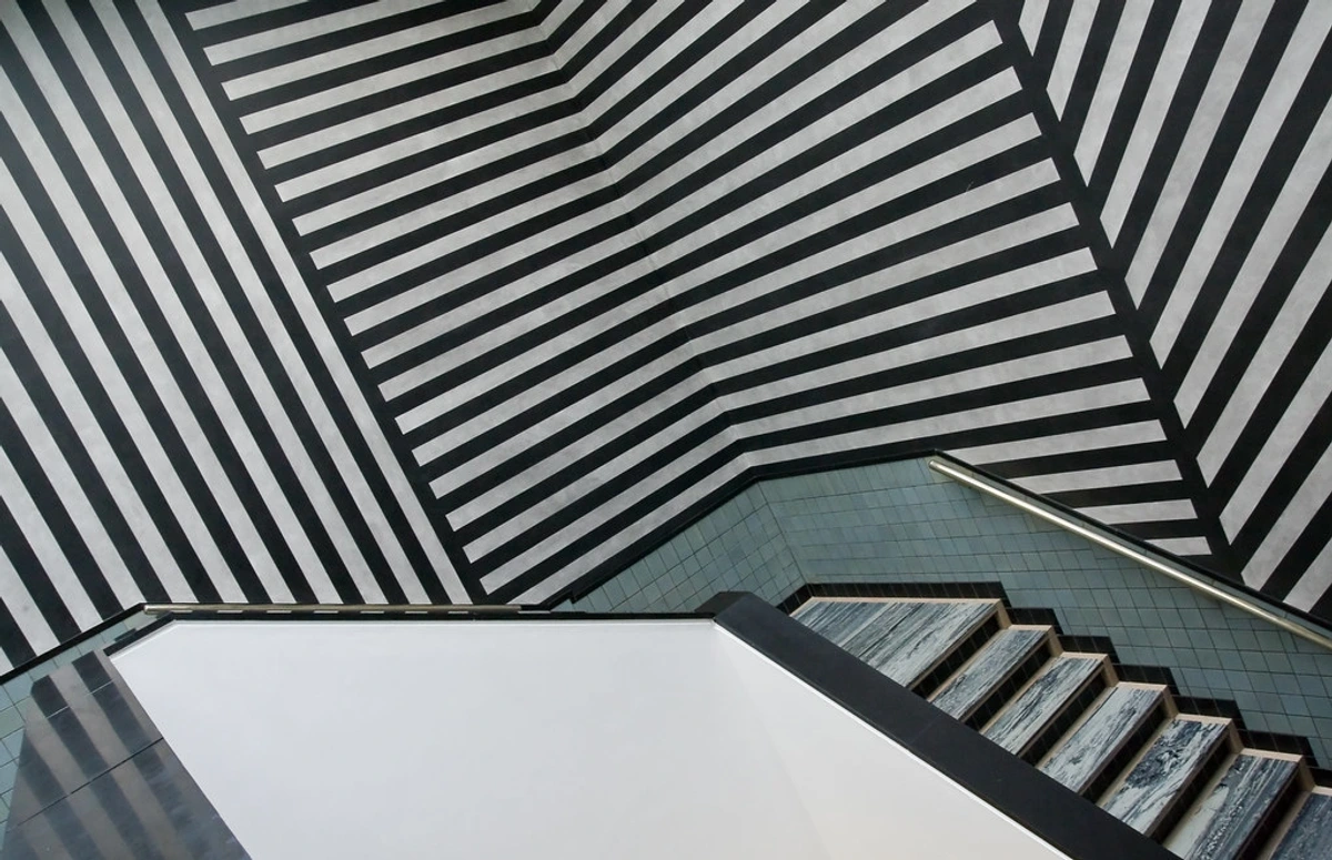
- Stable Triangles: Resting firmly on their base, they feel solid, monumental, and grounded. Think of the pyramidal compositions common in the Renaissance.
- Dynamic Triangles: Balanced on a single point or with a dominant diagonal edge, they feel like they're in motion, full of energy and potential for both lift and collapse. This is the engine of Baroque dynamism.
- Conflicting Triangles: When multiple competing, non-parallel triangles are introduced, you create visual tension. The eye is pulled in different directions, mimicking conflict, chaos, or complex internal emotion. The Cubists were masters of this, shattering reality into competing planes.
Case Study: The Scream vs. American Gothic
Let's put this into practice with a real-world example.
Think of Edvard Munch's The Scream. The entire composition is a masterclass in unstable diagonals. The bridge, the water, even the sky are a swirling vortex of frantic, steep angles. There are almost no true horizontals or verticals to rest your eyes on. This visual instability is what creates that visceral feeling of anxiety and existential dread. The angles are the feeling.
Now, look at Grant Wood's American Gothic. It's the polar opposite. The two figures are rigid, almost completely vertical. The pitchfork mirrors their posture. The window of the house behind them is a perfect grid of horizontals and verticals. This is the architecture of stoicism, rigidity, and unwavering faith. The composition itself is telling you, "Nothing moves here. Nothing changes." The power comes from the utter lack of dynamic diagonals.
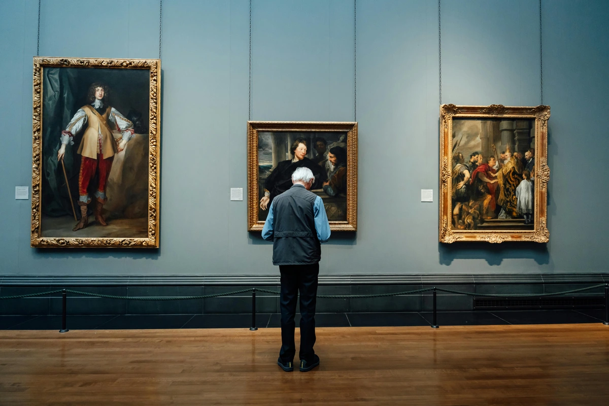
Two masterpieces, two completely different emotional worlds, built fundamentally on the bones of their angles. But let's not stop there. Look at the serene, horizontal landscapes of the Dutch Golden Age. Their calmness isn't an accident; it's a direct result of compositional choices favoring stability over chaos. It's the same language, just with a different accent.
But let's push past these two well-known examples and see how this principle appears in different art movements. The contrast between the serene formalism of the Dutch Golden Age, with its clear horizontal and vertical arrangements, and the explosive dynamism of the Baroque period, which embraced swirling, complex diagonals, tells a similar story. The same invisible framework of angles defines entire eras of artistic sentiment.
Consider the tension between the controlled structure of the Renaissance and the chaotic energy of Baroque art. Renaissance masters like Raphael used stable pyramidal forms and strong horizontals to create compositions that feel serene, balanced, and intellectually satisfying. It's the art of order. In contrast, Baroque masters like Caravaggio and Rubens employed sharp diagonals, dramatic foreshortening, and clashing triangles to generate visceral, emotional intensity. They thrust you directly into the action. They aimed to make you feel the divine ecstasy or the mortal terror, using geometry as the delivery system for raw emotion. It's the difference between hearing a story told calmly and being shoved onto the stage yourself.
Using Degree Angles in Your Own Work: A Practical Playground
Let's move from theory to your canvas. Here’s a non-dogmatic way to start thinking about angles in your own compositions.
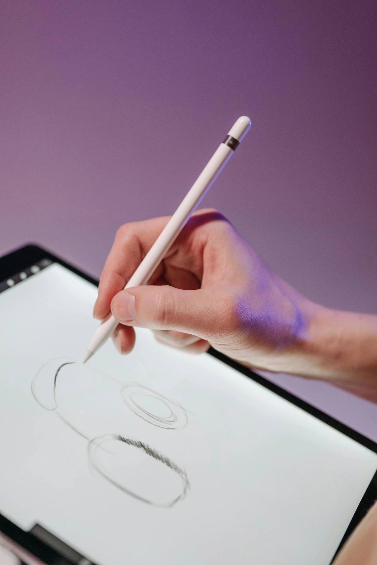
Step 1: The 'Mood Thumbnail' Method
Before you commit to a big canvas (or if you prefer to experiment digitally, a tablet like in many digital art tutorials), spend 10 minutes doing five small thumbnail sketches. This is where you decide the emotional direction. Don't draw objects—draw angles. For each one, assign a core emotion:
- For Calm: Lean on horizontals and gentle, shallow diagonals. Think serene lakes and sleeping forms.
- For Energy & Joy: Embrace balanced diagonals (around 40°-50°). This is the language of dance and celebration.
- For Chaos & Anxiety: Use steep, conflicting diagonals (60°+). Crashes, falls, and storms live here.
- For Stability & Power: Find your anchor in the verticals. This is the domain of skyscrapers and unwavering figures.
This pre-work is a game-changer. It saves you from the heartache of realizing halfway through a painting that its very skeleton contradicts your intent.
Step 2: Sketch the Skeleton
Now, take your strongest thumbnail and translate its 'angle skeleton' onto your actual canvas or paper. Rough out your composition not with objects, but with straight lines. Find the major directional thrusts. I sometimes lay down a few strips of painter's tape on the canvas just to visualize the main angles before I even touch a brush.
Step 3: Map the Implied Angles
As you place elements, don't just look at the lines you draw, but the lines you create between elements. This is where the magic happens.
- The Gaze: The invisible line connecting the eyes of a subject to what they're looking at is a powerful diagonal of attention. It pulls the viewer's focus instantly. This is one of the most potent ways to create narrative tension within a static image.
- The Limb: An outstretched arm creates a clear directional thrust that can either stabilize or destabilize a composition. An arm reaching upward at 75° suggests grasping or pleading, while an arm extended downward at 15° might point to something hidden.
- The Repetition: A series of objects placed along an invisible diagonal line (e.g., a line of trees, a row of buildings) creates a strong sense of rhythm and leading lines. This is a foundational technique for leading the viewer's eye through a piece.
- The Foreshortened Plane: When a flat surface, like a table or a path, recedes into the distance, its edges create powerful converging diagonals that pull the viewer's eye deep into the picture plane. This is the engine of creating spatial depth in everything from still lifes to landscapes.
- The Grouped Headline: When multiple figures are arranged, the 'line' connecting their heads forms a powerful compositional anchor. A horizontal lineup feels static and unified, a vertical one suggests hierarchy, and a diagonal one implies movement and energy.
Step 4: The Strategic Rule-Break
Once you see your geometric grid, look for the opportunity to break it. A single, strong vertical figure cutting through a field of chaotic diagonals can be incredibly powerful. A small, isolated circle amidst sharp, jagged lines draws the eye like a magnet. The contrast between the established pattern and the exception is what creates visual tension, narrative, and ultimately, magic. This brings to mind the spontaneity and energy of action painting, where artists like Jackson Pollock allowed poured lines and splatters to land at random, creating a chaotic web of angles that is felt more than it is planned. It's a reminder that while understanding the rules is powerful, breaking them with intent is the birth of a unique style. Pollock's method was to engage with the canvas from all sides, letting his gestures determine the angle and flow of the paint, creating a composition that was a direct record of movement frozen in time. You don't plan a 67-degree splatter; you do it.
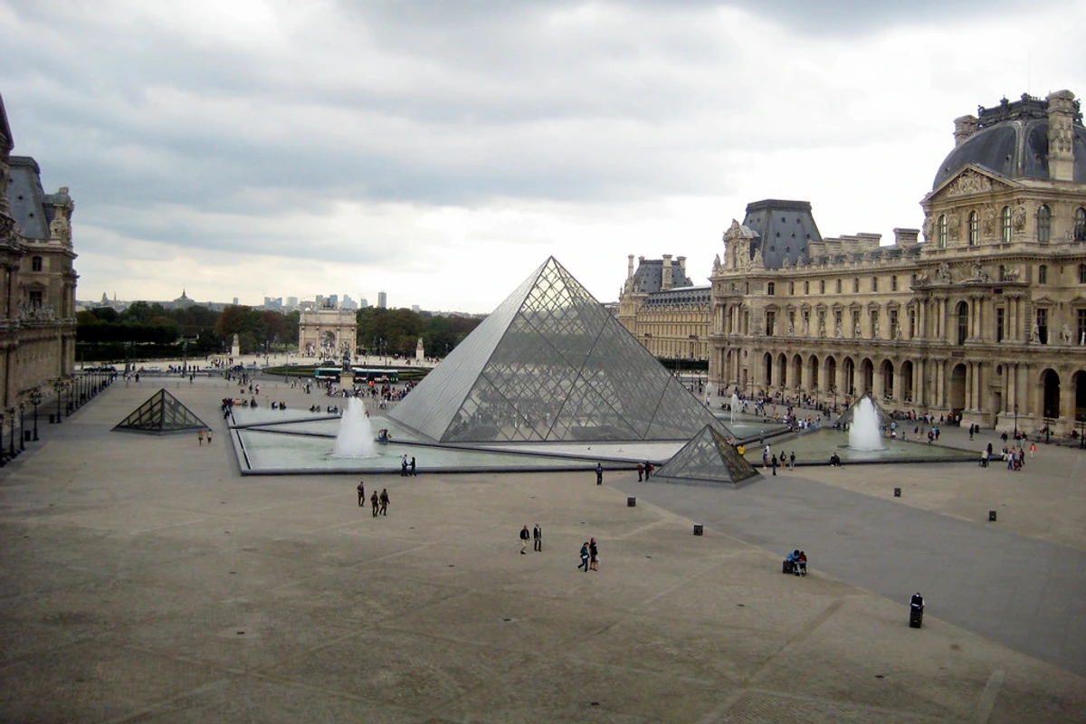
Nicolas Poussin, "The Rape of the Sabine Women," c. 1633-34. A masterclass in using dynamic diagonals to generate energy and chaos in a meticulously planned composition. credit, licence
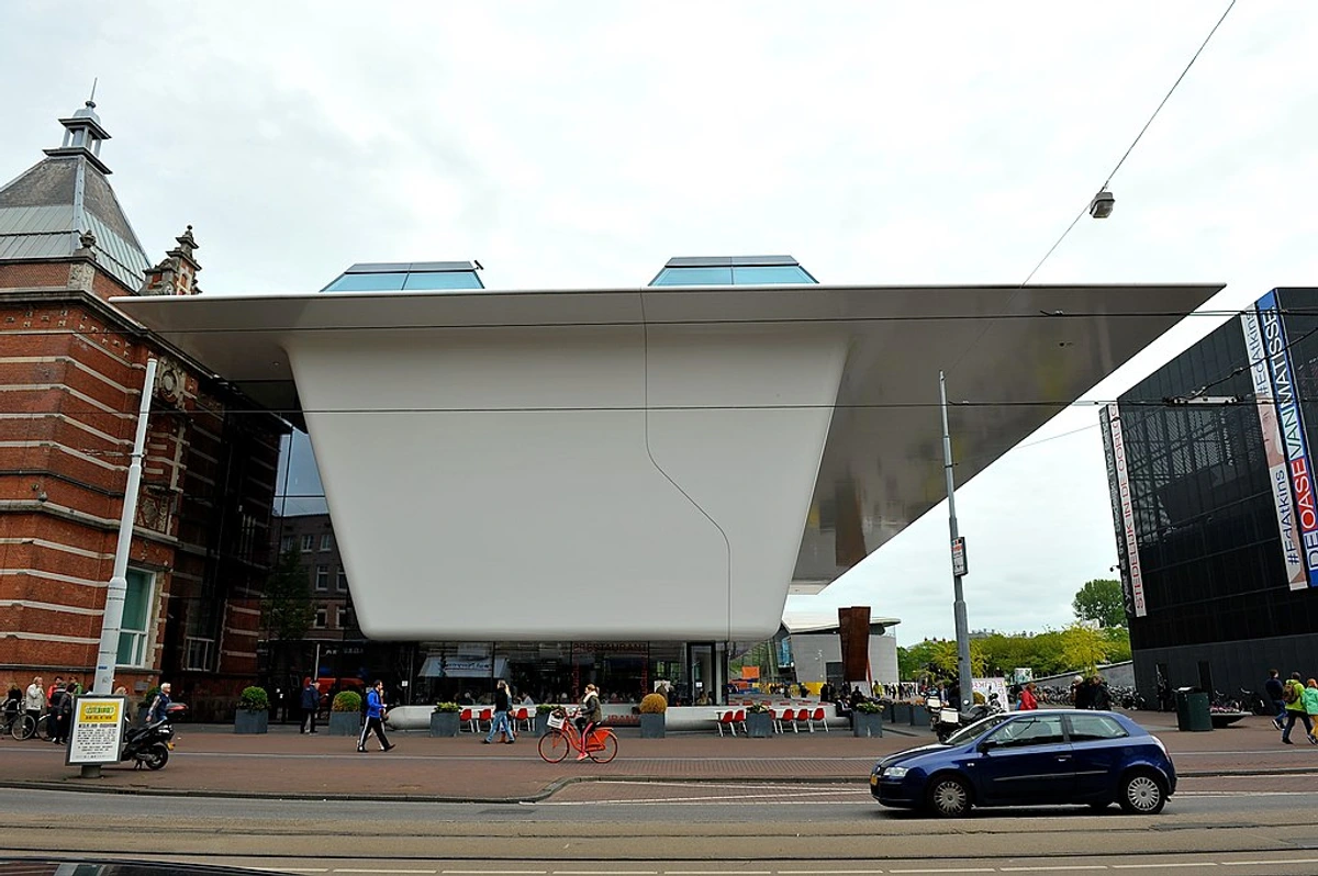
Merging Angles with Color and Shape
Here’s the beautiful part: angles don't work in isolation. They're part of a team. They are, in fact, one of the most fundamental of the Elements and Principles of Art, acting as the literal skeleton upon which all other elements hang.
- A 70-degree diagonal painted in a fiery red screams immediate danger. It’s a visual alarm.
- That same sharp line rendered in a cool, soft blue might suggest a cracking glacier or a shard of glass in moonlight—dangerous, but distant and mysterious.
- A 30-degree slope made of soft, rounded, biomorphic shapes feels organic and gentle, like a rolling hill.
- The same 30-degree slope constructed from harsh, jagged triangles feels treacherous and painful, like a rocky, unstable scree.
- Imagine a 45° diagonal made of thin, sketchy lines versus a thick, heavy impasto stroke. One is energetic like a gust of wind, the other is a powerful, physical thrust.
It's the interplay that creates the final emotional payload. The angle gives the direction and energy; the color and shape define its character. It’s like a sentence: the angle is the verb (the action), and the color is the adjective (the description). You need both to tell the full story.
Consider the element of scale. A 45° diagonal formed by a single brushstroke feels energetic. But a 45° diagonal formed by a massive cliff face in a landscape painting feels epic and monumental. The size of the angular element relative to the frame amplifies the emotional impact, transforming personal energy into a force of nature.
Texture also plays a critical role. A diagonal rendered with a soft, blurry edge creates a sense of gentle motion, like wind or water. The same angle, painted with a sharp, jagged, impasto edge, screams conflict and physical impact. It stops being a direction and starts being an event.
Beyond the Canvas: The Angle in Art History and Digital Art
The relationship between artists and geometry is a long and complex one. Interestingly, many artists find their practice evolving over time, often becoming more focused and refined. Some even feel they have said all they needed to and stop creating publicly, a concept explored in the intriguing collection of artworks at /finder/page/an-artist-never-ran-out-of-art-an-artist-ran-out-of-time. It’s a different kind of finality, shaped by the artist's own timeline rather than external pressures. This resonates with the idea of paring down to essentials, a hallmark of movements like Minimalism, where the composition is the content.

For centuries, implied geometry guided the hand of the painter. But in the 20th century, movements like De Stijl and Constructivism made the angle and the grid the subject itself. Mondrian's work is a perfect example: the emotional content comes almost entirely from the interplay of verticals, horizontals, and the dynamic tension of his asymmetric compositions. Then came generative and digital art, where this relationship became even more direct.
The Algorithmic Angle
In generative art, artists don't just paint the lines; they write the rules for the lines to appear. The angle becomes a variable in a piece of code. A simple algorithm might say, 'For a calm composition, generate lines between 0 and 15 degrees. For a chaotic one, use angles between 65 and 90 degrees.' Suddenly, the artist is sculpting emotion with mathematical logic. This digital creation process often involves a sequence of steps and tools, not unlike the structured preparation an artist might go through, as detailed in the guide on how to make an art portfolio. For a wider exploration of how art movements have treated line and form, or for tips on making your own mark, consider visiting the /buy page to see how these principles come to life in my own contemporary work.
But it's not just about code. Even in contemporary abstract art, the influence of emerging art movements often pushes these principles to their limits, blending chaotic, unpredictable splatters (which have their own inherent angular moments) with meticulously planned geometric structures. It's the dialogue—and sometimes the outright battle—between these two forces that keeps the language of angles fresh, relevant, and endlessly fascinating.
The Physics of Illusion: Foreshortening and Perspective
Creating the illusion of depth on a flat surface is one of art's great magic tricks, and it's powered almost entirely by the manipulation of angles. Two key concepts are at play here: foreshortening and linear perspective.
Foreshortening is the visual effect where an object appears compressed when viewed end-on. That outstretched arm is a real-world diagonal, but when you look down its length, the hand and forearm are drastically shortened. To draw it, you can't rely on what you know the arm looks like; you have to draw the specific, acute angle of the foreshortened plane. It's about trusting the angle, not the object. When an arm points directly at the viewer, its length is reduced to a near-circle, a radical angular shift. It’s a tool of high drama, used extensively in the Baroque period to create a sense of overwhelming immediacy, a figure bursting out of the canvas toward the viewer.
Linear Perspective is the systematic method for creating depth using angled lines. Converging lines—diagonals that point toward one or more vanishing points on the horizon—create the powerful illusion of receding space. A road stretching into the distance is the classic example. The edges of the road form two long diagonals that appear to meet at a single point on the horizon. Every object placed within this system of angles will appear to exist in a logical, three-dimensional space. This mathematical approach, perfected during the Renaissance, is the ultimate example of putting geometry in the service of illusion. It transforms the flat canvas into a window opening onto a realistic world, a tool of intellectual order that dominated art for centuries.
Kazimir Malevich, "Suprematist Composition," c. 1916. credit, licence
Frequently Asked Questions
Here are some of the most common questions I get about applying these principles in practice.
Q: Do I need to use a protractor when I paint? A: Absolutely not. Please, don’t. This would be a fast track to sucking all the life out of your art. It’s about training your eye and your intuition. Make marks, step back, and ask yourself how they feel. The goal is for this knowledge to become subconscious, a tool in the back of your mind that you pull out when you’re stuck or when you want to push a specific emotion. If you absolutely must measure, use the angle of your brush handle against the canvas edge as a rough guide, but trust your gut first.
Start by comparing your mark to the edges of your canvas or paper—is it closer to a perfect horizontal (0°), a balanced diagonal (45°), or a vertical (90°)? This is usually enough to get you in the right emotional ballpark. This intuitive approach keeps your line work lively and authentic, an energy that is often lost in purely technical applications, which underscores the value of modern art education where intuition is balanced with formal knowledge in the digital age.
Q: Isn't this just for abstract art? A: Not at all. Consider a portrait. A subject looking straight on has a different presence than one with a tilted head. A landscape with a flat horizon feels endless and calm, while one with a dramatic, sloping hill feels grand and epic. The principles apply whether you’re painting a bowl of fruit or a swirling vortex of emotion.
Q: How do angles affect composition in photography? A: The exact same way! Tilting your camera just a few degrees (the famous "Dutch angle" or "Dutch tilt") instantly creates tension and unease, a favorite of German Expressionist cinema and modern thrillers. Leading lines in a photo—a winding river, a row of streetlamps, the converging edge of a building—are powerful diagonals that pull your eye deep into the frame. This is a universal principle of visual design. A photographer's choice to use a wide-angle lens, which introduces extreme diagonal distortion at the edges, versus a telephoto lens, which compresses space and flattens angles, is a fundamental geometric decision.
Q: Are some angles objectively "better" than others? A: No. A peaceful 0-degree seascape isn't "worse" than a dynamic 45-degree action scene. They serve different purposes. The key is intentionality. Use the angle that serves the feeling you want to create. The "mistake" is using an angle that contradicts your artistic intention and then wondering why the piece doesn't feel right. It's like choosing the right word for a sentence—'serene' isn't better than 'frantic,' it's just different.
Q: How do I practice 'seeing' these angles in my daily life? A: It's surprisingly simple and transformative. A fantastic exercise is to take five minutes a day for a week and do an 'Angle Sketch.' Don't draw objects—draw the dominant angles you see. Look at the roof of a house against the sky (a diagonal), a lamppost (a vertical), the edge of a table (a horizontal). You'll quickly start to see the world not as a collection of things, but as a dynamic scaffolding of lines. It's like switching on a superpower. This practice will make you hyper-aware of the compositional choices in everything, from the buildings you pass to the photographs you take.
Another advanced exercise is the 'Masters' Dissection.' Find a high-quality image of a painting you admire. Grab a piece of tracing paper or use a digital layer and just trace the major directional lines and angles. You'll be shocked at how clearly the artist's structural plan reveals itself. It's like pulling back the curtain on their entire thought process. A third, more tactile exercise is 'The Frame Game.' Cut a small rectangular viewfinder out of cardstock. Walk around your neighborhood and use it to isolate scenes. Ignore the objects and focus only on the dominant angle created by the composition within your frame. It's a powerful way to train your brain to see like an artist—not in terms of things, but in terms of forces. An artist like Agnes Martin could spend weeks adjusting a single pencil line by a fraction of a degree, knowing that this minute adjustment was the difference between a line that simply was and a line that sang.

Beyond the Frame: Angles in Sculpture, Architecture, and Design
The power of the angle is not confined to the flat plane of a canvas. Once you start looking, you see this invisible geometry shaping the world in three dimensions.
Sculpture: Here, lines become physical forces. A vertical sculpture like Alberto Giacometti's elongated figures conveys frailty and existential isolation, each figure a solitary 90-degree testament to being. In contrast, the dynamic, thrusting diagonals of Umberto Boccioni's Futurist sculptures capture the sensation of speed and motion, freezing a moment of energy. The artist doesn't just depict movement; the angles of the material are the movement. Even the way light strikes the ridges and planes of a sculpture creates secondary angles of shadow, adding another layer of dynamic geometry.
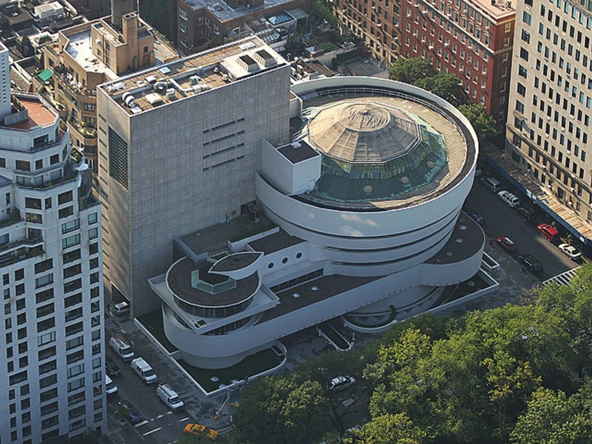
Architecture: This is perhaps the most public form of angular expression. The soaring verticality of a Gothic cathedral inspires awe by directing the eye—and the spirit—heavenward, its spires a powerful 90-degree gesture against the sky. Modernist architects like Frank Lloyd Wright used strong horizontal lines (the "prairie line") to anchor his homes to the landscape, creating a sense of organic stability. And then there are the audacious diagonals of something like the Leaning Tower of Pisa, whose precarious tilt is its entire reason for being famous. It's a glorious architectural rule-break. Contemporary deconstructivist architects, like Frank Gehry, revel in clashing, chaotic diagonals to create a sense of fragmented energy and movement from static materials.
Graphic and Product Design: Every logo, every poster, every chair you sit on is built on a skeleton of angles. A logo tilted on a 15° axis feels modern and progressive. A chair with a high, 100° backrest feels formal and authoritative, while a low-slung lounger at 30° screams relaxation. Even typography has its own angular character: compare the stable, Roman verticals of a serif font to the dynamic, often 15°-tilted stress of an italic. These choices aren't arbitrary; they are the silent communicators of function and brand identity.
Deep Dive: The Intuitive Artist vs. The Analytical Master
We've talked a lot about intention, but I think it's worth addressing the elephant in the room: what about the "natural" artist who just feels it, without all this analytical stuff? I used to believe this was the purest form of creation, and in some ways, it is. Many incredible artists work entirely from intuition, their hands guided by a deep, internalized understanding of visual weight and balance that they could never put into words.
But here's the thing I've realized. For every artist like that, there is another who uses this "hidden geometry" with the precision of an architect. Think of Cézanne, who claimed to want to "redo Poussin from nature," essentially aiming to combine the analytical structure of a classical master with the raw sensation of the visible world. His paintings of Mont Sainte-Victoire are not just landscapes; they are demonstrations of an underlying geometric order. He broke the world down into cylinders, spheres, and cones, patiently building his compositions stroke by stroke, angle by angle. He was painting not just the mountain, but the tectonic forces that held it together.
Which is the "right" way? Neither. This knowledge isn't a set of handcuffs for the intuitive painter; it's a set of training wheels you can take off once you've mastered the route. It's a troubleshooting guide for when your intuition fails you. And for the analytical minds among us, it's the grammar that allows us to write poetry in the language of paint. Understanding the rules allows you to break them with purpose, turning a happy accident into a deliberate act of genius. This connects to the idea that our creative drive can evolve over time, leading some artists to feel they've said all they needed to, a fascinating concept explored in /finder/page/an-artist-ran-out-of-time. But for those still creating, this grammar is their toolkit.

The Angle as Your Silent Collaborator, and a Quick Recap
We've covered a lot of ground. We've dissected the primal, evolutionary language of angles—how horizontals whisper peace, verticals declare strength, and diagonals demand action. We've analyzed the emotional spectrum of the protractor, explored the power of implied angles and geometric shapes like triangles, and seen how masters from the Renaissance to the Digital Age have built entire worlds on these simple principles. From the stable formalism of the Dutch Golden Age to the chaotic energy of the Baroque, from the meditative horizontals of Rothko to the frantic diagonals of Munch, we've seen the undeniable impact of an angle on a canvas. We've also looked at how this geometry extends beyond two dimensions into sculpture, architecture, and even the design of the everyday objects we use.
I shared my own "aha!" moment with that one crimson line that woke up a dead painting, and we've outlined a practical, step-by-step process for you to apply this knowledge in your own work—from mood thumbnails to mapping the invisible web of relationships between your subjects. The goal isn't to turn you into a human protractor, but to make this intuitive, to arm you with a troubleshooting guide for those moments when a piece just isn't working.
Every line you make is a statement. A horizontal line is a declaration of peace. A vertical is a statement of strength. A diagonal is a question, a motion, a rebellion.
I've learned that these geometric underpinnings are not the enemy of artistic freedom. They're the very things that give our emotions a structure to cling to. They allow us to speak a visual language that is felt in the gut before it's understood in the mind. The next time you feel stuck on a piece, don't just look at the colors or the forms. Ask yourself about its skeleton. Ask yourself: "What do my angles want to say?" You might be surprised by the answer.
And when you start to see the world this way—not as a collection of objects, but as a dance of forces, a scaffolding of lines—you haven't just learned a new technique. You've learned a new way of seeing. It's one of the most profound shifts an artist can make. The world is full of angles waiting to be noticed. You just have to know how to look. And once you do, you'll never see things the same way again.











If you'd like to see how these principles translate into contemporary works, feel free to explore my collection of prints and originals over on the /buy page. For a deeper dive into art history and how these concepts have evolved, the collection at the /den-bosch-museum is a fantastic resource. And if you're an artist who feels you've run out of time, or who wants to explore the deeper philosophical questions of a creative life, consider reading my thoughts on /finder/page/an-artist-never-ran-out-of-art-an-artist-ran-out-of-time and its counterpart, /finder/page/an-artist-ran-out-of-time. Sometimes the most profound discoveries come not from the lines we draw, but from understanding the forces that compel us to draw them in the first place.