What Are Horizontal Streaks in Art? A Dive into a Powerful Compositional Tool
Discover the psychological impact and historical significance of horizontal streaks in art. Learn how these simple lines create calm, depth, and rhythm in compositions from classical to contemporary works.

What Are Horizontal Streaks in Art? A Dive into a Powerful Compositional Tool
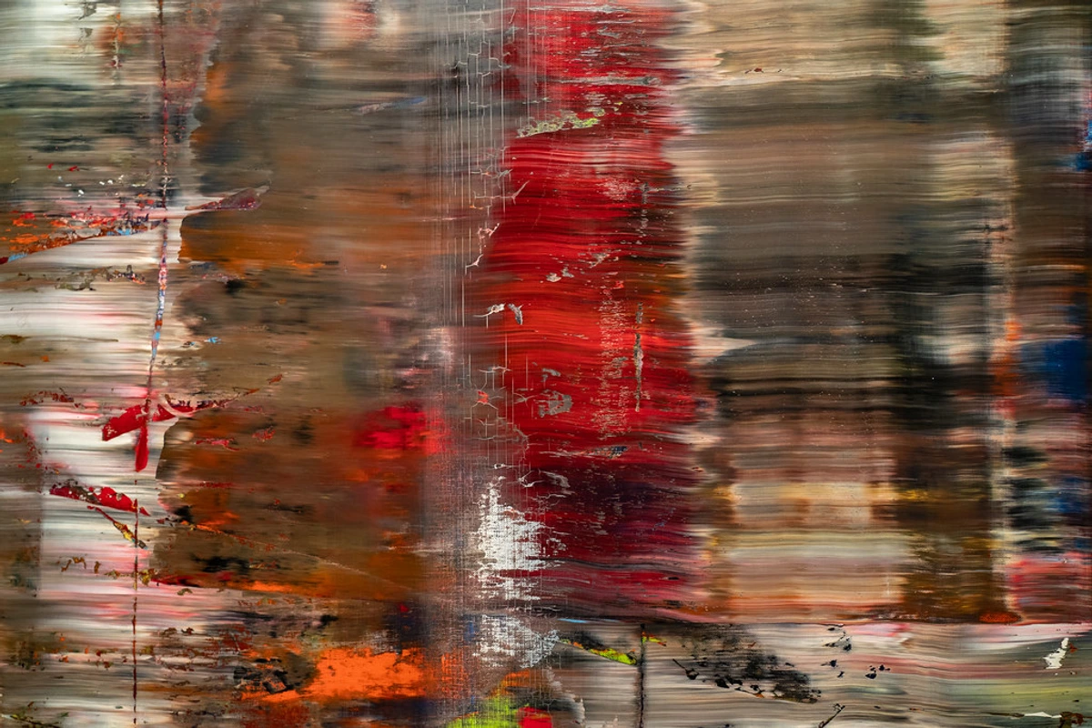
Have you ever stood before a painting and felt an inexplicable wave of calm wash over you? A sense of grounding that made you exhale without realizing you’d been holding your breath? I certainly have. It took years of staring at canvases before I realized those subtle horizontal bands—those quiet rivers of color traversing a composition—were often the architects of that stillness. So what are horizontal streaks, really? They’re deliberate, rhythmical bands of color, texture, or light that sweep across a surface. They might be soft-edged and blended, or sharp and distinct. Far more than decorative elements, they’re psychological anchors and historical echoes that shape how we experience art’s deepest emotions.
Why the Horizon Sings: The Psychology of Horizontal Lines
Let’s talk about lines for a moment. In our daily lives, they’re everywhere. Some lines lift us up, some make us tense, and others... well, they just let us breathe. And I think we can all agree: nothing whispers “I’m not in a hurry” quite like a horizontal line.
Think about it—horizons. The line where earth meets sky. Horizontal lines tap into that primal recognition. They represent stability, rest, and tranquility. Vertical lines? Those feel aspirational, like saplings reaching for light. Diagonal lines? They’re the drama of the art world—full of energy, movement, and sometimes a little anxiety.

Line Direction  | Common Associations | |
|---|---|---|
| Horizontal | Calm, stable, restful | Peace, horizon, tranquility |
| Vertical | Balance, strength, formality | Strength, growth, power |
| Diagonal | Dynamic, energetic, unstable | Action, movement, tension |
| Curved | Organic, flowing, sensual | Nature, movement, grace |
| Zigzag | Tension, energy, excitement | Lightning, excitement, chaos |
Cultural Context | Horizontal Line Symbolism | Notable Examples |
|---|---|---|
| Western Art | Stability, horizon, division | Renaissance landscapes, modern abstracts |
| Chinese Art | Flow, journey, narrative | Handscrolls, landscape paintings |
| Islamic Art | Infinity, divine order | Geometric patterns, mosque architecture |
| Japanese Art | Impermanence, natural rhythm | Wave paintings, seasonal compositions |
| African Art | Connection, earth-sky bridge | Textiles, ceremonial masks |
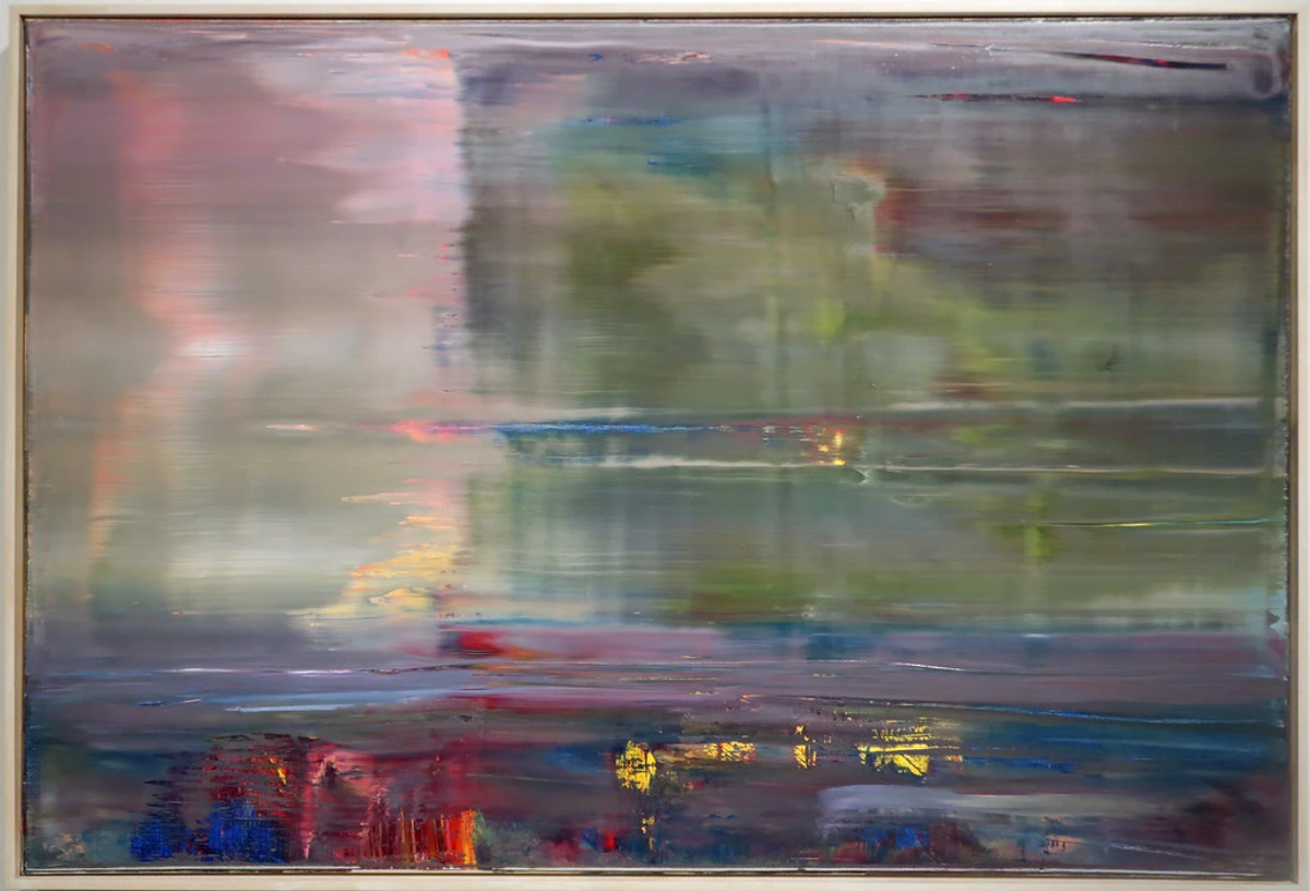
This is precisely why artists employ horizontal streaks. They create a visual cadence that can soothe the viewer or, in more complex arrangements, build profound stillness. Imagine a seascape where the horizontal bands representing sea and sky don’t merely describe the scene—they make you feel the rhythm of the tides. It’s no wonder horizontal streaks are a favored tool in abstract art when meditative states are the goal.
A Timeless Stroke: The Historical Evolution of Horizontal Streaks
The use of horizontal organization isn’t new—it’s ancient. Consider Chinese landscape paintings. Those meticulous handscrolls were, by definition, horizontal journeys. Within them, artists created distinct horizontal zones: a band of mist, a winding river, layered mountains, and a vast sky. Each band wasn’t just paint; it was a chapter, a deliberate rhythm guiding the eye through a narrative journey from left to right.
Fast forward to the 19th century. The Impressionists were obsessed with capturing fleeting moments and atmospheric light. Think Monet’s Haystacks series. He painted the same subject at different times of day, using subtle horizontal shifts in hue and temperature to record how light transformed the familiar. Those bands of dawn pink or twilight blue weren’t just representation—they were time made visible. Then came the Abstract Expressionists. Artists like Mark Rothko, though best known for vertical rectangles, frequently employed horizontal bands. In his later works, these bands seem to float, creating a sense of infinite space and quiet contemplation.

In contemporary art, particularly abstract circles, horizontal streaks remain a fundamental vocabulary. They break up color fields, create depth, and guide the eye. You’ll find them everywhere—from minimalist canvases to vibrant, textured pieces that hum with energy.
More Than Meets the Eye: The Deep Conceptual Impact of Horizontal Streaks
So what’s the deeper magic? Horizontal streaks aren’t just there for aesthetic pleasure. They carry conceptual weight. Here’s how they work:
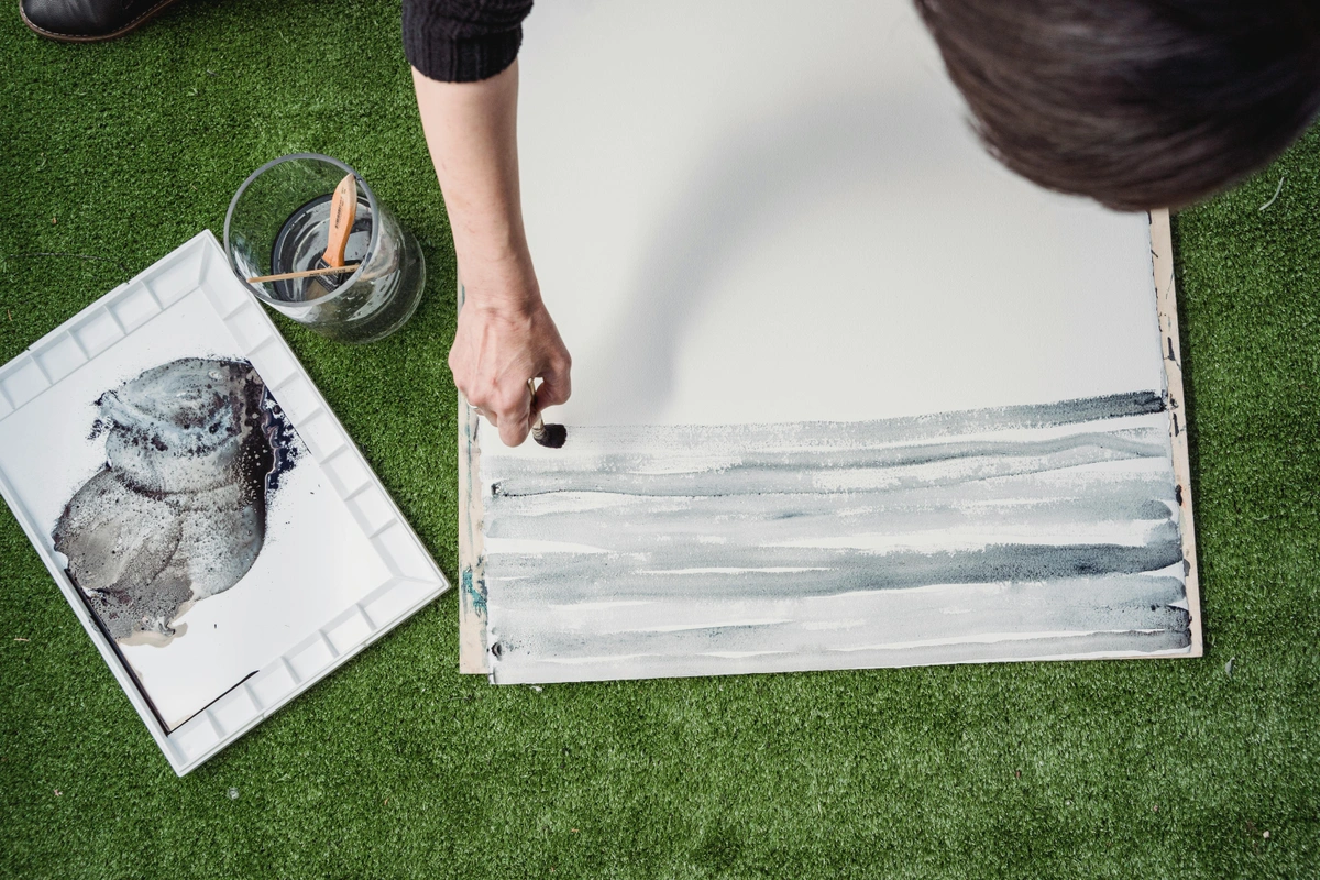
- Creating Depth: A series of horizontal, receding bands—with each growing lighter or more blurred—can create powerful atmospheric perspective. It’s like looking into distance. I remember standing before a painting where the top bands were washed in hazy blue while those below were rich with earth tones. It felt like I was looking down from a mountain pass. The technique pulled me right into the scene.
- Establishing Rhythm: The repetition of horizontal bands creates a visual rhythm. Think music. The spacing, color, and thickness of each streak can change the tempo. Consistent, evenly spaced bands are like a steady drumbeat—calming and predictable. If the bands become choppy or shift width suddenly, they introduce syncopated energy, a visual surprise that can be exciting or even unsettling.
- Dividing and Narrating: Horizontal streaks can act as quiet dividers, separating conceptual or emotional spaces in a painting. Imagine a canvas split into a muted dark bottom and a luminous top by a single, thin band. That line isn’t just paint; it could represent the boundary between earth and sky, or memory and present. It gives the artist a way to organize complex ideas visually.
- Guiding the Gaze: Our eyes naturally move from left to right in Western cultures. Horizontal lines support this natural reading flow. A clever artist can use these streaks to subtly lead your gaze across the canvas, ensuring you experience the work in a specific order. It’s like using a handrail for your eyes.
Getting Your Hands Dirty: Creating Your Own Streaks - A Comprehensive Guide
Alright, let’s get practical. For any artist curious about experimenting with horizontal streaks, here are foundational techniques. Remember, there’s no single “right” way, but these tools are a great starting point.
Technique | Description | Best For |
|---|---|---|
| Wet-on-Wet Blending | While the base layer is still wet, apply a new color and blend horizontally with a clean, soft brush. | Seamless color transitions (like Rothko). Fast, atmospheric effects. |
| Glazing | Apply thin, transparent layers of paint over a dry layer, using horizontal brushstrokes. Repeat to build depth. | Subtle color shifts and luminous, stained-glass effects. |
| Scumbling | Drag a dry brush loaded with a small amount of paint (lighter than the layer underneath) horizontally over the surface. | Textured, broken-color effects. Suggesting clouds, mist, or rough textures. |
| Palette Knife | Use the edge of a palette knife to drag thick paint horizontally across the canvas. | Bold, expressive strokes. Sculptural texture (impasto). |
| Sponging | Use a natural sea sponge to dab paint horizontally, creating textured, uneven bands. | Creating organic, cloud-like effects or textured backgrounds. |
| Rag Wiping | Wipe partially wet paint with a cloth in horizontal motions to create soft blends and transitions. | Creating smooth, painterly effects with soft edges. |
| Dripping | Allow paint to drip naturally across a horizontal surface, creating flowing, organic streaks. | Expressive, energetic compositions with movement. |

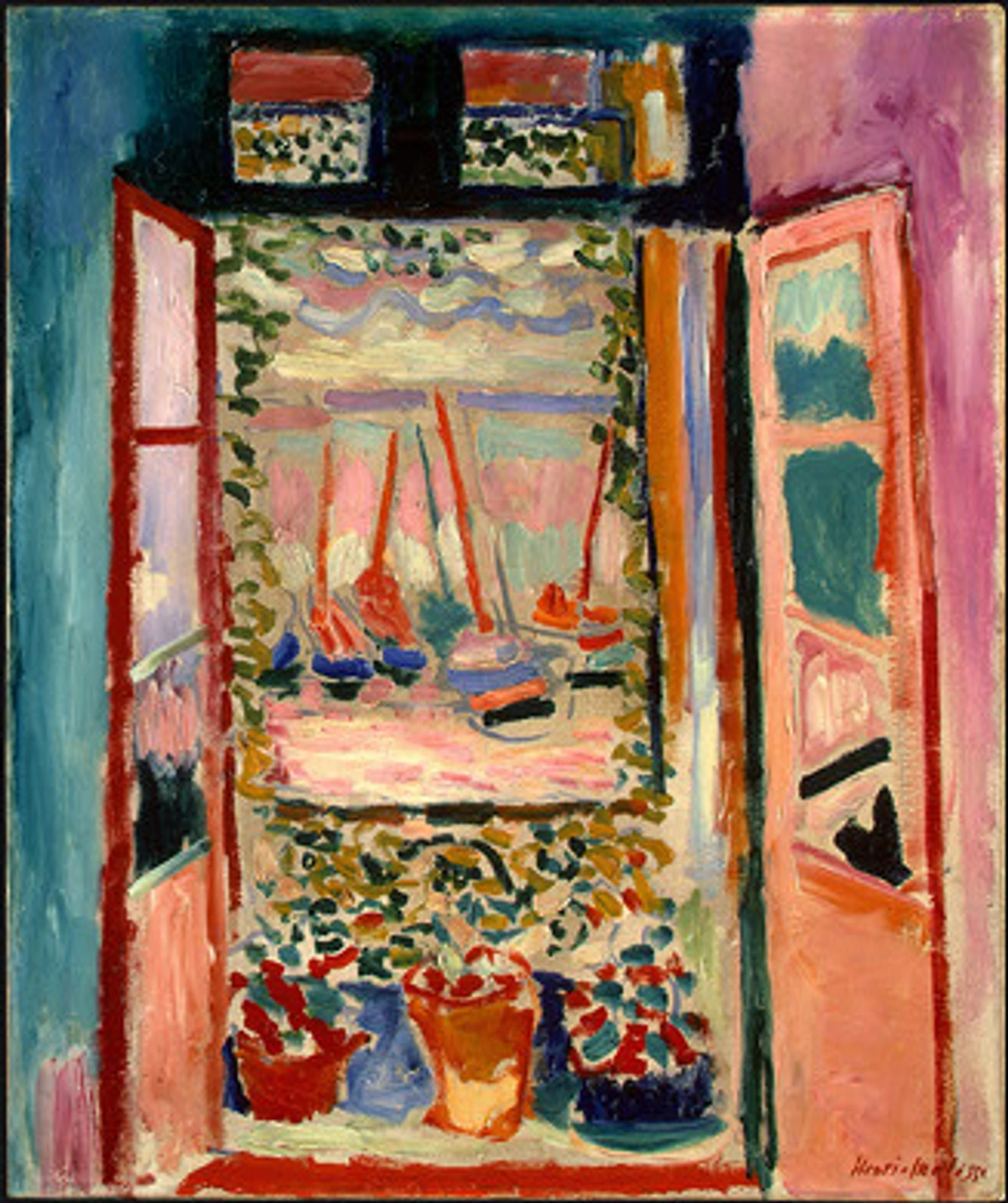
When planning, ask yourself: What feeling am I after? Calm? Soft blending and harmonious colors. Energy? A palette knife with vivid hues. Placement matters too. Streaks in the lower third feel grounded, while those in the upper third feel more ethereal.
Planning Your Horizontal Streak Composition
Before you start painting, take some time to plan your composition. Here are key considerations:
Placement Zone | Emotional Effect | Best For |
|---|---|---|
| Top Third | Ethereal, sky-like, dreamy | Spiritual themes, atmospheric effects, light-focused works |
| Middle Third | Balanced, transitional, human-centered | Narrative works, emotional depth, balanced compositions |
| Bottom Third | Grounded, earthy, stable | Landscapes, foundations, stability-focused works |
| Full Vertical | Monumental, encompassing, immersive | Large-scale works, immersive experiences, powerful statements |
Consider also the spacing between your horizontal bands:

Spacing Type | Visual Effect | Emotional Impact |
|---|---|---|
| Equal Spacing | Rhythmic, predictable, formal | Calm, ordered, meditative |
| Varied Spacing | Dynamic, organic, alive | Interesting, engaging, natural |
| Narrow Spacing | Dense, intense, detailed | Complex, contemplative, rich |
| Wide Spacing | Open, airy, expansive | Spacious, serene, liberating |
Color Considerations for Horizontal Streaks
Color choice dramatically affects the impact of your horizontal streaks. Here are some guidelines:
Color Relationship | Effect | Example Use |
|---|---|---|
| Analogous Colors | Harmonious, flowing, natural | Sunset paintings, peaceful landscapes |
| Complementary Colors | Vibrant, dynamic, energetic | Bold abstracts, dramatic expressions |
| Monochromatic | Subtle, sophisticated, elegant | Minimalist works, refined compositions |
| Warm to Cool Transition | Atmospheric, depth, perspective | Distance effects, time-of-day paintings |
Remember that colors appear different when placed next to each other. Always test your color combinations on a separate surface before applying them to your main work.
Step-by-Step: Creating Your First Horizontal Streak Composition
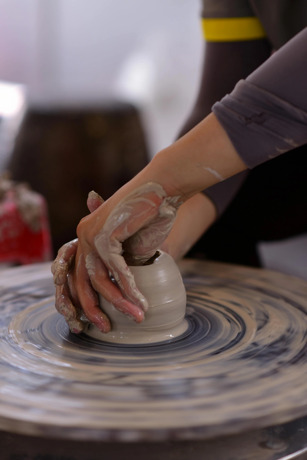
Let's walk through creating a simple horizontal streak composition:

Materials You'll Need
- Canvas or painting surface
- Acrylic or oil paints
- Various brushes (flat, round, fan)
- Palette knife
- Palette and palette paper
- Water container (for acrylics)
- Rag or paper towels
- Varnish (optional, for finishing)
Step 1: Prepare Your Canvas
Apply a mid-tone base coat and let it dry completely. This creates a neutral foundation that will help your colors appear more vibrant. For acrylics, gesso your canvas first. For oils, ensure your canvas is properly sized and primed.
Step 2: Plan Your Composition
Decide on 3-5 horizontal bands of varying widths and colors. Sketch out your plan lightly with pencil if needed. Consider:
- The emotional tone you want to create
- The color relationships you want to explore
- The spacing between bands
- Any special effects you want to achieve
Step 3: Mix Your Colors
Prepare your colors slightly lighter than desired since they'll darken when applied. Mix more than you think you'll need—running out of paint mid-streak can be frustrating!
Step 4: Apply the Bottom Band
Start with your darkest color at the bottom, using horizontal strokes. Use a flat brush for clean lines, or a fan brush for softer edges. Apply paint evenly, working from one side to the other.
Step 5: Blend to the Next Band
While the first band is still workable, apply the next color above it, blending where they meet. For acrylics, work quickly before the paint dries. For oils, you have more time to blend.
Step 6: Continue Upward
Repeat this process, working from bottom to top. Remember that each band should relate to the others in terms of color, spacing, and emotional impact.
Step 7: Let Dry
Allow each layer to dry before adding the next for crisp edges. This is especially important for oils, which can take days to dry completely.
Step 8: Refine Details
Once dry, add any final details or texture. This could include:
- Subtle scumbling effects
- Accented highlights
- Textural elements
- Glazing for depth
Advanced Techniques to Try
Once you're comfortable with the basics, experiment with:
- Variable Opacity: Some bands transparent, others opaque
- Texture Variation: Combine smooth and textured bands
- Mixed Media: Add collage elements, gold leaf, or other materials
- Layering: Multiple layers of thin glazes for complex depth
- Geometric Interruption: Break horizontal bands with vertical elements
Troubleshooting Common Issues
Problem | Cause | Solution |
|---|---|---|
| Bleeding between bands | Paint too wet | Let layers dry completely, use different drying times between colors |
| Muddy colors | Overmixing on canvas | Mix colors on palette first, apply cleanly |
| Streaks look choppy | Inconsistent brushwork | Practice smooth, even strokes, use larger brushes |
| Colors appear different | Not testing first | Always test color combinations on scrap paper |
| Canvas warping | Too much moisture | Use appropriate gesso, work in thin layers |
This basic technique can be modified in endless ways—experiment with different brush sizes, pressure, and timing to create unique effects. The key is to practice and develop your own voice with this powerful compositional tool.

The Flip Side: When Streaks Don't Work
Look, my studio floor is littered with experiments that didn’t quite click. I’ve been there. Here are a few things to keep in mind:
- Overdoing It: Too many horizontal bands can feel static or restrictive. Break the rhythm with a vertical element or a contrasting color splash.
- Poor Color Choices: Streaks too similar in value can merge into a murky background. Too jarring, and they create visual noise. Test color swatches!
- Lack of Balance: If all the visual weight is in the top with faint streaks below, the painting can feel top-heavy. Consider the energy and visual importance of each band.
The best advice? Embrace the mess. Some of the most interesting compositional breakthroughs come from happy accidents.
Frequently Asked Questions About Horizontal Streaks About Horizontal Streaks
What’s the difference between horizontal streaks and stripes?
Stripes are typically defined, parallel, and often of equal width. They belong to graphic design territory. Horizontale strepen in fine art are usually more organic, varied in width and texture, and may blend or bleed into each other. Streaks are about flow and transition; stripes are about pattern and division.
Can horizontal streaks be used in representational art?
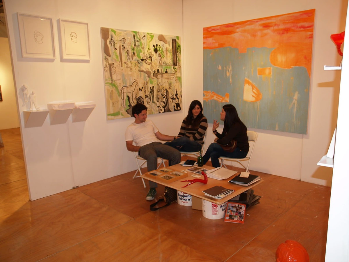
Absolutely! Representational art uses them constantly. Think of a sunset: those horizontal bands of orange and pink across the sky are natural streaks. You can use them to emphasize the horizon, create distance in a landscape, or even depict rain or mist.
Why do horizontal streaks make me feel so calm?
It’s biology and psychology. Our world is filled with horizontal references—the ground, the horizon, water’s surface. Our brains and bodies are wired to associate these lines with safety and orientation. When we see horizontal lines in art, they trigger this primal sense of calm and stability. It’s the artistic equivalent of a deep breath.
How many horizontal streaks should I use in a painting?
There’s no magic number. It entirely depends on the composition and the feeling you want to evoke. A single bold horizontal line can be incredibly powerful (dividing worlds!). Three to five bands can create a strong rhythm. Start with three and adjust based on what feels balanced.
Are horizontal streaks a new trend in art?
Not at all! As we saw, they're ancient techniques. But like any tool, their popularity waxes and wanes. In contemporary abstract circles, they're having a major moment. But their timeless appeal guarantees they'll always be a staple.
The cyclical nature of artistic interest in horizontal organization is fascinating. Here's a brief timeline:
Period | Art Movement | Key Artists | Horizontal Streak Focus |
|---|---|---|---|
| Ancient Times | Egyptian, Chinese | Tomb painters, landscape artists | Narrative organization, spatial division |
| Renaissance | Classical painting | Leonardo da Vinci, Raphael | Atmospheric perspective, depth |
| 19th Century | Impressionism | Monet, Turner | Light and atmosphere, time of day |
| Early 20th Century | Abstract Expressionism | Rothko, Still | Emotional expression, color fields |
| Mid 20th Century | Minimalism | Martin, Flavin | Simplicity, reduction, meditation |
| Late 20th Century | Neo-Expressionism | Wool, Baselitz | Textured surfaces, emotional intensity |
| Contemporary | Digital, Mixed Media | Richter, Mehretu | Experimentation, new media integration |

Each period brings new interpretations while building on the fundamental appeal of horizontal organization.
Not at all! As we saw, they’re ancient techniques. But like any tool, their popularity waxes and wanes. In contemporary abstract circles, they’re having a major moment. But their timeless appeal guarantees they’ll always be a staple.











The Final Brushstroke
So the next time you stand before a painting, pause and notice the horizontal lines. Are they working in concert to create peace? Are they telling a silent story of land meeting sky? Horizontale strepen are fundamental to our visual language, a tool that can ground a composition and calm the viewer. They seem simple at first glance, but their power lies in their subtlety and history. Go find examples. Look around you—you’ll see horizontal bands everywhere. In a city’s architecture, layered rock faces, the vibrant colors on a canvas. It’s a powerful reminder: the most profound statements often arrive on the quietest lines.