
The Art of Abstract Composition: Principles, Techniques & Unseen Impact
Unlock abstract art composition. Explore principles, personal techniques, and how masters like Kandinsky, Pollock, and Agnes Martin shape profound meaning and impact. Learn to 'read' and craft visual stories.
The Art of Abstract Composition: Principles, Techniques, and Unseen Impact
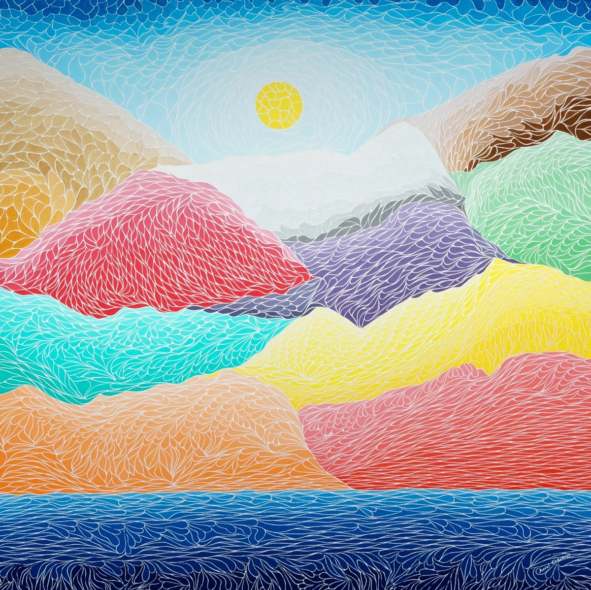
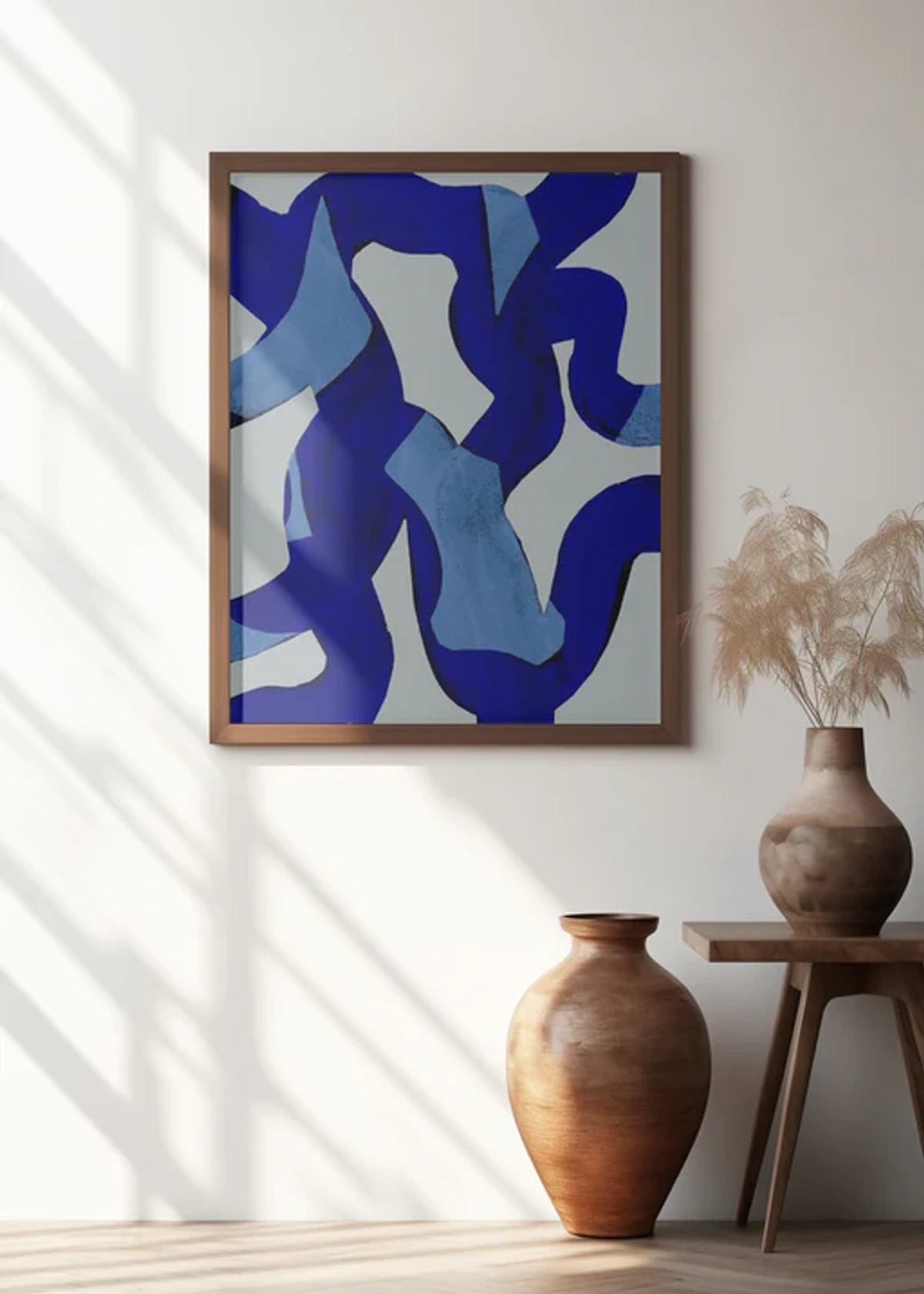
Sometimes, when I tell people I paint abstract art, they'll say something like, "Oh, so you just throw paint on a canvas, right?" And I usually just smile, because honestly, sometimes it feels that way! It's a glorious, messy, often chaotic dance. But beneath the spontaneous gestures and vibrant colors, there's always an underlying structure, a quiet conversation happening on the canvas. It's what I call the unseen backbone of any compelling piece: composition. Without it, even the most brilliant colors would simply be a beautiful mess, a delicious-looking meal without a plate. It’s the whisper beneath the shout, the blueprint you feel rather than explicitly see. Sometimes, I look at the chaos of my studio floor after a painting session and think, "How on earth did that become this?" It's usually composition, quietly doing its magic.
But how did we get here, to a place where composition isn't about perfectly replicating reality, but about creating it? Abstract art's journey is one of liberation, yet even in its wildest expressions, the principles of arrangement persist. It's about creating a new reality – an emotional, perceptual, spiritual, or even conceptual landscape through the deliberate organization of visual elements. From the Cubists fragmenting form (which profoundly influenced later abstract artists by breaking traditional perspective and inviting new explorations of space and dimension) to the Abstract Expressionists exploding it across the canvas, and later the Minimalists stripping it back to bare essentials, composition has remained the silent orchestrator. It's about arranging elements—lines, shapes, colors, textures—in a way that guides your eye, creates a feeling, or tells a story without a single recognizable figure. It's the silent language that transforms mere decoration into art. And if you've ever wondered why some abstract pieces just work, while others fall flat, chances are it all comes down to their compositional savvy. It’s what allows chaos to feel controlled, and silence to scream.
What Exactly is Abstract Composition, Anyway?
At its core, abstract composition is the deliberate arrangement of visual elements—line, shape, color, texture, and form—to create a unified and impactful whole, independent of representational subject matter. It's the architecture beneath the paint, the underlying blueprint that transforms a collection of marks into a coherent visual experience. It's the skeleton, the nervous system, the very breath of the painting.
Think of it like this: if painting were cooking, composition would be the recipe and the plating. You can have the finest ingredients (colors, textures), but without a thoughtful arrangement, you might end up with a delicious mess, but not necessarily a dish that's beautifully presented. In abstract art, design is art, and composition is its core. It's about consciously or intuitively organizing visual elements to achieve a desired aesthetic effect, a particular emotional resonance, or a specific visual journey for the viewer.
For me, it often starts as an intuitive dance. I remember one time, I was trying to resolve a chaotic area, throwing paint in what felt like frustration. My studio floor looked like a crime scene, and the canvas was screaming. Then, a single, unexpected crimson line snaked across the canvas, like a lifeline. Suddenly, the whole piece breathed. It wasn't planned; it just felt right, pulling the disparate elements into a new kind of harmony. That's the fascinating blend of letting go and holding on, a push and pull between chaos and order that defines my process – it’s about responding to the painting’s emerging needs, like a conversation where you listen intently to find the next right word.
The Fundamental Principles: My Unwritten Rules (Mostly)
So, if composition is the recipe, what are the essential ingredients and how do we arrange them? Even though abstract art often feels like breaking rules, understanding the core principles of composition is like knowing the notes before you improvise a jazz solo. You can bend them, twist them, even ignore them, but you do it from a place of knowledge. It's a dialogue with tradition, not a rejection.
Balance: The Art of Visual Weight and Intentional Disequilibrium
Balance is crucial. It’s about how elements are distributed on the canvas, creating a sense of equilibrium, or intentional disequilibrium. It’s not necessarily about physical weight, but visual weight – how much an element draws the eye. Factors like size, color saturation (a bright red holds more visual weight than a muted grey, even if smaller), complexity of detail, and placement all contribute to an element's ability to pull the viewer's gaze. You have two main types:
- Symmetrical Balance: Think of a mirror image. It’s formal, calm, and often feels very stable. I rarely aim for perfect symmetry in my abstract work; it can feel a bit too rigid for my taste, a little too... predictable. It's like having all your spices lined up alphabetically – neat, but where's the adventure?
- Asymmetrical Balance: This is where the magic often happens for me. It’s achieved by balancing dissimilar elements that have equal visual weight. A small, vibrant splash of color on one side might balance a larger, more muted shape on the other. It feels dynamic, organic, and a little bit like life itself – often messy, but somehow still working out. How do you find your balance, on and off the canvas? Intentional disequilibrium, on the other hand, is a deliberate choice to create imbalance, specifically designed to lead to a feeling of tension, unease, or impending movement. For example, placing a large, dark, irregular shape precariously close to an edge, balanced only by a small, intensely bright mark on the opposite side, creates a deliberate visual instability that compels the eye to seek resolution. Sometimes, that's exactly the story I want to tell.
Rhythm and Movement: Guiding the Eye on a Journey
My favorite pieces often have a sense of rhythm, a visual melody that guides your eye across the canvas. Lines, shapes, and colors can create pathways, leading you on a journey. It's about the flow, the pace, and the direction your gaze takes. Sometimes it's a slow, meandering stroll; other times, it's a frantic dance of gestural marks that command immediate attention. This rhythm is often built through repetition – recurring shapes, lines, or colors – and variation, which prevents monotony and keeps the viewer engaged. Think of alternating rhythms (like a calm pulse), progressive rhythms (gradually building intensity), or even entirely random rhythms that still feel coherent, like a controlled explosion. The eye is constantly moving, searching, connecting. A composition can lead your eye in a sweeping curve, a sharp zigzag, or a contained spiral, each creating a distinct visual experience.

Contrast: The Spice of Visual Life
Without contrast, everything would be flat. Contrast adds drama, interest, and separates elements, making them stand out and interact. This could be:
- Color Contrast: Pairing vibrant hues with subdued tones, or complementary colors to create tension. For a deeper dive, consider my approach to color mixing or explore the psychology of color to understand its profound impact.
- Shape Contrast: Juxtaposing organic, flowing shapes with sharp, geometric ones. (The symbolism of geometric shapes is a fascinating rabbit hole if you're curious).
- Texture Contrast: Smooth areas against rough, impasto surfaces. My love for adding depth with texture often plays a huge role here.
- Size Contrast: Small elements next to large ones.
- Directional Contrast: Horizontal lines meeting vertical or diagonal ones.
Value: Light, Shadow, and Depth
Value refers to the lightness or darkness of colors. It's a fundamental compositional tool for creating contrast, depth, and a sense of three-dimensionality, even in a flat abstract painting. High contrast in value (dark next to light) can create drama and direct the eye to a focal point, while subtle shifts in value can build a sense of atmospheric depth or quiet harmony. For me, playing with value is like sculpting with light – it gives form to the formless, revealing hidden contours and relationships that might otherwise remain unseen. Sometimes, a piece truly sings when I realize it's not just about the colors, but the precise dance between their inherent luminosities, the quiet conversation between light and shadow.

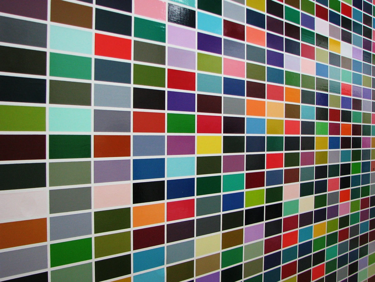
Unity and Variety: The Harmony of Opposites
This is the big one for me. You want enough variety to keep things interesting—a chaotic explosion of ideas, perhaps—but enough unity to make it feel like a cohesive piece, not just a random collection of marks. It’s about finding that sweet spot where everything belongs, even if it’s wildly different. It's like a dysfunctional family gathering: everyone's unique, but they're all still family, somehow making it work. Or, as the Gestalt psychologists might put it, our brains naturally seek to organize disparate visual information into coherent wholes (think proximity, similarity, continuity, and closure). Artists leverage this, creating an overarching harmony that feels complete, even amidst a riot of diverse elements.
Emphasis and Focal Point: Where Do Your Eyes Go First?
Even in abstract art, there's often a point where your eye naturally rests. It might not be a "subject" in the traditional sense, but perhaps a particularly intense color, a dominant shape, or a cluster of compelling marks. I often think about where I want the viewer's journey to begin, or where their gaze will linger. It’s about creating a subtle gravitational pull, drawing the eye to a specific area through placement, contrast, or intensity. Sometimes, the negative space around an element can become the focal point itself, the emptiness as compelling as the filled space, defining and giving breathing room to the positive forms. This interplay is essential for guiding the viewer's journey and is a powerful, often overlooked, compositional tool. Want to know more about this? I wrote about creating a focal point in any room, and have explored the power of negative space in detail.
Scale and Proportion: The Grand Illusion
Scale in abstract art is less about literal size and more about relative proportion and how it impacts perception. It's the relationship between the size of elements within the artwork and the size of the artwork itself, and how those elements relate to each other. A small element on a large canvas can feel monumental, or a vast, sweeping gesture can convey intimacy. Manipulating scale and proportion dictates how the viewer experiences the work—do they feel enveloped, dwarfed, or drawn into a contained world? It's a powerful way to influence the viewer's emotional response and the overall impact of the composition. Sometimes, I feel like a tiny architect building entire worlds with just a few strokes, adjusting the relative 'heights' and 'distances' until the whole piece feels right, like a miniature universe suddenly coming into balance. It's the subtle magic of making a vast canvas feel intensely personal, or a small piece feel infinite.
Pattern: Repetition with a Purpose
While often a byproduct of other principles like rhythm, pattern in abstract composition is worth noting as a deliberate choice. It involves the repetition of a visual motif, line, shape, or color across the canvas to create a sense of order, movement, or texture. Unlike a rigid grid, abstract patterns can be organic, broken, or implied, adding visual interest and holding the viewer's eye through a predictable yet engaging visual flow. It's the comforting, yet often dynamic, hum beneath the surface of the painting, like a heartbeat or a repeated mantra.
Abstract Composition Principles at a Glance
Principle | Core Idea | My Approach (Often) | Effect | Key Takeaway for Abstract Artists |
|---|---|---|---|---|
| Balance | Distribution of visual weight to create stability/tension. | Asymmetrical; intentional disequilibrium for tension. | Harmony, stability, tension, excitement. | Use visual weight (size, color, detail) to guide the eye or create deliberate unease. |
| Rhythm/Movement | Guiding the eye through the artwork. | Repetition and variation of lines, shapes, colors. | Flow, energy, visual journey, pace. | Create pathways for the viewer's eye using recurring elements or directional forces. |
| Contrast | Differences in elements (color, shape, texture) for interest. | Juxtaposition of vibrant/muted, organic/geometric, smooth/rough. | Drama, interest, definition, separation. | Vary elements to add dynamism and make focal points stand out. |
| Value | Lightness or darkness of elements. | High/low contrast; subtle shifts for depth. | Drama, depth, form, mood, three-dimensionality. | Sculpt with light and shadow to create depth and emphasis, even in flatness. |
| Unity/Variety | Cohesion with enough diversity to avoid monotony. | Finding the sweet spot where disparate elements feel connected. | Harmony, richness, completeness, engagement. | Ensure enough difference to engage, but enough similarity to cohere. |
| Emphasis/Focal Point | Area of visual dominance that draws the eye. | Intense color, dominant shape, compelling marks, or even negative space. | Direction, interest, beginning of viewer's journey. | Direct the viewer's gaze to a key area, or let negative space define forms. |
| Scale/Proportion | Relative size and relationship of elements. | Manipulating how large/small elements feel, and their relative sizes. | Influences emotional response, spatial perception. | Play with relative sizes to evoke feelings of intimacy, monumentality, or narrative. |
| Pattern | Repetition of visual elements for order/flow. | Implied, organic, or broken repetitions of marks/shapes. | Order, visual hum, textural richness. | Repeat motifs or elements to create underlying structure and textural interest. |
Masters of Abstract Composition: Different Visions, Shared Principles
These principles are not just theoretical concepts; they are masterfully woven into the fabric of abstract art by countless artists, each with their unique interpretations and innovations. Looking at their approaches helps clarify how diverse compositional strategies can be, and how artists push the boundaries of what composition can mean, ultimately shaping their distinct visual language and signature style.
Wassily Kandinsky: The Spiritual Architect
Often credited as one of the pioneers of pure abstraction, Kandinsky saw composition as an expression of inner necessity and spiritual harmony. His early works often contained hidden figures, but as he moved to pure abstraction, his compositions became complex orchestrations of dynamic lines, floating geometric shapes, and vibrant, contrasting colors, all carefully arranged to evoke specific emotions or spiritual states. He believed that each element had a "soul," and their arrangement was like composing music. For him, composition was about a profound, almost mystical balance, a visual symphony of the soul where every mark played its part in a cosmic drama.
Jackson Pollock: The All-Over Maestro
Pollock's "drip paintings" challenge traditional notions of composition, yet are masterclasses in their own right. By laying his canvas on the floor and moving around it, dripping and pouring paint, he created an "all-over" composition. This meant there was no single focal point, no clear top or bottom, no hierarchy of elements in the traditional sense. It radically redefined compositional space, asserting that every inch of the canvas held equal importance. The eye is meant to continually move across the entire surface, engaging with the intricate web of lines and colors, creating a dynamic rhythm that feels both chaotic and deeply unified. It's a composition of boundless energy, where every inch of the canvas holds equal importance, pulling the viewer into an immersive, rhythmic experience that feels like pure, unadulterated process – a raw, unframed moment of creation.

Mark Rothko: The Sublimity of Color Fields
Rothko's iconic color field paintings, with their large, rectangular blocks of color floating on a stained background, are deceptively simple in composition. Yet, their arrangement is meticulously considered. The careful placement, monumental scale, and luminosity of these color blocks create a profound sense of depth and spiritual resonance. The edges often bleed softly, blurring the boundaries and inviting contemplation. Rothko's compositional genius lies in using minimal elements to achieve maximum emotional and transcendent impact, often playing with a subtle asymmetrical balance and the sheer scale of the forms to envelop the viewer in a meditative space. He understood that sometimes, the most powerful compositions whisper rather than shout, inviting the viewer into a vast, silent dialogue.
Piet Mondrian: The Architect of Pure Plastic Reality
Mondrian's iconic grid-based paintings are the epitome of geometric abstraction, a stark contrast to the organic flow of a Pollock or the spiritual expressions of Kandinsky. His compositions, driven by the philosophy of Neo-Plasticism, sought universal harmony through the precise arrangement of vertical and horizontal lines, primary colors, and non-colors (black, white, gray). For Mondrian, composition was about absolute balance and clarity, reducing visual elements to their most fundamental form to achieve a 'pure plastic reality' – a state of universal, objective beauty free from individual emotion. He sought to transcend the personal and emotional, believing that this rigorous, almost ascetic, approach to composition could reveal a deeper, cosmic order. Each line and rectangle is meticulously placed, not for intuitive expression, but to create a dynamic equilibrium that feels both utterly precise and profoundly serene.
Agnes Martin: The Subtle Rhythms of the Grid
Moving into a more minimalist realm, Agnes Martin's work, though often featuring grids, presents a different compositional philosophy than Mondrian's starkness. Her hand-drawn lines, subtle washes of color, and precisely modulated surfaces create compositions that are less about rigid structure and more about quiet contemplation and infinite variations within a seemingly simple framework. Her grids, often imperfectly drawn, invite a meditative gaze, creating a soft rhythm and a sense of expansive, yet contained, space. Martin's compositions achieve a profound sense of unity and balance through extreme subtlety, where the nuances of repetition and slight variation become the entire visual event. It’s a testament to how composition can speak volumes through whispers.
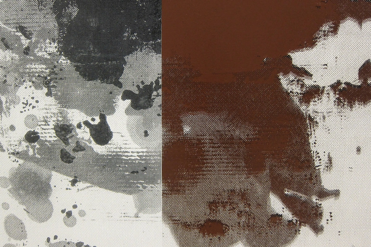
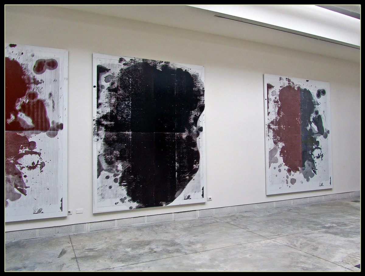
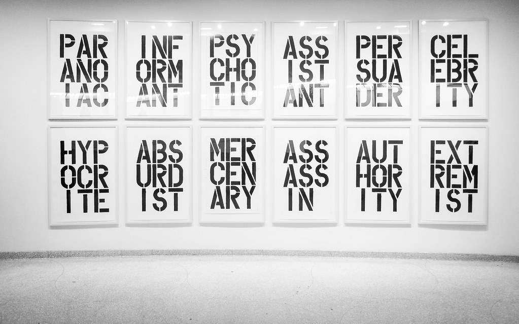
Christopher Wool: The Urban Rhythms of Repetition
Christopher Wool, an artist whose work I greatly admire, offers another fascinating perspective on abstract composition, often blending gestural abstraction with text and silkscreen processes. While his approaches vary, many of his compositions feature a stark, raw energy. He often uses repetition, layering, and erasure to build complex visual fields where elements appear and disappear, creating a sense of history and presence. His "all-over" compositions of abstract patterns or fragmented words, like those in his Black Book drawings, create a compelling visual rhythm and movement, often playing with the tension between order and chaos, or legibility and abstraction. Wool's compositional mastery lies in creating dynamic tension and a distinctive urban grit through seemingly simple, yet meticulously layered and repeated, forms that feel both structured and wildly spontaneous, much like the dynamic interplay of a city itself. If you'd like to dive deeper into his world, explore our ultimate guide to Christopher Wool.
These diverse masters demonstrate that while the journey into abstraction can be wildly different, a thoughtful engagement with composition remains a constant, shaping the very essence of their artistic vision and proving that structure is just as vital as spontaneity, a silent force guiding their revolutionary works.
Techniques I Use (and Sometimes Accidentally Discover) for Composition
Understanding these foundational principles and seeing them in the work of masters is one thing, but applying them in the studio is where the real magic happens. It’s less about following a rigid formula and more about an ongoing conversation with the canvas, a constant push and pull.
The Intuitive Approach: Trusting the Gut (and the Mess)
Many of my pieces begin with an entirely intuitive approach. I'll choose a color or make a mark simply because it feels right, a primal response to the blank space. I remember vividly once starting a large canvas, feeling utterly blocked, my brain a blank slate. I just stared, then without thinking, picked up a huge brush and made one sweeping, wild curve. It felt ridiculous, out of place, like a misplaced sneeze on a quiet morning. But that single, unexpected mark became the anchor, the rhythmic spine around which the entire composition eventually unfolded, a perfect example of trusting that initial, often illogical, instinct. It's a bit like wandering into a forest without a map, trusting that the path will reveal itself, though sometimes it leads to a spectacular dead end, which is its own kind of lesson. This spontaneous start often lays the foundational rhythms and energies that define the composition, embracing the freedom of intuitive painting. My entire creative process is deeply rooted in this – it's about listening more than dictating.

Layering for Depth and Narrative
Oh, layering! It's one of my favorite techniques, not just for adding physical depth but for building compositional richness and a sense of history. Each layer contributes to the overall structure, creating windows, obscuring elements, and pushing others forward. It’s like building an archeological dig on the canvas, with remnants of past decisions informing the present. A ghost of a line, a whisper of a color beneath the surface – these all contribute to the final composition's perceived depth and complexity, creating a subtle, unfolding narrative over time, a dance of intuition and intent. It's a way of composing not just on a flat plane, but through time.
Using Grids and Underlying Structures (Even Subtly)
Sometimes, even in the most expressive abstract work, there's an invisible grid at play. Think of artists like Piet Mondrian, who used grids to achieve a universal, rational harmony, or even the subtle divisions in Gerhard Richter's work. While I rarely map out a precise grid, I sometimes subconsciously work with implied lines or the Golden Ratio principles. The Golden Ratio, a mathematical proportion found in nature and art, can provide an aesthetically pleasing division of space, even if just a subtle suggestion. Even the simple Rule of Thirds, though often associated with photography or figurative art, can offer a subtle compositional guide in abstract work, suggesting areas for emphasis without rigid adherence. It gives me a sense of order to rebel against, or a quiet structure to build upon. It's like having a tidy desk before you make a creative mess, or a clean kitchen before you embark on a glorious, messy cooking experiment. Our ultimate guide to Gerhard Richter delves deeper into his unique approach to structure and abstraction.
Shape and Form: The Building Blocks
Whether they're organic blobs or sharp, geometric lines, shapes are fundamental to composition. How they interact—overlapping, abutting, mirroring—creates visual tension or harmony. I spend a lot of time playing with how different shapes relate to each other, trying to create conversations between them. Are they fighting? Dancing? Whispering secrets? Do they feel heavy or light? Dominant or submissive? It's a delicate choreography of forms, where each shape asserts its presence and relates to its neighbors, defining the overall spatial dynamics of the piece.
Color as a Compositional Driver
Color isn't just about aesthetics; it's a powerful compositional tool. Warm colors tend to advance, while cool colors recede, creating depth. Bright colors draw attention, while muted tones can act as a backdrop, pushing other elements forward. My approach to color mixing is always with composition in mind, thinking about how each hue will affect the visual balance and movement. Sometimes, a single unexpected color can completely shift the energy of a piece, like a sudden drumbeat changing the entire rhythm. It’s the emotional conductor of the visual symphony, guiding the viewer's eye and heart.

Mark-Making and Texture: Adding Personality
Every brushstroke, every scraped layer, every drip is a mark, and these marks contribute significantly to composition. They create rhythm, texture, and visual interest, adding a unique 'voice' to the painting. I often use diverse mark-making to build different "voices" within a single painting, from bold slashes to delicate whispers. And then there's texture! My exploration of mixed media has taught me that the tactile quality of a surface can profoundly affect how a piece is perceived compositionally, adding another layer of engagement and depth. It's the silent language of touch, inviting you to lean in and feel the surface with your eyes.
The Power of Edges and Cropping
In abstract art, the edges of the canvas are not just boundaries; they are active compositional elements. How shapes and lines meet, or don't meet, the edge can dramatically alter the feeling of a piece. Does a form extend beyond the canvas, implying a larger world? Or is the composition tightly contained, creating a focused, intimate space? Cropping, whether intentional in the initial design or during the viewing, also plays a role in defining the composition. It's about what you choose to include and exclude, and how those choices frame the visual experience. Sometimes, a perfectly cropped piece feels like a stolen glance into a private universe, or a carefully curated glimpse of something vast.
Practical Starting Points for Aspiring Abstract Artists
If you're just beginning your journey into abstract art and composition feels daunting, remember that even masters started somewhere. Try these simple exercises: Thumbnail Sketches to quickly explore multiple compositional ideas without committing to a large canvas; Value Studies using only black, white, and grays to understand light and shadow relationships without the distraction of color; or Color Studies focused purely on how hues interact and create visual weight. These small steps can build a strong foundation for your larger, more expressive works.
The Impact of Composition: Why It Truly Matters
Ultimately, composition isn't just an academic exercise; it's the bridge between the artist's intention and the viewer's experience, the silent language that connects two souls across time and space. It's the underlying pulse of the artwork that resonates with our own inner rhythms.
Evoking Emotion and Resonance
A well-composed abstract piece can evoke powerful emotions. The balance of elements, the implied movement, the push and pull of contrast—all contribute to the feeling a painting conveys. A chaotic composition might induce anxiety or excitement, while a balanced one could bring a sense of calm. It's like a silent symphony for your soul, playing on your emotional palette. This is also where an artist's personal visual language or signature style truly shines through; their consistent compositional choices become recognizable, a unique voice speaking without words, a direct line from my gut to yours. It’s how I find my voice and share it without a single representational image.
Crafting a Non-Literal Narrative
Even without recognizable figures, composition can suggest a story. The way shapes move across the canvas, or how colors interact, can hint at conflict, harmony, growth, or decay, implying narrative arcs. The very absence of a literal subject forces the viewer to engage with the abstract elements – the lines, shapes, and their arrangement – to construct meaning. For me, composition is integral to decoding the personal symbolism and narratives within my work, but it also silently broadcasts the artist's emotional state or the raw energy of the creative process. A frenetic, imbalanced composition might scream urgency or chaos, while a calm, expansive arrangement could whisper peace. It’s about creating a narrative space, inviting you to project your own stories onto it, and perhaps even feel the echoes of my own journey. It’s a shared hallucination, if you will, a whispered secret between canvas and consciousness.
Engaging the Viewer: The Silent Conversation
A truly effective composition draws you in and keeps you there. Your eyes dance, explore, and discover new relationships between elements. It’s not passive viewing; it’s an active engagement. The composition whispers, "Look here, now here, and then notice that." It’s an invitation to participate in the art itself, a visual dialogue between canvas and consciousness. What conversations do you find yourself having with abstract art? Do you listen, or do you try to speak over it? It's a call to pause, to feel, to simply be with the artwork.
Enhancing Your Space: From Canvas to Room
Beyond the canvas, composition's impact extends to how the art interacts with its environment. A dynamically composed piece can energize a minimalist room, while a serene composition might bring peace to a busy space. Understanding how composition works can even help you in decorating with abstract art in open-concept living spaces, ensuring a harmonious flow. It's about finding the right visual anchor, the perfect conversation starter for your walls.
Learning to See: Critiquing Abstract Composition
So, how do you, the viewer, begin to unpack the compositional magic of an abstract piece? It's less about finding a 'right' answer and more about asking questions and trusting your intuition. Start by letting your eyes wander, then try to pinpoint where they naturally rest first – that's likely the focal point. Observe the implied movement: do your eyes flow smoothly or jump frenetically? Look for balance: does the piece feel stable, or purposefully unsettling? Notice the contrast in colors, shapes, or textures. How do these elements relate to the edges of the canvas? Are there areas of negative space that feel as important as the filled areas? By consciously engaging with these principles, you move beyond simply 'liking' or 'disliking' a piece, and begin to understand why it resonates, opening up a richer, more profound dialogue with the art. It’s a skill that grows with practice, like learning to savor a fine wine, or understand a complex poem. And remember, the goal isn't necessarily to decipher the artist's exact intent, but to open yourself to the artwork's unique conversation.
My Ongoing Journey with Composition
Composition, for me, is an endless exploration, a dance between intention and accident. It's a reminder that even in the wildest chaos of abstract expression, there's a profound, often hidden, order waiting to be discovered or created. It’s the quiet voice that reminds me that every mark, every color, every decision on the canvas, however spontaneous, contributes to the whole. It’s the ultimate paradox: freedom within structure. Perhaps this journey with composition mirrors our own lives—a constant attempt to find meaning and order amidst the beautiful, messy, glorious chaos. The unseen backbone is always there, guiding and holding things together. I invite you to join this exploration, whether through creating, viewing, or simply contemplating the 'unseen backbone' of abstract art. If you're inspired to bring this conversation into your own space, explore my art for sale or visit my museum in 's-Hertogenbosch to experience these principles in person.


