Using Bold Outlines in Art: A Practical Guide to Making an Impact
Discover when and how to use bold outlines in your painting and drawing. A practical, personal guide to creating structure, impact, and a graphic feel in your artwork.
The Power of the Bold Outline: Why I Learned to Stop Worrying and Love Drawing Like a Cartoonist
An opinionated, comprehensive deep dive into the history, tools, and techniques of using bold outlines to make your art pop.
I’ll admit it. For years, I thought bold outlines were for coloring books. A crutch. The kind of thing you did before you really learned how to paint, how to blend colors and create soft, realistic edges. To me, a thick black line around an object screamed ‘amateur.’
I was so, so wrong.
It took me a while, but I came to see the outline not as a crutch, but as a megaphone. It’s a deliberate choice, a powerful tool for emphasis, structure, and pure, unadulterated style. It’s the difference between a whisper and a declaration. And once you understand how to wield it, it can completely transform your art. And honestly, if you're here trying to figure out how to make your art pop, you're already on the right track. This simple, often overlooked technique is one of the most direct routes to injecting personality and impact into your work.
So, let’s talk about lines. Not the subtle, suggestive kind, but their loud, confident cousins.
First, What Exactly Are We Talking About?
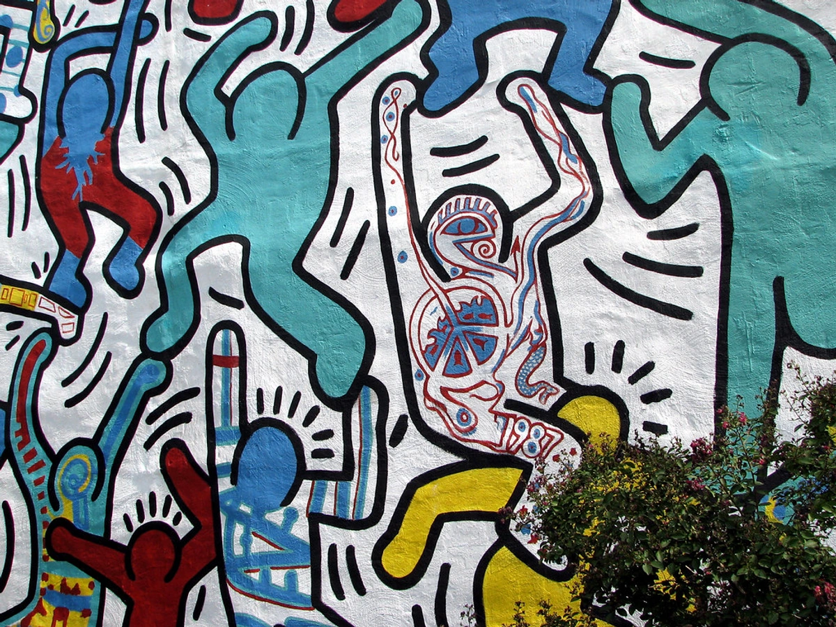
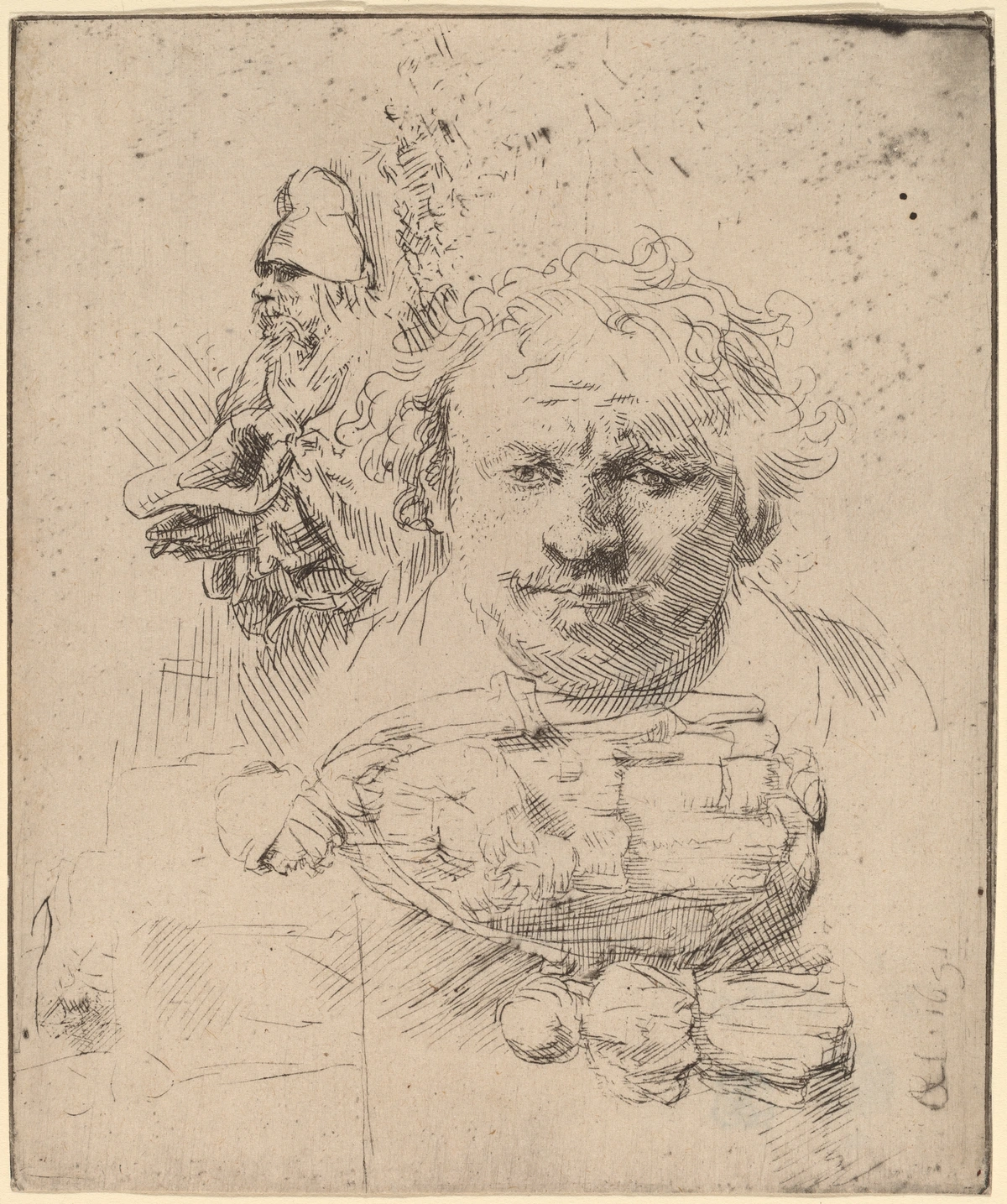
A bold outline is essentially a strong, defined line that separates a subject from its background or from other elements in the composition. Think comic books, stained glass windows, or the brilliant, unapologetic work of artists like Keith Haring. It’s a technique that doesn't hide. It defines.
This is different from the sensitive, varied line weight you might see in a life drawing, where lines get thicker and thinner to suggest form and shadow. The bold outline is more graphic, more immediate. It’s one of the fundamental elements of art, used with intention. It's about making a conscious decision to prioritize clarity and shape over the illusion of reality. This graphic nature forces the artist to think in terms of shape and design rather than just replicating what they see, a mental shift that can fundamentally alter your approach to art-making itself. It's a tool for simplification and amplification, a way to take a complex scene and distill it into its essential energy.
From Cave Walls to Canvas: A (Biased) History of the Bold Outline
A few years ago, I stumbled across a documentary about prehistoric art, and it hit me—the very first artists were outline artists. Think about the hand stencils in the Lascaux caves. That spray of pigment around a hand? It's the primal act of separating a figure from its ground. We've been wired to understand the world through defined shapes for tens of thousands of years. It's a language our brains are desperate to parse.
So, the idea of using strong lines is hardly new. It’s been with us for centuries, long before it became a hallmark of modernism.
- Ancient Roots & Printmaking: Look at historical woodcuts. To print an image, you literally have to carve away everything that isn't a line. The line is the hero of the entire process. Artists like Albrecht Dürer were masters of this, creating incredibly complex scenes with nothing but lines.
- Japanese Ukiyo-e: Masters like Hokusai used bold, fluid outlines in their woodblock prints to capture everything from epic landscapes to intimate daily scenes. These outlines provided structure and clarity, and they had a massive influence on European artists.
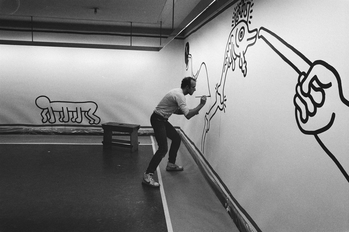
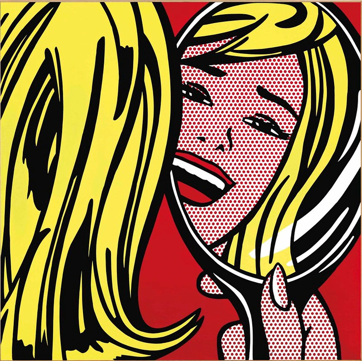
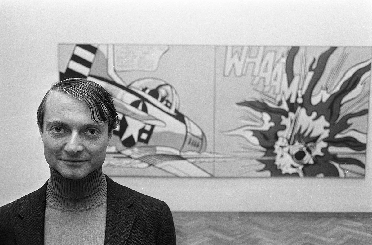
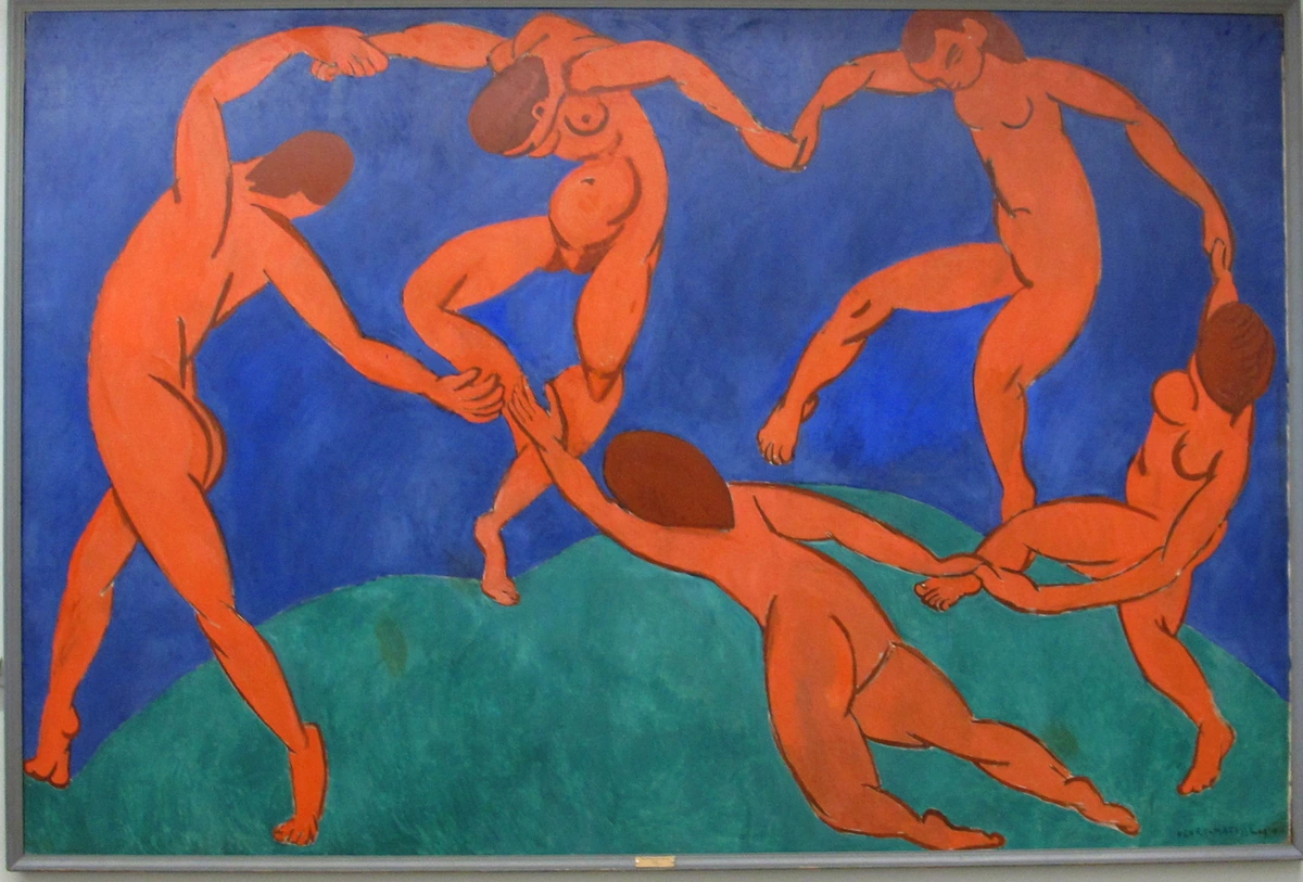
- Modern Art's Embrace: In the late 19th and early 20th centuries, European artists, tired of chasing realism, fell in love with the outline all over again. The Fauvists, like Henri Matisse, used it to contain wild, expressive fields of color. Then came Pop Art, where artists like Roy Lichtenstein elevated the comic book style, making the thick black outline an iconic part of their work.
This wasn't a step backward; it was a conscious rebellion. A move away from realism and toward graphic impact and pure design in art.
The Big "Why": When to Unleash the Outline
So, when should you reach for that thick marker or load your brush with black paint? It’s not about fixing a wobbly drawing (though, let's be honest, it can sometimes help). It’s about what you want to achieve.
Goal | Why a Bold Outline Works | Example |
|---|---|---|
| Create a Focal Point | The human eye is drawn to contrast. A strong outline separates your subject from the noise around it, telling the viewer, "Look here!" | A single outlined figure in a busy, painted background. |
| Achieve a Graphic Style | It instantly gives your work an illustrative, stylized, or cartoonish feel. Perfect for posters, murals, and narrative art. | The work of Keith Haring is a masterclass in this. |
| Flatten the Picture Plane | By outlining everything, you reduce the illusion of three-dimensional depth. This is a key technique in how to abstract art and modernism. | Henri Matisse's interiors, where wallpaper and a tablecloth feel like they exist on the same plane. |
| Contain and Separate Color | It creates a container for color, making each hue pop. It’s like the lead in a stained glass window, letting each piece of glass shine. | Stained glass art, or paintings that mimic that effect. |
| Convey Energy & Emotion | A raw, aggressive outline can add a jolt of energy and raw emotion, a signature of movements like Neo-Expressionism. | The frenetic, outlined figures in the works of Jean-Michel Basquiat. |
My Go-To Tools for Making a Statement
You don’t need anything fancy, but different tools give you different feelings. The choice of your tool can fundamentally change the personality of your line. A line from a sleek marker feels completely different from one dragged out of a lump of charcoal. I’ve experimented with a ton of them, and these are some of my favorites, the ones I keep coming back to. Think of your tool as an extension of your hand and your intent.
The Digital Contender: Posca Paint Markers
Posca Paint Markers are my absolute favorite for adding sharp, clean lines to acrylic paintings. They feel like cheating in the best way possible, like having a digital "undo" button but in the real world. The pros are clear: the lines are opaque, incredibly consistent, and the colors are vibrant. You can work on top of almost any dry media, which is a lifesaver when you need to rescue a section that's gotten a bit muddy. The only downside is that their perfection can sometimes look a bit 'flat' or 'digital', and the cost can add up if you're outlining a large canvas. For a final, crisp, confident definition, they're hard to beat.
The Buttery Traditionalist: Oil Sticks
Oil Sticks are a completely different beast. They create a powerful, expressive line that feels deeply integrated with the paint because, well, it is. The texture is buttery and rich, sinking into the canvas grain. The danger is that they can get muddy if the paint layer underneath is still wet, and they smudge very easily until they're fully dry. But if you're after a raw, gestural look with a lot of physical presence, they're perfect. I love exploring oil sticks for expressive mark making when I want the line to feel like it's part of the painting's history, not just a final addition.
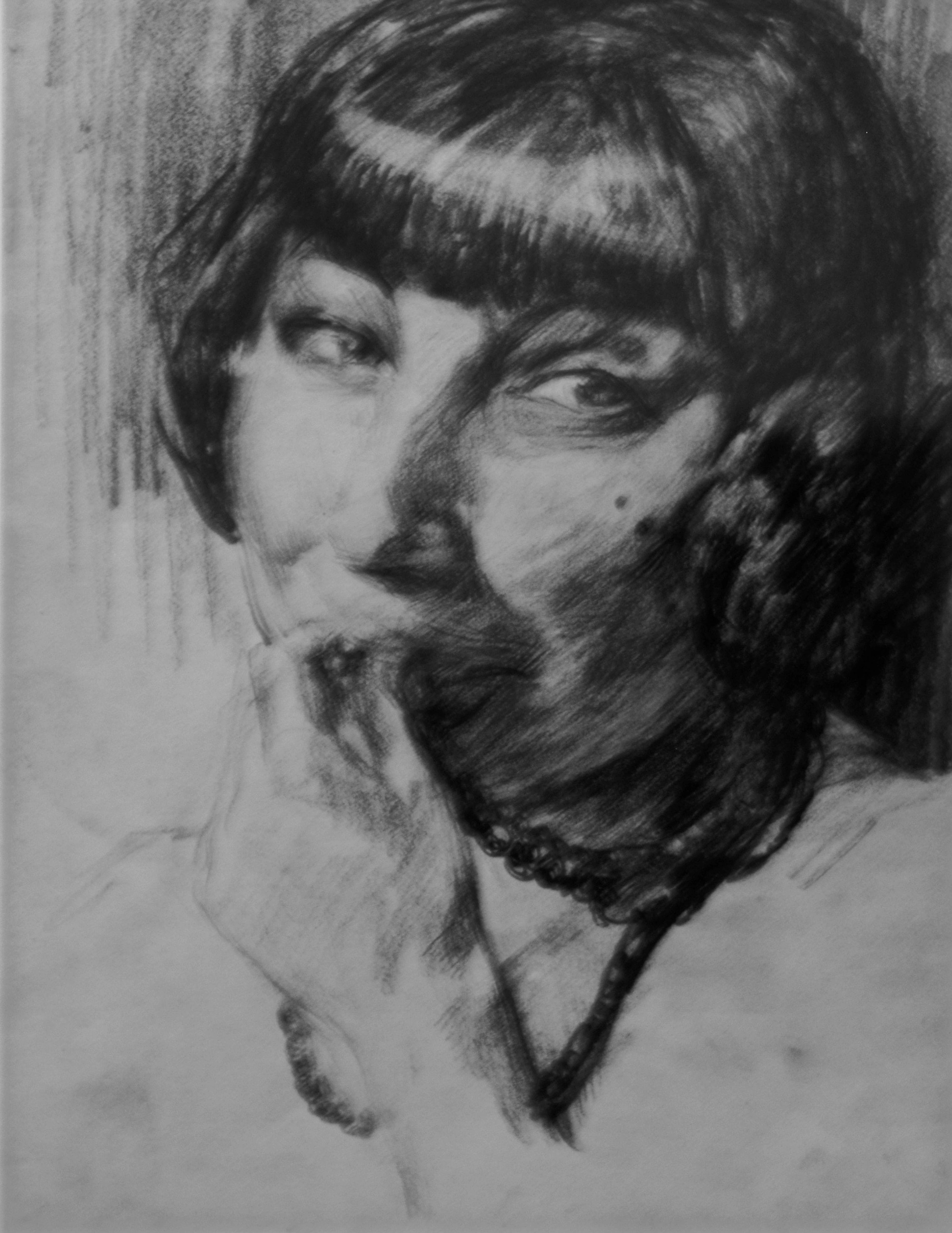
The Primal Classic: Compressed Charcoal
It's hard to beat the primal satisfaction of compressed charcoal. It gives you deep, velvety blacks and can be smudged and manipulated for a softer or grittier feel. The main drawback, of course, is that it's incredibly messy—expect black fingerprints on everything—and absolutely needs to be sealed with a fixative spray to prevent it from turning your artwork into a dusty gray mess. For pure, raw, dramatic power in a drawing, especially on toned paper, it's still the classic for a reason.
The Skillful Master: India Ink & a Brush
Using India ink & a brush is like learning to drive a manual transmission car. It requires a steady hand, a practiced touch to control the ink flow, and a willingness to embrace "happy accidents." It offers the most beautiful variations in line weight, allowing you to go from a hair-thin whisper to a thick, powerful statement in a single stroke. It can feel unforgiving if you make a mistake, but the learning curve is worth it. The payoff is a line with true character and soul, one that breathes.
Tool | The Feeling It Creates | Best For | A Quick Tip |
|---|---|---|---|
| Posca Paint Markers | Sharp, digital, confident, graphic | Clean-up, sharp definition, graphic styles | Shake well and press the tip on scrap paper to get the ink flowing before you touch your painting. |
| Oil Sticks | Buttery, gestural, integrated, textured | Laying down strong lines in oil or acrylic | Let your under-painting dry completely first to avoid muddying your colors. |
| Compressed Charcoal | Raw, powerful, dramatic, smudgy | Expressive drawing, high-contrast work | After sealing with fixative, you can add more layers on top for incredibly deep tones. |
| India Ink & Brush | Varied, characterful, traditional, calligraphic | Ink drawings, expressive outlining, mastering line weight | Practice on scrap paper to get a feel for the ink flow before committing to your final piece. |
| Fine Liners (e.g., Micron) | Precise, controlled, delicate, consistent | Detailed illustrations, comics, technical work | Don't press too hard! A light touch preserves the tip and provides a smoother line. |
| Graphite Pencils (6B-8B) | Soft, blendable, subtle, familiar | Exploring outlines before committing permanently | Use a light box to trace a refined pencil outline onto your final surface. |
| Acrylic Paint Markers | Vibrant, opaque, versatile, layered | Adding color to outlines, working on dark backgrounds | Layer different colors while the base is wet for a soft blend, or wait for it to dry for a crisp edge. |
The "Danger Zone": When to Put the Pen Down
Could I write a whole article gushing about outlines? Yes. Are they always the right choice? Absolutely not. I've found myself in the studio, ready to "fix" a painting by outlining a section, and I've had to physically stop my own hand. It's a powerful urge, a siren song of clarity, but it's not always the right one. Knowing when not to outline is just as critical as knowing how to do it.
Be cautious if you're aiming for:

- Photorealism: Bold outlines are the natural enemy of subtle, realistic transitions of light and shadow. In realism, edges disappear into backgrounds; they melt into one another. A hard outline shatters this illusion of reality, immediately flattening the form and reminding the viewer they're looking at a picture.
- Atmospheric Perspective: If you want to create a sense of deep, misty space (where things get lighter, paler, and less focused in the distance), outlines will work against you by bringing every element forward to the same plane. An outlined tree in the distance contradicts the laws of atmosphere.
- A Soft, Dreamy Mood: Hard lines create... well, hardness. For a soft, ethereal, or romantic feel, you’ll want to rely on blended, lost-and-found edges and gentle color shifts. Think of the way light fades at dusk—there are no black lines separating the sky from the land, only gradients of color and light.
There's another danger zone I've stumbled into personally: over-reliance. An outline can become a crutch that prevents you from mastering more challenging techniques of edge control. If you use a black line to solve every problem of where one shape meets another, you might never learn the delicate dance of "lost and found" edges that gives a painting true sophistication. It’s all about intention. Know the tool, and know when its strength becomes a limitation for your vision. Sometimes, the most powerful statement is the line you decided not to draw.
Putting Theory into Practice: A Simple Exercise
Reading about a technique is one thing; feeling its power is another. If you're feeling skeptical, or just eager to experiment, try this incredibly simple exercise. It takes about ten minutes and can be a real eye-opener.
- Find a Reference: Grab a photo from a magazine or find a simple still life in your home. A piece of fruit on a table works perfectly.
- Draw It Twice: Create two quick, gestural sketches of your subject. Just get the basic shapes down. Don't spend more than two minutes on each.
- The Experiment: Leave the first sketch as it is. Take a thick black marker and trace around every major shape in the second sketch. Don't overthink it. Just go for it.
- The Comparison: Now, lay the two sketches side by side.
I'd be willing to bet the outlined version feels more confident, more graphic, and more intentional. It's a low-stakes way to prove to yourself that this isn't a trick; it's a fundamental shift in how you define your subject. It forces you to make decisions about shape and edge that we often gloss over.
This little test is a microcosm of a larger artistic journey. It’s about moving from passively observing the world to actively declaring your interpretation of it.
Beyond the Line: Choosing Your Outliner's Color
One of the most frequent questions I get isn't about if you should outline, but what color to use. The knee-jerk reaction is black, but it's far from your only option. The choice of color sets an entirely different mood.
- Black: The classic. It provides the most contrast and graphic power. It's a statement of pure form and edge. When in doubt, black will always deliver clarity and punch.
- White: This creates a luminous, halo-like effect. It can make an object look like it's glowing or being lit from behind. It's softer than black but can be just as powerful.
- Complementary Colors: This is where it gets interesting. Try outlining an orange object with a blue line, or a green object with a red one. Using the color wheel's opposite creates a vibrant, buzzing energy. The colors seem to vibrate against each other, adding a layer of dynamic tension.
- Monochromatic: Outlining with a darker or lighter shade of the object's own color. For example, outlining a mid-tone blue shape with a deep navy blue. This is a subtler approach. It defines the form without the harsh graphic contrast, creating a more unified, harmonious feel.
- Metallics: Gold, silver, or copper outlines add a touch of opulence and graphic decoration. They can elevate simple shapes into something more ornamental and precious.
The best way to figure out what works? Scribble some shapes on a page and try outlining them in different colors. It's a five-minute experiment that can change your entire color strategy.
Advanced Techniques: Beyond the Simple Line
Once you're comfortable with the basics, the world of outlining opens up into a playground of advanced techniques. These methods can add layers of complexity and sophistication to the simple line, turning it from a boundary into a feature in its own right.
- Varying Line Weight: Not all parts of an outline need to be the same thickness. This is a principle straight out of calligraphy and classic illustration. A thick line can suggest shadow, weight, or a part of the form that is closer to the viewer. A thin line can indicate light or a part that is turning away. By deliberately varying the thickness of your outline around a single object—perhaps making it thicker where the form meets a shadow and thinner where it catches the light—you can suggest volume and depth even while working in a graphic style.
- Implied or Broken Outlines: Who says the line has to be continuous? Leaving deliberate gaps in your outline can be incredibly effective. It encourages the viewer's brain to complete the shape, making them an active participant in the artwork. This technique, sometimes called a "lost-and-found" line, can create a sense of mystery and subtlety, allowing the form to breathe and softly merge with the background in certain areas.
- Double Outlines (The "Inset" Effect): This is a fantastic trick for creating a sense of dimension. Outline your shape with one color, and then add a second, slightly offset outline next to it. It creates an effect similar to a drop shadow or a beveled edge, making the subject look like it has been slightly lifted off the page. It's a stylistic choice that screams graphic design and can add a playful, almost digital quality to your work.
- Decorative and Textural Outlines: An outline doesn't have to be a plain, smooth line. What if your outline was made of tiny dots (stippling), short dashes, or a zig-zag pattern? What if it faded from black to gray halfway around the form? By using a different kind of mark to create your boundary, you can add texture, rhythm, and a unique decorative element that reinforces the mood or subject matter of your piece. A jagged, nervous outline feels completely different from one made of soft, rolling waves.
Playing with these techniques bridges the gap between the simple, functional line and a more expressive, personal mark. It shows that the outline isn't just a container; it's another brush in your toolkit, capable of incredible nuance.