The Power of the Line: Why Bold Outlines Make Art Pop
Ever wonder why cartoons and pop art are so compelling? I dive into the psychology and history of bold outlines, from Japanese prints to modern art, and explore why that simple line is one of art's most powerful tools.

The Power of the Line: Why Bold Outlines Make Art Pop (And How to Use Them)
I have a confession. Whenever I'm sketching and something feels... off, weak, or just not quite there, I have a secret weapon. I reach for a thick, black marker and I trace the whole thing. Every single time, it’s like a little jolt of electricity hits the page. Suddenly, the image has presence. It has attitude. It exists.
I think we all have this instinct. It’s the same reason kids’ coloring books have thick lines. It's an act of definition, of making a statement. But what is it about a simple, bold outline that has so much power? It's more than just a container for color. It's a fundamental tool that artists have used for centuries to direct the eye, create emotion, and make their work unforgettable. Let's get into it.
First, What Are We Even Talking About? Outline vs. Contour
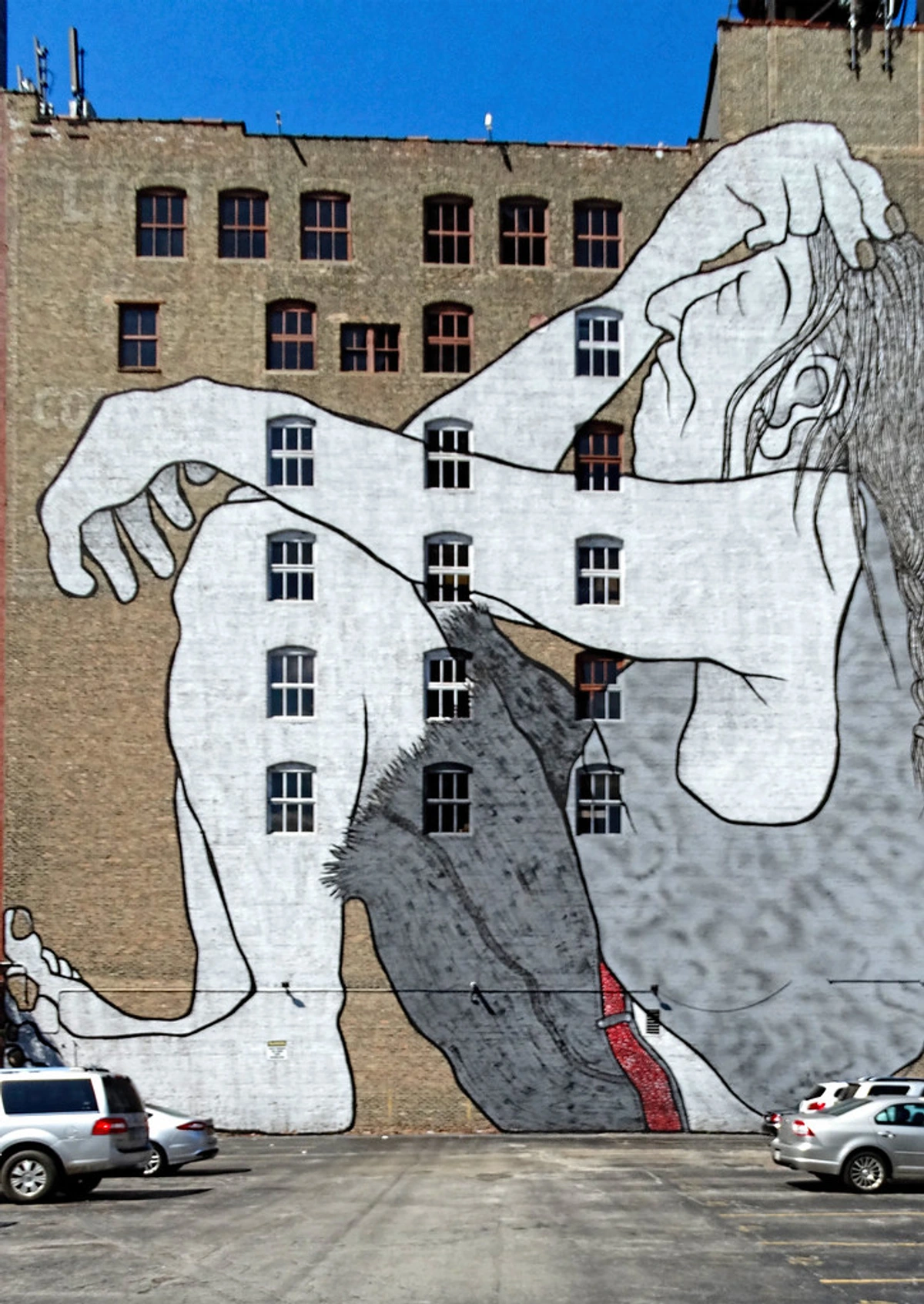
Before we go too deep, let's clear something up. People often use 'outline' and 'contour line' interchangeably, but they're slightly different beasts. Think of it like this: an outline is the edge of a flat shape, like a silhouette. A contour line describes the form of an object, including its interior shapes and three-dimensional volume.
Feature  | Bold Outline | Contour Line |
|---|---|---|
| Primary Goal | To define and separate a shape from its background. | To describe the form, volume, and surface of an object. |
| Appearance | Often a uniform, heavy weight. Think cartoons. | Varies in weight to suggest light, shadow, and form. |
| Effect | Creates flatness, graphic impact, and clarity. | Creates depth, dimension, and realism. |
For this article, we're mostly focusing on that powerful, graphic outline, but it’s good to know the difference. The principles often overlap, and a great artist knows when to blend the two.
The Psychology of the Bold Line: Why Our Brains Love It
So why does that thick black line work so well? It’s basically a cheat code for our brains. Our minds are constantly trying to make sense of the visual noise around us. A bold outline does a few key things to help:
- Clarity and Order: It separates objects from each other and from the background. It turns a confusing scene into a set of clearly defined elements. It’s visual organization, and our brains find that incredibly satisfying.
- Focus: A strong line is a command: "Look here!" It draws the eye and holds it, making the subject the undeniable star of the show. There's no ambiguity.
- Energy and Confidence: A shaky, uncertain line feels timid. A bold, clean line feels confident, decisive, and energetic. That confidence is transferred directly to the artwork itself.
- Emotional Resonance: Depending on its use, an outline can make something feel playful and fun (like in comics) or stark and serious. It's a powerful mood-setter.
A Quick Trip Through Time: Outlines in Art History
This isn't some new-fangled idea. The bold outline has been a recurring character throughout art history, popping up whenever artists needed to make a strong, clear statement.
Ancient and Classical Roots
Long before the Renaissance, ancient cultures used bold outlines for both practical and aesthetic purposes. Egyptian hieroglyphs relied on clear, defined lines to ensure readability across different materials and distances. Greek vase paintings used outline techniques to define figures, often filling them in with black slip before firing. These weren't decorative choices—they were essential for communication and storytelling in societies where visual literacy was paramount.
Renaissance and Baroque: The Age of Definition
During the Renaissance, artists like Leonardo da Vinci and Michelangelo used outlines as part of their preparatory drawings, but they often softened these lines in their final paintings to create the illusion of depth. However, in woodcuts and engravings—important mediums of the time—bold outlines were absolutely essential. Albrecht Dürer's detailed engravings relied on precise lines to create depth and texture without color, showing how outline techniques evolved to serve different artistic needs.
The Romantic Era: Emotion Through Line
In the Romantic period, artists like Francisco Goya used bold, expressive outlines to convey emotion and drama. Goya's "Los Caprichos" series features etchings with strong, sometimes jagged lines that reflect the social commentary and psychological depth of his work. Here, the outline became more than a technical element—it became a vehicle for emotional expression.
From Woodblocks to Stained Glass
Long before modern printing, think about Japanese Ukiyo-e woodblock prints. The very nature of carving a block of wood necessitates strong lines to separate areas of color. These lines weren't just a technical necessity; they became a core part of the aesthetic, creating dynamic and beautifully composed scenes.
Similarly, look at the stained glass windows of medieval cathedrals. The lead came—the black lines holding the pieces of glass together—acts as a powerful outline. It was a structural need that created a divine, graphic style that could be 'read' from far below.
The Renaissance and Beyond: Technical Innovation
The invention of the printing press in the 15th century created new demand for bold outlines. Woodcuts and engravings needed clear lines to ensure the image would transfer properly to paper. Artists like Albrecht Dürer mastered this medium, using outlines to create incredible detail and texture. Their work shows how technical constraints can actually drive artistic innovation—necessity became the mother of beautiful, bold line work.
Art Nouveau: Organic Outlines
In the late 19th and early 20th centuries, the Art Nouveau movement embraced flowing, organic outlines. Artists like Alphonse Mucha used elegant, sinuous lines to create posters and illustrations that felt both modern and timeless. Unlike the geometric precision of earlier movements, Art Nouveau outlines were inspired by natural forms—flowers, vines, and the human body—showing how the same basic technique can serve entirely different aesthetic goals.

The Comic Book and Pop Art Explosion
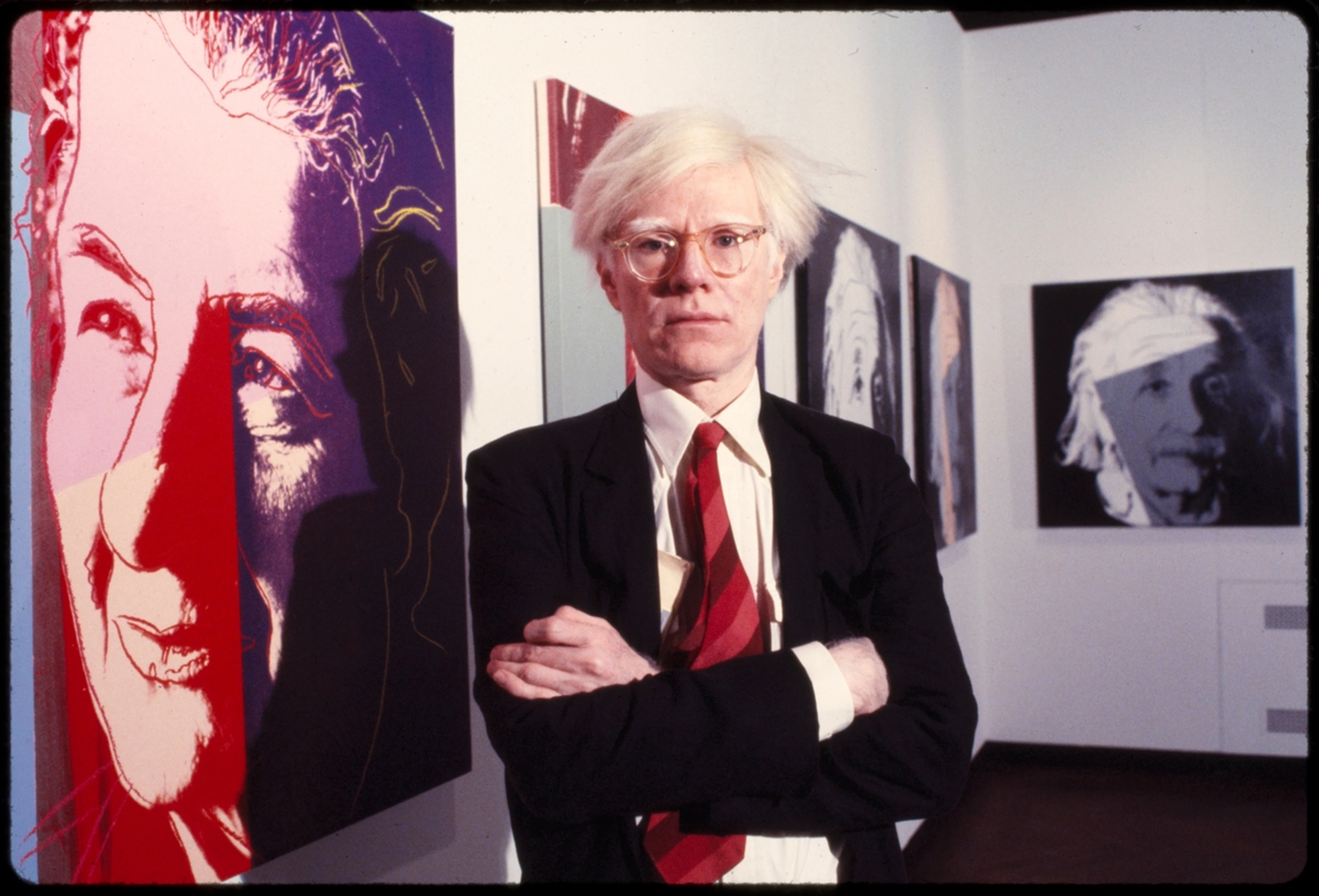
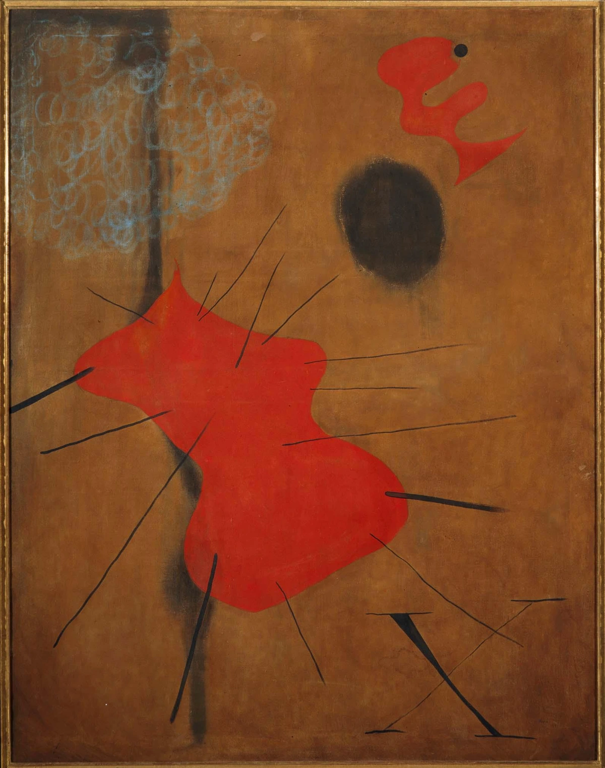
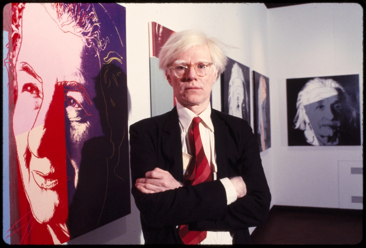
This is where the bold outline really became a superstar. In the mid-20th century, artists like Andy Warhol and Roy Lichtenstein looked at the so-called 'low art' of comic books and advertising and saw something brilliant. They took the thick black lines, flat colors, and Ben-Day dots of mass production and elevated them to the gallery wall.
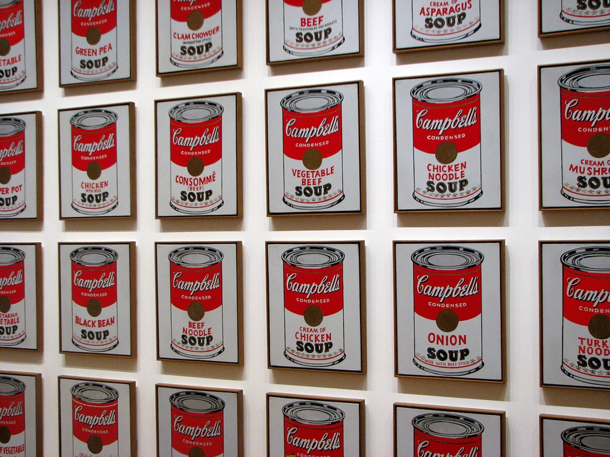
Warhol’s work, like his famous soup cans, used outlines to turn everyday objects into icons. The line separated the object from its original context and presented it as a pure, graphic symbol. It was a radical statement about what could be considered art, and the bold outline was its language.
Modern Mavericks: The Outline Reimagined
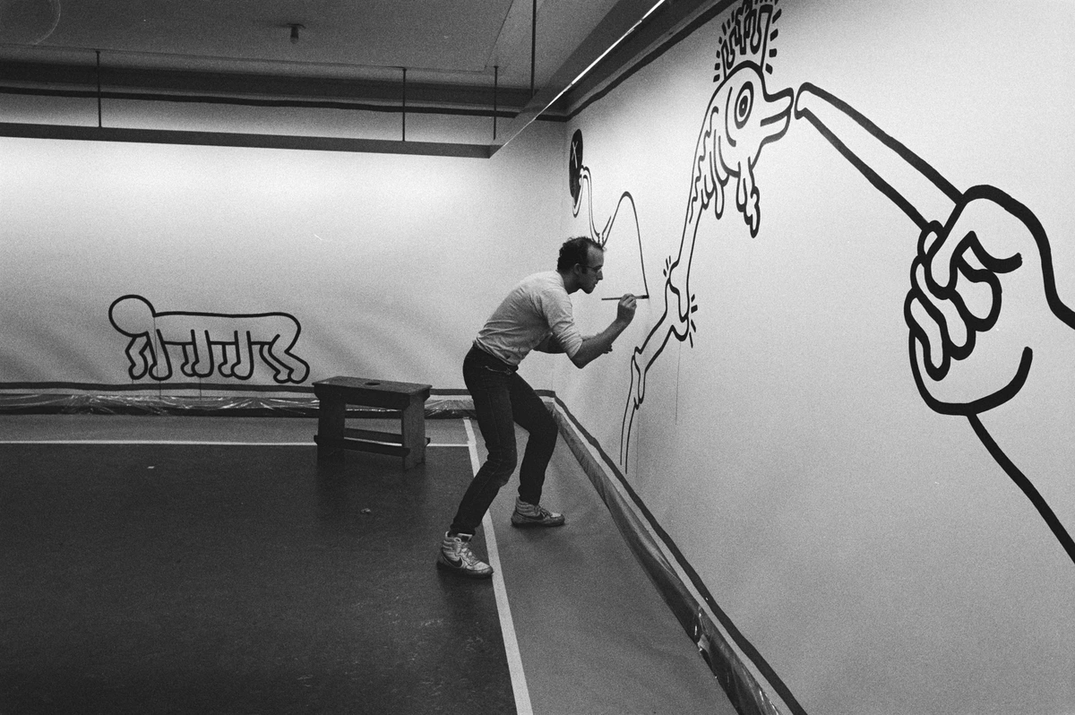
Artists continue to push the boundaries of what an outline can do. Keith Haring used his continuous, bold line to create a universally understood language of figures that pulsed with the energy of 1980s New York. His lines weren't just outlines; they were life-forces.
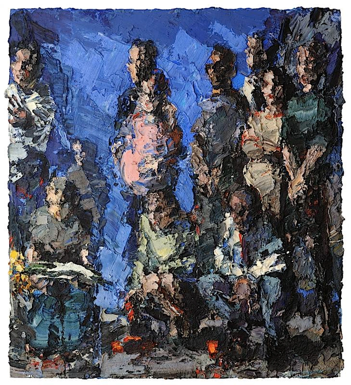
Then you have someone like George Condo, whose work often features fractured, cubist-inspired figures held together by chaotic but deliberate outlines. His lines don't create simple clarity; they define a complex and often turbulent psychological space. It shows that an outline doesn't always have to be neat and clean to be effective.
Spotlight: Artists Who Mastered Bold Outlines
Jean-Michel Basquiat: Basquiat's work features raw, expressive outlines that feel both childlike and deeply sophisticated. His lines carry emotional weight, often filled with text and symbols that comment on social and political issues. For Basquiat, the outline was a container for meaning as much as it was a visual element.
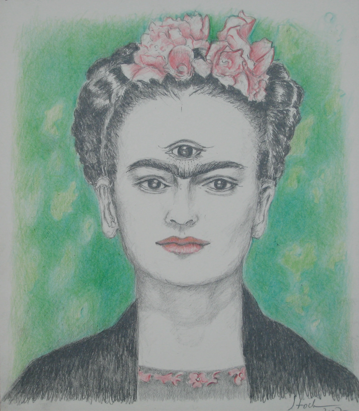
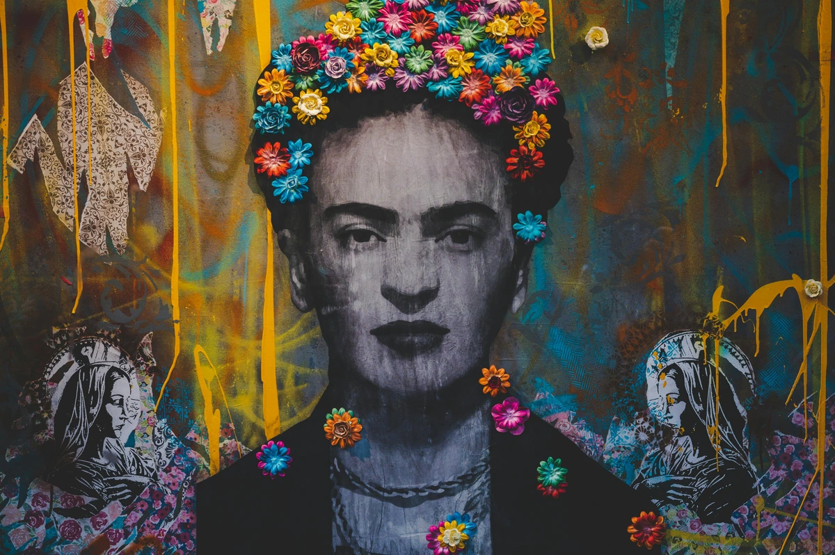
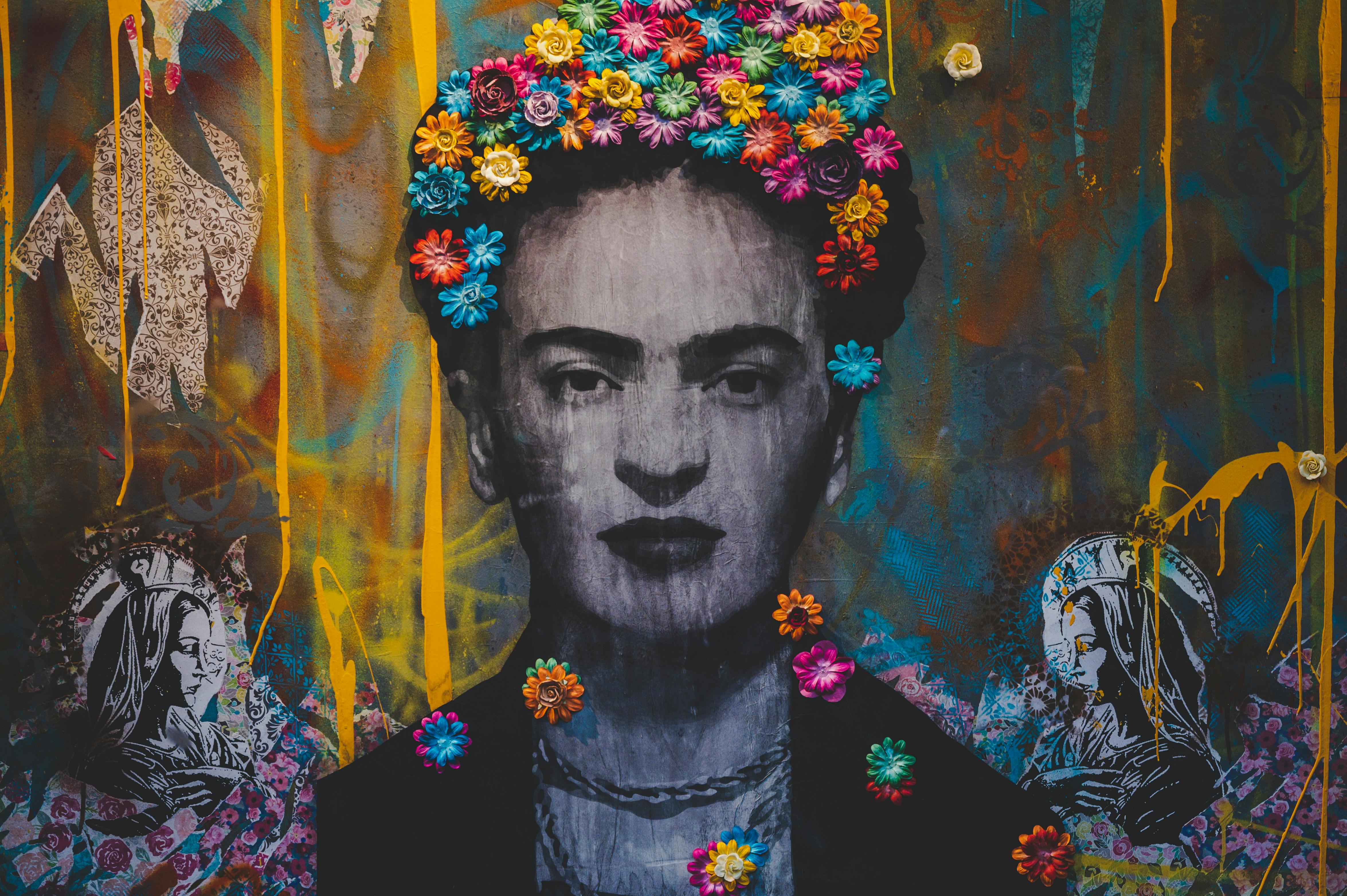
Frida Kahlo: Though known for her realistic style, Kahlo used bold outlines to define her surreal and symbolic imagery. Her self-portraits feature strong, deliberate lines that contain the complex emotional and narrative content of her work. The outlines create a sense of permanence and importance around her personal stories.
Kara Walker: Walker uses silhouette outlines—essentially extreme outlines—to explore complex themes of race, gender, and power. Her large-scale installations cut figures from black paper, creating powerful visual narratives through the absence of detail and the emphasis on shape and outline. She demonstrates how the oldest form of outline can still be incredibly relevant and powerful today.
Takashi Murakami: This contemporary Japanese artist blends traditional Japanese line work with pop culture references. His "superflat" style uses bold outlines to create characters that feel both cute and subversive. Murakami shows how bold outlines can bridge traditional and contemporary aesthetics, creating work that is both accessible and conceptually rich.
Emerging Voices in Contemporary Art
Contemporary artists continue to find new ways to use bold outlines. Kara Walker uses silhouettes—essentially extreme outlines—to explore complex themes of race and identity. Her work shows how the oldest form of outline (the silhouette) can still be powerfully relevant today. Julie Mehretu uses architectural and drawing-like outlines to create layered, complex compositions that feel both historical and urgent. These artists demonstrate that the bold outline is far from exhausted—it remains a vibrant, evolving tool for contemporary expression.
Step-by-Step: Creating Your Bold Outline Masterpiece
Ready to put these principles into practice? Here's a simple exercise to help you master bold outlines:
Exercise: The Bold Outline Challenge
What you'll need: Paper, pen or pencil, your favorite medium (colors optional)
Step 1: Choose Your Subject Select a simple subject with clear edges. It could be a coffee mug, a houseplant, or a simple geometric shape. The key is to choose something with distinctive outlines.
Step 2: Sketch Lightly Draw your subject with very light, tentative lines. Don't worry about perfection—this is just about getting the basic proportions and placement right.
Step 3: Add Bold Outlines Now go over your light sketch with bold, confident lines. Press harder with your pen or use a thicker marker. Make decisive strokes—don't go back and forth trying to "fix" lines.
Step 4: Vary Your Line Weight Identify areas where your subject overlaps or where shadows fall. Make these areas slightly thicker than other parts of your outline. This adds depth and visual interest.
Step 5: Add Color (Optional) If you're using color, fill in your shapes. Notice how the bold outlines contain the colors and make them pop. Experiment with different outline colors to see how they affect the overall mood.
Step 6: Analyze Your Results Look at your finished piece. How do the bold outlines affect the composition? Do they draw attention to certain areas? How does the piece feel compared to if you had used softer lines?
This simple exercise demonstrates the core principles of bold outlining: confidence, variation, and purpose. With practice, these techniques will become second nature.
Advanced Bold Outline Techniques
Once you've mastered the basics, you can start exploring more advanced techniques that take your bold outlines to the next level:
The Double Outline Technique
Create outlines by drawing two parallel lines, leaving a small space between them. Fill this space with a contrasting color or pattern. This technique adds depth and visual interest, making your outlines feel more substantial and intentional.
Gradient Outlines
Instead of using a single color for your outlines, create a gradient that flows along the line. This can be done digitally with gradient tools or traditionally by carefully blending colors. Gradient outlines can create a sense of movement and energy.
Textured Outlines
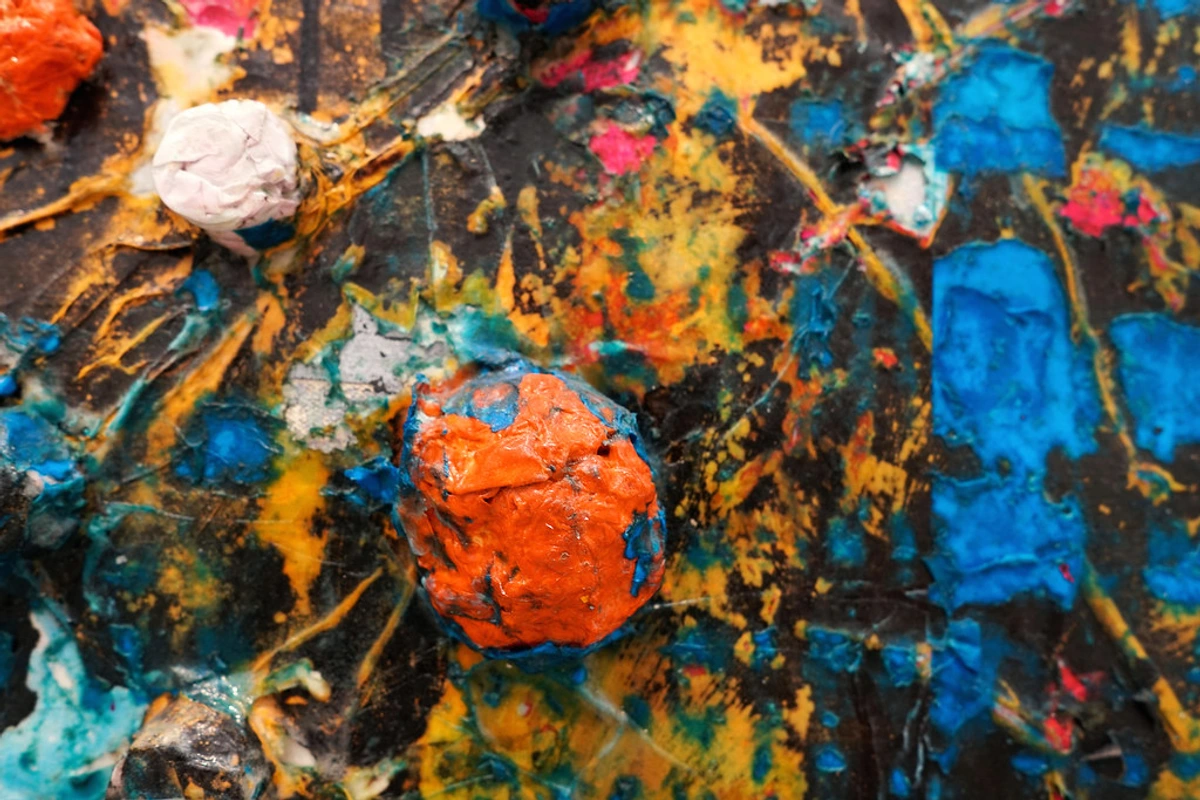
Add texture to your outlines using various techniques. Cross-hatching, stippling, or even collage elements can turn simple outlines into complex textural experiences. This works particularly well in mixed media pieces.
Negative Space Outlines
Sometimes the most powerful outlines are the ones you don't draw. Use negative space—areas where you deliberately leave no outline—to create contrast with areas where you do use bold outlines. This technique can create dramatic visual tension.
Interactive Outlines
Make your outlines part of the interactive experience. In digital art, you can create outlines that respond to user input or change based on context. In traditional art, you can use outlines that "break" or "fade" at strategic points to guide the viewer's eye.
These advanced techniques show that bold outlines are far more than just borders—they're compositional elements in their own right that can add layers of meaning and visual interest to your work.
So, You Want to Use Bold Outlines?
Thinking of incorporating this into your own work? Awesome. It's a fantastic tool to have in your belt. Here are a few things I've learned:
Essential Techniques for Bold Outlines
- Vary Your Line Weight: A completely uniform line can look a bit flat or digital. Try letting your line get a little thicker in shadow areas or where objects overlap. It adds a subtle, dynamic touch.
- Colored Outlines are a Thing: Who says an outline has to be black? Try using a dark blue, a deep purple, or even a complementary color to your main subject. It can completely change the mood.
- Embrace Imperfection: Sometimes a perfectly clean, straight line isn't what you want. A slightly wobbly, hand-drawn line can add warmth and character. Don't be afraid of the human touch. For more on this, check out the fundamentals of line as an element of art.
- Know When to Hold Back: Outlines aren't for everything. If you're going for a soft, atmospheric, or photorealistic look, a hard outline can kill the mood. It's a powerful spice—use it when you want that flavor, but don't pour it on every dish.
Medium-Specific Guide to Bold Outlines
For Digital Artists: Most drawing software offers pressure sensitivity settings that can simulate natural line variation. Experiment with different brush presets—some are designed specifically for inking. Don't forget that you can adjust line width after drawing in many programs.
For Traditional Pen & Ink: Use different pen nib sizes (005, 01, 03, etc.) to create variation. For expressive work, try a dip pen with flexible nibs that respond to pressure. Remember that ink is permanent, so work light to dark.
For Painters: Use a rigger brush (a very fine round brush) for precise outlines. You can also use a small piece of cardboard or a ruler to create straight lines. For expressive outlines, try loading your brush with just enough paint to create a consistent line.
For Mixed Media: Bold outlines work wonderfully with collage and other mixed media techniques. Use outlines to unify disparate elements and create a cohesive composition. A bold line can tie together different textures and materials into a single visual statement.
Troubleshooting Common Bold Outline Issues
Even experienced artists run into problems with bold outlines. Here are some common issues and how to fix them:
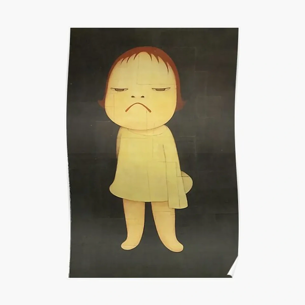
Problem: Outlines Look Too Harsh or Mechanical
Solution: Add subtle variations in line weight and incorporate slight imperfections. Use different line qualities—some smooth, some slightly textured. You can also soften harsh outlines by adding a thin "halo" of complementary color around them.
Problem: Outlines Compete with the Main Subject
Solution: Reduce the contrast between your outlines and your subject. Try using a darker shade of your subject's color for the outline instead of pure black. You can also make the outlines thinner in areas where you want the focus to be on the subject itself.
Problem: Outlines Make the Piece Feel "Flat"
Solution: Use line weight variation to create the illusion of depth. Make outlines thicker where objects overlap or in shadow areas. You can also add subtle "halftone" patterns or textures within outlined shapes to create visual depth.
Problem: Digital Outlines Look Pixelated or Blurry
Solution: Make sure you're working at a high resolution (300 DPI or higher). Use vector-based tools for clean, scalable outlines. If working with raster tools, use brush presets that are designed for crisp lines and avoid excessive smoothing.
FAQ: Your Burning Questions About Bold Lines
I get asked these all the time, so let's just tackle them head-on.
Getting Started with Bold Outlines
What's the best way to practice bold outlines? Start with simple shapes—circles, squares, triangles. Focus on making smooth, confident lines rather than perfect ones. A wobbly but confident line is better than a perfect but hesitant one. Practice line exercises like drawing straight lines, curves, and spirals without lifting your pen from the paper.
How do I avoid outlines looking stiff or robotic? The key is variation. Use different line weights, vary your pressure, and don't make every line perfectly smooth. A little "imperfection" adds character. Think about how natural lines have subtle variations in thickness and flow.
What are some common mistakes beginners make with bold outlines? The biggest mistake is trying to make every line perfect and uniform. Another is using outlines as a crutch to hide weak drawing skills—remember, outlines should enhance your drawing, not compensate for it. Many also use outlines when they should be using value or color to create separation.
Is using an outline "cheating" in art?
Absolutely not. This is a silly idea probably started by someone trying to sound superior. It's a stylistic choice. Saying outlines are cheating is like saying using the color blue is cheating. It's one of the many tools in the design toolkit. Use it if it serves your vision.
Technical and Practical Questions
What's the difference between outlining before and after coloring? Outlining before coloring (traditional comic style) gives you clear boundaries to work within. Outlining after coloring (more common in illustration) allows you to adjust line weights and colors based on your final composition. Many professionals use a combination—rough outlines during sketching, refined outlines after coloring.
What kind of pen or brush is best for outlining?
This depends on your medium! For ink on paper, I love fineliners like Pigma Microns or Faber-Castell Pitt Artist Pens for control. For a more expressive line, a brush pen is fantastic. In painting, a thin rigger brush with slightly diluted paint can give you great control.

Digital Tools for Bold Outlines: For digital artists, programs like Procreate, Clip Studio Paint, and Adobe Illustrator all have excellent tools for bold outlines. Procreate's "Studio Pen" and "Technical Pen" brushes are great for clean lines, while Illustrator's "Width Tool" allows you to create variable width lines. Many artists also use textured brushes to add character to their outlines.
Traditional Tools: For traditional work, consider brush pens (like Tombow or Pentel) for expressive lines, technical pens for precision, and dip pens with flexible nibs for classic calligraphic effects. Watercolor artists often use "masking fluid" to preserve crisp white outlines while painting.
How do bold outlines affect the colors in a piece?
A black outline tends to make colors appear more vibrant and saturated by providing a neutral border. It contains them, letting each color sing without having to compete with its neighbor. It's a key part of understanding the psychology of color in art.
Color Psychology with Outlines: The color of your outline dramatically affects the mood of your piece. Black outlines create drama and clarity. White outlines can create a dreamy, ethereal quality. Colored outlines can enhance or contrast with your main colors—try using complementary colors for maximum impact or analogous colors for harmony. Experiment with different outline colors to see how they change the emotional feel of your work.
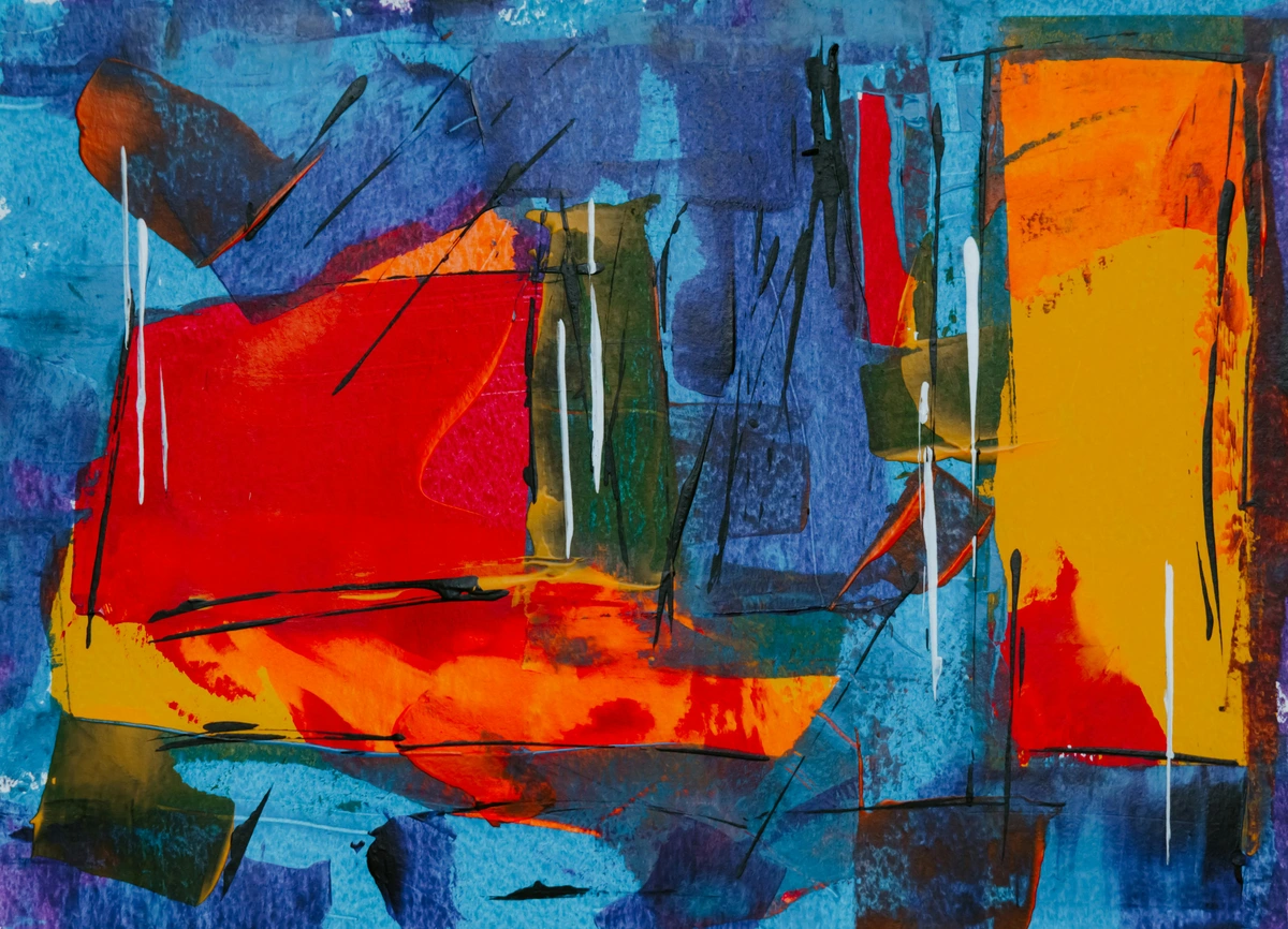
Can you use outlines in abstract art?
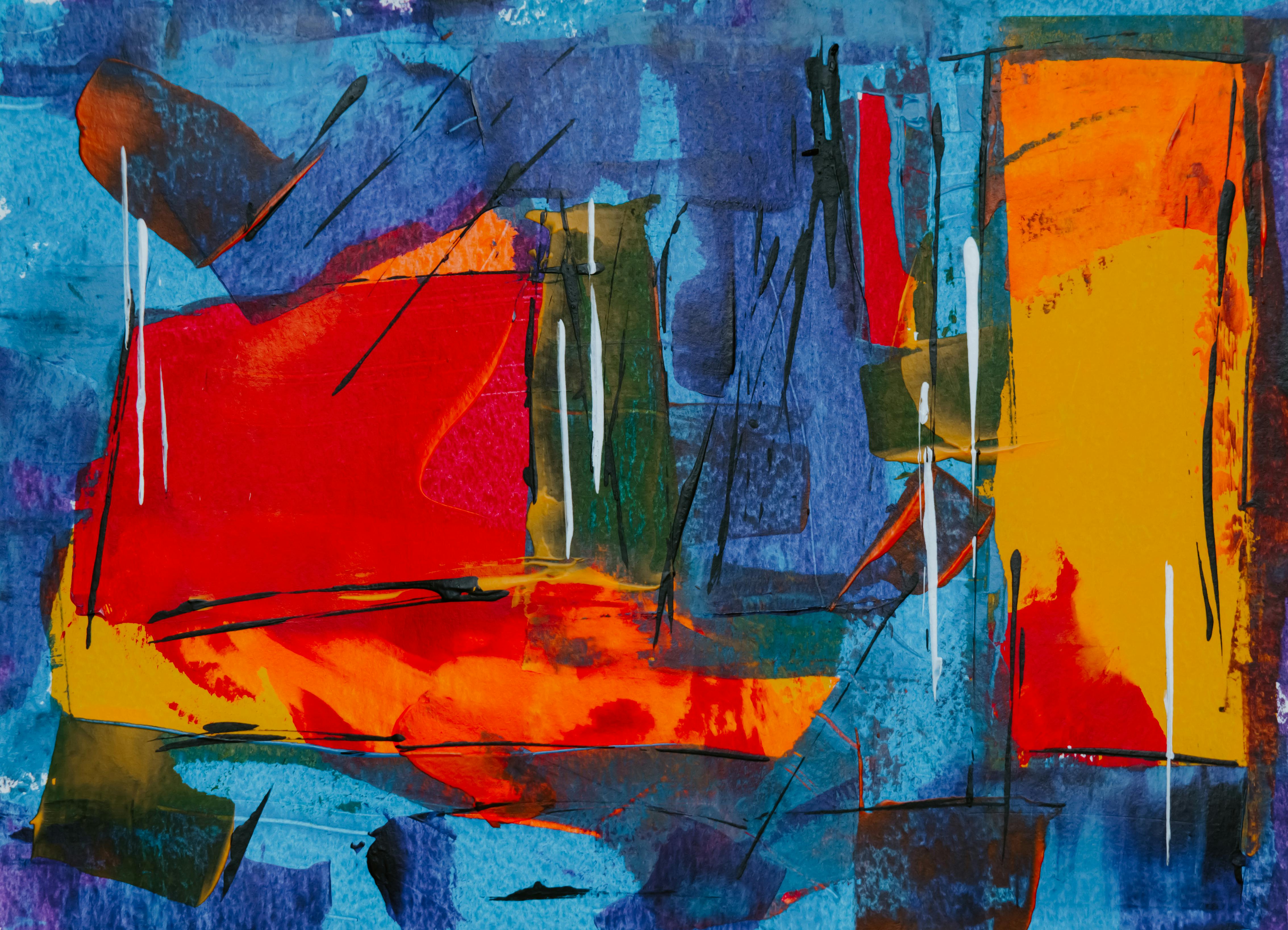
Definitely! Look at the work of Piet Mondrian. His work is all about the bold, black line creating a structure for fields of color. Outlines can provide rhythm, structure, and definition to an otherwise purely non-representational piece. It's a cornerstone of the history of abstract art.
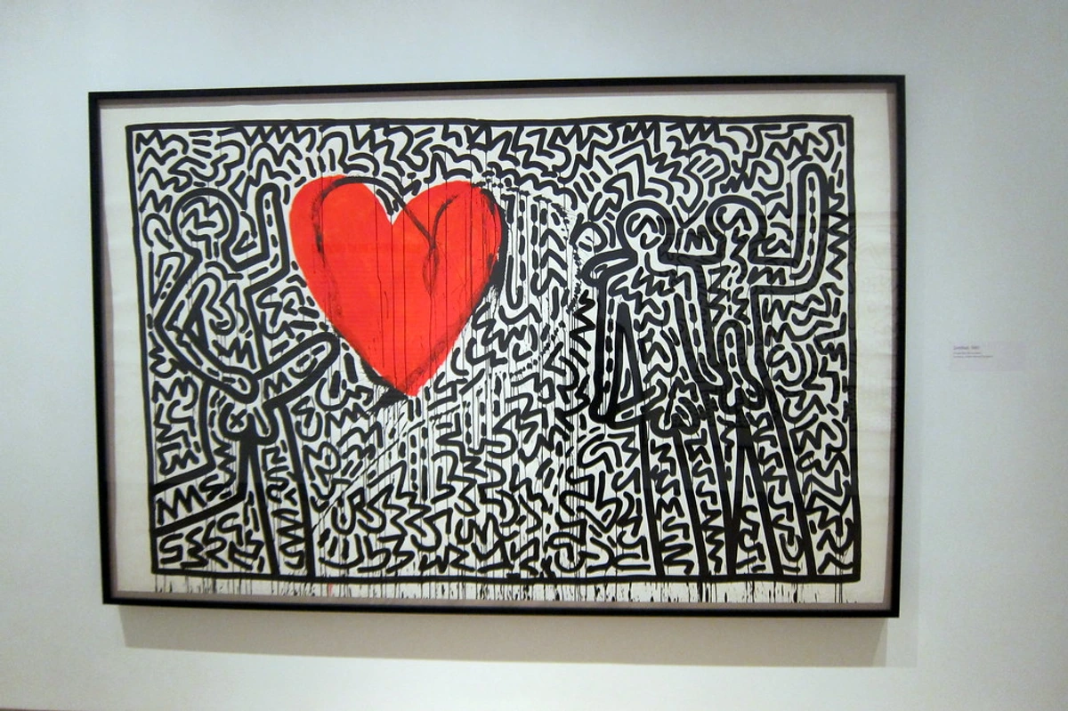
Abstract Outline Techniques: In abstract art, outlines can create architectural forms, define negative space, or create visual pathways for the eye to follow. Artists like Sol LeWitt used systematic lines to explore conceptual ideas, while more expressionist abstract artists use bold outlines to convey emotion and movement. The key is to think of outlines as compositional elements that can create structure, tension, or flow in your abstract work.
The Therapeutic Power of Bold Outlines
Beyond their artistic applications, bold outlines have surprising therapeutic benefits. Many people find that creating bold, confident lines is a form of meditation—a way to focus the mind and release creative energy. The repetitive nature of outlining can be calming, while the act of making decisive strokes can build confidence.
Art therapists often use bold outline exercises with clients who struggle with anxiety or perfectionism. The emphasis on confidence and imperfection in bold outlining can be liberating for someone who feels paralyzed by the need to create "perfect" art. Children naturally gravitate toward bold outlines, which may explain why coloring books are so popular as stress-relief tools.
For adults, returning to bold outline techniques can reconnect them with the unselfconscious creativity of childhood. There's something freeing about making a bold mark on paper without overthinking it. In a world that often values precision and perfection, bold outlines remind us that confidence and intention can be more important than technical perfection.
My Final Take
At the end of the day, a line is a path. It's the record of a point moving through space. And a bold line is a path taken with conviction. It's a declaration. Whether it's defining a superhero's jaw, a saint in a window, or a can of soup, it grabs you by the collar and says, "This matters." And in a world full of visual noise, that kind of clarity is something I find incredibly beautiful.
Bold Outlines in Commercial Design
Beyond fine art, bold outlines are essential in commercial design. Logos need to be recognizable at any size, and bold outlines ensure that. Think about the Nike swoosh or the McDonald's "M"—these are essentially bold outlines that have become cultural icons. In advertising, bold outlines cut through the visual clutter and communicate messages quickly and effectively. The principles of bold outlining in commercial design are the same as in fine art—clarity, impact, and memorability—but applied to serve specific communication goals.
So next time you're drawing, don't be afraid to go bold. You might be surprised by the power you find in that simple, definitive line. It's a technique I use in my own works, which you can check out anytime you like on my sales page.








Your Bold Outline Journey Starts Now
The most important thing about bold outlines is to start using them. Don't wait for the perfect moment or the perfect piece of paper—grab whatever you have and make a bold mark. Experiment, play, and don't be afraid to make mistakes. The confidence you develop through bold outlining will carry over into all areas of your artistic practice.
Remember that every artist who ever picked up a tool started somewhere. They weren't born knowing how to make perfect lines—they practiced, they experimented, and they developed their own voice. Your bold outline journey is no different. Every confident stroke you make brings you closer to finding your unique artistic voice.
The world needs more bold outlines, and more importantly, it needs more artists who aren't afraid to make their mark with confidence. So go ahead—grab that thick marker, make that decisive stroke, and show the world what you have to say. Your bold outline might just be the beginning of something amazing.