The Art of Perspective: Depth, Illusion, and My Artistic Journey
Unravel the art of perspective: from linear to atmospheric, foreshortening, and abstract applications. This personal guide covers techniques, historical insights (camera obscura, Renaissance masters), common pitfalls, and practical tips to transform how you see and create art. Explore how depth transforms abstract and realistic compositions, enhancing visual literacy and artistic expression.
Title
Oh, the elusive dance of depth and illusion on a flat surface! Have you ever stood before a painting, utterly convinced you could step right into its world, or perhaps tried to draw something simple, like a box, only for it to stubbornly remain two-dimensional? And what about that time you tried to draw your cat, only for it to end up looking like a slightly squashed cardboard cutout, despite your best intentions? If so, then you’ve stumbled upon the ancient, beautiful, and sometimes maddening secret of perspective in art. For me, looking back at my early attempts, everything looked… flat. Like a collection of cutouts glued onto a background, regardless of how much effort I poured into shading. The idea of creating depth, of making a scene recede into the distance or an object pop out, felt like some magical secret held by art masters in dusty old books, like Leonardo da Vinci himself, whose notebooks are filled with studies on this very subject. Welcome to the club! This article will explore both the foundational techniques of perspective and my own evolving relationship with it, from initial frustration to creative freedom. We’ll uncover how artists create these compelling illusions and why understanding them can transform not just your art, but how you see the world.
For the longest time, "perspective" sounded like a daunting, technical word, reserved for architects and super-serious oil painters. But I've come to realize it's less about rigid rules and more about understanding how our eyes, and consequently our brains, interpret the world around us. It’s about creating an illusion, a beautiful, convincing lie on a two-dimensional surface. The moment it clicked for me, truly clicked, was when I realized it wasn't about perfectly replicating reality, but about guiding the viewer's eye, manipulating their perception. It unlocked a whole new way of seeing, both in art and in everyday life. It's a foundational piece of the puzzle, deeply connected to how composition guides my abstract art, even in my seemingly rule-breaking works, as the geometry of space, even when abstract, profoundly impacts the viewer's journey through a piece. So, let's break down this 'maddening secret' together, exploring both the foundational techniques and my own journey with it.
What Exactly Is Perspective in Art? The Picture Plane and Beyond
At its heart, perspective in art is a technique used to create the illusion of depth, space, and distance on a flat surface. Think of it as mapping a three-dimensional world onto a two-dimensional canvas. It helps objects appear closer or further away, larger or smaller, just as they do in real life.
Renaissance theorists would often refer to the concept of the picture plane – an imaginary transparent surface, like a windowpane, through which the artist views the scene. All the lines and shapes that hit this plane are what get translated onto the canvas, mimicking how light rays are projected onto a flat surface. Interestingly, the invention of the camera obscura (Latin for "dark room") around the 15th century, a device that projected an image through a small hole onto an opposite surface, greatly aided artists in understanding and replicating these principles of perspective. It was a kind of proto-camera, showing the world already flattened onto a picture plane.
Beyond just spatial arrangement, techniques like chiaroscuro – the use of strong contrasts between light and dark – can dramatically enhance this illusion, making objects appear to have more volume and pop out from the surface, even without strict linear perspective. Without it, everything would just sit on the same visual plane. This can be interesting in its own right, for example in early Egyptian art, where the focus was on symbolic representation and storytelling rather than creating an illusion of spatial depth. Figures were often depicted frontally or in profile, with sizes determined by importance, not distance. It’s a completely valid artistic choice, just a different one than the immersive "I could step right into that painting" feeling that perspective offers. But what happens when we start to draw lines that do converge?
Linear Perspective: The Grand Illusionist
This is probably what most people think of when they hear "perspective." Linear perspective uses geometric lines and a fixed viewpoint to simulate depth. Imagine standing on a perfectly straight road that stretches to the horizon. The edges of the road, the power lines, even the fence posts all appear to converge at a single point far away. That's linear perspective in action! It's about convincing your eye that flat lines are actually receding into deep space.
The Basics: Horizon Line and Vanishing Point
Every linear perspective drawing or painting starts with a horizon line. This is essentially your eye level. If you're standing on flat ground, it's where the sky meets the earth. If you're looking out from a tall building, it's still your eye level relative to the scene. Crucially, your physical position – whether you're standing, sitting, or even lying down – directly influences where this horizon line falls in your composition and thus how the entire scene is perceived. A low horizon line gives a towering, majestic feel (like looking up), while a high horizon line offers a sweeping, panoramic view (like looking down). Understanding where your eye level is will define how all other elements relate to it.
On this horizon line, you'll place vanishing points. These are the points where parallel lines in your scene appear to converge. The more vanishing points you use, the more complex the perspective:
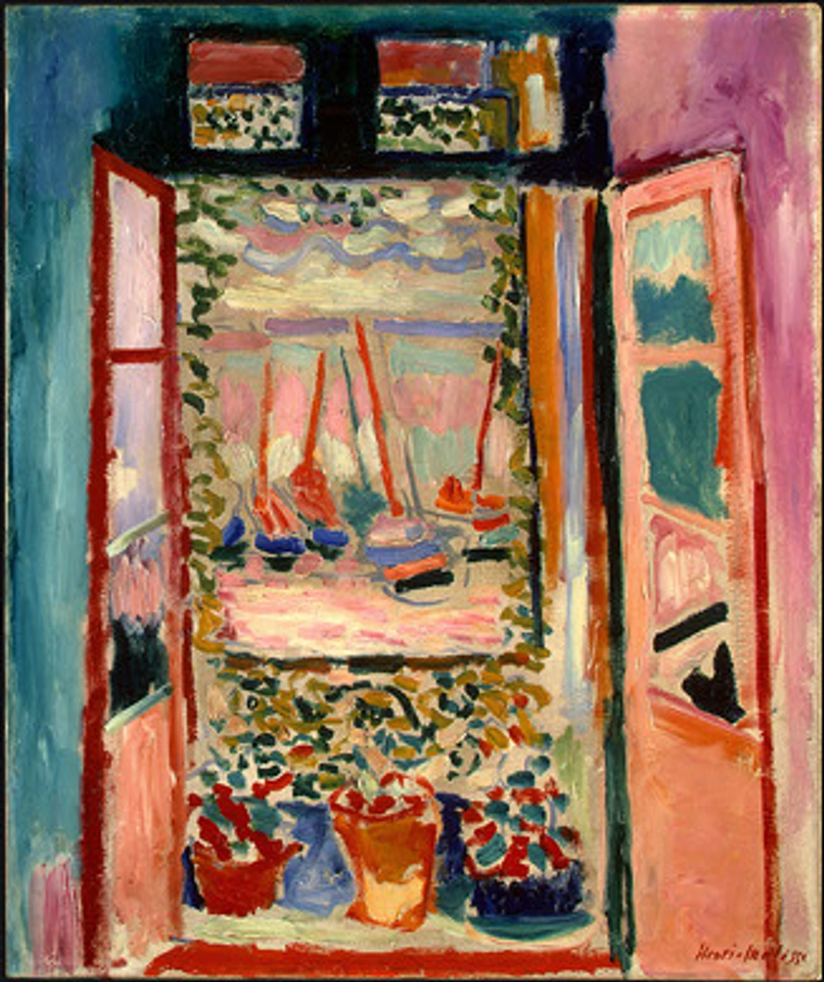
While artists intuitively depicted depth for centuries, it was during the Renaissance that linear perspective truly revolutionized Western art. Figures like architect Filippo Brunelleschi, artist-theorist Leon Battista Alberti, and painters such as Masaccio and Piero della Francesca systemized these techniques, providing the mathematical framework that allowed artists to create incredibly convincing illusions of three-dimensional space on flat surfaces. This was a profound shift, tying art directly to scientific observation and rational thought, a seismic event that mirrored the scientific revolution of the era.
One-Point Perspective
Used when you're looking directly at a flat side of an object (like staring down a long corridor or at the front of a building). All parallel lines not parallel to the viewer's plane converge to a single vanishing point on the horizon line. It creates a strong sense of direct depth, like a tunnel extending endlessly before you.
Two-Point Perspective
Used when you're looking at an object from an angle, showing two of its sides receding into the distance. Here, you'll have two vanishing points on the horizon line, one for each set of parallel lines that aren't parallel to the viewer's plane. Think of looking at the corner of a building, with both sides stretching away from you.
Three-Point Perspective
This one gets wild! It's used when you're looking at an object from a very high or very low viewpoint, adding a third vanishing point either above or below the horizon line. This creates the impression of looking up at a skyscraper (a worm's-eye view) or down into a deep canyon (a bird's-eye view). My brain usually does a little dance here, trying to visualize three converging sets of lines at once, but it's incredibly impressive when done well and crucial for dramatic, immersive scenes. Mastering linear perspective is a core part of what is design in art, as it deeply affects how elements are arranged to guide the viewer's eye through techniques like leading lines and establishing a clear focal point. Understanding these geometric underpinnings sets the stage for manipulating space in any artwork, whether realistic or abstract. But lines aren't the only way to create distance, are they?
Atmospheric Perspective: The Haze of Distance
While linear perspective is about lines converging, atmospheric perspective (also known as aerial perspective) is all about how the atmosphere affects our perception of distant objects. You know how mountains in the distance often look hazy, bluer, and less detailed than those closer to you? That’s atmospheric perspective!
I remember hiking in the mountains once, looking across a vast valley. The closest peaks were sharp, vibrant green. But as my gaze stretched to the horizon, each successive ridge became softer, paler blue, almost merging with the sky. It was a live demonstration of atmospheric perspective, and it hit me how artists weren't just painting what they saw, but how the air itself altered that vision. Even in digital art or a studio setting, artists often simulate these effects by carefully adjusting color, value, and detail to give the illusion of immense depth, proving it’s a powerful tool independent of a natural atmosphere. The air isn't perfectly clear; it's full of tiny particles (dust, water vapor) that scatter light. This scattering makes distant objects:
- Lighter in value: They appear faded (value referring to the lightness or darkness of a color).
- Less saturated in color: Their colors become muted and often shift towards blue or cool tones.
- Less detailed: Fine textures and details disappear.
- Lower in contrast: The difference between their lightest and darkest parts becomes smaller, making them appear softer.
- Cooler in temperature: Warm colors (reds, yellows) tend to advance, while cool colors (blues, greens) tend to recede, further enhancing the illusion of distance.
This principle, combined with techniques like sfumato – the gentle blurring of outlines and tones to create a soft, hazy, or smoky effect – was famously used by Leonardo da Vinci and other Renaissance masters to achieve a profound sense of depth and mystery in their work, echoing the natural atmospheric effects we observe.
![]()
Monet, bless his heart, was a master of this. His landscapes often show this beautiful fading effect, perfectly capturing the feeling of light and air. Understanding how artists use color is crucial here, as it's not just about the lines, but the very hues and values that suggest depth. But beyond the haze of the atmosphere, perspective also plays with the very shapes and proportions we perceive when objects are viewed at an angle... How does that work?
Foreshortening: The Trick of Proportions
Beyond the effects of the atmosphere, perspective also plays with how we perceive the actual shape and size of objects, especially when they're angled towards us. This one always feels like a brain teaser – it’s where your brain argues with your eyes, insisting a limb must be longer than it appears on the page. Foreshortening is a visual effect that causes an object or distance to appear shorter than it actually is because it is angled directly towards the viewer. Rather than distorting reality, it's about convincingly creating the illusion of distortion to match how our eyes perceive objects in space.
Think about drawing a person lying down with their feet coming straight towards you. Their feet would appear much larger and their body much shorter than if they were lying perpendicular to your view. Or consider a hand reaching out: the fingers closest to you become prominent, while the palm and wrist shrink dramatically, almost disappearing. It’s a tricky beast, making things appear compressed or squashed, but it's essential for realistic depictions of figures and objects in space. Accurately depicting foreshortening often requires a strong grasp of anatomy, as understanding the underlying bone and muscle structure helps you convincingly present proportions. Beyond just realism, foreshortening can be a powerful compositional tool, creating a dramatic sense of dynamism, tension, or immediacy by bringing elements forcefully into the viewer's space, such as a heroic figure's outstretched arm or a rushing animal. It’s a constant push and pull between observed reality and artistic translation—a delightful struggle to convince the viewer of something that isn't truly there. What happens, though, when artists actively don't want to convince the viewer of traditional reality?
Beyond Realism: When Artists Break the Rules
Of course, not all art aims for realistic depiction. Some artists deliberately distort or abandon traditional perspective to achieve different effects, to tell a different story, or to explore new ways of seeing. This is where art gets really interesting, in my humble opinion! Artists choose to break these rules not out of ignorance, but to communicate something beyond literal reality – perhaps the subjective experience of time, or to convey multiple facets of an object simultaneously, challenging our conventional understanding of space.
Take Cubism, for example. Artists like Picasso, Braque, and Juan Gris famously shattered traditional single-viewpoint perspective. Instead of showing an object from one angle, they depicted multiple viewpoints simultaneously, as if you're seeing it from the front, side, and top all at once. It's like your brain is trying to solve a visual puzzle. If you want to dive deeper into how this came about, there's an ultimate guide to Cubism that's quite fascinating. This shift was part of a larger history of art guide where different art styles emerged to challenge existing norms. And then there's Surrealism, where artists like Salvador Dalí bent and warped perspective to create dreamlike, unsettling, or highly symbolic landscapes, proving that manipulating space could evoke profound psychological states rather than just physical reality.
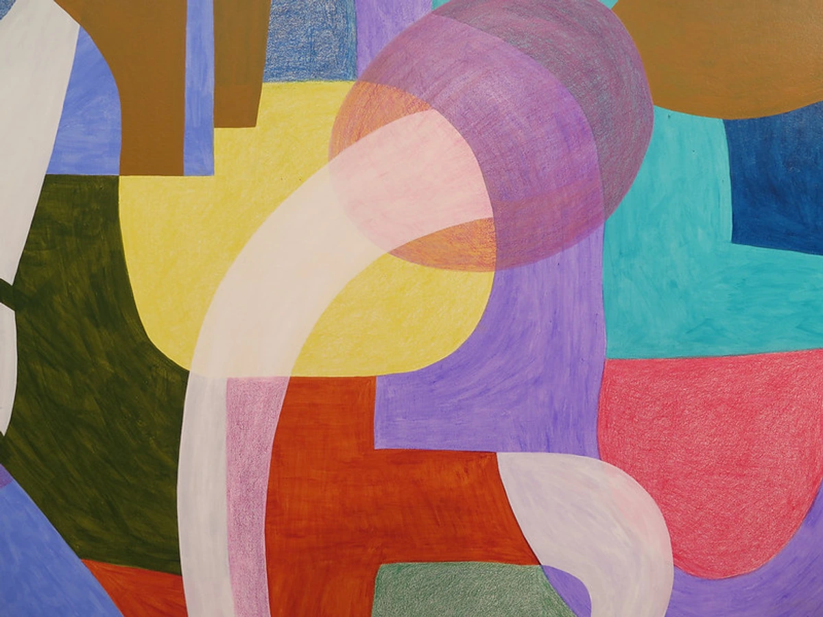
And while we're talking about bending reality, there are also specialized forms that use different rules for spatial effects. For instance, oblique perspective, often seen in technical drawings or some Asian art forms, such as traditional Japanese woodblock prints, creates depth by depicting objects at an angle without parallel lines converging. Unlike linear perspective, objects do not diminish in size as they recede, and parallel lines remain parallel, but appear skewed. This is distinct from isometric perspective, common in architectural blueprints, technical illustrations, or certain video games (like classic strategy games), where parallel lines also remain parallel and angles are maintained consistently, giving a sense of depth while preserving true measurements and avoiding visual skewing. Then there's curvilinear perspective, which depicts scenes on rounded surfaces like domes or when a wide-angle lens distorts a scene, making lines curve – think of a fisheye lens photograph, or even certain digital art effects designed to wrap an image around an imagined sphere. These are not about 'breaking' rules so much as exploring different sets of them for unique spatial effects.
When I first encountered Cubism and other movements that deconstructed traditional perspective, I remember feeling a mix of confusion and exhilaration. It felt like the artists were saying, "Hey, the world isn't just one fixed view. It's complex, multifaceted, and ever-shifting." It was a profound 'aha!' moment that gave me permission to explore my own abstract language: decoding the personal symbolism and narratives within my work later in my career, embracing multiple viewpoints and non-traditional spatial logic within a single frame. This liberation from strict realism led me to wonder, how does perspective play into art that doesn't aim to represent reality at all?
My Own Dance with Perspective, Even in Abstract Art
You might be thinking, "But you paint abstract art! What does perspective have to do with that?" And that's a perfectly valid question. While I don't necessarily strive for realistic depictions of three-dimensional space in the traditional sense, understanding perspective has profoundly influenced my abstract work. It’s a bit like learning the intricate rules of a dance so you can later improvise with graceful abandon.
Even in abstract compositions, there's often a play of depth and recession. I use color, layering, and line to create areas that feel like they're coming forward or receding. For instance, a vibrant, warm red might pop forward against a cool, muted blue background, creating an immediate sense of shallow depth, while a thick, opaque layer can push an underlying translucent wash further back. The interplay of my journey with mixed media: blending materials for abstract expression and the language of layers: building depth in abstract acrylics isn't just about texture; it's about creating spatial relationships that invite the viewer's eye to wander and explore, guiding them through a non-literal landscape. The principles of perspective, such as creating leading lines or focal points, still apply, but now they serve to construct an abstract sense of depth and movement, a kind of "geometry of emotion" that can be found in a work like this:
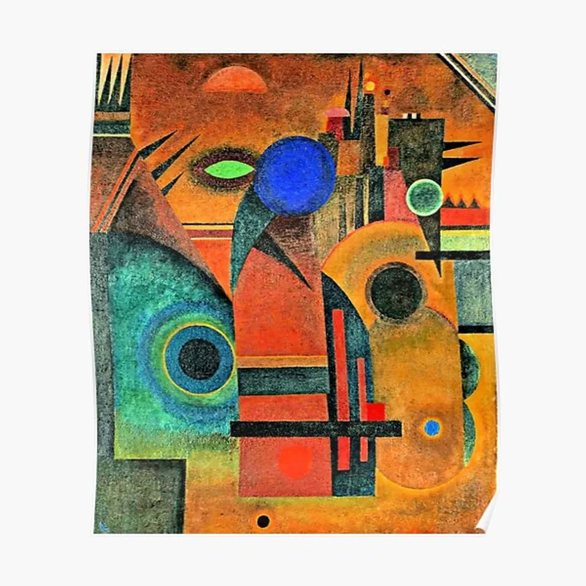
It's not about making a perfect replica of reality, but about creating an experience of space and movement. Knowing the rules of perspective first allowed me to understand why and how to break them effectively to evoke a certain feeling or energy. My abstract pieces, available for purchase here, often have a sense of push and pull, a visual rhythm that's informed by these underlying principles – a conscious manipulation of perceived space to create visual interest and emotional resonance, even without a clear subject. But even with all this understanding, we still trip up sometimes, don't we?
Common Perspective Pitfalls (and How to Conquer Them)
Trust me, I've made all these mistakes, and probably invented a few new ones along the way – usually involving a building that looked like it was melting or a table that defied gravity! Learning perspective isn't about instant perfection, it's about persistent practice and understanding where things can go awry. Here are some common pitfalls for beginners and how you can sidestep them:
- Inconsistent Vanishing Points: The most common one! Drawing different elements (a building, a road, a fence) with lines converging to different vanishing points for the same horizon line. Conquer It: Always establish your horizon line and vanishing points clearly before you start. Use light construction lines to guide everything.
- Wobbly Lines and Lack of Ruler Use: While freehand has its place, especially for sketching, accurate perspective often requires precision. Conquer It: Don't be afraid of rulers or straight edges in your initial construction phase. You can always loosen up and add your own touch later.
- Neglecting Scale Changes: Objects closer to a vanishing point should appear smaller, and objects closer to the viewer should appear larger, even if they're the same actual size. Conquer It: Continuously compare the relative sizes of objects throughout your drawing. Step back frequently to assess the overall illusion. Consider using a light grid system or simple measurement marks along your construction lines to help maintain consistent scale.
- Over-Reliance on Outlines: Using heavy outlines for everything can make objects feel flat, regardless of perspective lines. Conquer It: Introduce shading, value changes, and atmospheric effects to give your forms weight and distance. The edges of distant objects should be softer, not just thinner.
- Forgetting Atmospheric Effects: Even if you're not painting a vast landscape, a subtle hint of atmospheric perspective (e.g., slightly desaturating colors in the background) can add immense depth to any scene. Conquer It: Make a conscious effort to think about how light and air might subtly change the appearance of objects based on their distance from the viewer.
- Over-simplification of Complex Forms: When first learning linear perspective, there's a tendency to reduce everything to perfect boxes or cylinders. Real-world objects rarely have such rigid, straight edges. Conquer It: Once you have your basic perspective framework, observe the subtle curves, irregularities, and organic shifts in forms. Allow your lines to reflect these nuances rather than adhering strictly to geometric absolutes, making your objects feel more natural and less robotic. Why put yourself through this, though?
Why Bother with Perspective? My Take
Beyond the technical skills, understanding perspective is a powerful tool for visual literacy. It helps you:
- See the world differently: You start noticing how buildings recede, how colors shift in the distance, how objects foreshorten in everyday life. It's like unlocking a secret cheat code for observation, turning mundane moments into rich visual lessons. Suddenly, a city street isn't just buildings; it's a symphony of converging lines and fading details. You'll also find yourself appreciating the thoughtful design in architecture and urban planning, recognizing how spaces are intentionally crafted to guide your eye and evoke certain feelings.
- Appreciate art more deeply: When you recognize the masterful use of perspective in a painting, you gain a deeper respect for the artist's skill and intention. It adds another layer to what is the meaning of art, allowing you to understand the deliberate choices made to evoke certain feelings or perceptions.
- Communicate visually effectively: Even if you don't aim to be a realistic painter, the principles of perspective help you guide the viewer's eye, establish a clear focal point, and create impactful compositions, influencing emotional responses or creating a sense of grandeur or unease. It also helps avoid visual pitfalls that can make a scene feel unnatural or 'off', ensuring your work has a coherent spatial logic, even if abstract.
- Build confidence: Drawing a convincing box or a street scene is incredibly satisfying and builds a strong foundation for any artistic endeavor. The ability to create believable space is a fundamental skill that unlocks countless creative possibilities.
For me, it was a slow burn, a gradual unveiling. Like learning a new language, it felt awkward at first, but with practice, the words (or in this case, the lines and shapes) started to flow more naturally. And now, when I visit a museum, like the one showcasing my work in 's-Hertogenbosch, I often find myself admiring not just the subject, but the clever illusions of depth and space that artists have crafted over centuries. This deep appreciation for the underlying structure of visual reality has undeniably enriched my own creative process, even when my brush dances far from realism. It's all part of the grand tapestry of art history that we, as artists and viewers, continue to weave. So, how can you start to harness this power yourself?
Practical Tips for Beginners: My Mini-Exercises
Ready to dip your toes into the world of perspective? Consider these a series of mini-challenges or artistic experiments. Don't worry about perfection; mine certainly didn't look like masterpieces initially – more like abstract blobs trying very hard to be boxes! The goal is to train your eye and brain. Here are a few simple exercises I'd recommend:
- Observe Your Surroundings (Training Your Eye for Linear Perspective): Pick a room you're in. Notice the parallel lines of the walls, floor, and ceiling. Where do they appear to converge? If you're looking down a hallway, find that single vanishing point. If you're looking at a corner, try to identify two. It's a mental exercise, but it trains your eye to see the underlying geometry.
- Draw Simple Boxes (Building Your Linear Perspective Foundation): Seriously, grab a pencil and paper. Try drawing a cube in one-point perspective, then two-point. Focus on making the parallel lines recede towards your chosen vanishing points. It's surprisingly therapeutic, like a simple art therapy exercise, even if your first attempts look a bit wonky. The key is consistent vanishing points.
- Sketch a Landscape (Focus on Atmospheric Perspective): Find a view with some distance – maybe a park with trees, or a cityscape. Sketch it quickly. Pay attention to how the colors change, how details disappear, and how contrast lessens as things get further away. You don't need to be a Monet; just observe and try to replicate those effects in a simplified way.
- Try a 'Foreshortened' Object (Grappling with Proportions): Hold your hand out towards you, palm facing you. Now try to draw it. Notice how your fingers appear shorter and wider. It’s tricky, but a great way to grapple with this concept and appreciate the struggle Renaissance masters faced! It really highlights how observation can challenge what your brain thinks it knows.
Key Concepts & Terms
For a quick reference, here are some of the essential terms we've explored:
- Picture Plane: An imaginary transparent surface through which an artist views a scene, onto which the three-dimensional world is projected as a two-dimensional image.
- Horizon Line: Represents the viewer's eye level in a perspective drawing, where the sky appears to meet the earth or where distant objects converge.
- Vanishing Point: A point on the horizon line where parallel lines in a perspective drawing appear to converge.
- Linear Perspective: A system using geometric lines and vanishing points to create the illusion of depth and distance on a flat surface.
- Atmospheric Perspective (Aerial Perspective): A technique using changes in color, value, and detail to create the illusion of distance, based on how the atmosphere affects our perception of distant objects.
- Foreshortening: A visual effect that causes an object or distance to appear shorter than it actually is because it is angled directly towards the viewer.
- Chiaroscuro: The use of strong contrasts between light and dark, usually bold, to give objects a sense of volume and depth.
- Sfumato: A painting technique that involves subtle gradations of light and shadow, often blurring outlines, to create a soft, hazy, or smoky effect, reminiscent of atmospheric haze.
Frequently Asked Questions About Perspective in Art
Q: What's the main difference between linear and atmospheric perspective?
A: Linear perspective uses geometric lines that converge to vanishing points to create the illusion of depth, primarily focusing on how objects change in size and position relative to the viewer. Atmospheric perspective uses changes in color, value, and detail to simulate distance, relying on how the atmosphere affects our view of distant objects (making them lighter, bluer, and less distinct).
Q: Is perspective only for realistic art?
A: Not at all! While crucial for realism, understanding perspective principles can inform abstract and non-representational art as well. Artists can choose to adhere to, distort, or completely abandon traditional perspective to achieve specific expressive or conceptual goals. Even in abstract art, the principles of spatial arrangement (which perspective fundamentally informs) are still at play, allowing artists to create a sense of push, pull, or depth without depicting a literal scene. This also applies to dramatic viewpoints like bird's-eye or worm's-eye views, where the artist deliberately manipulates the horizon line and vanishing points to create an exaggerated sense of scale or emotional impact, even if the subject itself isn't perfectly realistic.
Q: How can I practice perspective effectively as a beginner?
A: Start with conscious observation: actively look for perspective in your daily environment. Then, move to practical drawing exercises, beginning with simple geometric shapes like cubes and cylinders using one-point and two-point perspective. A common beginner pitfall is trying to tackle overly complex scenes too soon; build that foundation first. Also, sketch landscapes focusing on atmospheric effects, paying attention to how colors and details fade with distance. Don't be afraid to make mistakes; it's all part of the learning process and building your understanding over time.
Q: How is perspective applied in digital art?
A: Digital art tools often streamline perspective drawing with built-in grids, vanishing point rulers, and even 3D modeling features that automatically handle complex perspective calculations. This allows digital artists to focus more on creative expression and less on the painstaking manual construction of perspective lines, though understanding the underlying principles remains crucial for effective use of these tools and for knowing when and how to creatively deviate from them.
Q: How does perspective relate to composition in art?
A: Perspective is intrinsically linked to composition, as it provides the underlying structure that helps organize elements within an artwork. By establishing a clear horizon line, vanishing points, and controlling the viewer's eye level, perspective helps to create a sense of spatial hierarchy, guiding the eye to focal points and through implied pathways. It allows artists to arrange forms in a believable space, contributing to balance, rhythm, and the overall narrative or emotional impact of a piece, whether realistic or abstract.
Final Thoughts: It's All About How You See
Learning about perspective in art was never just about mastering a technique for me; it was about expanding my visual vocabulary, understanding the history of how artists have tried to capture the world, and ultimately, finding more freedom in my own expression. It’s a tool, a lens, a way of seeing. It’s not about being perfectly accurate every single time, but about knowing the 'rules' so you can break them thoughtfully, creating art that resonates with your unique vision. So go ahead, look around you, see the lines, the colors, the distances. The world is your canvas, and perspective is your guide to painting its depths.


