
Gouache Painting: An Artist's Unfiltered Guide to Opaque Watercolor Mastery
Embark on an artist's personal journey through gouache painting. This comprehensive guide covers its history, essential supplies, unique techniques, troubleshooting, and tips for mastering this versatile, re-workable opaque watercolor, blending personal insight with practical advice.
Gouache Painting: My Unfiltered Journey into the Opaque World of Designers' Paint
There are moments in an artist's life when a medium isn't just a tool, but a revelation. For me, after years of wrestling with the slow-drying patience demanded by oils and the unforgiving transparency of traditional watercolors, that revelation arrived, quite unexpectedly, in a tube of gouache. I remember feeling a bit like it was a mysterious, fussy cousin of watercolor, destined to frustrate. But oh, how wrong I was! This isn't just a guide; it's a peek into my messy, joyful journey with a medium that has truly captivated me. Beyond my personal narrative and the stories of how I fell in love with it, this guide aims to be your ultimate companion on this opaque adventure, covering everything from its historical roots to practical techniques and troubleshooting. We'll explore not just what gouache is and why I've come to love it, but also what you'll need to get started and some foundational techniques to help you on your own journey, ensuring you have all the practical know-how for this captivating medium.

Why Gouache and I Became Inseparable: My Love Story with Opaque Watercolors
Honestly, it wasn't love at first sight. It was more like a slow, appreciative realization, an understanding that grew over time. I was always drawn to vibrant color and the ability to build up layers in my work. With acrylics, I got that, but gouache offered something different – a certain softness, a remarkable speed, and that incredible re-workability. Its less committal nature is a godsend for my 'try it and see' creative process. I remember one particularly frustrating session on an abstract piece. I'd laid down a sprawling, vibrant orange background, feeling so good about the energy. But then, in a moment of questionable impulse, I'd instinctively painted a jarring blue shape right in the middle that threw off the entire composition. My heart sank, a familiar pit of despair for artists who feel a piece is ruined. With watercolor, it would have been irreversible. With oils, a long, messy cover-up, probably leading to weeks of self-doubt. But with gouache, I simply re-wet the offending blue with a damp brush, gently lifted it with a clean cloth, and within minutes, the vibrant orange background was visible again, ready for a new, harmonious element. The sheer relief was palpable, like discovering a secret "undo" button for my artistic impulses. No heartbreak; just re-wet, lift, or paint over it. It's truly like a patient friend in the studio, always ready for a second chance.

- The Matte Finish: There's something undeniably elegant about how gouache dries. It's a velvety, non-reflective surface that makes colors just pop. No glare, just pure, absorbing pigment. Have you ever noticed how some glossy paintings can be hard to photograph? Gouache sidesteps that entirely, making my art for sale look pristine online.
- The Opaque Power: Being able to paint light over dark has revolutionized how I approach compositions. It’s a game-changer, allowing for bold, layered effects and easy corrections that are tough to achieve with pure watercolor. It really opens up possibilities for detailed highlights and vibrant accents, letting me build form and visual weight in ways transparent mediums simply can't. It feels like a secret cheat code for rich, velvety color.
- Speed and Portability: It dries relatively quickly, and all you need is water. I've taken my gouache set on countless trips, sketching in notebooks, capturing fleeting moments. It’s perfect for studies or just getting ideas down before they escape. Once, while sketching a sunset over a Dutch canal near my museum in 's-Hertogenbosch, I had to pack up quickly due to an unexpected downpour. The fast-drying nature of gouache meant my colors were set, unlike a still-wet watercolor that would have bled everywhere.
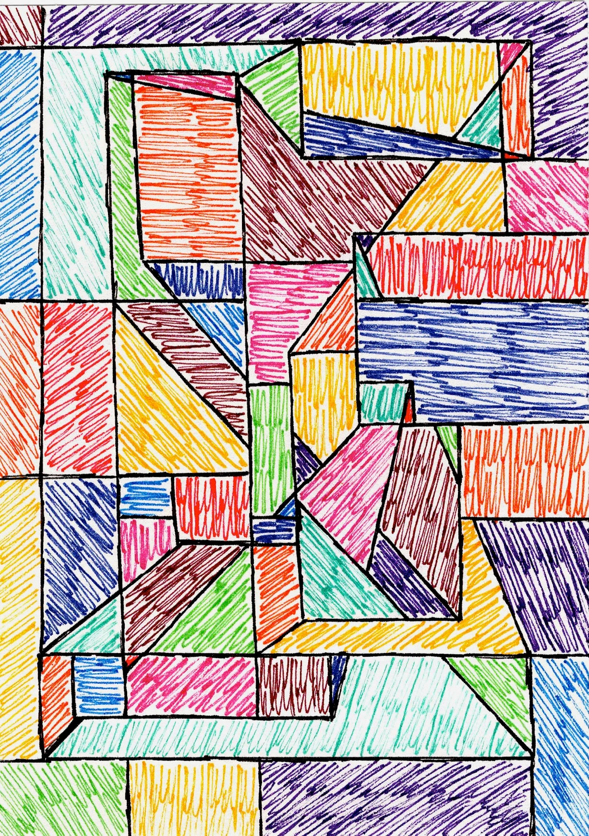
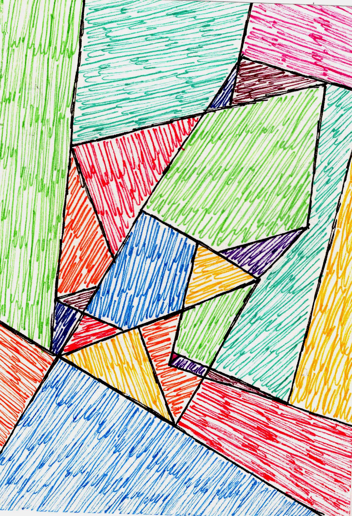
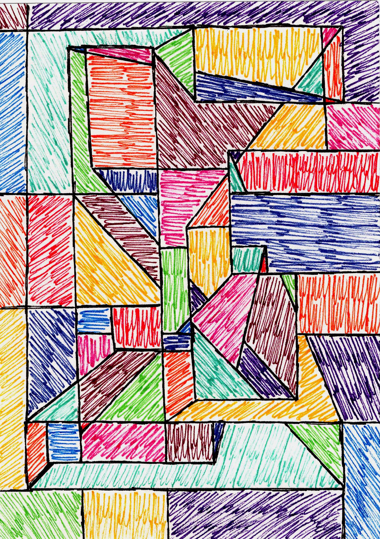
- The Forgiveness Factor: My intuition often leads me down interesting, albeit sometimes wrong, paths. Gouache lets me correct course without feeling like I've ruined everything. It truly encourages experimentation and a playful approach. It's like a patient art teacher, always saying, "Try again, you got this!" This ability to lift or paint over mistakes has been profoundly liberating for my emotional journey as an artist, as you can see in my artistic timeline.
What qualities in a medium are most important to your creative process? For me, it's this blend of vibrancy and freedom.
So, What Exactly is Gouache? My First Impressions & Core Differences
Alright, so you've heard my personal connection and the simple joys it brings. But truly, beyond all that emotional connection, what exactly is this magical medium that has captured my heart? Let's cut to the chase. If you've ever painted with watercolor, you're halfway there. Gouache (pronounced "gwahsh," by the way – no need to struggle with that in your head like I did for months) is essentially an opaque watercolor. Think of it as watercolor that decided it wanted to be a bit bolder, a little less shy. Or, if you prefer a culinary comparison, imagine the difference between a thin, translucent glaze and a rich, creamy frosting – gouache is definitely the frosting! For another perspective, think about the difference between a sheer silk scarf (transparent watercolor) and a plush velvet curtain (gouache); both are beautiful fabrics, but one offers depth and coverage the other can't. This opacity primarily comes from a higher pigment load compared to traditional watercolors, and often the addition of inert white fillers like chalk, kaolin, or titanium dioxide, which scatter light and contribute to its characteristic solid, velvety finish. On the brush, gouache feels richer, almost like a thin cream, unlike the thinner, more watery feel of transparent watercolor. It's water-soluble, dries to a beautiful matte finish, and here's the kicker: it’s completely re-workable. Yes, you heard that right! If you mess up, you can often just re-wet it and lift it, or even paint right over it. It’s like having a forgiving friend in the studio, a true "undo" button for your art. I once had a whole background go completely wrong, and instead of trashing the piece, gouache let me lift it and essentially start that section fresh. It was a lifesaver.
For a deeper dive into its core, I actually put together a page specifically asking the question: What is Gouache Painting?. But for now, let’s keep it personal.
Gouache vs. Other Mediums: A Closer Look
When I first started playing with it, I was used to the transparent layers of traditional watercolor. Gouache felt... chunky. Different. I distinctly remember trying to get a smooth, even wash and ending up with streaks. My initial thought? "Oh, another medium to conquer." But then, I leaned into its opacity, its ability to layer dark over light (a watercolor artist's dream!), and its vibrant color payoff. It felt like I had discovered a secret cheat code for rich, velvety color.
Gouache vs. Acrylics: A Permanent Difference
Now, how does it compare to, say, acrylics? While both offer vibrant color and can be opaque, the similarities pretty much end there. Acrylics are plastic-based, becoming permanent and waterproof once dry. This means no re-wetting or lifting. They can also dry with a glossy or satin finish, and their drying time is generally longer, allowing for more blending on the canvas. When applying, acrylics often feel more 'slippery' or 'tacky,' with a distinct drag that changes as they dry, almost like you're pulling a thin sheet of plastic. Gouache, with its gum arabic binder, remains water-soluble, always re-workable, dries quickly to that signature matte finish, and offers a unique flexibility. It has a smooth, creamy flow off the brush, more akin to thick watercolor but with substantial body, allowing for crisper lines and flatter applications than acrylics often achieve without mediums. Acrylics also form a distinct plastic film when dry, making them less prone to cracking in thick applications than gouache, and generally more resistant to environmental changes once cured. This plastic film also means acrylic surfaces can feel less "breathable" and absorbent than gouache's velvety matte finish. Each has its place, but gouache’s unique properties make it a distinct and powerful medium. If you're curious about acrylics, you might enjoy my guides on best acrylic mediums for abstract artists or the history of acrylic painting.
Beyond its fundamental differences, the quality of gouache itself plays a significant role in its performance. This brings me to something I wish I'd known sooner: the difference between artist-grade and student-grade paints. You'll often see gouache referred to as "designers' gouache" or simply "gouache" without a grade, but it matters! Generally, artist-grade gouache (like Winsor & Newton Professional Designers' Gouache, M. Graham, or Holbein Artist Gouache) uses higher concentrations of fine pigments and a specific pigment-to-binder ratio with gum arabic, offering superior opacity, lightfastness (resistance to fading), and a smoother, more vibrant finish. These brands are highly regarded for their rich, velvety consistency and intense color payoff. For example, a single, creamy layer of artist-grade ultramarine blue might give you deep, vibrant coverage, while a student-grade version might require two or three layers to reach a similar opacity, often drying slightly chalkier or less intense. Student-grade gouache or some "poster paints" might contain more inexpensive fillers like chalk, calcium carbonate, or clay. These fillers reduce the pigment load, leading to a chalkier finish, less opacity, poorer lightfastness, and sometimes even a grittier texture. "Poster paints," in particular, are often formulated for temporary use in classrooms or for signage, with less focus on archival quality or lightfastness. For learning and practice, student grade is absolutely fine (I started there, no shame!), but if you're aiming for professional results or lasting pieces, artist-grade is worth the investment. It’s a bit like the difference between a quick-sketch pencil and a fine art graphite set – both work, but for different purposes.
A Nod to History: Gouache's Long and Winding Road
It's pretty cool to think about how long artists have been using this stuff. Gouache isn't a new kid on the block; it's got roots stretching back to ancient Egypt, where artists used a similar opaque, water-based paint for illuminated manuscripts. Later, European artists in the 18th century, especially landscape and miniature painters, really started embracing it. It was perfect for those detailed, vibrant studies before photography became a dominant tool for documentation and reproduction.
Scientific Precision & Illustrative Power
But gouache's story doesn't end there; its utility extended far beyond the fine art canvas. Beyond fine art, gouache also found significant application in scientific illustration and cartography. Its opacity and ability to render fine detail made it ideal for botanical drawings, anatomical studies, and detailed maps where precision and clear, defined lines were paramount. Imagine those intricate diagrams of flora and fauna, or the meticulously drawn coastlines of old maps – chances are, gouache (or a very similar opaque water-based paint) played a starring role, allowing for the crisp, defined edges and vibrant colors needed to convey complex information clearly. Of course, the challenge for these early illustrators was avoiding the cracking that can occur with thick applications, demanding a precise hand even then. This precision, seen in those old botanical drawings, is something I find myself tapping into when I want to capture delicate details even in my most expressive abstract pieces. Its ability to produce flat, vibrant colors with clean edges also made it invaluable for early 20th-century animation cels and comic book illustration. Imagine the pre-digital era: animators needed to quickly lay down consistent, reproducible colors on thousands of cels. Gouache's rapid drying time, opacity, and the uniform matte finish it provided were a godsend, allowing for efficient workflow and sharp lines that photographed beautifully. It truly brought fantastical worlds to life with incredible precision for illustrators like Arthur Rackham (known for his enchanting illustrations for The Wind in the Willows) and Kay Nielsen (whose work in East of the Sun and West of the Moon exemplifies its precision), and I often marvel at how artists like them leveraged its properties for such intricate, imaginative work, a spirit I try to bring to my own abstract visions.
Modern Masters & Contemporary Renaissance
This widespread historical utility paved the way for its continued use by artists across various movements and eras. While not as historically dramatic or widely publicized as oil painting, gouache has quietly empowered artists for centuries. Think of the rich, detailed works of Symbolist painters like Gustave Moreau, who leveraged its opacity for rich, jewel-toned surfaces, or the lush landscapes by Pre-Raphaelite artists, where it allowed for meticulous detail and vibrant, atmospheric effects. Even today, many contemporary artists are rediscovering its unique properties for everything from bold, abstract compositions (using its flat, matte quality for striking color blocks) to intricate nature studies (where its fine detail capabilities shine). Artists like Anna Bond of Rifle Paper Co. enchant with its crisp illustrative qualities and ability to create clean, flat areas of vibrant color perfect for her whimsical designs, while others like Clare Curtis use it for vibrant, stylized landscapes, loving how it allows for both bold color blocking and intricate layering, showing its incredible range. I often wonder what those old masters would think of the abstract worlds I try to build with it these days!

Setting Up Your Gouache Haven: The Essentials I Can't Live Without
Okay, so you're intrigued. You're thinking, "Alright, where do I start?" Glad you asked! You don't need a massive studio or an endless budget. Trust me, I've fallen into the trap of buying every single brush and color only to use a fraction of them (a classic rookie mistake, if you ask me!). I once convinced myself I needed a dozen shades of green, only to find myself using two or three and mixing the rest. Lesson learned: start small, explore, then expand! Here's my minimalist (but effective!) setup:
1. The Paints Themselves: Quality Over Quantity (Mostly)
You'll find gouache in tubes or pans. I prefer tubes for their creamy consistency and vibrant, fresh color, especially for larger areas or when I want intense pigment. Pans are great for portability and quick sketches.
- Artist Grade vs. Student Grade: As mentioned earlier, artist-grade gouache, often labeled "designers' gouache" by brands like Winsor & Newton Professional Designers' Gouache, M. Graham, or Holbein Artist Gouache, offers superior pigment load, opacity, and lightfastness. Student grade is perfectly fine for practice. You don't need every color under the sun; a basic palette of Cadmium Yellow Hue, Cadmium Red Hue, Ultramarine Blue, Titanium White, and Ivory Black is a fantastic starting point for mixing a wide range of colors. Trust me, I've spent years exploring my approach to color mixing and color theory, and you'd be amazed what you can create with just a few tubes.
2. Brushes: My Trusty Companions
You don't need a huge collection. I mainly use a few round brushes (sizes 6, 8, 10 are a good start) for detail and broader washes, and maybe a flat brush for crisp edges or wider strokes. For even more versatility, a fan brush can be great for blending and creating soft textures, while a liner brush is perfect for those really fine details or long, flowing lines. High-quality synthetic brushes are generally excellent for gouache because they hold their shape well, offer a good snap, and are incredibly easy to clean – a definite plus for someone like me who's not always the tidiest!

3. Paper: The Foundation of Your Art
This is crucial. Gouache needs something sturdy that won't buckle. I recommend cold press watercolor paper, at least 140lb (300gsm). The slightly textured surface of cold press gives the paint something to grab onto – what artists call tooth – which I love, especially when I'm exploring texture in my more abstract pieces. This tooth is important because it helps the paint adhere to the surface, preventing it from easily rubbing off once dry. Hot press is smoother if you prefer fine detail with less tooth, but be warned: with very smooth paper, gouache can sometimes sit more on the surface rather than sinking in slightly, which can make lifting more difficult or lead to the paint being easily scratched off once dry. For beginners or for practice, don't feel you need expensive watercolor paper right away. Heavier weight drawing paper (e.g., 100lb/180gsm) or even mixed-media paper can be a good, budget-friendly starting point, though be aware they may buckle more or not handle heavy layering as well. For more on paper choices, you might find my guide on best watercolor paper for artists helpful.
4. Palette: My Colorful Playground
Any non-porous surface will do: a ceramic plate, a plastic palette, even an old dinner plate. Just make sure it’s white so you can accurately see your colors. I often use a simple white ceramic tile because it’s easy to clean and reactivate dried gouache. If you find your paints drying out too quickly, especially in warmer climates, a stay-wet palette can be a game-changer – it keeps your gouache workable for hours, sometimes even days! This not only reduces paint waste (especially for those expensive artist-grade tubes!) but also encourages more spontaneous and experimental mixing since you're not constantly worried about things drying out. It’s basically a sponge underneath parchment paper, keeping things moist. For super budget-friendly options, even a piece of wax paper, aluminum foil, or a plastic lid can work in a pinch for temporary mixing.
5. Water, Water, Everywhere (and a cloth!)
You'll need at least two water containers: one for rinsing dirty brushes (full of pigment) and one for clean water to dilute and mix with your paints. This simple trick helps prevent muddy colors. And a soft cloth or paper towel is essential for blotting brushes and controlling paint consistency. Believe me, I've had many muddy moments from not having enough clean water – learn from my mistakes!
Here’s a quick summary of your essentials:
Item | Recommendation | Why it’s essential |
|---|---|---|
| Gouache Paints | Artist-grade tubes (primary colors + black/white) or student-grade for practice | Opaque, vibrant color; tubes for creaminess, pans for portability |
| Brushes | Synthetic round brushes (sizes 6, 8, 10) + a flat, fan, and liner brush | Hold shape, easy to clean, versatile for detail, blending, and washes |
| Paper | Cold press watercolor paper, 140lb (300gsm) minimum; also drawing or mixed-media paper for practice | Sturdy, won't buckle, good surface for paint adhesion (tooth) |
| Palette | Non-porous white surface (ceramic tile, plastic palette, stay-wet palette, even wax paper) | Accurate color mixing, easy to clean, allows reactivation |
| Water Containers | Two (one for dirty rinse water, one for clean mixing water) | Prevents muddy colors, essential for diluting and cleaning |
| Soft Cloth/Paper Towel | Absorbent fabric or paper | Blotting brushes, controlling consistency, minor clean-ups |
Dive In! Basic Techniques I Use All The Time
Gouache is incredibly versatile, and half the fun is just experimenting. But here are a few fundamental techniques that have helped me tame this beautiful beast. Ready to talk consistency?
The secret to successful gouache painting often boils down to achieving the right consistency, which I affectionately call "The Creamy Consistency Conundrum." Unlike watercolor, where you aim for thin, tea-like consistency, gouache wants to be like thick cream, smooth toothpaste, or even slightly melted soft-serve ice cream. It should hold its shape on the brush for a moment, leaving a slight ridge at the tip, before flowing smoothly. What does "just right" look like? Imagine heavy cream or a smooth, spreadable butter. When you load your brush and make a mark, it should flow effortlessly but retain its opacity. Too much water, and it becomes watery and translucent, like weak tea or diluted ink, losing its opacity significantly – more like a transparent watercolor wash. Too little, and it'll be stiff, crumbly, draggy, and might crack when it dries, barely leaving pigment behind. It's a delicate dance, and honestly, it just takes practice. Load your brush, then dab it on your palette to check the flow. My rule of thumb: if it looks like skim milk, add more paint. If it looks like modeling paste, add more water (slowly!).

Laying Down the Color: Flat Washes and Gradients
- Flat Wash: Mix a generous amount of paint to that creamy consistency. Load your brush fully and apply it evenly across your paper, working quickly before it dries. Overlapping slightly will help prevent streaks. The goal is a uniform block of color.
- Graded Wash: Start with a loaded brush, then gradually add more water to your mix as you move across the paper, or simply dip your brush into clean water between strokes. This creates a smooth transition from dark to light. Experimentation is your best friend here; don't be afraid to play!
Mastering Color: Mixing & Hue Shifts
One thing I quickly learned about gouache, and something that used to catch me out constantly, is that colors often dry slightly lighter and less saturated than they appear when wet. This "hue shift" is common, so it's a good idea to make a swatch chart of your colors and note their wet vs. dry appearance. To do this practically, simply paint a small, clear square of each color on a scrap piece of your chosen paper, let it dry completely, and then paint an identical square right next to it. Observing the shift will help you proactively mix your colors a touch darker or more saturated than you might initially intend, avoiding surprises later on. While you're at it, creating a small "color mixing chart" where you document how your primary and secondary mixes dry can also be incredibly insightful. When it comes to actual mixing, I've found that gouache thrives on a limited palette. Working with fewer colors forces you to really understand your pigments and how they interact, often resulting in more harmonious and less muddy mixtures.
Layering: The True Magic of Gouache
This is where gouache really shines, especially for someone like me who loves to build unseen layers and complexity. It’s what truly sets it apart from traditional watercolors.
Light over Dark
Yes, you can do this! Once a layer is completely dry (and I really mean completely dry – patience is a virtue here!), you can paint lighter, opaque colors right over darker ones. This allows for brilliant highlights, intricate details, and crucial corrections that are impossible with traditional transparent watercolor. Imagine painting bright white stars on a deep night sky, or delicate, shimmering lace patterns over a dark dress – this is where light-over-dark layering truly becomes a superpower. I remember working on a nocturnal landscape and being able to add luminous moonlit clouds over a dried deep indigo sky, a feat that would be a multi-day struggle with oils or impossible with transparent watercolor. It's like having an "undo" button for your painting, but also a "redo with improvement" button! Just a word of caution: if your dark layer isn't absolutely bone-dry, trying to paint a lighter opaque color over it might reactivate the dark pigment and lead to muddying. My first few attempts resulted in a lot of accidental brown blobs, but practice makes perfect.
Dark over Light
This is more straightforward. Just ensure your lighter underlying layers are completely dry to avoid reactivating them and creating mud.
Dry Brush & Scumbling: Adding Texture and Mood
- Dry Brush: With very little water on your brush and a good amount of paint, drag the brush lightly over textured paper. This creates a broken, textural effect where the paper's tooth shows through. It's fantastic for expressive marks and adding grit, like painting weathered wood or rough stone. I often use this technique when exploring texture in my abstracts.
- Scumbling: Scumbling, on the other hand, often involves a lighter, more circular or gentle dabbing motion with a nearly dry brush, building up soft, hazy layers that blend without sharp edges. It's fantastic for creating atmospheric effects or subtle shifts in tone. I use this a lot for building depth without sharp edges, giving a dreamy, ethereal quality.
Lifting and Reactivating: Embracing the "Undo" Button
Because it's water-soluble, you can re-wet dried gouache. If you want to lighten an area or lift out a mistake, dampen a clean brush or sponge and gently rub the area. This process both lifts pigment and reactivates the dried paint. The degree to which you can lift depends on how long the paint has been dry, the quality of the paint, and how much water you use. This can be tricky, as you might lift the underlying layers too, so practice on scrap paper first. But it's an incredible tool for adjustments. I remember correcting a whole sky that was the wrong shade of blue, turning a potential disaster into a triumph with just a damp brush! It's truly a skill that liberates your creative process, transforming 'mistakes' into opportunities!
Limitations of Gouache (Because No Medium is Perfect!)
Now, no medium is perfect, right? And while I adore gouache, it's fair to acknowledge its few quirks and limitations. Understanding these can help you better plan your approach and save you some head-scratching moments down the road:
- Susceptibility to Water: Its water-solubility is its strength but also its vulnerability. A finished gouache piece, if not properly protected, can be reactivated and damaged by even a single drop of water, leading to unsightly 'blooming' or water spots on the surface. This is why framing gouache behind glass with a mat is so crucial for finished works. The mat creates an essential air gap between the painting surface and the glass, preventing the delicate gouache from potentially sticking to the glass—a real risk in humid conditions, or if any moisture condenses—which can cause permanent damage. Alternatively, some artists use a spray fixative (specifically designed for water-soluble mediums), but always test it first, as it can subtly alter the matte finish and make re-workability more difficult. Good ventilation is key!
- Cracking When Applied Too Thickly: Gouache isn't designed for heavy impasto (thick, sculptural application of paint) like oil or acrylic. If laid on too thick, especially student-grade varieties, it can crack as it dries, losing its smooth surface. This can also lead to the paint becoming brittle over time, particularly in very dry environments, as the binder loses flexibility. To prevent this, ensure your consistency is creamy but not pasty, and for thicker applications, consider adding a tiny bit of gum arabic or a specialized
gouache mediumto your paint for increased flexibility. - Drying Shift: As mentioned, colors often dry slightly lighter and duller than they appear wet. This isn't necessarily a limitation, but it requires adjustment and foresight in color mixing, making test swatches a helpful habit.
- No Gloss Option (Naturally): Its beautiful matte finish is a signature trait, but if you're aiming for a glossy or satin sheen without varnishing, gouache won't inherently provide it. While varnishes can achieve a different finish, be aware of the trade-offs.
Troubleshooting Common Gouache Quandaries (Because We All Face Them)
Ever found yourself staring at a cracked painting and wondering 'what went wrong?' You're not alone! Don't worry, you're not alone if you run into these! It's all part of the learning curve, and I've certainly encountered them more times than I can count. I've definitely had my fair share of cracked gouache paintings and muddy mixes over the years, so learn from my mishaps! Let's tackle some of the most common issues:
- Cracking: This usually happens if you've applied the paint too thickly, or if there isn't enough binder in the paint (sometimes an issue with student-grade paints). The solution? Don't go too thick, and for heavy applications, add a tiny bit of gum arabic (a binder) to your water. This boosts the binder content, making the paint more flexible upon drying. You could also try a dedicated
gouache mediumfor added flexibility. - Chalkiness/Dull Appearance: If your dried gouache looks chalky or dull, especially when compared to its wet appearance, it's often due to a high content of fillers (like chalk or clay) in student-grade paints, or simply applying it too thinly with too much water. To remedy this, try investing in artist-grade gouache for critical pieces, or ensure you're using a creamy consistency with adequate pigment load. Sometimes, a very light mist of water after drying can temporarily deepen the color, but the best long-term solution is higher pigment concentration. Pigment quality can also play a role; some pigments are naturally more vibrant and less prone to chalkiness than others; for example, some earth tones might naturally appear a bit more subdued even in artist-grade versions.
- Streaking/Uneven Washes: Often due to not enough paint, too much water, or working too slowly. Keep your paint creamy, your brush loaded, and your movements confident and swift. Practicing long, even strokes helps immensely. If you're struggling, try working on a slightly tilted surface to help the wash flow evenly.
- Muddy Colors: This is the classic pitfall of water-based mediums. Two main culprits: dirty water, reactivating a wet underlying layer with a new color, or improperly mixing or overworking the paint. When you blend too much, brush repeatedly over a semi-dry layer, or don't thoroughly mix your initial colors, pigments can mix unintentionally, creating mud. My advice? Use two water containers, ensure layers are completely dry before painting over them, and consider using a limited palette. Working with fewer colors often reduces the chances of accidental muddy mixes and helps you understand your pigments better.
- Water Spots / Blooming on Finished Work: Oh, this one stings! If a drop of water (or even just high humidity) touches a dried, unprotected gouache painting, it can reactivate pigments and leave an irreversible 'bloom' or water spot. It's heart-breaking, I know, I've seen it happen to pieces I thought were done. The best prevention is proper protection: always frame your finished gouache art behind glass with a mat, as discussed earlier. For unframed work, a light, tested spray fixative can offer some protection, but be aware it alters the matte finish.
- Paint Drying Too Quickly on the Palette: This is common, especially with tubes. Solutions include using a stay-wet palette (which keeps paint moist for longer), working in a cooler environment, or simply misting your palette lightly with water every now and then. Don't worry, dried gouache can almost always be reactivated with a little water, so don't throw it out!
- Paint Drying Too Quickly on the Brush: If your brush feels stiff or the paint is drying on the bristles before you can get it onto the paper, it means you're likely working too slowly or in a very dry environment. Keep a small cup of clean water handy for quick dips to re-moisten your brush, or try a slightly wetter (but still creamy) consistency. You can also lightly mist your painting surface or palette with water to slow down drying.
Caring for Your Gouache Paintings: Ensuring Longevity
Gouache, being water-soluble, needs a little love once it's dry. It's a robust medium in many ways, but my experience has shown me that its interaction with water means finished pieces need protection to truly last – especially if you want your art to be enjoyed for generations.
- Archival Quality: When using artist-grade gouache with good lightfastness ratings on high-quality archival paper, your gouache paintings can last for centuries. It's a testament to the medium's inherent stability, provided it's protected from external factors like direct sunlight, dust, and humidity. Always choose papers that are acid-free and lignin-free for the best longevity.
- Framing: I almost always frame my gouache pieces behind glass with a mat. The mat is crucial because it creates an essential air gap between the painting surface and the glass, preventing the delicate gouache from potentially sticking to the glass—a real risk in humid conditions, or if temperatures fluctuate—which can cause permanent damage. Beyond the mat, I always recommend using acid-free matting and backing boards to prevent the paper itself from yellowing or degrading over time. For extra safeguarding against fading from light exposure, I also consider UV-protective glass or acrylic. This approach protects them from dust, moisture, and any accidental re-wetting, ensuring your work remains vibrant. This is by far the most common and recommended method for preserving gouache artworks.
- Varnishing (Use with Caution!): This is a bit controversial in the gouache world, and I generally advise against it for finished, framed pieces. Some artists do use a spray varnish (like a matte acrylic spray varnish), but it can irrevocably alter the beautiful matte finish, making it more satin or glossy because the varnish fills the microscopic texture of the dry gouache pigments. This also makes the paint difficult, if not impossible, to reactivate later. Furthermore, be cautious: some varnishes can yellow or darken over time, altering your artwork's original colors, and once applied, they are incredibly difficult to remove without damaging the fragile gouache layer. If you're determined to protect it without glass, test varnishes on a scrap piece first and understand the potential risks. For me, glass is usually the way to go, preserving that signature matte look.
Frequently Asked Questions About Gouache Painting
I get these questions a lot, so let's clear up some common curiosities!
Q: Is gouache the same as tempera paint? A: Not exactly, but they're cousins! I often get asked this. Both are opaque, water-soluble, and dry matte. Traditional egg tempera uses egg yolk as a binder and is a historically significant archival medium. Modern poster tempera or "tempera paint" often uses synthetic binders and typically has less pigment load, leading to lower opacity, vibrancy, and lightfastness compared to artist-grade gouache. In casual conversation, "tempera" often refers to these poster paints, which are generally lower quality than artist-grade gouache. While sometimes called "designer gouache" in casual settings, true gouache uses gum arabic as its binder and offers superior archival qualities to poster paints. For more on historical mediums, you might be interested in the history of tempera painting.
Q: Can you use gouache like watercolor? A: Oh, absolutely! It's one of my favorite tricks. You can thin gouache down with a lot of water to create transparent washes, much like watercolor. The key difference is that even when thinned, gouache still retains a bit more body and opacity than pure watercolor, giving your washes a unique velvety quality. And critically, unlike dried watercolor which can be quite stubborn to lift without staining, gouache will readily re-wet, offering an "undo" button for your transparent layers too. This makes it a wonderfully flexible medium for combining both transparent and opaque effects in a single piece, allowing you to build up delicate glazes and then pop in bold, opaque details.
Q: Does gouache crack when it dries? A: It can, yes, especially if applied very thickly or if the paint itself has a low binder content (often found in student-grade paints). To minimize cracking, try not to lay it on too thick, and ensure your paint has a good creamy consistency. Adding a tiny bit of gum arabic to your water can also help, as it increases the flexibility of the dried paint film.
Q: Is gouache lightfast? A: This varies greatly by brand and pigment. Artist-grade gouache typically has good to excellent lightfastness, meaning the colors will resist fading over time. Student-grade gouache might be less lightfast. Always check the lightfastness rating (often represented by stars or letters) on the paint tube if longevity is a concern for your finished piece. It's a critical factor for professional work.
Q: What's the best paper for gouache? A: I'd recommend cold press watercolor paper, at least 140lb (300gsm). It has enough tooth to hold the paint and is sturdy enough to handle the water without buckling. Smooth hot press paper is also an option if you prefer finer detail and less texture, though be aware it can make lifting more challenging. For more detailed paper recommendations, check out my guide on best watercolor paper for artists.
Q: Can I use gouache with other mediums? A: Absolutely! This is one of my favorite aspects of gouache. Its opacity makes it fantastic for adding details and highlights over drier mediums like watercolor (think crisp, opaque white caps on a watercolor wave!), ink, colored pencils, or even acrylics (once dry, you can add fine gouache details over a block of dried acrylic color). It also pairs beautifully with pastels, offering a unique mixed-media experience. Don't be afraid to experiment! The possibilities are truly endless.
Q: Can gouache be used for plein air painting? A: Yes, definitely! Plein air painting with gouache is fantastic because it dries quickly, is portable (especially in pan sets or a small metal tin with dried gouache), and only requires water. The quick drying time is a huge advantage when working outdoors, as it minimizes smudging. To manage its water-solubility, I recommend carrying two water containers (one for rinsing, one for clean mixing), and be mindful of wind which can dry your palette too fast. A small spray bottle with water can also be a lifesaver for reactivating paints on your palette, keeping them workable on the go. It's a truly liberating medium for capturing fleeting moments in nature.
Q: Can gouache be used with a digital tablet or for digital art? A: Not directly, as gouache is a physical, analogue medium, but what a great question! Many digital artists love to replicate the unique look and feel of gouache in their digital paintings, using specific brushes and textures in software like Procreate, Photoshop, or Corel Painter. I've even seen artists create physical gouache studies and then scan them at high resolution for use in digital collages or as reference material for larger digital pieces, blending the best of both worlds! It's a fantastic way to bridge the gap between traditional and digital art.
Q: What is the shelf life of gouache paints? A: Gouache in tubes, if sealed properly, can last for many years – often 5-10 years or even longer, though the consistency might change slightly. Pans of gouache can last indefinitely if kept dry, as they are simply reactivated with water. To maximize the shelf life of tubes, store them upright in an airtight container or wrap them tightly in plastic wrap once opened to minimize air exposure and prevent drying. The main enemies are drying out (for tubes), mold/mildew if left wet or in humid conditions, and exposure to air which can degrade the binder over a very long time, sometimes making the paint film less flexible. Proper storage (tightly capped tubes, dry pans) is key to maximizing their lifespan.
Q: How do I prevent gouache from looking streaky? A: Streaking usually occurs when you don't use enough paint, use too much water, or work too slowly. Ensure your gouache is mixed to that lovely creamy consistency, load your brush generously, and apply your washes with confident, swift strokes. Working on a slightly tilted surface can also help gravity distribute the paint more evenly, reducing streaks.
Ready to Dive In?
Gouache, for me, isn't just a medium; it's a creative partner that encourages exploration, forgiveness, and bold expression. Its unique balance of watercolor's fluidity and acrylic's opacity offers a versatility that continues to inspire my abstract art and personal journey. There's a profound freedom in knowing I can adjust, cover, or even completely change my mind, which perfectly aligns with my intuitive approach to art. This medium has taught me a lot about letting go and embracing the unexpected, something that has been profoundly liberating for my emotional journey as an artist. The tactile satisfaction of the smooth, creamy paint gliding across the paper, then drying to that satisfying matte finish, is a joy in itself. So, whether you're looking to capture fleeting moments in a sketchbook or build bold, layered abstract compositions, gouache offers a refreshing sense of freedom. It’s a medium that truly meets you where you are, encouraging every joyful, messy stroke of your artistic journey. If you're curious about the kind of artwork I create with gouache, feel free to explore my art for sale right here. Perhaps it's time to open a tube and see where your own opaque adventure takes you? My advice? Don't overthink it. Grab a small set of primary colors, some sturdy paper, and just start playing. You might just find your new creative soulmate.


