
The Ultimate Glossary of Art Terms: From Abstract to Zenith | Artist's Personal Guide
Unlock the secret language of art with my definitive, personal glossary. Explore terms from Abstract to Zenith, deepen your understanding of movements, techniques, and find new meaning in art.
The Ultimate Glossary of Art Terms: From Abstract to Zenith | Your Personal Guide to Unraveling Artistic Language
When I first ventured into the art world, it felt a bit like trying to understand a secret language. You’d hear terms like 'chiaroscuro' or 'impasto,' and while the art itself might speak to you, the words felt like a barrier, a secret handshake you hadn't learned. It's easy to feel intimidated, to think you need an art history degree just to appreciate a canvas. I certainly did.
But art, at its core, is about feeling and connection. The language, the terminology – it's just a way to deepen that connection, to give names to the incredible techniques and movements that artists have explored throughout history. Think of it not as a test, but as a roadmap to richer conversations and a more profound understanding. It's about giving you more tools to truly see and feel the art.
Even as an artist, I'm constantly learning, rediscovering, and sometimes even misremembering terms. This glossary isn't about being perfectly academic; it's about making sense of the beautiful chaos, through my own lens. You see the colors and forms in my art for sale, but what goes into those choices? What stories do these terms tell about the creative journey? Let’s unravel them together.
Navigating the Art World's Lexicon: My Journey with Words
For me, understanding art terms isn't about snobbery; it's about unlocking layers. It’s like finally getting the inside joke, or understanding the nuances of a dish you've always enjoyed. Suddenly, the world feels a little bigger, a little richer. This is my personal journey through the art alphabet, sharing what these terms mean to me, and how they connect to the broader world of art and my own practice.
No judgment here, just curiosity and a desire to make this fascinating world a little more accessible for all of us. Consider this your invitation to dive in, ask questions, and maybe even find a new favorite word.
Foundational Elements: The Building Blocks of Art
Before we dive into the A-Z, let's briefly touch upon the very first words in the artist's vocabulary – the basic elements of art that form the bedrock of every creation. These are the tools artists use to communicate, whether consciously or instinctively:
- Line: The most fundamental element, a mark made by a moving point. It defines
shape, createsform, and guides the eye. - Shape: A two-dimensional area defined by a
lineorcolor. - Form: The three-dimensional aspect of an object, suggesting volume and mass.
- Color: The element of art made up of
hue,saturation(orchroma), andvalue. - Texture: The perceived surface quality of a work of art, which can be actual or implied.
- Space: The area an artist works in, including the area within and around objects, creating a sense of
depth.
Understanding these basics is like knowing the alphabet before writing a story – they allow for deeper critique and richer appreciation of any artwork, abstract or otherwise.
Your A-Z Guide to Art Terminology
A
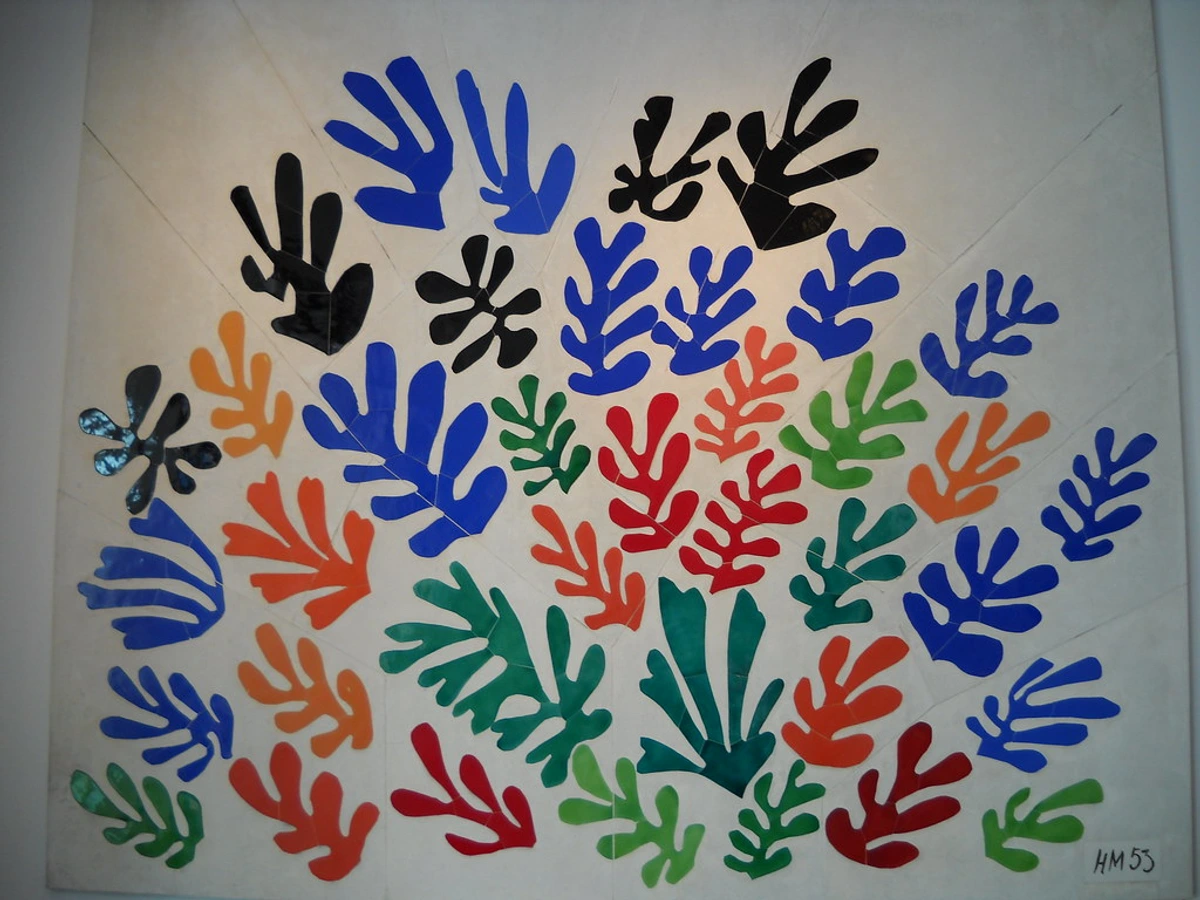
Abstract Art: Ah, my bread and butter! When I first started, 'abstract' felt like a fancy word for 'I don't get it.' But it's so much more. It's art that doesn't attempt to represent an accurate depiction of a visual reality but rather uses shapes, colors, forms, and gestural marks to achieve its effect. It’s about emotion, energy, and internal landscapes. It can even take recognizable subjects and simplify them down to their essence. If you're curious about diving deeper, I've shared my thoughts on how to abstract art, explored its evolution, and offered a guide to decoding abstract art. Did you know artists like Wassily Kandinsky, Jackson Pollock, and Mark Rothko, though vastly different in style, all explored the power of abstraction?

https://live.staticflickr.com/65535/53064827119_1b7c27cd96_b.jpg, https://creativecommons.org/licenses/by-nc-nd/2.0/
Acrylic: My go-to medium. It's a fast-drying paint made of pigment suspended in acrylic polymer emulsion. What I love about it is its versatility and how quickly it lets me layer colors, creating depth without endless waiting. It's truly revolutionized modern painting, as detailed in the history of acrylic painting.
Assemblage: Like collage, but stepping into three dimensions. It’s about taking found objects, sometimes forgotten, sometimes mundane, and giving them a new voice, a new purpose within a sculpture. My studio is full of bits and pieces I've gathered, always wondering if they'll find their way into a piece – giving life to the discarded is a powerful act of creation.
Avant-garde: This term always makes me think of artists fearlessly pushing boundaries, often ahead of their time. It's about innovation, challenging the status quo, and sometimes, making people a little uncomfortable with new ideas. My own explorations with AI as co-creator definitely flirt with this idea, pushing the boundaries of authorship and what 'creativity' even means when a machine is involved. It’s a bit unsettling, a bit thrilling, and definitely not for everyone – classic avant-garde territory!
B
Baroque: When I think Baroque, I imagine drama, grandeur, and intense emotion. Think opulent churches, dramatic lighting, and a real sense of movement in the artwork. It's not my style personally, but I appreciate the sheer scale of ambition and the emotional punch of the era. It's like a magnificent, over-the-top opera in visual form.
Brushstroke: The visible mark of the brush on the canvas. For me, it's like a signature, a trace of my hand and emotion. Some artists hide them; I often celebrate them, especially when exploring texture. Each stroke tells a micro-story, a moment of energy captured.
C
Canvas: The surface! Traditionally linen or cotton, stretched over a frame. It's where the magic begins. For me, the blank canvas is both terrifying and exhilarating—a portal to an unknown world, full of silent potential.
Chiaroscuro: Light and shadow, dramatically contrasted to create a sense of volume and depth. Old masters were brilliant at this, using it to make figures pop out of darkness. It's about making things impactful, which I try to do with color rather than just light in my own abstract compositions.
Chroma: Often called saturation or intensity, chroma is the purity or vividness of a color. A high chroma color is bright and strong; a low chroma color is duller, closer to gray. It’s what makes a color sing or whisper. For me, especially in abstract work, playing with high chroma allows those vibrant hues to really pop, almost demanding attention, creating that electrifying energy I aim for.
Collage: As someone who loves mixed media, collage is fantastic. It's assembling different forms, texts, or images to create a new whole. It’s like my morning routine, bits and pieces of life glued together to form a coherent (or wonderfully incoherent) day.
https://live.staticflickr.com/6090/6059309027_476779f1de_b.jpg, https://creativecommons.org/licenses/by-sa/2.0/
Color Theory: Oh, where do I begin? The study of color mixing, combinations, and the visual effects of specific color choices. It's fundamental to everything I do. My whole abstract language relies on it, and it's something I constantly explore in articles about how artists use color and my own methods beyond primary colors. Did you know a color's hue (its pure identity) can be modified by adding white (creating a tint), black (creating a shade), or gray (creating a tone)? It’s a subtle dance that shifts the mood entirely.
Composition: How elements are arranged within a work of art. The unseen structure. It's the silent force guiding the viewer's eye, creating balance or tension. I spend a surprising amount of time on this in my seemingly chaotic pieces, thinking about the unseen structure.
Critique: The analytical discussion and evaluation of art. It’s where you break down form, technique, composition, and meaning. For me, it's often an internal conversation – dissecting my own work, asking 'Does this really work?' before it ever leaves the studio. And sometimes, it's just accepting that not everyone will 'get' it,' and that's okay, because art is subjective, isn't it?
Cubism: Breaking objects into geometric forms and reassembling them, often showing multiple viewpoints simultaneously. Think Picasso and Braque. It challenged traditional perspective and opened up new ways of seeing, definitely a movement that taught me to question how we perceive reality. Learn more in my ultimate guide to Cubism.
D
Dadaism: Pure delightful rebellion! An art movement born out of disillusionment with WWI, rejecting logic and reason. It's playful, provocative, and still inspires me to not take everything so seriously in my own work. Sometimes, you just need to break the rules, even the ones you didn't know existed.
Digital Art: Art created using digital technology as part of the creative or presentation process. This could be anything from digital painting and sculpture to generative art and AI-assisted creations. Given my dabbling in AI, this field is endlessly fascinating and constantly evolving. It challenges the very definition of a brush and canvas.
Diptych: Two panels, usually hinged, forming a single artwork. I've often thought about creating these for homes where you want a piece that can adapt, perhaps for abstract art for small spaces. They offer a unique narrative possibility, like two pages from an unfolding story.
E
Easel: The trusty stand for my canvas. Simple, essential. It's where I spend most of my creative time, often with my studio playlist humming in the background. My silent, patient companion, always holding my work steady, even when my mind isn't.
Expressionism: Art driven by emotion rather than objective reality. It's about expressing inner feelings, often with bold colors and distorted forms. When I paint from my creative flow, it often leans into this, capturing a mood rather than a scene. Dive deeper with the ultimate guide to Expressionism.
https://www.flickr.com/photos/vintage_illustration/51913390730, https://creativecommons.org/licenses/by/2.0/
F
Figurative Art: Art that clearly depicts recognizable objects or subjects from the real world. It's the opposite of abstract, but both can be incredibly powerful. I sometimes dabble in forms that hint at figures, but usually, they dissolve into my abstract worlds.
Form: The three-dimensional aspect of an object or the overall structure of a piece. Unlike shape (which is 2D), form suggests volume and mass. Even in my flat abstract art, I'm constantly thinking about implied forms – how shapes overlap, recede, or push forward to create a sense of three-dimensional space and structure.
Fresco: Painting on wet plaster, usually on walls or ceilings. An ancient technique that requires incredible speed and precision before the plaster dries. I'm far too messy and indecisive for that kind of commitment! Hats off to those masters who made it look so effortless.
G
Genre: A category of art based on style, subject matter, or technique. Like music genres. My work often falls into the 'abstract expressionist' or 'contemporary' genres, but I try not to let labels box me in too much; creativity loves freedom, and sometimes the best art defies easy categorization.
Gesso: A primer applied to canvas or other surfaces before painting. It creates a smooth, absorbent base for the paint. Essential for me, especially when I want those vibrant colors to truly pop and adhere properly. It’s the invisible groundwork for all the visible magic.
Gesture: The expressive movement or stance of a figure in art, or the energetic, spontaneous mark-making of an artist. It's the brushstroke with an attitude, a trace of the body's dance on the canvas. When I'm in my creative flow, especially with larger pieces, my entire arm, sometimes my whole body, is involved – that's pure gesture.
Giclée: A high-quality fine art printing method using inkjet technology to create reproductions of original artwork. For me, it's how I can share my original vision in a more accessible way, ensuring the colors and details are as true to the original as possible. It means more people can own a piece of my abstract world.
Gouache: An opaque watercolor paint. It has a matte finish and can be reactivated with water. Great for illustrations and detailed work, less so for my large-scale abstract pieces, but a lovely, versatile medium in its own right, like a quiet, understated cousin to acrylics.
Ground: The prepared surface on which an artist paints. It's literally the foundation – a canvas, a panel, paper – usually prepared with gesso. It dictates how the paint behaves, how colors sing. Choosing the right ground is like choosing the right stage for a performance; it sets the tone for everything that follows.
H
Hatching: Creating tonal or shading effects with closely spaced parallel lines. Cross-hatching uses intersecting lines. It's meticulous work, like cross-stitching with a pen, not usually my spontaneous style, but effective for detailed realism.
Hue: Essentially, the pure color itself – red, blue, green, etc. It's a foundational concept in color theory and the starting point for all my vibrant palettes. Think of it as the 'name' of the color before it gets mixed with white (tint), black (shade), or gray (tone).
I
Iconography: The study of symbolic meanings in art. Every symbol tells a story, whether obvious or hidden. When I create, sometimes I embed subtle personal symbols, contributing to my abstract language and adding layers of meaning. It's like leaving breadcrumbs for the curious viewer.
Impasto: Applying paint thickly so that it stands out from the surface, creating a physical texture. Love this! It gives a painting a physical presence, a sculptural quality. You can really feel the paint in many of my pieces, adding depth that draws you in. It's like the artwork is literally reaching out to you.
Impressionism: Capturing fleeting moments and the effects of light, often with visible brushstrokes and an emphasis on atmosphere over precise detail. Monet's 'Woman with a Parasol' is a classic example. It's like a snapshot of light and atmosphere, a whispered secret about a specific moment. My own work, while abstract, also chases light and its transient qualities, especially when thinking about the language of light.
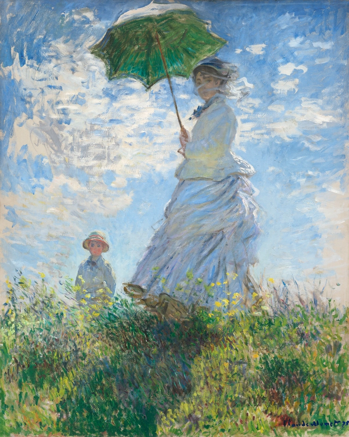
https://www.rawpixel.com/image/547292, https://creativecommons.org/publicdomain/zero/1.0/
Installation Art: Three-dimensional artworks designed to transform the perception of a space. Unlike a sculpture, which is often a singular object, an installation involves the entire environment. Think of Yayoi Kusama's 'Dots Obsession' – an immersive experience. The idea of creating an entire world for the viewer, even temporarily, is incredibly exciting, a grander scale of storytelling than a canvas alone.
J
Juxtaposition: Placing two elements side-by-side for a contrasting effect. It creates tension, drama, or highlights similarities in unexpected ways. I often use this with colors or forms in my abstract compositions, playing with how they 'talk' to each other, sometimes in harmony, sometimes in glorious discord.
K
Kinetic Art: Art that literally moves. Think mobiles, sculptures with rotating parts, or even light installations that shift. It fascinates me, the idea of an artwork constantly changing and interacting with its environment. It's a very different challenge from the static canvas I'm used to, but undeniably captivating – a dance between art and air.
Kitsch: Art or objects considered to be in poor taste because of their excessive sentimentality, gaudiness, or vulgarity, yet sometimes appreciated ironically or for their camp value. It’s the art world's guilty pleasure, or sometimes, a deliberate statement about taste itself. I find it fascinating how what one person considers 'kitsch' another sees as genuine expression. It reminds me that rules are made to be bent, even broken, and that beauty is truly in the eye of the beholder.
L
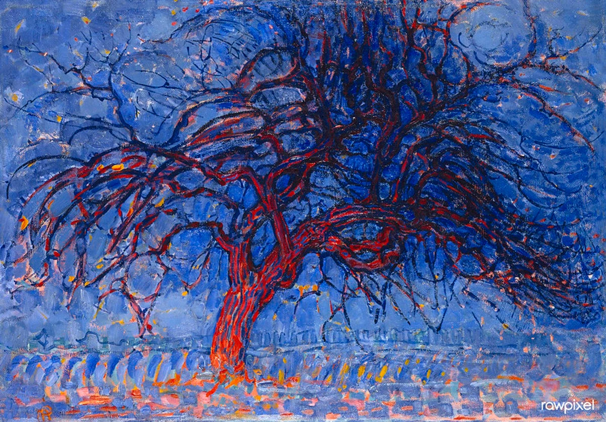
Landscape: A depiction of natural scenery. Even in my abstract work, I sometimes draw inspiration from landscapes—the feeling of vastness, the texture of a forest floor, or the flow of a river. It's like translating a memory of nature into pure form and color, an echo rather than a direct copy.
https://commons.wikimedia.org/wiki/File:The_Creation_Of_The_Mountains.jpg, https://creativecommons.org/licenses/by-sa/4.0/deed.en
Light (in art): Crucial! How light is depicted, how it interacts with the subject, creates mood, reveals form, and defines space. For collectors, knowing how to choose the right lighting for your art is equally important, as it completely transforms how a piece is perceived. It’s the breath that brings a painting to life.
Line: The most fundamental element of art, defined as a mark made by a tool or moving point. It can be thin, thick, continuous, broken, straight, curved, expressive, or precise. In my abstract work, line is everything – it defines boundaries, creates rhythm, suggests movement, or simply exists as a raw, energetic gesture across the canvas. It's the skeleton of my creative thoughts, waiting to be fleshed out with color and texture.
Luminosity: The quality of emitting or reflecting light; brightness, especially a soft, glowing light. It’s what gives certain colors a 'lift,' making them seem to glow from within. I often chase luminosity in my layered acrylics, trying to capture that ethereal quality where light seems to emanate from the artwork itself, inviting you to step closer and bask in its glow. It’s the quiet hum of a truly vibrant color.
M
Maquette: A small preliminary model or sketch, typically in three dimensions, for a larger sculpture or architectural project. It’s the artist's sandbox, a space to test ideas, solve spatial puzzles, and get a feel for scale before committing to the grand vision. For me, it’s not about sculpture, but I often do 'color maquettes' – small studies to see how hues will interact before they hit the big canvas.
Medium: The materials an artist uses – paint, clay, digital tools, mixed materials, etc. My primary medium is acrylic, but I'm increasingly drawn to mixed media explorations, always curious about new textures and layers. It’s the vehicle for my expression.
Minimalism: Art that reduces forms to their essential elements, emphasizing simplicity and purity. Less is more. While my work is often vibrant and complex, I appreciate the quiet power of art for minimalist interiors, where a single, impactful piece can speak volumes with almost nothing to say. It's a stark, beautiful contrast to my own creative explosions.
Motif: A recurring element, theme, or design in a work of art. Think Yayoi Kusama's polka dots – an iconic motif. I sometimes find myself returning to certain shapes or color combinations that become personal motifs, almost like visual anchors in my evolving style.
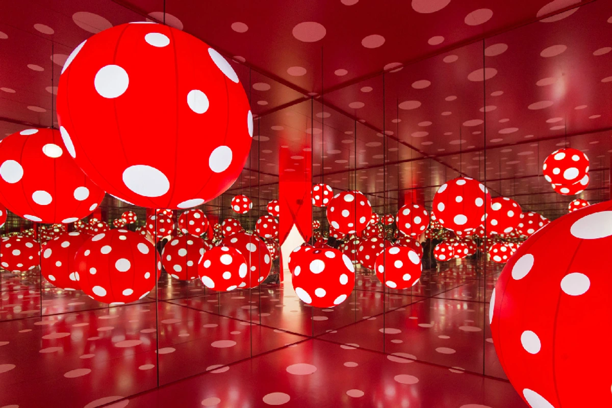
https://upload.wikimedia.org/wikipedia/commons/e/e6/Yayoi_Kusama%2C_Dots_Obsession%2C_2013-2016.jpg, https://creativecommons.org/licenses/by-sa/4.0
Mural: A large painting or artwork applied directly to a wall or ceiling. Imagine painting something that big! It's a different scale of thinking, and definitely on my bucket list one day, perhaps for my den-bosch-museum if I ever get to expand it! It’s art on an architectural scale, truly public and immersive.
N
Naturalism: Art that aims for a realistic portrayal of the natural world, often with an emphasis on idealized beauty or truth to nature. It's about honesty in depiction, capturing the world exactly as it appears. While Naturalism often seeks an ideal, Realism (which we'll cover soon) typically focuses on the gritty, unvarnished truth, even if it's unpleasant. I admire both, even as I choose to express my reality abstractly, through the lens of emotion and energy.
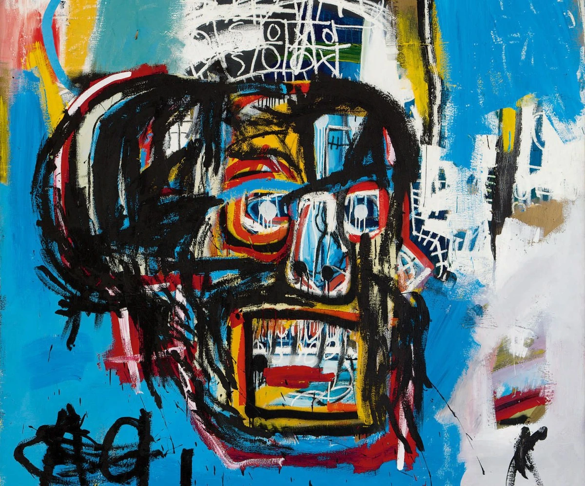
Neo-expressionism: A resurgence of expressionistic styles in the late 20th century, often characterized by raw brushstrokes, intense colors, and figurative subjects. Basquiat is a great example. It's got an undeniable energy, a powerful, almost primal scream on canvas. Explore more in the ultimate guide to Neo-expressionism.
https://heute-at-prod-images.imgix.net/2021/07/23/25b32e7b-0659-4b35-adfe-8895b41a5f89.jpeg?auto=format, https://creativecommons.org/licenses/by/4.0/
O
Oil Paint: A classic medium, pigments bound with drying oil. Known for its rich, luminous colors, incredible blendability, and slow drying time, which allows for extensive manipulation. I respect oil painters immensely; their patience is something I often lack, preferring the immediate gratification of acrylics! It's a medium that demands a slow dance, and I'm more of a quick jive kind of artist.
Op Art: Optical Art. Art that uses optical illusions to create a sense of movement, depth, or hidden images through precise geometric patterns. It's like a visual puzzle, very clever and engaging, playing delightful tricks on your eyes. It makes you question what you truly see, a theme I explore in abstract art in a different way.
P
Palette: The board an artist uses to mix colors, or the range of colors used in a particular artwork. My current palette is probably much brighter and more varied than it was a few years ago – a reflection of my evolving creative flow and confidence. It’s the painter’s stage, where hues meet and mingle before their grand performance on canvas.
Palette Knife: A blunt tool with a flexible steel blade, used for mixing and applying paint, or for scraping paint from the canvas. I use them extensively, not just for mixing, but for creating incredible textures – thick, sculptural impasto marks, sharp edges, or smooth, blended areas. It adds another layer of unpredictable energy to my abstract work.
Pattern: The repetition of elements (shapes, lines, colors) in a recognizable sequence or arrangement. It can be highly ordered or chaotic, but it always implies a visual rhythm. In my work, you might not see obvious repeating motifs, but I often play with subtle patterns in brushstrokes or color blocks to guide the eye and create a sense of underlying structure. It’s the hidden beat beneath the visual melody.
Perspective: Creating the illusion of depth and distance on a two-dimensional surface. Essential for realistic art, making flat images appear three-dimensional. Even in abstract art, there's often an implied perspective, guiding the eye through layers and forms, though it's less about strict realism and more about creating space for the emotion to breathe.
Photorealism: A genre of art where the artist meticulously recreates a photograph in another medium, typically painting or drawing, with extreme precision and detail, often making it difficult to distinguish from the photograph itself. It’s a testament to incredible technical skill, an almost obsessive dedication to capturing reality – a fascinating contrast to my own pursuit of abstract truth.
Plein Air: French for 'in the open air,' referring to the practice of painting outdoors. Popularized by the Impressionists, it's about capturing the fleeting effects of natural light and atmosphere directly, rather than from memory or studies in a studio. The thought of wrestling with the elements while trying to paint a complex scene always makes me chuckle; my studio has air conditioning for a reason! It’s an artist's adventurous spirit, braving the elements for art.
Pointillism: A technique where small, distinct dots of pure color are applied in patterns to form an image, with the colors blending optically in the viewer's eye. Seurat's 'A Sunday Afternoon on the Island of La Grande Jatte' is the most famous example. Imagine the dedication required! It's like building an image, pixel by pixel, with paint.
https://live.staticflickr.com/3731/13401949523_202a6aac63_b.jpg, https://creativecommons.org/licenses/by/2.0/
Portrait: A depiction of a person, usually focusing on the face, to capture their likeness and often their personality. I've done a few pet portrait paintings in my time, which is a surprisingly intimate process, trying to capture the soul of an animal. It's about seeing beyond the surface to the essence of a being.
Provenance: The history of ownership of a work of art, from the time it was created to the present day. It's the artwork's biography, a crucial aspect for collectors as it establishes authenticity, value, and ethical sourcing. Knowing a piece's journey, who cherished it, who passed it on – that adds another layer of narrative to its existence, a silent whisper through time.
R
Realism: Art that strives to portray subjects accurately and truthfully, without artificiality, idealization, or exaggeration. While Naturalism often seeks an idealized depiction, Realism tends to depict subjects as they are, warts and all, often focusing on everyday life and social commentary. It's about seeing the world exactly as it is, which can be profoundly challenging and revealing in its own way, like holding up a mirror to society.
Renaissance: A period of intense cultural, artistic, political, and economic 'rebirth' in Europe, roughly from the 14th to the 17th century. Think Da Vinci, Michelangelo, and a focus on humanism. It laid the foundations for so much Western art, a true explosion of genius that still resonates today. It was a time of rediscovery, where the past informed a dazzling future.
Reproduction: A copy or imitation of an original artwork, often made using printing techniques like giclée. While nothing replaces the energy of an original, high-quality reproductions allow art to be more widely shared and enjoyed. It's about spreading the joy, not just hoarding it, and I'm proud to offer them through my art for sale section, making art accessible to more homes.
Rhythm: The repetition of elements (colors, shapes, lines) to create a sense of movement, flow, or visual beat in a work of art. I often think about rhythm in my abstract compositions, how colors and shapes dance across the canvas, guiding your eye through the piece. It’s the heartbeat of the artwork, subtly pulling you along.

https://www.flickr.com/photos/42803050@N00/31171785864, https://creativecommons.org/licenses/by-nd/2.0/
S
Sculpture: Three-dimensional art forms, created by carving, modeling, casting, or assembling. From classical statues to modern installations, it's about form in space. I sometimes wish I had a stronger spatial awareness for sculpture; my mind is usually flatter on the canvas, exploring two dimensions! It’s a physical conversation with space itself.
Sgraffito: A technique where a top layer of paint, plaster, or slip is scratched away to reveal a contrasting color or material beneath. It’s a bit like digging for treasure on the canvas, revealing hidden layers and textures. I sometimes use a similar subtractive process in my acrylic work, scraping back wet paint to expose the underpainting or bare canvas, creating unexpected lines and forms.
Sketch: A rapidly executed freehand drawing or painting, often serving as a preliminary study or an idea captured quickly. It's the raw thought, the spark of inspiration before it's finessed. My sketchbooks are chaotic maps of half-formed ideas, color tests, and scribbled gestures – the secret diary of my creative process, where mistakes are encouraged.
Sfumato: A painting technique that blends colors or tones in such a subtle way that they melt into one another without perceptible transitions, creating soft, hazy effects. Leonardo da Vinci's Mona Lisa is famous for this. It’s wonderfully soft and mysterious, like a whispered secret in paint.
Still Life: An arrangement of inanimate objects as a subject for a work of art. Think fruit bowls, flowers, or everyday items. It's a classic way to practice composition and light, even if I prefer my subjects to be less tangible and more expressive. There’s a quiet drama in the everyday, if you look closely enough.
Sublime: A concept in aesthetics, referring to art that evokes a sense of awe, grandeur, terror, or overwhelming power, often associated with the infinite or vastness of nature. It's that gut-punch feeling when you encounter something truly monumental, something that humbles you. I strive for moments of the sublime in my abstract work – not through literal depiction, but through the sheer force of color and composition that can transport you beyond yourself.
Symbolism: Using symbols, objects, or figures to represent ideas, qualities, or concepts. Geometric shapes in abstract art can carry deep symbolic weight, and that's something I often explore to convey deeper meaning without direct representation. It's a language of the soul, a hidden conversation between artist and viewer.
T
Technique: The skill, method, and specific approach an artist uses to create art. My techniques in abstract painting have evolved over my timeline, a constant experimentation with tools, gestures, and materials. It's the 'how' behind the 'what,' the invisible dance that brings the artwork to life.
Texture: The perceived surface quality of a work of art. Can be actual (like thick impasto paint that you can feel) or implied (a smooth painting that looks like rough fabric). I'm obsessed with texture; it adds so much depth and sensory experience, and you can see it in my studio. It’s the tangible whisper of the canvas.
Tonalism: An art movement primarily in the late 19th and early 20th centuries, characterized by soft, hazy, muted colors, often in landscapes, emphasizing atmospheric effects and a sense of mood. It’s the art of quiet contemplation, a gentle, almost melancholic beauty, often achieved through subtle shifts in value. While my own work is often more vibrant, I appreciate the meditative quality of Tonalism, a reminder that art can also whisper, rather than shout.
Trompe-l'oeil: French for 'deceive the eye,' an art technique that creates an optical illusion of three-dimensionality. It makes flat objects appear to exist in three dimensions, often with astonishing realism. It’s the ultimate visual prank, a playful challenge to perception. While I'm exploring abstract truths, the sheer cleverness of trompe-l'oeil always makes me smile – a reminder that art can be both profound and wonderfully mischievous.
Triptych: An artwork divided into three panels, often hinged together, and usually related thematically. Like a diptych, but with more storytelling potential and a grander presence. I envision one day creating a grand triptych that tells a whole abstract narrative, a visual epic that unfolds across multiple canvases.
U
Underdrawing: The initial drawing or sketch made on a surface before painting begins. It's the blueprint, the hidden structure that guides the layers of paint to come. Sometimes, I let parts of my underdrawing show through in the final piece, a ghostly echo of the beginning, a hint at the journey the canvas has taken.
Underpainting: An initial layer of paint, often monochromatic, used as a base for subsequent glazes or layers of color. It helps to establish the overall tone, forms, and values for the final painting. It’s like a secret foundation, giving structure to the beauty on top, a hidden scaffolding for the visual world.
V
Value (in art): The lightness or darkness of a color, independent of its hue. It's essential for creating contrast, dimension, and form, even more so than hue sometimes. Think of it: a dark red and a light blue have different hues but could have the same value if they have similar lightness/darkness. My early abstract work often struggled with value contrast, a common rookie mistake, but crucial for impact! It's the backbone of visual drama.
Vanishing Point: In perspective drawing, the point on the horizon line where parallel lines appear to converge, creating the illusion of distance and depth. Even in my abstract work, I play with implied vanishing points or focal areas to create a sense of recession or forward movement, guiding the eye through an imagined space.
Varnish: A transparent, protective coating applied to the surface of a finished painting. It not only protects the artwork from dirt, UV light, and wear but can also enhance the luminosity of colors and unify the painting's sheen (matte, satin, or gloss). It’s the final blessing, sealing the artwork's journey before it goes out into the world, a protective embrace for the finished piece.
W
Watercolor: Transparent paint made with pigments ground in gum arabic and thinned with water. It's delicate, fluid, and often unforgiving due to its transparency and quick drying. I tried it once and decided I prefer the boldness and control of acrylics – watercolor demands a patience I haven't quite mastered! It’s a medium that teaches you to let go, a lesson I’m still learning.
Warp and Weft: The two components of weaving; the warp threads are the longitudinal threads held stationary in tension, and the weft threads are drawn through them to create fabric. For a painter, understanding warp and weft in canvas helps appreciate the very material beneath the paint, the subtle texture and inherent strength of the woven support. It’s the textile soul of my abstract worlds, the foundation woven into existence.
Wash: A thin, translucent layer of paint, often watercolor or diluted ink, applied evenly over a surface to create a pale, transparent effect. Beautiful for soft backgrounds or establishing an initial atmospheric tone. It’s a whisper of color, setting the mood before the main conversation begins.
WIP (Work in Progress): A common acronym for 'Work in Progress,' referring to an unfinished artwork. It's a snapshot of creation, raw and unpolished, full of potential and unresolved questions. My studio is usually littered with several WIPs at various stages – each one a conversation with myself, waiting for the next answer, the next gesture, the next layer. It's the messy, beautiful reality of being an artist.
X
X-Acto Knife: A brand of craft knife with a very sharp, replaceable blade, commonly used for precise cutting in collage, papercraft, and mixed media. It's the surgeon's tool in my mixed media experiments, allowing for clean lines and intricate details amidst the chaos of paint and found materials. It's a small tool, but incredibly powerful for defining form and creating crisp edges.
Y
Yellow Ochre: A natural earth pigment, a warm, muted yellow. While not a unique term in its definition, it stands in here for the countless specific pigments and colors that form an artist's palette. It's a reminder that even the simplest colors have deep histories and unique qualities, each waiting for its moment to shine. For me, it’s a foundational color, a quiet workhorse that brings warmth and depth to so many compositions.
Z
Zeitgeist: German for 'spirit of the age' or 'spirit of the time,' referring to the defining mood, characteristic, or intellectual and cultural climate of a particular period in history. Art is always, in some way, a reflection of its zeitgeist, responding to the world it exists in. Even my most personal abstract pieces are subtly shaped by the world around me, the collective unconscious of our time – a silent dialogue between the personal and the universal.
Zenith: Ah, the grand finale! While not a specific art term in the traditional sense, for me, 'zenith' in art represents the peak, the highest point of artistic achievement or expression – a moment of artistic triumph recognized either personally or critically. It’s that moment when an artwork truly transcends, resonates, and moves you deeply. Every artist, myself included, strives for those moments – that ultimate connection with the viewer, that perfect expression in a piece you want to buy. It’s the highest point of my own artistic journey, a continuous quest for that sublime connection, where art touches the soul.
Understanding Art Movements: A Quick Overview
Art movements are like historical signposts, each reflecting the zeitgeist of its time and pushing the boundaries of expression. Here’s a quick look at some key movements mentioned in this glossary and beyond:
Movement | Period | Key Characteristics | Notable Artists (Examples) |
|---|---|---|---|
| Renaissance | c. 1400–1600 | Rebirth of classical learning, humanism, perspective, realism, naturalistic depiction | Leonardo da Vinci, Michelangelo, Raphael |
| Baroque | c. 1600–1750 | Drama, emotion, grandeur, ornate detail, intense chiaroscuro, movement | Caravaggio, Bernini, Rembrandt |
| Impressionism | c. 1860s–1880s | Capturing fleeting light and atmosphere, visible brushstrokes, plein air painting | Claude Monet, Pierre-Auguste Renoir, Edgar Degas |
| Cubism | c. 1907–1914 | Breaking objects into geometric forms, multiple viewpoints, challenging perspective | Pablo Picasso, Georges Braque |
| Expressionism | c. 1905–1920 | Expressing inner emotion over objective reality, bold colors, distorted forms | Ernst Ludwig Kirchner, Wassily Kandinsky, Edvard Munch |
| Dadaism | c. 1916–1922 | Anti-art, rejection of logic and reason, playful, provocative | Marcel Duchamp, Man Ray, Hannah Höch |
| Abstract Art | c. 1910–Present | Non-representational, forms and colors for their own sake, emotion, energy | Wassily Kandinsky, Piet Mondrian, Jackson Pollock |
| Minimalism | c. 1960s–1970s | Simplicity, essential elements, purity of form, 'less is more' | Donald Judd, Agnes Martin, Carl Andre |
| Neo-expressionism | c. 1970s–1980s | Resurgence of expressionistic styles, raw brushstrokes, intense colors, often figurative | Jean-Michel Basquiat, Julian Schnabel, Anselm Kiefer |
Why This Glossary Matters: Beyond Just Words
Knowing these terms isn't about becoming an art historian or a snob; it's about enriching your experience. It's about having more precise conversations, not just about what you like, but why you like it, and what fascinating journey the artist or artwork might have taken. It gives you hooks, reference points, and a shared vocabulary. It transforms passive viewing into active engagement.
When you look at my art, I want you to feel free to interpret, to find your own meaning. But if you're curious about the 'how' behind the 'what,' or want to explore the traditions my abstract work might subtly defy or embrace, this glossary is for you. It's about giving you more tools to enjoy the vast, incredible world of art. And frankly, it's just fun to learn new things, isn't it?
Frequently Asked Questions (FAQ)
Q: Do I need to know all these terms to enjoy art?
A: Absolutely not! Enjoyment is primal, intuitive, and deeply personal. You don't need to know the chemical composition of a delicious meal to savor it. But knowing the ingredients and techniques can definitely enhance appreciation, like understanding the nuances of a favorite dish. It just adds another layer to the deliciousness!
Q: How do artists use this language in their daily practice?
A: We use it to communicate with each other, to plan our work, to articulate our vision, and sometimes, to critique our own creations. It's a professional shorthand and a conceptual framework. It's a tool, not a barrier, for fostering understanding and pushing creative boundaries. It helps us translate the chaos in our minds into something coherent, or beautifully incoherent, on canvas.
Q: Where can I see more examples of these concepts in action?
A: Everywhere! Visit museums (like my future den-bosch-museum), local galleries, or explore art books and online resources. Many of the articles on this site also delve deeper into these topics, offering real-world examples and personal insights. The more you look, the more you'll see! And remember, every piece of art you encounter is a living example of these terms.
Q: What are the most important terms for a beginner to know?
A: If I had to pick just a few, I'd say start with the Foundational Elements: Line, Shape, Form, Color, Texture, and Space. These are the basic building blocks. Then, understanding Abstract Art (for obvious reasons!) and Composition will give you a fantastic foundation for appreciating almost any artwork. Don't try to learn them all at once; let your curiosity guide you!
So, whether you're just starting your art journey or are a seasoned collector, I hope this glossary sparks a bit more curiosity and provides a helpful guide. Keep exploring, keep questioning, and most importantly, keep feeling. The art world is vast and welcoming, and there's always something new to discover. And if any of these terms make you think of a particular artwork of mine, feel free to explore my collection and see how these ideas manifest in my own creative expression.


