
The Natural Light Art Placement Guide: Where Sunlight Becomes Your Curator
Stop guessing where to hang your art. This is your personal, thoughtful guide to using natural light as your most powerful curatorial tool.

The Art Lover's Guide to Hanging Art in Natural Light
You just bought a piece of art you love. It felt electric in the gallery, perfect in the sterile showroom light. Now it's in your living room at 2 PM on a Tuesday, and something’s wrong. The colors you fell in love with look faded, the textures feel flat, and a harsh glare cuts right across the center. You start to wonder: was it the money? The wall? Did you just make a huge mistake?
Sunlight can be an artist's most dynamic collaborator or its most destructive enemy. I've spent years studying how masterpieces in the world's great museums are curated and protected, and I can tell you there's a reason why some centuries-old paintings still look vibrant while a modern print can fade in just a few seasons. The difference lies in understanding light as a material—something you manipulate, not just something that happens to your walls.
Here’s the secret no one tells you: you’re not crazy, and the art isn’t the problem. The problem is the light. More specifically, the problem is a fundamental misunderstanding of natural light's dual nature—it can be both a breathtaking spotlight and an invisible agent of decay. Conservators at the Tate Modern or the Metropolitan Museum would tell you exactly the same thing: light is the most critical variable in their entire conservation strategy, more so than humidity or temperature. They've calculated the "lux hours" each piece can safely receive in its lifetime, treating sunlight with the same caution a doctor would use in prescribing medication.
This isn’t another article telling you to avoid the sun. It’s the opposite. We’re going to learn how to stop fighting natural light and start collaborating with it—to treat sunlight not as an enemy to be feared, but as the most powerful curatorial tool you already own. Because once you understand its language, a south-facing wall stops being a hazard and starts being a stage. A north-facing window becomes your personal museum gallery. That tricky piece you can’t quite place finds its home on a wall you never even considered. We're going to dissect precisely how museum curators think, embracing light as a living part of your décor.
This is a masterclass in the art of seeing. We’ll cover the hard science of UV wavelengths and Lux measurements alongside the soft poetry of how a piece can feel at different times of day. We’ll debunk myths, answer the questions you’ve been too afraid to ask (like "How long is too long in the sun?"), and give you a practical framework for any space, from a sun-drenched beach house to a cozy north-facing apartment. We'll even address highly specific situations, like how high to hang art when light is the primary concern and whether you can ever safely display art in a bathroom or kitchen.
Consider this a masterclass in the art of seeing—where we'll cover everything from the hard science of UV wavelengths and Lux measurements to the soft poetry of how a piece can feel at different times of day. We'll debunk myths, answer the questions you've been too afraid to ask (like "How long is too long in the sun?"), and provide a practical, step-by-step framework that applies to any space, from a sun-drenched beach house to a cozy north-facing apartment.
Most articles will scream about UV rays and tell you to shun sunlight entirely. It’s not that simple. Imagine a vibrant, abstract painting, born from the chaos and color of life, now hidden in a dimly lit corner because you were told light is dangerous. It’s a tragedy.
To me, banning all natural light from your art is like keeping a songbird in a soundproof cage. Sure, it's safe, but you've missed the entire point. The real question isn't if you should use natural light, but how. It requires us to adopt a more nuanced perspective, one that balances preservation with presentation, and understands that different types of art thrive under different lighting conditions.
The truth is, natural light is a nuanced character. It's the warm glow of a late afternoon sun that can make the gold leaf in a painting sing. It's the clean, white light of a north-facing window that bathes a piece in perfect, shadowless clarity for hours. But it's also the relentless, direct blast of a midday summer sun that, yes, will absolutely wage a war of attrition against your beloved prints.
The key isn't to live in fear. It's to become fluent in the language of light. Once you understand its different personalities—the gentle morning optimist, the dramatic high-noon performer, the soft museum curator—you can begin to direct the story it tells in your home, inviting the light that elevates without destroying.

Before we dive into window directions, let's talk about the physics for a moment—it's actually simpler than you think. Every light source has two critical characteristics that dictate how it will behave with your art: intensity and color temperature. Intensity, measured in lux, tells you how much light is hitting an object. On a bright day, direct sunlight can exceed 100,000 lux—an immense amount of energy. In contrast, a well-lit office might only be 500 lux. Your artwork doesn't need "sunlight" per se—it needs enough lux to be seen clearly without being damaged. Color temperature, measured in Kelvin (K), describes the quality of that light. Warm candlelight is around 1800K, harsh noon sun is around 5500K, and an overcast sky can be 7000K or higher. These aren't just abstract numbers; they fundamentally change how we perceive the colors in a painting.
Once you start noticing Kelvin, you'll see its fingerprints everywhere. Think of it this way: a master framer might spend hours choosing the perfect mat and frame to complement a work, but all that effort is wasted if it's hung under a green-tinted LED or a harsh orange-tinted bulb. The right color temperature completes the presentation, ensuring the work's true colors can sing. It's a subtle art, one that separates a good display from a truly breathtaking one. This is also why professional galleries invest so heavily in lighting systems—because they know the wrong light can completely misinterpret an artist's intention, turning a cool abstract statement into something that looks vaguely muddy and brown.
A painting with warm undertones placed in cool north light might appear more muted and somber than the artist ever intended. Conversely, a cool-toned piece in a warm west-facing window can become unnaturally golden. You're not just protecting your art; you're curating its emotional impact. By understanding color temperature, you become the editor, choosing the light that best conveys the story you want the art to tell.
Here's the core takeaway: Light doesn't just illuminate your art; it edits it. Professional museum conservators consider this the foundational principle of collection management. They spend their entire careers mastering this delicate balance between visibility and vulnerability. And while you're not running the Louvre, you're facing the exact same fundamental challenge in your living room—every single day. The only difference is scale. A museum like the Rijksmuseum is calculating the exposure for thousands of works; you're doing it for a handful. But the principles—measuring light, understanding its effects, choosing the right spot—are identical.
Think of the light in your home as a cast of characters, each with a unique role to play.

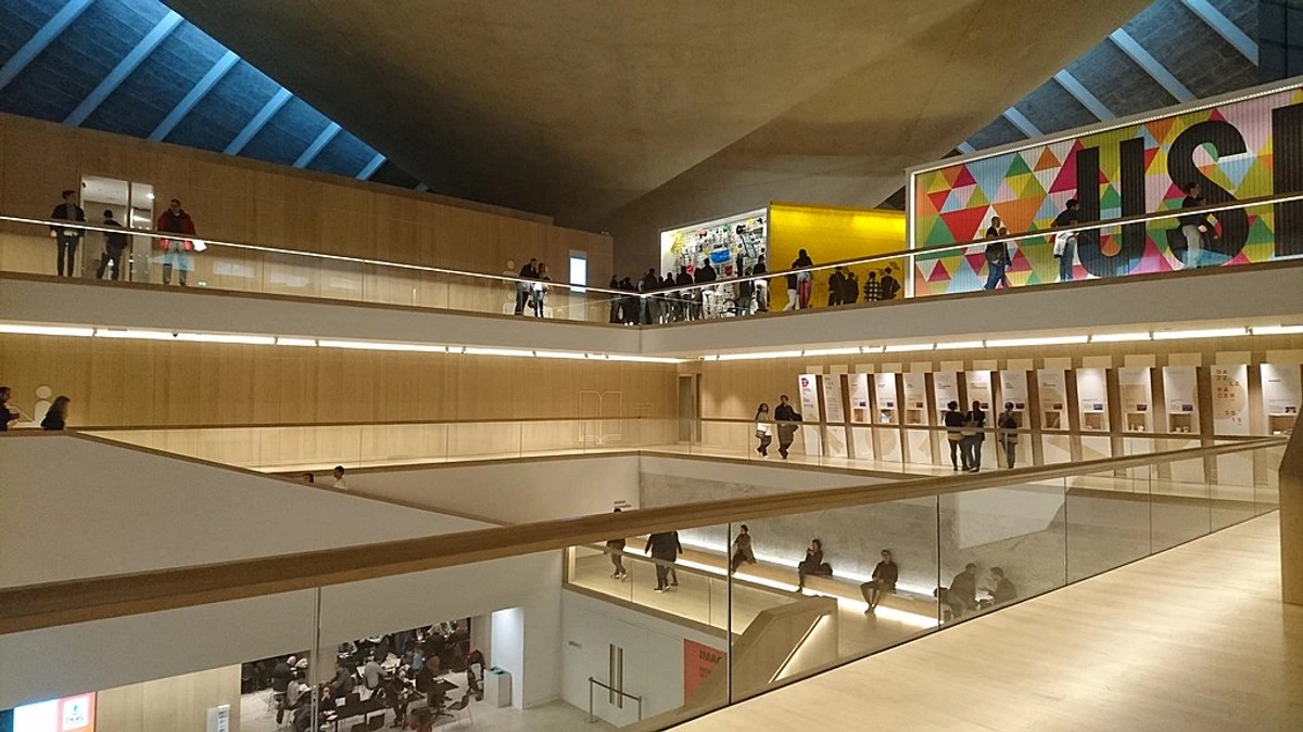
1. The North-Facing Window: The Museum Curator
This is the gold standard for artists and curators, and for good reason. A window facing north (in the Northern Hemisphere) receives no direct sunlight. What you get instead is a beautiful, diffused, and remarkably consistent light. It's gentle, cool (often around 5500-6500K), and even-toned, allowing you to see every detail and color in your artwork without the harsh glare or dramatic shifts of direct sun.
This is the closest you can get to a professional gallery's salle des états in your own home. The light is stable for most of the day, offering a reliable, honest representation of your art. It's the perfect environment for pieces where color accuracy and intricate detail are paramount, such as fine drawings, delicate watercolors, or complex prints. If you're ever unsure or just starting out, your safest and most rewarding bet is always the north wall.
If you have a north-facing wall, consider it prime real estate. It is the gold standard for a reason, offering the closest you can get to a professional gallery setting in your own home. This is the spot for the piece you want to live with, quietly and beautifully, all day long.
2. The South-Facing Window: The Dramatic Performer
Here’s where things get powerful. South-facing light is intense. It’s full of energy and changes character drastically throughout the day. The morning light can be warm and inviting, while midday light is sharp and bright. The late afternoon sun is often a rich, golden hue that can create stunning, ever-changing reflections and shadows.

This light is not for the faint of heart. It demands your attention. It can make a piece with metallic leaf, high-gloss resins, or bold, contrasting colors absolutely explode with life. But it's also the source of the most UV radiation, a relentless force that will wage a war of attrition against your art.

Hanging a piece here is a decision. You’re choosing to embrace a dynamic, theatrical relationship with your art, knowing you’ll need to protect it.
3. The East-Facing Window: The Gentle Optimist
An east-facing window greets the day with the soft, hopeful light of morning. It's warm (around 3000-3500K), fresh, and surprisingly gentle. This light is perfect for pieces that have a calming, serene energy. A landscape, a soft-focus abstract, or a piece with delicate pastel tones can look absolutely magical during the golden hour of dawn. It's the light for contemplative pieces, work that rewards quiet, patient observation, revealing its secrets in the first hours of the day. I particularly love how it can transform a busy abstract canvas into something surprisingly calm and focused.
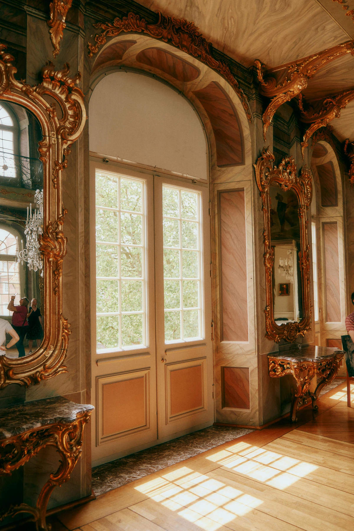
The key characteristic of this light is its transience. It's a beautiful but passing performance. By mid-morning, the direct light will have moved on, leaving your art in a more subdued, gentle ambient light for the rest of the day. This makes it the perfect choice for the art lover who wants to enjoy the sun's initial kiss without committing to its full, all-day intensity. It delivers a daily dose of warmth without the sustained risk of UV damage. East walls are where I test-drive new, unfamiliar pieces before deciding on their final home.

4. The West-Facing Window: The Melancholic Poet
West light is the emotional heart of the home. It's the light of late afternoons and the celebrated 'golden hour,' often dipping to 3000K or lower. This warm, rich quality casts long, poetic shadows that stretch and transform a room, creating a deeply atmospheric and introspective mood. It's the feeling of winding down, reflection, and quiet romance.
Artwork with warm color palettes—deep reds, burnt oranges, golden yellows, rich earth tones—absolutely thrives in this light. It can make a piece feel nostalgic, incredibly inviting, and emotionally resonant. Like east light, its direct intensity is brief, offering a daily performance of fading glory that begs you to pause and appreciate the moment.
Your Practical Toolkit: Real-World Strategies for Strategic Hanging
You’ve met the cast of characters—the Curator, the Performer, the Optimist, and the Poet. Now, how do you direct the play? This section is the bridge between understanding light and actually living with it. It's time to translate all this theory into a clear, step-by-step framework you can use this weekend. We'll cover the golden rules of placement, how to handle complex arrangements like a gallery wall, and how to manipulate height and angle to your advantage.
The goal here isn't just to protect your art, but to create an environment where it feels connected to your daily life, responding to the rhythm of the sun and the changing moods of your home.
The Hands-Down Easiest Winning Move
You have a beautiful piece of art and a wall. The single most effective, no-fail piece of advice I can give you is this:

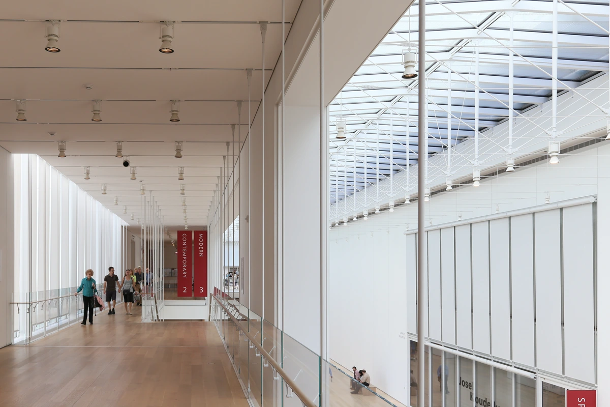
Hang your art on a wall that receives beautiful, ambient room light, not direct window light.
This is the single most important piece of advice I can give you—the 'one weird trick' that actually works. Place the artwork on a wall that is perpendicular (at a 90-degree angle) to the window wall, not opposite it. Think of it as putting the art at the 'shoulder' of the window, not staring it down face-to-face.
Why does this work so well? Because light travels in a straight line. When the sun pours through your window, the direct beam hits the floor. That light then bounces and scatters, filling the room with a soft, even, and diffused glow. By placing your art on a perpendicular wall, you are positioning it to be illuminated by this gentle, reflected light, not the harsh, concentrated beam. It is the difference between feeling the warmth of a campfire and being thrown directly into the sun itself. This simple, counterintuitive move solves 90% of light-related art problems before they even start.
Navigating Challenges: Gallery Walls, Bathrooms, and Kitchens
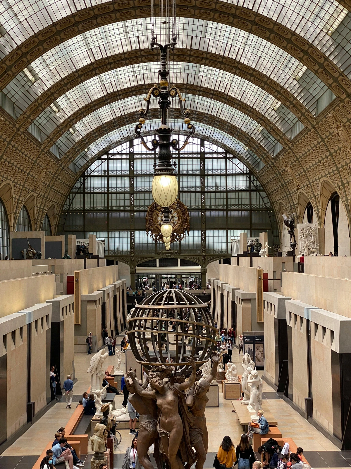
A gallery wall introduces complexity: a large wall with many pieces, often catching a lot of light. The solution is to zone your gallery wall by light sensitivity.
Instead of fighting the light, use it to choreograph your arrangement. Zone your gallery wall by sensitivity. Here is a practical strategy:
- Identify the 'Hot Zone': Figure out where the most intense direct light falls on the wall during the day.
- Place 'Robust' Art in the Hot Zone: Reserve this prime, high-impact area for more light-resistant pieces. Think oil paintings on canvas, acrylic works, or any piece you’re less concerned about long-term fading.
- Shelter 'Sensitive' Art in the 'Cool Zone': Place your most UV-sensitive pieces (like works on paper, watercolors, delicate prints, or older photographs) on the edges of the arrangement. This 'cool zone' receives much softer, indirect light.
This strategy transforms a potential liability into a strength. It creates a dynamic composition where the light itself helps guide the viewer's eye, naturally highlighting certain pieces while allowing others to reveal their subtlety in gentler tones. You end up with a collection that feels alive and responsive to the natural rhythm of your home. It’s about creating layers of visual interest that shift and change throughout the day.

The Power of Height and Angle: Working with Direct Light
Direct light isn’t always something to run from, but it is something to control. If you have a piece that you must place in a sunny spot—perhaps it's the only wall large enough or the piece demands that kind of drama—manipulating its position can be your saving grace.

Master the Vertical Plane: Sunlight travels on a predictable arc. In most rooms, the direct beam only hits the lower half to two-thirds of a wall. The upper third, sometimes called the 'shadow zone,' is often bathed in a much softer, reflected light bouncing off the floor or ceiling. Simply hanging a piece higher on the wall can move it out of the sun's direct path and into this safer, diffused light.
Command the Angle: If hanging higher isn't an option, change the angle of attack. Instead of hanging a piece flat against the wall, give it a slight tilt away from the window. This is especially easy if the piece is leaning on a shelf, mantle, or secured with a stand-off bracket. By angling the art, you change the point of impact from a direct, 90-degree strike into a glancing, oblique blow. This deflection significantly reduces UV exposure and glare without hiding the piece away.

The UV Ultimatum: Your Essential Guide to Preventive Conservation
Let’s stop whispering and address the elephant in the room directly: UV damage is real, relentless, and unforgiving. Ultraviolet light is the single greatest threat to your artwork. It's an invisible, high-energy photon that acts like a molecular battering ram, breaking down the chemical dyes and pigments in your art. This process, called photodegradation, causes irreversible fading and deterioration. Think of it as a suntan for your art that never fades, only gets worse.
Ignoring UV protection is like leaving a priceless book out in a rainstorm and hoping for the best. The damage is cumulative, often invisible at first, and by the time you notice it, it's far too late to reverse. The good news is, with modern materials and a clear strategy, you have the power to stop it in its tracks.
Framing is Your Art’s Armor
When you invest in a piece of art—especially a print or a work on paper—you must invest in its protection. Always, always frame with museum-grade UV-protective glass or acrylic.
Yes, it costs more upfront. But this cost is a tiny fraction of replacing a faded print or restoring a damaged original. It's an insurance policy with a one-time premium. The peace of mind from knowing your collection is shielded by the same materials used in the world's top museums is, in my experience, absolutely priceless. It is the single most important investment you can make for the longevity of your collection.
Here’s why you should never skip this step:
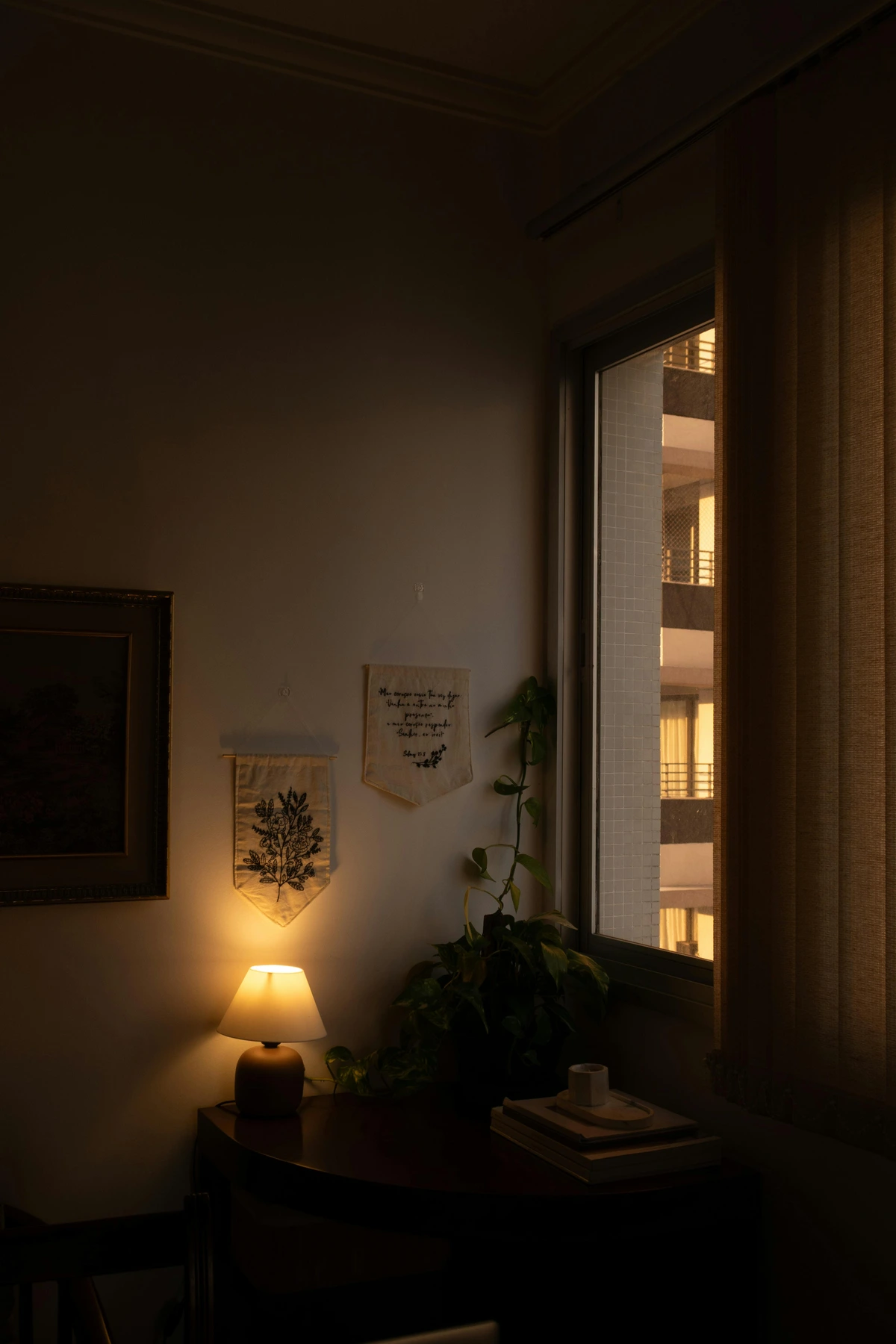
| Feature | Standard Glass | UV-Protective Glass (Museum Glass) | Premium UV Acrylic | | :--- | :--- | :--- | | UV Filtration | Blocks ~40% | Blocks 99%+ | Blocks 99%+ | | Glare Reduction | None | Superior (virtually eliminates glare) | Moderate to high | | Clarity | Good | Excellent (makes colors "pop") | Excellent | | Weight | Heavy | Heavy | Light (ideal for large pieces) | | Scratch Resistance | High | High | Moderate (requires care) | | Cost | Low | Higher | Moderate |
Understanding these differences is key to making an informed choice. For a priceless original drawing or a favorite limited-edition print you want to gaze at without a single reflection, Museum Glass is the unrivaled champion. For a large canvas-backed print or a piece going in a busy hallway, UV Acrylic is a lightweight, tough, and practical choice. For all-around daily use, Conservation Clear glass is the workhorse. No matter which you choose, opting for one of these three is the single most important investment you can make for the longevity of your collection.
Your Technical Questions, Answered with Science
Now, let's address the real-world questions that often keep art lovers up at night, grounded in science and years of conservation research.
Q1: Is it really such a big deal if my art gets a little sun?
Yes. Unequivocally, yes. It's a slow-motion disaster that's often invisible until it's too late. Think of it like a suntan for your artwork that never fades—it just gets progressively worse, forever. UV radiation is a high-energy photon. Over months and years, these photons slam into the pigment molecules in your art, snapping their chemical bonds. This process, called photodegradation, causes colors to bleach, paper to turn yellow and brittle, and the very material of your art to break down at a molecular level. The damage is cumulative, meaning every moment of exposure adds up, and it is irreversible. A 'little sun' every day is like taking a 'little sip' of poison; eventually, the effect will be the same. Museums quantify this with 'lux hours'—a precise measurement of how much exposure a piece can tolerate over its expected lifetime. We should think the same way.
Q2: I live in a super sunny apartment. Am I doomed to live with bare walls?
Absolutely not! This is about strategy, not surrender. I've consulted for clients in south-facing beach houses and top-floor loft apartments with floor-to-ceiling windows who have stunning art collections. The key is building a Multi-Layer Defense Strategy. Sunlight is an enemy you can outmaneuver. Here is your battle plan:
- The First Wall: Window Treatments. Your windows are the primary point of entry.
- UV-Filtering Film: Professionally install a clear window film that blocks 95-99% of UV rays. This is your strongest defense and costs roughly $4-$8 per square foot installed, making it cheaper than replacing a single faded print. These films can last for 10-15 years.
- Sheer Curtains / Blinds: Layer on a sheer curtain or a blind system. This provides additional UV filtration and diffuses harsh direct light into a beautiful, soft glow. A good white roller shade can reduce UV by another 60-70% while still allowing you to see outside.
- The Second Wall: Strategic Placement. Use the perpendicular wall strategy religiously. Avoid hanging art on the wall directly opposite any window at all costs. Treat it as a 'no-art zone.' A general rule of thumb: maintain at least 8-10 feet of perpendicular distance from a large window for your most sensitive pieces. I literally sketch out a rough floorplan of my rooms and mark the 'danger zones' with a red pen; it makes placement decisions so much easier.
- The Third Wall: Protective Framing. Every single piece of framed art gets museum-grade UV-protective glass or acrylic. There are no exceptions here. This ensures each piece has its own personal body armor 24/7, even when your curtains are open.
- Curate for Resilience: Prioritize UV-resistant mediums for your brightest spots. Oils and acrylics on canvas are naturally more durable than works on paper. Think of it as putting your toughest soldiers on the front line. If you absolutely must place a sensitive piece in a bright area, consider getting a high-quality, pigment-based print or even a digital reproduction made on more stable, modern materials. There's no shame in displaying a high-quality replica in a brutal spot while the original lives safely on a north wall.
- The Rotation Policy: For extremely sun-drenched rooms, consider a rotation schedule for your most sensitive or beloved pieces. Every 6 to 12 months, swap a piece from a bright wall with one from a more protected spot. It keeps your display fresh and gives your art a break from the intensity. Many private collectors use this exact method, creating a 'collections management rotation' list to keep their displays dynamic and their art protected. I find doing this every spring and fall is an easy rhythm to remember—it signals a bigger seasonal change in the home.
A sunny room is a challenge, but a solvable one. You just need the right defensive layers.
Q3: What about LED lights? Are those a safe alternative?
A: Yes—with some very important caveats. This is where I get to geek out on lighting specs, so bear with me. For supplementing natural light or illuminating art in a dark corner, modern LED technology is a game-changer.
Why LEDs are the Gold Standard for Artificial Light:
- Minimal UV: A high-quality LED emits almost no UV radiation, making it inherently safer than sunlight or any bulb with a filament.
- Low Heat: LEDs radiate almost no infrared (heat), which protects your art from the thermal damage and expansion/contraction issues that incandescent bulbs can cause.
- Energy Efficient: They consume a fraction of the energy of traditional bulbs, making it affordable to light your collection beautifully 24/7.
- Controllable: They offer unparalleled control. With dimmable and color-tunable (warm-to-cool) options, you can dial in the exact mood and intensity you want.
Your LED Shopping Checklist:
- CRI (Color Rendering Index) 90 or higher: This metric, measured on a scale of 0-100, tells you how accurately a light source reveals the true colors of an object compared to natural light. Anything below 90 can make your art's colors look dull and inaccurate. A CRI of 95+ is ideal for a gallery-quality effect.
- 2700K - 3000K: This is the color temperature sweet spot. It mimics the warm, inviting glow of traditional gallery lighting without the yellow cast of older bulbs.
The Caveat: Not all LEDs are created equal. Cheap, no-name LEDs often have terrible CRI (sometimes as low as 70) and can have inconsistent color temperatures. Your art deserves better. Always invest in quality LED strips or bulbs from reputable brands, and never rely on a poor-quality source to light an entire collection.
Your Warm vs. Cool Light Script: Here is a practical guide for creating an entire system of artificial light for your home and art.
- Living Rooms & Dining Rooms (The Comfort Zone): 2700K This should be your default for social spaces. It's the light that mimics sunset, creating an atmosphere of warmth, relaxation, and intimacy. Picture lighting for treasured pieces in these rooms should match this warmth to avoid clashing color stories.
- Kitchens & Home Offices (The Focus Zone): 3000K - 3500K This is your clean, alert, and productive light. It feels energetic without being sterile. In these spaces, you can highlight dynamic or graphic art under these slightly cooler tones to enhance their crispness.
- Dedicated Art Display Nooks (The So-Called "Gallery Mode"): 4000K - 5000K This is the crisp, neutral blue-white of an overcast day. It offers maximum color accuracy and for a short daily viewing duration can elevate your perception of detail and vibrancy. Most people find it too cold for general living, but a discrete art niche or cabinet can be transformed by this focused "daylight" scene.
The key is creating scenes that work together without one type of light overwhelming the other. A poorly planned 5000K spotlight in an otherwise 2700K living room will feel jarring and cold, not gallery-like. Always consider the total light environment.
Q4: How do I know which art is most at risk from sunlight?
This is a fantastic and crucial question. Not all art is created equal when it comes to UV resistance, and understanding this hierarchy of risk is fundamental to smart collecting.
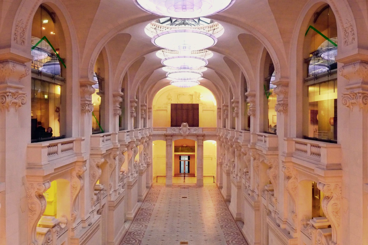
Highest Risk (The Fugitives & Fragile): These mediums contain organic dyes, delicate surfaces, or light-sensitive chemicals. They require maximum protection (museum glass + strategic placement).
- Works on Paper: This is the highest-risk category. It includes watercolors, gouache, pencil, charcoal, and pastel drawings. The light, translucent nature of paper fibers makes them incredibly vulnerable.
- Textiles & Tapestries: Natural fibers like silk, wool, and cotton are extremely light-sensitive. The organic dyes used in tapestries are often fugitive, meaning they break down and fade more quickly than modern synthetic art materials. Never hang a textile opposite a sunlit window.
- Photographs: Especially vintage color photographs and any print made with traditional chemical processes. Modern archival pigment-based inkjet prints are more stable, but still vulnerable. Dye-based photo prints are highly fugitive.
- Giclée and Digital Prints: While the inks have improved, they are still fundamentally dyes on paper and are highly susceptible to fading. Many budget giclées use inks with a fade-life of just a few years in direct light.
- Vintage Posters & Ephemera: The cheap, fugitive inks and low-quality wood-pulp paper used in old posters make them fade incredibly quickly. The paper itself will yellow and become brittle long before the inks fully disappear.
- Works with Natural Organic Pigments: Some artists' materials, particularly older natural dyes like certain red lakes or indigo, are famously fugitive and will break down rapidly. Many traditional Japanese woodblock prints from the 19th century show significant fading for this exact reason.
Medium Risk (The Stable but Not Invincible): These are robust, but prolonged, direct exposure will still have a long-term effect.
- Acrylic Paintings on Canvas: While acrylic polymer binders offer decent UV protection and dry to form a resilient plastic sheet, the specific paints themselves are still vulnerable to fading over time. Phthalocyanine blues and quinacridone reds are fairly stable, but other acrylics are not.
- Most Screen Prints & Lithographs: The plastic-based inks are fairly stable, but they are not immune to the effects of intense UV light. White inks on a dark shirt, for instance, often yellow over time due to heat and UV exposure.
Lower Risk (The Heavyweights): These are the most resilient and can handle more incidental light exposure.
- Oil Paintings on Canvas: The heavy, oil-based binder provides a naturally thick, dense, and somewhat UV-resistant layer over the pigments. The lead in older white paints also had a stabilizing effect, a phenomenon now known as "lead-soap formation." However, don't be fooled—even old master paintings will eventually fade if subjected to decades of direct sun. Van Gogh's "Sunflowers" have notably faded over the last century under museum lighting, shifting from vibrant yellow to a more muted brownish-green.
- Works with Modern Synthetic Pigments: Contemporary acrylics and oils made with high-quality, light-stable synthetic pigments (like most professional-grade paints) are your most durable option. The ASTM (American Society for Testing and Materials) has standardized a rating system for lightfastness, with "ASTM I" being the highest level of permanence.
- Ceramics & Glass: These are largely inert and UV-resistant. The only risk comes from any hand-painted details, glazes, or decals, which may be vulnerable to severe or prolonged exposure.
- Mixed-Media & Sculpture: Pieces made from metal, stone, or fired clay are generally very durable. The risk lies in any attached paper elements, organic materials, or painted surfaces.
The Key Takeaway: Just because it's an original oil painting doesn't mean it's invincible. And just because it's a print doesn't mean it's doomed. The key is to match the protection level (framing + placement) to the medium's specific vulnerabilities. Understanding your specific pieces is the first step in a long and healthy relationship with your collection. This knowledge allows you to curate your space not just for aesthetics, but for longevity.
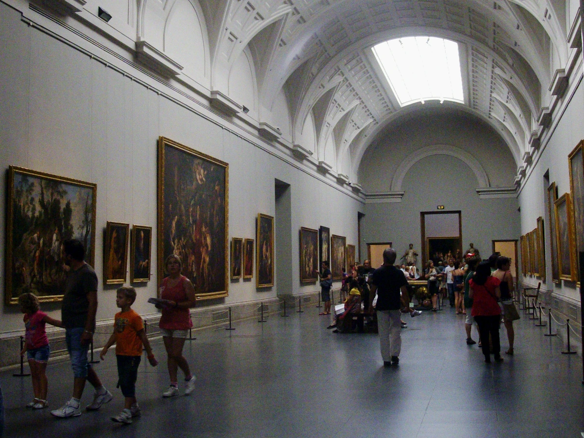
Q5: Can I just use regular glass if I have curtains?
A very common and sensible question, but the answer is no—relying on curtains alone is a bit like wearing a rain jacket with the sleeves cut off. Here's why you need both:
- Curtains Aren't Always Closed: You'll inevitably have times when the curtains are open. A bright, sunny afternoon, a moment of cleaning, a party where you want to let the light in. Each moment of direct exposure is adding to the cumulative UV damage.
- Ambient Light is the Sneaky Enemy: Even with curtains closed, light doesn't just stop. It bounces. It scatters. It filters through the weave of the fabric and reflects off floors, walls, and furniture, filling the room with a subtle amount of ambient UV radiation. This low-level, all-day exposure is what slowly, invisibly fades the colors in your art over years.
- Two Layers of Defense are Better Than One: Think of window treatments (curtains, blinds, UV film) as your perimeter defense. They handle the bulk of the threat at the source. Think of UV-protective glass or acrylic as your personal armor for each piece of art. It's the final, fail-safe layer that protects your art from the sneaky ambient light that gets past the first line of defense, and it works 24/7, regardless of whether your curtains are open or closed.
A truly bulletproof setup uses both. It's the one-two punch that ensures your collection is protected from both the direct assault and the slow, creeping siege of everyday ambient light.
Q6: How high should I hang art when light is my main concern?
If UV exposure is your absolute primary concern, there's a beautiful, counterintuitive solution: hang it higher. Much higher.
Think about the sun's path across the sky. In a typical room, especially one with low or mid-height ceilings, direct sunlight only penetrates so far into the space. It bathes the floor and rises up the wall opposite the window, but rarely reaches the very top of the wall—that area usually remains in soft, shadowed, reflected light.
Measurements show that the intensity of light, and therefore UV radiation, can drop by 30-50% between the middle of a wall and a spot just one or two feet below the ceiling. This "shadow zone" is the safest perch for your most light-sensitive pieces—delicate works on paper, vintage photographs, or a treasured watercolor.
A good rule of thumb is to place the bottom of your frame at or above the height of the window's header. This simple elevation change can take your art out of the sun's direct line of fire and into a much gentler, diffused "sky glow." It's a classic museum trick, often used in historic homes or galleries where they can't control the architecture but can control the display height.
Of course, this must be balanced with viewing ergonomics. A standard eye-level hang is 57-60 inches from the floor to the center of the artwork. A UV-safe hang might be 6-12 inches higher, a smart trade-off for irreplaceable pieces.
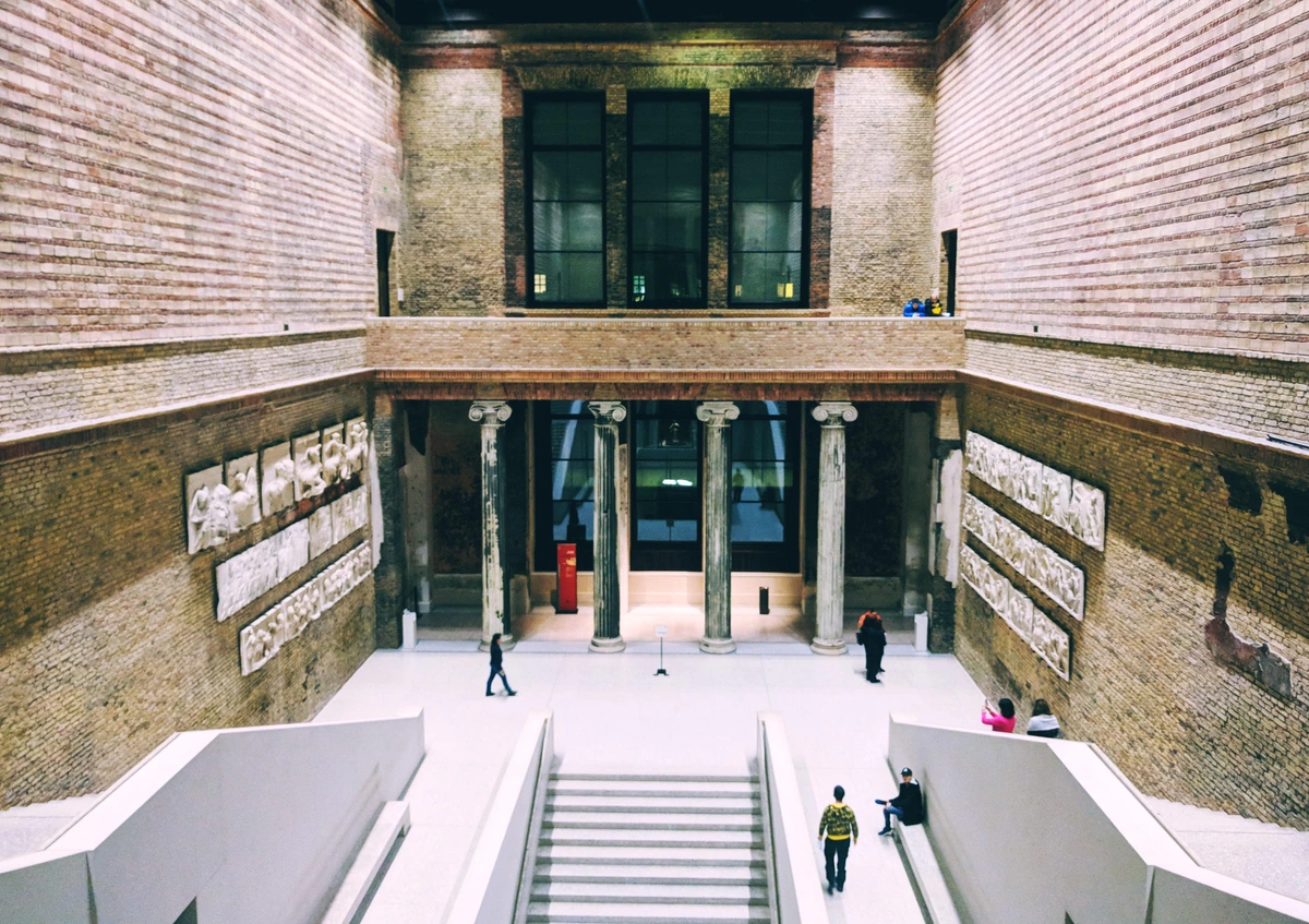
The Final Thought: It's Not About Rules, It's About Relationship
At the end of the day, this isn’t a rigid set of rules to be followed with fear and anxiety. It’s an invitation to start a more thoughtful conversation—first with the light in your home, then with your space, and finally, with your art.
I encourage you to do a little experiment. Spend a day, or even just an afternoon, simply noticing the light in your home—a practice I like to call 'light tracing.' Sit on your couch at 10 AM with a coffee. Come back to the exact same spot at 3 PM. Notice how the room feels completely different, how the colors shift, how the mood changes from fresh and optimistic to warm and reflective. Watch how a sunbeam marches across your floor like a slow, golden clock.
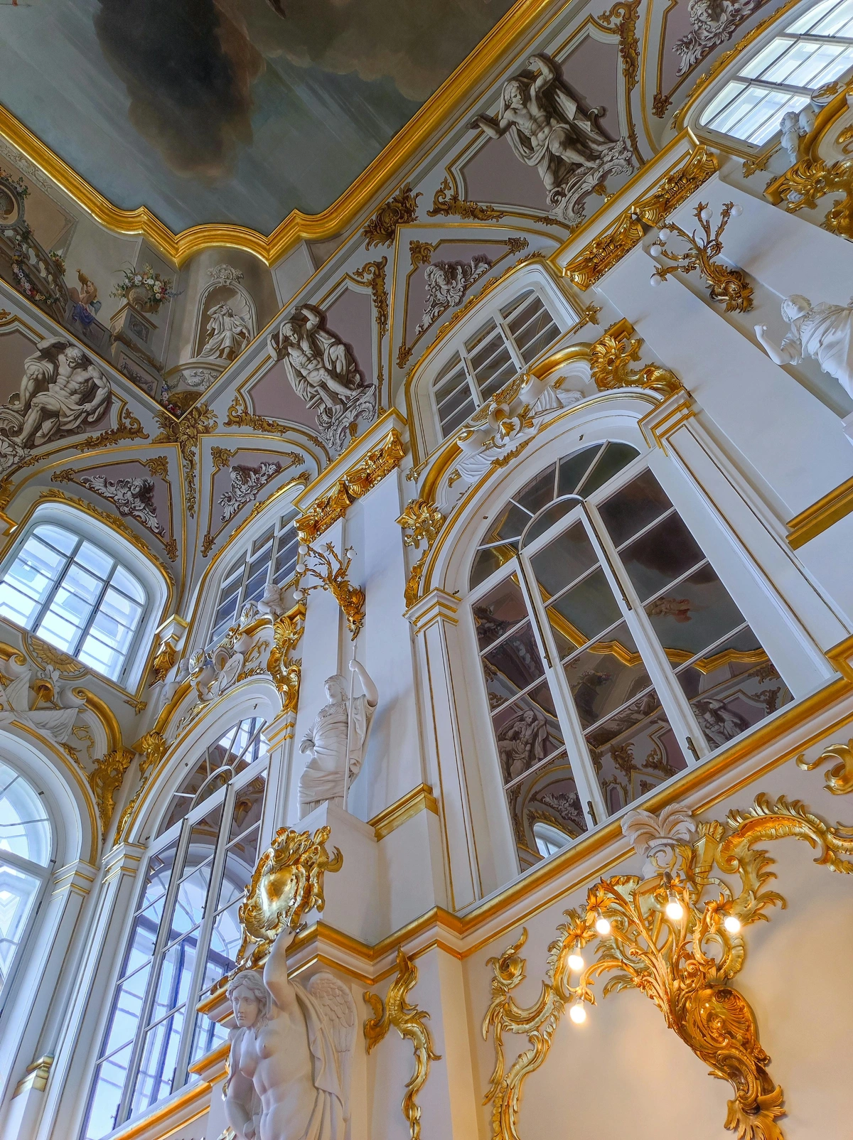
To make this tangible, arm yourself with a free light meter app on your smartphone. These apps measure lux (illuminance) and can give you a concrete understanding of the light hitting your art. It’s a game-changer, turning abstract advice into hard data. I used one to map my entire apartment, which is how I discovered that my prized charcoal drawing was getting 2000 lux of direct sun for three hours a day. I moved it immediately.
- The 9 AM Reconnaissance: On a clear day, measure the light on the wall directly opposite your largest window. Note the lux value. It might be 800 or even 1,500 lux.
- The 3 PM Perpendicular Check: Now go to a wall perpendicular to that window. Measure the light there. You'll likely see values between 300-500 lux—a dramatic difference. This data is the empirical proof of the perpendicular placement strategy. The art on perpendicular walls experiences significantly less intense light exposure, greatly extending its life. It's also helpful to measure through your UV-filtering window glass; you'll see exactly how much protection you're getting.
Once you understand the rhythm and personality of the light you live with through data and observation, placing a piece of art stops being an act of decoration and becomes an act of collaboration. You're not just hanging a picture; you're inviting a new character into a story that's already being told by the sun and the sky. You're setting the stage for a daily performance, where the art and the light dance together, revealing something new every single day.















You're not just hanging a picture. You're becoming the director of a daily, living performance, one that will bring you and your home joy for years to come if you protect it properly. It's a skill, an ever-evolving practice. It's the difference between owning art and truly living with it.
Every Journey Starts with a Single Step
So, where do you go from here? Don't try to overhaul your entire home in a weekend. That way lies madness and misplaced picture hooks. Next time you're enjoying your morning coffee, just look up. Notice which wall is glowing. Ask yourself, "What piece of mine would absolutely sing in this light?" Start there. Move one piece. See how it feels for a week. You'll be amazed by what that one small, intentional change can teach you.
For more on transforming a challenging space, explore our guide to decorating rooms with no natural light. If you're feeling inspired to find your next piece, you can browse the collection here: /buy.