Choosing Art for Small Living Rooms: Maximize Impact, Craft Your Sanctuary
Unlock the secret to stunning art in a compact living room! An artist's guide to choosing and displaying pieces that create depth, personality, and an expansive feel, from single statement art to smart gallery walls, including practical tips for challenging spaces.

Title
Ever found yourself staring at a blank wall in a tiny living room, worried that anything you hang will just make the space feel even smaller, more suffocating? I have, countless times. It’s like a decorating Catch-22: you want beautiful art, but you don't want to shrink your world. Sound familiar? Trust me, it’s a thought I've wrestled with more often than I care to admit. But here’s the thing I’ve learned over the years, often through trial-and-error (and a few questionable early purchases, bless their hearts): a small living room isn't a limitation; it's an opportunity for incredibly thoughtful, impactful choices. It’s about making deliberate, perhaps a little daring, and definitely personal selections. And spoiler alert: you absolutely can have stunning art in a compact space without it feeling cramped. In fact, with the right approach, art can be the very thing that makes a small room feel grander, more intentional, and uniquely yours. My goal here is to share actionable strategies to help you choose and display art that truly maximizes impact and creates a beautiful sense of space, whether you’re drawn to a single, bold statement piece or a thoughtfully curated collection, even in the coziest of living rooms. Throughout this guide, we'll dive into the grand paradox of big art, the art of the gallery wall, the power of negative space, mastering light and color, understanding scale and visual weight, and even practical uses for art in your compact sanctuary. Consider this your roadmap to transforming a modest space into a masterpiece of personal expression and comfort.
The Grand Paradox: Big Art in a Small Room?
This is often the first instinct I hear from people: "My room is small, so my art must be small." And while a collection of tiny pieces can certainly be charming – perhaps nestled on a shelf or as part of a very specific vignette – I’ve found that sometimes, the opposite is true. A single, oversized statement piece can actually work wonders in a small living room. It's counter-intuitive, I know, but hear me out. My inner minimalist sometimes whispers this secret weapon to me.
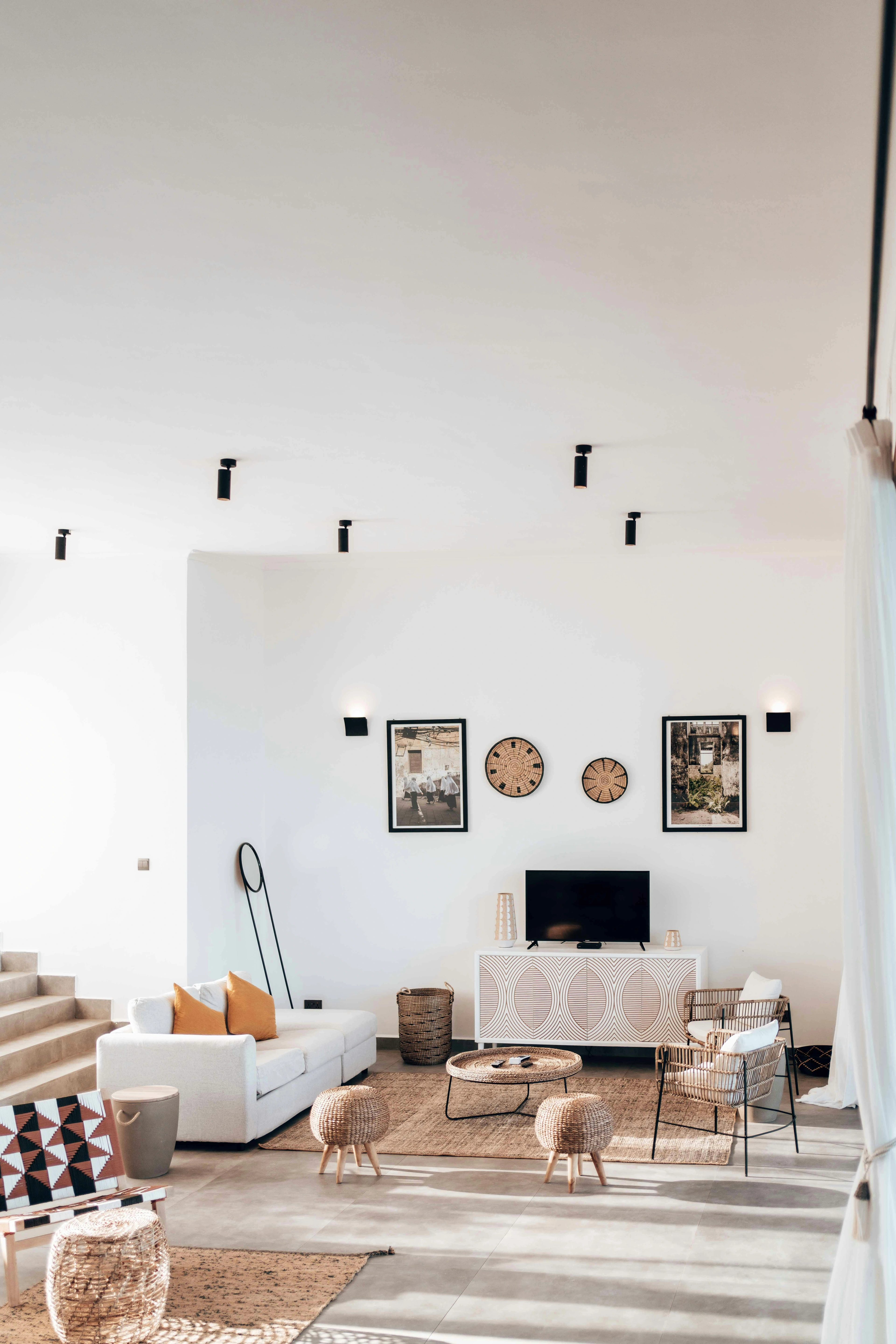
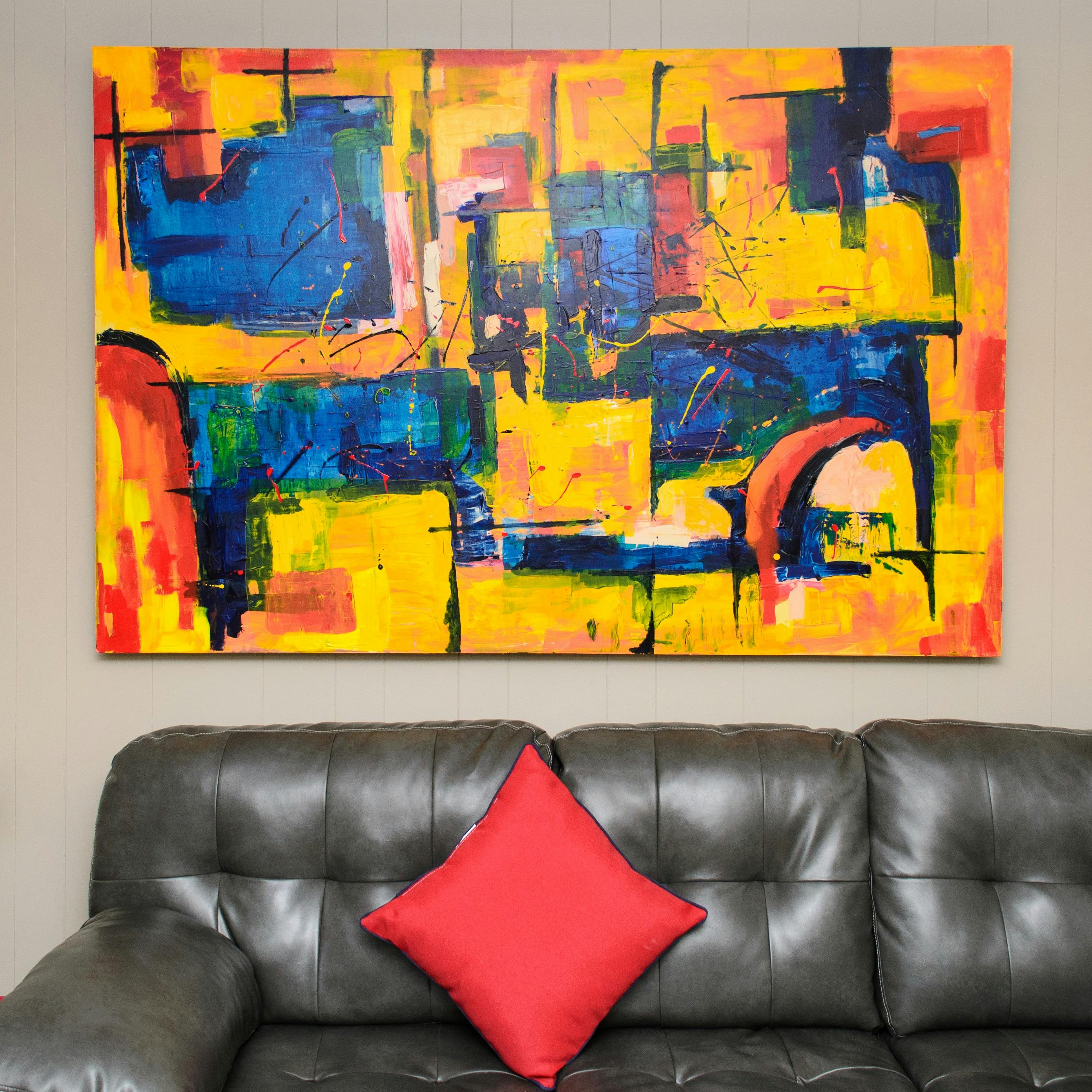
Instead of making the room feel crowded, a large piece of art can act as a window, drawing the eye and creating a sense of depth and focus. It streamlines the visual story, offering a singular powerful anchor rather than a cacophony of distractions. Imagine trying to read a complicated map versus a single, bold compass point; the latter guides you effortlessly. When I'm thinking about how to really open up a space, I often lean into this idea of one strong visual anchor. A vast landscape painting, for instance, can visually extend the walls, or a large abstract piece with receding colors can create an illusion of infinite depth. Think of it like a magician's trick: the grander the gesture, the more convinced the audience is of something beyond what's physically there, a captivating illusion that expands your perception beyond the frame. Historically, grand altarpieces in intimate chapels or monumental frescoes in relatively confined spaces have always demonstrated how large-scale art can command a space, creating awe and drawing the viewer into its narrative, rather than overwhelming the physical dimensions. From Renaissance masters like Giotto in the Scrovegna Chapel to Baroque and Rococo interiors with immense canvases, or even the quiet grandeur of a Vermeer painting, where a single, relatively large artwork can define an entire intimate interior, the principle remains. More recently, walking into a gallery room dominated by a single, expansive Rothko color field painting, I've felt the walls recede, the space becoming purely about the meditative experience of color and light. Even Impressionist works, though often smaller, frequently hint at vast scenes beyond the frame, creating a similar sense of spaciousness within their contained canvases. You can dive deeper into this concept on using art to make a small room feel bigger. Does the idea of a single, impactful piece intrigue you, or does your heart yearn for more?
But what if your heart yearns for more than a single anchor? What if you, like me, collect art with a passion and want to showcase several beloved pieces, even in a compact area? Then, my friend, you're ready to explore a different kind of artistry.
Curated Chaos: The Art of the Gallery Wall (Done Right)
Okay, so what if you're like me and have a bit of a maximalist heart, even in a small space? That's where a gallery wall comes into play. But in a small living room, this isn't about throwing everything you own onto a wall. Oh no, my friend, that way lies visual chaos and a definite feeling of the walls closing in. My inner magpie sometimes needs a firm talking-to; I've learned the hard way that a truly effective gallery wall in a compact area isn't about quantity, but about careful planning and cohesion. The psychological effect of a well-executed gallery wall in a small space is profound: it transforms a potentially sterile wall into a vibrant testament to your personality, making the room feel genuinely lived-in, warm, and utterly unique, rather than just a place to exist.
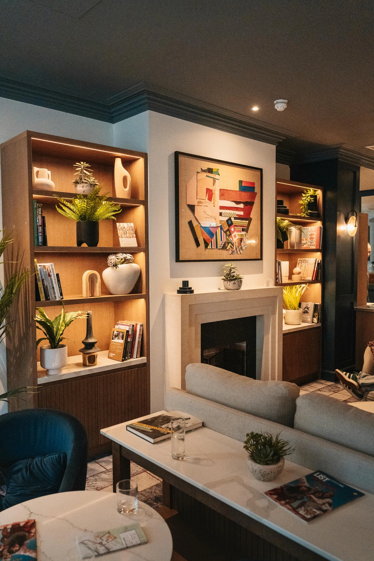
Instead, think of it as curated chaos. The trick is cohesion. Perhaps a consistent color palette, similar framing styles (think all sleek black, unifying natural wood tones, or a playful mix of ornate gold and simple white), or a central theme. You could opt for frames with consistent widths but varying textures, or maintain a uniform matting color across diverse frame styles. A gallery wall of mismatched frames can feel cohesive if they share a common color (e.g., all white or all black), or if the art within them shares a consistent theme. I once saw a gallery wall in a tiny Amsterdam apartment that featured only abstract ocean-themed pieces, all in varying shades of blue and green, with simple white frames. It wasn't cluttered; it felt like a serene, expansive window into the sea. Or consider a collection of black and white photography, all in different but harmonizing frame types, creating a sophisticated, unified statement. You could also unify your gallery by subject matter – a series of botanical illustrations, vintage maps, architectural sketches, or even abstract portraits can feel incredibly coherent – or perhaps a collection of travel memories from a beloved trip. Another approach is to group works by the same artist or using similar artistic techniques, creating a visual narrative even with diverse content. Many of these approaches you might find among my abstract art for sale. The key is that the individual pieces, no matter how diverse, speak to each other – whether through echoing lines, a recurring motif, or an underlying emotional current – creating a sense of intentionality rather than randomness. For more on creating harmony, check out creating a cohesive look with abstract art.
When hanging a gallery wall in a small space, think about the practicalities too. Lightweight frames are your friend, as they're easier to hang and adjust without making too many holes. Also, consider the weight distribution, especially if you're in an older building; you don't want all your heaviest pieces clustered together on one weak spot. Spacing is key: generally, 2-4 inches between frames works well, but trust your eye. A mock-up with paper cut-outs is always a good idea (more on that later!). If you're renting or dealing with challenging wall materials like rough plaster or exposed brick, consider alternatives like picture ledges (allowing easy rearrangement) or using damage-free strips for lighter pieces. These methods reduce the commitment and allow for flexibility without compromising style.
Embracing the "White Space": The Power of Negative Space
Speaking of making things feel expansive, here’s a concept that changed my perspective on art composition, especially for smaller rooms: negative space. It’s not just what is there, but also what isn't. In art, negative space refers to the empty areas around and between the subjects of an image. Think of the space between your fingers when you hold up your hand, or the air surrounding a sculpture, or even just a single teacup on a vast, empty table. In art, this translates to large, unbroken fields of color in a minimalist abstract piece, like a Rothko with its vast, floating rectangles of color, or a delicate line drawing on a vast white canvas. Agnes Martin, for instance, masterfully used subtle grids and expansive fields of color to create a profound sense of quietude and endlessness. Ellsworth Kelly's hard-edge color field paintings and Sol LeWitt's conceptual geometric works also heavily rely on the intentional absence of detail to create powerful visual statements. Even in representational art, a single figure silhouetted against a vast, empty sky employs negative space to evoke scale and emotion. This concept also extends to three-dimensional art, where a minimalist sculpture with significant void space, like many by Barbara Hepworth or Henry Moore, uses the absence of form to define its presence and interaction with the surrounding environment, creating a sense of lightness and openness even in a confined area. Such pieces don't just exist on the wall; they actively create a sense of breathing room, an invitation for quiet contemplation that makes a small room feel mentally expansive. I remember the first time I consciously applied this to one of my own abstract pieces, leaving a significant portion of the canvas untouched – the result was a surprising calmness and depth I hadn't achieved by filling every inch. It was like finally allowing the painting to take a deep, quiet breath, and in doing so, it invited the whole room to do the same, making me pull back from over-complicating every canvas. This personal discovery completely shifted how I approached composition for compact areas, making me realize the power of less. I often find myself sketching out compositions, specifically seeking out where I can 'rest' the eye.
Art that intelligently uses negative space can create a profound sense of openness and calm. It allows the eye to rest, preventing the feeling of being overwhelmed in a compact area. When the artwork itself breathes, the room around it seems to follow suit. This is similar to how white space functions in graphic design, or the essential silence between musical notes that gives them meaning, or even the pauses in a conversation that allow for deeper thought. For me, a piece with thoughtful negative space doesn't just hang on a wall; it actively contributes to the feeling of a spacious, uncluttered environment, allowing for mental expansion even when physical space is limited. It's a subtle but powerful illusion, and one I often play with in my own abstract paintings. You can delve deeper into this idea with the role of negative space in abstract art. How might your room benefit from a little more visual quietude? Here’s a little exercise: try looking at a familiar piece of art or even a section of your wall. What shapes do the empty spaces create? What happens if you focus on them instead of the main subjects? It’s a game-changer for spatial perception!

Mastering Color Psychology for Spatial Illusion
When I'm contemplating art for a small room, I often fall back on a few visual tricks that leverage how color interacts. After all, my abstract art often plays with these very elements, and understanding color theory is something I delve into quite a bit on my artist's timeline! When I'm mixing paints for my own pieces, I'm constantly thinking about this push and pull.
Playing with Color Psychology
- Light Colors & Open Spaces: Art with lighter backgrounds or subjects can make a wall feel like it's receding, subtly expanding the perceived space. Think soft pastels, airy landscapes, or minimalist abstract pieces. They don't demand attention aggressively; they invite it gently. For a serene reading nook, consider cool blues and greens with touches of muted gold, which promote calm and focus.
- Bold Colors as Focal Points: This is where the paradox comes back! A single piece with vibrant, high-contrast colors can be an incredible focal point, pulling the eye in and distracting from the room's actual dimensions. It’s like a visual exclamation mark. Just be sure it’s a piece you truly love, because it will dominate. For example, a single, fiery red abstract piece in an otherwise neutral room will command all attention, much like Henri Matisse's 'The Red Room' fills its canvas with undeniable presence. This bold use of color reminds me of how I often employ vibrant hues in my own abstract pieces, like those you can find among my art for sale, to create a similar sense of immediate impact and draw the eye. I once created a piece with an intense, electric blue at its core, intending it to be a tiny, vibrant pulse in a quiet corner – and it worked, pulling all focus without overwhelming. When choosing such a piece, consider a complementary or analogous color from your existing decor to ensure it feels intentional and harmonious, not accidental or jarring. It’s about balance: a single intense color can thrive in a small space, but too many competing bold colors or a poorly executed 'color blocking' approach across multiple art pieces can quickly make it feel overwhelming, transforming dynamism into visual noise. I once used a large, electric blue abstract in a tiny white entryway, and instead of feeling cramped, it felt like an invitation, a vibrant pulse drawing you further into the home. For a vibrant, social area, a piece with energetic yellows, oranges, or warm reds can infuse life and personality without feeling chaotic, provided it’s given room to shine as the primary focal point. You can see how abstract art can make an impact in compact areas.
- Cool vs. Warm Tones: For small rooms, I often lean towards cool colors (blues, greens, purples) as they tend to recede visually, making walls feel further away and thus expanding the perceived space. They also evoke a sense of calm and serenity, which is lovely in a cozy sanctuary. Warm colors (reds, oranges, yellows), on the other hand, tend to advance, bringing energy and intimacy. When used strategically as a single, powerful focal point, they can create a vibrant and inviting atmosphere without overwhelming the space. However, using too many warm colors or warm-toned art without careful planning can sometimes make a small space feel even smaller if not used judiciously. It's a delicate dance between warmth and openness.
- Color Saturation: Beyond temperature, the saturation of a color profoundly impacts its visual weight. Highly saturated, vivid colors tend to advance and grab attention, making them excellent for focal points, but if overused, they can make a small room feel very busy and contained. Conversely, desaturated, muted, or pastel colors tend to recede, contributing to a sense of openness and calm, ideal for creating a more expansive backdrop or a tranquil mood. It's like turning the volume up or down on your color palette.

For more on using color, check out the psychology of color in abstract art.
Harnessing Light, Reflection, and Sheen
When I'm thinking about making a small room feel bigger and brighter, light is always at the forefront of my mind. It's not just about the art itself, but how the art interacts with its environment, particularly light. After all, my artist's timeline is filled with experiments in how light shapes my compositions, so I know its power intimately.
- Art and Natural Light: Position your art to leverage natural light, not fight it. Rather than directly opposite a bright window (which can cause glare and potentially damage delicate mediums over time), consider placing it on an adjacent wall where diffused light can gently illuminate it, enhancing colors and details without harsh reflections. A piece that receives indirect natural light throughout the day will constantly reveal new facets, making it a living, breathing part of your small space.
- Strategic Lighting: And speaking of light, don't forget it's not just about what comes in naturally! Thoughtful art lighting, like a subtle picture light or well-aimed track lighting, can dramatically enhance the mood and depth a piece creates. Accent lighting, focused directly on the artwork, highlights details and textures, making the piece pop and allowing the wall around it to recede, further enhancing the illusion of space. Ambient lighting, on the other hand, can soften the room's overall feel, making a small space feel less stark. It’s like giving your favorite art its own spotlight, making it pop without cluttering the room. For more on this, explore the art of display.
- Reflective Surfaces & Sheen: While not art per se, don't underestimate the power of a strategically placed mirror or art with a highly glossy finish or metallic accents. They bounce light around, creating an illusion of more space and adding a touch of glamour. The sheen of the artwork itself matters too: a glossy resin finish reflects light beautifully, contributing to a sense of openness and sleekness, while a matte acrylic surface absorbs light, creating a more grounded, quiet, and perhaps cozier feel. I once hung a piece with a subtle resin finish near a window, and the way it caught and diffused the afternoon light was simply magical, making the wall practically disappear – a lovely visual trick rather than actual vanishing.
- Art Depicting Light and Reflection: Even a piece of art that depicts a bright, open scene—like a sun-drenched landscape, a window view, or an abstract piece with a radiant focal point—can visually contribute to the feeling of light and expansion. Your brain subtly processes the light within the artwork as an extension of the room's own illumination, creating a harmonious sense of spaciousness.
The Power of Texture & Medium
When choosing art for a small room, it’s not just about what’s depicted, but how the art feels and how it's presented. The physical qualities of an artwork – its texture, the medium it’s made from, and its framing – profoundly impact its presence and how it contributes to the spatial dynamics of a compact area. These tactile qualities create an unspoken dialogue with the room, subtly shaping its atmosphere and perceived comfort. I once had a small, somewhat stark living room, and I added a large abstract piece with incredibly rich, organic textures in warm, earthy tones. It instantly added a layer of cozy comfort and visual depth that completely transformed the mood, making the room feel more inviting without feeling crowded. These physical qualities also heavily influence a piece's visual weight and overall impact, leading us nicely into our next topic.
- Framing Choices: The color and thickness of your frame significantly influence how a piece is perceived in a small room. A dark, heavy frame on a light wall can create a stark contrast that visually shrinks the space. I tend to favor lighter, thinner frames, or even frameless canvases, that blend seamlessly with your wall color, making the art feel like an integrated extension of the wall rather than a heavy, separate object. If you're aiming for a single, bold statement, a contrasting frame can work, but for a gallery wall in a small space, unifying light frames are often a safer, more expansive bet. Sometimes, even floating frames that create a shadow gap can add a subtle sense of depth.
- Artistic Mediums: The medium of your art contributes to its visual weight and spatial presence. A heavily impastoed oil painting, with its thick texture, can feel more substantial and sculptural, demanding attention. Its physical depth absorbs more space. Conversely, a delicate watercolor or a sheer textile piece might feel lighter and more ephemeral, almost floating on the wall, contributing to a sense of airiness. A sleek, minimalist metal sculpture can add a contemporary edge with its clean lines and reflective properties, feeling light and open, while a mixed-media piece incorporating found objects might create intriguing shadows and conversational points without overwhelming. Matching the medium's inherent qualities to your desired spatial effect is another layer of artistic choice. Discover more about texture in abstract art.
- Textural Intrigue and Acoustic Influence: In a small space, every element counts. Art with interesting textures – perhaps a heavily impastoed abstract painting, a woven tapestry, a ceramic wall hanging, or a piece incorporating mixed media – can add incredible visual and tactile interest without demanding extra physical space. Heavily textured pieces, like thick impasto oil paintings, add depth and sculptural quality, drawing the eye in. Smooth, glossy finishes, conversely, reflect light, contributing to a sense of openness. It invites the eye to linger and explore, adding layers of depth and sophistication to a compact area, making the room feel richer without feeling fuller. It can even subtly influence a room's acoustics, absorbing some sound and contributing to a cozier, quieter ambiance by dampening echoes. Also, consider the texture of your wall itself: a rough plaster wall might beautifully complement a soft, organic abstract, while a smooth, painted surface might highlight the sharp lines of a geometric piece. The perceived 'warmth' or 'coolness' of a room can also be subtly influenced by the textures in your art – soft wool tapestries feel warmer, while sleek metal or glass feels cooler.
- The Scale of Texture: Just as crucial as the presence of texture is its scale. Large, bold impasto strokes or broad, organic weaves in a tapestry can create a sense of expansive movement and visual generosity, even in a small area, making the piece feel grand. In contrast, tiny, intricate textures or highly detailed patterns, while beautiful, can sometimes feel busy or dense up close, absorbing visual space rather than expanding it. It’s about ensuring the texture feels proportionate to the piece and the room, inviting engagement without overwhelming.
What illusions will you invite into your compact living space today?
Visual Weight, Scale, and Emotion: Crafting Your Room's Aura
Beyond just the physical dimensions, it's crucial to think about the visual weight of a piece. What do I mean by that? Well, a very busy, detailed, or dark abstract painting, even if it's technically a "medium" size, can feel much heavier and more imposing than a larger, more minimalist piece with light colors. It's like comparing a dense, ornate tapestry to a sheer, expansive curtain; one absorbs space, the other suggests more of it. Imagine a highly detailed, high-contrast Baroque still life with dark, brooding colors – say, a Caravaggio – it would likely feel much heavier and more imposing, sucking the visual air out of a compact area, precisely because its intense detail and dark palette absorb light and visual energy. This contrasts sharply with a much larger, soft-focus abstract landscape with muted tones and expansive skies, which would reflect light, invite the eye to roam, and suggest more space beyond the frame. When looking at art for sale, I often find myself mentally "weighing" them, imagining how they would breathe in a tight corner, or how a minimalist abstract might expand the view. I confess, I've bought pieces thinking they'd be light and airy, only to realize (after painstakingly hanging them) that they sucked all the air out of a small space. Live and learn, right? For instance, a highly active, gestural abstract with many overlapping lines and vibrant, clashing colors (like some Abstract Expressionist works) might have a heavier visual weight than a serene, geometric abstract with fewer elements and a calmer color palette, even if physically similar in size. The former demands more visual processing, while the latter offers a more restful engagement. To assess visual weight, look for density of detail, contrast, color saturation, and perceived depth – the more of these, the heavier it often feels. Remember, visual weight is also inherently subjective, influenced by personal associations and even cultural context. For example, a piece depicting a bustling city scene, no matter its size, might carry a heavier visual weight than a sparse, tranquil landscape of the same dimensions, simply due to the inherent 'busyness' of its subject matter.
The Nuances of Scale
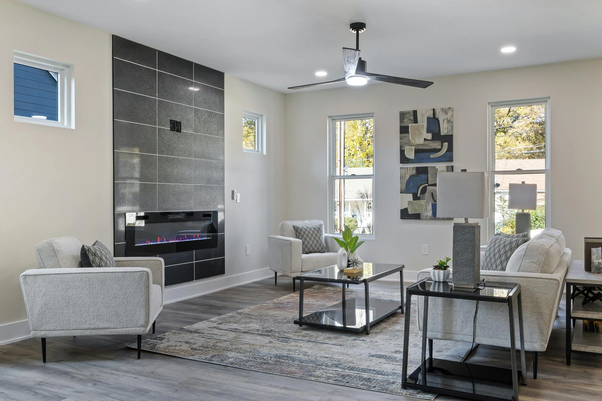
- Scale Relative to Furniture: This is often overlooked, but the art you choose should be in conversation with your furniture. As a general rule, a piece hung above a sofa should be roughly two-thirds its width. So, if your sofa is 90 inches wide, the art should be around 60 inches wide. Too small, and it looks lost; too large, and it overwhelms. Similarly, art placed near a tall bookshelf needs a different scale than art next to a low console. It's about creating a harmonious visual block, where art and furniture feel like they belong together. For more on how to think about form and space in abstract art, consider this a practical application.
- Scale Relative to the Wall: Beyond furniture, consider the entire wall. A tall, narrow piece can visually elongate a wall, making it feel higher. Conversely, a wider, shorter piece might emphasize horizontal lines and make a wall feel more expansive breadth-wise. It's about how the art's dimensions play with the room's inherent architecture, subtly reshaping perception. This is particularly effective with abstract paintings that utilize strong directional lines or expansive fields of color.
- Scale Relative to the Viewer's Eye: In a small room, you're often closer to the art. This means a highly detailed piece, even if not physically large, can have immense visual weight up close, demanding intense focus. Conversely, an abstract with broad strokes or expansive fields of color might invite the eye to move, creating a sense of journey even within limited physical distance. Consider a finely detailed miniature versus a sweeping landscape; your eye interacts with them very differently up close. It's about how the art 'reads' from different proximity points within your compact living area. For instance, if children are your primary viewers, you might adjust art placement to their eye level or choose pieces that are robust enough to withstand closer inspection.
- Creating Depth with Art: Beyond the 'window' effect of a single large piece, art can create depth through illusion within the piece itself. Look for art that uses perspective, receding lines, or layered elements to draw the eye inwards. Even an abstract piece with overlapping shapes or a subtle gradient can create a sense of three-dimensionality, inviting your gaze deeper into the canvas and, by extension, into a more expansive perceived space in your room.
Psychological Impact: Crafting Your Emotional Environment
- Crafting Your Emotional Environment: Don't forget the story the art tells, or the feeling it evokes. In a small space where you spend a lot of time, the emotional resonance of a piece is paramount. A serene abstract landscape can offer an escape, while a vibrant, energetic abstract expressionist piece can infuse life and personality. Consider how minimalist art can bring a sense of calm and order, allowing the mind to breathe, or how a surrealist piece might open up worlds beyond the physical confines of the room, inviting curiosity and introspection. Conversely, a highly aggressive or chaotic expressionist piece, while powerful, might feel overwhelming in a space meant for relaxation. Art can be a window to another world, making your small room feel boundless. Think about how Impressionist works, with their focus on light and ephemeral moments, can make a space feel airy and dynamic, or how a Surrealist piece, like those by Magritte or Dalí, can playfully expand perceived reality, inviting thought beyond your walls. This isn't just about decor; it's about crafting an emotional environment that supports your well-being. This is why I pour so much emotion into my abstract paintings – they're meant to connect with you on a deeper level.
- Artistic Styles for Small Spaces: While abstract art is incredibly versatile for compact areas, other styles can also excel. Impressionist pieces, with their focus on light and open scenes, can create an airy, expansive feel. Pointillism, with its intricate details, can draw the eye in for close contemplation without needing vast scale. Even finely detailed miniatures, when grouped thoughtfully or highlighted, can offer intimate moments of beauty and narrative. Surrealist art can transport the viewer to other realms, making the physical confines of the room disappear. The key is how the style contributes to the desired feeling – expansive, calming, or engaging – not just the subject matter.
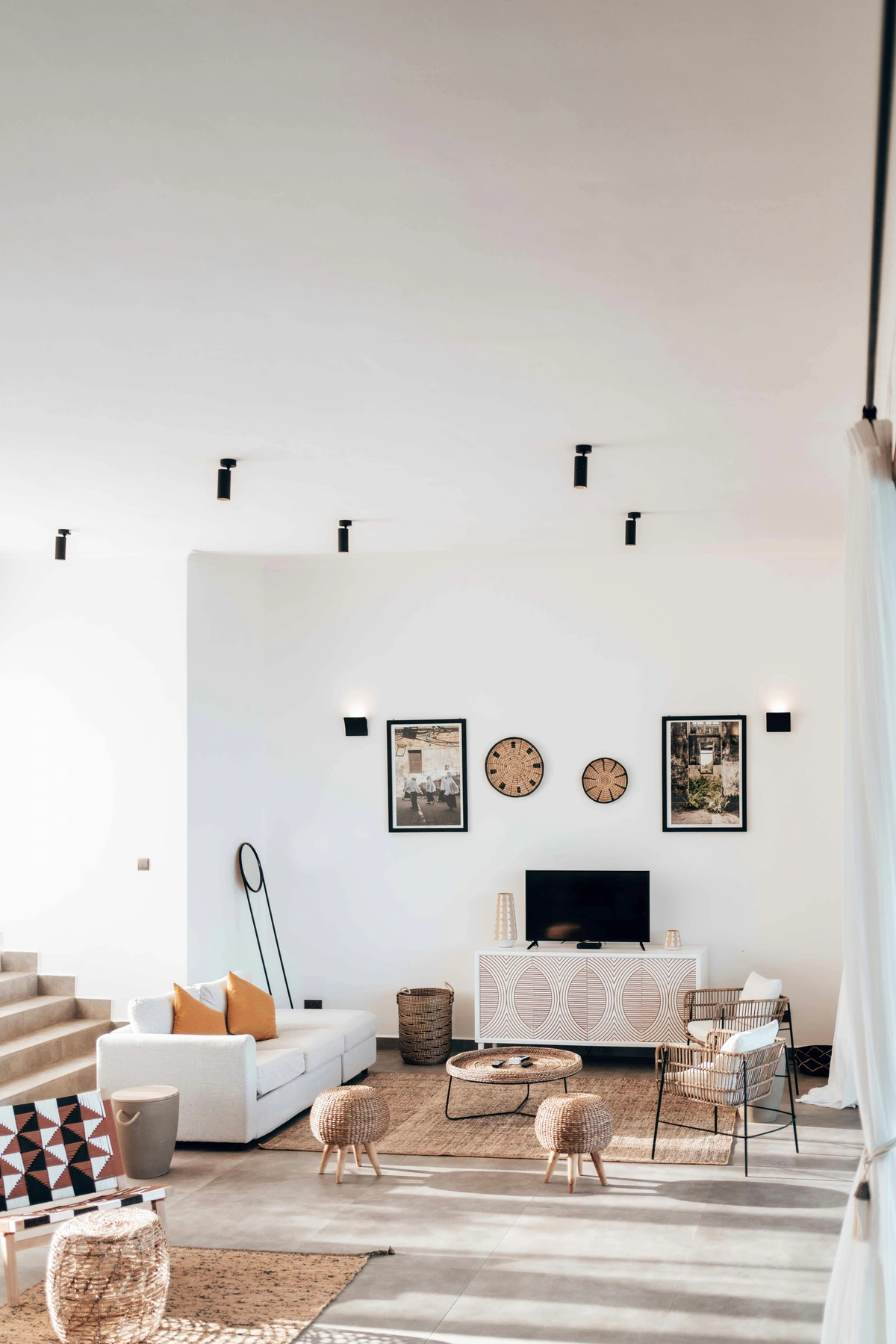
- Art as a Conversation Starter: Especially in a cozy living room where guests are close, a unique or provocative piece of art can be a wonderful catalyst for discussion. Surrealist art, pieces with a strong narrative, or works by emerging artists with interesting backstories are particularly good at sparking curiosity. It tells a story about you, sparks curiosity, and invites connection. Choose a piece that genuinely interests you, something you can happily talk about, and it will effortlessly draw people in, making your small space feel rich with personality and interaction.
How will your art communicate the mood and story of your intimate space?
Beyond the Canvas: Art with Purpose & Practicality
Sometimes, in a small living room, every element needs to earn its keep. Why should art be any different? I've seen some ingenious ways art can serve more than just an aesthetic purpose, subtly enhancing functionality without sacrificing beauty. It’s like getting a secret bonus – art that works for you! In a compact space, art can be a silent partner in creating a more harmonious and efficient environment.
- Art for Defining Zones in Open-Plan Spaces: In a small open-plan living area, art can be used to visually delineate different functional zones without the need for physical barriers. A large, impactful piece in one area can anchor the 'lounge' zone, while a complementary but distinct piece or collection marks the 'dining' or 'work' zone. This creates a psychological separation, making each area feel distinct and intentional. Imagine using a diptych or triptych above a low console to subtly suggest a transition between your living and dining areas in a studio apartment, creating distinct 'zones' without physical barriers.
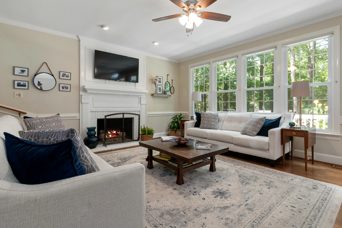
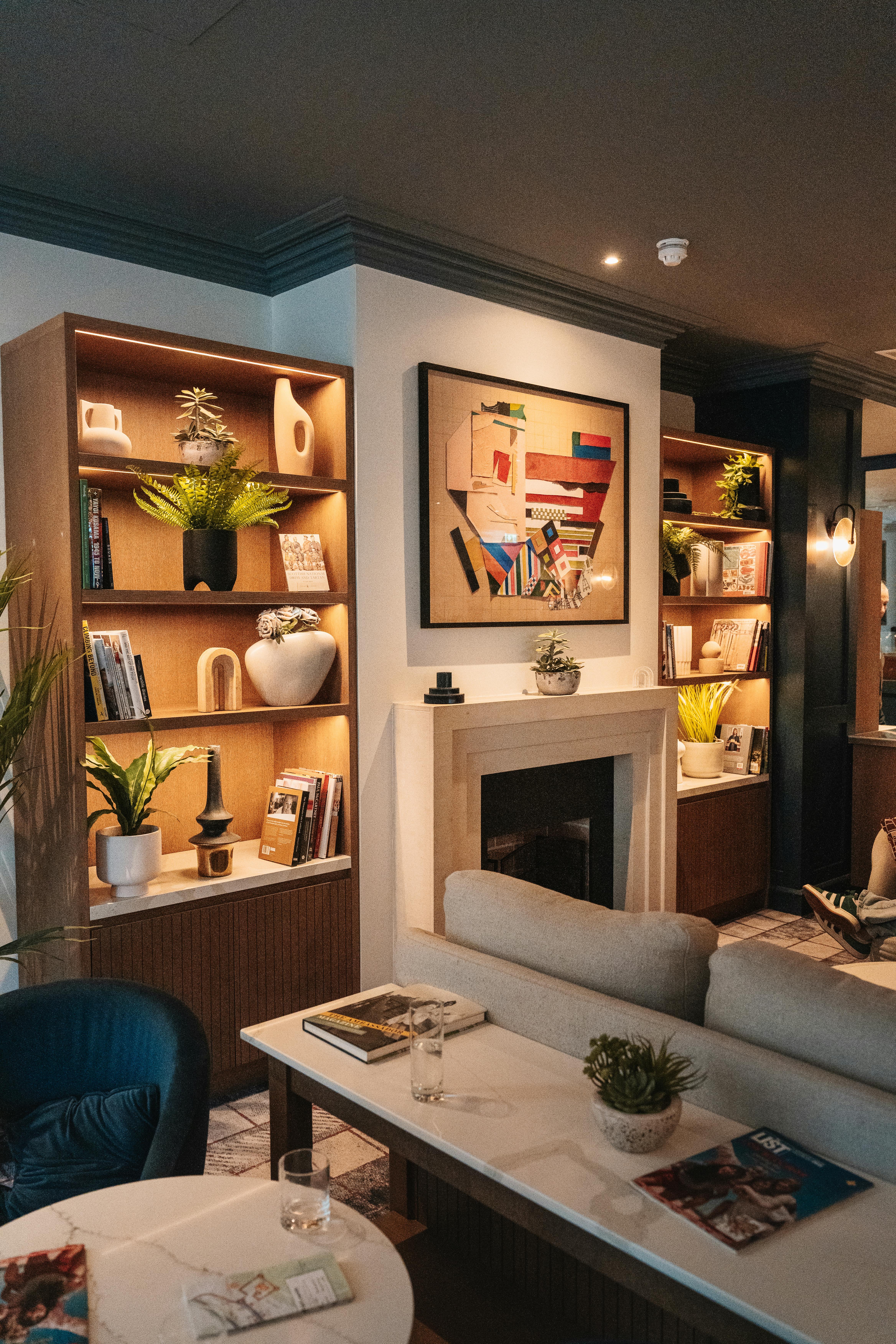
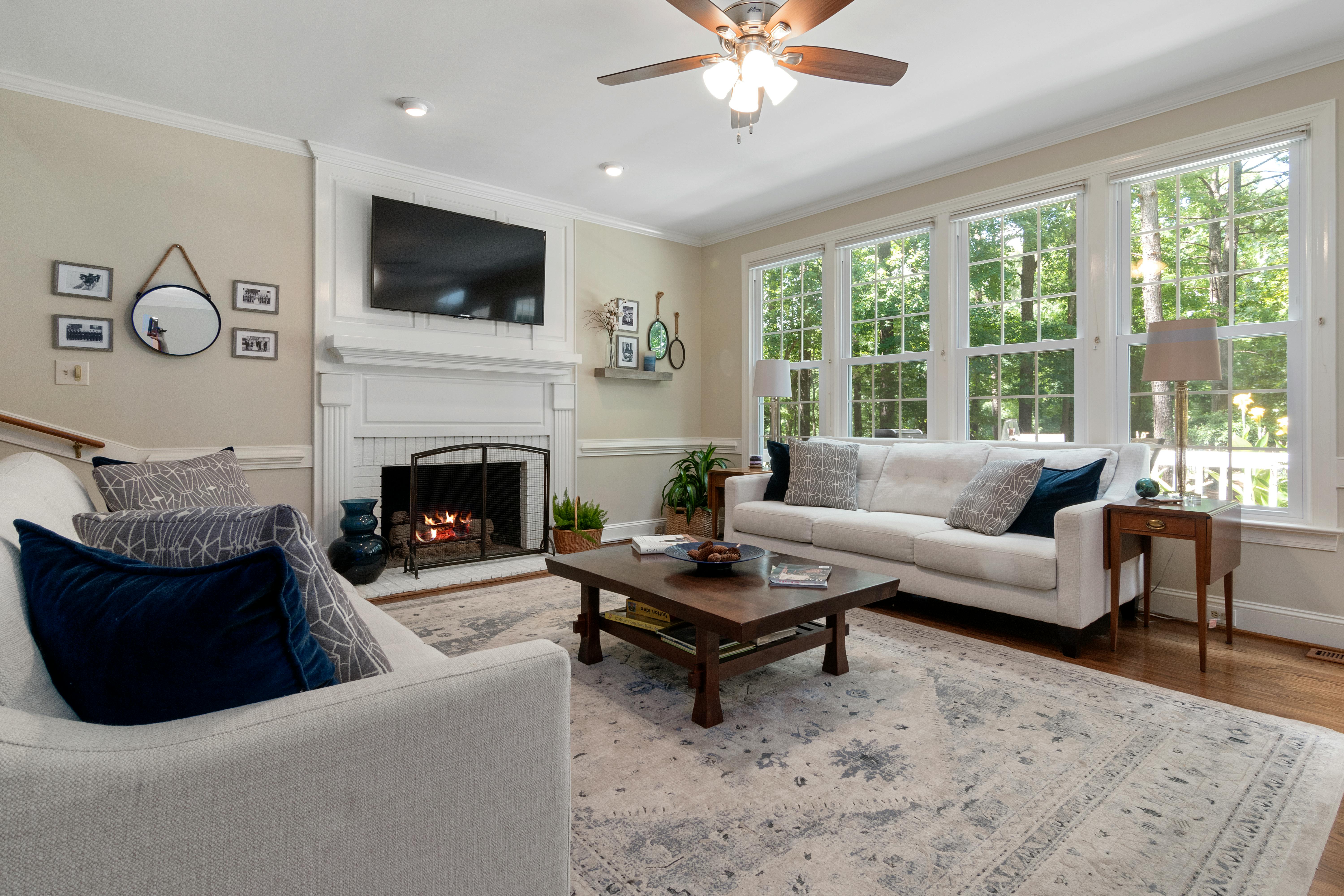
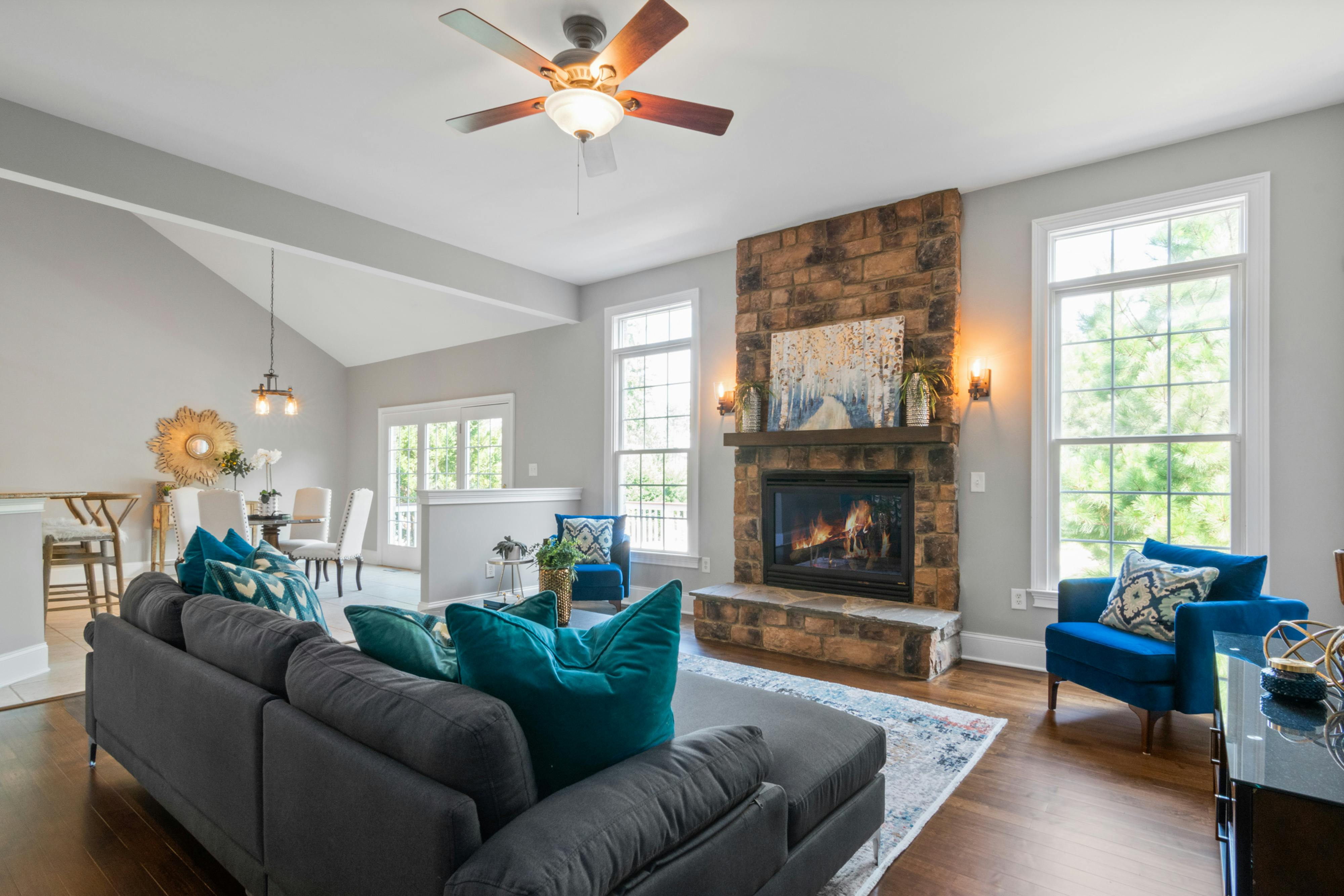
- Art for Specific Functional Areas: Don't forget those often-overlooked spots! Art can be strategically placed to visually anchor or balance specific furniture pieces or architectural elements. Above a fireplace, a landscape or abstract piece can extend the visual line upwards, balancing the fireplace's mass. Next to a window, a translucent or reflective piece can interact beautifully with natural light. In an awkward corner, a narrow, vertical abstract can visually elongate the space, making the corner feel less confined and more intentional. A piece hung above a console table or desk, chosen to be proportionate to that specific furniture, can tie the functional area together, making it feel less like standalone items and more like a cohesive design.
- Dynamic Backdrops: With more of us working from home or connecting virtually, your living room wall often becomes a backdrop for video calls. A carefully chosen piece of abstract art can provide a sophisticated, engaging, and professional backdrop, adding personality without being distracting. It tells a story about you without saying a word.
- Subtle Storage Solutions: While not strictly art, some creative pieces can integrate shelves or hidden compartments, providing a discreet way to store small items like remote controls or charging cables. Imagine a geometric abstract piece where certain colored 'blocks' subtly slide open to reveal shallow storage, or a thick, framed canvas that secretly houses a recessed shelf. Some contemporary designers and artists create modular wall installations that blend art with hidden storage, offering sleek solutions for compact living, perhaps sculptural pieces with integrated compartments. This concept reminds me of the clever ways artists sometimes incorporate hidden meanings or messages in their works, creating layers of discovery, much like the process I often undertake on my artist's timeline in developing complex compositions.
- Acoustic Influence: Beyond just what you see, art can subtly impact what you hear. Textured art, like a heavy tapestry, a mixed-media piece with fibrous elements, or even large, soft-canvas prints, can absorb sound, reducing echo in a compact room and contributing to a cozier, quieter ambiance. Even a strategically placed large canvas, without explicit texture, can help break up sound waves, making a small room feel less boomy and more intimate. This is particularly valuable in hard-surfaced apartments.
- Art for Rental Properties: Living in a rental often means restrictions on permanent changes. Art offers a powerful solution for personalization without violating your lease. Consider using damage-free hanging strips (like Command Strips), picture ledges that require minimal installation, or simply leaning larger canvases against a wall. Magnetic hanging systems or removable wallpaper murals with artistic designs are also great options. This allows you to infuse your personal style and create a sense of home without risking your security deposit. For more detailed strategies on temporary displays, check out art for rental properties.
- Art as an Investment & Sense of Home: Beyond aesthetics, the art you choose can be a long-term investment. Quality pieces, especially from established or emerging artists, can appreciate in value. Choosing art for its longevity and archival quality means you’re not just decorating, but building a collection that can grow with you. Moreover, art is deeply personal. It imbues your space with character and history, transforming a mere house into a sanctuary, a true home. Even in a small space, a cherished artwork provides a consistent source of beauty, comfort, and personal narrative, a visual anchor in your daily life. It's about nurturing your well-being through your surroundings.
- Art for Calm and Focus: In a small space, which can sometimes feel overwhelming, art can be a powerful tool for creating a sense of calm and focus. A minimalist abstract with serene colors or ample negative space can act as a visual respite, allowing the mind to quiet. Similarly, a piece with intricate details can draw the eye in for meditative contemplation, offering a mental escape without adding visual clutter. It becomes a quiet companion, offering a moment of peace in your busy day.
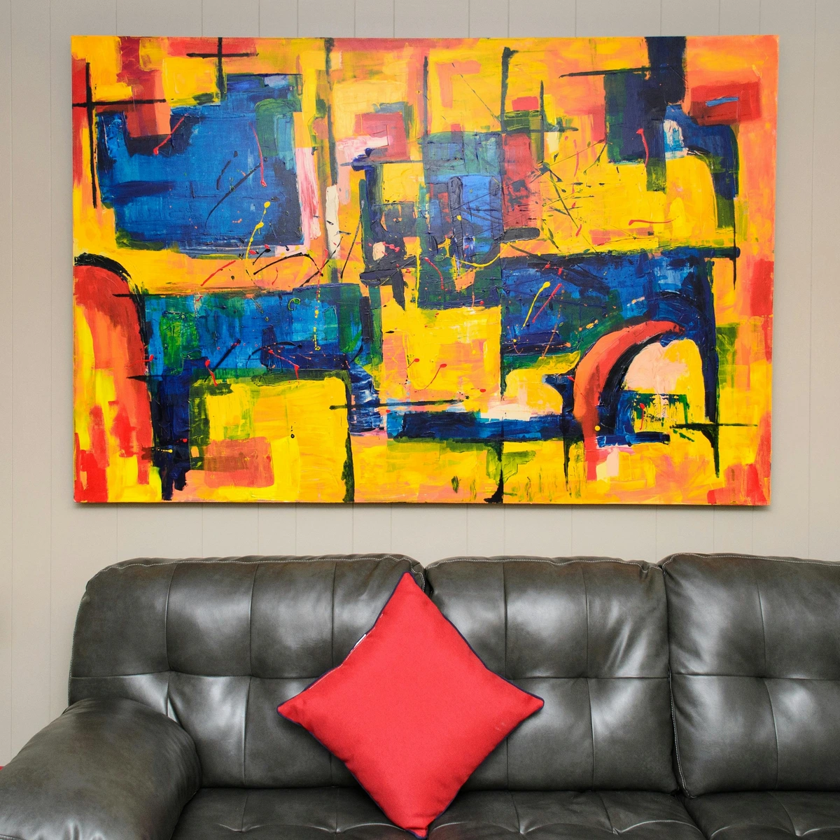
- The Exterior Aesthetic: If your living room has windows visible from outside—whether from a garden, a patio, or even the street—consider how your chosen art might contribute to the exterior view. A vibrant abstract piece visible from outdoors can add an unexpected splash of color or intrigue, becoming a delightful visual treat for those passing by, and even reflecting a touch of your interior style to the outside world. This visual connection also means that from inside your living room, the exterior view of the art can subtly enhance the room's perceived depth and connection to its surroundings.
- Impact of Subject Matter: While abstract art is incredibly versatile, the subject matter of your art can also profoundly influence the mood of a small room. A calming landscape or seascape can provide a window to tranquility, offering an escape. A vibrant cityscape or a piece depicting movement can inject energy and a sense of dynamism. Even a still life, carefully chosen for its palette and composition, can bring a quiet sense of beauty and order. It's about aligning the art's narrative with the feeling you want to cultivate in your compact sanctuary.
How will your art go beyond mere decoration to actively enhance your small living room's functionality and feel?
Beyond the Obvious: Art for Challenging Corners and Varied Views
A small room often comes with its own quirks: that narrow hallway leading into the main space, the oddly low ceiling, or an unexpected alcove. These aren't obstacles; they're invitations for creative problem-solving! I remember once trying to hide a ridiculously bulky radiator, only to realize the wall next to it was the perfect sliver for a striking, narrow piece of art – it completely transformed the perception of that awkward corner. Historically, artists living and working in compact city apartments, from 19th-century Parisian bohemians to modern-day urban dwellers, have always found ingenious ways to integrate art into challenging spaces, turning constraints into creative opportunities. This approach reminds me of how to decorate with abstract art in small spaces.
- Art that Complements Architectural Features: Rather than fighting with exposed beams, unusual window shapes, or unconventional wall angles, choose art that works with them. A piece with strong diagonal lines might echo a sloped ceiling, creating a continuous flow, or a series of small pieces might trace the outline of a unique archway. If your room features a modern, industrial style with exposed brick or concrete, an abstract piece with sharp geometric lines or metallic elements can amplify that aesthetic. Conversely, a flowing, organic abstract might soften a very rigid traditional space. This integration makes the art and architecture feel like a cohesive, intentional design.
- Conquering Low Ceilings: If your ceiling feels too low, embrace verticality. A tall, narrow canvas or a stack of two to three smaller pieces, strategically hung to emphasize height, can trick the eye into perceiving more loft. Look for abstract art with strong upward lines, upward-sweeping gestures, or compositions that direct the gaze skyward, creating an illusion of extended height. Even a landscape painting with a strong, low horizon line can suggest distant, open skies, drawing the eye up and out.
- Navigating Narrow Hallways: For a very narrow hallway that opens into your living area, avoid wide, dominating pieces. Instead, think about a series of smaller, vertically aligned pieces, or a single, tall, slender abstract that draws the eye down the length of the hall without making it feel claustrophobic. A series of framed botanical prints or a minimalist abstract with strong vertical lines can guide the eye gracefully, making the hallway feel like a deliberate passage rather than a squeeze.
- Embracing Alcoves and Nooks: These cozy indentations are perfect for creating intimate vignettes. Instead of ignoring them, fit a custom-sized piece, or display a carefully curated stack of smaller artworks. You could even use a small easel to present a cherished piece, making the nook feel like a mini-gallery within your home. It's like the art is playing hide-and-seek, revealing itself in unexpected, delightful ways, inviting a closer look.
- Dealing with Quirky Features & Camouflage: Don't let radiators, built-in cabinets, or awkward wall angles defeat you. Instead of trying to hide them, sometimes art can playfully complement them. A narrow, vertical piece might perfectly fit the sliver of wall next to a radiator, drawing attention away from the heat source and towards the art. Or, for a built-in bookshelf, a series of small, contrasting pieces can create an interesting visual rhythm that elevates the entire unit, making it a curated display rather than just storage. A well-chosen, vibrant abstract can even camouflage an awkwardly placed support beam or an uneven patch of wall, making its beauty the focal point.
- Mirrored Art & Reflective Elements: In particularly dark or awkward corners, don't just hang art – hang art that reflects. A piece incorporating mirrored elements, a highly polished metallic surface, or even a framed piece with a slightly convex glass can bounce light around, brightening the space and visually expanding it. It's a double whammy: art and instant spatial illusion.
- Considering All Angles: The 360-Degree View: In a small, open-plan space, your art isn't just seen from one spot. How does it look from the entryway, from the sofa, or even from the adjacent kitchen? A piece that is impactful from multiple vantage points will feel more integrated and thoughtful. This holistic approach ensures the art truly enhances the entire flow and feel of your compact sanctuary.


Placement: It's Not Just What, But Where
Ah, placement. This is where I've seen even the most beautiful art go wrong in a small space. I once meticulously planned a gallery wall, only to hang the first piece and realize it was so high I had to crane my neck to see it – a rookie mistake! It's not rocket science, but it does require a little foresight. The right placement can transform a modest piece into a powerful focal point, making the room feel intentional and well-designed – especially crucial when every inch counts in a compact living room. So, let's shift from what art to choose, to where to put it. I usually think about these guidelines, more like friendly suggestions based on hard-won experience (and yes, a few forehead-slapping moments of my own):
- Eye Level is Your Anchor (Mostly): Generally, art should be hung so the center of the piece is at eye level (around 57-60 inches from the floor for an average person). Why? Because this is the height we naturally view things, making the art feel like an integrated part of your personal space, rather than something floating awkwardly. However, in a small room, if you have a particularly tall piece, you might cheat slightly higher to emphasize verticality and draw the eye upwards, thus making the room feel taller. Conversely, for a seated viewing area (like above a sofa), you might opt for slightly lower placement to suit the seated perspective, aligning the center of the artwork with the average eye-level of someone seated. Always consider the primary viewing angle in your space.
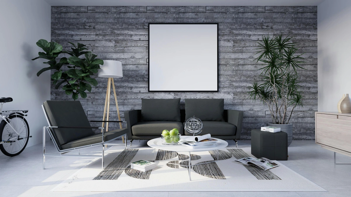
- Over Furniture, Not Floating: If you're hanging art above a sofa or console table, make sure it's visually connected. The art should be about two-thirds the width of the furniture below it and hung 6-8 inches above. This grounds the piece and makes the arrangement feel cohesive, rather than two separate elements vying for attention. It's a classic interior design rule for a reason, creating that harmonious visual block. You can read more about creating a focal point.
- Verticality Can Help (Especially with High Ceilings): If your room has decent ceiling height but limited floor space, consider a taller, narrower piece. It draws the eye upwards, emphasizing vertical lines and making the ceiling appear higher. It's a subtle trick I picked up from browsing galleries in older European cities – they always knew how to make grandeur out of compact dimensions. This strategy can be particularly effective with abstract paintings that features strong vertical lines or compositions, giving the illusion of extended height.
- Hanging in Tricky Spaces (and Rentals): Living in a rental often means restrictions on permanent changes. Art offers a powerful solution for personalization without violating your lease. Consider using damage-free hanging strips (like Command Strips), picture ledges that require minimal installation, or simply leaning larger canvases against a wall. For more detailed strategies on temporary displays, check out art for rental properties. For sloped ceilings, consider hanging art slightly lower or finding pieces with unusual orientations to complement the angle rather than fighting it. Sometimes, the most challenging spaces lead to the most creative solutions.
- Mind the Traffic Flow: In a small living room, pathways are precious. Ensure your art isn't hung in a way that obstructs natural movement or creates visual pinch points. You want the eye to flow effortlessly around the room, not get snagged on an ill-placed piece. This often means carefully considering corners and areas near doorways, making sure art enhances the space without impeding its function.
- Avoid Direct Glare: When considering placement, be mindful of windows. Hanging art directly opposite a window, especially one that receives direct sunlight, can lead to glare on the artwork, making it difficult to appreciate and potentially damaging it over time. Instead, consider an adjacent wall or a corner where natural light can illuminate the piece indirectly.
- The Mock-Up Method: Your Pre-Emptive Strike Against Regret: Before you hammer any nails, a little planning goes a long way. Use painter's tape or cut-out paper templates to mock up the size and placement of your chosen art on the wall. Live with it for a day or two. This simple step can save you countless holes and headaches, allowing you to visualize the scale, proportion, and height accurately. It’s like a dress rehearsal for your walls, and trust me, it’s worth the extra effort – a small investment of time for a perfect placement. I’ve skipped this step more times than I care to admit, usually resulting in a wall that looks like Swiss cheese before I get it right. Learn from my mistakes, please!
Where will you strategically place your chosen artwork to tell your room's story?
Your Room, Your Canvas: Embracing Personal Style
Ultimately, choosing art for any space, especially a small one, comes down to what resonates with you. Don't get so caught up in the rules that you forget the joy of the process. I've broken a few of these guidelines myself over the years – like that time I hung a tiny, intricate drawing above a huge sofa, completely losing its impact. Oops. Sometimes, you just have to try it out. The goal isn't perfection, but a living room that feels like yours, a curated reflection of your spirit and experiences. The art you choose powerfully influences the mood of your small room; it can be a calming sanctuary, an energetic hub, or a place for quiet contemplation. And, if you're making an investment, consider the longevity and archival quality of the piece. Even in a small space, you want your art to be a lasting source of beauty and value. Moreover, a truly captivating piece can actually distract from less desirable architectural features of your small room, like an awkwardly placed support beam, an uneven wall, or a utility box. The eye will naturally be drawn to the beauty you've chosen, making those imperfections recede into a gentle hum.
Also, a quick note on conservation and care: in compact spaces, environmental factors like consistent temperature, humidity, and direct sunlight can have a more pronounced impact. Protect your investment by avoiding direct sunlight, extreme temperature fluctuations, and high humidity, which can damage delicate mediums and colors over time. If your small living room is close to a kitchen or bathroom, consider framing art with UV-protective glass or choosing mediums less susceptible to moisture. One final thought: in a small space, less is often more, but this doesn't mean sacrificing personality. Be mindful of over-accessorizing your art. A magnificent painting often needs room to breathe, so resist the urge to clutter the surrounding wall or surfaces with too many decorative objects. Let the art be the star. My own artistic journey, often shared on my artist's timeline, is a testament to the idea that personal expression is key, and that often means making bold, unconventional choices. Your small living room isn't just a space; it's a canvas waiting for your story.
So go ahead, be a little daring, trust your instincts, and let your art make a big, beautiful statement, no matter the dimensions. And who knows, maybe one day a piece from my colorful abstract art collection will find its way into your carefully chosen collection, becoming a new conversation starter in your own compact sanctuary. After all, art is a dialogue, and I'd love to be part of yours. What bold choice will you make today – a single statement piece, or a carefully curated gallery wall – to transform your space?
Key Takeaways for Art in Small Living Rooms: Your Action Plan
Ready to transform your compact living room? Here’s a summary of the core advice for making art work wonders in your space:
- Embrace the Paradox: Don't fear large art; a single oversized piece can create depth and focus.
- Curate, Don't Clutter: Gallery walls need cohesion (theme, color, frames) to feel expansive, not overwhelming, creating warmth and personality. Consider unifying by subject or technique, and remember hanging practicalities like lightweight frames and rent-friendly options.
- Leverage Visual Tricks: Use light colors, bold focal points, reflective surfaces, thoughtful lighting, and specific framing and sheen to enhance perceived space and mood. Remember how art depicting light can also expand a room.
- The Power of Texture & Medium: Consider how the physical qualities of art add depth, interest, and even subtly influence the room's perceived temperature. Different mediums (impasto vs. watercolor) and the scale of texture impact visual weight and spatial presence.
- Consider Emotional Impact & Story: Choose art that evokes the desired mood (calm, energy, introspection), tells a personal story, and suits the viewing distance. Explore various styles (Impressionist, Pointillist, Surrealist) that work well and act as conversation starters. Also, be mindful of how the subject matter influences visual weight.
- Mind the Scale & Placement: Ensure art is in conversation with furniture and walls, hung thoughtfully for both seated and standing perspectives, and enhances flow without creating visual obstacles. Always consider the viewer's primary perspective and even the exterior aesthetic.
- Explore Beyond the Canvas: Utilize art for practical purposes like defining zones, improving acoustics, providing dynamic backdrops, subtle storage solutions, creating calm and focus, or even as an investment. Consider art for specific functional areas like fireplaces or awkward corners, and how subject matter influences mood.
- Turn Challenges into Opportunities: Use art to navigate awkward corners, low ceilings (e.g., vertical abstracts), narrow hallways, or even camouflage less desirable architectural features. Art can actively complement existing architectural elements.
- Strive for Balance: Whether bold or subtle, ensure art elements harmonize, creating a cohesive and enriching experience without overwhelming.
- Personalize & Trust Your Taste: Rules are guides, but your unique resonance and willingness to experiment (even in rental spaces!) are key to making the space truly yours and creating a rich, engaging conversation piece. Let your art be a reflection of your personality and journey!