Your Life on Display: The Ultimate Guide to Decorating with Personal Photos
Transform your digital clutter into meaningful art. This ultimate guide helps you choose, frame, print, and arrange personal photos for unique, soul-filled home decor, covering everything from technical tips to mindful curation.

Your Life on Display: The Ultimate Guide to Decorating with Personal Photos
I’ve got thousands of photos on my phone. Endless scrolls of sunsets, blurry selfies, perfectly plated meals, and countless moments that, honestly, blur into one big digital soup. And I know you probably do too. We live in an ocean of images, constantly snapping and scrolling, but how many of those moments truly live on beyond the fleeting glow of a screen? How many become tangible touchstones, real pieces of your story, rather than just data points in the digital ether? It's a question I've wrestled with, seeing my own phone overflow with beautiful images lost in the digital ether. This guide will take you from that endless scroll of your camera roll to beautifully curated walls that tell your unique story.
I have this one blurry, overexposed photo from a cheap disposable camera. It’s of a beach at sunset, and technically, it’s a terrible picture. The horizon is crooked, there’s a thumbprint in the corner, and the focus is… optimistic at best. But it hangs in my hallway. Why? Because I remember the exact feeling of that moment—the salty air, the laughter of friends just out of frame, the end of a perfect day. That piece of glossy paper is a time machine. It’s authentic. It’s real. It’s mine. And that, right there, is the goal of this guide: to help you transform your own digital clutter into meaningful, soul-filled wall art.
This is the profound magic you miss if you only see decorating as a transactional act, buying mere objects. Your walls aren't just structural supports; they're storyboards. Using your own photography, whether it's from your phone or a fancy camera, is the most authentic way to fill your home with soul. It’s about curating your own life, right where you live it. It’s about creating a space that breathes you, distinguishing your home from any other. This is about making your house feel like an extension of your own journey, a living, breathing autobiography.
Table of Contents
- Why Photography? It's Your Life, Curated.
- Choosing Your Photos: What Deserves a Frame?
- The Personal Chronicles
- The World Through Your Lens
- Finding Art in the Everyday: Fine Art Photographs
- Personal Growth and Evolution: A Visual Timeline
- Crafting Narratives: Conversation & Captions
- Photography Styles for Every Home
- Quick Guide: Photo Types & Their Vibe
- Technical Deep Dive: Bringing Your Digital Photos to Life
- Editing Your Photos for Print
- Printing Services: Quality Over Convenience
- DIY vs. Professional Printing
- Paper Finishes: Choose Your Vibe
- Resolution and DPI: The Bigger Picture
- Color Spaces: sRGB vs. Adobe RGB
- Choosing Print Sizes and Aspect Ratios
- Framing: The Unsung Hero
- The Mat is Not Optional
- Glass Matters
- Eclectic vs. Uniform: Choosing Frame Styles
- Bringing Your Vision to the Wall: Placement and Arrangement
- The Lone Wolf: The Power of One
- The Pack: Mastering the Gallery Wall
- Unexpected Places
- Photography as a Mindfulness Practice
- Sustainability in Photo Decor & Preservation
- Proper Storage of Physical Photographs
- Digital Preservation: Safeguarding Your Memories
- DIY Photo Projects
- Common Decorating Pitfalls to Avoid
- Overcrowding & Scale Issues
- Color Mismatch
- Ethical Considerations: Respecting Privacy
- FAQ: Your Photography Decor Questions, Answered
- A Final Thought...
Why Photography? It's Your Life, Curated.
Pulling a photograph out of that digital stream and giving it a physical home on your wall is a powerful act. It says, 'This moment matters.' It’s a pause button in a world that’s always on fast-forward. Psychologically, surrounding ourselves with these tangible memories can foster a deep sense of self-presence, reinforcing our identity and providing constant, gentle reminders of the people, places, and experiences that shape us. I've personally found it a fantastic way to trigger positive emotions, reduce stress, and promote a quiet sense of gratitude for the journey. It's an active process of autobiographical memory retrieval, enriching your psychological well-being every single day. I mean, who doesn't want a daily dose of gratitude, right? This isn't just about pretty pictures; it's about actively engaging with your past to build a more present and appreciative future.
Historically, photography's journey from scientific documentation to a respected art form, spearheaded by pioneers like Alfred Stieglitz, paved the way for us to see our personal snapshots as legitimate art in our homes. Early forms like daguerreotypes, and later tintypes and carte de visite, though cumbersome, allowed families to capture momentous occasions, leading to the framed portraits that adorned Victorian parlors. The mid-20th century brought accessible technologies like Kodachrome color film and Polaroid instant cameras, democratizing photography and shifting home decor from formal portraits to more candid, lifestyle-focused displays. The widespread adoption of 35mm cameras further cemented the snapshot as a powerful personal artifact. This embrace of personal photography became an integral element of contemporary home design, recognizing that your life, captured through your lens, is art. For more on this fascinating evolution, you can explore [ the history of photography as fine art](/finder/page/the-history-of-photography-as-fine-art).
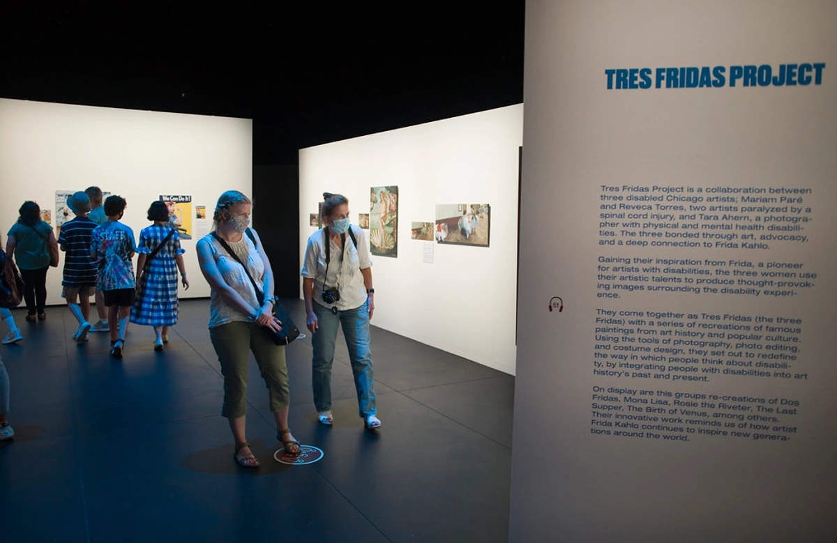
Unlike a painting you might acquire (and trust me, I appreciate a good painting, having made quite a few myself that you can explore on my /timeline), a personal photograph has a built-in narrative that is yours alone. It’s a direct link to a memory, a person, a feeling. It doesn't just match the sofa; it is a piece of you. And speaking of matching, choosing photos that complement your room’s existing color palette is like finding the perfect outfit for a cherished memory. Look for dominant colors in your furniture or textiles and try to echo them subtly in your chosen photos, or use a cohesive black and white theme for effortless harmony. For instance, cool blues and greens in a photo can enhance a tranquil bedroom (how to choose art for a bedroom), while warm reds and oranges can energize a living room or dining area (how to choose art for a dining room), sparking conversation and warmth.
Choosing Your Photos: What Deserves a Frame?
Now that we understand the profound impact of personal photography, let's dive into the art of selecting which moments deserve to become wall art. Okay, so you're sold on the idea. Now comes what feels like the hard part: choosing. You have thousands of photos on your phone. Where do you even begin? Forget about finding the 'perfect' photo; that's just paralysis by analysis, in my opinion. Think instead about the story you want to tell, the feeling you want to evoke. The selection process itself is an act of curation, a journey of self-discovery. And remember that the photo doesn't have to be technically perfect; its emotional resonance is often far more important. My favorite photo is that blurry beach sunset, after all. What story do you want your walls to whisper?
The Personal Chronicles
This is the obvious one: photos of family, friends, pets, and major life events. My advice? Elevate them. A candid, laughing shot often has more emotional punch than a stiff, posed portrait. Look for the in-between moments. Those unvarnished glimpses of joy, connection, or quiet reflection are the real treasures – perhaps a child completely engrossed in play, a pet curled up in a peculiar, sleepy pose, or a quiet moment of shared reflection between loved ones. For a timeless, cohesive feel, I often find printing them in black and white works wonders. It magically turns a chaotic collection of snapshots into a sophisticated series, unifying disparate moments with a shared aesthetic.
The World Through Your Lens
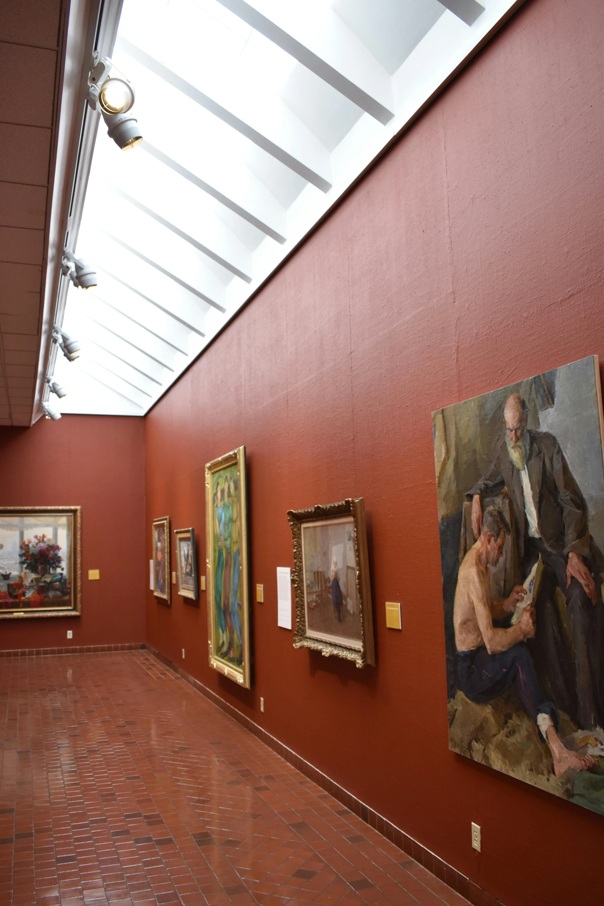
Those travel photos aren't just for Instagram. A misty mountain landscape, a bustling city street, a captivating street portrait, or a close-up of a strange-looking flower can transport you right back to that place. I remember a particularly rainy day in Amsterdam, a perfectly grey sky over a canal. Technically, not a stunner, but it evokes the quiet charm of that morning far more than any postcard-perfect shot. Don't just pick the iconic landmark; choose the photo of the quiet little side street that only you explored, or a close-up of a local dish. That's where the real story is, the one that whispers a memory just to you. Look for mood, atmosphere, and a unique perspective that transcends a simple factual record.
Finding Art in the Everyday: Fine Art Photographs
Some of the most compelling photographs are of nothing in particular, or rather, of the art in the mundane. This is where we delve into what I call fine art photographs from your own collection. It’s less about documenting a memory and more about seeing beauty in the world around you. This conscious act of looking, of truly seeing the world, can be a form of mindfulness, enriching your daily life even before you print a single image. The difference between merely 'snapping' and truly 'seeing' is the intentionality – capturing the inherent artistic quality rather than just recording a scene. It’s like finding a compelling abstract in a puddle after a rain shower, noticing the rhythmic pattern of bicycles parked against a wall, or appreciating the intricate patina on an old metal gate. This philosophy, sometimes called "everyday aesthetics," elevates the ordinary to the extraordinary. It's a practice that deeply informs my own abstract work, where I often try to capture the essence of these everyday visual discoveries, which you can explore on my /timeline.
Let's try an exercise: Look at a simple object near you – a coffee cup, a crumpled piece of paper, the shadow cast by a window. Can you find:
- Textures: The peeling paint on an old door, the intricate weave of a rustic fabric, the subtle grain of weathered wood, the rough surface of a stone wall, the intricate patterns of frost on a windowpane, the rich patina on a bicycle handlebar.
- Light & Shadow: The way sunlight slices across a hallway, the long shadows cast by a window frame, the subtle gradients of a cloudy sky, the stark contrast of light and shadow on crumpled fabric.
- Abstract Patterns: The repeating lines of a picket fence, the rhythmic ripples on water, the geometric shapes formed by buildings against the sky, the contrast of a lone umbrella against a wet city street, or the rhythmic lines of a row of bicycles, even raindrops on a windowpane.
- Close-ups of Nature: A dewy spiderweb, the intricate veins of a leaf, the delicate petals of a wilting flower, the complex structure of a pinecone.
What differentiates these? It's the intent and composition. You're not just snapping; you're seeing the inherent artistic quality. These types of photos are fantastic for mixing with other types of art (even abstract paintings like those you can find in my own collection /buy or explore on my /timeline!) because they add a layer of texture and mood without screaming for attention. They blend beautifully into minimalist, Scandinavian, or Japandi interior styles (how to choose art for japandi style home), creating depth and visual interest without overwhelming the space.
Personal Growth and Evolution: A Visual Timeline
Sometimes, the most powerful stories are told through a series. Consider displaying photos that mark significant milestones or personal transformations. A photo from a challenging period alongside one celebrating overcoming it, or a series showing the growth of your children (or even a beloved houseplant!). For example, you could pair a snapshot from your first day of college with one from your graduation, or document the stages of a challenging DIY project, creating a visual testament to your journey and resilience. Perhaps a progression of your artistic endeavors, from a beginner sketch to a finished painting (a diptych or triptych works wonders here), or photos marking the stages of a marathon training journey. You could even chart the evolution of a beloved hobby, like learning a new instrument or mastering a craft, or document a recovery from an illness or a significant life change. These aren't just snapshots; they're chapters of your evolving story, serving as powerful reminders of resilience and joy.
Crafting Narratives: Conversation & Captions
One of the often-overlooked benefits of decorating with personal photography is its power to spark connection. A unique travel photo can lead to stories of adventure, a candid family portrait can invite fond memories, and even an abstract detail shot can prompt curiosity and shared interpretation. Your walls become more than just decor; they become a visual autobiography, inviting guests to delve deeper into your world and fostering richer interactions. It's like having silent storytellers all around you, just waiting for someone to ask, "Tell me about that one..." I’ve seen it countless times in my own home, a blurry photo of a moment I cherish becoming the starting point for a wonderful shared memory. For example, a photo of an unusual street performer I took in Lisbon sparked a vivid discussion about unexpected encounters and travel adventures with a friend who had never been there. A family portrait might spark a question like, "Where was this taken?" leading to stories about a favorite vacation spot or a special family event.
To caption or not to caption? That is the question. While text can add context and deeper meaning, especially for historical family photos or abstract pieces where you want to guide the viewer, I often find less is more. For personal photos, the memory often speaks for itself. If you do use captions, keep them short, sweet, and perhaps handwritten for an extra personal touch. Or, use them strategically for a gallery wall, perhaps identifying a location or date for your travel photos.
Photography Styles for Every Home
Just as paintings come in different genres, so too does photography. Understanding various styles can help you curate a collection that truly complements your interior design:
- Documentary/Photojournalistic: Captures real life unposed. Perfect for candid family moments, street photography, or travel scenes that tell a raw, authentic story. Works well in eclectic or bohemian interiors.
- Fine Art Photography: Emphasizes aesthetic vision over factual representation. Think abstract details, minimalist landscapes, or thoughtful portraits. Ideal for modern, minimalist, or contemporary spaces, creating a sophisticated mood.
- Portrait Photography: Focused on individuals or groups, often posed. Traditional portraits suit classic or formal rooms, while candid portraits fit relaxed, family-oriented spaces.
- Landscape/Nature Photography: Captures the beauty of the natural world. Panoramic scenes of mountains, forests, or oceans can bring tranquility and a sense of scale, especially in large living rooms or offices. Consider choosing art for your living room.
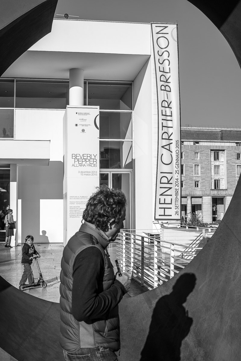
- Street Photography: Unscripted moments of everyday life in public spaces. Adds a dynamic, often gritty, urban energy. Great for urban lofts or contemporary spaces that embrace a city vibe.
Quick Guide: Photo Types & Their Vibe
Photo Type  | Best For Creating a... | Best Use Case | Emotional Impact | Pro Tip | Best Framing Style | Interior Style Fit |
|---|---|---|---|---|---|---|
| Candid Portraits | Warm, personal, lively atmosphere. | Living rooms, bedrooms, hallways. | Joy, connection, nostalgia. | Convert to black and white to unify different shots and add a classic feel. | Simple wood or slim black frames. | Traditional, Farmhouse, Eclectic |
| Travel Landscapes | Sense of adventure, calm, or wonder. | Large focal walls, offices, dining rooms. | Awe, tranquility, wanderlust. | Go big! A large landscape can act as a window to another world. Especially good for [ | ||
| choosing art for high ceilings](/finder/page/maximizing-impact-choosing-art-for-high-ceilings). | Float frame or thin, unobtrusive frame to emphasize the image. | Modern, Bohemian, Scandinavian | ||||
| Abstract/Detail Shots | Modern, sophisticated, and moody vibe. | Minimalist spaces, bathrooms, kitchens. | Curiosity, contemplation, serenity. | Group them in a grid of small frames for a high-impact, minimalist look, creating a cohesive visual texture. | Minimalist metal or black frames, with or without a wide mat. | Minimalist, Japandi, Contemporary |
| Vintage/Old Family Photos | Feeling of history, nostalgia, and connection. | Libraries, dens, hallways, studies. | Warmth, heritage, sense of roots. | Scan them at a high resolution and reprint them. The quality will be much better, and consider photo restoration services for damaged ones. | Ornate, distressed, or classic wooden frames to match their era. | Traditional, Rustic, Grandmillennial |
| Pet Photography | Playful, comforting, heartwarming. | Bedrooms, family rooms, entryways. | Joy, companionship, love. | Capture their unique personality and quirks in candid moments. | Playful colors, or classic frames for a more dignified pet portrait. | Casual, Cozy, Family-Friendly |
| Food Photography | Inviting, delicious, inspiring. | Kitchens, dining rooms, cafes. | Appetite, warmth, shared pleasure. | Focus on vibrant colors and appealing textures with natural light. | Clean, simple frames in natural wood or white. | Modern, Industrial, Minimalist Kitchens |
| Event Photography | Celebratory, energetic, joyful. | Entryways, family rooms, playrooms. | Excitement, happiness, memory. | Select key moments that tell a story of the event. | Gallery wall with varied frames, or a cohesive modern suite. | Contemporary, Eclectic, Maximalist |
Technical Deep Dive: Bringing Your Digital Photos to Life
So you've chosen your digital images. Now, how do you turn them into high-quality physical prints that do your memories justice? This isn't a step to skimp on. I know, this part can feel a bit dry, but trust me, getting the technical details right is like laying a solid foundation for your house of memories. It ensures your beautiful selections look as good in print as they do on your screen. And if your monitor isn't color calibrated, what you see might not be what you get on paper, leading to frustrating surprises. I've had my share of prints that looked dull compared to the screen, and it's always a disappointment. Avoiding the dreaded 'pixelated soup' or 'muddy colors' is entirely achievable with a little foresight.
Editing Your Photos for Print
Before sending your photos to the printer, a little basic editing can make a huge difference. You don't need professional software; most phones and free online tools offer these adjustments. Remember to check your chosen print service's guidelines for preferred file types (e.g., JPEG, TIFF) and their specific resolution requirements. Consider saving high-resolution versions of your edited images as TIFF files before printing for maximum quality. For optimal color accuracy, especially if you're printing professionally, investing in a simple monitor calibration device can align your screen's colors with print standards, saving you from unpleasant surprises.
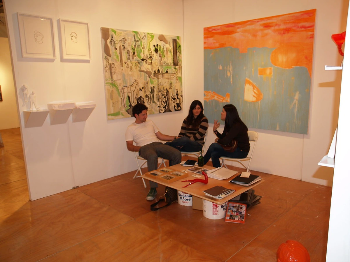
- Cropping: Remove distracting elements or adjust the composition to fit your desired frame size. This is crucial for guiding the viewer's eye. Think of it as telling a clearer visual story.
- Brightness & Contrast: Adjust these to ensure your photo isn't too dark or too washed out. A slight boost often makes images pop in print.
- Color Correction: If a photo looks a bit off-color (too yellow, too blue), a subtle adjustment can bring it back to life. Or, embrace the monochrome and convert it to black and white for a timeless feel.
- Sharpening: A touch of sharpening can make details crisper, but don't overdo it, or your image can look grainy. It’s like adding just the right amount of salt – too much ruins the dish.
If you're unsure, many professional print services offer basic editing or color correction services, which can be a worthwhile investment.
Printing Services: Quality Over Convenience
Don't use the one-hour kiosk at the pharmacy if you want true quality. Use a dedicated online printing service (many offer excellent archival printing) or a local professional print shop. They'll have better equipment, better paper, and color calibration. Ask about their Giclée printing services, which are essentially high-quality inkjet prints using pigment-based inks on archival paper. This method offers exceptional color accuracy and longevity, meaning your prints will resist fading and look vibrant for decades, unlike standard photo prints. You can read more about it here: [ what is giclee print](/finder/page/what-is-giclee-print). When ordering, you can explicitly request a specific color profile (like sRGB) or paper type if you have a preference, or ask for their expert recommendation. Besides Giclée, some services offer traditional darkroom prints for a classic, chemical-process look, or advanced large-format digital printing for truly monumental displays.
You can also explore specialized materials like canvas prints (for a painterly texture and frameless look), metal prints (for vibrant, modern aesthetics with a high-gloss finish that really makes colors pop), or acrylic prints (for deep color saturation, enhanced depth, and a sleek, contemporary feel).
DIY vs. Professional Printing
Aspect | DIY/Home Printer | Online Service/Local Print Shop |
|---|---|---|
| Cost | Low initial, high per-print (ink, paper). | Varies, can be more economical for larger prints. |
| Quality | Variable, depends on printer/ink/paper. | Generally high, professional-grade equipment and expertise. |
| Expertise | Requires user knowledge of settings and color profiles. | Staff can offer advice on optimal settings and color management. |
| Convenience | Instant gratification, but can be fiddly and prone to error. | Order online or drop off, wait time, but reliable, consistent results. |
| Material Choice | Limited by home printer compatibility. | Wide range of archival papers, finishes, and substrates. |
| Longevity | Often less fade-resistant, especially with standard inks. | Excellent, especially with archival pigment inks and paper. |
| Color Accuracy | Difficult to achieve without calibration. | Professionally calibrated for consistent color reproduction. |
Paper Finishes: Choose Your Vibe
The paper finish significantly impacts how your photo looks and feels. Here are a few common options:
Finish Type | Characteristics | Best For... | Aesthetic Impact |
|---|---|---|---|
| Matte | Non-reflective, subtle texture, muted colors. | Black & white, vintage, soft portraits, serene landscapes. | Reduces glare, classic, understated. |
| Luster/Satin | Soft sheen, good color depth, less glare than glossy. | Vibrant landscapes, general-purpose color prints. | Best of both worlds: good detail, subtle shine. |
| Glossy | High shine, vibrant colors, sharp details, can show fingerprints. | High-contrast, colorful images, abstract art, urban night scenes. | Makes colors pop, modern, impactful in controlled lighting. |
| Metallic | Unique pearlescent finish, adds shimmer and depth. | Abstract art, landscapes with strong light, contemporary photos. | Futuristic, high-impact, makes colors truly glow. |
Resolution and DPI: The Bigger Picture
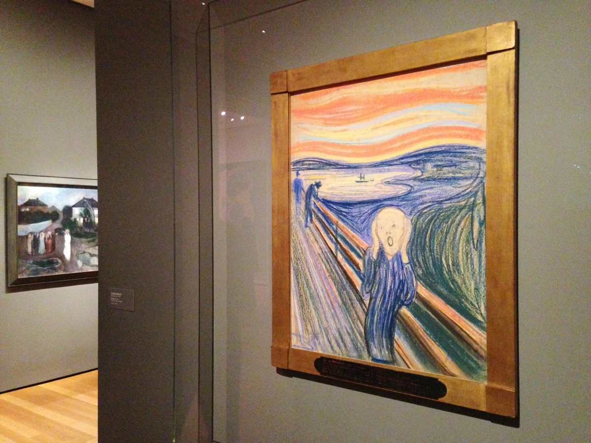
This is crucial for print clarity. DPI (dots per inch) refers to the density of ink dots on the paper. Think of it like a mosaic: the more tiny tiles (dots) you can fit into each square inch, the smoother and more detailed the overall picture will be. For high-quality prints, you generally want 300 DPI at your desired print size. If your photo has a low resolution (e.g., a screenshot or a heavily cropped image common from a 72 DPI web source), trying to print it large will result in a pixelated, blurry image – trust me, you'll see the individual 'blocks.' Always check the pixel dimensions of your photo and consult a DPI calculator or your printer's recommendations before committing to a large print. My rule of thumb: For small prints (e.g., 4x6 inches), 300 DPI is excellent. For larger prints (e.g., 16x20 inches), you might get away with slightly lower DPI (e.g., 150-200), but 300 DPI is always ideal for maximum crispness. To put it simply: low DPI at a large size equals blur. If you want an acceptable print quality, you'll likely need to reduce the print size considerably for low-resolution images.
Color Spaces: sRGB vs. Adobe RGB
This can get technical, but here's the gist: most consumer cameras and web browsers use sRGB, a smaller color space. Professional photographers often work in Adobe RGB, which has a wider range of colors. Think of sRGB as a standard box of 64 crayons with a good, practical range of colors, while Adobe RGB is like a professional artist's palette with 256 more subtle shades and hues. If your photo was 'painted' with the 'professional palette' (Adobe RGB) but printed by a service expecting 'standard crayons' (sRGB), it might look dull or desaturated. The safest bet for most people is to stick to sRGB, or confirm with your printing service which color profile they prefer and can accurately reproduce. When sending files, explicitly ask if they prefer sRGB or Adobe RGB to avoid color surprises. It's a small detail that can make a huge difference in the vibrancy and accuracy of your final print. Your computer's operating system also plays a role in color management; ensure your display settings are not overriding your chosen color profile for optimal consistency.
Choosing Print Sizes and Aspect Ratios
Different photos have different aspect ratios, which affects how they fit into standard frames and how they look on your wall. The aspect ratio is simply the ratio of the width to the height of an image. Understanding it prevents awkward cropping or wasted space.
Aspect Ratio | Description | Common Use Cases | Ideal For... |
|---|---|---|---|
| 3:2 | Standard rectangular format. | DSLR cameras, 35mm film, common photo prints (4x6, 8x12, 12x18 inches). | Versatile for landscapes, portraits, general photography, especially when printing many photos. |
| 4:3 | Slightly taller rectangle. | Point-and-shoot cameras, older digital cameras, many phone cameras, iPads. | Good for everyday snapshots, often feels slightly taller than 3:2, fitting more vertical scenes. |
| 16:9 | Wide rectangular format. | HDTV screens, video, some newer phone cameras. | Panoramic landscapes, cinematic feel, great for wide views that emphasize horizons. |
| 1:1 | Perfect square format. | Instagram, medium format film cameras, classic square frames. | Portraits, abstract details, strong symmetrical compositions, minimalist displays. |
When choosing a print size, think about the wall space it will occupy. A helpful trick: cut out paper templates of your desired print sizes and tape them to the wall. This gives you a tangible sense of scale and proportion before you commit to printing. For more detailed guidance, check out [ how to choose the right size art for your space](/finder/page/how-to-choose-the-right-size-art-for-your-space-a-decorators-guide).
Framing: The Unsung Hero
You've chosen your photos, you've handled the technical wizardry of printing – but how do you ensure they truly shine? Once you've decided where your stories will live, the next crucial step in making them shine is how they are presented – the frame. A frame can truly make or break a photograph. Think of it as the outfit you're dressing your memory in. A cheap, flimsy frame will make even the most beautiful photo look, well, cheap. It’s worth investing a little here. I once bought a set of frames from a discount store that practically fell apart as I was hanging them. Lesson learned: sometimes saving a few bucks isn't worth the daily visual annoyance, or the inevitable crooked hang.
The Mat is Not Optional
A mat (that white cardboard border) gives your photo breathing room. It separates the image from the frame, draws the eye inward, and makes it look instantly more professional and substantial. Think of it as a quiet stage for your photo to perform on. For a classic look, a thick white mat is always a safe bet, but consider black for dramatic effect or a subtle color mat if you want to pull a tone from the photo itself. Mats also serve a crucial preservation purpose by keeping the photograph from touching the glass, preventing it from sticking or mildewing over time. Always choose acid-free mats to prevent discoloration of your precious prints.
Glass Matters
If your photo will be in a sunny spot, consider UV-protective glass to prevent fading. Direct sunlight is the mortal enemy of all art and will fade colors over time. For a super clear view without glare, museum glass is the top of the line, but it's definitely an investment. Beyond UV protection, consider anti-glare glass for rooms with strong light sources, or acrylic glazing which is lighter and more shatter-resistant than traditional glass, making it ideal for large pieces or busy areas. Acrylic is also less prone to condensation than glass, a bonus for certain environments.
Eclectic vs. Uniform: Choosing Frame Styles
For a gallery wall, using all the same frames creates a clean, modern look. Using a mix of different styles and materials creates a more eclectic, bohemian vibe. There’s no wrong answer—it just depends on the story you’re telling and the overall aesthetic of the room. For a minimalist aesthetic, slim black or natural wood frames work perfectly. For a more ornate or vintage feel, distressed white or gold frames can add character. Also, consider specialized frame profiles:
- Shadow box frames add depth by creating space between the art and the glass, perfect for displaying small objects with your photo. You can learn more about them here: the role of shadow boxes in displaying art.
- Float frames make the art appear to 'float' within the frame without touching the edges, excellent for a modern, gallery-like presentation.
Deciding between custom framing and off-the-shelf options often comes down to budget and unique sizing needs; custom offers perfection but at a higher cost, while ready-made frames are budget-friendly but might limit your size and style choices. For budget-friendly framing, don't overlook online retailers with a wide selection, or even thrift stores where you can find unique frames and upcycle them with a coat of paint! It's amazing what a little creativity can do to a forgotten frame. For a truly sustainable choice, seek out frames made from recycled materials or certified sustainable wood sources.
Bringing Your Vision to the Wall: Placement and Arrangement
Once you have your photos, the next question is where to put them. Don't just default to that big empty space above the sofa. The placement is part of the storytelling. As an artist, I often think about how pieces interact with the light, the furniture, and the human eye. And here's a confession: almost everyone hangs things too high. Myself included, for years! Remember the eye-level rule. Your art and furniture should be conversing; they should be speaking at a similar volume. Think of the wall as a stage, and your photographs as the performers – you want them to be seen clearly and harmoniously.
The Lone Wolf: The Power of One
A single, large-scale photograph can completely define a room. This is where you use your most breathtaking landscape or a powerful portrait. It becomes the undisputed focal point. When hanging one big piece, the general rule of thumb is to center it at eye level—about 57 inches (or 145 cm) from the floor to the center of the image. It feels weirdly low at first, but it connects the art to the furniture and the human scale of the room, making the space feel cohesive, not like a formal, cold gallery. This height aligns with our natural viewing perspective, preventing neck strain and ensuring the art integrates with the surrounding furniture rather than floating aimlessly. But rules are made to be broken. If you have high ceilings, you might go higher to maintain proportion, but always consider how it relates to surrounding furniture. For a detailed guide on this, check out how to hang art above the sofa. To visualize this before committing, cut out paper templates of your chosen print size and tape them to the wall, adjusting until it feels just right. For more general advice on sizing, explore how to choose the right size art for your space.
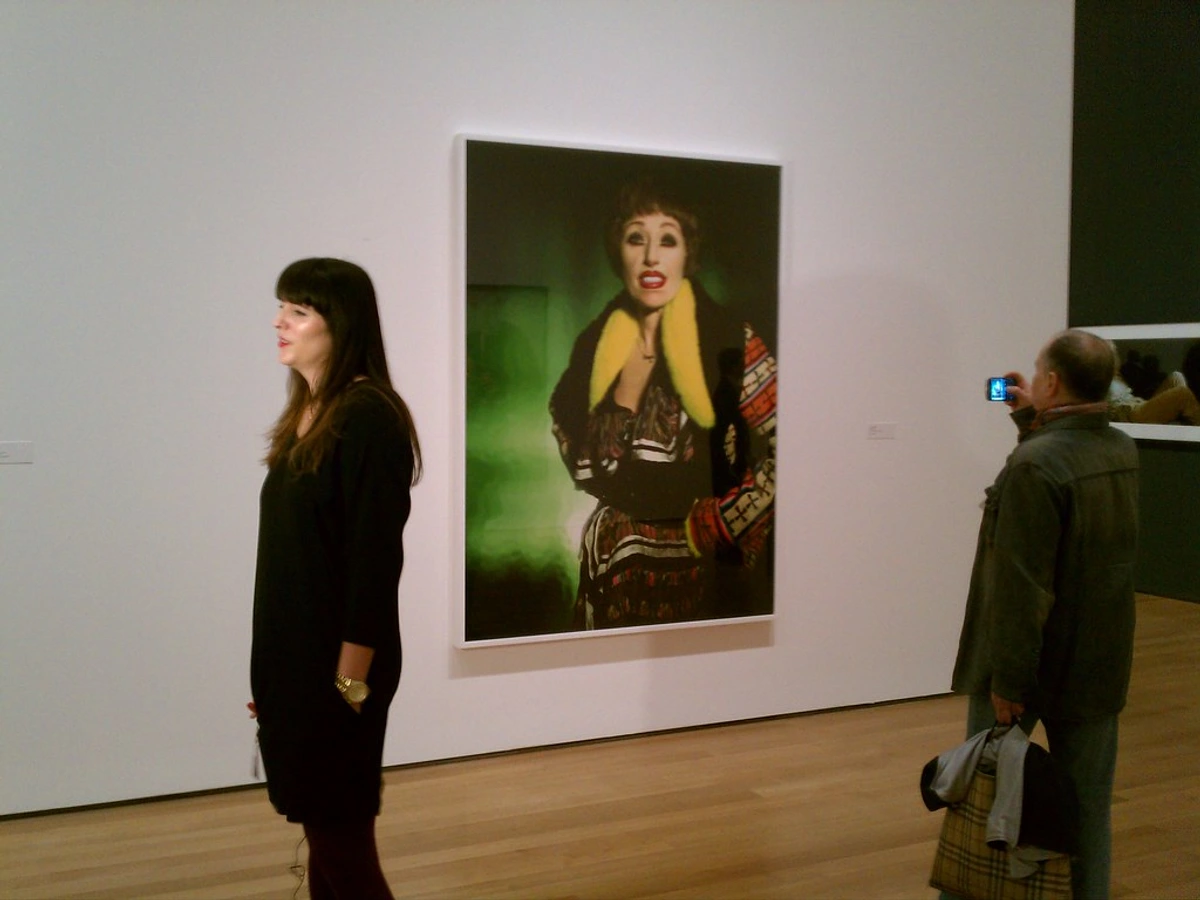
When considering scale and proportion for any room, remember that art should feel balanced with the furniture it accompanies. A small photo above a massive couch will look lost, while a huge piece in a tiny nook can overwhelm. Think of your art and furniture as conversing; they should be speaking at a similar volume. A mismatched scale makes the conversation awkward! Understanding balance in art composition is key here.
The Pack: Mastering the Gallery Wall
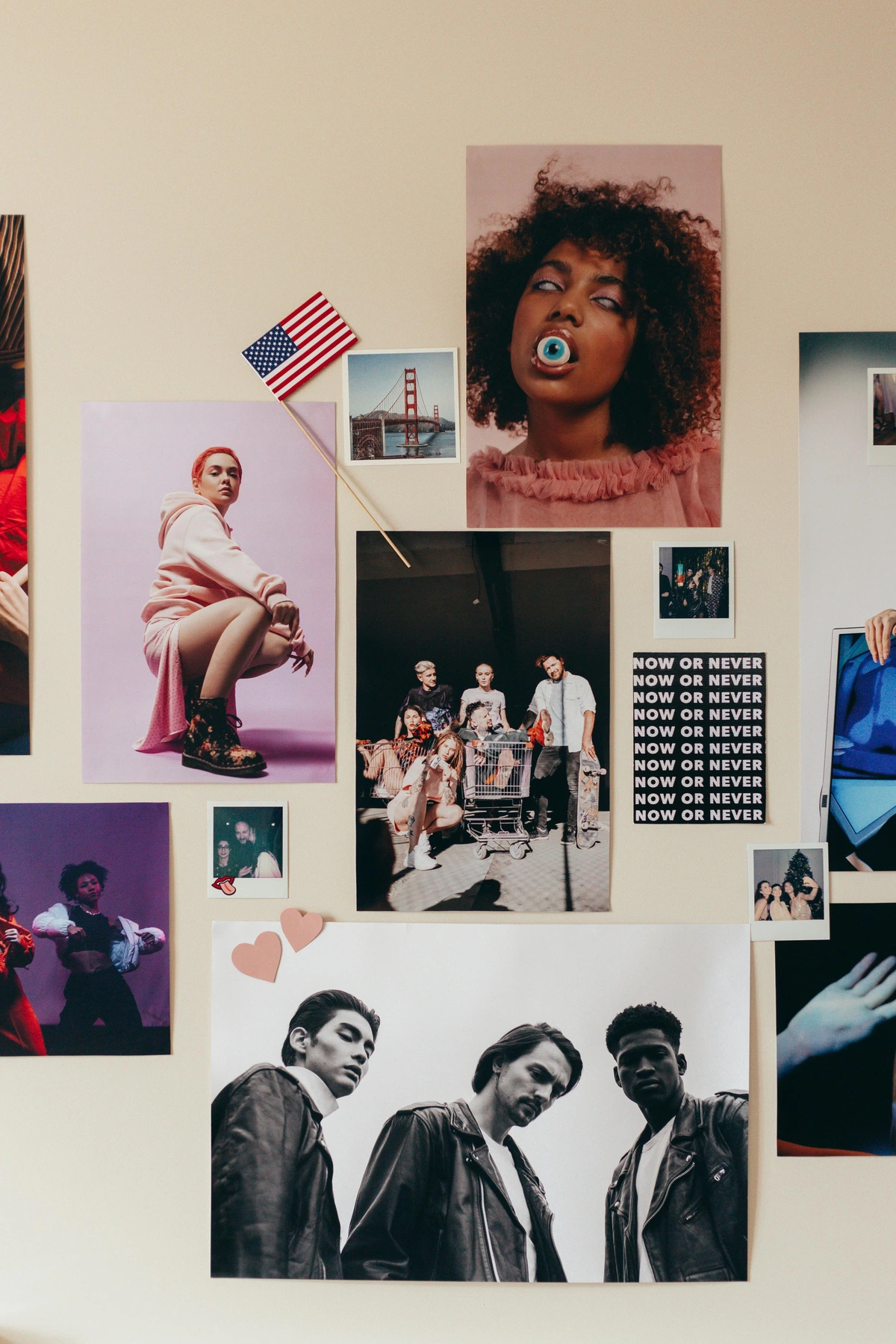
The gallery wall is a classic for a reason: it lets you tell multiple stories at once. It's a visual collage of your life. Here’s my secret to a great one: stop trying to make it perfect. Embrace the organic, curated feel of a life well-lived. This is not about rigidity; it's about flow and personality. If you want more detailed guidance, we have a whole guide on what is a gallery wall that you might find useful, as well as how to arrange pictures on a wall and even how to make a gallery wall.
- Mix and Match: This is where the magic happens. Combine your personal photos with other art—prints, postcards, even your kid's drawings. Mix vertical and horizontal orientations. Don't be afraid to mix black and white photos with color photos; just distribute them evenly so you don't have one big clump of color and one of black and white. This eclectic approach is what makes it interesting and deeply personal.
- Find a Common Thread: To keep it from looking like a chaotic mess, find one unifying element. It could be the color of the frames (all black, or all wood), the color palette of the photos themselves (all black and white, or all warm tones), a consistent mat size (e.g., all 2-inch mats), a theme in the subject matter (e.g., all nature details, all urban scenes), or a shared artistic style. This visual anchor pulls everything together without stifling individuality. When thinking about visual weight, remember that larger, darker, or more complex images will draw the eye more, so distribute these evenly to avoid one side of your gallery wall feeling 'heavier' than the other. For instance, imagine placing a dark, heavy-looking portrait next to a very light, minimalist line drawing; you might want to strategically place a mid-toned piece in between to bridge the gap. Images with high contrast, dark colors, or intricate details tend to have more visual weight, while soft-focus, muted tones, and simple subjects feel 'lighter.' Balancing these elements creates harmony.
- Plan on the Floor (or Digitally): Before you hammer a single nail, lay out your arrangement on the floor. Take a picture of it with your phone. Live with it for a day. You'll be amazed at the adjustments you make. It's like sketching out a composition before painting. Alternatively, use a digital app to create a virtual gallery wall, which can save even more time and effort, especially for complex arrangements. There are also apps that let you photograph your wall and then overlay potential arrangements.
- Secure and Level: Once you’re happy with the layout, take the time to hang each piece securely. Use appropriate hardware for your wall type (we have guides for how to hang art on drywall, how to hang art on brick walls, and how to hang art on lath and plaster walls!). And for the love of aesthetics, use a small spirit level. A crooked picture is a tiny, persistent annoyance you don’t need.

Unexpected Places
Who says art is only for the living room? Some of the most impactful places for photography are the ones you'd least expect. Don't be afraid to play around and experiment! Break free from convention and let your memories enliven every corner of your home.
- The Hallway: A long, narrow hallway is perfect for a linear series of photos. It creates a journey as you walk through the space, inviting contemplation. For more ideas, delve into our guide on art for long narrow hallways.
- The Bathroom: A small powder room is a fantastic place to go bold. Since it's a small, often overlooked space, you can use dramatic or quirky photos without overwhelming a whole room. Just make sure they're framed well to protect from moisture. For high-moisture areas, consider sealed frames, acrylic glazing (which is lighter and less prone to condensation than glass), or even printing on metal or acrylic directly. We've written about decorating with art in a powder room before, and also how to choose art for a bathroom.
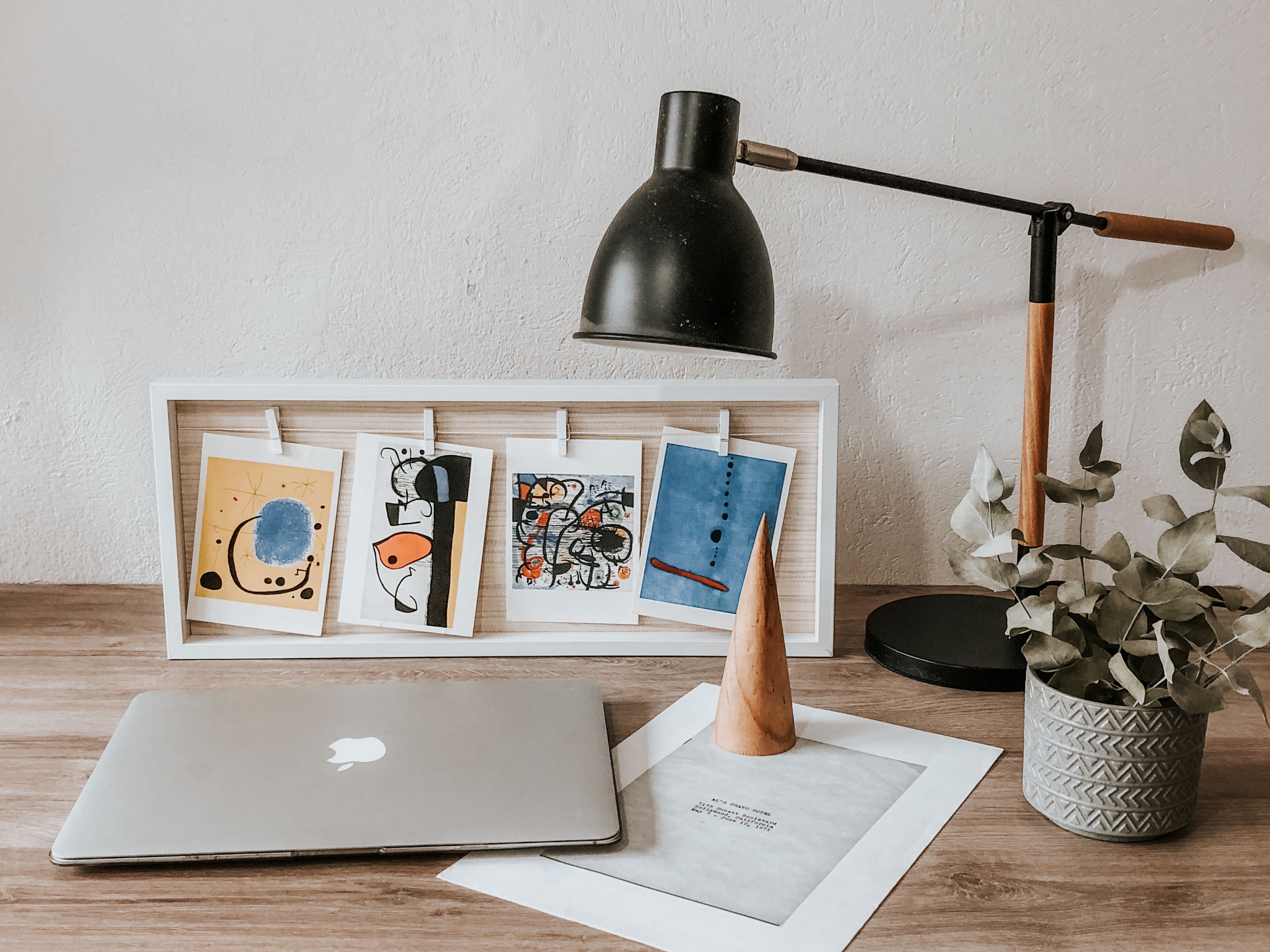
- The Bookshelf: Lean a few smaller, framed photos against the back of your bookshelves, nestled between books and objects. It adds depth and a personal touch.
- Stair Risers or Ceiling Panels: For the truly adventurous, small, waterproofed prints can be applied to stair risers for a playful, unexpected touch. Similarly, a grid of lightweight, framed photos on a ceiling panel could create a unique focal point in a den or child's room.
- Room Dividers: Use string, clips, and a collection of varied prints to create a flexible, semi-transparent room divider that tells a story and adds texture to your space.
- Digital Photo Frames: While this article focuses on physical prints, don't overlook modern digital photo frames. They offer a fantastic way to rotate a vast collection of memories, especially if you have too many favorites to print all at once. It's a great way to keep your personal gallery fresh and dynamic.
Photography as a Mindfulness Practice
Beyond simply decorating, the act of selecting, curating, and displaying your personal photos can be a profound form of mindfulness and self-care. It’s an active practice of reflection, allowing you to pause, revisit cherished moments, and intentionally surround yourself with positivity. This deliberate engagement with your memories can reduce stress, enhance gratitude, and reinforce your identity. It's about creating a living shrine to your journey, a constant source of quiet joy and affirmation. I've personally found immense calm in sifting through old photos, discovering forgotten gems, and giving them new life on my walls. It’s like a quiet conversation with your past self, a reminder of all you’ve experienced and overcome.
To turn photo curation into a mindful activity, try these steps:
- Slow Selection: Instead of quick scrolls, dedicate an hour to mindfully browsing a small selection of photos. Reflect on each image. What feelings does it evoke? What story does it tell?
- Journaling Prompts: For a few chosen photos, write down three words that describe the memory, or a short sentence about why it's meaningful to you. This deepens your connection.
- The "Why" Behind the Wall: Before hanging, consciously articulate why each photo deserves its place. This isn't about perfection, but purpose.
Sustainability in Photo Decor & Preservation
As we think about filling our homes with memories, it's also worth considering our impact. Opting for archival printing practices ensures the longevity of your prints, reducing the need for frequent replacements. When choosing frames, look for options made from recycled materials (e.g., reclaimed wood, recycled plastic) or sustainable wood sources (e.g., FSC-certified timber). Some frame manufacturers even specialize in low-VOC (volatile organic compound) finishes. And don't forget the power of upcycling: giving new life to old frames with a fresh coat of paint or a creative treatment can be a wonderfully sustainable and personal touch.
Proper Storage of Physical Photographs
To ensure your physical memories last a lifetime, proper storage is paramount. Store prints in archival sleeves made from polypropylene, polyethylene, or polyester, and place them in acid-free boxes away from direct sunlight, extreme temperatures, and high humidity. A cool, dark, dry environment is ideal – think a closet, not an attic or basement. Avoid rubber bands, paper clips, or acidic papers which can degrade prints over time. For albums, choose photo-safe options that are acid-free and lignin-free. You can also explore art storage solutions for collectors for more advanced options.
Digital Preservation: Safeguarding Your Memories
Beyond physical prints, your digital photo collection also requires thoughtful preservation. The last thing you want is to lose years of memories to a hard drive crash! Adopt the 3-2-1 backup rule: keep 3 copies of your data, on at least 2 different types of media, with 1 copy stored offsite. This might mean having one copy on your computer, one on an external hard drive, and one on a cloud storage service (like Google Photos, Dropbox, or OneDrive). This multi-layered approach safeguards against data loss, ensuring your precious moments are preserved for future generations.
DIY Photo Projects
For those who love to get hands-on, integrating photos into DIY projects can add an extra layer of personal charm and creativity:
- Photo Collages: Create unique visual stories by cutting and pasting different photos onto a canvas or board. Mix textures, colors, and themes for an eclectic look. This is a great way to combine smaller, less-than-perfect prints into a compelling whole. For inspiration, consider the vibrant energy of [ collage art](/finder/page/what-is-collage-art).
- Decoupage: Apply small photos or photo fragments onto furniture, trays, or decorative boxes using decoupage glue. It’s a beautiful way to personalize everyday objects and give new life to old pieces.
- Mixed-Media Art: Combine your printed photos with paint, ink, fabric, or other found objects to create unique, layered artworks. This is a fantastic way to blend your memories with your artistic expression and explore themes of found objects art.
Common Decorating Pitfalls to Avoid
With your photos ready to be transformed into stunning prints, it's also wise to be aware of the common traps that can diminish their impact. Even with the best intentions, it's easy to make a few common mistakes that can detract from your beautiful photography display. As I've learned through my own trials (and errors!), a little foresight goes a long way. Trust me, I've seen (and made) them all, from the slightly-too-high hang to the frame that just screams 'cheap.'
Overcrowding & Scale Issues
While a gallery wall thrives on abundance, there’s a fine line between curated charm and chaotic clutter. Give your pieces room to breathe. Don't feel every inch of wall needs filling. Negative space is your friend, allowing the eye to rest and appreciate individual pieces. It's about visual pauses, not visual noise. For more on maximizing impact, check out how to decorate a large wall.
Beyond this, ensure individual photos within a gallery wall are appropriately scaled relative to each other and the wall space. Avoid tiny frames lost on a vast wall, or one enormous print dwarfing everything else in a small arrangement. Remember, as I said before, art and furniture should be conversing at a similar volume. A mismatched scale makes the conversation awkward!
Color Mismatch
If you’re mixing many different color photos and a black and white palette isn't your thing, try to find a subtle dominant color that appears in several pieces or in the room’s existing decor. This creates an unspoken harmony. Alternatively, consider converting a few outlier photos to black and white or sepia to blend them in, or group photos with similar color temperatures (all warm tones together, all cool tones together). The goal is visual cohesion, not a rainbow explosion (unless you're aiming for a controlled explosion of color, which, hey, is also a valid artistic statement!). For example, if your living room has muted greens and blues, pick photos with complementary or echoing cool tones, or convert the vibrant red-orange vacation photos to black and white to keep visual peace.
Ethical Considerations: Respecting Privacy
This isn't strictly decor, but it's important. When displaying photos of others, especially children or acquaintances, consider their privacy and consent. Always get explicit permission before publicly displaying intimate or potentially sensitive images of people who aren't immediate family. An intimate image might be a candid shot of a child in a vulnerable moment (like crying or being comforted), or a photo of a friend in a context they might prefer to keep private (such as a messy personal space or a moment of quiet reflection). For children, always obtain explicit consent from parents or guardians, and carefully consider whether the image truly respects the child’s dignity and future privacy. It's about respect, not just aesthetics. When altering photos of people, especially for display, consider the ethics of manipulation and how it might change the perception of the individual or event. Transparency is key. This aligns with broader principles of ethical practices in art and photography.
FAQ: Your Photography Decor Questions, Answered
What's the biggest mistake people make?
Hanging things too high. It’s almost universal! Remember the eye-level rule (center of the art at 57 inches / 145 cm). It feels weirdly low at first, but it connects the art to the furniture and the human scale of the room. It makes the space feel cohesive, not like a formal, cold gallery. I've been there myself, staring at a floating picture for years before finally lowering it. Trust me, your neck will thank you.
How do I protect my photos from sunlight and other environmental factors?
Direct sunlight is the mortal enemy of all art. It will fade colors over time. If you have a precious photo, hang it on a wall that doesn't get direct, harsh sunlight. If you can't avoid it, investing in UV-protective glass for the frame is your best bet. Think of it as sunscreen for your memories. Additionally, ensure proper air circulation around your prints and avoid hanging them directly above heat sources like radiators or in high-humidity areas (like unventilated bathrooms) to prevent temperature and humidity fluctuations, which can cause warping, fading, or mildew. For unframed prints, store them in archival sleeves or boxes in a cool, dark, dry place, away from pests.
Can I use digital art or NFTs on my walls?
While this guide focuses on physical prints, digital art and NFTs are certainly a modern way to display art. You can use high-resolution digital screens (like smart TVs or dedicated digital art frames) to showcase these. However, be mindful of their environmental impact and the volatile nature of the NFT market if you're considering them as an investment rather than just a display medium. For me, there’s still nothing quite like the tangible presence of a printed image, a real piece of history you can touch.

How do I clean framed photos?
For glass, a soft, lint-free cloth with a gentle glass cleaner (sprayed onto the cloth, not directly onto the glass) works wonders. For acrylic, use a cleaner specifically designed for acrylic to avoid scratching. Always avoid harsh chemicals, and dust regularly with a dry cloth to prevent buildup. And remember, less is often more when it comes to cleaning delicate items.
What if I don't have many high-quality photos or my old photos are damaged?
Don't despair! Quality can mean many things. If your phone photos aren't super sharp for large prints, embrace smaller sizes or a matte finish, which can be more forgiving. Consider converting them to black and white, which often elevates even lower-resolution images. You could also explore creating new art from existing photos through digital manipulation, collages, or even tracing and painting over them! And remember, emotional value trumps technical perfection any day. That blurry beach photo? Still my favorite. You can also look for high-quality public domain images for specific themes or styles to supplement your personal collection. Websites like Pexels, Unsplash, and Wikimedia Commons offer a vast selection.
For old or damaged photos, consider professional photo restoration services that can digitally repair tears, creases, and discoloration. Before that, or for DIY attempts, use a high-resolution scanner (at least 600 DPI, preferably 1200 DPI for very small or damaged originals) to capture as much detail as possible. This creates a digital archive you can work from and print again. There are also many apps like Adobe Photoshop Express, Snapseed, or even simple online editors that offer basic photo editing for print preparation.










How do I choose the right size for my print?
This depends on its intended location and the overall scale of the room. For a focal point above a sofa, aim for art that is roughly two-thirds the width of the furniture. For a gallery wall, vary sizes for visual interest but ensure no single piece overwhelms the others. Always consider the negative space around your art – it's just as important as the art itself. A good trick is to cut out paper templates of your planned print sizes and tape them to the wall to visualize the arrangement before committing. This simple step can save you a lot of time and effort! For more detailed guidance, check out how to choose the right size art for your space.
What kind of photos are best for specific rooms?
- Living Room: Focus on vibrant, conversation-starting pieces like travel landscapes, candid family portraits, or expressive abstract shots. These spark discussion and reflect your personality. Aim for larger pieces or a dynamic gallery wall, perhaps even choosing art for your living room.
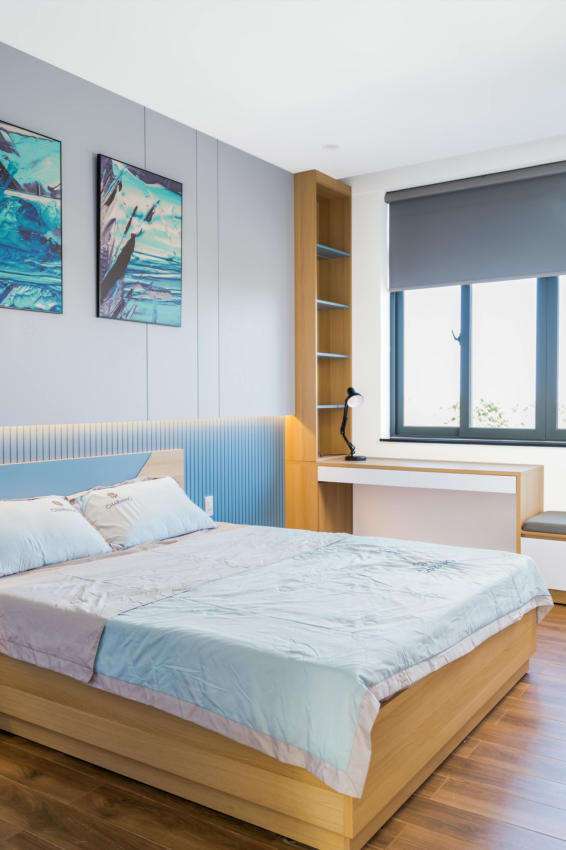
- Bedroom: Opt for tranquil and serene images – soft landscapes, calming abstract patterns, or peaceful black and white portraits. The goal is relaxation and comfort. Muted colors and soft lighting work best. Consider a single, impactful piece above the bed.
- Home Office: Choose photos that inspire focus, creativity, or motivation. Think architectural details, aspirational travel photos, or a series showcasing personal achievements. Keep the palette cohesive to avoid distraction.
- Kitchen: Warm, inviting photos work well – maybe close-ups of fresh produce, bustling market scenes, or cheerful family cooking moments. Consider durability with sealed frames for moisture and splashes, or printing on metal/acrylic.
- Hallways: Long, narrow spaces are ideal for a linear series of smaller, thematic photos that tell a story as you walk past. This creates a visual journey.
A Final Thought...
Your home should be a reflection of your journey. Every scuff on the floor, every ring on the coffee table, and every image on the wall tells a piece of your story. Decorating with your own photography isn't about impressing anyone. It's about reminding yourself of who you are, where you've been, and the people you've loved along the way. It’s turning your house into a home, one memory at a time. So what are you waiting for? Grab your phone, scroll through your camera roll, and start unearthing the soul of your home. Your walls are ready to tell your story. Maybe even share your creations with us using #MyZenMuseumWalls! You can always see the stories I've tried to tell, and my own artistic journey, on the /timeline. Your story is next.