Woodcut Prints: The Ultimate Guide to History, Process, Collecting & Modern Relevance
Unravel the world of woodcut prints: from ancient origins and carving techniques to Ukiyo-e, Dürer, and Expressionism. Learn the process, how to collect, and its enduring impact in contemporary art.
Woodcut Prints: The Ultimate Guide to History, Process & Collecting
I remember the first time I properly looked at a woodcut print. Not just glanced, but really looked. It was an old German piece, full of stark, black lines, and my first thought was, "How on earth did they do that?" It looked so raw, so direct, so utterly unapologetic in its presence. It wasn't the smooth, polished feel of a painting; it had a texture and a soul that felt like it was pulled directly from the grain of the wood itself. Because, well, it was. And in that raw directness, there's a kind of magic that truly challenges how you see an image, inviting you to look deeper than just the surface. It's a testament to the artist's hand, a tangible connection to the material that resonates in a way few other mediums can.
That initial encounter sparked a deep curiosity, and it's that very curiosity that I hope to share with you today. This guide aims not just to unravel the secrets of the woodcut print, but to demystify the process, explore its rich, global history, and offer practical advice for both aspiring artists and discerning collectors. We'll delve into the intricate process of creating these powerful images, explore their rich global journey from ancient China to modern studios, and equip you with the knowledge to either start your own printmaking journey or build a discerning collection. So, what exactly is a woodcut print, and why does this ancient technique still captivate artists and enthusiasts today? At its simplest, it's a relief printing technique. Imagine a fancy, artistic stamp – you remove everything you don't want to be seen, leaving the image raised. The parts you carve away stay white (or the color of the paper), and the raised parts leave an inky impression. It's fundamentally different from, say, an intaglio print where the ink sits below the surface in etched lines, or a planographic print (like lithography) where the image is on the surface but treated chemically to accept ink only in specific areas. Here, the image literally stands proud, in relief. Think of it like a mountain range: the peaks hold the ink, the valleys don't. It's an honest conversation between the artist and the wood itself, and that's where its power lies. This visible evidence of the human touch, the deliberate actions, and the conversation with the material, makes a woodcut feel so alive.
The Woodcut Process: From Idea to Impression
So, how exactly does one transform a block of wood into a compelling image? Let's break it down. If you were to walk into my studio (or any printmaker's, for that matter) and ask me to make a woodcut, here’s what you’d see. It’s a process that hasn't changed all that much in hundreds of years, but the magic is truly in the details and the commitment each step demands.
1. The Design: Thinking in Reverse
It all starts with an idea, naturally. Usually, I'll sketch the design onto the woodblock itself, often with a simple pencil or ink. The key thing to remember? Everything will be printed in reverse. It’s a bit of a mind-bender at first, especially when incorporating text or numbers! If you're going to include words, you literally have to carve them backwards. I’ve definitely had a few prints come out looking like a mirror image of what I intended, much to my own wry amusement (and mild frustration!). It's a permanent commitment, so double-checking your reverse image is key. Trust me on this, I once carved an entire block only to realize my signature was backward, a rookie mistake I still chuckle (and cringe) about.
2. The Wood Itself: Your Creative Partner
The choice of wood is a huge part of this conversation, influencing the entire aesthetic. It's one of the first questions people ask me: What kind of wood is used for woodcuts? Historically, printmakers reached for fine-grained hardwoods like pear, cherry, or apple. These dense woods, with their tight, often subtle grain, allow for incredibly fine detail and clean lines – crucial for intricate imagery, much like the delicate work seen in Japanese Ukiyo-e prints. Their consistent structure makes them predictable under the carving tool.
But then there are softer woods, like pine or plywood, where the dramatic, swirling grain can be deliberately incorporated. This yields a raw, almost expressive texture that can't be replicated with other mediums. Think of a bold, graphic print where the wood's inherent character adds another layer to the narrative. The way the wood's plank grain (cut along the length of the tree) can resist or yield to the tool fundamentally shapes the mark. I find it’s a deliberate dance with the material; even a knot or imperfection can become a focal point if you let it, truly making the wood a partner in the artistic process. The feel of the wood under the tool, the way it resists or yields, is all part of the unique experience of woodcut printing. I find myself constantly surprised by how a knot or a natural imperfection in the wood can either be a challenge to overcome or an unexpected gift, guiding the direction of the carving and adding a layer of character that planned perfection could never achieve.
Modern artists also use MDF for its uniform, grain-free surface, offering a different kind of predictable control that can be useful for graphic, consistent results, especially for large-scale, consistent patterns. The choice really depends on the desired aesthetic – a coarse, rustic feel or a smooth, precise impression. And for those of us concerned with our planet, seeking out sustainably sourced wood or experimenting with recycled materials to create our blocks is becoming an increasingly important part of the artistic dialogue, a quiet statement embedded in the art itself.
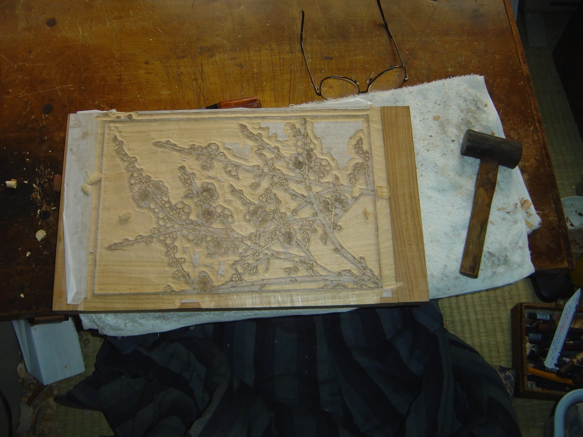
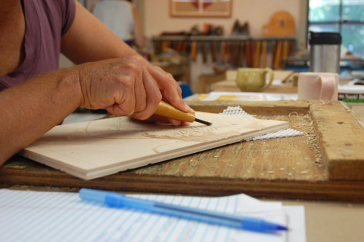
3. The Carving: A Permanent Commitment
This is the heart of the process, and where the "bold, graphic lines" woodcuts are known for truly emerge. Using tools like sharp gouges (V-shaped for fine lines, U-shaped for broader areas and clearing channels), chisels for clearing large, flat areas, and knives for intricate details and defining outlines, I begin to carve away the 'negative space'—the areas that will not hold ink and therefore appear as white or the color of the paper in the final print. This is a subtractive process; once you carve a piece away, you can't put it back. No 'undo' button here, folks. It's like sculpting, but instead of adding clay, you're forever taking away, each chip of wood a permanent commitment. I often think of it as drawing by removing material, defining the positive space by meticulously eliminating the negative.
Maintaining sharp tools isn't just about precision; it's about safety, as dull tools slip and can cause injury. Trust me, I've got the scars to prove it! Sharp tools also yield cleaner cuts and more defined lines. The physical effort required, the feeling of the wood yielding (or resisting!) under your hand, really connects you to the medium. I remember one time, struggling with a particularly stubborn knot, my hand cramped, and I almost gave up. But then, as I paused, I saw how that very resistance, that struggle, could become part of the design – a happy accident that emphasized the raw struggle of creation itself, a kind of visible authenticity. That's the magic, where even imperfections tell a story. Common challenges like unexpected splintering or chipping can often be mitigated by changing the angle of your cut or the direction you're carving in relation to the wood grain. It's a continuous learning process.
4. The Inking: A Thin, Even Kiss
Once the carving is done, I'll take a roller (called a brayer) and apply a thin, even layer of ink over the surface of the block. This precise application is vital; too much ink and details can clog, too little and the print will be patchy. The ink only sticks to the raised, uncarved parts. It’s a bit like giving the block a very precise, inky kiss.
Choosing the right ink is another subtle decision that impacts the final print:
- Oil-based inks: Offer rich, permanent results with deep blacks and vibrant colors. They have slower drying times, allowing for more working time, and excellent opacity, which is fantastic for bold, solid color fields.
- Water-based inks: Are generally easier to clean up with soap and water, less toxic, and offer greater transparency, making them ideal for layering colors to create subtle washes or atmospheric effects. They dry much quicker, which can be both a blessing and a curse!
Sometimes I use a spatula to mix and spread ink before rolling, adjusting the viscosity (how thick or thin it is) to ensure it transfers cleanly without filling delicate lines. Too thick, and it clogs; too thin, and it won't pick up evenly. It's a delicate balance, and honestly, a lot of trial and error at first!
5. The Printing: Revealing the Image
Finally, a sheet of paper is laid over the inked block. Pressure is applied, either by hand or through a press. For hand printing, a tool called a baren is used (a traditional Japanese hand-printing tool, often a disc of string wrapped in a bamboo sheath, used with circular rubbing motions). For larger editions or more consistent pressure, various types of presses can be employed:
- Relief presses: Specifically designed for this purpose, applying even pressure across the block.
- Lever presses (or platen presses): Common in letterpress, can also be adapted for woodcuts, providing strong, even pressure.
- Cylinder presses: Suitable for larger blocks, rolling a cylinder over the inked block and paper.
The choice of paper is crucial here too; from delicate Japanese rice papers (like Hosho or Kozo), known for their strength, absorbency, and ability to pick up fine details, to sturdy archival printmaking papers (like Rives BFK), which offer a lovely texture and durability. The paper is then carefully peeled back to reveal the finished print. This moment, when the image emerges, is always a small thrill, even after hundreds of prints.
It sounds simple, but the magic is in the details, and honestly, sometimes the frustrations! Uneven inking, paper tearing, or misregistration in multi-color prints are common challenges, reinforcing the commitment needed at each stage. The choice of wood, the sharpness of the tools, the consistency of the ink, the texture of the paper—they all play a part in the final artwork, making each impression truly unique, an undeniable "artist's touch" present in every pull.
Getting Started with Woodcut Printing: Your First Steps into Relief Art
Feeling inspired to pick up a gouge? That's the spirit! Woodcut printing, while requiring patience, is surprisingly accessible. Here’s a basic toolkit and some advice for beginners, because trust me, you don't need a huge studio to get started.

Essential Beginner's Toolkit:
- Carving Tools: Start with a basic set of linocut or woodcut tools. Look for a handle that fits comfortably in your hand, with a few interchangeable V and U-shaped gouges. For your very first attempts, I highly recommend a linocut set. Linoleum is much softer and easier to carve than wood, offering less resistance and being less prone to splintering, allowing you to get a feel for the tools and techniques before tackling wood. When you do move to wood, try a soft plywood or shina plywood first. Safety cutters (like a Flexcut system) are also great for beginners, as are cut-resistant gloves – seriously, protect those digits!
- Block Material: As mentioned, soft linoleum blocks or soft-cut rubber blocks are ideal for starting. Traditional battleship gray linoleum offers good resistance and takes fine detail. Rubber blocks are even softer, very forgiving, and allow for smooth, continuous cuts because they lack the variable grain of wood, offering consistent resistance. This means fewer unexpected splinters and more predictable results. For wood, begin with a soft plywood like shina, which has a tight, even grain and is relatively easy to carve.
- Ink: A small tube of water-based relief printing ink is perfect for starting. It cleans up easily with soap and water and is generally less toxic.
- Brayer: A rubber brayer (roller) about 4-6 inches wide is ideal for applying an even layer of ink. Make sure it's firm but slightly pliable.
- Paper: Simple drawing paper or even copier paper can work for practice. Once you’re ready for better impressions, look for thin, smooth papers like Japanese rice paper (Hosho or Kozo), known for their strength and absorbency, or a heavier archival printmaking paper like Rives BFK, which offers a lovely texture and durability.
- Baren/Pressure Tool: A simple wooden spoon, a smooth, round rock, or a traditional Japanese baren can be used to apply pressure by hand. If you're using a printing press, that's another story entirely, but for hand printing, a baren is fantastic. I've even used the back of a soup ladle in a pinch!
- Bench Hook: This simple device keeps your block from slipping while you carve, significantly increasing safety. It’s a game-changer for stability.
Choosing Your First Subject:
Start simple! Think bold, graphic shapes and clear lines. Avoid intricate details or too much text initially. A simple leaf, a bold silhouette, or a stylized initial are great starting points. Remember, you're thinking in terms of what you're removing to create your image. I always suggest sketching out your design and then filling in the areas you don't want to print with a marker, just to visually reinforce the subtractive process. It helps trick your brain into thinking in negative space.
Woodcut vs. The World: Distinguishing Printmaking Techniques
It's easy to get lost in the wonderful world of printmaking, and many techniques share similarities. But understanding the nuances is key to appreciating each art form. Here's a quick cheat sheet to tell woodcuts apart from some of its closest relatives. If you want to dive deeper into other methods, check out my definitive guide to printmaking techniques.
Technique | Material | The Process | Typical Line Quality | The Look (Visual Cues) | Key Differentiator |
|---|---|---|---|---|---|
| Woodcut | Wood block (plank grain) | Carve away 'whites', ink raised surface. | Bold, strong, often irregular, sometimes jagged where grain resists, can have a slight halo effect from the ink sitting on the surface. | Visible wood grain texture, raw, direct, expressive. Often stark black/white contrasts or bold color fields. | Carved away material from plank grain with gouges and knives. Ink applied to raised surface (relief). |
| Wood Engraving | Wood block (end grain, hard) | Engrave lines into hard end grain with burins. | Extremely fine, delicate, precise; capable of intricate cross-hatching, almost microscopic detail, building tone through many thin lines. | Almost photographic, no visible grain, crisp detail, velvety blacks, wide tonal range. Often compared to finely detailed pen-and-ink drawings, e.g., Thomas Bewick's natural history illustrations. | Engraved into end grain with a burin. Ink applied to raised surface (relief). |
| Linocut | Linoleum block | Same relief process as woodcut, but linoleum is softer, grainless, and easier to cut. | Smooth, flowing, uniform, capable of cleaner, unbroken curves than woodcuts. | No wood grain texture, clean, bold shapes. Often feels softer or more fluid than a woodcut, e.g., the strong forms of Picasso's linocuts. | Softer, grainless material. Ink applied to raised surface (relief). |
| Etching | Metal plate (usually copper) | Scratch through wax ground, acid 'bites' lines into metal. | Fine, delicate, slightly fuzzy edge, can vary in depth and darkness, often exhibits subtle tonal variations due to how ink is wiped. | Intaglio (ink in grooves), rich, velvety blacks, atmospheric, often with subtle, painterly tones. Look for plate marks (indentations) around the image and a slightly raised line of ink. Rembrandt's etchings are prime examples. | Ink sits in recessed lines (intaglio). |
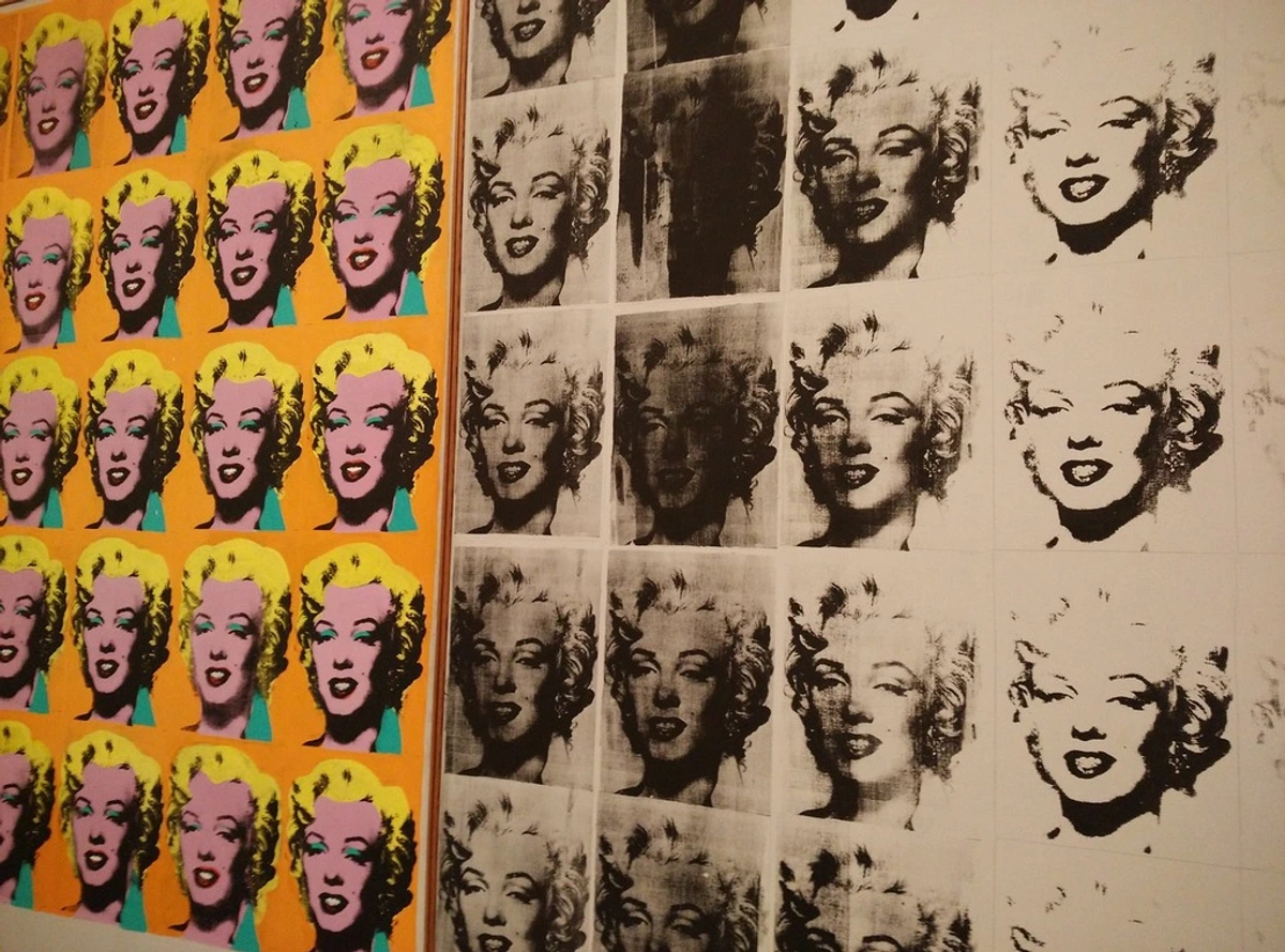
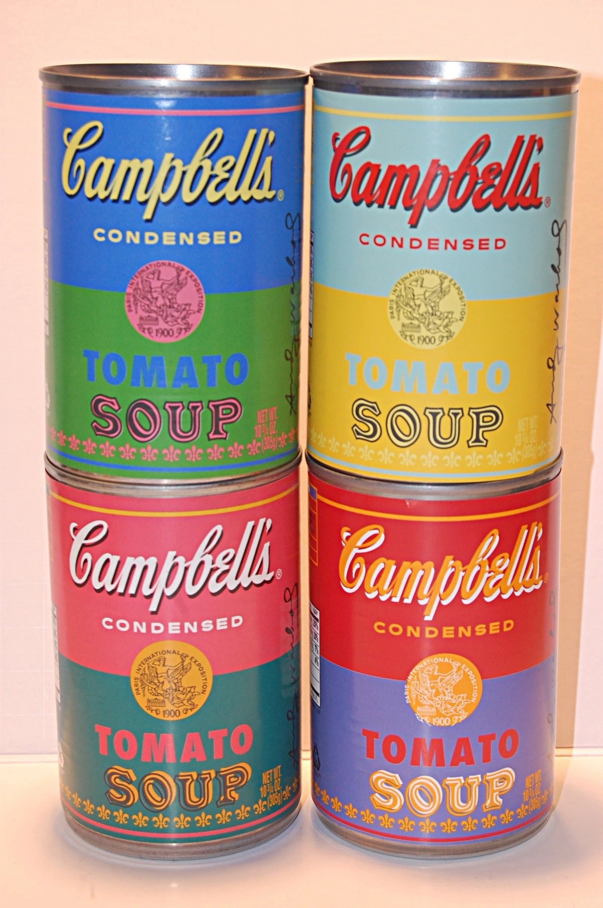
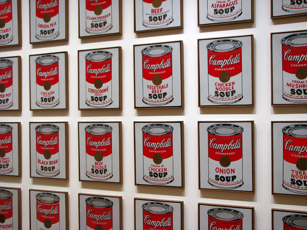
| Screen Printing | Screen (mesh), stencil | Ink pushed through stencil on mesh screen. | Flat, even color fields, crisp edges, can be very graphic and reproducible. | Flat, vibrant colors, often used for bold designs, text, or commercial prints. No discernible relief. Andy Warhol's iconic Pop Art prints. | Stencil-based. Ink pushed through a screen. |
| Lithography | Limestone or metal plate | Drawing on surface with greasy crayon, treated to repel water but hold ink. | Fluid, painterly, can mimic crayon, wash, or pen drawings with great spontaneity. | Wide tonal range, subtle gradations, often looks very much like a drawing on paper. No discernible relief or plate mark. Toulouse-Lautrec's vibrant posters. | Planographic. Based on oil/water repulsion. |
At the end of the day, woodcut is a cornerstone of printmaking, a foundational technique that has influenced countless artists. My personal journey as an artist, which you can see on my /timeline, has been deeply influenced by these foundational techniques. Seeing them in person at a place like the /den-bosch-museum really brings their power home. Understanding these differences isn't just academic; it deeply enriches your appreciation for the decisions an artist makes and the unique qualities of each finished piece.
A Global History of Woodcuts: From East to West
Before we dive deep, it’s worth remembering that the very idea of pressing an inked surface onto another to create a repeatable image is ancient. We're talking thousands of years, with early forms of relief printing found in Mesopotamia and Egypt for stamping seals and patterns. Early evidence also suggests similar stamping techniques in ancient India and other cultures, proving its universal appeal. This wasn't 'art' as we might think of it today, but the foundational principle was there. It's truly a global art form with a long, fascinating story.
Origins in the East: The Flowering of Woodblock Printing
The earliest woodcut prints we know of in a more artistic and communicative context come from China, around the 9th century, where they were used to print texts and illustrations on scrolls. The Diamond Sutra (868 AD), a Buddhist scripture found in a cave in Dunhuang, is considered the earliest dated printed book and a testament to the remarkable sophistication of early Chinese woodblock printing. Beyond early Buddhist scriptures, Chinese woodcuts facilitated the widespread dissemination of almanacs, medical texts, scientific diagrams, and playing cards, proving their utility far beyond pure art.
But it was in Japan, during the Edo period (1603-1868), that woodblock printing truly blossomed into the art form known as Ukiyo-e, or "pictures of the floating world." Artists like Katsushika Hokusai and Hiroshige created stunning, multi-colored prints of landscapes, famous actors, and city life. The Great Wave off Kanagawa? That's probably the most famous woodcut print in the world, and it's a testament to the collaborative brilliance of Japanese printmaking. This wasn't a solo act; it was a symphony between the artist who designed the image, the skilled carver who meticulously cut the block (often one for each color), the printer who applied the pigments with precision, and the publisher who financed and distributed the work. This complex division of labor allowed for an incredible level of detail and a vast output. You can learn more about this in my article on the legacy of Ukiyo-e.
Arrival and Revolution in Europe: Elevating the Craft
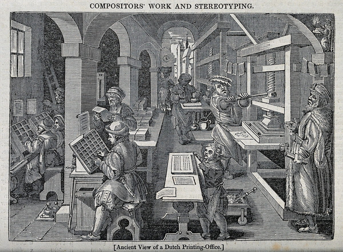
Woodcuts made their way to Europe around 1400, initially used for printing block books (books with text and illustrations carved from the same block) and then for playing cards and simple religious images. Imagine the sheer impact of being able to reproduce images relatively quickly in an era before widespread literacy! Early printers, like those in the 15th-century Dutch office shown below, understood the power of repeatable imagery. The role of the printer and publisher, separate from the artist, became crucial in Europe for the dissemination of these works.
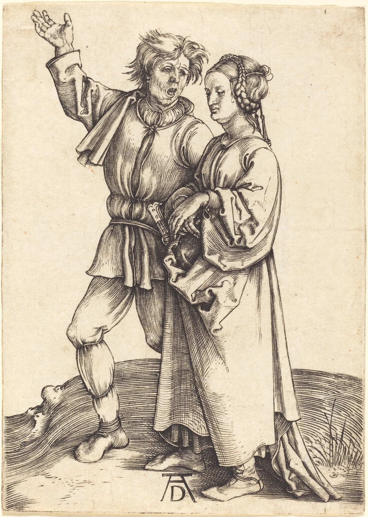
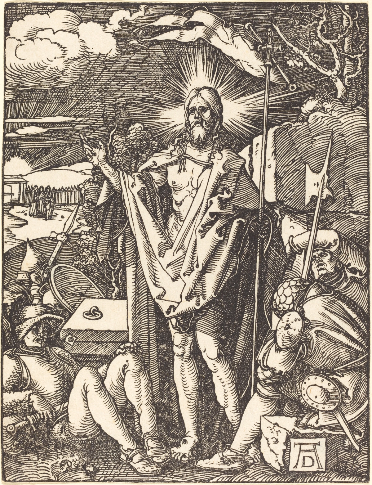
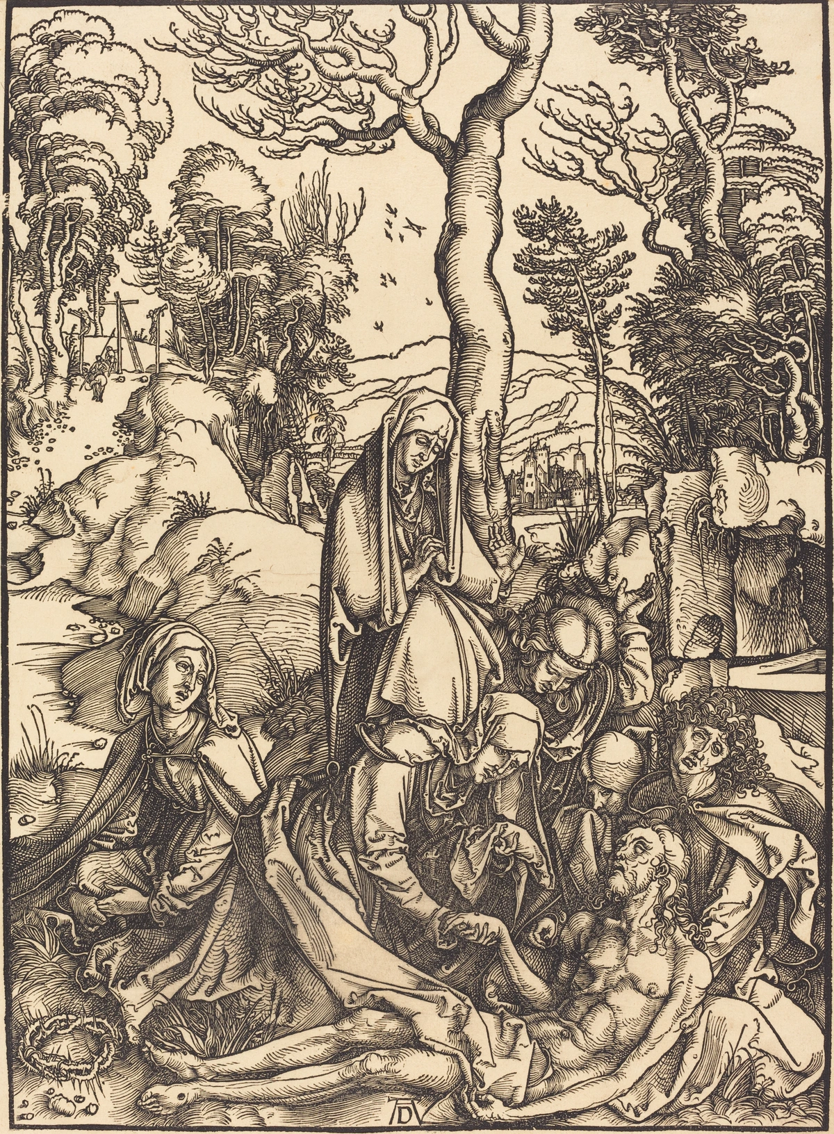
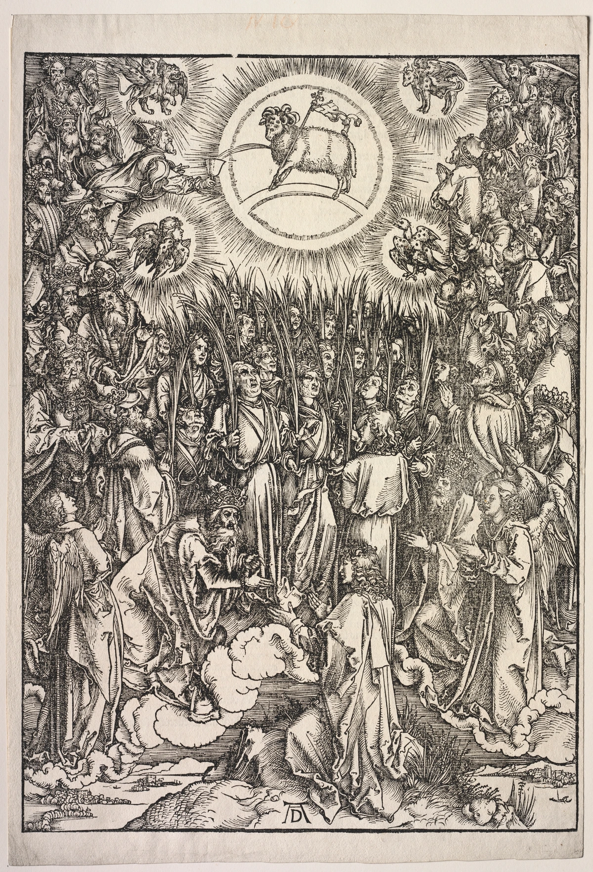
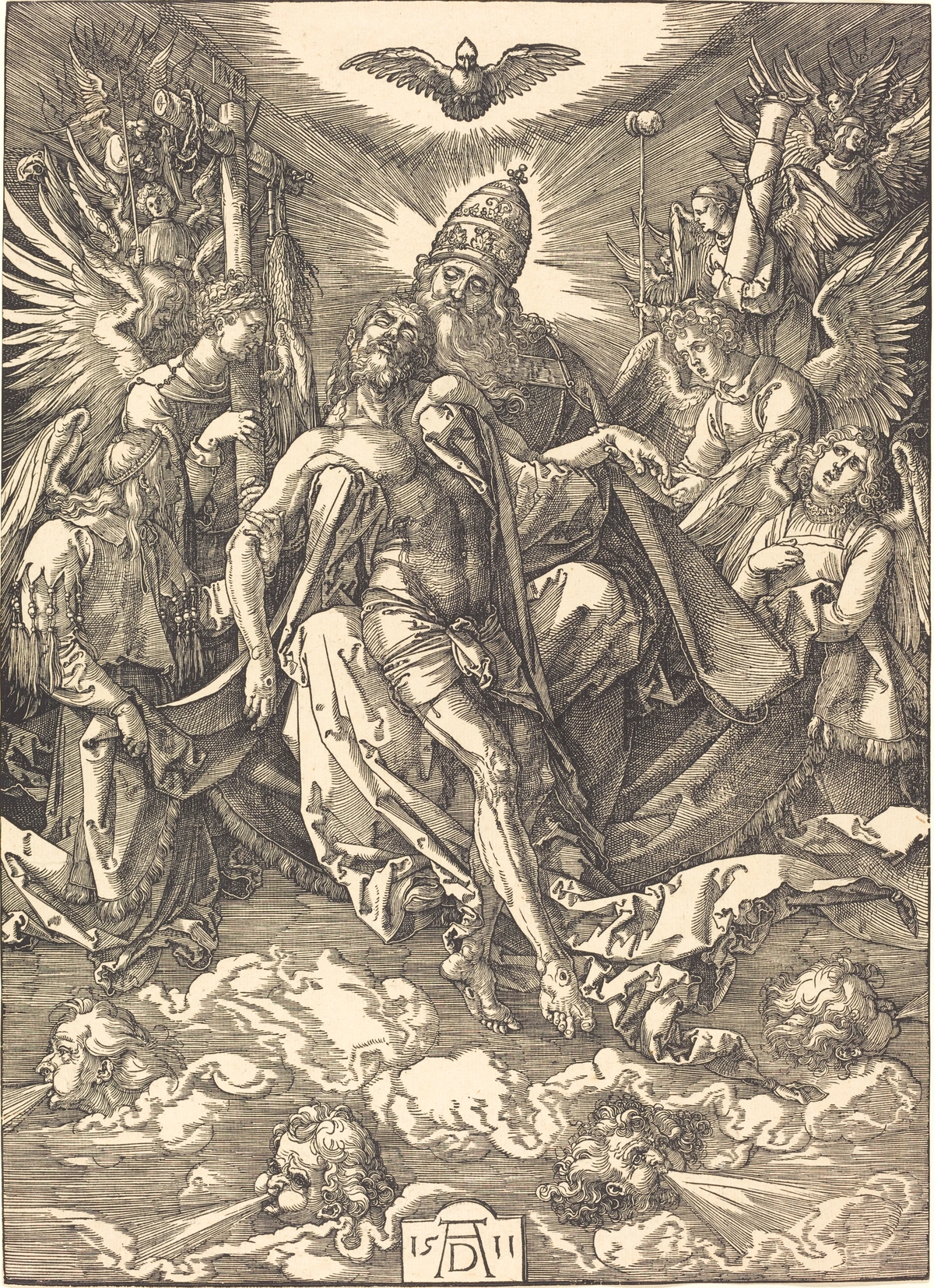
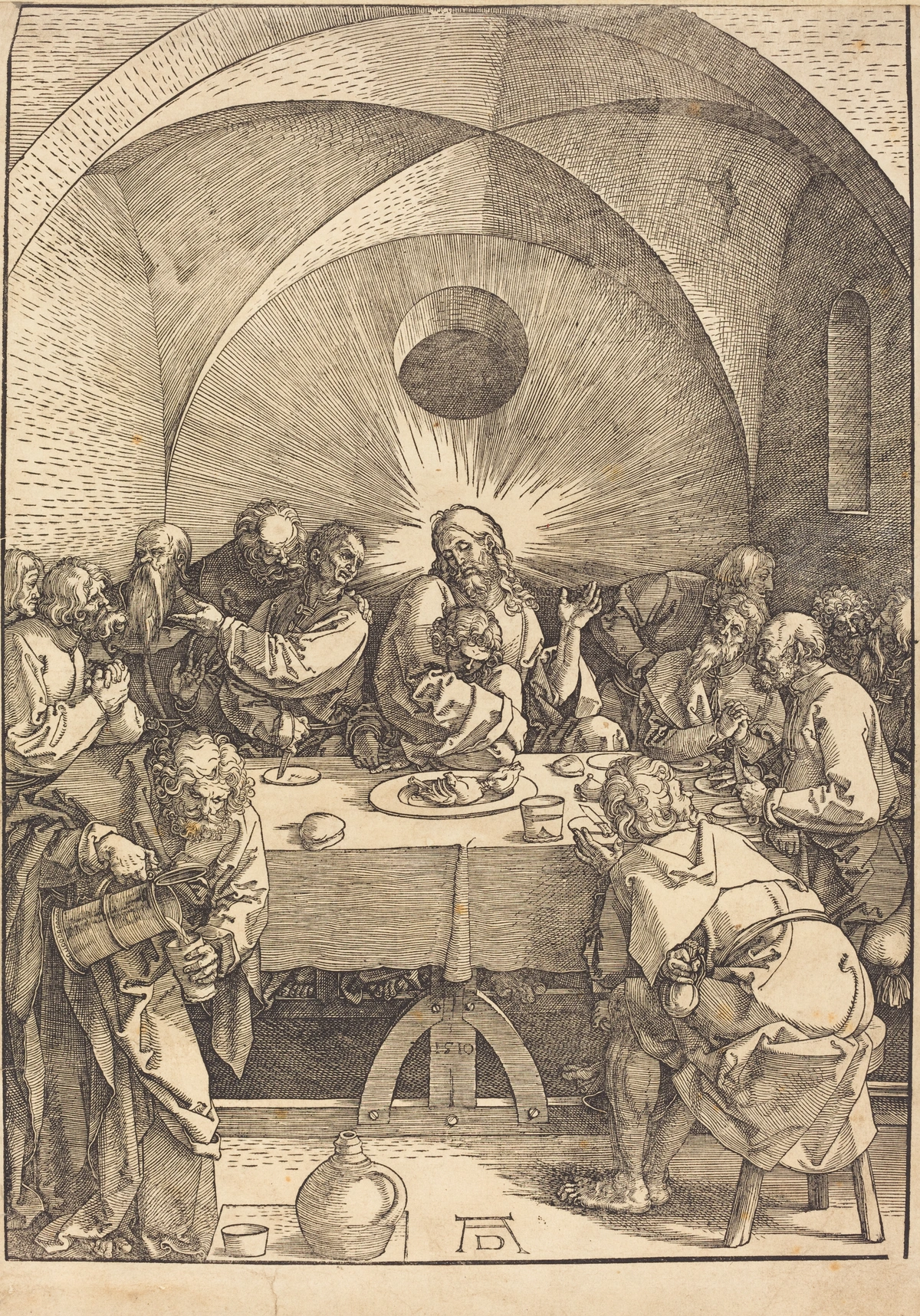
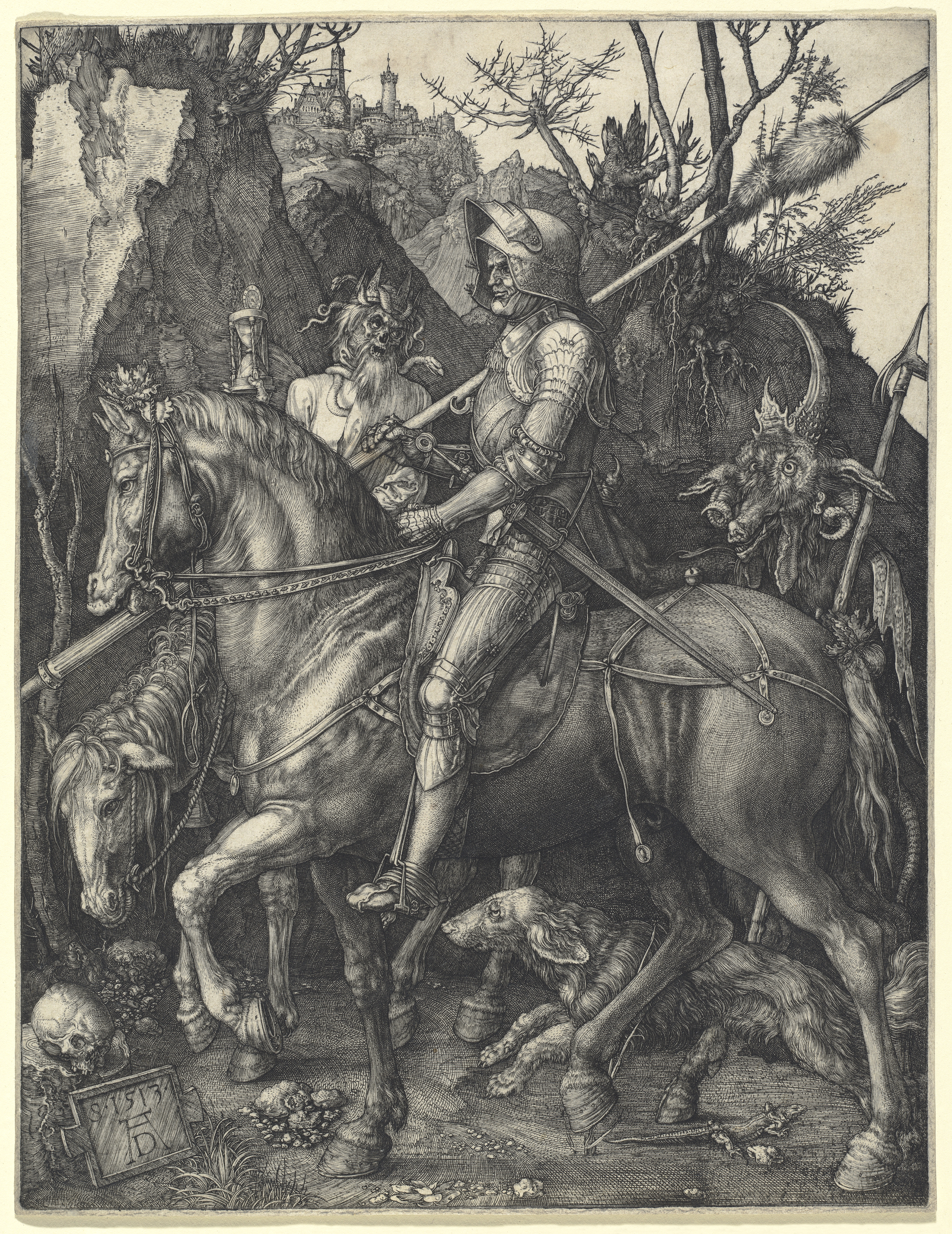
But it was Albrecht Dürer, a master of the Northern Renaissance, who truly elevated the woodcut to a major art form. His intricate and dynamic compositions, like the Four Horsemen of the Apocalypse from his Apocalypse series (1498) and his meticulous Adam and Eve (1504), alongside works by contemporaries like Hans Holbein the Younger, showed what was possible with just black line and white space, bringing an incredible level of detail and emotional depth to the medium. Dürer's ability to achieve such fine detail with such a seemingly blunt medium still utterly captivates me, challenging my own perceptions of what is possible. He essentially took a popular, functional medium and infused it with the power and prestige of painting. Check out my thoughts on the elements of art, especially line, to see how crucial this is.

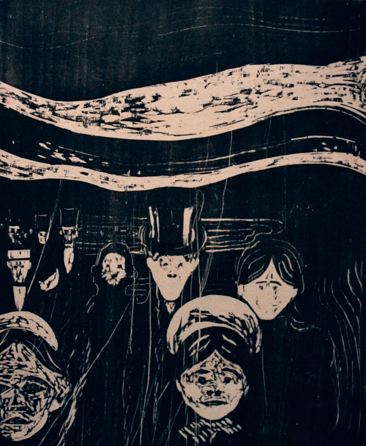
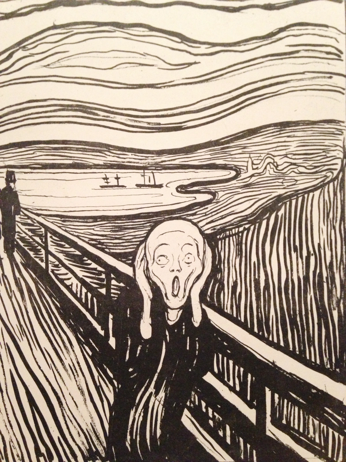
Later, in the late 19th and early 20th centuries, artists like the German Expressionists, including Edvard Munch, Ernst Ludwig Kirchner, and Erich Heckel, rediscovered the raw, emotional power of the woodcut. They weren't interested in Dürer's fine detail. Instead, they embraced the coarse, jagged, and emotionally charged marks they could make, using the inherent resistance and visible grain of the wood to add to the psychological intensity of their work and often to make powerful social commentary or even propaganda. Think of Munch's Angst (1896) – it's a feeling etched directly into the wood. The aggressive cuts and stark contrasts perfectly conveyed the anxieties of the modern world. I find Munch's work particularly potent; it speaks directly to universal human feelings, stripped bare through the visceral nature of the woodcut. This resurgence, influenced in part by the influx of Japanese ukiyo-e prints into Europe, showed a profound shift from the delicate lines of wood engraving back to the expressive power of the woodcut.
The Enduring Spirit of the Woodcut: Authentic Art in a Digital Age
In our increasingly digital world, I find the enduring appeal of the woodcut fascinating. Why are woodcuts still relevant today? There's a tangible honesty to it, a direct connection to the artist's hand and the organic material. Contemporary artists are pushing its boundaries, creating large-scale installations, experimenting with textures, and even integrating woodcut elements into mixed media and abstract pieces. Some even use digital tools to prepare designs before transferring them to the block, blending modern precision with traditional craft. It speaks to a yearning for authenticity, for something physically made, something that carries the marks of its own creation. While digital tools can emulate the visual appearance of a woodcut, they fundamentally struggle to replicate the inherent tactility, the subtle variations in ink density, the physical resistance of the wood, or the unique, often imperfect, marks of the hand. The bold, graphic power that captivated Dürer and Munch continues to inspire, offering a powerful counterpoint to the slick perfection and infinite reproducibility of digital art.
The raw, often expressive lines that emerge from the wood can communicate a feeling or an idea with an immediacy that other mediums sometimes struggle to achieve. It feels grounded, authentic, and deeply human, a true investment of time and physical effort that digital art often bypasses. This raw, tactile quality is something I often find myself drawn to even in my own work; there's a certain energy in a bold line or a textured surface that resonates deeply, whether it's carved from wood or painted on canvas. It's a testament to the enduring power of elemental mark-making. Contemporary artists like Tom Huck are known for their satirical, often grotesque, large-scale woodcuts, while others like Swoon integrate woodcut into street art and installations, showcasing the medium's versatility.
What's more, there's a certain environmental consciousness emerging. Artists are increasingly seeking out sustainably sourced wood, experimenting with reclaimed timber, or using recycled materials to create their blocks, adding another layer of meaning to their creations – a quiet protest or a hopeful statement embedded in the art itself.
Collecting & Caring for Woodcuts: A Comprehensive Guide
Ensuring the longevity of your woodcut prints is as much an art as their creation. For collectors and enthusiasts, understanding the conservation of woodcuts is crucial. These prints, often on paper, require protection from light, humidity, and acidic environments to ensure their longevity. I remember a particularly heartbreaking instance where a cherished print was ruined by light damage, a stark reminder of why proper care is paramount. Here are some best practices, along with what to look for when you're considering adding a woodcut to your collection:
What to Look For in a Woodcut: A Collector's Eye
When you're admiring a woodcut, whether in a gallery or considering a purchase, a trained eye can spot the hallmarks of quality and authenticity. It’s not just about the image, but about the execution of the technique itself, and the unique footprint of the artist's hand:
- Quality of Line and Cut: Look for crisp, clean lines appropriate to the style. Are the edges sharp where intended? Are the carved-away areas free from stray marks or splinters? This indicates skillful carving and sharp tools. A truly masterful woodcut will show a confidence in the cut, even in its imperfections. For older prints, examine the edges of the carved lines under magnification; a woodcut will typically show slightly less uniform edges compared to a wood engraving due to the plank grain.
- Evenness of Ink Application: A good print will have consistent ink coverage across the raised areas. Avoid prints with patchy, uneven ink or areas where ink has spread into the carved-away (white) spaces – this is often called 'clogging' or 'dirty printing'. Slight, deliberate variations in ink can be part of the artist's touch, but excessive patchiness is a flaw.
- Clarity and Sharpness of Impression: The image should be clearly transferred to the paper without blurring or smudging. This speaks to the artist's control during the printing phase and the quality of pressure applied. With hand-pulled prints, there can be charming, subtle variations in intensity, which is part of their character.
- Registration (for Multi-Color Prints): If it's a multi-color woodcut, check that all colors are perfectly aligned. Misregistration (colors overlapping incorrectly or leaving gaps) can detract significantly from the artwork. Precision here is a mark of a skilled printer, especially in complex Ukiyo-e prints.
- Paper Quality and Condition: Is the paper acid-free and in good condition? Look for any signs of foxing (small brown spots, often from mold or iron impurities in the paper), other types of mold, tears, creases, or discoloration (yellowing, browning) that might affect its longevity and value. The paper itself tells part of the story; consider whether its texture and weight are appropriate for the print's style – a delicate print might look best on a fine Japanese paper, while a bold, graphic image might hold up better on a sturdier archival stock.
- Editioning and Signature: Look for the artist's signature, typically in pencil below the image, along with the edition number (e.g., 1/50, indicating the first print of an edition of 50). "A.P." or "E.A." signifies an Artist's Proof or Épreuve d'Artiste, a print outside the main edition, usually retained by the artist. Be wary of unsigned prints unless provenance is absolutely solid. For valuable pieces, consider asking about provenance (the history of ownership), which can confirm authenticity and deter counterfeits. For older historical prints, a chop mark (a small, often red, impression from the artist's or publisher's seal) can indicate authenticity.
Preserving Your Woodcuts: Longevity for Your Collection
- Archival Materials: Always use acid-free mats and backing boards. This prevents discoloration and deterioration of the paper over time, ensuring your print doesn't yellow or become brittle. These materials are chemically stable and won't leach harmful acids into your artwork.
- UV Protection: Frame your woodcuts with UV-protective glass or acrylic. Direct sunlight is the enemy of paper, causing fading of inks and brittleness of the paper fibers. Displaying in indirect light is always preferable. Even ambient room light over decades can cause irreversible damage.
- Proper Mounting: "Hinging" a print (attaching it to the backing board with small, reversible archival tape hinges at the top) is preferred over full adhesion, which can damage the print if it ever needs to be removed or conserved in the future. It allows the paper to expand and contract naturally.
- Stable Environment: Store and display prints in a stable environment, avoiding extreme fluctuations in temperature and humidity, which can cause paper to warp, buckle, or even encourage mold growth (like the aforementioned foxing) and attract pests. Ideal conditions are generally around 68-72°F (20-22°C) and 45-55% relative humidity. Keep them away from exterior walls, bathrooms, or heating/cooling vents. For unframed prints, archival portfolios or flat storage boxes are ideal, providing a stable, acid-free environment.
- Marketplaces and Authenticity: When purchasing, especially online, research the gallery or seller's reputation. Reputable dealers will provide certificates of authenticity and detailed provenance. For very valuable historical pieces, consult with an art appraiser or expert in Japanese or European prints. Be aware that many digital reproductions are sold as 'prints'; always confirm it's an original relief print (woodcut or linocut) as described.
Proper care ensures that the unique character of your woodcut can be appreciated for generations to come, protecting both its aesthetic and its value.
FAQ: Your Woodcut Questions Answered
I get asked a lot of questions about this technique. Here are some of the most common ones, and a few thoughts from my own experience.
Is Woodcut Printing Difficult for Beginners?
It definitely has a learning curve, for sure! The hardest part is learning to think in reverse and accepting that you can't undo a cut. But it's also surprisingly accessible. You don't need a massive printing press to start; you can make beautiful prints right on your kitchen table with just a baren (or even a wooden spoon) for pressure. If you're curious to try, start with softer woods or simpler linocut (it’s much softer and easier to cut!). For your very first projects, I always suggest simple, bold graphic shapes – a stylized leaf, a clean silhouette, or a personal initial are perfect. Beyond the carving, developing an eye for composition, understanding ink consistency, and mastering consistent pressure all come with practice. And always remember: sharp tools are safe tools. Blunt tools slip, and I've got the scars to prove it!
What's the Difference Between a Woodcut and a Wood Engraving?
The key difference, and this is crucial, is the part of the wood used and the tools. Think of a tree trunk: a woodcut is carved on the plank side of the wood, along the visible grain. Imagine slicing a loaf of bread lengthwise and carving on the flat surface. This usually results in bolder, more expressive lines because you're carving with or against the natural fibers, which can be resistant, sometimes causing a slightly jagged or textural line. Wood engravings, on the other hand, are done on the end grain of a very hard, often boxwood, block. Imagine slicing that same loaf of bread crosswise, then carving on the circular end face. This much denser, more uniform surface allows for incredibly fine detail and thin lines, almost like drawing with a fine-tipped pen versus a marker. The primary tool for wood engraving is a burin, a specialized chisel that is pushed through the wood, allowing for meticulous control and the creation of delicate, often cross-hatched lines that build tone. They simply feel very different to create and look different in the final print – wood engravings often have a velvety, highly detailed quality with a wider range of tones.

Can You Make Color Woodcuts?
Absolutely! The Japanese Ukiyo-e masters were geniuses at this, often using multiple blocks, one for each color, precisely registered to create complex multi-color images. This is incredibly laborious but allows for stunning depth. The most common method today for multi-color prints from a single block is the reduction method. Here’s a simplified breakdown:
- First Carving & Lightest Color: You carve away only the areas that will remain the color of your paper (white). Then, you ink the entire block with your lightest color (say, yellow) and print all your sheets.
- Second Carving & Next Color: You carve more from the same block, removing the areas you want to remain yellow. You then ink the remaining raised areas with your next color (say, red) and print over your already yellow-printed papers.
- Repeat & Final Color: You continue this process, reducing the block further for each subsequent, darker color. The last color printed will use the smallest remaining raised areas of the block.
It's a high-stakes game because you can't go back and re-print an earlier color once you've carved more away – you are effectively destroying the block with each subsequent carving, making the process irreversible and rendering early prints in an edition potentially more valuable. One wrong cut on any layer can compromise the entire edition, which certainly keeps you on your toes.

What is Print Editioning?
Once an artist pulls a series of prints, they often create an 'edition.' This means they decide on a limited number of identical prints (e.g., 1/50, 2/50, etc.), sign and number each one, and then typically 'cancel' the block to ensure its rarity and value. To cancel the block usually means rendering it unusable for further identical prints, often by cutting a large 'X' across the surface, drilling holes, or even cutting the block into pieces. This is a crucial aspect of traditional printmaking that collectors and enthusiasts are often interested in, defining an original print's authenticity and scarcity. This defines a limited edition print, distinct from an open edition where an unlimited number of prints can be made. You might also encounter 'artist's proofs' (AP) or épreuve d'artiste (E.A.), which are prints outside the main edition, typically retained by the artist for their own records or sales.
What Factors Influence the Cost of Woodcut Prints?
Ah, the perennial question! The price of a woodcut print can vary wildly, from a few dollars for a student's work to millions for a historical masterpiece. Several key factors come into play:
- Artist's Reputation and Rarity: Works by renowned artists like Dürer or Munch will naturally command higher prices. If the artist is highly sought after or has a limited body of work, prices increase. Emerging artists often offer more accessible entry points.
- Edition Size: This is a big one. The smaller the edition number (e.g., an edition of 10 vs. 100), the rarer each print, and generally, the higher the value. Prints from a cancelled block are also seen as truly finite.
- Age and Provenance: Older prints, especially those with a documented history of ownership (provenance), tend to be more valuable. Knowing its journey through time adds to its story and authenticity.
- Condition: Like any artwork, condition is paramount. Prints free of tears, creases, fading, foxing, or repairs will be more desirable and valuable. A pristine print will always fetch more than a damaged one, even if it's by the same artist.
- Image Quality and Subject Matter: Some images or subjects are simply more iconic or aesthetically appealing, driving up demand and price. A particularly strong or historically significant image will naturally be more sought after.
- Printing Quality: A well-executed print with crisp lines, even inking, and accurate registration (for multi-color prints) will always be more valuable than a poorly printed one.
So, it's a blend of objective criteria and subjective appeal, just like most art! Always buy what you love, but keeping these factors in mind can guide you.
Conclusion: The Unfolding Story of Wood and Ink
Woodcut is more than a technique; it’s a living tradition that connects us back through centuries of art history, through diverse cultures, and through the very grain of natural materials. It's a process that demands presence, patience, and a deep respect for the material. And in a world that often rushes by, taking a moment to appreciate the intentionality, the visible human effort, and the directness of a woodcut print is, I think, a beautiful act.
Whether you're drawn to the historical weight, the tactile process, or the bold aesthetic, I encourage you to seek out woodcuts, either in person at a museum or gallery, or through further research into contemporary printmakers, to truly appreciate this timeless art form that continues to evolve and surprise. Artists like Jim Dine, Kiki Smith, and even graffiti artists are breathing new life into the medium, demonstrating its incredible versatility and enduring power. What stories might the wood whisper to you?
If you're inspired by the enduring spirit and raw energy of woodcuts, you might find resonance in some of my own contemporary takes on this medium, where I often explore elemental mark-making and tactile qualities. You can explore some prints on my /buy page, or see more about my artistic influences on my /timeline.