Bronze Age to Modern Canvas: The Timeless Echo in Abstract Art
Explore how the raw power and elemental forms of Bronze Age art continue to shape modern abstract painting, from geometry to texture and color. Discover ancient echoes in your favorite contemporary art.
How a 3,500-Year-Old Bronze Age Wall Still Decorates My Living Room
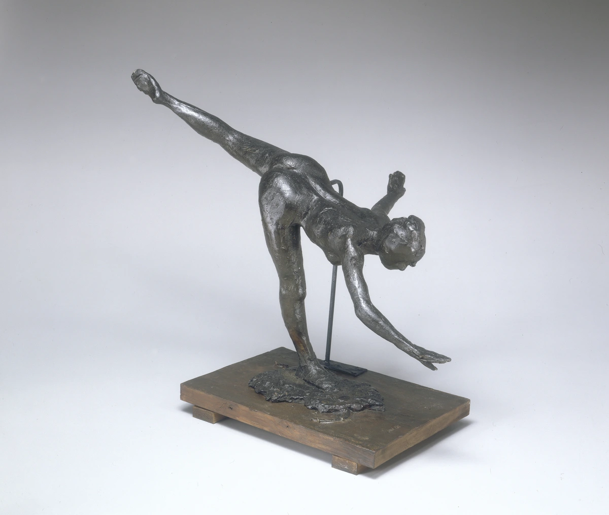
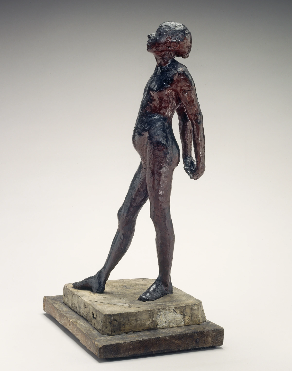
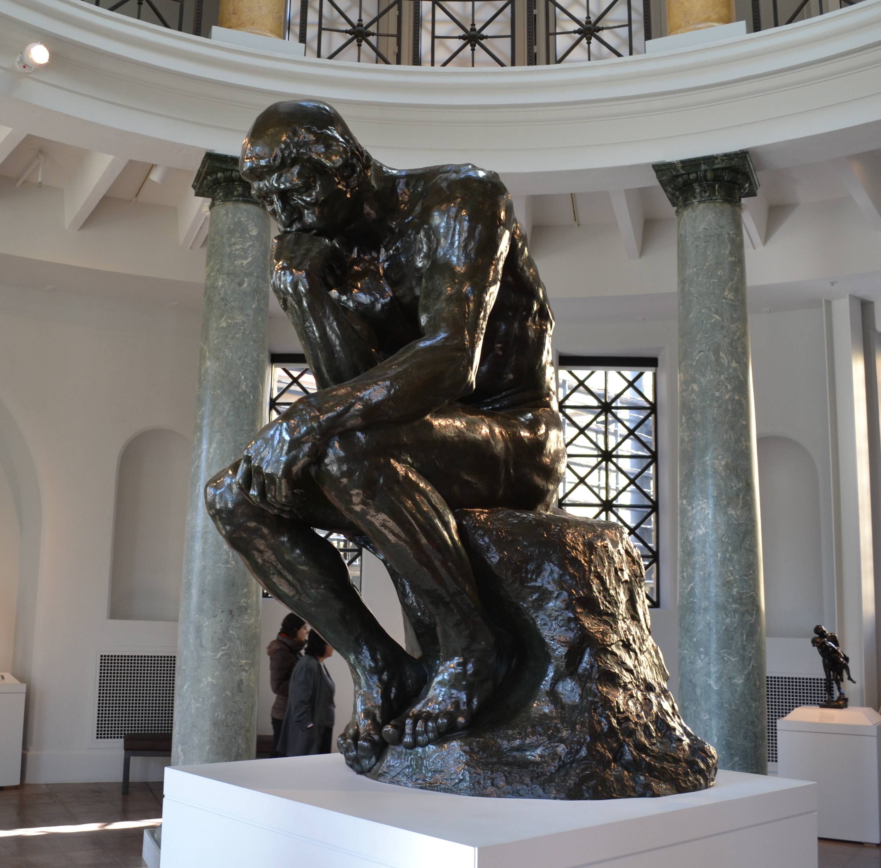
There's a coiled energy in my studio that doesn't come from me. It comes from a fragment of memory, a photograph pinned to my wall of a 3,500-year-old Minoan fresco. I don't look at it for historical accuracy; I look at it for permission. Permission to let a line be a feeling, to let a color be a character, and to let an empty space hold more weight than any filled one. A museum guard once told me I was standing too close to a Cycladic figurine, but I was just trying to see if the artist's hand had trembled, or if they'd been in a hurry to capture a feeling. That’s the thing about art that’s survived millennia—it connects you directly to the impulse of a human mind. That sculptor wasn’t aiming for realism. They were after something else: the essence of a form, the rhythm of a pattern, the symbolic weight of a color.
You might not think your taste in modern abstract art has anything to do with a Bronze Age pot. But we’re about to trace a direct line from a wall painting in a Minoan palace to the canvases hanging in today’s lofts and galleries. The ancient world isn’t just a history lesson; it’s a living source code for what we find beautiful. This isn't about dusty artifacts; it's about understanding why a minimalist canvas with a single red slash can stop you in your tracks—a question that was first answered not in a Soho gallery, but by an artisan working by firelight.
A Cycladic figurine and a Brancusi sculpture. A Minoan spiral and a Jackson Pollock drip painting. The language changes, the context shifts, but the fundamental vocabulary remains. We are not so much inventing as we are remembering, re-arranging, and re-contextualizing the core building blocks of visual meaning that our ancestors first discovered.
A Cycladic figurine and a Brancusi sculpture. A Minoan spiral and a Jackson Pollock drip painting. The language changes, the context shifts, but the fundamental vocabulary remains. We are not so much inventing as we are remembering, re-arranging, and re-contextualizing the core building blocks of visual meaning that our ancestors first discovered by firelight.

Ancient Code in Modern Canvases
The Mathematical Muse: Proportion and Sacred Geometry
Beneath the seeming simplicity of a Bronze Age pot or the frieze on a Mycenaean tomb lies an intuitive grasp of proportion. This wasn't formal Euclidian geometry, but a geometry born of observation—the golden proportions found in a nautilus shell or the spiral of a pinecone. These ratios, which our brains are wired to find pleasing, became embedded in art. It's the mathematical underpinning of beauty, a system of order that creates a sense of rightness, even if the viewer can't articulate why.
Fast forward to the 20th century, and we see this same obsession with mathematical order in Piet Mondrian's search for "universal harmony" through grids and primary colors, or in the modular, system-based art of Sol LeWitt. Digital artists today use algorithms to generate complex, mathematically precise forms, proving that the ancient impulse to find order in numbers is alive and well. The tools change, but the search for that perfect, bone-deep proportion remains. When I'm sizing a canvas or dividing a composition, I often fall back on simple ratios—thirds, fifths, the golden mean—because they are the compositional equivalent of a perfect musical chord.
Let’s get one thing straight: visiting the Bronze Age gallery isn’t an academic exercise. It’s a lesson in artistic fundamentals. Think of it not as a history lesson, but as a hack into the aesthetic mainframe of humanity. The period, roughly 3300–1200 BCE, was a time before art got tangled up in the rules of perspective and photorealism. Artists weren’t trying to copy the world; they were trying to encode it. This is a concept I keep coming back to when I look at my own collection or think about what to put on a fresh canvas. The goal was to communicate complex ideas—power, fertility, the divine, the cyclical nature of life—using the most potent visual shorthand available.

And this idea of encoding life into essential forms never truly left us. Every time a modern artist simplifies a landscape into blocks of color or reduces a feeling to a gestural mark, they are participating in this millennia-old tradition. The tools have changed—acrylics instead of ochre, gessoed canvas instead of plaster—but the underlying impulse remains shockingly consistent.

Intuitive Geometry: Shape as a Physical Force
Forget the ruler. The geometry of Bronze Age art is the kind you feel in your gut—the perfect, imperfect circle, the powerful slash of a diagonal, the massive weight of a square. It’s about shape as a physical force, not an intellectual exercise. Think of the stark, elongated heads of Cycladic statues. They don't represent a real person so much as the idea of a person, an ancestor, a presence. This intuitive geometry resonates powerfully with the work of 20th-century masters like Wassily Kandinsky, who argued that certain shapes contain inherent spiritual and emotional properties. When you see a contemporary artist working with bold, flat geometric shapes, they are tapping into that same ancient understanding.
There’s a language to these forms, a syntax. The square can feel grounded and stable, but also static and heavy. The circle feels whole and infinite, but also enclosing. The triangle is dynamic, pointing, ascending or descending depending on its orientation. These aren’t just aesthetic choices; they’re a vocabulary of feeling. When I’m stuck in the studio, I often return to these primal shapes, asking not what I want to depict, but what I want the viewer to feel in their body. It’s a direct line back to that intuitive, gut-level geometry that defined the Bronze Age.
The Duality of a Line: Object and Action in a Single Mark
In Cretan frescoes, a single line can define a bull’s powerful flank and the flowing motion of an acrobat. It’s both object and action, a frozen moment of immense dynamism. This approach elevates a line from a simple boundary to the central actor in the visual story. Modern abstract artists like Ellsworth Kelly or Sean Scully work with this same deliberate weight, understanding that a line isn’t just a border; it’s an event. It’s a decision. It’s a slash of energy that can divide a canvas or hold it together. The more I paint, the more I realize that mastering the weight, speed, and character of a single line is a lifelong pursuit—one that began on the walls of Knossos.
Think of it like this: a line can whisper or scream. A hesitant, broken line can convey searching, anxiety, or a fleeting moment. A thick, confident, unbroken line feels inevitable, a force of nature. The ancient Chinese art of calligraphy elevated this idea, equating the quality of the brushstroke with the character of the artist. This concept didn’t disappear; it is just as present in the confident gestural marks of a Cy Twombly painting as it was on a Minoan wall, or in the stark architectural lines of a contemporary building.
From Line to Symbol: The Continuous Curve
The Minoans, in particular, were masters of the continuous, rhythmic line. Look at their depictions of bulls and dolphins—the line doesn’t start and stop; it flows, capturing the essence of motion in a single, unified gesture. This is a direct ancestor to the Surrealists’ "automatic drawing," where the hand is allowed to move freely across the page to bypass conscious thought. It's also the DNA of a Joan Miró painting or the fluid, calligraphic sculptures of Jean Arp. The line is no longer just describing a boundary; it is an event, a performance captured in a single breath.
Symmetry: The Architecture of the Sacred
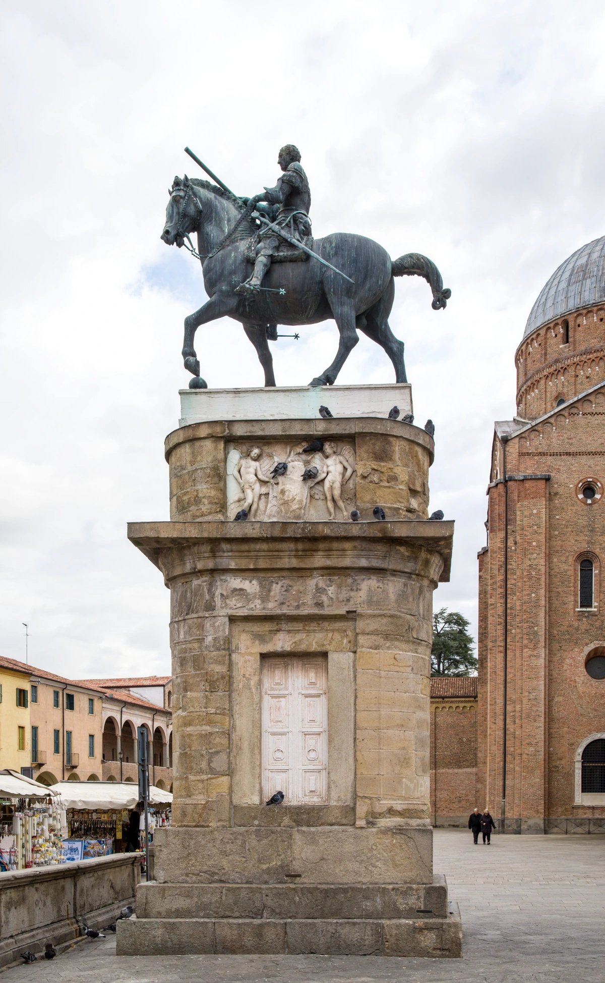
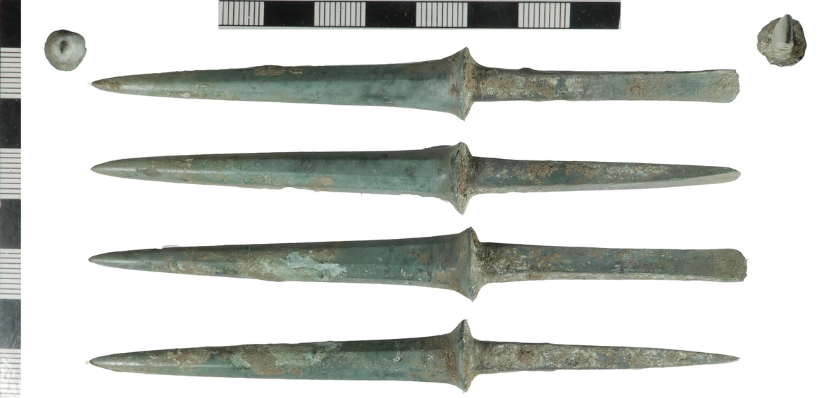
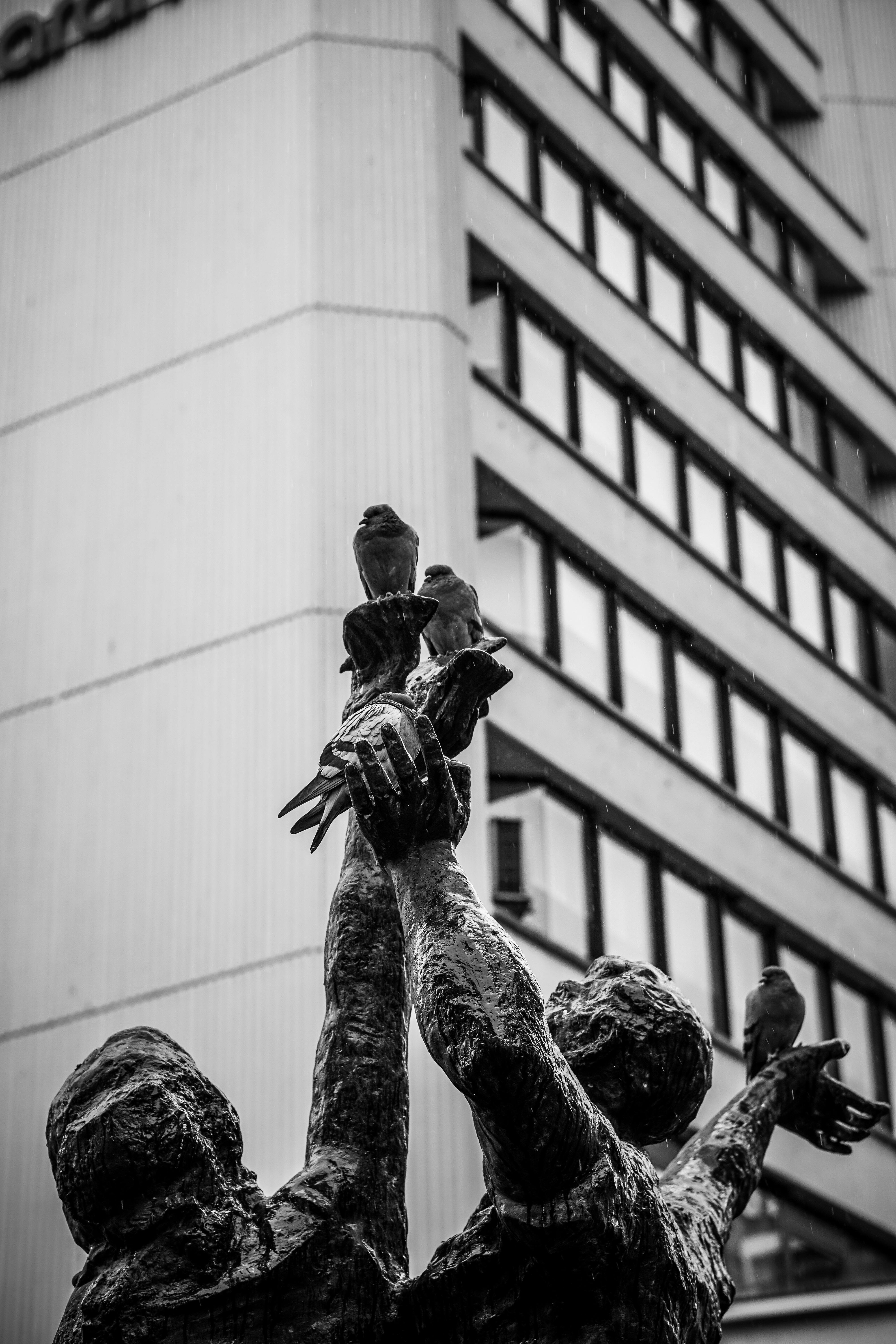
If motifs are the words, symmetry was the grammar that held them in a state of order and power. It’s easy to dismiss symmetry as mere decorative balance, but in the ancient world, it was the architecture of the sacred. Symmetry reflects the order of the human body, the predictable cycles of the seasons, and the cosmic balance of the heavens. It implies intention, stability, and perfection. Look at a Mycenaean bronze shield, its surface a perfect radiating pattern, or the bilateral symmetry of a ceremonial dagger's blade. They are not just objects; they are cosmograms—miniature models of a perfectly ordered universe.
This obsession with symmetrical order is the direct ancestor of the architectural principles that would define the Parthenon and, much later, the entire ethos of the Bauhaus school, which sought a similar purity of form. It's in the clean lines of a Scandinavian chair, the balanced composition of an Agnes Martin grid, and even the user interface of your iPhone.
Symbol as Soul: When Form and Meaning Fuse
In ancient Mesopotamia, a cuneiform symbol for “god” had as much artistic impact as a painted deity. The form and the message were inseparable. The symbol wasn't just a signpost; it was a container for the idea itself. That’s the same energy you see in the work of Mark Rothko or Agnes Martin. This principle is the bedrock of non-representational art. It’s the reason a Barnett Newman "zip" can make your spine tingle—it’s not a line, it's an invocation.
This is the core of what I learn from the ancients: art is not always about describing what is; it’s about creating a new reality, a new symbol, with its own power. We see this in the totemic forms of Brâncuși or the monumental simplicity of an Isamu Noguchi. They are not asking us to recognize something from our world; they are inviting us into theirs.

The Timeless Palette: Earth, Blood, Sky, and Stone
The Role of Limited Color in a World of Noise
The modern world is a visual assault of color. We are bombarded with millions of hues on our screens, in our shops, on our streets. The Bronze Age artist worked from a palette that, by necessity, was limited to what could be dug from the earth or gathered from minerals. But this limitation was also the source of its immense power. In a world of infinite choice, the discipline of a restricted palette is a radical act. It forces a focus on value (the light-to-dark contrast), composition, and the symbolic weight of each color, rather than on mere description or decoration.
This is a lesson I have to re-learn constantly in my own studio. When I feel stuck, the first thing I do is put away 90% of my paints and work only with a few earth tones. Suddenly, every decision becomes clearer and more deliberate. The noise disappears, and the essential message of the painting can emerge. This is the same power that Agnes Martin found in her subtle, nearly monochromatic grids, and what Robert Ryman explored in his lifelong dedication to the color white.
Walk through a collection of Bronze Age artifacts and one thing will hit you: the limited, but impossibly powerful, palette. This wasn’t a limitation; it was a statement. The classic combination of red ochre, black, and white, sometimes joined by the shimmer of gold, is a lesson in contrast, harmony, and raw emotional power that I find myself instinctively reaching for. My studio is filled with the echoes of this ancient chemistry: the deep, hematite-infused reds, the dense carbon blacks, the chalky whites that aren't just colors, but characters in a drama older than written language.
But this wasn't a uniform aesthetic across the globe. In China, the Shang Dynasty was perfecting the casting of intricate bronze vessels, their surfaces enriched through chemical patination, a controlled corrosion that resulted in deep blues and greens unseen in the Mediterranean palette. Meanwhile, in the Andes, artists were working with the vibrant, almost artificial-looking pigments derived from minerals like cinnabar and azurite long before the Bronze Age. So while we focus on the Aegean's earthy tones as a foundational source code, it's crucial to remember that this global conversation in color was happening on multiple, independent channels. The core principle, however, remains universal: a restricted palette forces a focus on value, composition, and symbolic weight over mere description.
The Primal Pigments: A Chemistry of Meaning
These colors weren’t chosen from a catalogue. They were dug from the earth, harvested from minerals, and carried immense symbolic weight. The very act of gathering them was a ritual, a physical connection to the landscape. It's a process that couldn't be more different from clicking "add to cart" for a tube of cadmium red, yet the destination is the same.
- Red Ochre: The color of life, blood, and the earth itself. It’s visceral, grounding, and impossible to ignore. It's the pigment used in rituals for millennia, a stark declaration of presence. When you see a modern artist use a bold, flat red, they are tapping into that same primal frequency. I think of Anish Kapoor's massive, void-like sculptures covered in Vantablack, or the way a single red slash in a minimal painting can feel both violent and vital.
- Black: Made from charcoal or manganese, this was the color of the unknown, the underworld, and the fertile void from which life emerged. It provides definition, depth, and a powerful anchor in any composition. It's the absence that gives presence meaning. Ad Reinhardt famously spent years painting nearly indistinguishable "black" paintings, forcing the viewer to confront the subtlety of light and shadow within the apparent void.
- White (often from chalk, lime, or gypsum): Represents light, bone, and the spiritual realm. Used not just as a background, but as an active positive space. It is the canvas of creation, the blank slate pregnant with potential. Robert Ryman's entire career can be seen as an exploration of 'white', proving it to be the most complex and active of all colors.
I sometimes think the entire history of art is just a footnote to the first moment someone mixed red ochre and charcoal with water on a cave wall. These aren’t just “colors.” They are the primary notes in a visual language of survival, ritual, and meaning that speaks directly to something deep in our collective brain. When you see these combinations today—whether in a minimalist canvas or a bold graphic print—you are witnessing the continuation of that lineage.
From Ancient Earth to Modern Wall: A Comparative Palette
Bronze Age Color Source | Symbolic Meaning | Chromatic Function | Modern Analog in Abstract Art |
|---|---|---|---|
| Red Ochre | Life, blood, conflict, power | Grounding Force, Focal Point | Barnett Newman’s "zip" paintings, Mark Rothko’s maroon fields, Anselm Kiefer’s scorched earthscapes |
| Black (Charcoal/Manganese) | Void, death, potential, the unknown | Defining Negative Space, Creating Depth | Ad Reinhardt’s "black" paintings, Franz Kline’s gestural work, Richard Serra’s monumental sculptures |
| White (Chalk/Lime) | Spirit, bone, sky, potential | Active Emptiness, Source of Light | Robert Ryman’s white-on-white studies, Kazimir Malevich’s "White on White," Agnes Martin's gessoed grids |
| Gold/Electrum | Sun, divinity, imperishable power | Luminous Accent, Signifier of Value | Gustav Klimt’s gold leaf periods, the gilded backgrounds of Byzantine icons reimagined |
The Primacy of Texture: Beyond the Visual
This is where you have to engage with the art on a physical level, an experience the digital screen tries its best to erase. I remember seeing a Bronze Age beaker at the /den-bosch-museum, its surface covered in precise, ridged lines forged by a long-forgotten artisan. My first urge was to run my fingers over it. It was meant to be touched, to be held, to communicate not just through the eye but through the skin.
The Language of the Hand: Toolmarks as Story
Bronze Age artists understood texture as a language. The roughness of a clay pot fired in an open pit, the deliberate hammer marks left on a bronze shield, the impossibly fine incisions on a golden pendant—each was a conscious choice. This haptic quality separates ancient art from the sleek, often sterile, surfaces of much contemporary design. It asserts the object's physical reality, its "thing-ness." The physicality of making—the thump of clay, the ting of a hammer on bronze—isn’t just a process; it’s a message embedded in the object itself.
Today, this celebration of the tactile is making a fierce comeback. I see it in the thick, buttery impasto of a Frank Auerbach painting and in the textured canvases of Anselm Kiefer, where straw and lead mix with paint. They are engaging in the same dialogue with material that a Bronze Age smith did.
Repetition as Rhythm: The Hypnotic Pulse of Pattern
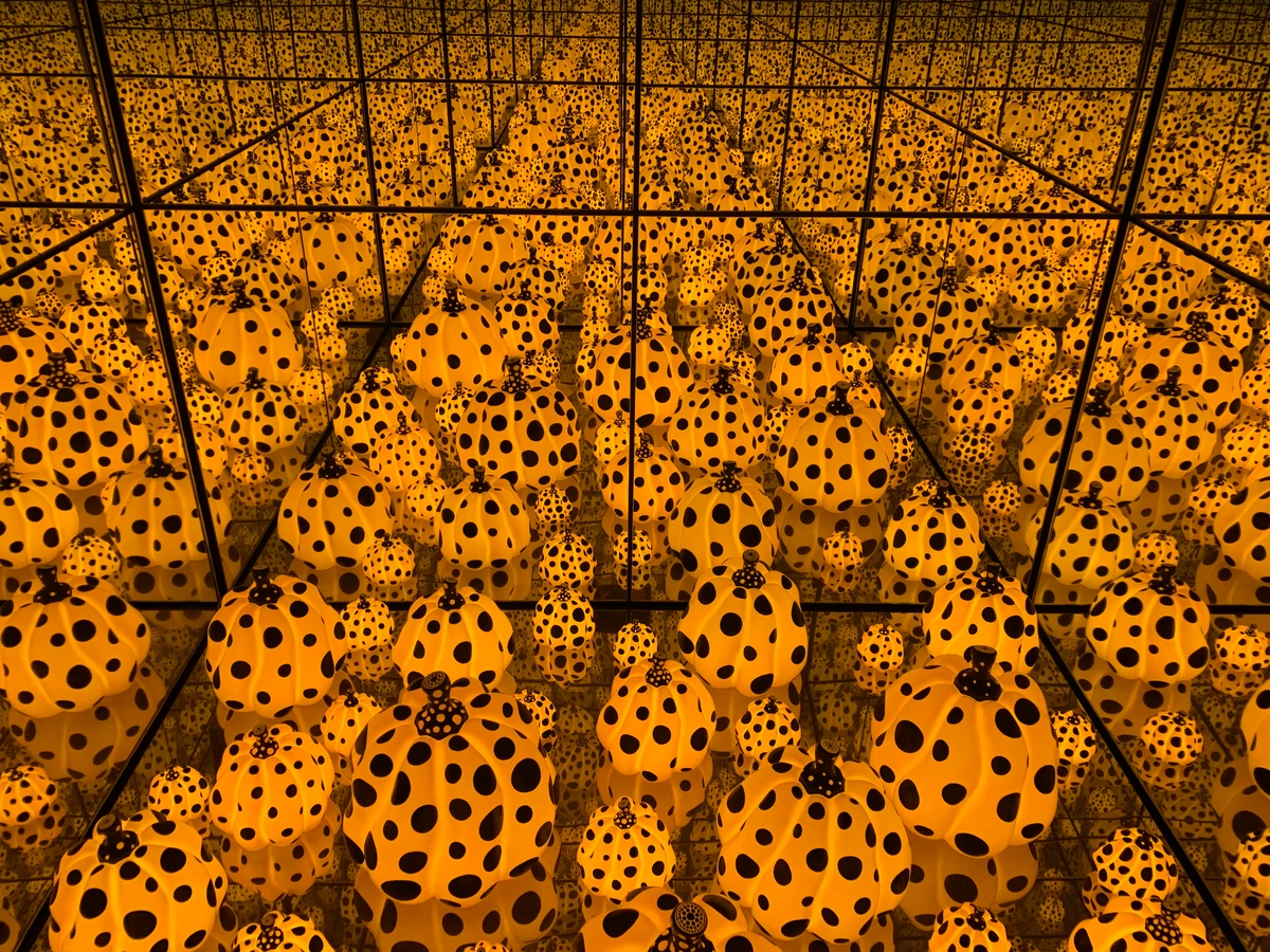
The endless patterns on a Mycenaean dagger or a Minoan pot were more than just decoration. They were a form of visual music, a pulse that could induce a trance-like state. This repetitive, almost obsessive attention to detail is something we see throughout art history. That same hypnotic rhythm is what I feel when I look at the grid paintings of Agnes Martin, where slight imperfections in the ruled pencil lines testify to the human hand behind the seemingly perfect system. It's the same energy you find in the dynamic patterns of a contemporary textile artist or the methodical, ritualistic mark-making in a painting by Zarina Hashmi. The "endlessness" of the pattern is the entire point—it suggests a reality that continues beyond the edges of the canvas or the lip of the pot.
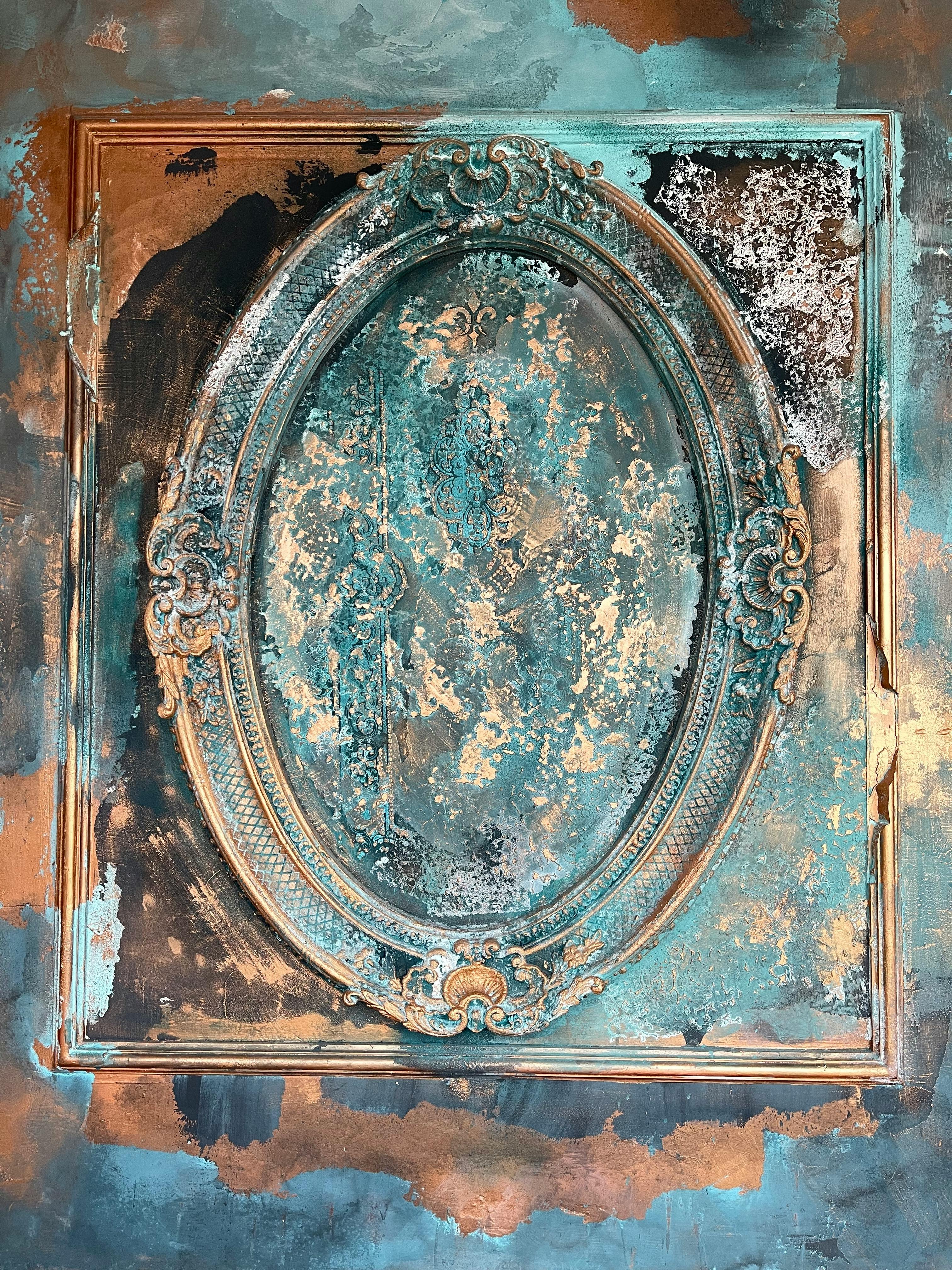
The Wabi-Sabi of the Ancient World: Honoring the Imperfect
Look at a piece of bronze from that era. The casting flaws, the subtle pits from the mold, the hammer marks from forging—they weren’t polished away. They became part of the object’s character, its history written on its skin. This embrace of the imperfect—a global wabi-sabi long before the term existed—values process over pristine finish. I see a clear kinship between the irregular surface of an ancient bronze axe and the rough, gestural surface of a Jean-Michel Basquiat painting, where layers of paint, text, and imagery fight for dominance. It’s an honest conversation with the material, a record of a struggle, a story told through scars. This aesthetic, born from material constraints, has become a powerful philosophical choice in modern art, celebrating the beauty of aging, accident, and the evidence of the maker's hand.
The Archetypal Motif: Humanity's First Visual Words
Let’s talk about the building blocks, the visual words artists have used for millennia. I think of them as cultural DNA—units of information that replicate and evolve. They are the code that allows us to read a 3,500-year-old fresco and feel a flicker of recognition.
Motif | Original Meaning | The Feeling it Evokes | Its Modern Counterpart |
|---|---|---|---|
| The Spiral | The whirlpool of creation, the path inward, the hypnotic motion of the galaxy. A universal archetype of growth. | Drawing in, contemplation, energy, becoming. | The all-over compositions of Jackson Pollock; the concentric "target" paintings of Kenneth Noland; the swirling forms in a Joan Miró. |
| The Meander (Greek Key) | Infinity, unity, the eternal flow of life. A decorative border containing the universe. | Continuity, order, endlessness. | The clean geometric abstractions of Piet Mondrian and the De Stijl movement; the architectonic compositions of Josef Albers. |
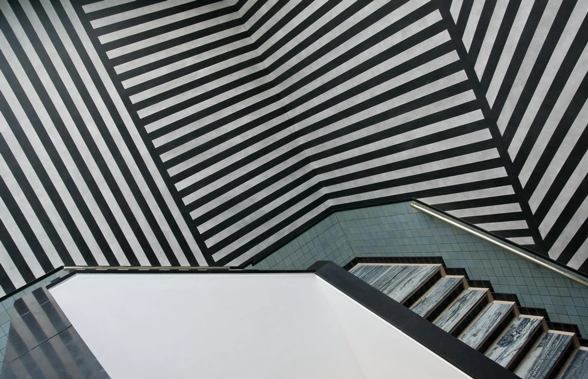
| The Chevron/Zigzag | Dynamic energy, water, or conflict. A simple, aggressive shape that injects pure movement. | Unrest, rhythm, chaos, power. | The shaped canvases of Frank Stella; the dynamic compositions of Futurist paintings; Op Art's illusory vibrations. |
| The Sun Cross / Circle | The sun, the four seasons, the cardinal directions, the cosmic order. A near-universal symbol. | Centeredness, the cosmos, balance, sacred geometry. | The late geometric abstractions of Kazimir Malevich; the minimalist, reductive forms of contemporary art. |

credit, licence
Re-Creating Ancient Flames: How to Channel the Bronze Age in Your Own Work
A Step-by-Step Guide: From Studio Visit to Canvas
For those who want to move beyond theory, here is a practical, five-step process I use to translate ancient inspiration into a modern piece.
- The Hunt: Visit a museum or a good online collection (like the
/den-bosch-museum). Don't photograph everything. Find one object—just one—that makes you stop. A pot, a tool, a piece of jewelry. Spend ten minutes just looking at it. What is the one quality that draws you in? Is it the brutal simplicity of its form? The hypnotic repetition of its pattern? The visceral pull of its color? - The Sketch: Do a thirty-second sketch. Then a two-minute sketch. Don't try to be perfect. You're not copying. You're trying to translate its energy onto the page. Use a single pencil or a pen. The constraint is the point. How does the curve of that handle feel? How does the weight of that base sit on the imagined table?
- The Forgetting: This is the most important step. Put the photo and the sketch away. Go for a walk. Let the feeling of the object sink in, but let the literal details blur. You're distilling the wine, not drinking the grapes.
- The Channeling: Return to your studio. Grab the first tool that feels right—charcoal, a big brush, a stick of pastel. Don't plan the composition. Just react. Let the feeling from the object guide your first, biggest mark. That mark is the seed of your new painting.
- The Dialogue: Now, start building around that mark. You're no longer channeling the past; you're in a dialogue with it. Your modern knowledge of color theory, your own style, your contemporary context—that all comes into play. The ancient object has provided the initial spark, but you are now building the fire.
So how does this ancient influence show up on a modern canvas? How do you translate a 3,500-year-old aesthetic into contemporary practice without creating a pastiche? It’s less about copying what you see in a museum case and more about channeling the core principles—the why behind the forms—into a 21st-century context. It's about finding the "Bronze Age" sensibility that already lives inside modernism, minimalism, and abstract expressionism.

A Practical Framework for Ancient-Modern Synthesis
Here are five principles to guide your own work, whether you're painting, sculpting, or designing a textile. Think of them as a conscious dialogue with your Bronze Age predecessors.
- Strip It Down to the Bones: What is the absolute core? The Bronze Age artist didn’t have the luxury of extraneous detail, and that limitation bred incredible power. A bull was its essential curve, a wave a series of arcs. Find your essential shapes and ruthlessly cut everything else. This is the philosophy behind every minimalist poster you see today.
- Revere Your Materials: Feel the chalkiness of the pastel, the gritty resistance of charcoal. Let the material’s natural behavior guide you. If the paint is running, don't fight it—follow it. This is the essence of modern process art, where the material itself is a co-creator.
- Tell a Story Through Pattern: A repeated shape creates a rhythm, a trance. Use repetition to build a feeling, just like a Minoan artisan encoded infinity into a border pattern. When you use repetition, you're setting a tempo. Is it a frantic stutter, a peaceful meditation, or a relentless march? This is the principle behind the best textile art and graphic design.
- Embrace the Elemental Palette: Reconnect with the power of earth tones: ochre, charcoal black, chalk white. See what you can say with only these three. The discipline is exhilarating and cuts through creative blocks. This is the secret power behind the palettes of many modern artists who work with a limited, but impactful, color range.
- Let the Hand Be Seen: Don't over-polish. The slight wobble of a line, the grit of a texture—these are the human signatures that connect us across millennia. It's the sweet spot between intentionality and accident, a concept celebrated in movements from Arte Povera to Abstract Expressionism.
Case Study: From Museum Wall to Living Room
I once spent a week sketching only from photographs of a single Minoan fresco. I wasn’t trying to copy the bull or the acrobat. I was trying to trace the feeling of the line. I noticed how the curve of the bull’s back was an arc of pure tension. On the third day, I put the photo away and just painted from memory. The result was a canvas I called Knossos Redux. It bore no literal resemblance to the ancient art, but it was imbued with its spirit—its dynamic curves, its bold, earthy palette, its sense of controlled energy. That’s the sweet spot. That’s when you stop copying history and start speaking its language.
The painting now hangs in a client's living room, next to a sleek mid-century modern sofa. And it works. The ancient spirit grounds the modern setting, and the modern setting makes the ancient spirit feel fresh and alive. It’s a living demonstration of this article’s thesis.
Bridging Millennia: Your Questions Answered
How can art from 1500 BCE influence a 21st-century artist?
Ancient art operates on a primal, archetypal level. It’s not about copying an image, but about learning from its fundamental DNA—symbolic color, essential geometry, raw texture. It’s a masterclass in communication through reduction. A 21st-century artist learns that you don't need the entire story; you need the most potent fragment of it. That brutal, exhilarating simplification is a lesson that never gets old.
When you work with that same mindset today, you’re participating in a ritual that's thousands of years old. You're learning the why behind the how, which is the most powerful lesson any artist can ever learn.

Why do modern abstract paintings that look simple often cost so much?
This is a classic frustration, and a fair one. But that apparent "simplicity" is an illusion. It's the result of a high-wire act of distillation that often takes decades to achieve. It's easy to add more; it's incredibly difficult to have the confidence to take everything away until only the essential truth of the work remains. It’s the ultimate "less is more." That’s what you’re paying for: a lifetime of discipline used to create something that looks effortless. A three-line poem by a master is harder to write, and more valuable, than a three-page one by a novice. It’s the same for the powerful simplicity of a painting.
Were their abstract shapes actually abstract, or did they mean something?
This is a fantastic question that gets to the heart of the difference between ancient and modern art. For us, abstraction is often about pure form or emotion. For them, it was a highly efficient symbolic language. A spiral wasn't a pleasing design; it was the whirlpool, the path of the sun. A zigzag was the flash of lightning or the flow of a river. The abstraction was a form of shorthand, a way of writing down the world in a visual code. We see pretty shapes; they saw maps of the universe and instructions for living.
The magic is that this symbolic weight doesn't disappear over time. Even if we don't know the code, we feel its resonance. That’s why a Minoan spiral can feel as alive as a Jackson Pollock. They are both tapping into a deep, fundamental pulse of energy and movement. It’s communication that happens below the level of conscious thought.

Where can I see more great geometric art?
Start with the origins. Visit the /den-bosch-museum or a similar antiquities collection. Then, trace the evolution to the pioneers of geometric abstraction: Kazimir Malevich and the Suprematists, the De Stijl movement (Mondrian), and the Bauhaus. For a contemporary take, seek out Carmen Herrera or Daniel Buren. You can browse works available to (/buy) on our site. And look beyond the canvas: visit a Brutalist building or get lost in Islamic tile work. The language of geometry is everywhere.
Can I use these ideas in digital art or graphic design?
Absolutely. In fact, the digital realm is where these ancient principles can have a revolutionary impact. The slickness of digital tools can lead to sterile, lifeless work. Injecting ancient principles is the antidote.
- For Graphic Designers: Think like a Minoan. Use a limited, symbolic palette. Let a single shape—a chevron, a circle—carry the entire design. Use repetition to create a rhythm, not just to fill space. Reject the quest for digital perfection; introduce subtle textures or hand-drawn elements to give your work a human feel.
- For Digital Artists: Study the crackled texture of an ancient fresco or the patina of a bronze statue. Use digital brushes and texture overlays to mimic these surfaces, not to create something new, but to make your work feel old—to give it a history it doesn't have. Limit your color palette to three or four core hues and see how much more powerful your compositions become. The aesthetic is timeless because the principles are universal.
We Are All Part of the Same River: A Creative Lineage
I started this by telling you about a museum guard and my nose being inches from a Cycladic figurine. I’ll end with a thought I had while finally walking away from that glass case. We tend to see art history as a straight line, a triumphant march of progress from primitive to complex, from rough to refined. I think that’s a comforting, but deeply wrong, way to look at it. It’s more like a river—or perhaps a Minoan meander. The same powerful currents that flowed through the minds of Bronze Age artisans—the need to find symbols for the unspeakable, to make patterns that bring order to chaos, to use color to touch the soul directly—are the very same currents that flow through the studios of abstract artists today, including my own.

The ancient world isn’t a place we visited once and then left behind. It’s a place we carry within us. Every time an artist makes a mark on a canvas, they are participating in a ritual that began when the first hand pressed pigment to rock. The materials change, the contexts shift, but the fundamental human impulse—to create, to communicate, to find meaning in form and color—remains. We are not so much inventing as we are remembering, re-arranging, and re-contextualizing the core building blocks of visual meaning that our ancestors first discovered by firelight.
When you look at a contemporary abstract painting and feel a deep, inexplicable pull, a recognition that bypasses language and theory, you might just be hearing an echo. It’s the whisper of a hand from 3,500 years ago, reaching across the chasm of time to remind you that some questions—about beauty, meaning, and our place in the cosmos—are eternal. And the answers, too, are written in the same elemental grammar of shape, color, and line.
And what is that impulse today, in a world saturated with pixels and perfect gradients? I believe it's a desire for authenticity. For the wobble of a line that betrays a human hand. For the grit of a texture that rewards a closer look. For the primal power of an elemental color that bypasses the brain and goes straight to the gut. The next time you stand before a work of art, no matter how modern it appears, lean in close. You might just find the ancient world staring back at you, proving that what we call the past is often just a different name for the present.
That museum guard was wrong to shoo me away. You have to get close enough to catch the tremor.