A Deep Dive into ASTM Standards for Art Materials: What Artists Really Need to Know
Unlock the secrets of ASTM standards for artist materials—permanence ratings, colorfastness tests, and practical tips to protect your creative legacy.
A Deep Dive into ASTM Standards for Art Materials
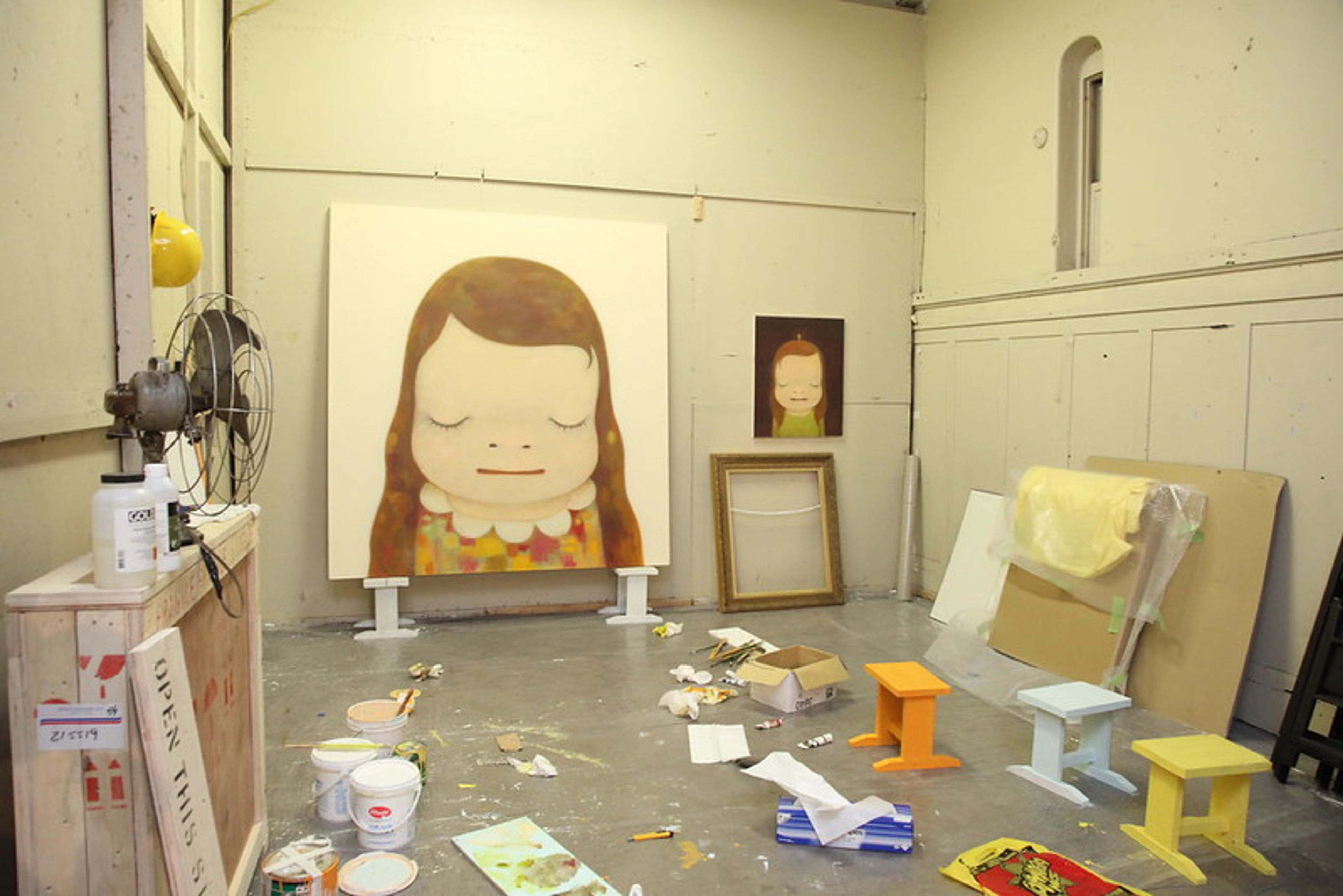
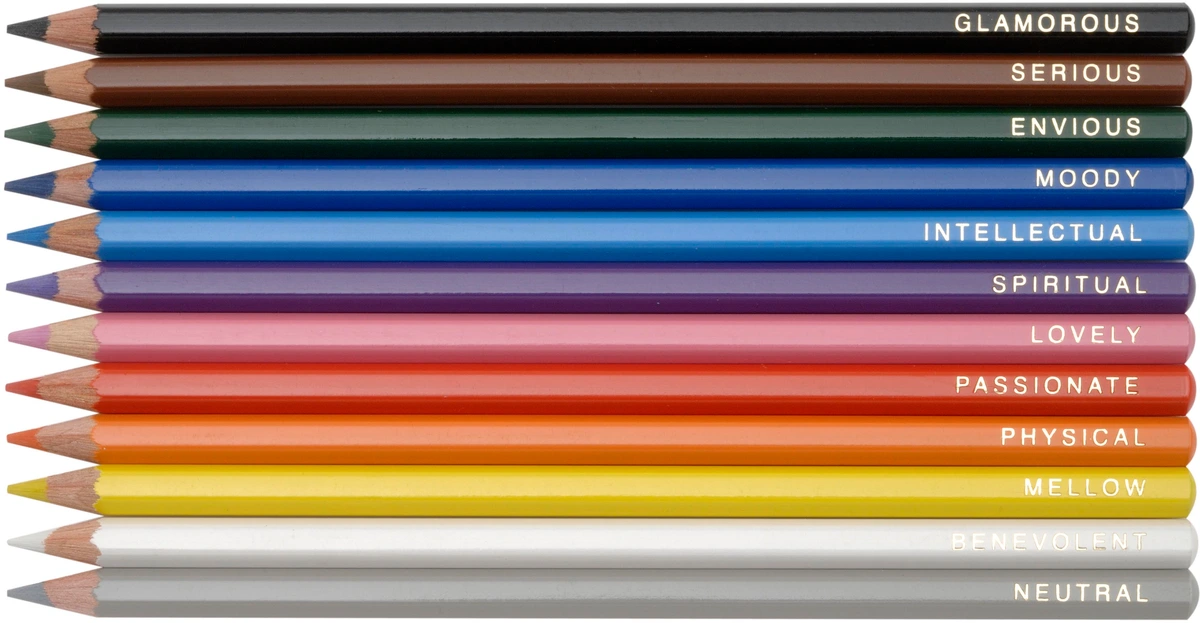
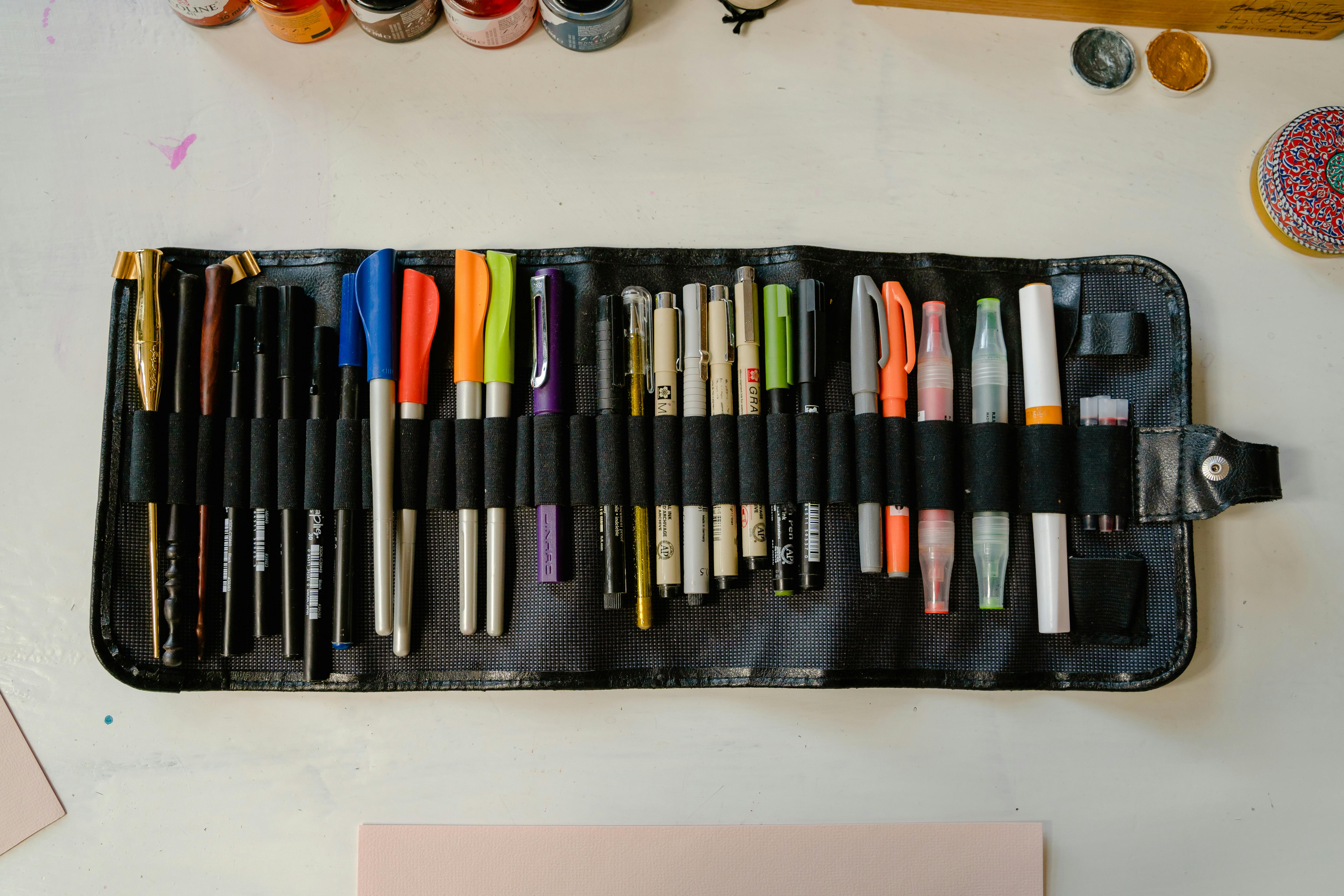
I’ve stood in an art store aisle, overwhelmed by paint tubes labeled “permanent green” or “lightfast red,” wondering if my future self would curse me for choosing the wrong one. It’s one of those quiet anxieties creators carry—will my work fade into a memory instead of lasting a legacy? That’s where ASTM standards step in, not as boring technical jargon, but as your artistic ally. This guide cuts through the noise to explain what these ratings mean, why they matter, and how they’ll help you create art that endures.
And let's be honest, most of us have a graveyard of faded pieces at the back of our portfolios. I certainly do. It's a specific kind of creative heartbreak. But what if you could eliminate that uncertainty? What if you could look at a label and know, with real confidence, that your painting will hold its vibrancy for a hundred years? That's the power these codes unlock.
Why This Matters More Than Ever
We live in an age of endless material choice. An artist can get paralyzed by options. But with that choice comes risk. Many of the most vibrant, attention-grabbing pigments—the ones that make you stop in the aisle—are also the most chemically unstable. They're beautiful, but temporary. ASTM standards cut through the marketing and give you a simple, powerful tool: the ability to choose permanence on purpose.
What to Expect in This Guide
- The Big Picture: We'll strip away the technical speak and explore what ASTM International actually is and why its standards are the unsung heroes of art conservation.
- Decoding the Labels: A deep dive into the two most critical scales: Lightfastness (I-V) and Permanence (AA-C). You'll learn to read a paint tube like a pro.
- Beyond the Basics: We'll investigate the less-talked-about standards for water resistance, abrasion, and flexibility, helping you choose materials for any environment.
- Real-World Consequences: Through case studies, I'll show you exactly what happens when these standards are ignored—and when they're embraced.
- A Practical Workflow: I'm giving you my personal 4-step checklist for vetting every material before it touches your canvas, plus my secret "control swatch" trick.

What Is ASTM International?
ASTM International—formerly the American Society for Testing and Materials—isn’t just another bureaucratic organization. Think of it as a global roundtable where material scientists, professional artists, museum conservators, and manufacturers sit down together to define the rules of the road for products. This isn't a top-down decree; it's a consensus. The people who make the paints, the people who use them, and the people who restore them decades later all have a seat at the table. This collaborative process is why the standards carry so much weight—they're born from real-world needs, not just theoretical ideals.
When you see an ASTM rating on a tube of paint, sketchpad, or ink bottle, it’s not just marketing fluff. It’s a shared language for quality and durability, backed by rigorous, repeatable science. Think of it like a nutritional label for art supplies, but instead of calories, it tells you how your creations will age over time, how they react to light, moisture, and the very air they breathe.
For an artist, this is revolutionary. For centuries, material knowledge was passed down through apprenticeships, often shrouded in secrecy. You had to trust your master or your supplier. Today, that black box has been opened. A Lightfastness I rating from Golden Artist Colors and a Lightfastness I rating from Daniel Smith mean the exact same thing, because they were tested using the exact same scientific benchmark. It's a democratization of knowledge, putting the power of professional-grade information directly into your hands.

Why Every Artist Should Care
Ignoring ASTM standards is like building a house on sand and hoping it won’t weather. The data is stark, and the consequences are real. Here’s why they matter:
- Permanence Assurance: ASTM D4302 tests whether pigments resist fading from light exposure. Without it, your prized portrait could wash out in a sunny window. I’ve heard too many stories of artists discovering their early works turned muddy brown—or even pink—because they prioritized vibrant color over stability.
- Predictable Chemistry: Ever had paints “crank” (develop surface wrinkles) or paper turn brittle and yellow? ASTM standards address long-term aging properties like humidity tolerance and oxidation resistance. They help you avoid gut-wrenching surprises like oil paints turning to rubbery goop decades later, or pastels dropping off a canvas because the binder failed.
- Professional Credibility and Value: Galleries and serious collectors care intensely about longevity. An unproven material can tank a piece’s monetary and historical value. Knowing and using ASTM-rated materials isn’t just practical—it’s a strategic investment in your artistic legacy.
- Permanence Assurance: ASTM D4302 tests whether pigments resist fading from light exposure. Without it, your prized portrait could wash out in a sunny window. I’ve heard too many stories of artists discovering their early works turned muddy brown because they prioritized color vibrancy over stability.
- Predictable Chemistry: Ever had paints “crank” or paper turn brittle? ASTM standards address aging properties like humidity tolerance and oxidation resistance. They help you avoid surprises like oil paints turning to rubbery goop decades later.
- Professional Credibility: Galleries and collectors care about longevity. An unproven material might tank a piece’s value. Knowing ASTM ratings isn’t just practical—it’s strategic.
Decoding the ASTM Rating Scale for Artists: It's Not Just a Number
Decoding the ASTM Rating Scale for Artists: Lightfastness vs. Permanence
Let’s get into the weeds. What does a code like “ASTM D4302-IV” actually mean? I see so many artists mix up permanence (resistance to aging over time) and lightfastness (resistance to fading from light). They’re linked but distinctly different concepts, and confusing them can lead to heartbreak.
The Crucial Difference in Plain English
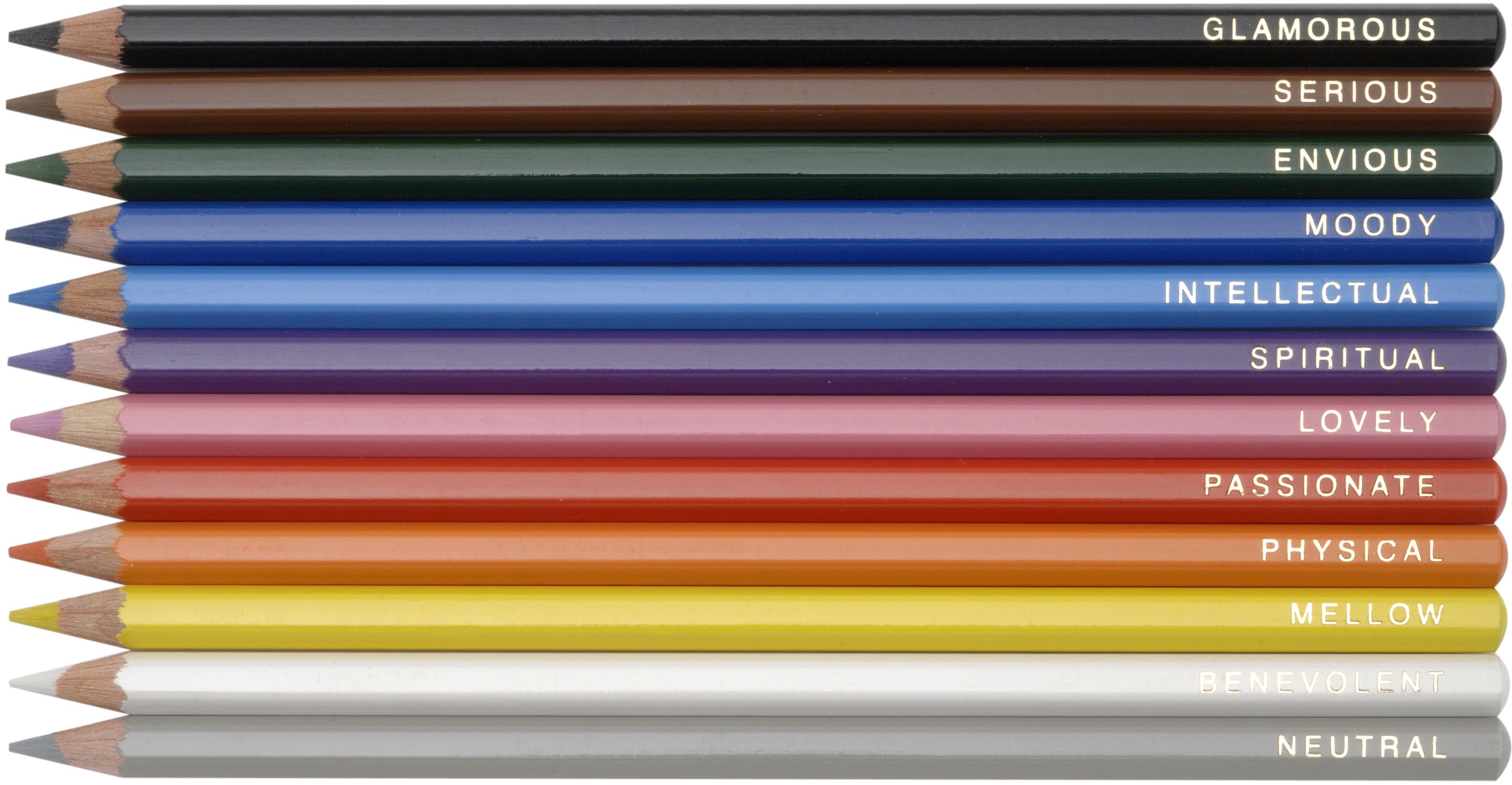
Think of it this way: Lightfastness is your art's sunscreen—its specific ability to fight fading from photons. Permanence is its overall health—its ability to withstand everything time throws at it: humidity, heat, pollution, and the slow decay of its own components.

Lightfastness: The Sun-Fading Battle
This is a material’s ability to withstand photons without changing color or fading. It’s measured by exposing samples to intense, simulated sunlight, usually from a xenon-arc lamp that mimics the full spectrum of the sun. To be a bit technical, the "Lightfastness I" test under ASTM D4302 subjects a sample to the equivalent of 5.0 million lux hours of exposure. To put that in perspective, that’s like leaving your painting in a brightly lit museum gallery for over 100 years, all compressed into a few weeks. If your work will be displayed, this is your primary concern.
Here’s a quick mental model for how it works:
- Pigment Molecules: Each pigment is made of specific molecules that absorb and reflect light.
- The Photon Attack: When high-energy UV and visible light photons strike, they can literally break the chemical bonds holding those color molecules together. A vivid blue molecule might break into smaller, colorless fragments, revealing the other colors it was mixed with.
- The Bonded Binder: The paint's binder—the "glue" holding the pigment to the canvas—can also suffer. It can yellow, become brittle, or even crack under extended light exposure, affecting the appearance of the pigment locked within it.
Permanence: The War on Time Itself
This is the broader war against a dozen different enemies. It includes lightfastness but also factors like heat, humidity, oxidation, and atmospheric pollutants. A paint could be perfectly lightfast but still crack in a few years because its binder (the glue that holds the pigment together) breaks down in high humidity. That’s a permanence failure, not a lightfastness one. Or imagine a paper that turns yellow and brittle not from light, but from the acid in its own wood pulp. That's another permanence failure. Permanence is the ultimate measure of a material's will to live.
Rating System | Test Method | What it Means for You | Typical Use Cases | |
|---|---|---|---|---|
| Lightfastness | ASTM D4302 | Intense light exposure (Xenon-arc lamp) | Colors ranked I–V. Aim for I or II. | Landscapes, sunlit interiors, works for gallery display |
| Permanence | ASTM D4236 | Accelerated aging (heat/humidity) | AA, A, B, or C. AA = most durable. | Heirloom commissions, museum pieces, work intended to last generations |
| Acid-Free | ASTM D6868 | pH testing (no acidic lignin) | Prevents yellowing and brittleness in paper. | Paper, mat boards, mixed media substrates |
| Safety | ASTM D4236 | Toxicity testing | Certifies a material is non-toxic. | Educational settings, kids' art projects, materials for sensitive individuals |
| Abrasion Resistance | ASTM D5264 | Rubbing/fading simulation | Resists smudging and surface wear from physical contact. | Charcoal, pastel, and chalk applications |
| Flexibility | ASTM D522 | Bend and crack testing | Prevents cracking when the support (like canvas) flexes. | Canvas, paper, and alternative substrates |
| Water Resistance | ASTM D5402 | Water immersion and humidity testing | Protects against water damage, bleeding, and mold. | Outdoor art, coastal environments, high-humidity areas |
| UV Resistance | ASTM D1544 | UV light exposure testing | Enhanced protection against the most damaging part of sunlight. | Sunrooms, display windows, tropical locations |
| Chemical Stability | ASTM D1308 | Chemical exposure testing | Resists damage from cleaning agents and pollutants. | Museum settings, high-traffic areas, commercial installations |

Understanding the Lightfastness Rating (I-V)
This scale, defined primarily by ASTM D4302 ("Standard Test Methods for Lightfastness of Pigments"), is your most critical tool for color selection. The test involves exposing painted samples alongside a standardized blue-wool scale to a high-intensity xenon-arc lamp, simulating years of sunlight in a short period. The Blue Wool Scale is a brilliant piece of scientific simplicity: it's a set of eight blue-dyed wool fabric strips, each one dyed with a pigment of a known and progressively lower lightfastness. By placing your test paint sample next to this scale and blasting them both with light, scientists can precisely quantify the fading by comparing the paint's performance to the known benchmarks. If your paint sample fades at the same rate as Blue Wool 4, its lightfastness is a III. It's a beautifully analog yardstick in a high-tech world.
- I (Excellent): The gold standard. In the test, these colors show virtually no change after the equivalent of a century in a museum. Think of them for murals, outdoor sculptures, or any work destined for a brightly lit gallery wall. They're engineered to last for generations. Colors in this category are often synthetic, inorganic pigments like Titanium White, various metal oxides (for earth tones), and highly stable organic compounds.
- II (Very Good): Excellent for most professional work. A few "pluses" to get to a I, but they'll hold their vibrancy for decades under normal conditions. For most artists, a mix of I and II is the sweet spot between longevity and color palette availability. It's the difference between "forever" and "long enough."
- III (Fair): This is where you need to be cautious. Colors rated III have moderate lightfastness and will show some fading after extended display. They might be acceptable for works that will be stored in the dark or in very low light, but they are not suitable for permanent display. I’ve seen III-rated reds turn into dull, lifeless shades in just a few years. These are often the "student-grade convenience" mixes or older, less stable pigment formulations.
- IV (Poor): These colors are fugitive. They will fade noticeably in a relatively short period, sometimes within a few months of bright light exposure. Using them is a gamble, reserved only for quick sketches or studies that you know will not be exposed to significant light. That painting I mentioned where the blues turned pink? It was full of IV-rated watercolors. Many beautiful, traditional organic dyes fall into this category.
- V (Very Poor): Avoid for anything you care about. These are the most fugitive pigments, fading faster than ice cream melting in the July sun. Their use is purely for experimentation or temporary artwork where longevity is explicitly not the goal. Think of fluorescent colors or certain natural food dyes.
Understanding the Permanence Rating (AA-C)
Governed by ASTM D4236 ("Standard Practice for Labeling Art Materials for Chronic Health Hazards"), this rating system assesses the overall durability and stability of an art material over time, considering factors beyond just light. It's fascinating how they test for this. They can't wait 100 years, so they use an "accelerated aging" process. This typically involves placing the material in an environmental chamber and subjecting it to high temperatures and humidity cycles. This tortures the binder and the pigment, forcing a lifetime of chemical reactions to happen in a matter of weeks or months. A material that emerges from this test without cracking, yellowing, or becoming brittle is awarded the highest permanence rating.
- AA (Extremely Permanent): The highest assurance of longevity. These materials have not just been tested; they've been judged to have near-heirloom stability. Think of artists like Mark Rothko, whose works are now priceless cultural artifacts. The stability of his chosen materials wasn't an accident; it was a necessity. A standard acrylic gesso might be an "A," but a purpose-built, museum-grade gesso that resists cracking and off-gassing for centuries would be an "AA."
- A (Durable): Very high permanence. For most professional applications, an "A" rated material is an excellent choice. It offers a fantastic balance of proven durability and availability. Most professional-grade paints from reputable manufacturers fall into this category. You can trust an "A" rated paint to last for generations if cared for properly.
- B (Moderately Durable): These materials are considered reasonably permanent but may show signs of aging more quickly than A or AA-rated products. This might be due to a slightly less stable binder or a pigment that, while lightfast, is sensitive to humidity. They're suitable for non-critical work or when a specific, less-stable color is essential for your palette. The key is awareness. Don't use a B-rated binder for a canvas you plan to roll and ship multiple times.
- C (Not Sufficiently Durable): This is a warning label in disguise. A "C" rating suggests the material may deteriorate noticeably within a few decades, or even less. Think of it as “fine for sketchbooks, but risky for serious work.” Using "C" rated materials—like a C-rated paper for a final drawing—for a piece intended as a legacy is like building on that proverbial sandy foundation. The work might look fine for a few years, but its future is fundamentally compromised.
ASTM in Practice: Real-World Case Studies
The true value of ASTM standards isn’t in theory; it’s in the stark difference they make in reality. Here are a few real-world case studies that highlight the good, the bad, and the heartbreaking when it comes to material choices.
Case Study 1: The Fading Portrait
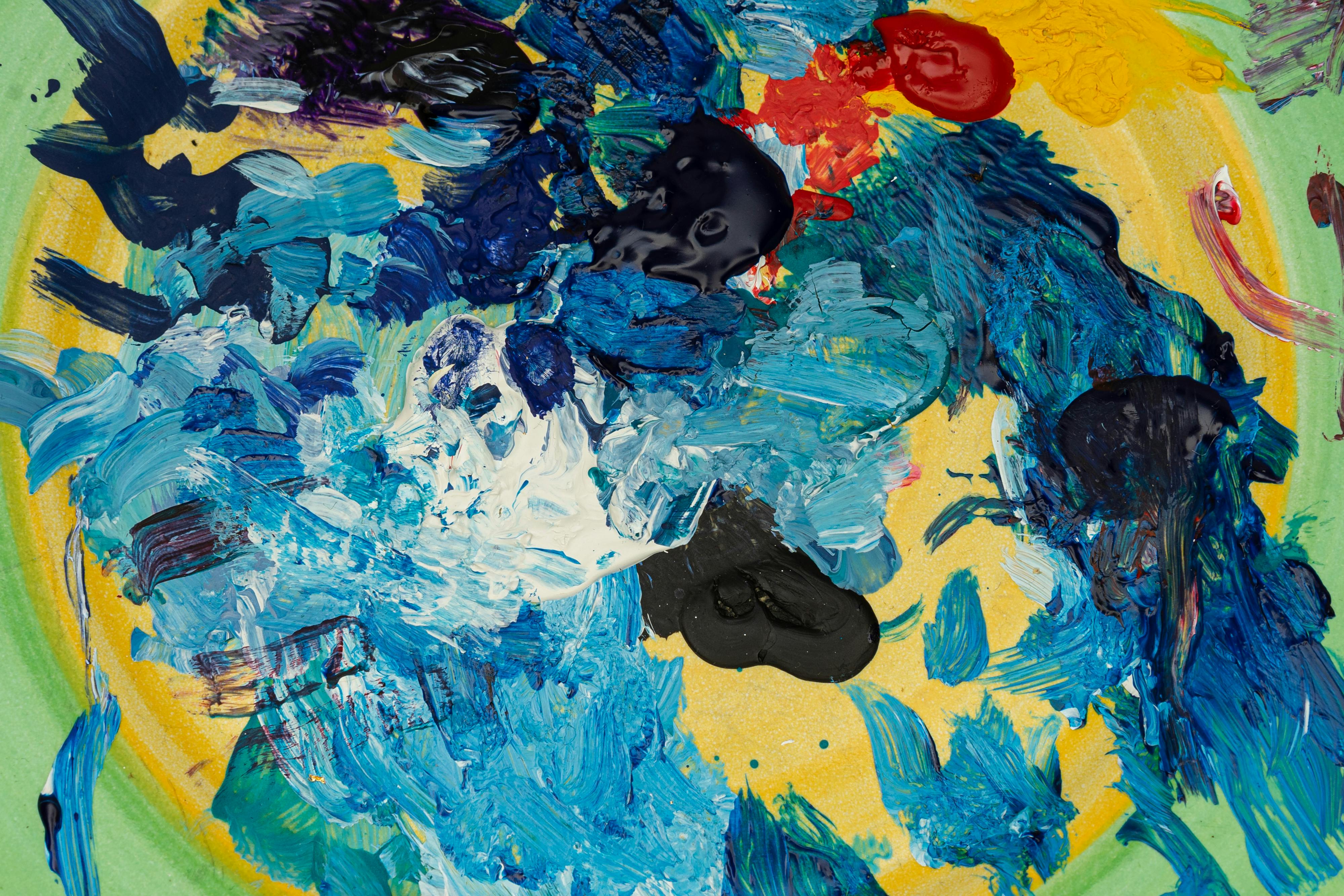
I once restored a 2000s-era portrait where the subject’s blue eyes and blue shirt had turned a muddy, lifeless pink. Why? The artist had used a popular, moderately priced watercolor with a fugitive blue pigment, rated as Lightfastness IV. The specific pigment was likely Phthalo Blue RS, a notoriously unstable variant. When the painting was displayed in a client’s well-lit living room, the blue molecules literally broke down and disintegrated under UV light, leaving behind the other color components (in this case, a pink/magenta pigment). The fix was nearly impossible, short of repainting the entire section from scratch. It was a heartbreaking, and entirely preventable, loss. This is a classic example of selective fading, where one component of a mix fails catastrophically.
Case Study 2: The Journey Across the Ocean
A friend of mine, a marine artist, was commissioned to create a large diptych for a cruise ship. The work would be exposed to intense, direct sunlight, high humidity, and salt spray. For this project, there was no room for error. We spent hours on the phone, going through the technical data sheets for every single pigment, ever mindful that acrylic emulsions can be sensitive to constant moisture. We chose only ASTM D4302 I-rated paints and ensured the binders were highly flexible (ASTM D522) and chemically stable (ASTM D1308) for the harsh environment. The artist had to sacrifice some color convenience, but the result is a painting that, five years later, looks as vibrant as the day it was installed. It’s a testament to how layering multiple ASTM standards creates a truly robust artwork.
Case Study 3: The Brittle Sketchbook Legacy
An artist left behind a collection of beautiful charcoal figure studies, intending them as a legacy for his children. The drawings were exquisite, but he had used a cheap, wood-pulp based sketchbook. Over 20 years, the paper, full of acidic lignin, turned a deep yellow and became so brittle it would crumble at the edges. The charcoal itself, though stable on good paper, was now falling off the degraded support. This highlights a critical concept: the chain is only as strong as its weakest link. An ASTM-rated pigment is useless if applied to a non-archival support. We had to painstakingly de-acidify each page and mount them on museum board, a costly and invasive process that could have been avoided with an acid-free paper conforming to ASTM D6868.
The Artist's Practical Guide to ASTM Standards
Okay, so you’re convinced. You want to use materials that last. Where do you actually find this information, and how do you decode the often-cryptic labels on your art supplies? Here’s your practical field guide.

On Paint Tubes and Jars: Your Primary Source
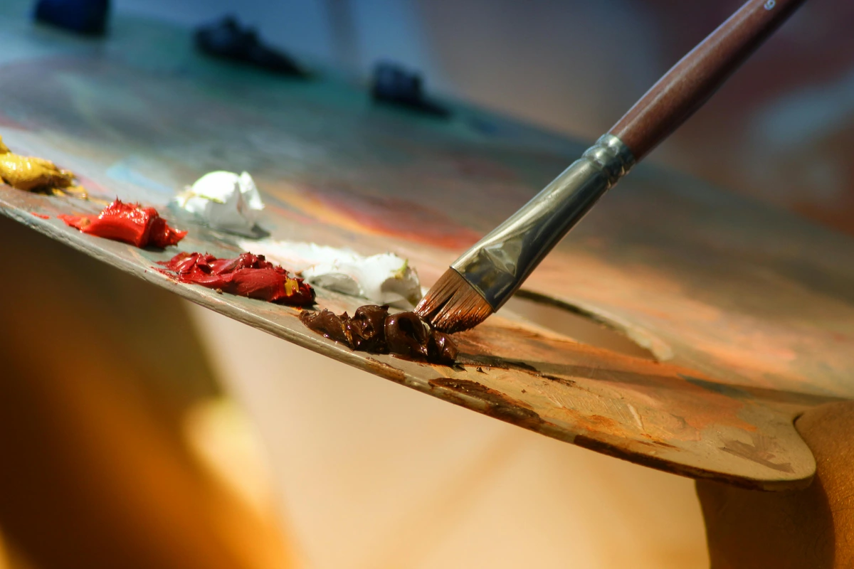
This is the most direct source. Look for a specific code or series of codes. You might see “ASTM D4302-I” or “Lightfastness I.” Some brands use their own abbreviations like “LF I” or symbols (a star rating, for example). I personally trust labels that list the exact ASTM standard number the most. Transparency is the name of the game here. If a label just says "Permanent" or "Excellent Lightfastness" without a specific test number, I get skeptical. That's marketing. A number is a promise.
On Paper Pads and Boards: The Foundation
For paper, you’re often looking for two things: “acid-free” (which usually conforms to ASTM D6868) and a second, crucial term: “alkaline buffered.” An acid-free paper has a neutral pH (around 7), which is good. An alkaline buffered paper has an alkaline reserve (a pH of 8.5+), which actively fights off acids that might try to form in the paper over time from atmospheric pollutants. This ensures the paper won't yellow or become brittle for centuries. Look for the infinity symbol (∞) which denotes archival quality.
On Pastels, Charcoal, and Dry Media: Binder Uncertainty
Check for standards like ASTM D6901 for pastels or references to the ASTM D4236 toxicological review. Dry media is particularly tricky because their binders—the minimal amount of stuff that holds the pigment in stick form—can be unstable. A brand’s commitment to testing is a very good sign, as it shows they've thought about more than just the pigment.
On Inks and Markers: The Pigment vs. Dye Trap
Inks are a world of their own. Look for the phrase “pigment-based ink.” Pigment particles are solid, microscopic flecks of color that sit on the paper's surface and are naturally more resilient. Dye-based inks, on the other hand, are liquid colorants that soak into the paper fibers like a stain. They can be incredibly vibrant, but they are far more susceptible to fading. Standards like ASTM D5098 might be referenced for artist’s pens, but the "pigment vs. dye" distinction is your quickest, most reliable filter.
Manufacturer’s Websites: The Final Arbiter
If the label is vague, your next stop should be the manufacturer's official website. Reputable brands almost always have a “Technical Data” or “Quality” section that provides comprehensive PDFs with the lightfastness and permanence rating for every single color they produce. If you can’t find this information easily, or if the only data is a vague "excellent" rating, that’s often a red flag in itself. A brand that knows its materials are good isn't afraid to show you the receipts.
Controversial Takes & Skepticism
Here’s the hot take: Some brands say they follow ASTM but use shortcuts. I’ve seen ASTM “compliance” certificates with no third-party testing. Shady? Absolutely. Always prioritize brands listing ASTM standard numbers (like D4302) over generic “archival” claims—and demand transparency.
Beyond the Basics: Advanced ASTM Standards for Artists
While lightfastness and permanence are the headliners, a host of other ASTM standards address specific environmental and physical challenges your art might face. These are the unsung heroes for specialized applications. It's like the difference between a car's top speed and its crash safety rating. One is flashy, the others are what save you when things go wrong.
ASTM D5264: Abrasion Resistance
Ever had a charcoal drawing get smudged in a portfolio? Or watched pastel dust slowly migrate off your paper? Abrasion resistance is the material’s ability to withstand physical rubbing, both from accidental contact and from particles in the air settling on the surface.
- What it is: ASTM D5264 ("Test Method for Abrading of Art Materials") simulates this wear by rubbing a sample with a special pad or eraser under controlled pressure.
- Why it matters: For any work using dry media like pastels, charcoal, or chalk, abrasion resistance is critical. It determines whether a piece can be safely handled, framed, or transported without losing its detail.
- An honest take: Don’t assume your top-tier pastels are invincible. A workable fixative spray is often necessary to lock dry media in place, but even then, the underlying paper’s surface texture plays a huge role. Abrasion resistance is as much about your support as it is about your medium.
ASTM D522: Flexibility
For painters working on canvas, paper, or any flexible substrate, flexibility is paramount. This is the ability of a paint film to bend without cracking, flaking, or losing adhesion from its support.
- What it is: ASTM D522 involves wrapping a painted sample around a cylindrical mandrel of a specific diameter and looking for cracks.
- Why it matters: An oil painting on canvas that is rolled for shipping, or a work on paper that gets bumped, needs a paint film that can handle stress. An inflexible paint will telegraph every little movement with a network of fine cracks, known as "crazing."
ASTM D5402: Water and Humidity Resistance
If your art will be displayed in a coastal home, a humid climate, or even a kitchen or bathroom, water resistance is non-negotiable.
- What it is: This standard tests how a material holds up to liquid water and high-humidity environments, checking for issues like bleeding, changes in sheen, or the growth of mold.
- Why it matters: Watercolors, inks, and even some acrylics can re-wet or degrade in high humidity. Water-resistance testing helps you select materials that won’t turn into a blurry mess when exposed to moisture, and it’s essential for any outdoor installations.
ASTM D1544: UV Resistance
This standard often overlaps with lightfastness, but it has a special focus on the most damaging part of the light spectrum: ultraviolet radiation.
- What it is: UV resistance tests a material’s ability to withstand prolonged exposure to UV light, which causes fading and material breakdown (a process called photo-oxidation) faster than visible light.
- Why it matters: Your painting will be exposed to UV rays from the sun or even artificial lights. UV-filtering glass in a frame offers significant protection, but combining it with an inherently UV-resistant material gives your work the best possible chance of survival.
ASTM D1308: Chemical Stability
This is a big one for gallery and museum professionals. Chemical stability refers to a material’s resistance to substances it might encounter after it leaves your studio, such as cleaning agents, atmospheric pollutants, or even the gases released by certain construction materials (a process called "off-gassing").
- What it is: ASTM D1308 involves exposing a painted surface to various household chemicals and observing any changes in color, gloss, or texture.
- Why it matters: If you’re creating a piece for a commercial space, an airport, or any high-traffic area, it will inevitably need to be cleaned. Without chemical stability, a well-meaning cleaner could irreparably damage your painting with a standard glass cleaner. This standard ensures your art can withstand the real world.
How to Apply This in Your Studio: A Practical Workflow
Okay, you understand the theory. Now, let’s get practical. How do you actually build this into your creative process without it becoming a burden? Here’s the simple workflow I’ve developed over the years that allows me to make informed choices quickly, so I can get back to the actual painting.

My 4-Step Pre-Painting Checklist
- Identify the Stakes: Before I even pick up a brush, I ask myself one question: What is this piece’s intended life? Is it a quick sketch for Instagram, a study for a larger work, or a potential legacy piece I hope will last a lifetime? If it’s the latter, the stakes are high, and my palette choices must reflect that. I mentally put it in the "Legacy" category.
- Build the "Legacy Palette": For every legacy piece, I make a rule: only use colors with a Lightfastness rating of I or II and a Permanence rating of AA or A. I literally write these colors down before I start, which prevents me from reaching for a tempting but fugitive "grab" color mid-painting when I’m in the zone.
- The 10-Minute Website Check: This is the non-negotiable step. No matter what the label says, I spend ten minutes on the manufacturer’s website, pulling up their official lightfastness documentation. I’m looking for a clear chart, a downloadable PDF, something that lists every color by its ASTM D-number. If I can’t find it in ten minutes, I find a different brand for that color.
- Create a "Control Swatch": For any piece I’m deeply invested in, I paint a small, inconspicuous swatch of every color I use on the back of the canvas or on a hidden corner of my substrate. I then cut a piece of cardboard and tape it over half of this swatch. This is my personal "doomsday clock." Every six months, I can peek under the cardboard. The covered half stays pristine, while the exposed half shows me exactly how my painting is aging, in real-time, under my specific studio conditions. It’s the ultimate reality check.
Pro Tip: Mix ASTM-rated materials with caution. Combining “permanent” acrylic with fugitive watercolor in the same layer? That’s like mixing dynamite with glitter. Fun until it’s not. But if you layer strategically—say, a fugitive underpainting completely sealed by permanent glazes—you can sometimes have your cake and eat it too. It's all about intent and isolation.
Cost vs. Longevity: The Honest Trade-Off
I’ll admit it—ASTM-rated materials cost more. A tube of professional-grade, Lightfastness I paint can cost three times as much as a student-grade tube. But here’s the math I do in my head: A $200 ASTM-certified acrylic canvas that lasts 50 years costs $4/year. A $50 unlabeled canvas faded in 5 years? That’s $10/year. Plus, you avoid the existential dread of your art crumbling. Call me dramatic, but I’d rather spend more now than explain to my grandniece why her inheritance is a pile of dust.
But the value isn't just in preventing failure; it's in enabling success. When I trust my materials, I paint more confidently. I don’t hold back. I use rich, saturated mixes because I know they won’t fade. That confidence translates directly into better, more powerful art, which is worth far more than the few extra dollars I spent on a tube of paint.
However, I'm not advocating for reckless spending. If you're just starting out and making studies, buying the top-of-the-line "AA" rated everything is overkill. Buy the best you can reasonably afford for the task at hand. The key is to know the difference and make a conscious choice. Save the "AA" materials for the pieces that have "Legacy" written all over them from the moment the idea strikes.
A Note on Color Palette Limitations and Creativity
One valid criticism of adhering strictly to ASTM I and II-rated paints is that it can feel limiting. Some of the most vibrant, unique, and historically significant colors are, frankly, fugitive. Think of Alizarin Crimson, a color used by the Old Masters. It's a beautiful, deep red, but it's inherently fugitive. Certain quinacridone reds and rose madder pigments are the same. Van Gogh's Sunflowers have faded over time precisely because he used chrome yellow, a pigment with known stability issues, mixed with other, more stable paints. Does this mean you should never use an Alizarin Crimson?
My view is that this isn’t a restriction, but a clarification of intent. It demands a level of honesty and strategy from you. I keep a separate palette of fugitive but gorgeous colors for two things: quick studies that I know will never be displayed, and underpaintings for larger works. In the latter case, I know that the initial layer will be completely covered and protected from light by subsequent, more stable layers. You can also use them in mixed media work where the final piece is documented and the physical object's decay is part of the artistic concept. It’s about understanding the lifespan of the material and matching it to the intent of the artwork. It forces you to be a more conscious and deliberate creator, not a less creative one.

Frequently Asked Questions
Since diving deep into this topic, I’ve found certain questions popping up again and again from fellow artists. Here are the most common ones, answered. This section is a living document; if you have a burning question I haven't covered, feel free to reach out.

A Deeper Dive into Brand Transparency
Ever wonder how much you can really trust a label? Some brands are an open book, while others are a locked diary. Here’s my take on the transparency of a few popular brands.
Brand | ASTM D4302 Lightfastness Data | ASTM D4236 Permanence Data | Third-Party Lab Verified? | Ease of Finding Info | My Take |
|---|---|---|---|---|---|
| Golden | Yes, detailed PDF for all colors | Yes, on product pages | Yes, they have an in-house lab that's well-respected | Very Easy | The gold standard of transparency. They want you to know everything. |
| Daniel Smith | Yes, detailed charts available | Yes, on product pages | Yes | Easy | Also excellent. They pioneered many modern, stable pigments. |
| Some Student Brands | Sometimes, vague "excellent/triple star" ratings | Rarely | Unlikely | Difficult / Absent | This is where you need to be careful. Vague language is a red flag. "Excellent" isn't a number. |
Q: Do digital artists or NFT creators need to worry about ASTM standards?
A: No, but they have a different, more complex problem. The longevity of digital art is a totally different beast, governed by file formats, bit rot, and the lifespan of storage media. For longevity, digital artists should focus on using archival formats like TIFF or PNG, implementing robust backup strategies (the 3-2-1 rule is a great start: 3 copies, on 2 different media types, with 1 off-site), and migrating files to new formats as technology evolves.
For NFTs, it’s crucial to separate the hype from reality. An NFT is a certificate of ownership on a blockchain ledger; it is not a preservation method for the art file it points to. The underlying image file (a JPG, GIF, etc.) is just as susceptible to degradation, loss, or the shutdown of the hosting server as any other digital file. I've seen so many artists put their faith in the "permanence" of the blockchain, only to misunderstand that the token is permanent, but the art is not. The permanence of the token does not guarantee the permanence of the art itself. ASTM standards are for the physical world; digital permanence requires its own distinct technological discipline.
Q: Do expensive materials always have better ASTM ratings?
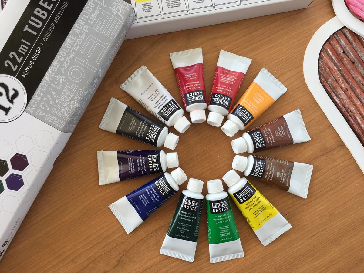
A: Generally, yes, but it's a rule of thumb, not a guarantee. There is a strong correlation between price and stability. High-quality, lightfast pigments like Quinacridone Gold (PO49) or Pyrrole Red are simply more expensive to manufacture than cheaper, fugitive lake pigments. The binder quality also plays a huge role. However, I've been burned before. I once bought a very expensive, small-batch oil paint from a "boutique" brand only to find they provided zero technical data. The color was beautiful, but I relegated it to studies because I couldn't trust it. Conversely, some large, professional-grade brands offer student lines (like Golden's "Matisse" or Liquitex "Basics") that still publish their ASTM D4302 ratings and are often very good (mostly II-rated). Always check the ASTM rating itself. A mid-range paint with a Lightfastness I rating is a far better investment for a lasting piece than a more expensive, “premium-feeling” paint from a brand that is opaque about its testing standards. Don’t just buy the most expensive; buy the best-rated for your purpose.
Q: Where can I reliably buy ASTM-certified materials?
A: Most professional-grade brands are proud of their specifications and make them easy to find. Companies like Golden (acrylics), M. Graham & Co. (oils and watercolors), Arches (papers), Winsor & Newton, and Daniel Smith publish detailed technical sheets and lightfastness information directly on their websites, often listing the specific ASTM standard for each color. When purchasing, look beyond the label and check the manufacturer's site for their ASTM-specific pages. If you’re commissioning or buying original art or prints from another artist, it's perfectly reasonable to ask about the materials they use and their ASTM ratings. A professional artist will have this information.
My personal favorites for reliability:
Brand | What They're Known For | Transparency Level |
|---|---|---|
| Golden Artist Colors | Acrylics & Mediums | Excellent - Comprehensive PDFs for every color |
| Daniel Smith | Watercolors & Specialty Primers | Excellent - Detailed online charts with test results |
| M. Graham & Co. | Oils & Watercolors (uses honey as a binder) | Very Good - Clear ratings on product pages |
| Winsor & Newton | Full range of artist materials | Very Good - Detailed technical information available online |
| Arches | 100% Cotton Rag Paper | Excellent - The gold standard for watercolor paper |
| Liquitex | Acrylics & Inks | Good - Lightfastness ratings widely published |
The Unseen Backbone of Lasting Art
I often think about the cave paintings in Lascaux. Created with simple earth pigments—ochres, manganese, charcoal—they’ve lasted over 17,000 years. It's humbling. The artists of that time chose their materials with an intuitive understanding of permanence that we now meticulously quantify in a lab. They looked at a pile of ochre clay and a handful of berries, and they understood at a fundamental level: one will last, the other will not. They were the first material scientists.
That’s what ASTM standards are: our modern, scientific method for making that same fundamental choice. They are the data-driven link between your creative vision today and the physical object someone might stand in front of a hundred years from now. They aren’t about creative constraint; they’re about intentionality. They are the unseen backbone of a legacy.
In a world saturated with fleeting digital images, making something physical that is built to endure is a radical act of optimism. It's a statement that what you have to say, the beauty you're bringing into the world, is worth preserving.
Knowing your materials—really knowing them—lets you fearlessly experiment with color and texture, secure in the knowledge that the heart of your vision won’t vanish. It transforms material selection from a chore into an act of creative power. It allows you to say, without hubris, “This is built to last.” So next time you’re in the paint aisle, skip the mystery tubes. Reach for the ones with the clear ASTM stamps. Your future self (and all the future selves who might cherish your work) will thank you for taking the time to build a legacy that endures.

After all, art's true magic isn't just in the moment of creation—it's in its staying power. It's in the ability to speak across time, to connect with someone you'll never meet. ASTM standards are simply the tools that help ensure your voice won't be lost along the way.