The Art of Finishing a Painting: A Definitive Guide to Professional Final Touches
Unlock the secrets to a truly complete artwork. This artist's guide covers critical assessment, advanced technical refinements, professional protection, presentation strategies, and the nuanced art of knowing when your painting is truly finished.

The Art of Finishing a Painting: A Definitive Guide to Professional Final Touches
I know the feeling all too well. You've poured your heart and soul into a canvas, wrestling with colors and forms, bringing a vision vibrantly to life. And then, there it is: that last, elusive 10%. It’s the gap between "almost there" and "truly complete" – a profound psychological hurdle many artists, myself included, find most daunting. We fear ruining what we've painstakingly built, or perhaps we chase an imagined perfection that keeps slipping away. I’ve often caught myself staring at a piece, brushes in hand, wondering if one more stroke would make it sing or send it spiraling into an overworked mess – where the spontaneity dies, the colors turn muddy, and the original energy gets buried under layers of indecision.
These final touches are far more than just tidying up. They are a series of deliberate actions, a nuanced conversation with your work, that transforms a good painting into a truly resonant one. It’s about stepping back, seeing with fresh eyes, making precise refinements, and ultimately, ensuring your creation is protected and presented for the world to see, its visual language fully realized. This isn't merely the end; it's the culmination. In this definitive guide, we’ll walk through every crucial final stage, from the initial critical assessment to the final signature, a process I've honed (and occasionally botched, much to my own chagrin!) over years of practice.
The Critical Eye: Stepping Back to Truly See
So, you've wrestled with your vision, and now it's time to assess the battlefield. But how do we truly see what's there, rather than what we think is there? Before I even think about adding another speck of paint, my most powerful tool is distance – both physical and mental. After being inches from the canvas for so long, my eyes often betray me. They've grown far too comfortable with the composition, the colors, and yes, even the subtle flaws. To truly perceive the work, to give it a fair and objective critique, I have to trick my brain into seeing it for the very first time. It’s a bit like trying to read your own handwriting after a long day; sometimes, you need a fresh perspective. Or, even better, imagine trying to find a misplaced item in a room you've been tidying for hours – you need to leave and come back, or have someone else look! It's about changing your vantage point.
Here are several professional techniques I rely on for re-evaluating my work, and what they often reveal for me:
Technique  | How It Works | What It Reveals For Me |
|---|---|---|
| The Long View | Place the painting on a wall and view it from the other side of the room. | Reveals major compositional imbalances, value structure issues (the arrangement of light and dark areas that create form and depth), or if the focal point lacks punch. |
| The Mirror Trick | Look at the painting's reflection in a mirror. | Instantly exposes compositional flaws, awkward shapes, or areas of tension my brain had stubbornly ignored. It's truly a disorienting, yet invaluable, way to catch errors. |
| The Squint Test | Squint your eyes until the details blur, reducing the image to basic shapes and light/dark masses. | Confirms if the core structure and major color relationships (how different hues, saturations, and temperatures interact) are strong; muddy means trouble. |
| The Digital Photo | Take a photo of the painting with your phone, perhaps converting it to black and white. | Highlights weak tonal composition and lack of depth without the emotional distraction of specific hues. It's a cold, hard truth-teller, revealing unflattering truths about my values! |
| The Time Out | Turn the painting to face the wall for a day or two, or even a week. | Provides startling clarity, revealing glaring issues (or unexpected successes!) as if someone else painted it. I've often walked away from a piece I was about to abandon, only to find its solution screaming at me a few days later. |
Once your critical eye has pinpointed the areas ripe for transformation – and believe me, it often will! – it’s time to dive back into the studio for the next crucial phase of art finishing. After all, we're not just making art; we're refining a visual language. For more on how elements guide the viewer's eye, check out this guide to understanding balance in art composition.
Technical Adjustments: The Precision Polish
With a clear list of improvements from my "critical eye" session, it’s time to get back to the palette. This isn't about grand, sweeping changes anymore; these are precise, intentional actions that elevate the work. Think of it less as rebuilding and more as fine-tuning a beautiful instrument to truly sing. In the history of art, masters from different eras approached this stage with varying degrees of zeal; an academic painter might obsess over every minute detail, while an Impressionist might consider the subtle interplay of light and color itself the "finish." What matters to me is coherence and impact. Here, we transition from broad strokes to the subtle, almost surgical refinements that distinguish a good painting from a truly exceptional one.
Unifying the Composition: Creating Visual Flow
Now, I look at the overall flow of the piece. Does my eye move comfortably through it, or does it get stuck somewhere? A strong painting invites the viewer on a journey. Often, it's the subtlest of elements that connect disparate parts: a gentle line that echoes a distant form, a softened edge that guides the eye, or a small color echo (a faint repetition of a specific color from one area in another part of the painting) to tie everything together. This is where a deep understanding of understanding balance in art composition becomes invaluable. I'm no longer building but refining the visual journey, ensuring every element feels intentional and harmonious. Even in abstract art, the unseen structure and flow are paramount; I often find myself thinking about the unseen structure: how composition guides my abstract art at this stage.
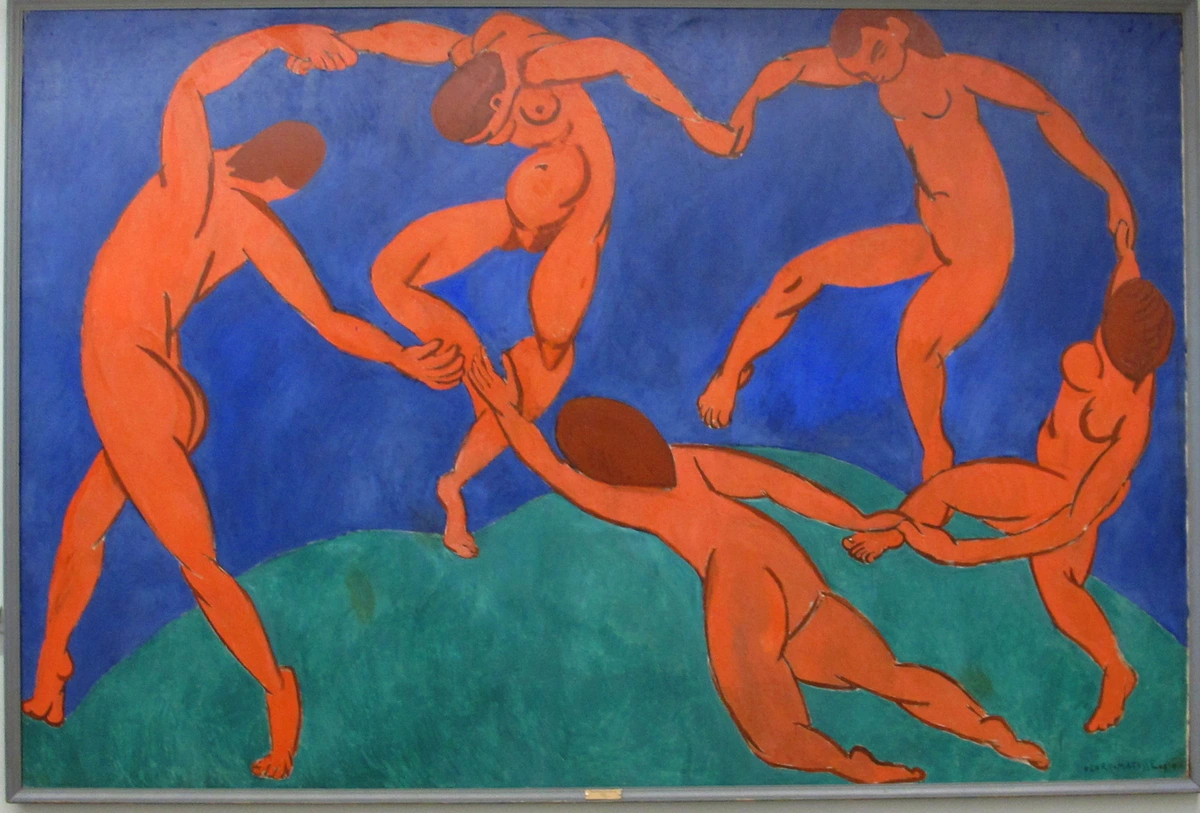
Revisiting and Refining Layers: Beneath the Surface
Sometimes a painting benefits from revisiting its foundational layers, even late in the game. It might sound counterintuitive, but these subtle layers can dramatically enhance the final outcome, allowing underlying elements to influence the surface in a sophisticated way.
- Underpainting: Though usually done early, a subtle underpainting – a monochromatic or limited-color layer – can be applied thinly over areas that feel too stark or need a unifying base. This late-stage underpainting is about setting a quiet, harmonious stage for the vibrant colors to come, deepening their richness, or subtly adjusting a hue that feels 'off' after the main painting is complete. For example, a thin wash of burnt sienna over a too-bright blue can instantly add warmth and depth to a sky that felt flat, or a cool grey underpainting can mute an area that's screaming for attention. You're giving your colors a solid foundation to truly pop. For a full dive into various mediums, check out this definitive guide to paint types for artists.
- Scumbling: This involves applying a thin, broken layer of opaque or semi-opaque paint over a dry area, allowing the underlying color to show through in glimpses. I often use scumbling to create atmospheric effects (like softening the edge of a distant tree line, making it recede into a hazy background), to add a subtle shimmer to the surface of water, or to soften harsh transitions. For me, scumbling a muted ochre over a vibrant blue creates a sense of distant haze or aged texture in an abstract landscape, making it recede. Or a whisper of titanium white over a dark, textured area can simulate diffused light, giving the surface an almost ethereal shimmer. It’s like a whisper of color rather than a shout, offering visual softness and delicate textural interest.
Adjusting Values and Colors: Making the Painting Sing
Often, a painting that feels "flat" or unengaging just needs its value range expanded. This is where I really push the contrasts and refine the color temperature, coaxing the artwork to truly sing with vibrancy and depth. Think of a painting with only mid-tones – it feels muted, lacking punch. Now imagine deepening the darkest darks and pushing the brightest highlights; suddenly, forms emerge, light gleams, and the entire scene gains a compelling drama, much like how atmospheric perspective creates depth in real-world landscapes by making distant objects lighter and less saturated. For more on this, exploring the definitive guide to color theory in art can be incredibly insightful.
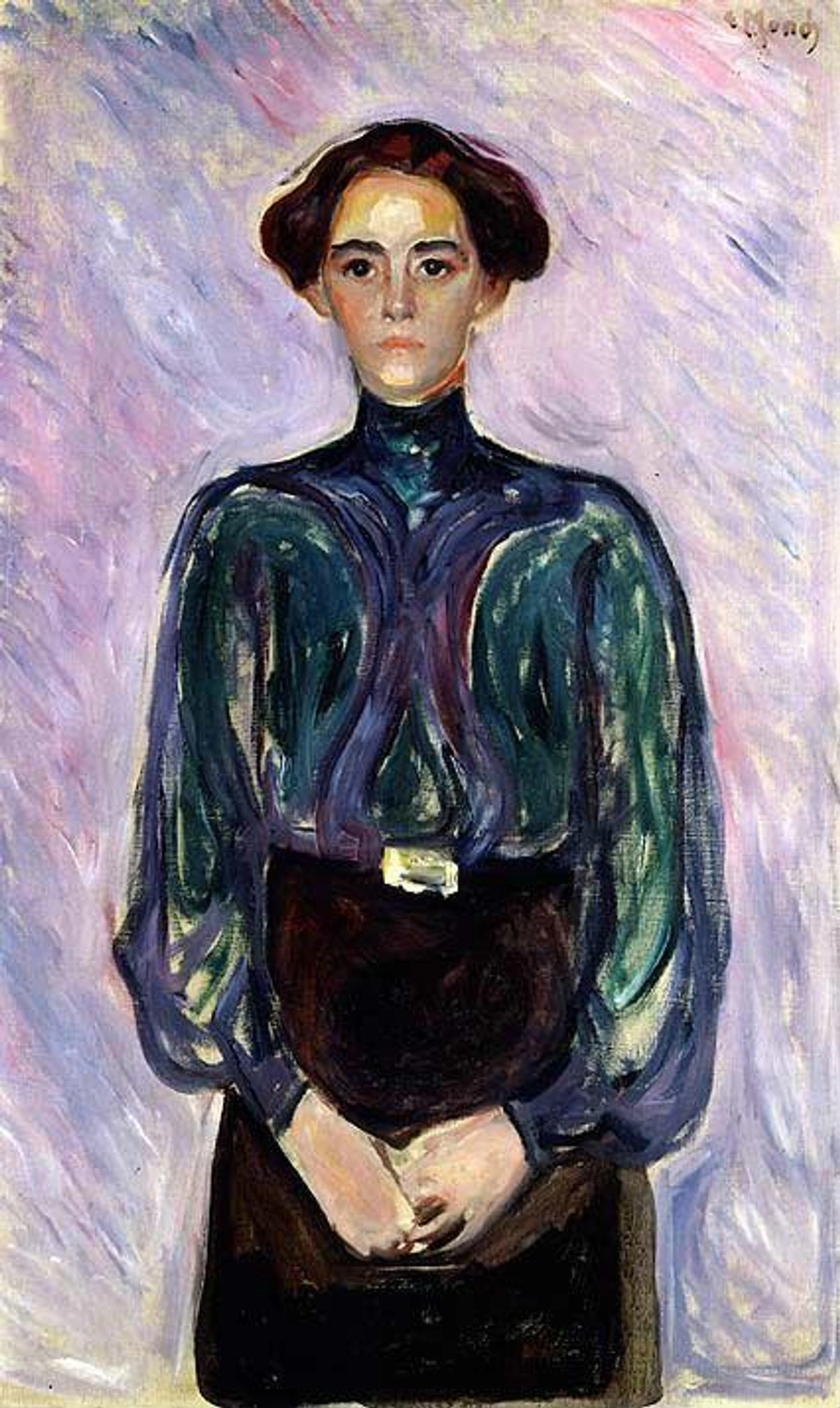
- Pushing the Highlights: Adding that one final, brightest spec of light, a tiny dot of pure white or highly saturated color, can make everything else pop with renewed vibrancy. For a landscape, it might be the glint of sunlight on a distant peak; for a portrait, the sparkle in an eye. It's like adding the final sparkle to a jewel, causing the entire piece to gleam.
- Deepening the Darks: Reinforcing the darkest darks – the true shadows and deepest recesses – creates a full value range and adds a profound sense of depth and drama. Without these anchors, a painting can feel insubstantial, almost as if it's floating aimlessly. In an abstract piece, a rich, deep black or indigo can ground other vibrant colors and create a sense of monumental gravity.
- Glazing: This is a technique I adore, a personal favorite for creating rich, subtle effects. It involves applying a very thin, transparent layer of color over another dry area. I use glazing to subtly shift a color's temperature (e.g., adding a warm yellow glaze over a cool blue to make it a luminous greenish-gold), to unify different sections, or to create an ethereal, almost glowing quality that breathes life into the canvas. I've found it transformative for creating a rich, velvety plum by glazing a warm red over a muted purple, or an earthy, nuanced tone by applying a cool blue glaze over an orange base. The key is transparency and layering; each thin veil of color deepens the visual narrative and breathes life into the canvas. For instance, a cadmium yellow glaze over a crimson can birth an unexpected, luminous burnt orange that feels both ancient and modern. Mastering glazing techniques is, in my experience, a game-changer for depth and luminosity. If you're working with abstract art, understanding the emotional resonance of my abstract art how feelings guide my brushstrokes can further inform your glazing choices.
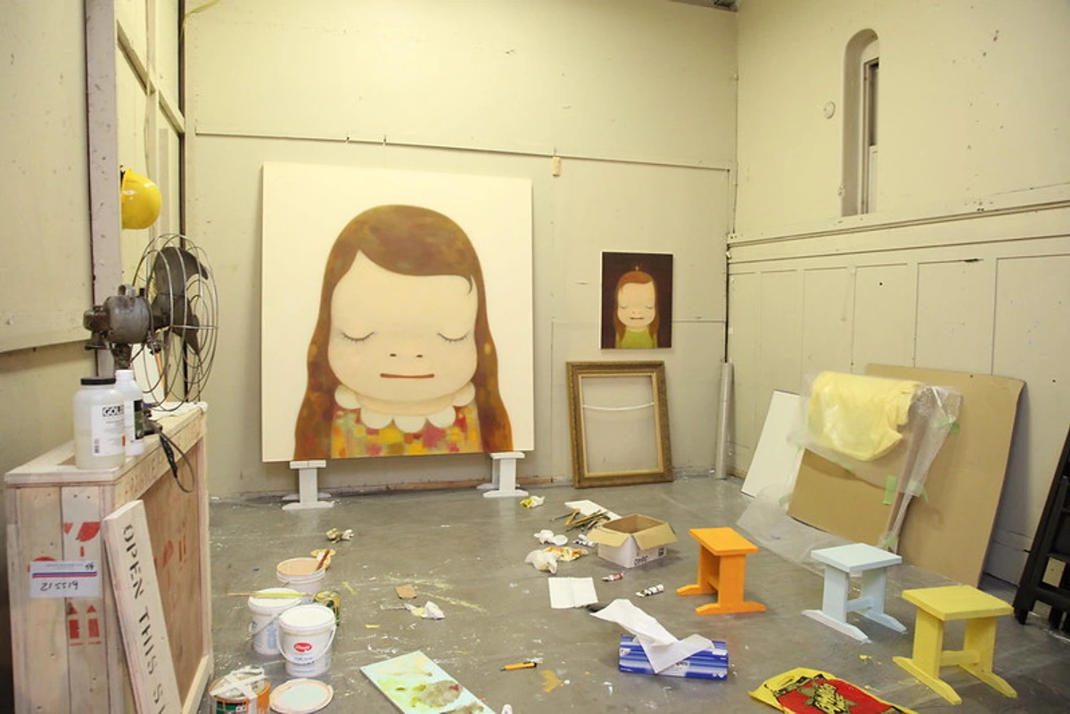
Adding Details and Texture: The Final Seasoning
This is the very last layer of refinement, the artistic "seasoning" that elevates a good meal to a gourmet experience. It could be a crisp line to define an abstract shape's edge, a deliberate touch of impasto (thickly applied paint) to catch the light and add tactile interest, or a subtle pattern to bring life to a quiet area. For abstract work, this might involve careful linear elements, delicate stippling, or even controlled drips that introduce a focal point or unify disparate elements. My rule here is absolute restraint: the goal is to enhance, not to overwhelm or distract. Overdoing it can easily muddy the freshness and vitality you've worked so hard to build. For me, exploring exploring texture: my favorite techniques for adding depth to abstract paintings often comes down to these delicate, impactful final touches. You might also find that using a what is a palette knife and how to use it can create some truly unique impasto effects, allowing for that final sculptural flourish.
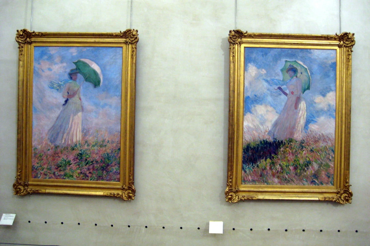
Protection and Presentation: Varnishing and Framing
Once the paint itself has achieved its resolved state, my work isn't quite done. The artistic statement, however complete it feels on the canvas, still needs its stage and its shield. This leads us to the crucial final acts: protection and presentation. A painting, no matter how "finished" it feels to me, isn't truly complete until it's protected and presented in its best light. Think of it as sending your child out into the world – you want them well-dressed and prepared! These final painting steps are crucial for longevity and impact. Historically, the practice of varnishing and framing evolved alongside art itself, moving from purely practical needs (protecting fragile pigments) to becoming integral elements of the aesthetic presentation, influencing how art is perceived and valued. These steps aren't just practical; they elevate the artwork's presence, transforming it from a mere painted surface into a finished art object.
Pre-Varnishing Checks: Patience is a Virtue
Before even thinking about varnish, I always ensure the painting is impeccably clean and completely dry. For acrylics, a few days is generally sufficient, but for oil paintings, this is absolutely critical. I've learned the hard way that impatience here can lead to disaster, turning a triumphant finish into a regrettable mess. Oil paint needs to be fully cured – a complex process of oxidation, not just surface drying – which can take anywhere from 6 to 12 months, sometimes even longer for very thick impasto layers. Varnishing too early can trap solvents, preventing proper curing and potentially causing the varnish to yellow, crack, or even peel over time. To clarify, "dry to the touch" means the surface solvent has evaporated, but the deeper layers are still undergoing chemical changes. "Fully cured" means those chemical changes are complete, making the paint film stable and ready for a protective layer. For cleaning, a quick dusting with a soft, dry brush is usually all that's needed to remove surface debris or any stray dried paint drips that might interfere with the varnish layer. For more comprehensive care, you can refer to guides on art storage solutions for collectors.
To Varnish or Not to Varnish? That is the Question.
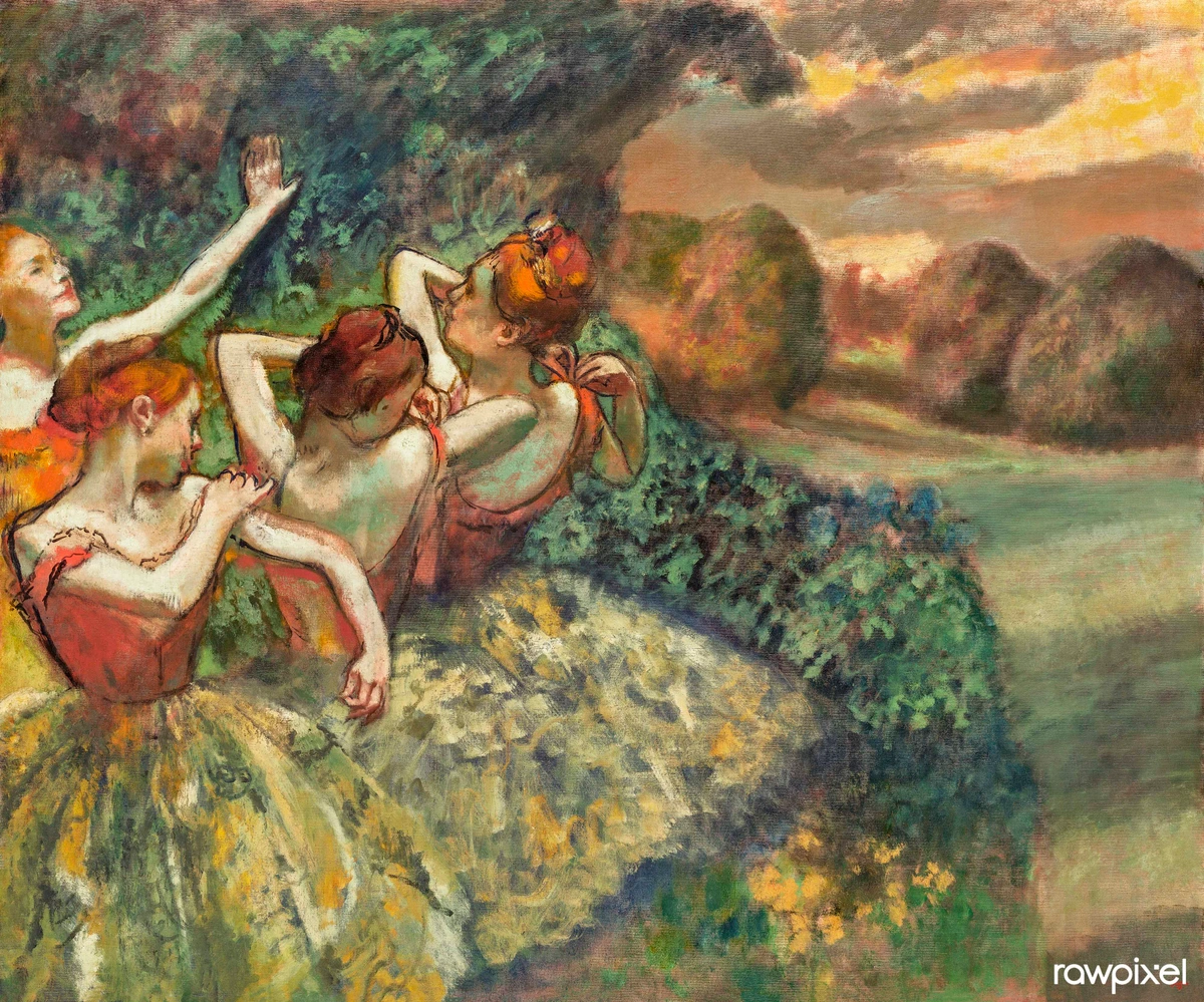
Varnish serves two crucial purposes: it protects the paint from UV light, dust, and environmental pollutants, and it unifies the final sheen of the painting, saturating the colors and bringing them to life. But which finish is right for your piece? The choice significantly impacts how your artwork is perceived, almost acting as another layer of artistic expression.
Varnish Type | Finish | Effect on Artwork & Style Suitability |
|---|---|---|
| Gloss | Shiny, highly reflective | Deepens darks significantly and makes colors appear very saturated, vibrant, and luminous. It can be intense, almost like looking into a liquid surface. Often favored for hyperrealism or pieces where deep color saturation is paramount, especially for works with intricate details or a desire to emulate a traditional "wet" oil look. |
| Matte | Flat, non-reflective | Offers a modern, contemporary look with virtually no glare, which can be great for photography or large installations where reflections are undesirable. However, it can slightly dull the darkest values and sometimes lighten colors, softening the overall impact. Ideal for minimalist work, pieces relying heavily on texture, or when you want a subtle, sophisticated finish that doesn't compete with the art itself. |
| Satin | A beautiful in-between sheen, neither too glossy nor too matte. | This is my most popular choice, as it offers a lovely balance: good color saturation and depth with minimal glare, making it very versatile. It works wonderfully across a broad range of styles, from abstract to figurative, providing a natural luster without being distracting. It's often chosen to mimic the natural sheen of a cured oil painting. |
The Role of the Frame: The Artwork's Advocate
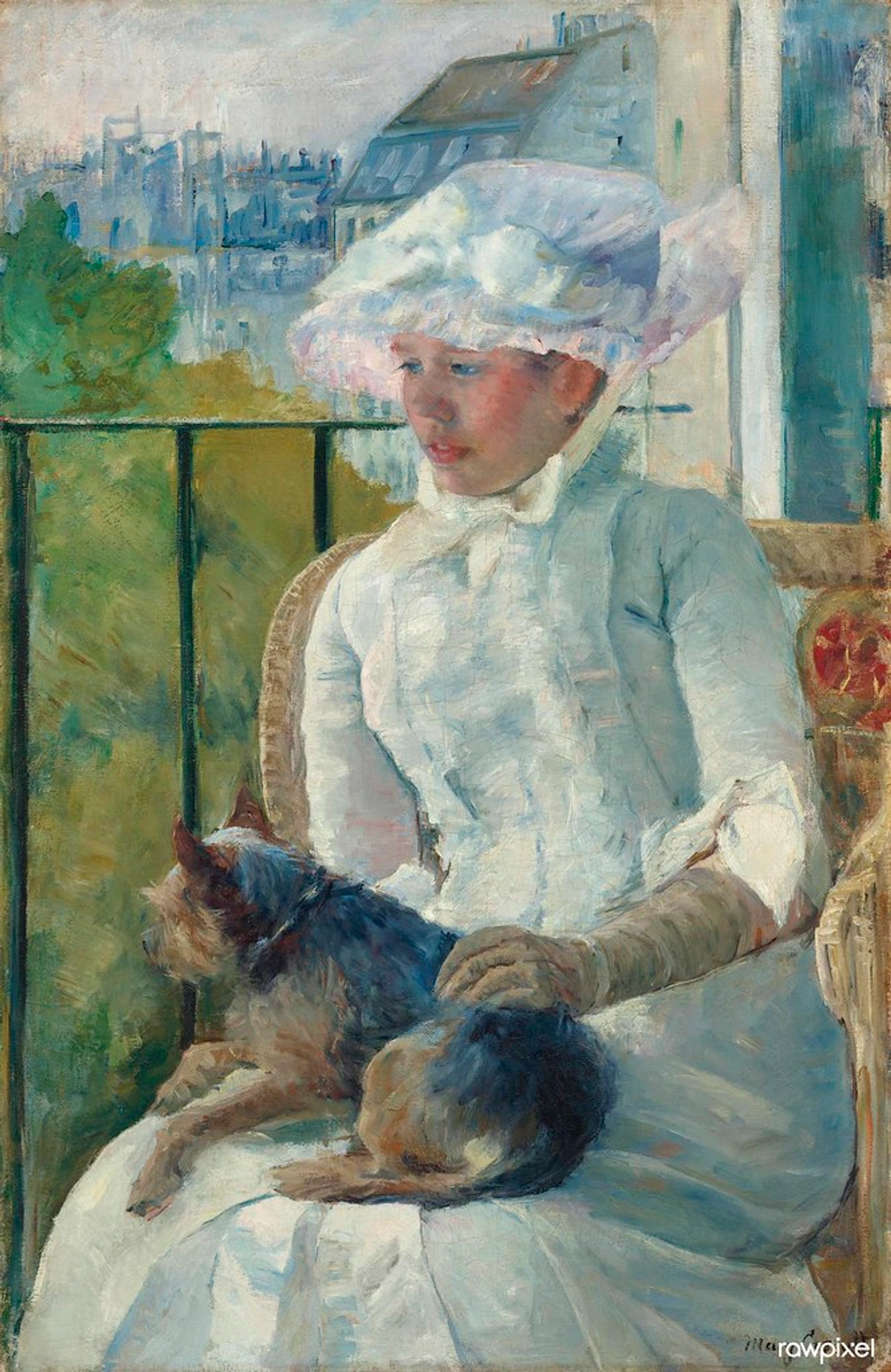
I see a frame as the punctuation mark at the end of the artistic statement. It creates a defined boundary, separating the artwork from its surroundings and completing the piece, giving it gravitas and a sense of permanence. Historically, frames evolved from simple protective borders in medieval altarpieces to ornate gilded statements during the Baroque era, then back to simpler, more integrated designs in Modernism. Each style influenced how the art within was perceived, enhancing its perceived value and the context in which it's viewed. Whether it's a simple floater frame for a modern abstract canvas or an ornate gilded frame for a more traditional piece, the frame should always serve the painting, enhancing it without ever competing for attention. An overly ornate frame, for instance, could easily overpower a minimalist abstract, or a stark, modern metal frame might clash with the delicate brushwork of a Baroque portrait. I remember once seeing an incredible, vibrant abstract piece almost swallowed by a heavy, traditional dark wood frame; it actively fought against the painting's energy. A well-chosen frame truly elevates the entire presentation, offering the viewer a complete art presentation. For those who create prints or digital art, the 'framing' often extends to the quality of the print medium itself, the digital presentation, and even the choice of display screen – it's all about how the work is finally advocated for.

Documenting Your Finished Work: Beyond the Studio
Before a painting truly leaves the studio, an often-overlooked but crucial step is documenting it. High-quality photography of your finished artwork is essential for your portfolio, website, social media, and any future exhibition submissions or sales. It's not just about capturing an image; it's about accurately representing its colors, textures, and details. Proper lighting, a neutral background, and precise camera settings ensure that the digital record truly honors the physical artwork. This digital archive becomes a part of its provenance, a vital link in its story once it's out in the world, proving its authenticity and original state. For an artist, this is a non-negotiable step in building a professional presence and managing your artistic legacy.
The Signature: An Artist's Final Mark
The artist signature is more than just a name; for me, it’s the very last compositional element, a final statement before the work truly leaves my hands. Historically, artists began signing their work more consistently during the Renaissance, as a way to assert authorship, establish reputation, and claim individual artistic genius – a far cry from the anonymity of medieval craftsmen. Think of how Picasso or Monet's signatures became instantly recognizable, almost brands in themselves, inseparable from the artwork's identity. In today's digital landscape, with concepts like NFTs and digital art challenging traditional notions of ownership and authenticity, the physical signature might seem like a relic. Yet, for me, it retains its profound importance on a tangible canvas. It's an indelible claim of authorship, a whispered "I was here," anchoring the physical object to its creator in a way digital tokens can only attempt to replicate. I believe it should be thoughtfully integrated, not just hastily slapped on as an afterthought. When I sign my work, I meticulously consider its placement, its color, and its scale. It should be legible enough to identify the artist but never distracting, never pulling focus from the main image. It’s a subtle claim of authorship, a whispered "I was here."
Placement | Pros | Cons |
|---|---|---|
| Bottom Right | Traditional, expected, and generally keeps the focus on the main image. Familiar and safe. | Can feel predictable, almost an afterthought if not done well, or if the composition is already very heavy on that side. Risk of being cropped out during framing or display, especially in tight gallery hangings. |
| Bottom Left | Also traditional, and can beautifully balance a composition that feels visually heavy on the right. Offers an alternative traditional spot. | Similar potential for predictability if not handled with care. Can feel like a forced balance if not genuinely needed, or again, risk of cropping. |
| Integrated into the Art | Can be a clever, subtle way to sign, almost a hidden gem within the work itself. Adds intrigue and a personal touch, making it an integral part of the visual narrative. | May be difficult for viewers to find, or it could inadvertently disrupt the image if not executed with extreme finesse. Risk of becoming too obscured and losing its function as an identifier. |
| On the Back | Keeps the front of the canvas completely clean, a choice favored by some modern and minimalist artists who prefer an uninterrupted visual field. | Viewers and potential buyers cannot easily identify the artist at first glance, which can be a practical drawback for quick identification or gallery display. Crucially, without proper documentation, the signature on the back is more vulnerable to damage or loss, especially if the canvas is restretched or repaired, leading to potential provenance issues. |
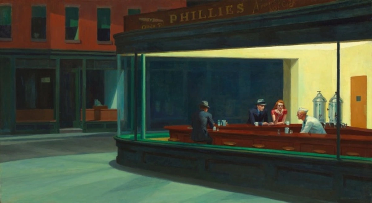
Most artists, myself included, sign their work with a color already present in the painting, using a fine-tipped brush or even a pencil to ensure it feels like an organic part of the artwork itself, rather than a jarring addition. For a deeper dive into the nuances, I've found this article on how to sign a painting to be quite helpful.
Knowing When to Stop: The Hardest Step of All
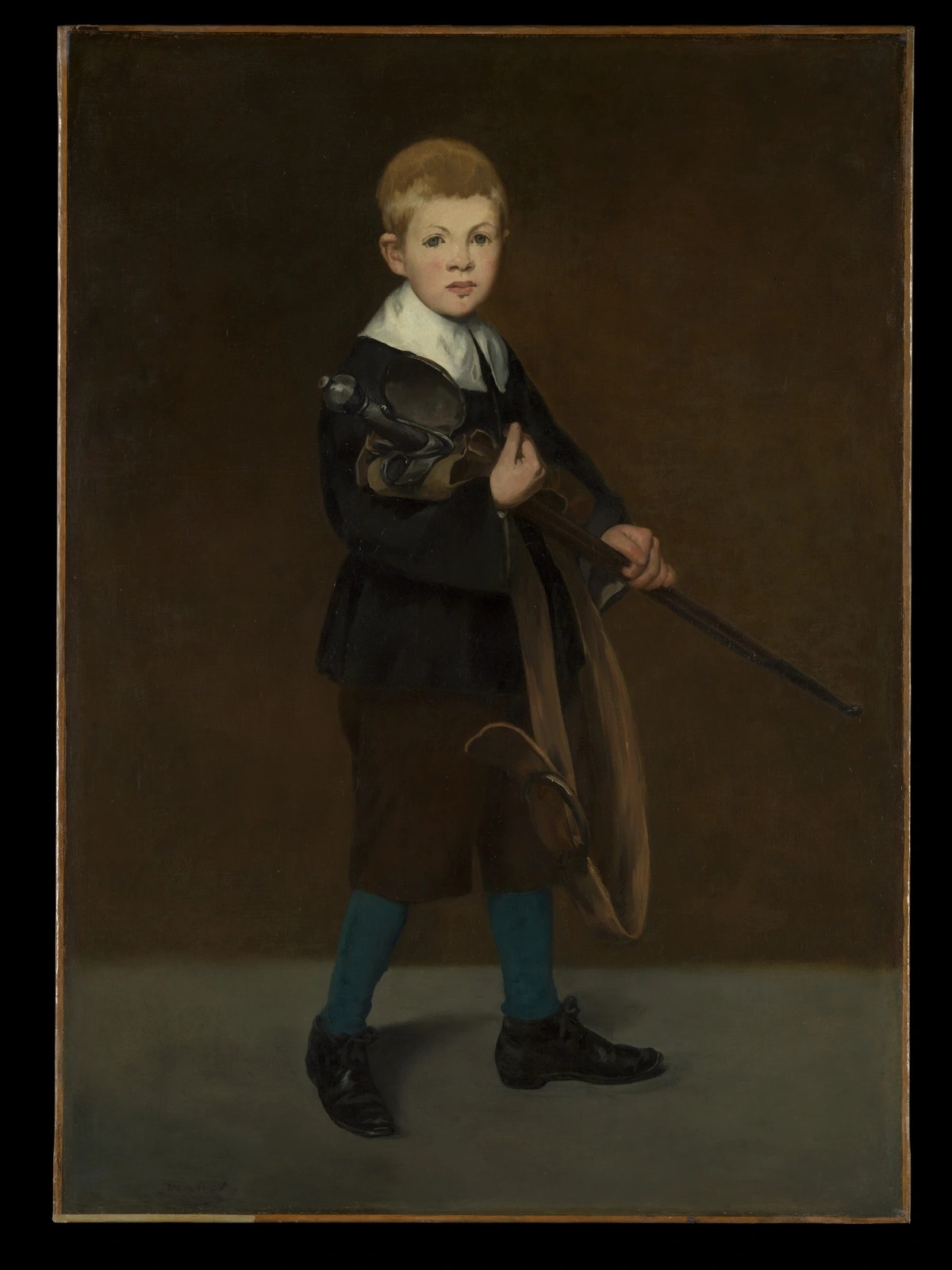
This, in my humble opinion, is often the single most challenging part of the entire process. There is a very real, insidious danger of overworking a painting – of fussing with it, tweaking it, and adding "just one more thing" until the initial energy, spontaneity, and freshness are completely lost. Leonardo da Vinci famously, and perhaps wryly, said, "Art is never finished, only abandoned." I used to find that quote incredibly frustrating, but now I see its profound wisdom. It's not about giving up in defeat; it's about recognizing when your battle with the canvas has achieved its purpose, when the piece has communicated its essential message, and choosing to step away. Different art movements throughout history have held vastly different philosophies on what constitutes "completion" – from the meticulous, hyper-realistic finish of Renaissance masters to the process-oriented, often intentionally raw aesthetic of Abstract Expressionism (think of a piece by Jackson Pollock, for instance, where the process is the visible conclusion). This dance between intention and emergence is key.
It’s a strategic decision, an act of confident release, rather than surrender. Perfection is a myth, after all, a constantly moving target that can lead to endless, fruitless tinkering. I often wrestle with my initial artist's intent; did I achieve what I set out to do? Or, perhaps more frequently in my abstract work, has the painting become something new and compelling that satisfies my creative impulse, even if it deviates from the first spark of an idea? I've had to literally pry a brush from my own hand, or turn a canvas to the wall for weeks, just to resist the urge to overwork a piece. There was one abstract landscape where I kept adding layers of green, convinced it needed more "nature," until a friend gently pointed out it was starting to look like a swamp. That was my cue to stop. It’s a battle, honestly. For me, a painting is truly finished when adding anything more would subtract from its impact. It’s finished when it successfully communicates my intended idea or emotion, even if it’s an abstract one that speaks more to feeling than form. It's finished when I can look at it and feel a sense of resolution and quiet completeness, even if my artist's eye still spots a dozen tiny "imperfections." Sometimes, those subtle imperfections are precisely what give the work its soul, its unique human touch, its authentic artistic expression. For more on this delicate balance, you might find my thoughts on knowing when a painting is finished or the power of imperfection embracing accidents and evolution in my abstract art resonate deeply. Ultimately, it’s about recognizing the final touches that complete a painting without stifling its inherent vitality.
Frequently Asked Questions (FAQ)
Even after walking through these stages, I find myself answering common questions about the delicate art of finishing. So, to ensure clarity and address those lingering thoughts, here are the queries I get asked most often by fellow artists and collectors, along with my honest insights.
How long should I wait before varnishing an oil painting?
For oil paintings, it is absolutely critical to wait for the paint to fully cure, not just be dry to the touch. This intricate process, known as oxidation, can take anywhere from 6 to 12 months, or even significantly longer for very thick applications of paint (impasto). Speaking from experience, "dry to the touch" means the surface solvents have evaporated, allowing the paint to feel dry, but the deeper layers are still undergoing chemical changes. "Fully cured" means these chemical changes are complete, and the paint film is stable throughout. Varnishing too early will trap solvents, which prevents the paint from curing properly. This premature sealing can lead to the varnish yellowing or cracking over time, ultimately damaging your artwork. Patience here is genuinely rewarded, acting as a final art protection step. For acrylics, the drying time is much shorter – a few days to a week is generally sufficient, as they cure through evaporation rather than oxidation. However, re-varnishing acrylics after a removal can be trickier, as the acrylic paint layer itself can be more sensitive to solvents than fully cured oils, making careful application or professional consultation even more crucial.
What is the best way to sign a painting?
My approach is to use a fine script or liner brush with paint that is slightly thinned and in a color that harmonizes, rather than clashes, with your existing palette. I typically choose a location (most often the bottom right or left) that doesn't pull focus or distract from the main subject, making it an integrated artist's mark. Before signing on the final piece, I always practice my signature on a separate surface a few times to ensure a smooth, confident application. The ultimate goal is for the signature to feel like a natural, graceful mark that completes the artwork, not a jarring intrusion.




How do I know if I've overworked my painting?
This is a tough one, and I've certainly been there! Common signs of an overworked painting include colors that start to look muddy (often from too much blending or layering without letting layers dry), a noticeable loss of spontaneity or energy in the brushwork, and a composition that begins to feel cluttered or confused rather than unified. If I find myself repeatedly "fixing" the same spot without any real improvement, or if the initial vibrancy is gone, that's a very strong signal to step away. At that point, taking a "time out" (turning the painting to the wall for a few days) is usually the best course of action to gain a fresh, objective perspective and help you avoid the pitfalls of overworking art.
Can I use household products to clean my painting?
Absolutely not! This is a crucial mistake many beginners make. Household cleaning products, even seemingly mild ones, contain chemicals that can be highly corrosive or abrasive to paint and varnish layers. They can cause irreversible damage, such as dissolving paint, leaving residues, changing color, or creating permanent streaks. For routine dusting of a varnished painting, a very soft, dry brush is sufficient. For any ingrained dirt or significant cleaning, always consult a professional art conservator. They possess the specialized knowledge and archival-safe solvents to clean your artwork without causing harm, ensuring proper art preservation.
How do I prepare a finished painting for shipping?
Preparing a finished painting for shipping is a meticulous process to prevent damage. First, ensure the painting is completely dry (and fully cured if oil). For a varnished painting, allow the varnish to fully harden for several weeks. Frame the artwork securely if it's meant to be framed. For unframed canvases, protect the corners with cardboard protectors. Wrap the entire painting in glassine paper or archival-safe plastic wrap, followed by a layer of bubble wrap (bubble side out to prevent impressions on the surface). Create a custom-sized shipping box, ideally a double-walled art box, with adequate cushioning (foam, packing peanuts) to prevent movement. Clearly label the box as "FRAGILE" and "ARTWORK - DO NOT LAY FLAT." Always get insurance. This level of care ensures your painting final steps extend to its safe journey to its new home.
A Final Thought
The journey from a blank canvas to a completed artwork is, for me, a profound and often unpredictable dance between intention and discovery. These last touches art – from the critical assessment to the precise technical adjustments and the ultimate protection and presentation – are what transform a painting from a work in progress into a resolved, articulate piece of art, ready to engage with the world. It’s a phase that demands a shift in mindset: less about passionate, spontaneous creation and more about critical, objective refinement, coupled with the courage to call it done. As artists, we often feel the pull of that imagined perfection, but true mastery lies in knowing when to step away, allowing the work to breathe and speak for itself. By embracing these final steps, by truly seeing your work anew, you not only honor the immense effort you've already invested but also ensure your unique vision is presented in its absolute best possible light. So, take that moment of quiet accomplishment, and then, perhaps with a fresh perspective and renewed energy, embark on your next creative adventure. Your fully realized vision, now eloquently expressed, awaits.